
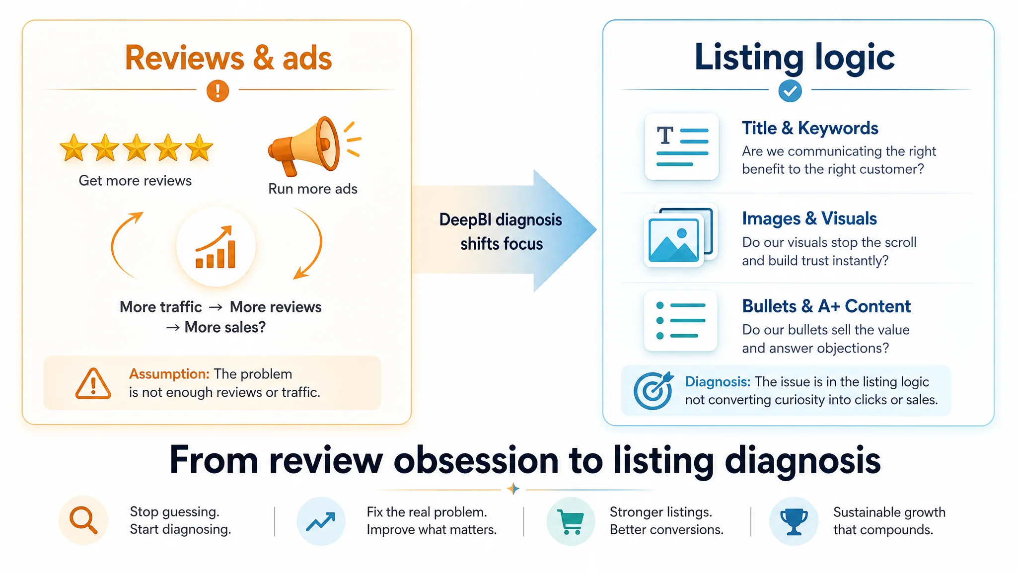
This Amazon seller case follows a women’s outdoor jacket that appeared healthy on the surface—solid star rating, active Amazon ads, and steady sales—but kept losing ground to a close competitor. The brand’s internal story sounded familiar: the gap must be about review volume and time in market, so the solution was framed as “run more ads, collect more reviews, and wait.” In their minds, advertising and review velocity were the only levers that could realistically close the conversion gap.
DeepBI’s listing diagnosis showed a different picture. Instead of a product problem or a rating problem, it uncovered a structural listing problem: the jacket was being presented as a casual windbreaker in a category where shoppers were actually buying quantified sun‑protection gear. Title, images, bullets, and A+ content all under‑communicated UPF performance and outdoor use, while the competitor’s listing made those attributes central. In other words, traffic from Amazon ads was being poured into a page whose logic and visuals were misaligned with search intent.
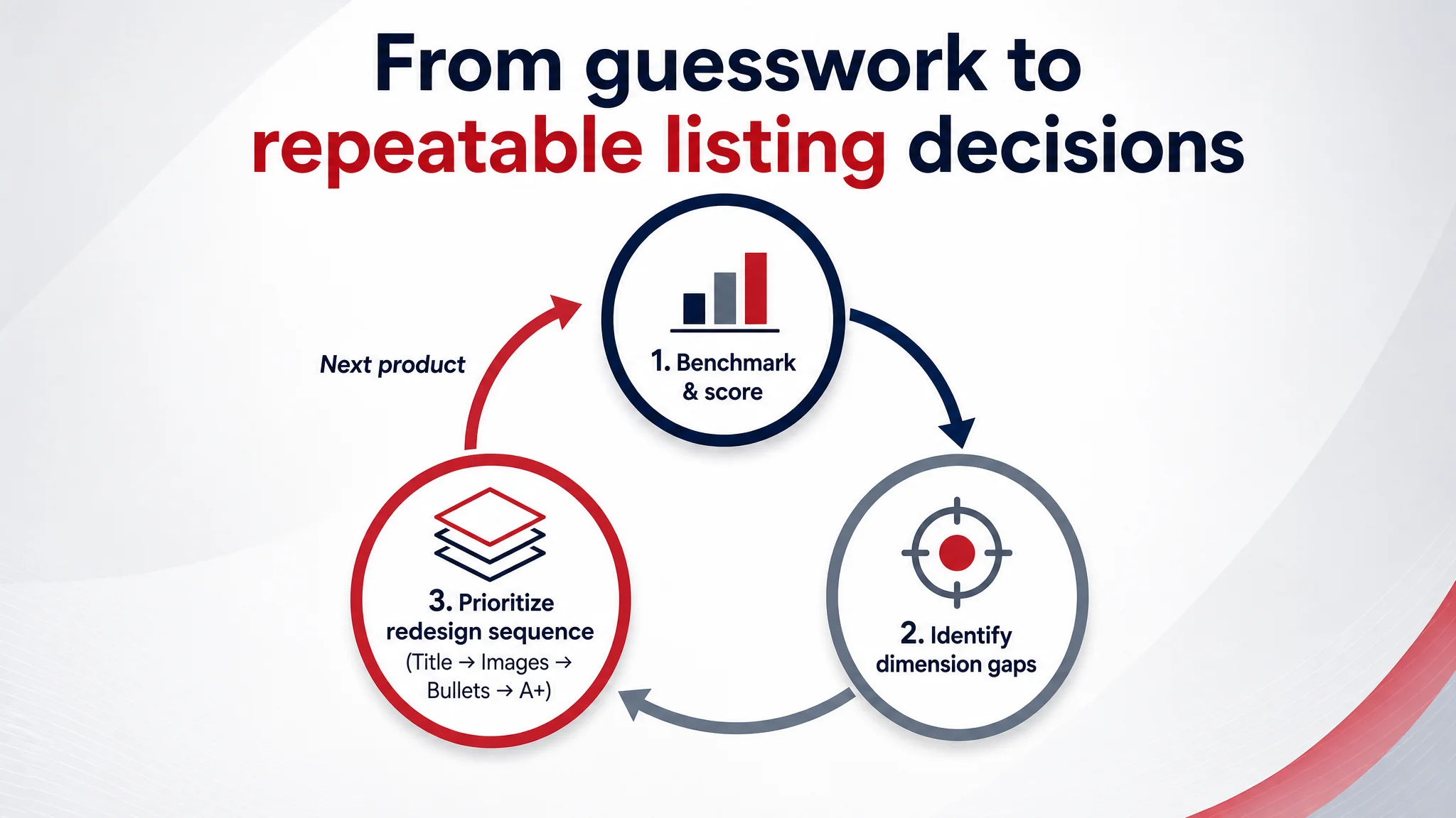
Subsequent optimization focused not on “beautifying” creatives or chasing more reviews, but on rebuilding the decision path inside the listing: front‑loading UPF and hiking signals in the title, reshaping the image set from lifestyle‑only to technical and scenario‑driven, and rewriting bullets and A+ modules around concrete outdoor problems, usage scenarios, and functional reassurance. Only after this information architecture was corrected did it make sense to scale ads and review programs, because each paid click now landed on a page that could credibly convert in its category.
For other Amazon sellers, the lesson is clear: when a listing has good ratings but weak Amazon ads performance or lagging conversion versus competitors, the constraint is often not “too few reviews” or “an unfair market.” It is how the product is framed and decoded on the page. DeepBI’s role in this case was to separate myth from mechanism—to show that before you spend more on traffic or incentives, you must first ensure your listing tells the right story, in the right language, for how your category actually buys.
How a Mid‑Tier Outdoor Jacket Listing Discovered Its Real Constraint
For six months, a women’s hooded windbreaker on Amazon US sat in an uncomfortable position: healthy star rating, stable but modest sales, and a competitor that kept widening the gap.
Internally, the team framed it as a classic Amazon problem: > “We’re new. They’re established. We just need more reviews and more ads.”
Their main benchmark—another women’s sun protection jacket—had hundreds of reviews and a slightly higher rating. The conclusion felt obvious: push ads, maybe tweak bids, and wait for social proof to catch up.
DeepBI was brought in not to “beautify” the listing, but to answer a simpler question: Is the real problem review volume—or something else inside the listing itself?
 ---
---
The Original Misdiagnosis: Blaming Reviews for a Listing Logic Problem
On the surface, the numbers seemed to confirm the team’s story:
- Their jacket: 4.4 stars, 26 reviews
- Competitor: 4.5 stars, 712 reviews
To the operators, this translated into a binary worldview:
- Competitor wins because: more reviews → more trust → higher conversion
- Our job: get reviews up, run more ads, keep price stable
What this framing implicitly assumed:
- The listing was “good enough” and didn’t materially block conversion.
- Reviews were the primary trust gap.
- CTR and CVR issues were “market fairness” issues, not listing design issues.
DeepBI’s listing scoring quickly undermined that comfort.
---
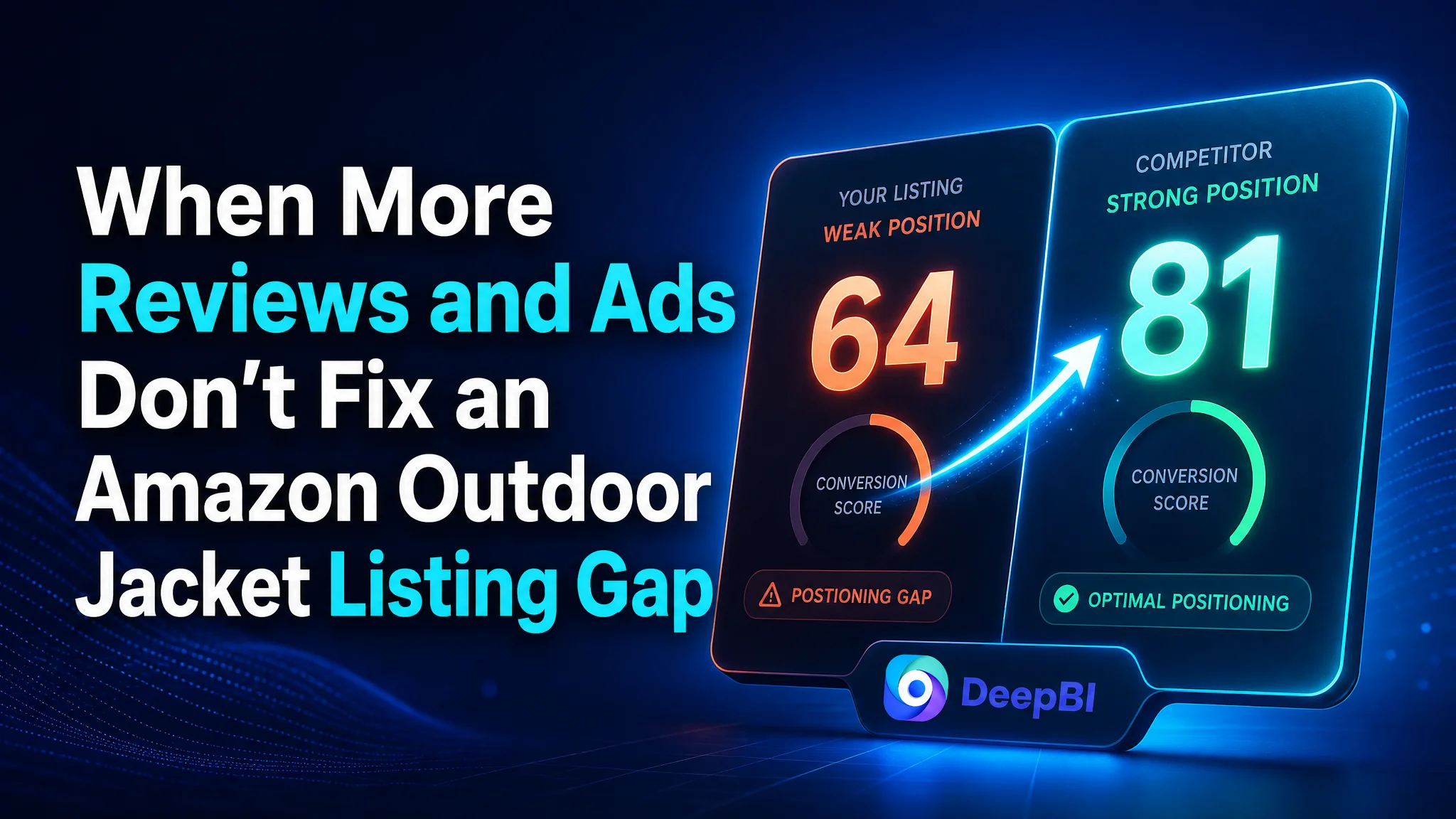
The Diagnostic Reality: A 64 vs 81 Listing, Not a 4.4 vs 4.5 Product
When DeepBI ran its multi‑dimension benchmark, the listing scored:
- 64 / 100 vs competitor’s 81 / 100
- –17 points overall gap
Broken down, the problem wasn’t star rating at all:
| Dimension | Their Listing | Competitor | Gap | |-----------|--------------|-----------|-----| | Title | 12/20 | 16/20 | -4 | | Main Images | 19/30 | 25/30 | -6 | | Bullet Points | 4/10 | 6/10 | -2 | | Detail Page (A+) | 19/25 | 21/25 | -2 | | Reviews | 10/15 | 13/15 | -3 |
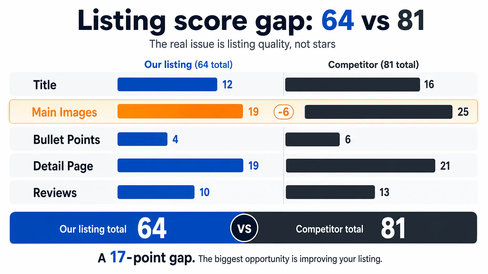 Key shift: The listing wasn’t underperforming because customers doubted the product. It was underperforming because:
- It failed to present the product as a serious sun‑protection hiking jacket.
- It buried or diluted the attributes that matter most in this niche.
- It treated visuals as lifestyle decoration, not as part of the conversion logic.
The review gap was real—but it was not the primary constraint.
---
Where the Listing Logic Broke: Four Misalignments
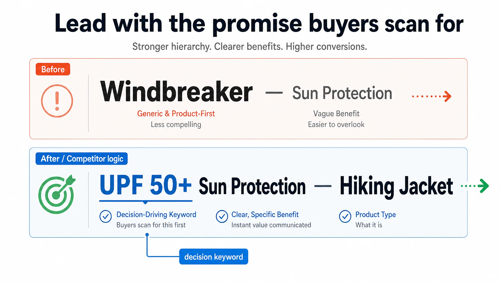
1. Title: Selling “Windbreaker” When the Category Buys “Sun Protection”
The team led with “Windbreaker” and a generic “Sun Protection” phrase. The competitor did something fundamentally different:
- Front‑loaded “UPF 50+ Sun Protection” with a clear numeric promise
- Stacked category‑relevant long‑tail terms:
“Long Sleeve Shirts”, “Full Zip Tops”, “Hiking Outdoor”
DeepBI’s scoring didn’t just penalize keyword coverage. It highlighted a category reality:
- In this niche, “UPF 50+” is not decoration; it’s a purchase condition.
- Customers filter mental shortlists around quantified protection + activity type.
The team had framed the product as a light urban windbreaker. The market was shopping for a certified sun protection hiking jacket.
 2. Main Images: Lifestyle Fashion Where the Market Expects Technical Gear
All seven images leaned on:
- Park / city backgrounds
- Model‑only, dynamic poses
- No clear separation between:
- product overview
- functional detail
- usage scenarios
- size/fit comprehension
The competitor’s visual logic, as DeepBI decomposed it:
- White‑background technical shots as the anchor for CTR
- Close‑ups of thumb holes, pockets, fabric
- Icons for Sun Protection / Lightweight / Quick Dry
- Clear “from search thumbnail you can already see:
this is technical, not just aesthetic”
DeepBI’s score gap (-6 in main images) wasn’t about “beauty”; it was about information density and role clarity:
- Their images looked pleasant but did not answer:
- How does this jacket protect me from sun?
- How does it behave in real hiking conditions?
- What makes it more than a cheap casual shell?
The operators had assumed “good lifestyle shots = competitive visuals.” DeepBI reframed it: “Good for Instagram” ≠ “Good for Amazon CTR/CVR in a technical category.”
 3. Bullet Points: Listing Features Instead of Solving Outdoor Problems
The original bullets:
- Focused on fabric parameters, structural features, washing instructions
- Talked about “windproof, waterproof, loose fit”
- Used broad, non‑situational phrases like “outdoor activities”
The competitor’s bullets followed a different pattern:
- User felt experience: “soft and light”, “keep you feminine and stylish”
- Certifications: “Certified UPF 50+”
- Concrete scenarios: hiking, running, fishing, sailing, swimming, camping
- Specific utilities: low‑profile thumb holes, 4 pockets, what they hold
DeepBI’s analysis surfaced a key behavioral gap: customers don’t buy jackets, they buy resolved worries:
- Will I overheat?
- Will I really be protected from UV?
- Where do my phone and keys go?
- Can I move freely without feeling boxy?
The team’s bullets answered none of those directly. They were technically accurate but commercially quiet.
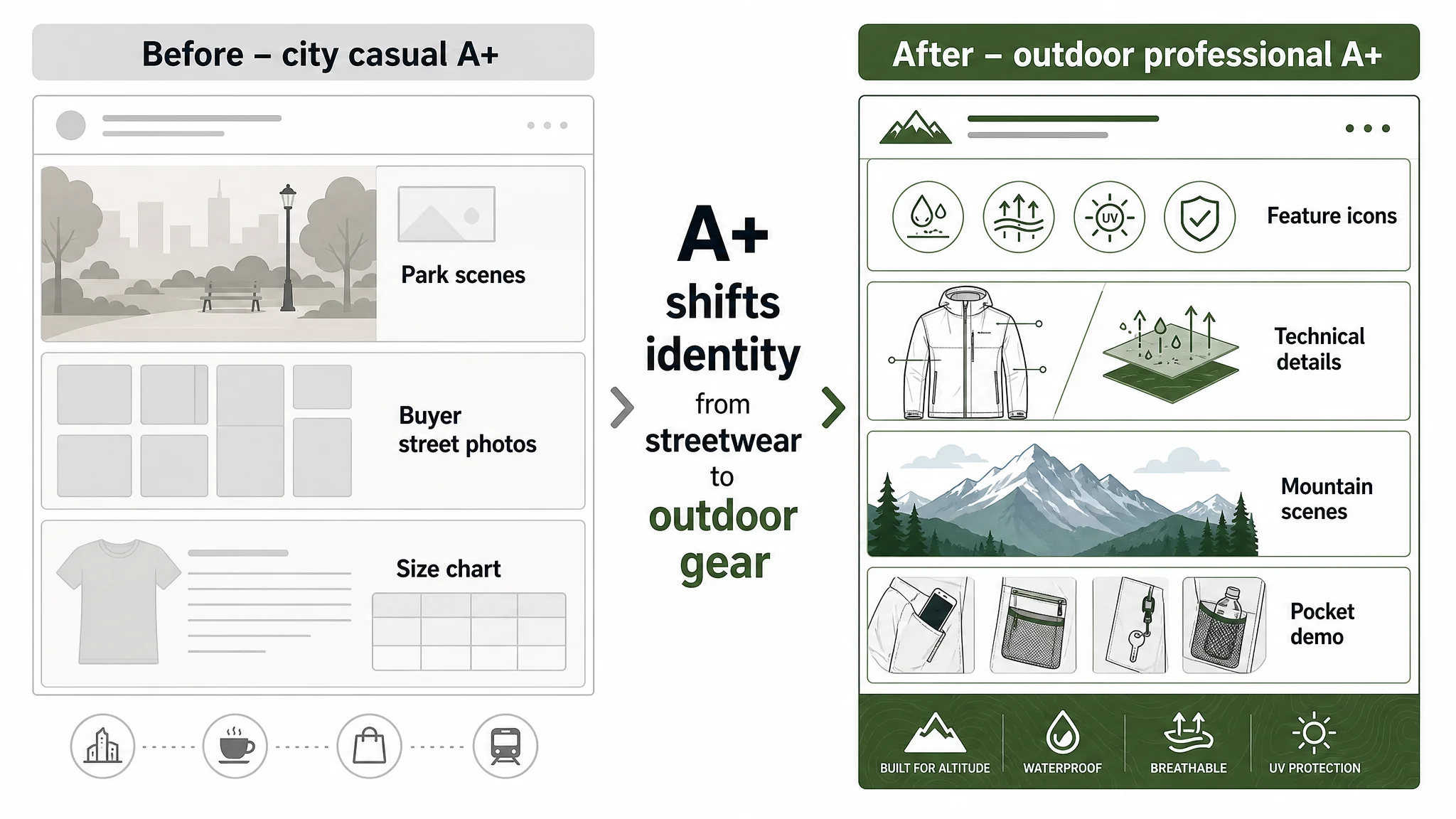
 4. A+ Detail Page: Urban Casual vs Outdoor Professional
On the A+ level:
- Their layout: main visual + fabric + detail callouts + styling + buyer photos + size chart
- Competitor’s layout:
- Main hero scene
- Icon‑driven feature panels
- Detailed functional shots (thumb holes, pockets)
- Strong outdoor scenes (mountains, forests, hikes)
- Video entry mentioned (even if not fully used)
DeepBI’s diagnosis:
- Their page confirmed a casual, city‑use identity
- Competitor’s page asserted a serious outdoor, sun‑defense identity
- Both could be “true use cases,” but only one aligned with:
- category search intent
- major search terms
- pricing power for technical jackets
This wasn’t a design taste issue; it was category positioning drift.
 ---
---
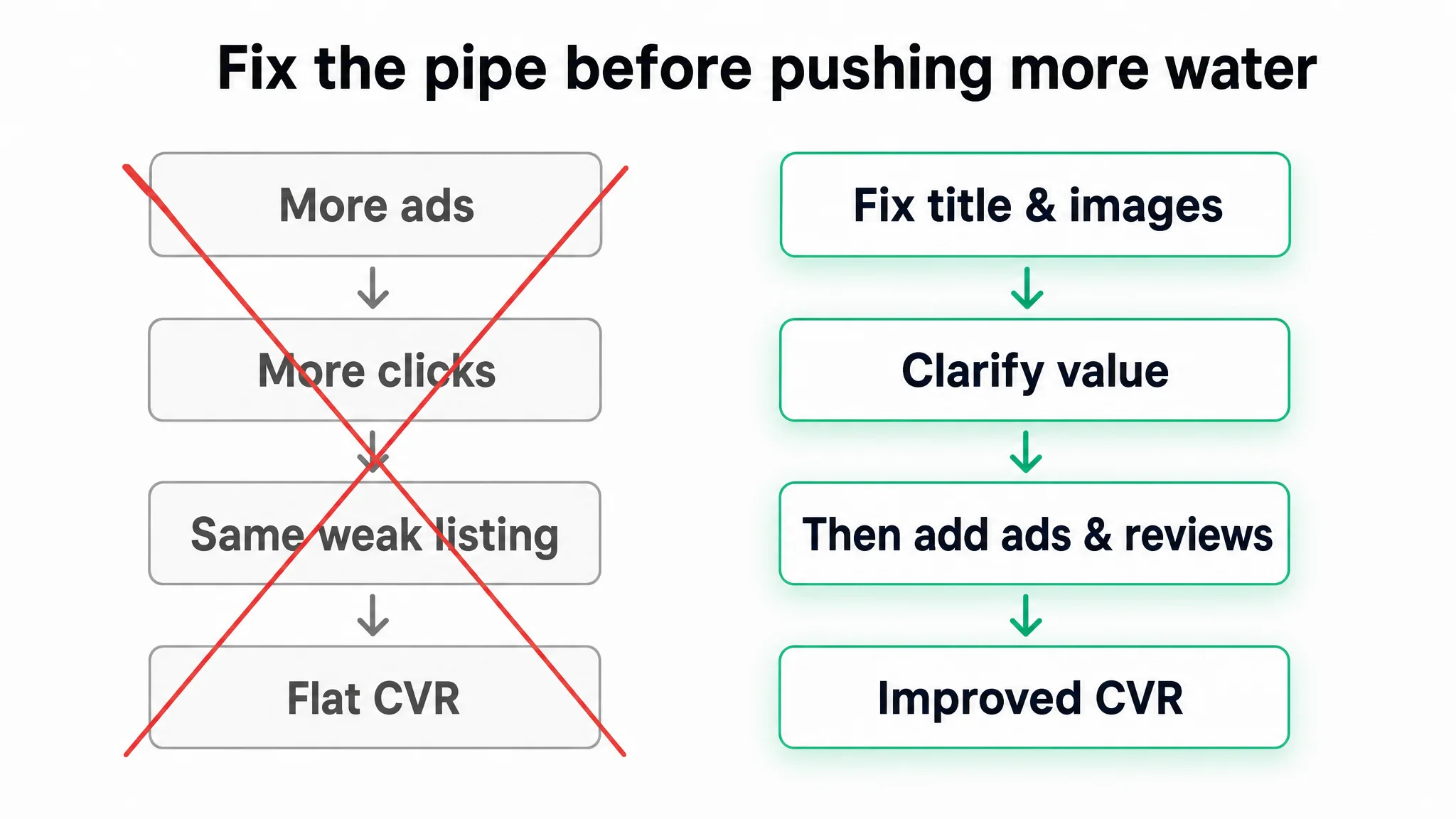
Why “Fix the Reviews” Was the Wrong First Move
Once DeepBI laid out the 64 vs 81 gap across dimensions, the question became: What do we fix first to change business outcomes, not just aesthetics?
The initial instinct—pouring budget into reviews and ads—would have:
- Driven more traffic into a listing that still:
- undersold its sun protection competence
- looked recreational vs technical
- buried practical outdoor benefits
- Potentially increased spend without improving CVR
- Left the team concluding “the market is just too competitive”
Instead, DeepBI’s recommendation sequence was:
- Rebuild the information logic of the listing (title, main images, bullets, A+),
so that the product is recognized as what it actually is: a UPF‑grade outdoor jacket, not just a casual shell.
- Only then layer on review growth and advertising,
once each click has a higher chance of converting.
In other words, fix the pipe before pushing more water through it.
 ---
---
The Listing Changes: From Casual Windbreaker to Credible Sun‑Protection Jacket
The team didn’t change the product. They changed how the product was read.
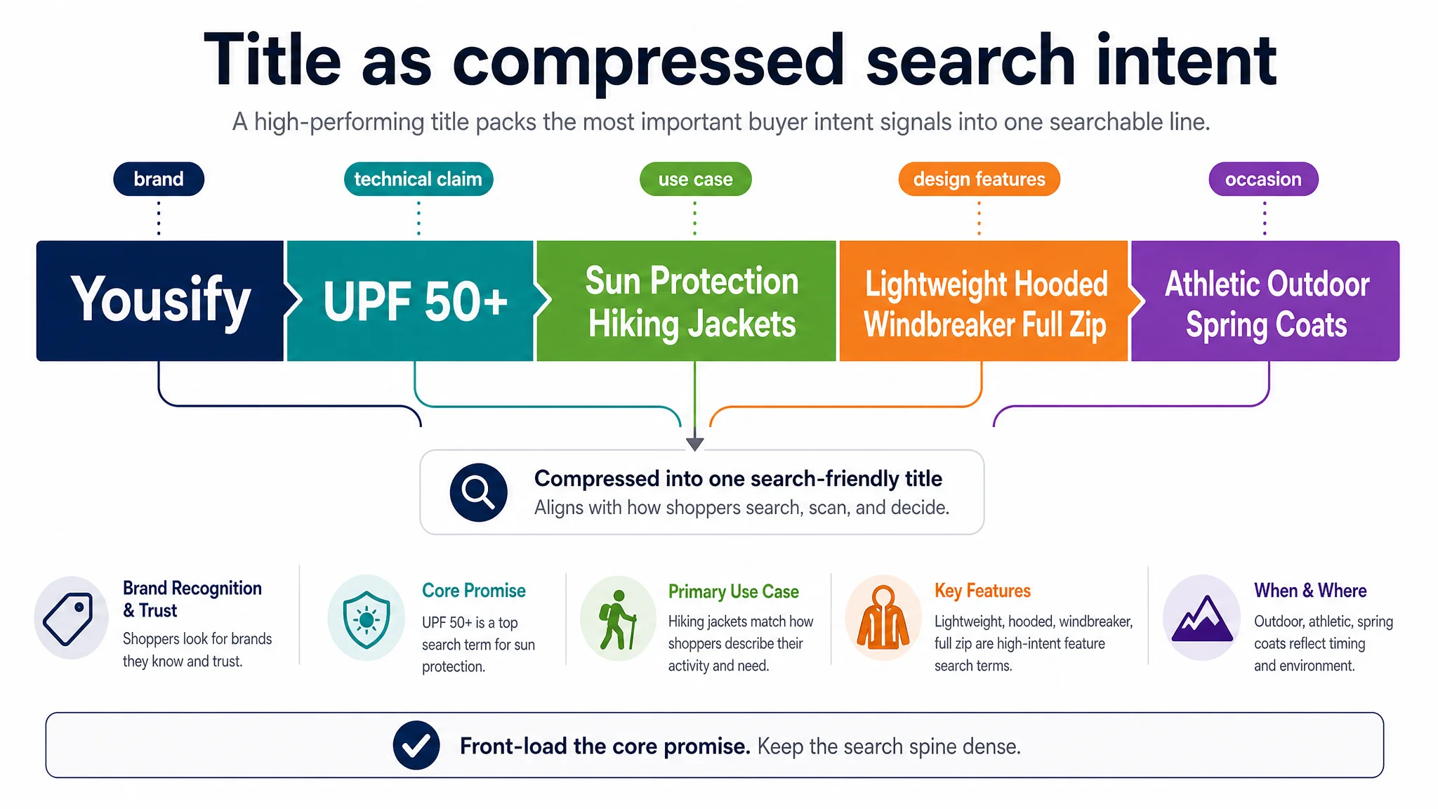
1. Title: Aligning with How the Category Actually Searches
Before (logic) “Brand + Windbreaker + Sun Protection + assorted descriptors”
After (DeepBI‑guided structure)
> Yousify Womens UPF 50+ Sun Protection Hiking Jackets Lightweight Hooded Windbreaker Full Zip Athletic Outdoor Spring Coats
What changed in decision terms:
- UPF 50+ is now explicit, not implied.
- “Sun Protection” + “Hiking Jackets” moved into the core spine of the title.
- Redundant “Jacket/Jackets” repetition was cut to keep signal dense.
- “Full Zip”, “Hooded”, “Athletic Outdoor” became scan‑friendly design clues.
Effect on business judgment:
- The team stopped thinking of the title as a brand expression.
- They began treating it as a search‑intent compression line,
encoding the minimum technical promise a sun‑protection buyer expects.
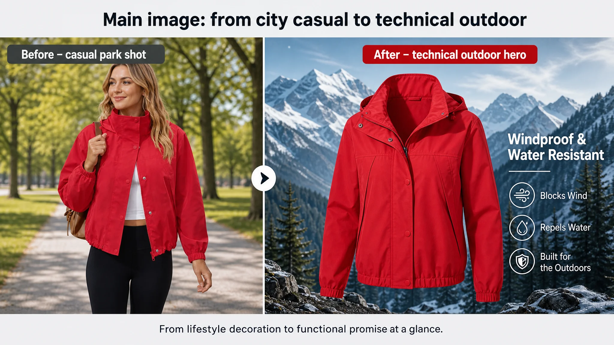
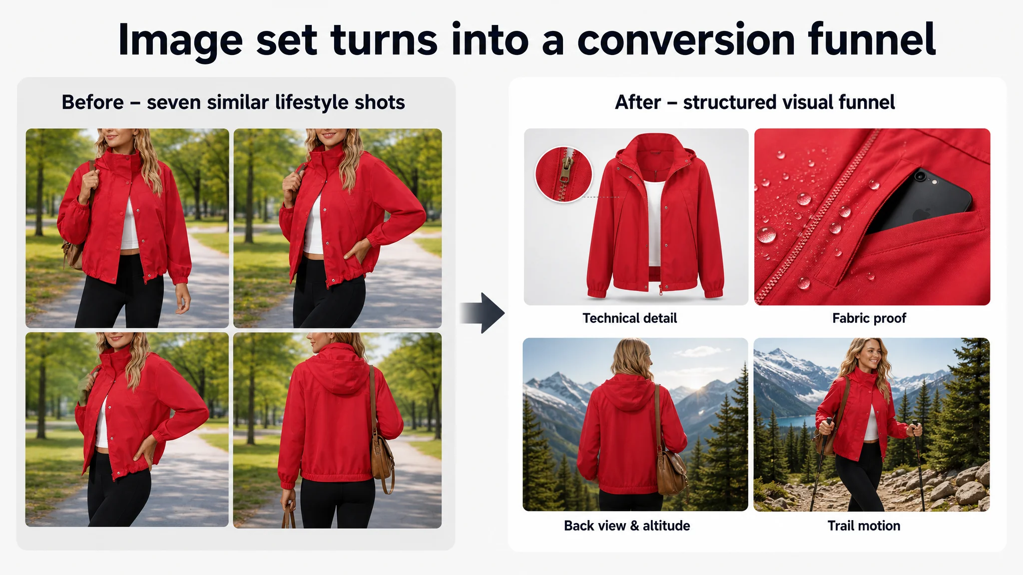
 2. Main Image Set: Rewriting the Visual Hierarchy
DeepBI didn’t say “make nicer images”; it specified how to re‑allocate visual roles:
- Primary hero image
- Product centered, ~85% frame coverage
- Strong directional light to sculpt shape
- Background: snow mountain or conifer forest, lightly blurred
- Overlay text: “Windproof & Water Resistant” in clean sans serif
- Cold‑tone palette to cue “technical gear,” not just fashion
- Technical white‑background shot
- Pure white or light gradient background
- Circular “zoom” callouts on zipper, cuffs, pockets
- Short, factual labels: “Reinforced Zipper”, “Elastic Cuffs”
- Outdoor scenario image
- 45° side view with open zipper
- Realistic camping or hiking scene
- Model with a real hiking backpack
- High contrast to make red jacket pop
- Back view / hood emphasis
- Slight low angle to convey robustness
- Ridge or mountain horizon at dusk
- Text band referencing recommended climate/altitude usage
- Motion / trail image
- Model walking with trekking pole
- Forest trail background with motion blur
- Natural sunlight angle to suggest real use
The core shift:
- Each image now had a defined narrative job:
- Attract click (hero)
- Prove build quality (macro details)
- Project usage (scenario)
- Validate protection design (hood/back)
- Seed self‑identification: “that’s how I’ll use it”
This was not creative improvisation; it was structured conversion design.
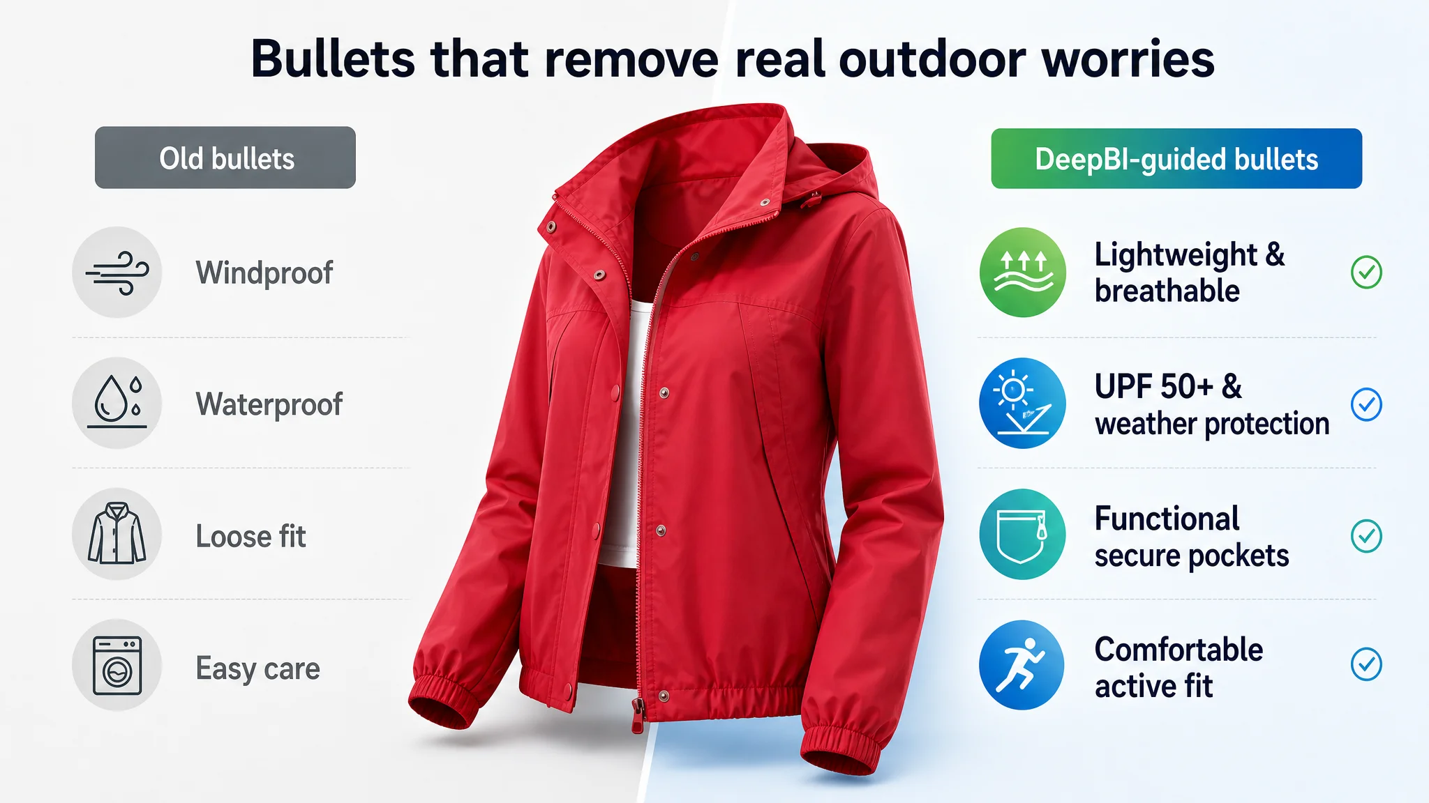
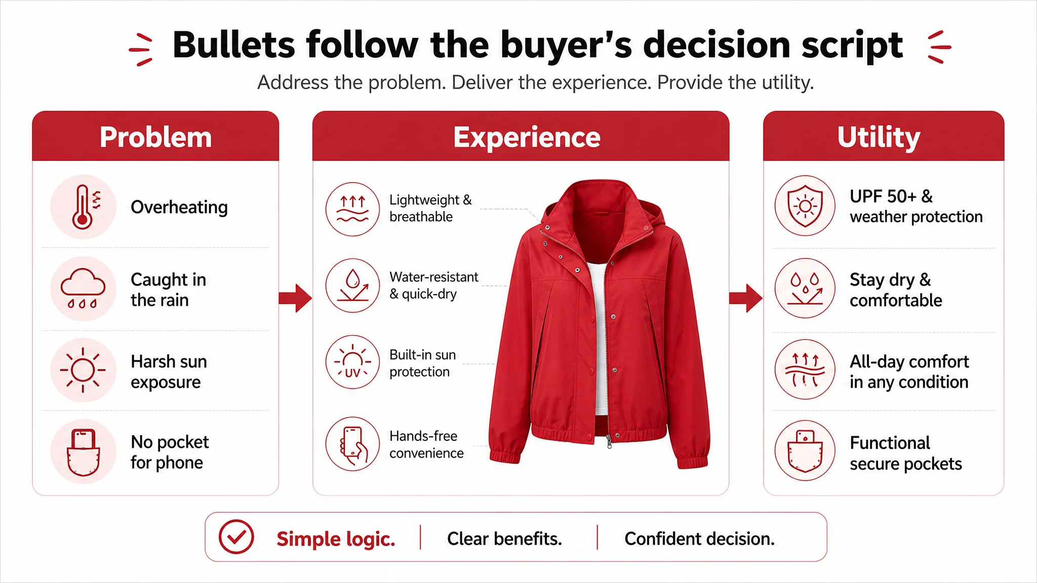
 3. Bullet Points: From Feature Lists to Decision Scripts
DeepBI’s bullet proposals re‑sequenced content to follow a “problem → experience → utility” logic:
- Lightweight & Breathable
- Explicitly ties to moisture‑wicking and comfort,
not just “fabric description.”
- Positions the jacket as something you forget you’re wearing,
essential in sun‑protection categories where overheating is a fear.
- UPF 50+ & Weather Protection
- Combines sun protection with wind/light rain handling.
- Reinforces that this is all‑weather armor, not just a flimsy cover.
- Ergonomic Athletic Fit
- Frames cut and fit as “freedom to move” plus “feminine silhouette.”
- Bridges function and style, mirroring competitor’s “feminine & stylish” but in the brand’s own voice.
- Functional Secure Pockets
- Moves from “there are pockets” to:
what goes in them, why hands are free, and why that matters while hiking or running.
- Versatile Outdoor Companion
- Converts “outdoor activities” into a concrete list:
hiking, running, fishing, camping, cycling.
- Signals breadth of use, increasing perceived value per dollar.
The business impact isn’t yet measured in CVR uplift, but the team’s lens changed:
- They now ask, for each bullet:
“What specific hesitation does this remove?”
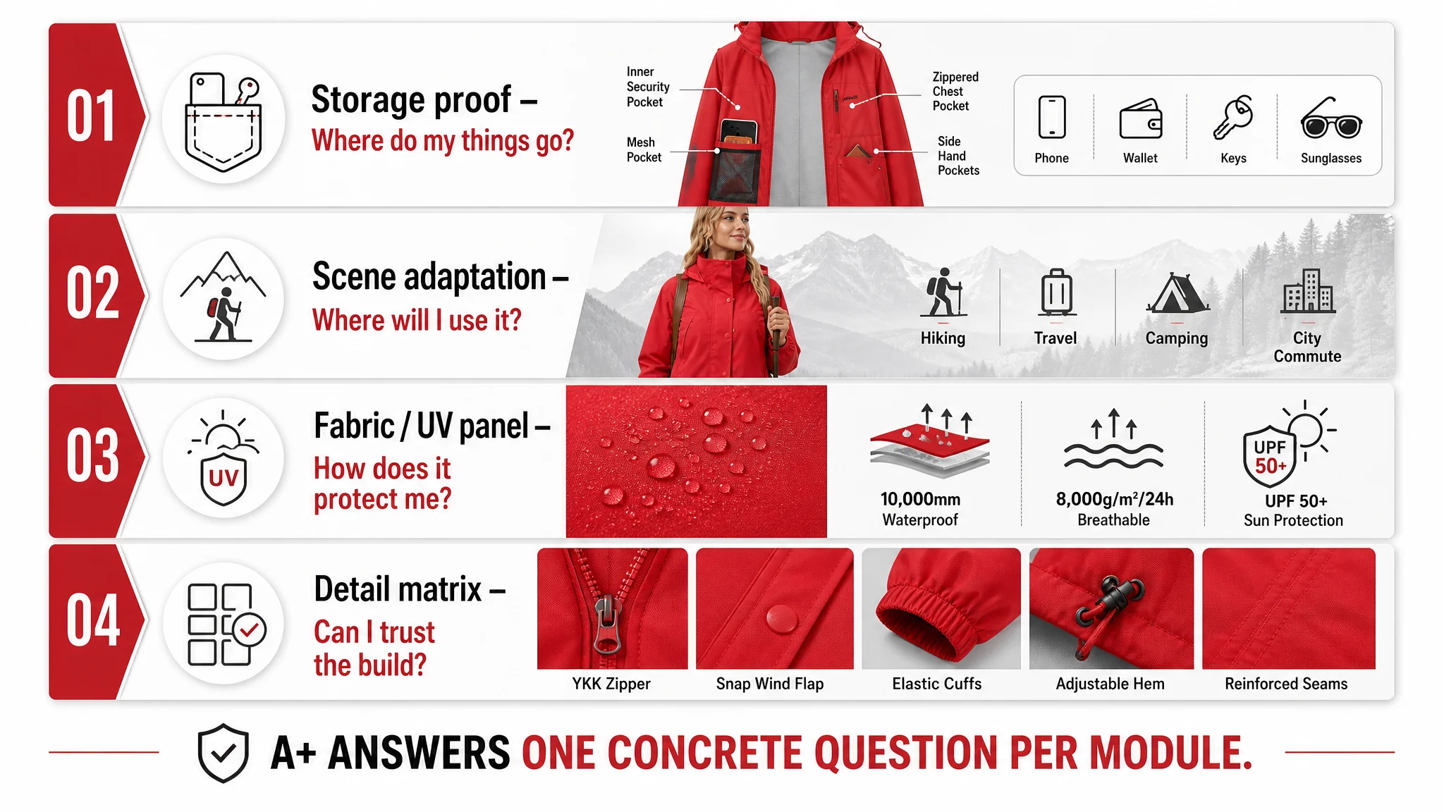
 4. A+ Detail Page: Visual Proof of Function, Not Just Style
DeepBI’s recommendations re‑ordered and re‑framed modules:
- Storage proof shot
- Split layout: full‑body wear on left,
right side showing a phone sliding into side pocket
- Clear label: “2 Large Side Pockets”
- Scene adaptation panel
- Model on a sunlit hillside or trail
- Overlay labels: “Sun Protection”, “Outdoor Travel”
- Fabric / UV panel
- Top‑down view of fabric texture
- Stylized sunlight beam with golden dots
- Visual metaphor for UV defense, not abstract “breathability only”
- Detail matrix
- Multi‑cell layout showing hood, zipper, cuffs
- Neutral, consistent backgrounds
- Short labels with enough contrast to be instantly readable
Again, the product didn’t change. What changed is that the product could finally be seen as what it actually is.
 ---
---
What Changed Internally: From “Make It Prettier” to “Diagnose the Constraint”
This engagement didn’t end with a post‑optimization CVR report; that data wasn’t yet available at the time of analysis.
But the operating logic inside the team shifted in three important ways:
- From intuition to quantified gap thinking
- They stopped asking “Do we like these images?”
- They started asking “On which dimension are we 6 points behind—and why?”
- From one‑shot redesigns to structured decision paths
- Title → main images → bullets → A+
- In that order, because that’s how the customer sees the page
- Ads and review programs were moved to after the listing could credibly perform.
- From self‑referenced to benchmark‑anchored
- Instead of “this looks good enough for our brand,”
- The question became:
“Does this match or exceed how the category leader frames similar functions?”
DeepBI’s value in this case wasn’t in generating text or images per se. The value was in showing that the bottleneck wasn’t outside the listing (reviews, competition), but inside the listing’s own logic.
 ---
---
Conclusion: DeepBI as a Business Diagnosis Engine, Not a Design Tool
This case is common: a mid‑tier listing with:
- Decent star rating
- Moderate review count
- A belief that “time + ads + reviews” will naturally close the gap
DeepBI’s scoring and comparative analysis forced a different narrative:
- The product was already competitive.
- The representation of the product was not.
- Reviews and ads would only scale a flawed information architecture.
By decomposing the gap into scores across title, images, bullets, detail page, and reviews, and by tying each recommendation to a specific decision point in the buyer journey, DeepBI helped the team:
- Re‑locate the real constraint from “market unfairness” to “self‑inflicted listing under‑communication.”
- Rationalize the order of actions: fix the listing logic first, then invest in traffic and social proof.
- Upgrade their judgment framework for future products, not just this one ASIN.
For operators reading this, the uncomfortable takeaway is simple:
If your listing has solid stars but trails a competitor, the core problem may not be who is reviewing you— it may be how you’re letting customers understand what you sell.
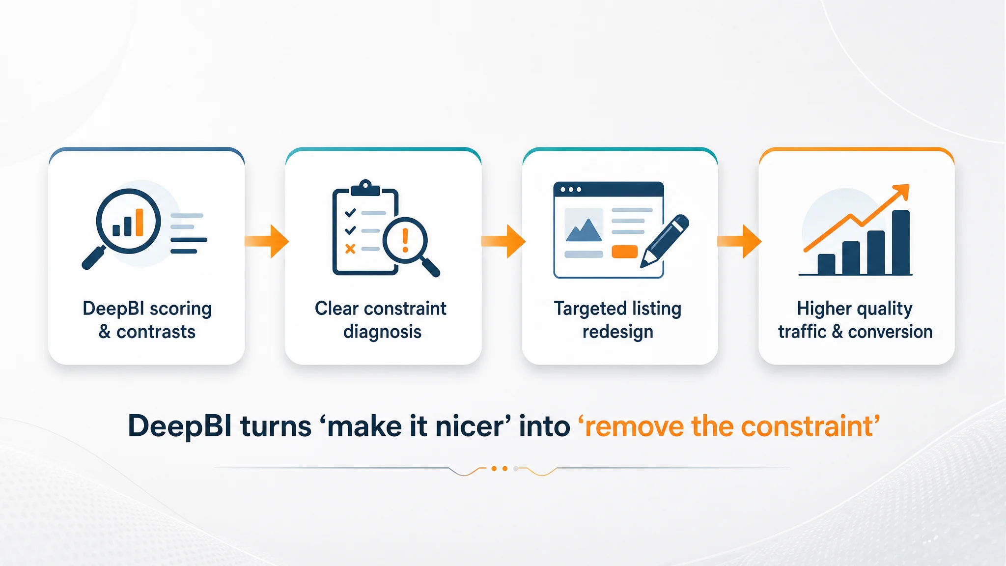
DeepBI’s role is to surface that distinction with numbers, structure, and concrete contrasts— so that “optimize the listing” stops meaning “make it nicer” and starts meaning “remove the actual constraint to conversion.”
 ---
---