
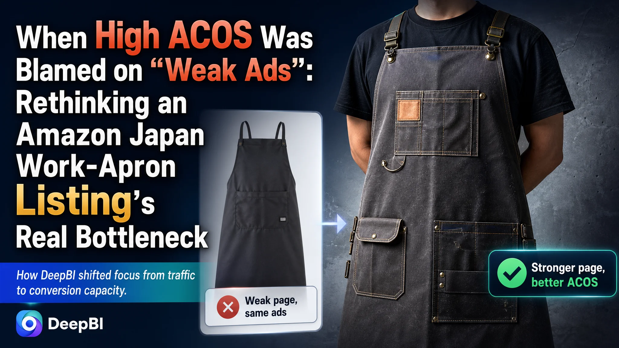
This case comes from an Amazon Japan seller in the work-apron / outdoor apron category. The team had been under pressure from rising Amazon ad costs and flat orders, and their instinct was to treat it as a pure advertising problem—optimize bids, widen keywords, and push harder. What they did not expect was that DeepBI’s diagnosis would show a much more fundamental issue: the Amazon Listing itself lacked enough conversion capacity to digest the traffic they were already paying for.
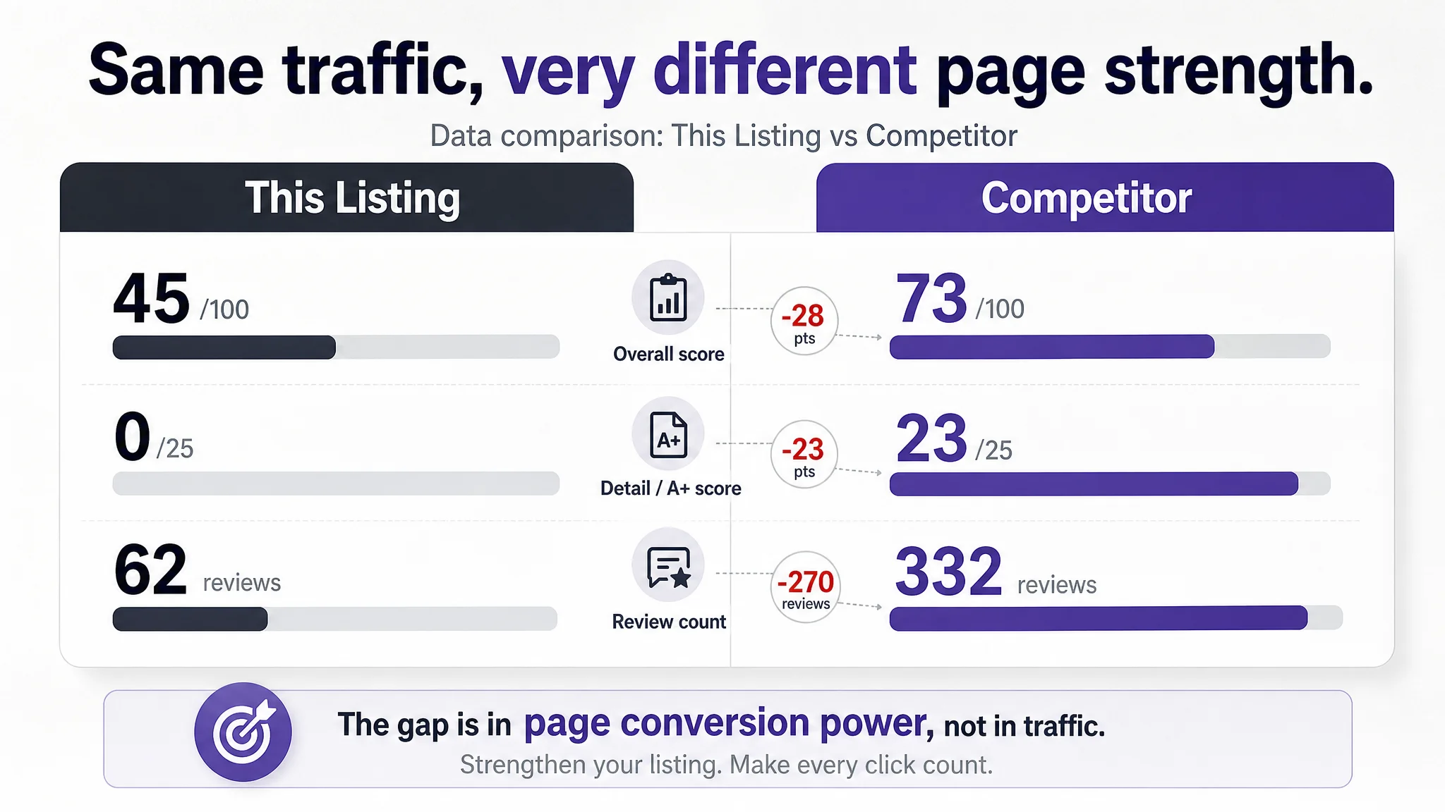
On the surface, the Listing did not look “broken”: the main image looked professional, the product had reviews, and the star rating was not bad. The internal discussion kept circling around “creative needs to be cooler” and “keywords aren’t broad enough”. But when DeepBI benchmarked the Listing against a category-leading competitor, the data made the problem hard to ignore: a 45/100 overall score vs 73/100, and a brutal 0/25 on the detail-page/A+ dimension. In other words, ads were driving people into a page that did almost nothing to build trust or guide a buying decision.
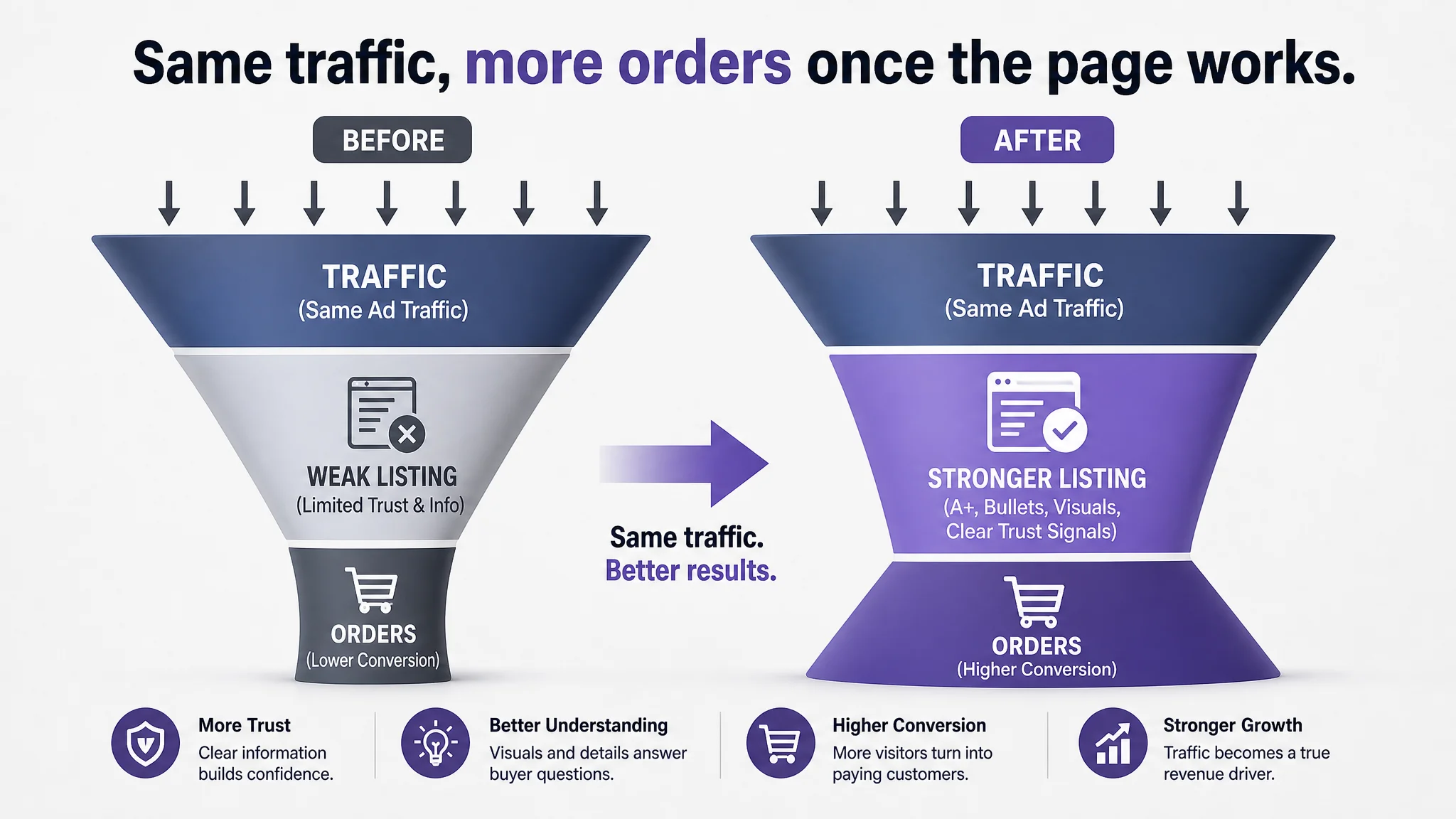
Once the problem was reframed from “ads underperforming” to “page unable to convert ad and organic traffic”, the optimization sequence changed completely. Instead of continuing to squeeze ACOS through bid tweaks, the focus moved to a new title structure, bullet-point logic, and especially a full A+ content rebuild with clear scenes, specs, and trust elements. For other Amazon sellers, the lesson is clear: when ad efficiency stalls, it’s often not the traffic source that is failing, but the product page’s ability to convert that traffic into orders.
Amazon Ads Were Not Failing. The Page Was Consuming the Traffic.
Before DeepBI entered the picture, the seller was facing a familiar Amazon pattern:
- Ad spend was rising, but orders were not advancing at the same pace.
- ACOS felt increasingly “sticky” and hard to push down.
- Organic performance was flat; the team tried adjusting keywords and bids, yet saw little structural improvement.
Internally, the assumed diagnosis was straightforward: “Our Amazon ads aren’t competitive enough.” The action plan focused on:
- Expanding keyword coverage around “work apron”, “gardening apron”, “camping apron”.
- Tuning bids and campaign structure to squeeze more traffic.
- Discussing “cooler” creatives, but still treating that as part of the ad layer, not as a deep Listing issue.
What they did not see was that the Listing’s ability to convert both ad and organic traffic had already fallen behind the benchmark in several key dimensions:
- Overall Listing score: 45/100 vs competitor’s 73/100 (a 28-point gap).
- Detail-page/A+ dimension: 0/25 vs competitor’s 23/25.
- Review dimension: similar star rating (4.0), but only 62 reviews vs competitor’s 332, and no visible top reviews on the first page.
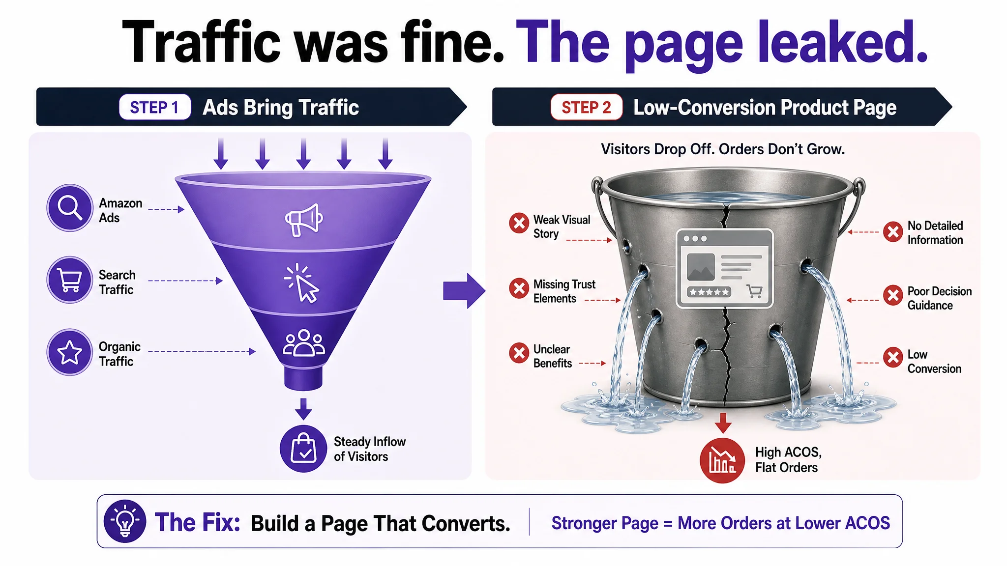
“The real problem was not that ads failed to bring traffic. It was that the page could not convert the traffic.”
In this state, every incremental yen spent on Amazon ads was mostly feeding a low-conversion page. Optimizing bids without fixing the page was equivalent to pouring more water into a leaking bucket.
The Real Constraint Was Listing Conversion Capacity
DeepBI’s Listing scoring and competitive benchmarking made the bottleneck explicit. There was only one core constraint at this stage: the Listing’s conversion capacity, especially on the detail-page side, was too weak relative to the traffic volume.
The numbers made the priority obvious
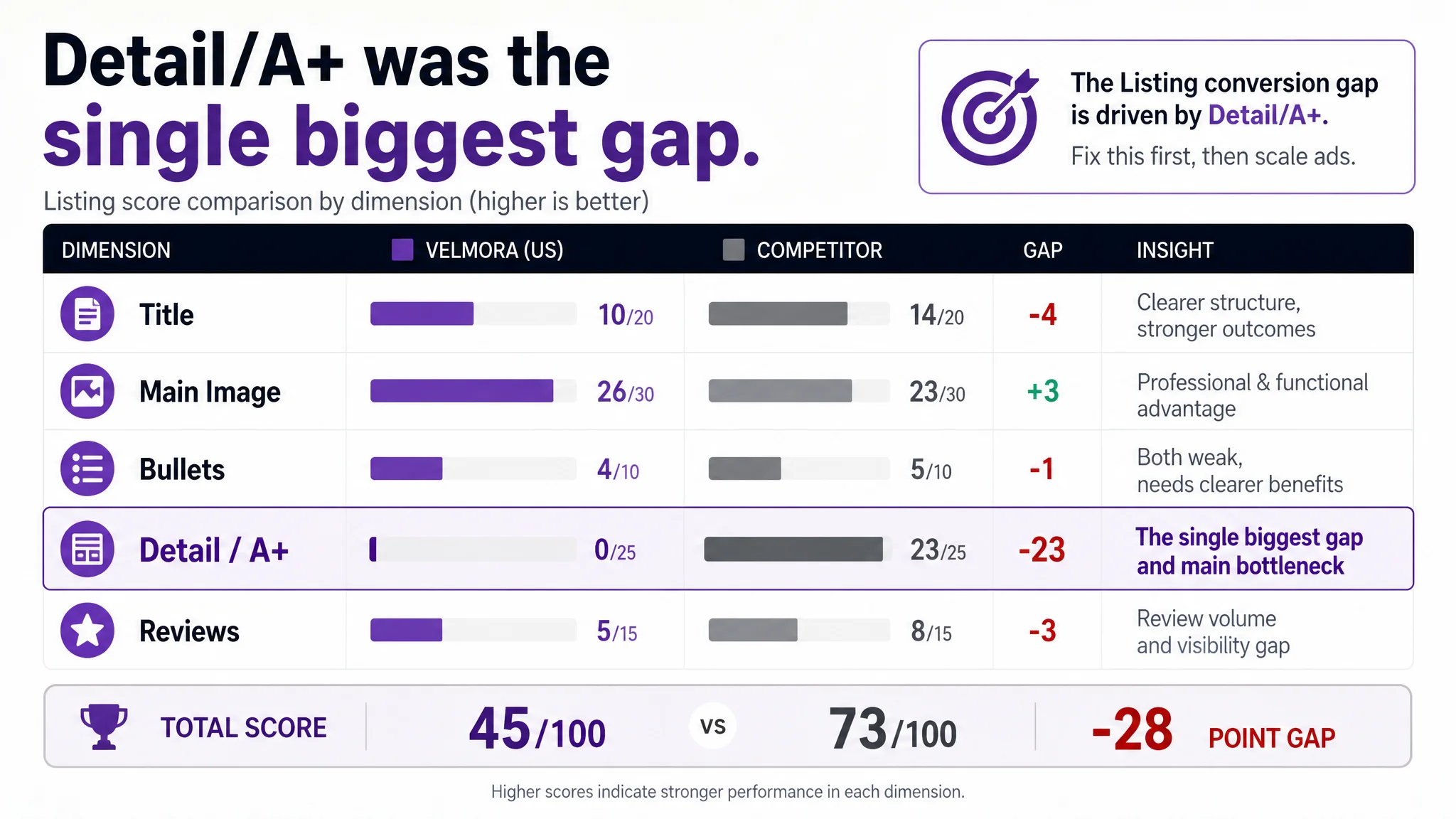
- Total score gap: 45 vs 73.
- Detail/A+ score gap: 0 vs 23 (the single largest dimension gap).
- Title: 10/20 vs 14/20 (not the worst, but structurally trailing).
- Main image: 26/30 vs 23/30 (actually ahead on some professional cues).
- Bullet points: 4/10 vs 5/10 (both mediocre, but the competitor was slightly more structured).
- Reviews: 5/15 vs 8/15 (trust gap in volume and visibility).
If you look only at ads, you never see this picture. But once the Listing was placed side-by-side with a high-performing competitor, one thing became clear: the page was not missing traffic; it was missing a complete, persuasive decision journey.
Why DeepBI treated detail/A+ as the first-order issue
From a business perspective, DeepBI’s judgment was:
- Main-image performance was not the primary drag. It had strong functional visualization (straps, waterproof test, sparks), even outperforming the benchmark on professional feel.
- Title and bullet points had issues, but they were partially functional and could be upgraded in place.
- The detail/A+ region, however, was practically empty—no structured modules, no scenes, no specs, no brand or trust elements.
For an Amazon work-apron Listing in Japan, this meant:
- No visual proof of usage scenes (camping, BBQ, DIY, gardening, kitchen).
- No structured size/spec diagram to answer “Will this fit my body and tools?”
- No pictogram-level explanation of core functions (water repellency, flame resistance, washability, breathability).
- No brand story or trust-building layer to offset the lower review volume.
In other words, traffic entering the page had almost no guided path from “click curiosity” to “purchase confidence”.
“Advertising does not only amplify advantages. It can also amplify a page’s existing defects.”
Given this structure, DeepBI’s core judgment was: if the detail/A+ layer is not rebuilt, ad optimization will remain structurally capped.
Why Continuing to Tune Ads First Would Have Been a Business Risk
From DeepBI’s point of view, the biggest risk was not “wasting a few clicks”. It was allowing Amazon ads to keep amplifying a structurally weak page, with several long-term consequences:
- ACOS lock-in: The seller would keep hitting a ceiling where more spend does not translate into proportional orders.
- Organic erosion: Weak conversion slows down organic rank progression; over time, this increases dependence on paid traffic.
- Category positioning risk: The competitor’s Listing, with a richer A+ story and stronger trust elements, would keep compounding its advantage.
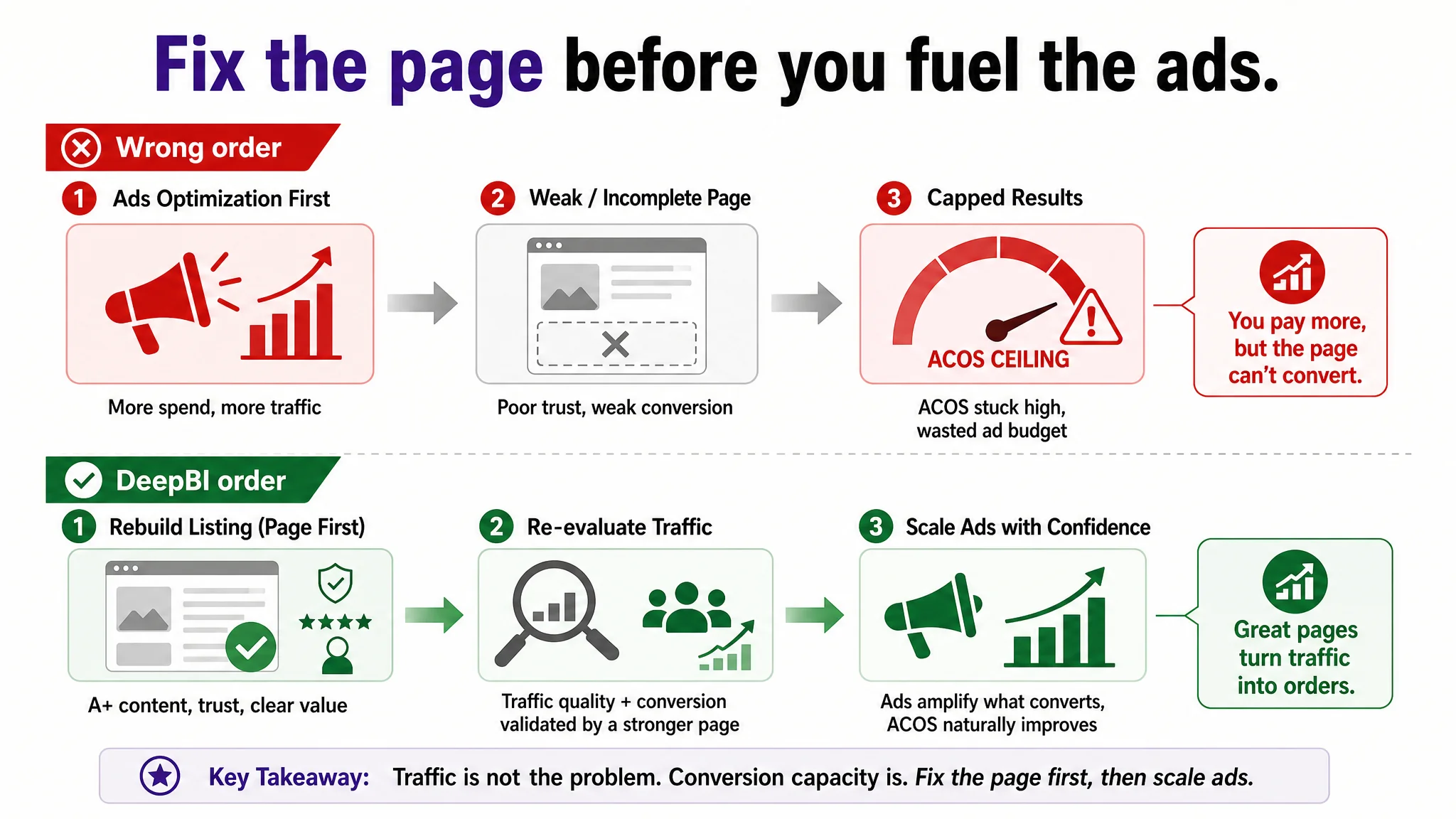
This is why DeepBI did not recommend “push more ads and see” as the next step. The sequence had to be reversed:
1. Repair Listing conversion capacity first, especially in the detail/A+ layer.
2. Only then re-evaluate how much traffic the page actually deserves.
3. After that, refine ads in a way that scales what is now a stronger, more trustworthy page.
This Product Page Did Not Lack Traffic. It Lacked Trust.
DeepBI’s granular analysis across title, main image, bullet points, detail content, and reviews showed a consistent pattern: the seller’s page was functionally informed, but emotionally and structurally weak.
The title communicated keywords, but not a buying outcome
The original title did cover important keywords such as “作業用エプロン (work apron)”, “ワークエプロン”, “ガーデニング”. But compared with the benchmark:
- The competitor’s title front-loaded the core scenario: “アウトドアエプロン (outdoor apron)”—clear at a glance.
- It specified concrete advantages: “大判タイプ (large size)”, “ツールポケット付き (tool pockets)”, “厚手コットン素材 (thick cotton)”, “収納力 耐久性◎ (storage & durability)”.
- It broadened audience and style appeal with “男女兼用 おしゃれ (unisex, stylish)”.
The seller’s title, in contrast:
- Leaned toward keyword stacking after the brand name, with a list of scenes.
- Described features in a basic way: “防水素材 調整可能 (waterproof material, adjustable)”—true but generic.
- Lacked explicit outcome or trust-driving phrasing that helps a buyer quickly justify a click.
DeepBI’s recommendation was not to chase more words, but to:
- Re-anchor the core: “作業用エプロン / ワークエプロン” prominently.
- Clearly state unisex and free-size benefits (“男女兼用”, “フリーサイズ”) to reduce fit anxiety.
- Add specific functions that matter in this category (tool pockets, storage power) and high-intent scenes (BBQ, gardening).
- Keep the structure clean so buyers and Amazon’s algorithm can both parse it easily.
The main image was professional—but narrowly framed
On main images, the seller had more hardcore professional signals than the competitor:
- Visible strap structure.
- Waterproof tests.
- Real sparks in use.
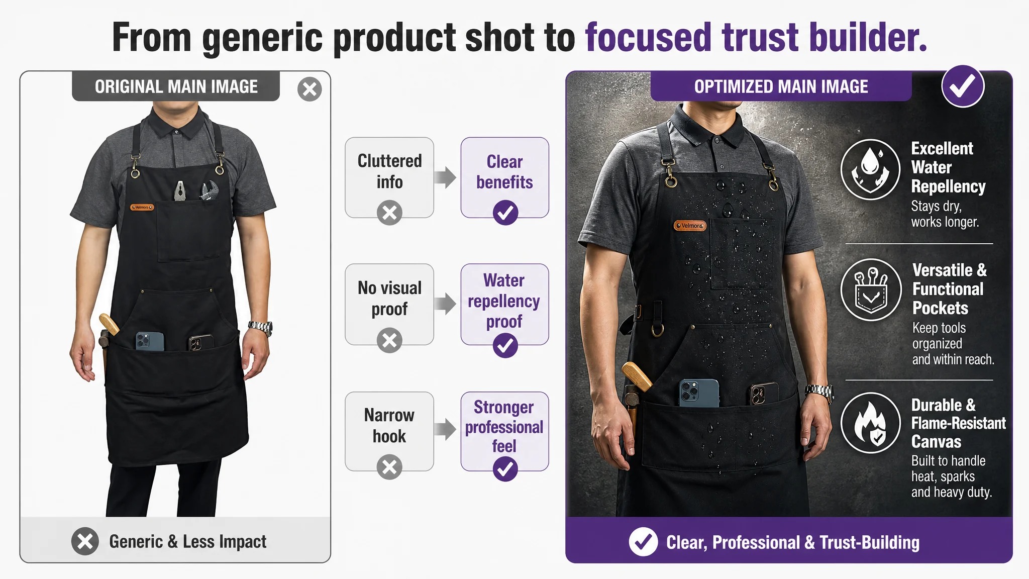
These elements help for welding and heavy-duty buyers. But DeepBI’s visual benchmarking surfaced three issues:
1. Mobile reading burden: High information density works on desktop; on mobile, small overlay text is hard to read, pushing bounce rates up by an estimated 5–8%.
2. Over-narrow audience: Strong industrial scenes can unintentionally narrow appeal, discouraging home users who might need a stylish yet functional apron.
3. Lack of click-stage “hook”: The competitor used more lifestyle scenes (kitchen, café, office), which generate emotional resonance earlier in the funnel.
The conclusion: the main image did not need to become more complex; it needed clearer roles:
- One image dedicated to professional industrial credibility.
- Another to home and light-use scenes (kitchen, café, gardening).
- A micro-level visual proof of water repellency and material quality.
This is why DeepBI’s prompts focused on very specific changes—industrial backgrounds with strong contrast, lifestyle kitchen scenes, woodworking scenes, and a high-impact micro shot of water beads on fabric—rather than generic “make it nicer” instructions.
The Bullet Points Had Information, but Not a Buying Logic
The seller’s bullet points were trying to do the right thing: they detailed material, protection features, and multi-scene use. But when compared with the benchmark:
- Several bullets repeated similar content (fire protection appears twice, material/scene mix repeats).
- The structure was loose; each bullet did not have a clear, distinct job.
- Important after-use information (like maintenance instructions) was missing, reducing perceived completeness.
DeepBI reframed the bullet section not as “five lines of text” but as five stages of persuasion. Each proposed bullet had a clear role:
1. Material & craftsmanship as first impression
Emphasize thick 10oz cotton canvas, brass hardware, hand-finished leather—conveying durability and breathability in one shot.
1. Category-critical protection
Highlight the specific combination of flame-resistant fibers and water/oil/dust protections, directly addressing campfire and welding risks.
1. Storage and convenience
Turn pockets, bottle opener, hooks into a coherent “mobile tool chest” story with clear structure: 3 large pockets, phone holder, pen slots, utilities.
1. Multi-purpose yet refined design
Bridge professional and lifestyle: grilling, cooking, DIY, gardening, with an emphasis on “looks good, fits many roles”.
1. Fit and comfort
Address fit anxiety through explicit dimensions and cross-back strap benefits—relieving neck pressure and covering sizes from roughly M to XXL.
1. Specs and care
Add a final bullet for material composition and washing guidance, mirroring the competitor’s completeness and strengthening trust.
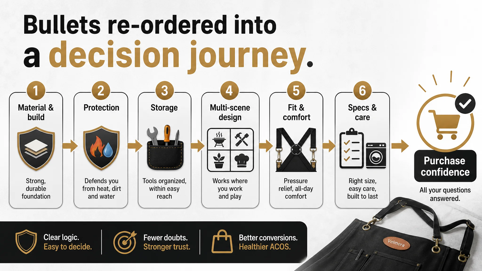
By doing this, bullets stopped being a parameter list and became a reading path that moves a buyer from “Is this serious enough?” to “Will this suit my body and use case?” and finally “Is it safe to buy?”.
Before Ads Could Work Again, the Page Had to Convert
The most severe weakness DeepBI found was in the detail/A+ zone. Against a competitor that built a full story using multiple modules, the seller effectively had nothing.
What the competitor’s Amazon A+ did—and this page didn’t
The competitor used:
- Brand story modules and textual philosophy.
- Full-width model shots in multiple scenes (café, DIY, gardening, baking).
- Multi-color comparisons and variant overview.
- Function detail diagrams, including step-by-step strap usage.
- Size diagrams with explicit dimensions.
- Icon-based summaries for “waterproof, stain-resistant, skin-friendly, breathable”.
- Simple usage-steps visuals to reduce friction.
- Multi-scene collages to broaden imagination of use.
The seller’s page, by comparison, had no such visual structure. DeepBI’s scoring reflected this as a 0/25 on detail/A+.
The A+ rebuild was not decoration; it was decision infrastructure
DeepBI’s optimization plan treated A+ as the backbone of conversion:
1. Specs & core function module
A clean white-background diagram showing apron dimensions (height, width, upper width), with four icons for water repellency, flame resistance, washability, and breathability. This solves the “Will this fit?” and “What exactly can it do?” questions in one glance.
1. Three-step wearing guide for cross-back straps
A visual sequence with steps ①②③, demonstrating hook attachment, strap routing, and final knot. This directly addresses a known friction point for X-type strap aprons and reduces potential post-purchase confusion and returns.
1. High-quality outdoor scene
A dusk camp scene by a campfire, with the apron in real use. The goal is to re-create a professional yet aspirational camping context, showing thickness, texture, and how the apron fits into a full camping setup.
1. Pocket storage detail shot
A top-down view over a workbench, with each pocket filled with specific tools (phone, shears, notebook, hammer) to dramatize the idea of a “mobile tool station”.
1. Water repellency micro shot
A macro photograph of beads of water on black canvas, with strong side lighting. This translates the abstract claim “water-repellent processing” into a persuasive, visual proof.
1. Multi-scene collage
A diagonal-split image combining a café scene and a woodworking DIY scene, both with the same apron, to expand the audience from niche industrial to wider lifestyle use.
1. Back-strap comfort visualization
A close-up of the cross-back strap distribution, emphasizing “reduced shoulder and neck burden”. This answers the hidden but critical question of long-term wear comfort.
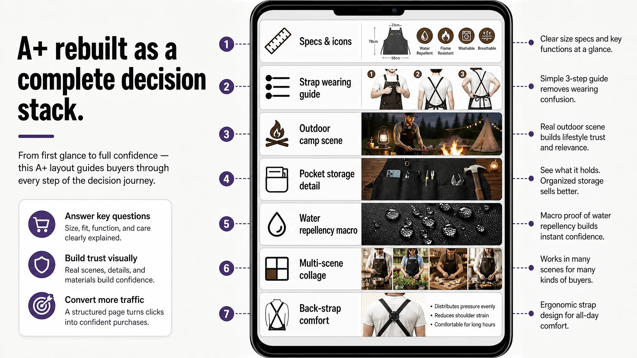
All of these modules were not “nice-to-haves”. They answered specific decision questions the competitor’s page already handled better:
- “Can this hold my tools?”
- “Is it comfortable for long shifts?”
- “Is it truly protective around fire and dirt?”
- “Will it look appropriate in my context—café, workshop, home kitchen, campsite?”
Once these A+ blocks are in place, the Listing no longer depends only on reviews to build trust. The page itself becomes a structured, visual argument.
How Ad Traffic Became Useful Again
The direct post-optimization numbers are not disclosed for this case, so we cannot quote ACOS or CVR changes. But the operating state of the Listing changed in several key ways:
- The detail page gained a complete trust and explanation layer, instead of relying purely on main image and bullets.
- The Listing’s conversion capacity became closer to the benchmark, especially for buyers arriving from generic searches who need more guidance.
- Ad traffic quality remained similar, but its productivity improved because the page now did more work per visitor.
- The seller’s dependence on reviews alone to convince buyers was reduced; the page itself carried more weight.
Most importantly, the seller’s understanding of the problem shifted:
- They stopped treating “high ACOS” and “flat orders” as primarily advertising issues.
- They began to see Listing conversion as the foundation on which ad efficiency sits.
- They understood that title, main image, bullets, and A+ must work together—you cannot expect ads to rescue a page that lacks trust, clarity, and structure.
What Other Amazon Sellers Can Take Away
This case is not about a single apron in Amazon Japan. It is about a common misdiagnosis pattern:
- Ads are blamed for weak results.
- The response is more bidding, more keywords, and “better creatives”.
- The product page’s actual conversion logic is left unexamined.
DeepBI’s diagnosis reframed the situation:
- A 0/25 detail/A+ score in a visually driven, trust-sensitive category is not a side issue—it is the core bottleneck.
- Without a complete decision journey on the Amazon product page, traffic—whether paid or organic—cannot be efficiently converted.
- When the Listing is structurally weak, ads amplify the weaknesses as much as they amplify strengths.
For Amazon sellers, the practical checklist from this case is:
- When ACOS feels stuck, check Listing conversion first, especially the A+ layer.
- Benchmark against a category-leading competitor; look for structural gaps, not just superficial aesthetic differences.
- Treat title, main images, bullets, and A+ as a single sales system, not four separate tasks.
- Only scale ads aggressively after you are confident the page deserves more traffic.
DeepBI’s value in this case was not in generating “prettier pictures”. It was in providing a clear, evidence-based judgment: the ads were not the main problem; the page was. Once that was understood and the Listing’s conversion logic was rebuilt, ad traffic finally had a chance to work as intended.