
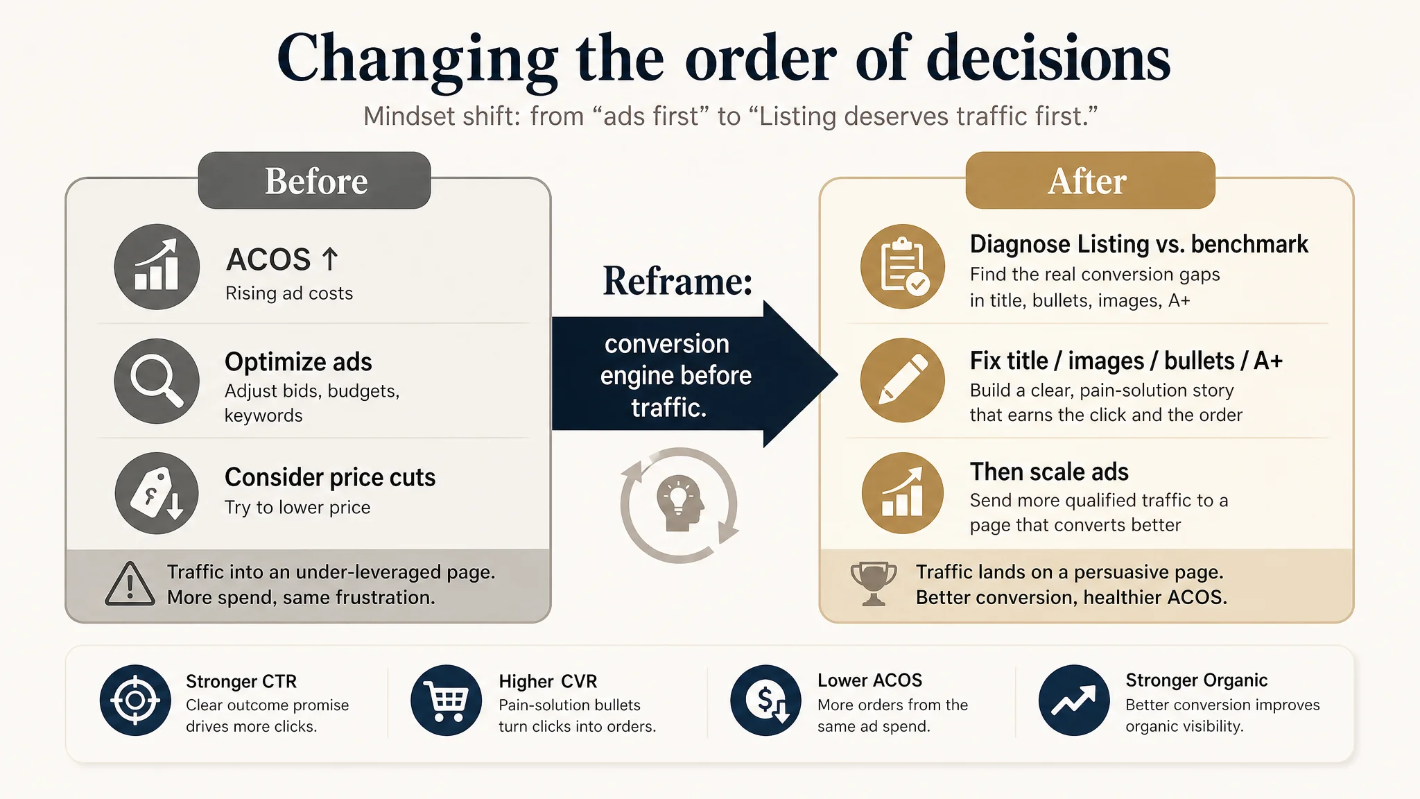
This case comes from a US Amazon seller in the silk sleep mask category. On paper, the product page looked acceptable: 4.5 stars, hundreds of reviews, and a main image that didn’t seem obviously worse than competitors. Yet as Amazon ad costs rose, the team felt that every extra dollar of traffic was getting harder to turn into orders. Internally,他们 initially framed it as “category competition is getting fiercer, bids need to go up, maybe price needs to go down.”
DeepBI’s Listing diagnosis put that judgment under pressure. Against a strong category benchmark, the Listing scored 77/100 vs. the competitor’s 84/100. The gap did not come from reviews or basic trust, but from how the Amazon product page actually built (or failed to build) a buying decision: the title didn’t frame the outcome, the bullets didn’t follow a pain–solution logic, and the A+ content stopped at “遮光 & breathable” instead of pushing into “sleep + skincare + lifestyle.” Ads weren’t the problem; ads were simply sending traffic into an under-leveraged page.
The subsequent optimization did not start from new campaigns or more aggressive bids. It started from tightening the Amazon title around “100% mulberry silk + total blackout,” rebuilding bullet points around concrete problems (light leakage, ear pressure, insomnia, migraines), and redesigning images/A+ modules to elevate the product from “a cover for your eyes” to “a high-end sleep and skincare accessory that travels with you.” Once the page’s conversion logic became coherent, ad traffic became useful again instead of being consumed.
For other Amazon sellers, the value of this case is not that it’s about a sleep mask. It’s about recognizing when “ACOS pressure” is actually a Listing-conversion issue disguised as an advertising problem—and how to read the gaps in title, bullets, images, and A+ against a real benchmark before pouring more budget into campaigns.
The Listing Looked Healthy. The Advertising Felt Heavy.
From the seller’s perspective, nothing on the Amazon product page screamed “broken”:
- 4.5-star rating, with 700+ reviews
- Home-page reviews rich in photos and videos
- Star rating on par with a leading competitor in the same 100% mulberry silk sleep mask niche
The team’s pressure came from somewhere else: as they pushed Amazon ads harder, ACOS became stubborn. Clicks weren’t cheap, competition in the category tightened, and yet the product page didn’t seem to “scale” with the traffic. The instinctive diagnosis was:
“The category is just more competitive; we need better bids, more keywords, maybe a lower price.”
This is a classic trap. When the surface metrics (rating, review volume, images that look ‘fine’) don’t point to an obvious defect, sellers often default to ad-level explanations.
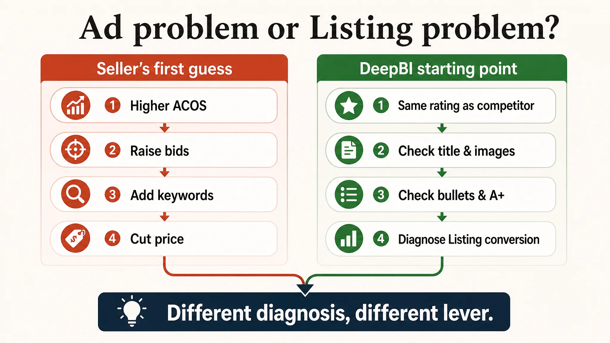
But DeepBI’s starting point was different: if the reviews and rating are roughly equal, yet the competitor is sustaining stronger performance, the real constraint is likely in how the Listing structures the decision, not in the ads themselves.
The Real Constraint Was Listing Conversion Capacity, Not Ad Strategy
DeepBI’s Listing scoring compared the seller’s Amazon product page against a tightly matched category benchmark. The overall gap was only 7 points (77 vs. 84), but the structure of that gap mattered:
- Title: 13 vs. 15
- Main image: 25 vs. 24
- Bullets: 6 vs. 8
- Detail/A+: 19 vs. 23
- Reviews: 14 vs. 14
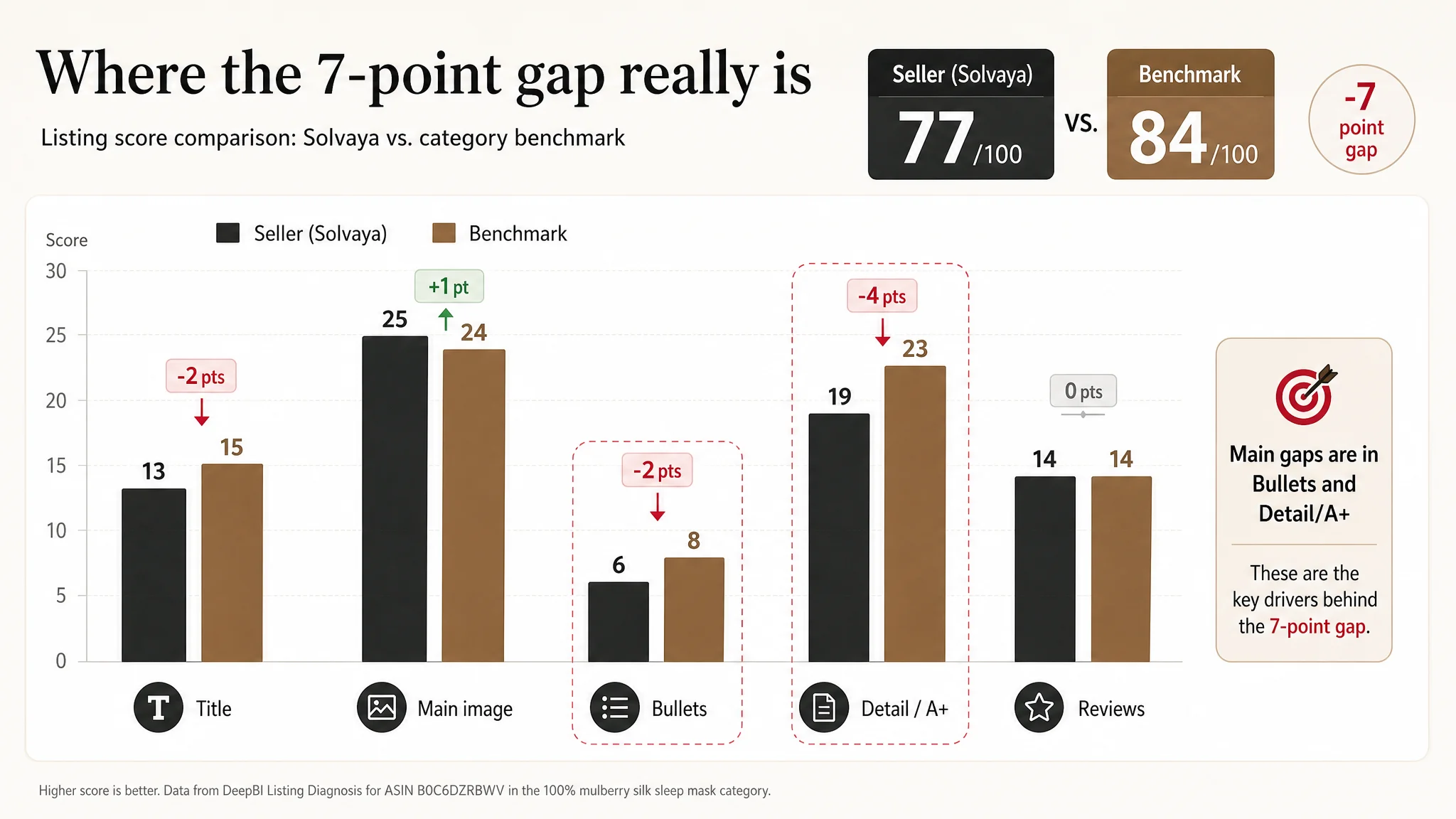
Two key observations:
1. Reviews were not the problem. Both sides sat at 4.5★. The competitor had more total reviews (roughly 2x), but the seller’s recent review quality was actually slightly better (lower visible negative-rate on the first page). So “we just need more reviews” was not the right lever.
1. Main image was not the obvious weak link. The seller even scored slightly higher on main image than the competitor in the diagnostic model. So chasing yet another “prettier hero shot” was unlikely to solve the fundamental issue either.
The real weakness sat in how the page communicated value and built trust from search result to A+:
- Title: weaker outcome framing and keyword logic
- Bullets: static descriptors instead of pain–solution logic
- A+ content: functional but not elevating the product beyond “遮光 + breathable”
In other words: this Amazon Listing didn’t lack traffic; it lacked a persuasive structure to convert that traffic.
“The real problem was not that ads failed to bring traffic. It was that the page could not convert the traffic.”
Why Traditional “Ad Optimization First” Kept Failing
Before the Listing was scored, the seller had tried to fight the pressure with familiar levers:
- Expanding keyword coverage
- Adjusting bids and budgets
- Tweaking campaigns to chase a better ACOS
Yet each iteration ran into a hard ceiling. The underlying reason:
- CTR was capped by an unclear title promise and a visually noisy first impression.
- CVR was capped by a page that spoke in features, not in outcomes and scenarios.
More traffic into that structure just amplified the inefficiency:
- If the main value is described as “Luxury Comfortable” while the competitor says “LARGER IN SIZE, NO MORE LIGHT SLIP IN,” the competitor wins more high-intent clicks from the same search results.
- If your bullets say “soft, breathable” and the competitor says “help minimize wrinkles, preserve moisture, support insomnia and migraine relief,” they own more of the decision-making space even at the same rating.
Advertising here was a megaphone pointed at a page that hadn’t fully learned how to sell.
How the Title Subtly Leaked Conversion
On Amazon, the title doesn’t just carry keywords; it frames the promise that drives clicks and sets expectations for conversion.
The competitor’s title structure:
- Tight clustering of core keywords: “100% Mulberry Silk Sleep Mask Eye Mask” placed early and compact
- Immediate clarity on who it’s for and what it does: “for Man and Woman with Adjustable Headband, Full Size Large Sleep Mask & Blindfold for Total Blackout”
- Explicit outcome: “Total Blackout for All Night Sleep, Travel & Nap”
By contrast, the seller’s original title:
- Spread core keywords more diffusely, diluting search weight and visual impact
- Listed selling points as parallel phrases (“for side sleeper, for travel rest and office”) without a clear logical progression
- Separated “Large Size” from the core product name, weakening the sense of a unified, specific solution
- Underplayed “total blackout” and “blindfold” as outcome-driven language
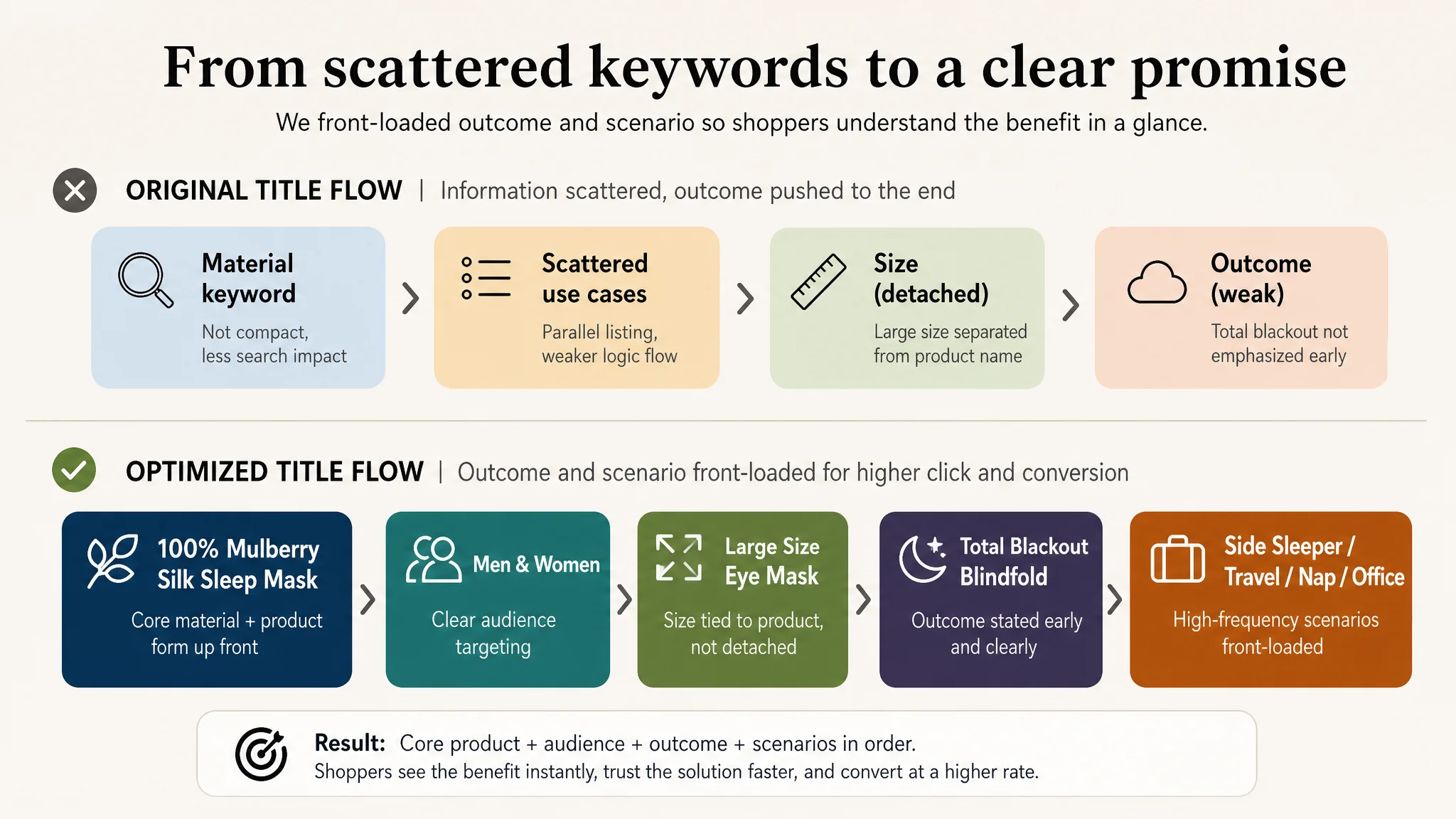
DeepBI’s judgment was that title optimization had to center on three things:
1. Condense and front-load core search terms: “100% Mulberry Silk Sleep Mask” + “Eye Mask” + “Blindfold.”
2. Tie “large size” directly to the product form: make it an attribute of the mask, not a detached adjective.
3. Push the outcome to the foreground: “Total Blackout” + “Side Sleeper” + key usage scenarios.
The proposed title:
100% Mulberry Silk Sleep Mask for Men & Women, Large Size Eye Mask with Adjustable Strap, Total Blackout Blindfold for Side Sleeper, Travel, Nap & Office - Soft & Breathable Silk Eye Cover (Black)
This isn’t just a wording change; it reorders the decision logic:
- Material + product form → who it’s for → what problem it solves (total blackout, side sleeper) → where it fits in life.
That’s the level where CTR starts moving—not from more adjectives, but from tighter decision framing.
The Bullet Points Had Information, but Not a Buying Logic
The Amazon bullets were where the gap became decisive. Both pages had five bullets, but their logic was different.
Competitor: Pain + Solution, With Data and Scenarios
Competitor bullet pattern:
- BP1: “LARGER IN SIZE, NO MORE LIGHT SLIP IN” → clearly frames a pain (light leak) and solution (oversized total blackout).
- BP2: Adjustable size & nose design, addressing tightness and fit.
- BP3: Ear protection & noise reduction, designed for side sleepers.
- BP4: “19 mm premium quality silk,” with explicit moisture and wrinkle benefits.
- BP5: Direct application to insomnia, migraines, dry-eye; home/hotel/plane contexts.
Result: each bullet is anchored in a specific discomfort and a specific relief.
Seller: Generic Advantages, Weak Pain Anchoring
Seller’s original bullets leaned on:
- “Luxury comfortable” style descriptors
- Generic mentions of softness, breathability, and convenience
- Basic portability and giftability
They told you the product was nice. They did not tell you what problem in your life it was going to solve, especially compared with a cheaper, simpler eye mask.
DeepBI’s conclusion: the bullets had to be rebuilt around tightly framed problems and outcomes, not just attributes.
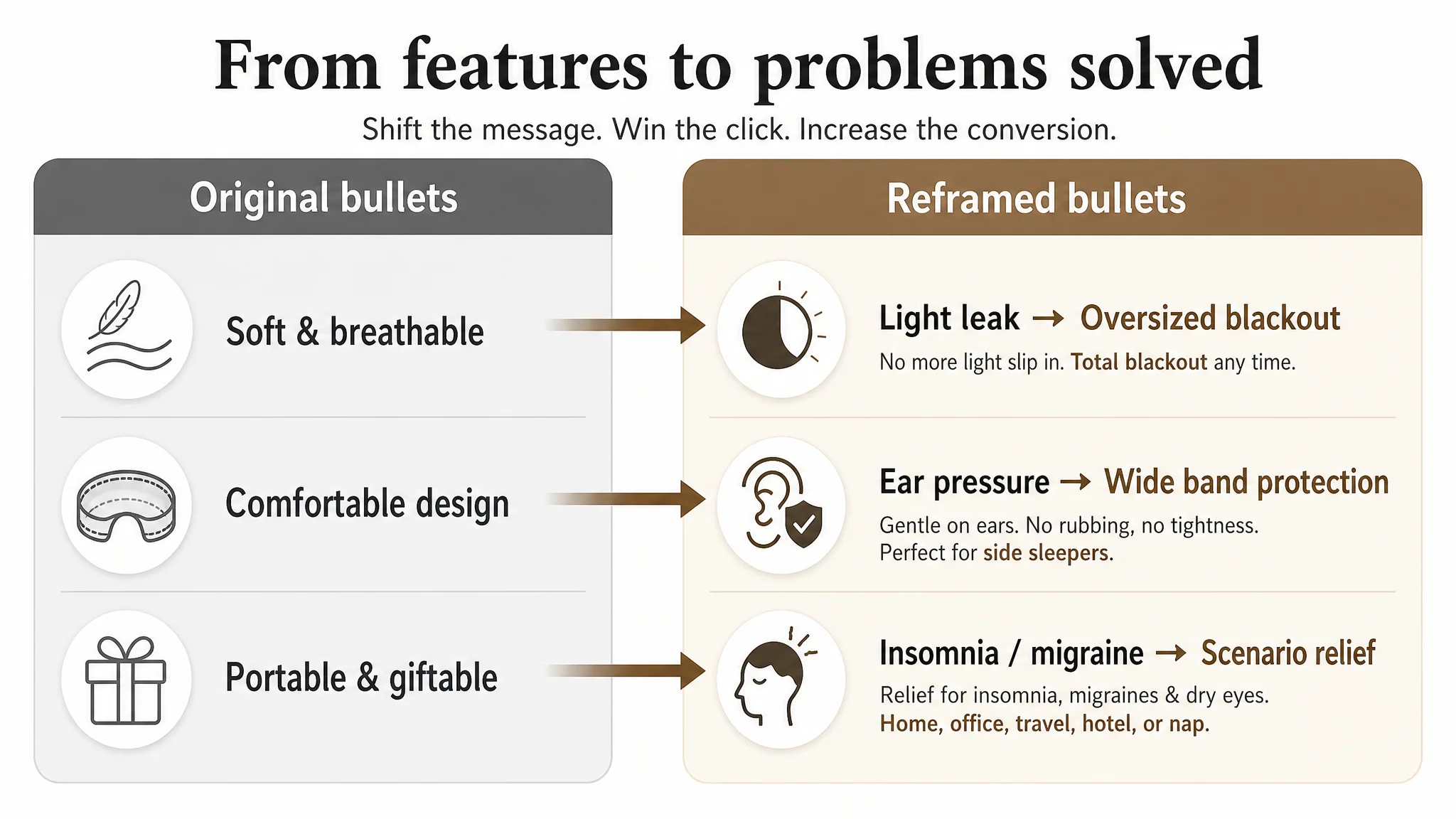
This is why the optimization proposals look long: they reintroduce the missing logic.
Reframed Bullet Logic
1. Material + skincare outcome
100% PURE MULBERRY SILK & SKIN CARE
Not just “soft and breathable,” but: retain moisture, minimize fine lines, reduce friction on skin and hair, “spa-like experience.”
This elevates the product from a commodity eye mask to a sleep-and-beauty tool.
1. Total blackout via oversized design
TOTAL BLACKOUT WITH OVERSIZED DESIGN
Clear answer to “will it leak light?” and why the larger size matters. This directly competes with the benchmark’s strongest claim.
1. Ear protection & side-sleeper comfort
PRESSURE-FREE EAR PROTECTION & SIDE-SLEEPER FRIENDLY
Converts a design detail (wide band) into a real-life benefit: less rubbing, more secure earplugs, better for side sleepers.
1. Scenario-based relief (insomnia, migraine, dry-eye)
VERSATILE RELIEF FOR VARIOUS SCENARIOS
Names the people and situations explicitly so the buyer can self-identify: “That’s me. That’s my use case.”
1. Gift logic anchored in health and sleep quality
THE ULTIMATE GIFT OF LUXURY SLEEP
Not “can be a gift,” but “a way to share high-quality rest and wellness.” This reframes price as part of a higher-value category.
The shift is subtle but crucial: from listing features to structuring a buying argument. That’s what Listing conversion capacity actually is.
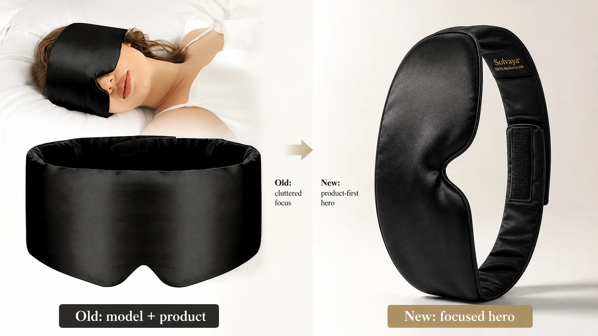
The Main Image Didn’t Need More Decoration. It Needed Focus.
On the Amazon search results page, the first image and title work together. DeepBI found:
- The seller’s main image combined product and model elements in a way that scattered visual focus.
- Some secondary images tried to do too much—text overlays, icons, multiple objects—reducing clarity and professional feel.
- Material visuals (silk, cocoon imagery) looked more “raw” and less refined than the competitor’s high-end fabric treatments.
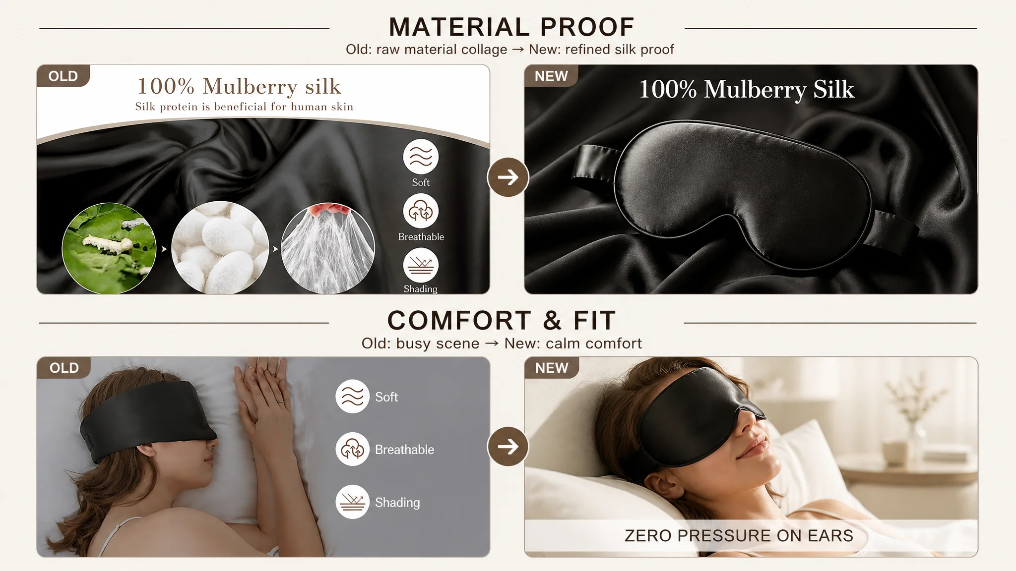
The core judgment:
The hero image had to behave like a premium, minimal Amazon main image, not like a cluttered brochure.
Recommended adjustments focused on:
- Hero product-only main image: product centered, ~80% of the frame, 30° angle, clean white background, strong side light to bring out silk texture, no text or extra objects.
- Texture-focused secondary image: mask on matching black silk fabric, 70% frame coverage, high-contrast light emphasizing “100% Mulberry Silk” with restrained typography.
- Immersive wear-shot: dark, sleep-focused portrait with the mask in use, subtle copy like “Enjoy Deep Sleep,” establishing emotional and functional context.
- Technical detail shot: close-up of the wide adjustable back band, with a magnified area showing Velcro and a clean label like “Wide Adjustable Velcro.”
- Comfort scene: bright bedroom shot showing “zero pressure on ears,” shifting technical dimensions into felt comfort.
This isn’t cosmetic refinement. It’s about ensuring each image has one job:
- Hero: win click.
- Fabric shot: prove material.
- Wear shot: show fit & blackout.
- Back-band shot: solve “will this hurt or tangle my hair?”
- Comfort shot: make “zero pressure” believable.
The A+ Detail Page Was Busy, but It Didn’t Climb the Value Ladder
The standard A+ modules were present:
- Main visual showcasing product and key features
- “Doctor” endorsement
- Multiple scenario collages
- Care instructions
But the structure under-used the product’s true positioning potential.
DeepBI’s benchmark analysis showed the competitor doing three things better:
1. Brand and emotional opening
The competitor led with a brand-level promise like “EXPERIENCE THE ULTIMATE COMFORT,” visually framed in a high-end way. It immediately signaled: this is not a cheap eye mask; it’s a deliberate sleep choice.
The seller’s A+ opened with functional description and model imagery—adequate, but not transformative.
1. Elevating from “遮光” to “sleep + skincare”
The competitor explicitly tied the mask to anti-wrinkle and moisture-preserving benefits, turning a functional tool into a skincare-adjacent product.
The seller stayed at the level of “遮光, breathable, comfortable,” leaving high-ASP positioning and differentiation on the table.
1. Consistent, immersive scenarios
The competitor’s travel, work, and sleep scenes shared a unified visual language and narrative: “you can rest deeply anywhere.”
The seller’s multi-scene collages had more fragmented composition and less consistency in mood, reducing the sense of a coherent lifestyle story.
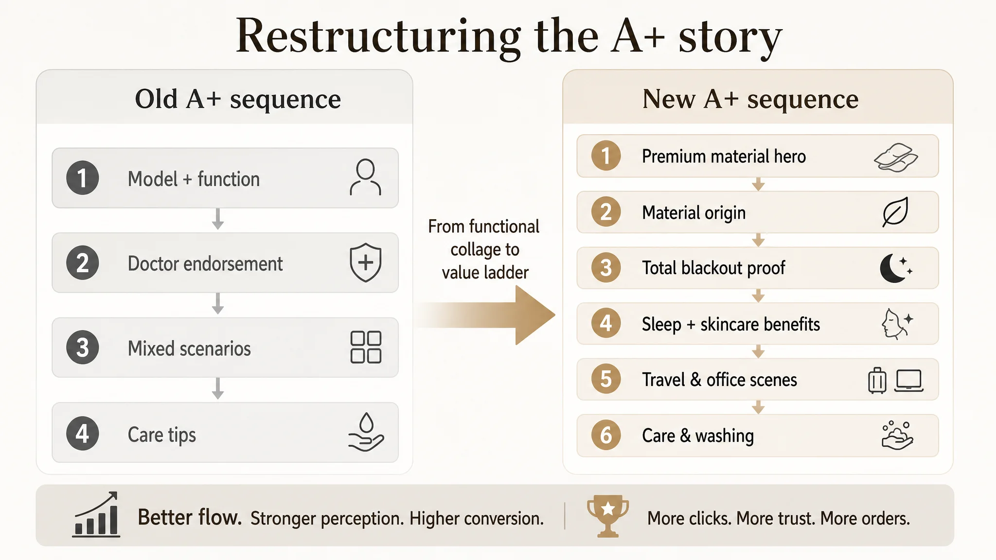
Rebuilding the A+ Logic
DeepBI’s A+ recommendations were essentially a re-sequencing of the story:
1. High-end material/hero first screen
- Product as sole subject on dark silk background, premium lighting, no text.
- Purpose: instantly convey “this is a higher tier of eye mask.”
1. Material origin and craftsmanship
- Diagonal composition with product seam detail and real silk cocoons.
- Focuses on natural, premium material rather than generic “doctor” visuals, which can read as cheap or fake.
1. Visual proof of total blackout
- Dark bedroom scene with emphasis on the thickened nose wing and perfect facial fit.
- Persuades visually, not just textually, that there is no light leak.
1. Sleep + skincare benefit
- Bright, clean scene showing smooth under-eye skin under the mask.
- Moves the conversation from “遮光” to “less friction, fewer fine lines, better morning skin.”
1. Business travel scenario
- Realistic business-class airplane context with cinematic lighting.
- Positions the product as part of a premium travel routine, anchoring value in a higher reference frame.
1. Office nap scenario
- Modern office with laptop and coffee subtly in frame, mask in use.
- Speaks directly to the office worker who needs mid-day recovery.
1. Care and washing
- Clean bathroom setup showing gentle hand-wash.
- Turns perceived “delicate care” complexity into part of a refined lifestyle, reducing post-purchase anxiety.
The underlying logic: move the user through material trust → functional proof → elevated benefits → real-life fit → long-term use confidence.
Why DeepBI Insisted on Fixing the Listing Before Touching Ads Again
At this stage, DeepBI’s judgment was clear:
- Reviews were robust enough.
- The main product was fundamentally competitive.
- The largest gaps were in how the Listing expressed value, not in whether the product had value.
If the team had continued to prioritize ads:
- Every incremental dollar would keep being filtered through the same suboptimal title, bullets, and A+.
- CTR and CVR would remain bounded by the current narrative; ad tuning would yield diminishing returns.
- The team might wrongly conclude “this product has hit its ceiling,” when in reality the Listing had never been fully activated.
So the decision order was:
1. Rebuild the page’s decision logic (title, bullets, hero & key images, A+ story).
2. Then expand traffic, using ads to amplify a stronger conversion engine.
“Advertising does not only amplify advantages. It can also amplify a page’s existing defects.”
By re-centering on Listing conversion, the seller reduced the risk of scaling a shaky structure.
How the Page’s Sales Logic Started to Recover
After the optimization, even without invented numbers, we can describe the operational shift:
- CTR had more room to grow
- Search thumbnails now combined a clearer outcome-driven title (“Total Blackout,” “Side Sleeper”) with a more focused, high-end hero image.
- Users scanning multiple sleep masks were more likely to perceive this Listing as both premium and specific.
- CVR had more structural support
- Bullets matched real user pains: light leak, ear pressure, insomnia, migraines, dry-eye, gifting.
- A+ moved the conversation from generic comfort to a full sleep-and-skin benefit stack, supported by visuals.
- Ad traffic became less “wasted”
- Paid clicks were now landing on a page that did more to earn the order.
- Instead of trying to force ACOS down through bid cuts, the seller could rely on the Listing to carry more of the conversion work.
- Organic positioning became more defensible
- A stronger Listing helped stabilize organic order share.
- Over time, healthier conversion gives Amazon’s algorithm more reasons to keep the product visible without relying solely on ad spend.
Operationally, the business moved:
- From “we need to push harder in ads”
- To “we need to make the page deserve more traffic first.”
What This Case Changes in the Seller’s Understanding
By the end of the process, the seller’s internal narrative had shifted:
- Before:
- “Competition is increasing, our ACOS is going up, we must optimize ads and maybe lower price.”
- After:
- “Our reviews are fine. Our product is fine. The benchmark is winning because their Amazon Listing tells a stronger story and covers more real pains.”
- “Title, hero image, bullets, and A+ have to work as one argument. Without that, ads are just burning budget.”
- “When ACOS feels stuck, we must first check: is the page truly converting at par with the best Listing in our category?”
Three key takeaways for other Amazon sellers:
1. Don’t let good ratings hide Listing problems.
A 4.5★ product can still have a structurally weaker page than a competitor. Reviews are only one layer of trust.
1. Ads cannot fix a weak decision logic.
If the title, images, bullets, and A+ don’t form a coherent, pain-driven narrative, tweaking campaigns will only have marginal impact.
1. Benchmark at the level of narrative, not just aesthetics.
Ask:
- Does my title frame an outcome as clearly as the best Listing in my niche?
- Do my bullets solve concrete problems with data and scenarios, or just list attributes?
- Does my A+ elevate the product’s value ladder beyond the basic function?
DeepBI’s contribution in this case wasn’t “better copy” or “nicer images” in isolation. It was the ability to see the real bottleneck: a Listing that looked okay from the outside, but underperformed in how it guided buyers from click to conviction. Once that was corrected, advertising could finally do what it was supposed to do—amplify a page that knew how to sell.