
An Amazon seller in the French marketplace came to DeepBI with a familiar pressure point: ads were becoming more expensive, competitors were crowding the category, and yet their helmet Bluetooth device for motorcyclists was not converting as expected. The team’s first instinct was to “push harder” on Amazon ads and keep adding feature highlights to the page, assuming the problem was insufficient exposure or incomplete feature description.
DeepBI’s listing scoring instead showed something subtler: this was not a traffic shortage, and it was not a feature shortage. The real gap lay in how the Amazon Listing translated those features into a clear, trustworthy buying story—especially when compared with a benchmark intercom-style competitor that had already built a strong visual and narrative logic around group riding, mesh networking, and long-distance trust.
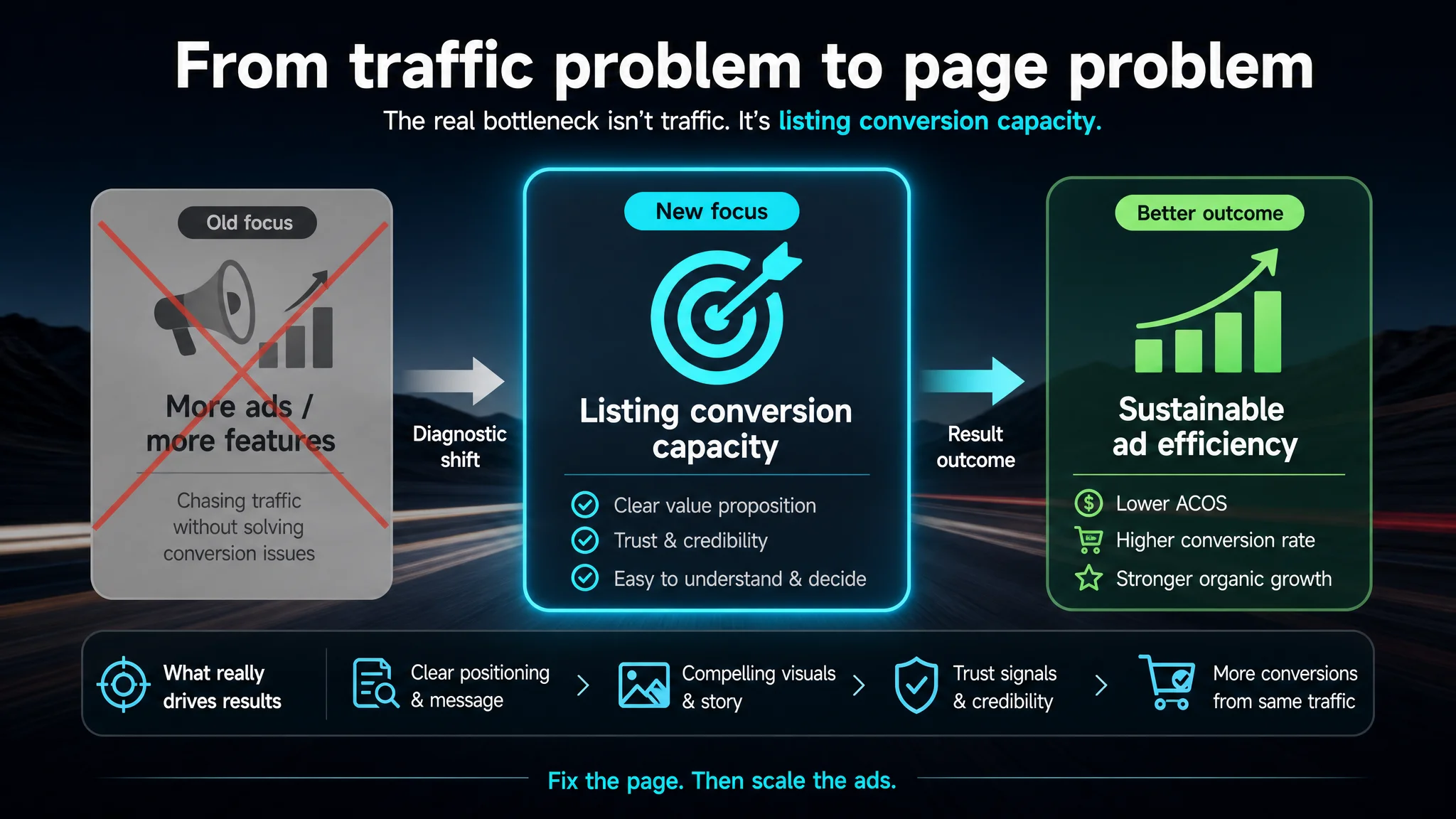
The optimization path therefore shifted away from “keep tuning bids and stuffing more specs” toward rebuilding the product page’s conversion capacity: reorganizing the title, sharpening bullet-point logic, and redesigning main images and A+ modules to mirror how motorcyclists actually decide on communication gear. For other Amazon sellers, this case is a reminder that ads cannot compensate for a listing that does not convert; Listing quality is not a cosmetic issue, but the foundation of sustainable ad efficiency.
Amazon Ads Were Not Failing. The Page Was Consuming the Traffic.
When this Amazon seller approached DeepBI, their category—motorcycle Bluetooth helmet devices—was already crowded on Amazon.fr.
They had:
- A technically competitive product (LCD screen, 6 EQ modes, HiFi audio, AI voice assistant, IPX6 water resistance, 1000mAh battery).
- A reasonably built-out Listing with multiple images and a full A+ detail page.
- Active Amazon ad campaigns feeding traffic to the product page.
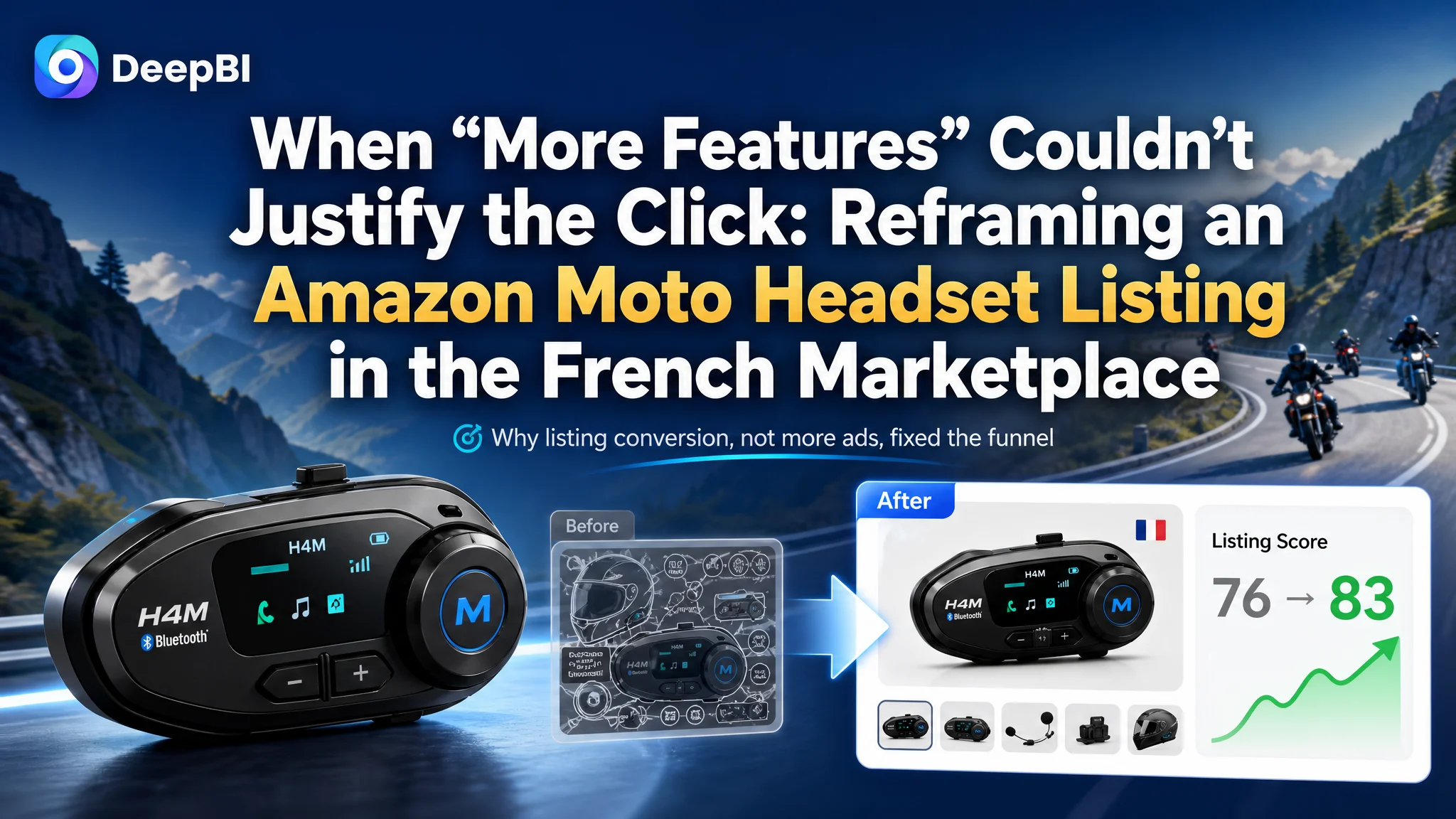
On paper, nothing looked dramatically broken. Yet against a benchmark “intercom moto” listing in the same category, DeepBI’s scoring showed a total score of 76/100 vs. the competitor’s 83/100. The numbers alone were not catastrophic, but they pointed to a systematic disadvantage in how the listing converted both organic and ad traffic.
“The real problem was not that ads failed to bring traffic. It was that the page could not convert the traffic.”
The seller’s early diagnosis was typical: blame ACOS and bids, and keep pushing ads while trying minor text tweaks. DeepBI’s analysis made a different argument—if the listing’s conversion logic stays weaker than the benchmark, every unit of ad spend will continue to be diluted.
The Real Constraint Was Listing Conversion Capacity
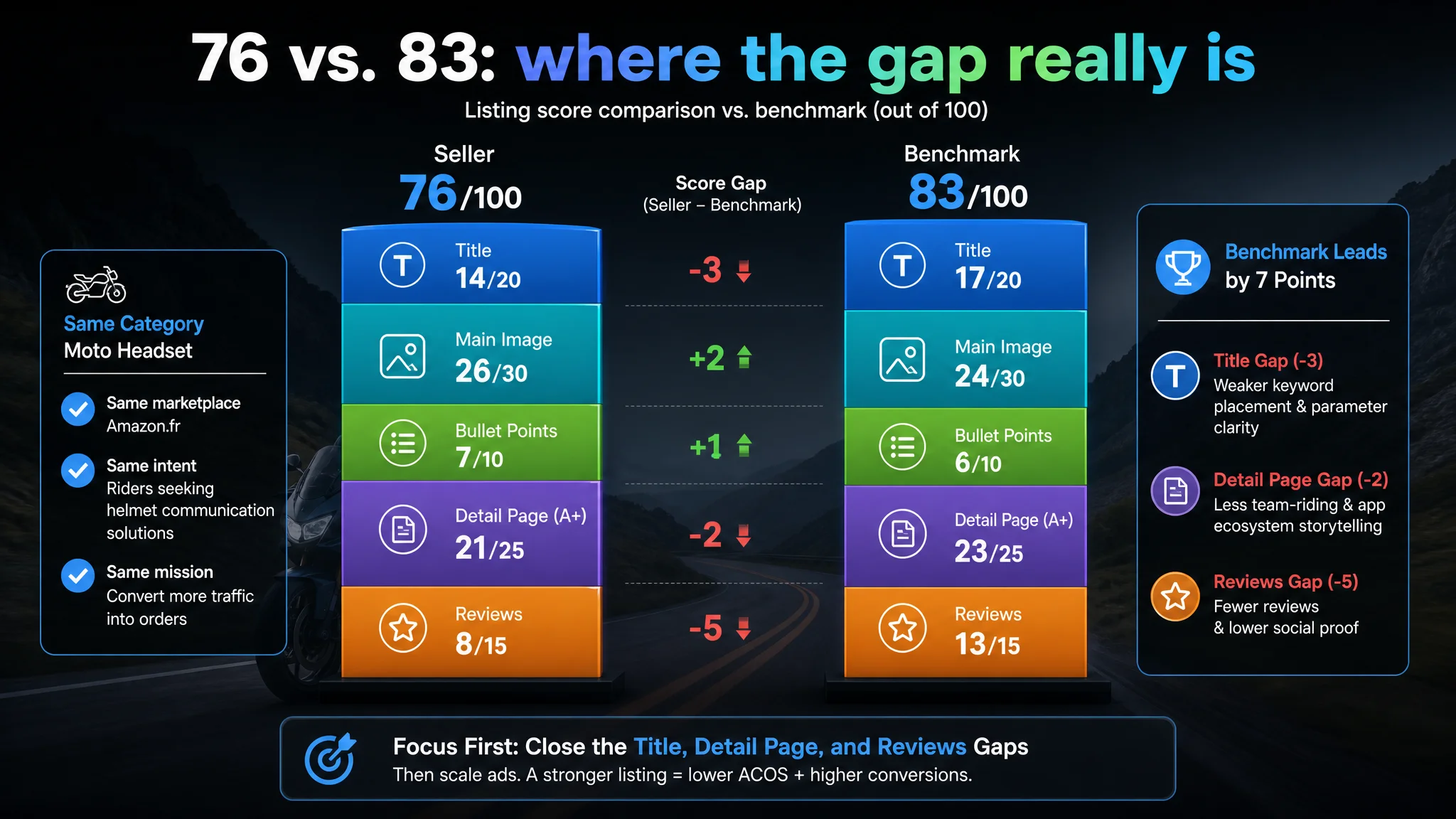
DeepBI’s Listing scoring broke the problem into five dimensions: title, main image, bullet points, detail page (A+), and reviews.
Score comparison vs. a benchmark listing (same category, Amazon.fr):
- Title: 14 vs. 17 (out of 20)
- Main Image: 26 vs. 24 (out of 30)
- Bullet Points: 7 vs. 6 (out of 10)
- Detail Page (A+): 21 vs. 23 (out of 25)
- Reviews: 8 vs. 13 (out of 15)
- Total: 76 vs. 83 (out of 100)
On the surface, the seller even outperformed the competitor in main-image scoring and bullet points. But the data plus qualitative analysis uncovered a deeper issue: the structure and decision logic favored the competitor.
Title: Keywords Without a Clear Decision Hook
The seller’s original title:
- Pushed the core keyword “casque moto” back in the string.
- Presented multiple features (“LCD screen”, “6 EQ modes”, “AI voice control”) but without a clear hierarchy or outcome.
- Read like a dense feature list rather than an immediate promise for riders.
The benchmark competitor:
- Put “intercom moto” upfront, aligning with how buyers search for communication solutions.
- Used parameterized claims like “8 motocyclistes”, “60min charge rapide”, “2 puces 4 cœurs”.
- Followed a clear formula: brand + core function (intercom) + key parameters.
On Amazon, this difference does not just affect SEO; it decides whether the search-result thumbnail immediately answers: “Is this the intercom/helmet headset I’m looking for?”
Main Images: Visual Density vs. Visual Decisions
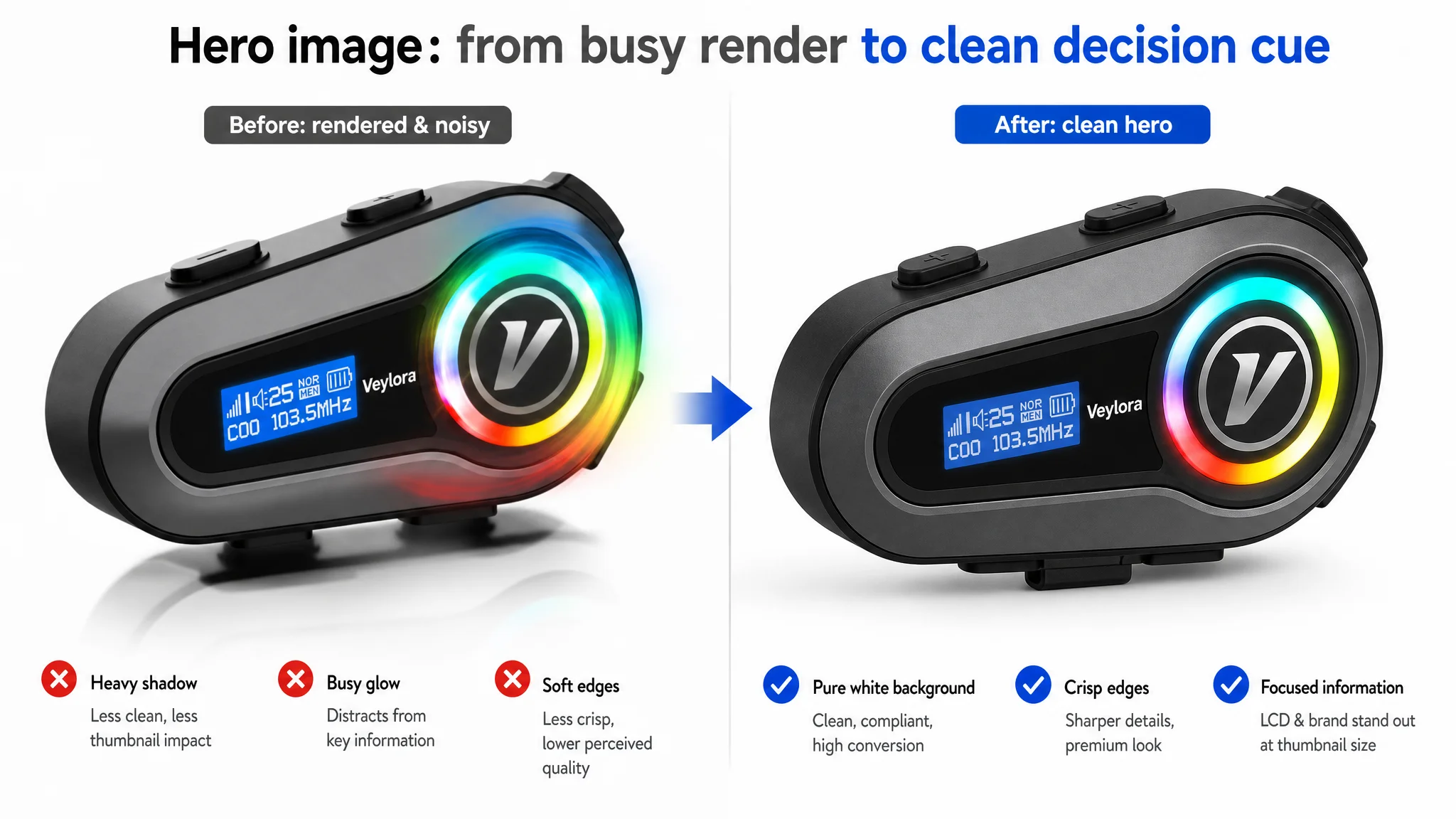
Numerically, the seller’s main-image score was slightly higher than the competitor’s, but DeepBI’s visual agents highlighted a critical conversion risk:
- The primary image leaned heavily on rendered visuals, with a relatively “studio” feel and limited real riding context.
- Shadows were too heavy, background not fully clean, and LCD details not sufficiently leveraged as a visual hook at thumbnail size.
- Some images exposed internal circuitry, which not only breaks Amazon’s guidelines but also wastes visual space on a non-decision factor for riders.
The competitor’s image sequence was simpler but more focused:
- Each image had a clear function (group communication range, mesh network visualization, multi-rider scenario).
- Scene-based visuals (mountain roads, multiple bikers connected) instantly communicated “team riding” and long-distance reliability.
The takeaway: the seller had more images and more information, but less decision-aligned visual storytelling.
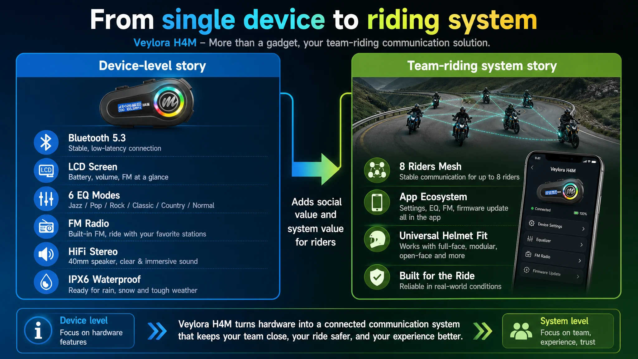
Detail Page and A+: Hardware Without the Social Story
DeepBI’s A+ comparison revealed the sharpest narrative gap:
- The benchmark listing highlighted:
- Mesh networking (up to 8 riders, long-distance communication).
- Real-world road scenes with signal-path visualization.
- An app ecosystem (remote management, firmware updates).
- Dual-mic adaptation for different helmet types.
- The seller’s detail page emphasized:
- Bluetooth 5.3, LCD, EQ modes, HiFi sound, FM radio, AI assistant.
- IPX6 water resistance, battery specs, generic accessories.
In other words, the seller stayed at the device level. The competitor sold a team-riding communication system backed by ongoing software value and clear helmet compatibility. For a category where trust, range, and usability under real conditions matter more than pure specs, that difference directly hits conversion.
Reviews: Trust Scale and Social Proof
Finally, the review dimension widened the trust gap:
- Seller: 4.2 stars, 56 ratings, 7 reviews visible on the first page.
- Competitor: 4.4 stars, 946 ratings, 13 reviews visible on the first page, with rich photo/video content.
From a buyer’s perspective in Amazon’s French marketplace, the competitor simply feels more “proven.” For the seller, this means their listing needs to work harder on-page to offset a weaker review footprint.
Why DeepBI Did Not Keep Tuning the Ads First
Facing a 7-point Listing gap and a clear trust deficit, DeepBI made a strategic judgment: fixing Listing conversion came before further ad escalation.
Continuing to concentrate on ad optimization would have created three risks:
1. Amplifying a weak conversion funnel
Additional traffic would mostly hit the same structural weaknesses—unclear positioning in the title, diluted visual story, and weaker trust signals. ACOS might worsen even with “better” bids.
1. Letting the competitor’s narrative dominate
In search results and on the detail page, the competitor’s “8 riders / mesh / app” story set buyer expectations. Without a sharpened counter-position, this seller’s product risked being perceived as a simpler “music headset”, not a plausible alternative in the communication gear space.
1. Raising dependency on paid traffic without strengthening organic conversion capacity
A listing that struggles to convert ad traffic also struggles to convert organic traffic. Without solid page-level conversion, any improvement in ranking is fragile.
DeepBI’s judgment: this product page did not lack impressions; it lacked a coherent, trust-building buying logic. Until that was repaired, ads would continue to be an expensive band-aid.
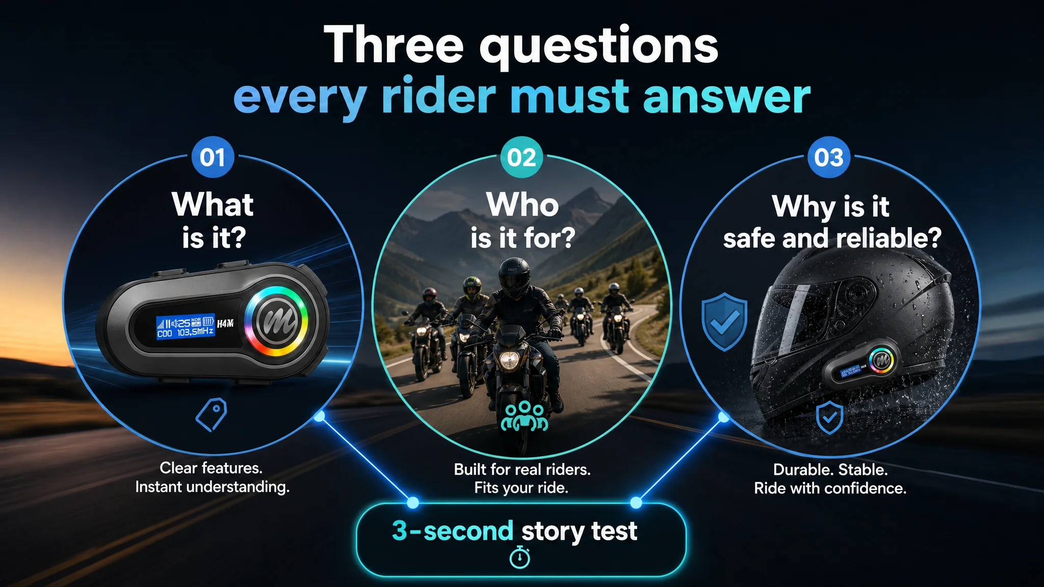
This Product Page Did Not Lack Features. It Lacked a Clear Story.
DeepBI reframed the core bottleneck as: Listing conversion capacity, not ad mechanics.
The optimization focus became: how to make an Amazon shopper in the motorcycle-gear category understand—within a few seconds—what this product is, who it is for, and why it is safe and reliable enough for real-world riding.
Title Reordered Around How Riders Search
The revised title direction:
“Casque Bluetooth Moto avec Écran LCD, 6 Modes EQ, Kit Main Libre sans Fil, Radio FM, HiFi Stéréo, AI Commande Vocale, Réduction du Bruit, IPX6 Étanche pour Moto et Scooter”
Key shifts:
- Core keyword front-loading: “casque bluetooth moto” moves near the front, aligning with how riders search on Amazon.fr.
- Readable blocks: Use of commas and consistent phrasing to make “Écran LCD”, “6 Modes EQ”, “AI commande vocale”, “IPX6 étanche” quickly scannable.
- Differentiated technical hooks: LCD display, AI voice control, and IPX6 serve as clear technical anchors without over-claiming intercom capabilities.
This restructuring supports both the algorithm (A9/A10) and human scanning: the shopper instantly knows it’s a Bluetooth helmet headset, not a generic gadget.
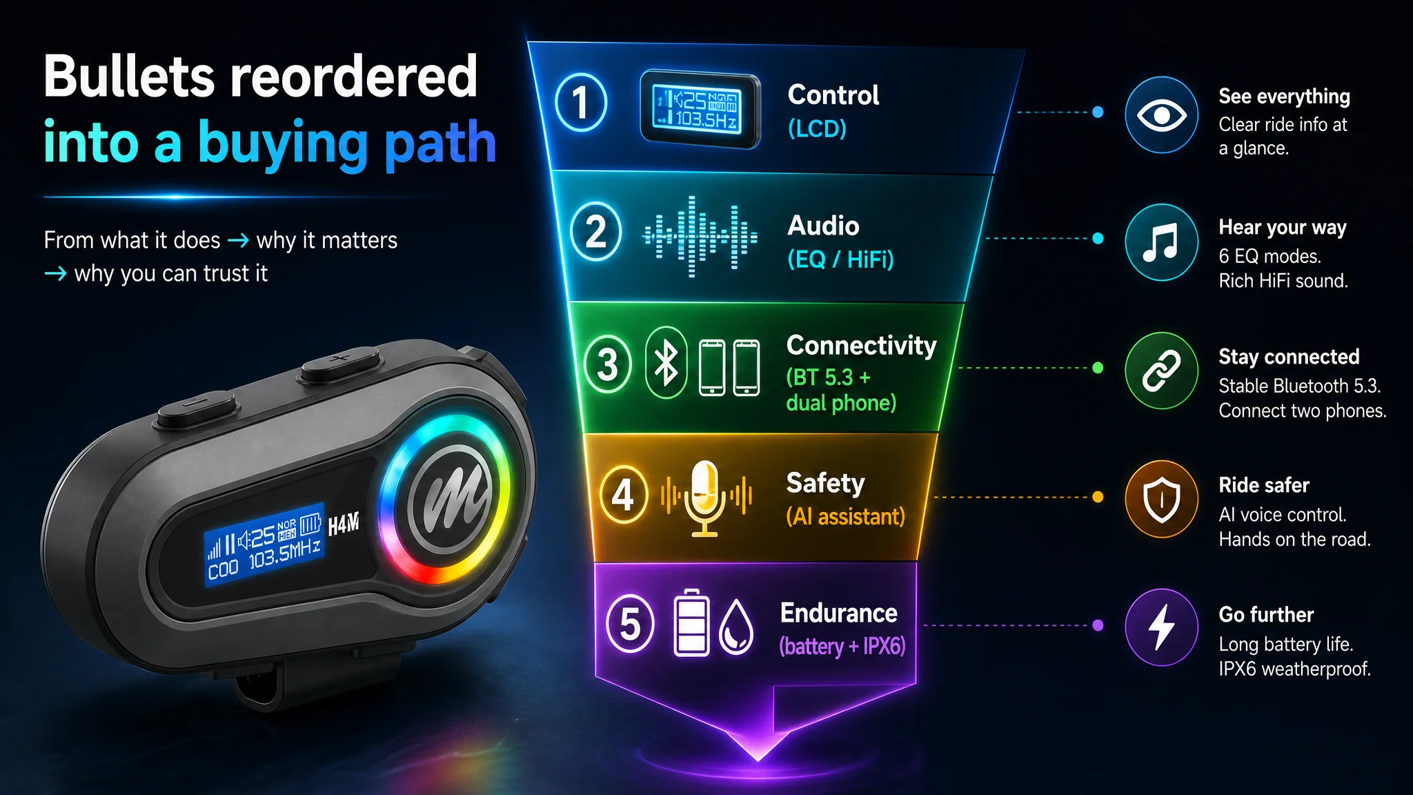
Bullet Points: From Feature List to Buying Logic
DeepBI did not just rewrite bullet points; it re-ordered them into a conversion path:
1. Control and clarity (LCD screen):
Highlighting instant visibility of battery, volume, and FM station. This addresses rider anxiety about not knowing device status mid-ride.
LCD screen + “control at a glance” → less distraction → safer usage.
1. Audio immersion and personalization (6 EQ modes):
40mm speakers, 3D stereo, six EQ modes tailored to riding mood and speed conditions.
1. Connection stability and dual-device logic (Bluetooth 5.3 + two smartphones):
Clarifying that this model focuses on music and calls, not intercom, while emphasizing stable multi-tasking (navigation + calls).
The explicit note that there is no intercom avoids trust-breaking expectations and positions the product clearly as an entertainment/call device.
1. Hands-free safety (AI voice assistant):
Linking voice assistant activation directly to riding safety: eyes on the road, auto-answer for calls.
1. Usage span and durability (1000mAh + IPX6):
Leveraging superior battery capacity vs. competitor (1000mAh vs. 960mAh) and water resistance for all-weather reliability.
Each bullet now follows a pain point → capability → outcome structure, rather than a pure spec list. This is crucial for Amazon shoppers who rarely read every word but need each bullet to carry a clear, standalone promise.
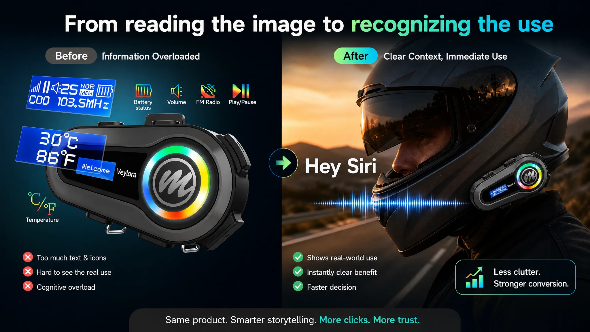
The Main Image Was Not Just a Visual Issue. It Failed to Create a Reason to Click.
In Amazon search results, the main image is effectively the first ad impression. DeepBI’s visual analysis pinpointed several conversion leaks:
- Shadows and background noise diluted the “premium gear” impression.
- Overly complex visual overlays forced users to “read” the image instead of recognizing the product instantly.
- Internal component images broke both compliance and trust.
Reframed Main Image Logic
DeepBI’s optimization guidelines focused on visual logic, not just aesthetics:
1. Clean hero image for the primary slot
- Product centered, occupying ~75% of frame.
- 45° top-down view, clean white background.
- LCD screen active and legible, emphasizing real-world utility.
- Cool blue-black tones to evoke professional tech.
This gives Amazon’s thumbnail a strong, recognizable silhouette and an immediate functional cue.
1. Scene images anchored in real riding
- Aerial view of 5–8 riders on a mountain road, connected by subtle glowing lines.
Even though this product is not an intercom, this type of scene can be repurposed to convey “connected experience” (music + navigation) without misrepresenting features.
- Side-view shot of a rider with helmet, with “Hey Siri” as a simple overlay and voice-wave visuals, to communicate voice control in one glance.
- Helmet-centered soundwave image, with concentric colored rings and musical-note particles, to visualize HiFi audio and EQ modes.
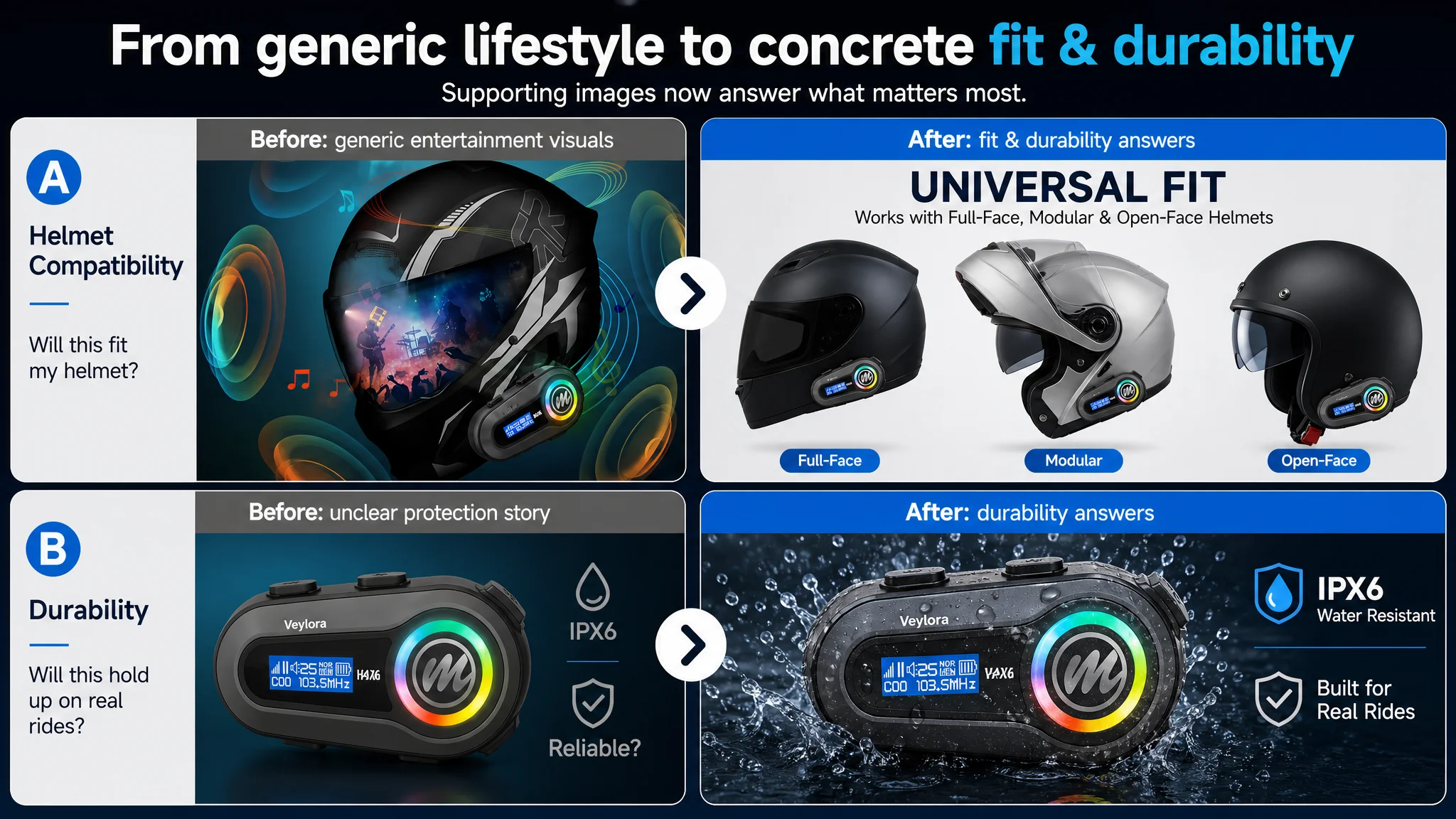
1. Compatibility and fit
- Matrix-style image with multiple helmet types (full, modular, half, off-road, vintage), each showing the device installed.
- Clear “universal fit” text on the image.
1. Water resistance and durability
- Dynamic IPX6 scene with intense rain and water droplets frozen mid-air, rather than a generic, flat “splash”.
The main-image set thus shifts from generic renders to decision-driving visuals: fit, control, audio, safety, and durability.
“Advertising does not only amplify advantages. It can also amplify a page’s existing defects.”
By aligning visuals with actual buying decisions, the listing stops burning impressions on non-essential imagery.
Before Ads Could Work Again, the Page Had to Convert
Once DeepBI and the seller aligned on Listing as the primary bottleneck, the optimization path followed a clear order.
Step 1: Fix the Story Spine (Title + Bullets)
- Reposition the product with a clear “helmet Bluetooth headset with LCD” identity.
- Clarify what the device does not do (no intercom), to avoid post-purchase disappointment and negative reviews.
- Build bullet points as a structured journey: control → audio → connectivity → safety → endurance.
Step 2: Rebuild Visual Trust (Main Images + A+)
DeepBI’s A+ suggestions were not random design requests; they specifically targeted the “trust leaks” identified in scoring:
- Real-world mounted shots on matte black helmets with dynamic road backgrounds to move the product out of “generic accessory” territory.
- EQ module image that uses minimalist neon soundwaves instead of busy band photos, focusing on sound immersion.
- AI assistant scene simplified to a single clear command bubble (“Hey Siri”), with blurred background to reduce cognitive noise.
- Battery + charging image translating 1000mAh and 32h usage into a strong visual metaphor (energy injection, data overlay).
- Waterproof scene with realistic high-pressure rain and detailed droplets to visually match or exceed competitors’ IPX7-style imagery.
- Helmet compatibility matrix directly answering “Will this fit my helmet?” ahead of the Q&A.
- LCD close-up to make the screen’s readability and information density obvious.
In Amazon’s environment, this level of visual discipline is not decorative—it is how the page compensates for fewer reviews and narrower social proof.
Step 3: Let Ads Feed a Stronger Funnel
Only after reinforcing the Listing did it make sense to re-evaluate ads:
- With a clearer title and main image, CTR has a structural reason to improve, even at similar bid levels.
- With a more convincing detail page and bullet-order logic, CVR has room to recover, particularly among riders who deeply compare two or three tabs before ordering.
- With a more honest positioning (no implied intercom function), the seller can reduce post-purchase friction, which in turn stabilizes ratings over time.
DeepBI’s broader logic remains consistent: Listing quality is the base layer; ad efficiency is the derivative. In this case, the priority was to ensure the page deserved more traffic before spending more to drive it.
How the Seller’s Understanding Changed
By the end of this diagnostic cycle, the seller’s perspective on their Amazon business had shifted in several important ways:
- They stopped assuming that “more features in the title and A+” automatically raises conversion.
The focus moved to clearer, rider-centric decision logic.
- They recognized that their product was not inherently weaker than the benchmark; the weakness lay in how the Amazon Listing communicated value and trust.
- They understood that ad performance is tied to listing quality. High ACOS was not only a bidding or keyword problem; it was partly a reflection of a page that failed to convert enough of its traffic.
- They embraced a more honest and precise positioning: a strong helmet Bluetooth headset for music and calls, not a full intercom system—reducing the risk of future trust erosion.
From DeepBI’s standpoint, this case underscores a recurring pattern among Amazon sellers:
- When ad costs rise and conversion stalls, the immediate reaction is often to tune campaigns.
- Yet in many situations, the real lever sits on the Amazon product page: title clarity, main image logic, A+ storytelling, and review-driven trust.
For sellers in categories like motorcycle accessories, audio gear, and other mid-ticket devices, the lesson is simple but non-trivial:
- Do not let ads carry a Listing that cannot close the sale.
- Before scaling budgets, ask whether your Amazon product page can convincingly answer: “What is this, for whom, under what conditions, and why should I trust it?”
In this French marketplace moto-headset case, once the Listing began to rebuild its conversion logic, ad traffic stopped being “fuel poured into a leaking tank” and started working as it should: amplifying a page that could finally hold its own against a benchmark competitor.