Case Summary
- A US seller of air-dry clay glaze saw healthy reviews but unstable sales in a niche, detail-driven craft category.
- The team believed the issue was mainly keyword coverage and technical messaging—so they kept refining title and bullets.
- DeepBI’s diagnosis showed something else: the Listing wasn’t structurally built to convert. It read like a lab report while the benchmark Listing walked buyers through a clear, visual “protection and gloss” story.
- The real bottleneck wasn’t “not enough features,” but misaligned narrative and visuals that failed to turn existing trust (reviews) into repeatable conversions.
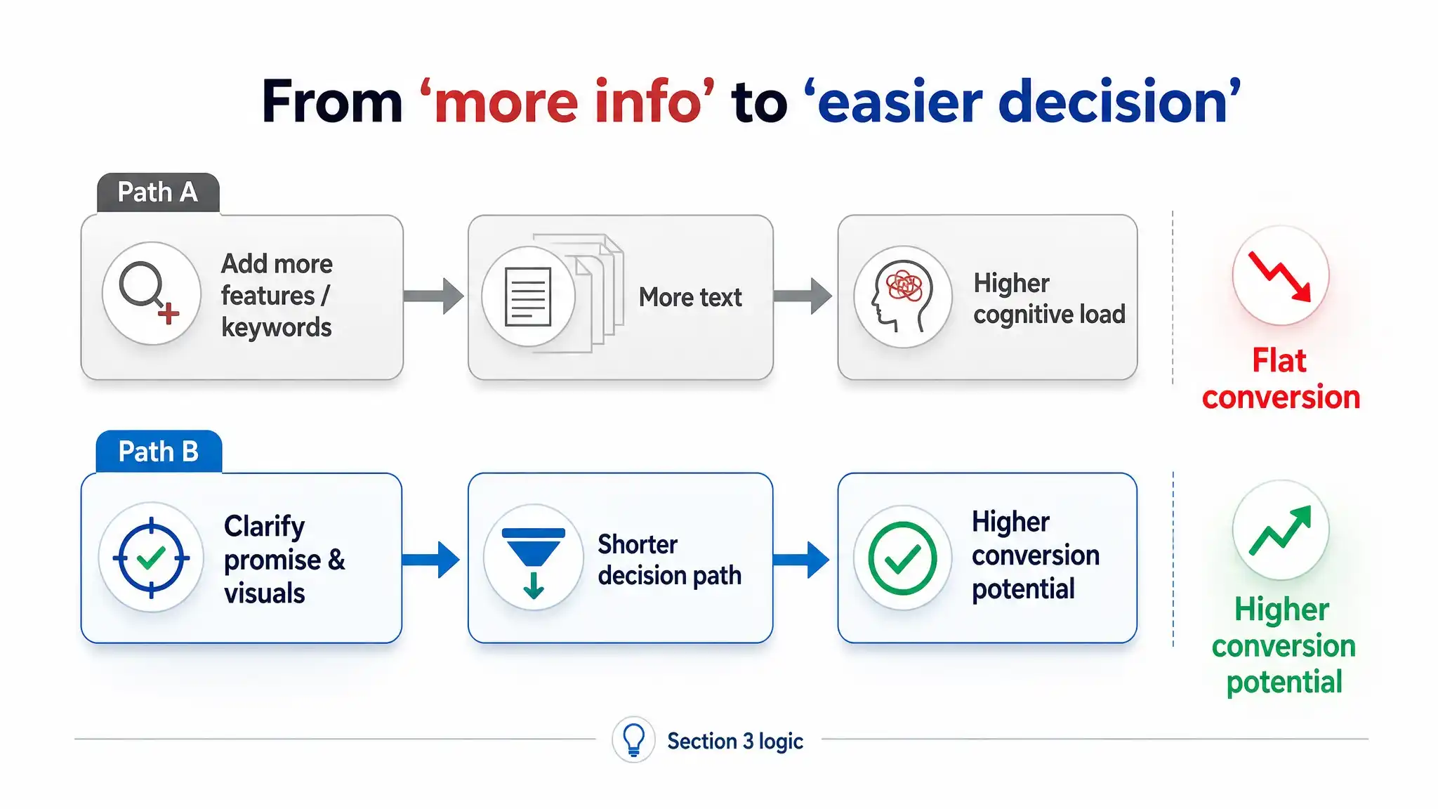
The Listing wasn’t underperforming because it lacked information,
it was underperforming because it was telling the wrong story.
1. How the Problem Showed Up on the Surface
This Listing sells a high-gloss glaze/sealant for air-dry clay and art projects.
On paper, it doesn’t look like a “problem child”:
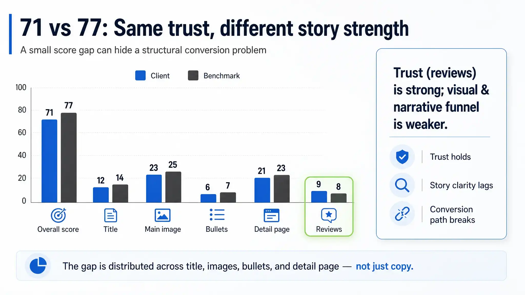
- Overall Listing score: 71/100
- Benchmark competitor: 77/100
- Star rating: 4.2 vs competitor’s 4.6
- Review volume: 41 vs competitor’s 12 (clear advantage in social proof)
- Category: a visual, hobby-driven niche where trust and effect visualization matter a lot.
From the seller’s perspective, that 6-point gap looked “fixable” with ** incremental copy tuning**:
- Slightly weaker title score (12 vs 14)
- Slightly weaker main image score (23 vs 25)
- 1-point gaps in bullets and detail page
- A 1-point advantage in review dimension
The intuitive conclusion inside the team was:
“We’re close. If we refine keywords, emphasize ASTM, waterproof, anti-yellowing, we should close the gap.”
So they doubled down on what they were already good at:
technical completeness and compliance-heavy messaging.
2. The Initial Misjudgment: Treating a Narrative Problem as a Keyword Problem
What the Team Believed
Internally, the team framed the issue as:
- “We need stronger search relevance.”
- “We must not lose any technical certs or attributes in the title.”
- “Bullets must list all features: gloss, waterproof, anti-yellowing, low odor, freeze recovery…”
In other words, they assumed the core battlefield was A9 and feature disclosure:
- Get all important keywords in the title.
- Keep every technical label (ASTM D-4236, low odor, anti-yellowing).
- Make bullets “complete” to avoid pre-sales questions.
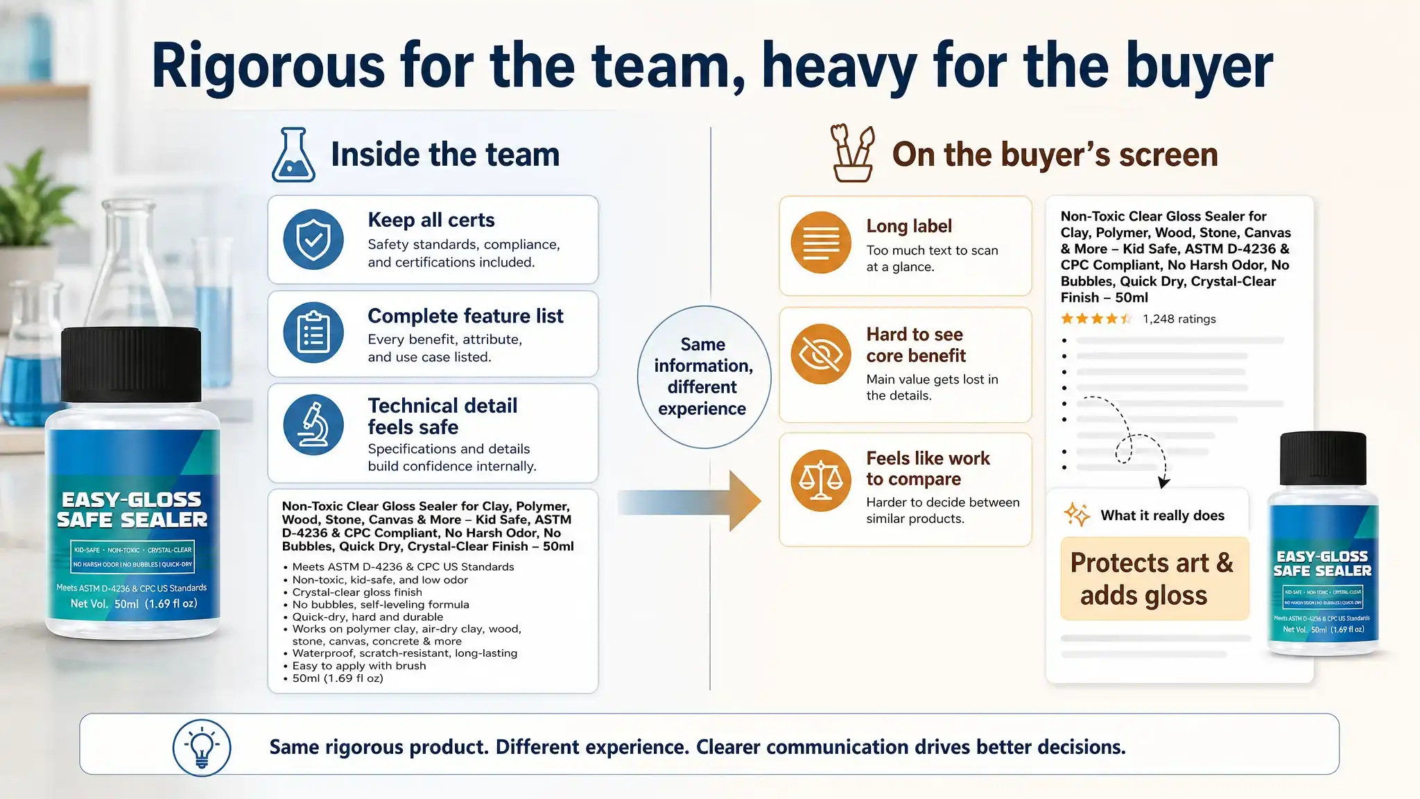
That led to a title structure like:
Brand + Product Name + Long Feature Chain + Certs + Volume
And to bullets that read like specification sheets.
From inside the company, this felt rigorous and safe.
From the buyer’s screen, it looked like work.
Why This Misjudgment Was So Persistent
Because the Listing already had:
- Healthy rating (4.2 stars)
- Strong review volume (41 reviews, many with photos and videos)
- No catastrophic feedback trend
So operationally, the story became:
“There’s no big problem, we just need to squeeze out more traffic and clarifications.”
It’s a classic misjudgment pattern:
- Over-trusting technical completeness
- Underestimating decision friction at the point of purchase
- Equating “no one complains loudly” with “the narrative is fine”
3. Why Traditional “Optimization” Kept Failing
If you only look at the surface, the Listing is “professional”:
- Title contains all major attributes
- Bullets are detailed and compliant
- Detail page has step-by-step usage, icons, safety info
- Reviews are abundant and rich
Yet against a simpler, more buyer-centric competitor, the Listing kept losing the key battle:
Who can help a hobbyist quickly feel
“This will protect my work and make it shine”
without cognitive overload?
Traditional optimizations—add more keywords, tweak phrasing, reorder some bullets—were solving the wrong type of problem:
- They reduced the risk of missing information,
- but they increased the cognitive load to extract the core benefit.
As a result:
- The core promise (“protects your art, makes it glossy, works on multiple surfaces”) was buried inside technical noise.
- The buyer had to parse the Listing instead of feeling guided through a clear decision path.
- Visuals did not carry the weight of proof; they merely decorated the text.
In a category where:
- buyers often browse visually,
- decisions are emotional (“will my piece crack, yellow, or stay beautiful?”),
traditional “more detail, more certs, more features” optimization simply couldn’t move the needle.
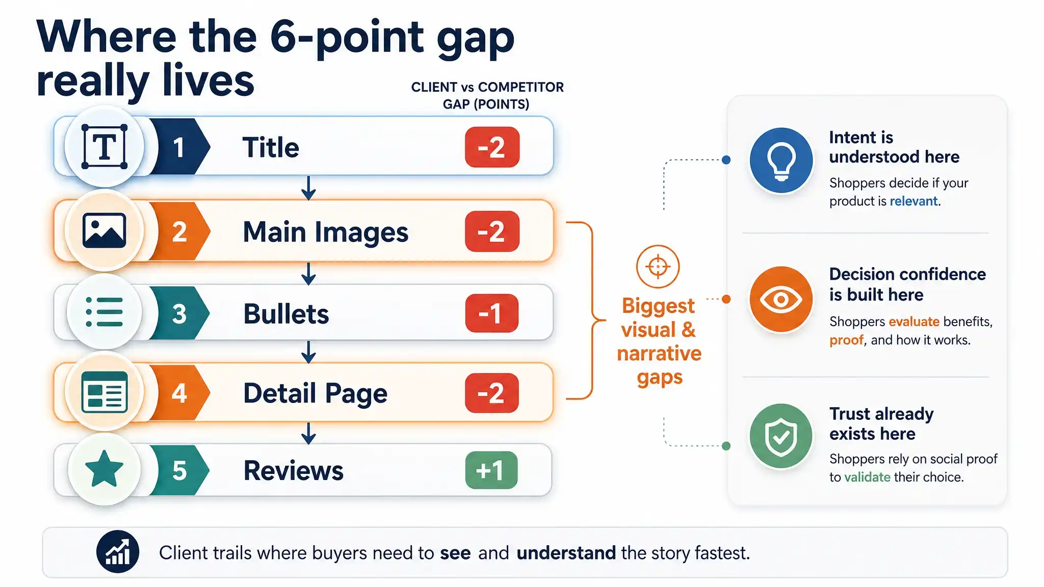
4. What DeepBI Saw in the Data: A 6-Point Gap That Meant More Than It Looked
On DeepBI’s radar, the 71 vs 77 gap was not “just 6 points.”
It was how those 6 points were distributed:
- Title: -2
- Main Image: -2
- Bullets: -1
- Detail Page: -2
- Reviews: +1
The system’s multi-dimensional scoring, mapped against the benchmark, exposed a structural pattern:
Anywhere the buyer needs help forming a mental picture
of “what it is, what it does, and how to use it,”
the competitor is more direct, more visual, and more sequenced.
Title: The First Misstep in the Funnel
DeepBI’s title analysis Agent highlighted:
- Competitor:
- Leads with “100ml Varnish – Clay Glaze for Air Dry Clay” (what it is, for what).
- Immediately follows with “Helps Prevent Cracks, Scratches & Wear” (pain relief).
- Ends with “(Gloss)” for effect confirmation.
- Client Listing:
- Leads with brand and proprietary name “Muanxious Air Dry Clay Glaze”.
- Then stacks No-Tack / High Gloss / Waterproof / Clear / Low Odor / Anti-Yellowing in a chain.
- Ends with volume (50ml) as a technical closure.
On a search result page:
- The competitor’s title answers intent in one glance.
- The client’s title reads like a label, not a promise.
DeepBI’s judgment:
The issue isn’t lack of keywords; it’s lack of hierarchy.
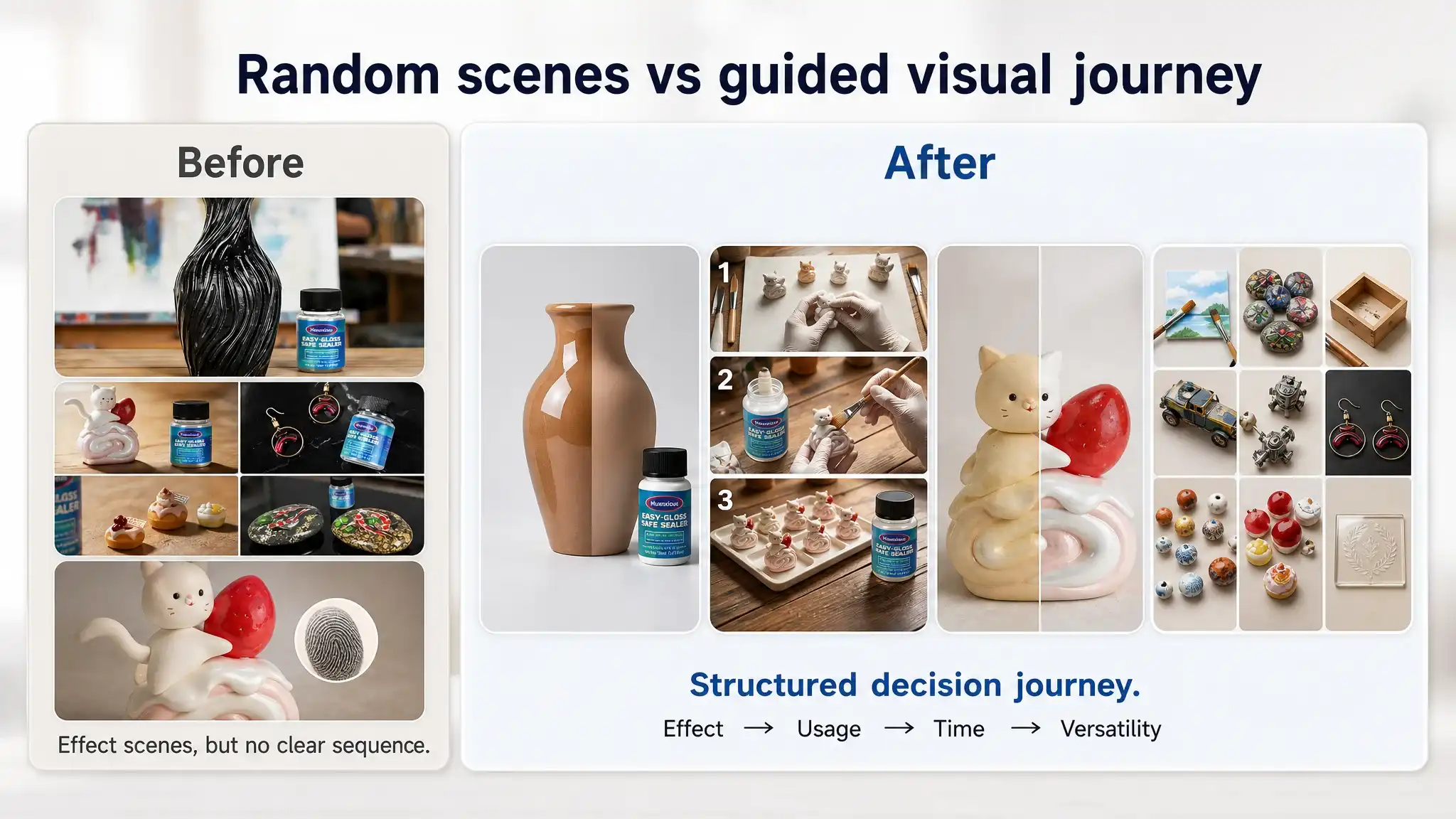
Main Images: No Story, No Time Dimension
The visual analysis Agent compared main and secondary images:
- Competitor:
- Clear “before vs after” gloss vs matte comparison.
- Visualized usage steps.
- Visual proof of long-term protection (yellowing prevention over time).
- Brush included in frame, signalling “ready-to-use kit.”
- Client Listing:
- Aesthetic but less instructional scenes.
- No explicit “time” narrative (no “after a period of time” yellowing comparison).
- No strong, single visual anchor that says:
- “This is what your sculpture looks like with and without our glaze.”
The conclusion:
CTR and CVR weren’t held back by image quality per se,
but by the lack of a visual argument.
Bullets & Detail Page: Technical Closure vs Decision Closure
DeepBI’s text Agents did a structural comparison:
- Competitor bullet flow:
- What it is + core effect
- Where you can use it
- How to use it
- Safety reassurance
- Product line explanation (gloss vs matte)
This forms a complete purchase decision loop:
“I know what it is → it fits my use → I know how to apply → I feel safe → I can choose finish.”
- Client bullet flow:
- Gloss description
- Touch & no-tack
- Safety & compliance
- Waterproof & anti-yellow
- Special conditions
This forms a technical specification loop, not a decision loop.
On the A+ detail page:
- The client uses:
- Brand hero scene
- Three-step usage guideline
- High coverage info
- Iconized benefits
- Safety comparison matrix
- The competitor uses:
- Kit hero image
- Gloss vs matte split visuals
- Four-step usage guide
- Multi-material application gallery
- Time-based durability comparison
- Contextual application examples
DeepBI’s diagnosis:
The client is “explaining the product.”
The competitor is “walking the buyer through a future where their art is protected and shining.”
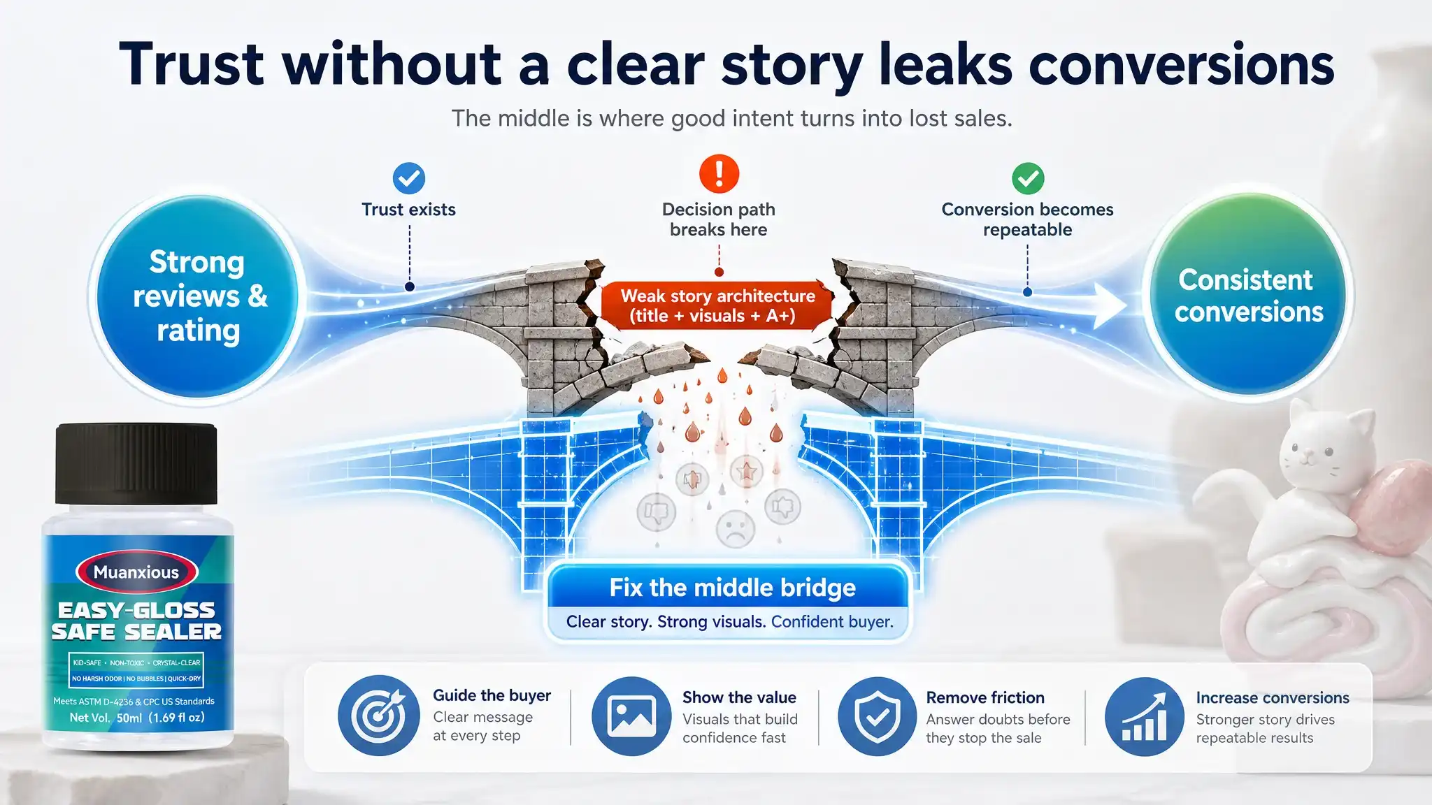
5. The Core Insight: The Listing Didn’t Lack Trust, It Lacked a Conversion Story
DeepBI’s logic linked three observations:
- Reviews and rating are healthy, and volume is high.
- → The product itself is not the bottleneck; trust in quality exists.
- Score gaps are concentrated in title, main images, and A+.
- → The bottleneck is how the offer is presented and *sequenced*.
- Competitor’s advantage is narrative clarity, not sheer feature superiority.
- → The main risk is keeping the product in “lab mode” while the buyer is in “craft room mode.”
So the root problem was redefined:
Not “how do we add more technical proof,”
but “how do we convert existing product trust into faster, clearer buyer decisions?”
In other words, this wasn’t a traffic problem.
It was a decision logic and story architecture problem.
6. Why DeepBI Didn’t Start by “Fixing Ads” or “Adding More Claims”
At this point, many teams would default to:
- “Let’s push more traffic; the reviews are strong.”
- “Let’s highlight ASTM, waterproof, anti-yellowing more aggressively.”
- “Let’s expand keywords for more surface coverage.”
DeepBI explicitly did not start there.
Reason 1: Ad Spend on a Blurry Story Is Just Amplified Waste
If:
- Title doesn’t immediately communicate “what it is + what problem it solves,”
- Images don’t show “before vs after” and “time-based protection,”
- Bullets don’t guide usage…
then buying more clicks only accelerates how fast users bounce out confused.
DeepBI’s operating logic:
You don’t amplify a Listing that hasn’t yet proven
it can tell a clear, conversion-ready story.
Reason 2: Adding More Features Would Intensify the Existing Problem
The existing narrative was already feature-dense:
- High gloss
- Waterproof
- Clear
- Low odor
- Anti-yellowing
- No-tack
- Freeze recovery
- ASTM compliance
Adding even more emphasis or wording would:
- Increase text density
- Further dilute the core promise
- Push the Listing away from a human-readable, scan-friendly structure
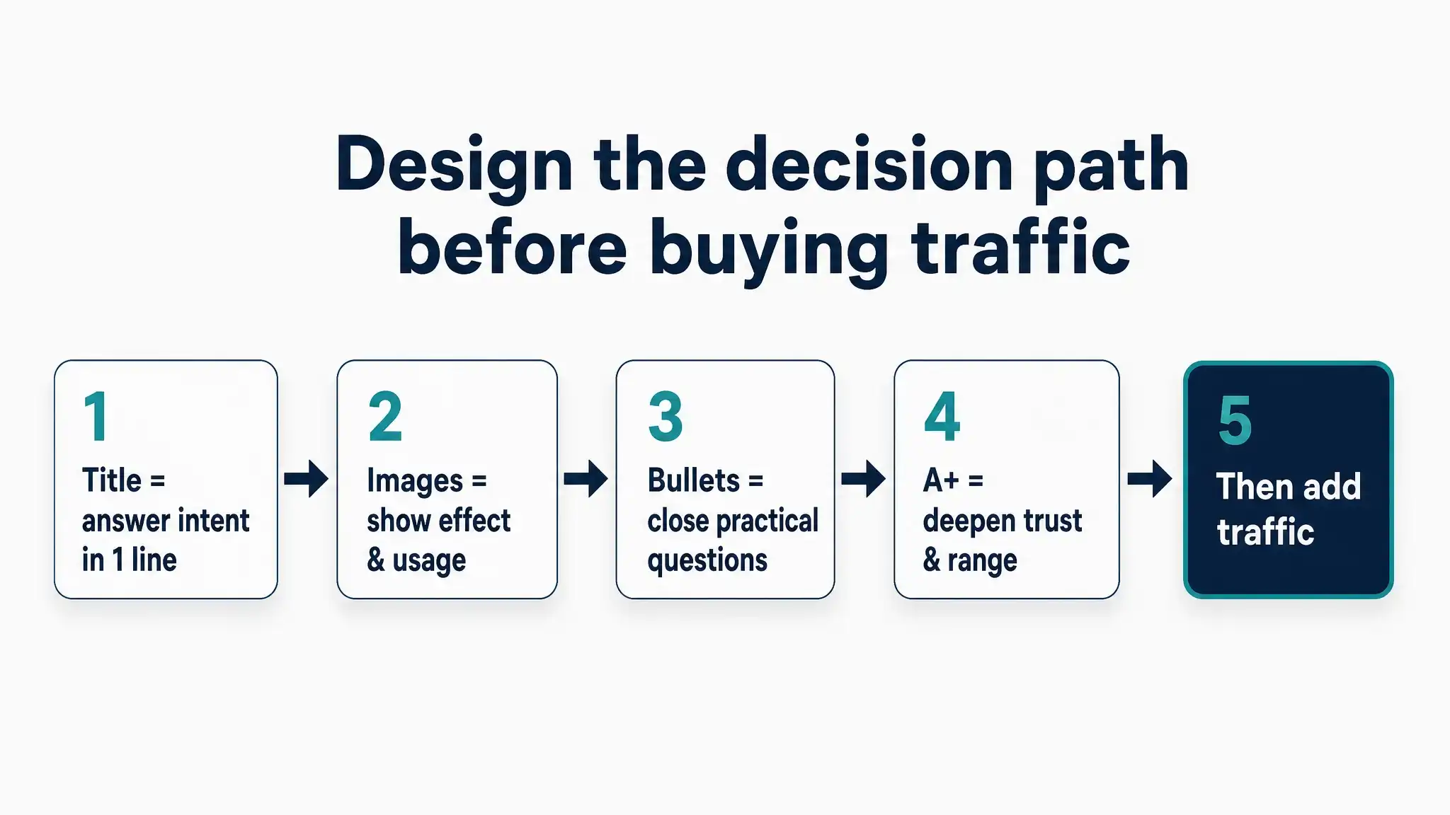
Instead of “more,” the need was re-ordering and simplifying.
7. How DeepBI Reframed the Optimization Sequence
First: Secure the Core Message in the Title
DeepBI’s title optimization was not about stuffing more attributes;
it was about rebuilding hierarchy:
From:
- Brand + Product Name + Feature Chain + Cert + Volume
To:
- Brand + Core use and result (Air Dry Clay Glaze – High Gloss Varnish & Sealant)
- Key benefit promise (Waterproof Clear Gloss Finish, Prevents Cracks, Scratches & Wear)
- Supportive attributes (ASTM D-4236, Low Odor, Anti-Yellowing)
- Spec (50ml)
The logic:
- First, answer “what is it and why should I care?”
- Only then, stack compliance and secondary traits.
This doesn’t just raise a “Title” score;
it shortens the mental distance from search result to click.
Second: Turn Visuals into Proof, Not Decoration
DeepBI’s visual strategy focused on restructuring the image set into a decision journey:
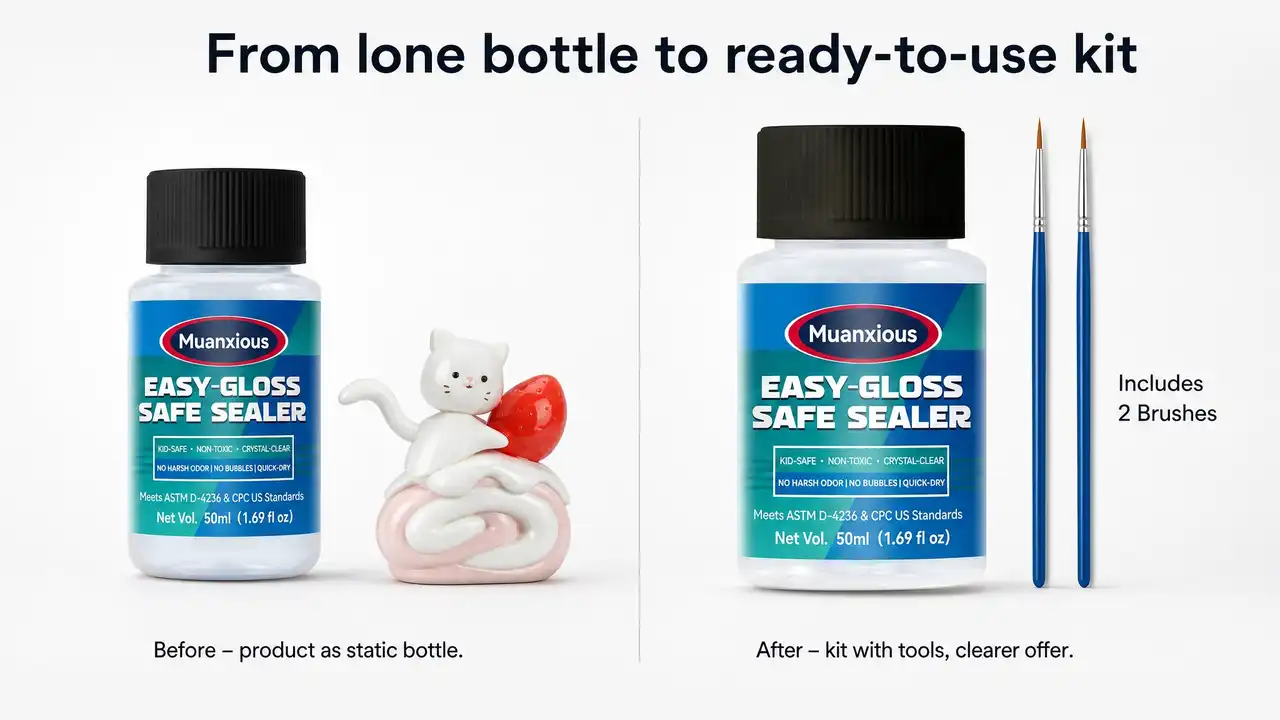
- Primary Image
- Centered product
- Visible brushes included (“Includes 2 Brushes”)
- Clean, professional, “studio-grade” composition
- → Move from “bottle alone” to “ready-to-use kit”.
- Gloss vs Matte Comparison
- Single clay vase with half gloss, half matte
- “Glossy vs Matte” label
- → Enable instant understanding of effect, even at thumbnail size.
- Step-by-Step Usage Image
- Three vertical panels: clean surface, apply evenly, let dry
- Numbered steps 1-2-3
- → Reduce perceived complexity and errors.
- Yellowing Resistance (Time Dimension)
- Side-by-side: protected bright piece vs yellowed unprotected piece
- “Yellowing Resistance” label
- → Visualize long-term value, rather than only immediate gloss.
- Multi-Material Application Grid
- Nine-grid layout: clay, stone painting, wood, canvas, etc.
- → Answer “Can I use it on my project?” visually, without reading.
The aim was not “prettier images,” but images that shoulder specific conversion tasks:
- Attract clicks
- Show effect
- Teach usage
- Reassure long-term protection
- Expand perceived versatility
Third: Rewire Bullets into a Decision Loop
DeepBI’s bullet-level guidance followed a clear structure:
- Name the finish and protection
- → “High-gloss & scratch-resistant finish”
- → Tie gloss + durability together.
- Name the breadth of use
- → “Widely used on multi-surfaces”
- → Clay, miniatures, pottery, ceramics, wood, acrylic-painted surfaces.
- Clarify tactile and practical outcome
- → “True no-tack & waterproof barrier”
- → Non-sticky finish, reduces dust, fingerprints.
- Lock in safety and compliance
- → “ASTM D-4236 compliant & safe”
- → Includes non-food-contact disclaimer to pre-empt concerns.
- Give clear curing and logistics guidance
- → “Freeze recovery & easy curing”
- → How to handle freeze-thaw and achieve best result (24h cure).
This way, each bullet becomes:
Pain point → Solution → Practical implication,
not just “feature → feature → feature.”
Fourth: Refocus the A+ Detail Page Around Buyer Psychology
DeepBI’s analysis saw the A+ page as modules, not just “more images”:
- Intro: Set professional, calm, art-studio tone
- Effect: Clear before/after gloss visualization
- Pain: Show unprotected vs protected piece over time
- Range: Multi-material application gallery
For each:
- Background clutter (like seasonal decor) was stripped away.
- Focus moved from brand decorative elements to art pieces and outcomes.
- Visual labels (“Before / After”, “Applications”) increased scanability.
Again, the objective wasn’t to add content, but to align each A+ segment with a specific trust or clarity gap.
8. How the Operating Risk Profile Changed
Even without publishing hard numbers, the business risk profile of this Listing clearly shifted.
Before
- Heavy reliance on buyer patience to decode technical language.
- Visuals that required “interpretation” rather than delivering a one-second message.
- Reviews carrying most of the trust-building weight.
- Any incremental ad spend risked becoming expensive traffic to a partially aligned message.
After
- The first line of the funnel (title + main image) now answers:
- What is it?
- For what?
- What result?
- Visuals now:
- Prove gloss vs matte instantly
- Demonstrate usage steps
- Visualize time-based protection
- Showcase cross-material compatibility
- Bullets and A+:
- Complete the decision loop instead of enumerating specs
- Reduce pre-purchase uncertainty about safety, usage, and longevity
In operating terms:
- The Listing is less dependent on “hero reviews” to close the sale.
- Each new visitor encounters less cognitive friction and more visual confirmation.
- Future ad tests now have a coherent, conversion-ready page to land on.
9. What Changed Most: The Seller’s Mental Model
The most important shift wasn’t in pixels or words;
it was in how the seller now thinks about problems.
Originally:
- “Our Listing is fine; we just need more exposure and more technical detail.”
- “If we mention every feature, we’re safer and more convincing.”
- “Visuals are there to decorate what we explain in text.”
After working through DeepBI’s diagnosis:
- They saw that reviews weren’t the weakness; the story architecture was.
- They experienced how a 6-point score gap, correctly interpreted, reveals a structural conversion issue instead of a marginal improvement task.
- They accepted that in craft/art categories:
- Effect visualization and usage guidance can outweigh technical detail in driving conversion.
- A Listing can be “complete” and still not easy to buy from.
The real pivot was realizing
“more information” is not the same as
“easier decision and higher conversion.”
In practice, this means:
- Future Listings won’t start from “list every feature we have,”
but from “design the decision path, then fit features into it.”
- Visual planning is now treated as a business decision, not just design.
- Ads and traffic decisions are now gated by a simple question:
“Is this Listing already telling a clear, conversion-ready story?”
10. Why This Case Matters Beyond One Clay Glaze Listing
This isn’t just about a 71 vs 77 score or a clay glaze SKU.
It’s about a pattern many sellers share:
- Healthy ratings
- Solid review volume
- “OK-ish” visuals
- And yet, sales that don’t match the product’s potential
Most teams respond with:
- More features
- More cert mentions
- More keywords
- More ads
This case shows a different path:
- Step back from incremental tweaks.
- Let data reveal where in the funnel the story breaks.
- Treat title, images, bullets, and A+ as coordinated stages in a decision narrative, not isolated assets.
- Only then, decide whether to amplify traffic.
DeepBI’s contribution here wasn’t a magic template;
it was a disciplined way to see the real problem:
This Listing didn’t fail because it lacked capabilities.
It struggled because it framed those capabilities
in a way that made sense to the brand,
but not to the buyer.
Once that was corrected,
every subsequent optimization—copy, visuals, even ads—
started from a far more accurate diagnosis.