
Clay glaze is a niche, high-intent category.
On paper, this US seller’s listing didn’t look bad at all:
- 4.5 stars, 34 reviews (more than 2x the benchmark)
- A reasonably structured title
- A complete set of images and A+ content
Yet in their words, “traffic comes in, but it doesn’t turn into enough orders”.
They were convinced the issue was keywords and title syntax.
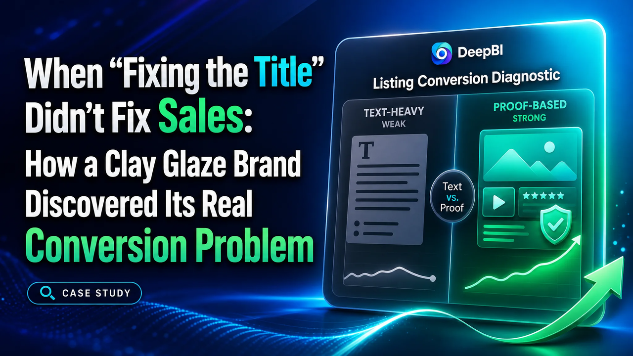
DeepBI’s analysis showed something very different:
The bottleneck wasn’t “being found”.
It was “being trusted enough to buy”—especially when placed next to a benchmark that visually proved protection, tools, and durability.
1. How the Problem Started to Slip Out of Control
This listing competes in a very specific segment:
Air-dry / polymer clay glaze with a “protection” promise.
On the surface, the basic indicators looked safe:
- Rating: 4.5 vs competitor’s 4.7
- Review count: 34 vs competitor’s 16(more social proof)
- Bullet points: more benefits, stronger emotional language
The team’s initial conclusion:
- “Reviews are fine.”
- “Bullets are stronger than competitors.”
- “We just need a better title and some keyword tweaks.”
So他们 focused on:
- Rewriting the title to front-load “Air Dry Clay Glaze”
- Packing more attributes: waterproof, non-yellowing, scratch resistant
- Highlighting bigger capacity (200ml/7oz vs 3.4FL OZ)
But weeks of iteration later, CTR and CVR uplifts remained marginal.
The listing was not collapsing—but it was stuck in a fragile, plateaued state:
- Traffic was costly to acquire
- Conversion was not catching up
- Any further ad push risked burning budget without structural improvement
At this point, intuition-based tweaks had hit their limit.
2. The Team’s Core Misjudgment: “Title-First, Everything Else Second”
Internally, the team framed the problem like this:
- “We’re not getting enough clicks; title and main image must be weak.”
- “If we match competitor keywords and polish our title, we’ll close the gap.”
- “Our bullets and reviews are already stronger; no big issue on the page.”
This led to a title-centric optimization loop:
- Continually polishing grammar and keyword order
- Highlighting capacity and “upgraded” wording
- Believing that once the search result snippet improved, clicks would follow
(and conversions would naturally improve after that)
But several facts were quietly contradicting this story:
- Listing score Title: 13 vs competitor’s 17
→ yes, there was room to improve
- Yet Detail: 17 vs competitor’s 23
→ a much bigger structural gap
- Main image: 24 vs 26
→ not a disaster, but lacking clarity and professional “kit” perception
Despite this, most of the team’s energy stayed on:
- Words, not structure
- Search coverage, not visual trust
- Capacity advantage, not value perception
They were, in effect, optimizing for visibility in a category where buyers were already arriving with strong intent—but still hesitating to convert.
3. Why Traditional “Micro-Optimizations” Failed
From DeepBI’s perspective, three characteristics made the existing approach fundamentally ineffective at this stage:
3.1 Optimizing the “Label”, Ignoring the “Proof”
The listing was saying all the right things:
- “Waterproof”
- “Non-yellowing”
- “Scratch resistant”
- “Anti-cracking”
- “Years of display”
- “Worry-free”
But the images and A+ told a different story:
- No strong Before/After visuals
- No clear crack vs non-crack comparison
- No long-term durability demonstration
- No visual tool ecosystem (just an occasional brush)
The competitor, meanwhile:
- Repeatedly used problem/solution split images
(uncoated vs coated, cracked vs intact)
- Showed freeze–thaw recoverability in real, process-like visuals
- Displayed full tool kits, laid out systematically
So:
The buyer saw “protection” in text on this listing,
but experienced “protection” visually on the competitor’s listing.
Micro-tweaking text in this context couldn’t offset the lack of proof.
3.2 Over-Relying on Review Volume as a Trust Anchor
The team leaned heavily on review volume:
- “We have more than double the reviews.”
- “Our first-page reviews are longer and more detailed.”
DeepBI’s diagnosis, however, flagged a critical nuance:
- In this category, buyers don’t browse reviews first
They first ask:
“Does this look like it truly protects my artwork?”
- Only after visual confirmation do reviews reinforce trust.
In other words:
Reviews here act as “reinforcement”, not “frontline trust”.
Without strong visual proof, more reviews don’t unlock more conversions.
3.3 Treating Images as “Decoration”, Not a Conversion Mechanism
Original images and A+ modules followed a familiar pattern:
- Product-only hero shots
- Static scene images
- Separate icons for features (“UV resistant”, “Waterproof” etc.)
- Generic lifestyle compositions
They looked decent, but they didn’t work like a funnel:
- No module explicitly owned “this is what your artwork looks like with vs without our glaze”
- No linear storytelling:
“Problem → Application → After 24 hours → 1 year later”
Thus, while the team believed:
- “We already show waterproofing and eco-friendliness”
- “We already mention multi-surface usage”
From a conversion mechanics standpoint, the listing had no spine.
4. What DeepBI’s Data Actually Flagged as the Real Risk
When DeepBI ran the listing through its benchmark comparison, the result wasn’t just a lower total score (72 vs 83).
The pattern of that score was more important:
- Title: -4
- Main Image: -2
- Bullet Points: +1 (stronger than competitor)
- Detail (A+): -6
- Reviews: 0
This pattern told a very specific story:
“Your problem is not ‘can people find you?’
It’s ‘once they find you, do they clearly see why your product is safer, more durable, and more complete than the competitor?’”
Three structural anomalies stood out:
4.1 Detail Page: Underpowered “Protection Proof”
DeepBI’s multi-modal agents flagged:
- Competitor uses multiple Before/After modules
(unprotected vs protected; cracked vs intact; yellowed vs vivid)
- Competitor shows water tests, usage demos, and tool set breakdown
- This listing mostly lists features without hard visual evidence
This is why the detail dimension saw a -6 gap:
- The page talks about protection
- The benchmark demonstrates protection
4.2 Main Image: Kit Perception and Information Hierarchy
On the search results page:
- Competitor’s main frame consistently reads as a “systematic clay protection + tool solution”
- This listing’s main frame reads more like a single bottle with loosely associated visuals
DeepBI’s agents observed:
- Tools appear only casually (e.g., a brush), not as intentional components
- The visual hierarchy doesn’t answer a key question fast enough:
“Am I buying just glaze, or a complete varnishing solution?”
In categories where:
- DIY users fear hidden extra purchases (extra tools, cups, etc.)
- Parents look for safe, complete kits
This ambiguity is costly.
4.3 Visual Storyline: Missing “Process and People”
DeepBI’s comparative analysis of the A+ sections showed:
- Competitor repeatedly uses human hands, children, and process shots
→ establishing ease, safety, and “family-friendly” use
- This listing mostly uses static, object-focused compositions
→ less warmth, less process, more “catalog” than “workshop”
For a product that promises:
- Delicate finishing
- Safe use around families
- Easy, non-intimidating application
The absence of process visuals is more than aesthetic—it’s a conversion risk.
5. Why DeepBI Didn’t Start by “Fixing Ads” or “Adding More Tools”
Faced with these gaps, there were several tempting moves:
- Increase ad budget to push more traffic
- Immediately add more physical tools to the bundle
- Aggressively emphasize capacity advantage (200ml vs 3.4FL OZ)
DeepBI’s decision logic, however, prioritized something else:
“Do not amplify an unproven message.
Fix the message and proof first, then decide what to amplify.”
5.1 Why Not Start with Ads?
- CTR issues here are intertwined with main image clarity
- Driving more traffic through ads would primarily:
- Increase ad spend
- Push more users into the same weakly convincing visual funnel
In other words:
Ads would become a multiplier of an unoptimized message.
Until the page could clearly:
- Show protection before/after
- Show multi-surface compatibility
- Show a clean, professional kit structure
…every marginal ad dollar carried elevated risk.
5.2 Why Not Immediately Add More Tools?
It’s true the competitor leveraged a 25-piece tool kit as a value anchor.
But DeepBI’s reading of the data was:
- The primary deficit was trust in protection outcomes, not tool count
- This listing already had a logical tool set (brushes, silicone cup); it was just under-communicated
So instead of pushing the client to:
- Change the product structure
- Add cost and operational complexity
DeepBI chose a different path:
“First, make the existing kit visible and *coherent*.
Only after that consider expanding the physical offer.”
6. The Decision Path: From Misplaced Text Efforts to a Visual Conversion Spine
DeepBI’s recommendations didn’t begin with “fight for more keywords”.
They began with an explicit re-prioritization of what needed to change first.
6.1 Step 1 – Reframe the Role of the Title: From “Savior” to “Support”
DeepBI did propose a refined title, but with a different philosophy:
- Keep core keywords: “Air Dry Clay Glaze”, “Varnish Sealant”, “Clay Varnish”
- Clean up logic and grammar (“Prevent Scratch Resistant” → “Scratch Resistant”)
- Borrow competitor’s “Prevent Cracking” language, but integrate it with:
- “Non-yellowing”
- “Waterproof”
- “Scratch resistant”
- Normalize capacity expression: “200ml/7oz” as an explicit bigger-volume anchor
The key shift:
The title is no longer expected to “carry” the conversion alone.
It’s treated as a precise front door, not the whole house.
6.2 Step 2 – Rebuild the Bullet Logic Around “Pain → Proof → Scope”
DeepBI didn’t just “add more claims” in bullets. It reordered what each bullet needed to accomplish:
- Bullet #1 – Protection Outcome, Not Just Shine
- Bullet #2 – Kit Completeness, Not Tool Count
- Bullet #3 – Simple 3-Step Application
- Bullet #4 – Multi-Surface Reality, Not Abstract Versatility
- Bullet #5 – Cold Chain Reality
- Bullet #6 – Safety Boundaries
The underlying change:
Bullets stop being “feature inventory”.
They become a structured conversation:
- Will it protect?
- Is it complete?
- Is it easy?
- Will it work on my materials?
- Will it survive shipping?
- Is it safe for my context?
6.3 Step 3 – Turn Images from “Decoration” into a Conversion Engine
Here, DeepBI’s decision logic was most visible.
Instead of vague “make image nicer” directives, the plan treated each slot as a business role:
Main Image #1 – Establish “Professional DIY Kit” Identity
Main Image #2 – Make Claims Scannable in 1 Second
Main Image #3 – Show “Protected Artwork in Its Natural Habitat”
Main Image #4 – Direct Crack / Fade vs Protected Comparison
Main Image #5 – Process: Hand, Brush, Surface
6.4 Step 4 – A+ Detail: Build a Coherent Story, Not a Collage
DeepBI restructured the A+ logic into four core modules:
- Core Benefit Module
- Usage Scene Module
- Pain Resolution Module
- Multi-Material Module
7. What Actually Changed: Structure Before Metrics
This case did not end with a list of dramatic percentage jumps—because the key transformation came before the data curves.
Three layers of change matter here:
7.1 Structural Change
- The listing went from:
- Text-heavy, proof-light
- Decoration-oriented images
- Unstructured A+ storytelling
- to:
- Clear protection narrative across bullets and visuals
- Role-based image system (each slot has a defined job)
- Scenario-driven A+ with problem/solution modules
Listing score-wise:
- The most critical movement was on the Detail and Main Image axes, not just Title.
7.2 Risk Profile Change
Before DeepBI’s intervention:
- The biggest risk was scaling ad spend on a structurally under-convincing listing
- Every incremental dollar exposed:
- The lack of visual proof
- The ambiguity around kit completeness
After restructuring:
- The listing is better positioned to:
- Convert intent-driven traffic, not just attract it
- Absorb ad traffic with lower wastage
- Compete on protection credibility, not just capacity or keyword density
In other words:
The business moved from “every extra click is a gamble”
to “each extra click meets a clearer, stronger conversion funnel”.
7.3 Cognitive Change on the Client Side
Perhaps the most important shift wasn’t in pixels or words, but in how the team now thinks about problems:
- From
“Our title isn’t strong enough”
to
“Our page doesn’t yet prove protection and ease strongly enough.”
- From
“We have more reviews, we should be fine”
to
“Reviews are not a substitute for visual evidence in this category.”
- From
“Images make the page look nice”
to
“Each image must take responsibility for a specific conversion task.”
And critically:
They saw, first-hand, that copywriting and keyword work cannot compensate for a missing visual conversion spine.
8. What This Case Really Shows About DeepBI
This case is not about DeepBI “writing a better title” or “generating prettier images”.
It’s about something more fundamental:
- Recognizing when a team is optimizing the wrong lever
- Resisting the urge to “just do more of the same, but better”
- Using data and competitive structure to say:
- “The problem isn’t your claim; it’s your proof.”
- “The risk isn’t in traffic volume; it’s in how your listing handles it.”
In this clay glaze case, DeepBI’s key contribution was:
Not telling the client how to decorate the listing,
but helping them see where their judgment about the real problem had been off.
Once that changed,
every subsequent title tweak, bullet rewrite, and visual iteration
finally started to sit on the right foundation.