
Fine-hair care is one of the most crowded micro-categories on Amazon UK. Our customer – a well‑known salon brand – launched a 75ml volumising shampoo, positioned as a premium, science‑backed treatment.
After several weeks, their team saw a familiar pattern in the dashboard:
- Impressions were acceptable.
- Click‑through rate (CTR) and conversion were underwhelming.
- A dominant competitor’s OGX Biotin & Collagen shampoo clearly owned the category.
The internal narrative took shape fast:
“We have a brand problem. Our A+ is too ‘editorial’. Let’s make it more like a conversion‑driven sales page.”
DeepBI’s diagnosis showed they were wrong about where the problem actually was.
The Original Misdiagnosis: Blaming the A+ and “Premium” Positioning
From the brand’s point of view, the story was simple:
- They had invested heavily in high‑end photography and lifestyle‑driven A+ content.
- OGX’s page looked more “Amazon‑native”: more technical, more data, more promise‑driven.
- Their listing underperformed against a product with 23,000+ reviews and strong visual proof.
The conclusion:
“Our A+ is too emotional; we need more technical proof and harder selling down the page.”
This diagnosis had two implicit assumptions:
- The main bottleneck sits low in the funnel, in the A+ area (detail page), not at the top (title, main image, bullets).
- Buying trust is primarily a story problem, solvable by making the content feel more ‘scientific’.
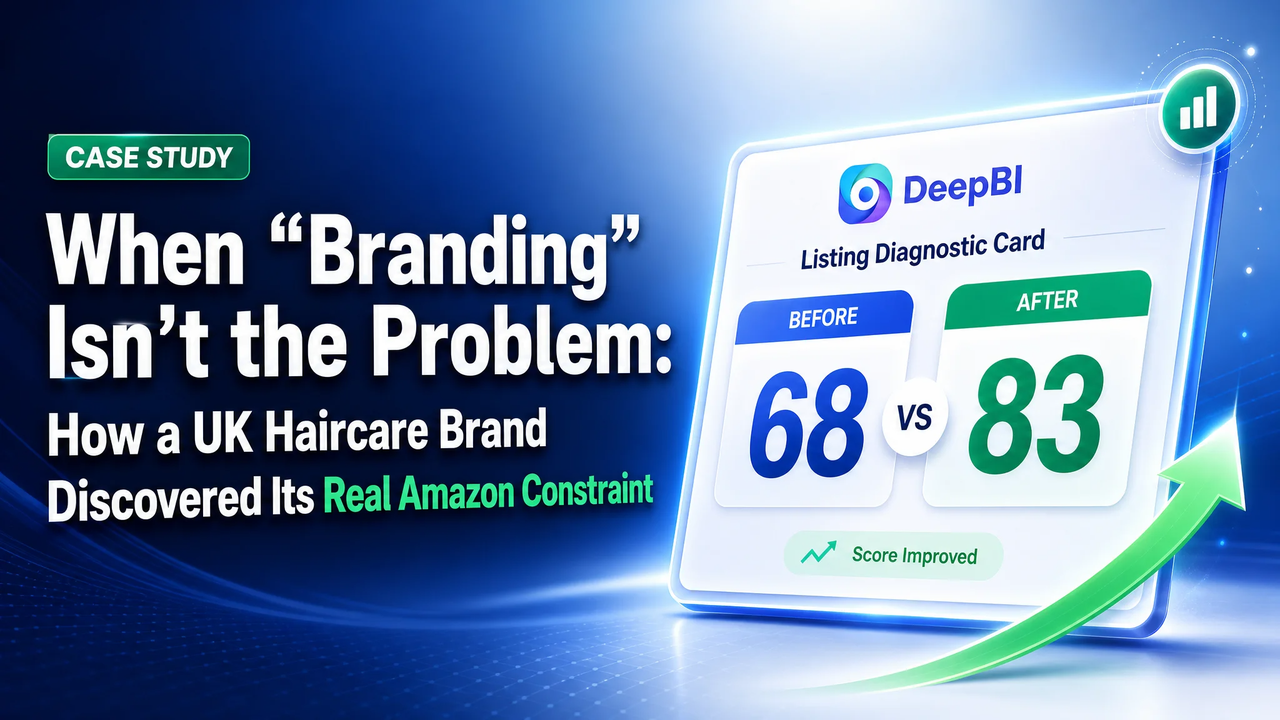
DeepBI’s listing score showed a different pattern.
What the Scores Actually Said
DeepBI benchmarked the listing against OGX on five dimensions, all on a 100‑point scale:
- Our listing total: 68/100
- Competitor total: 83/100
- Gap: −15 points
The critical part wasn’t the total, but where the shortfall sat:
| Dimension | Our Score | Competitor | Max | Gap vs Competitor |
| Title | 8 | 16 | 20 | −8 |
| Main image | 24 | 26 | 30 | −2 |
| Bullet points | 6 | 8 | 10 | −2 |
| Detail page (A+) | 22 | 19 | 25 | +3 |
| Reviews | 8 | 14 | 15 | −6 |
Two things stand out:
- Detail page is not the weakness. It actually outperforms the benchmark (+3).
- The A+ is already strong: multiple real before/after shots, multi‑model diversity, fragrance storytelling, high‑end lifestyle imagery.
- The real deficits sit above and around it:
- Title: −8 points
- Reviews: −6 points
- Main image and bullets: slightly behind, but not catastrophic
In other words: the lower funnel wasn’t the choke point. The listing wasn’t getting enough qualified clicks or enough social proof to leverage its strong A+.
If the team had followed their initial instinct – “fix the A+” – they would have spent budget optimising the *one area that wasn’t broken*.
DeepBI’s Diagnostic Finding: A Funnel That Starts with the Wrong Story
Looking at the scores, DeepBI treated the listing as a funnel, not a page:
- Title + main image: win or lose the click.
- Bullets + A+: convert the click into confidence.
- Reviews: provide external proof and risk insurance.
Plotted this way, the problem wasn’t “the A+ is too brand‑led.” It was:
- Search entry is weakly signalled (title).
- The promise is framed around the brand, not the buyer.
- Review volume is far from competitive, even with equal star ratings.
Let’s unpack that.
1. Title: Talking Like a Brand, Not Like Amazon Search
Original title pattern:
“Brand + Product Name + Capacity”
This is legible for shelf packaging. It’s weak for Amazon:
- Core benefit (“volumising”, “thick and full”) is not front‑loaded.
- Target user (“for fine hair”) is absent.
- Functional keywords (“volumising hair shampoo”, “thickening shampoo”) are not fully leveraged.
- Capacity appears, but doesn’t offset the price/value perception in a crowded category where a 385ml bottle sets the anchor.
Competitor’s title, by contrast, follows a fully loaded Amazon structure:
Core ingredients + benefit + target hair type + key features + capacity
DeepBI’s recommended reframe:
“John Frieda PROfiller+ Thickening Shampoo for Fine Hair, Volumising Hair Treatment for Thick and Full Results, 75ml”
This isn’t a cosmetic tweak. It changes the *entry logic*:
- The product no longer appears as “a branded SKU”.
- It shows up as “a solution for fine hair that delivers thick and full results”, which happens to be a John Frieda product.
That shift matters because Amazon’s search and buyers both respond to:
- Who it’s for (“for fine hair”).
- What it does (“thickening”, “volumising”, “thick and full”).
- What form it takes (shampoo, treatment).
The brand had been assuming its equity would pull the click. DeepBI’s scoring made clear: in this category, function and fit drive discovery more than brand name.
2. Reviews: A Trust Gap, Not a Star Gap
The review dimension revealed another misread:
- Both products sit at 4.4 stars.
- Competitor: 23,883 reviews with mixed but mature feedback.
- Our product: 10 reviews, all 5‑star.
Internally, the team used the clean 5‑star page as proof of product strength. DeepBI treated it differently:
- Star rating parity means the issue is not quality perception per buyer.
- Scale is the problem: 10 reviews against ~24,000 is a visibility and confidence imbalance.
- A few early reviews are not enough to counter the sheer social proof of a long‑established competitor.
So while the team wanted to “talk more scientifically” on the A+ page, DeepBI’s analysis implied a different priority:
- Increase review volume and diversity so that the strong A+ content has a credible backdrop.
- Use the listing to set expectations clearly (who it’s for, what it does), to avoid misaligned buyers and early negative feedback.
Again, this shifted the conversation from “rewrite our story” to “restructure our funnel and proof strategy.”
Why the Obvious Fix Was the Wrong Priority
Given the scores, DeepBI’s recommendation was counterintuitive from a branding lens:
- Do not start with the detail page.
- Do not dilute the emotional, lifestyle‑driven A+ that’s already outperforming the benchmark.
Instead, the rational order of operations was:
- Fix how the promise is framed at the top of the page (title, bullets, main visual logic).
- Align visual evidence around micro‑proof, not macro‑mood (microstructure of hair, tech explanation).
- Address the review imbalance through volume and clarity of targeting, not just copy polish.
This order comes directly from the scoring pattern:
- You cannot fully monetise a strong A+ if the listing under‑qualifies visitors at the title and main image level.
- You cannot expect a premium price/size ratio to carry without a hard, explicit promise (volume, thickness, fine hair) aligned with the category’s top‑performing language.
- You cannot “out‑science” a competitor with 23,000 reviews purely by adding more technical copy. You need specific visual and textual proof that maps to buyer anxieties.
What Changed in the Listing Logic
DeepBI’s recommendations did not ask the brand to abandon its aesthetic. They re‑sequenced and re‑coded how that aesthetic is deployed along the buyer journey.
1. Title: From Brand Label to Search‑Friendly Promise
The suggested title structure made three concrete changes:
- Audience tagging: Explicitly adding “for Fine Hair” turns the title into a filter, not just a label.
- Benefit stacking: Combining “Thickening” and “Volumising” captures the two main search intents in this niche.
- Effect language: Including “Thick and Full Results” translates the technical claim (“200% thicker”) into a visual outcome.
This is not about chasing keywords mechanically. It is about aligning the page’s first line with how buyers describe their problem.
2. Bullet Points: Closing the “Data Without Story” Gap
Initially, the bullets leaned on abstract data and isolated ingredient claims. DeepBI’s competitor comparison highlighted:
- OGX leads with scene‑based, time‑bound promises (“72 hours” volume, “healthier hair in just 1 wash”).
- OGX wraps ingredients inside specific outcomes and technologies (“LipiPro Shield Technology”, “2x more protection”).
DeepBI recommended a reordering and reframing of bullets into a consistent “pain → promise → proof” pattern:
- MAXIMUM VOLUME & THICKNESS
- Tie the “200% thicker” claim to an immediate, visible change “in just one wash”.
- Anchor it specifically in the context of fine hair that needs bounce and body.
- POWERED BY PROFILLER+ TECHNOLOGY
- Position the brand’s own technology as the conceptual equivalent to OGX’s “LipiPro Shield”.
- Emphasise structural strengthening and breakage prevention, creating a protective narrative rather than vague care.
- BIOTIN & HYALURONIC ACID INFUSION
- Assign each ingredient a job: Biotin = strength, Hyaluronic Acid = hydration.
- Map them explicitly to fine‑hair pain points: breakage and dryness.
- COLOR‑SAFE & GENTLE CLEANSING
- Integrate safety (for colour‑treated hair) with gentleness, echoing competitors’ “sulfate free” reassurance in the brand’s own language.
- COMPLETE VOLUMIZING SYSTEM
- Use the fifth bullet to guide system usage (shampoo, conditioner, spray) and absorb disclaimers into a “best results” message.
The key shift: bullets stop being a disconnected checklist of attributes and become a linked argument that mirrors how successful competitors build trust.
3. Main Image Set: From Mood‑Only to “Laboratory Premium”
The primary image set originally leaned heavily on lifestyle cues and brand feel. DeepBI’s analysis acknowledged that this worked well in A+, but underperformed in one area: clear, high‑information visuals early in the gallery.
The recommendation was to keep the premium tone but move towards an “extremely minimal, professional lab” aesthetic in the main image sequence:
- Hero image:
Product centred, ~80% of the frame, high‑contrast lighting, cold‑toned background, subtle halo. This increases perceived physical presence and draws the eye in search results.
- Packaging evolution:
Side‑by‑side old vs new packaging with a clear “NEW LOOK. SAME RESULTS.” label. This isn’t about vanity; it reduces confusion among repeat buyers and stabilises review behaviour when packaging changes.
- Benefit call‑out image:
Bottle placed to the right, with vertically stacked, large, simple benefit text on the left. This replicates the competitor’s effective “visually listed benefits” without copying.
- Before/after visual proof:
A clean, controlled side profile headshot: left “BEFORE” (flat roots), right “AFTER” (visible root lift), identical lighting and framing. This directly tackles the question: “Will my fine hair actually look thicker?”
- Authority slide:
A minimal typographic slide (“No.1 VOLUME brand” where it is truthful and substantiated), in stark black‑and‑white. This provides a simple trust anchor without cluttering every image with badges.
The deeper logic: each image gets a deliberate job:
- First image: win the scroll and click.
- Second–third images: clarify product identity and core benefits.
- Fourth image: show outcome, not just claim it.
- Fifth image: situate the brand’s authority in the category.
4. A+ Detail Page: From Mood‑First to Mood + Mechanism
DeepBI confirmed that the brand’s A+ module already had stronger emotional and visual storytelling than OGX:
- Multiple multi‑angle real before/after shots.
- Diverse models and age groups.
- A fragrance narrative (pear, wood, amber) that supports premium positioning.
What was missing was mechanism‑level clarity – the microscopic, “how it works” view that OGX uses to justify its technical language.
Rather than replacing the lifestyle content, DeepBI advised layering in four new modules:
- Microscopic hair cuticle comparison
- Left: lifted, damaged cuticles.
- Right: smoothed, sealed cuticles with a visible protective layer.
- This makes the “200% thicker” claim feel physical, not just numeric.
- Ingredient visualisation
- The bottle centred, surrounded by translucent droplets (for Hyaluronic Acid) and soft yellow particles (for Biotin).
- A neutral, scientific background reinforces the “lab‑grade hydration and strengthening” message.
- Close‑up before/after of the roots
- A head‑and‑shoulders close‑crop focused tightly on root lift.
- This solves the previous problem: existing before/after shots were real but too wide to highlight the critical area (the root).
- Three‑step usage map
- Shampoo, conditioner, spray arranged left to right, each with a simple step and benefit.
- This is both a usage guide and a subtle upsell path, clarifying that the headline claims are system‑level outcomes.
Crucially, these additions don’t contradict the premium, lifestyle‑driven tone. They translate brand mood into technical trust, instead of replacing it.
What Changed in the Team’s Operating Understanding
The most important outcome wasn’t a new set of images or bullets. It was a shift in how the brand’s team interpreted their own listing performance.
1. From “Our A+ Isn’t Salesy Enough” to “Our Funnel Is Misaligned”
Before DeepBI:
- The team framed underperformance as a “creative problem”: content too emotional, not technical enough.
- Their instinct was to rework the A+ to look more like their competitor’s technical narrative.
After DeepBI’s scoring and comparison:
- They saw that their A+ already outperformed the benchmark.
- They recognised that title and review volume were the primary constraints.
- They realised that brand mood was not the enemy; mis‑positioned entry messaging was.
This changed the ordering of work:
- First: reframe the listing for fine‑hair shoppers and volumising intent at title/bullets level.
- Then: refine imagery to visualise benefits and mechanisms.
- Only after: consider incremental adjustments to the A+.
2. From “More Content” to “Right Content in the Right Place”
DeepBI’s dimension scores and image‑by‑image analysis pushed the team to stop thinking in terms of “adding more”:
- Not more copy, but specific bullets linked to specific buyer pains.
- Not more images, but distinct roles for each image along the decision journey.
- Not more lab language, but visible mechanisms tied to existing claims.
In practical terms, this meant:
- The fragrance story stays – but becomes a supporting layer, not the lead argument for click or conversion.
- The brand’s multi‑model lifestyle photography is retained – but is coupled with close‑up, high‑evidence visuals that anchor the scientific claims.
3. From “Our Brand Should Carry Us” to “We Must Compete on Clarity First”
The review comparison was particularly sobering:
- Matching 4.4‑star ratings did not compensate for a review volume gap of almost 23,000 vs 10.
- The brand could no longer assume that its offline equity would offset the online proof imbalance.
DeepBI didn’t fabricate a growth story; there is no post‑optimisation performance data yet. Instead, it changed the risk structure the team was running:
- They now see that a low‑volume, 100% 5‑star review profile is fragile, not strong.
- They understand that misaligned expectations (caused by vague top‑of‑page messaging) could quickly introduce negative feedback.
- They recognise that clarity of audience and outcome is as much risk management as it is marketing.
DeepBI’s Value Here: Better Diagnosis, Not More Features
This case is not about DeepBI “enhancing images” or “auto‑generating copy”. The brand already had strong creative resources and a premium aesthetic.
The value came from three things:
- Quantified, dimension‑by‑dimension comparison
- DeepBI’s scores showed precisely where the listing lagged (title, reviews) and where it already led (A+). This prevented the team from “fixing” the strongest part of their funnel.
- Competitor‑anchored, but product‑truth‑constrained guidance
- By dissecting OGX’s title structure, bullet logic, visual hooks, and micro‑mechanism imagery, DeepBI could suggest comparable strategies without inventing new claims or altering the product’s physical truth.
- A rational order of actions
- Instead of a generic “optimise everything”, DeepBI laid out a sequence:
- Reframe the title and bullets around fine‑hair, volumising, and visible thickness.
- Introduce specific, high‑clarity visual proof in the main image set.
- Layer microscopic and system‑usage visuals into an already strong A+.
- Build review volume and diversity to close the trust gap.
For other brands reading this, the takeaway is not “copy this shampoo listing template.” It is:
- You may already be strong where you think you are weak.
- Your most visible problem (e.g., “our A+ doesn’t look technical”) may not be the actual constraint.
- Without a structured, dimensioned comparison, it is easy to invest heavily in the wrong layer of the funnel.
DeepBI did not solve this case by adding features. It changed the team’s judgment about where the real problem was – and in Amazon’s current environment, that shift in judgment is often the most valuable optimisation of all.