
The Business Pressure: “Our Reviews Are Great, So Why Are We Losing?”
A UK seller in the teenage skincare category came to DeepBI with a familiar contradiction:
- Their Amazon listing had:
- A high rating (4.7 stars)
- No visible negative reviews on the first page
- Solid packaging and a clear product concept (milk-based teenage skincare set)
- Yet in the same category, a direct competitor:
- Was outselling them
- Held more visible shelf space in search results
- And, on inspection, actually had a lower rating (4.2 stars with visible bad reviews)
Internally, the working assumption was simple and intuitive:
“We probably just need a slightly better title and a more eye-catching main image. Our product is stronger and our reviews are cleaner; once we polish the front, performance should follow.”
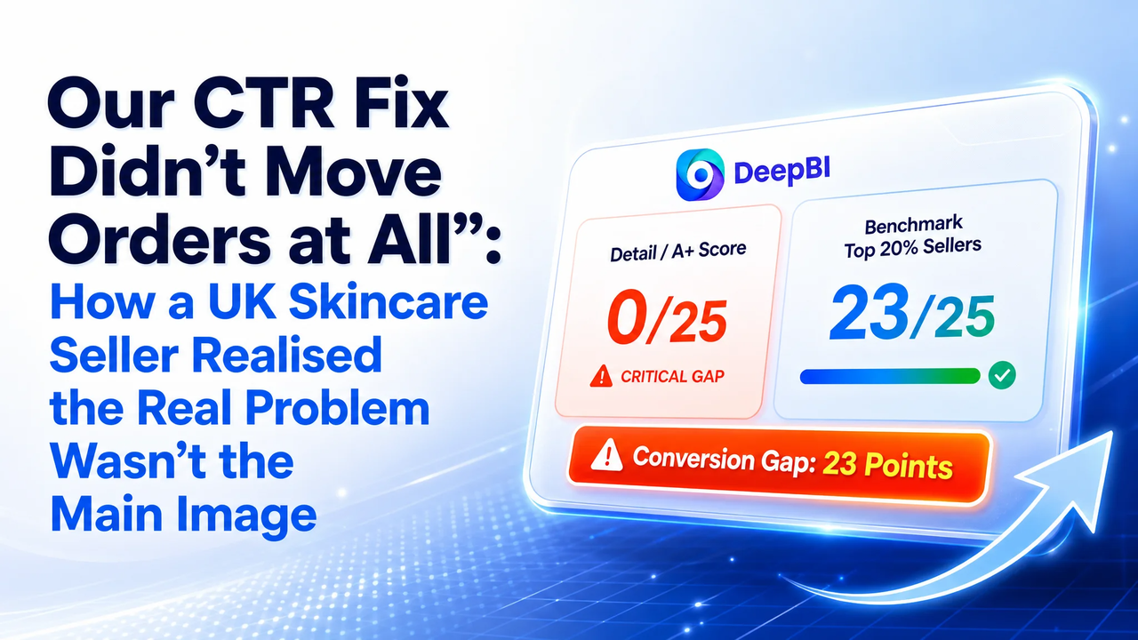
What the team did not expect was that DeepBI’s scoring would show a 29‑point competitive gap (51 vs. 80 out of 100) — and that almost all of that gap was concentrated in a place they had essentially ignored: the detail page.
The Original Misdiagnosis: Fixing the “Front” of a Hollow Listing
Before DeepBI, the team’s diagnostic logic was typical of many Amazon brands:
- Anchor on visible praise
- “We’re at 4.7 stars, they’re at 4.2. Customers clearly like us more. So the issue can’t be the product or trust.”
- Assume “top-of-page” issues
- Because CTR and CVR were under pressure, the intuitive conclusion was:
- Title needs more keywords
- Main image needs to “pop” more
- Bullet points could be polished
- Downplay the absence of A+ content
- The team knew they had no A+ (detail page) content, but treated that as “nice to have” rather than a core constraint:
- “We’re in a low-ticket gift set category.”
- “Customers don’t read that far down.”
- “Our reviews will do the trust-building.”
In other words, they saw the listing as under-optimized but fundamentally healthy — a solid product needing cosmetic adjustment.
DeepBI’s job was not to beautify this assumption, but to test whether it was even the right problem.
What DeepBI’s Scoring Showed: The Gap Wasn’t Where They Thought
When DeepBI ran its competitive scoring against the primary UK benchmark listing in the same niche, the result was structurally revealing:
Total Score
- Customer’s listing: 51 / 100
- Competitor’s listing: 80 / 100
- Gap: ‑29 points
That 29-point gap wasn’t distributed evenly. It was heavily concentrated in a single dimension.
Dimension Breakdown
| Dimension | Customer | Competitor | Max | Gap vs Competitor |
| Title | 9 | 14 | 20 | -5 |
| Main Image | 25 | 26 | 30 | -1 |
| Bullet Points | 7 | 8 | 10 | -1 |
| Detail Page (A+) | 0 | 23 | 25 | -23 |
| Reviews | 10 | 9 | 15 | +1 |
The implication was blunt:
- The front-of-page assets (title, main image, bullets) were not wildly deficient. They were behind, but not catastrophically.
- The detail page was not “a bit weak” — it was absent.
- The only dimension where the customer led was reviews.
What DeepBI’s scoring surfaced is not just that there was a problem, but that the team’s mental model of the funnel was inverted:
- They believed:
“Front-of-page visuals are the core lever; detail content is optional support.”
- The actual competitive structure was:
“Detail content is the primary trust engine; front-of-page is the hook.”
Any attempt to “fix CTR” by working only on titles and main images would therefore — in DeepBI’s framing — be treating symptoms while leaving the core constraint untouched.
How the Competitor Was Winning with Worse Reviews
To change the team’s judgment, DeepBI didn’t argue aesthetics. It reconstructed the entire decision path of a teenage skincare buyer and mapped each phase against what the competitor versus the customer provided.
1. Emotional Entry: Gift Identity and Target User
The competitor anchored their listing with:
- Title front-loaded with “Milk Beauty Gift Sets for Teenage Girls”
- Clear mention of:
- 15pcs total
- 4pcs hair accessories as extras
- Visual and textual emphasis on:
- Teenage girls
- Women
- Gift scenarios
The customer’s title, by contrast:
- Led with “Milk Teenage Skincare Set, 5PCS Skin Care Sets & Kits for Girls and Women”
- Focused on:
- “5PCS”
- Functional components (cleanser, hydrating toner, serum, etc.)
DeepBI highlighted a subtle, but commercially critical distinction:
- Competitor: leads with identity and value density (“gift set”, “teenage girls”, “15pcs”, extra accessories)
- Customer: leads with function listing and a smaller piece count
This is not just copywriting nuance; it frames the offer differently on the search results page:
- Competitor registers first as “a big, generous gift set specifically for teenage girls”.
- Customer registers first as “a 5-piece skincare set that teenagers can also use”.
When DeepBI scored the title dimension (-5 gap), it wasn’t simply about keyword inclusion. It was quantifying how much of the title real estate was used to:
- Define the who (teenage girls)
- Signal value (piece count + accessories)
- Suggest use case (gift, facial kits)
The customer’s title did some of this, but not as sharply or as early.
2. Visual Hook: Main Image and Supporting Images
Main image scores were close (‑1 gap), which reinforced a counterintuitive point:
- The customer’s main image wasn’t the obvious disaster.
- The deeper image stack was where the competitor built their advantage.
DeepBI’s visual agents broke down how:
- The competitor used:
- Emotional scenes (mother-daughter gifting with gift box)
- → Driving both “gift” and “self-care” motives.
- Before/After visuals + quantified metrics
- → Not just “better skin”, but evidence plus numbers.
- Concrete iconography (“Triple Roll & Glow massage head”)
- → Turning abstract benefits into recognizable visual hooks.
- The customer’s images, by comparison:
- Lacked human scenes; there was no visual story of gifting or usage.
- Showed results, but without process or explicit comparison — weakening credibility.
- Used abstract icons that lost clarity on mobile thumbnails.
DeepBI’s scoring treated this not as a design taste issue, but as an information density and trust gap:
- The competitor was using each image slot as a specific step in a persuasion sequence.
- The customer’s images were more like decor: pleasant, but not carrying structured arguments.
Why the “Obvious Fix” Was Rejected as Priority
The operating instinct inside the brand was:
“Let’s first refine our title, tweak main visuals, and maybe adjust bullets. A+ can be added later when we have time.”
DeepBI’s scoring forced a different order of operations.
Evidence from Scores
- Title gap: -5 (out of 20)
- Main image gap: -1 (out of 30)
- Bullet gap: -1 (out of 10)
- Detail page gap: -23 (out of 25)
If you treat each dimension as a constraint on the funnel:
- Title and main image largely constrain clicks.
- Bullet points and A+ content largely constrain conversion and average order value perception.
- Reviews help stabilize post-purchase trust.
In this case:
- Click-driving assets were slightly behind, but serviceable.
- Conversion-driving assets (A+) were nonexistent.
- Reviews were stronger than the competitor’s.
DeepBI’s commercial logic to the team was:
- You are already outperforming the competitor on reviews, and not catastrophically behind on the top-of-page.
- You are completely absent in the single area where the competitor is investing heavily and where 23/25 points are being left on the table.
- Therefore:
- Fixing title and main image first yields marginal and uncertain gains.
- Building a functional A+ and re-architecting the image sequence addresses the structural bottleneck in your funnel.
In other words, DeepBI re-ranked the roadmap:
- Build a coherent, high-density A+ detail page (to stop losing warmed-up buyers).
- Restructure the image stack to tell a progressive story (not just show assets).
- Then refine title and bullets as a second-stage optimization.
This reordering is exactly what the team had struggled to see: they were trying to pull harder on a lever (top-of-page tweaks) that was not actually the biggest constraint.
What Changed in Listing Logic: From Product Listing to Decision Architecture
Instead of treating DeepBI’s suggestions as “better copy” and “better pictures”, the team learned to rebuild their listing as a sequence of decisions.
1. Title: From Ingredient Listing to Identity Signal
The proposed title structure was:
“Milk Teenage Skincare Set, 5PCS Skin Care Sets & Kits for Girls and Women - Facial Kit with Cleanser, Hydrating Toner, Serum, Eye Cream, Moisturizing Cream - Travel Sized Beauty Gift Set”
DeepBI’s reasoning re-framed how the team thought about title:
- Keyword front-loading
Move “teenage skincare set” forward to align with the actual search terms they want to win, rather than burying it.
- Remove redundancy
Avoid repeating “skin care sets” and “skincare set” multiple times; free characters for meaningful distinction.
- Clarify structure
Use separators to define:
- Core audience and category
- Concrete contents
- Specific context (“Travel Sized”, “Beauty Gift Set”)
The mental shift:
The title was no longer a place to cram all words; it became the first filter for the right buyer and the first expression of value density.
2. Bullets: From Parallel Feature Listing to Logical Progression
Originally, the customer’s bullets were essentially parallel product claims: combinations of:
- Product combinations
- Suitable users
- Core ingredients
- General benefits
- Gift positioning
The competitor’s bullets, by contrast, followed a skincare journey:
- Cleanse
- Nourish
- Anti-age / cell renewal
- Soothe and repair
- Gift framing
DeepBI proposed a structural shift:
- Bullet 1: Complete Routine
Emphasize the set as a 5-in-1 daily skincare solution, not just five isolated products.
- Bullet 2: Teen-specific formula and gifting
Tie ingredients (milk proteins) to the “teen-friendly” and “gift from mom/grandma” narrative.
- Bullet 3: Deeper effect (cell renewal, firmness)
Introduce Korean skincare positioning to raise perceived sophistication.
- Bullet 4: Barrier protection & all-skin suitability
Move from surface-level moisture to long-term protection.
- Bullet 5: Occasion-led gifting
Anchor occasions (birthdays, Christmas, Valentine’s) and tie to confidence-building.
This reordering did more than improve language. It forced the team to:
- Think in terms of user journey rather than product checklist.
- Connect each bullet to a specific buyer anxiety:
- “Is it complete?”
- “Is it safe for my child?”
- “Does it actually do more than basic moisturization?”
- “Will it irritate sensitive skin?”
- “Is it a gift that feels thoughtful and substantial?”
DeepBI’s bullet optimization was effectively a crash course in structured persuasion.
3. Images: Turning Every Slot into a Persuasion Step
Previously, image decisions were driven by:
- Internal debates about “what looks nicer”
- Ad hoc additions as assets became available
- No explicit mapping between images and decision stages
DeepBI’s analysis, grounded in competitor contrast, reshaped the use of each image position:
- Primary “Family Portrait”
- 5-piece set centered, roughly 80% of the frame
- Soft blue-to-white gradient, “5-Piece Value Set” highlighted
- Purpose: Immediate value perception and “gift-worthy” impression
- Routine Flow Image
- Products arranged in usage order with numbered steps
- Milk-themed background cues to reinforce ingredient story
- Purpose: Lower cognitive load (“I know how to use this”) and support the “complete routine” bullet
- Before/After with Quantified Gains
- Three vertical comparisons with large percentage improvements
- Purpose: Turn vague promise (“more hydrated skin”) into visually quantified outcomes
- Ingredient and Science Visuals
- Single product over realistic milk surface
- Floating spheres labeled “Vitamin A”, “Vitamin B”, “Proteins”
- Purpose: Translate “milk essence” from a marketing buzzword into visualized nutrition and safety
- Scene-Based Gifting Image
- Mother gifting the set to a girl in a warm, festive interior
- Purpose: Bind the product to specific gifting situations, letting parents imagine their own child in that scene
In the past, the team chose images because they were available and looked acceptable.
After DeepBI, they were choosing images because each one advanced a specific part of the buying decision.
4. Detail Page (A+): Filling a 23-Point Trust Void
The most radical shift happened around the detail page.
Previously:
- There was no A+ content.
- The product relied on base description and reviews.
- The team did not consider this critical because:
- Price point was modest.
- They assumed teens and gift buyers wouldn’t scroll.
DeepBI’s diagnosis reframed this as:
“You are entering the most sensitive segment possible: skincare for children/teens. Safety, ingredients, and results cannot be outsourced to reviews. Without A+, you have a 23/25 point trust gap versus your competitor.”
The recommended A+ structure:
- Hero Family Visual Module
- Full set with an emphasis on visual richness and “15pcs” style completeness (even if the customer’s set is 5 pieces, the layout must evoke fullness).
- Purpose: Make the set look substantial and premium on first scroll.
- Gifting Scene Module
- Mother–daughter or friends gifting scene with holiday cues.
- Purpose: Anchor gifting as a primary use case, not a side benefit.
- Ingredient Education Module
- Milk splash visuals with labeled proteins and vitamins.
- Purpose: Show why milk-based skincare is gentle and suitable for young skin.
- Quantified Effect Module
- Before/after hydration metrics (e.g., 26.3% to 50.9% moisture).
- Purpose: Bridge the gap between “it feels hydrating” and “this product measurably improves hydration”.
This is not just design advice; it’s a reconfiguration of how the listing carries risk:
- Before A+:
- Parents had to trust without structured information.
- The listing leaned heavily on anecdotal reviews and generic claims.
- After A+:
- Risk is explicitly handled via:
- Visible ingredients
- Visual safety cues (milk, blue-white palette, “clean” aesthetic)
- Quantified results
- Gift scenes that reassure about appropriateness
- Risk is explicitly handled via:
What Really Changed: From “We Need Better Assets” to “We Misunderstood Our Constraint”
DeepBI did not deliver a magic number or claim that conversion instantly doubled; no post-optimization performance data was yet available at the time of this case.
What did change — and what mattered commercially — was the team’s operating logic.
1. From Asset-Centric to Constraint-Centric Thinking
Previously, the internal conversation was:
- “We need better photos.”
- “We should rewrite these bullets.”
- “Let’s A/B test a different title.”
After the DeepBI diagnosis, the conversation shifted to:
- “Our single biggest numerical gap is A+ content; that’s our first constraint.”
- “Main image and title refinements are second-order optimizations, not core fixes.”
- “Our reviews are not the problem; we should leverage them, not hide behind them.”
This shift stopped them from spreading effort thinly across everything and instead sequenced work based on measured constraint size.
2. From Aesthetic Debates to Structured Page Architecture
Instead of debating “Which image looks better?”, the team began asking:
- “Which decision stage does this image support?”
- “Do we have a clear emotional hook at the top?”
- “Where are we quantifying benefits, not just describing them?”
- “Are we making the teen-specific and gift-specific angles explicit enough?”
DeepBI’s use of scores and competitor contrast gave them an external reference that:
- Reduced subjective conflict internally.
- Created a common vocabulary about modules, order, and gaps, not just “good” or “bad”.
3. From Treating A+ as Optional to Seeing It as a Risk Control Layer
The single biggest mindset reversal was around the detail page:
- Before: “We’ll do A+ when we have time; it’s mostly about branding.”
- After: “We are 23 points behind purely because we do not show anything. For teenage skincare, that’s a risk exposure.”
The team now saw A+ as:
- A risk control mechanism (for parents concerned about ingredients and safety)
- A conversion engine (turning curiosity into justified purchase)
- A brand positioning tool (establishing a teen-friendly, science-informed identity)
This immediately changed budget allocation: resources were assigned to A+ and structured imagery before incremental title experiments.
Conclusion: DeepBI’s Value as Business Diagnosis, Not Feature Output
In this case, DeepBI did not “beautify” an Amazon listing. It exposed a faulty assumption:
- The team believed their problem was front-of-page polish.
- The data showed their real constraint was a missing trust and persuasion layer in the detail page, amplified by a competitor who built that layer meticulously.
By quantifying gaps per dimension, contrasting against a real benchmark, and translating those gaps into a rational order of actions, DeepBI:
- Prevented the team from over-investing in marginal title and main image tweaks.
- Reoriented effort toward building A+ content and restructuring the image stack.
- Elevated internal discussion from “what looks nicer” to “what removes the biggest constraint in our funnel.”
There is no inflated claim here of immediate revenue uplift; the listing’s new performance will depend on execution quality and marketplace dynamics.
What is clear, though, is that the team no longer thinks of optimization as “making assets prettier.” They now treat their listing as a decision architecture, and DeepBI as the diagnostic system that keeps their judgment aligned with where the real commercial constraint actually lies.
For other brands reading this, the uncomfortable takeaway is:
- You might already have better reviews than your competitor.
- You might already have a passable title and main image.
- You might still be losing — not because your assets are bad, but because your invisible constraint is somewhere you aren’t even looking.
That, more than any feature list, is where DeepBI’s value lies: in changing where you think the problem is, before you decide how to solve it.