
The Business Pressure: A Strong Brand Losing Share in Its Own Category
The brand behind this acrylic paint line isn’t a newcomer. It has history, distribution, and name recognition among hobbyists and artists. Yet in the US marketplace, its “super thick” acrylic paint variant was underperforming against a very close competitor in the same brand family.
Internally, the story sounded familiar:
- Advertising costs were rising.
- The main keyword “acrylic paint” was intensely competitive.
- CTR was modest but not catastrophic.
- Conversion lagged behind expectations despite a strong product and recognizable brand.
The operating assumption hardened quickly: “We are losing because our title is not optimized and our main image is not attractive enough. Fix those and the rest will follow.”
Budget and attention began to collect around title rewrites and image “beautification.” But the performance gap with the benchmark listing did not close.
DeepBI was brought in not to “generate better copy,” but to answer a narrower, harsher question:
> Where exactly is this listing structurally weaker than the benchmark—and in what order should we fix things if we want commercial impact, not just cosmetic changes?
The Original Misdiagnosis: Over-Focusing on Title and Aesthetics
Before DeepBI’s diagnostic run, the team’s mental model of the problem looked like this:
- Core belief 1: Search is king. If our title is less keyword-rich, we will always lose exposure and clicks.
- Core belief 2: Our visuals look “less premium” than the benchmark; this is likely why users skip us in search results.
- Core belief 3: Our content (bullets, description) is “good enough”; the product speaks for itself.
As a result:
- Brainstorming centered on which keywords to add into the title.
- Designers were asked to “make the pictures look more high-end.”
- The detail page (A+) was not seen as urgent—it was a “nice-to-have” for later.
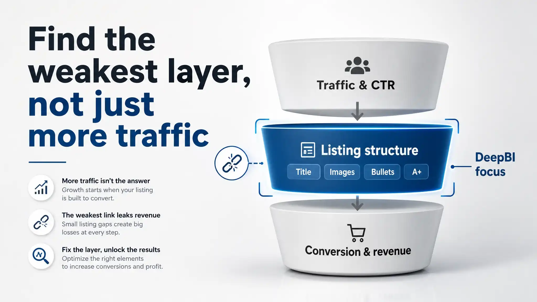
In other words, the team assumed they were already competitive at the bottom of the funnel and mainly needed to increase top-of-funnel visibility and appeal.
DeepBI’s scoring and benchmark analysis systematically contradicted that story.
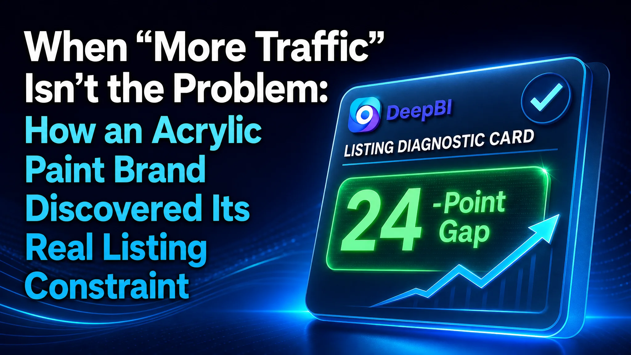
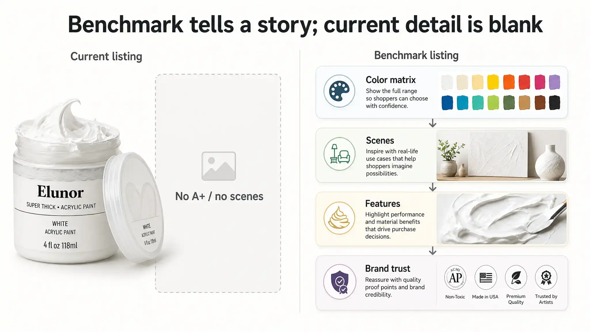
What the Numbers Actually Said: A 24-Point Gap in the Wrong Place
DeepBI’s listing scoring ran a structured comparison between the paint listing and its chosen benchmark (a close, same-brand acrylic paint variant) across five dimensions:
- Title
- Main images
- Bullet points
- Detail/A+ content
- Reviews and rating profile
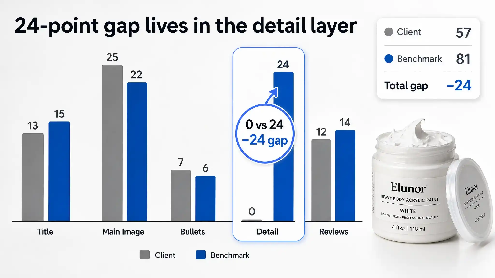
The total scores were straightforward:
- Client listing: 57 / 100
- Benchmark listing: 81 / 100
- Gap: –24 points
On the surface, this looked like “we are generally worse.” But the breakdown was far more specific:
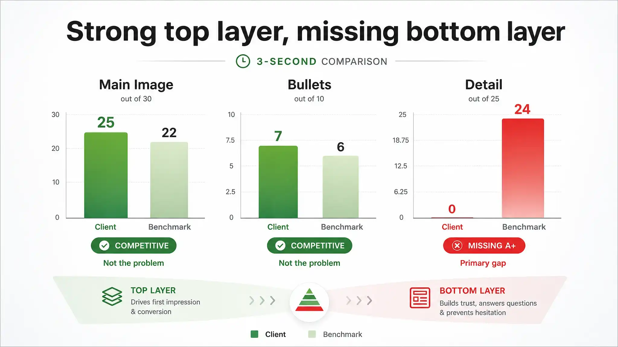
| Dimension | Client | Benchmark | Max | Gap | |-----------|--------|-----------|-----|-----| | Title | 13 | 15 | 20 | -2 | | Main Image| 25 | 22 | 30 | +3 | | Bullets | 7 | 6 | 10 | +1 | | Detail | 0 | 24 | 25 | -24 | | Reviews | 12 | 14 | 15 | -2 |
Three surprises emerged immediately:
- Main image: The client wasn’t weaker; it actually scored higher than the benchmark in the main image dimension.
- Bullets: The client’s bullet content was at least on par, slightly better structured in some aspects.
- Detail page: The entire 24-point gap in total score mapped almost 1:1 to a single missing component—the complete absence of A+ / detail content.
DeepBI’s role here wasn’t to say “you have no A+.” The team already knew they hadn’t built one. The diagnosis was subtler:
> In this category, with this benchmark, lacking a detail page is not a cosmetic omission; it’s the central commercial constraint. Your title and image tweaks cannot compensate for a missing trust and education layer.
This is where the operating logic changed.
 ---
---
Why the Obvious Fix (Title) Was Not the Right Priority
From a traditional Amazon operations viewpoint, the next moves felt intuitive:
- Front-load “Acrylic Paint” in the title.
- Insert more effect-related keywords.
- Maybe tweak the main image to show more “texture.”
DeepBI’s diagnostic logic forced the team to question that instinct.
1. Title: Under-Optimized but Not Decisive
The title comparison showed:
- Benchmark: “FolkArt Acrylic Paint, Toasted Terra Cotta 2 Fl Oz”
- Suggested optimized client title:
“FolkArt Super Thick Acrylic Paint, Heavy Body Textured Finish for Impasto and 3D Effects, White, 4 oz”
DeepBI highlighted minor structural weaknesses:
- The benchmark placed the core product term “Acrylic Paint” earlier.
- The benchmark bound color + volume tightly (“Toasted Terra Cotta 2 Fl Oz”), making the unit easier to recognize.
- The client title used a generic color word (“White”) rather than a more descriptive name.
But the score gap in title was only 2 points (13 vs 15).
Changing the title would help search weight and clarity—but it would not bridge a 24-point total gap. This was a secondary fix, not a primary constraint.
2. Main Image: Aesthetic Preference vs Commercial Weakness
DeepBI’s main image analysis found:
- The client’s visual quality was already strong.
- Issues were nuanced:
- Some angles and variants (back label shots, video thumbnails) diluted professionalism at first glance.
- The “heavy-bodied” texture wasn’t visually quantified—no clear “thickness” comparison or impasto effect demonstration.
- Yet, compared to the benchmark, the client still scored higher on main image.
Conclusion:
- There was room to refine the main image to better visualize thickness and texture, particularly for non-professional buyers.
- But again, this wasn’t the primary bottleneck; search-page attractiveness was not where the listing was hemorrhaging opportunity.
3. Detail Page: A Missing Layer in a Category That Depends on It
The decisive problem was structural:
- Client listing: No A+ / detail images, no structured narrative, no visual trust elements.
- Benchmark: A fully developed A+ stack:
- Brand introduction and logo modules.
- Product family and color matrix.
- Application scenes (home décor, baskets, lamps, abstract art).
- Functional modules highlighting different paint technologies.
- Brand trust cues (history, non-toxic, made in USA, social responsibility, multi-brand matrix).
In this category—art materials where texture, color payoff, surface compatibility, and safety are critical—buyers require visual proof and narrative. The benchmark uses its A+ to:
- Make the color and finish “feel real” through large, high-quality scene images.
- Show the result on different materials (wood, terra cotta, canvas, home décor).
- Anchor the purchase in brand trust (history, safety, quality).
The client’s absence of this entire layer made the listing behave like a bare-bones commodity item—even though the product itself was differentiated (“super thick,” heavy-bodied, 3D texture).
DeepBI didn’t just say “you lack A+.” It showed that:
- The entire 24-point competitive gap was localized in this missing detail dimension.
- All other dimensions were either competitive or only marginally behind.
- In practice, this meant the team had been optimizing where they were already strong, and neglecting the only dimension where they were truly disqualified.
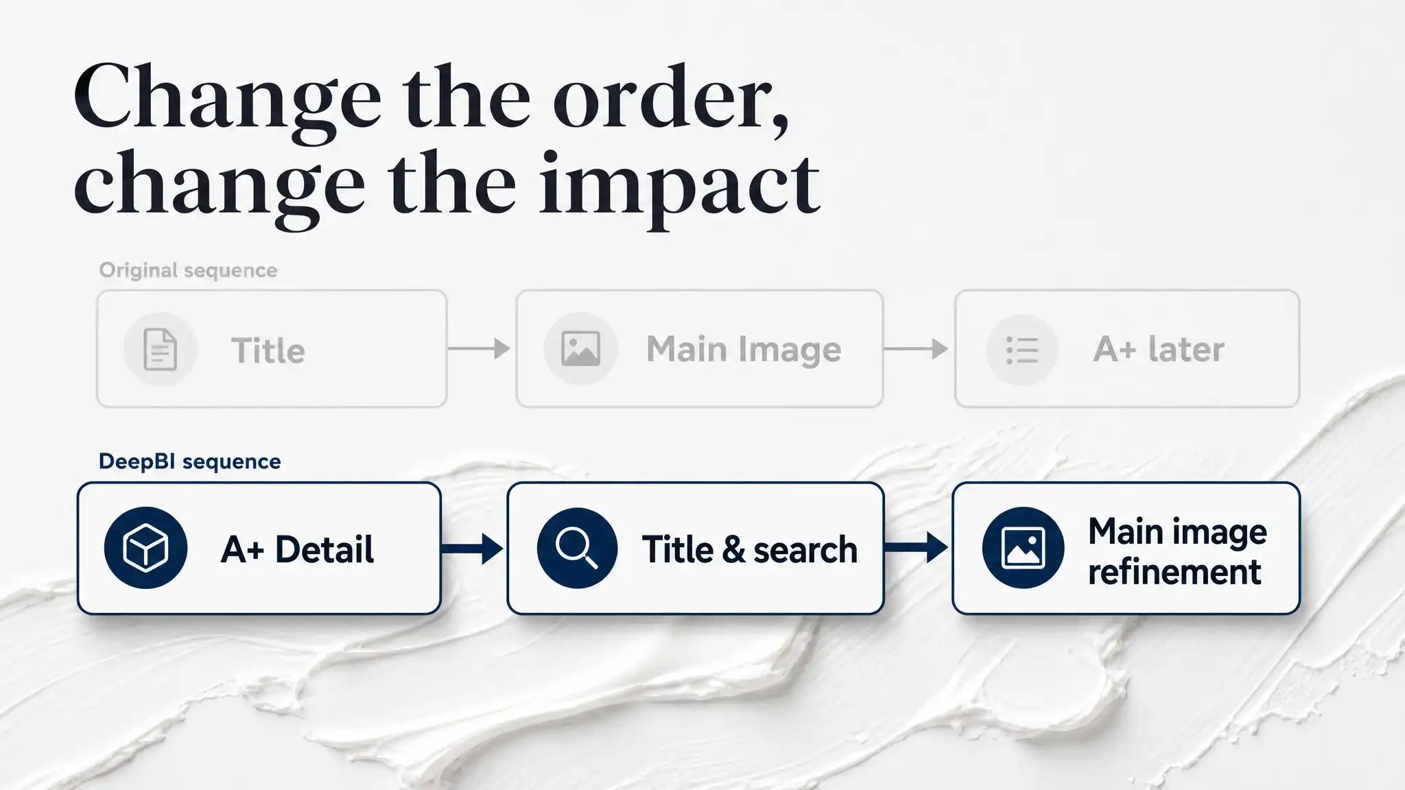
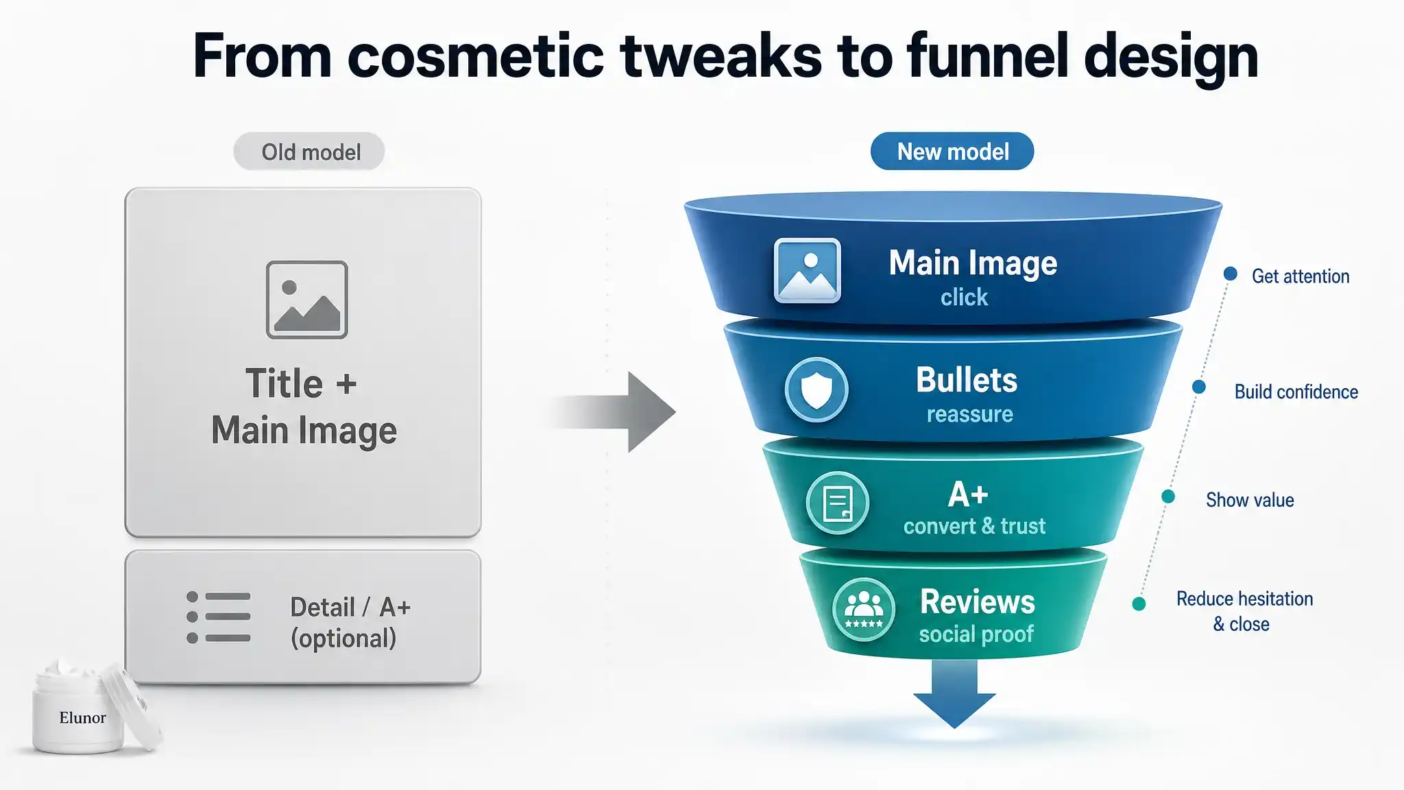
How DeepBI Reframed the Decision Path
Instead of treating optimization as a series of independent tasks (title tweaks, new photos, more bullets), DeepBI forced the team to think in sequence:
- Secure a credible, trust-building detail layer so that incoming traffic has something to “land on.”
- Then refine the way the product is discovered (title keywords, color naming, search intent coverage).
- Finally, tighten the main image around a single, unmissable visual proof of “super thick, 3D texture.”
This order was not arbitrary. It came directly from the scoring gaps and benchmark contrast:
- A buyer who cannot see texture, application scenes, and brand credibility will hesitate even if the title is improved.
- A buyer who sees a premium A+ narrative and clear use cases will be easier to convert even with a moderately optimized title.
DeepBI’s value here was not a long list of suggestions; it was the logic of what to do first.
What Actually Changed in Listing Logic
1. Title: From Generic Paint to Heavy Body Specialist
The recommended title restructuring was modest but precise:
> “FolkArt Super Thick Acrylic Paint, Heavy Body Textured Finish for Impasto and 3D Effects, White, 4 oz”
Key shifts:
- Semantic clarity for high-intent users:
- Introduced the professional term “Heavy Body” to capture users who actively seek thick, impasto-capable paint.
- Effect-led framing:
- “Textured Finish,” “Impasto,” and “3D Effects” make the benefit explicit rather than implied.
- Normalized structure for A9 and users:
- Brand → product type → key attribute (super thick / heavy body) → use-case / effect → color + size.
This isn’t about stuffing keywords; it’s about aligning how the product is named with how serious buyers search.
2. Bullet Points: From Feature Listing to “Pain Point – Solution” Clarity
The original bullets already had strengths:
- Started from the core effect (3D texture).
- Included concrete spec info (4 oz wide-mouth jar).
- Combined non-toxic and made in USA in a dense format.
DeepBI’s comparative analysis with the benchmark made one gap clear: The client lacked explicit closure of buyer doubts—especially surfaces, durability, and cleanup.
The re-ordered bullets now worked more like a decision script:
- TEXTURED 3D EFFECTS & MATTE FINISH
- Positions the paint as heavy-bodied, impasto-capable, with clear finish description.
- VERSATILE FOR MULTIPLE SURFACES
- Mirrors the benchmark’s surface list (wood, canvas, paper, terra cotta), but integrates indoor/outdoor suitability.
- CONVENIENT 4 OZ WIDE-MOUTH JAR
- Converts a packaging detail into a usability benefit: easy access, better for palette knives and thick application.
- EASY CLEAN UP & NON-TOXIC
- Translates “water-based” into a tangible promise: soap-and-water cleanup, safe for all skill levels.
- PROUDLY MADE IN USA
- Elevates “made in USA” from a tagline to a trust anchor for quality and safety.
DeepBI’s contribution here was not more adjectives, but better alignment between what buyers fear and what each bullet answers.
3. Main Images: Making “Super Thick” Visible, Not Just Stated
The scoring showed the client’s main images were not the primary weakness, but DeepBI identified subtle misalignments between what the product promises and what the images prove.
Across image variants, the new logic focused on:
- Quantifying thickness visually:
- Close-ups of paint ridges and waves with strong side lighting to create visible shadows.
- Palette knife lifting a thick “peak” of paint to show real 3D volume.
- Reassuring professionalism:
- Cleaner, more consistent white or light backgrounds for hero shots.
- Paired front-and-back bottle shots to reassure buyers on ingredients, origin, and instructions.
- Contextualizing use:
- Studio-like scenes with the jar next to textured canvases, showing completed heavy-texture artwork.
These were not aesthetic experiments; they were visual answers to the core question: “Is this really heavier and more sculptural than regular acrylic paint?”
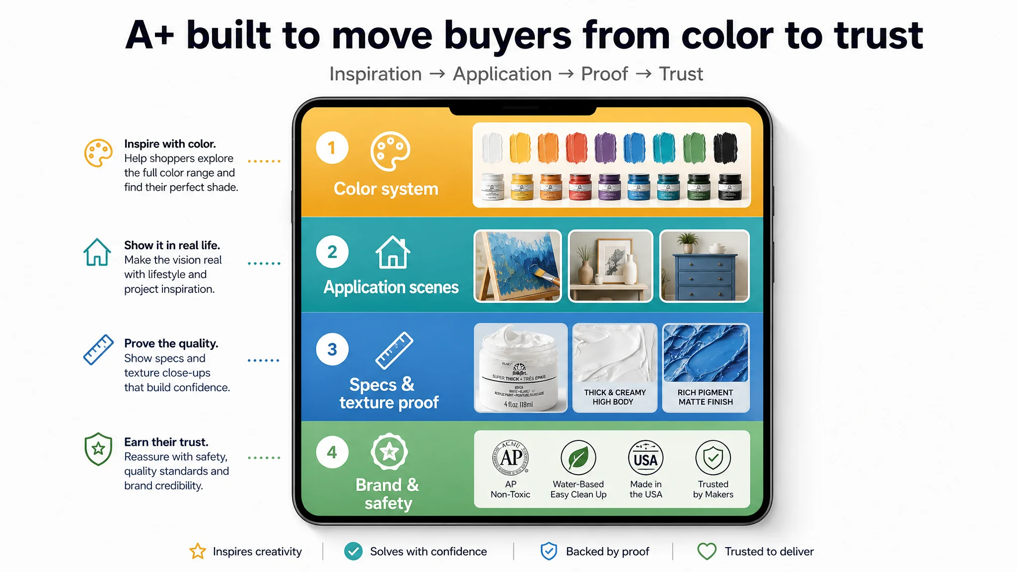
 4. Detail/A+ Page: Building the Missing Trust and Inspiration Layer
This was the decisive structural change.
DeepBI’s benchmark comparison suggested a specific page logic for detail content:
- Color Matrix Attraction
- Top module with multiple jars in different colors, arranged diagonally or in a tight grid.
- Purpose: instantly signal a rich color system and professional range, not a one-off product.
- Application Scene Inspiration
- Warm, real-world scenes: home craft tables, decorated wood boxes, terra cotta pots, or textured canvases.
- Purpose: show how thick texture looks on real surfaces and trigger “I could do that” moments.
- Core Specs and Texture Proof
- Micro-level shots highlighting:
- The “heavy body” texture on a canvas or board.
- The 4 oz jar volume and wide-mouth design.
- Purpose: link physical packaging and texture to use-case; reduce doubts about quantity and usability.
- Professional Brand and Safety Backing
- Clean, studio-like scene with jars, brushes, and palettes arranged in a controlled, minimalistic way.
- Copy to reinforce non-toxic, US-made, and brand history.
- Purpose: provide the rational justification that matches the emotional appeal created by scenes.
This structure mirrored the benchmark’s “function – effect – scene – trust” path but was adapted to the heavy-body texture story the client actually needed to tell.
DeepBI’s key role was to prioritize building this A+ architecture before any further micro-optimizations, because this was the single largest structural gap in the listing.
 ---
---
How the Team’s Operating Understanding Changed
Before DeepBI:
- The team saw optimization as a cosmetic race: “Make it prettier, add more keywords.”
- They believed that once buyers landed on the page, the product would “sell itself.”
- A+ was viewed as an enhancement, not a necessity.
After DeepBI’s diagnostic and planning:
- From “everything matters equally” to “one dimension is decisive”
- The team stopped spreading effort thinly across all elements.
- They recognized that in their case, detail content was the choke point, not the main image or bullets.
- From subjective taste to structured comparison
- Instead of debating whether images were “nice,” they compared:
- How many modules the benchmark used.
- How scenes were sequenced.
- Which trust elements appeared and where.
- From single-layer optimization to funnel-aware logic
- Main image: now treated as a click driver.
- Bullets: treated as search + reassurance.
- A+: treated as conversion and trust engine.
- Reviews: monitored as a social proof layer with an eye on homepage negative-review exposure.
- From content production to constraint removal
- The conversation shifted from “What else can we add?” to “Which constraint is currently blocking conversion most, and how do we remove that first?”
At the time of writing, there is no post-optimization performance data publicly available. What has changed, however, is the structure of decision-making:
- Budget allocation now follows the biggest quantified gaps, not the loudest internal opinions.
- Listing work is sequenced to ensure each layer of the funnel is strong enough to justify improvements in the next.
DeepBI’s Value in This Case: A Better Diagnosis, Not Just Better Assets
This case did not hinge on a revolutionary feature or a dramatic before/after screenshot. The product was already strong. The brand was already trusted. The team was already competent.
What they were missing was:
- A cold, quantified view of where they lagged the benchmark.
- A clear ordering of actions that reflected commercial leverage, not just visual polish.
- A way to separate “things that look important” (like tinkering with titles) from “things that are structurally decisive” (like having no A+ content at all in a trust-heavy category).
DeepBI’s scoring and comparison didn’t just surface issues; they re-ordered priorities:
- Title optimizations and image refinements stayed on the roadmap—but after, not before, building a conversion-capable detail page.
- Visual enhancements were anchored in specific gaps (missing texture proof, missing scenes, missing brand backing) rather than taste.
For teams reading this, the key takeaway isn’t “you need more A+ content.”
It is:
- You may be optimizing the wrong layer of your funnel.
- Your largest competitive gap may not be where your internal debates are happening.
- A tool like DeepBI matters less because it can “improve your listing” and more because it can show you which constraint to attack first, and why.
If you recognize yourself in this acrylic paint story—strong product, familiar brand, yet stubborn underperformance—your problem might not be your ads or even your main image. You may simply be missing the one layer of your listing that your category’s benchmark quietly relies on to convert hesitant buyers into confident customers.