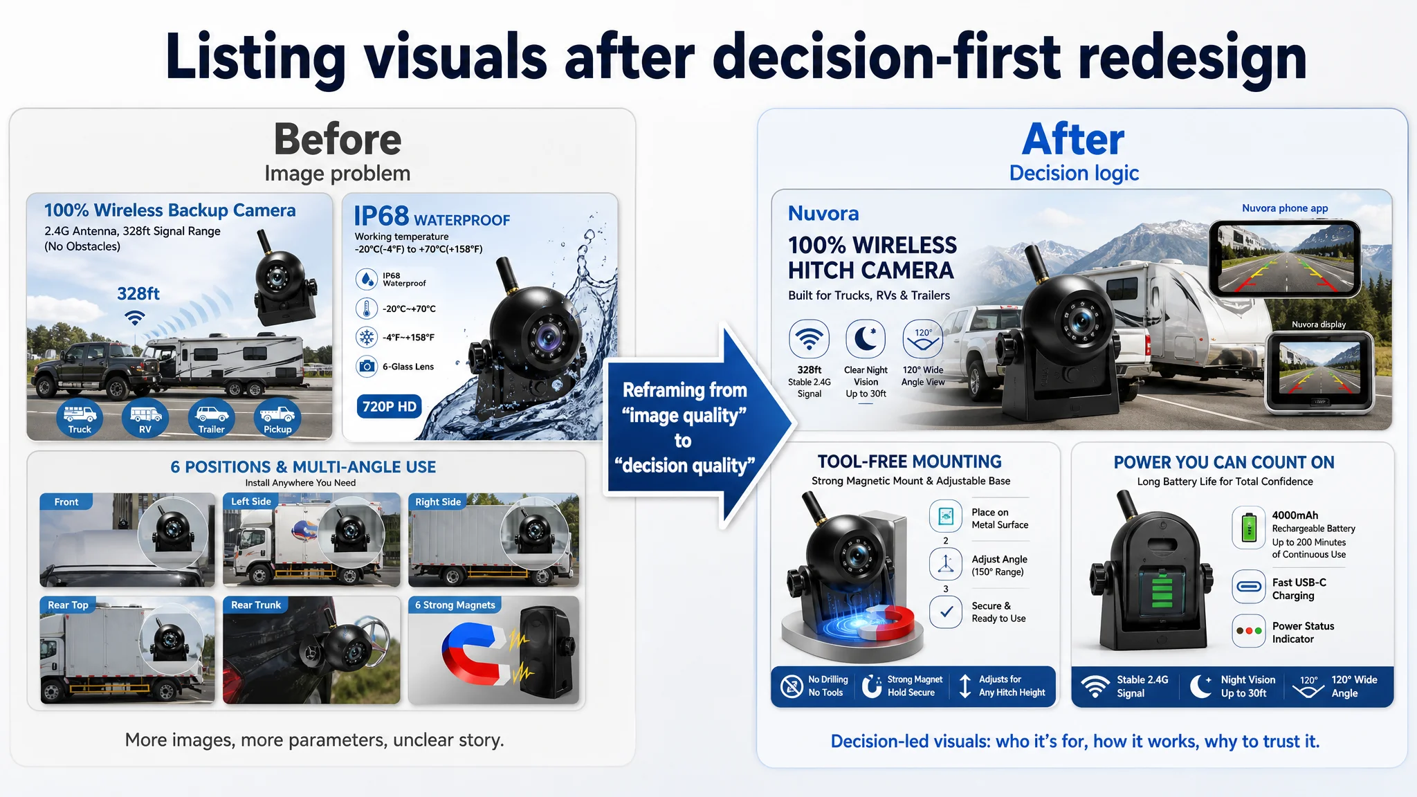
This Amazon seller case centers on a hitch and backup camera brand in the US marketplace that found itself consistently losing listing conversion to a weaker rival, despite having clear hardware advantages. The team originally framed the situation as a “visual problem” in Amazon ads and on the listing: they believed that adding more images, more icons, and more technical parameters would be enough to lift click‑through and conversion. For months, optimization work focused on polishing creatives and filling every available slot, while performance stubbornly lagged behind a competing camera with lower specs.
When DeepBI stepped in, the diagnosis quickly shifted. Instead of validating a lack of visuals, the scoring and benchmarks showed that the real gap was in decision logic, not asset volume. The title, bullets, A+ content, and review structure were all misaligned with how shoppers actually decide: the listing led with specs and “upgraded” language while burying core questions like “Will this work with my screen?”, “Is installation really painless?”, and “Will it solve my hitching and reversing headaches?” DeepBI revealed that the brand’s stronger battery, longer range, and flexible mounting were being drowned out by dense, technical storytelling that failed to reduce risk or create scenario‑level trust.
The subsequent optimization work focused on rebuilding that decision path end‑to‑end. The title was rewritten as a clear decision sentence around category, compatibility and core use vehicles; bullets were restructured from feature lists into pain‑→‑outcome‑→‑proof messages around signal stability, battery life, installation and night safety; and both main images and A+ modules were repurposed from parameter posters into a stepwise visual argument that shows real towing setups, app control, and concrete hitching scenarios. Even though reviews could not be changed directly, the listing was redesigned to work harder against existing rating and trust disadvantages by clarifying expectations and underscoring proof.
For other Amazon sellers, this case underlines a common but costly misdiagnosis: when ads underperform or listing conversion trails competitors, the instinct is to “fix the images” or “upgrade the visuals.” DeepBI’s work here shows that more assets and higher graphic polish do little if the underlying narrative is wrong. The real leverage often lies in how titles frame the first promise, how bullets resolve specific objections, how A+ supports that story, and how all of this compensates for review reality. Sellers who are already “rich in content” but weak in conversion can use this case as a reminder to stop adding noise and start rebuilding the logic of how their listing helps buyers decide.
1. Business Pressure: A Good Product Losing To A Weaker One
The brand sells a wireless backup / hitch camera on Amazon US, targeted at trucks, RVs, campers and trailers.
On paper, the product has several hard advantages:
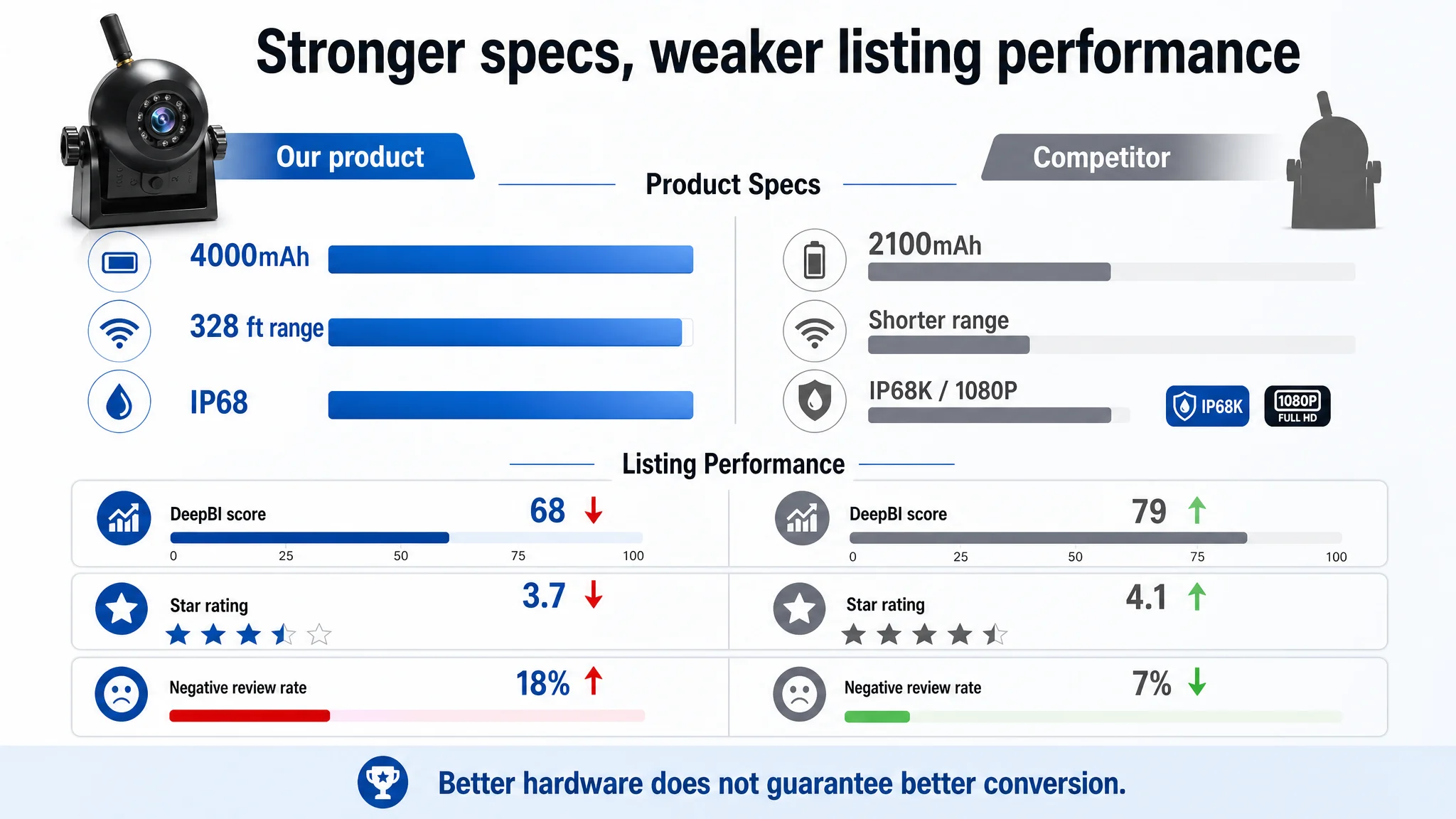
- Stronger battery: 4000mAh vs a common 2100mAh baseline
- Long wireless range: up to 328 ft in open area
- Solid protection: IP68, broad temperature range
- Flexible mounting: strong magnet + adhesive Velcro, adjustable base
- Multi‑device support: iOS / Android app, wireless viewing
Yet against a key competitor in the same sub‑category, the listing was systematically losing:
- Overall DeepBI score: 68 vs competitor’s 79 (‑11 gap)
- Reviews: 3.7 stars vs 4.1, and far fewer total reviews
- First‑page negative review rate: 37.5% vs competitor’s 15.4%
Internally, the team framed it as a “visual problem”:
“Our specs are clearly better. The photos just aren’t persuasive enough. Let’s fix images and A+ first.”
Before DeepBI, most optimization efforts were centered on adding more images, more icons and more parameters. But CTR and CVR were not improving as expected.
The real issue turned out to be different.
 2. The Original Misdiagnosis: “We Just Need Stronger Visuals”
From the brand’s perspective, the logic was straightforward:
- We have more images (9 vs 8).
- We show more parameters (battery size, IP rating, angle, magnets, etc.).
- Our visuals look more “complete” and “professional”.
So the working assumption inside the team was:
“We’re already ahead in visuals; if we polish them further, conversion will catch up.”
DeepBI’s scoring, however, made two uncomfortable points clear:
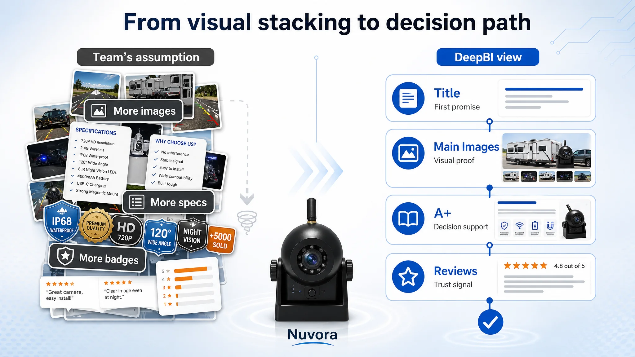
1. Visual density ≠ visual persuasion.
The brand was “winning” on number of images and parameter richness, but losing where decisions are actually made:
- Title: ‑5
- Bullet points: ‑2
- Detail / A+: ‑3
- Reviews: ‑5
1. The listing was optimized around what the product can do, not how customers decide.
The brand led with specs (WiFi signal, capacity, IP rating) instead of leading with:
- Compatibility and usage context
- What screen the user will actually look at
- What concrete problem it solves (hitching, reversing in tight spots, towing)
In other words, the brand was optimizing for “we’re advanced” while the competitor was optimizing for “this solves your exact hitching problem, with the devices you already own.”
Without a structured diagnostic, the team kept pushing more of the same: more parameters, more icons, more “upgraded” language.
 3. What DeepBI Actually Found: A Misaligned Decision Path
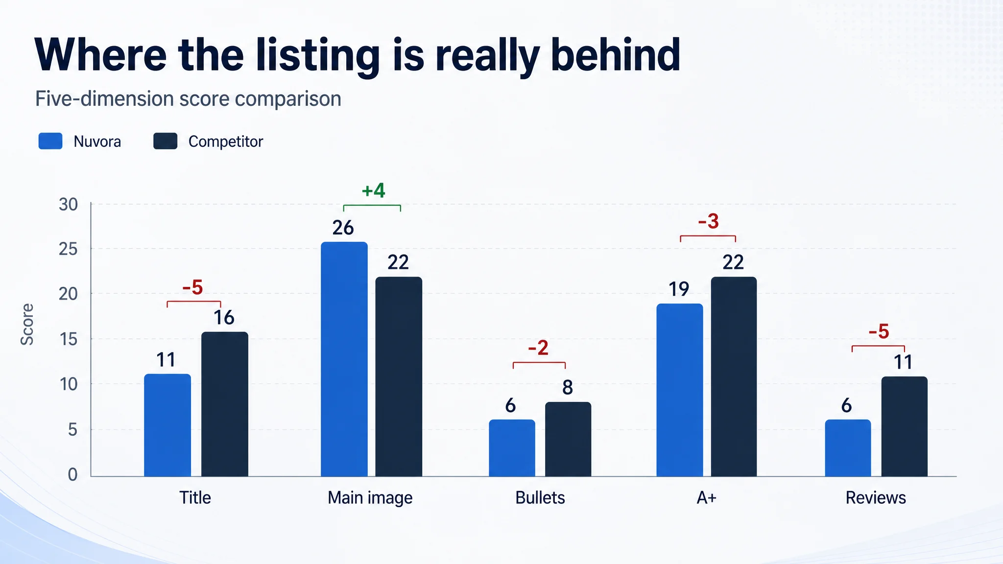
DeepBI did not start from “let’s beautify pictures”. It started from a five‑dimension benchmark gap:
- Title: Brand: 11, Competitor: 16, Gap: ‑5
- Main images: Brand: 26, Competitor: 22, Gap: +4
- Bullet points: Brand: 6, Competitor: 8, Gap: ‑2
- Detail / A+: Brand: 19, Competitor: 22, Gap: ‑3
- Reviews: Brand: 6, Competitor: 11, Gap: ‑5
Three findings redefined the problem.
 3.1 The Title: The Wrong “First Promise”
The competitor’s title was built like a decision sentence:
- Lead with the category: “Wireless Backup Camera”
- Immediately add the visible gain: “1080P HD”
- Then clarify where I see it: “Works with CarPlay & Android Auto / in‑Dash Screen”
- Then ease of install and key risk reducers: “No‑Drill Install, Rechargeable Battery, Night Vision, IP68”
The brand’s title:
- Opened with “Upgraded”
- Pushed “720P” (a visible disadvantage) into the comparison
- Treated compatibility and usage context as afterthoughts
- Looked like feature stacking, not a clear decision script
DeepBI’s reading: the title was burning the first three seconds on hierarchy and wording that didn’t answer the shopper’s top questions:
- “Will this work with my screen / phone?”
- “Is installation painless?”
- “Will it help me safely hitch and reverse?”
3.2 Main Images: Winning Details, Losing Narrative
On a pure content checklist, the brand’s main images looked strong:
- More total images (9 vs 8)
- More technical visualization: IP rating, temperature range, magnet structure, battery capacity, angles
- Realistic vehicle scenarios (vs competitor’s somewhat generic background in places)
But DeepBI’s visual agents highlighted a structural issue:
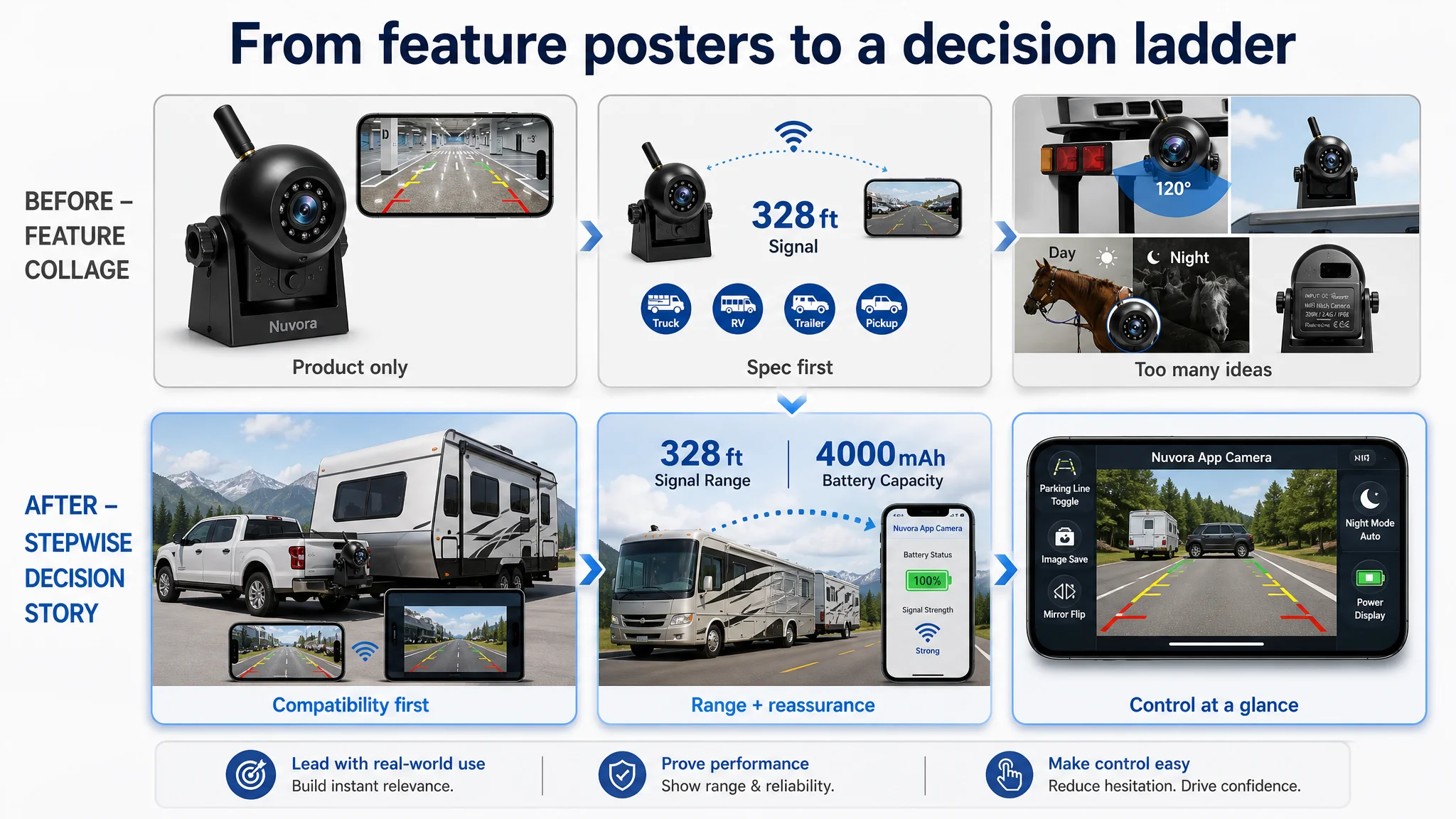
- Image 1: verifies “product type” but not compatibility or scale.
It says “this is a wireless camera” but not “this works on your big truck, with your iPhone or Android, for hitching”.
- Image 2: shows a range line, but does not reduce signal‑lag anxiety the way competitor does with device‑in‑vehicle visuals.
- Image 4: tries to show six viewpoints at once, so the core pain point (no drilling, strong magnet, simple install) gets diluted.
- Image 5: splits “night vs day” and “angle”, but never answers “how easy is it to operate this via the app when I’m actually reversing?”
So although the brand “won” on image completeness, it was losing on narrative coherence:
- Competitor: “Use your existing screen. Install in minutes. Here’s exactly what you see when reversing at night.”
- Brand: “We have strong WiFi, big battery, IP68, temperature, magnet, angle, icons…”
 3.3 Detail / A+ and Bullets: Specs Without Decision Guidance
DeepBI broke down the bullets and A+ into decision roles, not just text quality:
- Does the first bullet connect to the primary use scenario?
- Does each bullet move from pain → outcome → proof, or just list a feature?
- Does A+ align the visuals around a single core promise?
What the system saw:
- Bullets lead with technical parameters (WiFi signal) instead of scenario plus reassurance.
- The brand rarely translates features into result language (“peace of mind”, “easier backing up”, “safer towing”).
- The A+ modules heavily emphasize parameters and aesthetics, but:
- Underuse the app as the control center.
- Repeat generic vehicle silhouettes instead of tying to specific towing / hitching setups.
- Miss a dedicated battery proof node, even though the battery is a major hard advantage.
Net effect: the listing had more information, but fewer decisions answered.
4. Why the Obvious Fix (“Improve Images”) Was Not the Right First Move
From a typical operator’s perspective, the intuitive plan would be:
1. Hire a designer or use a generic AI tool to “beautify” images.
2. Add more icons and stickers for features (IP68, 4000mAh, 120° etc.).
3. Maybe tweak a few bullet points.
DeepBI’s scoring and diagnostic logic showed why this order was backwards.
 4.1 The Real Bottleneck Was “Decision Framing”
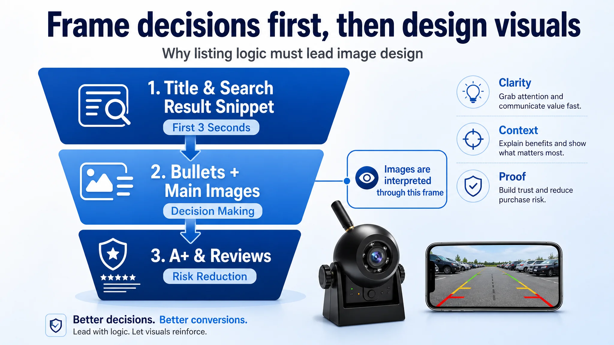
The largest scoring deficits were title, bullets, A+ and reviews, not the existence of images:
- Title: ‑5
- A+ / Detail: ‑3
- Bullets: ‑2
- Reviews: ‑5
These are the layers that frame how every image is interpreted:
- If the title doesn’t clearly say “wireless backup camera for hitching, works with your phone”, then the first image is just “some gadget”.
- If bullets don’t connect range, battery and WiFi to towing and reversing outcomes, then parameter graphics are “nice‑to‑know”, not “why I buy”.
- If A+ doesn’t show the app as the hub for grid lines, night vision and mirror flip, then app screenshots lack context.
So DeepBI’s recommendation was not “start from pixels”, but:
1. Rebuild the decision script (title and bullets).
2. Restructure images to serve that script, not the other way around.
3. Use A+ to validate the claims made in title and bullets, especially around battery, signal and specific use cases.
4.2 Reviews as a Shadow Story
The review gap (3.7 vs 4.1 stars, and far fewer total reviews) also mattered:
- Higher negative rate on the first page (37.5% vs 15.4%) directly hurts trust.
- Fewer “Verified Purchase” labels reduce perceived legitimacy.
DeepBI could not directly change reviews, but it used review structure as a risk signal:
- A listing that already struggles with trust cannot afford a confusing or heavily technical first impression.
- Every visual and textual element must work harder to counterbalance review‑based hesitation.
That again pushed priority away from “cosmetic upgrades” and toward clarity, risk reduction and proof.
5. What Actually Changed: Listing Logic, Not Just Content
The value of DeepBI here was not in “suggesting more images”, but in reordering what mattered.
5.1 Title: From Feature Heap to Decision Sentence
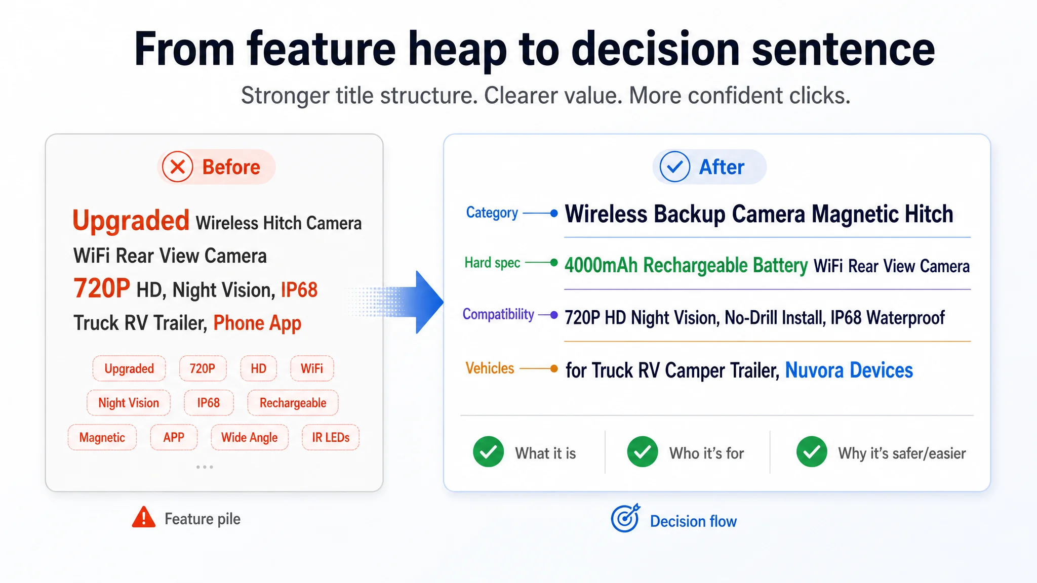
DeepBI’s optimization logic re‑sequenced the title around:
- Category recognition
- Unique advantages
- Compatibility
- Core use vehicles
An example rewritten structure:
Wireless Backup Camera Magnetic Hitch, 4000mAh Rechargeable Battery WiFi Rear View Camera, 720P HD Night Vision, No‑Drill Install, IP68 Waterproof for Truck/RV/Camper/Trailer, iPhone iPad Android
 Rational changes:
- Lead with category + hitch use: “Wireless Backup Camera Magnetic Hitch” makes it immediately clear what this is and why it exists.
- Pull hard spec where it helps: 4000mAh appears early as a differentiated rational reason.
- Keep “720P” but bundle with Night Vision to lower the salience of the resolution disadvantage and re‑anchor on night visibility, where expectations are softer.
- Simplify compatibility: “iPhone iPad Android” answers the device question in minimal characters.
- Keep vehicle list focused: trucks, RVs, campers, trailers — the actual buyers.
This doesn’t magically fix reviews, but it stops losing the first three seconds to vague adjectives and mis‑sequenced information.
5.2 Bullet Points: From Data Points to Pain‑→‑Outcome‑→‑Proof
DeepBI’s analysis did not just say “make bullets more emotional”. It mapped each bullet to a primary decision tension:
1. Signal stability & range anxiety
→ Rewritten to stress lag‑free video, 328 ft open‑area range, 2.4G digital antenna, real‑time monitoring via a named app.
1. Battery anxiety
→ Explicitly contrast “4000mAh” with“standard cameras” in capacity terms, add recharge time and indicator light for maintenance planning.
1. Installation fear
→ Emphasize “instant magnetic mount, no drilling”, plus a credible fallback (Velcro) for non‑metal surfaces, and a clear statement about adjustable angles.
1. Weather and durability concern
→ IP68 plus operating temperature range, tied to “harsh climate” RV and trailer use cases.
1. Night safety and maneuvering difficulty
→ Draw a direct line from IR LEDs, 30 ft night vision and 120° wide angle to “effortless and safe hitching / parking”.
1. Versatility and monitoring use
→ Position the camera as a portable surveillance or cargo monitoring tool, leveraging digital stability across use cases.
1. Post‑purchase risk
→ Spell out package contents and concrete warranty / service terms.
This re‑ordering removed the “feature salad” problem. Each bullet now explicitly answers: “Which fear or desire does this address, and what evidence do I give?”
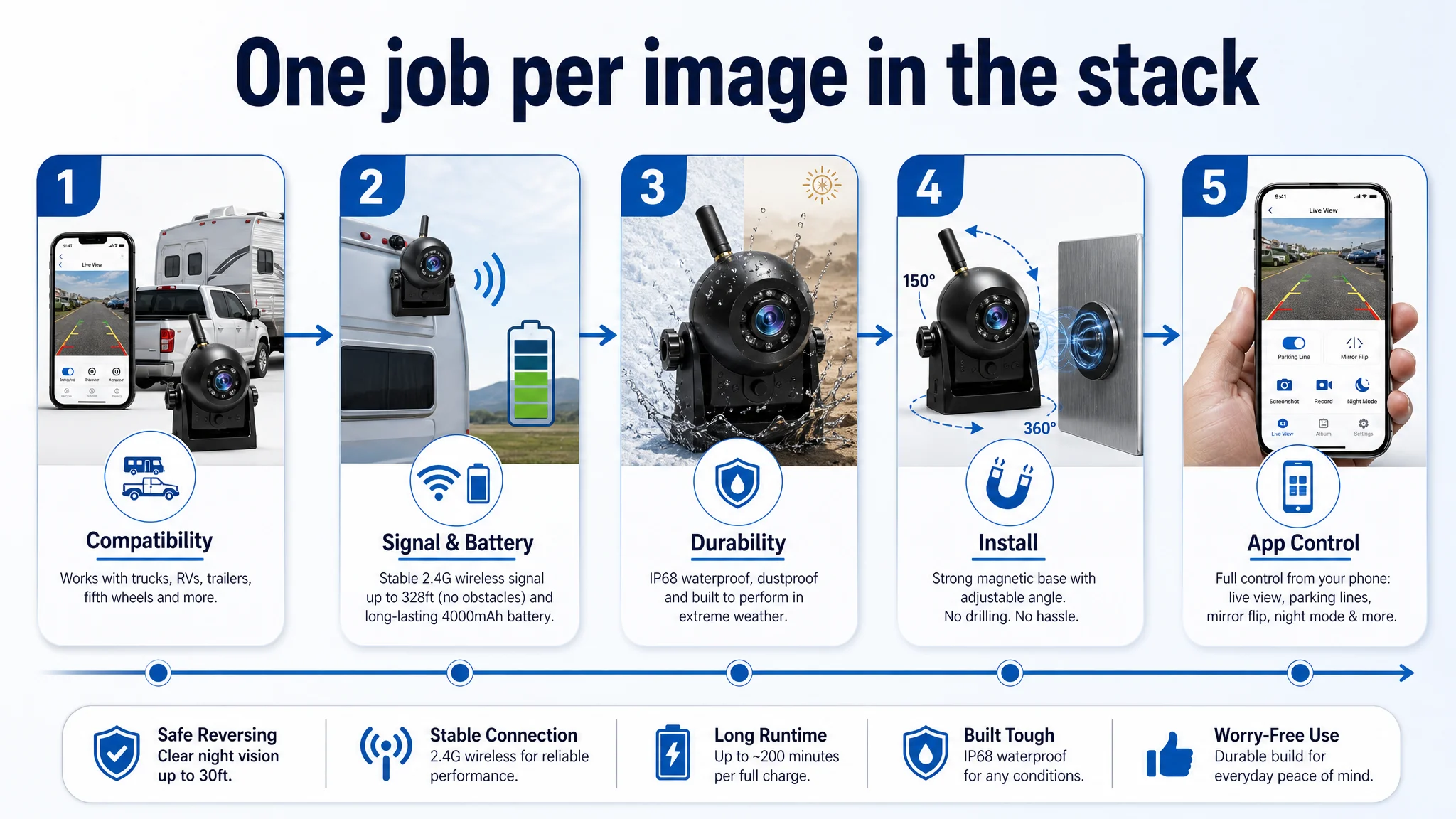
 5.3 Main Image Stack: From “Everything” to a Laddered Argument
Rather than simply “improving image quality”, DeepBI recommended changing what each image is trying to prove:
1. Image 1 – Compatibility and scenario fit
- Show the camera on a large truck / RV hitch, with both iPhone and Android screens displaying the live view.
- Text: multi‑device compatibility and target vehicle types.
- Role: “Yes, this is for your setup and your devices.”
1. Image 2 – Signal + battery as long‑distance proof
- Replace abstract connection lines with a long RV/trailer scenario with bold WiFi waves and clear “fast & stable” messaging.
- Integrate “4000mAh Large Capacity Battery” visually into the same frame.
- Role: “You can trust this for long rigs and long trips.”
1. Image 3 – Durability, simplified
- Keep water splash visual but reduce dense text.
- Emphasize “IP68 Waterproof” with simple hot/cold icons instead of numbers.
- Role: “You can forget about weather.” Quick comprehension, less cognitive load.
1. Image 4 – Installation as the core win
- Big horseshoe magnet visual attached to a bumper, clear “No Drilling Required”.
- Smaller callouts for Velcro on non‑metal surfaces.
- Role: “Installation is truly tool‑free and flexible.”
1. Image 5 – Operational control & ease of use
- Smartphone mockup showing the real app interface: grid line toggle, screenshot, night vision, image flip.
- Integrate day / night comparison into the same frame, plus 30 ft night range and 120° angle as rational proof.
- Role: “You’ll feel in control when actually reversing.”
This stack turns the image sequence into a stepwise argument, not a collection of independent posters.
 5.4 A+ / Detail Page: From Aesthetic Occupancy to Decision Nodes
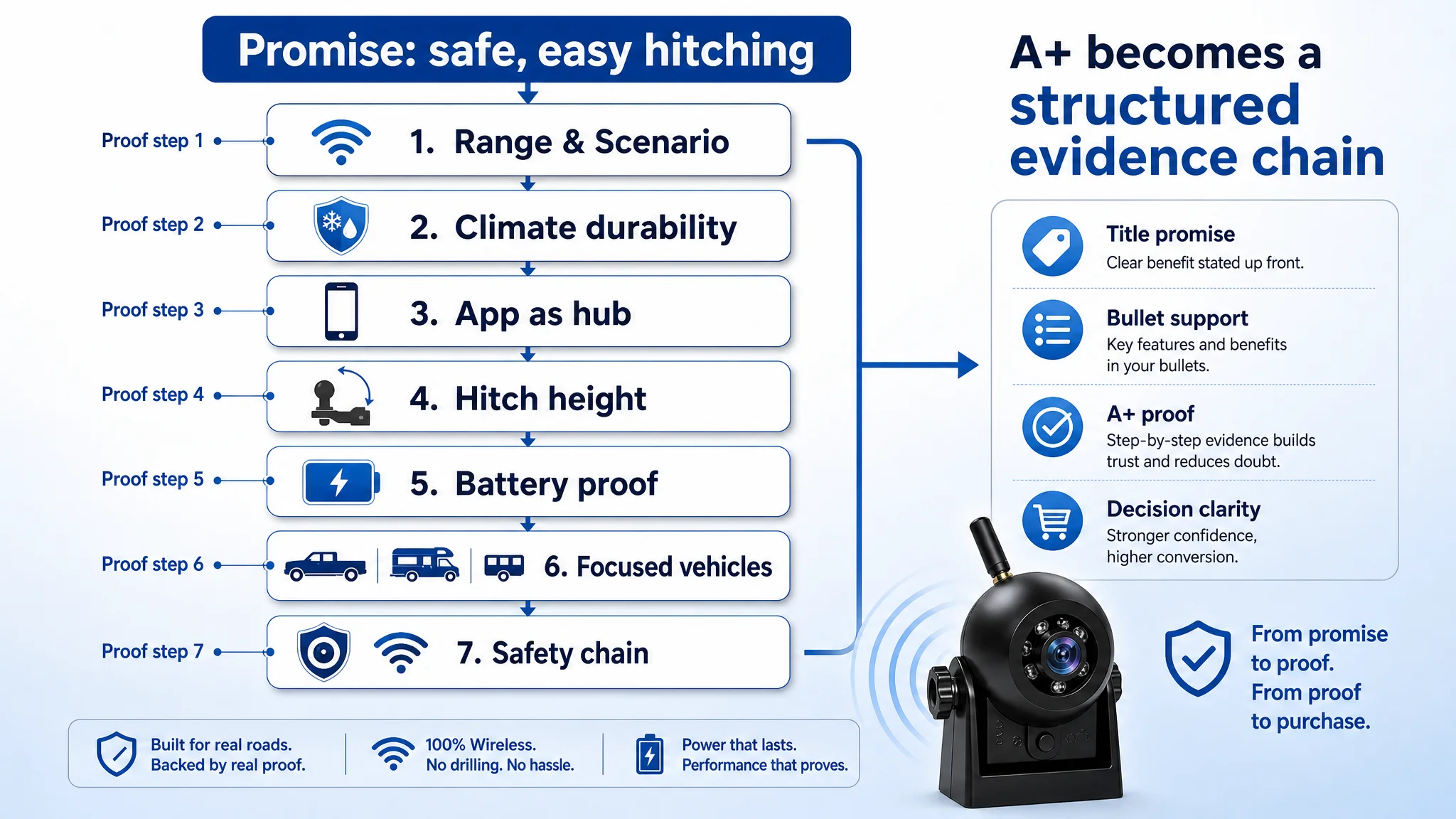
DeepBI treated the A+ modules as decision checkpoints:
1. Module 1 – Honest range & scenario framing
- Position product explicitly as WiFi hitching / short‑range rear view (around 30 ft for real vehicles).
- Show hitching a camper or trailer, not generic cars.
- Role: set expectations and reduce “will this reach the end of my 40‑ft rig?” anxiety.
1. Module 2 – Environmental capability as a differentiator
- Contrast harsh climates and temperature range, not just “water splash”.
- Even if competitor claims IP68K, emphasize the broader climate envelope and long‑term reliability.
1. Module 3 – App as the control center
- Integrate grid lines, live feed, mirroring and night vision directly into app UI visuals.
- Role: resolve fear that the app is complex or unreliable.
1. Module 4 – Angle as hitch‑height solution
- Show 150° vertical tilt solving different hitch height configurations.
- Answer: “Can I actually get the hitch into view on my lifted truck?”
1. Module 5 – Battery proof node
- Replace pure appearance shots with a dedicated battery module: 4000mAh, expected runtime ranges, recharge time, indicator explanation.
- Role: close the gap competitor leaves by only using a battery icon.
1. Module 6 – Narrow but deep compatibility
- Focus on the true core audience: towing/hitching, RV, camper, fifth wheel.
- Remove fringe cases (boats, harvesters) that dilute credibility.
1. Module 7 – Signal and visibility as a safety chain
- Combine antenna (2.4G), 328 ft digital range, 120° wide view and night vision in one “safety and reliability” module.
- Role: demonstrate that signal stability and field of view together reduce blind spots.
The key shift: A+ stopped being “nice extra images” and became a structured evidence chain to support the claims in title and bullets.
 6. What Changed in the Team’s Operating Understanding
DeepBI did not run the brand’s experiments or hold their ad account, so we do not have post‑optimization CTR or CVR numbers to quote.
What did change, and can be stated clearly, is the operating logic the team now uses when thinking about listings.
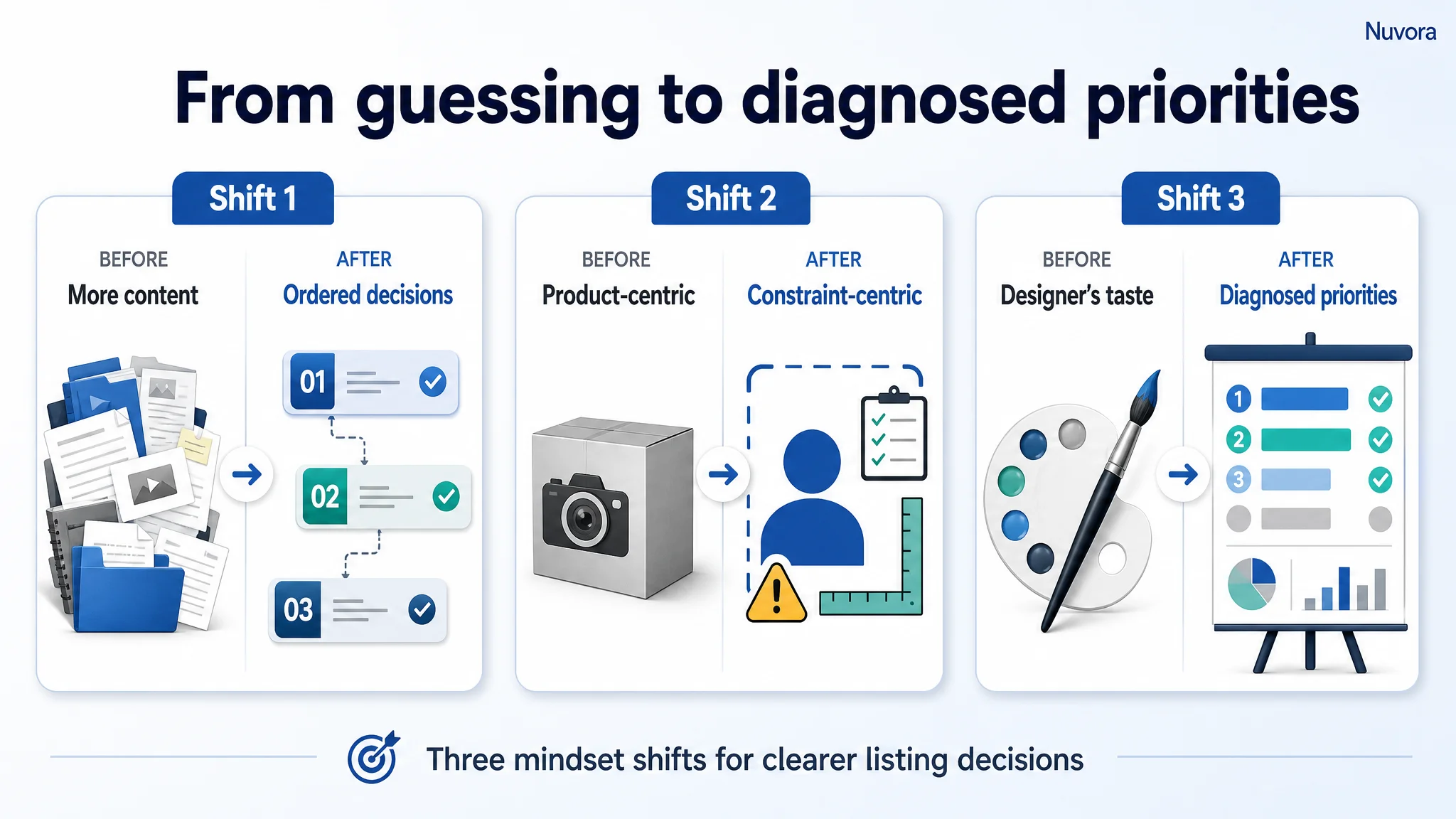
6.1 From “More Content” to “Ordered Decisions”
The team moved from:
“Add more images and more features until we fill all slots.”
to:
“For this product and this competitor, what is the exact sequence of decisions a buyer makes, and which module owns each decision?”
That changed how they briefed design and copy:
- Each image now has a single primary job (compatibility, signal, install, control, safety), not a laundry list of elements.
- Each bullet closes a specific buyer objection, not a theme category (“battery”, “signal”) in isolation.
- A+ modules are designed as proof for previous promises, not as a visual gallery.
6.2 From “Product‑Centric” to “Constraint‑Centric”
Before, the brand thought in terms of:
- “We have a big battery, strong WiFi, IP68, multiple mounts.”
DeepBI forced a reframing:
- Where does the competitor still beat us (1080P, IP68K, rating, reviews)?
- Where do we have a structural advantage (battery, range) that is under‑communicated?
- Which of these differences actually drives or blocks purchase decisions?
That made the brand more realistic:
- They stopped trying to “visually pretend” to be 1080P or IP68K.
- They accepted video resolution as a relative weakness and re‑anchored the story on night vision clarity, stability and battery longevity.
- They recognized reviews as a structural handicap and compensated with more explicit risk reduction in copy and visuals.
6.3 From “Designer’s Taste” to “Diagnosed Priorities”
Most importantly, decision sequencing is no longer based on internal opinions.
DeepBI’s scoring and contrast made it very explicit that:
- The main gap was not lack of visuals, but misaligned hierarchy (title, bullets, A+ structure).
- The brand was over‑investing in parameters, under‑investing in scene credibility (real in‑car shots, live app screens, hitch scenarios).
- The product’s unique strengths (4000mAh, 328 ft, dual mount) were buried in noise, not placed where they could carry the argument.
The team now uses DeepBI as a business diagnosis layer, not a “design suggestion plugin”.
 7. Conclusion: DeepBI as a Judgment Engine, Not a Feature List
This case was not about teaching a seller how to write nicer English or produce prettier pictures.
The brand’s problem was subtler:
- A technically better product was losing to a technically weaker competitor.
- The team believed they had a visual quality problem.
- DeepBI’s structured scoring showed they had a decision logic problem.
By:
- Quantifying gaps by dimension (title, bullets, main images, A+, reviews),
- Contrasting specific elements against a single high‑performing benchmark,
- And re‑ordering actions around how buyers actually decide,
DeepBI shifted the team from “we think we need more visuals” to “we need to rebuild the way this listing tells a story about hitching, installing, seeing and trusting.”
If you recognize any of these patterns in your own listings—
- More images than your competitors but lower conversion
- Strong specs hidden behind generic titles
- A+ used as decoration rather than proof
- Persistent review disadvantage you try to compensate for with more icons—
then the underlying issue may not be where you’ve been looking.
DeepBI’s value in this case was not about generating assets. It was about revealing the real constraint: misaligned decision framing. Once that changed, every subsequent design and copy choice had a clearer, commercially rational purpose.