This Amazon seller case follows a sports audio brand that launched bone conduction swimming headphones in the US marketplace, only to see their Amazon listing convert far worse than a key competitor. Internally, the team blamed “unattractive images” and “unpolished design,” and were preparing to pour budget into a full creative overhaul of their Amazon ads assets and listing visuals. What they did not yet realize was that the real barrier to conversion was not how the listing looked at first glance, but how it answered (or failed to answer) swimmers’ risk-focused questions as they moved down the page.
DeepBI’s diagnosis flipped that story. Against a specific benchmark listing, the brand’s main images and A+ modules were only marginally weaker in style, while the real performance gap came from low review scores and a confused decision path: trust-breaking feedback around mode switching, underwater use, and fit was colliding with a listing that emphasized technical audio explanations before proving basic reliability in the pool. Instead of recommending “better-looking” creatives as the first move, DeepBI showed that the optimization sequence needed to start with clarifying operational limits, reorganizing image order around risk reduction, and restructuring bullets and A+ content to walk buyers through when to use Bluetooth vs MP3 and what to expect in real swimming scenarios.
Subsequent optimization work focused less on adding more content and more on assigning each slot on the Amazon listing a clear job in the conversion journey: early visuals to prove underwater safety, mid-page content to make mode switching and phone-free use intuitive, and supporting modules to set realistic expectations on battery life, fit, and durability. For other Amazon sellers, the lesson is direct: when ads spend and clicks don’t translate into sales, it is dangerous to assume a “design problem” by default. Systematic diagnosis can reveal that the real constraint is the sequence of trust-building, not the surface polish—meaning the biggest lift in conversion often comes from reordering decisions and de-risking the buyer’s journey, not just refreshing your images.
The Business Pressure: A Good Product That Looked Like a Bad Bet
A sports audio brand launched bone conduction swimming headphones in the US Amazon marketplace. On paper, the product was competitive:
- Hybrid bone + air conduction audio
- IP68/IPX8-level waterproofing
- 32GB local storage
- Open-ear, titanium frame
Yet the listing underperformed against a category-leading competitor. The team’s internal narrative was simple:
“Our images aren’t as pretty. Let’s redesign the visuals and polish the copy.”
They were ready to commission a full creative refresh—new hero images, new A+ layout, re-written bullets—without a clear view of what actually constrained conversion.
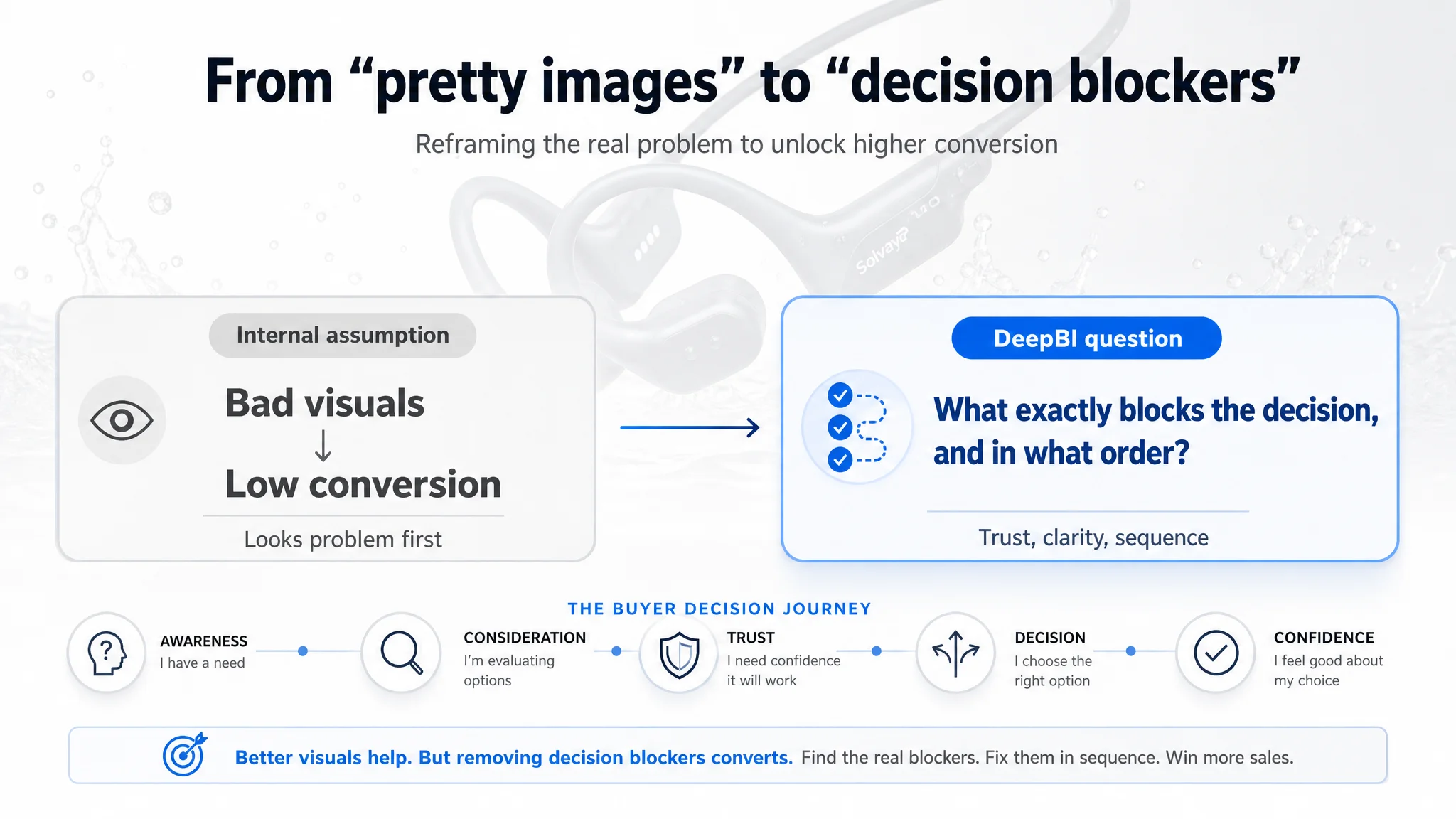
DeepBI was brought in not to “beautify the listing”, but to answer a narrower question:
What exactly is stopping shoppers from choosing this product over the benchmark—and in what order should we fix things?
 The Original Misdiagnosis: Blaming “Design” for a Trust Problem
Before any structured diagnosis, the team’s assumptions looked like this:
- Primary issue: Main image not strong enough, listing “doesn’t look premium”.
- Action plan: Redesign images and A+ to match competitor style; tweak title keywords.
- Hidden assumption: If the listing looks better and keywords are right, CTR and CVR will follow.
In other words, they treated the problem as a visual appeal gap, not a decision-risk gap.
Two things were missing from this thinking:
1. No quantified gap vs. a specific benchmark
The team “felt” the competitor page looked better, but could not say:
- Which dimensions were weaker?
- How big was the gap?
- What should be fixed first to change buyer judgment?
1. No link between page structure and buyer questions
The page was built around what the brand wanted to say (tech, audio, modes), not in the order a swimmer needs questions answered:
- “Can I really trust this underwater?”
- “How do I actually use this in the pool?”
- “Will it fit under a cap and stay on?”
Without that, any design overhaul risked being another subjective experiment.
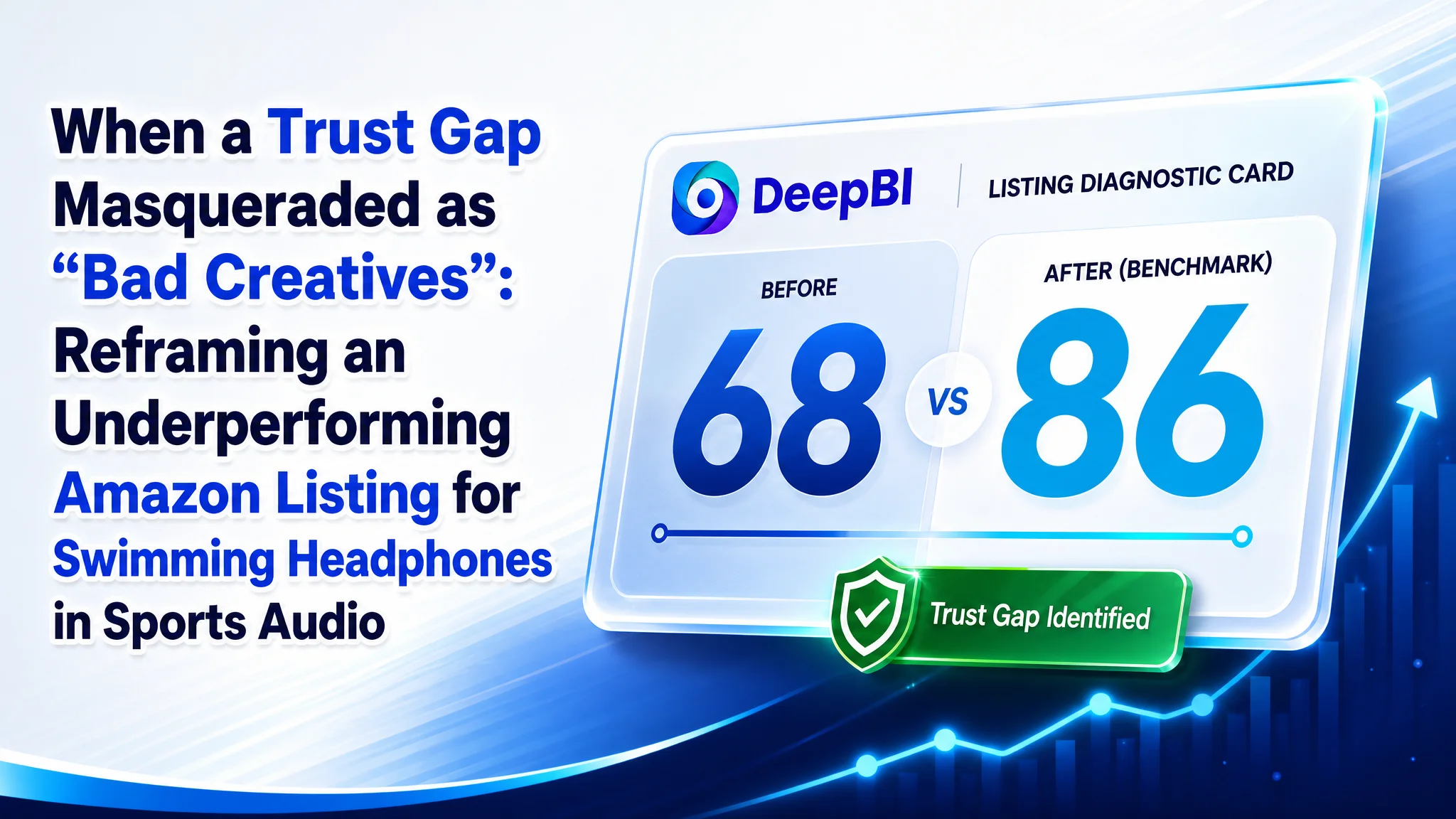
 DeepBI’s Diagnostic View: A 68 vs 86 Problem, Not a “Bad Images” Problem
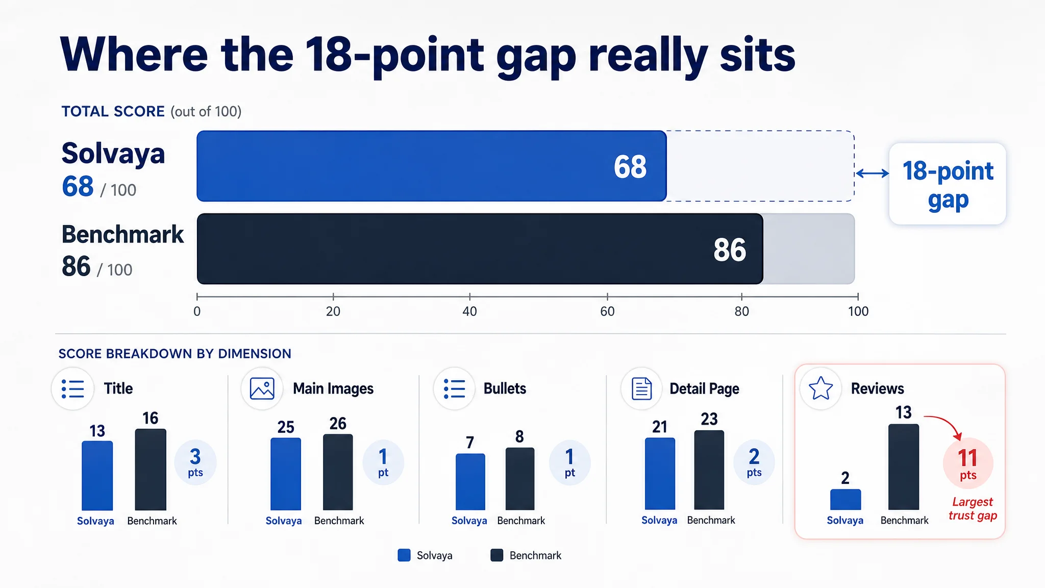
DeepBI’s scoring and benchmark comparison reframed the problem in one chart:
- Brand listing total score: 68 / 100
- Benchmark competitor: 86 / 100
- Gap: -18 points
Broken down by dimension:
- Title: Brand: 13, Benchmark: 16, Max: 20, Gap: -3
- Main Images: Brand: 25, Benchmark: 26, Max: 30, Gap: -1
- Bullet Points: Brand: 7, Benchmark: 8, Max: 10, Gap: -1
- Detail Page (A+): Brand: 21, Benchmark: 23, Max: 25, Gap: -2
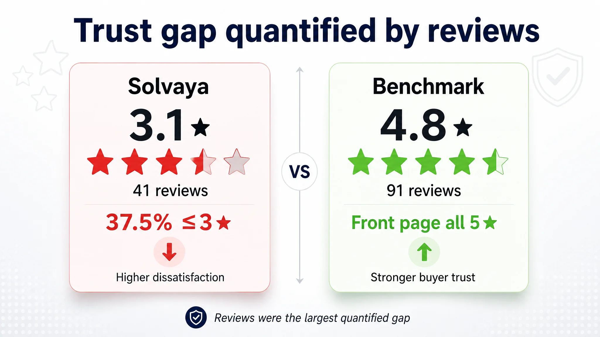
- Reviews: Brand: 2, Benchmark: 13, Max: 15, Gap: -11
Two insights immediately changed the conversation:
1. Main images were not the critical failure
The main image gap was only -1. There was room to improve, but the listing was not losing 18 points because of hero visuals alone.
1. The real sinkhole was trust, quantified through reviews (-11)
- 3.1★ average vs benchmark’s 4.8★
- 41 total reviews vs 91 for competitor
- ~37.5% of reviews at 3★ or below
- Complaints about mode switching, fit stability, sound quality
So while the team wanted to start with a design overhaul, the data showed:
- The page was not primarily a “design problem”
- It was a trust and clarity problem, with reviews and functional doubts at the center
- Visuals, copy, and structure were amplifying those doubts rather than containing them
 What DeepBI Actually Identified: Misaligned Story, Not Missing Features
DeepBI didn’t just score; it broke down how the brand’s listing logic diverged from the benchmark on each dimension.
1. Title: Technically Correct, Commercially Weak
Both titles front-loaded “Bone Conduction Headphones” and “IPX8 Waterproof”, but:
- The benchmark:
- Quickly introduced “IPX8 Waterproof”, “32GB Memory”, “12H Playtime”
- Ended with clear scenarios: “for Running, Cycling”
- The brand:
- Used longer technical phrases like “Hybrid Bone & Air Conduction”
- Did not fully exploit scenario hooks beyond “for Swimming”
DeepBI’s diagnosis: the title hit the right keywords, but failed to rationalize the choice by quantifying what the buyer gets and for which situations. This cost 3 points, but more importantly, it meant shoppers arrived with a fuzzier mental model of what the product was “for”.
2. Main Images: Right Themes, Wrong Order of Reassurance
DeepBI saw something subtle but decisive:
- The brand’s image set contained:
- Underwater usage
- Hybrid audio technology
- MP3 mode independence
- Multi-sport fit
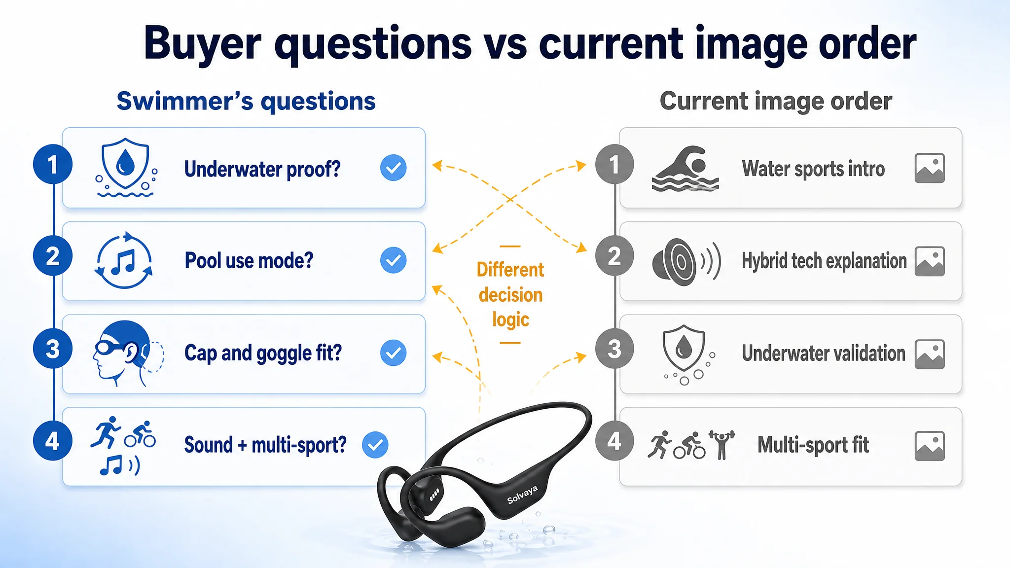
- But the sequence of images answered questions in the wrong order.
For a swimmer, the mental sequence is:
1. Is this really safe and reliable underwater?
2. How do I use it in the pool (Bluetooth vs MP3)?
3. Will it stay on my head with goggles and cap?
4. Does it sound decent, and is it flexible enough for other sports?
The brand’s sequence did the opposite:
1. Confirm it’s a “sports headset suitable for water”
2. Jump straight into technical audio explanation (hybrid sound)
3. Only then show active underwater validation
DeepBI’s scoring agents treated this as a page-structure issue, not an aesthetic one: the listing delayed core risk reduction (“prove it really works underwater”) and spent its second image on a secondary concern (“why the sound is special”).
The benchmark, by contrast, used early imagery to:
- Show full immersion
- Demonstrate depth limits and IPX8 claims
- Only then move into tech and secondary scenarios
Result: a small numerical gap (-1) in main images, but a significant difference in decision logic.
 3. Bullet Points: Heavy on Tech, Light on Buyer Journey
DeepBI’s comparison of bullet structure showed a pattern:
- Brand bullets:
- Heavily technical: hybrid audio explanation, power consumption, mode details
- Included many usage precautions (battery behavior, mode switching)
- Presented data without mapping it to user flows
- Benchmark bullets:
- Started with core usage flows (Bluetooth + MP3, how to switch modes)
- Used quantification (“3x sound quality”) to crystallize value
- Embedded precautions into benefits rather than as warnings
Scoring difference: -1 point. But operationally, this meant:
- Shoppers had to work harder to understand:
- How to switch from Bluetooth to MP3
- Why 32GB storage mattered in real life
- What to expect underwater vs on land
- The listing looked overly complicated, especially in light of the negative reviews about mode switching.
Without DeepBI’s structured bullet comparison, the team might have simply “rewritten bullets to sound nicer”, rather than re-ordering them around a clear “pain → solution” flow.
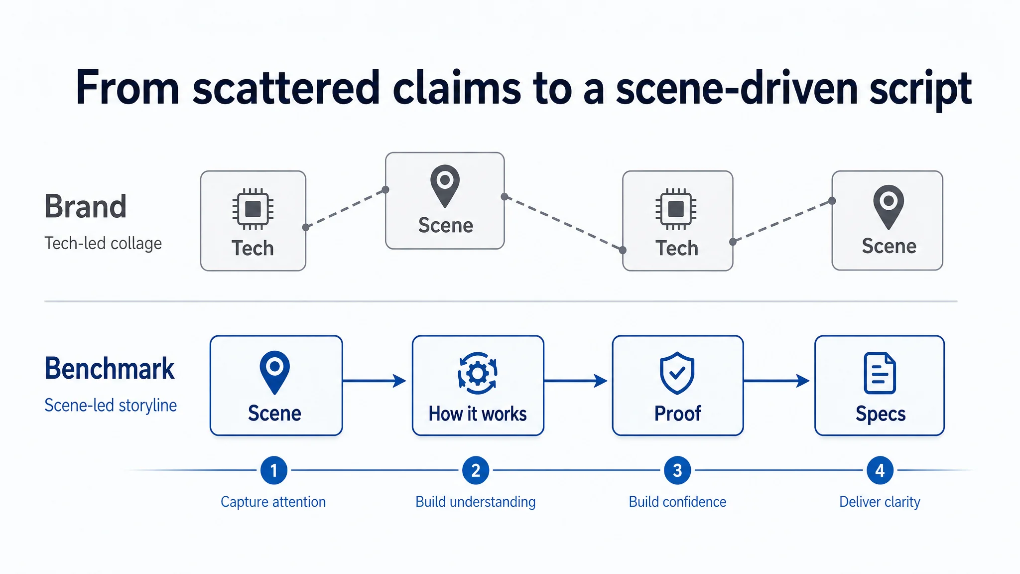
4. Detail Page (A+): Fragmented Story vs Scene-Driven Narrative
DeepBI’s module-level analysis of A+ found:
- The brand’s A+ covered:
- IP68 waterproofing
- Dual-device connection
- Lightweight design
- Hybrid audio
- 8h battery
- Swimming, cycling, running scenarios
- 32GB storage, colors, box contents
- But these modules:
- Jumped between tech and scenes without a clear visual thread
- Used technical language like “Clarity Beneath The Surface” without explicit user benefit translation
- Put critical mode operation instructions (MP3 vs Bluetooth) late and text-heavy
The benchmark’s A+:
- Opened with “swimming companion” imagery
- Anchored everything in scene-driven modules:
- “No Phone, No Limits”
- “Double Tap, Dive In”
- Used micro-process explanations:
- How to double tap to enter water mode
- How to charge and what 15 minutes of charge delivers
DeepBI’s conclusion: the brand’s A+ had enough ingredients, but lacked a role-based structure. Key trust moments (how to use it underwater, how to upload music, how fit works under a cap) were scattered instead of being front-loaded.
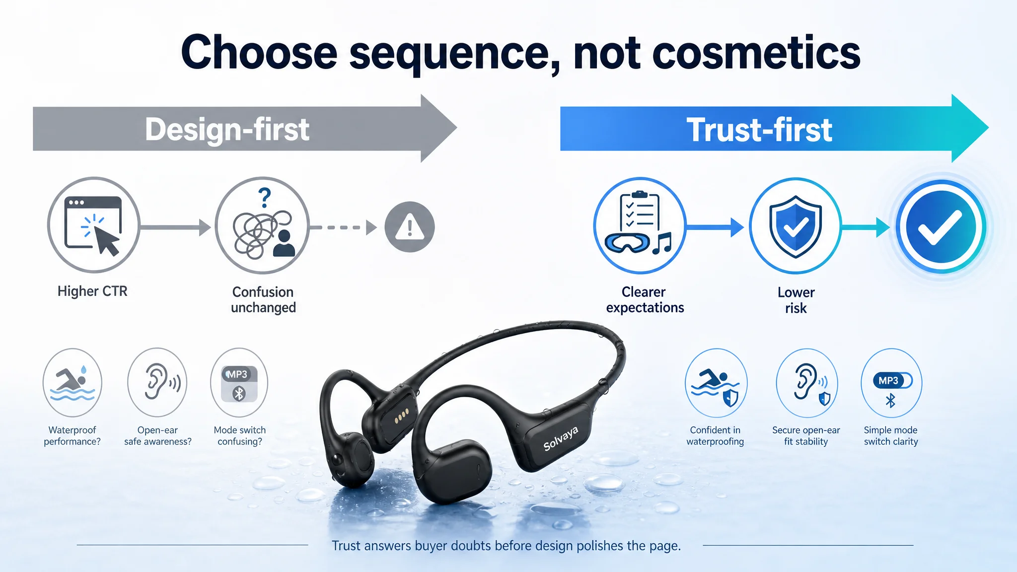
 Why the “Obvious Fix” (Make Prettier Images) Was the Wrong First Move
With these scores and comparisons, DeepBI forced a critical reordering of priorities:
1. Reviews were the largest quantified gap (-11)
Meaning: the product had real operational issues (mode switching, fit, sound) that the listing couldn’t hide—and shouldn’t try to.
1. Main visuals were serviceable, but mis-sequenced
The job wasn’t to “add more effects” but to reassign roles to each image:
- Image 1: Identify product category + core promise
- Image 2: Prove underwater reliability
- Image 3: Explain why hybrid audio works underwater
- Image 4: Show phone-free MP3 mode as risk reduction
- Image 5: Validate multi-sport stable fit
1. Detail page needed structural surgery more than artistic flair
The focus had to shift from:
- “How do we sound more technical?”
To:
- “How quickly do we neutralize risk and confusion?”
If the team had led with a design-first overhaul, they would have:
- Potentially increased CTR (more clicks from a better first impression)
- Pushed more users into a still-confusing, still-risky decision funnel
- Likely amplified frustration as users discovered:
- How unclear MP3 mode was
- How hard mode switching felt
- How unclear underwater limits were
DeepBI’s guidance instead was:
“Do not try to ‘market your way’ out of a trust problem. First, control expectations and clarify operations. Then, optimize aesthetics.”
 How the Listing Logic Was Actually Changed
DeepBI’s value in this case was less about “what to change” and more about “what each module’s job now is.”
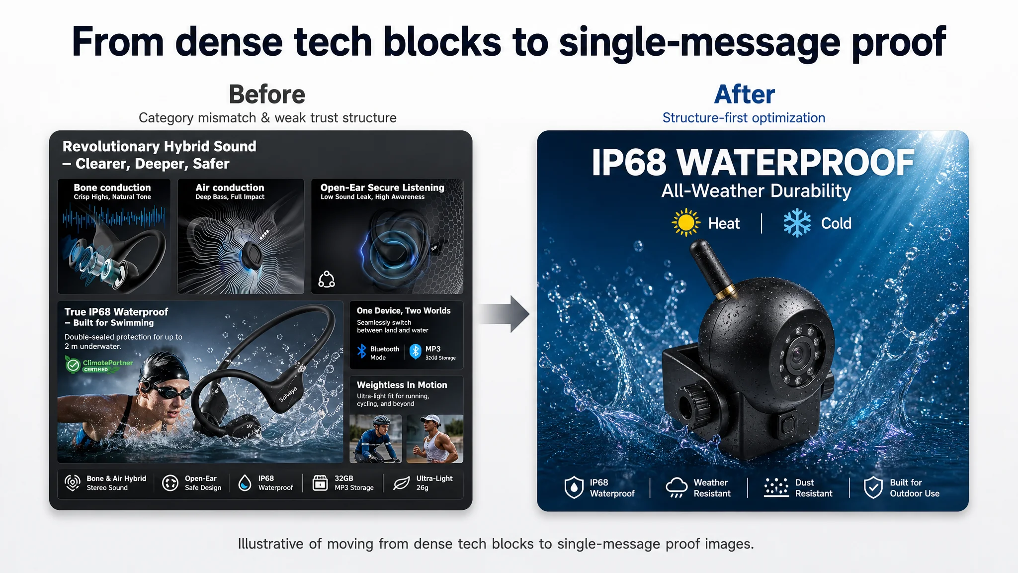
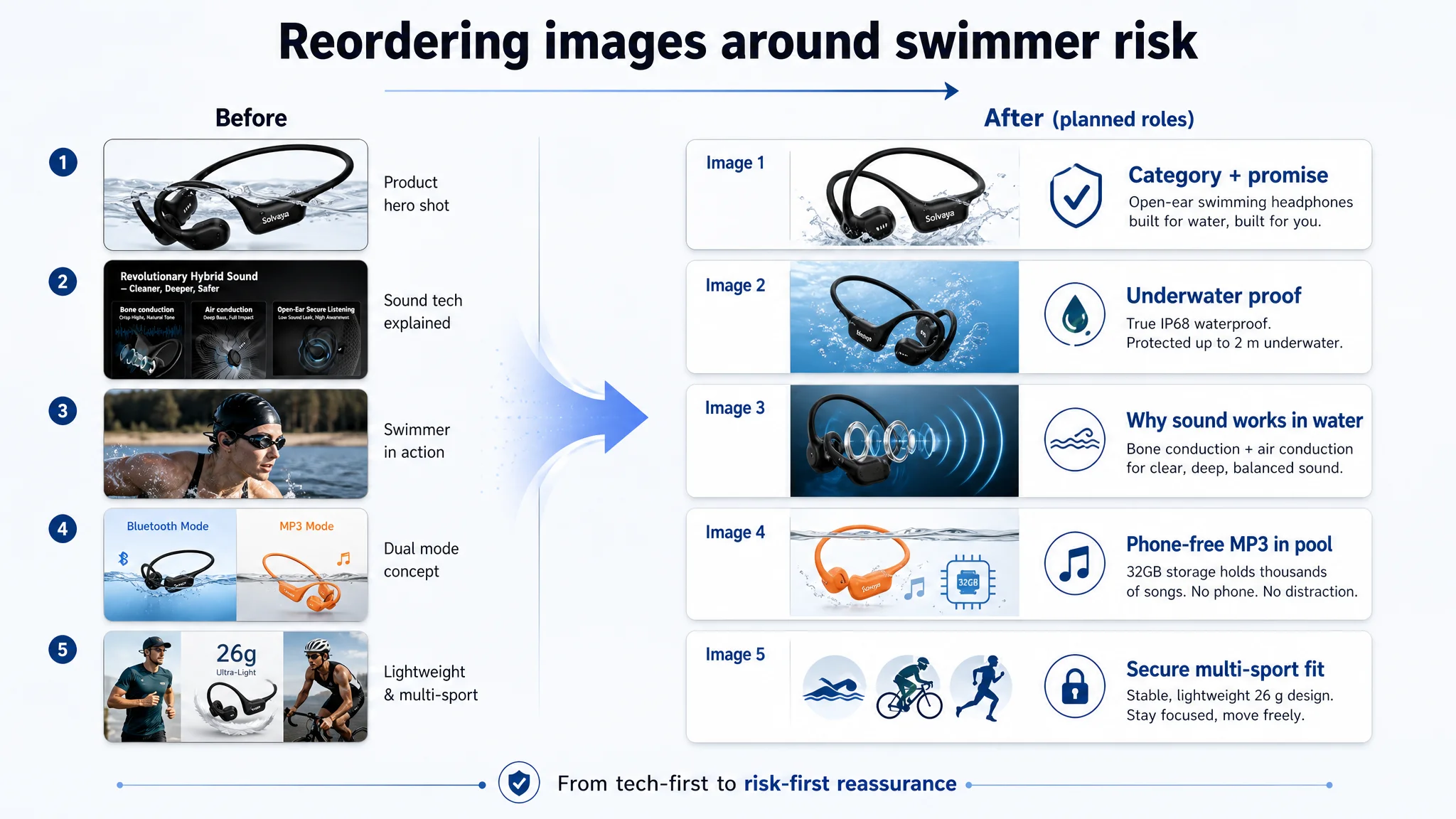
1. Main Image Sequence: From Tech-first to Risk-first
Before:
- Image 1: Generic confirmation of water suitability
- Image 2: Hybrid sound tech
- Image 3: Swimmer scene
- Image 4–5: Practicality and versatility
After DeepBI’s plan:
- Image 1 – Category + promise
- Confirm: “Bone Conduction Headphones for Swimming”
- Anchor IPX8/IP68 waterproof and Ash Black variant
- Image 2 – Underwater validation
- Show full immersion with clear mention of depth (e.g., up to 2m)
- Visually prioritize “engineered for swimming” over “generic sports”
- Image 3 – Hybrid audio, but with underwater relevance
- Visualize bone vs air conduction roles explicitly
- Tie it directly to “why it still sounds good in water”
- Image 4 – Phone-free MP3 reassurance
- Emphasize: “No phone needed in water”
- Make mode switching (e.g., triple-click to MP3) visually explicit
- Image 5 – Multi-sport fit and compatibility
- Show integration with goggles, helmets, glasses
- Highlight titanium frame adaptation and secure fit
The change wasn’t just aesthetic. It reorganized which buyer fears were addressed first:
- Fear 1: “Can I really swim with this?” → Image 2
- Fear 2: “Will I damage my phone?” → Image 4
- Fear 3: “Will this fall off under a cap?” → Image 5
- Curiosity: “Why is the sound good?” → Image 3
 2. Bullet Points: From Feature Lists to Decision Paths
DeepBI pushed the team to rewrite bullets around usage and risk rather than only tech:
- BP1 – Hybrid audio
Frame as: “Open-ear safety + better mids and bass” for running/cycling, not just a lab description.
- BP2 – IP68/IPX8 waterproof
Include explicit depth and scenarios (laps, rowing, surfing) and the MP3-underwater constraint.
- BP3 – Bluetooth 6.0 + 32GB MP3
Focus on the phone-free experience and simple mode switching.
- BP4 – Lightweight titanium fit
Highlight compatibility with swim gear and head shapes.
- BP5 – Calls & noise control
Justify use beyond the pool (commuting, outdoor calls).
- BP6 – Battery & charging
Transparently explain differences between Bluetooth and MP3 power draw and what protective behaviors (auto-switching) to expect.
This structure explicitly responded to negative review themes—fit, mode confusion, battery behavior—rather than ignoring them.
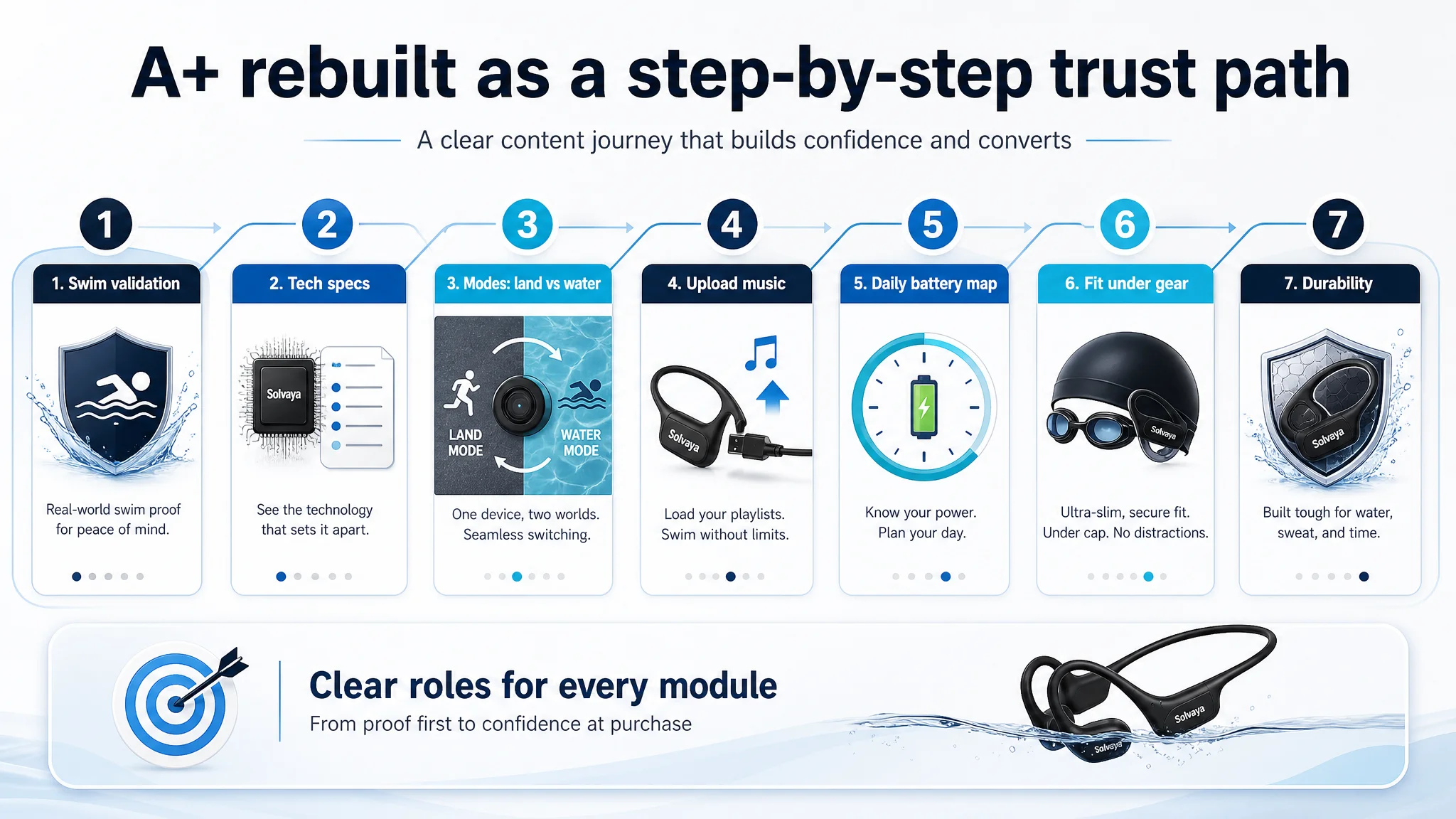
3. Detail Page (A+): Assigning Each Module a Single Job
DeepBI redefined each A+ module’s role:
1. Module 1 – “Can I swim with this today?”
- Strong underwater visual
- Clear IPX8 waterproof statement
1. Module 2 – “Why this device is technically trustworthy”
- Multi-icon spec table (waterproof rating, 32GB, Bluetooth 6.0, playtime)
1. Module 3 – “When to use Bluetooth vs MP3”
- Side-by-side land vs water modes
- Clear “Bluetooth does not work underwater” notice
1. Module 4 – “How to upload music”
- Simple process steps: connect cable, drag-and-drop, supported formats
1. Module 5 – “Battery expectations mapped to daily life”
- Example day: morning run (BT), evening swim (MP3)
- Hard numbers tied to use cases
1. Module 6 – “Fit under real swim gear”
- Visual proof under tight cap and goggles
1. Module 7 – “Material durability”
- Show titanium frame flexing, returning to shape
The A+ page stopped being a collage of technical claims and became a linear trust-building script.
 What Changed in the Team’s Operating Understanding
Even without post-optimization performance data, the case produced a clear internal shift in how the brand thought about listing work.
1. From “Design vs Copy” to “Decision Sequence vs Risk”
Previously:
- Design team: “We need better visuals.”
- Copy team: “We need more persuasive language.”
- Operations: “We need more reviews.”
After DeepBI:
- Everyone shared a single, quantified map of where the listing lost trust.
- Discussions moved from taste (“this looks nicer”) to sequence (“this image doesn’t answer the next buyer question”).
2. From Fixing Symptoms to Containing Risk
The team stopped thinking:
- “How do we hide our review problems?”
And started asking:
- “How do we reduce new disappointment by clarifying limitations up front?”
- “How do we integrate operational constraints (Bluetooth underwater, MP3 battery draw) into the listing so that expectations are realistic?”
This is different from a superficial cosmetic upgrade. It’s about risk structure:
- Fewer buyers surprised by Bluetooth not working underwater
- Fewer buyers confused by mode switching
- Fewer buyers expecting 8–10 hours in MP3 mode without understanding power draw
3. From “More Content” to “Right Content in the Right Slot”
DeepBI’s module-by-module scoring forced the idea that:
- The problem wasn’t lack of content; it was misallocated content.
- Some of the best assets (underwater shots, mode explanations) existed, but sat in low-impact positions or buried text.
The operating logic shifted to:
- Each image and module needs a clear job
- Jobs must be aligned with the most common buyer doubts, not internal preferences
 DeepBI’s Role: Not a Tool, but a Different Kind of Diagnosis
This case did not end in a dramatic “conversion +X%” claim, because the optimization was still in progress. What did change, decisively, was the quality of decisions:
- The team realized their main constraint was trust and clarity, not aesthetic weakness.
- They re-ordered actions:
1. Clarify operational limits and usage (modes, battery, underwater behavior)
2. Re-sequence images and A+ to front-load risk reduction
3. Then refine visual appeal and keyword nuance
- They stopped relying on opinions and started working from a scored, dimension-level gap vs a specific benchmark.
DeepBI’s value in this story was not that it “generated better creatives”, but that it:
- Quantified where the listing truly lagged (reviews, trust modules, order of evidence)
- Exposed the wrong initial diagnosis (“our images are bad”)
- Translated that diagnosis into explicit, ordered actions that aligned with buyer judgment rather than internal taste
For teams reading this and recognizing similar symptoms—a technically strong product, okay visuals, mediocre reviews, and a nagging sense that “something on the page isn’t working”—the underlying message is simple:
You may not need more content. You may need to re-diagnose where your real constraint is, and in which order the page should earn trust. That’s the kind of work DeepBI is built to do.