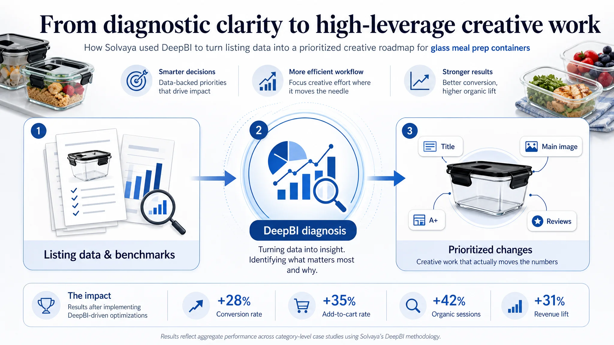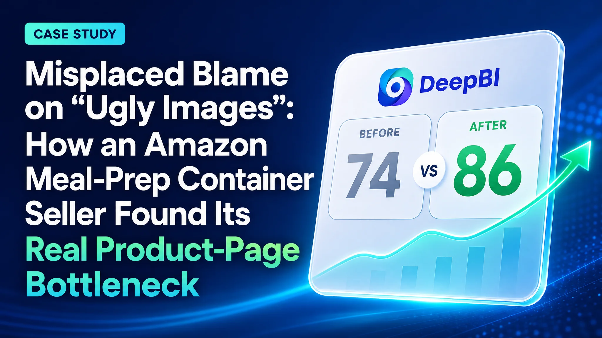
This Amazon seller case follows a meal‑prep container brand that thought it had a straightforward Amazon Listing problem: “our images just aren’t pretty enough.” On paper, the product looked competitive in Amazon ads and search—larger capacity, decent reviews, and a clear value story—yet a smaller 22oz competitor kept outperforming it in visibility and conversion. The team’s initial plan was to commission fresh visuals, refresh the hero shot, and hope a more attractive look would fix click-through and sales.
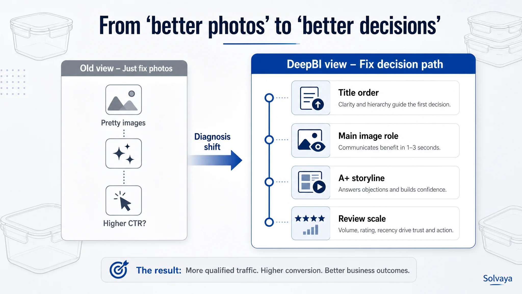
Once DeepBI stepped in, the diagnosis shifted from aesthetics to decision architecture. The scoring audit showed the main image was only a minor weakness, while the real drag on conversion lived in the title structure, bullet sequence, A+ detail flow, and how proof points like leakproof performance and capacity were being surfaced. In other words, shoppers weren’t rejecting the product; they were never being given the right information, in the right order, to understand why this 32oz set was the better choice.
The subsequent optimization focused on rebuilding that logic: reordering titles and bullets to front‑load pack size, capacity, and airtight benefits; using the main image and gallery to instantly clarify quantity and use; and restructuring A+ content so that capacity, safety, leakproof reliability, and cleaning ease answered buyer doubts in sequence instead of repeating generic scenes. Rather than adding more “nice” content, the brand learned to eliminate redundancy and create a shorter, clearer path from impression to conviction.
For other Amazon sellers, this case underlines a common trap in listing and ad performance: misdiagnosing a conversion problem as a “design” issue. When a competitor with seemingly weaker specs keeps winning, the constraint is often not product quality but how the listing guides decisions—what’s visible on the search page, which benefits are proven visually, and how quickly core objections are resolved. DeepBI’s analysis shows that by treating a listing as a structured persuasion flow instead of a collage of assets, sellers can uncover the true bottlenecks behind stagnant CTRs and conversion rates.
The pressure: “Our containers are better value—why are we still losing?”
A kitchenware brand selling 32oz glass meal-prep containers on Amazon US was under clear pressure.
- Their product offered a larger capacity (32oz vs 22oz).
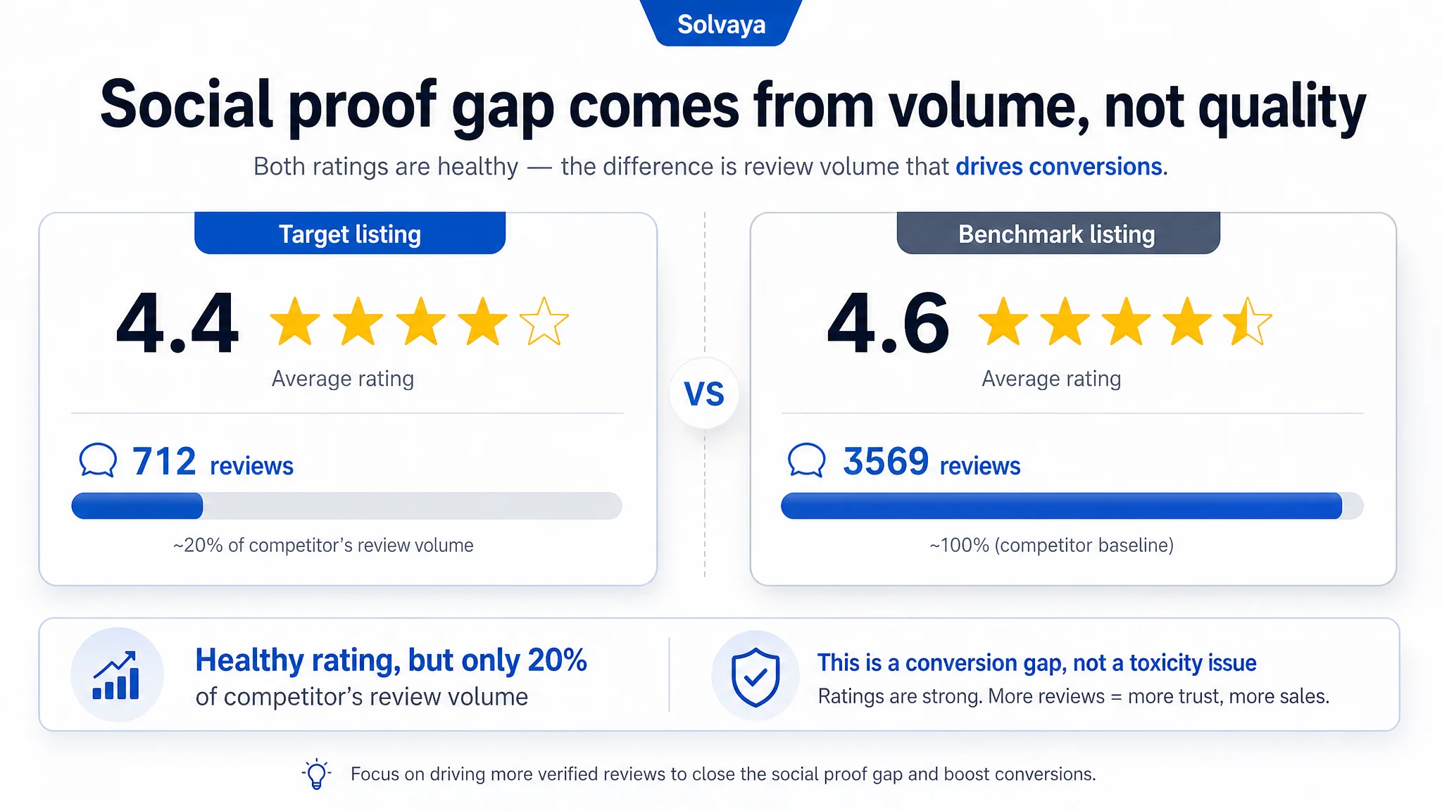
- The reviews were solid (4.4 stars across 700+ reviews).
- Yet, in their core keyword space, a benchmark competitor with smaller 22oz containers was winning the category and outscoring them in every visible performance signal.
Internally, the story sounded familiar:
“Our images are not attractive enough. If we refresh the photos, CTR and conversions will follow.”
The team was prepared to brief designers, redo the main image, and “make it more beautiful.” But they couldn’t shake a nagging doubt:
- Why does a smaller, more expensive-looking set dominate search rankings?
- If this is just an aesthetics problem, why have earlier “visual refreshes” not moved the needle?
They brought DeepBI in with one objective: find the real constraint, not just the obvious one.
The original misdiagnosis: “We just need better photos”
The operating assumption was simple—and wrong in a very specific way:
- Assumption: The listing underperforms because the visuals are bland. Fix the main image and secondary images, and performance will align with product quality.
- Planned response: Commission new hero images, maybe a lifestyle shot, tweak colors, and hope for a higher CTR.
Two blind spots sat inside this assumption:
1. It treated “visuals” as an aesthetic problem, not a decision problem.
2. It assumed the main image was the primary bottleneck, without checking where the largest structural gaps vs. the benchmark really were.
Before any new image was produced, DeepBI ran its listing scoring and benchmark comparison. The output was not a beauty verdict; it was a structured diagnosis of where the listing was losing the purchase decision.
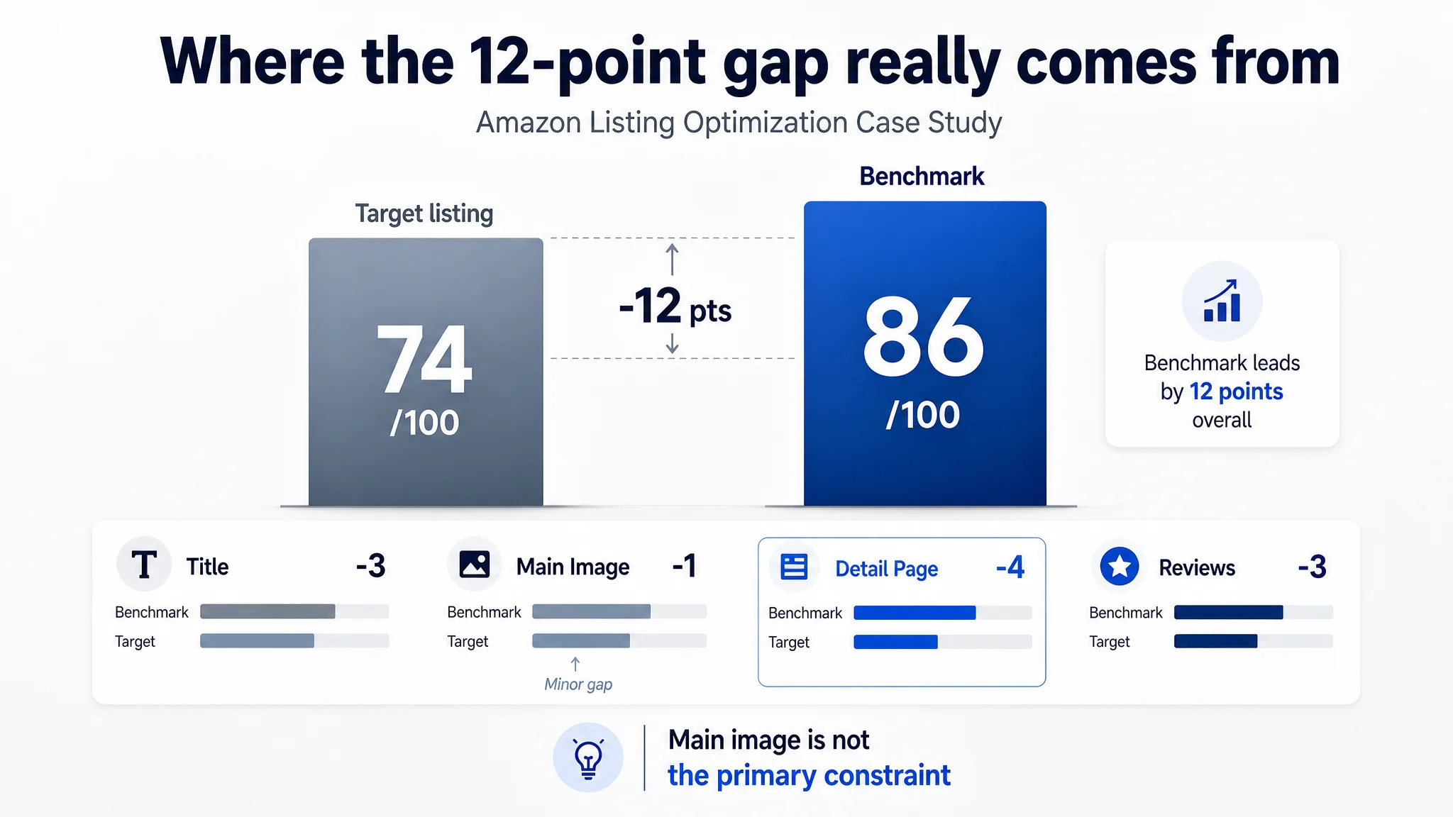 The cold audit: a 74 vs 86 scoreline that didn’t match intuition
DeepBI’s scoring engine benchmarked the brand’s listing against a top-performing competitor selling 22oz containers in the same category and use cases.
Total score
- Target listing: 74 / 100
- Benchmark listing: 86 / 100
- Gap: -12 points
By dimension
- Title: Target: 14, Benchmark: 17, Max: 20, Gap: -3
- Main Image & gallery: Target: 25, Benchmark: 26, Max: 30, Gap: -1
- Bullet Points: Target: 6, Benchmark: 7, Max: 10, Gap: -1
- Detail Page (A+): Target: 19, Benchmark: 23, Max: 25, Gap: -4
- Reviews: Target: 10, Benchmark: 13, Max: 15, Gap: -3
Two things immediately stood out:
1. The main image gap was small (-1 point). The listing’s hero visual was not catastrophically weak vs. the benchmark.
2. The largest structural gap was in the detail page (-4 points) and trust / review scale (-3 points), with title and narrative structure noticeably behind.
The “just photos” hypothesis didn’t hold. The constraint was not simply “our pictures are ugly.” It was that the entire persuasion sequence—from search results line to A+ modules—did not make the product’s advantages legible, fast, or trustworthy enough.
 What the team thought vs what DeepBI actually surfaced
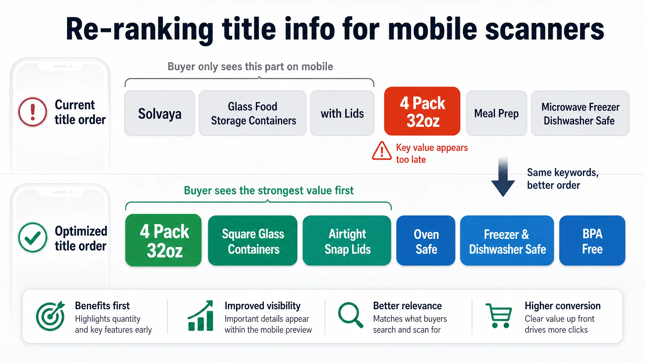
1. Title: misusing the most valuable 200 characters
Team’s mental model
“The title is fine, we have all the keywords: glass containers, meal prep, lids, etc. The real problem lies in the images.”
Reality from DeepBI’s scoring
The benchmark’s title earned a higher score (17 vs. 14) for reasons that had nothing to do with vocabulary richness and everything to do with information order and clarity:
- The benchmark front-loaded quantity and capacity: “5Pack 22oz…”
- It highlighted a concrete functional promise: “Snap Airtight Lids”.
- It explicitly locked in high-value usage contexts: “Microwave, Oven, Freezer, Dishwasher”.
The target title, by contrast:
- Led with a low-recognition brand name.
- Buried the 4-pack / 32oz advantage deeper in the string.
- Used generic wording like “with Lids” instead of specific, high-impact phrases like “Airtight Snap Lids”.
- Repeated overlapping terms (“Food Storage Containers” and “Meal Prep Bowls”), wasting limited space.
Why this mattered commercially
On mobile search results, buyers rarely read full titles. They scan the first few tokens for:
- What am I getting? (pack count, capacity)
- What does it do better? (airtight, oven safe)
- Where can I use it? (oven, freezer, dishwasher)
By prioritizing the brand name and generic descriptors, the listing made its 32oz / 4-pack advantage invisible at the point of click decision. The title wasn’t just “less rich”; it was misordered for how Amazon shoppers scan.
DeepBI’s recommended restructuring:
“4 Pack 32oz Square Glass Food Storage Containers with Lids, 4 Cup Glass Meal Prep Containers with Airtight Snap Lids, Microwave Oven Freezer and Dishwasher Safe, BPA Free”
This wasn’t about adding adjectives; it was about re-ranking information so the right buyers self-select in faster.
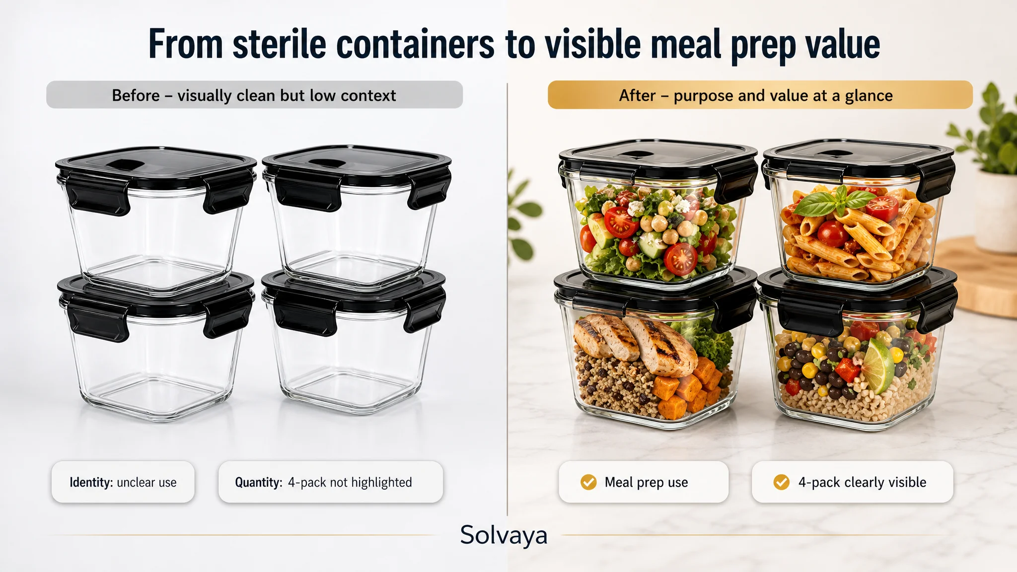
 2. Main image: not a design flaw, a logic flaw
Team’s belief
“Our main image is empty and sterile. The competitor shows tasty meals; we just need more appetizing food styling.”
DeepBI’s finding
The main image gap was only -1 point, and the real issue wasn’t “ugliness”—it was diagnostic clarity:
- The target hero image showed empty containers, clean but emotionally flat.
- The 4-pack quantity was not visually dominant.
- No immediate confirmation of capacity or intended use (meal prep) appeared in the hero shot.
The benchmark, on the other hand:
- Put real food inside each container to instantly frame use (meals, not just leftover scraps).
- Made pack count and purpose (meal prep) obvious at first glance.
DeepBI’s recommendation was not “make it prettier” but:
- Use the main image to instantly answer three questions:
1. What is this? (glass meal prep containers)
2. How many do I get? (4-pack, visually explicit)
3. What is it for? (batch-cooked meals, visible in real food)
Crucially, DeepBI also flagged a structural issue: the main image slot was being used by a video thumbnail, increasing noise and potentially diluting how Amazon’s algorithm judged image relevance. This was a logic error, not just a styling choice.
The outcome: instead of a loose “redo the hero shot” brief, the team now had a decision rule—the first image must establish identity, quantity, and purpose before any aesthetic flourish.
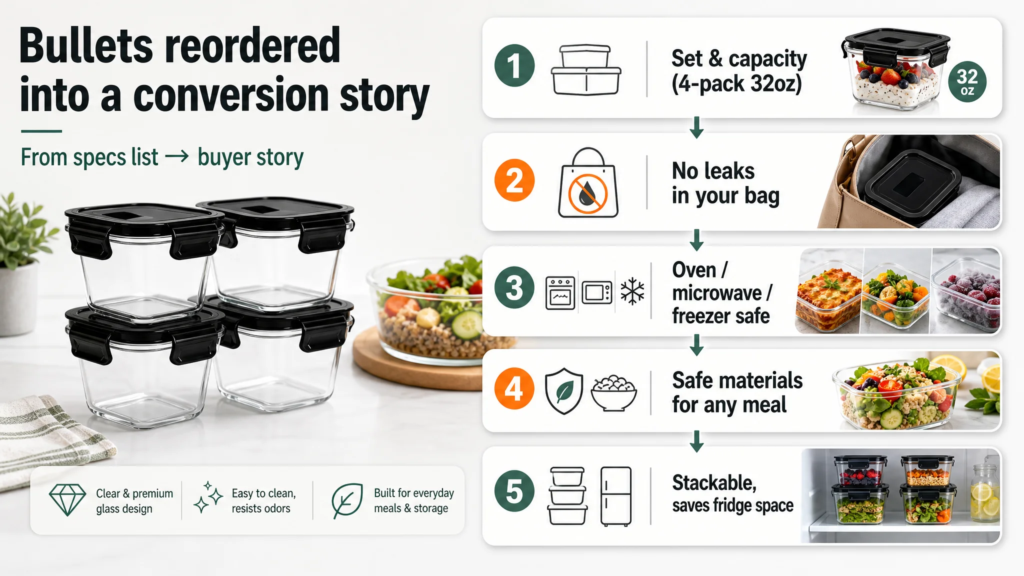
 3. Bullet points: too technical, too slow to create buying intent
Team’s starting point
“Our bullet points describe material and temperature range. Shoppers will see it’s safe and durable; that should be enough.”
DeepBI’s comparative reading
The benchmark’s bullets followed a buyer story arc:
1. Start from usage scenarios (meal prep, office lunches, takeout).
2. Move into specific pain relief (“never endure spilled soup or sauce dirty your bag”).
3. Then safety and material (BPA-free, durable, oven safe).
4. End with space-saving stackability.
The target listing did the opposite:
- Led with material and safety (“borosilicate glass, BPA-free”).
- Took several bullets before clearly stating who uses this and for what.
- Repeated similar ideas in bullet 1 and 5 (material and scenarios), wasting an entire slot.
- Mentioned leakproof features, but only as a generic feature, not as a real-life problem avoided.
DeepBI’s diagnosis wasn’t “rewrite in better English”. It was:
- The bullet structure extends the conversion path: buyers must translate technical details into their own use case.
- Critical emotional levers—like “your bag won’t be ruined by soup leaks”—are missing, even though the product physically supports them.
The recommended rewrites followed a strict pattern:
- Bullet 1: Declare the set and capacity (“4-pack 32oz”), immediately anchoring value.
- Bullet 2: Make leakproofness a bag safety story, not a gasket specification.
- Bullet 3: Clarify oven/microwave/freezer/dishwasher safety with actual temperature ranges and a usage warning (remove lid).
- Bullet 4: Reassure on material safety and wide applicability (from salads to hot soup).
- Bullet 5: Close on stackable, space-saving benefits for fridge and cabinets.
This reordering turned bullets from a compliance list into a conversion narrative: who you are, what problem you have, how this specific 32oz set solves it.
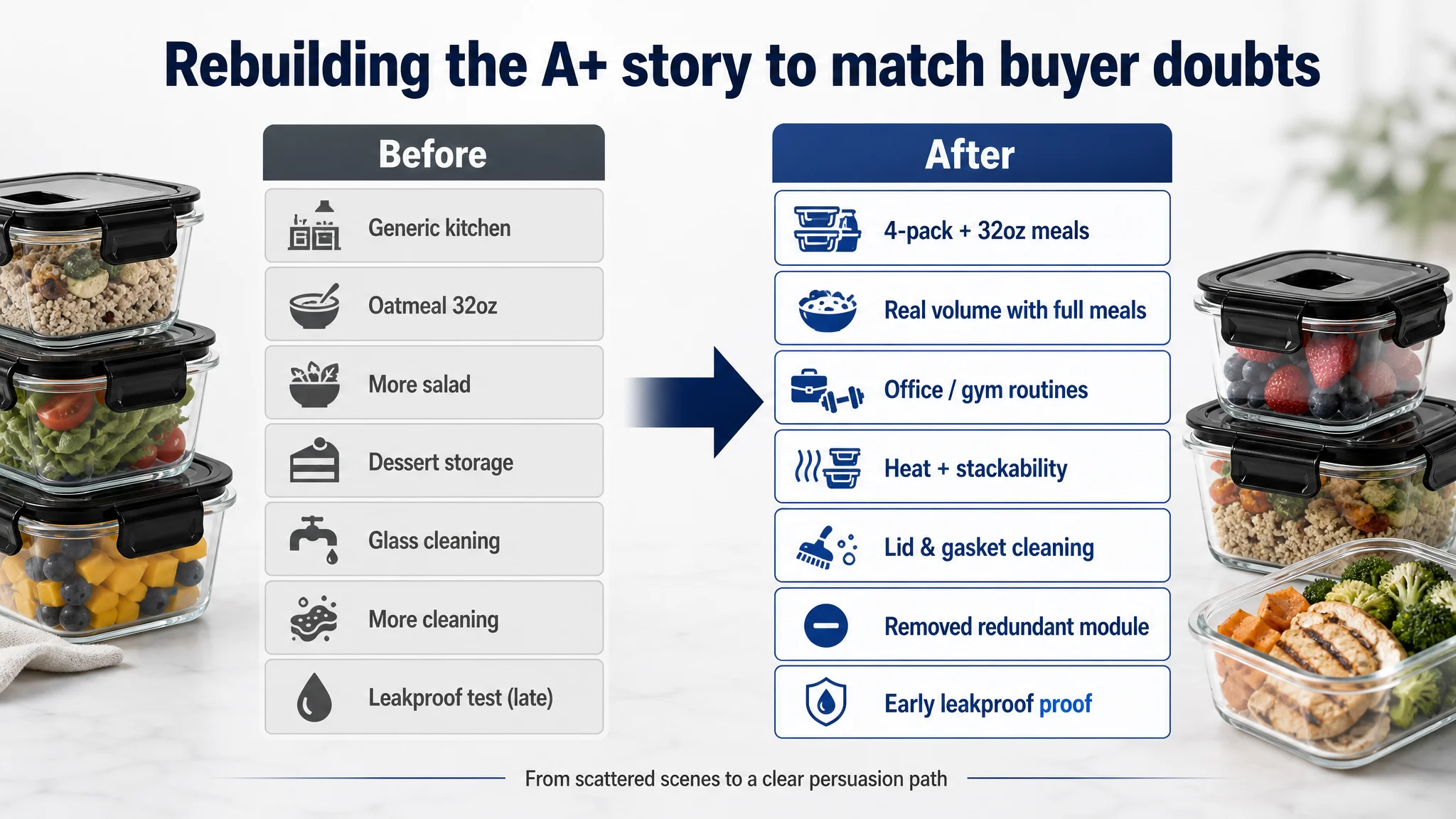
 4. Detail page (A+): a broken persuasion path, not a missing module
The biggest gap (19 vs 23 / 25) was in the A+ detail page. The team’s intuitive plan was:
“Let’s add more images and show more scenes.”
DeepBI’s breakdown showed a different issue: sequence and redundancy, not mere quantity.
What the target A+ did
- Module 1: Generic kitchen scene focused on material and broad uses, but:
- Didn’t clearly show “4-pack” as a concrete set.
- Didn’t visually anchor what 32oz actually means.
- Module 2: Showed 32oz capacity, but only with oatmeal and fruit—a light breakfast, not a full meal.
- Module 3: Another salad/meal prep image that added little beyond modules 1–2.
- Module 4–6: Repeated cleaning visuals, focused on rinsing glass, while not addressing the real complexity: hinged lids and removable seals.
- Module 7: Finally demonstrated leakproof performance—but at the end of the scroll.
What the benchmark did differently
From the very top, the benchmark:
- Introduced brand + safety icons (BPA-free, microwave safe) in the first screen.
- Used multi-person, multi-context scenes (family kitchen, office lunches) to broaden relevance.
- Explicitly mapped a “from freezer to microwave / oven” usage path.
- Included a dishwasher cleaning module that resolved cleaning doubts early.
DeepBI’s key insight: the target listing had most of the ingredients, but in the wrong order and density. The persuasion path was:
1. Generic reassurance.
2. Light breakfast use.
3. More salad.
4. Dessert storage.
5. Generic cleaning.
6. More cleaning.
7. Leakproof test.
Compare that to what a rational buyer actually worries about:
1. What am I buying? (set composition, capacity)
2. Is it safe? (material, BPA-free, heat resistance)
3. Will it leak in my bag?
4. Is it really big enough for a full meal?
5. Is it a pain to clean?
DeepBI’s recommended reordering and trimming:
- Module 1: Immediately show 4-pack composition and name the 32oz capacity with real meal visuals (meat, pasta, full dishes) instead of just raw vegetables.
- Module 2: Visualize the true volume with substantial meals, upgrading perception from “snack storage” to “full meal storage”.
- Module 3: Target daily routines: office lunches, gym meals, commute use. Tie directly to bullet scenarios.
- Module 4: Demonstrate temperature safety and stackability with mainstream leftovers, not niche desserts.
- Module 5: Explicitly address lid and gasket cleaning, as bullet points now promise removable silicone seals.
- Module 6: Remove redundant glass-cleaning module to shorten the decision path.
- Module 7: Move the leakproof test much earlier, so buyers don’t have to scroll to the bottom to see the most critical proof.
The change wasn’t “add more images” but rebuild the storyline: capacity → safety → portability → durability → cleaning → leakproof proof, with each module answering a specific buyer doubt only once.
 5. Reviews: trusting the product but underestimating scale and exposure
At first glance, the review dimension (10 vs 13 / 15) looked “good enough”:
- 4.4 stars is objectively strong.
- 712 reviews is respectable.
But in context:
- The benchmark had 3569 reviews and a 4.6-star rating.
- The target listing’s review volume was about 20% of the benchmark’s, which affects social proof perception and algorithmic favor.
DeepBI did not suggest gaming reviews; instead, it reframed expectations:
- This listing’s issue is not a toxic review profile; its VoC is healthy.
- The real gap is how effectively the listing converts the traffic it already gets into these positive reviews.
In other words, instead of chasing more review volume via campaigns, the priority is:
- Make every impression more likely to convert by fixing the visible story.
- Only then should the team decide whether to invest in structured review growth.
 Why the “obvious fix” was not the right first move
If the team had executed their original plan—general visual refresh—they would likely have:
- Made nicer-looking images that still failed to emphasize 32oz / 4-pack value.
- Left the most important proof (leakproof, temperature range, portability) buried deep in the detail page.
- Kept the bullet structure focused on material first, use case second.
- Continued to show light breakfast scenes that understate capacity.
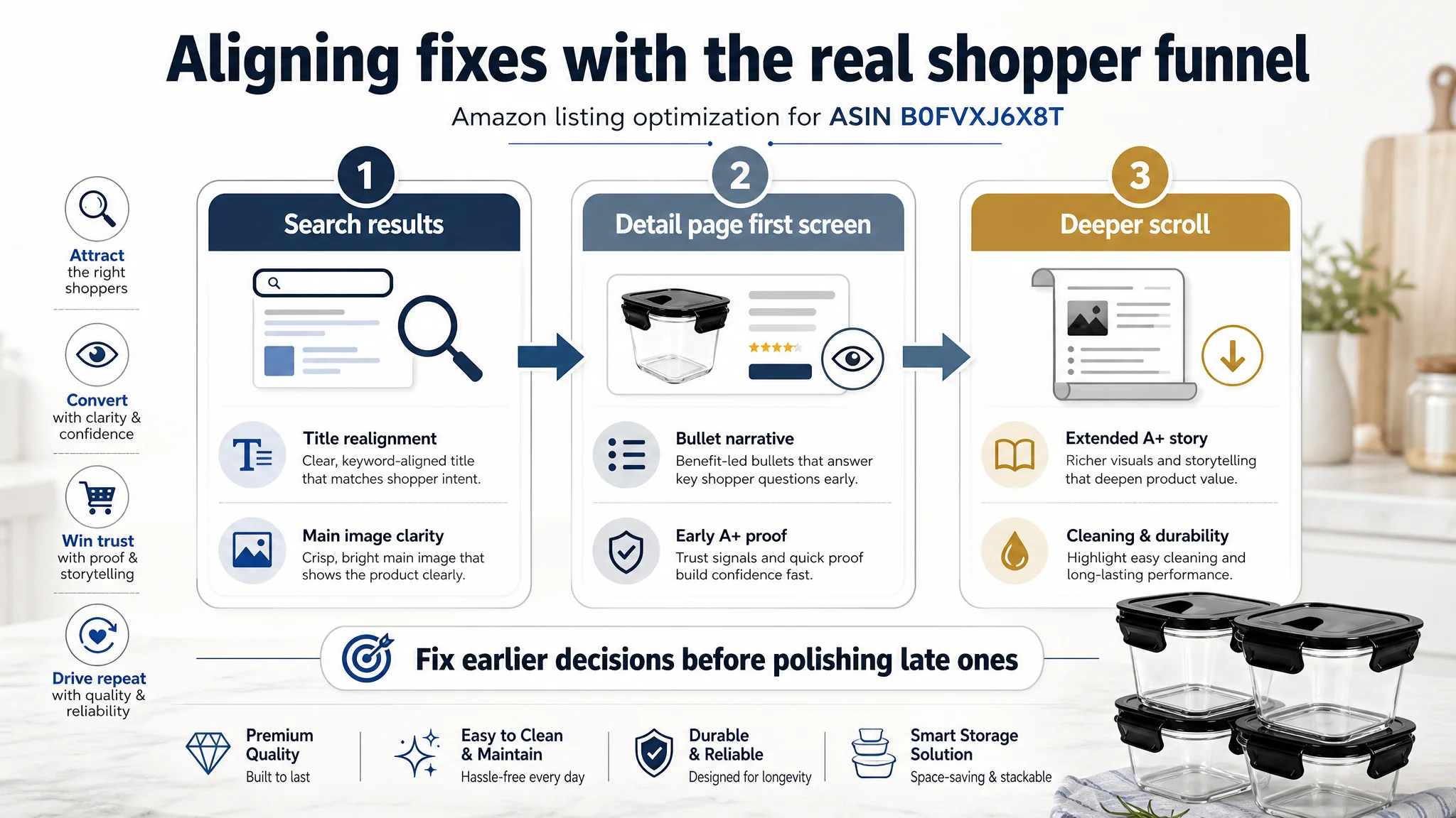
DeepBI’s scoring-based diagnosis forced a different order of operations:
1. Title realignment: Make 4-pack / 32oz, airtight lids, and oven safety visible in the first 100 characters. This improves relevance and pre-qualifies the right buyer.
2. Main image purpose clarity: Ensure identity, quantity, and purpose are obvious at a glance. Shift away from generic empty containers and away from video thumbnails occupying the main slot.
3. Bullet point narrative restructuring: Shorten the path from “I see glass containers” to “these solve my daily problems without mess or hassle.”
4. Detail page storyline rebuild: Use modules to answer questions in the order buyers ask them, cutting redundancy and bringing leakproof / cleaning proof forward.
5. Only then: Invest in higher-end imagery that follows this logic, rather than decorating an unchanged structure.
This order is rational because it mirrors the funnel:
- Search page → Title & main image
- Detail page first screen → Early A+ modules and key proof
- Deeper scroll → Extended use cases, cleaning, and trust consolidation
Optimizing a later stage while earlier stages are misaligned yields diminishing returns. DeepBI’s scoring surfaced where each point of loss actually occurred, so resources could be sequenced accordingly.
 What actually changed in the brand’s operating logic
Even before post-optimization performance data was available, the engagement shifted how the team thought about listing optimization:
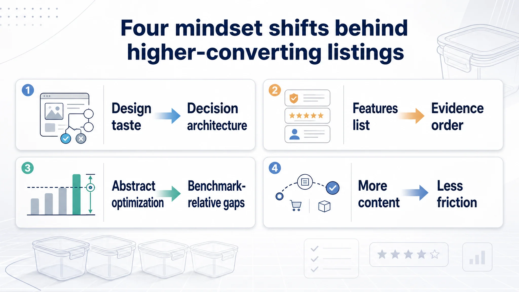
1. From “design taste” to “decision architecture”
They stopped asking, “Does this image look premium?” and started asking:
- “Which decision in the buyer journey does this image resolve?”
- “Which doubt does this bullet remove?”
1. From feature listing to evidence ordering
Instead of merely stating:
- “Borosilicate glass, BPA-free, airtight, 32oz”
They began to map:
- Which features must appear first to drive click.
- Which must be proven visually to justify a higher price or larger capacity.
- Which can be left for deeper readers.
1. From generic optimization to benchmark-relative gaps
The team no longer optimized “in the abstract.” Every change was anchored to:
- A specific gap vs a high-performing benchmark.
- A specific dimension score (title, main image, bullets, detail page, reviews).
- A precise module or bullet where that gap lived.
1. From “more content” to “less friction”
They learned that adding scenes and photos is not inherently good; duplication can create confusion and fatigue. The discipline became:
- One proof point per module.
- Eliminate redundant cleaning or salad images that don’t change the decision.
 DeepBI’s value: not more features, but better diagnosis
In this case, DeepBI did not “fix the listing” by pushing a button. It did something subtler and more commercially important:
- It disproved the team’s initial diagnosis (“it’s just bad photos”).
- It quantified where and how the listing underperformed: title ordering, narrative structure, A+ sequencing, evidence placement.
- It provided a decision framework:
- Which changes matter most.
- In what order they should be executed.
- How each visual or text change maps to a buyer decision.
Many Amazon brands believe they have a “creative” problem when they actually have a logic problem:
- Capacity advantages hidden behind brand names.
- Leakproof claims shown only at the bottom of the page.
- Cleaning complexities never addressed, while generic glass rinsing is shown twice.
- Light breakfast visuals underselling containers designed for full meals.
If your listing feels “good enough” but still loses to competitors who don’t seem fundamentally better, you may be misdiagnosing the constraint in a similar way.
DeepBI’s strength in this engagement wasn’t generating assets—it was locating the real bottleneck and aligning the team’s decisions around it. That shift—from guessing at aesthetics to auditing the decision path—is where the commercial leverage truly lies.