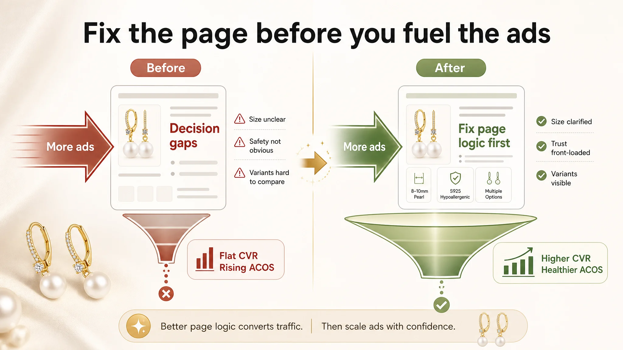
 Once this was clear, the optimization direction flipped. Instead of further fragmenting budget into new campaigns and micro‑keywords, the focus moved to restructuring the Listing’s decision logic: re‑prioritizing the title around “pearls + outcome + safety,” converting redundant lifestyle images into precise size and variant visuals, and front‑loading rational trust (materials, hypoallergenic proof, real dimensions) before aesthetic storytelling. As those changes landed, the page began to carry its own weight again—paid traffic became useful instead of expensive.
For other Amazon sellers, especially in categories like jewelry, personal care, and gifts, the lesson is sharp: a “nice” Listing with complete modules can still lock your conversion at an invisible ceiling. When ACOS won’t improve despite “good” ads, it may be your page’s trust and decision structure—not your campaign setup—that is quietly setting the limit.
What the Seller Saw: Ads Were Working, Yet Conversion Felt Stuck
This product is a pair of pearl drop earrings for women, on Amazon US. The Listing was not a typical problem child:
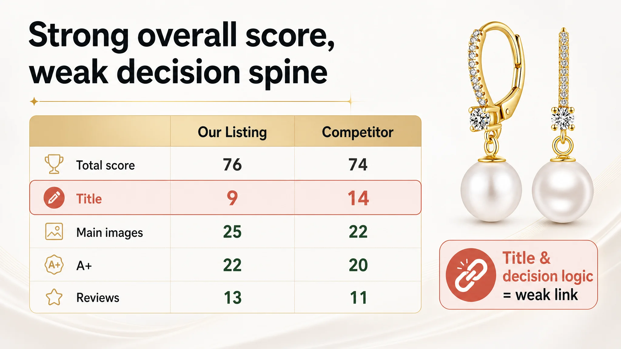
- Overall competitive score: 76/100 vs. 74/100 for the benchmark competitor.
- Review profile: 4.5 stars with 368 reviews vs. the competitor’s 4.0 stars and 106 reviews.
- A+ content present, with high‑quality model imagery and rich scenarios.
From a classic Amazon operations perspective, this looked healthy. The seller’s instinct was:
- “Our page is better than theirs, we just need to push more traffic.”
- “Ads probably need a more refined structure, better keyword coverage, and higher bids.”
- “If we keep feeding reviews, conversion will naturally climb.”
So the team kept iterating ads: adding campaigns, refining match types, testing new keyword branches. Yet the structural feeling did not change: traffic went up; ACOS did not really ease; conversion did not show a clear breakthrough.
“The real problem was not that ads failed to bring traffic. It was that the page could not convert the traffic efficiently enough.”
DeepBI entered this case not to “fix ACOS directly,” but to ask a prior question: does this Listing actually deserve more traffic at its current conversion capacity?
The Real Constraint Was Listing Conversion Capacity, Not Ad Sophistication
DeepBI’s Listing scoring showed a subtle but important imbalance:
- Total score: the seller slightly ahead of the benchmark (76 vs. 74).
- But dimension scores were uneven:
- Title: 9 vs. 14 (seller clearly weaker).
- Main image set: 25 vs. 22 (seller stronger).
- Bullets, A+, reviews: roughly comparable or better.
On the surface, this suggests a strong visual and trust backbone (images, A+, reviews) but a weaker “front door” (title). Yet deeper analysis showed a more systemic issue: the Listing’s visible strength was not aligned with buyers’ actual decision path on Amazon jewelry:
1. Can I trust this material on my skin?
2. How big does it look on the ear, really?
3. Which variant (size/color/metal) is right for me?
4. Is this safe and “giftable” enough?
The competitor’s page, though overall slightly lower in total score, was more tightly aligned with that path where it mattered most.
 Title: Search Weight and Safety Promise Were in the Wrong Order
The seller’s original title heavily stacked materials:
- “18k White Gold Plated, 925 Sterling Silver” repeated, with the core keyword “Pearl Diamond Earrings” pushed backward.
- No brand mention at the front.
- No explicit “Hypoallergenic” claim and no clear size hint.
The competitor:
- Led with a brand name and core keyword.
- Brought “Hypoallergenic” and size range (8mm–13mm) into the first visible chunk.
For Amazon jewelry buyers, especially sensitive‑ear customers, “Hypoallergenic + size clarity” is not an extra; it is a primary decision filter. The seller’s title left those cues too weak or too late.
DeepBI’s recommendation reframed the title around the buyer’s first question, not the seller’s desire to list materials:
18k White Gold Plated S925 Sterling Silver Pearl Drop Earrings with Cubic Zirconia, Hypoallergenic Dainty Pearl Jewelry for Women
This change:
- Consolidates duplicate “Pearl Earrings” wording to free space.
- Introduces “Drop Earrings” (shape) and “Cubic Zirconia” (clarified stone) for search and expectation alignment.
- Brings “Hypoallergenic” into the core promise, where mobile search results can actually show it.
The judgment here was simple but crucial: until the title clearly signals outcome, shape, and safety, no amount of ad volume can fix the fact that many qualified buyers will not click in at all, or will arrive with a fuzzy understanding of what they are getting.
The Main Image Set Looked Beautiful but Did Not Answer Key Buying Questions
On score alone, the seller’s main images edged out the competitor (25 vs. 22), thanks to:
- High‑quality model shots.
- Elegant silk backgrounds.
- Cohesive brand feeling.
But DeepBI’s side‑by‑side image analysis showed a different problem: the sequence did not progressively answer buyers’ rational doubts. Several images were visually pleasing repetitions, instead of distinct decision nodes.
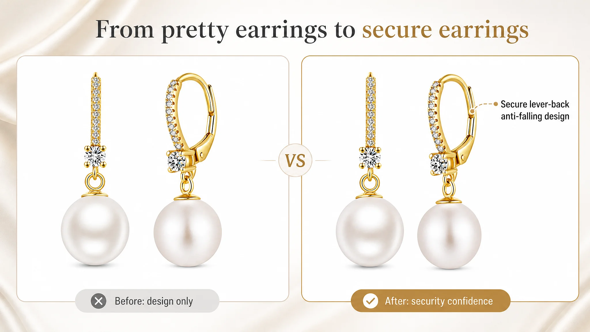 Image 1: Design Shown, Security Not Claimed
The first image showed the product and lever‑back design, but it behaved like a static beauty shot. The closing mechanism was visible, yet not framed as a benefit.
DeepBI’s judgment:
- This category carries a common concern: “Will these earrings fall off?”
- The lever‑back structure is an asset that reduces psychological risk.
- The first or second image should explicitly call out “secure lever-back design” with a side view, instead of letting this remain implicit.
Image 2: Wear View + Size Data Cramped Into One Frame
The second image tried to do too much:
- Model wear shot.
- Text overlays with size.
- Material and safety callouts.
The result: overcrowded composition, with no clear focal point. In contrast, the competitor split scale confidence into clearer steps: one image for wear and proportion, another for precise dimensions.
DeepBI’s call:
- De‑clutter image 2, letting it focus on one decisive confidence point, such as material quality and safety (S925 + hypoallergenic) with a precise close‑up.
- Move detailed size communication out to its own dedicated image.
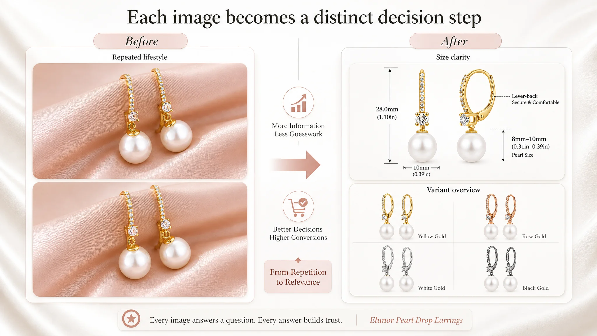 Image 3 & 4: Redundant Lifestyle Rather Than Hard Data
Image 3 repeated a front lifestyle view on silk; image 4 repeated a similar angle, barely advancing the narrative.
Yet this product’s real friction point is not “Is it pretty?”—the visuals already answer that. The doubts are:
- “How big is 8–10mm pearl drop on my ear?”
- “What are the exact dimensions?”
- “Which colors/variants exist?”
DeepBI’s re‑ordering:
- Convert image 3 into a clear size diagram with exact measurements (e.g., pearl size and overall length 15mm × 28mm).
- Convert image 4 into a multi‑variant display, showing available colors (White/Rose Gold/Gold/Black) in one glance.
This shifts the image sequence from “more of the same beauty” to “beauty + clear rational choice.” Each slot now earns its place in the funnel.
Image 5: Final Lifestyle Without a Clear New Reason to Buy
The last image again showed a lifestyle wear view, but it did not add new information.
DeepBI’s view:
- The last image should close the deal, not restate the obvious.
- This is where “giftability” and service assurance belong: gift box visual, multiple gifting scenarios, and the 180‑day promise.
“Advertising does not only amplify advantages. It can also amplify a page’s existing defects.”
With the original sequence, ads were amplifying a page that looked premium but still left size, variant options, and service guarantees under‑communicated. The Listing was consuming traffic instead of leveraging it.
A+ Content Was Strong Emotionally, But Trust Was Not Fully Front‑Loaded
Interestingly, the seller’s A+ content was objectively better than the competitor’s:
- Full‑width, high‑end bridal and festive scenes.
- Multi‑layer use cases: daily wear, wedding, fashion styling.
- Visualized third‑party testing (‘PASS’ magnifier), reinforcing professional safety claims.
The issue was order and emphasis, not quality.
 DeepBI’s diagnosis:
- The A+ modules did a great job of emotional persuasion and high‑end positioning, but rational trust (materials, safety, size) appeared later in the scroll.
- Buyers with sensitive ears and size anxiety needed those answers earlier, before they invested emotional attention in the bridal storyline.
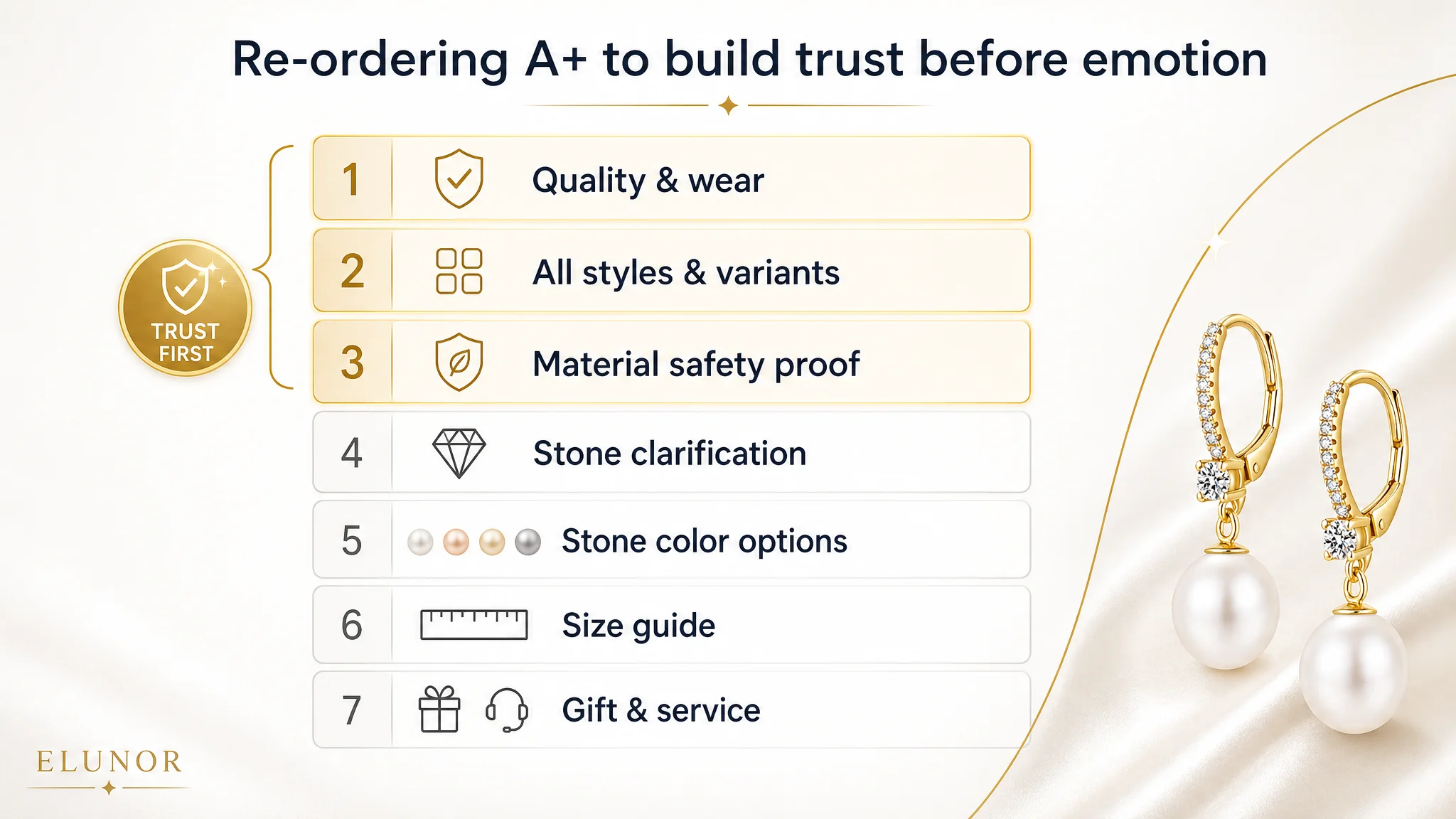
Recommended re‑ordering:
1. Module 1 – Immediate quality and wear effect.
Use a clean, high‑quality image that both looks premium and shows natural wear, immediately confirming “this is not cheap costume jewelry.”
1. Module 2 – Full style and variant overview.
One module that visually shows all metal/pearl color variations. Stop forcing buyers to decode the color dropdown alone.
1. Module 3 – Rational trust front‑loaded.
Visualize S925 sterling silver, 18K white gold plating, 925 stamp, “lead‑free, nickel‑free, hypoallergenic,” plus REACH compliance—using icons and close‑up shots, not just text.
1. Module 4 – Honest stone clarification.
Clearly present “5A Cubic Zirconia” as the accent stone. This reduces mismatch between the word “diamond” in the title and reality, lowering disappointment and returns.
1. Module 5 – Stone color options.
A color card of CZ colors corresponding to pearl/metal choices, making customization feel real, not just textual.
1. Module 6 – Size comparison.
Visual size guide clarifying pearl sizes and overall length, reducing hesitation for scale.
1. Module 7 – Gift proof.
Show the gift box, plus scenes like Mother’s Day, birthdays, anniversaries, with the 180‑day service promise visually anchored.
By moving trust and clarity upstream, the Listing reduces decision friction before asking for emotional commitment. This is exactly where conversion capacity is either built or lost.
Bullets: Information Was There, But the Buying Logic Needed Tightening
Both the seller and the competitor scored similarly on bullets (7/10 each). Text existed; the difference was in structure and buyer logic.
The competitor:
- Opened with “Large Pearl Earrings,” directly labeling style and size.
- Dedicated a bullet to cultured pearl details and color options.
- Stated “nickel‑free, lead‑free, cadmium‑free” and “sensitive ears” clearly.
The seller:
- Opened from “original design” and “5A zirconia”—unique, but less immediately aligned with the first concern (size and comfort).
- Merged size and target audience, making it dense.
- Mentioned safety and REACH compliance, but in a more technical, less buyer‑language way.
DeepBI’s rewrites did not invent new claims. They re‑sequenced existing truths into clearer buyer logic:
1. Design & visual impact
“Elegant Original Design” paired 5A CZ and lustrous pearls, linked to bridal and daily wear—a strong, premium opening.
1. Material & sensitive ears
“Premium Quality for Sensitive Ears” made the safety angle explicit: 925 silver, 18K plating, lead‑free, nickel‑free, hypoallergenic, ‘925’ stamp, hand‑polished comfort. This bullet speaks directly to a key anxiety.
1. Specifications & variety
Clear sizes (e.g., 8–10mm pearls, 15×28mm overall) and color variants (White, Rose Gold, Gold, Black) in one compact structure.
1. Gift scenarios & recipients
“Exquisite Gift Packaging” names mothers, daughters, wives, friends, and key occasions. This turns a generic gift claim into a concrete mental picture.
1. Service promise
“180-Day Hassle-Free Service” with explicit “reply within 12 hours” commitment, raising perceived professionalism.
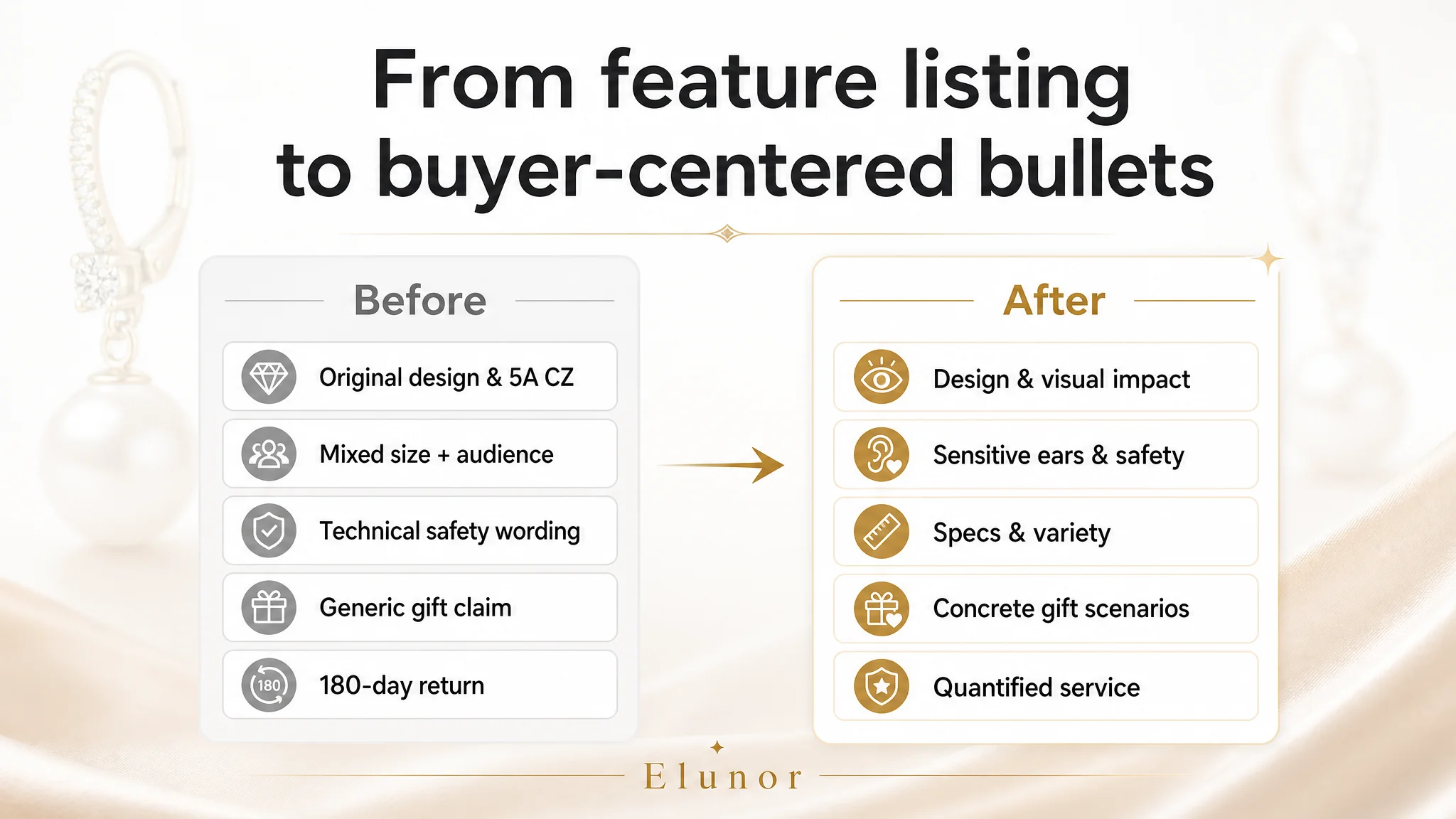 The business judgment here: the bullets were not a “word count task.” They were the skeleton of the page’s rational narrative. Without a clear pain‑point‑to‑solution flow, the Listing forced images and A+ content to carry more load than necessary.
Why DeepBI Did Not Recommend “More Ad Tuning” First
At the time DeepBI stepped in, the seller already had:
- Sufficient traffic from Amazon ads.
- Stronger review health than the competitor.
- Visually appealing assets.
But conversion remained flatter than expected relative to the investment and competitive edge.
Continuing to escalate ads under these conditions would create several risks:
- Rising ACOS without structural CVR improvement. More paid clicks into the same decision gaps simply magnify inefficiencies.
- Organic ranking stagnation. If ad‑driven sessions do not convert well enough, the Listing struggles to build sustainable organic momentum.
- Misleading diagnosis loop. The team might wrongly conclude “this product is saturated” or “the category is the problem” when the real issue is page logic.
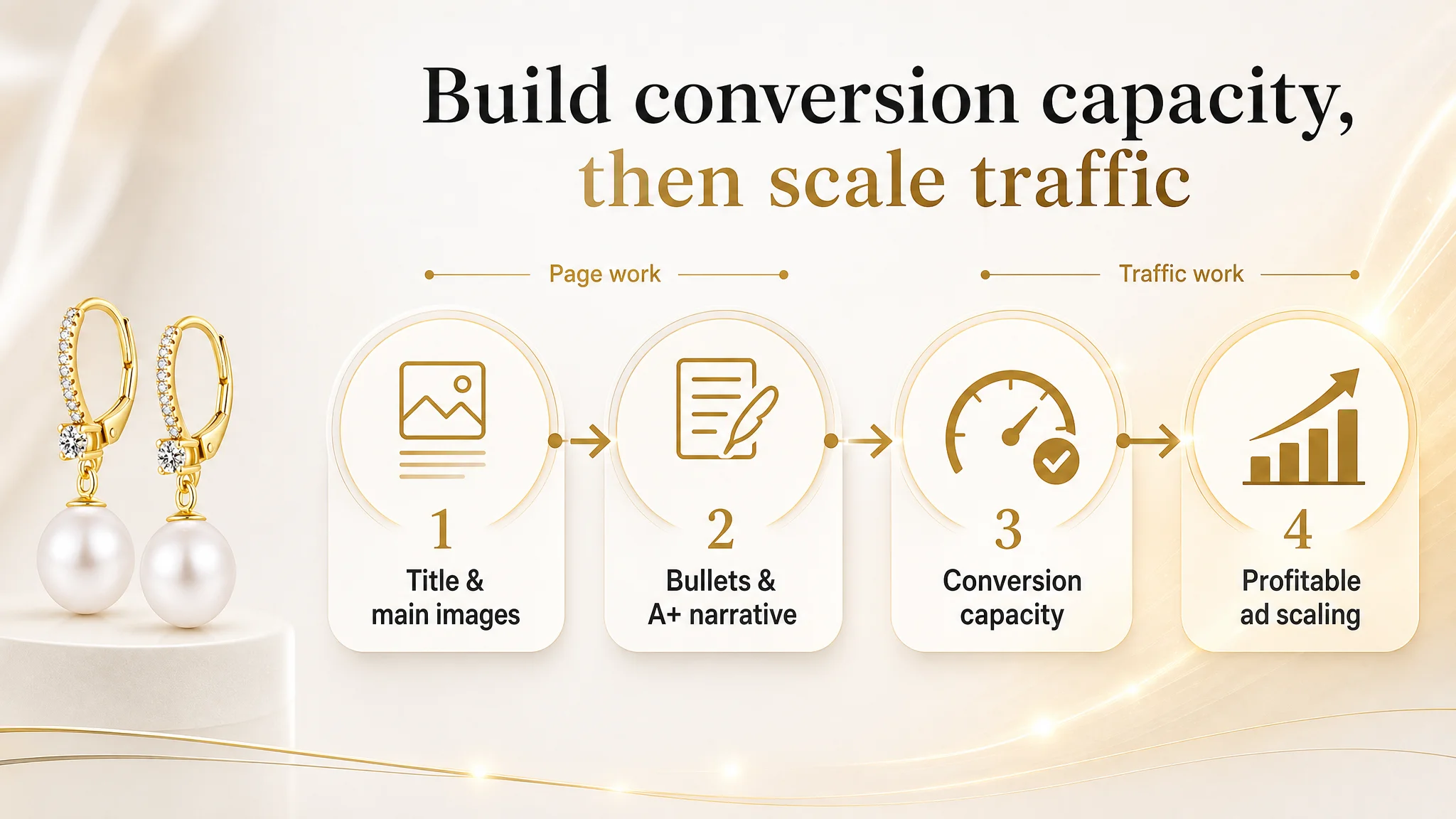
DeepBI’s position was clear: before scaling traffic further, the Listing must prove it can convert the traffic it already receives.
 The priority sequence was:
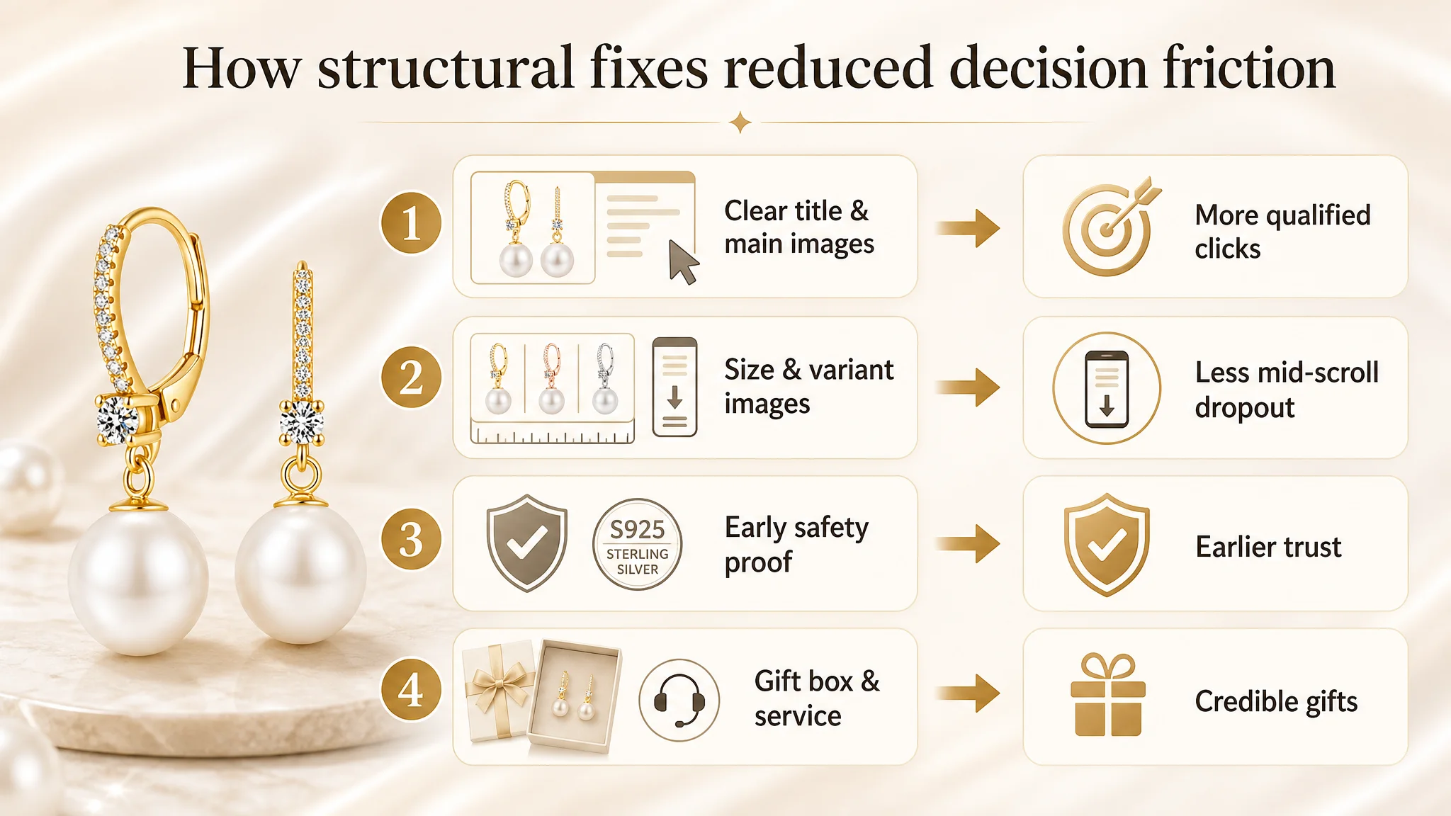
1. Repair conversion foundation.
- Clarify title and search intent alignment.
- Turn each main image into a distinct decision node (design → security → size → variants → giftability/service).
- Front‑load material/safety proof and size clarity in A+.
1. Then refine ads.
- Once CVR stabilizes upward, ad auctions become more forgiving.
- Each click has a higher probability of converting, giving more room to optimize bids and keyword breadth.
This reversal—Listing first, ads second—is what many sellers find hardest to accept, because ad dashboards scream for attention daily, while Listing issues feel “done” once modules are filled.
How the Page’s Sales Logic Started to Recover
After the Listing was reframed and content re‑sequenced, several structural changes became visible, even before quoting specific KPIs:
- Clicks became more qualified.
The new title and main image sequence set clearer expectations on size, shape, and hypoallergenic safety. Buyers who clicked were more aligned with what the product actually is.
- Fewer “silent doubts.”
Dedicated size and variant images, plus clearer bullets, meant fewer users dropping off mid‑scroll due to uncertainty about scale or color options.
- Trust was built earlier.
Visualized 925 stamp, REACH compliance, and hypoallergenic claims moved into earlier modules, making the page feel more “safe to proceed” before emotional scenes.
- Gift framing became credible.
Showing the gift box and 180‑day service promise visually made giftability look real, not aspirational.
 As these pieces aligned, the Listing’s conversion capacity improved—not by magic, but by removing friction points that previously were hidden behind “good enough” visuals.
Ad traffic, under these conditions, started to behave differently:
- The same budget generated more orders, because each click landed on a page that answered the right questions in the right order.
- The seller had more confidence to test new ad branches, knowing that conversion weakness was not purely a page issue anymore.
What Changed in the Seller’s Understanding
The most lasting outcome of this case was not only the uplift in Listing behavior, but a shift in how the team thought about Amazon optimization:
- Ads are not a universal fix.
When conversion is artificially capped by page logic, more traffic simply becomes more expensive learning.
- Title, main image, bullets, and A+ must work as a single argument.
It is not enough for each module to look “complete.” They must collectively guide a buyer from curiosity to trust to purchase, especially around core concerns like size and safety.
- A strong review profile does not guarantee that conversion has no room to grow.
Here, reviews and A+ were already strong, yet the title and image sequence still hid a conversion leak.
- Before increasing traffic, ask: “Does this page deserve more traffic?”
Once the Listing can clearly answer what the product is, who it is for, how it fits, and why it is safe and giftable, ads can become a true growth lever instead of a cost sink.
For Amazon sellers reading this, especially in categories where looks, size, and safety matter, this case is a reminder: a Listing that “looks good” and “scores well overall” can still quietly limit your business. The work is not just filling modules; it is constructing a precise decision journey that lets every paid click find its way to a justified purchase.