

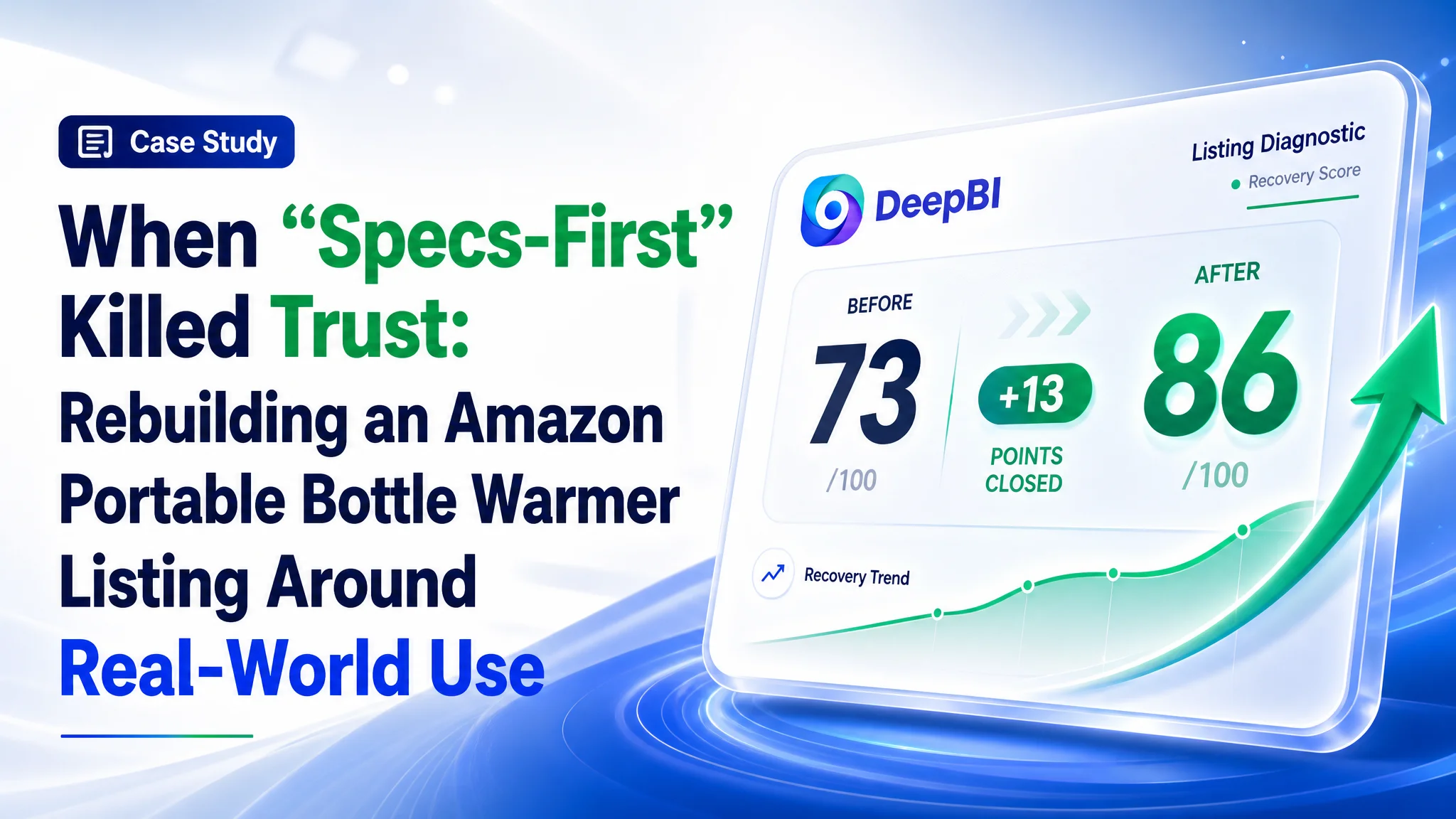
This is a case about a US Amazon seller in the baby-care category whose portable bottle warmer kept losing out to a direct competitor despite strong technical specs. The team believed the problem lay in advertising and keyword tuning, but the data told a different story: their Amazon Listing itself was underpowered in conversion, especially compared with a benchmark product page.
DeepBI’s Listing diagnosis showed that the page was built like a spec sheet: dense technical parameters in the title, “tech poster” style images, and functional text that read like a manual. The competitor’s Amazon product page, by contrast, felt like a clear travel-feeding solution supported by scenes, evidence, and reviews. Ads were not the primary bottleneck; the Listing’s ability to convert traffic was.
The optimization therefore did not start with “more traffic” or “better bids”, but with a full reframe of the product page: main images moved from static display to real travel feeding scenes, bullets were rebuilt around pain points like battery anxiety and late-night feeding, and A+ content added cleaning proof and objective trust modules. Other Amazon sellers can read this case as a warning: when ACOS feels stubborn or ads don’t scale, it is often the Listing’s conversion logic—not the ad console—that is quietly consuming your budget.
Amazon Ads Were Not Failing. The Page Was Consuming the Traffic.
The seller runs a portable bottle warmer on Amazon US, positioned for travel and outdoor use. On paper, the product is strong: 100W fast heating, 45W fast charging, 10,400mAh battery, 17oz capacity, 316 stainless-steel liner, long insulation. In practice, a directly comparable competitor’s Listing clearly outperformed it in visibility and trust.
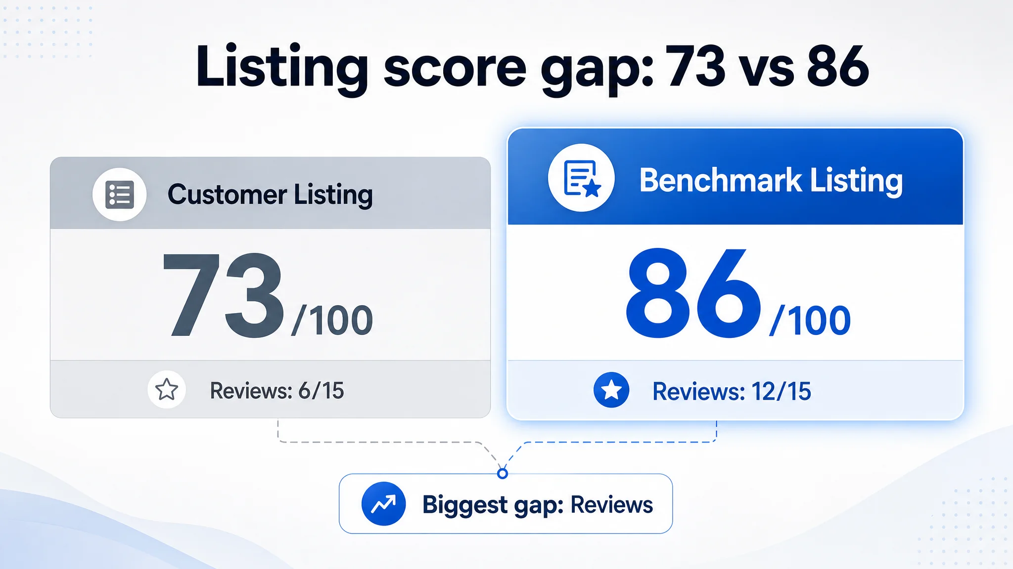
When we scored the two Amazon Listings across title, main image, bullet points, A+ detail, and reviews, the gap was clear:
- Customer Listing: 73/100
- Benchmark Listing: 86/100
- Deficit: –13 points overall
The largest single gap was not in visuals or title—it was in reviews (6 vs 12 out of 15). But every content dimension was also behind:
- Title: Customer: 13, Benchmark: 16, Full score: 20, Gap: -3
- Main image set: Customer: 25, Benchmark: 26, Full score: 30, Gap: -1
- Bullet points: Customer: 8, Benchmark: 9, Full score: 10, Gap: -1
- A+ / detail: Customer: 21, Benchmark: 23, Full score: 25, Gap: -2
- Reviews: Customer: 6, Benchmark: 12, Full score: 15, Gap: -6
From an ads perspective, this means every paid click is landing on a page that is structurally weaker than the benchmark. Continuing to push ad spend into this Listing would only amplify the Listing’s weaknesses.
“The real problem was not that ads failed to bring traffic. It was that the page could not convert the traffic.”
DeepBI’s judgment: before scaling ads, this Amazon product page had to regain its basic conversion capacity.
The Customer’s Misdiagnosis: “We Just Need to Push the Specs Harder”
Internally, the seller’s logic was straightforward:
- Our product has better specs (100W, 45W fast charge, 10,400mAh, 316 stainless steel).
- If we highlight these specs in title, images, and bullets, customers will see we’re superior.
- If results aren’t good enough, we should:
- Add more keywords into the title,
- Show more tech elements in the images,
- Push ads harder on “portable bottle warmer”, “battery bottle warmer”, etc.
This led to a spec-first, parameter-heavy Listing:
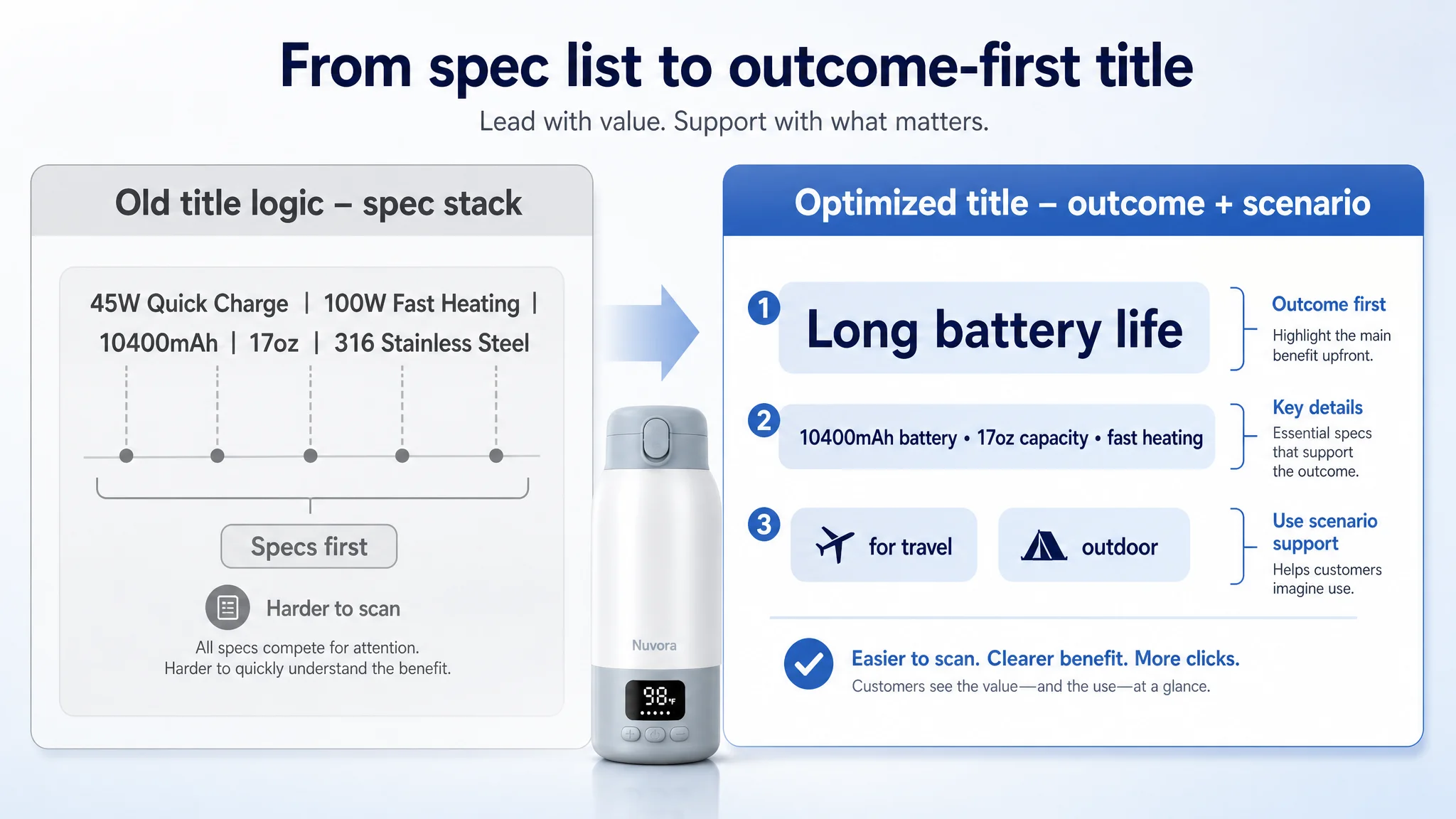
- Title stacked functions and numbers (“45W Quick Charge, 100W Fast Heating, 10400mAh, 17oz”), with “Portable Bottle Warmer for Travel” front-loaded but the real differentiator—battery life—hidden.
- Main images leaned into circuit-like visuals and “AI/SmartSensor” language, but did not visibly prove the real-world feeding experience.
- Bullet points focused on raw parameters, less on the parent’s pain points or context of use.
- A+ content opened with a crowded “feature collage” instead of a clean travel-validation story.
From the seller’s view, the ads team’s job was to solve performance by adjusting bids and keywords. From DeepBI’s Listing scores, it was clear that conversion capacity was the real constraint.
The Real Constraint Was Listing Conversion Capacity
When DeepBI benchmarked this Amazon Listing against the category leader, three structural issues emerged.
1. Title: Specs Over Outcome
The customer’s title:
- Structure: “function + spec” list, minimal hierarchy.
- Language: heavy technical terms (“45W Quick Charge, 100W Fast Heating, 10400mAh”) that require effort to parse.
- Missing logic:
- Core result (“long battery life”, “fast heating when the baby is crying”) is not clearly surfaced.
- Use cases are narrow: only “On-the-Go Use” is mentioned.
- No color or variant keyword coverage.
The competitor’s title, by contrast:
- Leads with “Extended Battery Life” as the primary hook.
- Combines result language (“Fast Heating, Dual Heating Modes”) with clear scenarios (“Travel, Outdoor, Baby Shower”).
- Ends with a color attribute, catching long-tail search.
DeepBI’s judgment: the customer’s title signals complexity rather than clarity. For a tired parent, the benchmark’s title reads like a solution; the customer’s reads like a spec sheet.
2. Visuals: Tech Poster vs. Real Feeding
In the image set, the customer’s page behaves like a technical brochure:
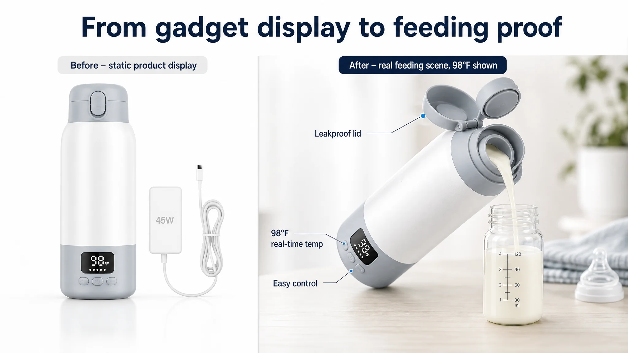
- Image 1: Product introduction, digital display, accessories — but no clear “this solves feeding while traveling” moment.
- Image 2: Capacity explanation (17oz) shown in a rational graphic, but out of context, without travel or day-long outing validation.
- Image 3: Emphasis on “SmartSensor” and AI-like circuits; actual heating times are relegated to a secondary table.
- Image 4: Fast-charging comparison, but battery capacity impact (how many feedings, how long you can go) is underplayed.
- Image 5: 316 stainless-steel and insulation explained in a static way, no explicit effort to link to hygiene or late-night feeding relief.
The competitor’s images do the opposite:
- Early images show real pouring into bottles and real scenes: picnic, car, nighttime feeding.
- Data is integrated only where it supports a clear, visible outcome (dual modes, precise temperature, certification).
This mismatch means the customer’s Listing fails to answer, visually and quickly: “Will this actually work for me when my baby is crying in a car at night?”
3. A+ Detail: Emotion Without Enough Evidence
The customer’s A+ content follows a familiar pattern:
- Mixed outdoor/indoor scenes plus multiple icons and text.
- Fast-heating claims in abstract “speed” visuals.
- Some structure and safety content, but no dedicated cleaning or certification modules.
The benchmark A+ content, however, systematically covers:
- Dual modes and ±1°F precision via clear diagrams.
- A step-by-step cleaning module with tools.
- A final test report/certification module, visually presented as documents.
For many buyers—especially for baby products—this kind of rational, objective proof is what closes the last 10–20% of hesitation. The customer’s page stops at emotional reassurance and specs, leaving a trust gap at the end of the journey.
Why DeepBI Did Not Keep Tuning the Ads First
Given this diagnosis, diving into Amazon ads structure, adding new keyword groups, or tweaking bids would not have solved the core issue.
The risks of “ads-first” here:
- High ACOS risk: Any extra ad spend drives more traffic into a Listing that converts weaker than the benchmark. ACOS tends to climb or remain stuck.
- Organic ranking pressure: If paid clicks don’t convert, Amazon’s algorithm gets weaker positive signals from that traffic. Organic rank becomes harder to maintain or improve.
- Misleading feedback loop: The seller might mistakenly conclude “the category is too expensive” or “our product is not competitive,” when in fact the page logic is misaligned.
DeepBI’s view was straightforward: until the product page tells a strong, credible story, ad optimization will be shallow. The priority had to be:
1. Restore the Listing’s ability to convert traffic.
2. Then let ads amplify that improved conversion, not fight against it.
This Product Page Did Not Lack Traffic. It Lacked Trust.
Looking across all five scored dimensions, DeepBI’s conclusion was:
“This Listing doesn’t lack features; it lacks a buyer-friendly decision path.”
Concretely:
- Title: Hard to scan, technical, outcome and scenarios under-expressed.
- Main images: Too static; not enough dynamic proof of pouring, travel use, or dual-mode benefit.
- Bullets: Informative but manual-like, not built around clear pain/relief logic.
- A+ content: Emotional scenes without enough visual evidence (cleaning, internal tech justification, certifications).
- Reviews: Fewer, weaker, with visible low-star quality complaints.
All of this accumulates into a simple buyer feeling: “This looks powerful, but I’m not 100% sure it really works the way I need, and I see some negative reviews.”
Ads cannot fix that feeling; only the product page can.
Reframing the Title: From “Parameter Stack” to “Outcome + Scenario”
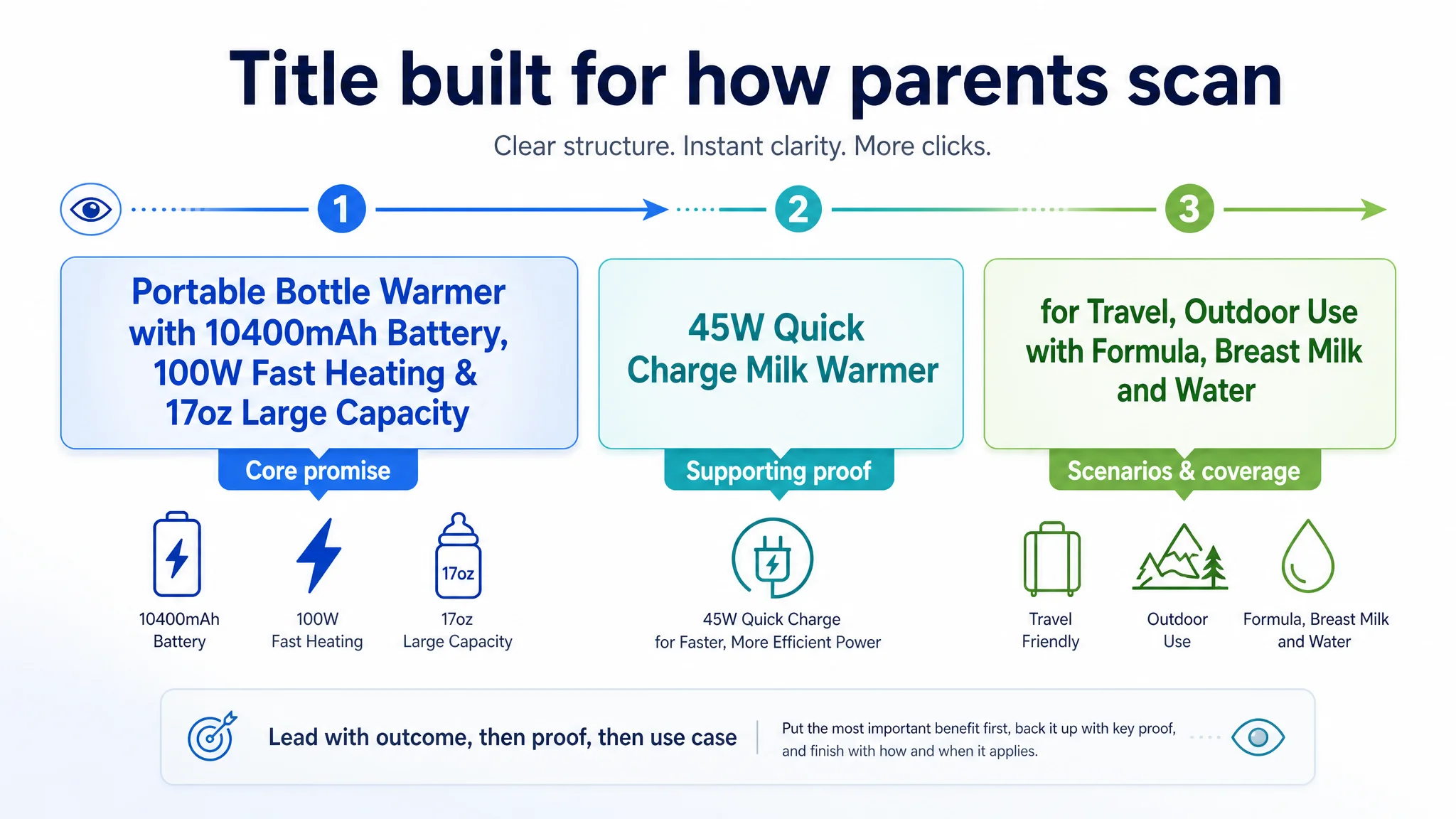
DeepBI’s first structural change was to reframe the title to match how parents actually decide:
- Surface battery and capacity as the practical core:
- “Portable Bottle Warmer with 10400mAh Battery, 100W Fast Heating & 17oz Large Capacity…”
- Keep fast heating and fast charge but tie them into a logical chain:
- 100W fast heating → baby doesn’t wait long
- 45W fast charge → battery refills quickly
- Expand scenes and liquid types:
- “for Travel, Outdoor Use with Formula, Breast Milk and Water”
This preserves the important specs for Amazon search while:
- Reducing duplication (“Portable Bottle Warmer” only once).
- Making the first half of the title read like a clear promise rather than a list of numbers.
- Catching more scenario-driven searches (“outdoor”, “travel”) without bloating.
The objective was not “SEO at all costs,” but SEO that matches how humans scan a search results page: the first few words must immediately say “this solves my portable feeding problem.”
The Bullet Points Had Information, but Not a Buying Logic
The original bullets behaved like condensed brochures. DeepBI restructured them into a pain-point-driven sequence, each with clear outcome and context.
Bullet 1: From “Speed Spec” to “Crying Baby Relief”
- Focus: fast heating + precise control.
- Language: “100W Ultra-Fast Heating & Smart Precision Control… heats 4oz to 98°F in 2–4 minutes with ±1°F precision, preserving nutrients and soothing hungry babies instantly.”
This connects technical capability → specific time → baby comfort, instead of just quoting watts.
Bullet 2: From “Battery Spec” to “No More Battery Anxiety”
- Focus: 45W fast charging + 10,400mAh capacity.
- Language: full charge in 1 hour, 8+ uses per charge, “no more battery anxiety during all-day outings”.
This mirrors the competitor’s “30% longer battery” logic but grounds it in the customer’s real advantages.
Bullet 3: Differentiation via Material and Insulation
- Focus: 316 stainless steel + 24-hour heat retention.
- Language: food-grade safety, easier cleaning, and late-night feeding without waiting.
Instead of abstract “material quality”, the bullet anchors on the night-feeding scenario parents remember.
Bullet 4: Capacity for Twins and Trips
- Focus: 17oz large capacity.
- Language: “for growing infants, twins, or siblings… multiple feedings without constant refills or reheating.”
This reframes size from “big bottle” to “fewer interruptions across the day.”
Bullet 5: Travel-Ready and Giftable
- Focus: leak-proof + portability + USB-C.
- Language: spill-proof seal, fits in diaper bags, universal USB-C charging, and a gift for new moms.
Each bullet now behaves as a mini landing page: pain → solution → context. That change alone increases the odds that ad traffic doesn’t bounce at the bullet-point layer.
The Main Image Set: From Static Tech Display to Real-Life Proof
On Amazon search-results pages, the main image set is the first conversion gate. DeepBI’s scoring showed the customer only slightly behind the benchmark numerically, but qualitatively the gap was larger.
Image 1: Proving It’s a Real Feeding Solution
- Current role: product intro, digital display, accessories.
- Problem: does not instantly answer “Can I actually use this to feed a baby on the go?”
- Adjustment:
- Show pouring into a standard baby bottle.
- Include a parent’s hand in a natural scene.
- Keep the digital temperature display visible to preserve precision positioning.
This turns the hero image from “gadget” into “feeding solution.”
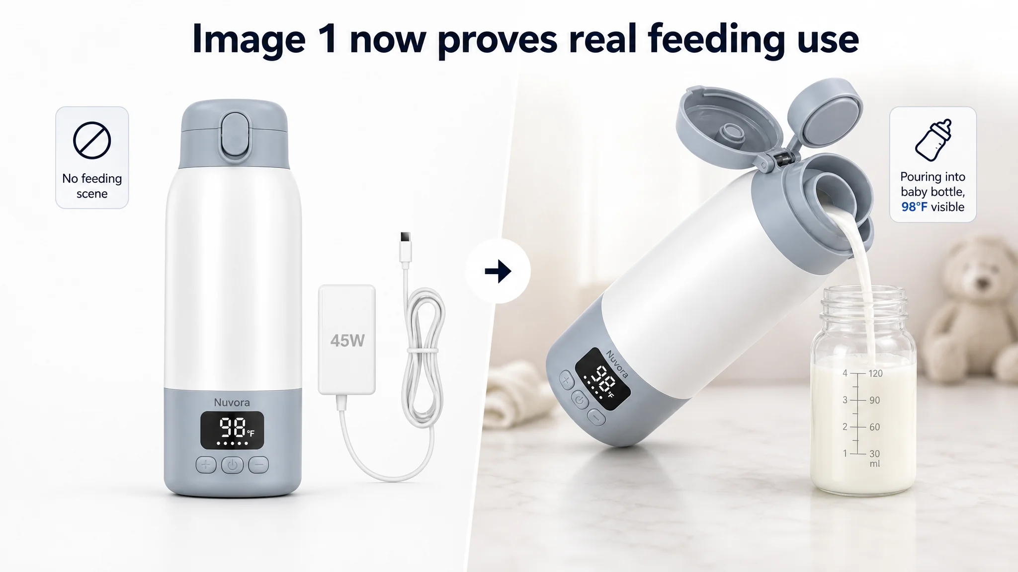
Image 2: Capacity in a Travel Day Context
- Current role: pure capacity graphic.
- Problem: addresses a secondary concern too early, in a vacuum.
- Adjustment:
- Use an outdoor or travel scene—car, park, airport—where 17oz capacity clearly supports multiple feeds.
- Overlay simple text: “17oz – all-day feeds on one fill”.
Now capacity reads as day-long convenience, not just a number.
Image 3: Put Heating Times Front and Center
- Current: “SmartSensor” background dominates, heating times are tiny.
- Problem: visual energy is spent on abstract tech; the buyer needs time-to-warm.
- Adjustment:
- Clear, prominent table: “4oz milk → 98°F → 2–4 minutes”.
- Side-by-side for water vs milk.
- SmartSensor remains, but framed as the reason these numbers are possible.
The message: “This is how fast your baby stops waiting; here’s why you can trust the temperature.”
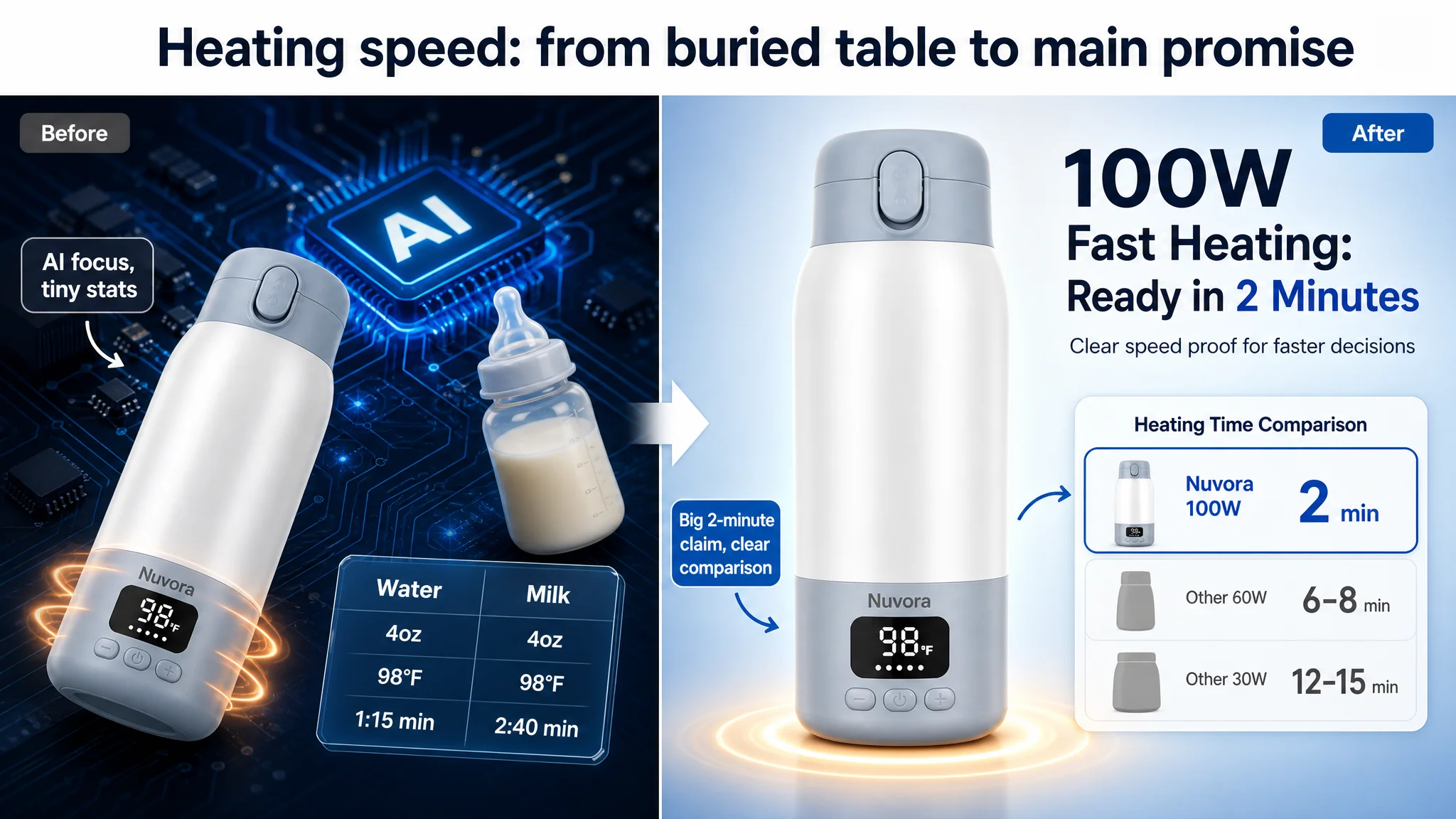
Image 4: Reframing Battery Messaging
- Current: fast-charging comparison bar.
- Problem: fast charge is useful but secondary; battery capacity and uses per charge matter more.
- Adjustment:
- Visualize “8+ uses per charge” with icons for multiple feedings or hourly segments.
- Keep 45W fast charge as a supporting detail.
Now this image reduces battery anxiety instead of just promoting charger speed.
Image 5: From Material Intro to Hygiene and Performance Proof
- Current: 316 stainless and insulation shown statically.
- Problem: does not explicitly connect to cleaning ease or odor resistance.
- Adjustment:
- Show inner liner disassembly and simple cleaning process.
- Connect 24-hour insulation to late-night feeding (e.g., darkened bedroom scene with a clock).
That turns an abstract safety claim into hygiene and sleep-protection proof.
The A+ Detail Page: Rebuilding the Persuasion Path
DeepBI’s analysis of the A+ modules focused on role clarity: each module must have a specific job in the decision journey.
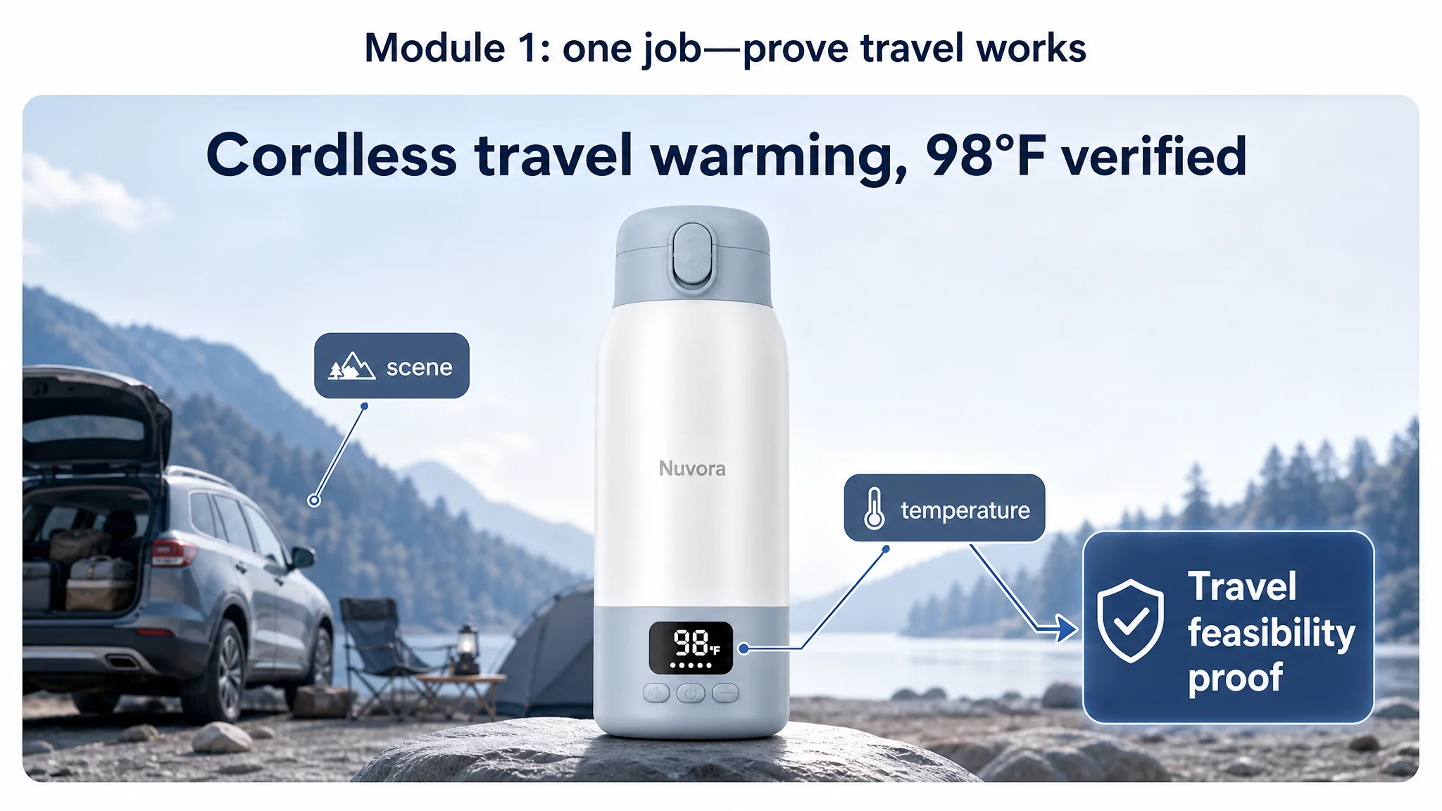
Module 1: Travel Feasibility Validation
- Old role: broad feature collage (icons + picnic scene).
- Problem: too many elements, no clear answer to “Does this really work outdoors, cordless?”
- New role:
- Large outdoor or camping backdrop.
- Prominent digital display showing 98°F.
- Simple message: “Travel/Camping Companion – cordless, 98°F verified outdoors”.
This gives buyers a single mental picture: “Yes, I can trust this out of the house.”
Module 2: Visual Proof of Dual Use (Water vs Milk)
- Old role: abstract speed graphics, text data.
- Problem: looks fast, but does not simplify mode complexity.
- New role:
- Two clear, labeled scenes side-by-side:
- “Water Mode” → pouring water into bottle for formula.
- “Milk Mode” → gently warming breast milk.
- Overlay the specific data points (time, temperature) in a clean mini-table.
Now dual modes feel obvious and usable, not technical.
Module 3: Technical Precision Validation
- Old role: abstract heat-layer visuals trying to imply precision.
- Problem: no concrete proof behind the SmartSensor claim.
- New role:
- Highlight a simplified SmartSensor callout connected visually to the digital display.
- Explicitly tie this to ±1°F precision and “protects breast-milk nutrients.”
This reduces rational doubts around overheating and nutrition loss.
Module 4: Stable Car Use
- Old role: fits in car cup holder.
- Problem: actually effective; no major change needed.
- New role:
- Confirmed as context diversification: “stable in car, cordless, safe over bumps.”
- Positioned after core travel validation and precision assurance.
It reassures parents that this is not just theoretically portable; it’s car-ready.
Module 5: Capacity and Hygiene Combined
- Old role: capacity + lifestyle, but without strong logic.
- Problem: does not justify bulkiness or address hygiene concerns.
- New role:
- Use a day-out picnic or long outing scene to justify “All-day feeds on one fill”.
- Add internal disassembly and cleaning visuals leveraging the 316 stainless-steel liner.
- Explicitly show cleaning simplicity to clear odor and hygiene worries.
This module converts “big and metallic” into “practical and hygienic.”
Module 6: Leak-Proof, Bag-Safe Structure
- Old role: safety-lock demonstration.
- Problem: conceptually good but low callout clarity.
- New role:
- Clear, high-resolution callouts for “Security Lock” and “Silicone Seal”.
- Link visually to diaper bag storage and travel scenarios.
It closes the “will it leak in my bag?” hesitation.
Module 7: Objective Trust and Risk Reduction
- Old role: not present.
- Problem: the page ends without third-party proof, unlike the benchmark.
- New role:
- A closing module showing certification-style visuals or test-report imagery (visually, not text-heavy).
- Focus on validating:
- temperature accuracy tests
- battery performance cycles
- material safety standards.
This gives cautious parents a final rational reason to proceed, especially important at higher price points.
Reviews: The One Area That Can’t Be “Designed Around”
The review gap was stark:
- Customer:
- 4.0 stars, 17 total reviews.
- 25% of front-page reviews were 3 stars or below.
- Some serious 1-star comments about product quality (e.g., damage, functional issues).
- Benchmark:
- 4.3 stars, 205 total reviews.
- 23% low-star, but diluted by volume and strong positive stories.
- Reviews rich in scenario detail (battery life, speed, different locations).
DeepBI’s position here is pragmatic:
- No Listing optimization can fully offset real product issues.
- However, a stronger page can:
- Attract more satisfied buyers who are more likely to leave positive, detailed reviews.
- Give future buyers a coherent story that puts isolated negative reviews into perspective.
Still, any serious functional complaints must be resolved upstream at product level. Listing optimization can’t rescue a product that systematically fails in real use.
How the Page’s Sales Logic Started to Recover
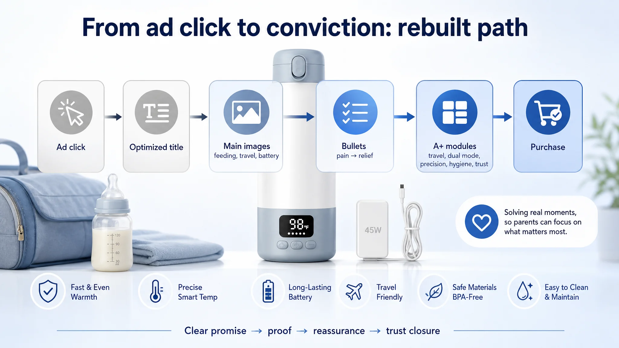
After these Listing changes, the Amazon product page was no longer a “technical document” but a coherent travel-feeding solution:
- The title made the promise clear: portable, big battery, fast heating, large capacity, travel-ready.
- The main images visually answered:
- “Does this warm milk quickly enough?”
- “Can I really use it outdoors, in the car, at night?”
- “Is it safe, leak-proof, and easy to clean?”
- The bullets closed everyday pain points instead of reciting specs.
- The A+ modules formed a logical persuasion path:
1. Outdoor/travel feasibility.
2. Dual-mode simplicity.
3. Technical precision.
4. Car stability.
5. Capacity + hygiene.
6. Leak-proof security.
7. Objective trust.
From an operational standpoint, this changed the nature of ad spend:
- Each paid click now landed on a page with a higher probability of conversion.
- The Listing itself began to earn its own organic orders, rather than depending solely on ads.
- The risk of ads amplifying defects (instead of strengths) was significantly reduced.
Even without quoting specific numbers, the seller could see a more controllable environment: ACOS became more responsive to ad adjustments; CVR had room to improve; organic and paid traffic could cooperate instead of conflict.
How the Customer’s Understanding Changed
Through this case, the seller’s mindset shifted in several important ways:
1. “High ACOS” is not always an ad problem.
When your Amazon Listing underperforms a close benchmark in every content dimension, ads will feel “inefficient” no matter how you structure them.
1. Listing quality is the foundation of advertising efficiency.
Main image, title, bullets, A+ and reviews are not decoration; they determine whether each paid click has a real chance to convert.
1. Specs don’t sell by themselves.
Even strong specs like 10,400mAh, 100W, 316 stainless steel must be translated into scenes and outcomes: “no more battery anxiety,” “baby fed in minutes at 2 a.m.,” “easy to clean, no lingering odors.”
1. Advertising amplifies whatever exists on the page.
If the page is unclear or unconvincing, ads amplify confusion. If the page is clear and trustworthy, ads amplify conviction.
1. Before scaling traffic, ask: “Does this page deserve more traffic?”
DeepBI’s Listing scoring and benchmark comparison gave the seller a concrete way to answer that question with data, not intuition.
For other Amazon sellers, this case is a reminder: when your Amazon ads start to feel “expensive” or “stuck,” do not assume the answer is more campaigns or more granular bidding. Often, the real leverage sits on the product page—specifically, in how clearly it turns your specs into a believable, lived solution for the buyer.