

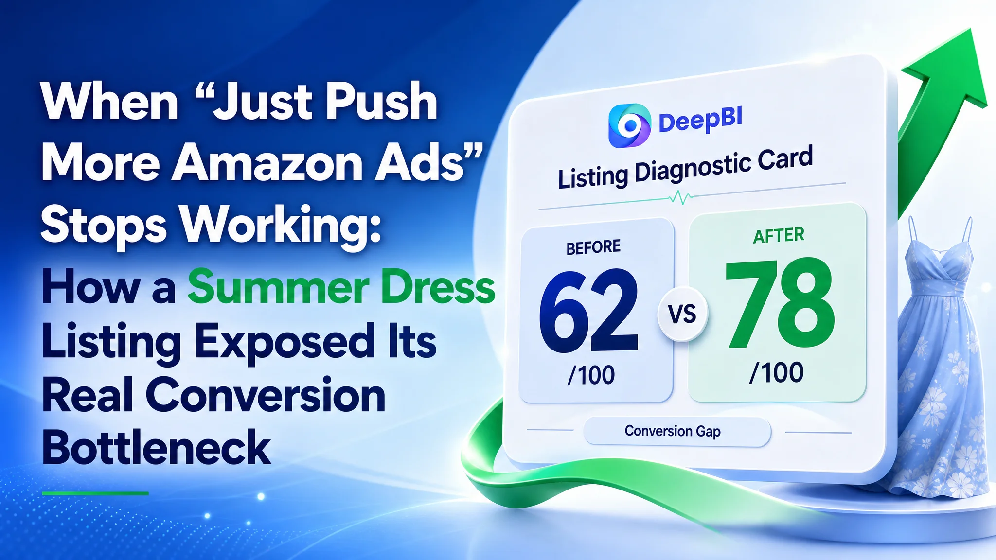
This case comes from a US Amazon fashion seller whose summer eyelet dress listing had already been pushed with ads, but orders did not follow as expected. The team’s first reaction was to keep tuning Amazon ads—adjust bids, expand keywords, test more budgets—assuming high ACOS and unstable sales were a pure traffic problem.
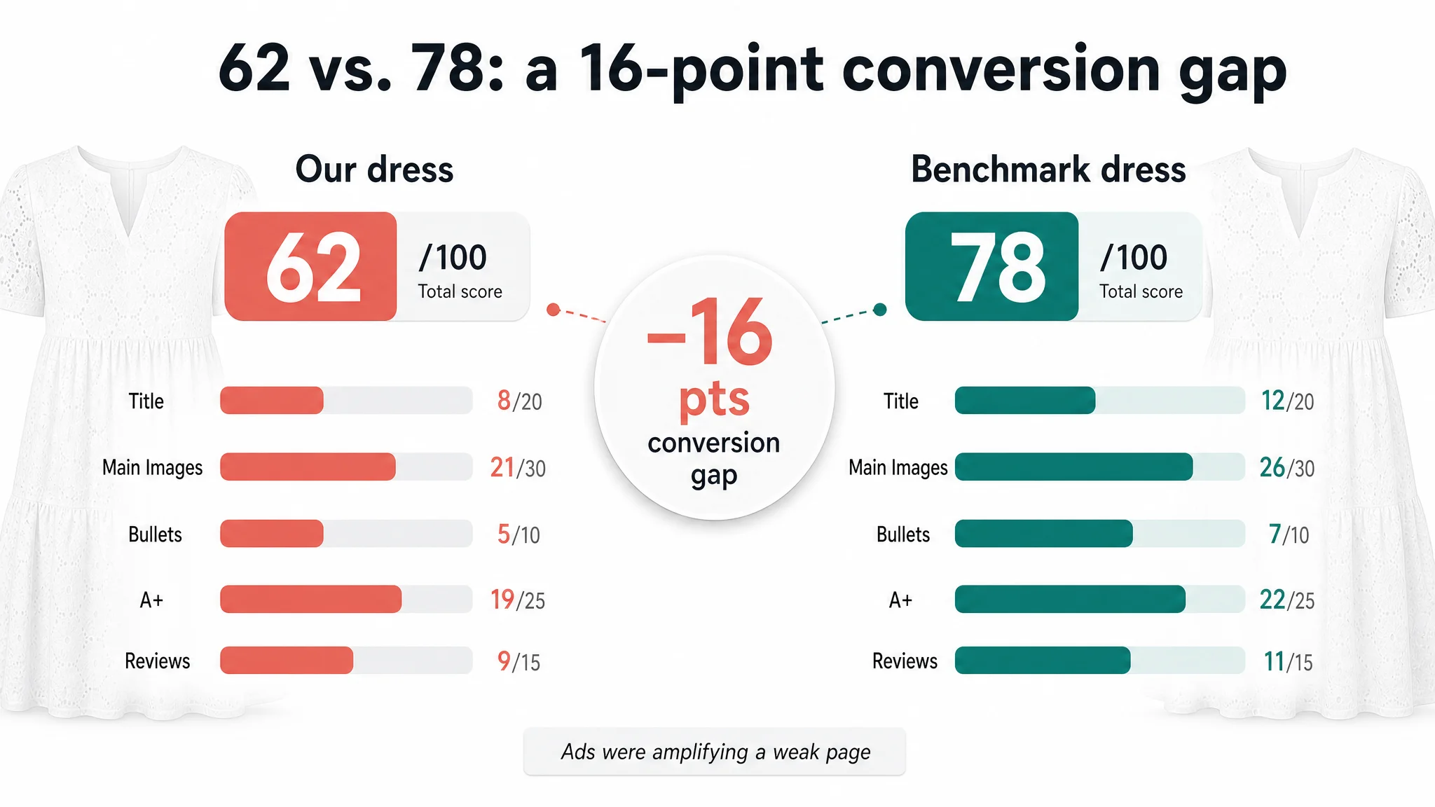
DeepBI’s Listing analysis told a different story. Against a directly comparable benchmark dress on Amazon, this product page scored 62/100 vs. the competitor’s 78/100. The gap wasn’t in traffic at all; it was in how the listing converted that traffic: title logic, main-image path, bullet-point persuasion, and A+ detail structure were all systematically weaker. Ads were simply amplifying a page that wasn’t yet capable of converting.
Once the seller accepted that judgment, the optimization direction flipped. Instead of “better ads,” the focus moved to rebuilding Amazon Listing conversion capacity: restructuring the title around real search behavior, turning the image set into a stepwise decision path, rewriting bullets from “fact listing” to “body-flattering benefits and scenarios,” and reordering A+ content to prove fabric, design, and fit before asking for the order. As the page’s sales logic became more coherent, ad traffic started to make sense again.
Many Amazon sellers in fashion and beyond will recognize this trap: ad costs rise, so the instinct is to work harder on ads. This case shows what happens when you stop assuming traffic is the constraint and examine whether your Amazon product page actually deserves the traffic you’re buying.
Amazon Ads Were Not Failing. The Page Was Consuming the Traffic.
The seller operates in women’s summer dresses on Amazon US. The product is a lace eyelet mini dress, positioned for casual and vacation wear. Traffic was not the hardest part—Amazon ads could reliably send visitors. The real pressure came from:
- Rising ACOS and difficulty improving it
- Unstable daily orders despite ongoing spend
- A sense that “we’re spending, but the listing is not pulling its weight”
Internally, the team framed the problem as a classic ads challenge:
- “We need more relevant keywords.”
- “Maybe our bids and match types are not structured well.”
- “Let’s keep testing campaigns; the product page is fine.”
So they stayed in the advertising toolbox—bid adjustments, keyword expansion, and negative keyword refinements—while the product page stayed largely unchanged.
But several weeks of ad iterations did not materially shift CVR or stabilize ACOS. To the seller, it felt like “ads just got more expensive.” From DeepBI’s perspective, the symptom was different:
The ads were doing their job of bringing people in. The listing was failing to close them.
That’s why the first step was not “another ad experiment,” but a cold comparison of the listing against a directly competing Amazon dress that actually converts.
One Core Constraint: The Listing’s Conversion Capacity
DeepBI’s Listing scoring put numbers on what the seller had been “feeling” but not quantifying.
- Target listing: 62/100
- Benchmark competitor: 78/100
- Gap: –16 points
Broken down by dimension:
- Title: 8 vs. 12 (out of 20)
- Main images: 21 vs. 26 (out of 30)
- Bullet points: 5 vs. 7 (out of 10)
- A+ / detail content: 19 vs. 22 (out of 25)
- Reviews: 9 vs. 11 (out of 15)
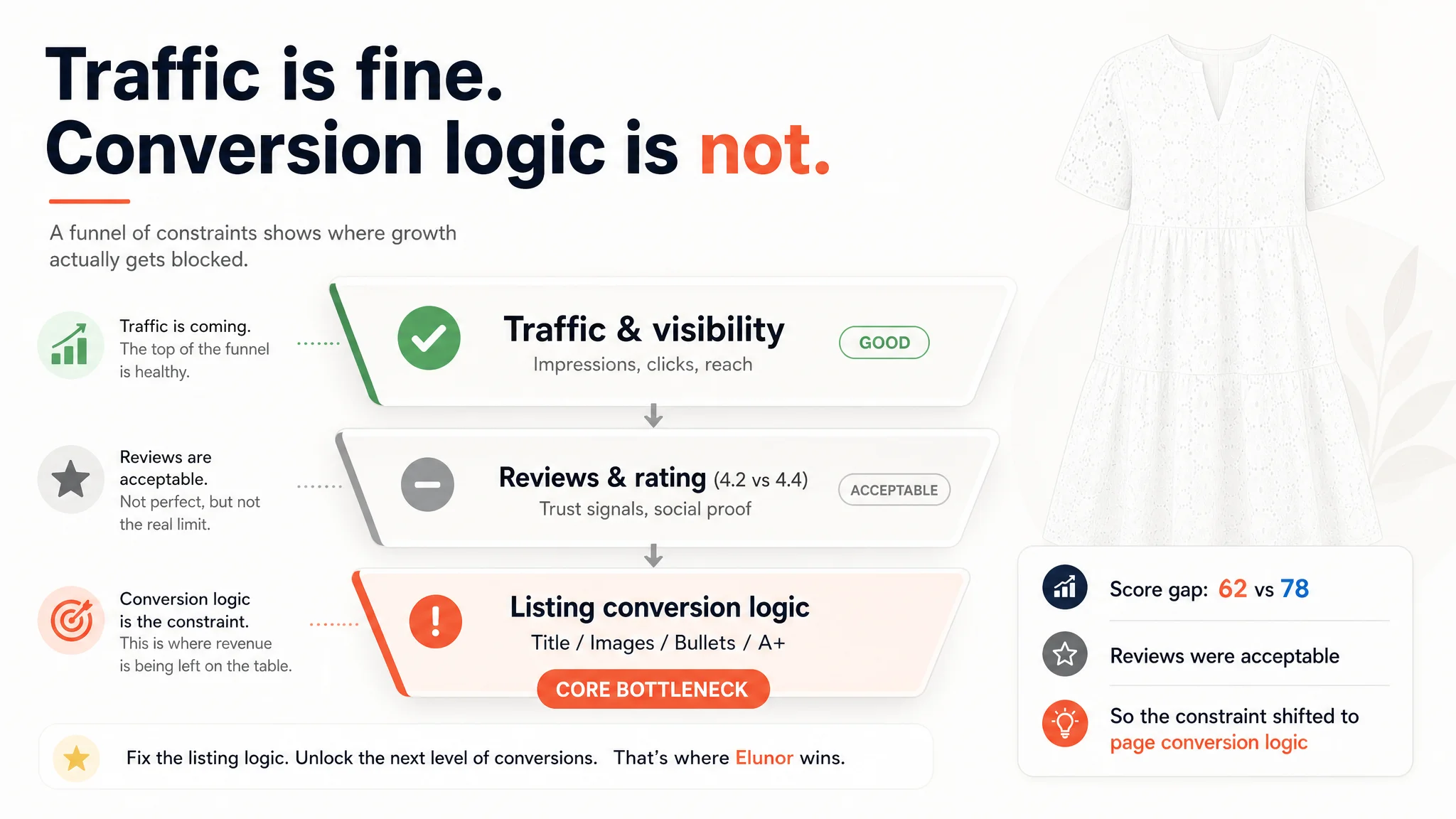
Star rating and review count were not catastrophic (4.2 with ~30 reviews vs. 4.4 with ~37). There was no obvious “review disaster” to blame. The conversion gap had to be coming from somewhere else.
DeepBI’s judgment:
- The core constraint was not ad setup, nor review volume.
- The core constraint was the listing’s ability to convert both paid and organic traffic.
The page did not lack traffic. It lacked a coherent, trust-building buying journey.
The Seller’s Original Misdiagnosis: “It Must Be the Ads”
From the seller’s perspective, the logic was simple and initially reasonable:
- ACOS is high → ads are the problem
- Competitors are more visible → we need more aggressive bidding
- The dress looks fine → why touch the listing?
Several biases reinforced this:
1. Traffic-first mindset
The team had historically been able to “buy growth” early in a product’s life. When that stopped working, they still assumed more or better traffic was the lever.
1. Underestimating listing subtlety in fashion
Clothes are heavily visual and emotional. As long as the photos were “not ugly,” the seller assumed the listing was good enough.
1. Overconfidence in star rating
A 4.2 rating with 30 reviews didn’t trigger alarm internally. It felt “acceptable,” so attention stayed on traffic.
That’s exactly how they ended up in a loop: more ad tweaks, more spend, same weak conversion.
The Data That Broke the Assumption
DeepBI’s Listing report reframed the conversation. Instead of “the page is fine,” the seller saw precisely where the benchmark was pulling ahead and why that mattered for conversion.
1. Title: Misaligned With Real Amazon Search Behavior
The existing title:
- Put the brand name first, burying what the shopper is actually typing into Amazon.
- Stacked a long list of attributes: brand + style + year + attributes + fit + neck + sleeve + craft + category.
- Included “2026” in the title—unnecessary, potentially misleading, and not something buyers search for.
- Used “Tunic Dress” as a key type term, while the benchmark leaned on “Mini Sundress”, which typically has higher search volume and stronger relevance in summer-dress browsing.
The benchmark title led with what matters on Amazon:
- Core category phrase: “Womens Summer Eyelet Dress”
- Then key attributes and fit
- Then a clear “Beach / Sundress” scenario cue
DeepBI’s judgment: this listing was not losing traffic because Amazon didn’t have impressions; it was wasting title real estate by leading with low-value tokens and burying the phrases buyers actually use.
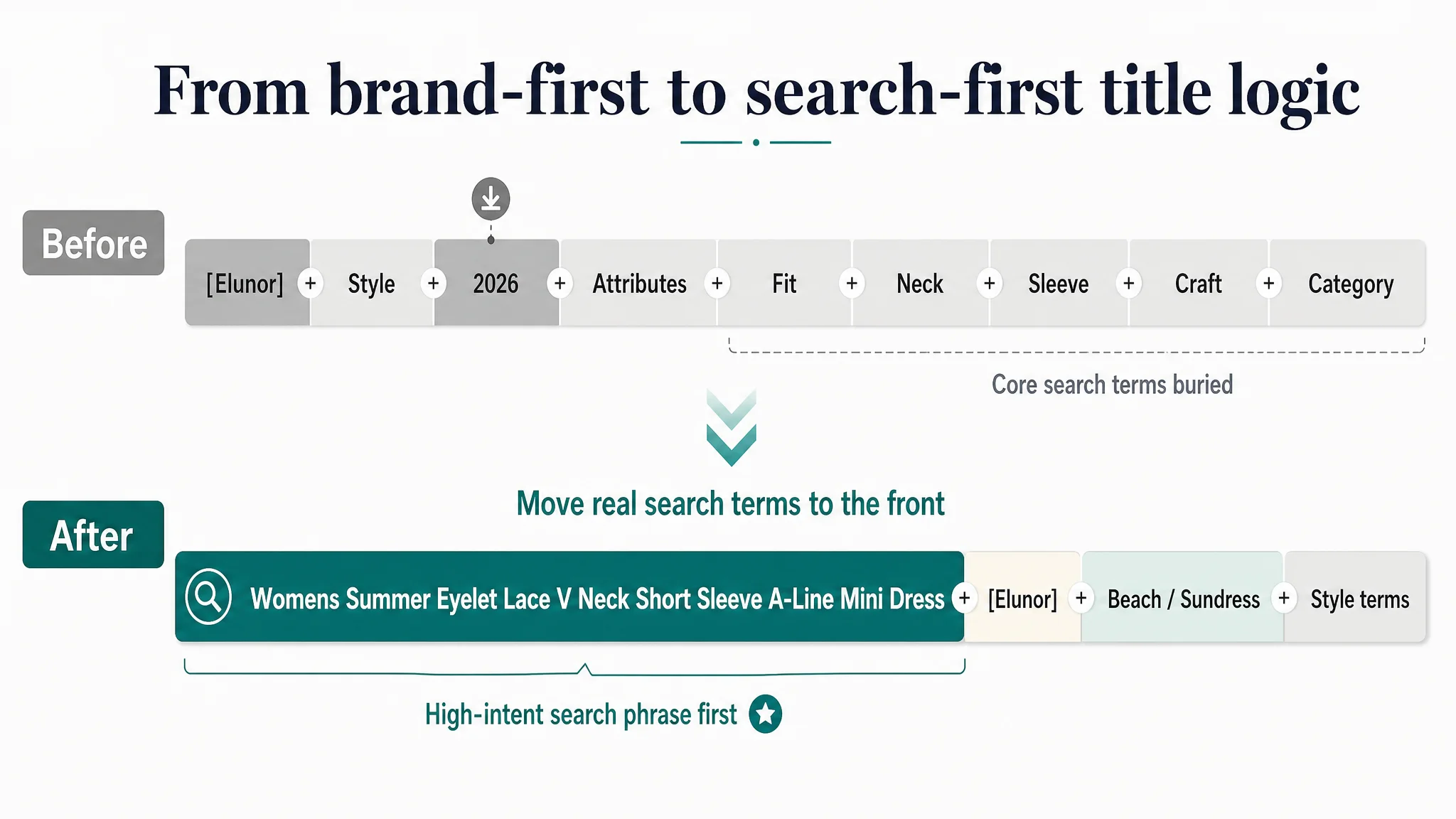
The proposed title direction:
[Brand] Womens Summer Eyelet Lace V Neck Short Sleeve A-Line Mini Dress Casual Babydoll Hollow Out Swing Beach Sundress Tunic Dress
Key changes:
- Brand moved back; “Womens Summer Eyelet Lace V Neck Short Sleeve A-Line Mini Dress” moved forward.
- Added “Beach” and “Sundress” for scenario alignment and search exposure.
- Removed the misleading year reference.
- Preserved important style terms like “Babydoll” and “Swing”.
This wasn’t cosmetic. It was a decision to align the listing with how Amazon shoppers actually search for this category.
2. Main Images: No Clear, Progressively Persuasive Path
On paper, both listings had multiple images. In practice, the benchmark built a five-layer visual story:
1. Product on a person
2. Detailed close-ups
3. Back view consistency
4. Scenario and styling
5. Overall proportion and drape
By contrast, this listing:
- Repeated similar frontal views with a straw bag that partially blocked the dress.
- Delayed the back view until much later in the sequence.
- Failed to step-by-step answer the user’s actual questions:
- “How does it really look on?”
- “What does the fabric and eyelet detail look like up close?”
- “Is the design consistent on the back?”
- “Can I imagine myself in this in real life?”
“The real problem was not that ads failed to bring traffic. It was that the image path could not convert the traffic.”
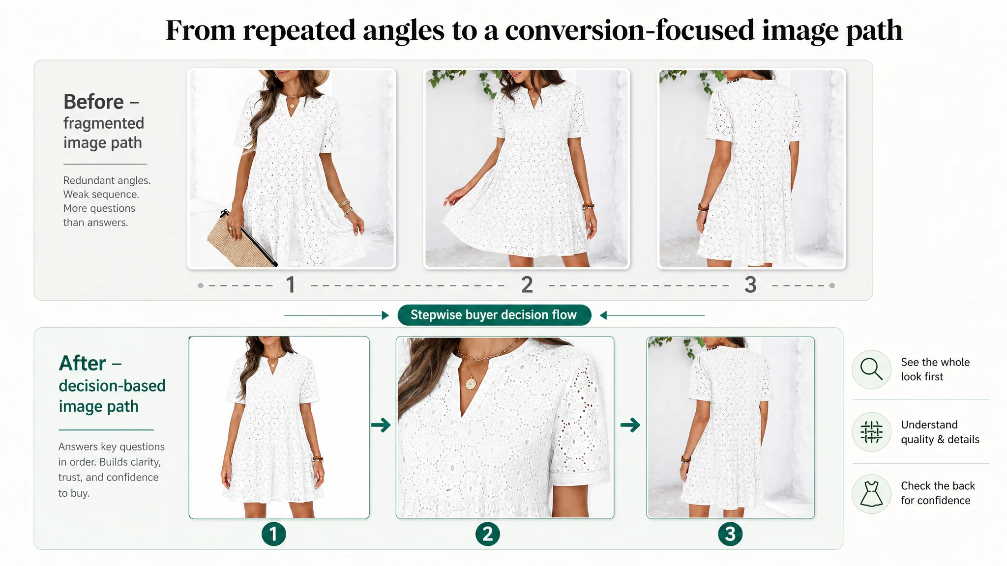
DeepBI’s recommended image path:
- Image 1 – Clear, unobstructed full-body view
Dress fully visible on a model, no bag hiding the hem or details.
- Image 2 – Fabric and neckline close-up
Early proof of material and eyelet detail; answers “Is this breathable and refined?”
- Image 3 – Back view, early in the sequence
Front–back consistency builds rational trust.
- Image 4 – Outdoor summer scenario
A lifestyle image that establishes “this is what your vacation or casual day could look like.”
- Image 5 – Proportion, length, and drape confirmation
Final rational check before adding to cart.
The intent was not “more images,” but non-redundant images that follow the buyer’s decision flow.
3. Bullet Points: From Fact Listing to Buying Logic
The original bullets were structured around variant names and simple attributes:
- Style name + basic description
- More style names
- A standalone bullet for washing instructions
They suffered from three conversion issues:
- Fragmented around variant names instead of a single product story
- Mostly neutral facts (material, cut) instead of benefit language
- Washing instructions placed as a full bullet, interrupting the buying logic
The benchmark, by contrast, used bullets to communicate:
- How the fabric feels and performs in hot weather
- How the cut hides imperfections and flatters the body
- Where and how to wear the dress (dates, vacations, daily)
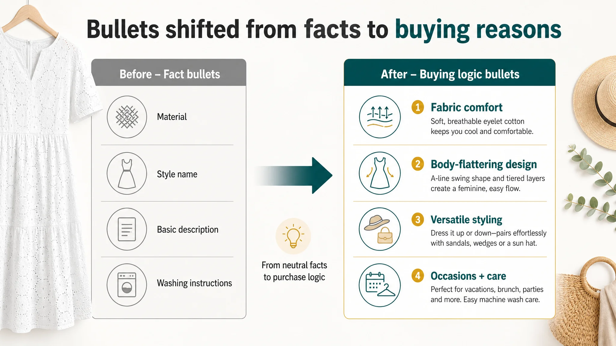
DeepBI’s direction was to reframe bullets around buyer concerns:
Bullet 1 – Fabric as a summer solution
Premium Eyelet Fabric: Crafted from high-quality soft cotton fabric with delicate eyelet textures, this summer mini dress is exceptionally breathable and skin-friendly. It maintains a refreshing, non-stuffy experience in the hot summer while showcasing an elegant and feminine aesthetic.
Bullet 2 – Design that flatters
Chic V-Neck & Embroidery: This tunic dress features exquisite embroidery eyelet details and a classic V-neck design that visually elongates the neckline and accentuates the collarbone. The short sleeves and boho-inspired style keep you cool and stylish throughout the summer days.
Bullet 3 – Inclusive, forgiving silhouette
Flattering A-Line Silhouette: Our pleated eyelet dresses feature a swing A-line shape that naturally drapes without being restrictive. This babydoll-style silhouette cleverly modifies the body shape, hiding imperfections while offering a slim, flattering look for all body types.
Bullet 4 – Styling flexibility, not just sandals
Versatile Styling Options: Easily transform your style by pairing this short sleeve dress with sandals for a relaxed beach look, or with high heels and accessories for a more sophisticated ensemble. It is an essential, versatile piece for your resort wear collection.
Bullet 5 – Scenarios first, care second
Various Occasions & Care: Perfect for date nights, wedding guests, parties, beach vacations, bridal showers, and daily commuting. This durable mini dress is machine washable (laundry bag recommended) and quick to line dry, making it as practical as it is beautiful.
In other words, bullets became a persuasion path, not a SKU catalogue.
4. A+ Detail Content: Mood Without Enough Evidence
On the A+ side, the seller had invested effort:
- Brand hero image with selling-point titles
- Detail shots of waist and sleeves
- Color variants (green/blue/pink/white)
- Scene-based outfits (market, street, waterside)
- Size chart and style tags (Elegant, Party, Vacation Ready)
But the content still underperformed against the benchmark’s more disciplined structure:
- Benchmark used video cover + static images at the top to instantly show motion and fit.
- Benchmark had clear, labeled structural breakdowns (“V neck”, “Sleeveless”, “Eyelet”) that turned design into visible benefits.
- Benchmark offered three clearly defined outfit scenarios (“Vacation”, “Casual”, “Daily Look”) with pairing guidance.
- Benchmark’s size support went beyond a simple table to a height/weight recommendation matrix.
DeepBI’s diagnosis: this A+ was rich in mood but weak in risk reduction:
- Fabric comfort was not visually proven.
- Design advantages weren’t explicitly mapped to benefits.
- Fit uncertainty remained high.
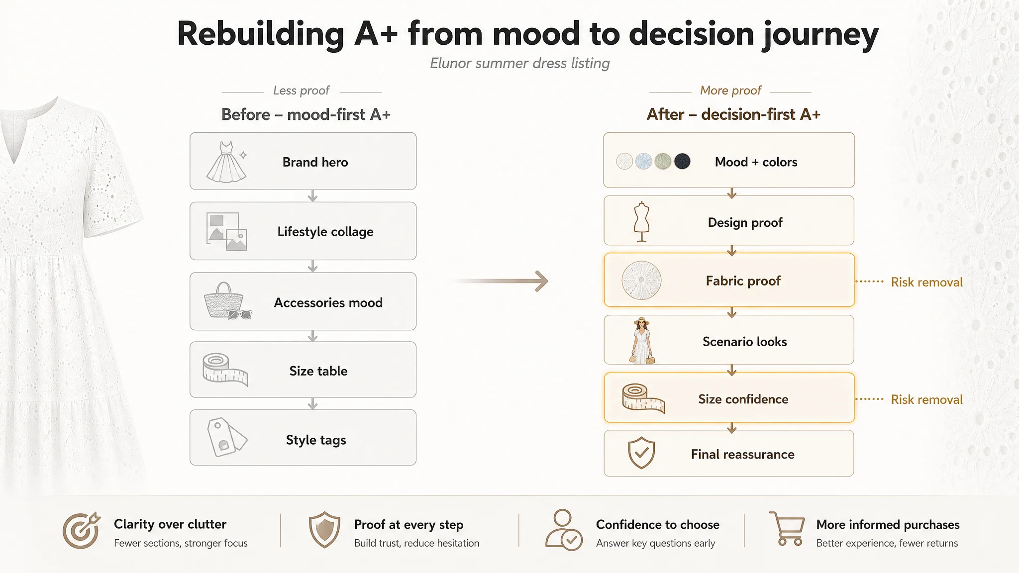
So the optimization plan reorganized A+ modules by decision logic:
1. Module 1 – Aspirational mood + color choice early
- Use outdoor sunny context to show at least three key colors together (blue, green, white).
- Make this the emotional hook and choice moment right after the main images.
1. Module 2 – Rational design validation
- Close-ups with labeled callouts: “V Neck”, “Short Sleeve”, “Eyelet Embroidery”, “Swing A-line”.
- Each label tied to a benefit (cooler, more movement, flattering neckline).
1. Module 3 – Material transparency
- Macro shot of eyelet pattern and fabric texture.
- Clear mention of cotton content and benefits: breathable, skin-friendly, soft.
1. Module 4 – Scenario-based outfits
- At least three “looks”: “Vacation Look”, “Casual Work Look”, “Daily City Walk Look”.
- Each with a small “Match Tip” (e.g., why this bag or shoe makes sense).
1. Module 5 – Social proof style confirmation
- Lifestyle compilation with diverse but relevant casual scenes (garden, street, beach).
- Reinforces that this dress is a “correct choice” for everyday summer wear.
1. Module 6 – Data-driven size confidence
- Replace basic chart with a height–weight cross-reference matrix.
- “If you are 5'4" and X lbs, recommended size is…” type guidance.
1. Module 7 – Final reassurance on fit
- Visual proof that the A-line cut works across different body types, if materials allow.
- Or use this space for a concise care/quality guarantee.
The goal: by the time shoppers reach the bottom of the page, fabric, design, fit, and usage scenarios are all resolved, leaving price and taste as the only remaining variables.
Why DeepBI Did Not Keep Tuning the Ads First
Facing poor ACOS, most teams reach for ad controls because they are:
- Immediate to change
- Measurable in the dashboard
- Familiar to performance marketers
DeepBI’s judgment was different in this case for three reasons:
1. Listing score clearly trailed a proven competitor.
A 62 vs. 78 gap, especially in title, main images, bullets, and A+, indicated structural conversion weaknesses. Pushing more traffic into that gap would magnify waste.
1. Reviews were not the primary blocker.
Star rating and review volume were not so far behind as to be the first limiting factor. That meant page logic was the likely bottleneck.
1. Ads amplify whatever the page already is.
In this state, ads would mainly amplify confusion and doubt instead of confidence. The biggest business risk was not “too little traffic,” but paying to expose more shoppers to an underperforming page.
So the decision path became:
- Fix listing conversion capacity first.
- Then re-evaluate ad performance with a page that actually deserves the clicks.
Before Ads Could Work Again, the Page Had to Convert
After implementing the new title logic, restructured images, benefit-led bullets, and a more disciplined A+ layout, the seller didn’t get a magic overnight spike. What changed was more fundamental:
- The product page started answering the questions buyers actually had about fabric, fit, and scenarios.
- The image stack stopped repeating and began walking users through a clear decision sequence.
- Shoppers saw not just “a cute dress,” but a specific solution for hot-weather style, body confidence, and multiple use cases.
- Fit anxiety decreased thanks to more concrete sizing support.
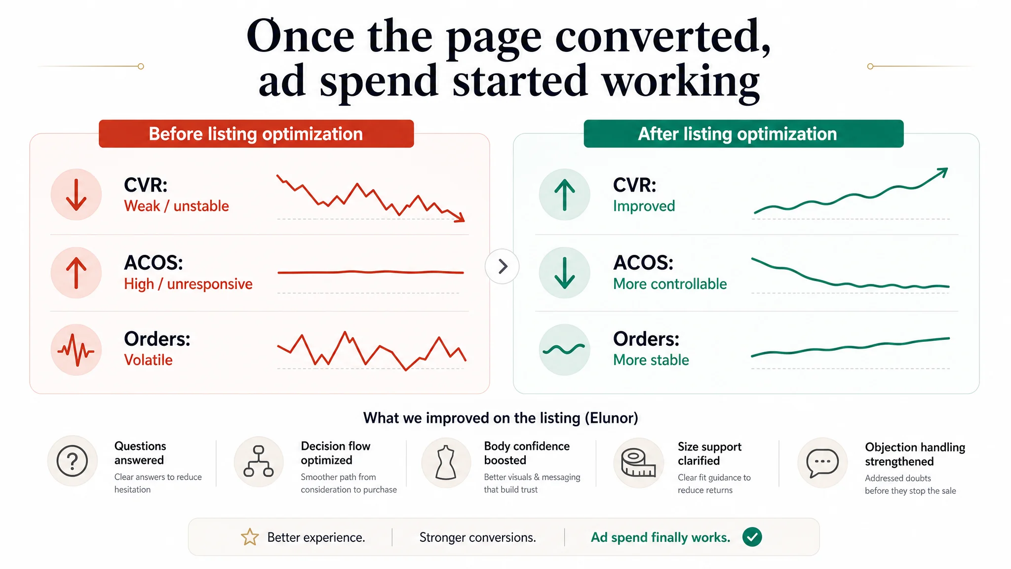
Once these changes took effect, ad traffic no longer felt like money poured into a hole:
- CVR began to make more sense relative to the category.
- ACOS became more responsive to ad tuning, because clicks now landed on a page built to convert.
- Organic orders had a more solid base, since the listing could convert browse traffic without relying purely on ad pressure.
The seller’s mental model shifted:
“We thought Amazon ads were our main lever. Now we see the listing was our real constraint.”
What Other Amazon Sellers Can Take Away
Several lessons from this summer dress case apply across Amazon categories:
1. Do not assume “ad problem” when ACOS is high.
Check whether your Amazon Listing conversion capacity is truly competitive—title, main images, bullets, and A+ together.
1. Respect how buyers actually search and decide.
Lead titles with real category phrases and scenario terms. Use images and A+ modules as a narrative, not as a gallery.
1. Turn facts into buying logic.
Material, cut, and design are just raw data. Conversion comes from expressing them as comfort, body confidence, usage range, and risk reduction.
1. Avoid letting ads amplify a weak page.
Before scaling spend, ask: “If I were a cold visitor from an ad, would this product page give me enough reason to buy?”
1. Treat listing optimization as the foundation of ad efficiency.
Strong Amazon ads are powerful, but only when the product page can hold its side of the deal.
In this case, DeepBI’s value was not in producing more words or images, but in reframing the problem: from “we need better ads” to “we need a listing that can convert the traffic ads bring.” Once that judgment was clear, every subsequent optimization had a much higher chance of actually moving the business.