

An Amazon fashion seller came to DeepBI with a familiar frustration: ads were getting more expensive, traffic was not the issue, yet orders for a women’s embroidered cropped bomber jacket in the US marketplace were stagnating. The team’s working assumption was that the product itself was “too niche” and that they simply needed more reviews and slightly better photos to make the ads work.
Once DeepBI put the Listing into a full Amazon context—benchmarking its product page against a high-performing competitor in the same cropped bomber jacket niche—the picture changed. The real problem wasn’t lack of traffic or “bad creatives” in ads; it was a structurally weaker Amazon Listing that could not convert the traffic it already had. The main image sequence, A+ story, bullets, and reviews all underperformed the benchmark, and that gap was large enough to drag down conversion, regardless of how the ads were tuned.
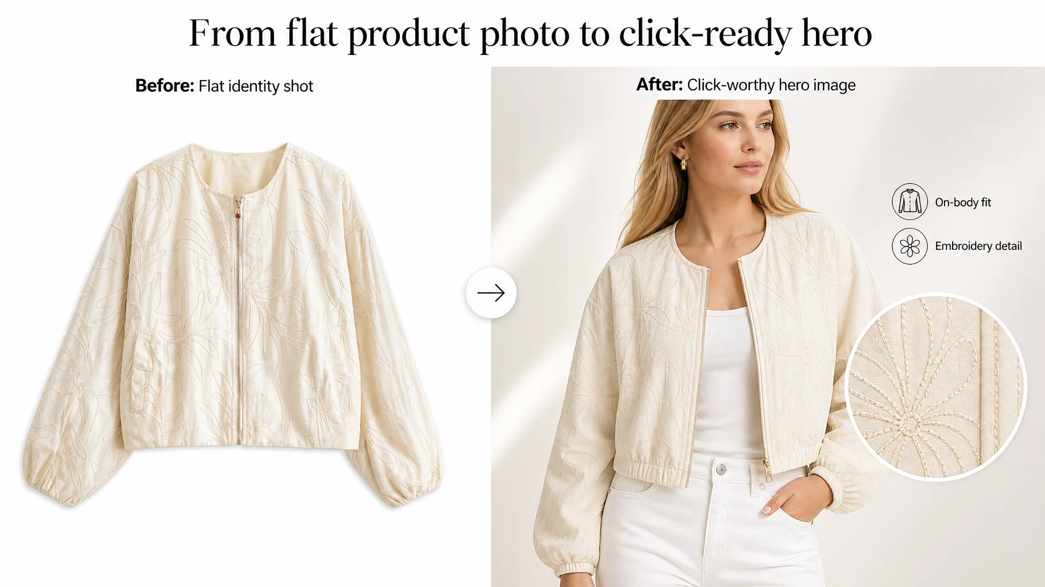
This reframing shifted the optimization direction. Instead of pushing harder on Amazon ads, DeepBI helped the seller rebuild the product page’s decision logic: from flat-lay main images to on-body lifestyle visuals, from repetitive A+ styling shots to a “style → function → risk reduction” flow, and from vague, aesthetic bullet points to structured, decision-oriented copy. For other Amazon sellers, this case is a reminder: when ACOS feels “stuck” and ads seem inefficient, the bottleneck is often page-level conversion capacity, not campaign settings.
This Amazon Listing Did Not Lack Traffic. It Lacked a Competitive Page.
Looking only at the Amazon Listing score, the problem was already visible.
- Target Listing total score: 58/100
- Benchmark high-performing competitor: 84/100
- Gap: -26 points
By dimension:
- Title: 13 vs 16 (gap -3)
- Main images: 19 vs 26 (gap -7)
- Bullet points: 4 vs 5 (gap -1)
- A+ / detail page: 16 vs 23 (gap -7)
- Reviews: 6 vs 14 (gap -8)
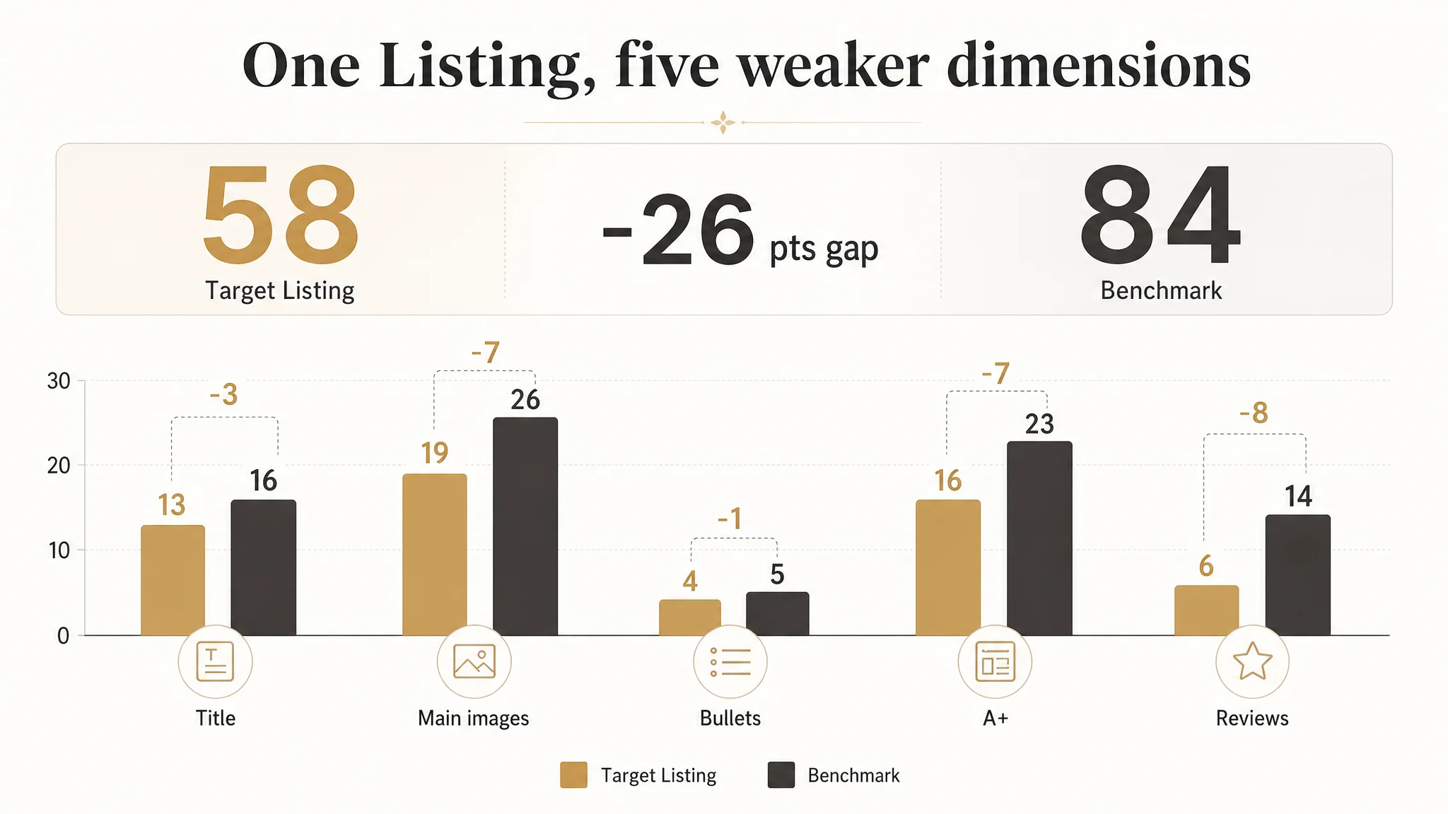
On paper, this is not a Listing that “just needs a little polish.” It is a Listing that is structurally weaker than its benchmark across every conversion-critical dimension. Yet the seller’s internal narrative was centered on product appeal and review count, not page logic.
“The real problem was not that ads failed to bring traffic. It was that the page could not convert the traffic.”
In fashion especially, this kind of structural gap is lethal: Amazon search pages are crowded, buyers skim quickly, and any Listing that doesn’t establish style, function, and trust within seconds will lose the click—and, even worse, the conversion after the click.
The Original Misdiagnosis: Blaming Niche Appeal and Review Volume
From the seller’s viewpoint, the story sounded reasonable:
- This was an embroidered cropped bomber jacket—visually distinctive and slightly niche.
- Ratings were 3.9 stars with 15 reviews. The team believed more reviews would naturally solve the trust gap.
- Ads were delivering impressions and clicks, but conversion felt “soft.”
- Internal attention went to “exposure and social proof”: more ads, more reviews, minor text tweaks.
The underlying assumption: the product was fine; the category was crowded; the main challenge was gaining enough reviews and visibility for the jacket’s uniqueness to “speak for itself.”
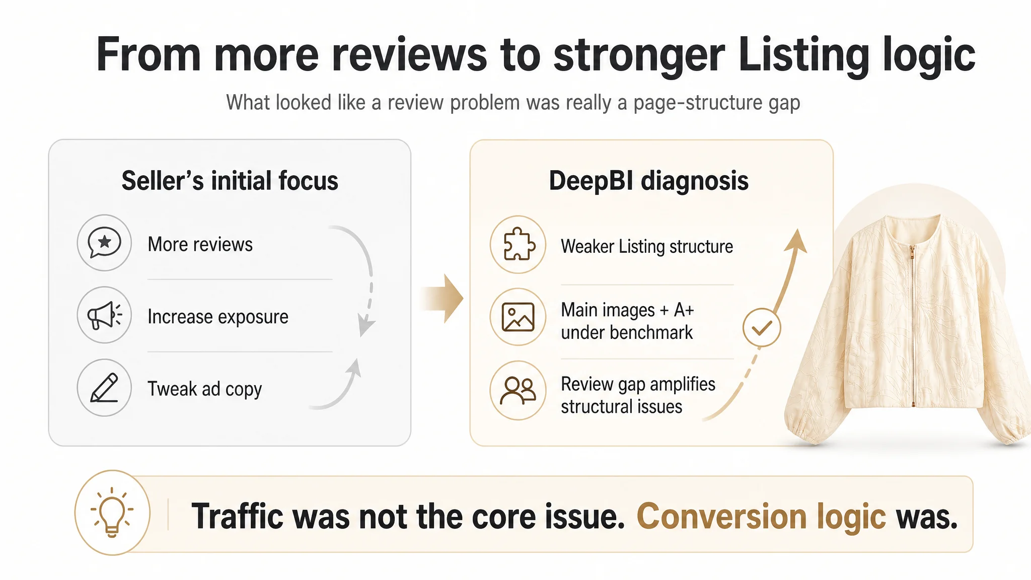
The problem with that assumption:
- The category benchmark had 4.6 stars and 358 reviews—a huge trust advantage.
- But even before reviews, the benchmark’s page logic was fundamentally stronger:
- Clear brand-first title structure.
- On-body, outdoor main images and lifestyle visuals.
- A+ layout that tells a complete style and function story.
- Explicit size chart and fit guidance to reduce risk.
In other words, the benchmark didn’t just have more social proof; it already translated every click into a more efficient decision flow. Copying its ad volume without matching its page conversion capacity would only magnify the gap.
Amazon Ads Were Not Failing. The Page Was Consuming the Traffic.
From DeepBI’s perspective, this was a classic ads–Listing mismatch:
- Ads brought traffic.
- The Listing did not build enough style desire, functional clarity, or risk reduction.
- Consequently, ACOS was trapped, and further ad optimizations had diminishing returns.
DeepBI’s scoring and benchmark comparison highlighted three non-negotiable weaknesses:
1. Main images failed at the first decision step
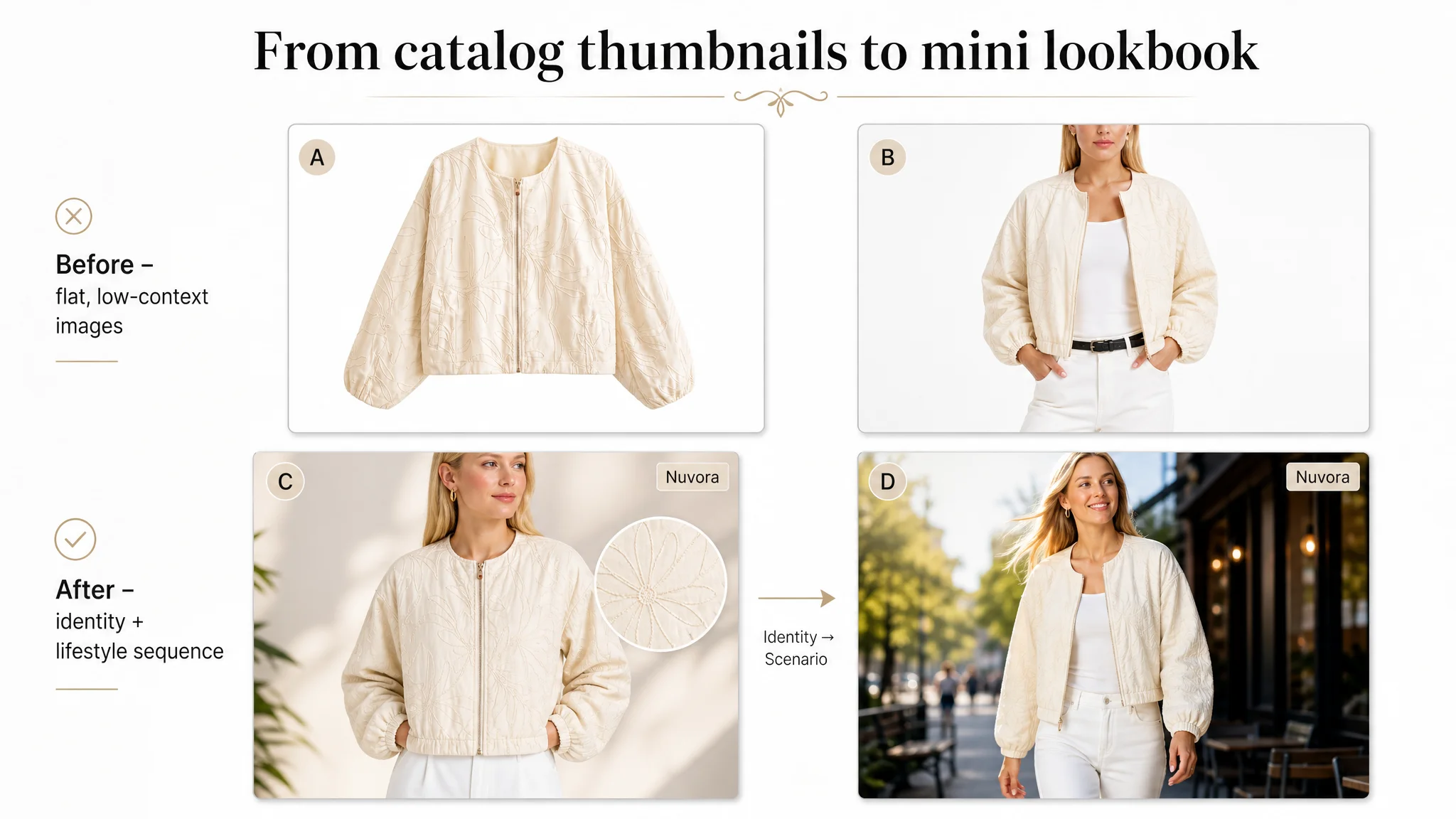
The target Listing led with a flat lay on a white background. This might be acceptable for some utilitarian categories, but for a women’s cropped bomber jacket:
- No model in the hero image meant no instant sense of fit, style, or attitude.
- No lifestyle background meant no emotional anchor—just a product floating in white space.
- The subsequent images were mostly variations of the same angle, offering repetition instead of persuasion.
Meanwhile, the benchmark:
- Showed the jacket on a model from the first image.
- Used outdoor natural light and real street environments in images #2–#4.
- Demonstrated multiple outfit combinations (black pants, leather skirt, jeans) to communicate “one jacket, many outfits.”
Result: on the Amazon search page, the benchmark Listing is a mini lookbook; the target Listing is a catalog thumbnail.
1. A+ content did not move beyond repetitive styling
The target Listing’s A+ modules focused on:
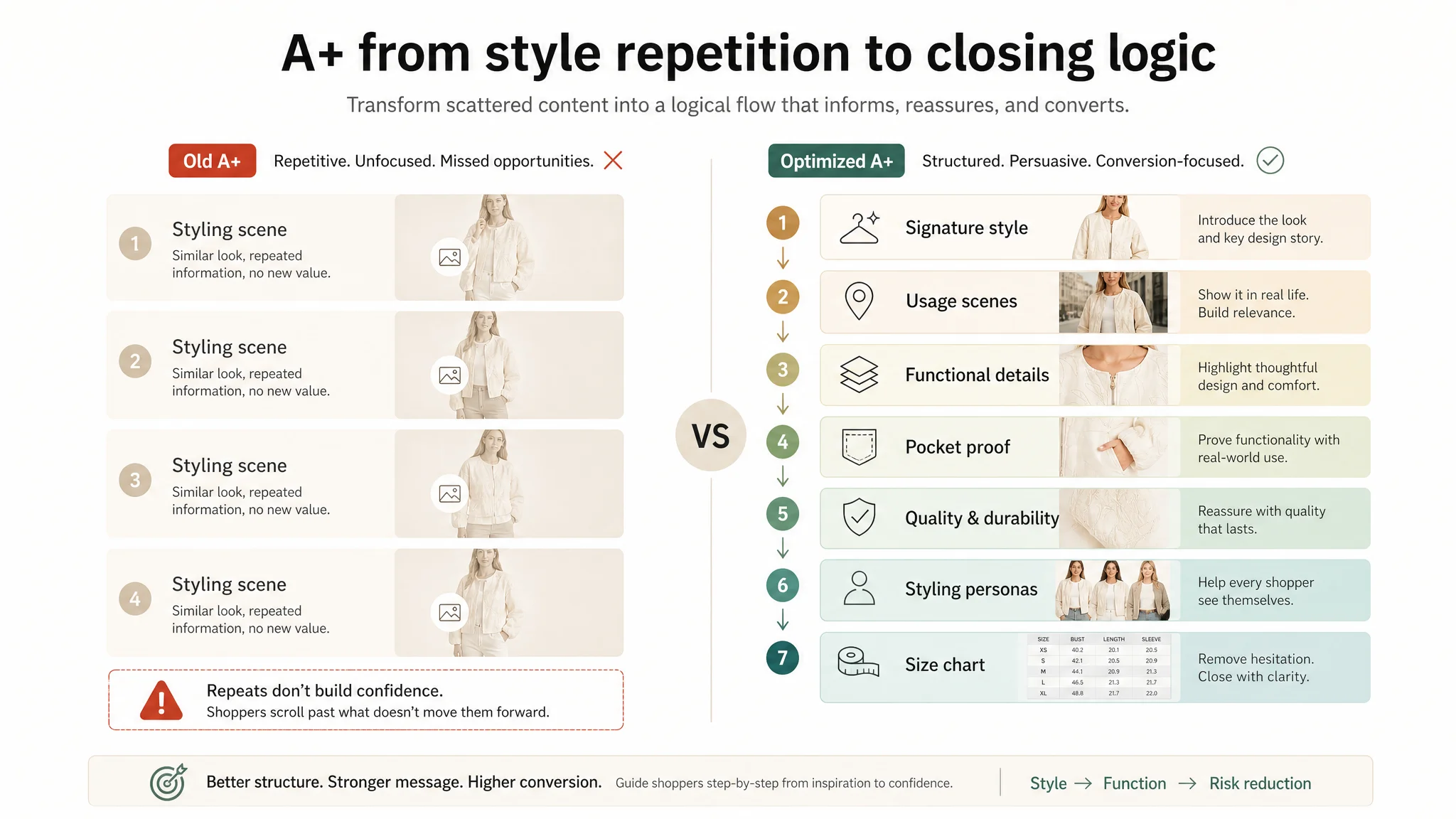
- Three styling scenes for a single beige jacket (daily casual / evening fashion / street motorcycle).
- A repeated daily casual module.
There were no:
- Feature close-ups.
- Fabric or construction explanations.
- Explicit function callouts (e.g., pockets, zippers, durability).
- Size chart or fit guidance.
In contrast, the benchmark’s A+:
- Opened with a strong brand visual.
- Showed multiple colors and styles.
- Included detailed close-ups (“Detail Show”) with terminology like “storm flap” and “full zipper.”
- Added a size chart with a model reference to reduce fit anxiety.
- Included an “Easy Match” module to inspire additional outfit and cross-sell ideas.
The benchmark’s A+ was not just decoration; it was a structured trust machine.
1. Reviews were too thin to compensate for weak content
With 3.9 stars and 15 reviews, the Listing lacked:
- The volume to signal popularity.
- The rating strength to override content weaknesses.
The benchmark’s 4.6 stars and 358 reviews did the opposite: they amplified an already persuasive page.
When ads feed this kind of page, the outcome is predictable: traffic leaks. Every additional dollar of Amazon ad spend flows into a conversion funnel that is systematically weaker than the benchmark.
The Real Constraint Was Listing Conversion Capacity
DeepBI’s analysis narrowed the core bottleneck down to a single, overriding issue:
The Amazon Listing’s conversion capacity was significantly lower than that of the benchmark, and ads were simply amplifying this gap.
Everything else—reviews, bids, keywords—was secondary at this stage. The Listing itself couldn’t:
- Create a strong first impression from the search page.
- Guide buyers through a coherent “style → function → trust” path.
- Reduce perceived risk around fit and quality.
To prevent further waste of advertising budget, the priority had to shift from “more ads, more reviews” to “fix the page so traffic has a fair chance to convert.”
Why DeepBI Did Not Recommend Adjusting Ads First
From an operating standpoint, continuing to adjust ads before fixing the Listing would have carried three major risks:
1. Amplified inefficiency
Driving more traffic into a weak-conversion page is not optimization; it is paid amplification of a structural defect. ACOS would remain hard to control, and the seller would misread the problem as an “ad efficiency” issue.
1. Misleading data signals
Without a solid Listing, it’s impossible to distinguish between:
- Traffic quality problems (wrong queries, wrong audience).
- Page-capacity problems (the right buyers not being convinced).
Fixing the Listing first establishes a baseline: if the page converts competitively, then ad data becomes meaningful again.
1. Lost organic potential
A low-conversion Listing erodes organic ranking over time. Even if ads maintain visibility, the product page never develops its own organic sales capability. That keeps the store locked in a cycle of dependence on paid traffic.
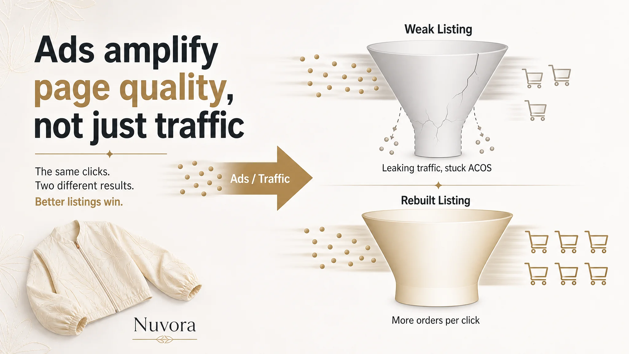
Given this, DeepBI’s judgment was straightforward: repair the Listing’s capacity to convert both paid and organic traffic before scaling or re-architecting ads.
This Product Page Did Not Lack Features. It Lacked a Clear Buying Logic.
DeepBI’s diagnosis did not conclude that the seller lacked imagination or product strengths. On the contrary, the jacket had clear potential:
- Embroidered floral pattern.
- Cropped bomber silhouette.
- Lightweight fabric for transitional weather.
- Pockets and casual streetwear positioning.
The problem was that these strengths were not organized into a buying logic the way Amazon buyers actually decide.
The title did not frame the outcome, only the ingredients
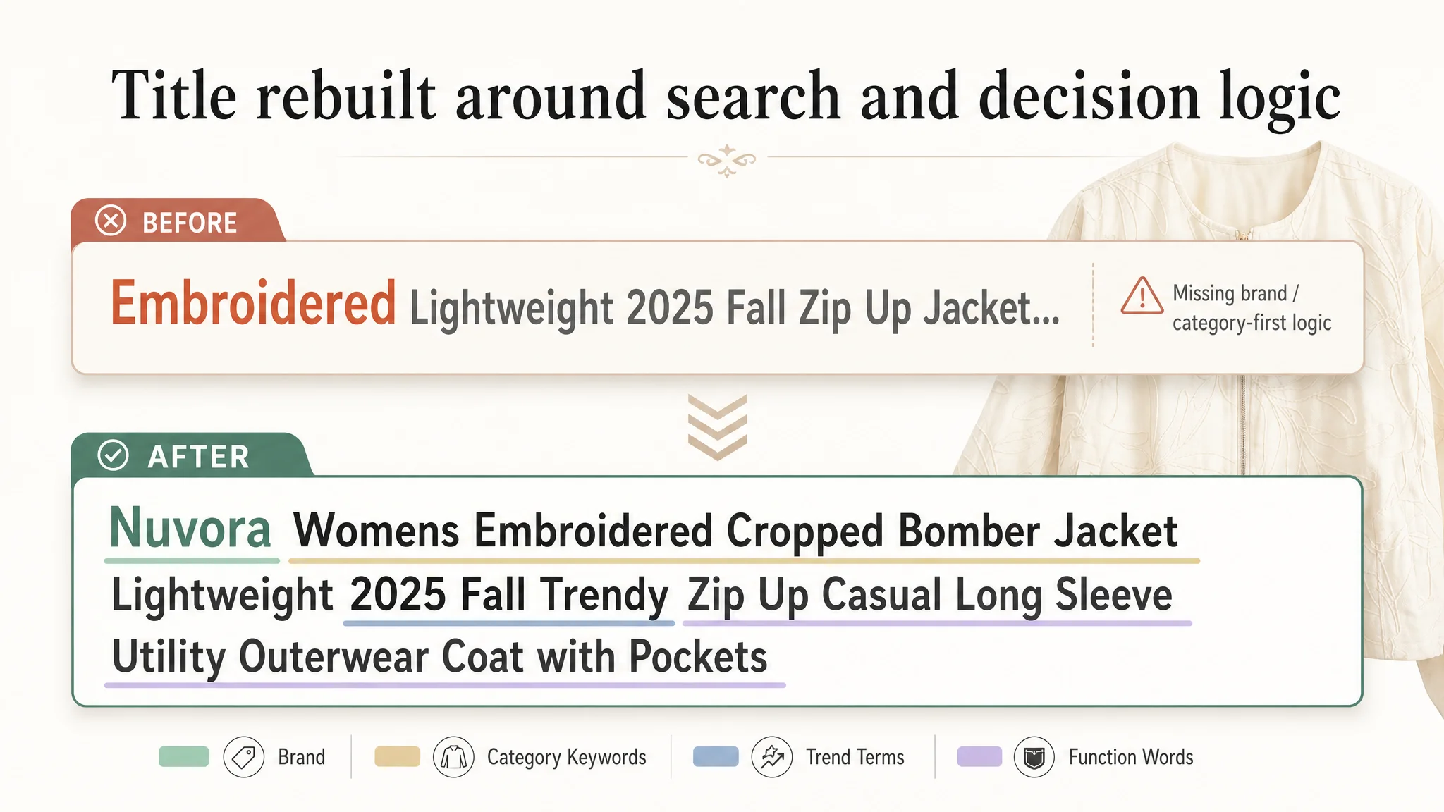
The original title pushed “Embroidered” as the primary hook and used a “style + function + season” sequence that felt looser than the benchmark’s:
- Benchmark structure: Brand + core product + year/trend + function/style
- Target structure: Style + function + year/season, with brand not leading
DeepBI’s recommended direction:
Womens Embroidered Cropped Bomber Jacket Lightweight 2025 Fall Trendy Zip Up Casual Long Sleeve Utility Outerwear Coat with Pockets
Key shifts:
- Lead with the core search and category terms: “Womens Embroidered Cropped Bomber Jacket Lightweight”.
- Integrate high-performing semantic elements: “Zip Up”, “Utility”, “Trendy”, “Outerwear Coat”.
- Keep “2025 Fall” to align with seasonal trend positioning but avoid redundancy (e.g., repeated “jackets”).
This was not about stuffing keywords; it was about aligning with the way Amazon search and buyers both parse titles: brand/identity, product, trend, function.
The bullet points had words, but not a decision path
Original bullets leaned heavily into aesthetic descriptors like “urban streetwear and minimalist chic aesthetics” without tightly connecting them to functional reassurance.
The benchmark’s bullets, by contrast, used:
- Structured labels (e.g., 【Material】, 【Design】, 【Occasion】).
- A clear mix of function and design (e.g., “storm flap, elastic cuffs, drawstring hem”).
- Direct alignment with buying decisions: material, design details, match, occasion, packaging.
DeepBI’s bullet suggestions for the target Listing followed that structure, but with the product’s own DNA:
1. 【Premium & Durable Fabric】
Emphasize lightweight, durable fabric, comfort, and the 2025 fall/winter relevance, while tying in the embroidered floral pattern as a style anchor.
1. 【Chic Embroidered Design】
Highlight the flower pattern, long sleeves, zip-up front, crew neck, and two side functional pockets, connecting style with utility.
1. 【Versatile Styling Options】
Provide concrete layering and pairing guidance—from tees and leggings to dresses and heels—to prove “one jacket, many looks.”
1. 【Adaptable for Any Occasion】
Anchor to specific seasons (spring, fall, mild winter) and specific scenes (commutes, brunch, club nights, street photography).
1. 【US Sizing & Easy Care】
Add US sizing clarity and practical care instructions, plus packaging/quality control reassurance.
The aim wasn’t just to “improve copy,” but to map the buyer’s mental checklist and close each loop directly on the bullet level.
The Main Image Was Not Just a Visual Issue. It Failed to Create a Reason to Click.
DeepBI’s main image analysis went frame by frame. The verdict: each image existed, but none advanced persuasion in a structured way.
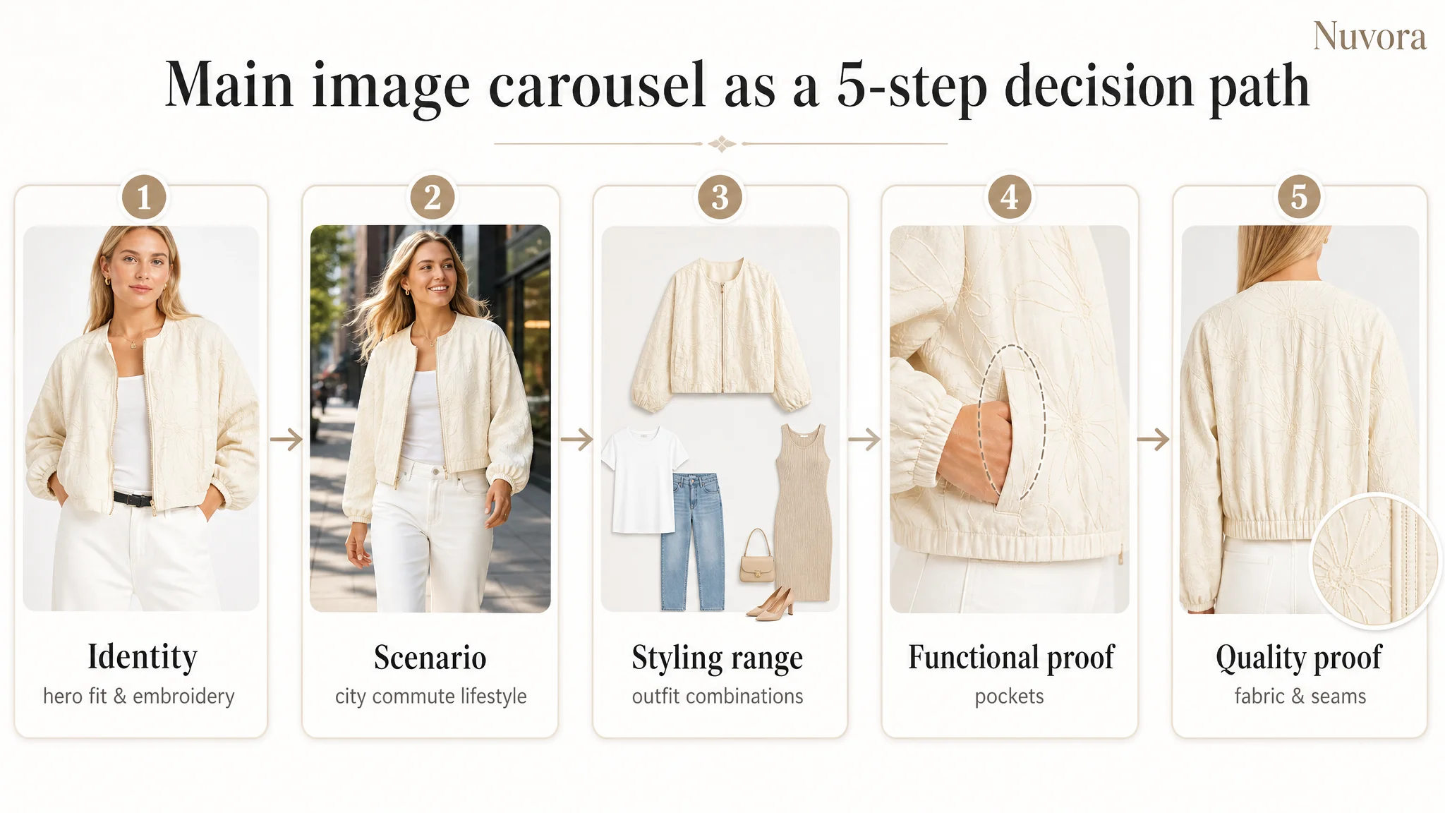
Image 1: Flat lay as the identity shot
- Role: confirm existence of the product in a specific color.
- Problem: weak first impression—no model, no fit, no sense of style or movement.
- Missed opportunity: the jacket’s embroidered pattern, cropped silhouette, and lightness could all be more powerful on-body.
Direction: replace with a front-view model shot showing the key elements at once: embroidered pattern, cropped fit, lightweight fabric, and overall style.
Image 2: Open-fit confirmation, but no scenario
- Role: show how the jacket looks open over an inner layer.
- Problem: functional but context-free; no life scenario, no emotional pull.
- Benchmark comparison: competitor uses this slot for urban scenes, city walks, or casual outdoor settings.
Direction: turn this into a scenario immersion image—urban streetwear, city commutes, weekend outings—while keeping the open-fit check.
Image 3: Redundant front pose
- Role: zipped front confirmation.
- Problem: nearly redundant once Image 1 becomes a strong on-body shot; adds little new information.
Direction: repurpose this slot to prove styling versatility—pairing with jeans, leggings, or dresses, consistent with the bullet-point pairing guidance.
Image 4: Slight angle change, no added value
- Role: minor angle variation.
- Problem: uses valuable image real estate for repetition instead of addressing functional doubts.
Direction: refocus on pocket functionality—showing real items in pockets, proving “two side functional pockets” actually work.
Image 5: Back view without texture assurance
- Role: show the back.
- Problem: purely informational; does not reassure about fabric quality or embroidery craftsmanship.
Direction: maintain the back view but emphasize texture and detail—premium fabric, embroidery sharpness, and stitching—to build quality trust.
In short, the main image carousel needed to evolve from “five variations of the same pose” to a stepwise persuasion sequence: identity → scenario → styling range → functional proof → quality proof.
This A+ Did Not Need More Pictures. It Needed a Different Logic.
The A+ content suffered from a different problem: not a lack of images, but a lack of structured logic. DeepBI reframed it into seven modules, each with a distinct job.
Module 1: Signature style, not just another beige jacket
Current role: daily casual styling of the beige version. Problem: low information density, fails to differentiate.
New role: establish a unique signature style:
- Visual emphasis on the embroidered floral pattern.
- Clear articulation of “premium fabric” and “exceptional comfort.”
- Positioning the jacket as a “fashion short jacket” that justifies its “trendy” claim.
Module 2: Use scenes, not just outfits
Current role: another styling display. Problem: no new information, no functional angle.
New role: address usage adaptability:
- Scenes like shopping, weekend brunch, outdoor walks, city commutes.
- Link scenes to benefits: durability, crease resistance, comfort over time.
Module 3: Functional detail, not just style repetition
Current role: more styling, zero functional detail. Problem: does not cover different functional needs.
New role: component functionality:
- Close-ups of zippers, embroidery stitching, fabric texture.
- Clear, concise labels explaining each feature.
Module 4: Pocket proof
Current role: more styling. Problem: bullets promise “functional pockets,” but there is no visual proof.
New role: pocket functionality node:
- Show a phone, wallet, or keys inside the pockets.
- Reinforce “utility outerwear” positioning visually.
Module 5: Deep-dive on quality and durability
Current role: nonexistent. Problem: no dedicated space for quality reassurance.
New role: quality and durability deep-dive:
- Bullet-based explanation of fabric, wear resistance, comfort.
- Visual focus on stitching, embroidery consistency, and finishing.
Module 6: Reduce styling cognitive load
Current role: multiple outfits shown, but no explicit guidance. Problem: buyers must do the mental work of “how would I wear this?”
New role: styling logic simplification:
- Group outfits into styles like “minimalist chic,” “urban streetwear,” “evening elegance.”
- Help the buyer quickly see which “persona” they identify with.
Module 7: Final fit risk reduction
Current role: missing. Problem: no size chart, buyers have to guess and risk returns.
New role: fit risk reduction node:
- US size chart with measurements.
- Clear guidance on fit (e.g., cropped length, recommended layering).
“Advertising does not only amplify advantages. It can also amplify a page’s existing defects.”
By establishing a clear A+ logic—style confirmation, function validation, risk reduction—the page can start to act like a proper “closing” layer, not just a gallery of nice photos.
After the Rebuild: How the Page’s Sales Logic Started to Recover
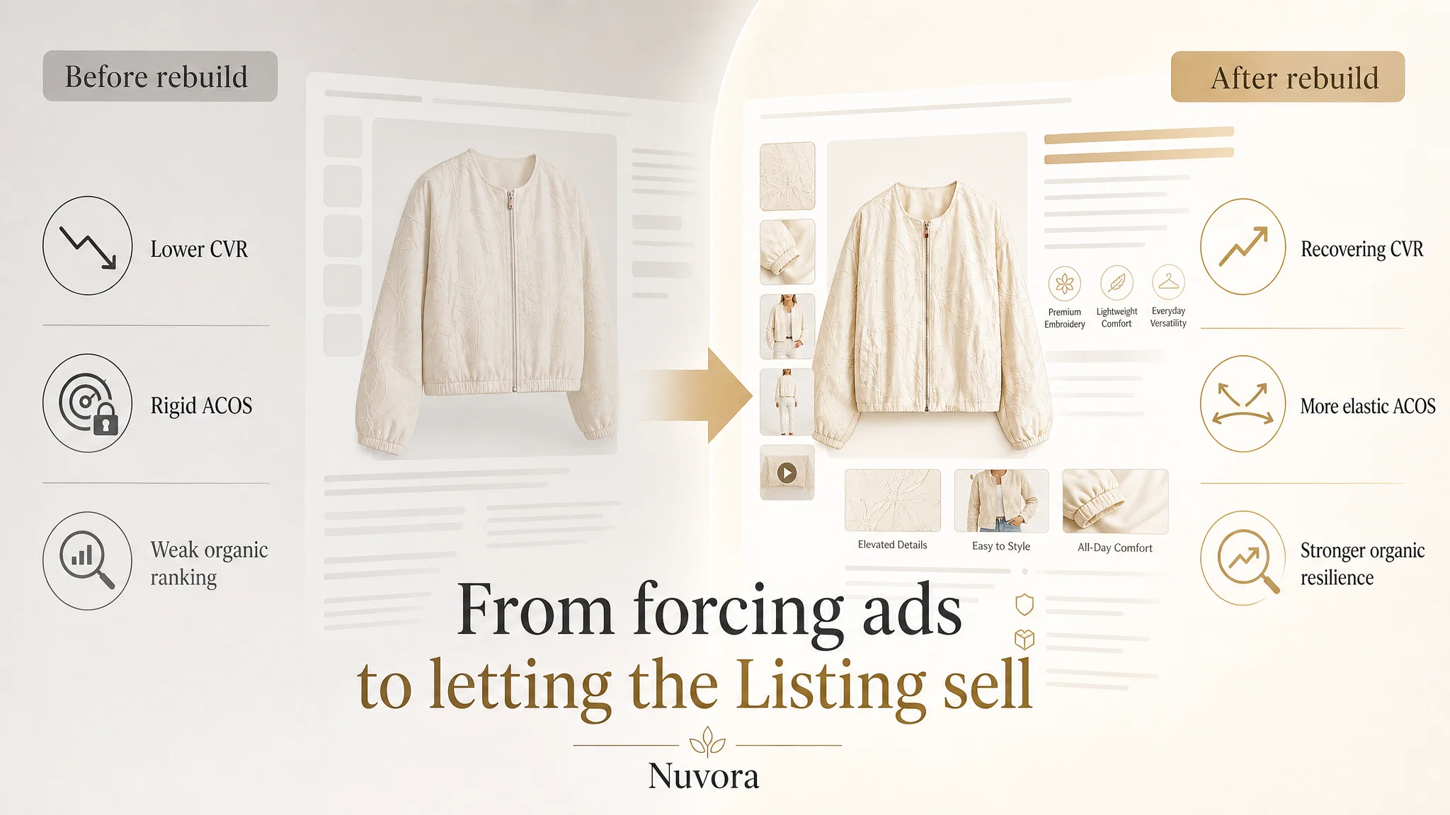
The primary outcome of this reframing was not a single magic metric, but a change in operating state:
- The main image sequence became capable of competing for clicks and attention on Amazon search pages.
- The bullet points and title began to speak the same language as buyers and the benchmark Listing.
- The A+ content shifted from aesthetic repetition to a structured argument: why this jacket is stylish, functional, and low-risk to buy.
- The absence of a size chart—previously an invisible deal-breaker—was addressed, lowering fit-related hesitation and returns.
Once these fundamentals were in place, any incremental increase in ad traffic had a better chance of turning into orders. In other words:
- CVR had room to recover, even if initial shifts were gradual.
- ACOS became more elastic, because the page could now support more efficient ad traffic.
- Organic ranking resilience improved, as the Listing became more self-sufficient in converting visits without depending entirely on paid exposure.
The seller also gained a different understanding of their Amazon business:
- That a 26-point Listing score gap vs a benchmark is not a “cosmetic issue,” but a conversion-capacity warning.
- That title, main images, bullets, A+, and reviews form one system; tweaking one layer while ignoring others is rarely enough.
- That reviews are important, but without page logic and trust modules, they cannot carry the entire conversion load.
What Other Amazon Sellers Can Take from This Case
This case is not about one jacket. It’s about a pattern many Amazon sellers recognize:
- Traffic is present.
- Ads are not obviously “broken.”
- Yet orders plateau or slide, and the reflex is to blame bids, keywords, or “product appeal.”
What DeepBI’s diagnosis showed here is that:
- A structurally weaker Listing will always drag down ad efficiency, regardless of tactical optimizations.
- Listing conversion capacity is a business constraint, not a cosmetic consideration.
- Before scaling ads, teams must ask: “Does this page deserve more traffic?” That means:
- Can the main image win the click in a real search page?
- Does the A+ content actually reduce risk and build trust?
- Are bullet points aligned with how buyers decide, not how we like to describe ourselves?
- Is there a clear bridge from style desire to fit confidence?
For this Amazon fashion seller, reframing the problem from “we need more reviews and better ads” to “our Listing cannot yet match the benchmark’s conversion capacity” was the turning point. Once the page started behaving like a true sales asset, ad traffic finally had something solid to land on.
And that is the core value of DeepBI in such cases: not listing out features, not just producing new images, but helping sellers see where the real constraint lies—so every dollar of traffic has a fair chance to become revenue.