

This case comes from an Amazon US seller in the craft-supplies category, selling an air-dry clay clear gloss varnish. On the surface, the team believed they just needed to clean up a few images and refine the copy. Ads were already bringing traffic, reviews looked solid, and the product itself was competitive. Yet the Amazon Listing still lagged behind a key benchmark competitor in conversion and overall page strength.
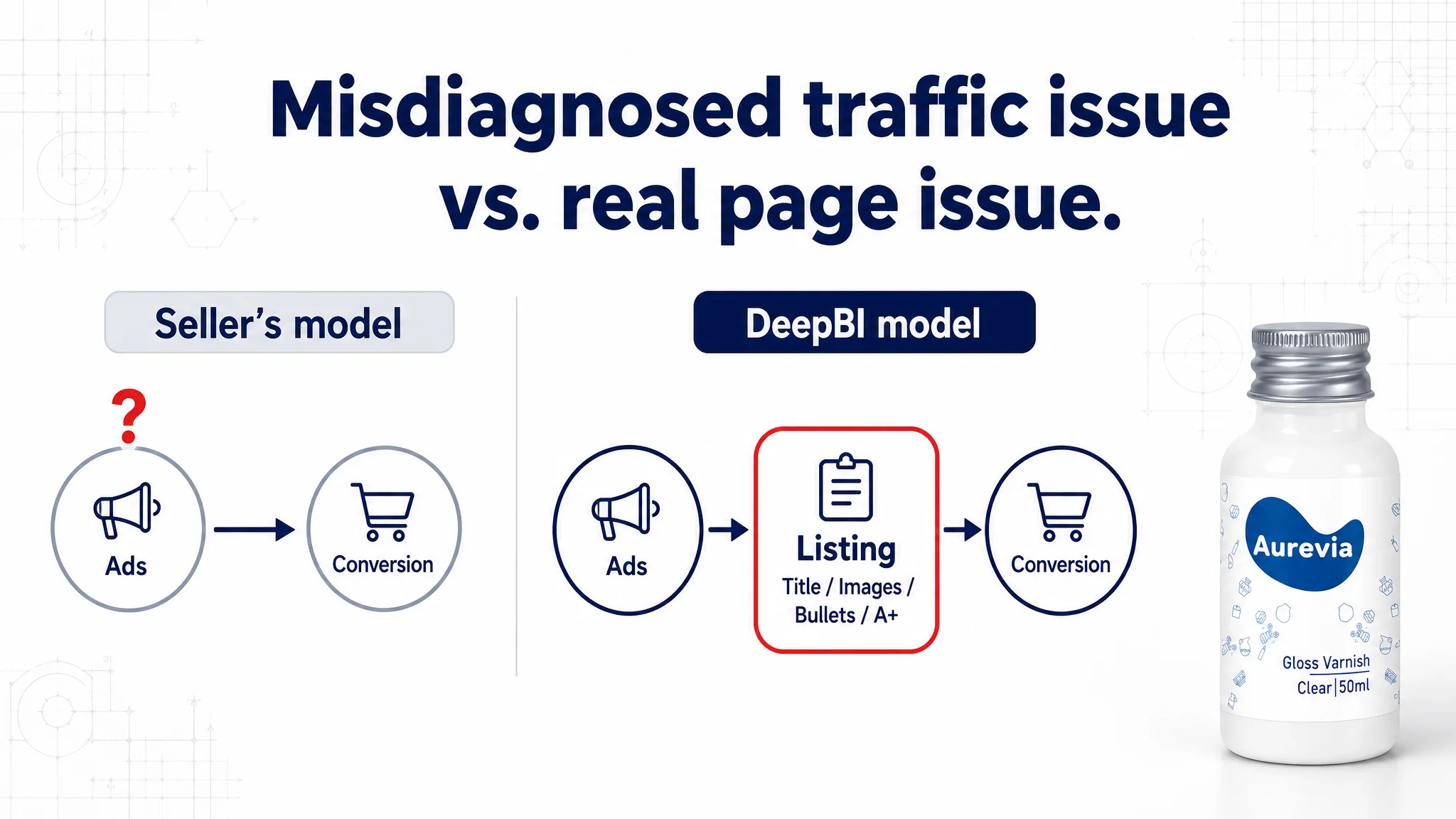
DeepBI’s Listing diagnosis showed something very different: this was not a minor cosmetic issue but a structural product-page problem. Compared with a category-leading competitor, the target Listing was weaker in how it framed the product in search (title wording), how the main images answered core buying questions, and how bullets and A+ content built a persuasive, low-friction decision path. Ads were sending in traffic, but the page could not fully convert it.
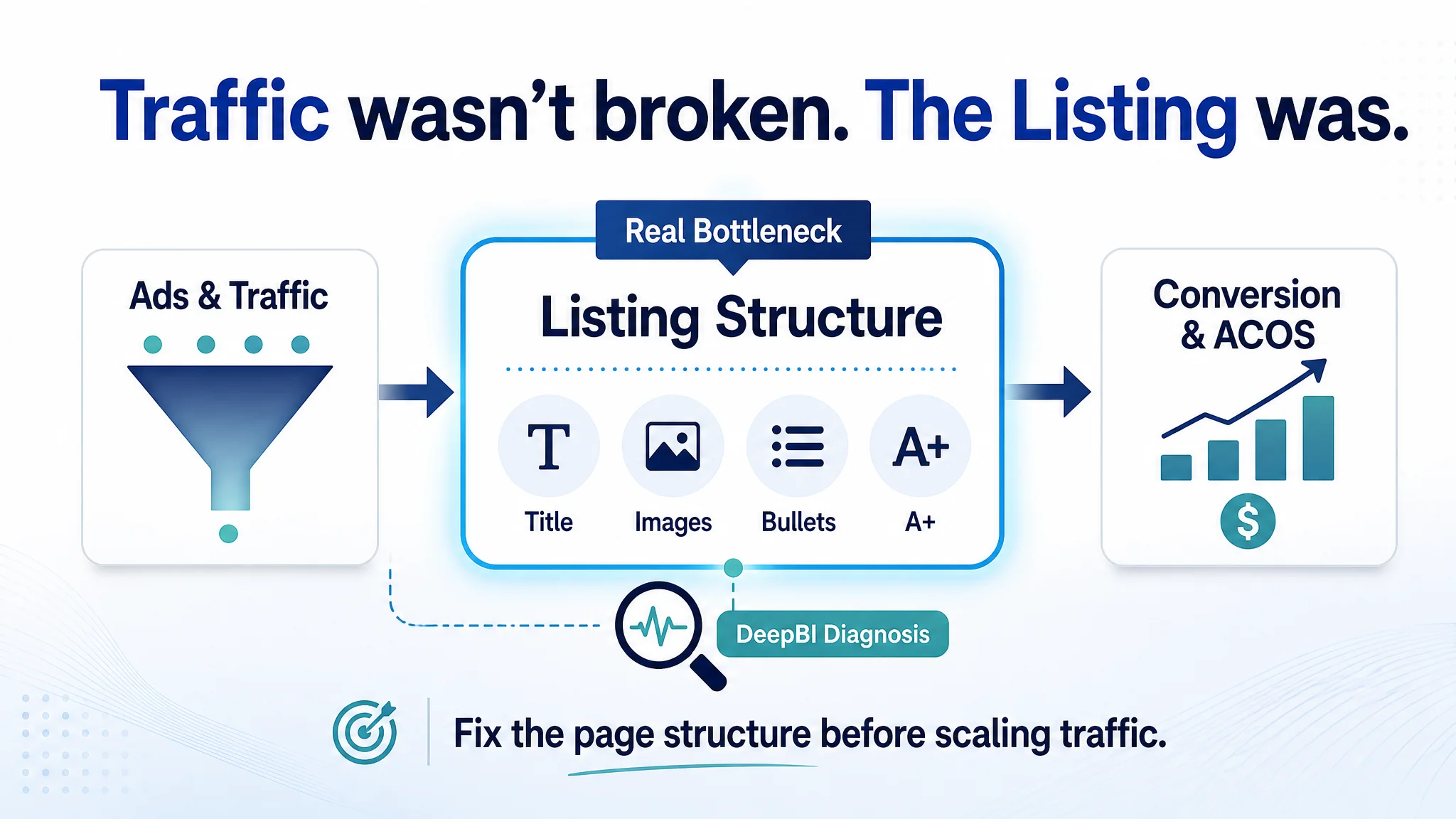
By rebuilding the Listing around a clear decision logic—“Is this for my project?” → “Does it really protect and last?” → “Is it safe and easy to use?”—and reorganizing title, main images, bullets, and A+ modules to match that logic, the Listing’s conversion capacity began to recover. For other Amazon sellers, the lesson is straightforward but uncomfortable: what feels like an “ad optimization problem” is often a product-page problem in disguise, and until the Listing is structurally sound, every extra click you pay for is at risk of being wasted.
What the Seller Saw: Strong Reviews, Weak Performance
From the seller’s perspective, the situation did not look like a classic “bad Listing” case:
- The product page was not empty or sloppy. It already had multiple images, a full A+ section, and detailed how-to instructions.
- Review data looked reassuring:
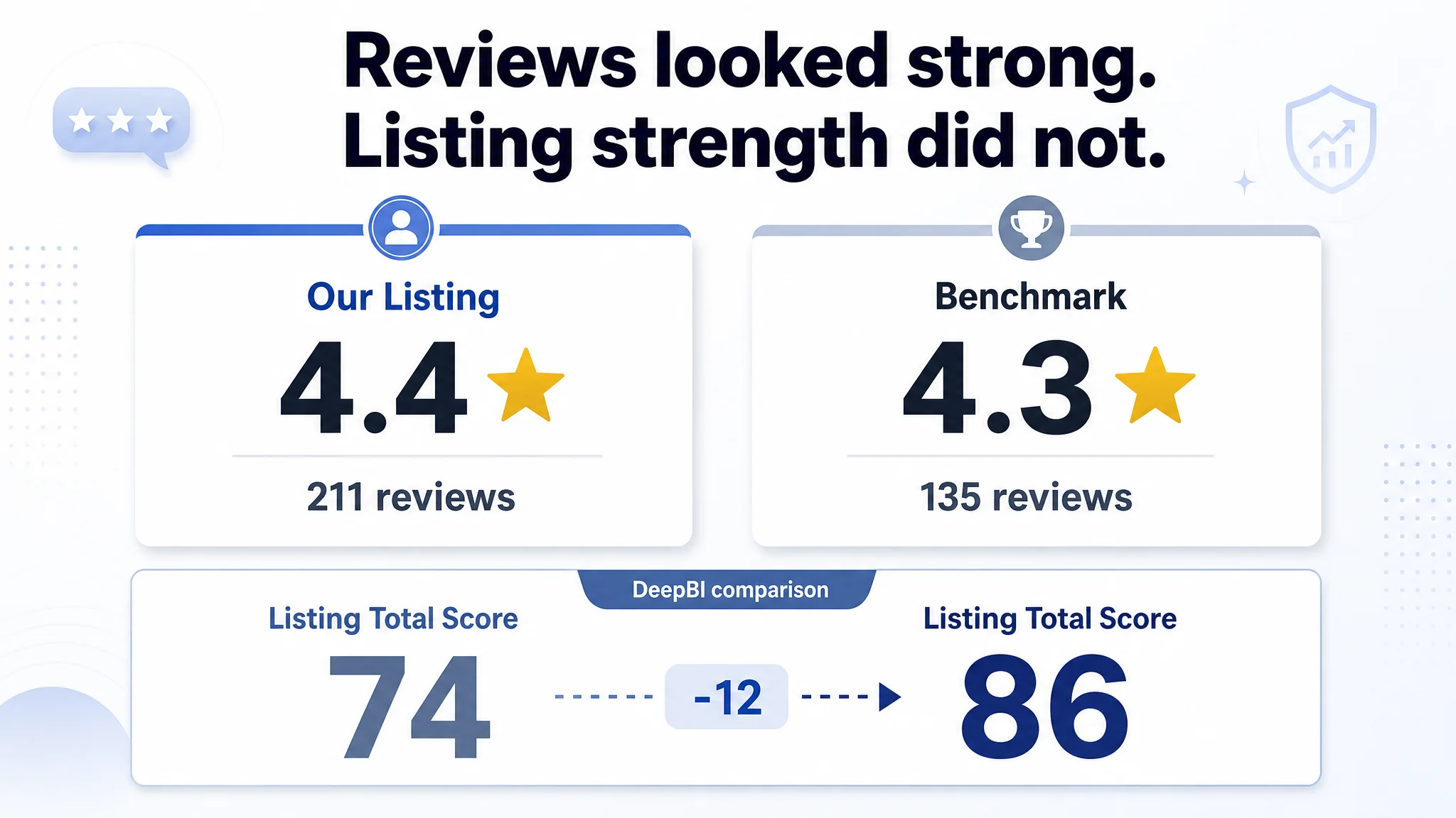
- Rating: 4.4 stars (slightly higher than the benchmark’s 4.3)
- Review count: 211 vs. the competitor’s 135
- Volume and rating both suggested decent market acceptance.
Operationally, the team was facing rising traffic costs and pressure on ad efficiency. The instinctive diagnosis was familiar:
- “The creatives feel a bit weak; fix the typo, refresh a few images, tweak bullets, and ACOS should come back down.”
- The assumption: ads and creatives needed tweaking, but the Listing logic was basically fine.
What was missing was a cold comparison against a true benchmark Listing in the same Amazon subcategory—and a view of how actual page content was shaping conversion, not just aesthetics.
The Hidden Constraint: Listing Conversion Capacity, Not Product Quality
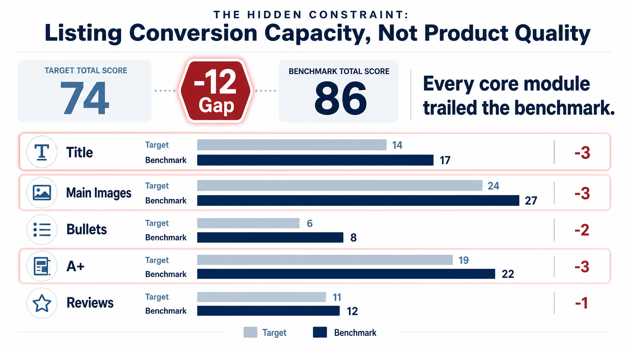
DeepBI’s Listing score made the constraint visible in one snapshot:
- Target Listing total: 74 / 100
- Benchmark competitor: 86 / 100
- Gap: -12 points
Broken down by core Amazon Listing elements:
- Title: Target: 14, Benchmark: 17, Gap: -3
- Main Images: Target: 24, Benchmark: 27, Gap: -3
- Bullet Points: Target: 6, Benchmark: 8, Gap: -2
- A+ / Detail: Target: 19, Benchmark: 22, Gap: -3
- Reviews: Target: 11, Benchmark: 12, Gap: -1
The page was not failing because buyers disliked the product. It was failing because the Listing did not help buyers decide as effectively as the benchmark.
“The real problem was not that ads failed to bring traffic. It was that the page could not convert the traffic.”
Once the page was scored against a category-leading competitor, the core conflict became clear:
- The competitor turned each module—title, main images, bullets, A+—into a step in a persuasive chain.
- The target Listing mixed instructions, features, and scenes in a way that raised effort and lowered trust at critical decision moments.
How the Problem Was Misdiagnosed
Before the diagnosis, the seller’s operating assumptions looked like this:
- Symptom: ACOS pressure, conversion not matching traffic.
- Assumed cause:
- Ad targeting/keywords not tuned enough.
- Creatives a bit “unpolished”.
- Minor mistakes (like a spelling error in an image) hurting performance.
- Planned actions:
- Keep adjusting bids and ad structure.
- Patch obvious visual issues.
- Add more explanation text to “educate” buyers.
DeepBI’s analysis showed why this logic stalled:
1. The Listing already had more reviews and slightly better ratings than the competitor.
Pushing for “more reviews” would not structurally change the conversion mechanics.
1. More explanation was actually increasing friction.
Detailed, early how-to steps made the product feel “high effort” before benefits were locked in.
1. Ad tuning could not fix a missing persuasion path.
The funnel was leaking at the product-page stage, not at the traffic stage.
Continuing to prioritize ad tweaks would simply pour more budget into a page that wasn’t structurally designed to convert like the benchmark.
Title: When One Word Changes the Entire Category Positioning
The competitor’s Amazon title strategy
The benchmark Listing did several important things in its title:
- Pushed the core category to the front: “Air Dry Clay Varnish”
- Added clear capacity: “120ml”
- Explicitly tied to key outcomes:
- “Used to Prevent Clay Cracking, Scratches, Wear”
- Used a clear ecommerce structure:
- Attribute + Core product word + Function/outcome description
This meant that:
- The title captured the main search patterns.
- Shoppers could see, in the search results, what it does and why it matters.
The target Listing’s title problem
The target page led with “Air Dry Clay Glaze” and leaned on “Glaze” rather than “Varnish”. That seems minor, but in this category:
- “Varnish” is the clearer, more widely used search and category word.
- “Glaze” overlaps conceptually but is more ambiguous and risks search mismatch.
The title also under-communicated:
- Protection outcomes (cracking, scratches, wear)
- The product’s role as a sealant, not just a nice gloss
The reframed title direction
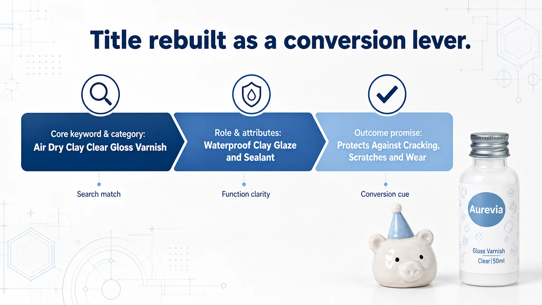
DeepBI’s recommendation was not just to “add keywords” but to reshuffle the logic:
Suggested structure:
Air Dry Clay Clear Gloss Varnish, Waterproof Clay Glaze and Sealant for Air Drying Clay Pottery, Clear Acrylic Varnish for Crafts, Protects Against Cracking, Scratches and Wear
Key shifts:
- Front-load “Air Dry Clay Clear Gloss Varnish” to align with real search behavior.
- Integrate “Sealant” and “Protects” to encode the product’s job.
- Tie attributes (waterproof, gloss) directly to the buyer’s core worry: protection.
This was about making the title a conversion lever, not just a compliance exercise.
Main Images: Traffic Was Clickable, but Not Fully Persuaded
Where the main images underperformed
DeepBI’s visual comparison highlighted three main issues:
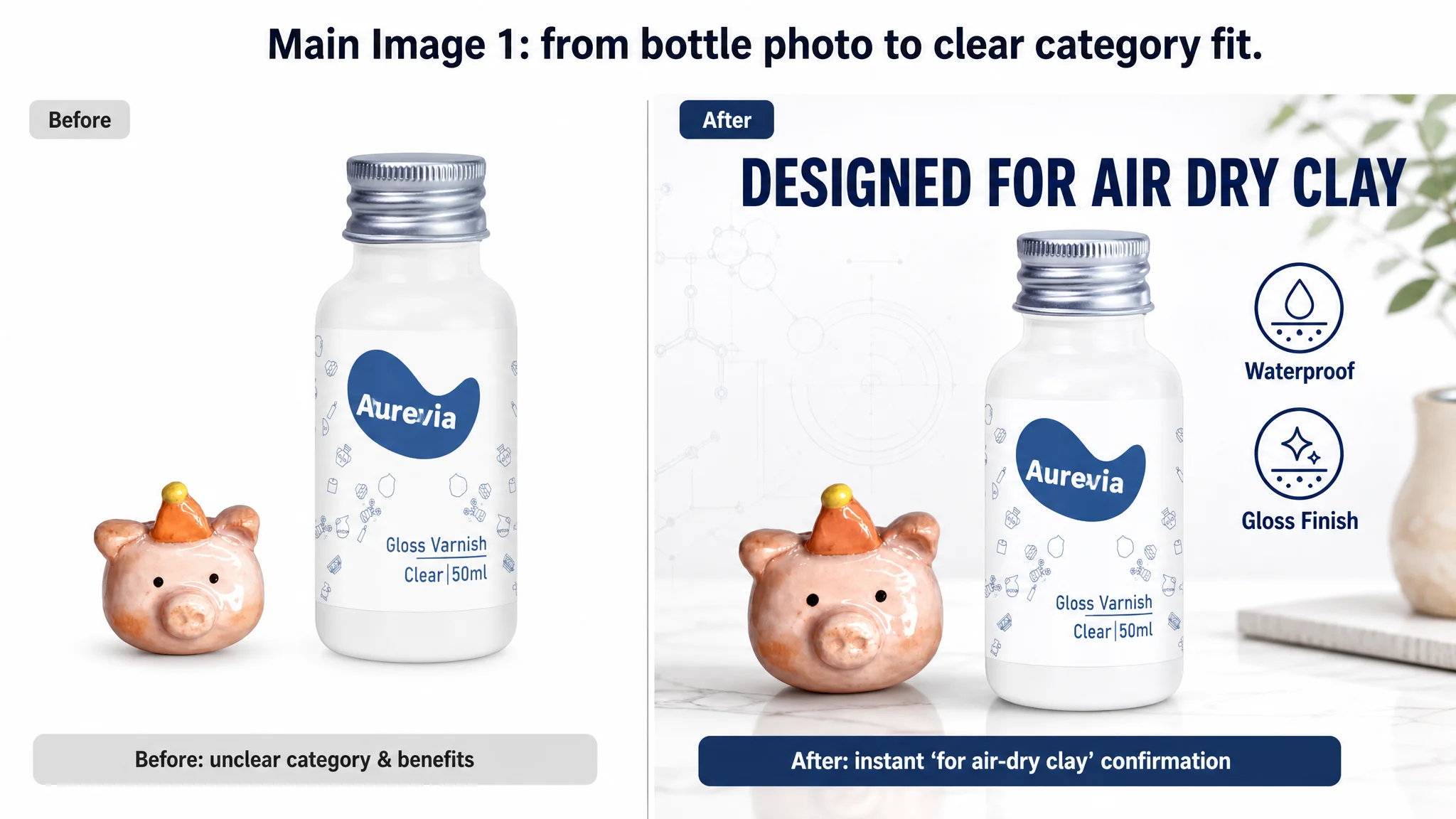
1. Lack of instant category & compatibility confirmation (Image 1).
- The main image showed the bottle and a prop, but did not loudly answer:
“Is this specifically for air-dry clay and for my type of project?”
- Buyers had to zoom and read the label to be sure—an unnecessary friction point.
1. Logical contradictions and spelling errors (Image 2).
- The image advertised “GLOOSY” (sic), undermining professionalism.
- It mixed Gloss and Matte finishes in one visual, while the ASIN in focus was a Gloss-only variant.
- This contradicted what the main listing was selling and introduced doubt.
1. Over-early, high-effort instructions (Image 3).
- A heavily instructional image explaining 3-day drying, 24-hour curing, etc., appeared before benefits were fully sold.
- For many buyers, the first impression became “this is complicated and slow,” not “this will protect my work and make it look beautiful.”
1. Confusing functional scenarios (Image 4 & 5).
- Showing teapots and large pottery in a way that visually suggests food use, while text says “not suitable for food/dishwasher”.
- Repetition of the same pain points across images, leading to information waste.
How the benchmark used images differently
The competitor’s image stack:
- Hit category affirmation and core promise early: “This is for air-dry clay; it protects; it adds gloss.”
- Used strong before/after contrasts with visually split objects (half dull, half glossy).
- Built professional trust via:
- Clean icon sets for “non-yellowing”, “permanent clear”, “waterproof”
- Scene setups implying high-value, artistic work, and giftability
DeepBI’s decision: repurpose image roles, not just “refresh visuals”
The recommendation was to redefine each image’s role in the buyer’s decision process:
1. Image 1 → “Instant Category Affirmation”
- Keep product + prop, but ensure bold, readable text at thumbnail size:
“Air Dry Clay Clear Gloss Varnish / Designed for Air-Dry Clay / Waterproof, Scratch-Resistant.”
- Make sure a crafter scanning search results can answer: “Is this for my project?” in 1 second.
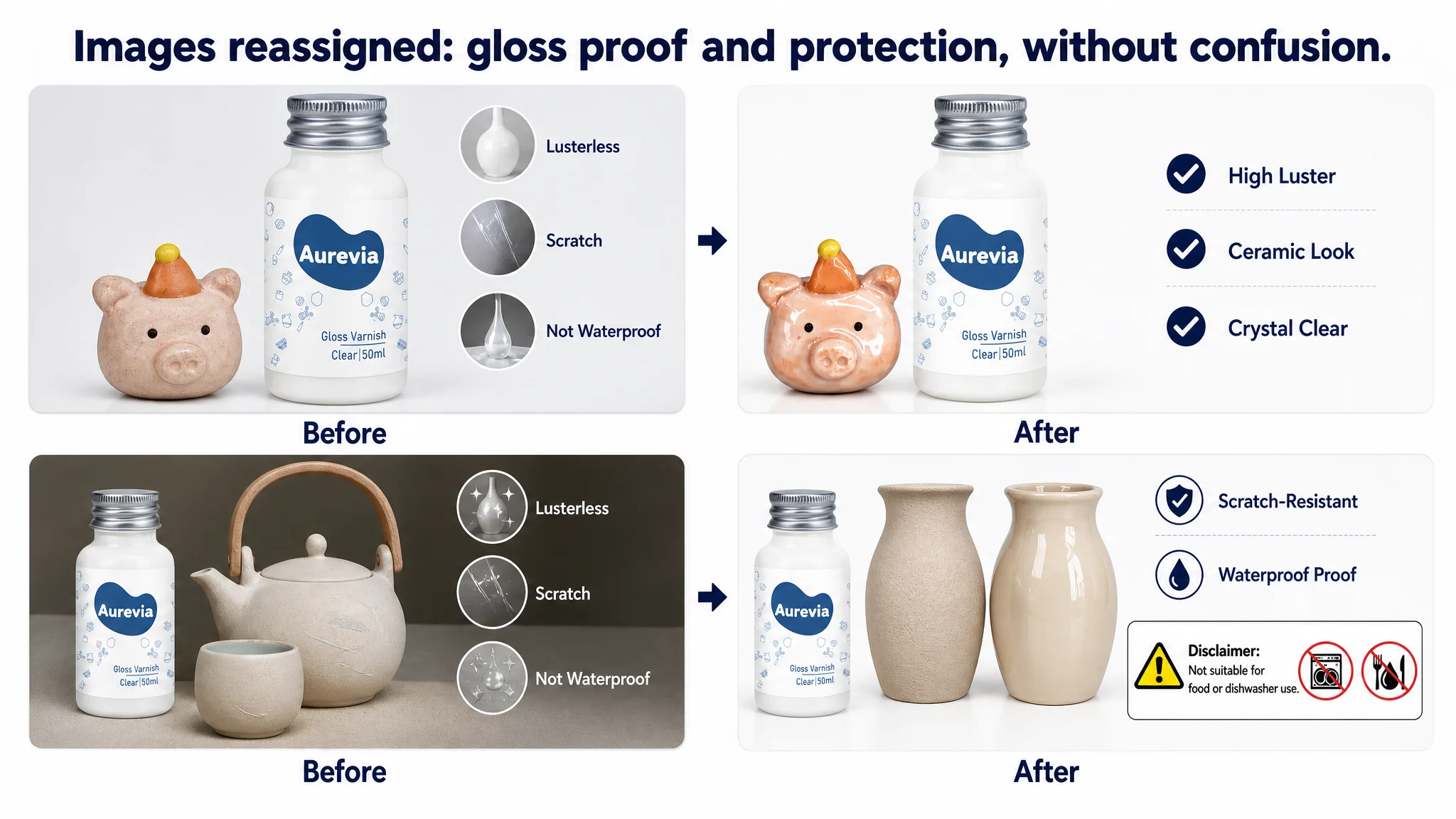
1. Image 2 → “Progressive Feature Confirmation”
- Remove Matte variant reference to avoid conflict with a Gloss-only Listing.
- Focus image on showing the promised “surprising gloss” and “ceramic look” on multiple finished pieces.
- Borrow the competitor’s miniature-object approach, but correct their logic errors.
1. Image 3 → “Trust Solidification via Problem/Solution”
- Use a clear comparison format like the original Image 5, but upgrade it with structured icons and clear boundaries:
- Scratch-resistant
- Waterproof
- Prevents cracking
- Explicit “Not for food / Not dishwasher-safe”
1. Later images → “Ease-of-use and scenario reassurance”
- Move detailed instructions lower in the sequence.
- Replace redundant pain-point repetition with:
- Versatility visuals (different crafts, surfaces)
- Gift / high-value scenes to support perceived price
In short, each image got a job, aligned with the buyer journey, instead of being a loose collection of visuals.
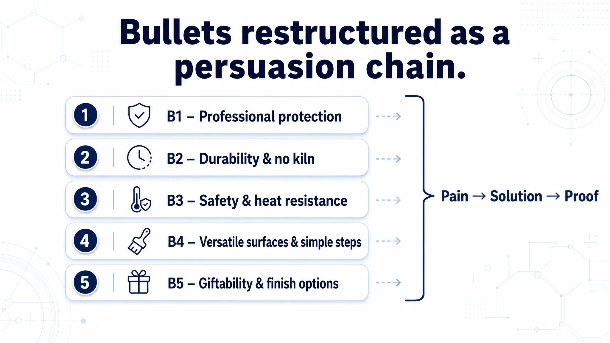
Bullet Points: From “Feature Listing” to “Pain Point → Solution → Proof”
The bullet points scored lower than the competitor (6 vs. 8 out of 10) not because they were short, but because they followed a weaker decision logic.
The original pattern
The target bullets leaned toward:
- Functional listing (waterproof, gloss, scratch resistance)
- Instruction-like detail (how to apply, how long to wait)
- Encouraging tone but limited hard proof
The competitor’s bullets, by contrast, consistently used a “Pain Point → Solution → Value/Proof” pattern:
- “Are you worried about…?” → Present risk.
- “This varnish provides…” → Offer solution.
- “Professional artists… Non-yellowing… Heat-resistant to X°F…” → Deliver credibility.
What DeepBI changed in the bullets
Each bullet was reframed to play a specific role in the persuasion chain:
1. Bullet 1 – Professional protection & clarity
- From: generalized protection and inspiration.
- To:
PROFESSIONAL PROTECTION & CRYSTAL CLEAR: Specifically formulated for air-dry clay, our varnish provides a professional protective layer that prevents cracks and ensures full waterproofing. This crystal-clear glaze keeps your creations scratch-resistant and looking vibrant for longer, adding a long-lasting gloss that enhances every detail of your artwork.
- Role: Establish that this is not generic craft paint, but a specialized, professional-grade safeguard for air-dry clay.
1. Bullet 2 – Convenience & long-term durability
- Introduced “No kiln required” and “anti-yellowing” to highlight DIY-friendliness and long-term clarity:
NO KILN REQUIRED & ANTI-YELLOWING: Create beautiful, watertight pottery at home without the need for an expensive kiln. Our durable formula dries to a high-luster finish that will not yellow over time, ensuring your pieces stay clear and bright for years. It is the perfect solution for protecting decorative ceramics (Note: Not intended for food or dishwasher use).
- Role: Tie practical convenience to long-term visual stability.
1. Bullet 3 – Safety & technical reassurance
- Added a clear “safe & heat-resistant” position:
SAFE & HEAT-RESISTANT FORMULA: Our clay sealant features a formula that meets strict safety standards, making it safe for artists and hobbyists of all ages. With heat-resistant properties, it protects your pottery well against environmental changes. Use it with confidence to seal, strengthen, and provide a professional-grade finish to your masterpieces.
- Role: Remove hesitation for family use and serious projects.
1. Bullet 4 – Versatile application & simplified usage
- Extended to other surfaces (polymer clay, plaster, ceramics, wood) and turned the long process text into concise steps:
VERSATILE APPLICATION & EASY TO USE: Designed not only for air-dry clay but also works excellently on polymer clay, plaster, ceramics, and wood. For best results: 1. Ensure the piece is dry (3 days); 2. Apply your desired paint; 3. Apply two coats of gloss varnish to the interior and exterior, allowing 24 hours to fully cure for a professional look.
- Role: Widen the addressable use-cases while keeping instructions digestible.
1. Bullet 5 – Giftability and finish options
- Reinforced the product as an essential tool and gift, with both gloss and matte:
PERFECT GIFT FOR CREATIVES: Available in both High-Luster Gloss and Natural Matte finishes, this varnish is an essential tool for any clay enthusiast. Whether for birthdays, Christmas, or DIY projects, this clay glaze seals, protects, and strengthens clay pieces, making it a thoughtful and practical gift for both beginners and professional artists.
- Role: Lift perceived value and align with the competitor’s holiday/gift framing.
Taken together, the bullets shifted from “what it is and how to use it” to “why it solves your risk, how it lasts, and why you can trust it.”
A+ / Detail Page: The Page Didn’t Lack Images. It Lacked a Story.
The A+ section was not empty; it just failed to organize persuasion as effectively as the benchmark.
Layout differences
- Target Listing A+:
- Product intro visual
- Core selling points list
- Problem visuals (dull / scratched / not waterproof)
- Three-step usage guide
- Before/after example
- Scene application and collection images
- Benchmark A+:
- Strong value proposition intro
- High-contrast half-and-half before/after
- Clear 4-step process (Preparation / Technique / Timing / Painting)
- Broad finished-piece examples
- Icon-based summary (permanent clear, non-yellowing, safe, universal surfaces)
Key gaps DeepBI identified
1. Weak first impression.
- The target’s first A+ image did not immediately resolve the biggest visual question:
“Will my piece actually look better after using this?”
- The competitor answered that in the first module; the target did not.
1. Pain points not visually dramatized.
- The target used small round icons to show problems (no gloss, scratches, not waterproof).
- The competitor used powerful split visuals—one object, two halves, “before vs. after”—which are much more persuasive at a glance.
1. How-to flow focused on steps, not risk avoidance.
- The target described “how to do it” but did not emphasize key “how not to fail” details, like avoiding thick coats or ensuring ventilation.
- The competitor wove in guidance that conveys professional care and safety.
1. Trust tags misplaced or diluted.
- The target sprinkled benefits like “watertight” and “anti-scratch” but did not clearly separate base features from differentiating advantages.
- The competitor pushed concepts like “UNIVERSAL SURFACES”, “SAFE FOR YOUNG AND OLD”, “PERMANENT CLEAR”, “NON-YELLOWING” right into the early modules—clear, high-value trust tags.
Rebuilding the A+ decision path
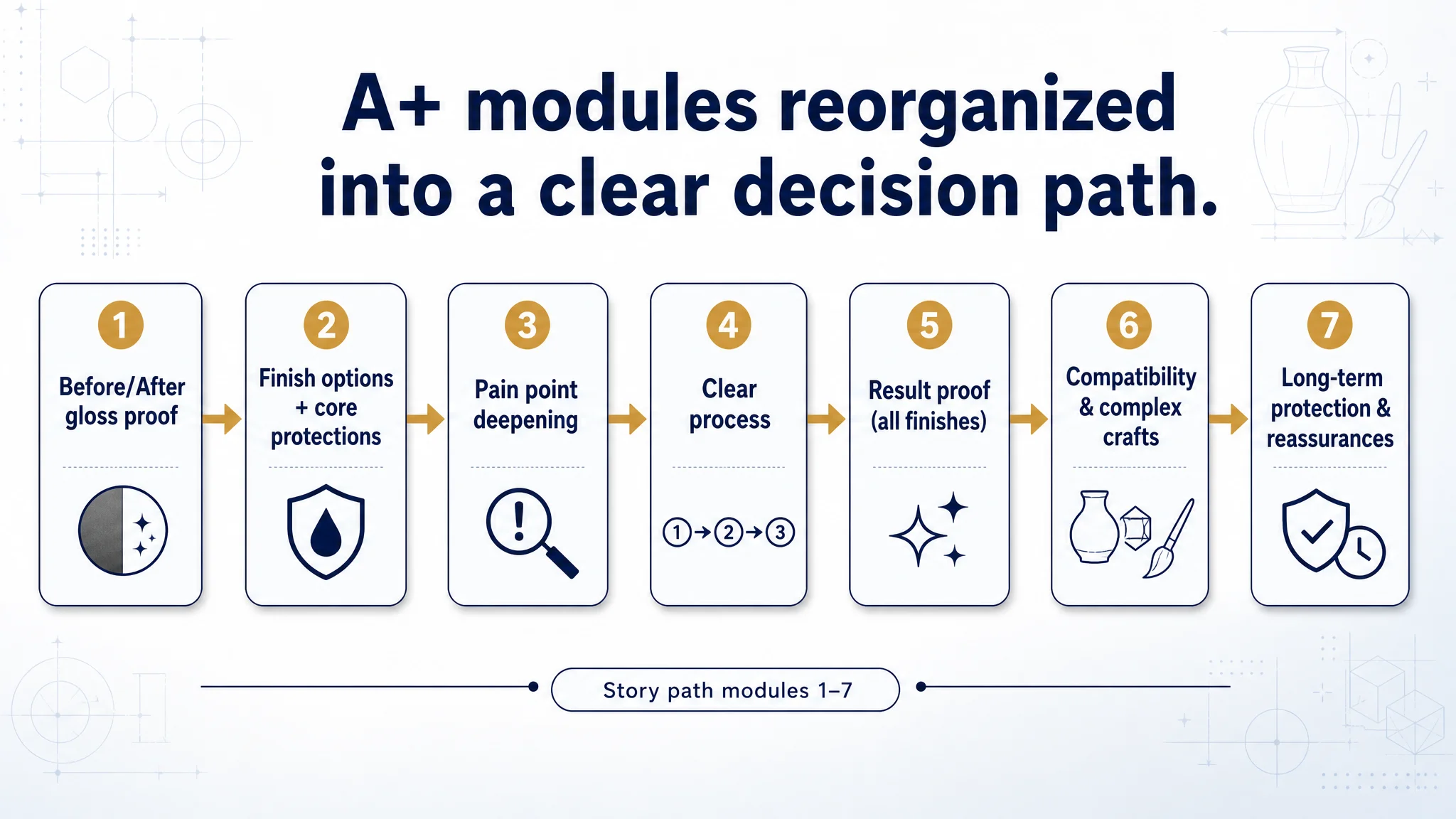
DeepBI recommended a new sequence:
1. Module 1 – “Immediate Gloss Validation”
- Start with a strong before/after image showing high-luster transformation.
- Make the first A+ impression: “This is what your clay looks like with our varnish.”
1. Module 2 – “Finish options & core protections”
- Clearly present Gloss vs. Matte (if both are within the brand family) and then show foundational protections: waterproof, scratch-resistant, anti-cracking.
- This ties directly to what matters most in the decision: look + protection.
1. Module 3 – “Pain point deepening”
- Keep the vase-like problem/solution comparison but rewrite it to frame dull, unprotected creations as a real risk—something the varnish proactively fixes.
1. Module 4 – “Clear process transparency”
- Rebuild the application guide to focus only on using the varnish itself.
- Remove confusion about primers or other products.
- Ensure warnings (non-food use, drying times) are straightforward and visible.
1. Module 5 – “Comprehensive finish proof”
- Combine the watermelon before/after or similar hero example with a summarized view of what matte looks like (if relevant), so both finish options feel fully proven.
1. Module 6 – “Compatibility & complexity reassurance”
- Show intricate crafts and colorful pieces to reassure users with complex projects that the varnish works on fine details, not just simple shapes.
1. Module 7 – “Long-term protection & closing assurances”
- Use multiple finished items to visually imply durability and long-term usage.
- Restate key assurances: waterproof, scratch resistance, non-yellowing, safety notes.
“Before ads could work again, the page had to convert.”
This restructured A+ flow aligns modules with buyer psychology instead of internal content categories.
Why DeepBI Prioritized the Listing Before the Ads
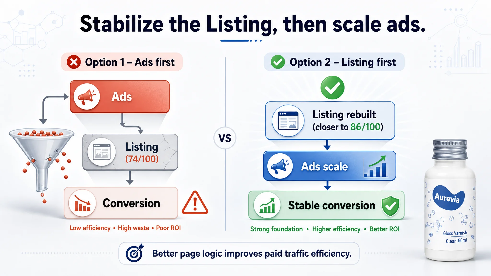
At this point, the seller had two options:
1. Continue tuning ads first
- Adjust bids, split campaigns, refine search-term targeting.
- Hope that more precise traffic and incremental creative tests would fix ACOS.
1. Repair the Conversion Infrastructure first
- Accept that the Listing was objectively behind a benchmark on title, main image, bullets, and A+.
- Rebuild the product page’s decision logic and trust layers, then resume aggressive ad scaling.
DeepBI pushed for option 2 for three reasons:
1. Ads were already supplying traffic.
The issue showed up in conversion when compared to a valid category benchmark. Sending more traffic to a sub-optimized page would mainly amplify inefficiency.
1. Review and product quality were not the problem.
Rating and volume were fine, and sometimes better than the competitor. That removed “product quality” as the primary suspect and kept focus on page-level presentation.
1. The benchmark showed what “good” could look like.
The competitor’s higher score on title, images, bullets, and A+ provided a reference for what a strong conversion path should include.
Improving the Listing first meant:
- Ads would land on a page better able to translate clicks into orders.
- The share of orders from organic traffic could recover, reducing overdependence on ads.
- Subsequent ad optimization would be more predictable—because the landing experience had been stabilized.
What Changed After the Reframe (Without Inventing Numbers)
The case does not include specific post-optimization metrics, so we will not invent them. But we can outline the changes in operating state and risk:
Conversion foundation:
- The Listing began to function more like the benchmark:
- Clear category fit in the title.
- Main images assigned specific decision roles.
- Bullets and A+ aligned around protection, durability, safety, and ease-of-use.
- The page’s ability to convert both organic and paid traffic improved from a structural standpoint.
Traffic and ads:
- Ad traffic became more “useful”—each click had a higher chance of converting because the page answered key questions more efficiently.
- The Listing became less vulnerable to ACOS spikes caused by weak on-page persuasion.
Risk profile:
- Reduced risk that ad spend would amplify a conversion defect.
- Less reliance on “just run more ads” as a default solution, and more emphasis on page quality as the base layer.
Seller understanding:
- The team saw that:
- Amazon ads cannot compensate for a disjointed Listing.
- Listing quality directly sets the ceiling for ad efficiency.
- Title, main image, bullets, and A+ must be designed as a coherent decision path, not as independent assets.
For Amazon sellers facing similar pressure—rising ad costs, reasonable traffic, but stubbornly uneven conversion—the real bottleneck may not be in the ad console at all. It may be in how your product page helps (or fails to help) a buyer make a confident decision in under a minute.