

This Amazon seller came to DeepBI with a problem that will feel familiar to many: the tote bag was getting traffic and had solid reviews, but its Amazon Listing was consistently losing to a newer competitor with far fewer reviews. The team’s first instinct was that their images were “not stylish enough” and the title “not attractive enough,” so they kept trying to tweak wording and aesthetics.
Once we put their Listing side by side with a benchmark Amazon competitor in the same tote bag niche, a different picture emerged. The real gap wasn’t that the product looked worse or had weaker social proof—it was that the entire product page failed to answer the buyer’s core decision questions: “Will this actually fit my stuff? How is the inside organized? Is the material really as reliable as you claim?” The competitor answered these on every inch of its Amazon product page; this Listing did not.
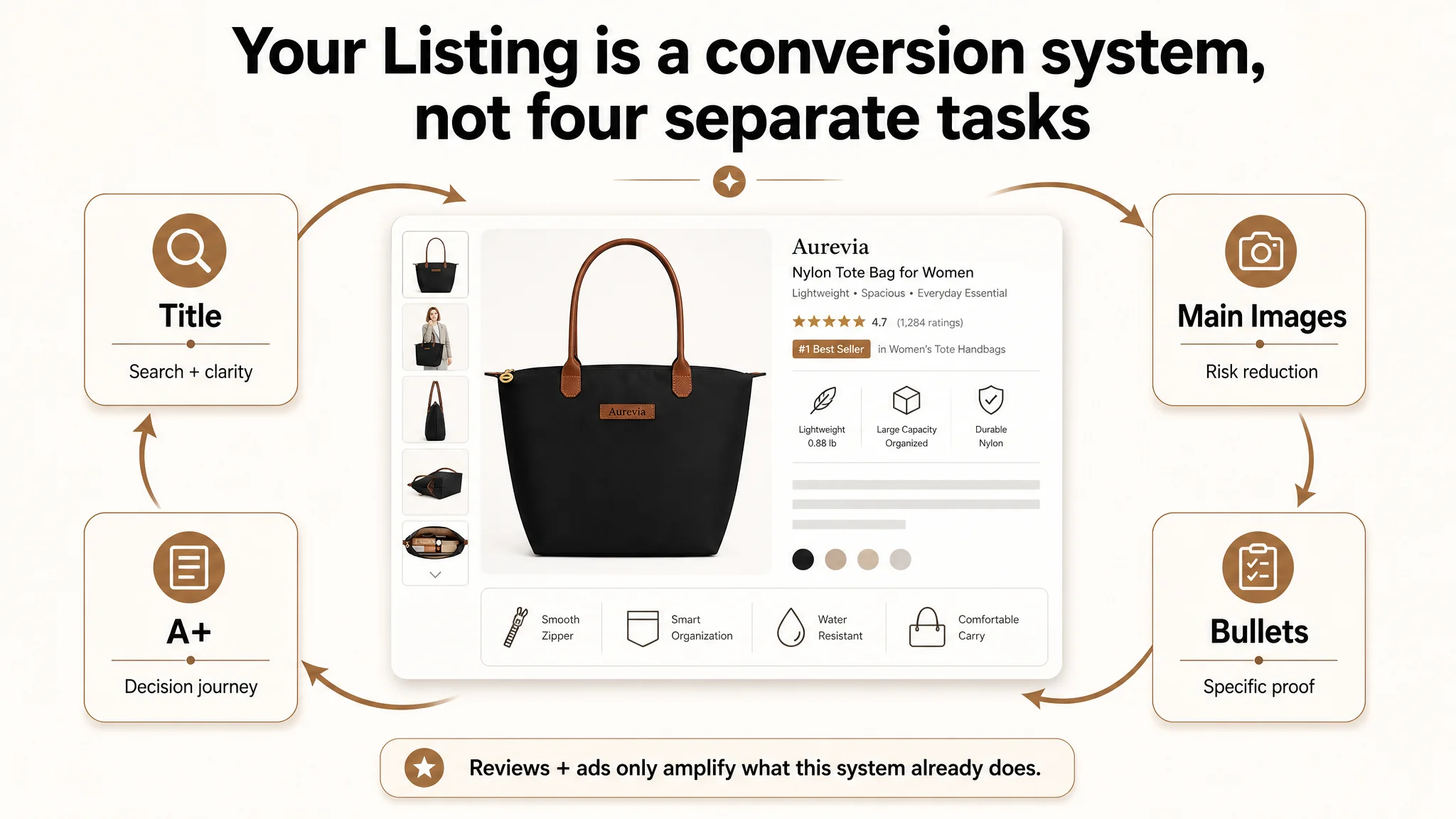
DeepBI’s diagnosis pushed the team away from generic “make it prettier” and “add more adjectives” toward rebuilding the page’s decision logic: title keyword structure, main-image sequence, bullets, and A+ modules all had to work together to reduce risk and prove utility. As the Listing’s conversion logic was repaired, the page became capable of truly converting both organic and ad traffic—without needing to rely on constant ad pushing. For other Amazon sellers, this case is a reminder: when a seemingly weaker competitor outperforms you, the issue is often not your ad bids or review count, but a missing chain of proof on the product page itself.
This Was Not an Ads Problem. The Listing Was Consuming the Traffic.
On the surface, this Amazon tote bag Listing looked healthy:
- Rating around 4.5 stars
- Roughly 250 reviews, far more than the benchmark competitor’s ~40+
- Several detailed, high-helpful reviews on the first page
Most teams, seeing these numbers, would assume the Listing’s “trust foundation” was fine and blame weak sales performance on:
- Insufficient ad bids
- Poor campaign structure
- Too little budget behind Sponsored Products
So they keep tuning ads, expecting ACOS to drop once “the right traffic” appears.
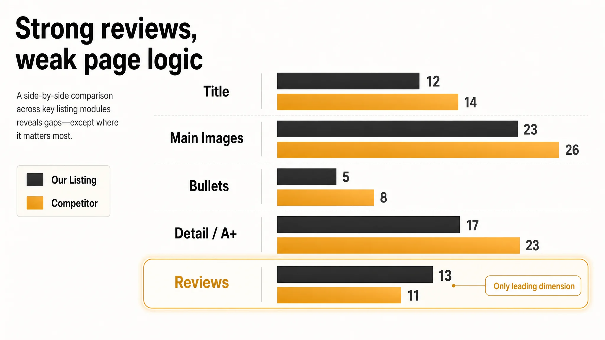
However, DeepBI’s Listing scoring told a different story. Against a strong benchmark tote bag Listing on Amazon US, the page scored:
- Total: 70/100 vs competitor’s 82/100 (–12 difference)
- Title: 12 vs 14 (–2)
- Main images: 23 vs 26 (–3)
- Bullet points: 5 vs 8 (–3)
- Detail/A+ content: 17 vs 23 (–6)
- Reviews: 13 vs 11 (+2)
In other words: the only dimension where this ASIN clearly led was reviews. Everywhere else, especially in detail content, it was behind.
“The real problem was not that ads failed to bring traffic. It was that the page could not convert the traffic.”
If the team had kept pushing ad volume into this structure, they would simply have been paying to amplify a weak conversion engine.
The Core Constraint: The Page Did Not Reduce Risk or Prove Capacity
Looking at the Amazon product page from a buyer’s perspective, one bottleneck stood out:
Core problem: the Listing did not build enough specific, visual proof around capacity, organization, and material reliability.
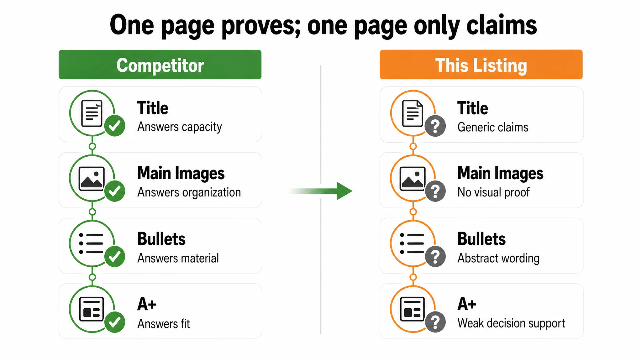
The competitor Listing—despite fewer reviews—built a continuous chain of reassurance:
- Title: immediately defined tote bag, large capacity, multi-pockets, and key use scenes (“Travel Gym Work”)
- Main images:
- Lifestyle scenes showing real use
- Visual evidence of waterproof performance
- Internal pockets labeled and filled
- Dimensions tied directly to a 15.6" laptop and A4 folders
- Bullets:
- Concrete capacity (laptop size, A4, books)
- Clear multi-pocket structure with specific items
- Expanded scenarios and gift occasions
- A+:
- Scene-based hero image with emotional context
- Internal structure maps with icons and “what fits where”
- Fit verification with real devices
- Color + outfit mapping to real-life scenes
By contrast, the target Amazon Listing did almost the opposite:
- Leaned heavily on generic words like “Stylish and Durable”
- Spent title weight on “Waterproof Nylon” before “Tote Bag”
- Main images stayed at the level of clean, static product shots
- Bullets stayed abstract (“large capacity”, “spacious interior”) with minimal object-level proof
- A+ content compressed many claims into one overloaded graphic, with almost no visual demonstration
The product wasn’t weak. The proof was weak.
From a business viewpoint, that’s the worst of both worlds: you pay for traffic, you have reviews, but you fail to cash in because the Amazon product page never truly closes the buyer’s risk gap.
How the Original Diagnosis Went Wrong
Before the Listing was scored, the seller’s intuition centered on three assumptions:
1. “Our star rating and review volume are strong, so trust is fine.”
They saw 4.5 stars and 250 reviews vs the competitor’s 4.7 and 43, and concluded review trust was not the issue.
1. “Our images just need to look more high-end or designer.”
The team focused on style, branding, and “making it look more attractive,” without a clear view of what specific shopper questions were unanswered.
1. “If CTR or CVR are low, we can fix it with better ad targeting and more traffic.”
The reflex was to treat it as an advertising problem.
All three were understandable, but incomplete:
- Ratings and volume are not the same as conversion ability if the page doesn’t prove key functional decisions (e.g., laptop fit).
- Aesthetic improvement without decision logic doesn’t change the buyer’s risk perception. Beautiful images that say nothing concrete don’t convert.
- Advertising cannot repair a weak page; it only makes the weakness more expensive.
DeepBI’s role was not to provide more “nice” visuals, but to expose that the conversion logic inside the Amazon Listing was structurally weaker than the benchmark, and that this was where optimization had to start.
Title: From Vague “Stylish” to a Clear Search and Decision Scaffold
The title gap looks small in score (–2) but large in effect.
What the competitor got right
The benchmark title followed a decision path that matches Amazon search behavior:
- Core category first: “Tote Bag with Zipper”
- Functional proof: “Large Capacity”, “Multi-Pockets”, “Waterproof”
- Audience: “for Women”
- Scenes: “Travel Gym Work”
This title does two jobs at once:
- Feeds Amazon’s search engine with clean, high-intent terms
- Tells a scanning buyer what outcome they get and where they’ll use it
What the target Listing was doing
The original title:
- Front-loaded “Waterproof Nylon” instead of “Tote Bag”
- Used generic, subjective claims like “Stylish” and “Durable”
- Underused key scene words that drive intent (travel, work, gym)
DeepBI’s recommended title structure was:
Nylon Tote Bag with Zipper for Women Waterproof Lightweight Handbag Large Capacity Multi-Pockets Shoulder Bag for Travel Work Gym Purse
Logic behind it:
- Core keyword front-loaded: “Nylon Tote Bag with Zipper”
- Concrete functions in the middle: “Large Capacity, Multi-Pockets, Waterproof, Lightweight”
- Audience + scenes: “for Women… Travel Work Gym”
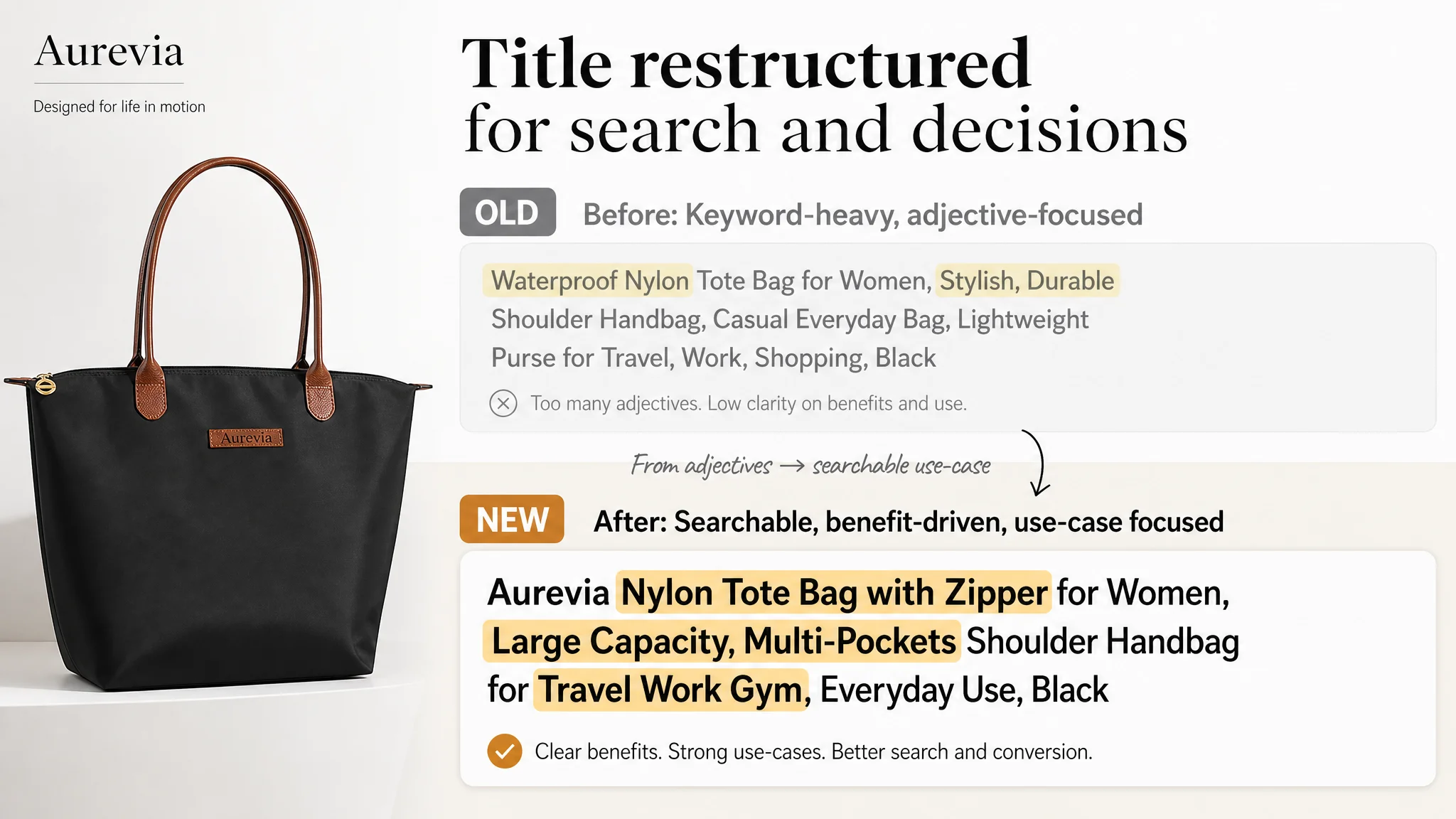
This doesn’t just improve keyword coverage; it anchors the entire Product Detail Page in a clear use case. Every buyer and every algorithm now reads the Listing from the same premise: “This is a women’s tote bag, zippered, large capacity, multi-pocket, for travel/work/gym.”
Main Images: The Listing Did Not Answer “Can This Actually Work For My Day?”
On Amazon, the main image strip is not just “branding.” It’s a mini-funnel:
1. Grab attention on the search page
2. Prove the product’s physical truth
3. Reduce concrete fears before the buyer scrolls
The benchmark competitor used its first three images to do exactly that:
- Image 1–3 combined high-aesthetic lifestyle scenes with clear capacity and waterproof proof
- Demonstrated inside organization with labeled pockets and real items
- Showed a laptop physically fitting with dimension overlay
- Used fashion-forward street photography to justify a slightly higher perceived price
The target Listing’s images, in contrast, were mostly:
- Clean, white/neutral background static shots
- Model pose, but in a studio-like setting with weak context
- Dimensions and structure separated from capacity and fit proof
- Internal view with items, but no clarity on laptop compatibility or structured organization
From DeepBI’s scoring and visual agents, the core judgment was:
The Listing had images, but not answers.
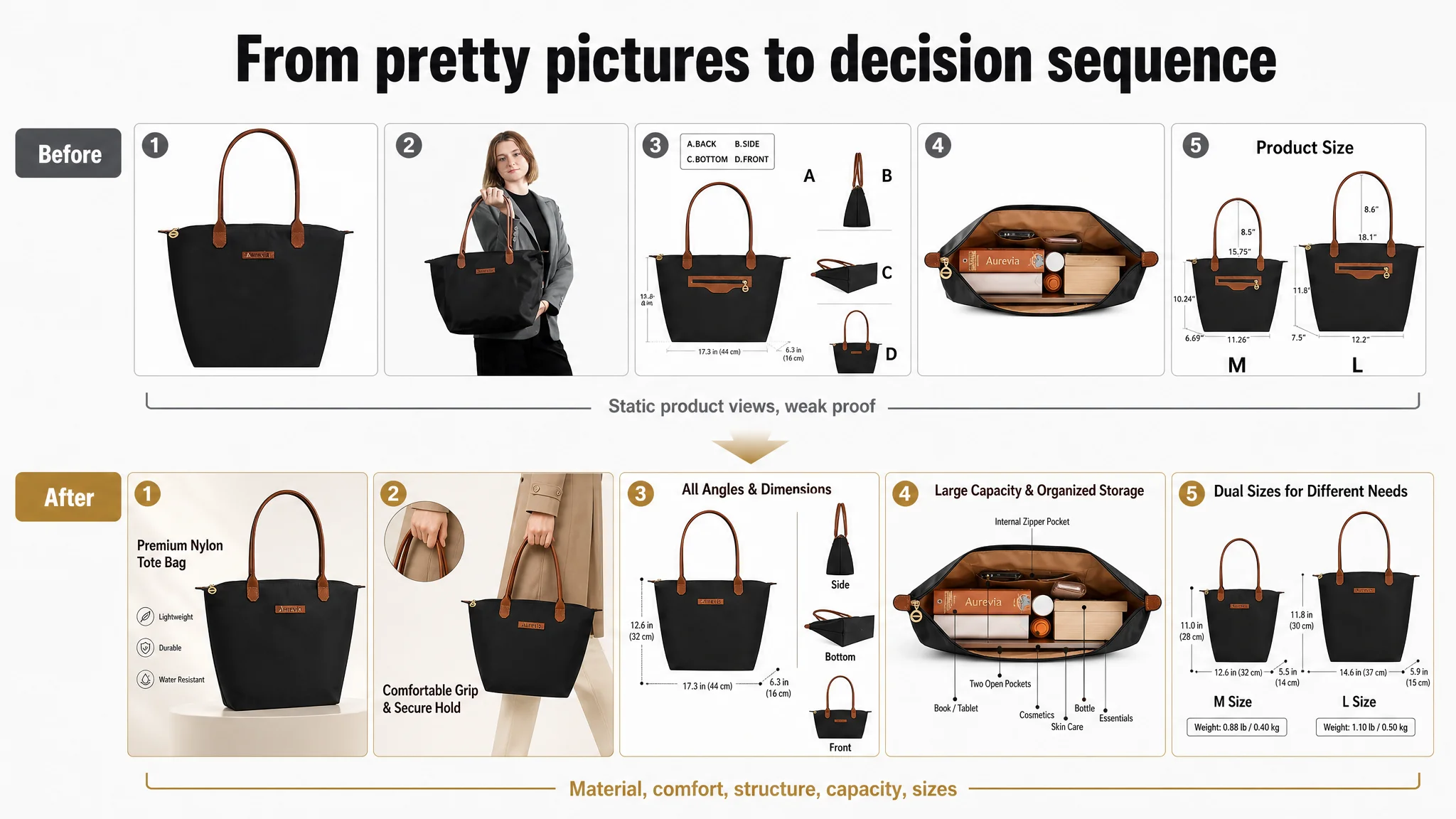
The repositioning DeepBI recommended
1. Reorder the image sequence by decision risk, not by internal logic.
- Move size data and internal-structure images earlier (Image 2–3), not buried at the end.
- Use early images to answer: “How big is it really?” and “How is the inside laid out?”
1. Turn abstract claims into visual proof.
- Show water-repellent behavior on actual nylon fabric (droplets, close-ups).
- Show close-up stitching and hardware as “durable” proof instead of just stating “durable.”
1. Use internal view to prove organization, not just capacity.
- Label visible pockets (zip pocket, open pockets) to demonstrate a real storage system.
- Avoid inventing new features—only label what the product already has.
1. Integrate dimensions with structure.
- Don’t isolate dimension diagrams as a standalone, low-impact image.
- Combine front/side/bottom views with clearly labeled dimensions for both sizes to reduce measurement anxiety early in the image set.
Notice what DeepBI did not recommend: adding fake features, over-promising laptop sizes that were not guaranteed, or purely cosmetic backgrounds. The focus was: “What questions must the first 3–4 images resolve so that a buyer feels safe to scroll further or add to cart?”
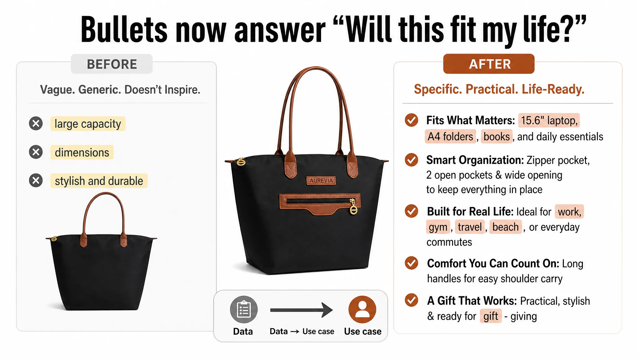
Bullet Points: From Numeric Data to Real-Life Use Cases
In the original Amazon Listing, bullet points suffered from the same pattern: information existed but did not translate into decisions.
- Dimensions were listed as raw numbers.
- Capacity was called “spacious” without naming what fits.
- Organization was reduced to “zipper closure” rather than a system of pockets.
- Scenario coverage was narrow (“work, shopping”) and lacked breadth.
The benchmark competitor, however, used bullets to move from data → use case → benefit:
- “17 x 4.7 x 14 inch… fits 15.6" laptop, A4 folders, books, school supplies…”
- “7 pockets… keeps your laptop, water bottle, umbrella, sunglasses, beach toys neatly organized”
- “Ideal gift… for Mother’s Day, birthdays, etc.”
DeepBI’s optimized bullets followed that same decision logic:
1. Material & protection first
From: generic “high-quality nylon, durable” To:
【High-Quality & Water-Repellent Material】 Crafted from premium lightweight nylon, this tote bag is not only durable but also water-resistant, protecting your essentials from unexpected splashes. Featuring reinforced shoulder straps and a smooth, secure zipper closure for long-lasting daily use.
This changes “durable + stylish” into something a buyer can picture: “My stuff won’t get wet; straps won’t give out.”
2. Capacity tied to real items
From: size numbers only To:
【Large Capacity & Practical Sizes】 Available in two sizes… The spacious interior is perfectly sized to fit a 15.6" laptop, A4 folders, books, and all your daily accessories without adding extra weight.
Now the numbers have a job: they answer “Will my laptop and documents fit?”
3. Organization as a daily-life system
From: “zipper closure” dominating the feature To:
【Organized & Secure Storage】 The secure top zipper closure keeps your belongings safe and organized. With multiple interior compartments, this shoulder bag offers dedicated space for your smartphone, wallet, keys, and cosmetics, making it easy to find what you need on the go.
Even without changing the physical product, the text now tells a story about how your daily items live inside the bag.
4. Scenes as search and motivation coverage
From: narrow work/shopping mention To:
【Multifunctional for Any Occasion】 Designed for versatility, this bag seamlessly transitions from a professional work bag or laptop tote to a casual gym bag, travel carry-on, or beach tote…
Search terms (work, gym, travel, beach) become both scene coverage and traffic entry points.
5. Comfort + gift logic
From: plain comfort statements To:
【Comfortable Carry & Ideal Gift Choice】 Features ergonomically designed handles that ensure a comfortable grip and reduce hand fatigue… Its stylish and practical design makes it a thoughtful gift…
Now the fifth bullet opens up additional buying triggers: “I can buy this for someone else.”
A+ Detail Page: The Biggest Conversion Leak
On Amazon, A+ content is often where “nice to have branding” goes. In this case, it was where major buying doubts should have been resolved but weren’t.
What the target Listing’s A+ looked like
- An intro module that repeated style and generic claims
- A color/model module that showed different colors but no scenario meaning
- One overloaded graphic mixing: nylon, handle, waterproofing, pockets, folding—without visual proof
- No clear module dedicated to laptop fit verification
- No clear, structured interior organization map
- No focused module for foldability or comfort
What the benchmark Listing did differently
It broke the A+ into a clean decision journey:
- Scene-based hero image to build emotional relevance
- Close-ups of material and waterproof performance
- Explicit internal layout map with icon-labeled pockets
- Laptop fit demonstration with measurement labels
- Scene + outfit mapping to solidify multi-scenario use
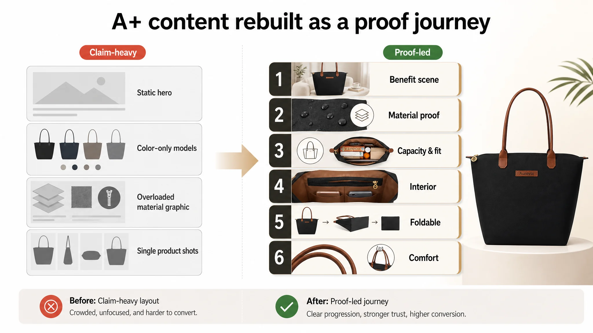
DeepBI’s advice was to rebuild the A+ around decision modules, not around the existing image inventory:
1. High-level benefit scene, not just “style.”
- Replace the generic intro with a scenario image that states a clear benefit (“lightweight large-capacity tote for work and travel”) and sets expectations for what will be proven below.
1. Material & durability as a dedicated proof block.
- Separate nylon, stitching, hardware, and waterproof behavior into a focused module.
- Show water droplets on the actual fabric, close-ups of stitching, and zippers as evidence.
1. Key capacity & fit verification module.
- Use precise dimensions for both sizes.
- Visualize common devices (a realistic laptop size per confirmed data) against or inside the bag to resolve the laptop-fit doubt.
1. Interior organization proof module.
- Use the actual internal pockets (soft lining, zip pocket, open pockets) and map them to specific items: phone, wallet, keys, cosmetics, etc.
- Show a “what it holds” scenario with all daily essentials.
1. Foldable convenience as its own risk reducer.
- Show the bag folded down to address storage and travel concerns.
1. Comfort assurance module.
- Use lightweight and handle design as rational evidence for comfort over time, even if long-term testing cannot be shown.
By shifting A+ from “compressed info” to “step-by-step proof,” the detail page starts working as a builder of conversion, not just decoration.
Why Listing Conversion Had to Be Fixed Before Pushing Ads
From an Amazon operations perspective, the priority sequence is crucial.
At the time of diagnosis:
- The Listing had traffic and review volume.
- Scores clearly showed the Listing lagging the competitor in title, images, bullets, and especially A+.
- The business risk was not “not enough traffic”; it was “not enough conversion per click.”
Continuing to tune ads first would have done three things:
1. Burned more budget through low CVR.
2. Misled the team into thinking the problem was purely traffic quality.
3. Potentially damaged long-term organic ranking because Amazon’s system would keep seeing weak conversion signals against that traffic level.
DeepBI’s judgment was:
- Fix the Listing’s conversion capacity first—title, main-image order, bullets, and A+ modules had to create a coherent proof chain.
- Only after the page could reasonably convert should the team consider scaling or restructuring ads.
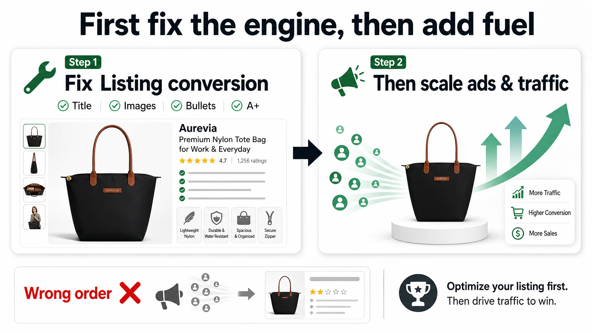
“Advertising does not only amplify advantages. It can also amplify a page’s existing defects.”
Once the Listing becomes capable of turning visits into orders, every additional click—organic or paid—starts to contribute to healthy ACOS/TACOS instead of compounding losses.
How the Page’s Sales Logic Started to Recover
While this case does not include post-change numeric CVR/ACOS outcomes, the operational state changed in several clear ways once the optimization logic was in place:
- The Listing began addressing buyers’ real doubts.
- Capacity and fit were proven with dimensions + objects, not left as numbers.
- Internal organization was visual and labeled, not implied.
- Waterproof performance shifted from claim to visual demonstration.
- The traffic funnel became less leaky.
- Searchers scanning titles saw clear category, function, and scenes in the first line.
- Main images answered more questions in the first 3–4 frames, improving the chance that a click turned into a scroll and then an add-to-cart.
- A+ modules reduced late-stage hesitation instead of confusing buyers with dense, undifferentiated graphics.
- Organic and paid traffic started to work together instead of fighting each other.
- With a stronger base conversion ability, ad traffic had a better chance of converting, making ad spend more rational.
- As the Listing’s conversion improves, Amazon’s algorithm is more willing to reward it with organic visibility on relevant keywords.
Most importantly, the seller’s understanding shifted:
- From “we need more stylish visuals and more ads”
- To “we need a Listing that earns conversion by systematically proving what buyers care about, then we can let ads scale that success.”
What Other Amazon Sellers Can Take from This Case
This tote bag Listing case is not unique to its category. The pattern appears across personal care, kitchen, electronics, and more.
Key takeaways:
1. Strong reviews do not guarantee strong conversion.
If your title, main images, bullets, and A+ don’t answer core decision questions, you will still lose to “smaller” competitors who do.
1. Most underperforming Listings are misdiagnosed as ad or aesthetic problems.
In this case, the real issue was not ad bids or basic product quality, but missing proof: capacity, organization, and material reliability were not demonstrated with enough specificity.
1. Before optimizing Amazon ads, audit whether your product page deserves more traffic.
- Is your core category clearly front-loaded in the title?
- Do early images reduce the biggest buying risks?
- Do bullets translate numbers into real-life items and scenes?
- Does A+ guide the buyer through a proof journey, or just restate claims?
1. Listing elements must work as a system, not as isolated checkboxes.
Here, the data showed: title, main graphics, bullets, and detail page all lagged the benchmark in different but related ways. Once they were aligned around a single conversion logic, the Listing could finally support the seller’s advertising ambitions.
When an Amazon competitor with fewer reviews and lower apparent “authority” passes you in sales, it is often your Listing’s decision logic—not your ad budget—that is truly outgunned. DeepBI’s role in this case was to make that visible, and to give the seller a structured way to rebuild conversion capacity before stepping again on the gas.