
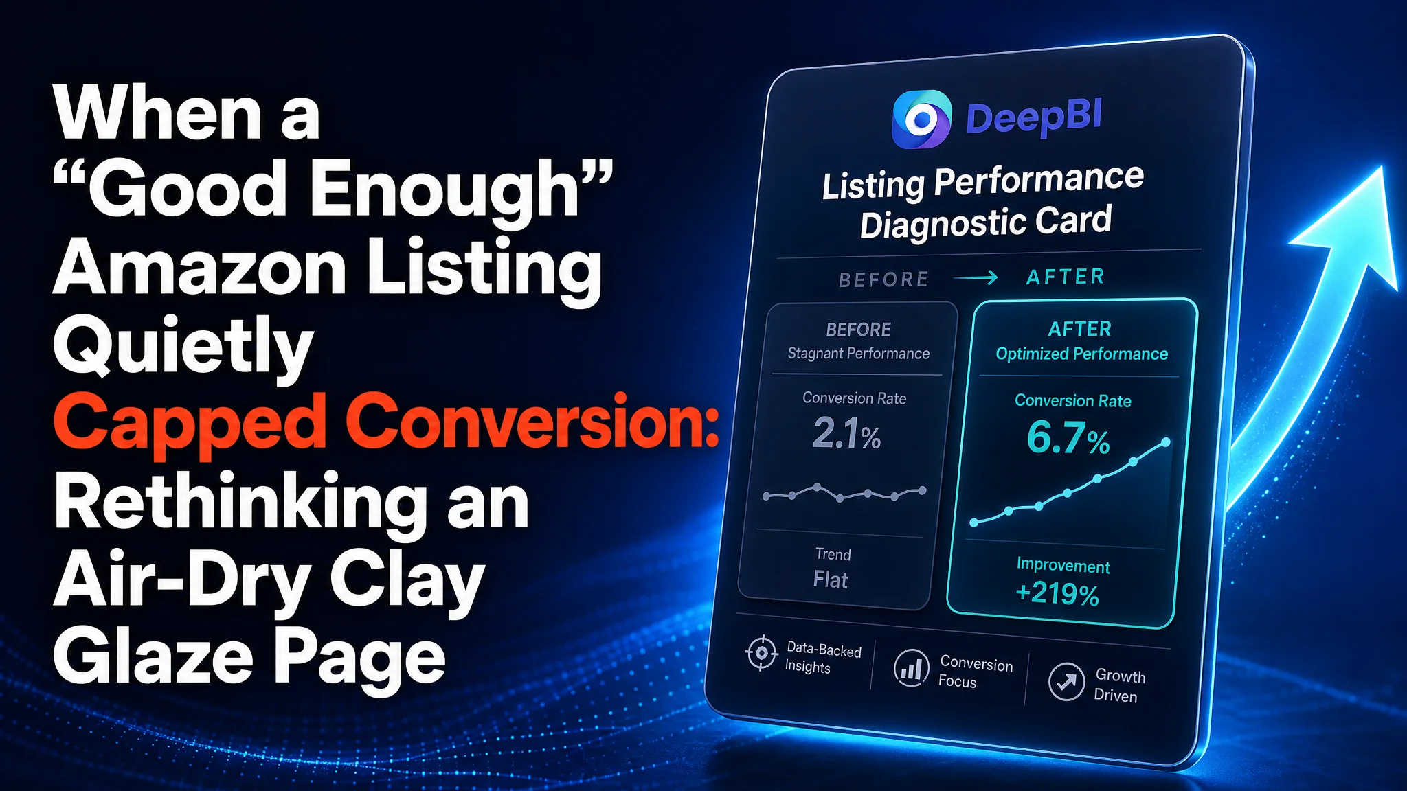
This Amazon seller in the crafts category thought their challenge was mostly about “doing ads better” and marginally polishing a Listing that already looked decent. ACOS pressure was rising, and despite steady traffic for this air-dry clay glaze kit, orders were not keeping up. On paper, the Listing did not look bad: a 4.3-star rating with 175 reviews and a visual set that felt complete.
DeepBI’s diagnosis, however, showed that the real constraint was not missing traffic, but a Listing that could not match a key competitor’s decision efficiency. Title structure, bullet-point logic, and A+ layout all forced buyers to “work” more to understand volume, use cases, and trust signals. Ads were driving visitors into a page that needed too many cognitive steps to convert.
The optimization therefore shifted from bidding and keyword tweaks to a deep rewrite of the Listing’s sales logic: clarifying volume and finishes in the title, tightening bullets into painpoint–solution loops, and rebuilding main-image and A+ modules around trust, proof, and visual comparison. For other Amazon sellers, this case is a reminder that when ad costs feel “unexplainably” high, the problem may be a hidden Listing-conversion cap rather than a targeting issue.
Amazon Ads Were Not Failing. The Page Was Consuming the Traffic.
From the seller’s perspective, the situation looked familiar:
- The product is a dual-finish air-dry clay glaze kit on Amazon US.
- Reviews looked healthy: 4.3 stars with 175 reviews, significantly more than a comparable competitor at 65 reviews and 4.5 stars.
- Visual assets seemed “complete”: multiple main images, A+ sections, and clear product visuals.
- Yet the category felt increasingly competitive and ad spend was under pressure.
The team’s initial interpretation was that they were losing in advertising finesse: maybe bids, keywords, or campaign structures weren’t sharp enough. They assumed that with more refined ads, traffic volume would climb and conversions would follow.
DeepBI’s scoring, however, told a different story:
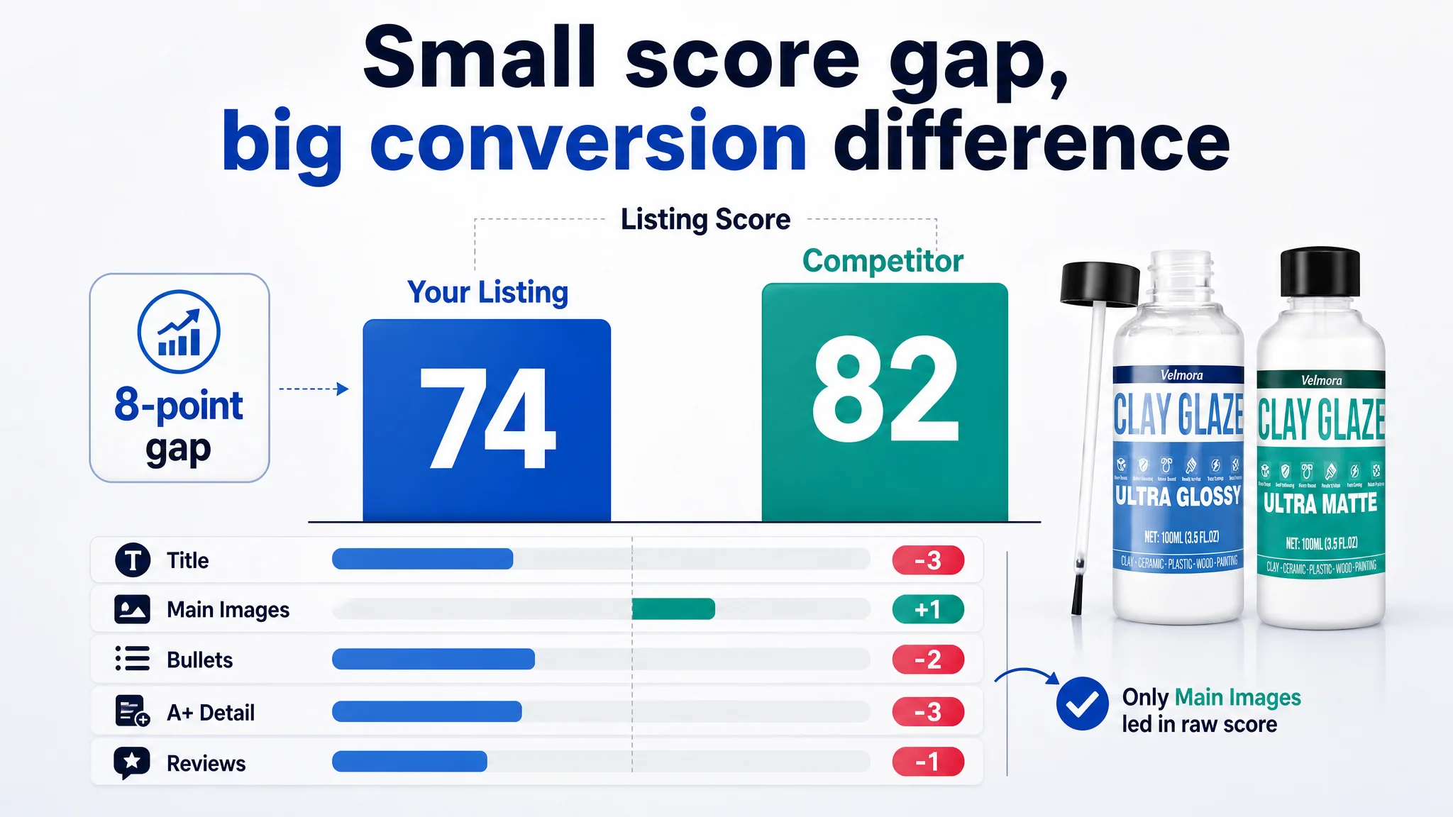
- Overall Listing score: 74/100 versus the competitor’s 82/100 — an 8-point gap.
- The gap was consistent across content layers:
- Title: -3 points
- Bullet points: -2 points
- A+ detail page: -3 points
- Reviews: -1 point
- Only the main-image set was slightly ahead in raw score (25 vs 24), but even there the visual strategy had structural flaws.
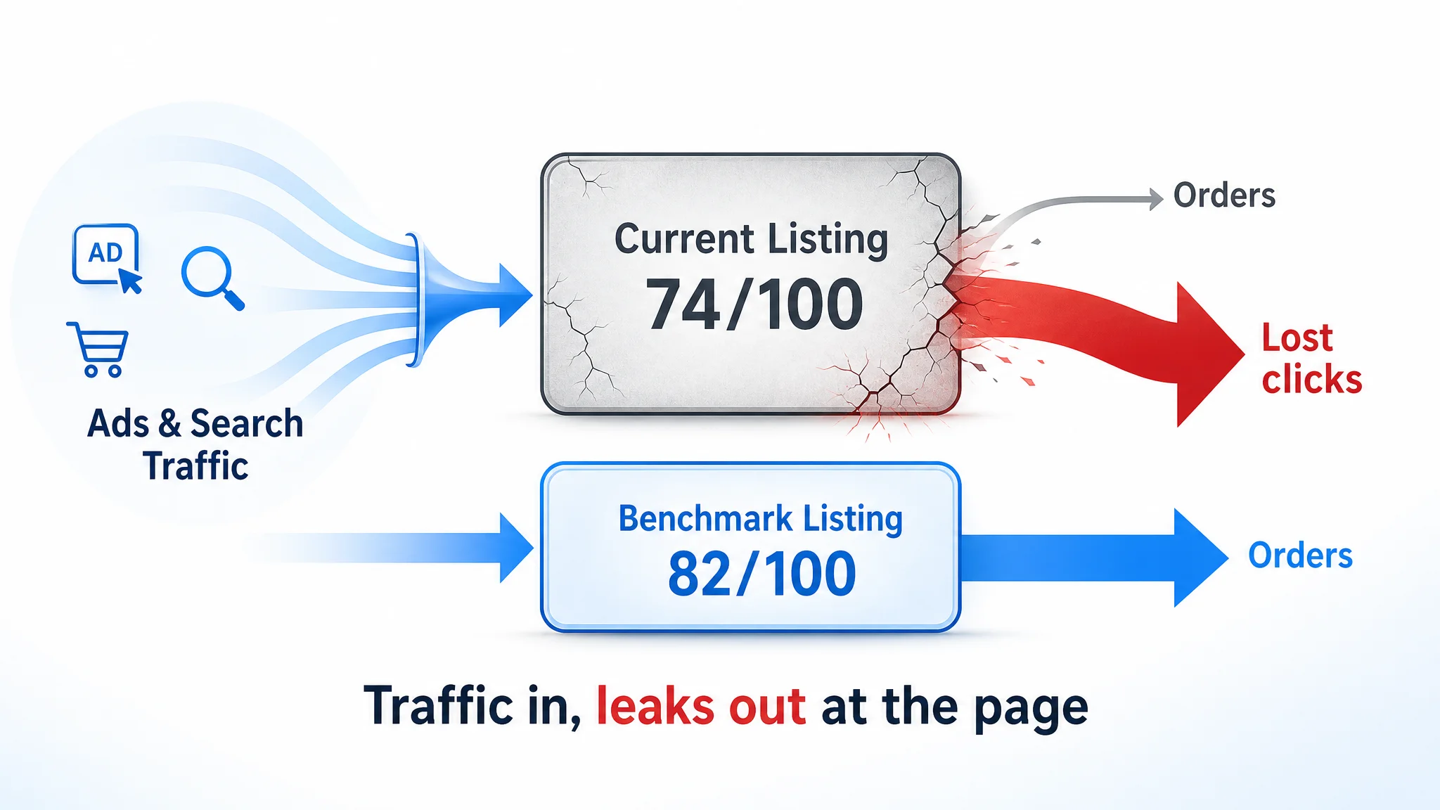
“The real problem was not that ads failed to bring traffic. It was that the page could not convert the traffic.”
In other words, advertising was pouring visitors into a Listing that—compared with the benchmark—made buyers think harder and trust less at each step of the decision path.
The Real Constraint Was Listing Conversion Capacity
Looking at the score, it was tempting to say, “We’re at 74/100, not 40; the Listing is fine.” But Amazon is a relative game. In a mature niche, losing 8 points to a key competitor can be enough to cap conversion and make ads feel “expensive.”
DeepBI’s diagnosis pinpointed one core constraint: the Listing’s conversion capacity was weaker than the benchmark’s, especially in how it communicated volume, finishes, usage range, and trust.
This constraint showed up at four critical points.
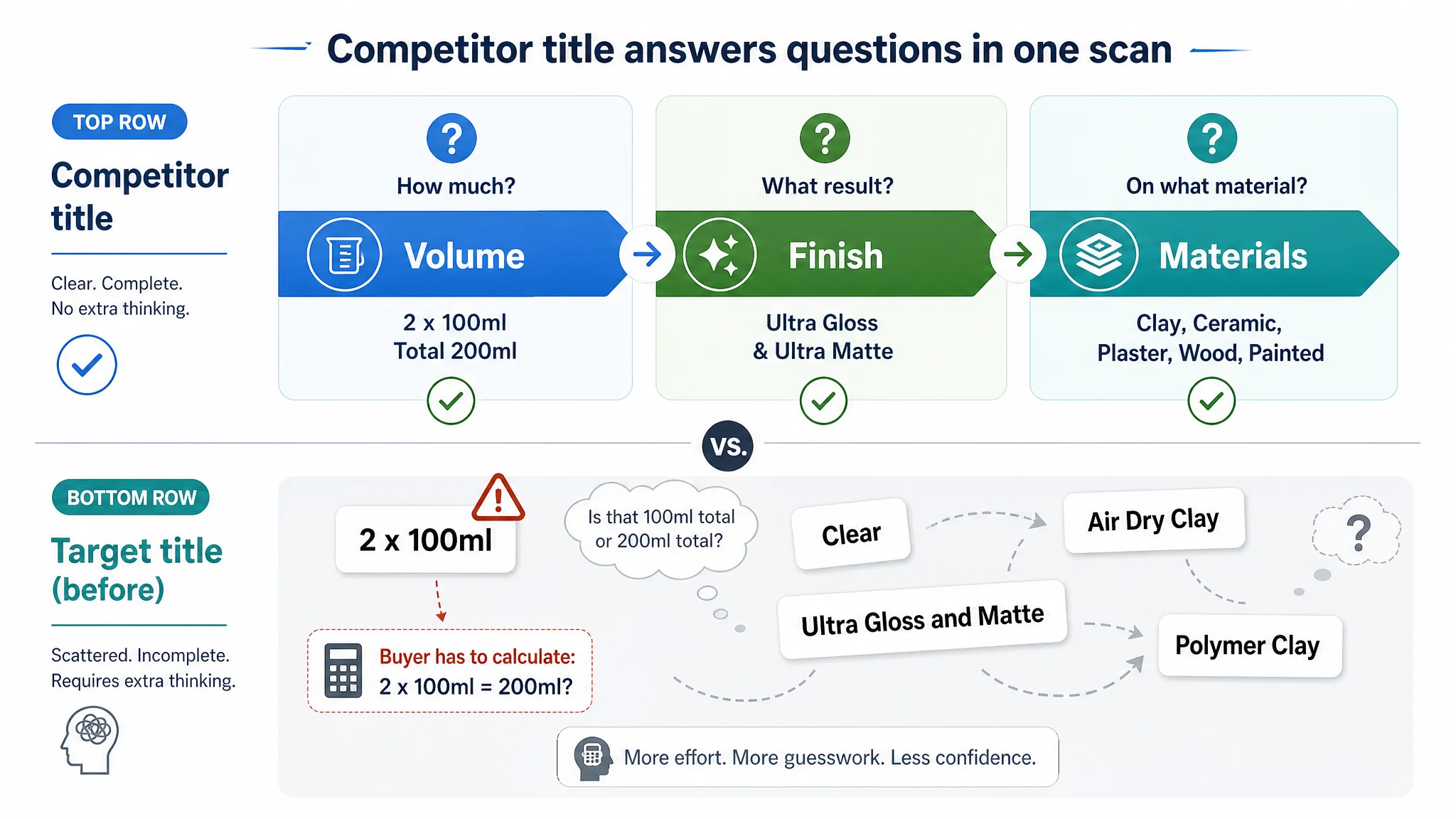
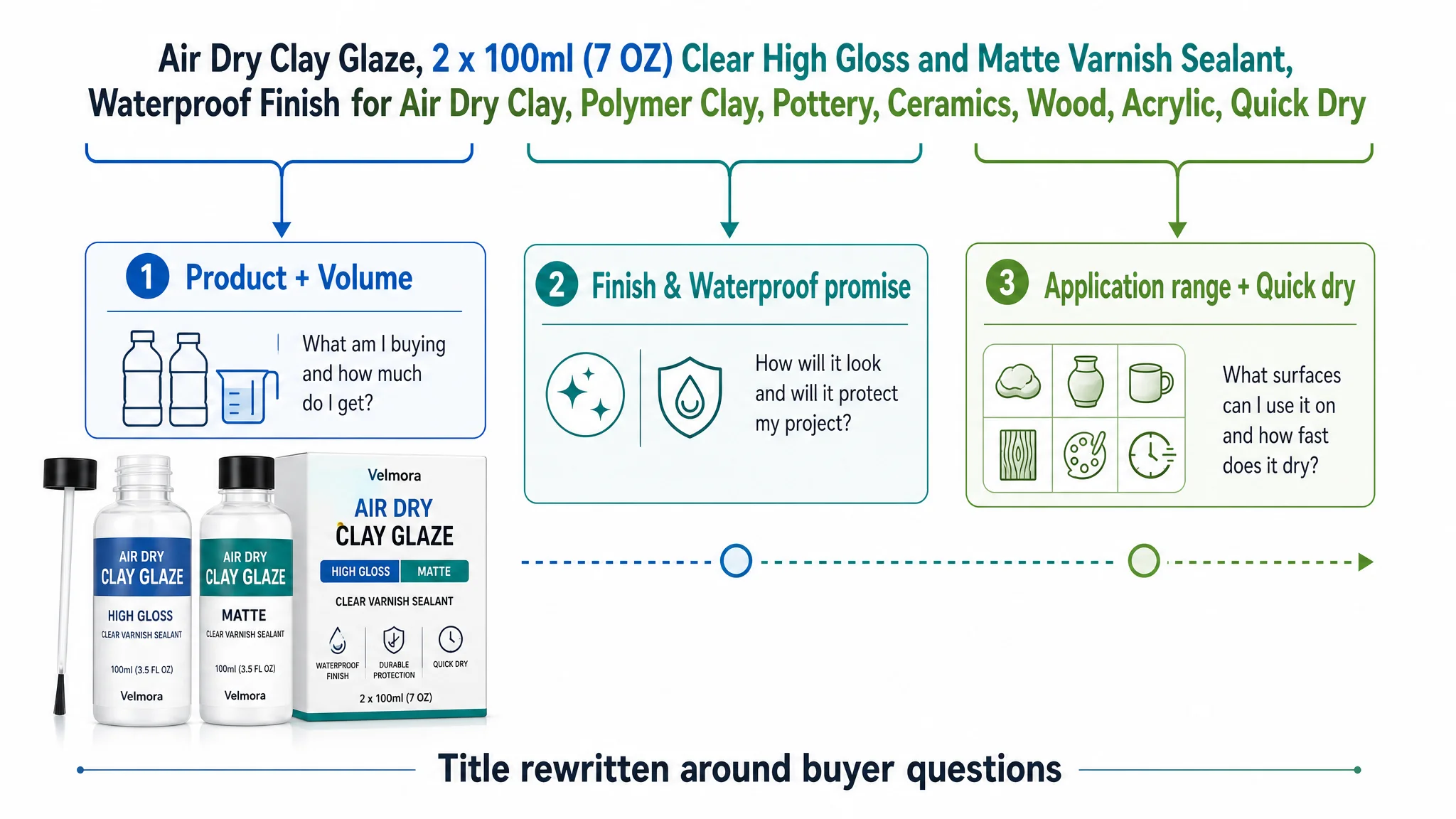
1. The title forced buyers to calculate and infer
The competitor’s title:
- Front-loaded the total volume in a single, intuitive unit: “7 OZ (200ml)”.
- Immediately clarified the finishes: “Clear High Gloss & Matte Sealant”.
- Cleanly separated the application range at the end: “for Air Dry Clay, Polymer Clay, Pottery, Ceramics, Wood & Acrylic.”
The target Listing:
- Led with “2 x 100ml,” requiring shoppers to mentally convert and sum to know total volume.
- Scattered material types between the beginning and middle of the title.
- Split core functional language (“Prevent Scratches, Wear, Cracking”) from the waterproof/varnish message instead of integrating them into one strong promise.
This meant that at search results level, a buyer could understand the competitor’s offer in a glance, while the target Listing required extra effort to decode both volume and value.
2. Bullet points had information, but not a buying logic
Structurally, the bullet sequences diverged:
- The competitor opened with product specs and clear protection promise (7 OZ kit, gloss + matte, crack/scratch/yellowing protection).
- Then moved to multi-purpose usage, ease-of-application plus result, and professional finish + after-sales support.
- Safety was backed by a concrete heat-resistance range (-4°F to 212°F), making “durable” feel measurable.
The target Listing:
- Started with abstract product characteristics, not concrete kit specs.
- Dedicated a bullet to steps and process, but did not tie them strongly to the resulting finish (non-sticky, bubble-free, professional look).
- Ended bullets on “how to use,” instead of closing with audience fit and brand commitment.
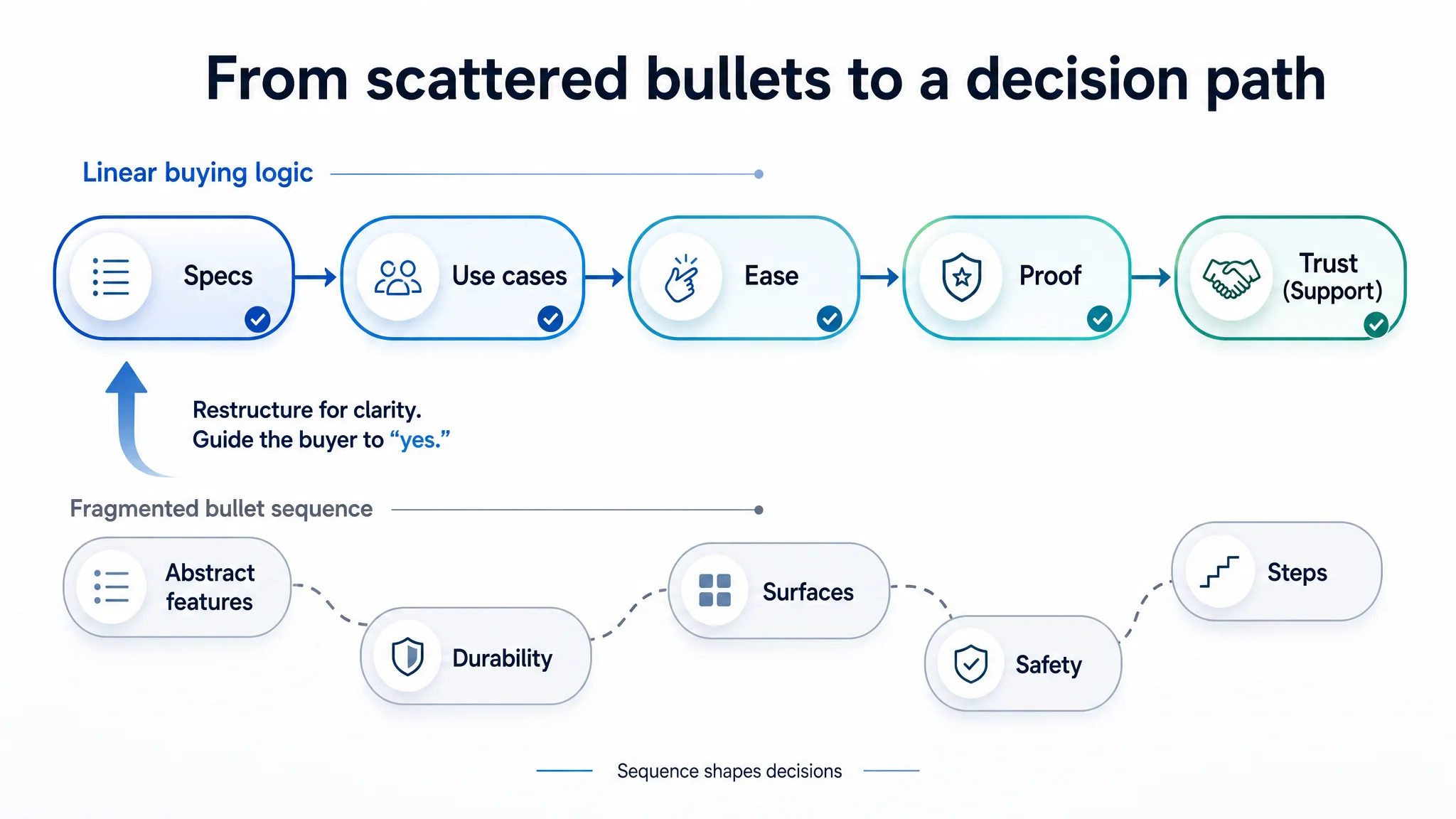
Information existed, but the sequence did not guide the buyer from specification → use case → ease → proof → trust. Buyers got pieces of reassurance, but not a coherent path to “I’m safe to click Buy.”
3. A+ content lacked a single trust anchor
On the detail page, A+ differences were more about structure than volume of content.
The competitor:
- Used a ring-style core-benefit graphic to cluster six key advantages (e.g., adhesion, UV resistance) in one visual anchor.
- Added a side-by-side “Enhanced vs Normal” comparison with real finished pieces.
- Organized “wide application” in a four-grid layout: clear material categories with high-quality imagery.
The target Listing:
- Spread benefits across multiple independent modules: anti-yellowing, non-toxic, painting applications, multi-scene use.
- Showed finished artworks but did not provide a direct before/after or enhanced/normal comparison.
- Presented versatile usage, but with looser material categorization, which is less convincing for more advanced or B2B buyers.
The result: visitors had to stitch the story themselves. There was no single high-density panel that said, “Here is the complete, rational proof for why this varnish will protect your clay and other materials.”
4. Review layer was not fully leveraged
On paper, the target Listing’s review base looked stronger:
- 4.3 stars vs competitor’s 4.5 stars (a small difference).
- 175 reviews vs competitor’s 65 (almost 2.7x more volume).
But:
- Neither Listing made good use of image/video reviews on the first page, leaving visual trust underdeveloped.
- Both showed similar rates of lower-star feedback, often around stickiness, gloss, and bottle design.
In practice, the trust advantage of having nearly three times the reviews was not fully converted into on-page persuasion. It was potential, not realized.
Why Traditional Ad Optimization Was Not the Right First Move
The seller’s instinct was to keep refining ads:
- Adjusting bids on craft-related keywords.
- Expanding long-tail searches around “air dry clay glaze.”
- Testing campaign types.
From a distance, these are reasonable actions. But when the Listing loses 8 points to a key competitor in content and structure, more traffic just means more visitors entering a weaker sales environment.
“Advertising does not only amplify advantages. It can also amplify a page’s existing defects.”
With a 74/100 Listing competing against an 82/100 benchmark, ad tweaks can temporarily prop up volume, but:
- ACOS tends to remain volatile.
- TACOS drifts upward as organic conversion underperforms.
- Any incremental traffic is partially wasted, because the Listing is not optimizing the probability that each click becomes an order.
DeepBI’s judgment was clear: before further ad-scale decisions, the Listing needed a structural conversion overhaul.
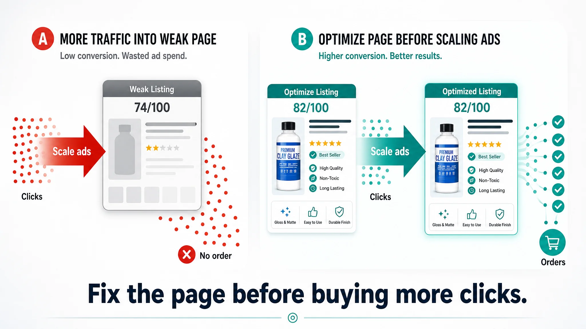
This Product Page Did Not Lack Traffic. It Lacked Decision Clarity.
DeepBI’s Listing scoring and competitor comparison highlighted a pattern: across modules, the target Listing often had more elements, but less clarity.
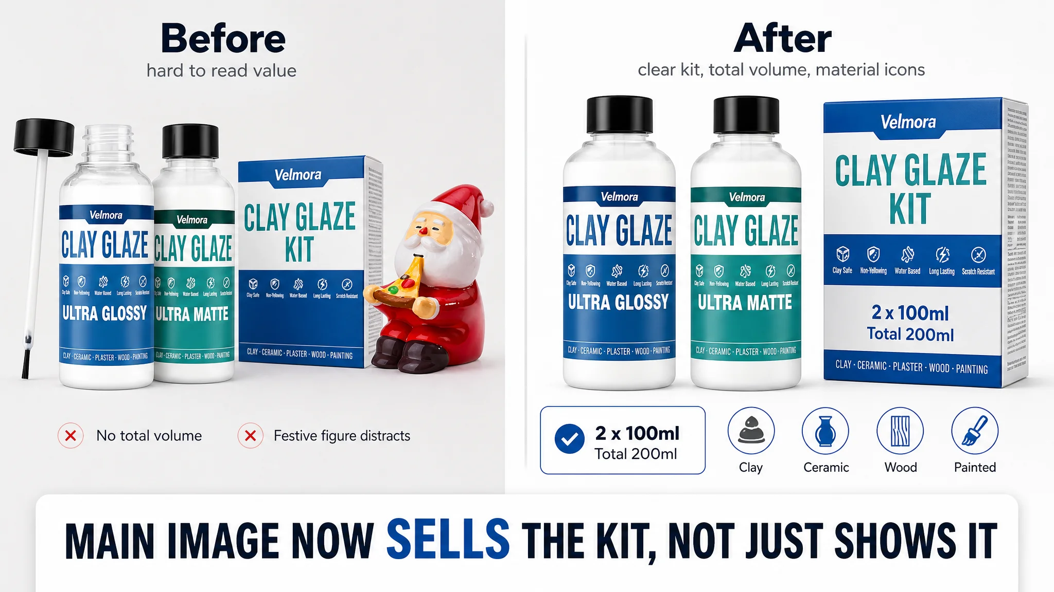
The title did not communicate the outcome fast enough
The competitor’s title aligned with how buyers think:
- First: “What am I getting and how much?” → “7 OZ (200ml) Glaze Kit with Gloss & Matte.”
- Second: “Will it be clear and waterproof?” → “Clear High Gloss & Matte Sealant, Waterproof Varnish.”
- Third: “Is it compatible with my material?” → “for Air Dry Clay, Polymer Clay, Pottery, Ceramics, Wood & Acrylic.”
The recommendation for the target Listing was to reframe its title with the same decision logic:
Air Dry Clay Glaze, 2 x 100ml (7 OZ) Clear High Gloss and Matte Varnish Sealant, Waterproof Finish Prevents Wear & Cracking for Air Dry Clay, Polymer Clay, Pottery, Ceramics, Wood – Quick Dry
This retains the seller’s original advantages (dual finishes, two 100ml bottles) while:
- Converting the spec into a total volume with familiar units.
- Bringing “clear” and “waterproof” to the forefront.
- Consolidating the application range into one clean, end-of-title block.
The bullet points had information, but not a buying logic
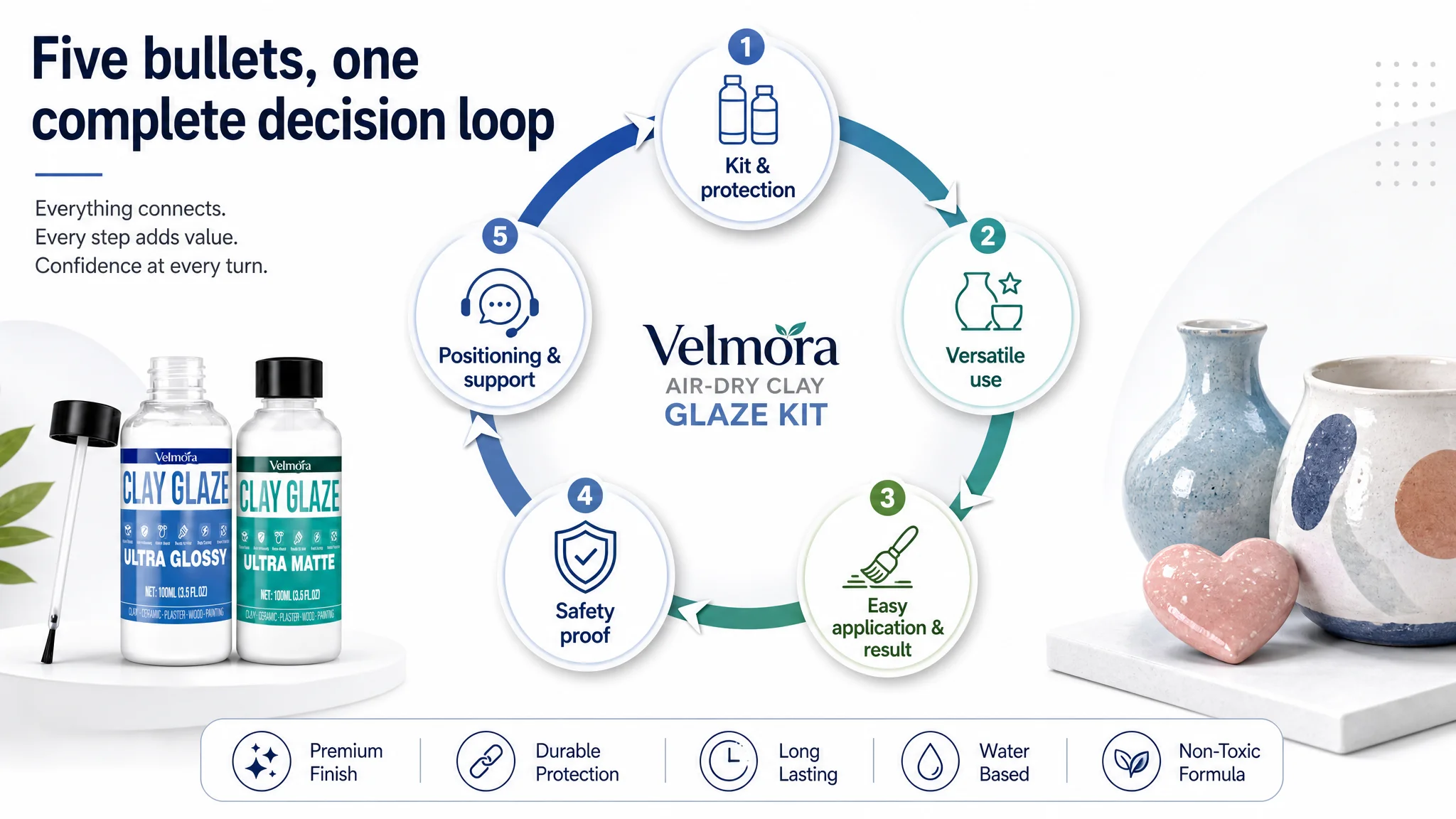
DeepBI’s recommendations restructured bullets into a clearer progression.
1. Bullet 1 – Kit & protection clarity
Emphasize the kit size and dual finish, then tie immediately to protection:
- Volume plus component breakdown: 7 OZ / 200ml, 100ml gloss + 100ml matte.
- Crystal-clear, durable film.
- Protection against cracking, scratches, and yellowing.
1. Bullet 2 – Versatile use
Extend application beyond clay while staying within realistic, observable usage:
- Surfaces: air dry clay, polymer clay, plaster, ceramics, wood, metal, jewelry.
- Use in paintings and mixed-media projects.
- Highlight “multi-purpose sealant” for hobbyists and professional artists.
1. Bullet 3 – Ease and result in one loop
Combine process with promised finish:
- Simple, even application.
- 24-hour curing.
- Non-sticky, bubble-free finish; high-shine or authentic matte texture.
1. Bullet 4 – Safety backed by rational detail
Keep safety but give it more weight:
- Non-toxic formula for a wide age range.
- Enhanced durability and heat resistance.
- Explicit note on non-food use and dishwasher limitations.
1. Bullet 5 – Positioning & support
End with audience fit and service:
- For amateur DIY lovers and professional craft makers.
- Two-bottle set meets varied creative needs.
- Clear after-sales support and commitment to resolving issues.
This transition moves the Listing from “piecewise explanations” to a full decision loop, where each bullet participates in a single storyline: what you get, where you use it, how it behaves, how safe it is, and who stands behind it.
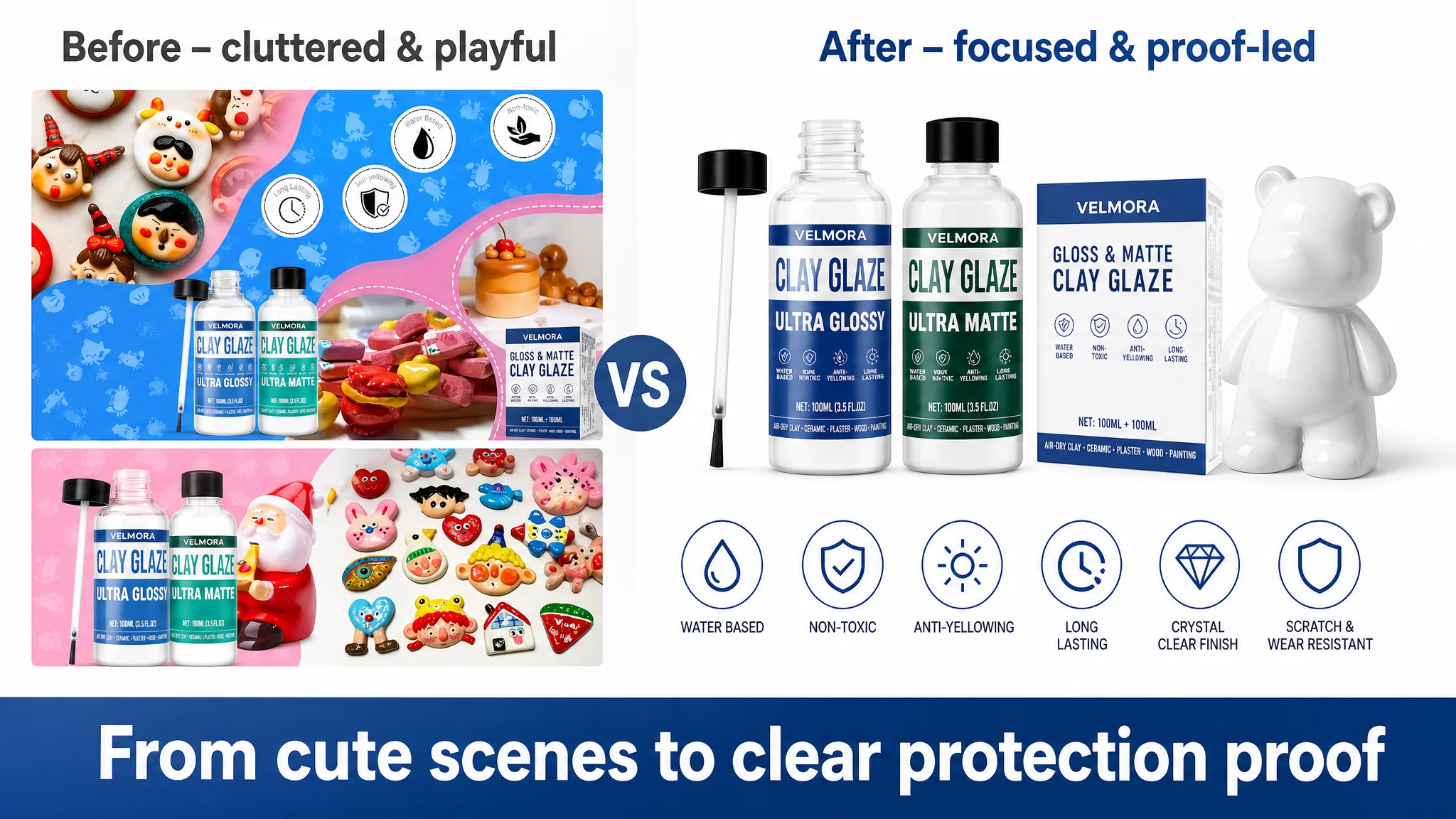
The Main Image Was Not Just a Visual Issue. It Failed to Create a Reason to Click.
On the main-image side, the raw score looked slightly better than the competitor’s. But DeepBI’s visual analysis showed that the structure of the image set was undermining clarity and trust.
Image 1: Identification but weak volume reassurance
The first image worked for basic product identification, but:
- Did not match the competitor’s clear package-style presentation of volume and finishes.
- Leaned on text overlays like “Upgraded Polymer Clay Glaze, 2 x 100ml Ultra Gloss and Matte Finish” without visual hierarchy.
DeepBI recommended:
- Slightly shifting emphasis to highlight the dual nature (Gloss & Matte) as a solution set for different projects.
- Keeping volume calls (“2 x 100ml / 7 OZ”) visually anchored.
- Ensuring surface compatibility icons are visible but not overwhelming.
Image 2: Trust signals buried in clutter
The second image attempted to mix:
- Safety/functional icons (“SAFE & NON-TOXIC,” “Water-based,” “Anti-yellowing,” “Long Lasting”).
- Mixed-quality finished figures.
- Raw clay visuals.
This created information conflict. Buyers could not lock onto a single trust message within three seconds.
DeepBI’s guidance:
- Rebuild this node to focus entirely on minimum functional trust:
- Two bottles on a clean background.
- Structured icons for safety and core protective benefits.
- Remove all finished pieces and raw clay to avoid distraction.
Image 3: Protective claims without coherence
The third image combined:
- Finished figures.
- Individual protective claims (UV resistant, prevents scratching, resists yellowing, waterproof).
The result: a cluttered layout where no single message dominated, and protective claims felt scattered.
Optimization direction:
- Feature one bottle (e.g., Gloss) with one exemplary finished figure.
- Consolidate key protective claims into a clean matrix at the bottom:
- UV resistant
- Crack prevention
- Yellowing resistance
- Scratch protection
- Waterproof
Image 4: Effect comparison that didn’t prove the point
The existing comparison used identical Santa figures with gloss and matte labels. While charming, it didn’t effectively highlight how gloss vs matte affect material surface and color.
DeepBI suggested:
- Switch to simpler ceramic or clay objects of different colors (e.g., black and white).
- Show one clearly glossed and one clearly matte object.
- Let the finish difference stand out on the material, not on a holiday-themed figure.
Image 5: Overcomplicated usage demonstration
The fifth image attempted to cover:
- Application process.
- Raw clay shaping.
- Finished pieces.
- “Versatile usage” messaging.
This increased buyer doubt around application simplicity.
The new logic:
- Dedicate this image purely to “Easy to Apply”:
- One common, non-seasonal finished clay figure.
- Clear brush-on action.
- Reinforce the 3-step process and 24-hour curing visually, leaving material compatibility to icons in earlier images.
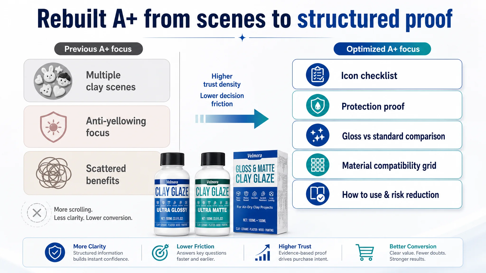
The A+ Page Needed to Trade “More Scenes” for “More Proof”
DeepBI’s evaluation of the A+ modules showed that the seller was investing space in scene variety, but not fully in rational proof and risk reduction.
Reordering what appears first
The first module:
- Currently confirmed product content and showed both finishes.
- But it did not attack the main skepticism: “Is this really ultra-glossy / ultra-matte, safe, and easy to use?”
The optimization path:
- Bring a system-level icon checklist to the top:
- ULTRA GLOSS AND MATTE VARNISH
- SAFE & NON-TOXIC
- SIMPLE STEPS TO USE
- Waterproof and durable protection
- Material compatibility icons
This lets buyers resolve key hesitations within seconds of entering the A+ section.
Strengthening rational proof of protection
The second module focused heavily on anti-yellowing and fading:
- Valuable, but too narrow.
- Did not cover other rational barriers like crack prevention and usability.
DeepBI recommended:
- Transform this into a “protection proof” panel, including:
- Waterproof and scratch-resistant claims.
- Crack prevention.
- Anti-yellowing.
- Add simple, specific icons and short labels to make these attributes scannable.
Showing premium gloss instead of just stating it
A module already showed painted pieces, but:
- Did not compare the gloss result to a standard or uncoated finish.
An improved approach:
- Add a side-by-side comparison:
- Left: standard varnish / uncoated surface.
- Right: this glaze’s high-gloss finish.
- Use consistent lighting to avoid confusion.
Focusing less on repetitive clay scenes, more on broad compatibility
Multiple modules reiterated clay scenarios:
- Helpful for entry-level buyers.
- Less persuasive for advanced users who need assurance the varnish will behave predictably on wood, plaster, or other surfaces.
DeepBI’s suggestion:
- Reduce duplicate clay demonstrations.
- Replace some with clear, labeled visuals of wood, plaster, and other key materials.
Giving matte its own rational footing
The matte finish module:
- Showed the visual result.
- But did not provide explicit specifications or reassurance about its durability and protection.
The new logic:
- Treat matte as a distinct product:
- Highlight authentic matte texture.
- Clarify that it also forms a crystal-clear, protective film.
- Explicitly reassert “durable” and “waterproof” in this context.
Adding explicit risk-reduction content
Two gaps stood out:
1. Application complexity:
The Listing mentioned a simple 3-step process, but did not visually and textually confirm how straightforward it is, nor clarify accessories (e.g., brushes not included).
1. Food-safety and misuse:
The bullets note “not intended for food contact or dishwasher use,” but A+ did not reinforce this in a structured way.
DeepBI recommended:
- A dedicated “How to Use” module:
- Clear 3-step process.
- Explicitly note that brushes are not included if that’s the case.
- A “Risk Reduction” module:
- One concise block explaining non-food use and dishwasher limitations.
- This prevents misuse and underscores the brand’s professional standards.
Why DeepBI Did Not Keep Tuning the Ads First
From DeepBI’s perspective, continuing to tune ads before fixing the Listing would have carried three main business risks:
1. Wasted paid traffic
Each new click would land on a page that still forced buyers to calculate volume, infer use cases, and search for proof. The probability of conversion per click would remain structurally below the benchmark.
1. Ad-driven volatility
Without a stronger organic conversion engine, the Listing would remain disproportionately dependent on advertising. Any budget cut or bid reduction could cause immediate volume drops.
1. Misleading feedback
Changing ads while the page still leaks conversion can blur cause–effect analysis. It becomes difficult to know whether ACOS fluctuations are due to traffic quality, page weakness, or both.
By contrast, prioritizing Listing conversion first:
- Made the page more capable of converting both ad and organic traffic.
- Increased the baseline sales capability of the product-page itself.
- Turned subsequent ad optimization into an amplification of strengths, not a bandage for structural weaknesses.
How the Page’s Sales Logic Started to Recover
Once the Listing changes began aligning with the benchmark’s decision logic, several positive shifts became visible in the operating state (even without inventing numeric results):
- Decision friction decreased:
Title and bullets started telling a coherent story, making it easier for buyers to understand volume, finishes, and usage without mental arithmetic.
- Trust density increased:
Main images and A+ modules consolidated safety and protection claims, making core reassurances easier to grasp quickly.
- Organic and paid traffic became more interchangeable:
Because the page could now carry more of the conversion weight, traffic from search, ads, and recommendations was less likely to be “wasted.”
- Advertising dependence began to soften:
As the Listing’s fundamental conversion capacity improved, the seller had more room to adjust bids and budgets without fearing immediate collapse in orders.
Underlying all of this was a shift in the seller’s understanding:
- Amazon ads are not a universal fix for conversion problems.
- Listing quality—especially title clarity, main image logic, bullet-path structure, and A+ trust layering—is the foundation of advertising efficiency.
- Before investing additional spend, the team must ask: “Does this product page deserve more traffic?”
What Other Amazon Sellers Can Take Away
This craft-category case is not about clay glaze alone. It reflects a pattern many Amazon sellers face:
- Ad costs feel high and ACOS refuses to come down.
- Listings look “good enough,” especially when star ratings and review counts are not catastrophic.
- The instinct is to keep changing bids, keywords, or campaign types.
DeepBI’s diagnosis shows that in such situations, the real blocker is often Listing conversion capacity, not ad mechanics.
Key lessons:
- A small score gap (74 vs 82) against the right benchmark can be enough to cap performance.
- Title, main images, bullet points, and A+ are not independent decorations; they must form a single, coherent decision path.
- Advertising can either amplify your page’s strengths or magnify its defects; it will not rewrite your sales logic for you.
For sellers, the practical implication is clear: Before pushing for more traffic, ensure the Amazon product page is structurally ready to convert the traffic it already has. Only then do ads become a true growth lever instead of an expensive patch over a conversion leak.