
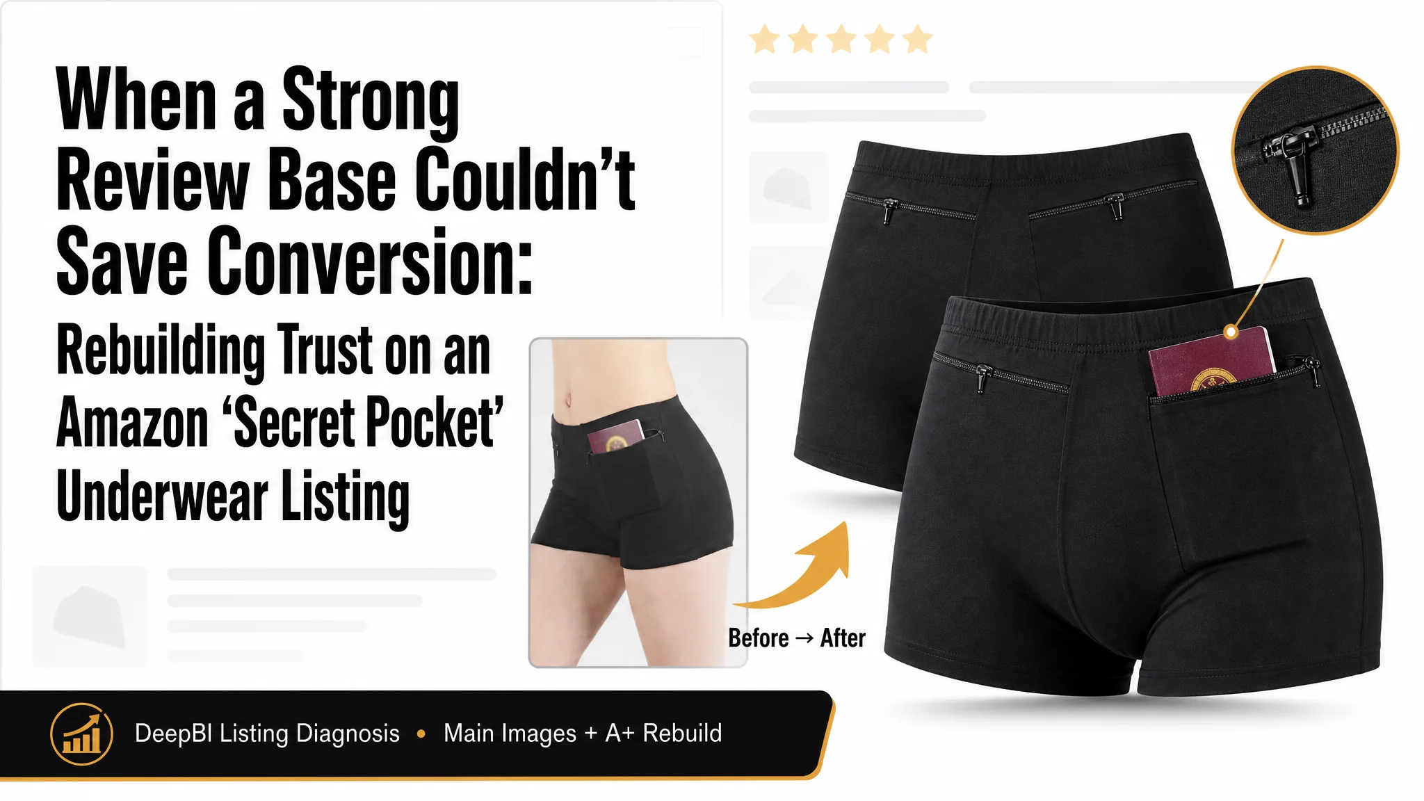
This case comes from an Amazon US seller in the women’s travel-underwear niche. On paper, the product was not weak: review rating was solid, total reviews clearly beat a key competitor, and advertising was already delivering traffic. Yet ACOS was becoming hard to control and orders weren’t keeping pace. The team’s instinct was to “optimize ads and keywords harder,” assuming the bottleneck was in traffic volume and targeting.
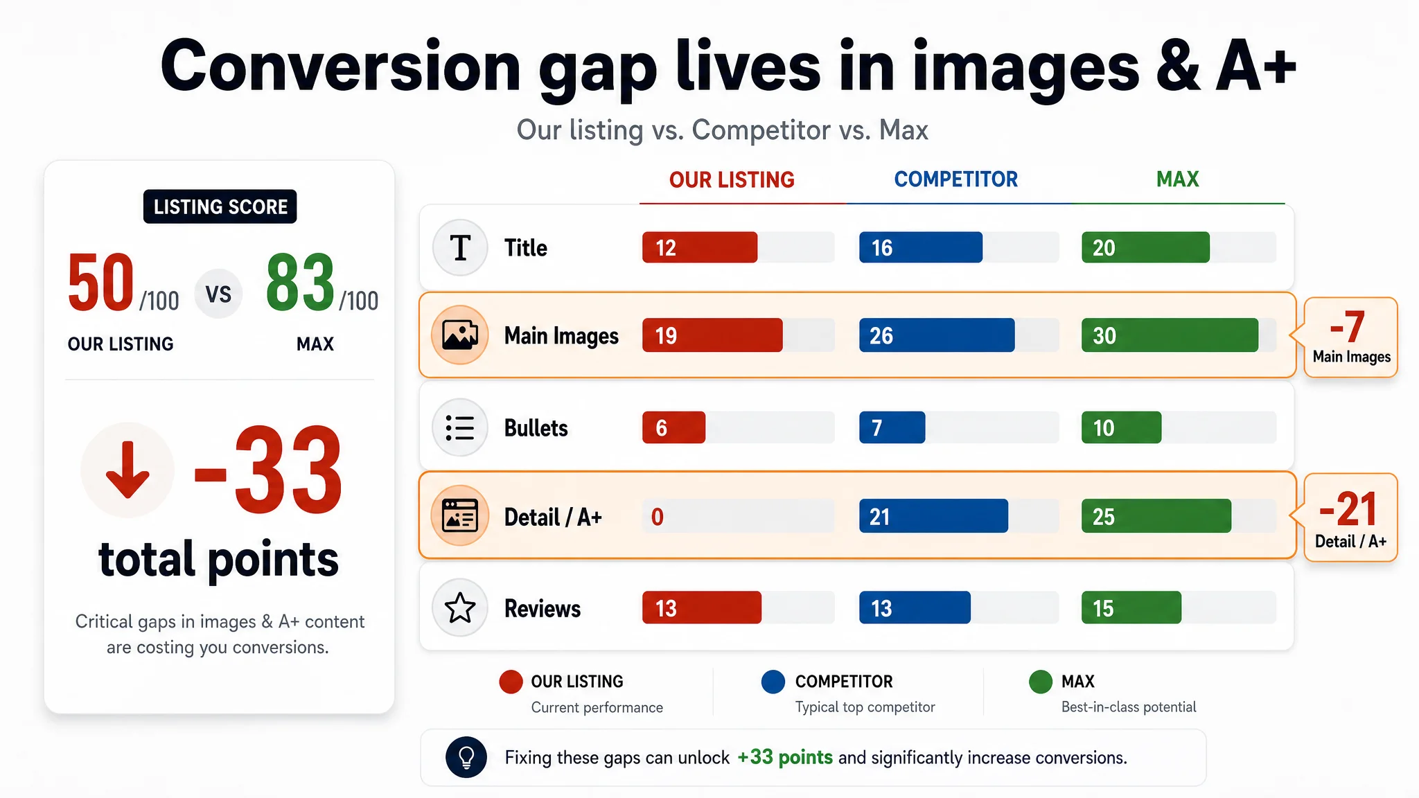
DeepBI’s listing diagnosis showed a different picture. Against a directly comparable Amazon competitor, the product page scored only 50/100 versus 83/100, with a massive -21 gap in the “detail/A+ content” dimension alone—and a -7 gap on main images. In other words, this wasn’t an advertising or traffic problem; it was a listing-conversion capacity problem. The page simply couldn’t carry the traffic the ads were buying.
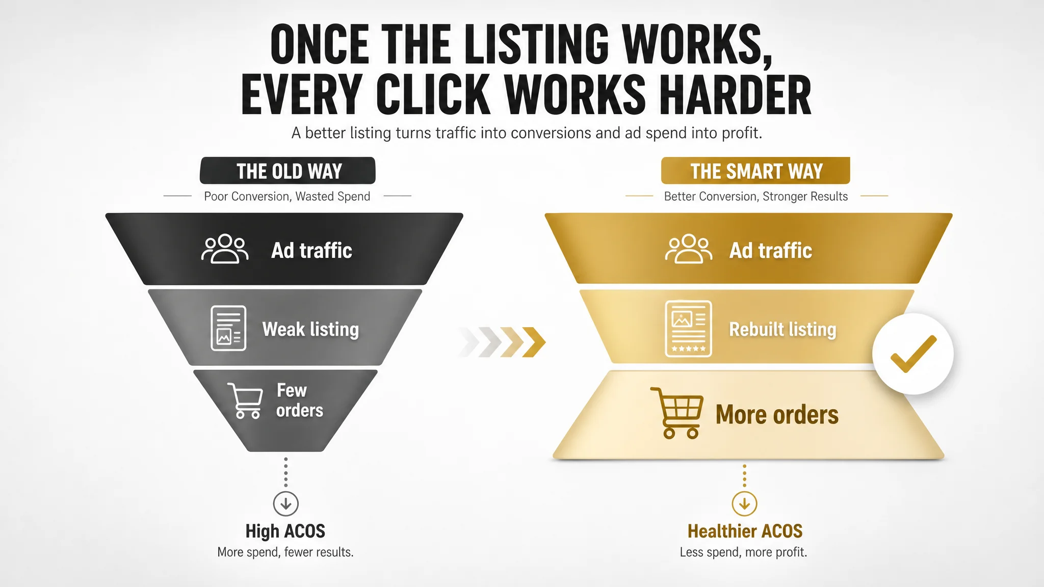
The later optimization did not start with new campaigns. It started with repositioning the Amazon Listing from a narrow “anti-theft gadget” to “comfortable travel underwear,” rebuilding the main-image sequence around trust and comfort, and adding an A+ structure that resolves sizing, comfort, and security doubts in a clear decision path. Ads became effective again only after the product page could actually persuade.
For other Amazon sellers, the lesson is straightforward but often overlooked: good reviews and more ad spend cannot compensate for a listing that doesn’t visually and structurally answer buyers’ key questions. When ACOS rises and you keep “fixing ads,” you may actually be amplifying a weak page, not a weak campaign.
What the Seller Saw: “Ads Are Getting Expensive”
On this women’s “secret pocket” travel underwear ASIN, the seller had already done several things right:
- Rating around 4.6 stars on Amazon US
- 123 total reviews vs. 49 for a key competitor
- Star rating slightly higher than competitor (4.6 vs. 4.5)
From an Amazon advertising perspective, this usually looks promising: enough social proof to support ad scaling, a product that clearly has a niche (anti-pickpocket / insulin-pump compatible underwear), and traffic already flowing.
Yet the real business pressure was:
- Ad costs increasingly hard to control
- Orders not growing in line with impressions
- The feeling that “we’ve tested a lot of ad setups, but ACOS still won’t improve”
The working assumption inside the team: “If we tune the search terms, bids, and structure more precisely, ACOS will come down.”
They were trying to solve a conversion problem with more media tactics.
The Core Constraint Was Not Traffic – It Was Listing Conversion
DeepBI’s listing score made the bottleneck obvious in a way the team hadn’t quantified before:
- Our listing total: 50 / 100
- Benchmark competitor: 83 / 100
- Gap: -33 points
Breaking this down:
- Title: Our Listing: 12, Competitor: 16, Max: 20, Gap: -4
- Main Image Set: Our Listing: 19, Competitor: 26, Max: 30, Gap: -7
- Bullet Points: Our Listing: 6, Competitor: 7, Max: 10, Gap: -1
- Detail / A+: Our Listing: 0, Competitor: 21, Max: 25, Gap: -21
- Reviews: Our Listing: 13, Competitor: 13, Max: 15, Gap: 0
Two things stand out:
1. Reviews are not the problem. We’re at parity on review dimension, and actually ahead on volume.
2. The page body is critically underbuilt.
- Zero score on detail/A+
- A large negative gap on main images
In DeepBI’s logic, this is the pattern of a listing that can attract traffic and clicks but cannot properly convert traffic into orders, especially as competition professionalizes.
“The real problem was not that ads failed to bring traffic. It was that the page could not convert the traffic.”
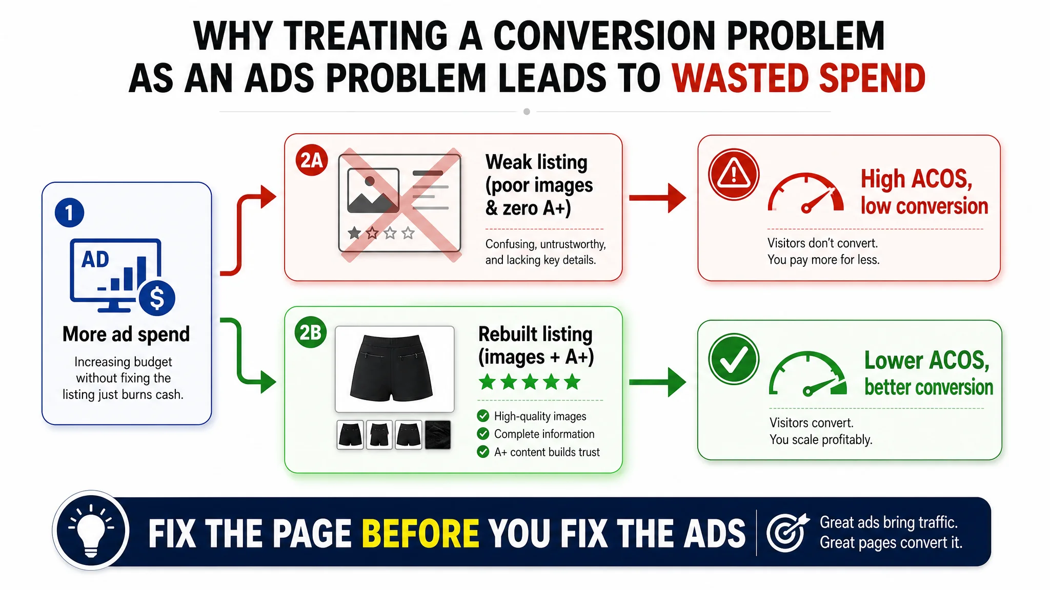
If the team had kept treating this as an ad-only problem, they would just be pouring more paid sessions into a page that lacked basic trust-building and decision support.
How Misdiagnosis Showed Up in the Content
Title: Keywords Present, Decision Logic Weak
The existing title was not disastrously wrong, but it was structured around internal logic rather than Amazon search and buyer logic:
- Core keyword “Women’s Underwear” appeared later in the title.
- Modifier “Travel Underwear with Secret Pocket” was descriptive, but soft—it sounds like a generic feature, not a sharp problem-solution.
- Spelling inconsistency (“Pantie” vs. “Panties”), with size and pack info pushed forward, made the structure feel messy.
The benchmark competitor:
- Put “Women’s Underwear with Secret Pocket” at the beginning—aligned with Amazon’s weight on early title terms.
- Used “Anti Pickpocket” up front, naming the anxiety (safety while traveling) instead of just describing a feature.
- Followed with “Travel Boxers,” tying together product type and usage scenario.
Our title wasn’t catastrophic, but it was a mildly inefficient entry point: not the root cause, but consistent with a broader pattern—information present, logic and emphasis off.
Main Images: Many Pictures, Little Buying Logic
On Amazon, main images are not just a gallery; they are a stepwise persuasion funnel:
1. Image #1: Trigger the click with immediate value + core function
2. Image #2: Show fit and appearance in real use
3. Image #3: Prove material quality
4. Image #4: Prove technical details (zipper, seams, waistband)
5. Image #5: Resolve last doubts (sizing, specific use cases like insulin pump)
Our image set, compared to the competitor:
- Image 1 – Value perception underused
- We showed a single product with the pocket and a passport—clear enough, but we wasted the chance to:
- Show the 2-pack value visually
- Build an immediate “secure storage” hook
- Image 2 – Redundant capacity display
- Similar angle and story as Image 1 (passport, cards); little progression in persuasion.
- Competitor used their second image to show how it looks when worn, addressing “Will this look OK on me?” early.
- Image 3 – Fit repetition instead of material proof
- Another fit illustration, again with limited new information.
- Competitor used this slot to visually prove fabric softness and comfort, building rational trust.
- Image 4 – A wasted trust node
- A basic flat product shot with no new message.
- Competitor used this node for macro details—zipper, seams, fabric stretch—to substantiate promises.
- Image 5 – Missing final doubt resolution
- No clear sizing visual, no explicit insulin-pump demo.
- Critical question left unanswered:
“Is this really suitable for my device and my body size?”
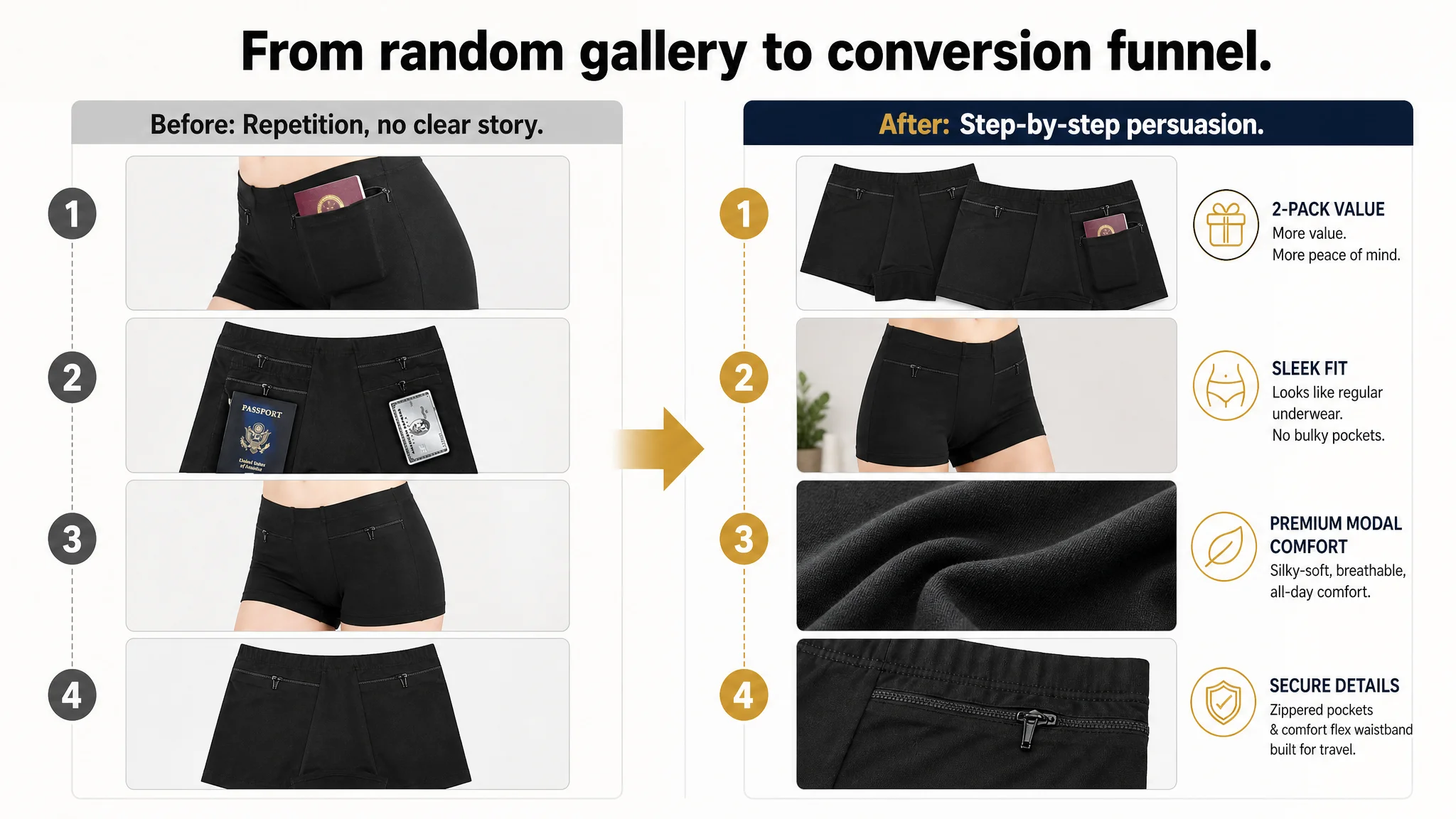
The result: We had images, but not a structured decision path. The main image set did not grow a buyer from “interested” to “convinced;” it just kept restating existence.
Detail / A+ Content: A 0/25 Black Hole
This was the single biggest structural problem.
- Our listing had no A+: no modules, no visuals beyond the main image set.
- The competitor ran a full A+ layout:
- A hero module “SOFT PREMIUM FABRIC” to set a high-end comfort premise
- Scenario grid (LEISURE / HOME / FITNESS / TRAVEL)
- Detailed size chart with measurement guidance
- Multiple fabric close-ups (seams, elasticity, rolled edges)
- Multi-color stack display
In practice, this meant:
- Buyers on our page:
- Couldn’t evaluate fit beyond a text size line in bullets
- Had no visual proof of fabric quality or stitching
- Had no structured reassurance for travel, workouts, medical-device use
- Buyers on the competitor page:
- Saw the product as comfort-first and multi-scenario, not just a functional anti-theft device
- Had explicit sizing guidance and measurement tips
- Could “feel” the fabric through close-ups and visual storytelling
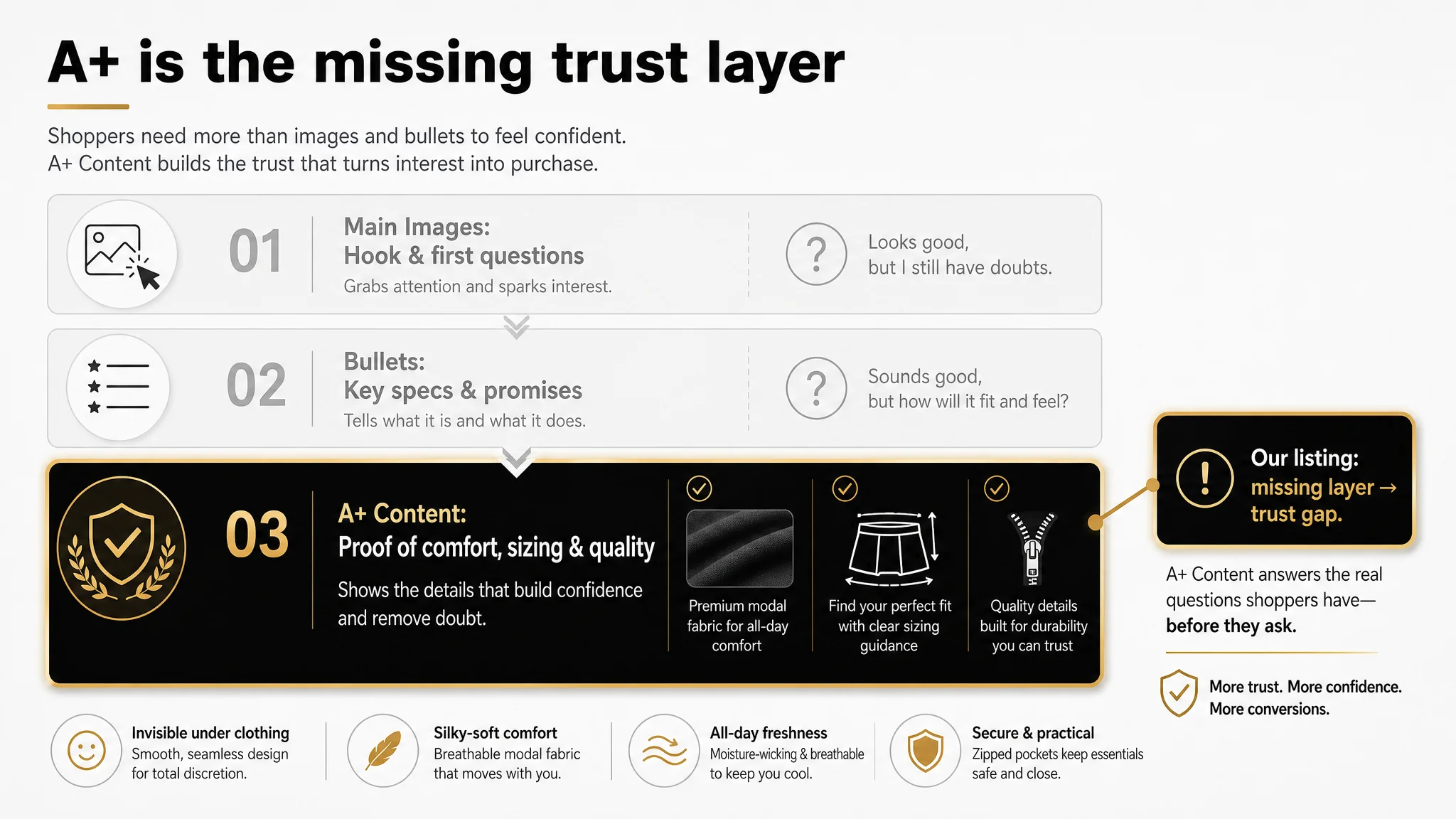
This is exactly how a listing with acceptable reviews can still bleed conversion:
“Advertising does not only amplify advantages. It can also amplify a page’s existing defects.”
Traffic that reaches a barren page—no A+ structure, no visual narrative—will convert poorly, no matter how well the ad keywords are tuned.
Why DeepBI Refused to Start with Ads
Given this score breakdown and visual audit, the decision logic was straightforward:
1. The biggest numerical and structural gap was in the detail/A+ dimension (-21 points).
2. Main images were underleveraged (-7 points) but fixable using existing assets.
3. Reviews were already good, and the title was “salvageable” with reordering and cleaning.
If we kept tuning Amazon ads first:
- We would be sending more incremental traffic into a listing that lacked a trust backbone.
- Any ACOS improvement would be fragile and capped, because the page itself could not sustain higher volumes.
- We would risk drawing the wrong conclusion—“this product just has limited potential”—when the real issue was page architecture.
So DeepBI prioritized:
- Rebuilding the listing’s decision logic (main images + A+)
- Reframing positioning from “defensive anti-theft gadget” to “comfortable travel underwear with integrated security”
- Then making ads work on top of a page that deserved traffic.
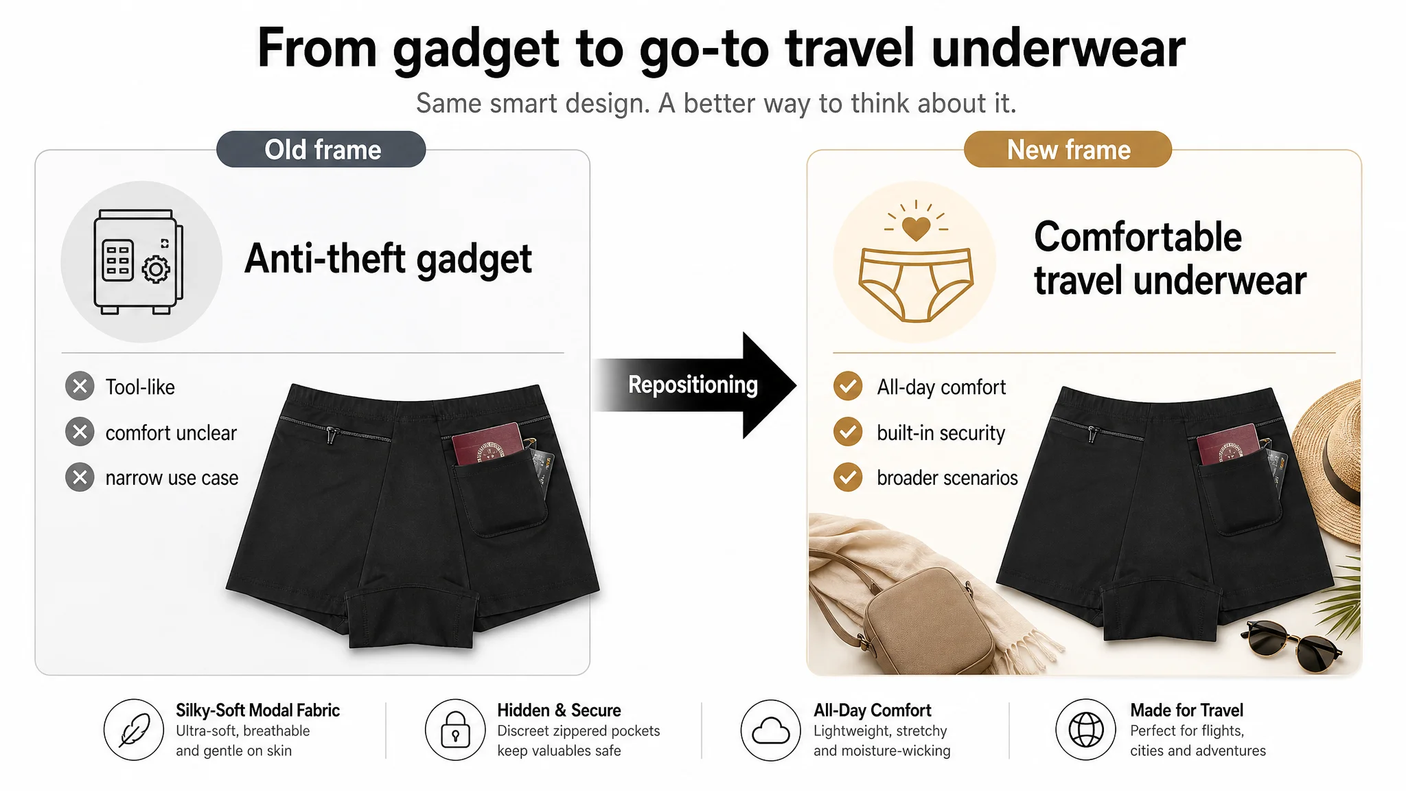
Reframing the Product: From “Anti-Theft Device” to “Comfortable Travel Underwear”
The initial page implicitly framed the product as “underwear with a secret pocket,” heavily functional, somewhat utilitarian.
That framing had two business issues:
1. It made the product feel like a tool rather than clothing—raising hidden doubts about comfort and all-day wear.
2. It limited the mental category to “anti-theft gadget”, which is smaller and more replaceable than “go-to travel underwear”.
DeepBI’s diagnosis led to a different positioning spine:
- Core premise: “Comfortable all-day travel underwear with secure storage, not just a hidden pocket.”
- Emotional outcome: peace of mind and freedom to enjoy the trip, festivals, or workouts without worrying about valuables.
- Rational pillars:
- Silky-soft modal vs. standard cotton
- Secure zippered pocket safe for insulin pumps and cards
- Rust-free, magnet-free zipper that doesn’t interfere with devices or scanners
- Clear sizing, specific to waist measurements
This repositioning drove all subsequent content decisions.
How the Listing Was Rebuilt Around Conversion
1. Title: Put the Right Words in the Right Order
Proposed title:
Women’s Underwear with Secret Zippered Pocket, 2 Packs Anti-Pickpocket Travel Panties, Secure Storage Underpants, Medium (Black)
Key changes in logic:
- Core keyword cluster first: “Women’s Underwear with Secret Zippered Pocket” front-loaded for Amazon’s search weight.
- Pain point explicit: “Anti-Pickpocket” included early to anchor the security use case.
- Usage + function: “Travel Panties, Secure Storage Underpants” extends coverage of relevant long-tail terms without bloat.
- Cleaned redundancy: Removed repeated “pocket” / “panties” loops and messy ordering.
This doesn’t “solve” conversion alone, but it increases relevance and clarity at the search-result stage, making the main image’s job easier.
2. Bullet Points: From Parameter Lists to Buying Logic
Each bullet was reframed into a pain point → product attribute → benefit structure.
Bullet 1 – Material as a Competitive Advantage
Original competitor angle: “Selected high-quality cotton fabric.”
Our advantage: Modal is actually superior (softer, more breathable, more moisture-wicking), but we weren’t leveraging it.
Optimized:
SILKY-SOFT MODAL FABRIC: Crafted from premium modal fabric, these women’s underwear are significantly more breathable and softer than standard cotton. The moisture-wicking material ensures all-day comfort and a gentle touch against the skin, perfect for sensitive skin.
Now the fabric is a reason to choose us, not a generic spec.
Bullet 2 – Pocket as Security, Not Just Storage
Competitor focused on “keep valuables safe” with a long item list.
We anchored on:
SECURE SECRET STASH POCKET: Features a discreet zippered pocket to safely store your insulin pump, cash, credit cards, passports, IDs, or feminine hygiene products. This hidden pouch provides ultimate security for your valuables and acts as an effective anti-pickpocketing solution.
The key shift: Not “what it can hold,” but “what problem it solves”—safety, including for medically sensitive items.
Bullet 3 – Zipper as a Trust Element
Original text was more about materials (“no magnets, not easy to rust”) with weaker emphasis on usage experience.
Optimized:
HIGH-QUALITY ANTI-THEFT ZIPPER: Equipped with a premium, smooth double-zipper head designed to glide without jamming. The hardware is rust-resistant and 100% magnet-free, ensuring it won’t interfere with medical devices or trigger security sensors during travel.
Now the zipper is positioned as:
- Smooth and comfortable in day-to-day use
- Safe for insulin pump users and airport security
That’s a conversion-critical trust factor, not just a detail.
Bullet 4 – Scenarios + Emotional Outcome
Competitor mentioned travel, workouts, and electronic music festivals, ending with “enjoy your journey.”
We leaned into this:
IDEAL FOR TRAVEL & ACTIVE LIFESTYLES: The perfect hidden storage solution for traveling, workouts, music festivals, and crowded events. Keep your essentials safe and secured right on your person, allowing you to enjoy your journey and activities with total peace of mind.
The product is now tied directly to peace of mind in high-loss environments, not just generic “use cases.”
Bullet 5 – Sizing Clarity as Risk Reduction
Original spec bullet was basic.
Optimized:
SPECIFICATIONS & SIZING: Colour: Black; Package: 2 Pack. Available in Size Medium (Fits waist 26in–27in). Please refer to the size chart in the product images to select the most appropriate fit for your body shape.
This sets up the next critical piece: a visual size chart in A+.
3. Main Images: Reordering the Visual Sales Argument
Based on DeepBI’s image-node analysis, the new plan:
- Image 1 – Value + Function Hook
- Show both pieces of the 2-pack clearly.
- Highlight the zippered pocket in use (passport or card partially inserted).
- Make “2-Pack” and “Secret Pocket” visually undeniable in the first glance.
- Image 2 – Fit & Invisibility
- Full-body rear-view model shot, showing how smoothly it wears, with no visible bulge.
- Directly addresses the “Will this look weird under clothes?” doubt that competitor already solved.
- Image 3 – Material Trust
- Macro close-up of the modal fabric, possibly with icons for “breathable,” “soft,” “moisture-wicking.”
- Connects to long-wear comfort during travel days.
- Image 4 – Technical Details
- Multi-panel detail callout: zipper head, waistband stretch, stitching.
- Text anchors referencing bullets: rust-resistant, magnet-free, smooth double zipper.
- Image 5 – “Is This For Me?” Checklist
- Visual checklist of common items: insulin pump, cards, passports, IDs, cash, feminine products.
- Overlay key sizing info (“Medium – waist 26–27 in”) with an arrow to the size chart in A+.
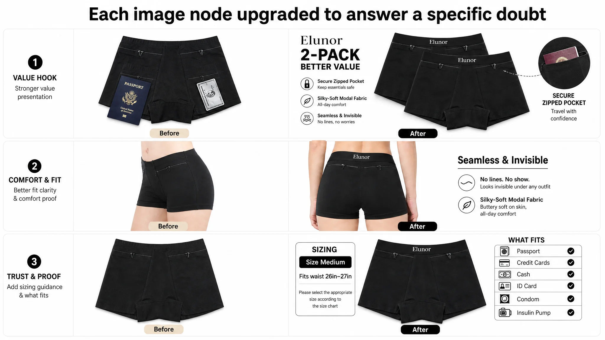
Now each image advances the sale instead of repeating the same message.
4. A+ Content: Building the Missing Trust Backbone
Because the existing listing had no A+ at all, DeepBI treated this as the highest leverage area to restore conversion.
The A+ strategy was structured around 7 modules:
1. All-day comfort premise
- Hero module presenting the underwear as comfortable daily wear that also happens to be secure.
- Emphasis on “silky-soft modal,” breathability, and long-wear comfort.
1. Style & coverage clarity
- Clear visuals of the cut: rise level, front and back coverage.
- Goal: remove uncertainty about whether it’s too revealing, too bulky, or unsuitable for certain outfits.
1. Sizing guidance as a conversion lever
- Visual size chart for Medium with clear waist ranges.
- “How to measure” graphic (waist/hip) to reduce size anxiety.
- This directly reduces returns and purchase hesitation.
1. Zipper & pocket details
- Focused module on:
- Smooth double zipper head
- Magnet-free and rust-resistant hardware
- No interference with insulin pumps or scanners
- Combines technical specs with a strong safety narrative.
1. Seam & comfort reassurance
- Visual proof of flat seams and soft edges, addressing workout/travel chafing concerns.
- Positions the product not just as secure, but actually wearable for active days.
1. Value confirmation: 2-pack visual
- Clear image of the two-piece pack in black.
- Reinforces dollar value and prevents “Is this just one piece?” misunderstanding.
1. Material texture re-emphasis
- Final module doubling down on modal’s softness and breathability.
- Keeps the comfort story consistent from top to bottom.
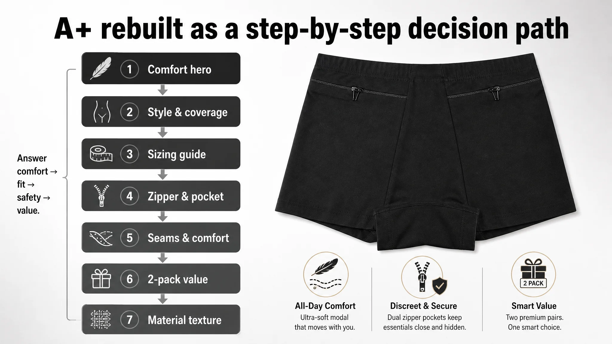
In effect, we rebuilt what the competitor already had—and then used our material and review advantages to compete beyond pure “anti-theft” positioning.
What Changed in the Business State
DeepBI’s role was not to run the ads, but to ensure that when the seller spent on ads, the listing deserved that spend.
After this reframing:
- The product page gained a coherent comfort + security narrative instead of just “hidden pocket underwear.”
- The main image set now followed a clear persuasion ladder instead of repeating the same angle.
- The A+ section started doing real work:
- Reducing sizing anxiety
- Demonstrating fabric and seam comfort
- Proving zipper safety for medical devices and travel security
This did not magically guarantee a specific CVR or ACOS number, but it fundamentally changed the risk structure:
- Ad traffic became useful again. Each paid click had a higher chance of becoming an order.
- Organic traffic had a better conversion foundation. The listing could now compete more fairly for category keywords.
- Advertising dependency became more controllable. Instead of buying their way out of conversion problems, the seller could let the improved listing do more of the work.
Just as importantly, the seller’s understanding shifted:
- High ACOS is not always an “ads problem.”
- Listing conversion capacity—especially main images and A+—sets the ceiling for what ads can achieve.
- Reviews are necessary but not sufficient; without a structured visual and textual storyline, social proof is underutilized.
- Before scaling Amazon ads, it is critical to ask:
“Does this product page actually deserve more traffic?”
What Other Amazon Sellers Can Take From This
If you recognize these signals in your own Amazon business—
- Strong ratings and review counts
- Ads driving traffic but not sustainable ACOS
- A product page with thin or no A+ content
- Main images that feel “fine” but don’t advance a buying story
—then you may be misdiagnosing a listing problem as an ads problem.
The key takeaway from this case is not that “A+ is good” or “better images help.” It is that:
- Listing quality sets the upper bound of advertising efficiency.
- Main images and A+ must be designed as a decision process, not a picture collection.
- Ad optimization should follow listing repair, not replace it.
DeepBI’s contribution in this case was to make that judgment visible and actionable, so the seller stopped fighting the wrong battle—and stopped asking ads to fix what only the Amazon product page could fix.