

An Amazon jewelry seller in the US category came to DeepBI with a familiar problem: the product page was visually “beautiful”, reviews were decent, and ad traffic wasn’t bad—yet the Listing still lagged behind a key competitor in both perceived value and conversion. The team’s first reaction was to keep tuning Amazon ads and keep adding more stylized photos, believing that “better creatives” would eventually move ACOS and sales.
DeepBI’s diagnosis pointed in a very different direction. When we benchmarked this handmade pressed‑flower earrings Listing against a high‑performing competitor on Amazon, the gaps were not in traffic volume or keyword coverage, but in page‑level decision logic: the main image sequence did not answer basic questions like “Is this a good gift?” and “How big does it look when worn?”, and the A+ content failed to turn a visually unique design into a clear, memorable gift concept.
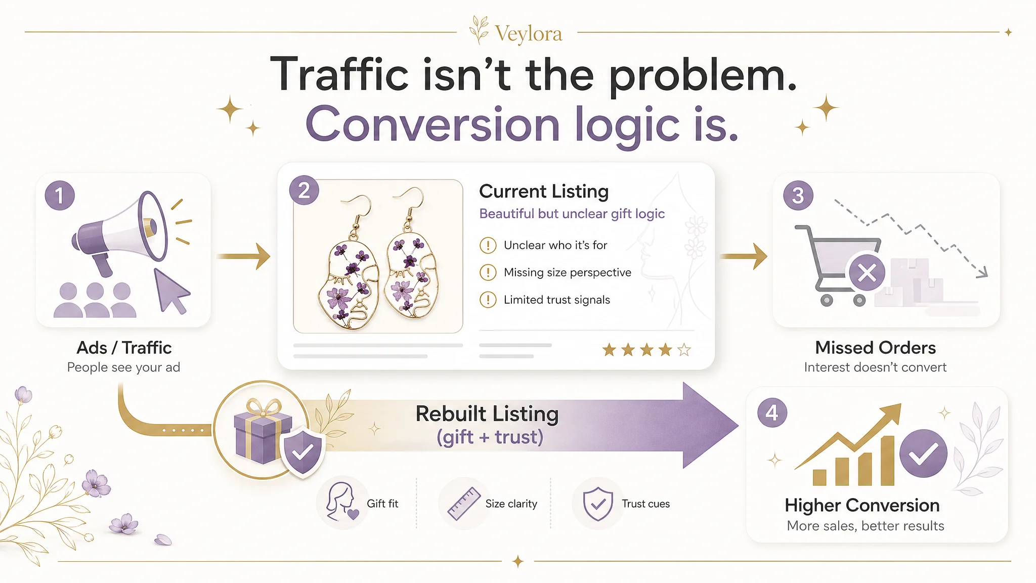
We recommended pausing the instinct to push more ads and instead rebuilding the Amazon Listing’s conversion capacity: re‑framing the main image set around gift and size confirmation, restructuring A+ content into a clear path from “wearing effect” to “design choice” to “emotional meaning and trust”, and tightening title and bullet points to support that same logic. For other Amazon sellers, this case is a reminder: when ad optimization stalls, the real bottleneck is often that the product page isn’t carrying the gift story or trust load that your ad spend assumes it can.
This Listing Did Not Lack Traffic. It Lacked a Clear Reason to Buy.
From a surface view, this Amazon Listing for handmade pressed‑flower teardrop earrings looked healthy:
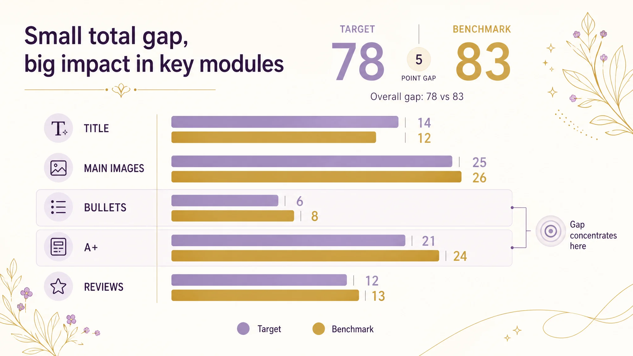
- Overall Listing score: 78/100 versus a competitor at 83/100
- Star rating: 4.5 with 49 reviews (competitor: 4.9 with 43 reviews)
- Title keyword coverage: rich, with multiple long‑tail terms and visual descriptors
For the seller, the obvious conclusion was: “We are close to the competitor; we just need better creatives and more ads.”
Yet the gap in orders persisted. The more they polished “artistic” images and poured traffic through Amazon ads, the more it felt like the Listing was not “catching” that traffic. DeepBI’s role was to clarify whether this was really an ad problem—or a conversion problem sitting underneath ads.
“The real problem was not that ads failed to bring traffic. It was that the page could not convert the traffic.”
DeepBI’s scoring and benchmark comparison made one judgment very clear: the core constraint was Listing conversion capacity—especially around gift logic and trust.
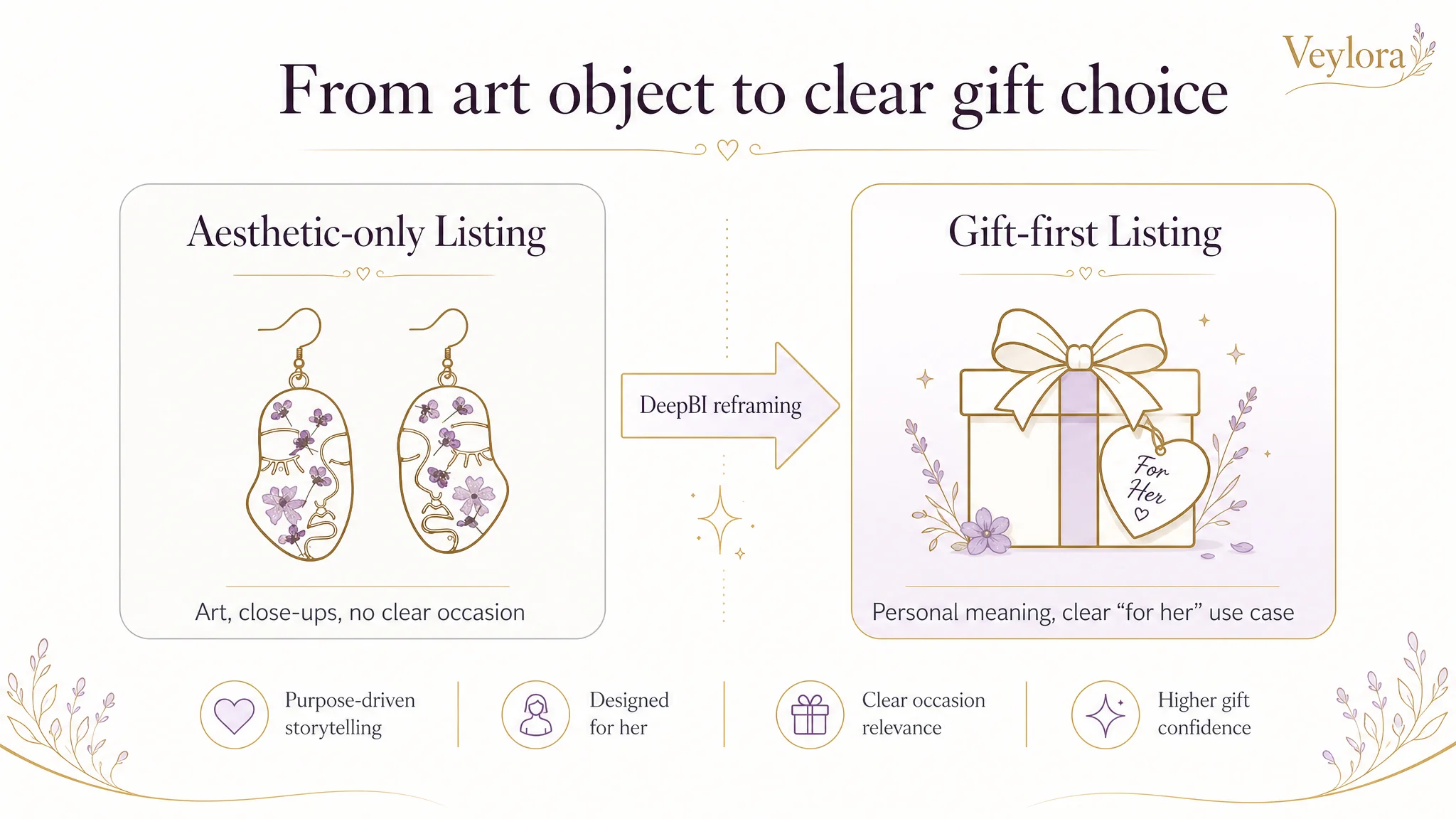
The Core Misdiagnosis: Treating a Gift Product as Pure Aesthetics
The customer positioned these earrings as art‑driven jewelry: abstract face shapes, real dried flowers, unique resin designs. The team fell in love with that uniqueness and built the Listing around aesthetic display.
But the benchmark competitor on Amazon was winning the market with a different logic: giftability through personalization and symbolism—birth month flowers, clear emotional meaning, strong “present for her” framing—backed by simple, reassuring information.
The customer misread the situation in three key ways:
1. Assuming more stylized images = higher conversion
They kept adding macro shots on marble or dark backgrounds, thinking “high‑end look” alone would close the sale. In reality, first‑time buyers of pressed‑flower jewelry were hesitating on very basic points: size, gift fit, and comfort.
1. Assuming reviews were “good enough”
A 4.5 rating with more total reviews than the competitor looked safe on paper. But the competitor’s home‑page reviews were all 4–5 stars, while this Listing had a visible 3‑star review mentioning comfort issues. That small trust gap matters a lot in a gift context.
1. Assuming traffic could fix conversion
The team believed that if they drove more Amazon ads, CTR and CVR would eventually follow because the product was “objectively beautiful”. Without a clear gift story and risk reduction on the page, ad spend could only amplify the Listing’s weaknesses.
The result: ads were feeding a page that didn’t answer the buyer’s gift and trust questions fast enough.
What DeepBI Saw in the Data and the Page Structure
DeepBI’s Listing scoring compared the target Listing to a benchmark competitor on five dimensions: title, main image set, bullet points, A+ detail page, and reviews.
Overall gap: 78 vs 83. The difference wasn’t huge, but it concentrated on the exact modules that impact conversion most for gift products.
Title: Traffic Was Not the Main Problem
On title, the target Listing actually scored slightly higher (14 vs 12):
- Strong brand‑first structure, aligned with Amazon’s brand recommendation
- Rich keyword coverage: “Pressed Flower”, “Handmade Unique Resin”, “Dried Flowers”, “Dangle Drop”
- Visually appealing modifiers: “Abstract Face Art”, “Gold Teardrop”, “Nature Floral”
The competitor, however, sacrificed keyword richness to land one sharp concept: birth‑month flower earrings—a direct, personalized gift scenario.
DeepBI’s judgment:
- Traffic coverage was already decent; optimization here was incremental (fix spelling, tighten keyword ordering, adjust scene terms).
- The fundamental problem did not lie in missing keywords, but in how the rest of the page supported—or failed to support—a clear purchase scenario.
In other words, this was not a “find more keywords” problem.
Main Image Set: Beautiful, but Misaligned With Buying Decisions
Both Listings had solid image quality. The seller’s main issue wasn’t pixel quality; it was role assignment—what each image was supposed to accomplish in the buyer’s decision path.
DeepBI’s benchmark analysis showed:
- Competitor Image 1: immediately framed as a “January Birthday Gift”—clear occasion, clear recipient.
- Competitor sequence: balanced between gift scene, wearable scale, craftsmanship, and risk reduction (dimensions, materials, hypoallergenic cues).
By contrast, the target Listing’s main images skewed heavily toward artistic close‑ups:
- Image 1: clean view of the abstract face + dried flower design, but no explicit gift or occasion context. Buyers couldn’t instantly see “this is perfect for her birthday.”
- Images 2–5: repeated stylized close‑ups, some partially obscured by hair and shadow; no dedicated size confirmation image, no clear “gift‑ready” visual.
DeepBI’s conclusion:
- CTR risk: Without a gift or use‑case hook on the search results page, clicks would trail a competitor that calls out “Birthday Gift for Women” directly in imagery.
- CVR risk: Without a clear mid‑distance model shot to show earring size and fit, size‑related hesitation stays unresolved.
- Brand risk: The competitor’s unified illustration and packaging style created recognizable brand assets; this Listing’s mixed marble/cement/natural light styles diluted brand memory.
This wasn’t about making “prettier” images—it was about a main image set that didn’t carry the gift and risk‑reduction logic Amazon buyers needed.
Bullet Points: Information Without a Persuasive Path
On paper, both Listings listed materials, scenarios, and quality. But their structures were very different.
The competitor’s bullets followed a clear conversion path:
1. Lead with personalized birth‑month flower + gift intent
2. Detail handcraft and materials to justify value
3. Tie gift scene + personalization into emotional meaning
4. Provide size/material comfort details
5. Close with service and risk‑reduction
The target Listing:
- Started with generic emotional and scene descriptions, not the sharpest visual and functional hook.
- Mentioned handcraft and materials, but without the same clarity and value scaffolding.
- Listed multiple gift occasions in a rather flat, enumerated way.
- Ended with care instructions—practical but weak as a last push to purchase.
DeepBI’s reading:
- The bullets had content, but not a buying logic.
- For a gift‑driven Amazon product, bullet #5 is often where trust is cemented; using it for maintenance instead of service and quality assurance left conversion power on the table.
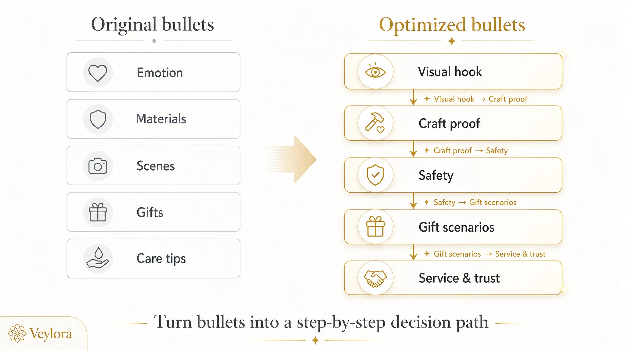
This is why DeepBI’s suggestions focused on re‑ordering and reframing, not just rephrasing:
- Bullet 1: lock in the unique artistic face shape + real dried flowers as the core visual hook.
- Bullet 2: deepen handcrafted uniqueness—each piece is one‑of‑a‑kind.
- Bullet 3: clarify hypoallergenic and comfort for daily wear.
- Bullet 4: sharpen gift scenarios tied to specific recipients and milestones.
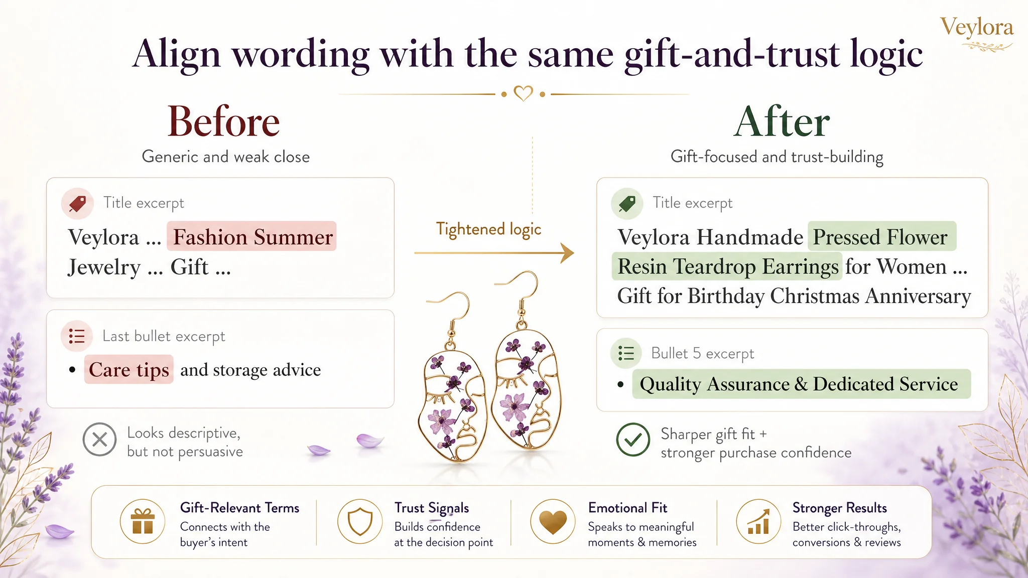
- Bullet 5: upgrade from care tips to quality assurance & service commitment.
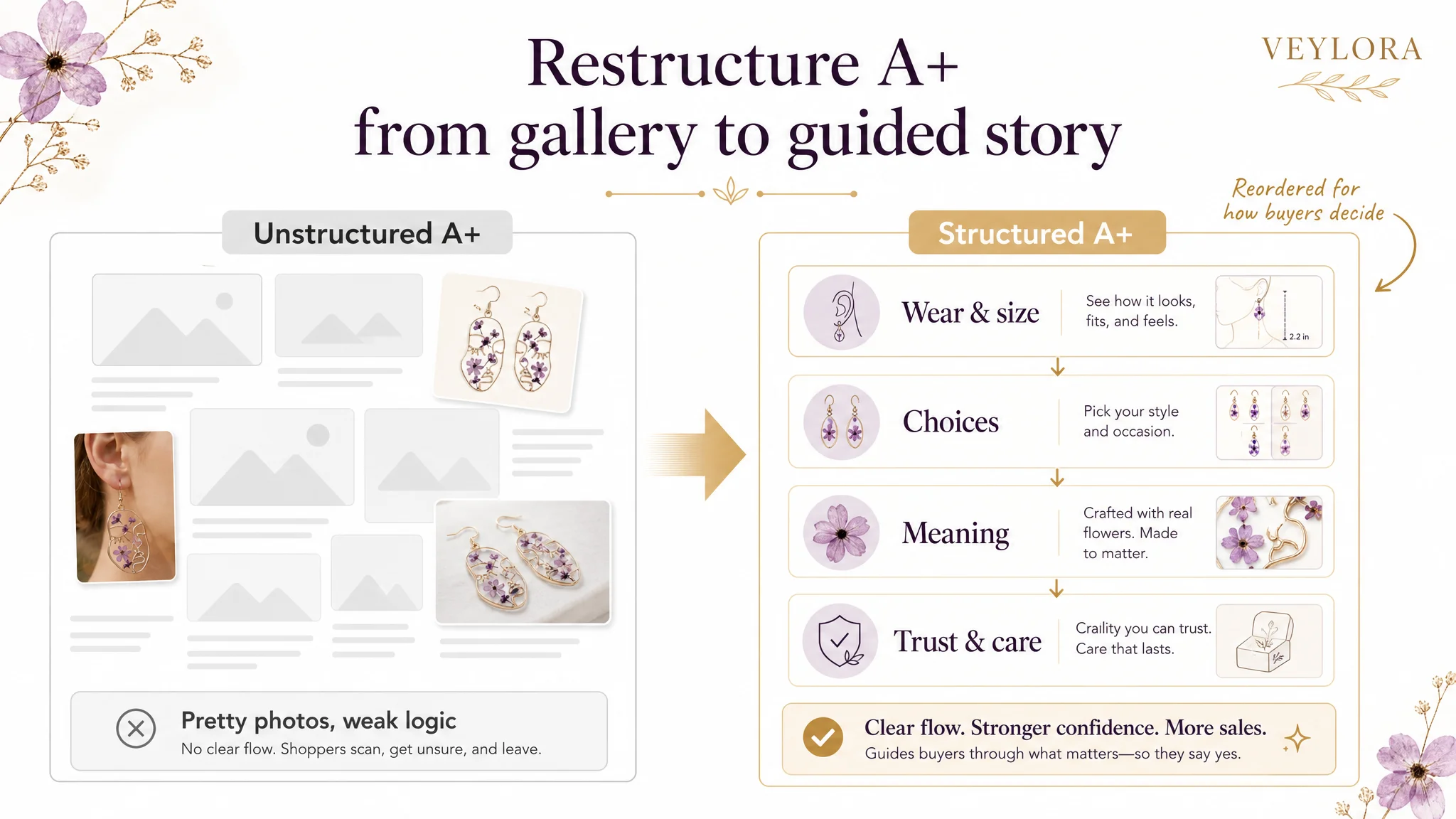
A+ Detail Page: Strong Visuals, Weak Story and Trust Structure
The A+ content made the seller’s aesthetic taste very clear: high‑quality photos of models, multiple angles, natural light. But from a commercial perspective, it underperformed where it mattered:
- It did not lead with the wearing effect and size.
- It under‑utilized the variety of designs and colors as a structured choice module.
- It did not build a symbolic or emotional framework comparable to the competitor’s “birth flower + month + meaning” matrix.
- It under‑communicated practical trust elements: material clarity, comfort, durability, and after‑sales assurance.
The competitor, by contrast, turned its A+ into a full emotional and practical story:
- Brand identity > month matrix overview > core value proposition > 12 months of themed image + meaning blocks.
- Clear left‑text / right‑image layout, unified illustration style, easy to scan and remember.
- Strong support for repeat and multi‑gift purchases (different months, different recipients).
DeepBI’s assessment:
“This product page did not lack beauty. It lacked a structured story that turned beauty into a reason to buy and a reason to trust.”
For conversion, that meant:
- New buyers had to work too hard to understand size, options, and why this specific design made a meaningful gift.
- The page did not fully justify the price or the idea of choosing this Listing over similar earrings.
Why DeepBI Did Not Recommend “More Ads” First
From an operational perspective, the biggest risk at this stage was letting ads amplify a low‑clarity, low‑trust page.
If the seller had continued to focus on:
- Increasing bids
- Expanding keyword coverage
- Testing more ad formats
…without fixing page logic, they would likely have seen:
- Rising impressions
- Volatile CTR
- Stagnant or worsening CVR
- ACOS stuck high, TACOS creeping up
DeepBI’s judgment was:
- The Listing was already receiving enough traffic signals to diagnose a conversion problem.
- The product’s uniqueness was not being translated into a buyer’s “yes” inside the page.
- With review quality roughly acceptable, the next leverage point had to be the Listing itself, not the ad engine.
So we framed the decision order clearly for the seller:
1. Rebuild the product‑page conversion logic around gift and trust.
2. Only then, re‑evaluate and scale ads, once the page can convert the traffic it receives.
How the Optimization Reframed the Page
DeepBI’s optimization path focused on changing the order and role of each major module rather than simply adding more assets.
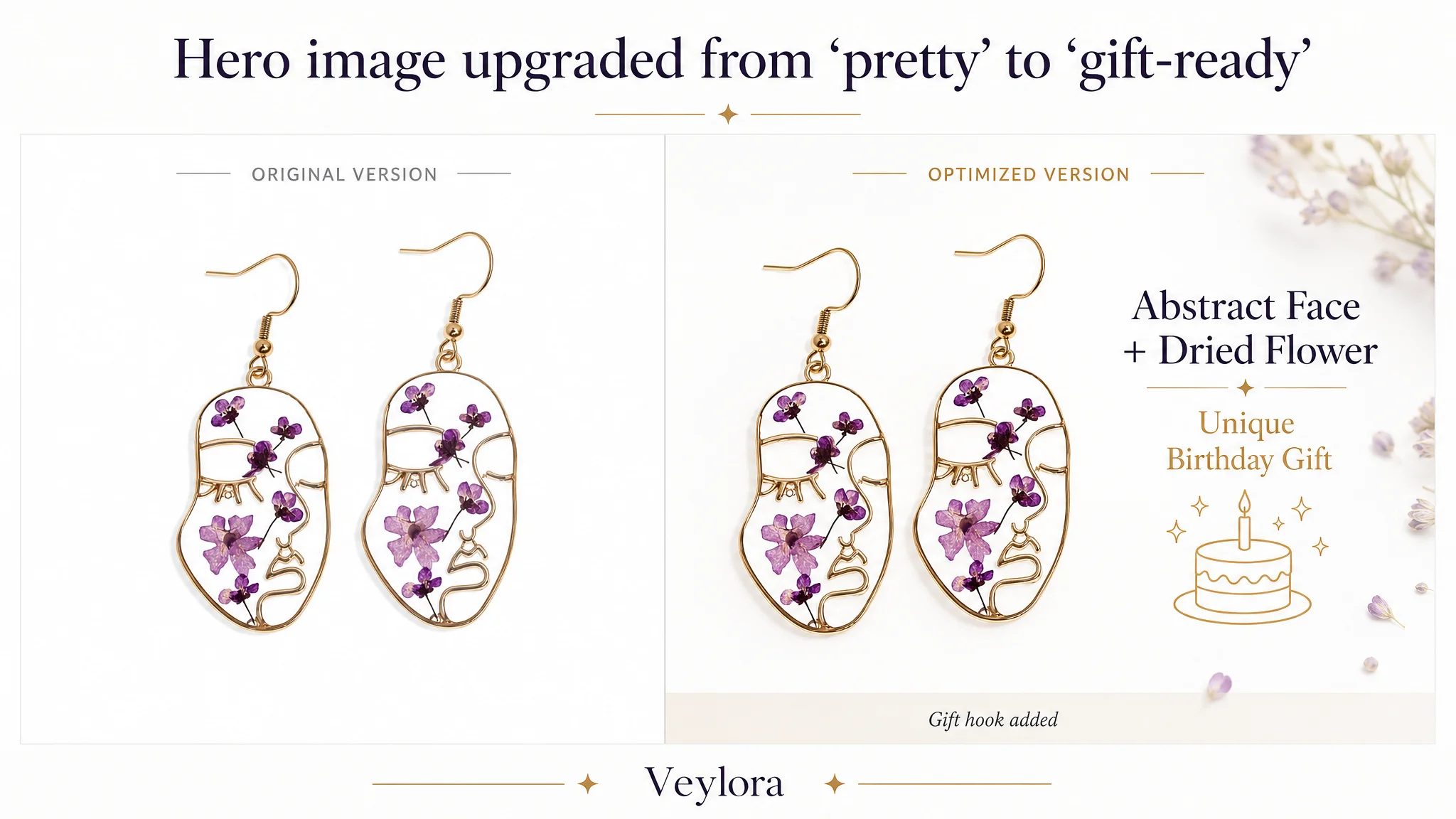
1. Main Image Sequence: From Aesthetic Display to Gift & Risk Resolution
Planned role re‑assignment:
- Image 1 – Gift Hook: Keep a clean, recognizable view of the design, but add a subtle gift overlay or graphic (“Birthday Gift for Her”) to anchor occasion fit.
- Image 2 – Scale Confirmation: Medium close‑up of the earrings on a model, showing jawline and lower face to answer “How big do they look?”
- Image 3 – Craftsmanship Detail: Back‑lit or angled shot highlighting real dried flowers embedded in resin—clarity, texture, and uniqueness.
- Image 4 – Rational Trust: Overlay dimensions and key specs (“Nickel‑Free”, “Lead‑Free”, “Lightweight”) to reduce material and comfort doubts.
- Image 5 – Gift‑Ready Confirmation: Visualize the “heartfelt gift” concept—earrings with a stylized gift box or card, reinforcing the gift decision.
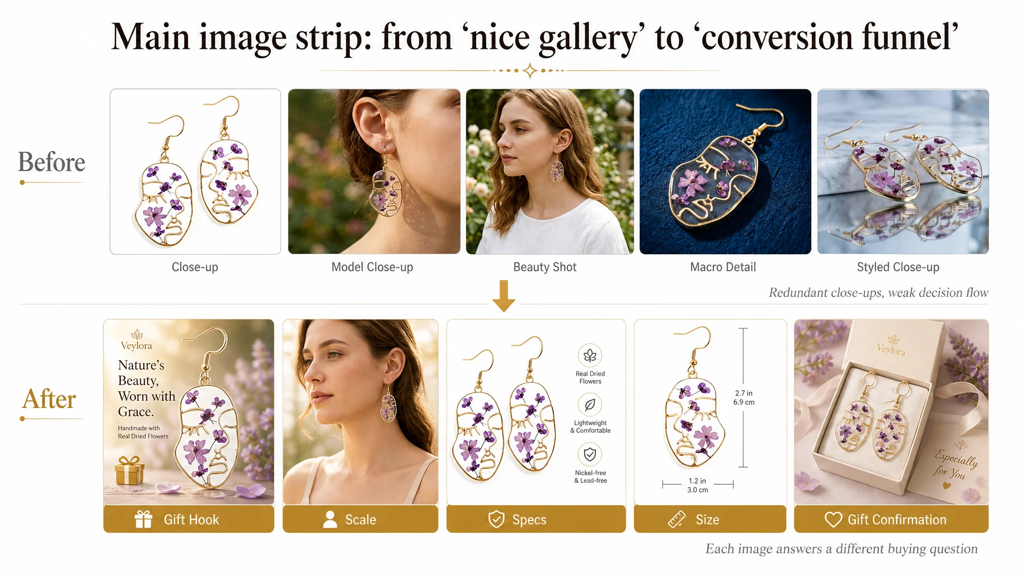
By reducing redundant close‑ups and giving each image a distinct decision role, the main image strip shifts from “pretty gallery” to “conversion funnel.”
2. A+ Content: Reordering Around Buyer Questions
DeepBI’s suggested flow:
1. Module 1 – Wear & Size First: Move model shots to the top. Clarify scale and comfort before anything else.
2. Module 2 – Design Choice: Show all major variants and colors together to support selection (“Which one suits her best?”).
3. Module 3 – Variety Confirmation: Deepen perception of choice using multiple color examples (pink, purple/blue, yellow).
4. Module 4 – Emotional Value & Giftability: Tie the distinct design to emotional uplift and gift meaning.
5. Module 5 – One‑of‑a‑kind Craftsmanship: Macro details reinforcing handcrafted uniqueness and artisanal quality.
6. Module 6 – Care & Value: Explain longevity, how to care, and why the piece is worth keeping for years.
7. Module 7 – Final Gift Confirmation: Reconnect to recipients and occasions, making the “yes” easy for birthdays, weddings, anniversaries, Christmas, etc.
In effect, the A+ is rewired to walk an Amazon buyer through the actual mental path:
“What does it look like on?” → “Which style fits?” → “Is it special enough?” → “Is it well‑made and safe?” → “Is it really a good gift for her?”
3. Title and Bullets: Tightening Around the Same Logic
DeepBI’s title guidance was incremental but important:
- Fix spelling issues (“earings” → “earrings”).
- Move the high‑value phrase “Pressed Flower Resin Teardrop Earrings” toward the front.
- Keep brand first for Amazon branding, but reduce generic descriptors like “Fashion Summer” in favor of concrete gift contexts (“Birthday, Anniversary, Christmas”).
Bullet optimizations, as noted earlier, turned each point into a named role in the conversion:
- Hook: artistic face + real dried flowers
- Proof: handcrafted uniqueness
- Safety: hypoallergenic, comfortable, fade‑resistant
- Scenario: specific recipients and occasions
- Trust: quality check and responsive service
What Changed for the Seller
Because the source material does not include post‑optimization metrics, we do not claim specific percentage lifts. But the operational state and risk profile changed in several important ways:
- Listing conversion capacity improved:
The page became more capable of converting both organic and ad traffic by resolving size, comfort, and gift fit earlier and more clearly.
- Traffic became more “usable”:
Ad clicks were no longer hitting a page that left core questions unanswered. Each module now had a defined role in pushing the buyer forward.
- Advertising dependence became more manageable:
With a more coherent gift and trust story, scaling ads has a better chance of lowering ACOS instead of just inflating spend.
- The team’s understanding shifted:
They no longer saw the problem as “we need nicer images and more ads,” but as “our Amazon product page must carry our gift logic and trust before we pour more traffic into it.”
What Other Amazon Sellers Can Take From This Case
Several broader points apply beyond jewelry:
1. A near‑benchmark score can still hide a critical bottleneck.
A 5‑point gap (78 vs 83) was enough to signal that this Listing’s weakness sat exactly where gift products live or die: gift framing, variety choice, and trust.
1. Ads amplify whatever your Listing already is.
If your Amazon product page does not quickly answer who the product is for, when it should be given, and why it can be trusted, more ad spend will just amplify that confusion.
1. Main images need roles, not just aesthetics.
Think in terms of hook → scale → detail → rational proof → gift confirmation, not five variations of “nice close‑ups.”
1. Bullet points are a path, not a checklist.
Each bullet should play a distinct part in moving the buyer from interest to trust, especially the final bullet, which should close with service and assurance, not maintenance trivia.
1. A+ content should mirror how buyers decide, not how designers think.
Start with wearing effect and choice, then layer meaning and trust. Beauty without structure rarely converts in a crowded Amazon category.
For DeepBI, the real value in this case was not producing different wording or images—it was reframing the seller’s judgment: recognizing that until the Amazon Listing itself carries a coherent gift and trust story, no amount of ad tuning can truly fix conversion.