
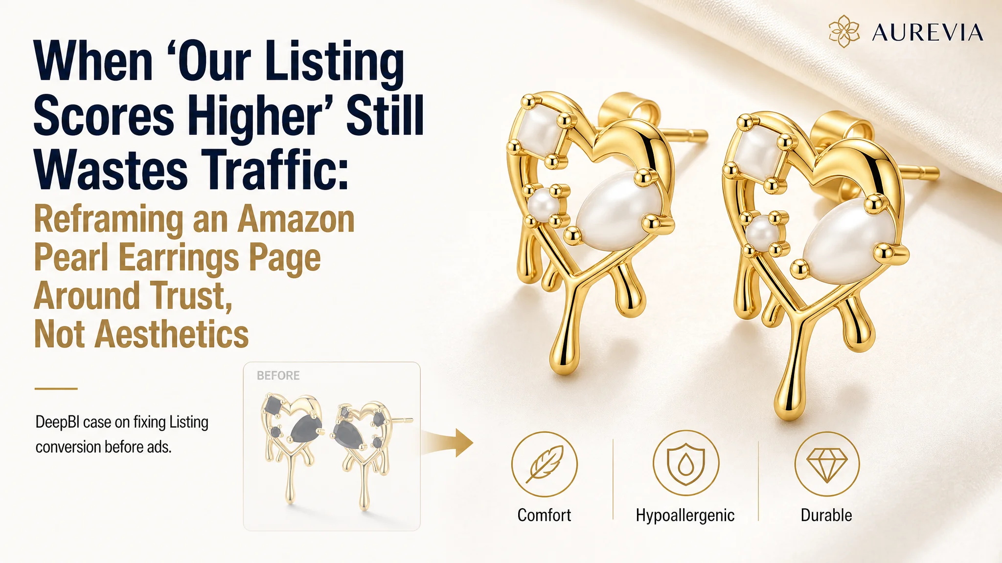
This Amazon jewelry seller came to DeepBI with a paradox. Their pearl earrings Listing scored higher than a key competitor on almost every Amazon page dimension, reviews were stronger, and the A+ content was more polished. Yet ad costs were hard to control, and the product page was not converting traffic as efficiently as it should. The team’s instinct was to keep tweaking Amazon ads and polishing visuals, assuming the problem lay in campaign setup or “not pretty enough” images.
DeepBI’s diagnosis pointed elsewhere. The Listing looked refined, but it was telling the story in the wrong order. The page over‑invested in aesthetic and technical polish, while delaying or underplaying what actually lowers decision risk in jewelry on Amazon: sizing clarity, everyday wear comfort, allergy safety, durability, and after‑sales reassurance. Ads were pushing traffic into a page that felt beautiful yet incomplete in trust.
Once the focus shifted from “making a better‑looking Listing” to “rebuilding the trust and decision path,” the optimization direction changed. Main-image slots were rethought around comfort and stability, A+ modules were reordered from technical-first to beauty-first then proof, and bullets were rebuilt around material safety, wear scenarios, gift logic, and clear post‑purchase protection. The goal was not more decoration, but a cleaner buying logic that could finally convert the traffic ads were already paying for.
For other Amazon sellers, this case is a reminder: a higher Listing score and nicer visuals do not guarantee higher conversion. If your Amazon ads feel “expensive” despite strong ratings and polished content, the problem may not be in your bids or creatives—but in how your product page sequences trust, risk reduction, and decision clarity.
The Conflict Behind a “Better” Amazon Listing That Still Underperforms
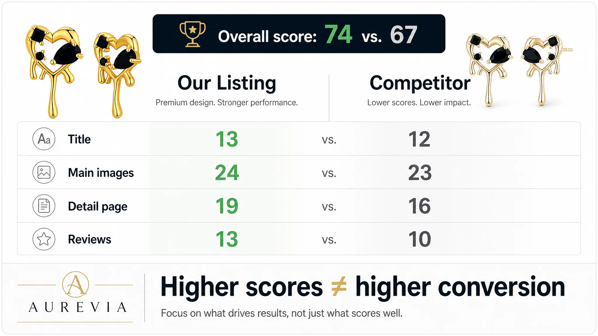
On paper, this jewelry Listing looked stronger than its benchmark competitor:
- Overall Listing score: 74 vs. competitor’s 67
- Better A+ depth, more complete title coverage, and stronger reviews
- 4.5 stars with 600+ reviews vs. competitor’s 4.4 stars with ~90 reviews
- Much lower negative‑review exposure on the first page of feedback
From the seller’s perspective, that meant the “Listing problem” was largely solved. If results lagged, they assumed the cause must be:
- Ads not optimized enough
- Keyword targeting and bids needing another round of tuning
- Creatives needing “more pop” to win clicks in search
So the team kept iterating Amazon ads and creatively polishing images—without questioning whether the page’s argument actually matched how jewelry buyers decide.
“The real problem was not that ads failed to bring traffic. It was that the page did not neutralize the exact risks buyers care about.”
DeepBI’s Listing audit, however, surfaced a different bottleneck: the Listing had conversion capacity on paper, but key trust gaps and decision steps were in the wrong place.
Amazon Ads Were Not Failing. The Page Was Consuming the Traffic.
DeepBI’s scoring system compared this Listing against a tightly matched Amazon competitor in the same US jewelry subcategory. The customer’s page scored higher on:
- A+ detail page: richer visuals, engineering diagram, and consistent brand visuals
- Reviews: significantly more reviews and healthier sentiment distribution
- Title coverage: more material keywords and multiple usage scenarios
Yet the advertising team still felt constant pressure on ACOS and TACOS. As traffic scaled, orders did not follow with the same slope. That pattern is characteristic of a conversion constraint, not a traffic constraint.
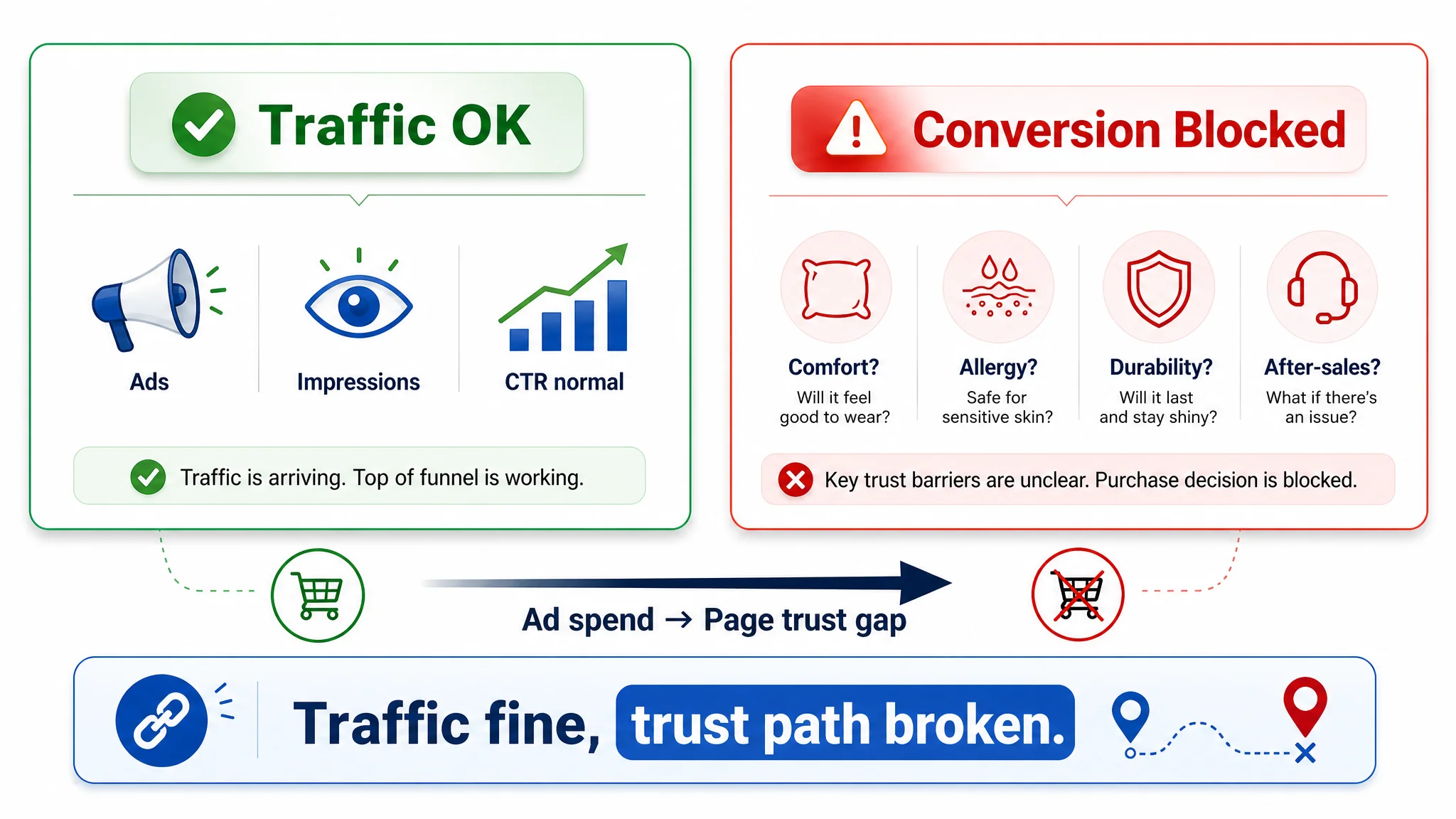
The data pattern and page structure suggested a specific risk:
- Ads were feeding a page that looked premium and artistic, but did not immediately answer:
- Will this fit and look right on my ear?
- Will it irritate my skin?
- Will it fade quickly?
- What happens if I’m not satisfied?
The competitor’s Listing, while visually less polished, attacked those concerns early in the bullets and made after‑sales support explicit. That difference is subtle at the design level, but critical at the conversion level when ad traffic is expensive.
The Real Constraint: Listing Conversion Capacity, Not Visual Quality
If you looked only at scores and aesthetics, the customer “won”:
- Title: 13 vs. 12
- Main images: 24 vs. 23
- Detail page: 19 vs. 16
- Reviews: 13 vs. 10
DeepBI’s judgment was that these advantages were misallocated. The Listing invested heavily in:
- Brand aesthetics (watercolor style, unified visuals)
- Technical precision (engineering diagram, size and structure cutaway)
- High‑quality product and lifestyle imagery
But the elements that directly convert ad traffic in jewelry were not leading:
1. Material safety and hypoallergenic reassurance
- Competitor opens bullets with “passed strict skin test, allergy‑free, nickel‑free”
- Customer leads with design and scenes; safety comes later or is implicit
1. Clear after‑sales safety net
- Competitor dedicates a bullet to “If there are any problems, contact us, we will fix it”
- Customer uses the final bullet for care advice and value feel, not explicit protection
1. Practical sizing and wear guidance in the top copy
- Competitor quickly refers buyers to model shots and size, acknowledging fit risk
- Customer has an excellent size diagram—but it is a mid‑flow rational element, not an early reassurance
In other words, the page had strong proof assets but weak ordering of proof. When ad traffic landed, the Listing was not addressing the risk queue in the order buyers actually experience it.
Why Traditional Ad Optimization Kept Failing
From an ad manager’s seat, the symptoms looked like a pure advertising issue:
- Rising competition in jewelry keywords
- ACOS hard to push down despite normal CTR
- Need to “refresh creatives” or “test more ad types”
But with better reviews and stronger Listing scores than the competitor, traffic quality was not the primary suspect. The conversion path was.
Traditional ad optimization failed for three reasons:
1. It assumed creative tweaks could substitute for page‑level trust.
Changing ad images or headlines cannot fix on‑page uncertainty about comfort, allergy safety, and returns.
1. It treated Listing quality as binary (“fine vs. broken”), not as sequence and emphasis.
Because the Listing “looked good,” nobody challenged whether its logic was aligned with how jewelry decisions are actually made on Amazon.
1. It continued to push more impressions into the same leak.
Without fixing conversion, every click from Sponsored Products or Sponsored Brands just magnified the Listing’s weak spots.
DeepBI’s conclusion: fix the Listing’s trust and decision logic before adding more fuel to the ads.
Where DeepBI Saw the Structural Gaps: Title, Bullets, Images, A+
The Title: Strong Coverage, Weak Decision Positioning
The customer’s title:
- Opens with the brand name
- Places “Pearl Earrings” later in the string
- Packs in multiple material terms: CZ pearls, gold plated, sterling silver
- Includes multiple occasions: wedding, prom, birthday
The competitor’s title:
- Pushes core keyword to the front: “Pearl Stud Earrings”
- Adds emotional hook early: “Elegant”
- Focuses on a clear recipient: “for Mother/Mom”
- Uses descriptive angle (“Little Flower”) that can double as a long‑tail keyword
DeepBI’s takeaway was not that the customer’s title was “bad”—it scored higher overall. The issue was what the title is used for at the ad and search stage:
- Front‑loaded decision cue (“Pearl Stud Earrings”) supports search relevance and quick scanning
- Emotional and recipient clarity (“Elegant… for Mom”) supports click intent when the shopper sees dozens of thumbnails
Hence the proposed direction:
“Brand + Cluster Pearl Leaf Stud Earrings for Women + Gold Plated Sterling Silver Pins Cubic Zirconia Flower Earrings + Wedding Jewelry Birthday Gift for Mom”
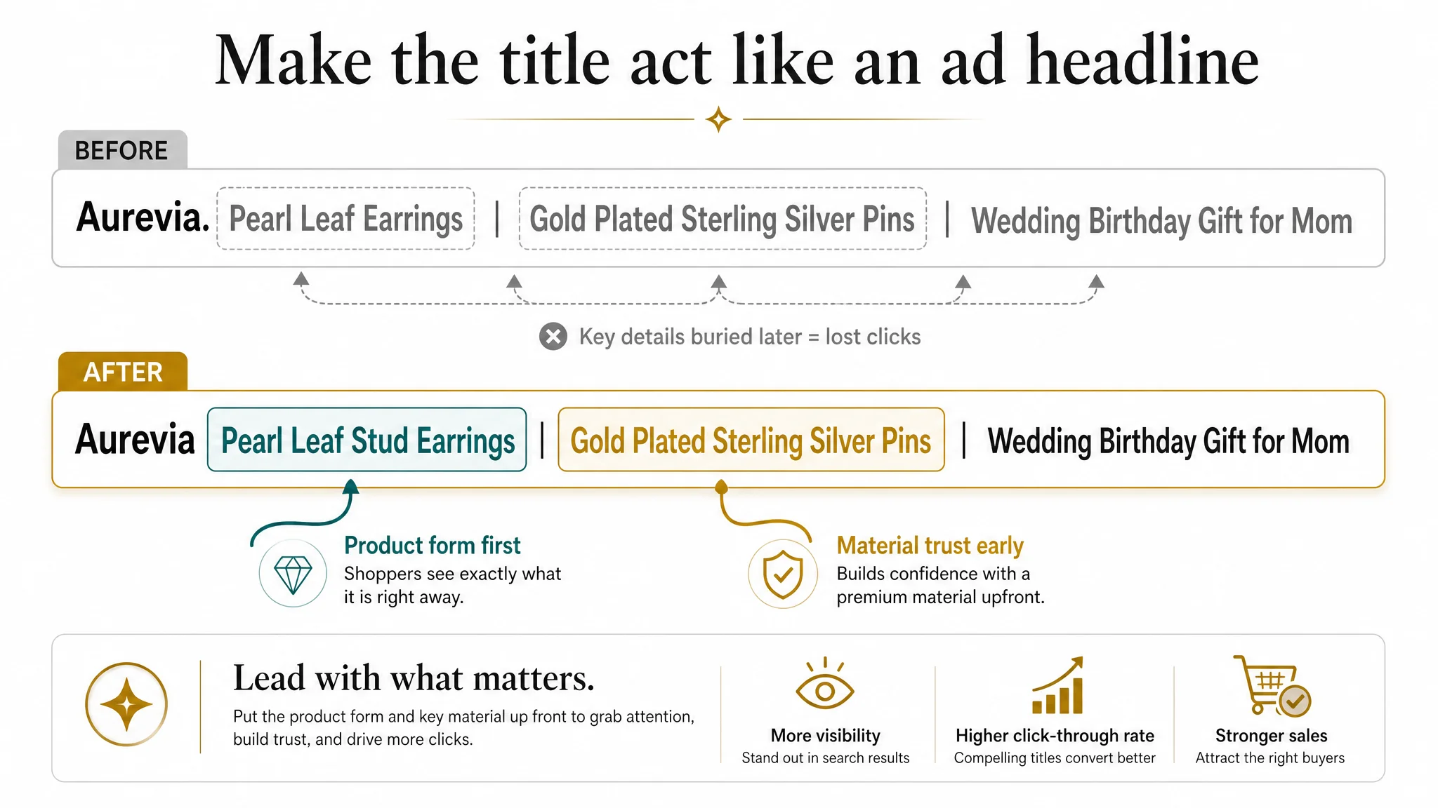
The logic:
- Put the product form and primary keyword cluster right after the brand
- Immediately follow with material and pin details (a trust cue)
- Close with scenes and recipient for long‑tail coverage and gifting clarity
This is less about word choice than about making the title work like the first line of the ad.
Bullet Points: Beautiful Language, Weak Risk Closure
A side‑by‑side analysis of the five bullets showed a clear strategy mismatch:
- Customer sequence: design → scenes → material craft → audiences & gift scenes → care advice
- Competitor sequence: material safety → size reference → design & scenes → gifting emotion → after‑sales promise
The competitor’s order matches the buyer’s mental process:
1. Is it safe for my skin?
2. Will it fit / look right?
3. Does it match my style and occasions?
4. Is it a good gift emotionally?
5. If something goes wrong, am I protected?
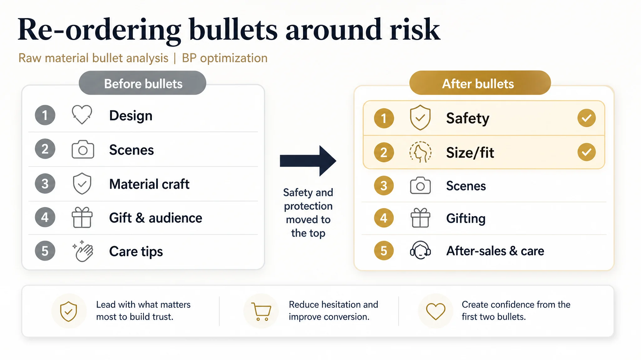
DeepBI recommended bullets that rebuild this decision path, for example:
1. UNIQUE VINTAGE DESIGN
- Lead with the differentiating look (irregular heart, mirror surface, crystal accents) and how it dresses up everyday style.
1. PREMIUM QUALITY MATERIAL
- Immediately reassure: 18K gold‑plated stainless steel, fade‑resistant, durable, hypoallergenic, nickel‑free.
1. VERSATILE FOR ANY OCCASION
- Translate design into use: business, formal events, dating, casual hangouts.
1. PERFECT GIFT CHOICE
- Name recipients and occasions explicitly: friends, family, wife, mother, daughters; birthdays, Christmas, Valentine’s Day, anniversaries, graduations.
1. SATISFACTION & CARE
- Combine realistic care advice with a clear “we will fix it” commitment.
This is not copywriting for its own sake. It moves material safety and after‑sales protection into the main decision flow, so every ad‑driven visitor encounters them without scrolling deep into reviews.
Main Images: Aesthetic Strength Without a Complete Trust Story
Both Listings had decent main‑image sets, but the focus differed.
The customer’s set:
- Clean front view of the earrings on white background
- On‑ear model shot showing scale and dripping asymmetrical design
- Rational size diagram
- Macro texture close‑up on silk
- Basic gift‑leaning visual
The competitor’s set:
- Less refined but more explicit about size and gifting intent
- More emphasis on multi‑angle wear and gift boxes
DeepBI’s assessment was that the customer’s images were high quality but underused as trust assets. The guidance focused on repurposing each slot:
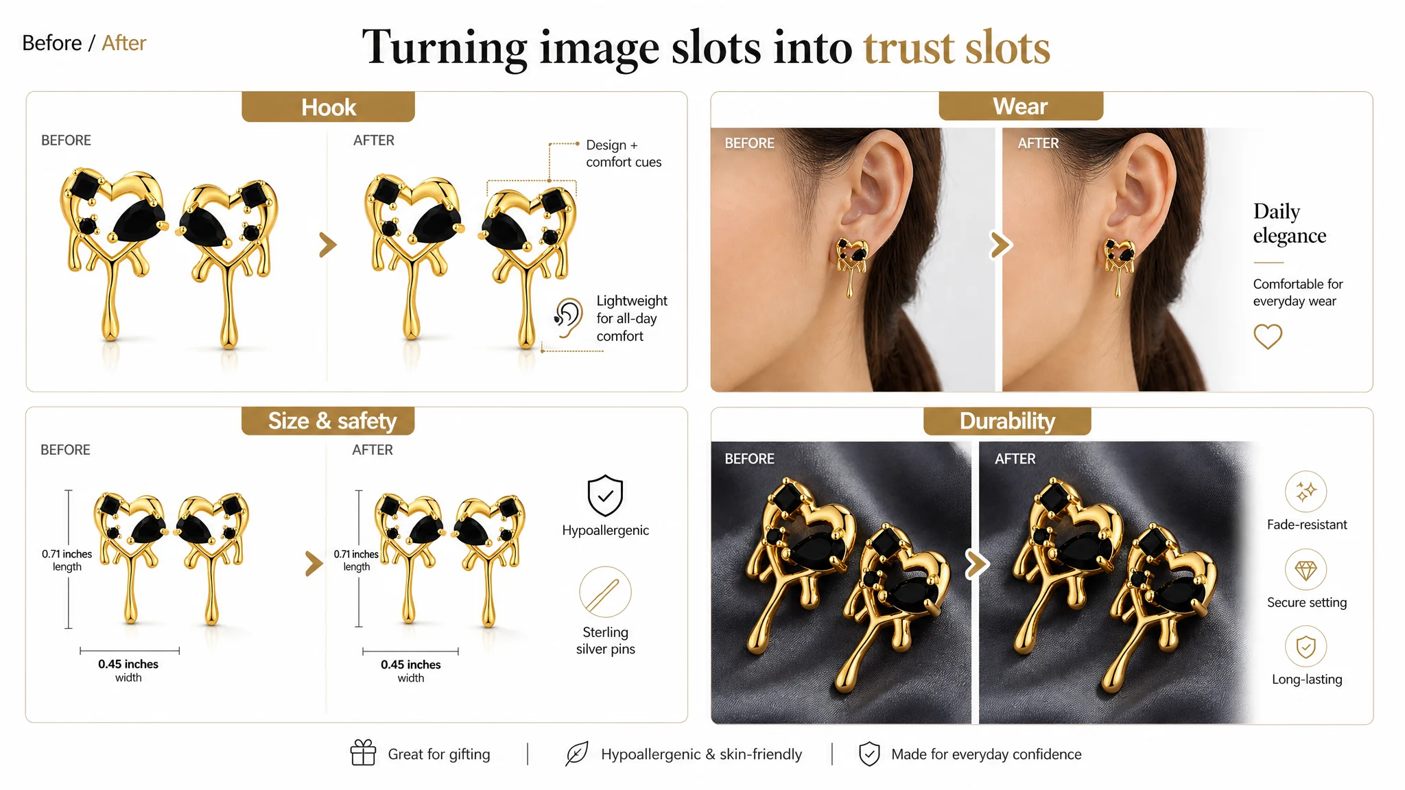
1. Image 1 – Initial Hook With Hidden Comfort Cue
- Keep the distinct irregular heart design and mirror finish.
- Make the push‑back setting clearly visible on the angled earring to suggest comfort and security.
1. Image 2 – On‑Ear Scale and Asymmetry as a Benefit
- Use this not just as a demonstration, but as proof that the chunky design is wearable, elegant, and suitable for daily or business wear.
1. Image 3 – Size Diagram + Material Credibility
- Combine exact dimensions with a visual element that confirms material (e.g., sterling silver pin detail).
- Subtly imply lightweight comfort; dispel fear of “too heavy” by proportion, not slogans.
1. Image 4 – Macro Integrity, Not Just Shine
- Macro shot should show secure crystal setting and plating thickness honestly, without exaggerated sparkle.
- This becomes the durability trust node: “these will not fall apart or flake quickly.”
1. Image 5 – Giftability and Low Misuse Risk
- Either a clear jewelry box scene with discreet messaging (“Sterling Silver Pin”, “Fade‑Resistant”)
- Or a dedicated material‑story visual focusing on safe, durable pins and secure backs.
In short: reposition the gallery from “pretty pictures” to a visual argument that these earrings are safe, comfortable, durable, and gift‑ready.
A+ Detail Page: Technical‑First When It Should Be Desire‑First
The customer’s A+ modules were objectively stronger than the competitor’s in craft:
- Consistent watercolor brand visuals
- Detailed engineering diagram with size and structure
- Model wearing the product
- Gift box scene
- Macro detail shot
The competitor’s A+ was more generic and less visually refined, mixing multiple unrelated earring styles and diluting focus.
Yet, the sequence on the customer’s page still hampered conversion:
- Module 1: Decorative brand introduction – aesthetic, but light on trust.
- Module 2: Technical diagram – rational, but early and dense.
- Module 3: Single model shot – limited wear scenarios.
- Module 4: Box shot – implies gifting but does not spell it out.
- Module 5: Close‑up product details – visually strong, but not directly tied to benefits.
- Modules 6–7: Missing – no cross‑sell, no explicit material safety module.
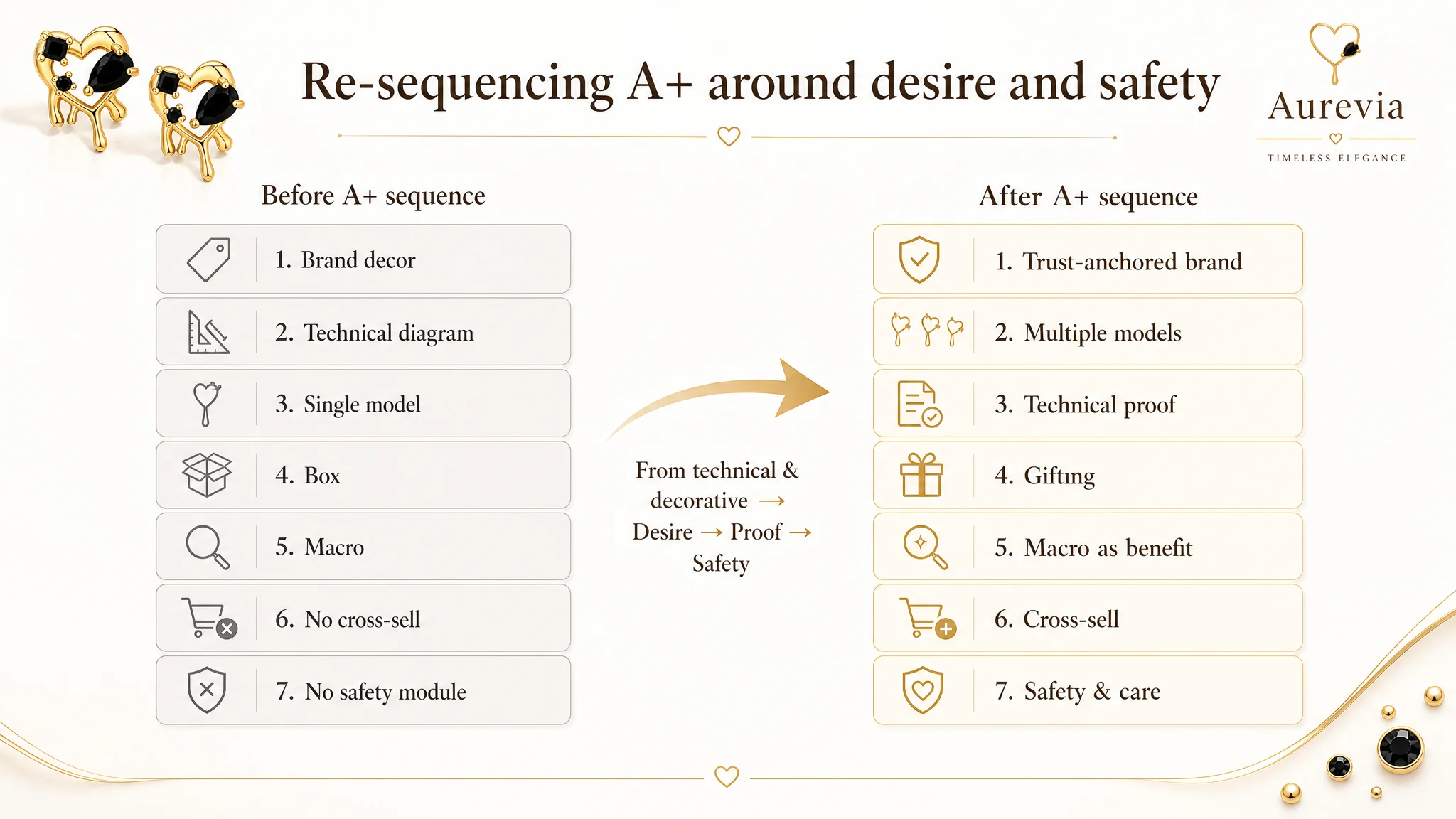
DeepBI recommended a re‑order and expansion:
1. Module 1 – Trust‑Anchored Brand Intro
- Still visually on‑brand, but explicitly states: durable, fade‑resistant, hypoallergenic, suitable for daily wear and gifting.
1. Module 2 – Desire: Multiple Model Angles
- Front, side, different hair styles and skin tones to answer “how will this look on me?”
- Emphasize elegance and versatility.
1. Module 3 – Technical Proof as Confirmation
- Move the engineering diagram after desire is built.
- Lead copy with material safety and comfort, then show size/structure.
1. Module 4 – Gifting Scenarios
- Make the box visual explicit: who to gift (mother, partner, friend), on which occasions, and why it’s a safe, meaningful choice.
1. Module 5 – Macro Detail as Benefit, Not Decoration
- Use macro to confirm claims: mirror surface, secure crystals, gold plating that resists fading.
1. Module 6 – Structured Cross‑Selling
- Introduce a comparison chart, not a random grid, outlining style differences, occasions, and materials across related designs.
- Keep focus on this product as the hero.
1. Module 7 – Material Safety & Care
- Dedicated section for hypoallergenic claims, nickel‑free reassurance, and realistic care instructions.
- This closes residual rational doubt and manages expectations.
“Before ads could work again, the page had to convert. That required moving from a ‘technical and decorative’ story to a ‘desire → proof → safety’ story.”
Why DeepBI Insisted on Fixing the Listing Before Scaling Ads
The key decision was prioritization.
DeepBI’s judgment was that continuing to tune ads first would only amplify the Listing’s misaligned logic:
- More clicks into a page that underplays safety and protection
- More traffic exposed to a trust story that starts too late
- Higher spend against a conversion ceiling
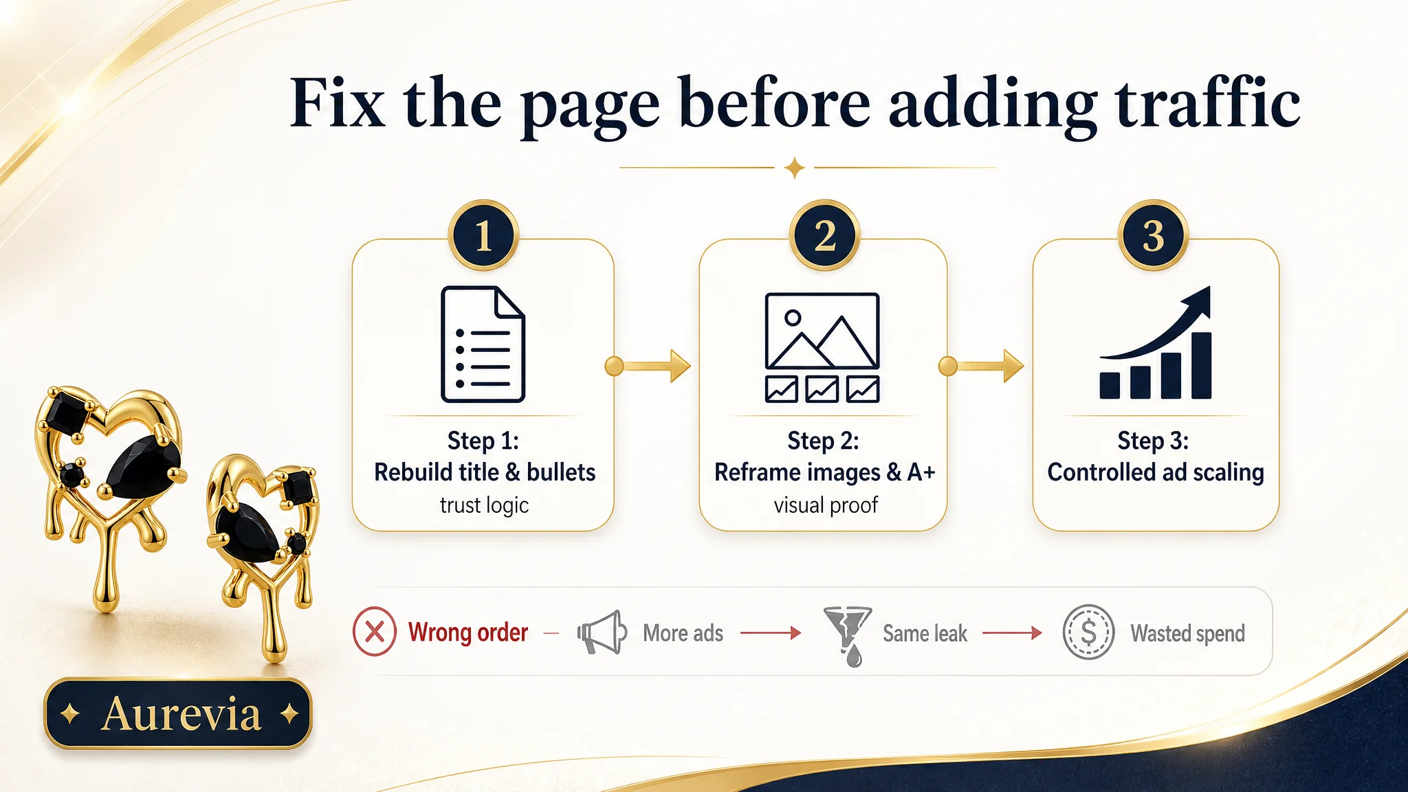
Instead, the sequence had to be:
1. Rebuild the title and bullets to align with Amazon jewelry decision logic: safety, comfort, fit, style, gifting, protection.
2. Reframe the image set and A+ modules to walk buyers through the same path visually.
3. Only after the Listing carried a coherent trust story, begin controlled ad optimization and scaling.
The biggest business risk at that stage was not “low traffic,” but unstable conversion under rising CPC. Addressing Listing conversion first reduced that risk and restored control.
How the Page’s Sales Logic Started to Recover
After re‑focusing on Listing conversion, several changes in operating state became possible:
- Ad traffic became more useful.
Each paid click now encountered clearer safety, material, and after‑sales assurances without having to dig deep into reviews.
- The Listing regained independent conversion capability.
Organic visitors had a more complete, low‑friction decision path, making the product less dependent on aggressive ad spend to move units.
- Traffic structure risk decreased.
With a stronger foundation, the seller could treat ads as a growth lever, not a crutch to offset a confusing or incomplete product page.
Even without quoting specific CVR or ACOS numbers, the qualitative shift was clear: the Listing began working with the ads instead of against them.
What This Case Changes in the Seller’s Understanding
For the customer team, the biggest shift was conceptual, not cosmetic:
- A higher Listing score is not the same as a finished conversion engine.
- Strong reviews and refined visuals can still hide a misordered trust story.
- Amazon ads can only scale profitably when the product page:
- Answers risk questions in the right order
- Makes safety and durability explicit
- Connects visuals and bullets into a single buying logic
They also saw that:
- Listing quality is not just about “better images.”
It’s about how title, main image, bullets, and A+ content work together to move a visitor from interest to comfort to purchase.
- Advertising does not only amplify advantages. It can also amplify existing defects.
Until the trust path is clear, every extra dollar in ads is at risk of being wasted.
What Other Amazon Sellers Can Take Away
If you are an Amazon seller seeing good reviews and “fine” Listing scores, but your ad spend feels increasingly hard to control, this case suggests a few questions:
- Does your title put the product form and core keyword where the buyer’s eye lands first?
- Do your bullets follow the buyer’s actual decision order: safety → fit → scenes → gifting → after‑sales?
- Do your images and A+ modules prove exactly what your bullets promise, in the same sequence?
- Is your most expensive ad click hitting a page that answers “is this safe, comfortable, durable, and protected?” in the first few seconds?
DeepBI’s work in this jewelry case was not about adding more features or more images. It was about seeing that the real bottleneck was Listing conversion capacity, not ad settings, and then rebuilding the page so that every paid visit finally had a fair chance to become an order.
For Amazon sellers, that is the critical judgment: before you push more traffic, decide whether your page truly deserves it.