
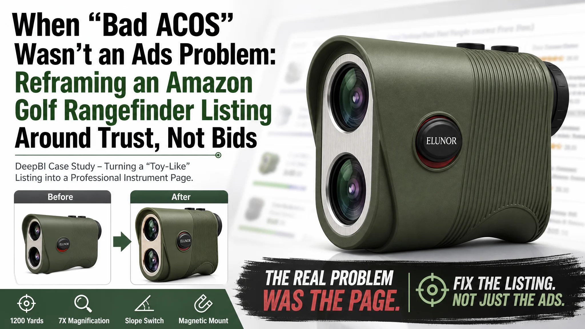
For this Amazon seller in the golf rangefinder category, the pressure looked familiar: ad costs on the US marketplace were climbing, impressions were not the issue, but orders were not following. The team’s first reaction was to treat it as a classic Amazon ads problem—tuning bids, restructuring campaigns, and chasing cheaper clicks.
Once we put their product page side by side with a leading competitor’s Amazon Listing, a different picture emerged. The ads were doing their job and bringing traffic; it was the Listing that could not convincingly convert golfers and hunters who landed on the page. The visuals felt closer to a toy than a precision instrument, the title under-leveraged critical search terms and scenarios, and early reviews were amplifying doubt instead of trust.
DeepBI’s diagnosis shifted the focus away from squeezing more efficiency out of the ads and toward rebuilding the product page’s conversion capacity: title logic, main-image system, A+ storytelling, and how all of that worked together with review signals. The outcome was not a flashy “creative refresh,” but a Listing that finally behaved like a high-precision tool in a high-intent Amazon search environment—making every advertising dollar more useful. Many Amazon sellers in technical or outdoor categories will recognize the same trap: blaming ACOS, when the real leak is a page that doesn’t look like it deserves the click or the price.
The Amazon Problem the Seller Thought They Had
On paper, this rangefinder had plenty going for it on Amazon US:
- Competitive feature set (slope, 1200 yards, 7X magnification, magnetic mount, USB‑C rechargeable)
- A fairly complete A+ section with multiple modules and scenes
- Bullet points that were more detailed than at least one key competitor
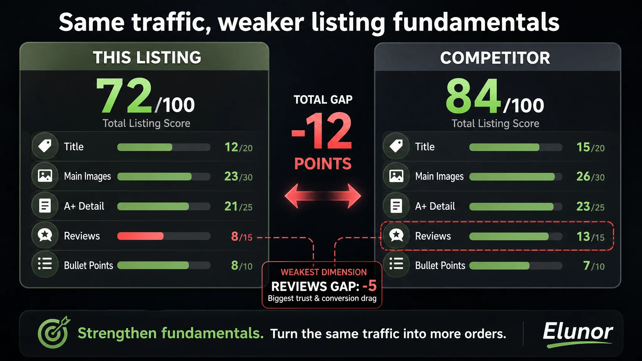
Yet, the competitive scoring DeepBI ran told a more uncomfortable story:
- Overall Listing score: 72/100 vs. competitor 84/100 (‑12 gap)
- Title: 12 vs. 15
- Main images: 23 vs. 26
- A+ detail: 21 vs. 23
- Reviews: 8 vs. 13 (biggest gap)
- Only the bullet points slightly outperformed (8 vs. 7)
At the same time, frontline signals from the ad account were exactly what many Amazon sellers see in this stage:
- Ads were getting traffic
- ACOS was hard to control
- Pushing harder on ads did not produce a proportional increase in orders
The seller’s internal conclusion: “Our ads structure and creatives must be wrong. We need to optimize keywords and bids harder.”
They were trapped in the familiar loop: when orders lag and ACOS rises, assume it’s a traffic problem.
“The real problem was not that ads failed to bring traffic. It was that the page could not convert the traffic.”
What the Listing Data Actually Showed
When we mapped the Listing against a category-leading golf & hunting rangefinder on Amazon, a single root constraint stood out:
Core bottleneck: The Amazon product page did not project professional, trustworthy “instrument” value. It projected a low-end gadget.
That weakness showed up across multiple dimensions.
Title: Under-claiming the Real Power of the Product
On Amazon, the title is not just for SEO; it’s also a micro-pitch in search results and a trust anchor on the detail page.
Compared to the competitor, this title was structurally weaker in three key ways:
- Scenario coverage was too narrow
- The competitor clearly framed the product as “Golf & Hunting”, capturing both golfers and outdoor/hunting searches.
- This Listing focused only on golf, leaving hunting and broader outdoor queries under-served, despite the device actually supporting those use cases.
- Critical value signals were misplaced or missing
- “1200 Yards” appeared, but was not treated as a top-tier selling point near the product concept.
- The competitor locked “1200 Yards” right next to the rangefinder type, reinforcing a high-end capability immediately.
- The competitor explicitly called out “IPX4 Waterproof” as a standard, testable durability attribute. This Listing mentioned durability but did not put that kind of concrete standard in the title, losing trust weight.
- Magnetic value was not “read” as a feature at a glance
- Competitor: clearly surfaced “Magnetic Strap” as a standalone, scannable benefit.
- This Listing hid the magnet inside a less immediate “Integrated Magnet” phrase, which feels more like internal engineering language than a user benefit.
These are small textual decisions, but on Amazon search pages they directly affect both CTR and the mental frame a shopper brings into the detail page.
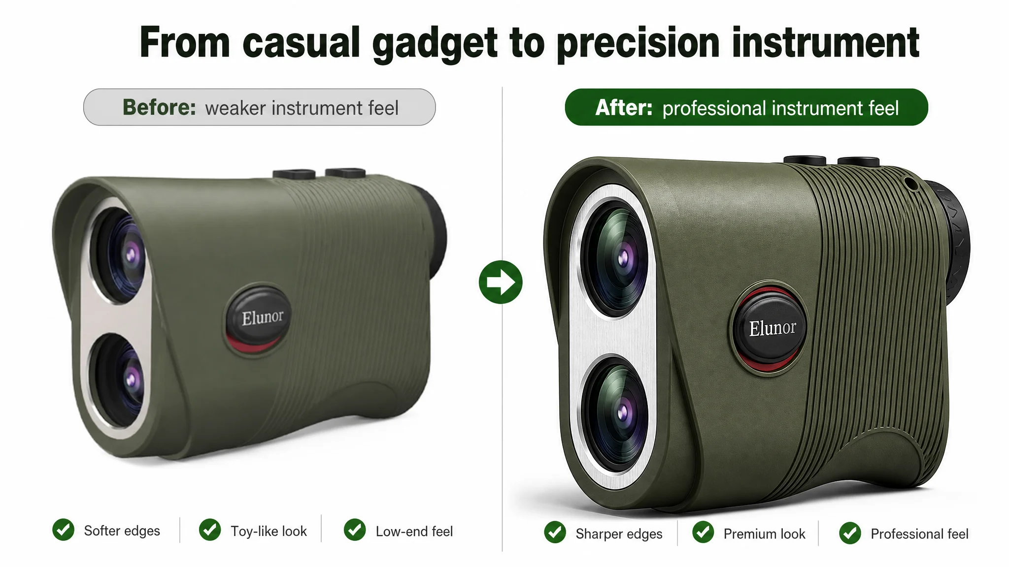
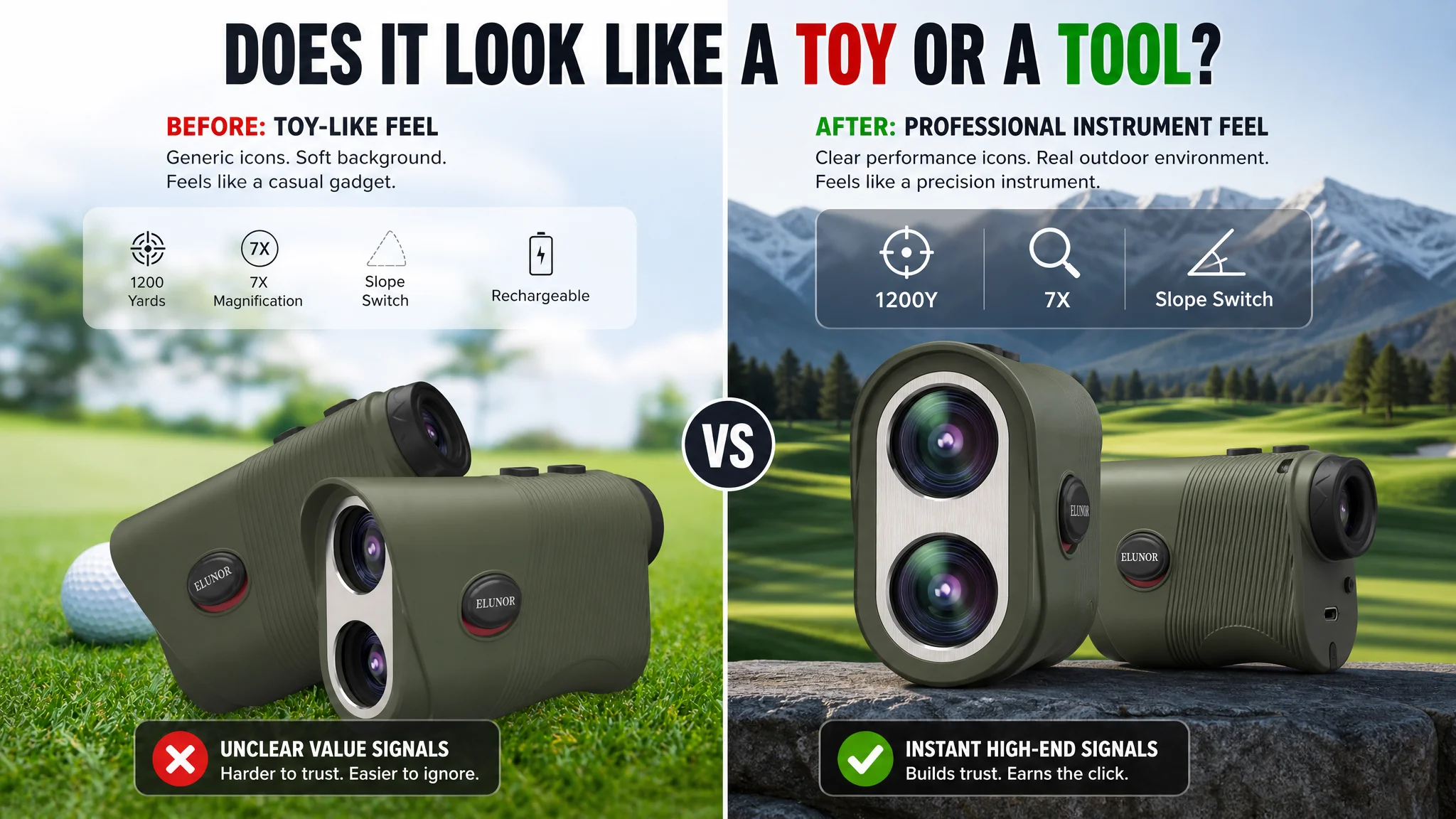
Main Images: A Professional Instrument That Looked Like a Toy
The main-image carousel was where the most damaging gap appeared.
From DeepBI’s multi-modal visual diagnosis:
1. Primary image lacked industrial, precision feel
In a category where buyers imagine a robust, accurate optical tool, the hero shot looked light and slightly “plastic.”
- Lighting didn’t carve out sharp edges or texture.
- The composition didn’t command presence.
- Overall, it undercut the price point and made the device feel like a casual gadget.
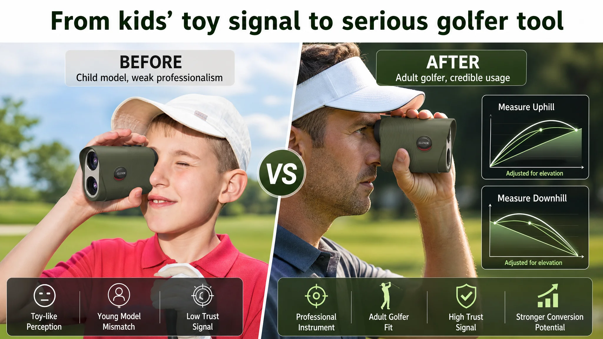
1. Model and audience mismatch
One of the key images used a child as the model. For a golf rangefinder that claims slope technology and long-range precision, this sends the wrong signal:
- Serious golfers and hunters do not want a “toy for kids.”
- It dilutes perceived professionalism and makes high-intent buyers hesitate.
1. Function visuals were noisy, not persuasive
- Slope compensation visuals muddled uphill/downhill logic instead of clarifying it.
- There was no crisp “before/after” or “with vs. without” demonstration.
- The competitor’s images used clear “VS” comparisons and numeric examples (e.g., 18→65M) that visually proved the functionality.
1. Hidden features stayed hidden
- This product supports vibration flag lock and a physical slope switch—high-value features in golf.
- The competitor visualized these with lock-on reticles and vibration waves; this Listing barely showed them.
- Features that were big differentiators in copy became almost invisible in images.
In search results, shoppers see titles and main images first. This Listing was “asking ads to fix” a problem that lived in those first two seconds of evaluation.
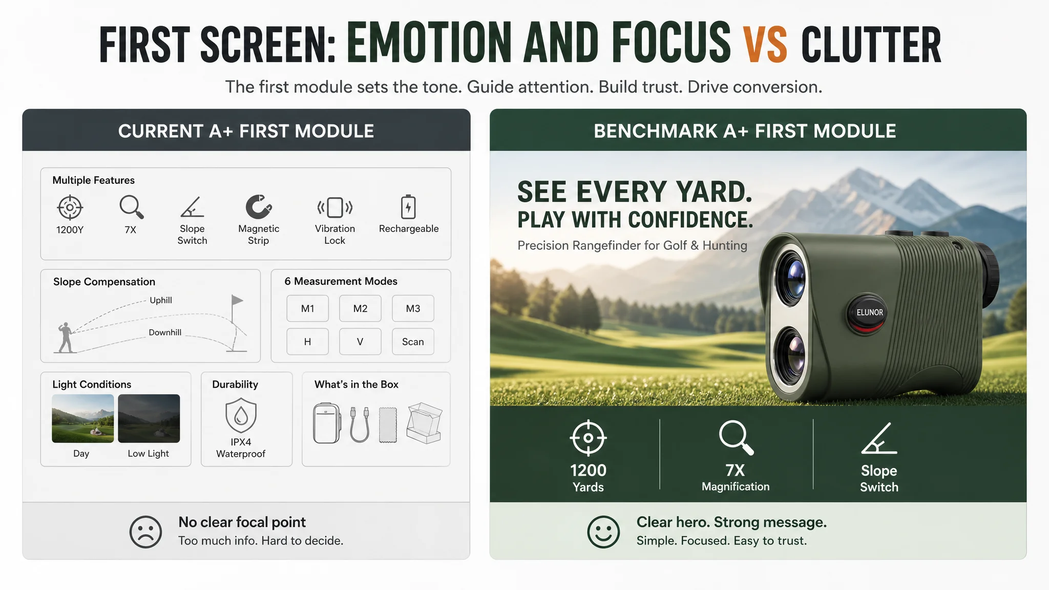
A+ Content: Plenty of Modules, Weak Story Logic
The seller’s A+ detail page wasn’t empty; in fact, it had a long sequence of modules:
- Core selling-point image
- Multi-mode display
- Slope-compensation schematic
- Performance scenes
- Feature triptych
- Light-condition comparison
- “Unboxing surprise”
- Harsh-environment test
- Packing list
On paper, that looks thorough. But versus the competitor’s A+ layout, the problem wasn’t quantity—it was logic and emotional entry.
Where the Competitor’s A+ Pulled Ahead
- First screen emotional hook vs. information dump
- Competitor: “NEXT LEVEL” style slogan + high-quality golf-course morning scene. The message: “This is a serious, premium tool for golfers who care.”
- This Listing: a visually busy first module with many small info elements, but no clear focal point or emotional hook. Buyers have to work to understand.
- Technical proof vs. abstract diagrams
- Competitor: “Smart Slope Compensation” shown with real-course terrain and specific numeric examples (e.g., actual distance vs. adjusted distance).
- This Listing: theoretical slope diagrams without a direct tie to real shots or distance decisions. The user cannot instantly see how the feature changes their shot.
- Scenario expansion vs. scenario confusion
- Competitor: clearly separated modules for hunt mode, unit freedom (yards/meters), and multi-environment usage, logically broadening use cases beyond golf.
- This Listing: referenced “M3” mode using a lion graphic—visually dramatic but not a believable hunting use scenario. It felt more like stock imagery than real outdoor usage, undermining trust.
A+ modules are supposed to turn curiosity into conviction. Here, they were working hard, but not in the right direction.
Reviews: The Silent Conversion Killer
The review dimension was where the numbers started to tell a story shoppers feel but rarely articulate.
- This Listing:
- Rating: 4.2 stars
- Review count: 12
- First-page reviews: 3
- Visible negative review rate on front page: ~33%
- Competitor Listing:
- Rating: 4.7 stars
- Review count: 26
- First-page reviews: 4
- First-page negative reviews: 0%
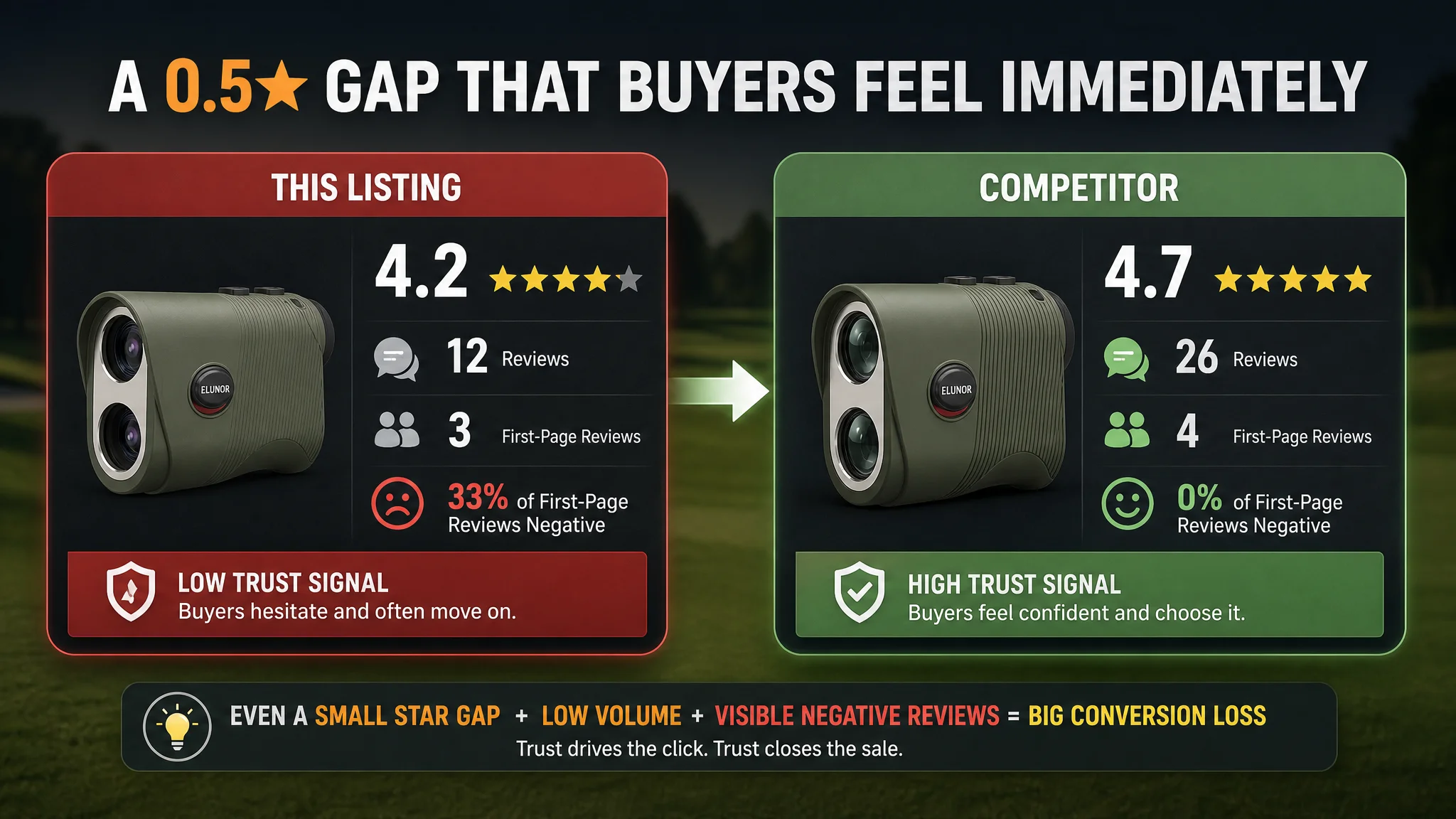
On Amazon, review panels work like a “trust meter” overlaying everything else. Even if bullet points and A+ look good, a 0.5‑star gap plus a much lower review volume and an obvious negative review on first view will push a buyer to click back and choose the safer option.
DeepBI’s judgment: reviews were not yet a volume that could carry the Listing; the page visuals and messaging needed to carry more of the trust burden instead of relying on rating alone.
Why Bidding Harder Would Not Fix This Listing
At this point, the decision path became clear.
Symptom: High pressure on ACOS, weak response in orders despite traffic.
Seller’s original plan:
- Push more ad tests
- Adjust bids and match types
- Try new audiences and placements
DeepBI’s call: If the Listing’s conversion engine is underbuilt, pumping more traffic into it is like pushing more water into a leaky pipe.
“Advertising does not only amplify advantages. It can also amplify a page’s existing defects.”
In this case:
- Title did not fully signal value or context (“Golf & Hunting”, “IPX4 Waterproof”, strong 1200Y callout).
- Main images did not visually position the product as a professional instrument.
- A+ was heavy on modules but light on emotionally resonant, decision-driving logic.
- Review layer was too fragile to offset weak visuals.
Continuing to lead with ads would have:
- Driven more shoppers into a page that looked a step below the category benchmark.
- Increased spend while the conversion rate stayed capped by trust and positioning.
- Made ACOS look like an ad problem, when it was really a page-conversion problem.
That’s why DeepBI pushed for Listing-first optimization before any serious scaling of ad spend.
How DeepBI Reframed the Optimization: From Ads to Page Conversion
The reframed question was:
“What has to change on this Amazon product page so that ad traffic has a real chance to convert at the benchmark level?”
From the scoring and visual analysis, three high-priority tracks emerged.
1. Re-architecting the Title Around Search and Scenarios
DeepBI’s recommended title:
Slope Golf Rangefinder, 1200 Yards Laser Range Finder for Golf & Hunting, 7X Magnification, Flag Pole Locking Vibration, Integrated Magnet, IPX4 Waterproof, Rechargeable, Golf Accessories for Men
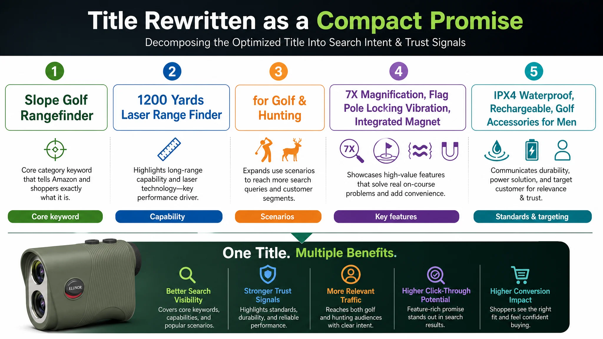
The logic behind this reordering:
- Lead with the core search term
- “Slope Golf Rangefinder” at the very front to maximize relevance for the highest-intent core query.
- “Laser Range Finder” added as a variant to capture semantic variants without bloating.
- Explicit scenario expansion
- “for Golf & Hunting” added to open the door to hunting and broader outdoor searches, aligning with what the competitor was doing and what the product can genuinely support.
- Pull crucial trust attributes into the title line
- “1200 Yards” pulled close to the product type—reading as a capability, not a footnote.
- “IPX4 Waterproof” surfaced as a specific protection standard.
- “Flag Pole Locking Vibration” and “Integrated Magnet” clearly stated as discrete, high-value benefits.
This wasn’t about stuffing keywords; it was about making the first line of the Listing read like a compact, high-relevance promise to both golfers and hunters.
2. Turning Bullet Points into a Buying Logic, Not a Feature List
The original bullet points were not weak in content; they simply lacked a crisp structure that mapped directly to the way shoppers evaluate a precision tool.
DeepBI kept the real technical strengths, but reorganized them into a coherent decision flow.
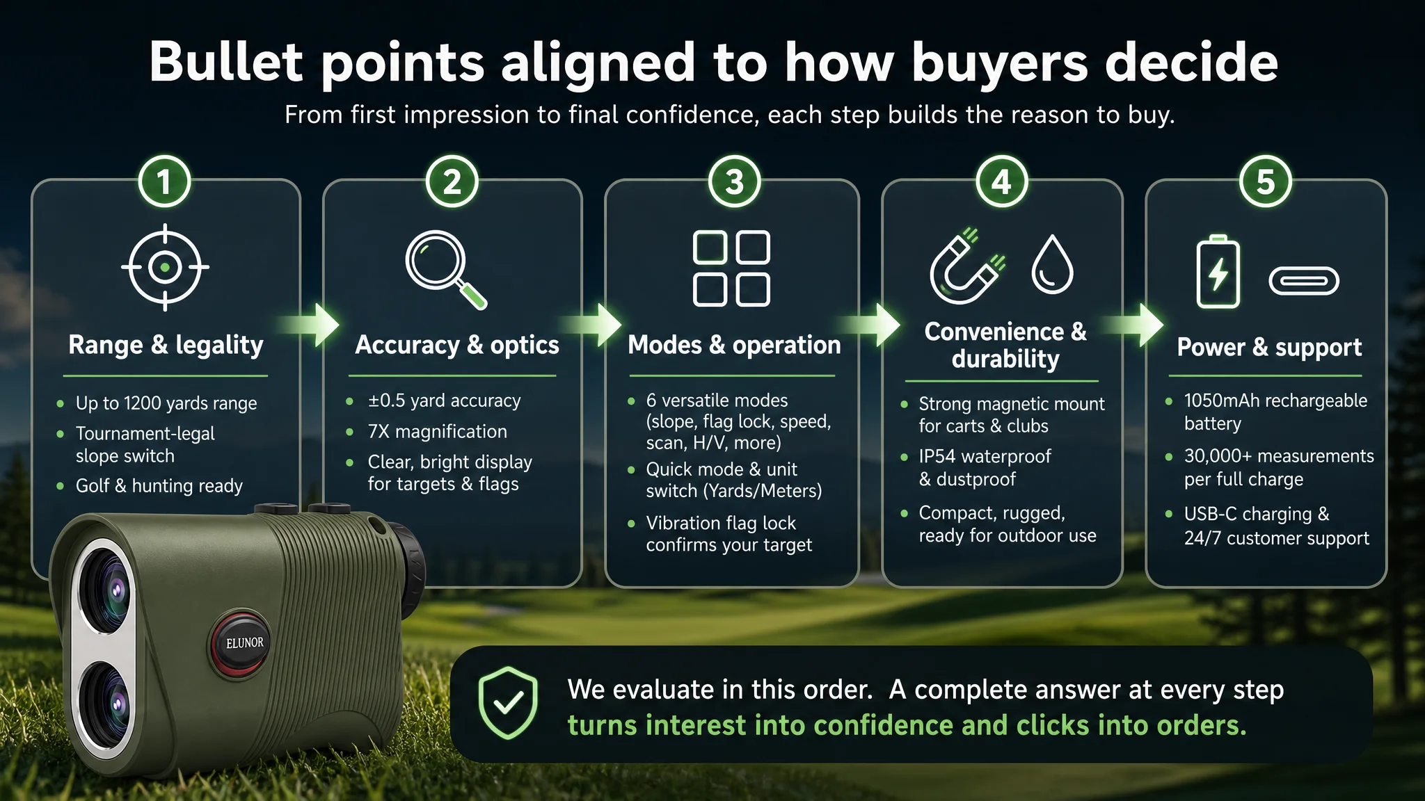
BP #1 – Lead with range + precision + legality
- Focus: “High-Precision & 1200Y Long Range”
- Clarify core parameters (1200 yards, 7X) and link them to real scenarios—golf, hunting, outdoor.
- Explicitly mention physical slope switch for tournament legality.
BP #2 – Proof of accuracy & optics
- Focus: “Unmatched Accuracy & Optical Clarity”
- Call out ±0.5 yard accuracy, 7X magnification, adjustable eyepiece.
- Frame it in terms of identifying flags and hazards, not abstract specs.
BP #3 – Mode logic, simplified
- Focus: “6 Versatile Modes with Easy Operation”
- Name key modes (Slope Compensation, Flag Lock with vibration, speed measurement, continuous scanning).
- Emphasize easy mode switching and units toggle (Y/M) instead of burying the shopper in mode names.
BP #4 – Convenience and durability in real use
- Focus: “Strong Magnetic Mount & IP54 Waterproof”
- Show how the magnet solves a real pain: not digging around in the bag.
- Reinforce serious outdoor capability with a clear IP rating.
BP #5 – Battery anxiety removed + support promise
- Focus: “USB-C Rechargeable & Long-Lasting Battery”
- Quantify: 1050mAh battery, over 30,000 measurements on a single charge.
- Add auto-power-off and mention 24/7 professional support in a calm, credible way.
Instead of five disconnected specs, the bullet section becomes a short narrative: What it does → How reliably it does it → How easy it is to use and keep powered → That you’re covered if something goes wrong.
3. Rebuilding Images and A+ as a Professional Story, Not a Poster Wall
The main visual direction DeepBI recommended to the seller was simple but demanding:
Move the visual identity from “cheap toy feel” to “professional measuring instrument feel.”
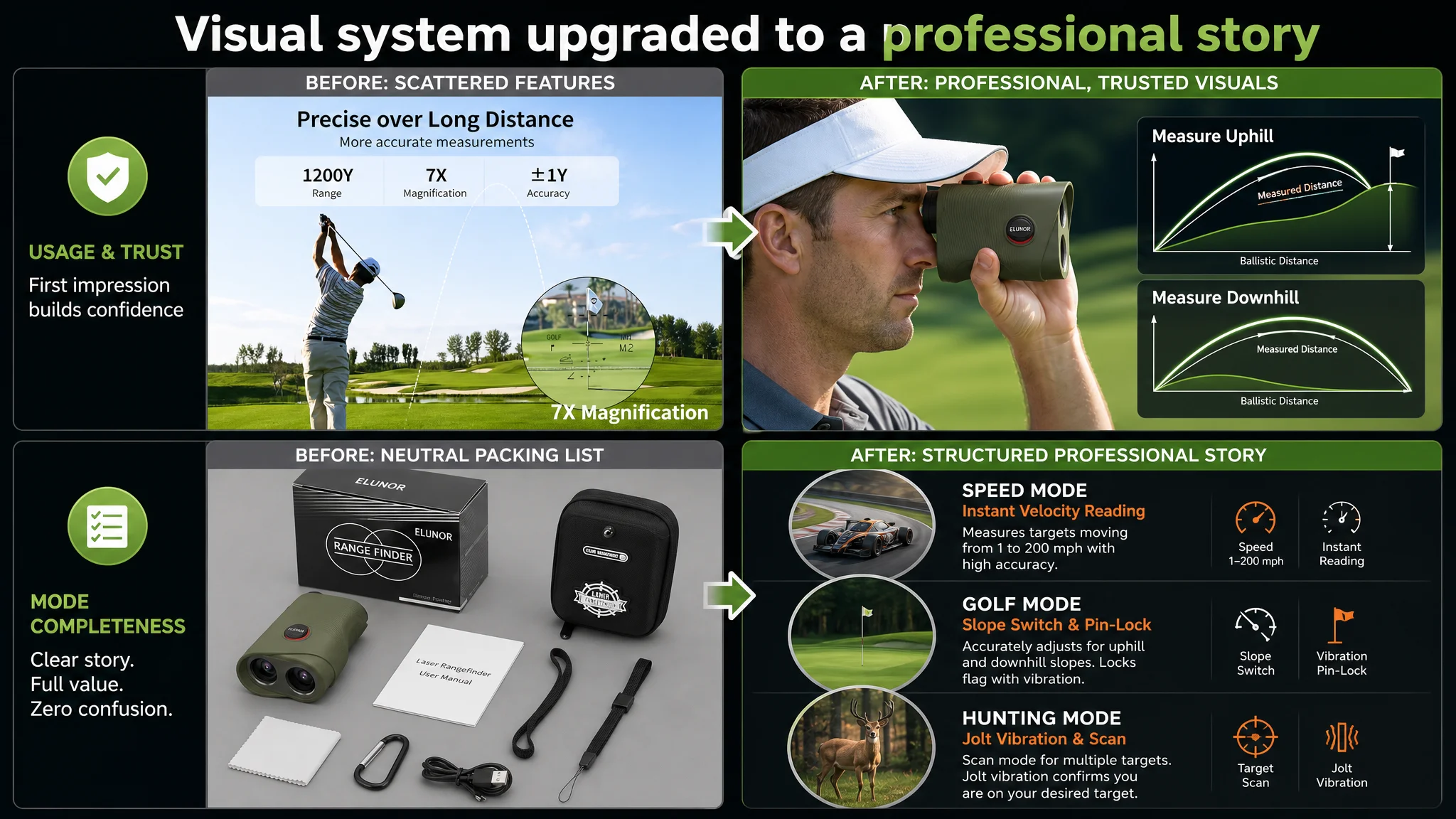
Concretely, that meant:
Main Image #1 – Industrial hero shot
- Product centered, ~70% of frame, 45° angle.
- High-contrast, cold light to carve out edges, texture, and matte green/black surfaces.
- Clean white background, no distractions.
- Shadows that feel engineered, not casual—communicating durability and precision.
Main Image #2 – Dual-product + high-altitude scenario
- Two units: one front-facing, one 45° behind, slight depth-of-field blur.
- Background: blurred golf course with snow-capped mountains, early-morning cool light.
- Overlay: minimalist icons for 1200Y, 7X, Slope Switch in a frosted strip—immediate read of core specs.
Main Image #3 – Real golfer using the device + slope visualization
- Adult golfer in professional attire, mid-shot using the rangefinder.
- Background: real green.
- Right-hand side: two small panels illustrating uphill and downhill trajectories, with clean, glowing lines and short text—“Measure Uphill” / “Measure Downhill.”
Main Image #4 – Flag lock and vibration made visible
- Left: inside-the-lens view with 7X magnification, flag in center, with lock-on effect and green circle.
- Right: close-up of the device in hand with subtle vibration ripples around it.
- Text: “Vibration-Locked Flagpole.”
Main Image #5 – Modes as structured use cases
- Vertical triptych: circular windows for speed mode (car), golf mode (flag), hunting mode (deer).
- Dark grey textured background; white and orange text highlighting “3 Precision Modes.”
On the A+ side, DeepBI’s recommendations followed a similar logic:
1. Open with a professional cover image
- 45° product angle in soft morning light on a real green.
- Left-side icon group: 1200Y, 7X, slope, magnetic mount.
- Mood: “This is a serious optical instrument for serious players.”
1. Simulated eyepiece view module
- Split: M1 standard mode vs. M2 slope mode, both in circular “viewfinder” masks.
- Clear reticle and distance readouts so shoppers can “feel” the usage.
1. Slope-compensation logic visualized with terrain
- Golfer on undulating ground on the left; trajectory diagram on the right.
- Distinguish actual vs. adjusted distance in intuitive colors.
1. Magnetic mount in actual golf-cart environment
- Device attached to a real cart pillar, not an icon.
- Composition that makes “grab-and-go” feel effortless and natural.
1. Battery and USB‑C close-up with quantified data
- Macro shot of USB‑C port; “30,000 measurements” as a clear overlay.
- Subtle glowing indicator light to hint at modern electronics, not legacy gear.
1. Dedicated hunting/outdoor module
- Viewfinder locking onto a deer in a forest environment, “M3 Speed Mode” UI visible.
- Warmer forest light to contrast the golf modules and show true multi-scenario capability.
1. Orderly packing list and gift perception
- Top-down, neatly arranged: device, hard case, USB‑C cable, lanyard, cloth, manual.
- Clean grey background and soft overhead light, making it feel like a deliberate, giftable package.
The point was not to make “prettier visuals,” but to rebuild the entire visual persuasion chain:
- Professional first impression
- Credible technical proof
- Realistic use scenarios (golf + hunting)
- Clear convenience and durability
- Strong “what you get” perception
What Changed Once the Page Stopped Wasting Traffic
This case did not hinge on a spectacular before/after metric spike being quoted. The seller’s transformation was more fundamental:
In the Listing’s operating state
- The page moved closer to category benchmark quality (from 72/100 toward the 80s range).
- The visual and textual story finally matched the product’s true capabilities.
- Trust no longer relied purely on a small, vulnerable review set.
In traffic economics
- Paid clicks became more valuable because the page deserved the traffic.
- The path was cleared for ACOS to start moving down—not because bids were “magically optimized,” but because conversion could now realistically improve.
- The groundwork was laid for organic ranking to become more resilient, as better conversion on existing traffic is one of the few levers that supports Amazon’s ranking algorithm.
In the seller’s understanding
- Ads were reframed as an amplifier, not a repair tool for weak pages.
- Title, main image, bullet points, A+, and reviews were seen as one conversion system, not separate checkboxes.
- Before dialing up spend, the team began asking:
“If we double the traffic to this page today, does the Listing honestly look like something a skeptical buyer would choose over the benchmark?”
For this rangefinder, the answer had initially been “no.” Only after the Amazon Listing itself was rebuilt to communicate professional precision, believable multi-scenario usage, and clear durability did it make sense to lean back into aggressive Amazon ads.
What Other Amazon Sellers Can Take from This Case
If you sell technical, outdoor, or precision tools on Amazon and are seeing:
- Rising ACOS
- Flat or weak conversion despite traffic
- A sense that “ads used to work better than they do now”
it may not be a bidding problem.
This case shows how:
- A 0.5-star rating gap plus weak visuals can erode trust far faster than ad testing can fix it.
- Titles that under-claim scenarios and standards (e.g., ignoring hunting, not naming waterproof ratings) quietly reduce both reach and persuasion.
- Main images that feel like toys push serious buyers back to the search results, no matter how strong your spec sheet is.
DeepBI’s strength in this case was not generating prettier assets; it was judging that the Listing’s conversion capacity, not the ad account, was the real constraint—and then translating that judgment into specific, Amazon-native changes in title hierarchy, main-image logic, and A+ storytelling.
Before the next round of ad experiments, it’s worth asking: is your Amazon product page in a state where more traffic is an investment—or just more evidence that the page isn’t yet good enough to win?