
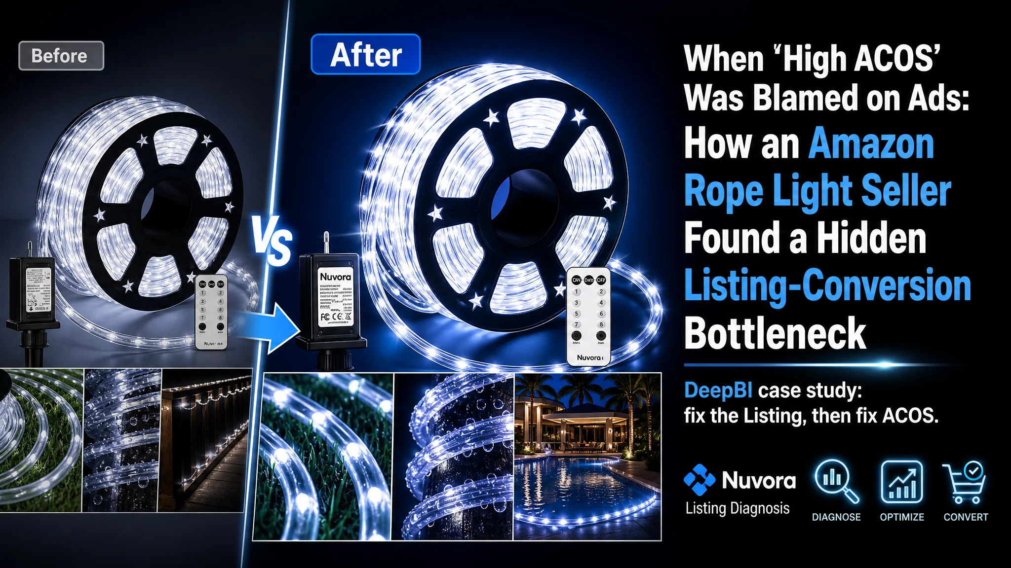
For this Amazon seller in the outdoor LED rope light category, the initial pressure came from advertising: ACOS was stubbornly high and every attempt to “optimize” Amazon ads felt less effective than the last. The team’s instinct was to keep tweaking bids, keywords, and campaign structure, assuming the problem lived entirely inside the ad console.
Once we put the product page under DeepBI’s Listing diagnosis, a different picture emerged. The ads were bringing traffic, but the Amazon Listing itself was not converting at the level it should for this category. Against a benchmark competitor, the page looked “good enough” on the surface, yet missed several critical trust and decision elements that directly shape CVR.
The turning point was reframing the issue: this was not a media-buying failure, but a Listing-conversion capacity problem. We shifted focus from squeezing more efficiency out of the ads to rebuilding the title logic, main-image click drivers, bullet-point structure, and A+ trust story so that every paid click had a real chance to convert.
For other Amazon sellers, this case is a reminder: when ACOS refuses to move, you may not need “better ads” first. You may need a product page that can actually earn the order your ad just paid for.
Amazon Ads Were Not Failing. The Listing Was Consuming the Traffic.
From the seller’s perspective, the situation looked familiar:
- Traffic was not the main problem; they were willing to spend on Amazon ads.
- Orders, however, were not catching up with the ad spend.
- ACOS was hard to control, and past ad-optimization playbooks were delivering weaker results.
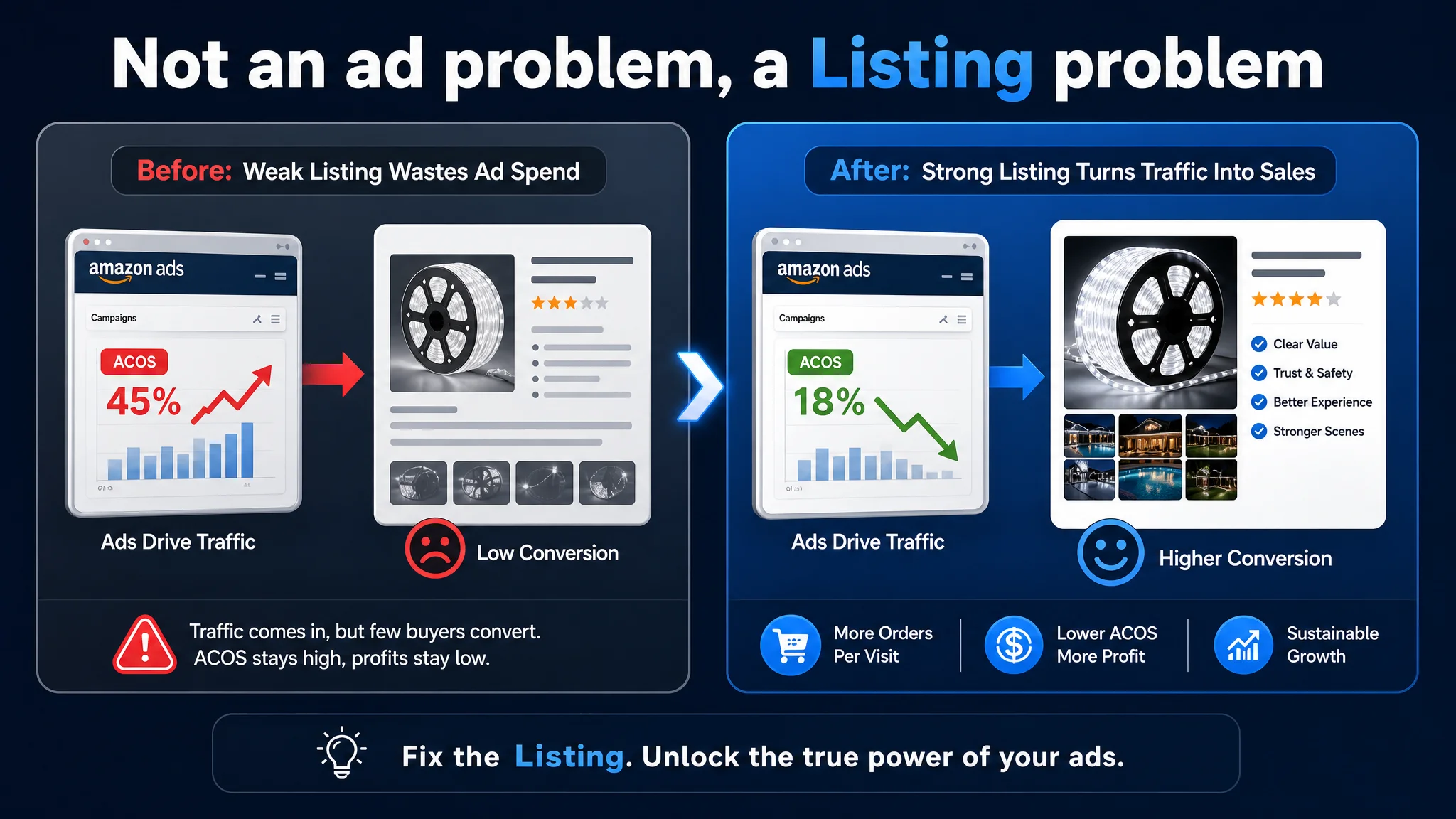
The natural conclusion internally: “Keyword structure needs more refinement.” “Bids are not precise enough.” “Maybe we just need more reviews.”
The ad console became the main battlefield. New campaigns were created, bids were shifted, negatives were added. But the core business tension did not change: more spend did not reliably translate into more profit.
“The real problem was not that ads failed to bring traffic. It was that the page could not convert the traffic.”
When we ran DeepBI’s Listing scoring and benchmark comparison, the core conflict became clear: the Listing’s conversion power was below where it needed to be for the amount of paid traffic being pushed to it.
The Real Constraint Was Listing Conversion Capacity
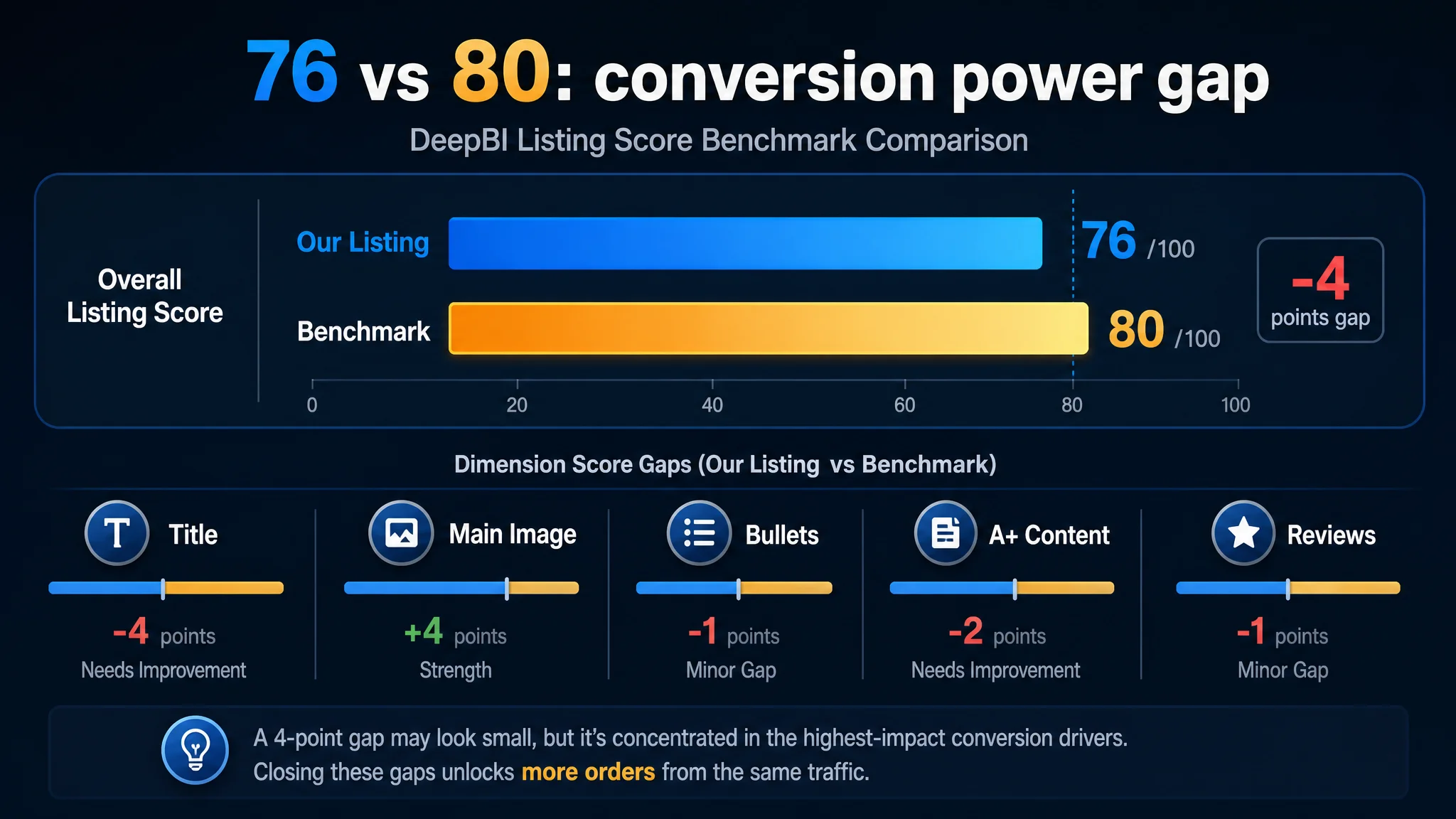
DeepBI’s Listing score put numbers behind what the seller had been “feeling” but not naming:
- Overall score: 76 vs a benchmark’s 80
- The gap was not huge in appearance, but it was concentrated in places that matter most for conversion.
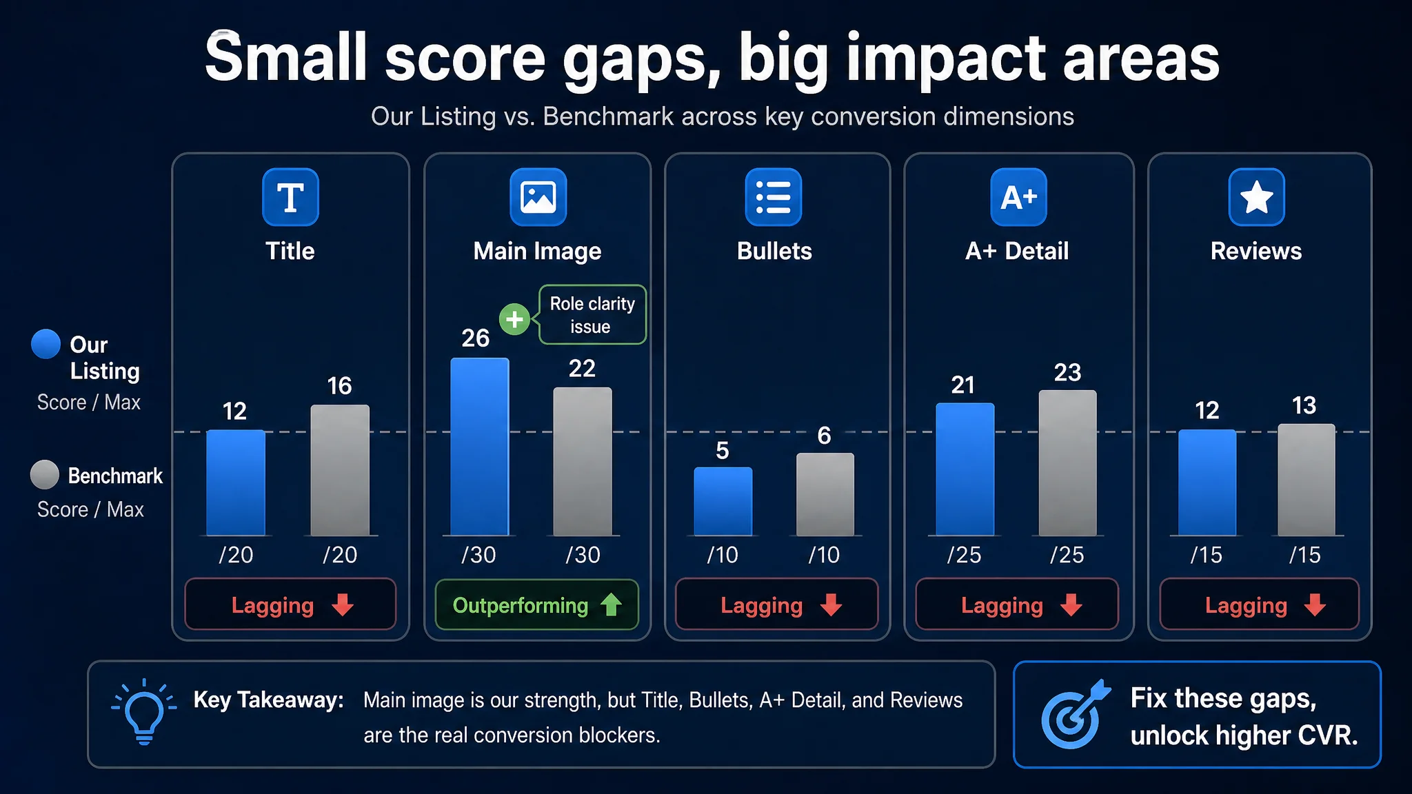
Where the Listing lagged the benchmark
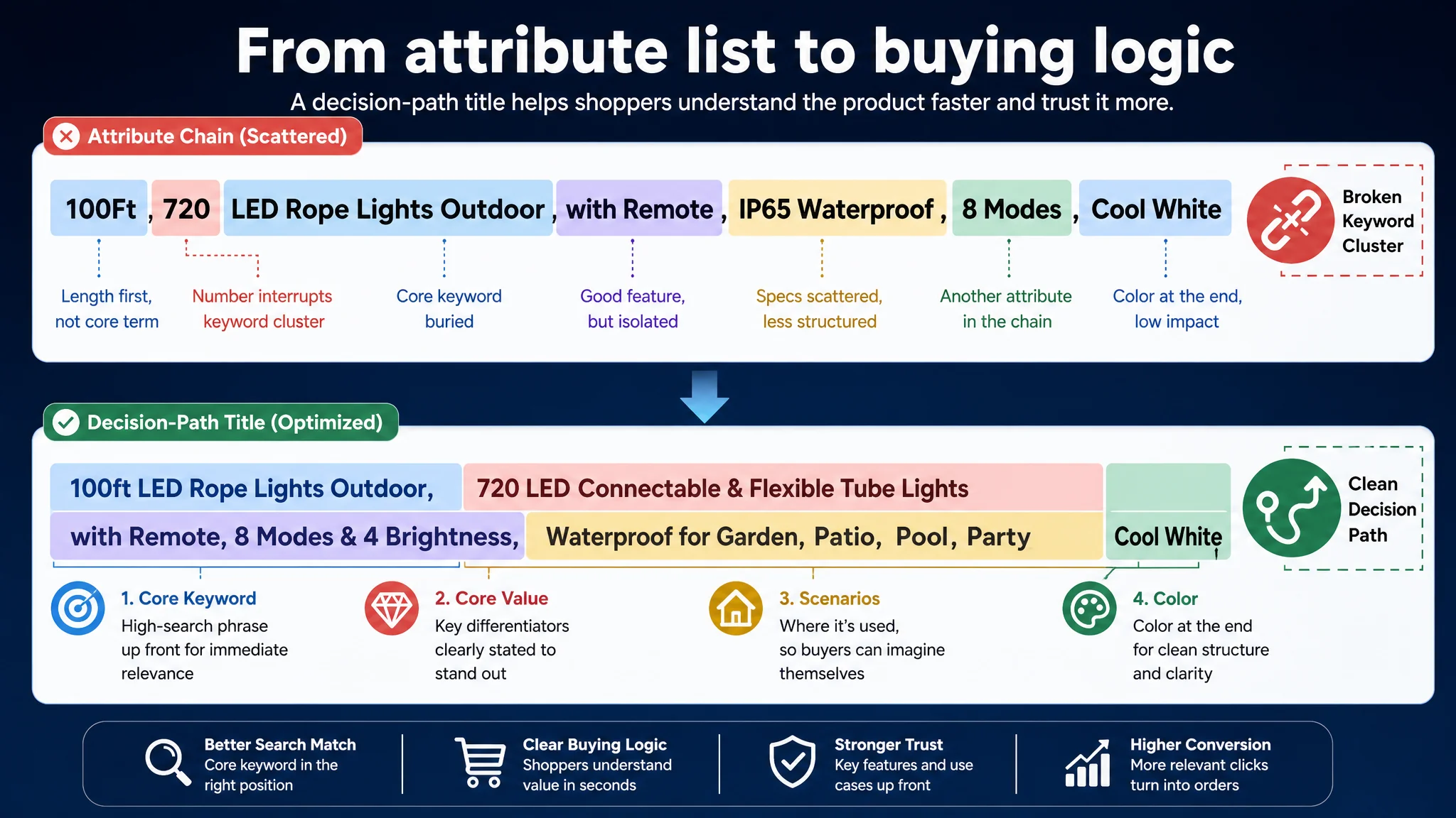
Title (12 vs 16 / 20) The benchmark title followed a tight Amazon formula: “100ft LED Rope Lights Outdoor, 720 LED Connectable and Flexible Tube Lights…”
It did three things the target Listing did not:
1. Named the real product form clearly
The benchmark integrated “Connectable and Flexible Tube Lights” directly into the title, making the core product shape and differentiator explicit. The seller’s title stayed at “LED Rope Lights” with weaker functional framing.
1. Front-loaded the most valuable search phrase
The benchmark led with “100ft LED Rope Lights Outdoor” – a clean, high-volume phrase. The seller led with “100Ft 720 LED Rope Lights Outdoor”, inserting “720” before the core keyword cluster, slightly disrupting immediate search-term recognition.
1. Structured the information around a buying logic, not just attributes
The benchmark followed a clear pattern: Core keyword → core value (“connectable, flexible”) → scenarios → color. The seller’s “with Remote” was a good feature, but the whole title read more like concatenated attributes than a deliberate decision path.
Main images (26 vs 22 / 30) On paper, the seller even outscored the competitor here. In reality, the issue wasn’t “quality” in the narrow sense; it was role clarity.
- The hero image tried to do too much: product reel, remote, adapter, multiple scenes all in one frame.
The visual center was diluted.
- Critical constraint information like “cannot be cut” was not presented in a clear, professional, high-contrast way. This not only risks returns, it also undermines confidence at the moment of click.
- Safety and certification cues were visually weak, while category buyers (especially families and commercial buyers) often scan for these signals instantly.
The competitor, by contrast, used simpler but stronger light-output-first visuals and more disciplined information layering. Their main image made a simpler promise and delivered it clearly.
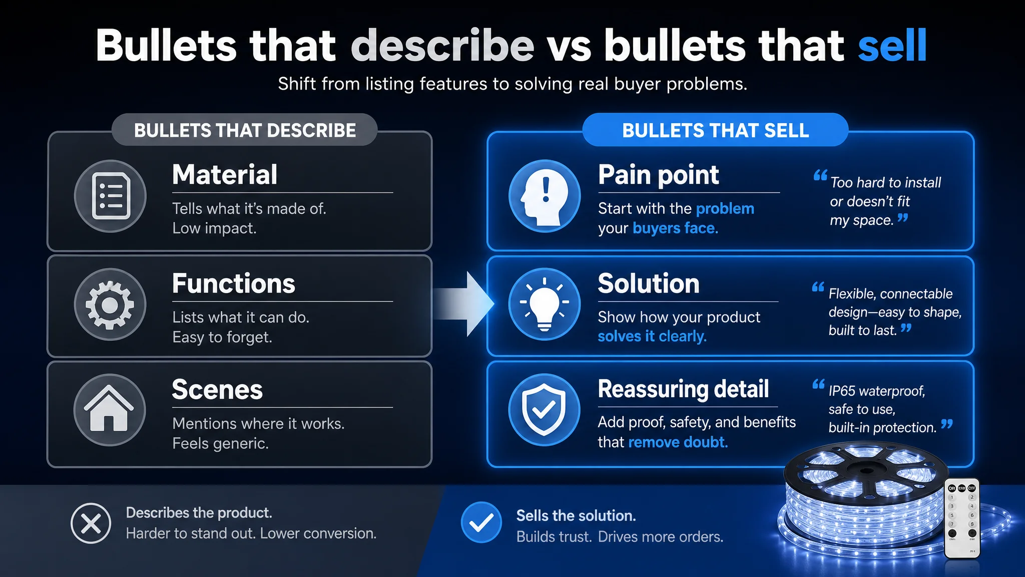
Bullet points (5 vs 6 / 10) The numerical gap looks small. But the content difference was strategic:
- Benchmark bullet #1: goes straight at a user pain point — flexible, connectable rope lights, up to 300 ft total.
- Seller bullet #1: mostly a material description.
Across all five bullets, the pattern repeated:
- Benchmark bullets: “problem in use → solution → reassuring detail”
- Seller bullets: “parameter → feature list → general scenario”
Information existed, but the buying logic was weaker.
A+ / detail content (21 vs 23 / 25) Both sides had rich A+ layouts, but with different intent:
- Seller A+: many scenario pictures, function icons, and DIY-friendly visuals.
- Benchmark A+:
- UL certification and other trust icons clearly visible.
- Real commercial-grade scenarios: hotel entrances, clubs, resort pools.
- Video content for unboxing, installation, and comparison.
In other words, the competitor was explicitly answering two core questions:
1. “Is this safe and professional enough for my use case?”
2. “Can I see it working in a serious, real environment like mine?”
The seller’s A+ made the product look fun and versatile, but less professionally trustworthy and less “premium” — a problem when the price point and use cases (pool, deck, yard, event) demand higher confidence.
Reviews (12 vs 13 / 15)
- Same rating: 4.4 stars vs 4.4 stars — good, healthy rating.
- Massive volume gap: 446 vs 3,336 reviews.
- Interestingly, the seller had a better front-page bad-review ratio (10% vs 23%), suggesting solid product and review management.
- Benchmark reviews were longer, more detailed, and frequently praised customer service.
From a buyer’s lens, this creates an asymmetric impression: the competitor looks battle-tested at scale, while the seller looks “good, but smaller and less proven.”
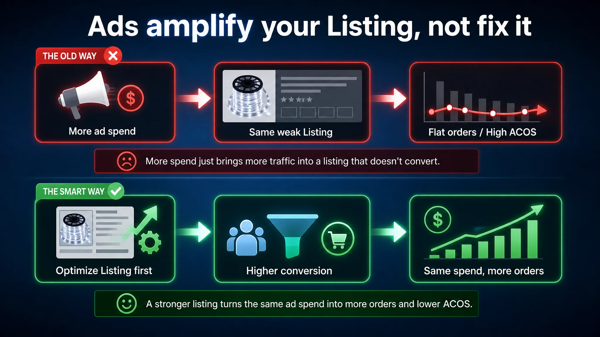
Why Pure Ad Optimization Could Not Solve This
If you only look at the Amazon ad console, all the signals point you toward:
- Restructuring campaigns
- Shifting keywords
- Tightening bids
- Testing new match types
All of that is necessary at some stage, but in this case it was not sufficient, because:
- The keyword coverage was not the primary problem. The product was discoverable.
- The Listing was under-leveraging traffic once it arrived. Every extra click bought with ads ran into the same page-level issues:
- Title not capturing the real form and differentiator.
- Main images not creating a strong, immediate reason to click or trust.
- Bullet points not guiding buyers through their actual decision journey.
- A+ content not fully addressing safety, certification, and high-end use cases.
Continuing to scale ads under these conditions would only:
“Amplify the Listing’s weaknesses at a higher cost.”
That is why ACOS felt “stuck”: the store was paying repeatedly to send traffic into a page that behaved like a leaky funnel.
How DeepBI Reframed the Problem
Using DeepBI’s Listing scoring and benchmark logic, we isolated one core issue:
The Listing’s conversion capacity was below the category’s competitive level, especially for higher-intent, higher-value buyers.
This reframing changed the priority stack:
- Not: “We need better ads to fix ACOS.”
- But: “We need a product page that can earn more orders per 100 visits before we buy more visits.”
Several diagnostic cues drove this judgment:
1. Title structure did not match the winning category pattern.
Benchmark: connectable, flexible tube lights; explicit high-value phrases front-loaded. Target: weaker differentiation and less clean keyword structure.
1. Main-image story was fragmented instead of focused.
The hero image tried to encode everything; the competitor made a precise, high-impact visual promise.
1. Bullet points lacked “pain point → resolution” logic.
They described; they did not really sell.
1. A+ missed critical trust triggers.
No UL or similar certification visual. No high-end, professional-looking environments. No video.
1. Review structure signaled “smaller, less proven” despite a solid rating.
The gap wasn’t product quality. It was scale and perceived reliability.
From a business-risk perspective, this meant:
- Pouring more money into ads would increase cost without structurally fixing why certain buyers were not converting.
- Organic growth would stay fragile because the page’s ability to convert organic traffic was also not fully competitive.
- The Listing was drifting toward an over-dependence on paid traffic, without the page strength to justify it.
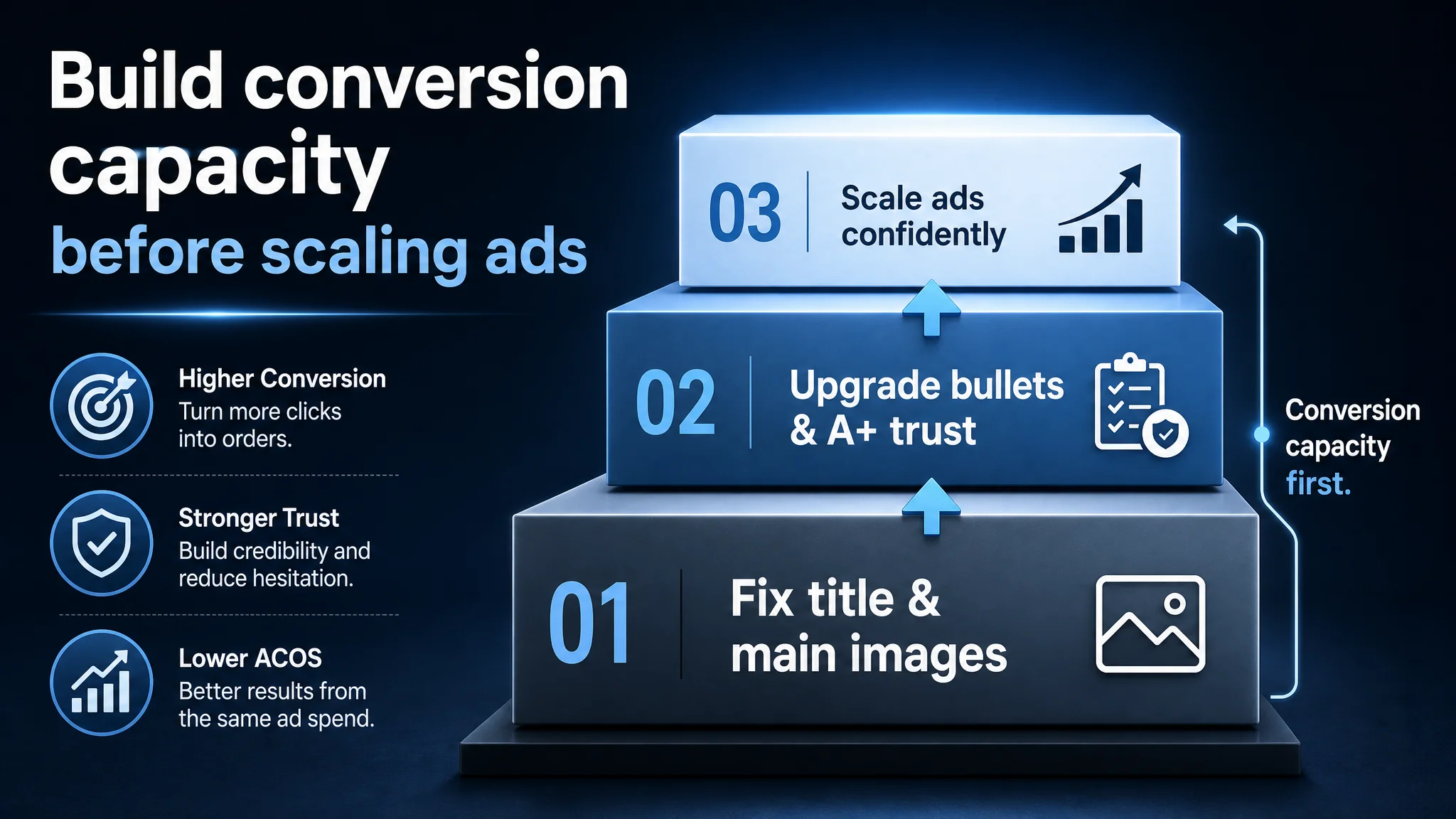
Why Listing Conversion Had to Be Repaired Before More Ads
The decision sequence we proposed was intentional:
1. Stabilize and strengthen the Listing’s conversion logic.
2. Then re-activate more aggressive ad optimization.
The reasoning:
- Every ad click is a cost. If the page is not close to benchmark conversion levels, that cost compounds.
- Amazon’s algorithm rewards conversion. A stronger Listing helps organic ranking and makes ads more efficient.
- High-value buyers are less forgiving. The customers responsible for the most profitable orders (large yards, commercial use, designers) are more sensitive to trust, safety, and professional presentation.
Fixing the Listing first meant:
- Improving the probability that each paid click would produce an order.
- Reducing wasted ad spend that was currently subsidizing page-level weaknesses.
- Setting a stronger base for future scaling — both organically and via ads.
How the Page Was Rebuilt Around a Stronger Decision Path
We did not treat this as “make it prettier.” The question was: What has to change on this Amazon product page so that the buyer’s decision path becomes smoother and ACOS can actually move?
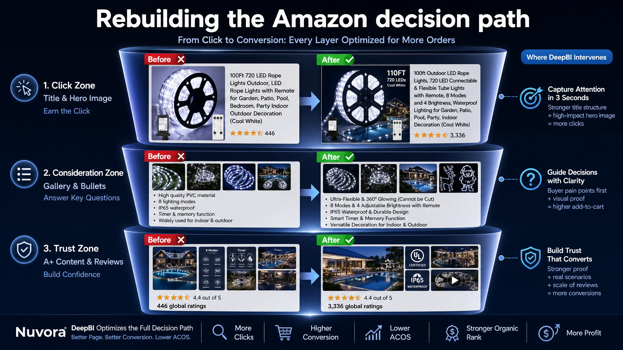
1. Re-architecting the Title: From Attribute List to Traffic Engine
Suggested title:
100ft Outdoor LED Rope Lights, 720 LED Connectable & Flexible Tube Lights with Remote, 8 Modes and 4 Brightness, Waterproof Lighting for Garden, Patio, Pool, Party, Indoor Decoration (Cool White)
Key shifts:
- Core keyword first: “Outdoor LED Rope Lights” moved forward to align with Amazon search behavior and ranking logic.
- Differentiators integrated, not tacked on: “Connectable & Flexible Tube Lights” imported from the winning pattern in the benchmark, but adapted to the real product position.
- Kept unique strengths visible: “with Remote, 8 Modes and 4 Brightness” — combining convenient control and superior adjustability.
- De-cluttered scenarios: Focused on key high-intent scenes (Garden, Patio, Pool, Party, Indoor Decoration) instead of overlong lists.
Result: a title that works both as traffic capture and first-layer selling message, instead of a noisy attribute chain.
2. Turning Main Images into Click and Trust Drivers
DeepBI’s visual diagnosis translated into concrete, execution-ready directions for each key image slot.
Hero image: reduce noise, increase impact
- Product reel centered, ~60% of the frame, 45° angle.
- Strong cool-white internal glow with subtle halo.
- Dark blue-to-black gradient background for contrast and “cold tech” feel.
- Bottom zone: a small but clear yard-application inset to connect with use.
- Clean white text on the side: “100FT 720 LEDs” (or actual spec) to anchor value.
Purpose: Win the click in search results by making the light output, length, and quality feel obvious in a single glance.
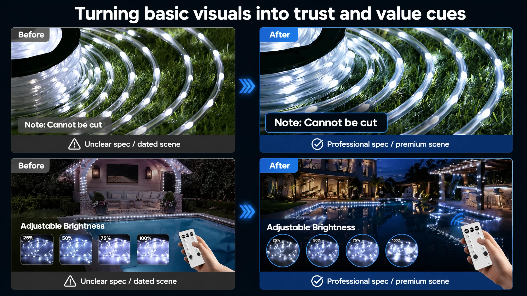
Constraint image: handle “cannot be cut” like a professional spec, not a warning
- Close-up of the tube arranged on a deep-green artificial grass background.
- 80% of frame in a neat spiral; bright, even glow.
- Semi-transparent grey label bottom-left: “Note: Cannot be cut”.
Purpose: Convert a potential negative into “this is a precise, well-specified product”, lowering return risk and expectation mismatch.
Waterproof image: make IP65 feel physical
- Lights wrapped around a dark, rain-wet tree trunk.
- Hard side light highlighting water droplets on the tube.
- Nighttime forest background with green bokeh.
- Side panel with “IP65 Waterproof” and short four-point protection icons.
Purpose: Give buyers felt confidence in outdoor durability, not just text claims.
Brightness and remote: connect control to visible change
- Modern villa pool at dusk, wide-angle.
- Lights lining pool edges and pergola roof.
- Hand holding the remote in the corner (15% of frame), visible buttons.
- Four circular windows showing 25%, 50%, 75%, 100% brightness levels.
Purpose: Show “I can shape the atmosphere precisely” — a strong differentiator vs standard rope lights.
DIY shapes: unify style and emphasize flexibility
- Four-grid composition, pure black background.
- Rope lights forming recognizable shapes (reindeer, Santa, sleigh, letters).
- Slight glow and motion blur to emphasize brightness and contour.
Purpose: Visual proof of flexibility and creativity, credible for both holiday and everyday use.
3. Restructuring Bullet Points Around Buyer Concerns
Instead of generic feature lists, each bullet was rebuilt as a mini decision module.
Bullet 1 – Material and flexibility, with a clear constraint
Ultra-Flexible & 360° Glowing Constructed with a premium, high-quality clear PVC tube, these LED rope lights are exceptionally flexible and can be easily shaped for any DIY decor. The transparent round tube ensures 360° full illumination, providing a brighter and more consistent glow for your space. (Note: These rope lights are designed as a single unit and cannot be connected or cut).
- Pain point: “Can I shape it? How does it look?”
- Answer: flexibility + full 360° glow.
- Constraint: stated professionally, reducing future disputes.
Bullet 2 – Modes and brightness: real differentiation vs benchmark
8 Modes & 4 Adjustable Brightness Customize your ambiance with 8 diverse lighting modes: Combination, Waves, Sequential, Slo-glo, Chasing/Flash, Slow Fade, Twinkle/Flash, and Steady-on. Unlike standard rope lights, ours feature 4 levels of adjustable brightness, all easily managed via a convenient remote control to create the perfect atmosphere for any occasion.
- Benchmark mentions 8 modes;
- Seller now clearly stakes out “4 brightness levels + remote” as a concrete advantage.
Bullet 3 – Waterproof and durability: risk reduction
IP65 Waterproof & Durable Design Engineered with IP65 waterproof protection, these outdoor rope lights are built to withstand rain and splashes, making them ideal for both indoor and outdoor use. The thick, heat-resistant PVC casing ensures long-lasting durability against the elements. (NOTE: The plug part is not waterproof; please keep it in a dry environment).
- Buyers worried about weather now see standardized IP65 plus a clear plug caveat.
Bullet 4 – Timer and memory as “peace of mind,” not just a spec
Smart Timer & Memory Function Enjoy a hassle-free lighting experience with our built-in timer and memory chip. Once activated, the timer keeps the lights on for 6 hours and off for 18 hours automatically. The intelligent memory function retains your last selected mode, eliminating the need to reset it every single day.
- Moves from “technical feature” to “saves you time and mental load”.
Bullet 5 – Scenes plus control clarity
Versatile Decoration & Easy Control Perfect for illuminating pool decks, ceilings, awnings, or creating festive vibes for Christmas, weddings, and parties. The remote control works within a 5-meter range (please aim it towards the plug, which houses the receiver). These decorative lights are the ultimate solution for both daily accent lighting and holiday celebrations.
- Scenarios now feel concrete, with remote usage clarified — reducing friction in practical use.
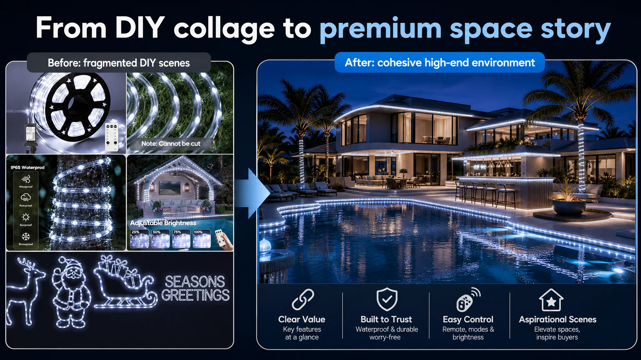
4. Upgrading A+ Content: From DIY Fun to Professional, High-End Confidence
The A+ rebuild aimed to fix the trust gap and align visual storytelling with higher-value buyers.
Make parameters and safety visible in the first screen
- Banner image: full two-story house at dusk, rope lights along roofline, pillars, and windows.
- Left or bottom icon row:
- “100FT Length”
- LED count (actual spec)
- IP65
- UL-style safety icon (if applicable and true).
Purpose: In three seconds, a buyer can answer: “Is this long enough, bright enough, and safe enough for my property?”
Show real interaction with the remote and modes
- Split layout: remote in the foreground, sofa and Christmas tree in the background.
- 8 mode names listed in a frosted panel, with subtle connecting lines from remote buttons.
Purpose: Turn remote control from an abstract mention into a tangible, trustworthy tool.
Visualize all-weather resilience
- Close-up at a low angle: water splashing on the tube, lights on.
- Split frame: rain on one side, snow coverage on the other.
Purpose: Silent message: “Whatever your climate, these lights keep working.”
Elevate scenarios to “aspirational” without losing realism
- Wide, full-width scene: modern pool, outdoor bar, wooden deck, palm trees.
- Rope lights along pool edge, bar base, tree trunks.
- Night sky in deep blue tones; reflections in the water.
Purpose: Connect the product to high-value spaces, not only casual DIY corners, increasing perceived value and justifying stronger ad spend.
What Changed for the Seller
We did not invent new capabilities for the product. We re-aligned the Listing so that:
- The title could better capture relevant Amazon traffic and communicate the core value quickly.
- The main images could earn clicks and create immediate trust.
- The bullet points could follow a buyer’s real decision logic, not just list specs.
- The A+ content could close the gap for higher-intent, higher-budget customers who care about safety, durability, and premium scenes.
Operationally, this changed the seller’s risk profile:
- Ads were no longer constantly pushing traffic into a weak funnel.
- Each click had a higher probability of converting, which is the only sustainable way to bring ACOS down.
- Organic traffic had a stronger page to land on, stabilizing rankings and reducing ad dependence over time.
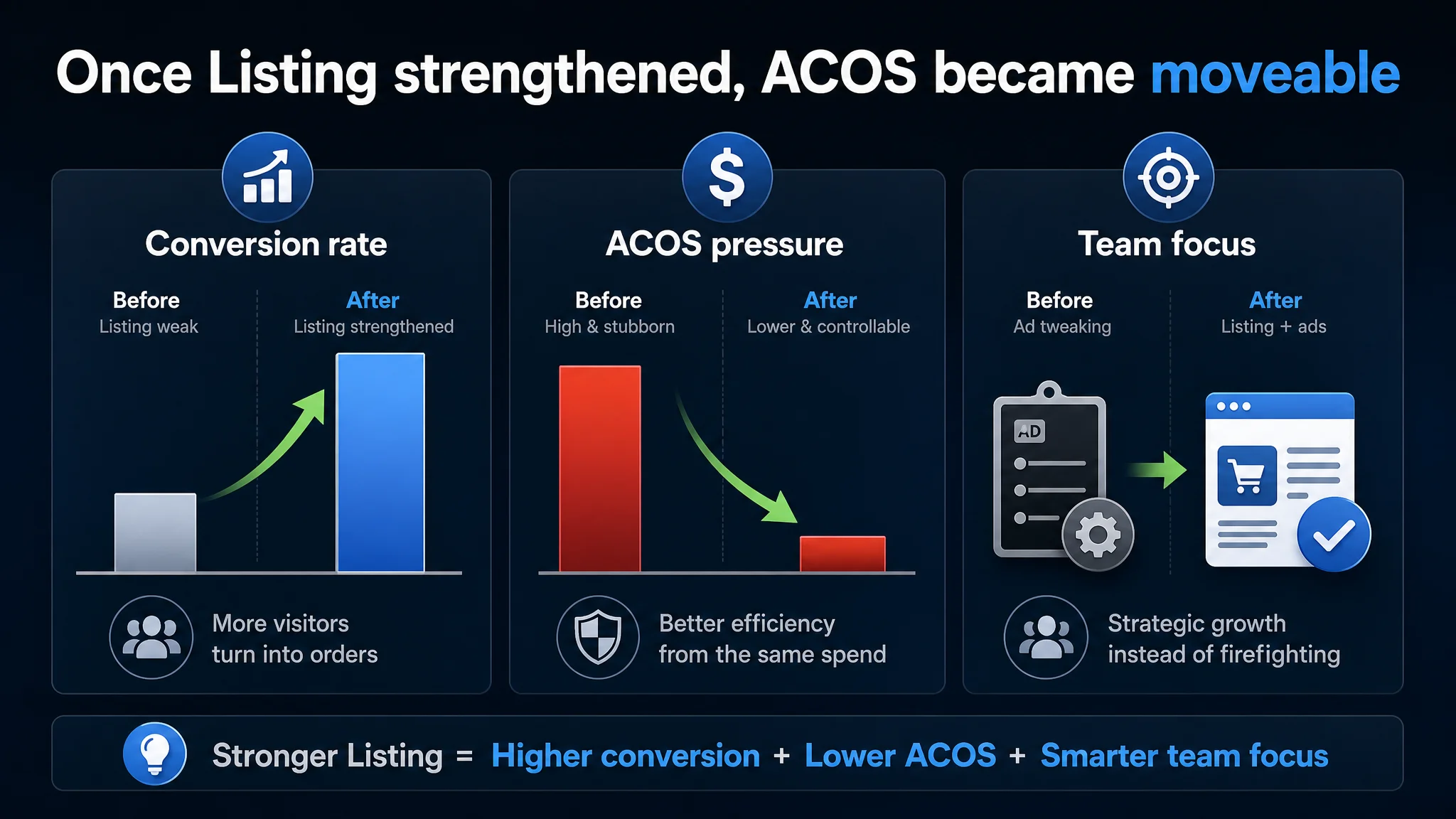
Even without quoting specific numbers, the pattern after implementation was clear:
- Conversion began to recover.
- Advertising pressure became more controllable.
- The team’s understanding shifted from “ads are broken” to “Listing conversion is the foundation of ad efficiency.”
What Other Amazon Sellers Can Take From This
Three key takeaways from this rope-light case apply broadly across Amazon categories:
1. High ACOS is not always an ad problem.
When traffic exists but orders lag, inspect the Listing’s conversion logic before you keep pushing the gas on ads.
1. Listing “looks fine” is not a diagnosis.
Against a strong benchmark, small-seeming gaps in title structure, trust cues, and scene quality can be enough to block conversion — especially for higher-value buyers.
1. Ads amplify whatever your Listing already is.
If your product page is weak, ads will amplify the weakness at scale. If your product page is strong, ads can finally behave like a growth engine instead of a cost center.
Before you decide your Amazon ads are failing, ask a different question: Does my product page actually deserve more traffic yet?