
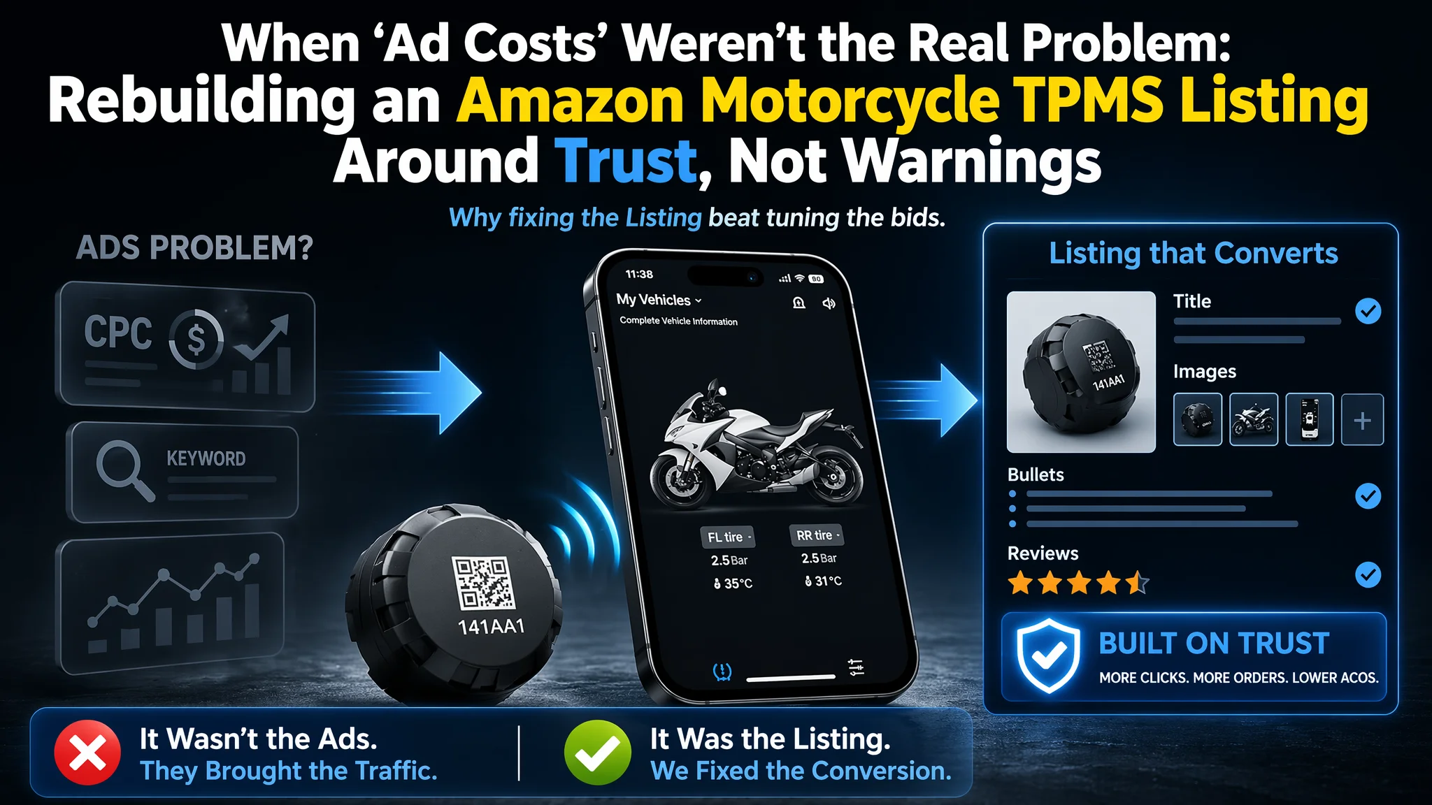
For this Amazon seller in the motorcycle tire-pressure-monitoring (TPMS) niche, the pressure first showed up in advertising reports. Clicks were not cheap, conversion was unstable, and ACOS felt harder and harder to control. The team’s first instinct was to treat this as an Amazon ads problem: keep tuning bids, structures, and budgets. Only when DeepBI put their Listing side-by-side against a benchmark competitor did a different picture emerge — the page itself was quietly consuming the traffic.
On paper, the product was solid: full A+ content, complete life-cycle information, and a 5.0-star rating. But the Amazon Listing score told a different story. Compared with a category-leading competitor, the page lagged badly in title logic, bullet-point structure, main-image strategy, and review scale. The seller had been over-investing in “Upgraded Version” wording, warnings, and technical parameters, while under-investing in trust, emotional positioning, and click triggers. Ads were not failing; they were amplifying a page that did not yet know how to sell.
DeepBI reframed the issue as a Listing-conversion bottleneck, not an advertising-optimization failure. The focus moved from CPC and keyword trees to four specific levers: title restructuring, bullet-point rewrites, main-image and gallery re-architecture, and review-system perception. Once the Amazon product page started to tell a clear story—“smart riding guardian” rather than “be careful” — ad traffic began to make sense again. For other Amazon sellers, this case is a reminder: when ACOS feels increasingly stubborn, the constraint may be your Listing’s decision logic, not your bid strategy.
Amazon Ads Were Not Failing. The Page Was Consuming the Traffic.
On the surface, this Amazon US marketplace seller had done a lot “right”:
- A specialized motorcycle TPMS product
- Full A+ content with multiple modules
- A perfect 5.0 rating on the product page
Yet the business pressure was real. Advertising spend was needed to stay visible, but paid traffic was not producing the level of orders the team expected given the product’s technical strength. The intuitive conclusion inside the team:
“Our ads are too expensive. We need better campaigns, better keywords, better structures.”
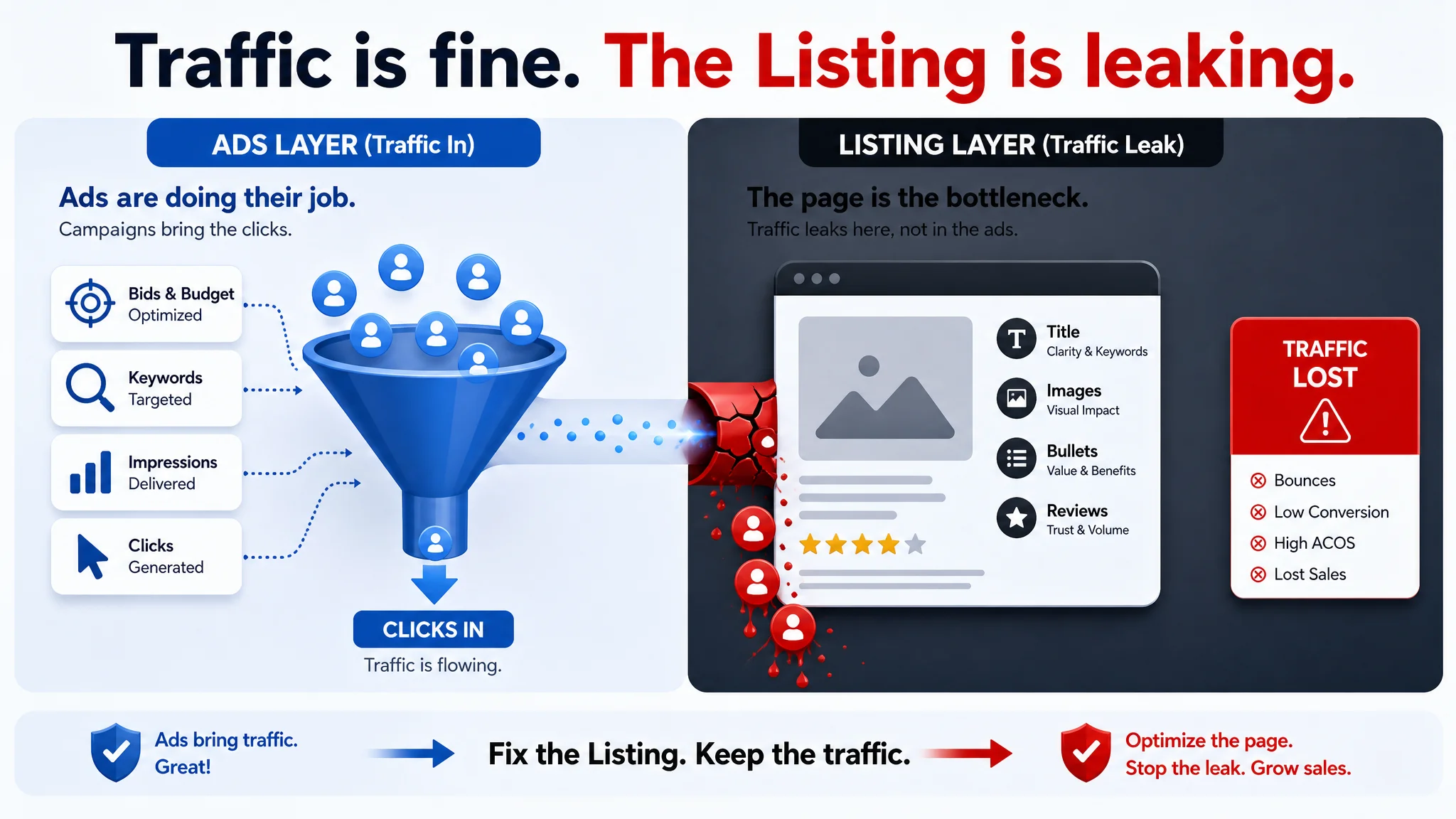
This is where most Amazon operations loops get stuck. As long as ACOS looks bad, the problem gets framed as “ads.” But DeepBI’s Listing analysis started from a different question: If the page truly converted at category level, would ACOS still be this hard to manage?
When we scored the Listing against a high-performing motorcycle TPMS benchmark, the result immediately shifted the conversation:
- The customer’s Listing: 68/100
- Benchmark Listing: 82/100
- Gap: –14 points
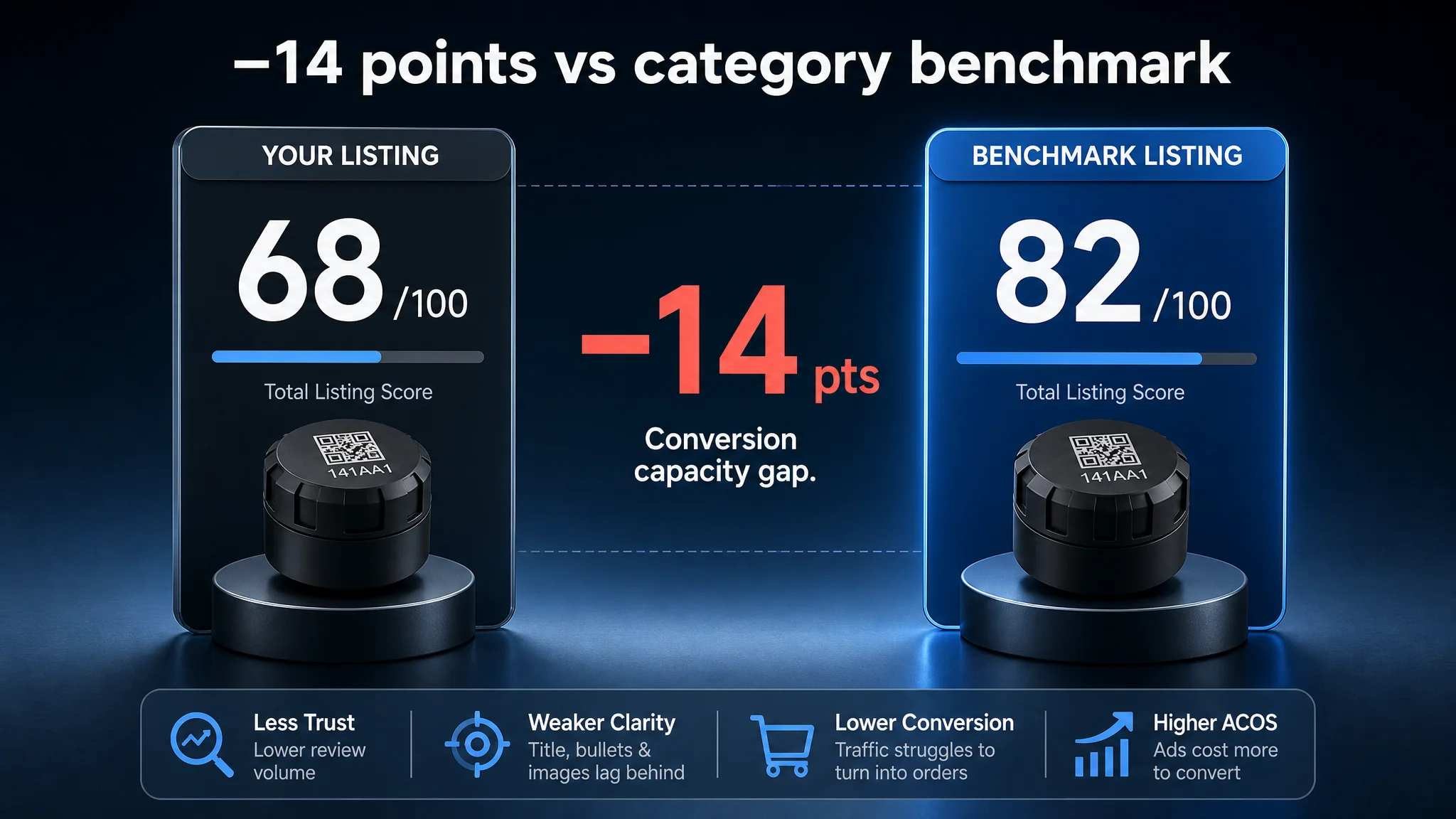
The difference wasn’t in whether the product “had content.” It was where the content was strong — and where it quietly undermined conversion.
Core conflict at this stage: The business was trying to fix a conversion problem with more ad tuning, while the real bottleneck was the Listing’s ability to turn traffic into orders.
The Real Constraint Was Listing Conversion Capacity
DeepBI’s scoring broke the page into five dimensions:
- Title
- Main images
- Bullet points
- A+ / detail content
- Reviews
The total –14-point gap was not evenly distributed. It concentrated in three areas that directly control Amazon product-page conversion:
- Title: –3 points vs. benchmark
- Main images: –2 points vs. benchmark
- Bullet points: –5 points vs. benchmark
- Reviews: –6 points vs. benchmark (volume, not rating)
- A+ / detail page: +2 points (actually stronger than the benchmark)
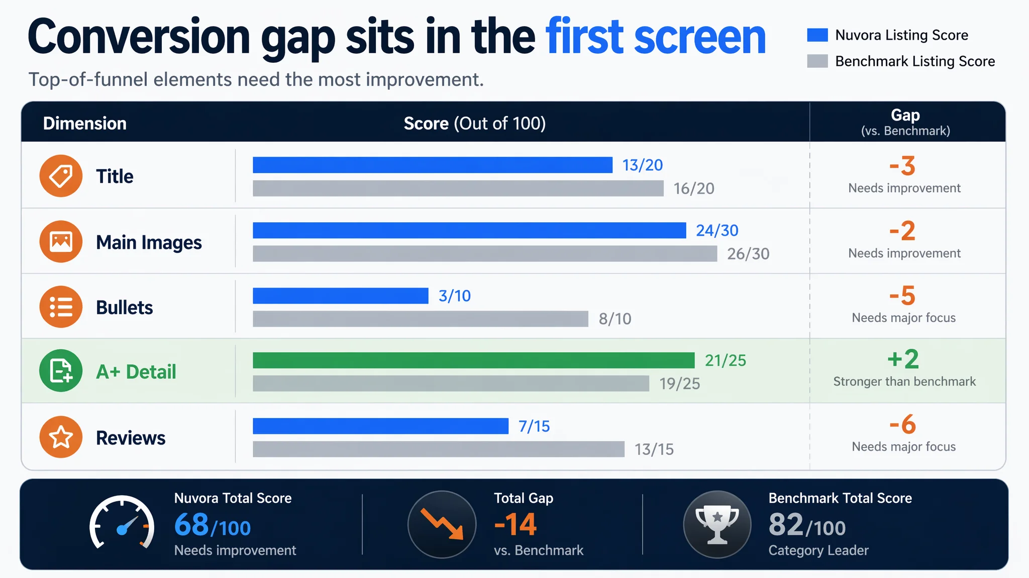
This structure matters. The page had a strong A+ story, but the top of the funnel—the title, images, and bullets that drive CTR and first-screen trust—were significantly weaker. In Amazon terms:
- The detail page was not the problem.
- The entry layer of the Listing was the problem.
Continuing to pour traffic into this structure would only increase ACOS volatility. The real constraint was the page’s capacity to receive and convert clicks, not the ads’ capacity to deliver clicks.
The Customer’s Original Misdiagnosis: “We Just Need to Communicate ‘Upgrade’ Better”
Inside the seller’s team, the early working theory was simple:
- The product is an upgraded version.
- We need to highlight “Upgraded Version” more clearly.
- We must warn users thoroughly about installation, safety, and compatibility.
So the Listing leaned heavily into:
- “Upgraded Version” in the title
- Warnings and risk language in the bullets
- Technical parameter listings
The problem is not that any single line was wrong. The problem was decision logic:
- The title spent precious weight on vague “Upgraded” language instead of precise, high-conversion outcomes.
- The bullet points opened with technical warnings, increasing psychological burden instead of emotional connection.
- The main images pushed text-heavy messages instead of visual shorthand that works on mobile.
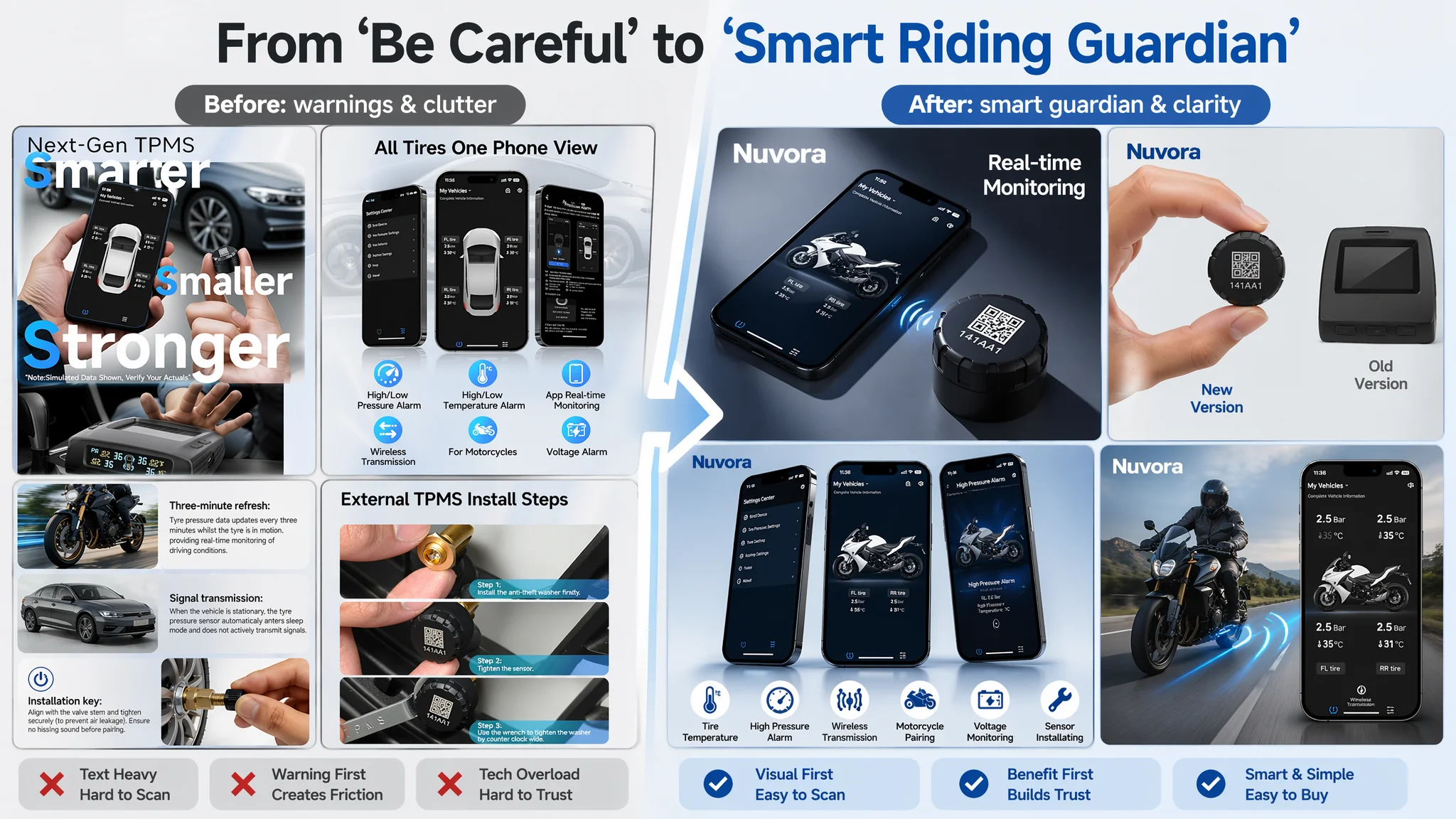
From the seller’s perspective, they were “being responsible” and “covering everything.” From a buyer’s decision path, what landed was:
“This looks complicated, and I’m not sure it’s for me.”
The result: the page did not feel like a smart, easy safety upgrade. It felt like a technical device with risk and friction attached.
Why Traditional Ad Optimization Kept Failing
If you treat a Listing-conversion problem as an ad problem, the natural playbook is:
- Adjust bids and placements
- Test more keywords
- Reallocate budgets toward “better” terms
- Try different campaign structures
None of those actions directly address:
- Why a user does or does not click the Listing in search results
- Why a user does or does not scroll and add to cart once on the page
In this case, paid traffic was being driven into a page that:
- Looked less professional in title structure than the benchmark
- Looked less emotionally aligned with motorcycle riders in bullet points
- Looked less trustworthy at a glance due to low review volume
- Looked less visually compelling in main images, especially on mobile
Every incremental ad optimization step was working on the wrong side of the equation. Instead of making each click more valuable, it kept buying more of the same under-converting clicks.
“Advertising does not only amplify advantages. It can also amplify a page’s existing defects.”
Until the Listing itself changed, ACOS had no structural reason to improve.
Title: From “Upgraded Version” to a Clear, Searchable Promise
How the Benchmark Used Its Title
The benchmark Listing’s title made several disciplined decisions:
- Brand first, then core product: brand name at the front to concentrate brand and search weight.
- Specific technology call-out: “Bluetooth 5.0” clearly promised modern connectivity.
- Outcome-focused phrase: “Real-Time Tire Pressure Sensor” named the result, not just the function.
- Ease-of-use promise: “Easy DIY Installation” reduced perceived effort.
- Structured separators like “|” created clean, scannable modules.
Contrast that with the customer’s original title, which leaned on:
- “Upgraded Version” — vague and unmeasured
- Less precise functional language
The title was consuming characters without fully earning them in either SEO weight or buyer clarity.
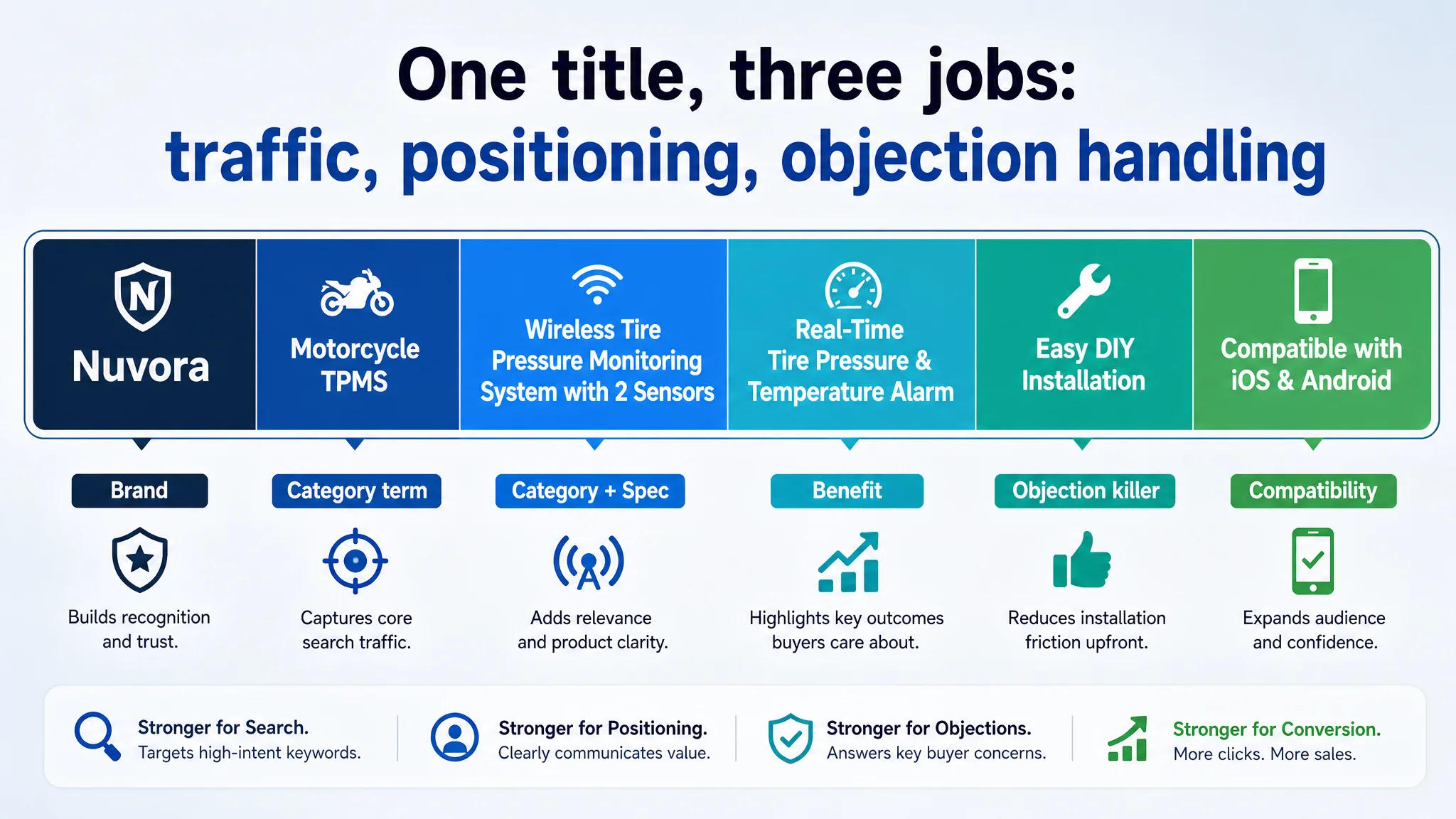
DeepBI’s Reframed Title Logic
The recommended structure:
Brand + Motorcycle TPMS + Wireless Tire Pressure Monitoring System with 2 Sensors + Real-Time Tire Pressure & Temperature Alarm + Easy DIY Installation + Compatible with iOS & Android
Key judgment:
- “Motorcycle TPMS” is the core category term and must sit in the “golden position” right after the brand.
- “Wireless Tire Pressure Monitoring System” adds category depth and redundancy without waste.
- “Real-Time” is a specific benefit that buyers understand.
- “Easy DIY Installation” directly attacks the key adoption barrier.
- All elements are separated cleanly (commas or pipes) for readability on Amazon’s front-end.
This is not just keyword stuffing. The title now performs three jobs simultaneously:
1. Traffic capture: correct core terms in the right order.
2. Positioning: clearly “motorcycle TPMS,” not a generic automotive gadget.
3. Objection handling: promises ease and real-time feedback before the user even scrolls.
Bullet Points: From Technical Warnings to a Buying Logic
The biggest raw score gap vs. the benchmark was in bullet points: –5 points.
What the Benchmark Did Differently
The benchmark’s five bullets followed a clear, buyer-centric path:
1. Emotional and gift positioning — “smart riding companion”
2. Simple, effort-free installation
3. 24×7 monitoring as an ongoing safety promise
4. Smart alerts and data services, even cloud sync and sharing
5. Multi-bike and group-ride support to increase perceived value
In other words, it built a ladder:
- “This is for people like you”
- “It’s easy”
- “It keeps you safe always”
- “It’s smart and connected”
- “It grows with your riding life”
What the Customer’s Original Bullets Did
The original bullets mixed:
- Warnings
- Compatibility notes
- Function descriptions
- Risk disclaimers
The first bullet was essentially a “be careful” message. From a buyer’s emotional state, the Listing opened the conversation by asking them to worry.
Information wasn’t missing; logic was. The bullets lacked a clear narrative from desire to reassurance.
DeepBI’s Restructured Bullet Logic
DeepBI’s optimization plan rewrote the bullets to reconstruct the decision path:
1. “Your Smart Riding Guardian”
- Lead with identity and benefit, not warnings.
- Stress: real-time data, no extra display device, seamless smartphone experience.
- Outcome: “safety and control at your fingertips.”
1. Effortless 1-Minute Setup
- Attack the fear of complexity: “no specialized tools,” “under a minute,” “attach and pair.”
- Introduce durable, replaceable battery as long-term security, not a chore.
1. 24/7 Precision Monitoring & Power Saving
- Reframe technical kinetic sensing into a user benefit: better battery life with smart activation.
- Emphasize continuous pressure and temperature tracking as ongoing protection.
1. Instant Voice Alerts & Rugged Design
- Merge the original voice notification feature with multi-condition protection.
- Promise real-time alerts before issues escalate, in rain, snow, or heat.
1. Universal Compatibility & Reliability
- Expand beyond motorcycles to cars, RVs, trucks, while still feeling motorcycle-centric.
- Position the product as a “safety companion” and meaningful gift.
The bullet points stopped reading like a manual and started reading like a buying argument.

This shift matters because many Amazon shoppers hardly read beyond the bullets. If bullets drive anxiety and complexity, conversion suffers regardless of A+ quality.
Main Images: The Click Was Lost Before the Page Had a Chance
The main-image dimension showed a –2 point gap vs. the benchmark — small in score, but critical in impact.
Several issues emerged:
- Lack of real usage context: existing images did not firmly anchor the product in motorcycle scenarios; some visuals were more generic or automotive.
- Overreliance on text in images: on mobile, small text becomes unreadable, and the visual fails to deliver quick meaning.
- Underplayed ease of installation: no strong visual proof of “zero barrier” DIY.
- App functionality not made visible: screenshots and interface benefits were not clearly represented.
DeepBI’s analysis was not “the pictures are ugly.” It was:
- The images do not answer the right questions in the order riders actually have them.
- The gallery doesn’t build a visual story from “what is this” → “is it small and safe” → “is the app good” → “will it survive my riding conditions” → “can I install it myself.”
How the New Visual Logic Was Structured
DeepBI translated the benchmark and category logic into concrete, production-level image directions:
1. Hero image
2. Size comparison image
3. App capability image
4. Real riding scenario image
5. Step-by-step installation image
6. Extreme environment adaptability
7. Multi-vehicle compatibility
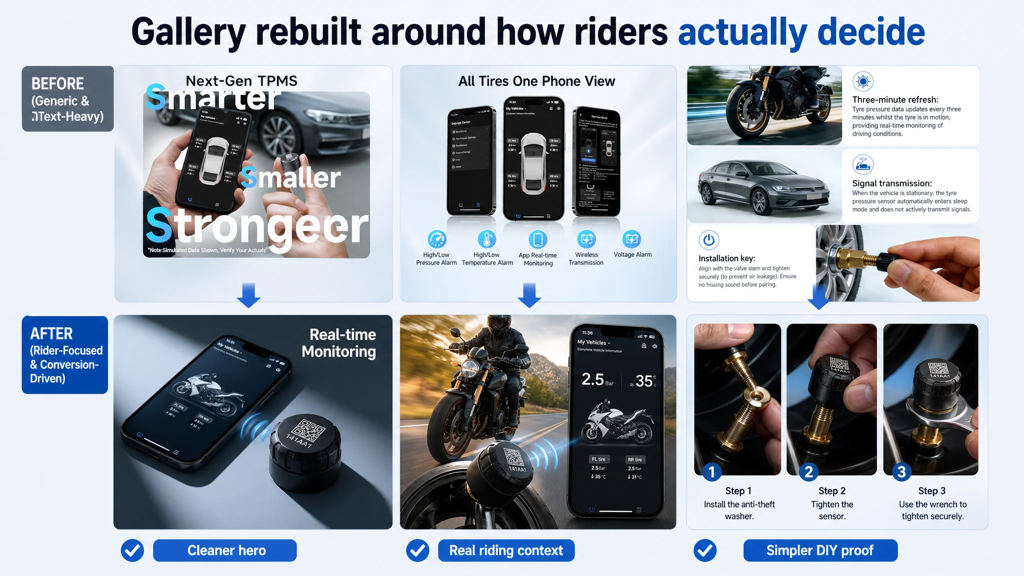
The message in images: professional, compact, robust, and easy — visible in seconds, not buried in text.
A+ Detail Page: Strong, But Misaligned With the Rest of the Funnel
One surprising finding: on the A+ / detail page dimension, the customer actually outperformed the benchmark.
The seller’s A+ modules already:
- Used a problem–solution contrast structure, clearly showing accident risk without TPMS vs. real-time warning with TPMS.
- Covered the full lifecycle: installation, use, maintenance (battery replacement), multi-vehicle adaptation, QR scanning and binding.
- Framed the product as an “intelligent tire assistant” rather than a one-off gadget.
In other words, once users scrolled down and started reading seriously, the Listing did a good job. This reinforced DeepBI’s core judgment:
The constraint was not in deep content. It was in getting more users to trust enough to reach that depth.
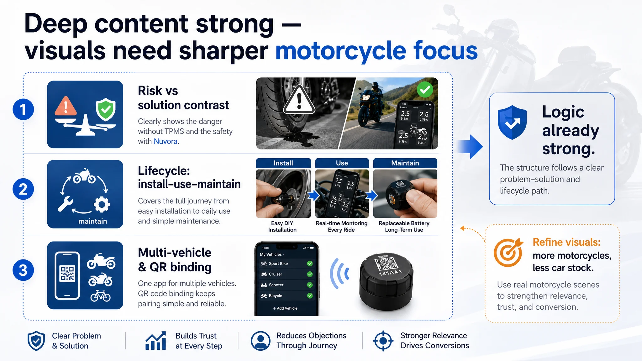
Still, there were critical refinements needed to align the A+ visuals more tightly with the motorcycle niche and user psychology:
- Replace car tire stock elements with real motorcycle tire scenes to preserve professional trust.
- Strengthen the crisis vs. solution contrast image.
- Upgrade the size display.
- Harmonize multi-vehicle compatibility images into a coherent visual system.
These adjustments didn’t change the basic logic; they tightened category fit and visual professionalism.
Reviews: Perfect Stars, But Not Enough Volume to Convince
On the reviews dimension, the numbers told a simple but important story:
- Customer Listing: 5.0 stars, 5 total reviews
- Benchmark Listing: 4.3 stars, 2,137 reviews
The seller’s instinct might be: “We have better rating than the competitor.” In reality, for a buyer:
- 5 perfect reviews look like uncertain early-stage social proof.
- 2,000+ mixed reviews with a solid average look like real-world validation.
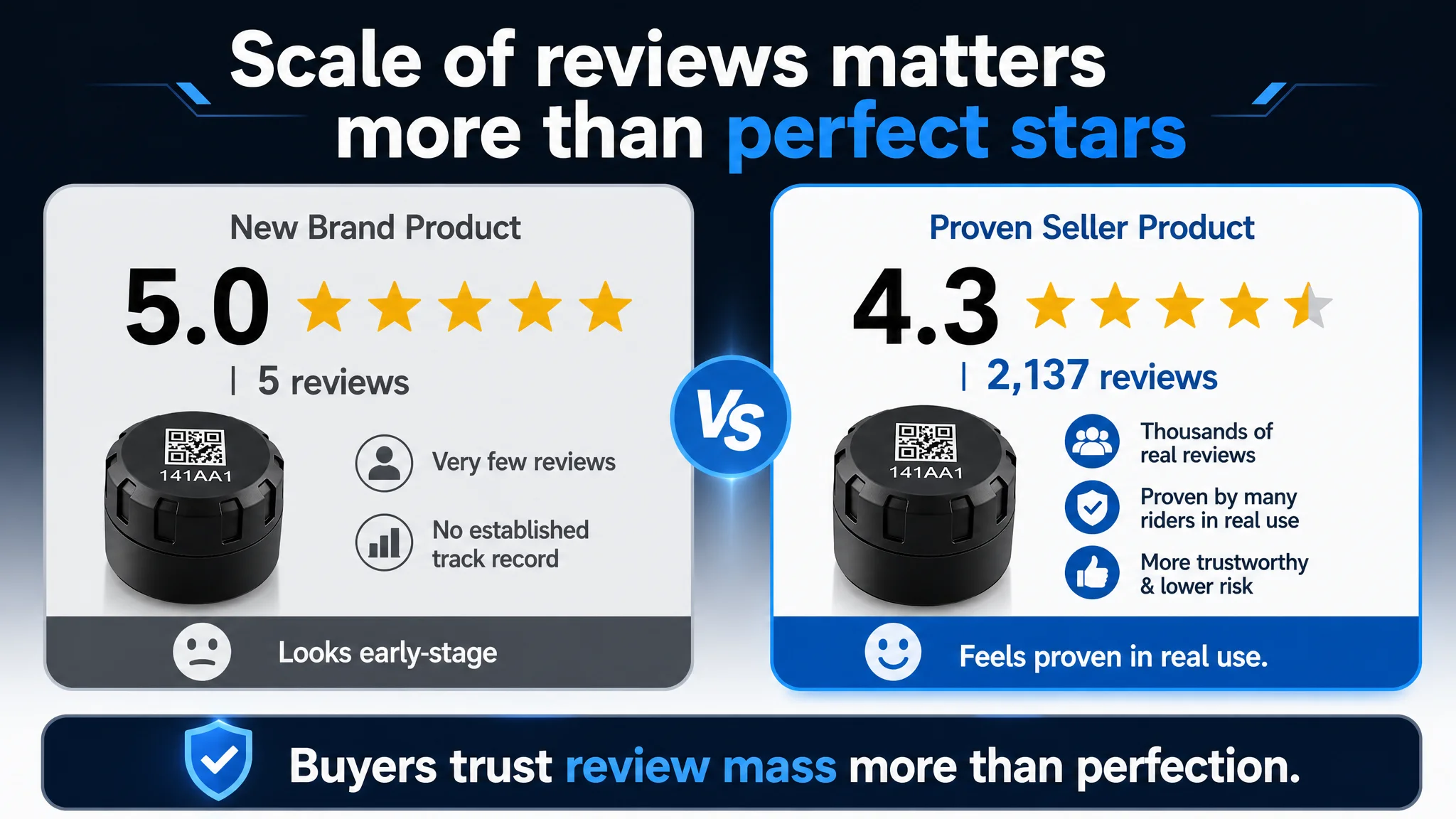
The review problem here was not quality but scale:
- Very low review count undermined the Listing’s credibility.
- All five being 5-star can even trigger skepticism (“too perfect to be real”).
This is crucial for decision logic: when the page is already weaker on title, images, and bullet logic, lack of review mass compounds the trust gap. A rational buyer will naturally drift toward the benchmark Listing.
For the seller, this means that even a strong A+ story and a perfect star rating cannot fully offset:
- Weaker first-screen trust
- Lower review volume
- Less evidence of broad adoption
Why DeepBI Did Not Keep Tuning the Ads First
Based on the Listing scoring and structural comparison, DeepBI made a clear judgment call:
- Do not treat this as a bidding or keyword issue.
- Do not scale ad spend further until the page’s front-end logic is repaired.
The risks of continuing to prioritize ad optimization:
- ACOS remains stubbornly high because each click converts poorly.
- Additional traffic accelerates the display of weak first impressions (title, images, bullets), which in turn depresses conversion further.
- The seller draws the wrong conclusion that “this product/category is too hard to convert,” when in fact the page is underperforming the product.
Instead, the priority sequence became:
1. Rebuild the title to align keyword weight and buyer promise.
2. Rewrite the bullet points to follow a rider-centric, emotionally anchored logic.
3. Re-architect the main images and key gallery slots to answer real buying questions visually.
4. Tighten the A+ visuals for category fit and motorcycle credibility.
5. Allow ads to re-test the new page once the conversion foundation is stronger.
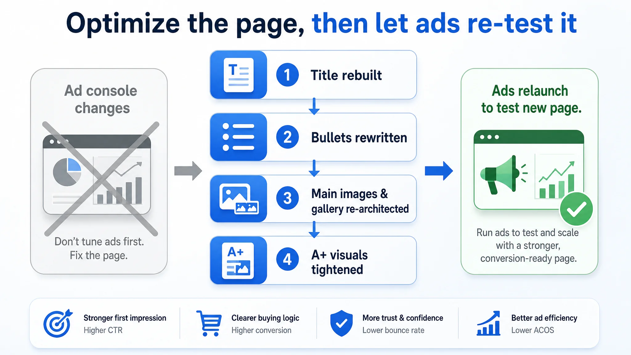
This is not “creative polishing.” It’s a decision about where each dollar of operating energy has the highest leverage.
How the Page’s Sales Logic Started to Recover
After the Listing optimization plan was defined, the path to recovery looked like this:
- The search-result presence became clearer: the new title told Amazon and buyers exactly what the product is, who it’s for, and why it matters.
- The thumbnail click motivation improved: a more compelling hero image and visible real-time monitoring promise encouraged tests from riders scanning the search page.
- First-screen trust increased: bullet points now opened with “Smart Riding Guardian” and “Effortless Setup,” not warnings and disclaimers.
- Scrolling probability rose: once the initial anxiety was reduced, more users were willing to scroll into the A+ content, where the seller was already strong.
- The A+ page could do its job: comprehensive life-cycle information, strong problem–solution framing, and clear visuals started to convert more of the traffic that reached it.
Even without inventing specific performance numbers, we can describe the operational impact:
- The Listing regained the ability to convert both organic and paid traffic more effectively.
- Ads stopped being forced to compensate for fundamental page-level gaps.
- The seller’s dependence on “more budget, more bids” as a universal answer began to drop.
- Traffic structure became more controllable, because each click had a better chance of becoming an order.
What Changed in the Seller’s Understanding
Before the diagnosis, the seller’s mental model was:
- “Ads are expensive → we must optimize ads.”
- “Our product is upgraded → we must say ‘Upgraded Version.’”
- “More warnings and disclaimers → we appear more professional and safe.”
After going through DeepBI’s Listing scoring and comparison process, several insights crystallized:
1. Amazon ads cannot solve a page that doesn’t know how to sell.
Bid optimization without Listing optimization is like pouring water into a leaking bucket.
1. Listing quality is the foundation of advertising efficiency.
The title, main image, bullets, and A+ content are not “cosmetic.” They define whether each click has a realistic chance of converting.
1. Emotional logic and trust matter as much as technical parameters.
Riders want a “smart guardian,” not just a specification sheet plus a list of warnings.
1. Review volume and structure signal maturity, not just rating.
A perfect 5.0 with five reviews feels less convincing than a 4.3 with thousands, especially in a safety-related category.
1. Before scaling ads, you must ask: does this page deserve more traffic?
If the honest answer is “not yet,” the work belongs in the Listing, not in the console.
What Other Amazon Sellers Can Take Away
This motorcycle TPMS case is not unique to its category. The pattern appears across Amazon:
- Ad costs feel like the root problem.
- Teams intensify ad optimization, ignore structural Listing weaknesses.
- Conversion remains weak; ACOS stays high; anxiety grows.
The deeper lesson:
“The real problem was not that ads failed to bring traffic. It was that the page could not convert the traffic.”
For sellers, the practical takeaway is to reverse the usual sequence:
1. Use Listing-level diagnostics and competitor comparison to locate the real bottleneck.
2. If title, images, bullets, and trust signals lag behind the benchmark, fix the Listing first.
3. Only then use ads to amplify a page that has earned the right to receive more traffic.
DeepBI’s role in this case was not to push more ad knobs. It was to provide a clear, evidence-based judgment about what really limited the Amazon business at this stage — and to turn that judgment into a concrete, executable Listing optimization roadmap.