
This case comes from a US Amazon seller in the EV accessories category. On the surface, their new Tesla/J1772 adapter kit had a clear niche and had already started running Amazon ads. But the more budget they pushed into ads, the more they felt the same pressure: clicks were not growing as expected, and orders were not catching up. The team’s first judgment was straightforward — “our campaigns and bids aren’t tuned enough; we need better ad optimization.”
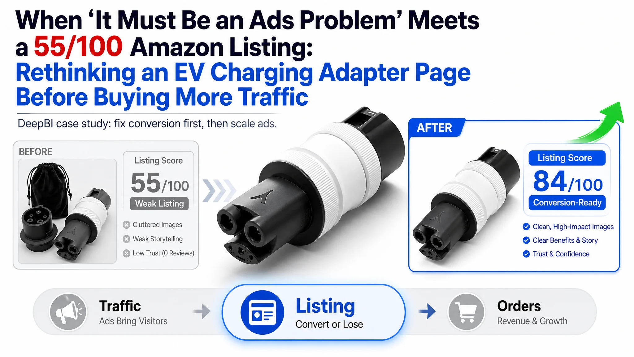
 When DeepBI stepped in and ran a full Listing diagnosis against the category’s benchmark product page, the picture changed. The core issue wasn’t bid levels or keyword structure. It was a weak Amazon Listing that scored only 55/100 vs. a competitor at 84/100, with the biggest gaps in main image strategy, A+ storytelling, and review trust — and literally zero reviews on the seller’s page. Ads were doing their job bringing traffic; the product page simply could not convert it.
The subsequent optimization did not start with more granular ads. It started with rebuilding the Amazon product page: reframing the title, restructuring bullets around user benefits instead of technical warnings, redesigning main images and A+ content to show real EV charging scenarios and safety advantages, and aligning visuals with what the product actually does (AC, not DC fast charging). Only after the page could credibly convert did ad traffic become worth paying for again.
For many Amazon sellers, especially in technical categories like EV charging accessories, this case is a reminder: when ACOS feels “stuck” and ads seem inefficient, the problem may not be in your Amazon ads manager. It may be that your Listing is not yet capable of turning paid and organic visits into orders.
What the Seller Saw: Ads Getting Harder, Orders Not Following
The product is a two‑adapter kit for the US marketplace:
- Tesla to J1772 adapter
- J1772 to NACS adapter
The business logic is strong: unlock more charging options for both Tesla and non‑Tesla EVs.
Operationally, the seller was under typical Amazon pressure:
- New product, no review base yet
- Amazon ads already running to drive initial traffic
- Early signs that traffic existed, but orders did not follow in proportion
Internally, the team framed the problem as an advertising issue:
- “Our keyword coverage might be too narrow.”
- “Bids and budgets may not be aggressive enough.”
- “We should push more spend and refine campaigns.”
That’s a familiar pattern: when ACOS is hard to control and orders lag, the default assumption is “ads haven’t been optimized enough.”
The Misdiagnosis: Treating a Conversion Problem as an Ads Problem
From the seller’s perspective, the logic felt reasonable:
- This is a technical EV accessory. Buyers search with clear intent: “Tesla to J1772 adapter”, “J1772 to NACS”, etc.
- If they got more relevant impressions and clicks, surely more orders would come.
- So the pressure focused on Amazon ads: campaign structure, keyword match types, bid levels.
What they didn’t have was a quantified view of the Listing itself relative to the category’s best‑performing page.
Once DeepBI scored the Listing against a benchmark competitor, a different story emerged.
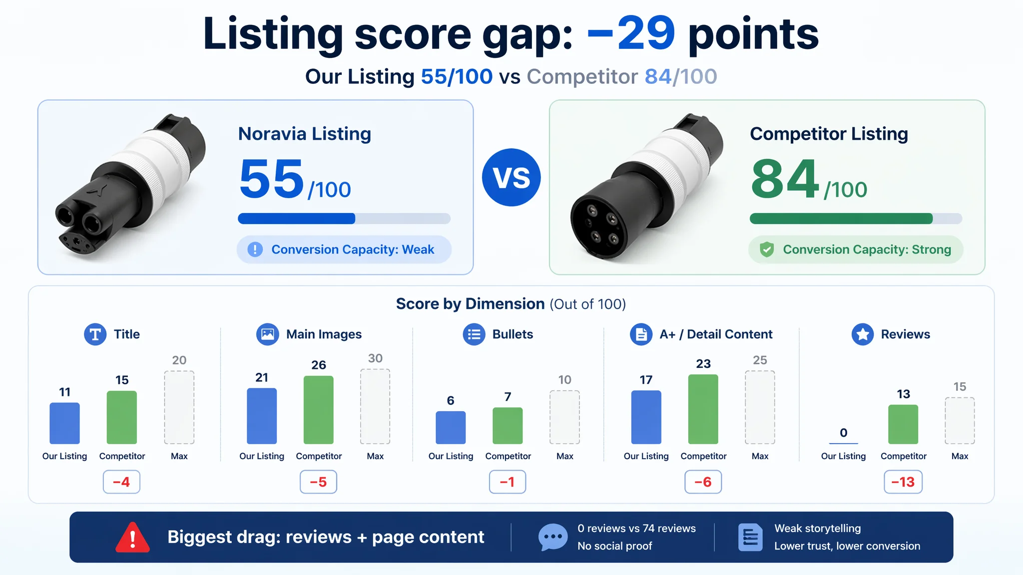 A 29‑Point Gap That Ads Couldn’t Cover
- Our page total score: 55/100
- Benchmark competitor: 84/100
- Gap: −29 points
By dimension:
- Title: Our Page: 11, Competitor: 15, Max: 20, Gap: −4
- Main images: Our Page: 21, Competitor: 26, Max: 30, Gap: −5
- Bullets: Our Page: 6, Competitor: 7, Max: 10, Gap: −1
- A+ / Detail content: Our Page: 17, Competitor: 23, Max: 25, Gap: −6
- Reviews: Our Page: 0, Competitor: 13, Max: 15, Gap: −13
The single biggest deficit was reviews (0 vs. 74 total, 4.6 stars), but title, main images, and A+ were also clearly behind.
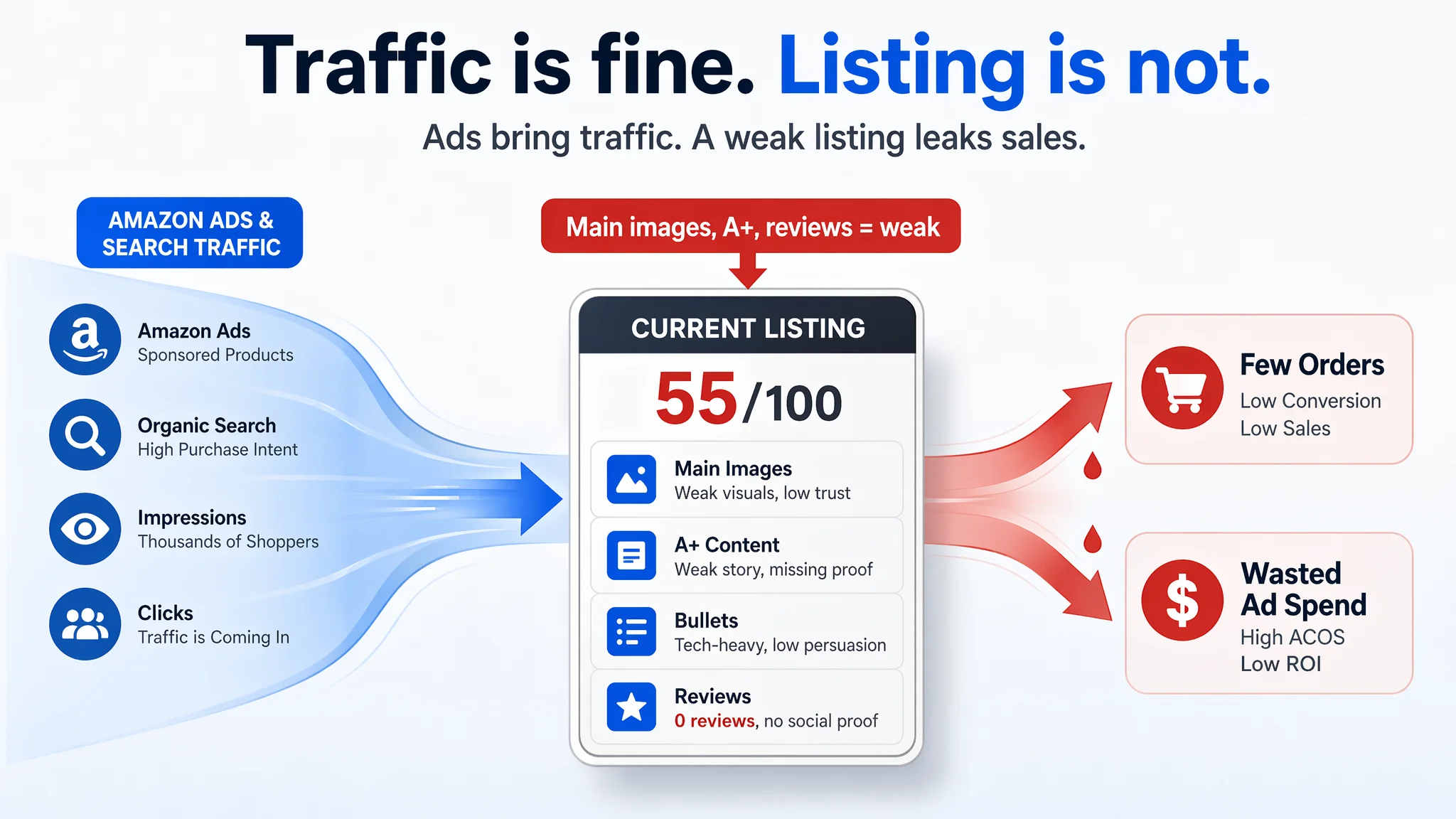
“The real problem was not that ads failed to bring traffic. It was that the page could not convert the traffic.”
At this point, it made little sense to keep pushing for higher ad impressions. The Listing itself was still in a low‑trust, low‑persuasion state.
Amazon Ads Were Not Failing. The Page Was Consuming the Traffic.
DeepBI’s view was clear: this ASIN did not lack traffic; it lacked conversion capacity.
In this category, the funnel looks like:
1. Search results: Main image + title decide CTR
2. Product page: Title, bullets, A+ and reviews decide CVR
3. Ads: Only amplify whatever conversion capacity the page already has
 If the page cannot:
- Win the click on the search results page
- Quickly answer “Is this safe? Does it fit my car? Does it really solve my charging problem?”
- Build enough trust to offset a higher price or low review count
…then extra traffic is just extra waste.
DeepBI’s diagnosis focused on how the page was failing to convert — and why that had to be fixed before any further ad scaling.
Where the Listing Really Fell Short
1. Title: Parameters Without a Clear Buying Logic
The original title had some good elements:
- The main keyword “Adapter Tesla to J1772” was placed early, which is structurally sound.
But several issues hurt both CTR and conversion intent:
- The structure was function‑listing style, with scattered sell‑points in the second half.
- The benchmark competitor used a clearer pattern: key benefit + keyword + conditions (e.g., “2 in 1 CCS & J1772”).
- The competitor title included hard numbers (“250kW DC / 80A AC”) that feel more powerful than “Controls Under 7.2kW” — even though our product is AC‑only, we weren’t even fully leveraging our own 48A spec in a compelling way.
- The competitor precisely limited fitment: “Only Fit for Tesla Model S/3/X/Y”, reducing doubts and increasing purchase intent.
- Our title carried ambiguous wording like “Comp BMW i3”, which can cause confusion rather than clarity.
The result: on the search page, the competitor title tells a story in one glance; ours feels like a technical list.
2. Main Images: Not Enough Reason to Click, Not Enough Proof to Trust
The main‑image set was the second major bottleneck.
DeepBI’s visual comparison highlighted three key problems:
1. Weak click magnet on the search results page
- The current primary image had a “raw” product shot with a busy, slightly cluttered feel, including a storage pouch that distracted from the main object.
- There was no strong contrast, no dynamic composition, which is costly in a crowded EV accessories grid.
1. Lack of real‑car interaction
- The competitor used close‑ups of the adapter plugged into actual vehicles, with dashboard or central console validation shots.
- Our set lacked convincing real‑world use — “plug in, see it work” — which is critical when promising “compatible” and “safe.”
1. Hidden performance and value
- High‑value technical attributes (e.g., 48A, adjustable resistor safety design) were buried or only present as text overlays, and not visualized in a way that a scrolling shopper can grasp in seconds.
- The competitor used icon sets + numbers + comparison visuals to make performance benefits obvious.
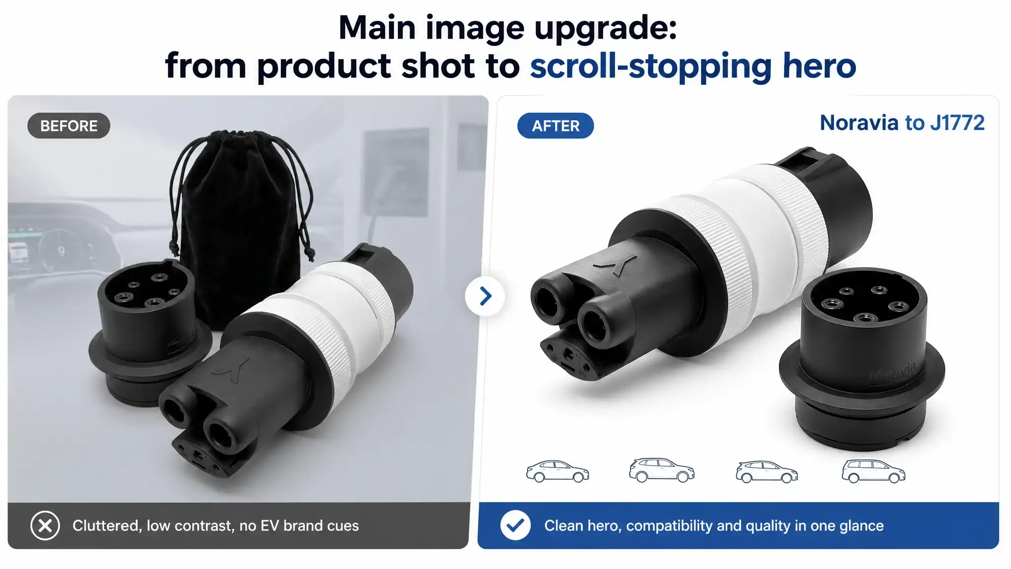 This combination pulled down both CTR and CVR: fewer clicks from search, and less trust once visitors landed.
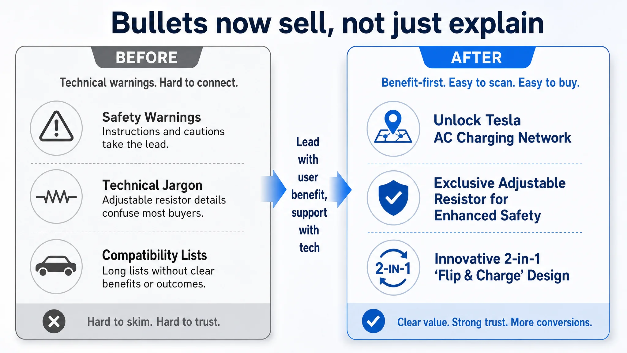
3. Bullets: Technical Warnings Instead of a Persuasive Buying Path
The bullet points were structurally weak from a persuasion standpoint.
Competitor bullets followed a clear “problem–benefit–assurance” pattern:
- Start from the user’s core inconvenience (“limited charging options”, “waiting too long”)
- Move to concrete benefits (“dual‑mode fast charge”, “charge freedom”, “less waiting”)
- Close the loop with safety and after‑sales reassurance
Our bullets, in contrast:
- Heavily emphasized technical details (adjustable resistors) and safety warnings
- Mentioned compatibility and portability, but without linking to clear user outcomes
- Felt more like an instruction manual than a buying argument
Structurally:
- Our structure: compatibility → technical principle → safety warnings → special‑case compatibility → portability/packaging
- Competitor structure: material & durability → scenario & convenience (two needs solved) → precise compatibility & efficiency → portability → safety & after‑sales
Result: traffic that made it to the bullets did not get a strong nudge toward “buy now.”
4. A+ Content: No Clear Story from “Why Buy” to “Why Trust”
On A+ and detail content, the competitor outperformed in both breadth and logic.
Our modules included:
- Brand logo
- Basic structure diagram
- Compatibility text
- Dual‑mode switching diagram
- Portability shot
- A performance parameters image
The competitor’s A+ went further and deeper:
- Emotional hero scene (e.g., user charging on the street) to create immediate relevance
- Icon matrix of core selling points
- Detailed dual‑mode specs
- Vehicle compatibility graphic
- Charging‑station compatibility chart
- Environmental adaptability (temperature range, IP rating)
- Installation steps (3‑step process)
- Durability tests (e.g., load and plug‑in cycles)
- Size and what’s included
 More important than module count was story order:
- Competitor: “Why buy” (scenario + value) → “How to use” (steps) → “Why reliable” (tests + environment) → “Detail assurance” (size, accessories)
- Ours: repeated certain visuals (e.g., “Quick‑Swap” twice), underplayed installation ease, and provided no strong durability proof.
One serious issue DeepBI flagged: our A+ showed a Tesla Supercharger in the background while the text explicitly states “Not compatible with Tesla Superchargers or Level 3 DC stations.” That kind of mismatch is a recipe for returns and negative reviews.
5. Reviews: Zero vs. 74 — No Trust Layer at All
Finally, the social proof gap:
- Our Listing: 0 reviews, no star rating
- Competitor: 4.6 stars, 74 reviews, with multiple detailed 5‑star comments and only minor negatives
This meant:
- We had no buyer reference at all; early shoppers had to take full risk.
- The competitor already had enough volume to support conversion and even justify a premium.
In this state, any traffic from Amazon ads faces not only a weaker page, but also a complete absence of social proof.
How DeepBI Reframed the Problem: Listing Conversion First, Ads Second
Given the 29‑point score gap and the pattern of weaknesses, DeepBI’s key judgment was:
“Before scaling or fine‑tuning Amazon ads, this Listing must rebuild its ability to convert both organic and paid traffic.”
Continuing to push ads into a 55/100 Listing with no reviews would only:
- Increase wasted ad spend
- Accelerate low‑quality clicks that may result in returns (especially with misleading visuals)
- Make ACOS look worse without addressing the root cause
Instead, DeepBI prioritized Listing conversion capacity as the first constraint to fix.
Why DeepBI Did Not Keep Tuning the Ads First
At this stage of the product’s lifecycle, the biggest business risk was:
- Ads amplifying defects in the product page faster than the team could correct them.
The reasoning:
1. CTR was constrained by main images and title
- Weak hero image and fragmented title structure meant even the best keyword work would still underdeliver clicks versus top competitors.
1. CVR was constrained by missing trust and inconsistent messaging
- No reviews, incomplete A+ trust elements, and a visual implying Supercharger use while text said otherwise.
1. Operational volatility risk
- If the seller pushed more ads now, they would likely attract some buyers expecting features the product doesn’t provide (e.g., DC fast charge), leading to higher returns and early negative reviews — hurting long‑term organic ranking.
From a business perspective, protecting the Listing’s long‑term viability was more important than squeezing short‑term impressions out of ads.
How the Optimization Refocused on the Product Page
DeepBI’s optimization direction centered on one thing: make the page worthy of traffic.
1. Clarifying the Title Around Real Use and Value
Recommended title:
Tesla to J1772 Adapter and J1772 to NACS Adapter Kit (2‑Pack), 48A Max EV Charging Accessories, Compatible with Tesla Wall Connector, Destination Chargers and Level 1/2 Charging Stations
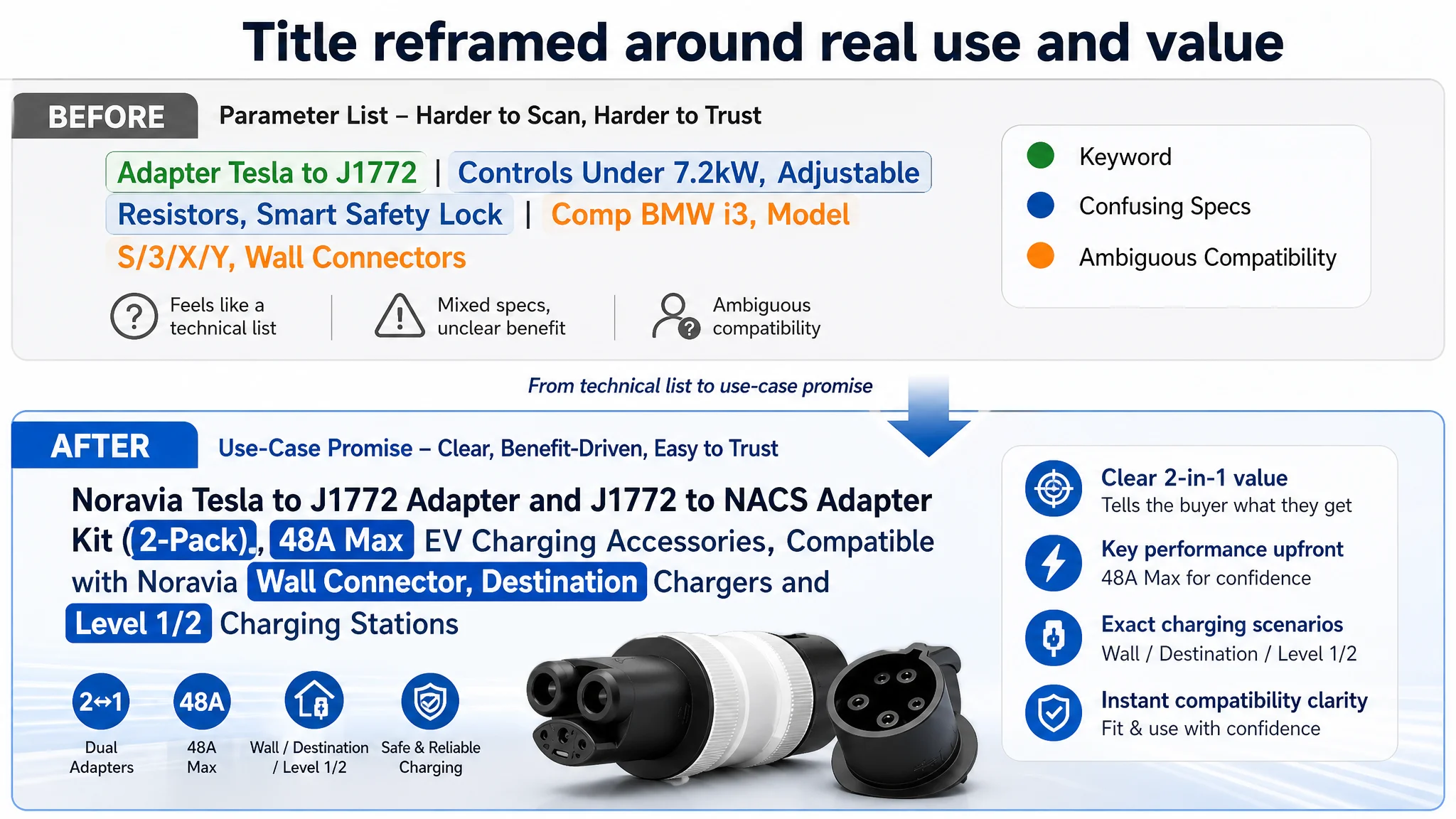 Key logic:
- Keep “Tesla to J1772 Adapter” upfront for keyword weight.
- Immediately surface the dual‑direction nature (“J1772 to NACS Adapter Kit, 2‑Pack”) — a core value difference vs. many competitors.
- Use real parameters we can stand behind: “48A Max”.
- Expand real application scenarios: “Wall Connector, Destination Chargers, Level 1/2 Charging Stations” — consistent with AC, not DC.
This restructures the title into a clearer promise: “2‑in‑1 kit, real 48A performance, covers the AC scenarios you actually use.”
2. Rebuilding Bullets from User Benefit to Technical Proof
The bullets were redesigned to follow a consistent pattern:
- Header (bold benefit) → user outcome → technical explanation/constraints
Examples of the new direction:
1. Unlock Tesla AC Charging Network
- Focus on the benefit first: access to 15,000+ Tesla AC chargers (Destination, Wall, Mobile) for non‑Tesla EVs.
- Explicitly state “Not compatible with Tesla Superchargers or Level 3 DC stations” to prevent mis‑purchase.
1. Exclusive Adjustable Resistor for Enhanced Safety
- Promote the adjustable resistor as a unique safety feature (a real advantage vs. typical fixed‑resistor adapters).
- Connect it to what users care about: avoiding overheating, melted components, and unstable communication.
1. Optimized 48A Power & Proactive Limiting
- Clarify that the product supports 48A, but we recommend 32A/7.2kW for long‑term battery health, showing professional understanding.
- Emphasize our proactive limiting as safer and more stable than generic adapters.
1. Innovative 2‑in‑1 “Flip & Charge” Design
- Turn form factor into convenience: pocket‑sized, no tools, flip to switch modes, with a velvet pouch.
- Make “2‑in‑1” a tangible, daily advantage, not just a spec.
1. Universal J1772 Compatibility & Plug‑and‑Play
- Provide clarity: supports J1772 vehicles from major brands (BMW, Porsche, Ford, etc.).
- Show we’re honest about what’s included and what isn’t (no DC, no Supercharger) — reducing returns.
1. Weather‑Resistant Build & 12H Reliable Support
- Add structured service commitment: weather‑resistant materials plus 24/7 support and 12‑hour response.
- Help close the final hesitation for first‑time buyers on a zero‑review product.
Overall, bullets shift from “scattered technical notes” to a coherent benefit → safety → convenience → reliability logic.
 3. Elevating Main Images to Drive Clicks and Immediate Trust
DeepBI’s main‑image plan focused on:
- White background hero with industrial rendering feel
- Clear EV brand logos to visually encode compatibility
- Real‑world car interior and charging scenarios
- Visualizing network coverage and compatibility
- Clarifying AC‑only usage through station types
Examples:
1. New Hero Image
- Product centered, 45° angle, occupying ~70% of frame.
- Pure white background, strong lighting on matte black and surface textures.
- Small logos of mainstream EV brands (Audi, BMW, Ford) at the bottom corner.
- Minimal text: “Tesla to J1772” in blue, clean font.
1. In‑Car Storage Scene
- Adapter resting neatly in a Tesla Model 3 center console.
- Natural daylight, real leather textures, annotation: “Perfect Fit for Center Console.”
- Communicates portability and cleanliness — not just functionality.
1. Coverage Map
- Simplified North America map in light grey.
- Glowing blue markers across regions, bold text: “Access 50,000+ Stations.”
- Sub‑text: “Compatible with Level 1/2 Chargers.”
- Directly addresses “range anxiety” and AC network availability.
1. Charger Compatibility Visual
- Icons for Tesla Mobile Connector, Wall Connector, Destination Charger, etc.
- Each with a green checkmark under “AC Chargers”.
- Bold line: “COMPATIBLE WITH ALL TESLA AC CHARGERS.”
1. Real Usage Close‑Up
- Human hand plugging the adapter into a Tesla charging port.
- Slightly low angle, cool evening light, subtle blue glow around port.
- No clutter, no excessive text — just a clear, real usage moment.
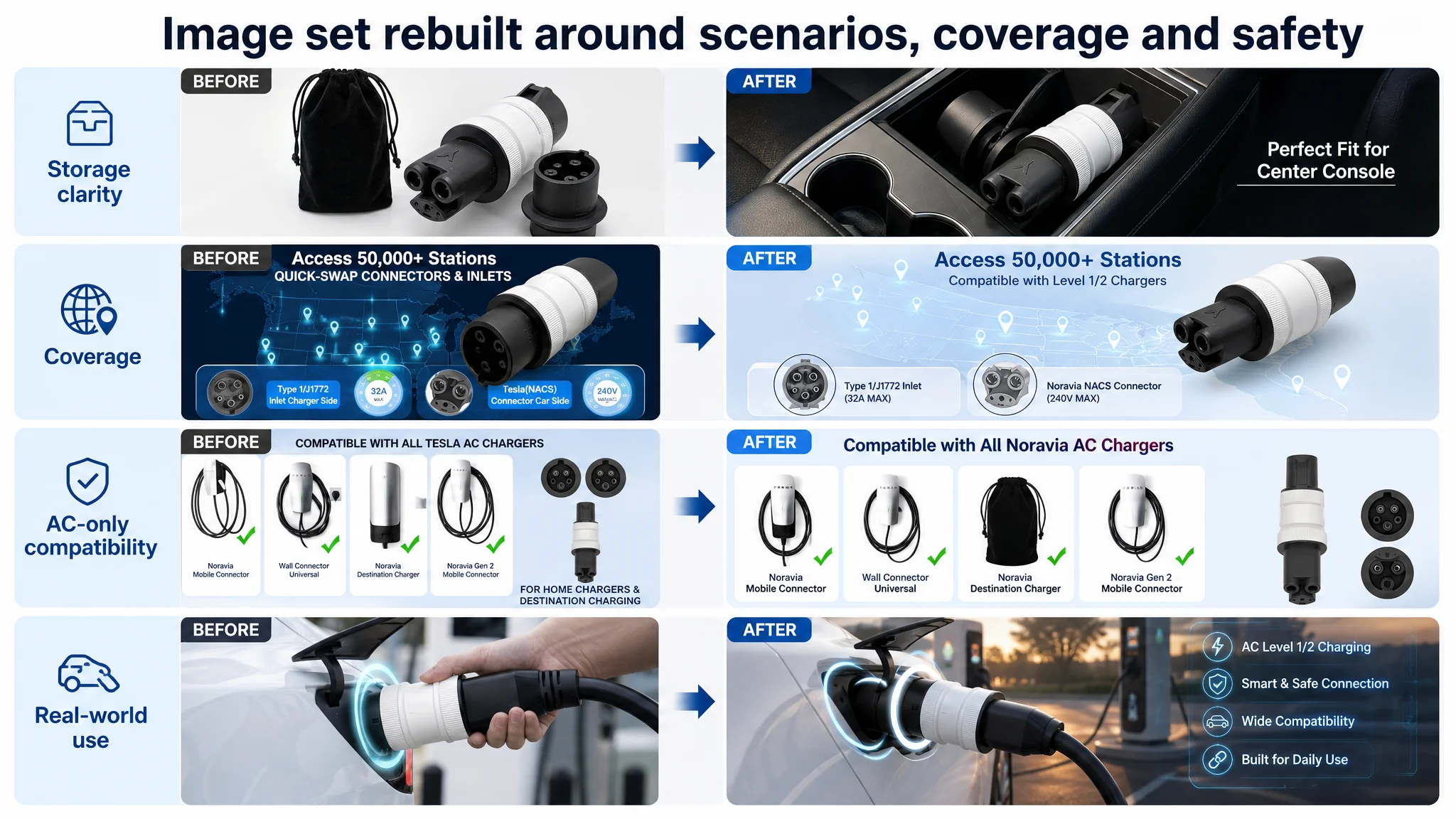 These images together aim to:
- Lift CTR by standing out visually in search
- Build trust within seconds on the product page
- Reduce compatibility confusion with clear visuals instead of long text
4. Re‑Architecting A+ to Tell a Coherent, Honest Story
DeepBI’s A+ recommendations reorganized the content into a complete decision path:
1. Opening: Dual‑Adapter Solution
- Clean layout showing both adapters and the velvet pouch in a modern home garage with a wall connector.
- Visual message: “This kit solves both directions of the standard gap — home and travel.”
1. Core Technical Advantage: 48A + Adjustable Resistor
- Product close‑up with minimal UI overlays: “48A Max” and “Adjustable Resistor.”
- No fake cross‑sections — just clear visualization of what the product actually does.
1. Corrected Scenario: Non‑Tesla Using Tesla Destination Charger
- Real photo: J1772 EV using a Tesla Destination Charger (AC) at a hotel or mall.
- Bright natural light, clean background.
- Visually aligns with the text disclaimer: AC only, no Supercharger.
1. 2‑in‑1 Logic: Tesla ↔ J1772
- Split graphic: left “For Non‑Tesla EV”, right “For Tesla EV.”
- Same angle, clean gradient background, arrows indicating conversion direction.
- Eliminates confusion about which end goes where.
1. Durability & Safety Testing
- Lab‑style imagery for load test (e.g., 5500 lbs approximation with car wheel silhouette).
- Clear label: “Extreme Load Bearing” — without inventing unrealistic specs.
- Reinforces physical toughness without claiming what doesn’t exist.
1. Storage & Portability
- Close‑up of both adapters in the velvet pouch inside a glovebox or console.
- Warm interior lighting, neat arrangement.
- Ties into “pocket‑sized” and “space‑saving” claims.
1. Compatibility & Support Summary
- Product in center, EV brand logos around it.
- Clean white background, bottom strip: “24/7 Support.”
- Final reminder: broad compatibility + accessible support.
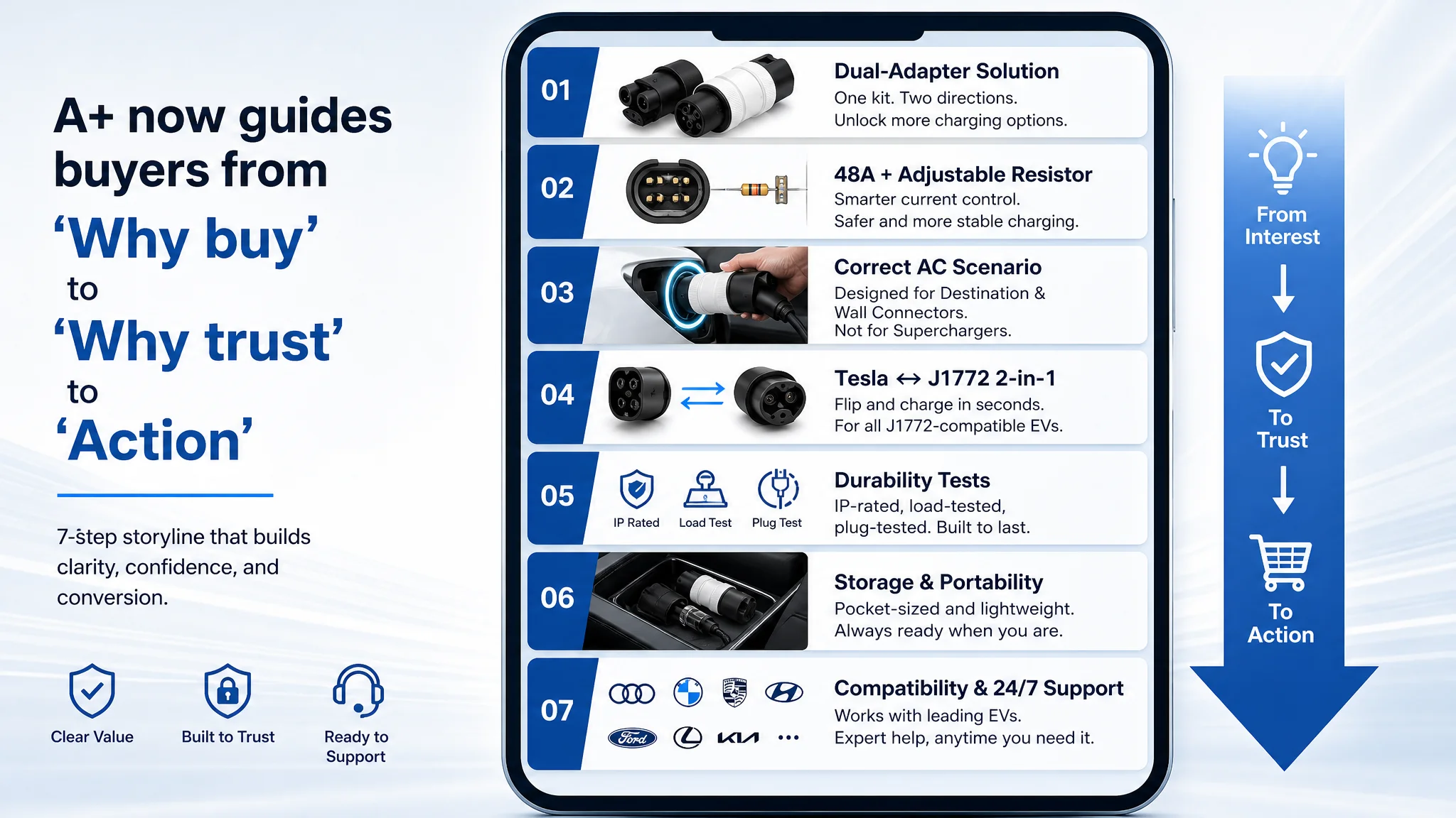 This structure fixes two critical issues:
- Removes visual mismatch (no more Supercharger in the background for an AC‑only adapter).
- Builds a trust ladder: solution → safety → durability → compatibility → support.
How the Page’s Sales Logic Began to Recover
Once these elements are aligned, the page’s behavior changes:
- CTR potential improves because the hero image and title now tell a clearer “2‑in‑1 AC network unlock” story.
- CVR can begin to recover as buyers see real scenarios, clear compatibility, and a robust safety narrative even before reviews accumulate.
- Return and complaint risk decreases because visual and textual claims now match actual capabilities (no DC/Supercharger implication).
- Early buyers are more likely to understand what they’re getting, generating cleaner, more positive first reviews.
At that point, Amazon ads can start to work as intended:
- Paid traffic lands on a more credible, better structured page.
- ACOS has a chance to move down not through bid tricks, but because CVR is no longer artificially suppressed by page defects.
- Organic ranking benefits from more efficient conversion — gradually reducing reliance on ads.
What This Seller Learned — and What Other Amazon Sellers Can Take Away
By the end of this diagnosis, the seller’s perspective on Amazon growth had shifted:
- Amazon ads were not “broken”; they were feeding a 55/100 Listing with zero social proof.
- The core constraint wasn’t campaign structure; it was page‑level conversion capacity.
- Title, main image, bullets, and A+ are not independent decorations; they form a single selling logic that either carries traffic to an order or drops it.
For other Amazon sellers, especially in technical or safety‑sensitive categories like EV charging:
- Do not let rising ACOS automatically lead you to more ad tuning.
- Ask first: “If I double traffic, does this page deserve it?”
- Check whether your title, main images, A+ and reviews actually answer the buyer’s core questions: “Does it fit my situation? Is it safe? Is it worth trusting?”
- Remember that ads amplify what your Listing already is — both strengths and flaws.
DeepBI’s role in this case was not to push more advertising, but to push for better judgment: recognize when the Amazon product page is the bottleneck, repair conversion first, and only then let ads scale what the page can reliably convert.