
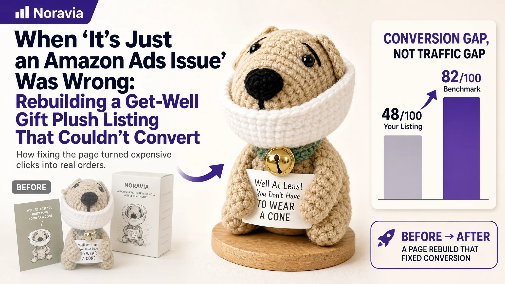
This case comes from an Amazon seller in the US marketplace, operating a handmade “get well soon” crochet dog plush as a recovery gift. On the surface, they believed their problem lived in Amazon ads: rising costs, unstable returns, and difficulty scaling budgets. But once we put their Listing into DeepBI, a different picture emerged — ads were delivering traffic to a product page that simply did not have the conversion capacity to carry it.
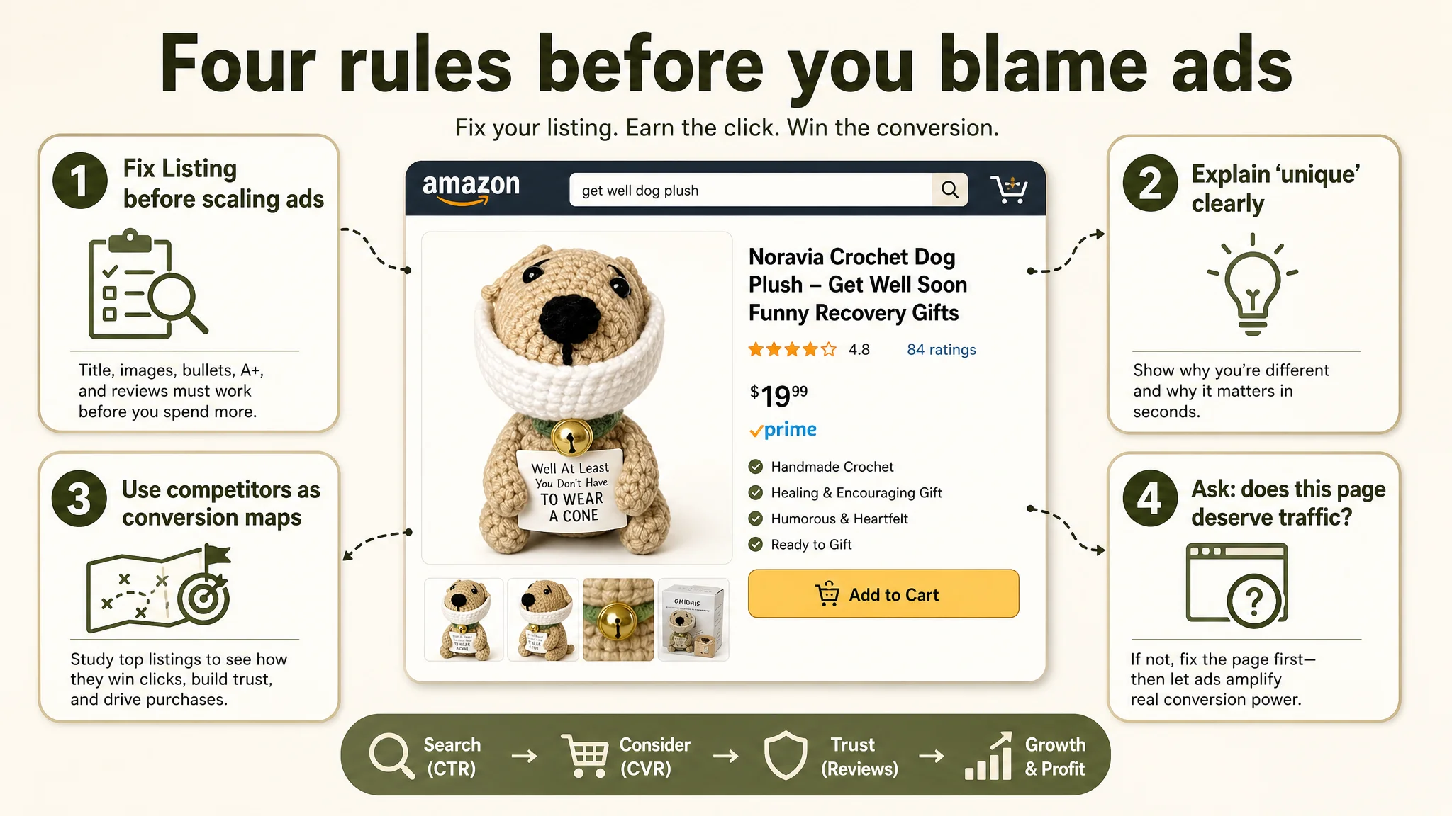
Against a directly comparable Amazon competitor in the same “get well dog plush” niche, the customer’s Listing scored only 48/100 versus the competitor’s 82/100. The seller had been focusing on bids, keywords, and campaign tweaks, assuming “we just need more traffic and more reviews.” DeepBI’s Listing-level diagnosis instead showed a much more basic block: weak title search logic, underpowered main images, A+ content that didn’t actually sell the get‑well story, and a near-empty review layer.
The optimization work did not start with new campaigns. It started with reshaping the Amazon product page: rewriting the title around real search and gift intent, restructuring bullet points into a buying story, and redesigning main images and A+ to move from “artistic expression” to “emotional, trust-building, commercial visuals.” Once the page could convincingly answer why someone should choose this plush as a recovery gift, ad traffic began to have something to work with.
For many Amazon sellers, this case is a reminder: when ACOS feels stubborn and ads “look fine,” the real leak may be that your Listing can’t convert the visits you are already paying for. Advertising does not just amplify strengths; it can also amplify Listing-level defects.
What the Seller Saw: Ads Felt Expensive, But the Real Leak Was the Page
From the seller’s point of view, the situation looked familiar:
- They had a differentiated handmade crochet dog plush positioned as a humorous, comforting get‑well gift.
- They were running Amazon ads, but scaling felt hard. Costs were uncomfortable, and they did not see a stable order flywheel forming.
- They assumed the main constraints were “low traffic” and “not enough reviews yet,” and that the solution was “optimize ads, find better keywords, wait for more reviews.”
There was some truth in that: review volume was very low, and the page was early in its life. But when we benchmarked their Amazon Listing directly against a category-leading “Get Well Soon Dog Plush” competitor, the gap was so structural that advertising alone could not reasonably fix it.
“The real problem was not that ads failed to bring traffic. It was that the page could not convert the traffic.”
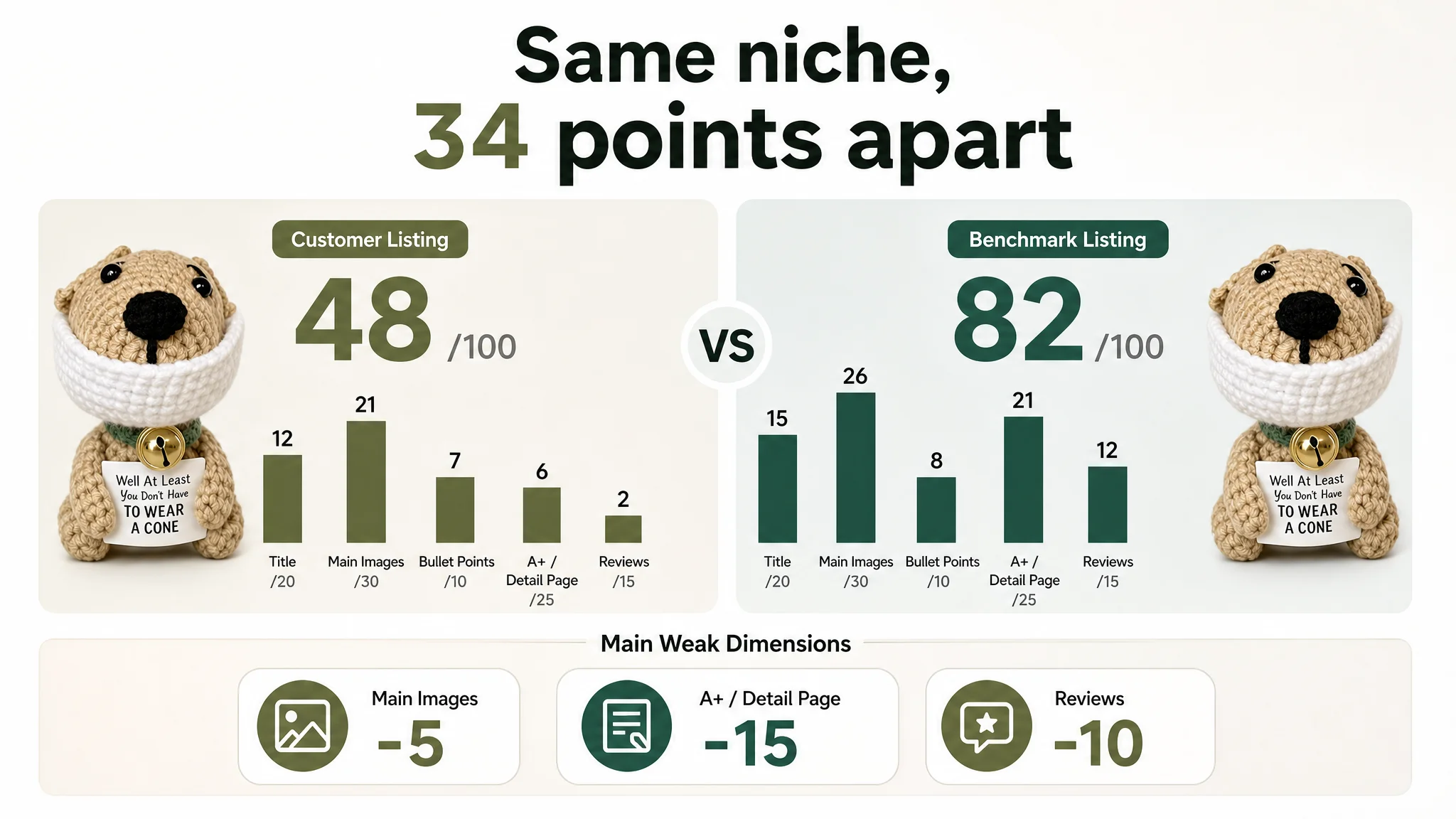
The Core Constraint: Listing Conversion Capacity, Not Keyword Bids
DeepBI’s Listing scoring made the root issue hard to ignore:
- Overall Listing score
- Customer Listing: 48/100
- Benchmark Listing: 82/100
- Gap: –34 points
Breaking it down by Amazon page components:
- Title: Customer: 12, Benchmark: 15, Max: 20, Gap: -3
- Main Images: Customer: 21, Benchmark: 26, Max: 30, Gap: -5
- Bullet Points: Customer: 7, Benchmark: 8, Max: 10, Gap: -1
- A+ / Detail Page: Customer: 6, Benchmark: 21, Max: 25, Gap: -15
- Reviews: Customer: 2, Benchmark: 12, Max: 15, Gap: -10
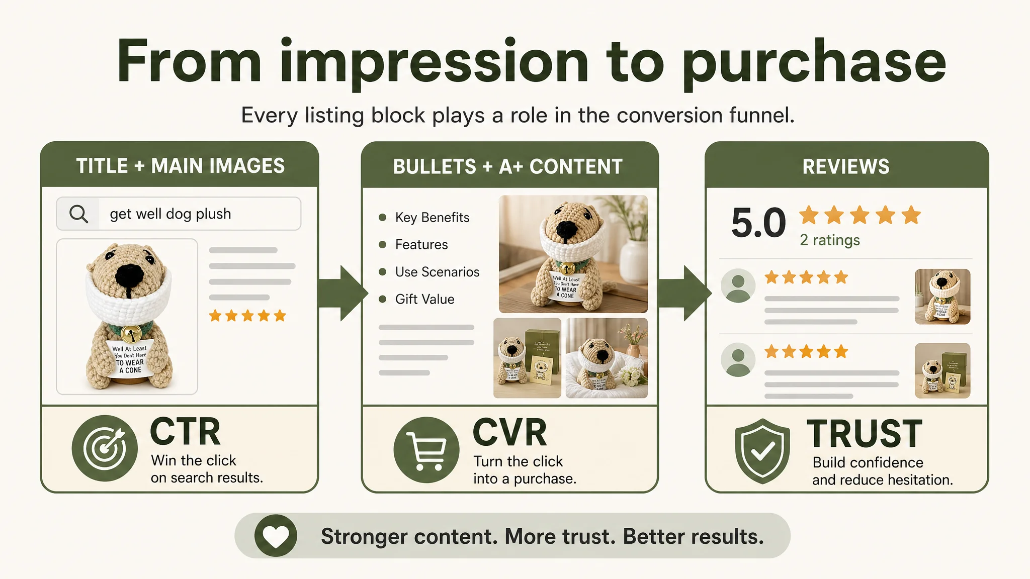
This breakdown matters because each weak block translates directly into a leak in the Amazon funnel:
- Title + main image → CTR (can you win the click on the search results page?)
- Bullet points + A+ → CVR (can you turn the click into a purchase?)
- Reviews → Trust (can you reduce hesitation enough to close?)
In this case, the most alarming gaps were:
- Detail page (A+): 6 vs 21 (–15)
- Reviews: 2 vs 12 (–10)
- Main images: 21 vs 26 (–5)
With these deficits, pouring more ad spend into the Listing would only amplify an under-converting page. The priority had to be rebuilding the product page’s ability to sell.
Why the Original Diagnosis Was Misaligned
The seller’s internal reasoning looked like this:
- “Our product is unique and hand‑crocheted.”
- “Our reviews are positive (5.0 stars), just not many yet.”
- “If we push more Amazon ads and keep refining keywords, orders should grow.”
- “Maybe our images are a bit amateur, but that’s just aesthetics, not the main issue.”
DeepBI’s diagnosis showed three misjudgments hidden in that logic:
1. Overestimating how much “handmade uniqueness” speaks for itself
The page leaned on the idea of “handmade crochet” but did not visually or textually prove why that should justify a purchase over a polished, non‑handmade competitor that told a much stronger get‑well story.
1. Treating images as “nice to have,” not as CTR/CVR drivers
The main images and A+ modules felt more like creative illustration than commercial get‑well gift content. On Amazon, that difference directly determines whether people click, stay, and add to cart.
1. Assuming “few reviews” was the only trust problem
Yes, only 2 reviews versus the competitor’s 84 created a trust gap. But the A+ and bullet points were also underserving the trust function: no real‑life scenes, little detail on material, size, use occasions, or gift-readiness.
As long as the team framed their situation as “ads and reviews,” they would continue optimizing levers that could not, by themselves, overcome such deep Listing‑level weaknesses.
Title: Search Exposure and Gift Intent Were Not Aligned
How the Benchmark Title Won the Search
The benchmark Amazon title:
“Get Well Soon Dog Plush – Adorable Labrador Stuffed Animal with Bandage Theme, Perfect Get Well Gift for Loved Ones 9 Inch”
It does four things very efficiently:
- Leads with core search term: “Get Well Soon Dog Plush”
- Adds specific dog type: “Labrador” for more precise matching
- Inserts emotional adjectives: “Adorable,” “Perfect Get Well Gift”
- Includes clear spec: “9 Inch,” which helps expectation management
This is optimized for Amazon’s search logic and for human scanning: anyone searching “get well dog plush” immediately sees outcome, product form, emotional angle, and size.
What the Customer Title Was Doing Instead
The original customer title:
- Pushed the brand name and packaging information too far forward.
- Buried the core “crochet dog plush” and “get well” keywords deeper in the line.
- Mixed too many scenario and audience tags, diluting the clear “recovery gift” intent.
Result: search friendliness was weaker, and the main buying intent (a recovery gift) did not register instantly in the SERP.
Reframing the Title Around Real Search and Use
DeepBI’s recommended direction:
“G MiDui'S Crochet Dog Plush - Handmade 4.5" Get Well Soon Dog, Funny Surgery Recovery Gifts with 'Well at Least You Don’t Have to Wear a Cone' Quote, 6Pcs Gift Box Set, Sage Green”
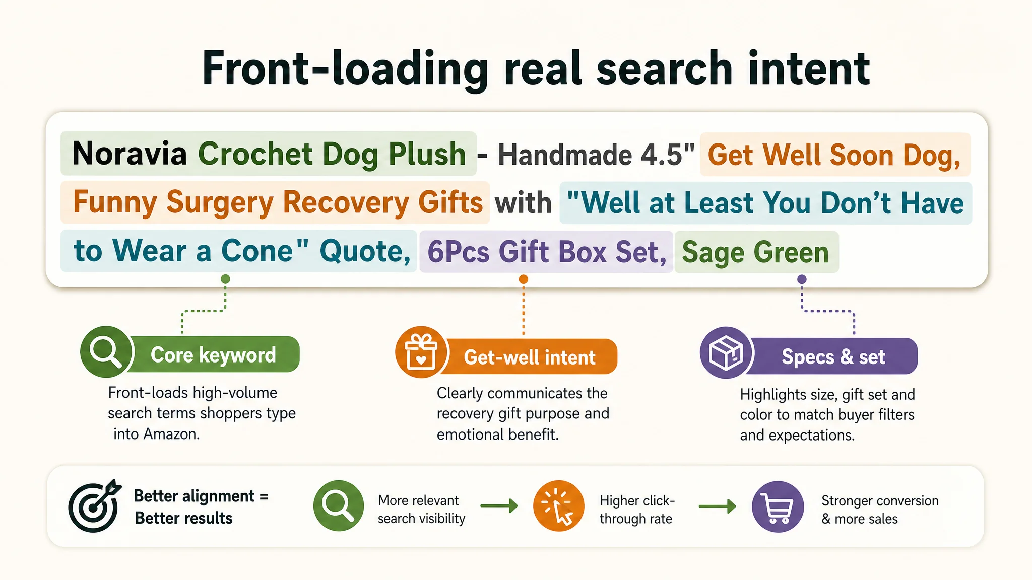
Key changes in logic:
- Keyword front‑loading: “Crochet Dog Plush” and “Get Well Soon Dog” appear early.
- Scene anchoring: “Funny Surgery Recovery Gifts” ties directly to high-intent searches and real use cases.
- Outcome clustering: dimension (4.5"), gift form (“6Pcs Gift Box Set”), and color (“Sage Green”) are clearly, compactly integrated.
This is not “just copywriting.” It is restructuring the Listing’s entry point so Amazon search and human shoppers immediately recognize the product as a recovery gift plush.
Main Images: The Page Did Not Create a Reason to Click or Trust
How the Benchmark Used the Image Strip
The competitor’s main images do three jobs:
1. Search-page hook
- A strong, clear main image of the dog plush with visible “Get Well Soon” embroidery and bandage theme.
- Expressions and small details (eyes, bandage, bones) create emotional pull.
1. Detail-level reassurance
- Close-ups of embroidery, facial features, and bandages.
- Clean, informative overlays to explain what buyers are seeing.
1. Scenario and gift logic
- Real-life scenes: different people (e.g., multiple generations) interacting with the plush, gifting contexts, bedside placement.
- Clear visual confirmation that this is a thoughtful hospital or recovery gift.
What the Customer’s Images Were Really Doing
In contrast, the customer’s existing image set:
- Mixed amateur smartphone-style shots with cluttered props, watermarks, and even UI overlays in some frames.
- Overused abstract illustration and static flat-lay shots of the plush and scent cards, without decisive emotional scenarios.
- Failed to show any real handholding, bedside, or gifting moments that would reassure a buyer this will “feel right” when given to someone who’s recovering.
Effects:
- CTR risk: No strong visual hook on the SERP; “handmade dog on a messy background” blends into the noise.
- Trust deficit: Without material close-ups or hand interaction, the “handmade crochet” claim can feel cheap or unproven.
- Comparison loss: Next to the benchmark’s polished, emotionally rich visuals, this Listing looks unfinished and less reliable.
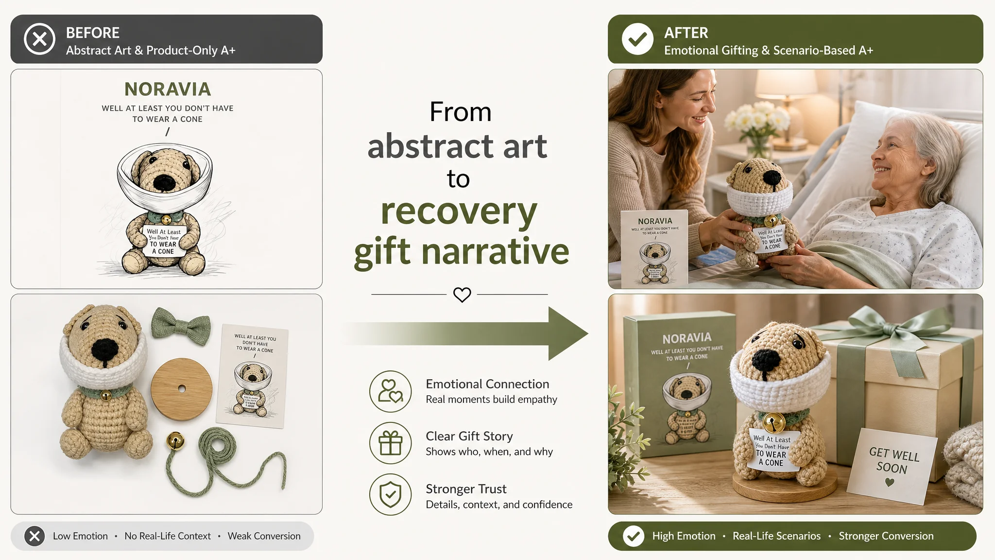
A+ and Detail Page: Art Instead of a Commercial Get-Well Story
The most severe numerical gap was in A+ / detail content: 6 vs 21 out of 25.
How the Benchmark Detail Page Supported Conversion
The benchmark’s Amazon A+:
- Opens with an emotional gifting scene (e.g., a family member giving the plush to someone recovering).
- Breaks out key product elements (embroidery, facial expression, bandages) into clear modules, with short copy explaining each.
- Includes multiple role scenarios: different ages and relationships (parents, partners, grandparents), making the plush feel widely appropriate.
- Explains packaging and gift readiness (e.g., vacuum packaging, gift suitability), reducing friction for buyers who don’t want the hassle of extra wrapping.
In short, the A+ builds a full decision chain: “What is it?” → “Why is it comforting?” → “How does it look and feel?” → “Is it ready to give?”
What the Customer A+ Was Doing
The customer’s A+ sequence:
- Used illustrative, artistic panels and static object shots.
- Did not clarify core usage: get-well gift, bedside companion, surgery recovery humor.
- Did not detail material, size, or tactile feel in a way that reduced risk.
- Lacked clear CTA or value propositions; it read more like a mood board than a sales page.
“This product page did not lack traffic. It lacked a structured story for why someone recovering should receive this specific crochet dog.”
In a category where buyers are worried about sending something that might feel inappropriate, cheesy, or low-quality, this lack of explicit reassurance severely suppresses conversion.
Bullet Points: Information Without a Persuasive Buying Logic
The bullet points dimension showed a smaller numerical gap (7 vs 8 out of 10) but a more important logical gap.
Benchmark Bullet Structure
The competitor’s five points form a clean conversion pattern:
1. Realistic design → charm and emotional resonance
2. Bandage theme → sympathy and “fits the situation”
3. Inspirational embroidery → supportive message
4. Soft & huggable → tactile comfort for all ages
5. Perfect gifting option → specific target users, clear use cases
Every bullet pushes the same direction: “This makes emotional sense as a get-well gift.”
Customer Bullet Structure
The customer’s bullets:
- Mixed scenes, materials, emotions, packaging content, and age limitations in a less ordered way.
- Included instructions and caveats (like the need to provide glue) inside the main bullets, diluting selling power.
- Emphasized multi-functionality and creativity, but not enough about why, concretely, this is the right emotional gift for recovery.
DeepBI reframed them into a more conversion-driven logic:
1. Humorous surgery recovery gifts
- Lead with the core hook: the witty quote and the role in post-surgery, cancer recovery, vasectomy humor, retirement, etc.
1. Unique handmade crochet craftsmanship
- Make “handmade” tangible: premium yarn, sage green accent, interchangeable neckties.
1. Emotional support and playful encouragement
- Position the plush as a companion, not just a decoration.
1. Premium 6-piece gift box set
- Cleanly list components and softly reframe the “glue requirement” as a DIY stability tip.
1. Thoughtful adult gift & safety note
- Clarify that this is an adult-focused emotional support gift, while integrating the 14+ safety constraint in a professional tone.
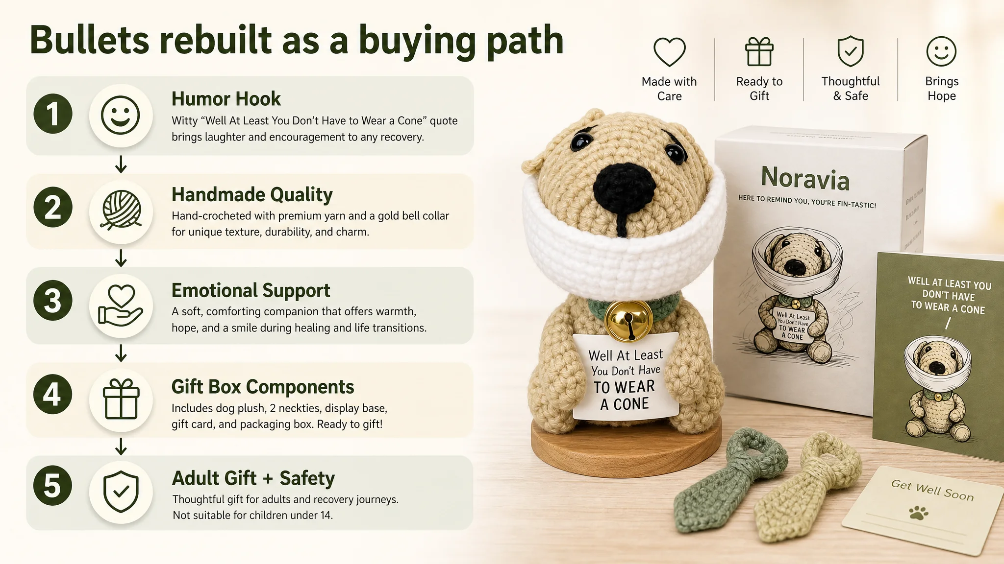
This shifts bullets from “mixed information” to a clear emotional and practical buying path.
Reviews: A Thin Trust Layer Amplified by Weak Content
Review metrics:
- Customer Listing: 5.0 stars, 2 total reviews (2 on first page)
- Benchmark Listing: 4.8 stars, 84 total reviews (8 on first page)
On Amazon, a low review count is survivable if the rest of the page works hard to build trust: strong images, clear A+, convincing bullets. Here, both layers were weak:
- Too few reviews to provide social proof.
- A+ and images that did not compensate with believable, real-life detail.
This combination makes buyers unconsciously ask: “Is this legit? Will it look like the photos? Will it feel okay to give to someone in a fragile moment?” Without a solid page, the 5.0 rating alone cannot carry the weight.
Why DeepBI Did Not Recommend “Keep Tuning Ads First”
Given the above structure, DeepBI’s decision logic was straightforward:
1. Main conversion bottleneck is on-page, not in ad mechanics.
With a 34‑point score gap versus the benchmark — especially a 15‑point gap in A+ and a 10‑point gap in reviews — raising bids or broadening keywords would only drive more people into a page that had not earned their trust yet.
1. Ads were already supplying traffic signals.
If ACOS feels sticky and conversion low despite reasonable keyword matching, the next step is not “more campaigns” but “does the page deserve this traffic?”
1. Fixing Listing conversion first reduces future ad dependency.
Once the product page begins to stand on its own — strong CTR from main images and title, solid CVR from bullets and A+, gradually growing review base — future ad spend can be more selective and profitable, and organic ranking can start to carry more of the volume.
“Advertising does not only amplify advantages. It can also amplify a page’s existing defects.”
For this get‑well plush, the rational order of operations was:
- Step 1: Rebuild Listing conversion capacity (title, main images, bullets, A+).
- Step 2: Let ads re‑test CTR and CVR on a stronger page.
- Step 3: Only then, consider scaling budgets.
How the Page’s Sales Logic Was Rebuilt
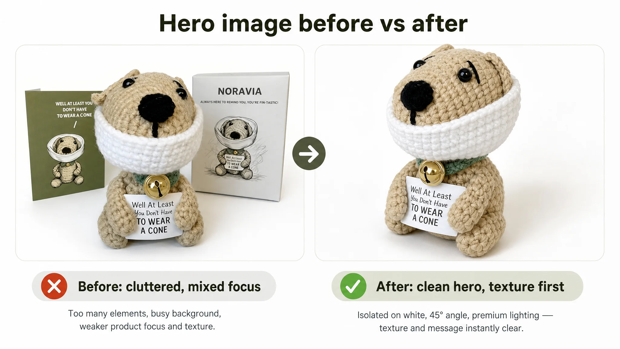
Main Image Strip: From Amateur Snapshots to Structured Commercial Visuals
Image-by-image, the direction was:
1. Primary hero image
- Product centered at ~70% of frame, 45° angle, pure white background, neutral bright lighting.
- Remove clutter (boxes, cards, watermarks).
- Focus on crochet texture and overall silhouette to maximize clarity on SERP.
1. Feature callout image
- Plush placed at lower-left ~35% of frame, with circular bubbles highlighting bell and tail details.
- Light, clean background with simple sans-serif labels.
1. Handmade craftsmanship scene
- 45° view with blurred background of colorful yarn balls and wooden storage.
- Warm, natural light at a workbench, visually proving hand‑crochet authenticity.
1. Emotional bedside scene
- Plush sitting on a nightstand in a cozy bedroom, warm morning light, overlay text like “Thoughtful Recovery Gift.”
- This visually anchors its role at the hospital or recovery home.
1. Gift set “family photo”
- Remove phone UI and anti‑theft overlays completely.
- Show plush, box, and card as a clean ready-to-gift set on a bright background.
These changes are not just aesthetic. They:
- Improve CTR by making the main thumbnail stand out and clearly “get-well gift”-coded.
- Improve CVR by providing concrete visual answers to “How big is it?”, “What does it look like in a real room?”, “Is the packaging decent?”.
A+ Detail Page: From Abstract Illustration to a Full Gift Narrative
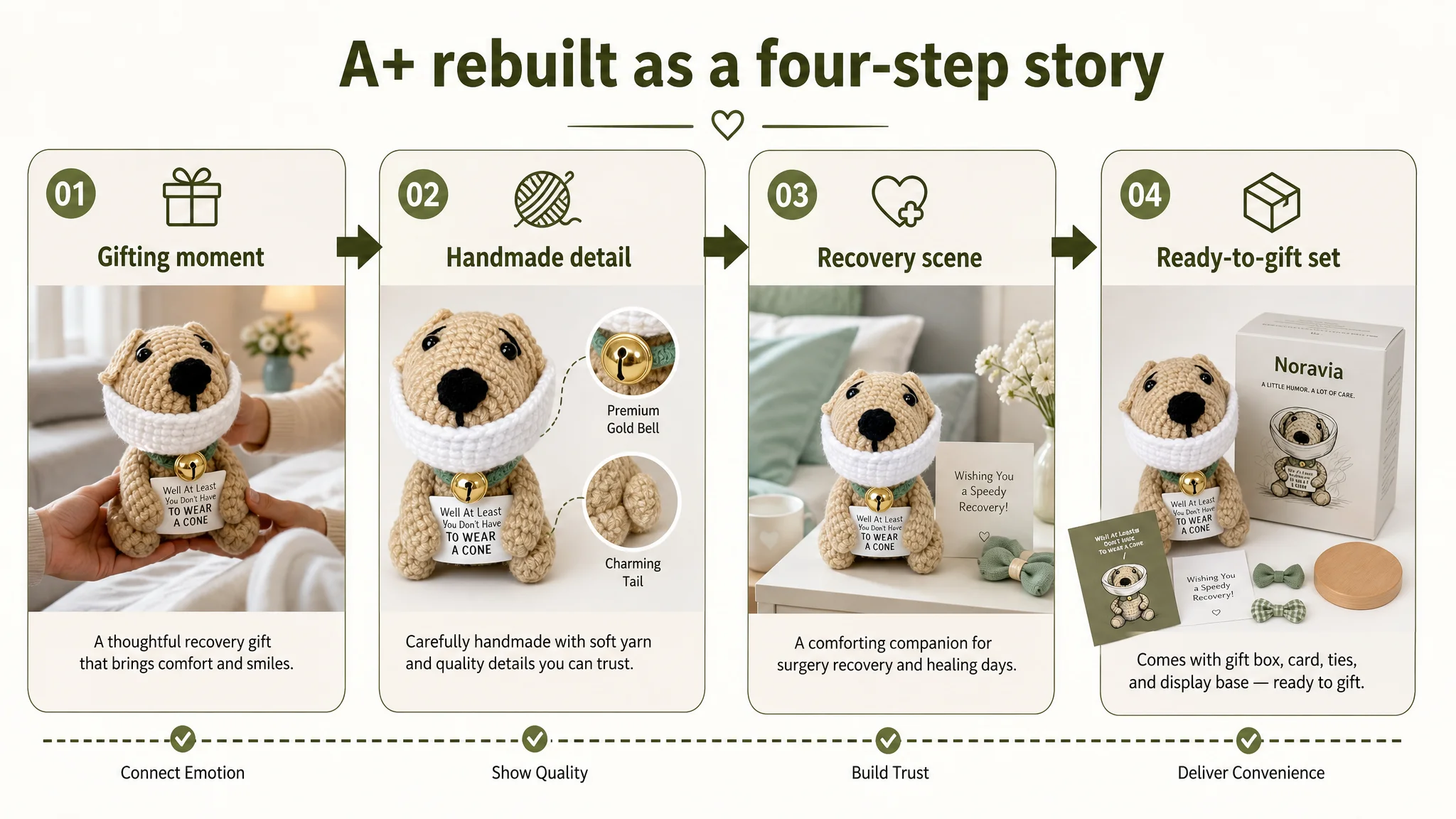
The detail page overhaul focused on four visual blocks:
1. Opening scene
- Warm, 45° mid-shot of an adult handing the crochet dog to an older relative in bed.
- Soft orange and cream tones, clear view of the plush and card in the center.
1. Handmade detail module
- Macro close-ups of crochet texture and bell, with simple overlays like “Handmade” and “Unique.”
- Clean, light wooden background to avoid distractions.
1. Recovery context module
- Bedside or hospital table scene with the plush, a thermos, and flowers.
- Subtle green and white palette, warm lamp light to suggest calm recovery.
1. Ready-to-gift module
- Straight-on product + gift box + card composition with bright indoor lighting.
- Short text like “Ready to Gift” to signal convenience and thoughtfulness.
Together, these modules turn the product from “a crocheted dog object” into a gift experience: who it’s for, how it feels, what moment it fits, and how it presents when opened.
What Changed in the Seller’s Operating Reality
We do not fabricate specific numbers when they are not available, but we can describe the operational shift:
- Listing conversion began to regain strength.
The product page started to act more like a proper get‑well gift listing: clearer entry point via title, a more compelling main image, and an A+ that walked buyers through emotional and practical questions.
- Ad traffic became useful again.
With a stronger page, existing ad spend had a better chance of generating conversions rather than bounces. This stabilized ACOS and gave room to observe real keyword performance.
- Organic potential improved.
As CTR and CVR recover, Amazon’s own ranking logic has more reason to surface the Listing organically on relevant queries like “get well dog plush” and “surgery recovery gift.”
- The seller’s understanding evolved.
Internally, the team moved from “we have an Amazon ads problem and not enough reviews” to “our Listing was not structurally ready to convert traffic.” That shift affects every future launch: they now know to check Listing conversion capacity before scaling campaigns.
What Other Amazon Sellers Can Take From This Case
1. Treat Listing conversion as the foundation of ad efficiency.
If your Amazon product page is 30+ points behind a benchmark Listing in title, images, A+, and reviews, no amount of bid optimization will fully compensate.
1. Don’t mistake “unique product” for “self‑explanatory product.”
Handmade, humorous, or niche items often need even stronger storytelling, not less. Buyers need to understand exactly when and how they should use it.
1. Use competitor pages as a conversion map, not a design trend board.
In this case, the benchmark showed a clear emotional story and decision chain that the seller’s Listing simply didn’t provide. That gap is measurable and fixable.
1. Before scaling ads, ask: does this page deserve more traffic?
Check whether your title leads with the right search intent, whether your main image creates a reason to click, whether your A+ and bullet points form a persuasive path, and whether your current reviews are supported by on-page trust signals.
DeepBI’s role in this case was not to push more automation buttons, but to reframe the problem: to show that the Amazon Listing itself — especially A+ and visual storytelling — was the real bottleneck. Once that judgment is made correctly, every dollar spent on ads afterward has a far better chance of returning as profit rather than wasted traffic.