
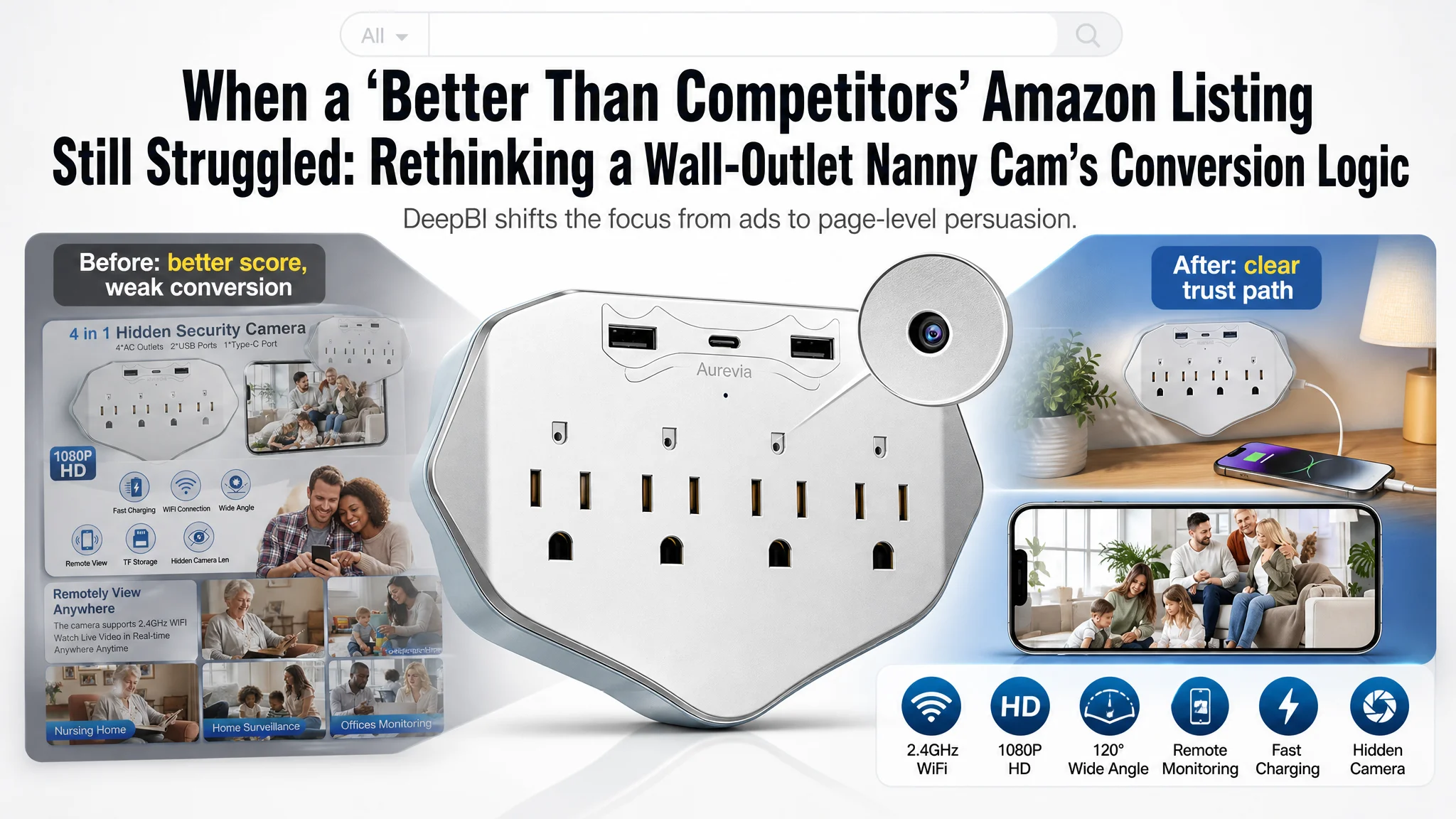
An Amazon seller in the home-security category came to DeepBI with a paradox. Their wall-outlet security camera Listing—built for the US marketplace—looked objectively stronger than a leading competitor on paper. DeepBI’s scoring showed higher totals in title, main image set, bullet logic, and A+ detail. Yet ad performance remained unstable, and the team felt they had to rely heavily on paid traffic without seeing a corresponding lift in orders.
The seller’s initial judgment was straightforward: “Our images and copy are already better than the benchmark; the problem must be Amazon ads—bids, keywords, or budget.” They had been repeatedly tuning campaigns, chasing lower ACOS, and questioning creatives, while assuming the Listing itself was not the bottleneck.
DeepBI’s diagnosis took a different path. By putting the Listing and a benchmark product page side by side—title, main image set, bullet logic, A+ structure, and review profile—it became clear that the real constraint was not ad targeting, but how the page converted the traffic it already had. Critical trust and decision points—especially around “hidden surveillance,” “discreet outlet,” and “easy remote control”—were visually diluted or mispositioned.
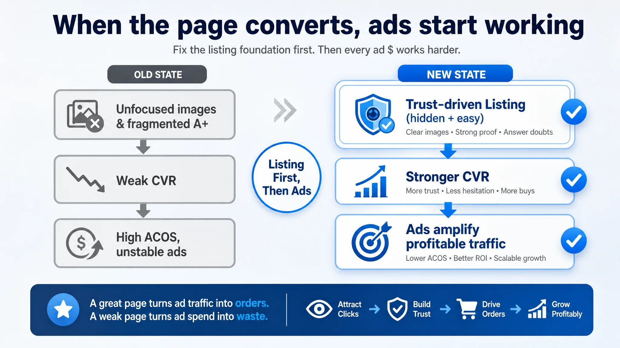
This case is about how the optimization direction shifted: from “keep fixing ads” to “rebuild the persuasion path of the Amazon Listing.” The work focused on main images, bullets, and A+ storytelling around invisibility, multi-function, and ease of use—so that every new ad click landed on a page capable of converting it. For other Amazon sellers, the lesson is sharp: even when your Listing scores higher than competitors, conversion can still leak if the visual and textual logic doesn’t align tightly with how buyers decide.
The Surface Story: A Stronger Listing That Still Felt “Stuck”
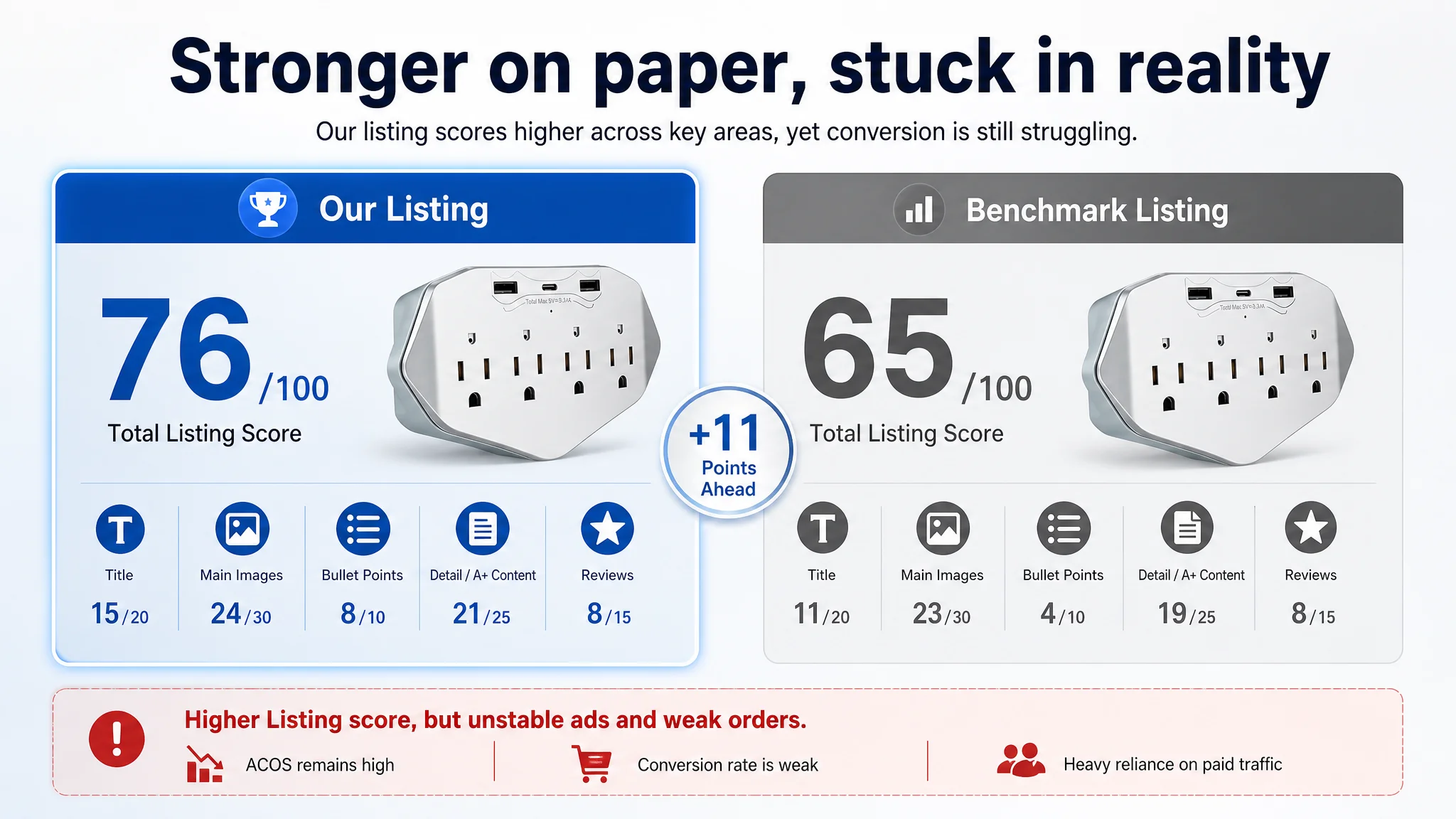
When DeepBI first evaluated this Amazon Listing for a wall-outlet security camera / nanny cam, the numbers looked reassuring:
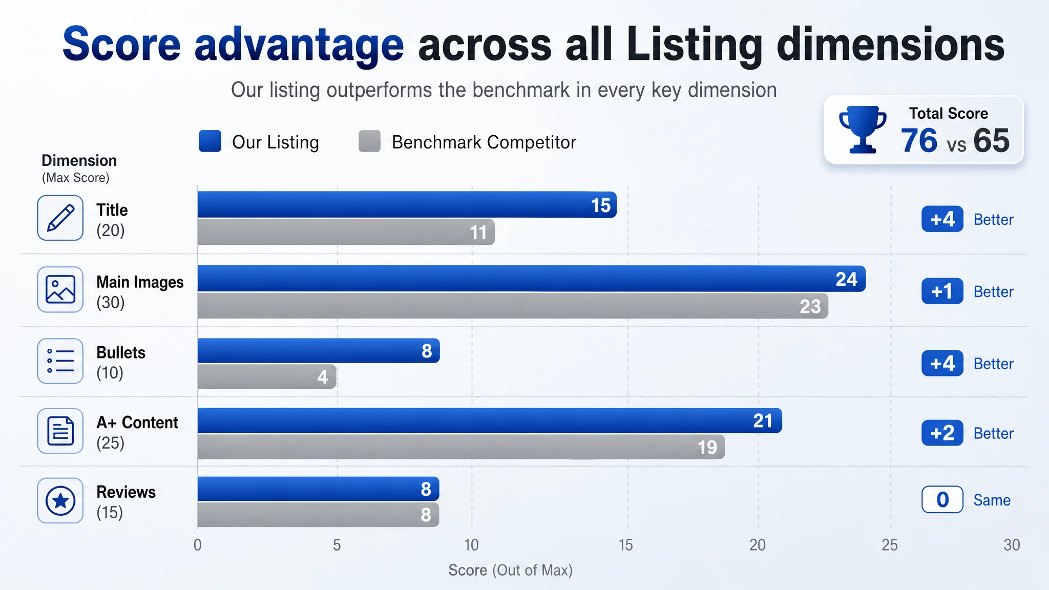
- Listing total score: 76/100
- Benchmark competitor: 65/100
Across most dimensions, the seller seemed ahead:
- Title: 15 vs 11 (out of 20)
- Main images: 24 vs 23 (out of 30)
- Bullet points: 8 vs 4 (out of 10)
- Detail/A+ content: 21 vs 19 (out of 25)
- Reviews: 8 vs 8 (out of 15)
On a pure “audit” view, this Amazon product page did not look like a problem child. The title followed a mature structure, the bullets formed a logical loop, and the A+ area was richer and more systematic than the competitor’s.
Yet operationally, the team was under pressure:
- Advertising felt increasingly expensive.
- ACOS was hard to push down sustainably.
- CTR and CVR were not moving in step with optimization effort.
- The Listing could not organically carry its weight; ads had to keep “pulling it up.”
The seller’s instinctive conclusion: “We’ve already done our Listing homework. The real problem must be the ads.”
They kept:
- Reworking keywords and bids.
- Splitting campaigns.
- Testing creatives around the same core images.
The business assumption was that ad problems should be solved at the ad layer.
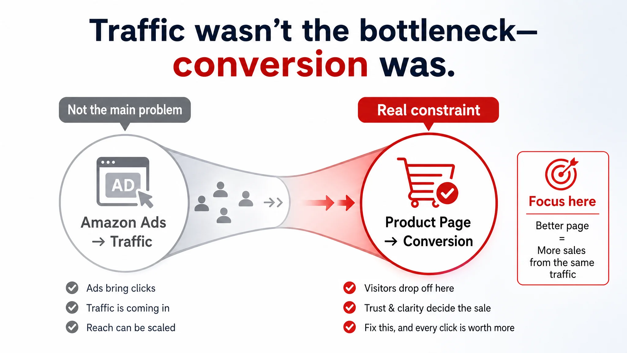
“The real problem was not that ads failed to bring traffic. It was that the page could not convert the traffic.”
DeepBI’s job was to stress-test that assumption.
The Misdiagnosis: Blaming Amazon Ads for a Page-Level Conversion Gap
From the seller’s perspective, the logic seemed sound:
- Title better than competitor.
- A+ more complete.
- Early reviews all 5.0 stars.
- Visual assets “cleaner” and more technical.
So when orders lagged behind traffic, the default diagnosis was:
- “Our ACOS is high because ads are inefficient.”
- “We probably haven’t found the right keywords or campaign structure.”
- “Maybe creatives in ads are not strong enough.”
In this mindset, the Listing was treated as “good enough,” and the team spent most of its time in the ad console instead of the product page.
There were three implicit assumptions:
1. Higher Listing score = no serious page problem.
If DeepBI’s listing score shows a double-digit lead over a benchmark, it’s easy to believe the page is not the bottleneck.
1. Better text and richer A+ = higher CVR by default.
The seller equated “more detailed explanations” with “more persuasive,” regardless of where and how those explanations appeared visually.
1. 5.0-star rating = trust is solved.
Despite only having 3 reviews (vs. 181 for the benchmark), the perfect rating created a psychological bias: “Customers love it; the page is not the issue.”
The consequence: Ad optimization was asked to solve a conversion problem that belonged to the Listing.
What DeepBI Saw: A Listing That Looked Strong but Converted Weak
Once DeepBI aligned Listing scoring with the seller’s operational data, a different pattern emerged.
The real constraint: Listing conversion capacity, not ad reach
DeepBI’s multi-dimensional scoring made one thing clear: the Listing was better than the benchmark in structure, but not sharper in decision logic.
Title and bullet scores hid a deeper issue:
- The title successfully led with “Wall Outlet Security Camera”, correctly aligning with home-security intent and emphasizing:
- 4-in-1 design with USB charger & surge protector
- Local SD card storage
- 120° wide angle
- Motion detection
- Nanny cam use for home and office
- The bullets formed a proper problem–solution–benefit loop:
- Wide view and 1080P clarity
- Discreet 4-in-1 functional outlet
- Easy WiFi setup and remote monitoring
- Local storage, no subscription fee
- 24/7 power and motion alerts
On paper, this was far more structured than the benchmark’s “function list” bullets.
Yet DeepBI’s diagnosis Agents found something critical:
The messaging was present, but the visual hooks at each stage of the funnel did not match how buyers decide.
Main images: The invisible camera wasn’t truly “felt” as invisible
DeepBI’s visual analysis surfaced several issues:
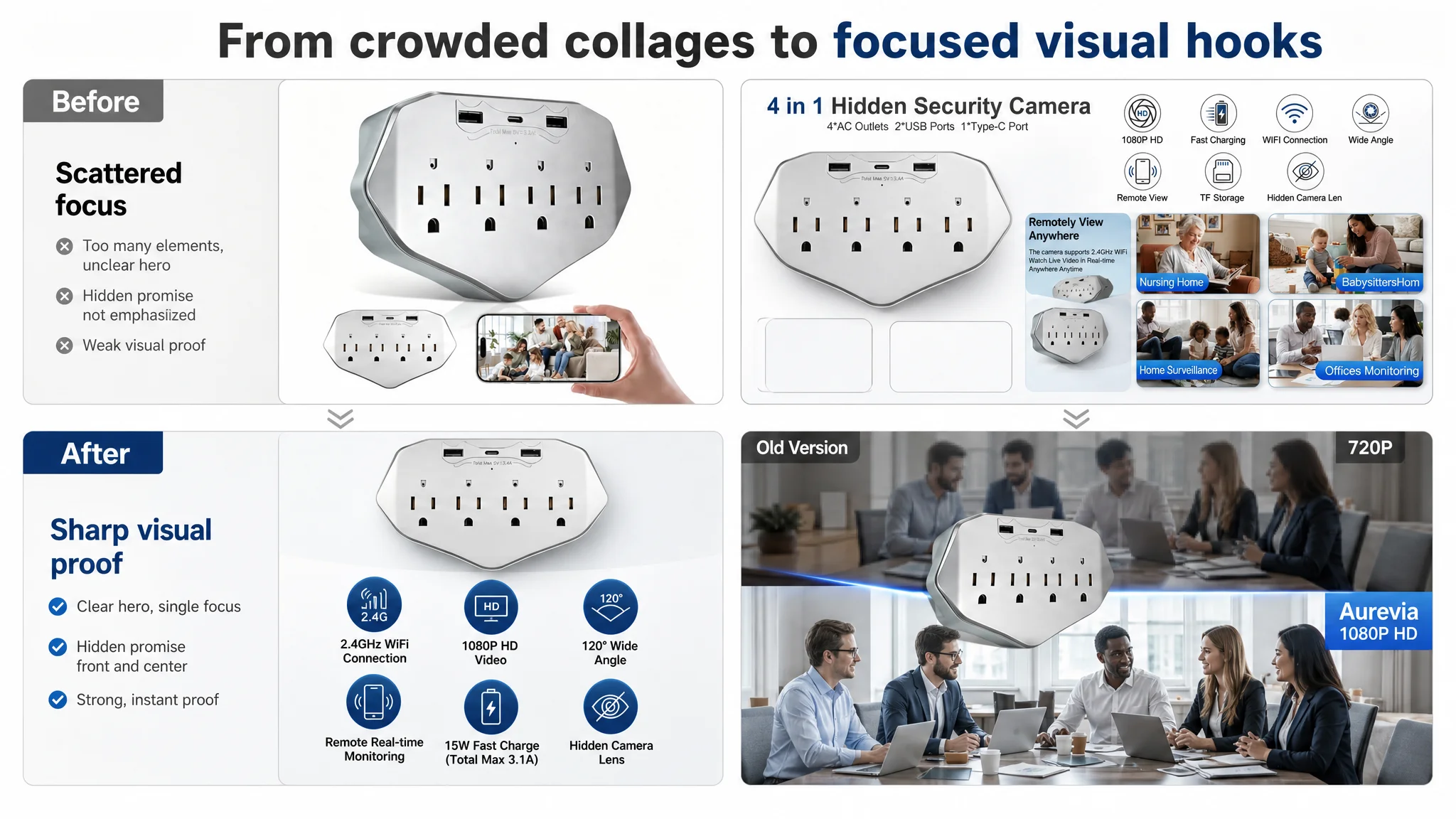
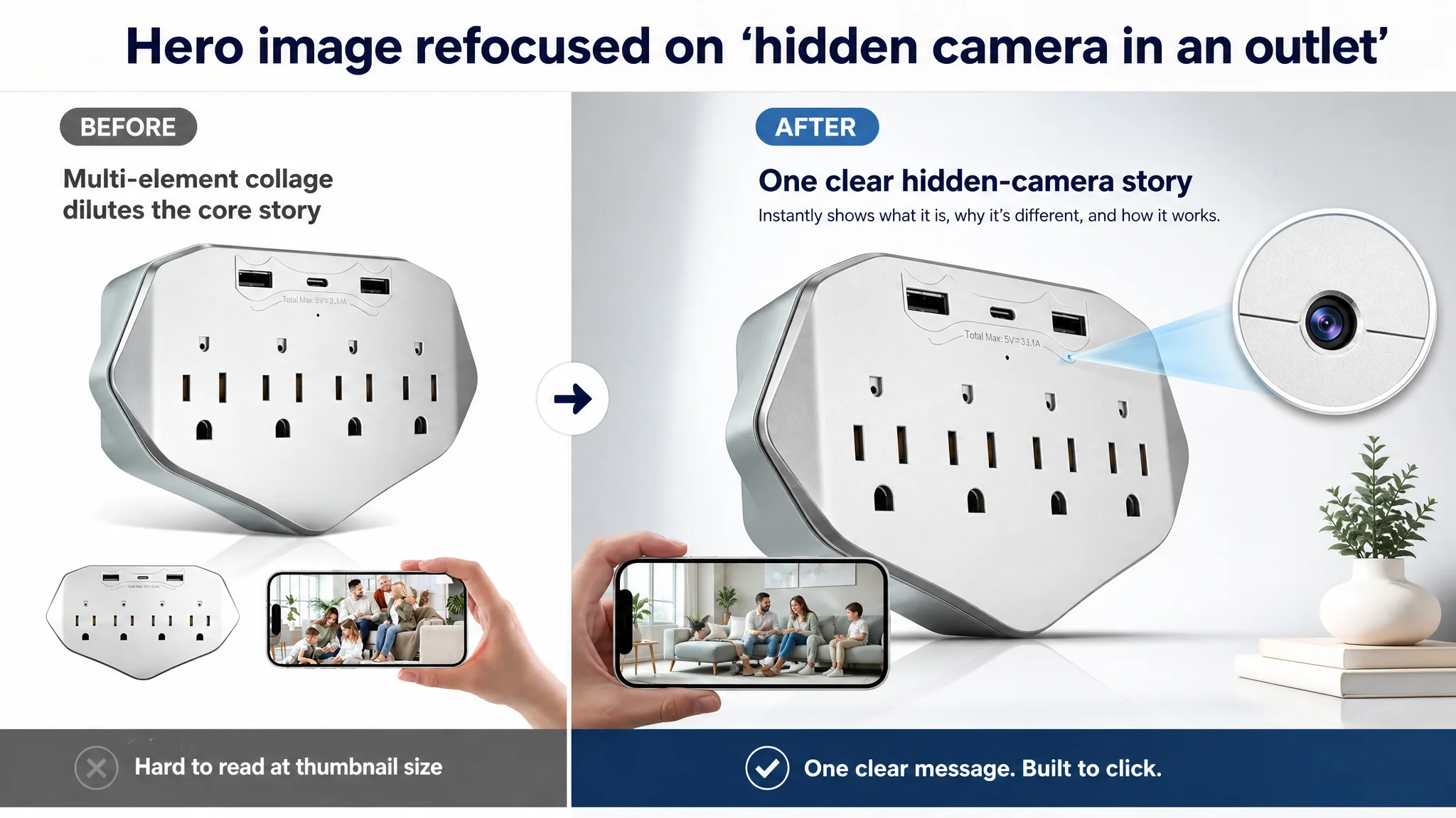
1. Collage main image diluted the core promise.
- A collage-style primary image lowered A9’s perception of clarity and subject focus.
- This risks a 5–10% drop in natural exposure compared with a clean, centered product shot.
- On the search results page, that means fewer chances for ads and organic impressions to even get a meaningful click.
1. Information overload in secondary images.
- A busy “feature collage” drove average attention time on some images below 2 seconds.
- The notion of a “hidden camera in a wall outlet” did not get a dedicated, magnified moment.
- The funnel broke at the “understand immediately why this is different” stage.
1. Image quality claims vs. visual proof mismatch.
- A 1080P claim was there, but visual proof was weak.
- The benchmark’s sharper comparison between “old vs. new” image quality gave a more visceral sense of upgrade.
- This gap risked future “image doesn’t match reality” complaints, undermining long-term trust and store rating.
In short: the product’s biggest advantage—truly discreet, multi-functional monitoring—did not have a single, dominating visual anchor in the main image set.
A+ detail page: Rich structure, but not maximized trust
On the A+ level, DeepBI found a similar pattern:
- The seller’s A+ was more systematized than the benchmark:
- Wide-angle coverage modules
- Icon matrix of core functions
- 2.4G vs. 5G connectivity clarity
- Multi-scenario grids (“Keep an Eye on what Matters,” “Multiple application scenarios”)
- Technical transparency was higher:
- Explicitly stating 2.4GHz support vs. 5GHz limitations.
- More concrete depiction of viewing angles with dynamic visuals.
However, there were cracks:
1. Over-rendered visuals reduced “real home” feel.
- Some modules felt like tech renderings rather than lived-in environments.
- For a hidden camera, “does it blend into real life?” is a central question; renders weakened that proof.
1. Remote control and app trust not given a full, clear-stage moment.
- App interface shots were smaller and less legible.
- Compared to the benchmark’s large, clean app-screen focus, this reduced the sense of “I can actually operate this easily.”
1. Scenes were comprehensive, but emotionally fragmented.
- Many small images, heavy overlays, and multiple micro-scenes.
- Less of a single, emotionally resonant “family / pet / elder care” narrative.
The outcome: Information density was high, but emotional and trust density were not.
Why DeepBI Refused to “Fix Ads First”
Given this diagnosis, DeepBI’s key judgment was:
“Before scaling ads again, the Amazon Listing must regain its conversion capability.”
There were three business reasons for this decision path.
1. Ads were amplifying a weak trust path
With a 76/100 Listing score vs. a 65/100 benchmark, the team had a false sense of security. But DeepBI’s interpretation was stricter:
- A higher score meant potential, not guaranteed conversion.
- The gaps were concentrated at critical micro-moments:
- Search-result thumbnail clarity.
- Visual proof of being truly discreet.
- Clear, reassuring remote control demonstration.
- Visualized “no subscription fee, local storage” promise.
In that state, pushing more ad spend would have:
- Driven more traffic into a page that did not fully answer the main fears (being discovered, setup difficulty, reliability).
- Increased wasted clicks and sustained high ACOS.
- Delayed addressing the real constraint.
2. Organic and paid traffic were both at risk
The Listing’s low review volume (3 reviews vs. 181 for the benchmark) put it in a fragile position:
- Any early mismatch between image expectations and real usage could quickly generate:
- “Not as hidden as expected”
- “Hard to connect”
- “Image quality not like photos”
- With such a small review base, a handful of critical reviews could:
- Drag the rating down sharply.
- Shrink organic CTR and CVR.
- Increase dependence on ads just to stay visible.
Fixing ads alone would not change this structural risk.
3. Listing conversion is the foundation of ad efficiency
DeepBI’s operating view is simple:
- CTR issues usually trace back to title + main image logic.
- CVR issues usually trace back to product-page trust and clarity.
- Ads can redistribute traffic, but cannot repair a broken persuasion path.
In this case:
- The title and bullets had strong logic already.
- The main image set and A+ modules failed to visually cash in those claims.
- Until that was fixed, every ad dollar had lower-than-necessary yield.
So instead of another round of bid tuning, DeepBI shifted the seller’s attention firmly to the Listing.
How the Optimization Focus Shifted: From “More Specs” to “Clearer Decisions”
DeepBI’s Listing optimization did not start from scratch; it started from the existing advantages and re-ordered the page around actual buying decisions.
Reframing the title: Keep the logic, sharpen the entry points
The proposed title:
Wall Outlet Security Camera 1080P Wireless WiFi Indoor Surveillance Cam, 4-in-1 Wall Plug with USB Charger & Surge Protector, 120° Wide Angle, Motion Detection Nanny Cam for Home Security & Office
Key decisions behind it:
- Keep “Wall Outlet Security Camera” at the front
To align with home-security intent and capture precise search demand, rather than generic “USB charger camera.”
- Introduce “Motion Detection” and “Nanny Cam” explicitly
To pick up pet/nanny monitoring queries without abandoning the core security persona.
- Hold the “4-in-1” and “Surge Protector” USP
To differentiate from ordinary plug-in cameras and justify a higher perceived value.
This was not about stuffing more keywords; it was about aligning the Amazon A9 logic with how buyers actually search and filter.
Rebuilding bullet points around a “trust path,” not a feature list
DeepBI reorganized bullets into a tighter decision sequence:
1. Visual clarity and coverage first
- 1080P clarity + 120° wide view.
- Eliminates blind spots and defines outcome: “You don’t miss critical moments.”
1. Discreet 4-in-1 wall outlet second
- 4 AC outlets, 3 USB PD ports, surge protection.
- The hidden lens narrative: “Blends into any home or office.”
1. Ease of connection third
- Simple 2.4GHz WiFi setup, iOS/Android support.
- “Live view and playback in minutes” becomes credible.
1. No subscription, local storage fourth
- Explicit “no monthly fees” plus H.265 compression, loop recording.
- Positions the camera as a low ongoing-cost solution, addressing a rising buyer pain point.
1. 24/7 power and real-time alerts fifth
- Wall-powered, no battery anxiety.
- Motion push notifications to close the loop on active protection.
Each bullet was designed as:
pain point → specific capability → outcome
so that buyers moved logically from “Can it see enough?” to “Will anyone notice it?” to “Can I operate this?” to “How much will it cost me over time?” to “Will it actually protect me when I’m away?”
Reconstructing the Visual Funnel: Making “Hidden and Easy” Visibly Obvious
DeepBI’s visual recommendations were not “make it prettier.” They followed one rule:
Every key claim in the text must have a clear, memorable visual proof.
Main image #1: A single, clear reason to click
Instead of a collage, the proposed hero shot:
- Centers the product at a 45° angle, occupying ~70% of the frame.
- Uses a modern white–light grey gradient background.
- Adds a magnifying-glass effect highlighting the hidden lens.
- Shows a smartphone with a warm, high-saturation live-view scene.
- Keeps a cool-tech color tone to signal security and reliability.
This gives a thumbnail viewer one immediate takeaway:
“It looks like a normal outlet—but it’s actually a camera I can monitor on my phone.”
Scene images: Show charging and monitoring together, not separately
The next key image places the outlet in a real bedroom wall, with:
- A phone charging from the USB port.
- A cozy, natural-light environment.
- A headline like “Fast PD Charging & Hidden Guard.”
This solves a specific trust friction:
- “Will it look out of place?” → It blends into everyday furniture.
- “Is it actually functional as an outlet?” → Visible charging progress.
- “Is the surveillance obvious?” → No; it visually disappears into the room.
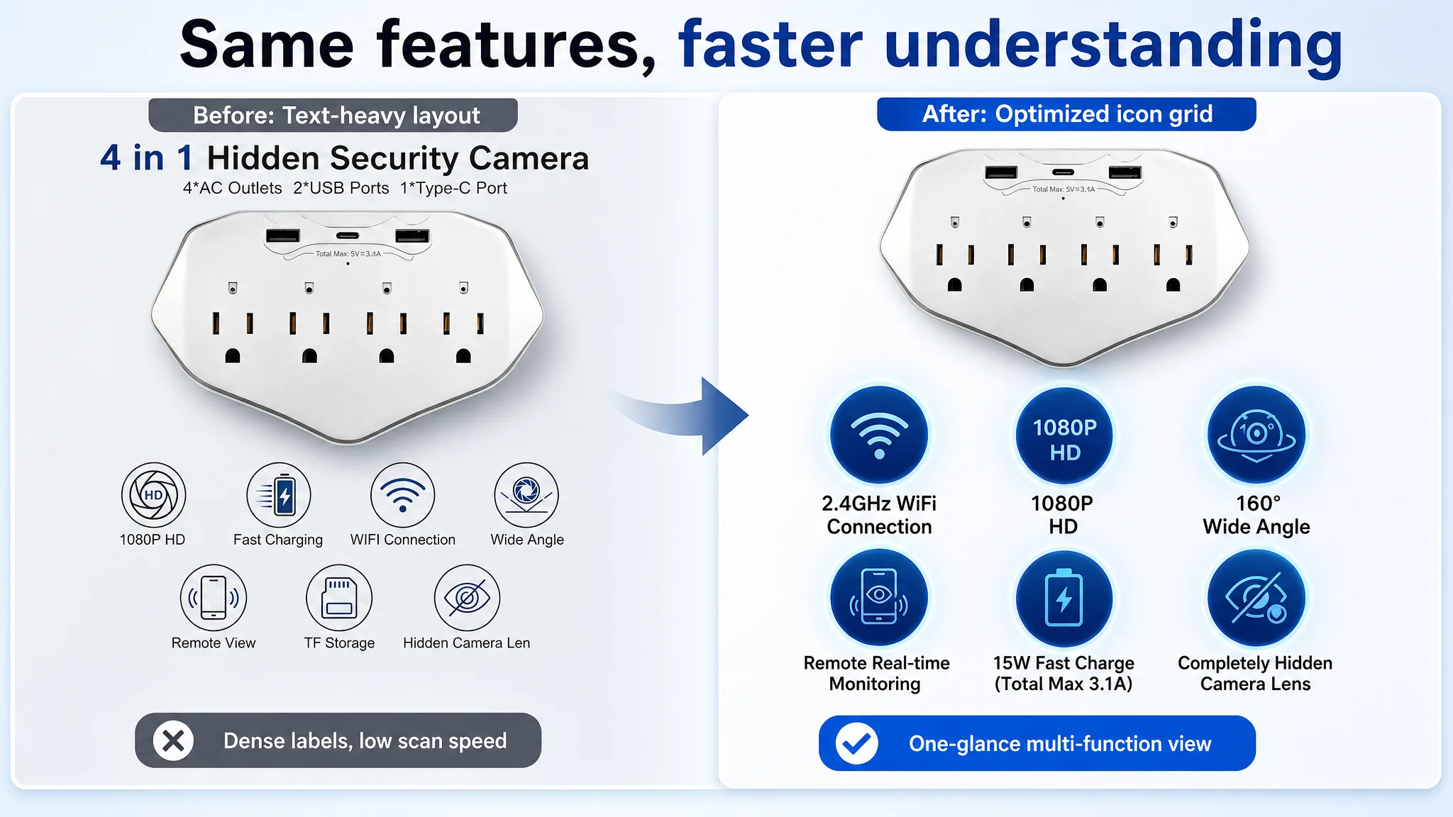
Feature grid: Compress the multi-function into one glance
Another revised image uses a clean grid:
- Product small and centered.
- Six deep-blue circular icons (WiFi, 1080P, wide angle, remote monitoring, fast charging, hidden lens).
- Quantified labels under each icon.
Instead of long paragraphs, buyers get:
- A one-glance understanding of what the outlet does.
- A sense of professional, tech-grade capability.
Remote view: Make the “connection” literally visible
To tackle setup anxiety:
- One image shows the outlet on a living-room wall.
- A smartphone displays multi-view, real-time monitoring.
- A subtle blue “data flow” connects product to phone.
- “Real-time Remote View” is clearly labeled.
This reduces perceived technical complexity and increases “I can do this” confidence.
Image quality: Make 1080P feel like an upgrade
The revised comparison:
- Top: intentionally blurred 720P screenshot, labeled “Old Version.”
- Bottom: sharp 1080P screenshot with facial detail, labeled “Ours 1080P HD.”
- The product floats near the divider, spotlighted.
This gives buyers a visceral before/after impression rather than a theoretical resolution number.
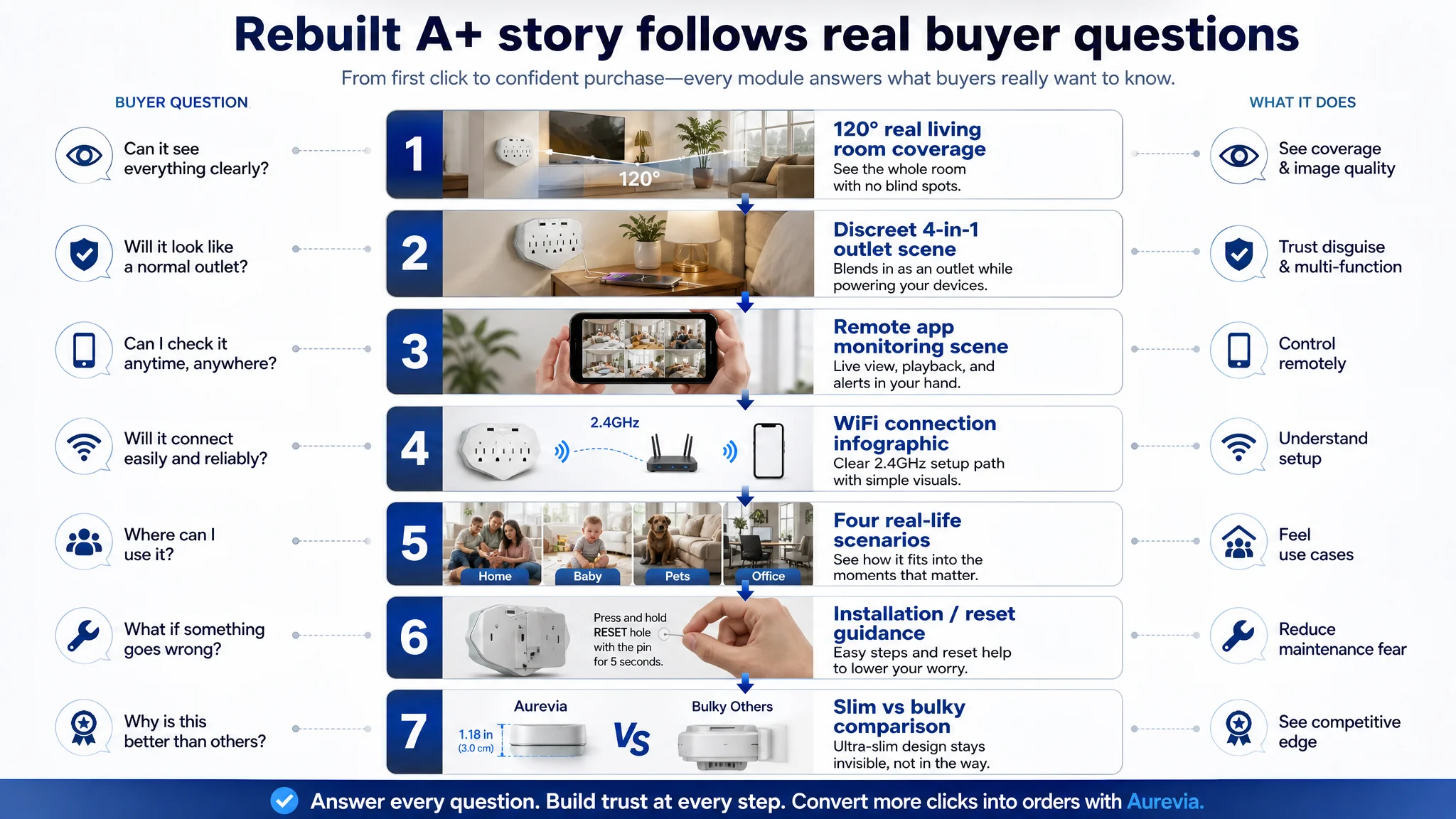
A+ Rebuild: From Fragmented Info to a Structured Story
On the A+ detail page, DeepBI kept the seller’s stronger structure but refined it for:
- More realistic home scenes
- Clearer app control experience
- Less “PPT” styling, more professional infographics
- Stronger emotional anchoring
Key changes:
1. Wide-angle module: Real living room, not a blue beam
2. 4-in-1 module: Everyday disguise, not “tech object”
3. App monitoring module: Clear, large, and contextual
4. WiFi connection module: From PPT to minimal infographic
5. Scenario module: Fewer icons, more real-life snapshots
6. Installation & reset module: Show, don’t just tell
7. Comparative design module: Visually prove slimness
What Changed: From Unstable Ads to a Controllable Traffic Structure
Because this case focuses on diagnosis and logic, not on post-optimization metrics, we won’t invent numbers. Instead, we focus on what changed in the seller’s operating state.
Listing conversion regained priority over “fine-tuning” ads
The biggest shift was mental:
- The seller stopped treating their Amazon Listing as a solved problem.
- They accepted that higher scores than a benchmark do not guarantee high CVR.
- Ad adjustment was no longer the default answer to every conversion issue.
Instead, they:
- Rebuilt the main image set around hidden surveillance + multi-function outlet.
- Tightened bullets into a decision-sequence rather than a feature list.
- Reorganized the A+ to concretely address:
- “Will it be noticed?”
- “Can I connect it?”
- “Do I really avoid subscription fees?”
- “What happens if things go wrong?”
Ad traffic became “worth sending” again
Once the Listing’s persuasion path aligned more closely with buyer logic:
- Each new ad click landed on a page that:
- Built trust more quickly.
- Showed the camera’s advantage visually, not just verbally.
- Reduced abandonment caused by technical and usability fears.
This allowed the seller to:
- Resume ad optimization knowing that the incremental cost per click had a higher probability of payoff.
- Start slowly balancing the traffic structure so the Listing could accumulate more:
- Real-world reviews.
- Organic ranking signals.
- Stable conversion data.
Understanding shifted from “ads vs page” to “ads on top of page”
The final learning for the seller—and for many Amazon operators reading this—is straightforward:
- Amazon ads amplify whatever your product page already is.
- If your Listing can’t convert, ads amplify waste.
- If your Listing builds trust, ads amplify growth.
In this case, DeepBI’s value did not come from another layer of ad tricks. It came from challenging the initial misdiagnosis, and insisting that the real problem was a conversion leak inside an otherwise “good-looking” Amazon Listing.
Takeaways for Other Amazon Sellers
This wall-outlet nanny cam case is not unique to home security. Similar patterns appear in many categories:
- A Listing scores higher than competitors.
- The team assumes the page is “fine.”
- Ads carry the blame when orders lag.
- Ad tuning continues while the real conversion leak remains untouched.
Three concrete lessons stand out:
1. A higher Listing score than competitors is not the finish line; it’s the baseline.
Look for micro-moment leaks: thumbnail clarity, hero image intent, and whether each claim has visual proof.
1. Bullet and A+ structure matter less than whether they mirror real buying decisions.
Ask: “Does the page answer, in order, the exact questions a cautious buyer has?”
1. Ads should be scaled only after the product page can reliably convert incremental traffic.
Otherwise, every extra dollar of spend is a magnifier on the wrong problem.
For Amazon sellers feeling that “we’ve already done the Listing work, but ACOS still won’t come down,” this case suggests a hard but necessary question:
Are you optimizing ads on top of a page that truly deserves more traffic, or are you asking ads to compensate for a conversion problem your Listing has not yet solved?