
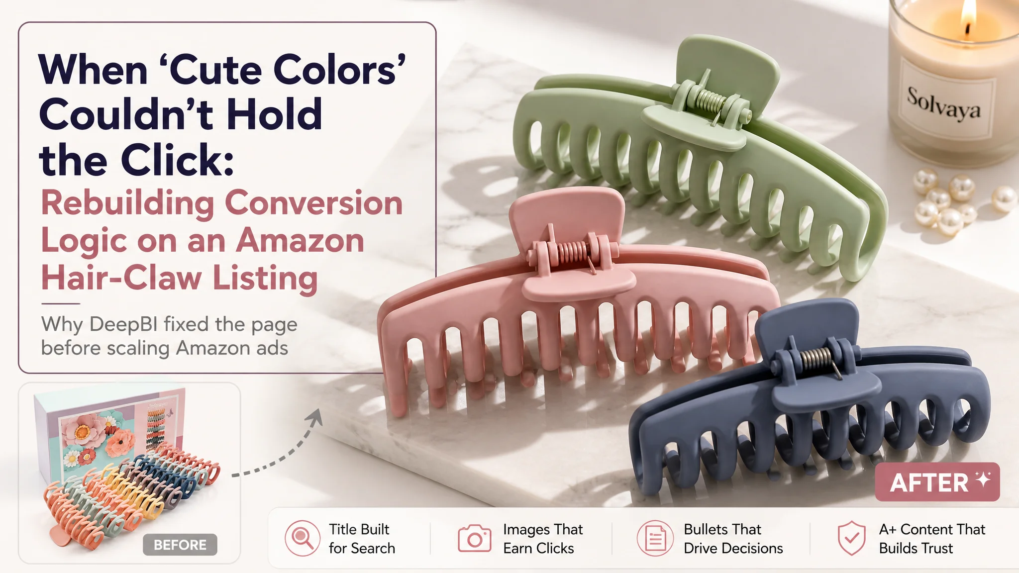
An Amazon seller in the hair-accessories category came to us with a familiar headache: ads were bringing traffic to their large matte hair-claw clips, reviews were solid, but the product page was not competing well against a leading Amazon competitor. The team was convinced the issue was “we just need more traffic and more reviews,” and kept adjusting Amazon ads and budgets to push the listing harder.
DeepBI’s diagnosis pointed somewhere else. When we scored the Amazon Listing against a benchmark competitor, the total score gap reached 15 points (67 vs. 82). The product itself was not the problem; the real bottleneck was the listing’s ability to convert traffic: the title emphasized “aesthetic” language instead of core functions, the main images looked cheaper and less focused, the bullet points read like feature lists instead of buying logic, and the A+ content missed the trust-building story that the benchmark competitor executed very well.
The optimization therefore did not start from ads. It started from reconstructing the Amazon product page: reordering the title around high-intent search terms and functional benefits, redesigning main images to a “minimal fashion” style that fits Amazon search-page competition, tightening bullet points into “pain point → solution” logic, and rebuilding A+ content around realistic high-aesthetic scenes and structural proof (size, hold strength, material, comfort). Only after the product page could hold its own did ad traffic become truly valuable again.
This case is worth reading if you have ever tried to solve a conversion problem only with Amazon ads. It shows how a hair-claw clip listing with good reviews still lost on conversion because the page spoke in “pretty” language while competitors spoke in purchase logic—and how reframing the problem from “not enough traffic” to “weak listing conversion capacity” changed the seller’s operating risk and future ad strategy.
The Store Thought It Had a Traffic Problem, Not a Page Problem
On the surface, this Amazon seller had an attractive offer:
- Large matte hair-claw clips
- 8-color sets
- 4.7-star rating with 800+ reviews on the US marketplace
Competing against them was a category-leading listing with:
- The same 4.7-star rating
- Nearly double the review count
- A visibly more polished Amazon product page
The seller felt the gap came from “too few reviews” and “not enough exposure.” Their instinctive response was to:
- Push Amazon ads harder
- Add more images
- Tweak a few phrases in the bullets
But they never systematically checked whether the listing itself could carry the traffic.
“The real problem was not that ads failed to bring traffic. It was that the page could not convert the traffic as effectively as the benchmark.”
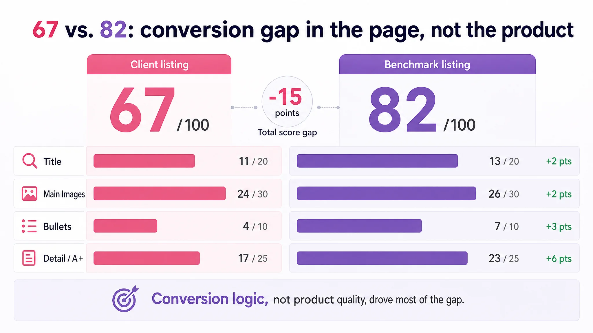
When DeepBI scored the listing, the total score came out at 67/100 versus the competitor’s 82/100. More importantly, the loss was concentrated in areas that directly affect conversion:
- Title: -2 points
- Main images: -2 points
- Bullet points: -3 points
- Detail/A+ page: -6 points
Reviews themselves were not the differentiator. Both held a 4.7-star rating. The competitor simply had more social proof volume, but the real “conversion machinery” difference lay in how the listing told the product story.
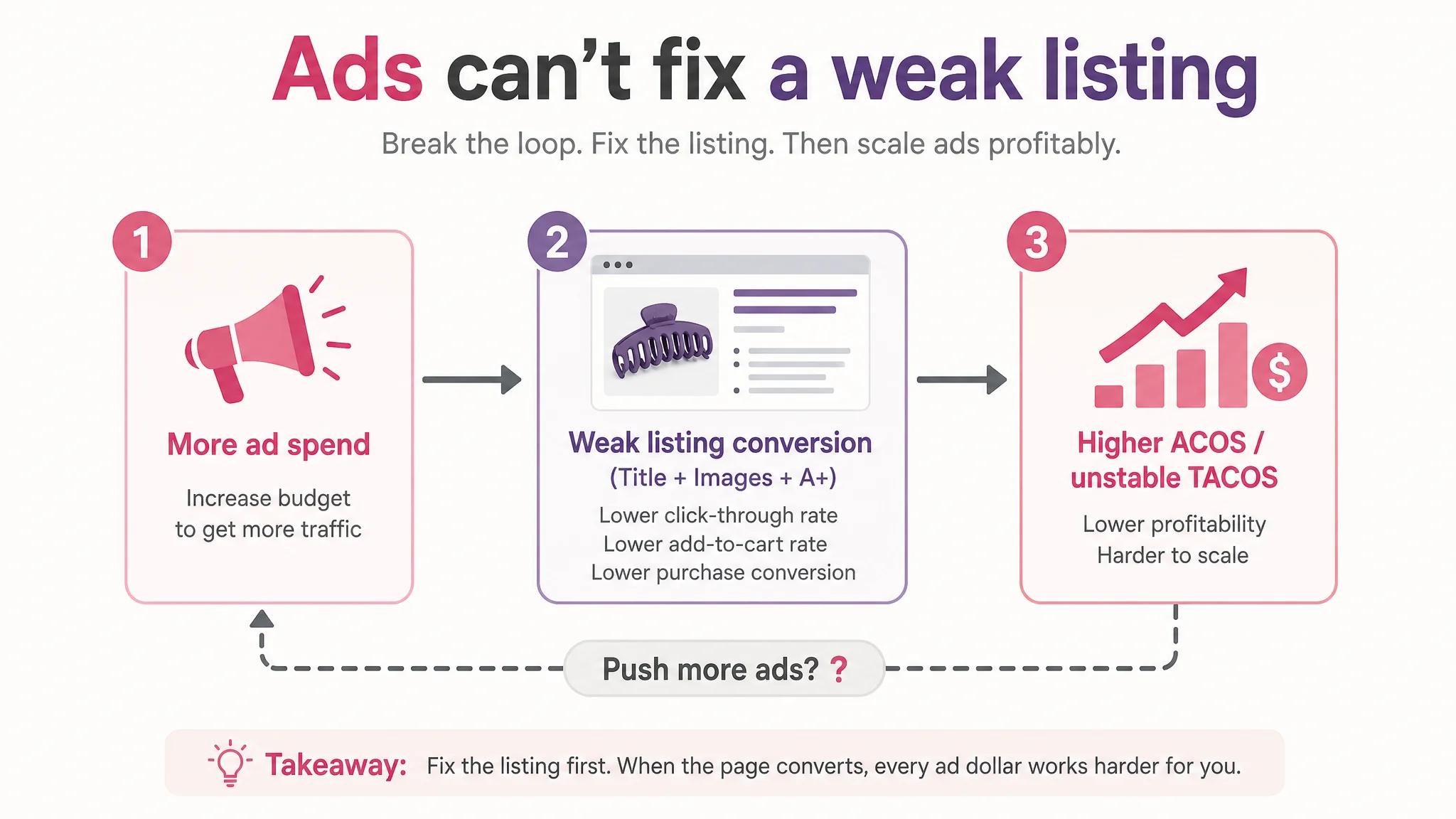
Amazon Ads Were Not Failing. The Page Was Consuming the Traffic.
From a business angle, this seller was stepping into a classic risk: using ads to fill a hole that was actually in listing conversion.
On Amazon, this shows up as:
- Ad spend keeps going in
- Impressions and clicks exist
- Orders don’t scale proportionally
- ACOS and TACOS become harder to control
DeepBI’s scoring and comparison made one thing clear: this listing did not lack people seeing it. It lacked a compelling reason to click, and a structured reason to buy once they arrived.
The title sounded cute, but search and conversion logic were weak
The original title leaned heavily on “aesthetic” language:
- “Fashion Colorful”
- “Aesthetic Preppy Stuff for Teen Girls”
The competitor’s title did something else:
- Led with the core search phrase: “4.3 Inch Large Hair Claw Clips”
- Stacked functional outcomes: “Nonslip”, “Strong Hold”
- Integrated user targeting efficiently: “for Women and Girls”
DeepBI’s diagnosis:
- The seller front-loaded “8Pcs” and style phrases instead of the core query and function.
- Confusing property combo: “Fashion Colorful” vs. “Matte” (glossy vs. matte logic clash).
- User portrait words (“for Women”, “for Teen Girls”) were scattered instead of integrated.
In Amazon search results, where buyers skim dozens of titles in seconds, this meant:
- The competitor’s title instantly answered: “Will this clip actually hold my hair without slipping?”
- The seller’s title mainly said: “These are cute, colorful things for teen girls.”
When your product is supposed to serve both women and girls, and both thick and thin hair, that kind of framing can quietly degrade conversion.
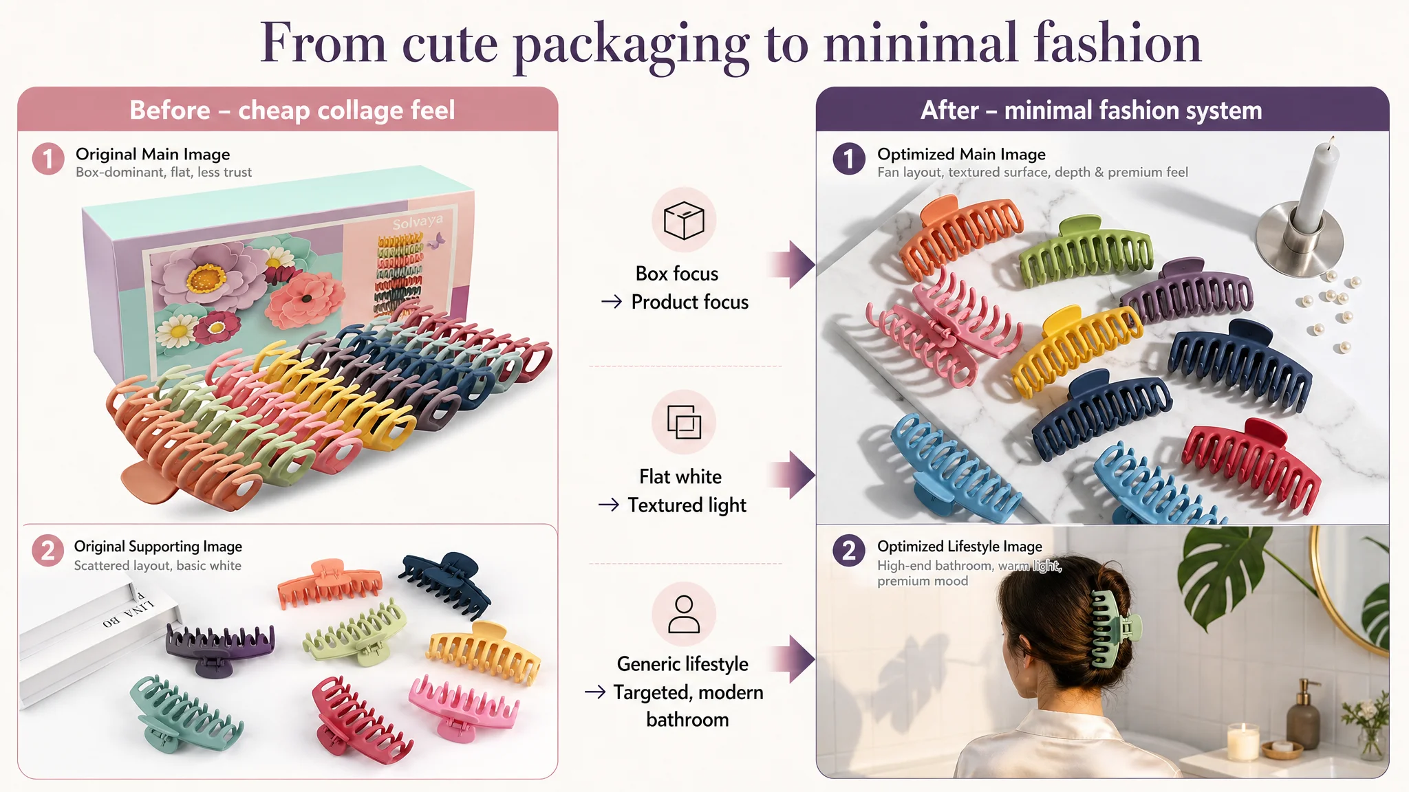
The main images felt cheaper and less trustworthy to the target buyer
The score gap in main images was only 2 points on paper, but the qualitative difference was much bigger.
DeepBI’s visual analysis found:
- The seller’s leading images leaned on:
- Box and packaging occupying too much space
- Flat collage-style compositions
- Plain white backgrounds with minimal depth
- The competitor relied on:
- Minimal, high-texture backgrounds (stone, marble, soft gradients)
- Clean product arrays that occupy most of the frame
- Realistic, high-aesthetic lifestyle use (hair up, comfortable, on-brand environments)
- Technical visuals with clear labels (size, spring, non-slip teeth)
For the real target buyer—25–35-year-old women who care about quality and aesthetics—this had consequences:
- Click-through rate likely undershot by 5–8% versus similar offers.
- The listing felt more “cheap daily gadget” than “reliable, stylish hair accessory.”
Bullet points: a list of features instead of a buying conversation
The bullet-point score gap (4 vs. 7 out of 10) captured another core problem.
Benchmark bullets:
- Used benefit-led titles: “HIGH QUALITY & NON-SLIP”, “FASHION & COMFORTABLE”
- Followed “advantage → outcome” logic:
- Strong flexible metal spring → grips hair tightly without slipping
- Lightweight design → all-day wear without hurting scalp
- Perfect size → holds thick, thin, and curly hair
- Quick updo → tidy hair for work and daily life
- Aesthetic + gift + after-sales → emotional and risk-closing layer
Customer’s bullets:
- Used neutral headers: “Material”, “Wide Application”
- Listed properties: “Durable, waterproof and Non-slip, lightweight”
- Enumerated scenes: “Healthcare”, “Accompanying pets” with little emotional logic
- Split gift attribute into a separate, rather thin point
So the competitor’s bullets guided the reader through:
1. Can it hold my hair securely?
2. Will it hurt or feel heavy?
3. Is it the right size and color for me?
4. Does it fit my daily routine (work, shower, makeup)?
5. Would it make a nice, safe gift?
The seller’s bullets mostly said, “Here are the features,” without tying them to specific worries and outcomes.
A+ content: the page didn’t build trust, it just showed variety
In the detail/A+ area, the score gap widened to -6 points (17 vs. 23).
The seller’s A+ structure:
- Color display collage
- Product structure illustration
- Multiple “usage scenarios” tiled together
- Gift scenario with emotional text
- Brand slogan image
The competitor’s A+ structure:
- Hero scene with strong visual story
- Icon-based core benefits
- Structural close-ups (matte finish, metal spring, non-slip teeth)
- Multiple high-quality lifestyle scenes across daily life
- Multi-angle wearing demonstrations
- Gift emotion module
- A usage flow (“daily → work → outdoor → home → gifting”)
- Video entry
Functionally, the seller’s A+:
- Lacked clear visualization of:
- Material (acrylic + metal spring)
- Safety design (non-slip teeth, not damaging hair)
- Size capacity (thick vs. thin hair compatibility)
- Overused generic scene labels (“Healthcare”, “Accompanying pets”) that felt forced
- Did not guide a coherent “from interest to purchase” journey
“Advertising does not only amplify advantages. It can also amplify a page’s existing defects.”
With this A+ setup, every additional visitor from ads was more likely to:
- See colorful images
- Still question hold strength, comfort, and fit
- Bounce or hesitate instead of adding to cart
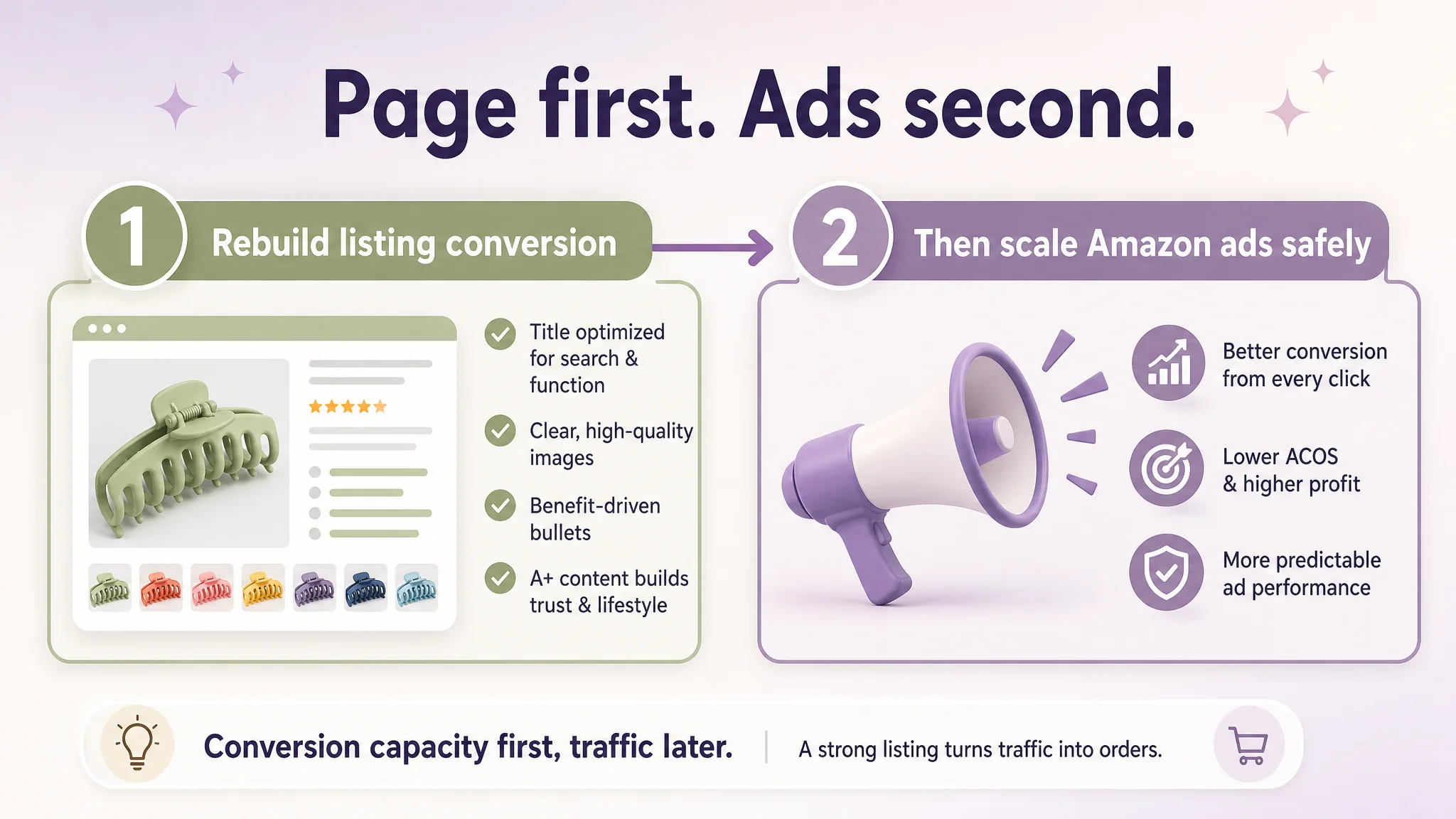
The Real Constraint Was Listing Conversion Capacity
DeepBI’s judgment was clear: before any further ad scaling, the listing itself needed to be rebuilt around real decision logic.
The core business risks if they continued pushing ads first:
- Wasted ad spend: More clicks landing on a page that cannot match the benchmark’s trust level.
- ACOS pressure: Higher cost to acquire each conversion compared to a better-structured competitor.
- Organic ranking risk: Poor conversion weakens Amazon’s confidence in the listing, making it harder to hold or gain ranking even with traffic.
The real bottleneck was not traffic volume; it was:
- Insufficient click incentive on the search results page (title + main image)
- Insufficient trust and clarity once users reached the product page (bullets + A+)
So DeepBI’s decision logic was:
1. Fix the listing’s conversion power first
Raise the page’s ability to convert both paid and organic traffic to a level closer to the benchmark.
1. Only then re-evaluate and scale ads
Once CVR stabilizes and improves, additional traffic becomes cheaper and safer.
How the Title Was Reframed Around Amazon Search and Buyer Logic
DeepBI’s title recommendation for this listing was not cosmetic; it changed the hierarchy of information.
Suggested title:
8Pcs 4.3 Inch Large Hair Claw Clips for Women, Matte Banana Hair Clips for Thick Thin Curly Hair, Non-slip Strong Hold Jaw Clips, Fashion Hair Accessories for Girls
What changed in terms of Amazon logic:
- Core length and shape (“4.3 Inch Large Hair Claw Clips”) moved forward to align with the primary query.
- Functionality words (“Non-slip”, “Strong Hold”) were explicitly added and front-weighted as conversion phrases.
- “Banana Hair Clips”, “Jaw Clips” were incorporated as category-relevant terms.
- The “aesthetic preppy stuff” phrasing was removed in favor of “Hair Accessories” to:
- Fit Amazon customers’ search habits
- Stay within policy boundaries
- Improve clarity and professionalism
Effectively, the title moved from “these are cute colorful things” to “these are large, matte, non-slip, strong-hold hair clips that work for thick or thin hair and are still stylish.”
For Amazon search, that shift helps both:
- Clicks (buyers immediately see the outcome they care about)
- Relevance (A9 can better align the listing with intent-heavy queries)
This Product Page Did Not Lack Traffic. It Lacked Trust.
Once DeepBI identified listing conversion as the core constraint, the optimization focused on four pillars:
1. Main image system: from “cheap collage” to “minimal fashion”
2. Bullet points: from feature lists to pain-point solutions
3. A+ content: from scattered scenes to a cohesive lifestyle + proof story
4. Visual language: aligning with the target audience’s aesthetic expectations
Main images: building a clean, high-value visual hook
The redesigned photo logic followed a simple principle: the main image and first few slots must win the click from Amazon’s results page, not just show “more things.”
Key shifts in concept:
- Remove oversized packaging from the main white-background image.
- Arrange the 8 clips in a fan or semi-circle, occupying ~85% of the frame.
- Use a 45° top-side angle with soft side lighting and a light grey-to-white gradient background.
- Upgrade secondary “white background” images with:
- Marble textures
- Stronger shadows to create depth
- A minimal prop (candle or pearl) as a style signal
- Introduce a technical macro shot:
- One clip in close-up, with three circular zoom-ins on spring, inner teeth, and matte surface
- Clean, thin connector lines and a restrained modern font to label “Strong Metal Spring”, “Non-slip Teeth”, “Matte Finish”
- Industrial-style size image:
- Front and side views with dimension lines
- Soft Morandi background color to elevate the perceived value
- Lifestyle hero:
- Model wearing a clip in a modern bathroom, soft warm light, clean interior
- Clearly targeted to women who care about both practicality and aesthetic
This was not “making the picture prettier for its own sake.” It was:
- Lowering the cognitive effort to understand size, function, and quality
- Visually signaling “this is a reliable, stylish accessory, not a random cheap clip”
Bullet points: stitching together a buying logic
DeepBI’s bullet recommendations reorganized the text around how buyers actually decide:
1. Material & non-slip performance
- Emphasize “high-quality durable acrylic”, “premium matte finish”, “strong flexible metal spring”
- Tie directly to: “firm yet comfortable grip”, “non-slip”, “no damage or strain”
1. Comfort & all-day wear
- From generic “firm and comfortable” to:
- Lightweight
- Ergonomically designed
- “Hold hair securely all day without scratching your scalp”
1. Size & color
- Combine dimension and color:
- “4.33 x 1.85 inches”
- 8 specific color names
- Tie to “works for thick, curly, thin, or fine hair,” not just “nice colors”
1. Use cases
- Replace scattered scenes with a focused, SEO-friendly set:
- Face washing, makeup, showering, cooking, working in the office
- “Quick updo” and “semi-formal styles”
1. Gift logic
- Describe the gift-box packaging as both protection and presentation
- Position them as “trendy aesthetic accessories” for teen girls and women
- Anchor gifting occasions: birthdays, Mother’s Day, Valentine’s, Christmas
The bullets now walk a buyer through the same questions that the competitor was already answering—but with the seller’s own strengths clearly presented.
A+ Content: From Image Collection to High-Aesthetic Decision Journey
The biggest single gap—and the biggest lever—was the A+ content.
DeepBI’s reframe:
- Stop treating A+ as a gallery of unrelated “showcase” images.
- Treat it as a guided tour from first impression → key proof → emotional resonance → gifting.
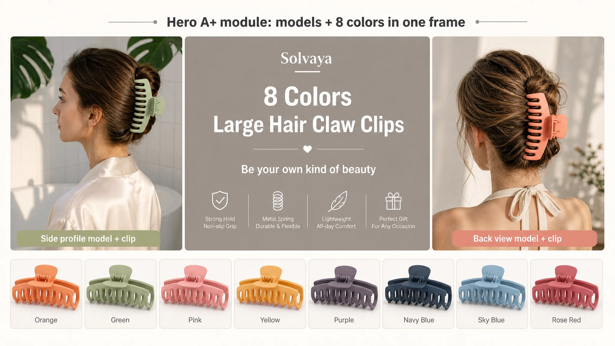
Opening panel: “this is the life you want with this clip”
First module concept:
- Left: side-profile model wearing a light green clip
- Right: back-view model with voluminous hair clipped up using a soft orange clip
- Center: floating text panel:
“8 Colors Large Hair Claw Clips” “Be your own kind of beauty”
- Bottom: all 8 colors lined up as individual product shots
This creates an immediate high-aesthetic, multi-color promise, rather than nine small, flat pictures.
Structural proof: “yes, it will hold your hair”
Second module concept:
- Large matte purple clip close-up with size height labeled
- 180° open view with “When Opened 180°”
- Spring close-up with “Strong Metal Spring”
- Front view with detailed length and height labeling
This directly addresses:
- “How big is it, really?”
- “Is the spring strong?”
- “Will it open wide enough for my hair?”
Lifestyle modules: real scenarios with emotional and functional clarity
From there, each major use case becomes a single, strong scenario:
- Home chill: woman sitting relaxed on a beige rug, hair up in a yellow clip, warm afternoon light, fireplace in background.
- Work/study: woman in a purple sweater, tidy updo with a purple clip, sitting at a desk with blurred bookshelves and equipment behind, cool office lighting.
- Washroom: woman in a pink robe in front of a mirror, pink clip holding hair up while she washes or applies skincare, grey marble wall, warm vanity lighting.
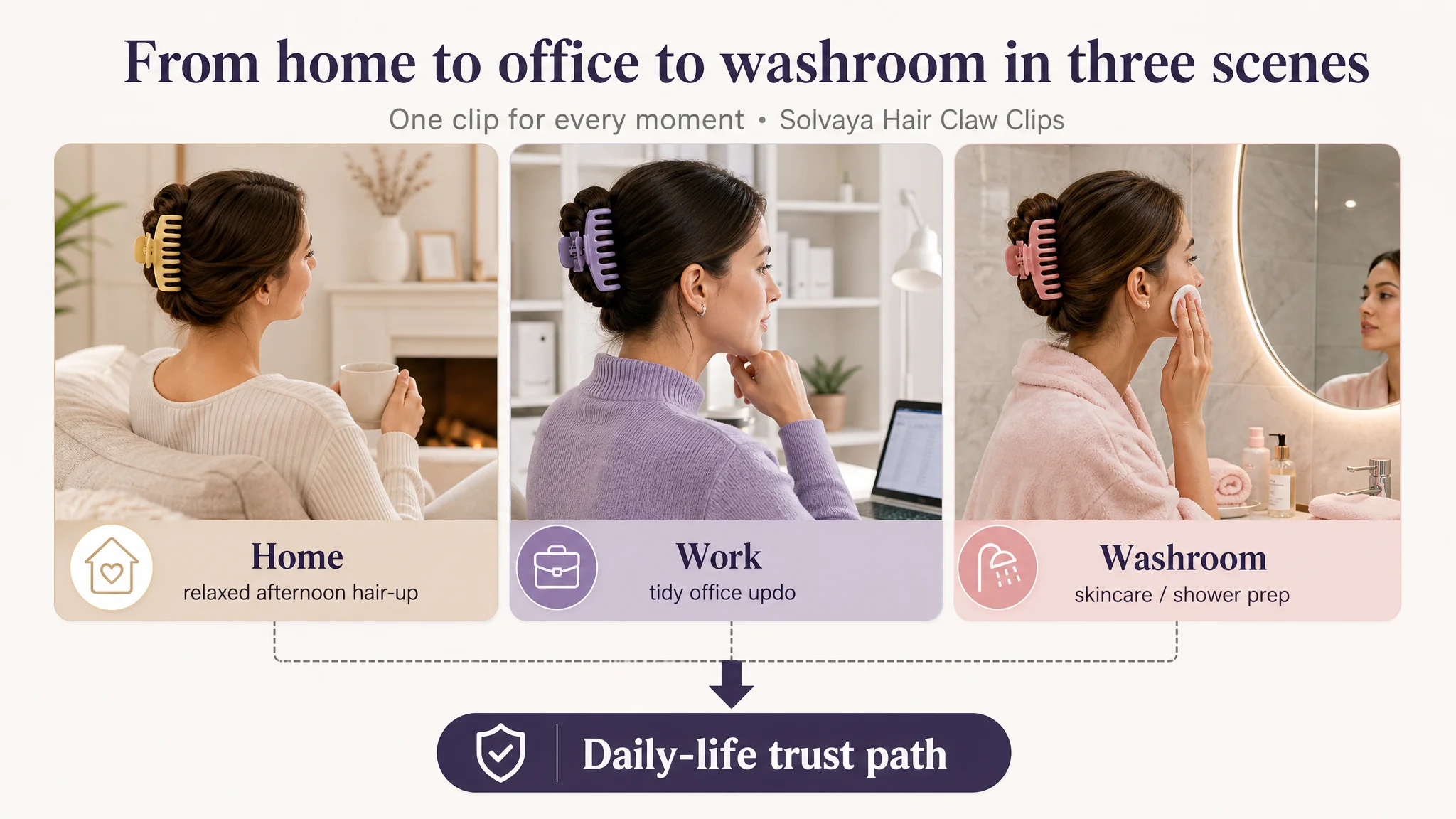
Each image does two jobs at once:
- Shows the clip functioning in a realistic moment
- Projects a specific aspirational lifestyle (comfortable, clean, stylish)
Finally, social/outdoor and gifting modules:
- Social/outdoor collage:
- Four different models in street, café, staircase, etc.
- “HAIR CLAW FOR YOUR DAILY” overlay
- Everyday outfit logic (OOTD-style), turning the clip into a fashion element, not just a tool.
- Gift emotion:
- Long-haired woman receiving a purple-pink gift box, wearing a clip, smiling
- Eight clip colors neatly aligned like a “gift list”
- Soft, muted Morandi palette for a premium gift feel
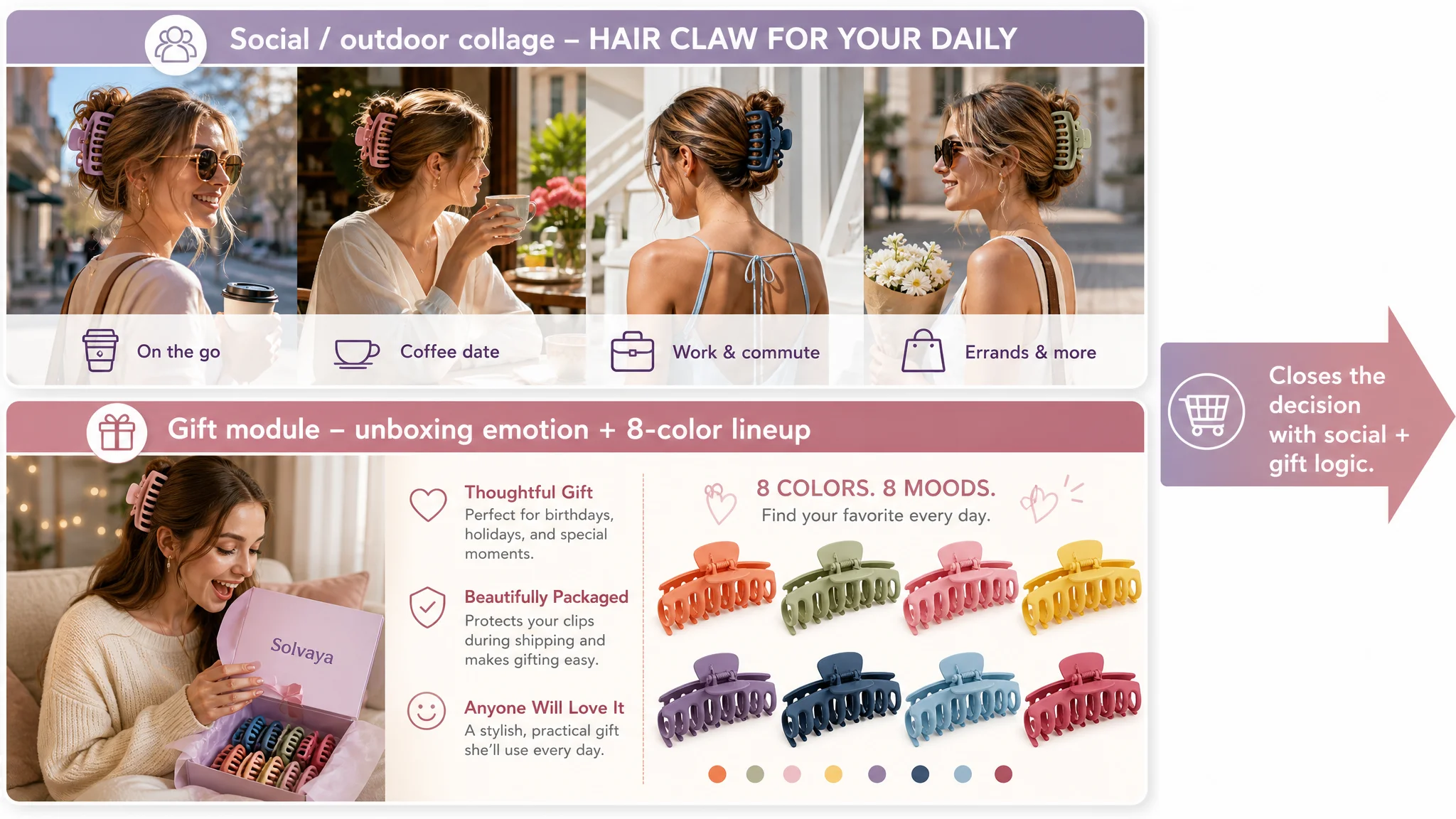
The result: instead of “look, many scenarios,” the A+ now says:
- “This fits your daily life, your style, and your gifting needs.”
- “You can trust its quality and feel good using or gifting it.”
Why Fixing Listing Conversion Came Before Ads
From DeepBI’s viewpoint, the sequence mattered more than any single tweak.
If the seller had kept tuning Amazon ads first:
- They would likely have seen:
- Slight CTR improvements at best
- Limited CVR change, because the page logic remained weaker than the benchmark
- ACOS volatility and ad dependence worsening over time
By addressing the listing first:
- Conversion capacity improves:
- The page becomes able to convert both paid and organic traffic more like the benchmark.
- Ad efficiency becomes predictable:
- When you later scale campaigns, each click has a higher probability of turning into an order.
- Organic traffic has a better chance to stick:
- Better CVR supports ranking stability and gradual organic share recovery.
The key operating insight for the seller—and for many Amazon sellers reading this—is:
“Amazon ads are not a universal fix. If the listing cannot build trust and explain value at benchmark level, ads simply magnify the weakness.”
How the Seller’s Understanding Changed
By the end of this diagnosis and optimization planning, the seller no longer spoke in terms of “we need more traffic and more reviews.”
Their internal conversation shifted to:
- “Our title must lead with the core query and functional outcomes.”
- “Our main images must signal quality and clarity the moment someone sees us on the search page.”
- “Our bullet points must follow a pain point → solution → outcome pattern, not just list features.”
- “Our A+ has to guide a buyer through real-life scenarios and proof, not just show many pictures.”
In operating terms, the business moved from:
- Ad-centric thinking:
- “How do we push more people into this listing?”
- To conversion-centric thinking:
- “Is this listing structurally capable of converting the traffic it already gets?”
- “Does the page deserve more traffic yet?”
For other Amazon sellers, the lesson is not that every detail must copy a competitor. It is that before you judge your ads, you must judge your listing:
- If your reviews are solid but your listing scores lag significantly in title, main images, bullets, and A+, you likely have a listing conversion problem, not a pure ad problem.
- Ads can then become what they are meant to be: an amplifier of a strong product page, not a crutch for a weak one.
DeepBI’s role in this case was not to “improve design” for its own sake, but to use comparative data and listing scoring to pinpoint where conversion logic was broken—and to force a change in decision order: page first, ads second.