
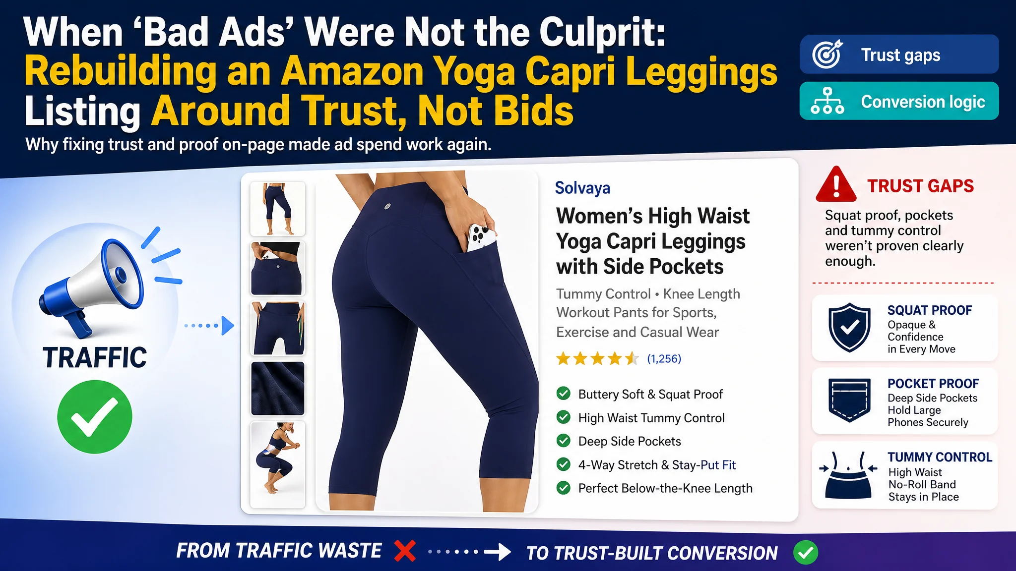
For this Amazon seller in women’s activewear, the story started with a familiar pressure point: rising Amazon ad spend, unstable ACOS, and a pair of yoga capri leggings that refused to convert at the level the traffic suggested it should. The team’s first reaction was to blame the ads—keywords, bids, campaign structure—and they doubled down on advertising tweaks instead of questioning the product page itself.
Once DeepBI stepped in, the data and page-level comparison told a different story. Against a clear benchmark listing in the same yoga capri segment, it became obvious that the real problem wasn’t traffic volume, but how that traffic was being received. Core selling points like “squat proof,” pocket design, and tummy control were either under-explained, poorly visualized, or buried in low-impact modules. The Amazon Listing was asking ads to do a job the page itself wasn’t equipped to finish.
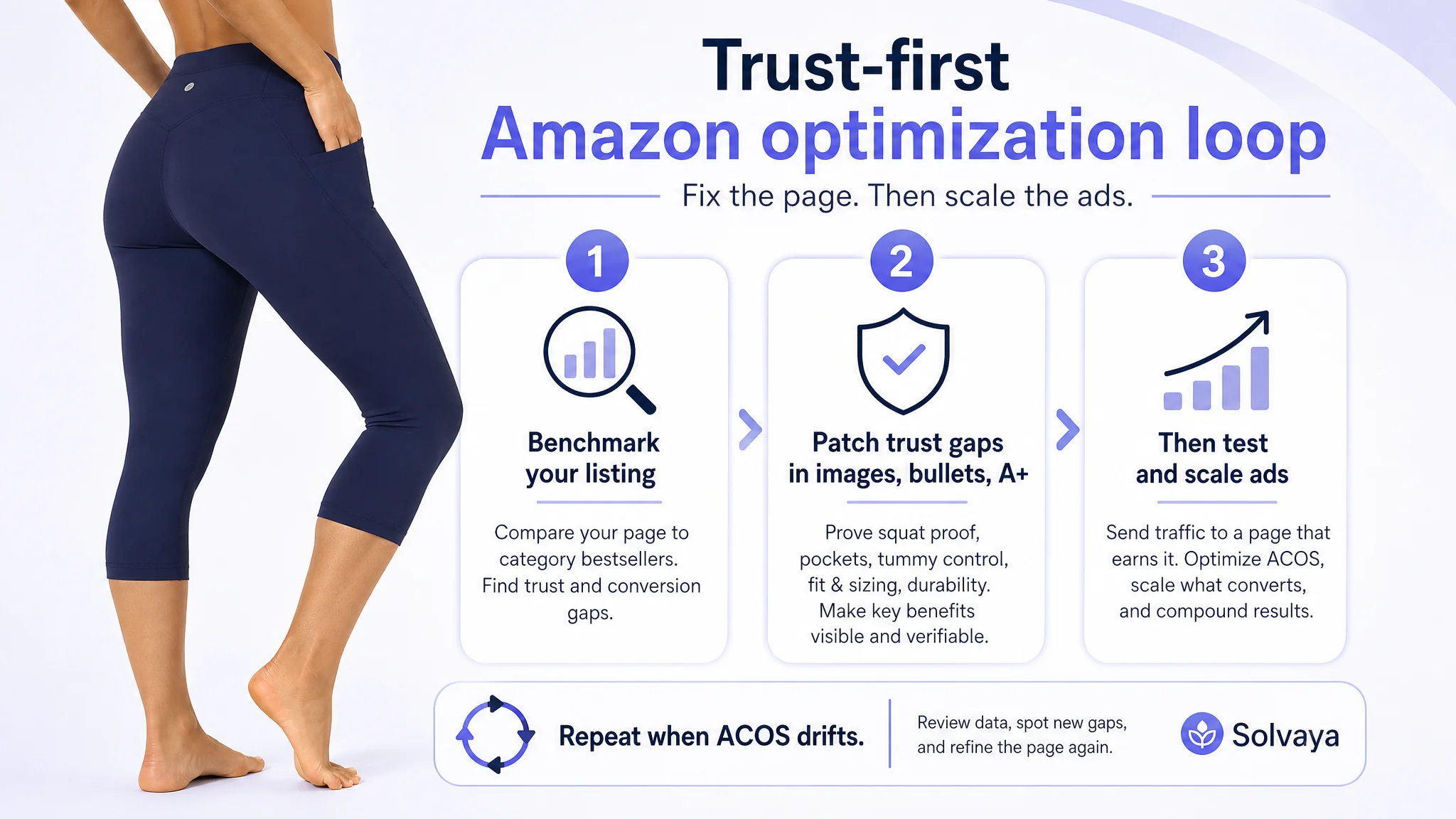
The subsequent optimization no longer focused on “better ads first,” but on rebuilding the listing’s conversion logic end to end: title, bullets, main images, and A+ modules were restructured to front-load comfort and stretch, make pockets and waist support verifiable, and explicitly reduce risk around transparency and fit. As those trust gaps closed, ad traffic started to work again instead of being consumed and wasted. For other Amazon sellers, the case is a reminder: when ACOS feels unmanageable, it may not be a bidding problem—it may be that your listing cannot convincingly answer the buyer’s last three questions.
Amazon Ads Were Not Failing. The Page Was Consuming the Traffic.
From the seller’s perspective, the symptom was clear but the cause was not.
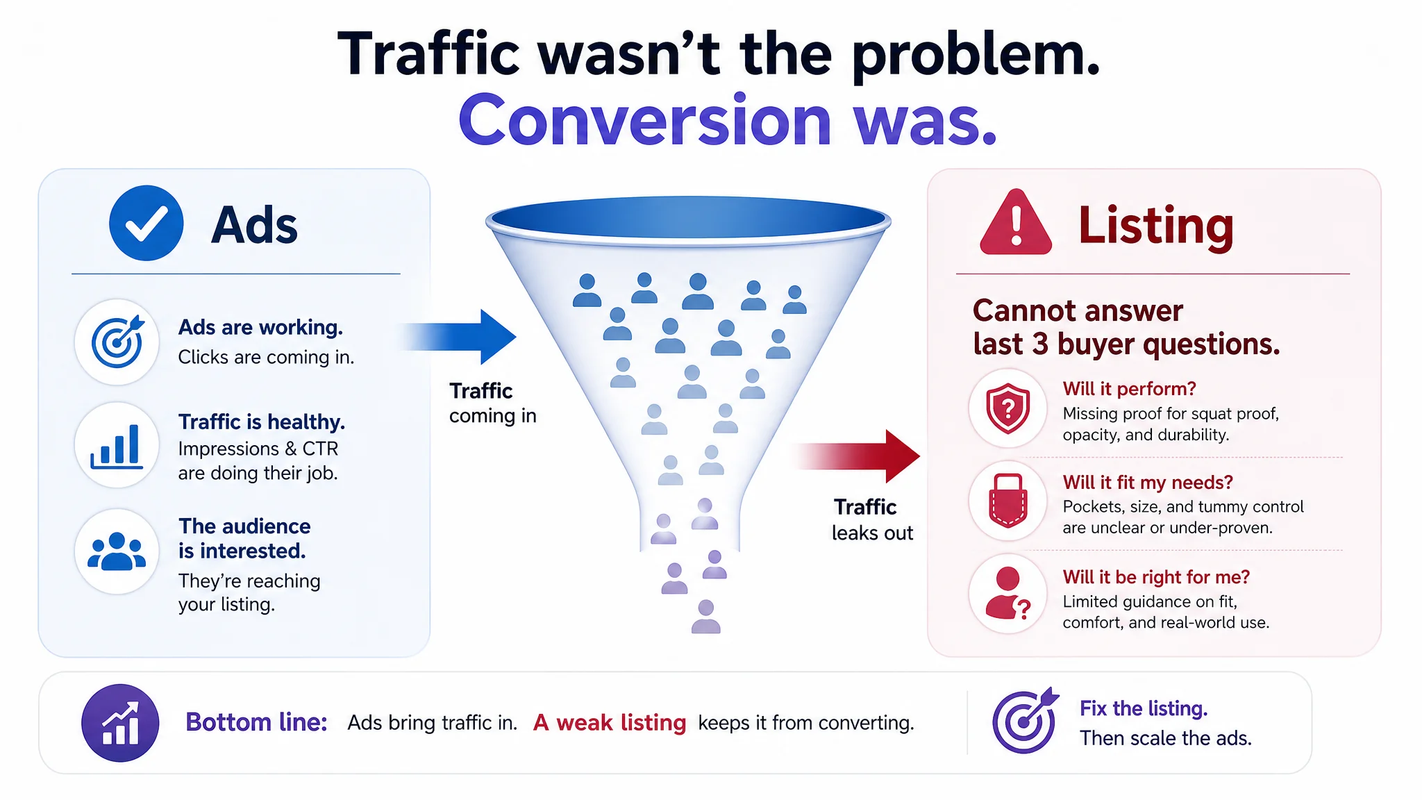
They were running Amazon ads on a women’s high-waist yoga capri leggings product in the US marketplace. Traffic wasn’t the issue—campaigns were driving visits—but orders were inconsistent, and ad spend felt increasingly “sticky.” The internal narrative quickly became: “Our ads aren’t efficient enough; we need better keywords and lower bids.”
There was very little structured suspicion directed at the Amazon Listing itself. The team believed:
- The product images were “good enough” because they showed multiple angles and poses.
- The bullets already covered core features: buttery-soft fabric, high waist, pockets.
- The A+ content existed, so the page was “complete.”
In other words, they assumed the page was fundamentally sound and that performance issues were an advertising optimization problem.
“The real problem was not that ads failed to bring traffic. It was that the page could not convert the traffic.”
From DeepBI’s perspective, this was a classic misdiagnosis: using ads as a lever to fix what was essentially a product-page conversion problem.
The Real Constraint Was Listing Conversion Capacity
When DeepBI benchmarked the listing against a direct competitor in the same segment—knee-length yoga capri leggings with pockets—the picture changed immediately.
Instead of focusing on abstract “design quality,” the comparison asked a simpler question: can this Amazon product page carry traffic through the buying decision as effectively as the benchmark?
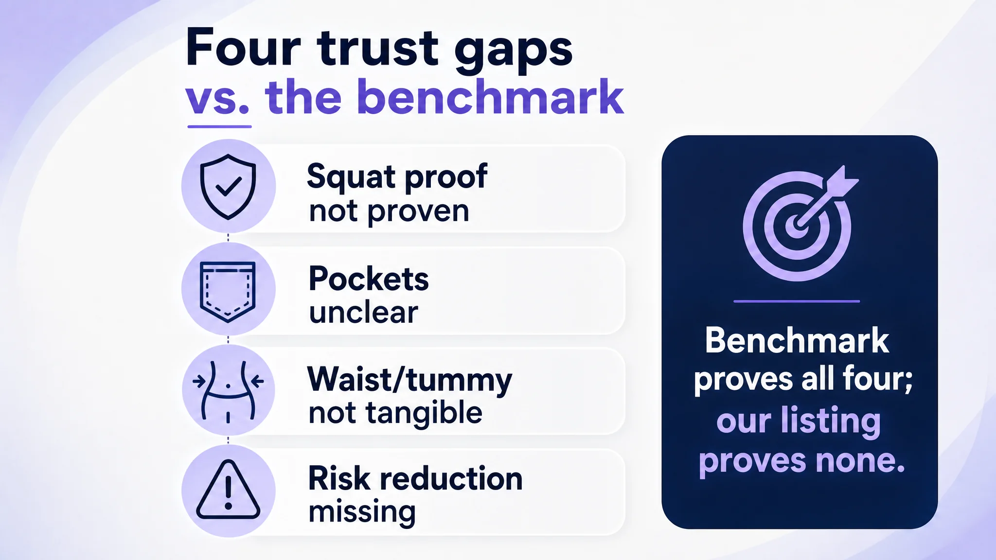
Several gaps surfaced:
- Squat-proof and opacity were not proven.
The benchmark made “pass the squat test” explicit, both in text and visuals. Our target listing mentioned softness but lacked visual or textual proof that the leggings wouldn’t go see-through during squats or deep stretches—a central anxiety in this category.
- Pockets were undersold and under-visualized.
The product offered multiple pocket options (hidden waistband pocket, side pockets), but the main images and A+ content did not clearly show where they were, how many there were, or what they could hold. The benchmark, by contrast, dedicated a full image to pocket structure and capacity, making “phone fits here” obvious at a glance.
- Tummy control and no-roll waistband were claimed, but not made tangible.
The listing text referenced a high-rise waistband and shaping, yet the visuals did not convincingly demonstrate “stay-put fit” or show how the band controls the midsection. The competitor used close-ups, directional arrows, and clear waist-pulling imagery.
- Comfort and stretch weren’t front-loaded as proof.
The A+ introduction was broad, and variant information appeared early, before trust-building. The benchmark opened with a direct validation of fabric feel and motion—immediately assuring buyers about softness, breathability, and 4-way stretch.
- Risk reduction modules were missing or underused.
Critical trust nodes—non-see-through performance, gusset durability, and accurate sizing guidance—were either absent, weakly positioned, or treated as raw visual assets without a clear decision role in the A+ flow.
Individually, these might look like minor deficiencies. Together, they formed a structural problem: the listing’s conversion capacity lagged behind the category’s current expectation. Ads were pushing traffic into a page that didn’t fully answer the most important “Will this fail me in the gym?” questions.
Why Traditional Amazon Ad Optimization Kept Failing
The seller’s response loop focused on the ad account:
- Testing new keyword sets.
- Tweaking bids and budgets.
- Adjusting campaign types and match types.
But none of those knobs could fix the fact that, compared with the benchmark, the listing:
- Under-communicated squat-proof safety.
- Left pocket design and capacity ambiguous.
- Failed to visualize no-roll tummy control persuasively.
- Did not structure the A+ content to reduce movement and sizing risk.
In performance terms:
- Ads were delivering visitors.
- The product itself had core strengths (fabric blend, gusset, high waist, pockets).
- The page, however, did not translate those strengths into visible, verifiable reasons to buy.
DeepBI’s diagnosis was blunt: continuing to micro-tune ads would only amplify a page-level defect. The biggest risk at that stage was not “under-optimized ad structure,” but “ads feeding a listing that is below benchmark in trust at key decision nodes.”
This Product Page Did Not Lack Traffic. It Lacked Trust.
To reframe the problem, DeepBI treated the listing as a decision funnel, not just a content block.
Every major module—title, main images, bullets, A+—was evaluated in terms of which buyer concern it resolved and how strongly. Against the benchmark, three trust gaps were decisive.
1. Squat-Proof Evidence Was Missing
In this category, “Will it show through when I squat?” is a non-negotiable question.
- The benchmark explicitly stated “pass the squat test” and paired this with an image showing a demanding pose plus “opaque / squat proof” icons.
- Our listing called the fabric soft, but never closed the loop on opacity, neither in bullets nor in a dedicated visual.
This meant that even when ads brought in qualified traffic, buyers had to imagine that the leggings wouldn’t be see-through. Many won’t. They either bounce or switch to a listing that proves it.
2. Pockets Were a Feature, Not a Decision Driver
The product actually had a compelling pocket story:
- Hidden waistband pocket for cards/keys.
- Variants with deeper side pockets for a smartphone or even a small camera.
But:
- The primary image sequence didn’t clearly show all pocket locations.
- There was no focused pocket diagram or capacity explanation.
- Pocket mentions in text were vague (“pockets” rather than “fits large-screen phone securely”).
The competitor’s listing, by contrast, dedicated a full gallery slot to pockets, combining close-ups and captions to make “more pockets, deep enough for phone” a clear and memorable advantage.
3. Tummy Control and Comfort Were Claimed, But Not Demonstrated
Buyers in this segment want:
- A waistband that shapes without cutting in.
- Assurance that the band won’t roll down mid-workout.
- Proof that fabric is both soft and resilient.
The benchmark used:
- Pulling visuals with arrows to show stretch and recovery.
- Clear “elastic & high waistband” messaging with fit implications.
Our listing had:
- Text references to tummy control and an “elastic-free waistband.”
- Visuals that showed some waist stretch, but not as focused or explanatory as the competitor.
The result: a gap between what the product could do and what the buyer could clearly see and understand.
How DeepBI Identified the Root Cause Without Turning It Into a Feature Demo
DeepBI did not start from “what can our tool optimize?” but from “where is this listing losing the buyer relative to the benchmark?”
By aligning the product and competitor pages along the same decision path, several judgments became clear:
- The first screen (title + main image) was not maximizing decision-critical information.
The original main image was visually decent but underutilized: it did not simultaneously confirm high waist, knee-length capri cut, and side pockets. The benchmark’s first image did.
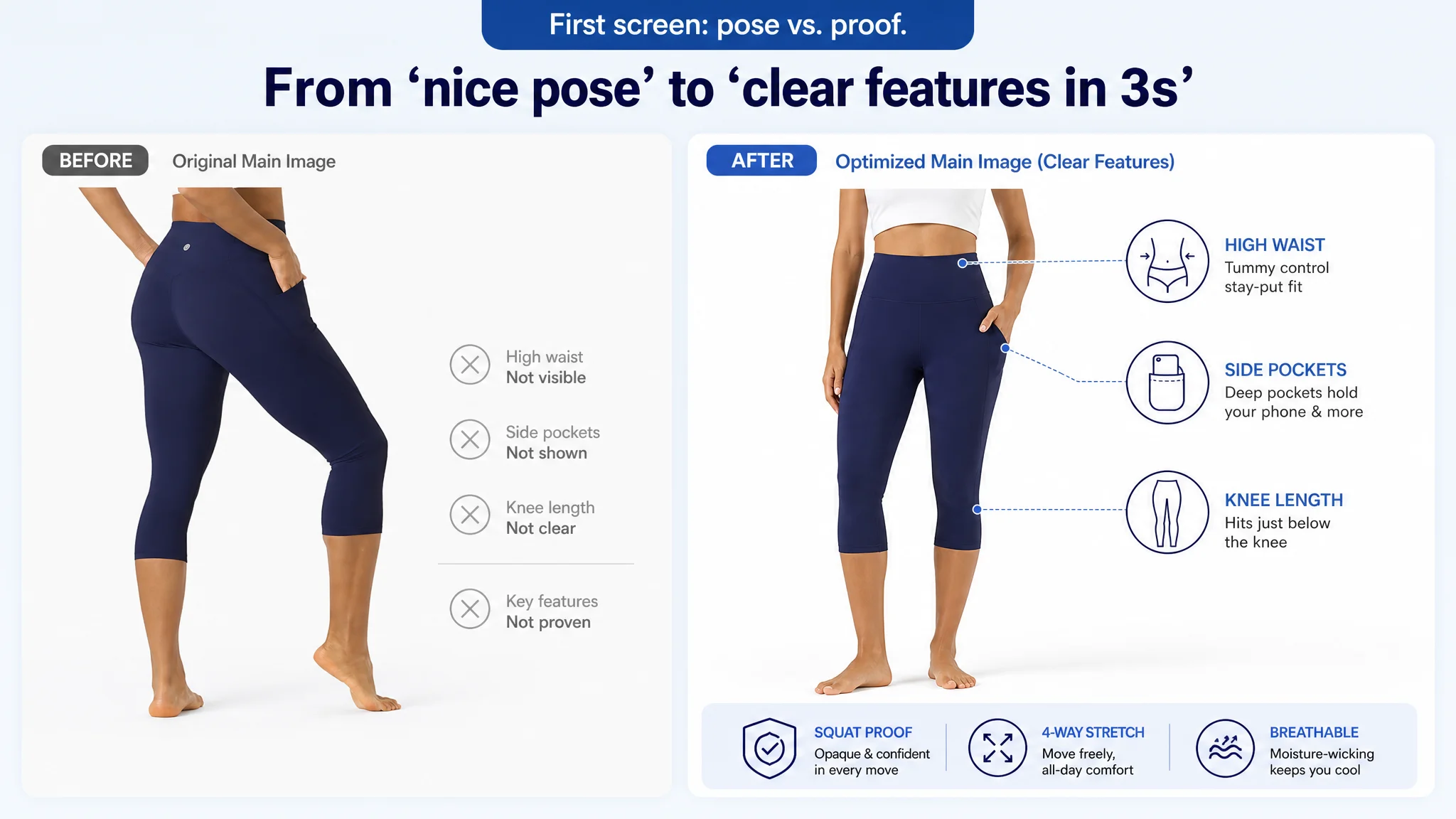
- Secondary images were used to show “variety of poses” rather than “variety of proofs.”
For buyers, different poses matter less than different proofs: pocket usage, waistband behavior, stretch, technical benefits, and performance in motion.
- A+ modules were present but not sequenced with a persuasion role.
Several assets (e.g., gusset, waistband close-ups) existed but were not structured as trust nodes—no clear “comfort validation,” “pocket proof,” “risk reduction,” or “sizing confidence” stages.
DeepBI’s scoring and comparison logic flagged these as conversion bottlenecks, not cosmetic issues. The core decision: before pulling more traffic, the page’s ability to carry existing traffic to purchase had to be raised closer to the benchmark.
Why DeepBI Did Not Keep Tuning the Ads First
From a business-risk standpoint, DeepBI recommended a sequence that many ad-focused teams initially resist:
1. Pause aggressive ad scaling.
There was no justification for pushing more traffic into a page with clear conversion gaps at squat-proof, pocket clarity, and waist trust.
1. Rebuild listing-level persuasion first.
Title, main images, bullets, and A+ had to be restructured so that each module clearly answered a buyer concern and used the product’s real strengths as evidence.
1. Only then re-open ad testing.
Once listing conversion capacity improved, ad spend could be resumed and optimized with a much lower risk of wasted clicks.
The reasoning was straightforward: advertising does not only amplify advantages; it can also amplify a page’s existing defects. Until the Amazon Listing deserved more traffic, scaling ads would deepen ACOS volatility rather than solve it.
Where the Optimization Actually Focused
The optimization work did not try to invent new features. It focused on making existing strengths visible, specific, and trustworthy, across four main areas.
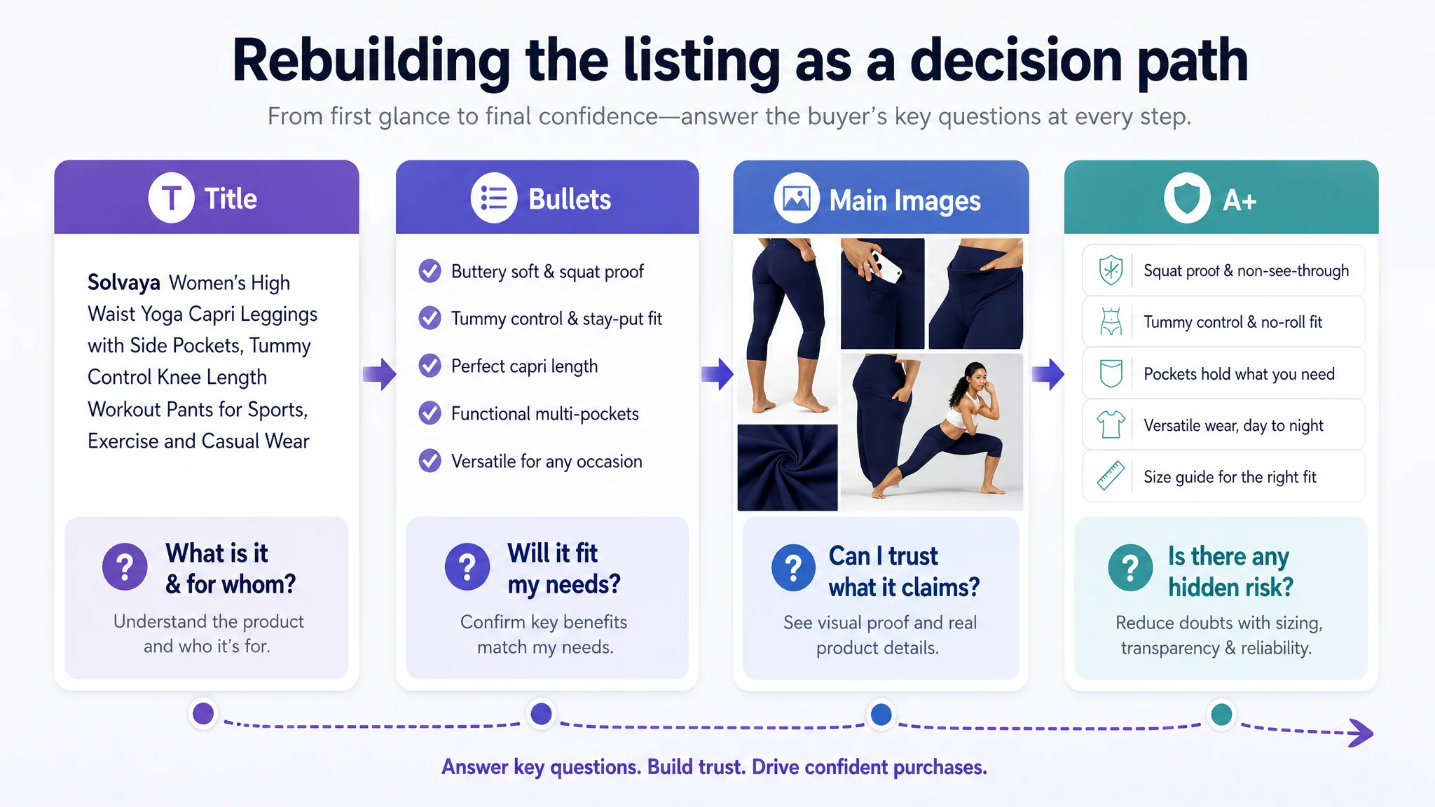
1. Title: From Internal Codes to External Benefits
Original structure problems included:
- Internal model codes (e.g., “L02B1”) occupying title space.
- Underutilized descriptors for length and feel.
The optimized title:
Women’s High Waist Yoga Capri Leggings with Side Pockets, Tummy Control Knee Length Workout Pants for Sports, Exercise and Casual Wear
Key shifts:
- Removed internal codes that carry no search or conversion value.
- Added “Knee Length” and “Capri Leggings” to match shopper expectations and search behavior.
- Brought “Tummy Control” and “Side Pockets” into a clear, benefit-driven structure.
- Extended usage scenarios (sports, exercise, casual wear) to broaden long-tail coverage.
This was about rebuilding the title as a search and decision tool, not a product catalog line.
2. Bullet Points: From Feature Lists to Buying Logic
Each bullet was reoriented to close a specific decision gap.
Bullet 1: Fabric Feel + Squat Proof
Original logic: emphasize softness, but not safety.
Optimized:
BUTTERY SOFT & SQUAT PROOF – Premium silky-smooth polyester/spandex blend with a second-skin feel, plus high-density opaque fabric that passes the “squat test,” giving confidence during deep stretches or high-intensity workouts.
Purpose: combine comfort and non-see-through assurance in one coherent promise.
Bullet 2: Tummy Control & No-Roll Fit
Original logic: generic “high waist” mentions.
Optimized:
TUMMY CONTROL & STAY-PUT FIT – High-rise, no-roll waistband providing gentle compression and a streamlined silhouette, designed to stay in place without constant readjustment.
Purpose: turn “high waist” into a concrete outcome: shaping + stability.
Bullet 3: Precise Capri Length and Versatility
Original logic: vague references to length and use.
Optimized:
PERFECT CAPRI LENGTH – Hits just below the knee, ideal for petite women and various body types, suitable for workouts, layering under dresses/skirts, or pairing with tunics.
Purpose: make length a fit and styling advantage, not just a dimension.
Bullet 4: Pocket Function, Not Just Pocket Existence
Original logic: “pockets” as a generic note.
Optimized:
FUNCTIONAL MULTI-POCKETS – Hidden waistband pocket for cards/keys and variants with deep side pockets large enough for a smartphone, camera, or other essentials.
Purpose: give buyers a clear mental picture of what fits where.
Bullet 5: Scenario Breadth + Durability
Original logic: scattered usage mentions.
Optimized:
VERSATILE FOR ANY OCCASION – 4-way stretch and triangle gusset for durability and freedom of movement; suitable for yoga, golf, running, lounging, and travel.
Purpose: extend perceived value beyond single-use workouts to a daily wardrobe role.
Together, the bullets shifted from listing features to orchestrating a buying path.
Main Images: From Pose Variety to Proof Variety
DeepBI recommended reframing each main image as a decision node rather than just a different view.
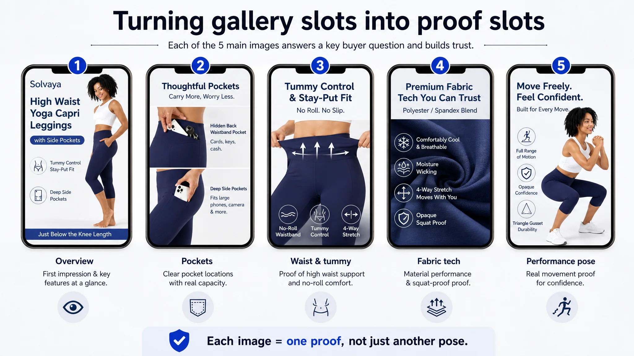
Image 1: First Impression & Feature Identification
New goal: at thumbnail level, immediately communicate:
- High waist.
- Knee-length capri cut.
- Side pockets.
Action: full or three-quarter body view that makes all three visible at once, with minimal, clean text overlays.
Image 2: Pocket Structure & Capacity
New goal: turn pockets into a confidence driver.
Action:
- Focused collage showing:
- Hidden back waistband pocket for cards/keys.
- Deep side pockets holding a large phone.
- Clear micro-text labeling what each pocket is for.
Image 3: High Waist & Tummy Control Proof
New goal: visualize “no-roll, stay-put” waistband.
Action:
- Single-purpose close-up: model pulling the waistband, with arrows or subtle guides.
- Emphasize contour support and stay-in-place behavior.
Image 4: Fabric Technology & Risk Reduction
New goal: consolidate technical reassurance.
Action:
- One technical infographic summarizing:
- Polyester/spandex blend.
- Breathable / moisture wicking.
- 4-way stretch.
- Opaque / squat proof.
- Icons and concise statements to convert abstract claims into visual proof.
Image 5: Performance Scenario Proof
New goal: show the leggings under stress.
Action:
- Model in a demanding pose (deep squat, wide stretch).
- Implicitly prove:
- Full range of motion.
- No transparency issues.
- No tearing at the gusset.
Each image thus contributed a different piece of the trust puzzle instead of repeating similar standing poses.
A+ Content: Turning Raw Assets Into a Persuasion Path
The A+ section originally had good raw material—waistband, gusset, pocket visuals—but lacked a coherent decision logic.
DeepBI’s guidance re-sequenced the modules into a six-node path:
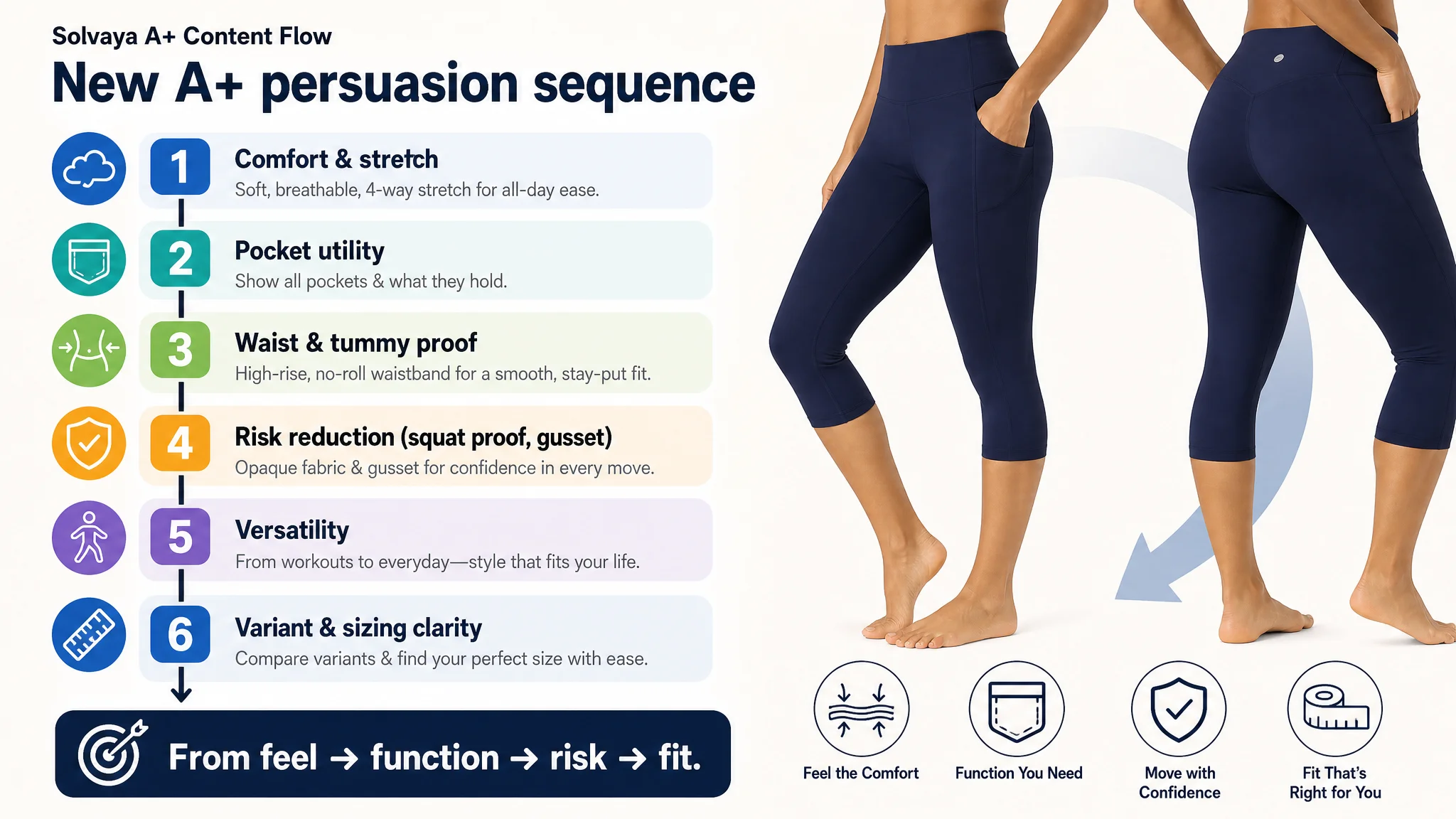
1. Comfort & Stretch First
Open with a module fully dedicated to fabric feel and movement: buttery-soft texture, breathable, 4-way stretch, illustrated with motion imagery. This mirrors what the benchmark did but uses the product’s specific material strengths.
1. Pocket Utility as a Dedicated Node
Elevate pockets to their own module:
- Close-ups of waistband and side pockets.
- Text explaining exactly what can be carried and how.
1. Tummy Control & Waist Support Validation
Replace generic waistband claims with:
- Visuals of waist shaping.
- Clear messaging on “elastic-free” comfort for sensitive stomachs.
- Explicit “stay put” reinforcement.
1. Risk Reduction: Squat Proof + Gusset
Introduce a module explicitly for:
- Squat-proof/opaque assurances.
- Triangle gusset durability for high-stress movement.
- Messaging aimed at reducing fear of tears, transparency, or wardrobe failure.
1. Versatility Scenario Node
Showcase non-athletic uses: casual wear, layering under dresses/skirts, home lounging—without promising accessories not present. This positions the leggings as a multi-role garment.
1. Variant Clarity & Fit Confidence
Use a comparison-oriented module to:
- Clarify differences between variants (e.g., pockets vs. no pockets, fabric nuance).
- Provide sizing information, aligning visual cues with sizing charts where feasible.
The key was not to add more content for its own sake, but to reorganize existing and new assets into a clear persuasion journey.
Before Ads Could Work Again, the Page Had to Convert
Once these changes were prioritized and implemented, three things began to shift—not as abstract claims, but as operating reality:
- Listing conversion capacity improved.
Buyers no longer needed to “guess” whether the leggings were squat proof, pocket-functional, or truly stay-put. The page documented those answers.
- Ad traffic stopped being silently wasted.
With a stronger page, the same or slightly reduced ad traffic had a better chance to convert. The listing could now justify further ad optimization.
- The seller’s understanding of the problem matured.
The team stopped treating every ACOS fluctuation as an “ad problem” and started asking: Is our current listing good enough to deserve this level of paid traffic?
They also recognized a structural truth: listing quality is not cosmetic—it is the foundation of advertising efficiency on Amazon.
What Other Amazon Sellers Can Take From This Case
Several lessons translate directly beyond activewear:
- If ads feel “too expensive,” check listing trust before touching bids.
Weak conversion capacity will always make ads look worse than they are.
- Treat each main image and A+ module as a decision node, not a design slot.
Ask: “Which buyer concern does this image or module resolve, and how clearly?”
- Do not hide critical proof (like squat proof, pocket structure, durability) in vague text.
Modern Amazon buyers look for visible, specific, and credible evidence.
- Avoid wasting title real estate on internal codes or repeated phrases.
Reallocate those characters to length, usage, and outcome descriptors buyers actually care about.
- Before scaling ads, decide whether your listing is at or near your category’s benchmark standard.
Ads amplify what the page already is—good or bad.
DeepBI’s role in this case was not to apply a generic feature set, but to reframe the seller’s core question: from “How do we push our ads harder?” to “Why is our Amazon product page failing to carry the traffic we already have?” Once that question was answered, operational decisions around ads became far more controllable—and ad traffic finally had a listing capable of turning clicks into orders.