
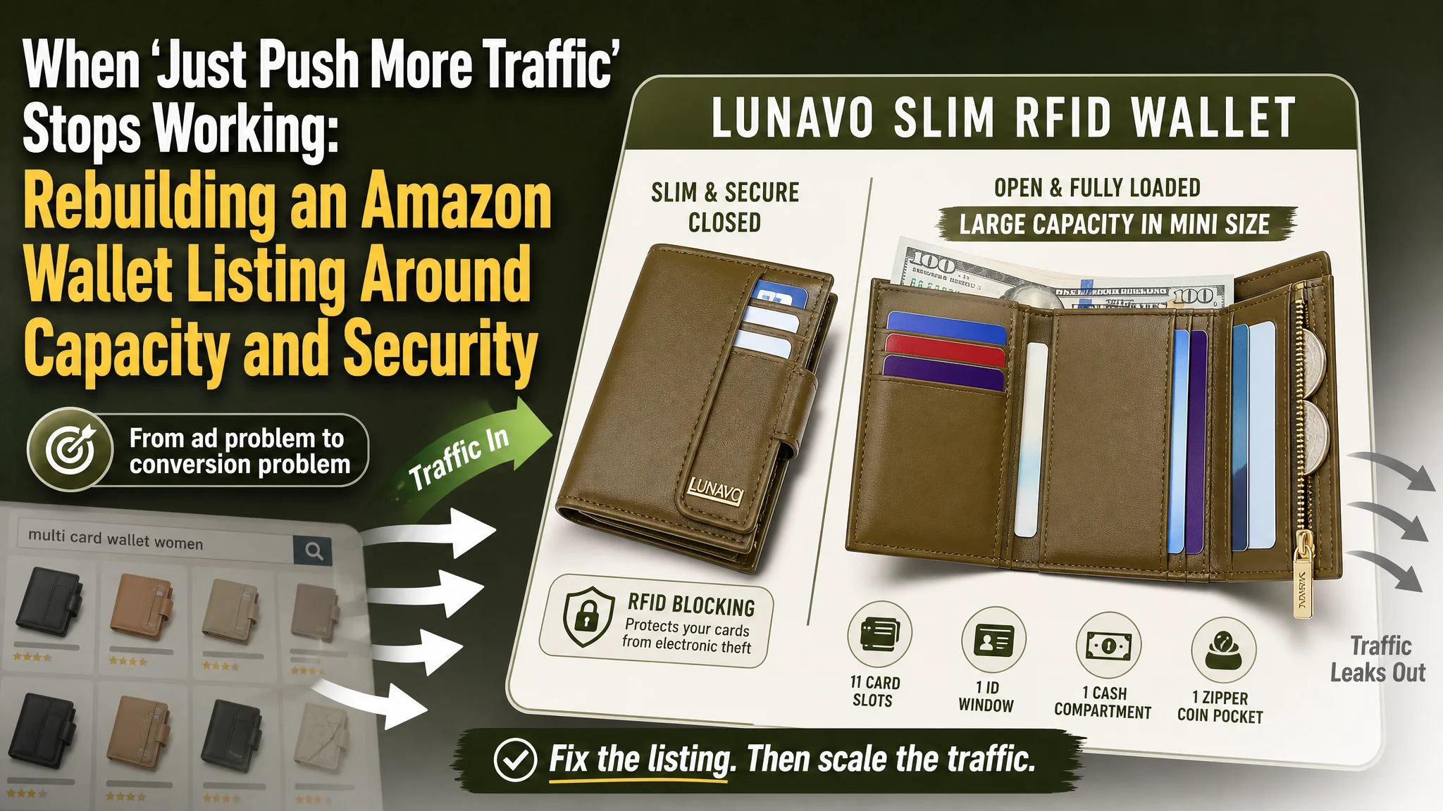
This case comes from an Amazon seller in the women’s wallet category on the US marketplace. The team was under pressure: ad costs were climbing, a major competitor dominated the keyword space, and yet their own product page already had decent reviews and traffic. Internally,the issue was framed as an Amazon ads problem — bids, keywords, and budgets — and the instinct was to “optimize campaigns” and push harder.
DeepBI’s diagnosis pointed in a different direction. Compared with a category‑leading competitor, the Listing itself was structurally weaker: the title hid the most important buying reason, the main image set failed to answer core doubts about capacity and security, and the A+ content spent golden positions on branding and colors instead of solving the buyer’s real questions. Ads were not the primary bottleneck — the Amazon product page could not fully convert the traffic it was already getting.
The optimization therefore did not start from campaign restructuring. It started from reframing the page logic: make “large capacity in a mini size” and RFID protection the center of the story, move full‑load usage scenarios forward, and only then talk about slimness, color options, and gift attributes. Once the Listing began to answer how much it can hold, whether it actually stays slim when full, and how it protects cards, ad traffic became far more valuable.
For other Amazon sellers, this case is a reminder: when ACOS feels uncontrollable and CPC keeps going up, the real problem may sit in the Listing’s decision logic. If the title, main images, bullets, and A+ are not aligned around the buyer’s key doubts, Amazon ads will only magnify the leak.
Amazon Ads Were Not Failing. The Page Was Consuming the Traffic.
From a surface view, this wallet Listing looked healthy enough:
- 4.6 stars with more than 4,000 reviews
- A full image set and A+ modules in place
- Visible “slim” and “minimalist” messaging in the title and bullets
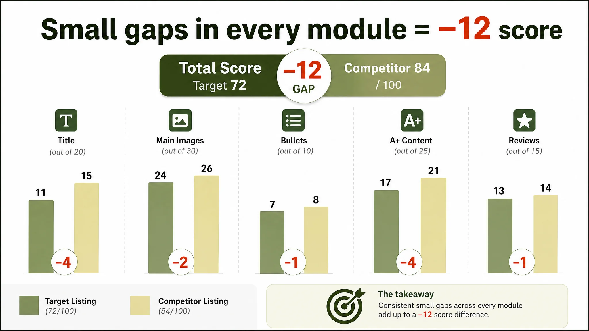
Yet side‑by‑side with a category‑leading competitor on Amazon, DeepBI’s Listing score immediately exposed a competitive gap:
- Target Listing: 72 / 100
- Benchmark competitor: 84 / 100
- Gap: –12 points, spread across all core modules (title, main image, bullets, A+, and even review scale)
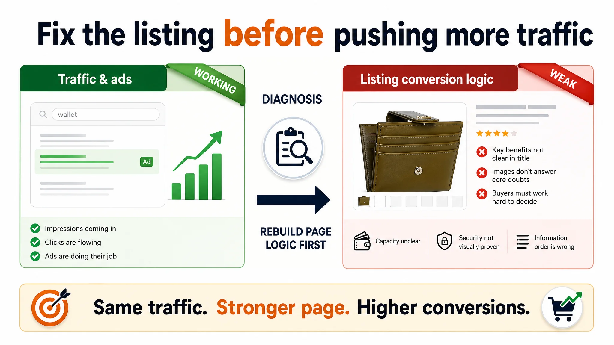
The seller’s first reaction was typical: “Our reviews are fine, but sales are not catching up — our Amazon ads probably need deeper optimization.” They had already tried:
- Raising bids on high‑volume keywords
- Expanding keyword coverage around “minimalist”, “credit card holder”, and color phrases
- Adjusting budgets to sustain more impressions on core terms
However, ACOS remained uncomfortable and volume did not grow in proportion to spend. DeepBI’s view was that ads were doing their job — sending relevant traffic — but the page logic was not converting that traffic fast enough versus the benchmark.
“The real problem was not that ads failed to bring traffic. It was that the page could not convert the traffic.”
The Real Constraint Was Listing Conversion Capacity
DeepBI’s Listing scoring broke the –12 point gap into five dimensions:
- Title: –4 vs. competitor (11 vs. 15 out of 20)
- Main Images: –2 (24 vs. 26 out of 30)
- Bullets: –1 (7 vs. 8 out of 10)
- Detail/A+ content: –4 (17 vs. 21 out of 25)
- Reviews: –1 (13 vs. 14 out of 15; same rating, but weaker scale)
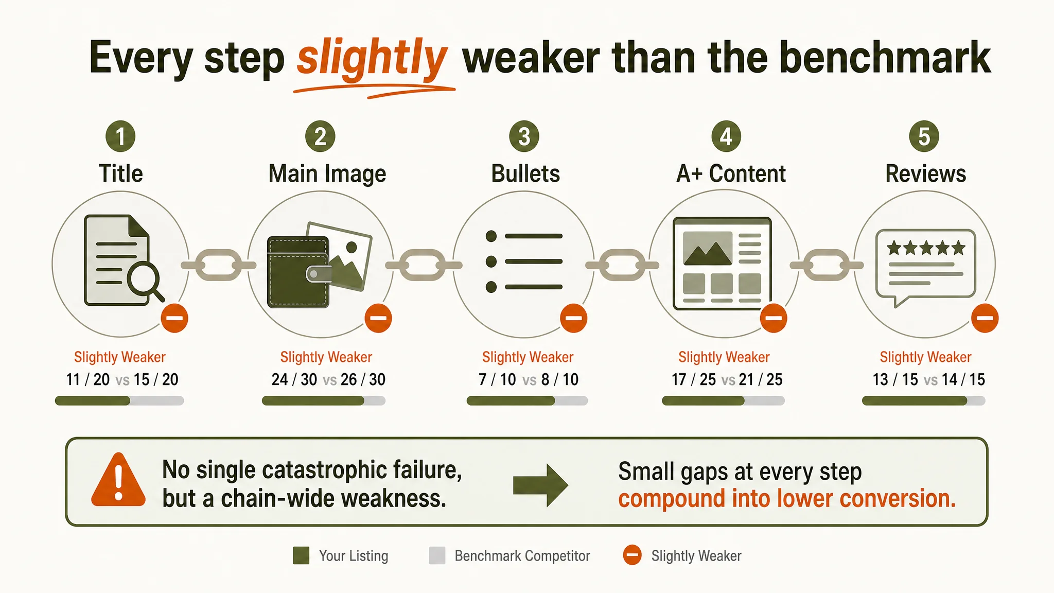
The pattern was clear: no single catastrophic failure, but consistent underperformance in every part of the decision chain. That is exactly the situation where advertising starts to feel “expensive and inefficient”.
Three structural issues mattered most for conversion:
1. Title: selling the wrong first reason to click
- Competitor leads with “RFID Blocking” — the primary functional pain point in this category (card safety).
- It uses “Multi Card Case Wallet” as the core phrase, sitting closer to how buyers actually search when they want capacity.
- Color (Army Green) is naturally integrated into the main phrase, not buried in brackets.
- The title follows a proven pattern: brand + core functional promise + product form + add‑on features.
The target Listing, by contrast:
- Emphasized “Minimalist” as a style word — a weaker purchase driver than “RFID Blocking” in this wallet niche.
- Used “Credit Card Holder” as the main term, missing the “multi card case / small wallet” traffic cluster.
- Pushed color to the tail, inside parentheses, lowering its search and visual impact.
At the search results level, this translated into weaker CTR: the Listing did not instantly signal “secure” and “can hold a lot” — exactly what the best competitor nailed in its title.
1. Main image route: information is visible, but not persuasive
DeepBI’s visual comparison found that the target Listing’s main image set:
- Leaned heavily on empty or lightly loaded product shots, often against white background.
- Introduced the “super slim” size image too early in the image sequence, before proving actual capacity.
- Showed cards inside but without quantified labeling (“11 slots”, “1 ID window”, etc.), forcing buyers to count or guess.
- Lacked a clear, visual explanation of RFID protection; the concept existed in text but had no image‑level “proof”.
The competitor did the opposite:
- Used human‑in‑scene and hand interaction images early to build realism and trust.
- Highlighted RFID shielding with concept graphics and a visible “tech” narrative.
- Marked “14 card slots / ID window / thickness” clearly on images, so capacity judgment took seconds, not effort.
1. A+ detail page: brand first, buyer doubts later
The target Listing’s A+ layout:
- Opened with a brand logo module — visually neat, but commercially empty for first‑time buyers.
- Pushed color choice and personalization to the front of the scroll, before addressing whether the wallet is actually practical.
- Repeated multiple “quality detail” modules (button close‑up, zipper close‑up, material texture) without forming a clear narrative.
Meanwhile, the competitor:
- Built a “problem–solution” flow:
- “Small size, big capacity” with loaded visuals
- Clear structural diagrams with labeled pockets
- Hand‑interaction shots to show real usage
- Treated A+ as a trust‑building storyboard, not a gallery of brand and color.
Amazon buyers who arrived via ads were therefore forced to work harder to answer three basic questions:
- How many cards and bills does this really hold?
- Does it stay reasonably slim when full?
- How exactly is my card information protected?
That extra cognitive cost is exactly what shows up as low CVR and rising ACOS, even when traffic is relevant.
Why DeepBI Did Not Keep Tuning the Ads First
Given this diagnosis, DeepBI’s judgment was straightforward: fix the Listing conversion logic before touching ads again.
Continuing to tweak keywords and bids without repairing the page would have carried three concrete business risks:
1. Amplifying the wrong outcome
More spend would only drive more buyers into a page that was weaker than the category benchmark at every persuasion step. Ads would amplify the competitor’s advantages, because side‑by‑side on the SERP and PDP, the competitor’s logic was clearer.
1. Misleading future decisions
If the team kept reading ad metrics in isolation, they might prematurely conclude that the product itself “doesn’t sell” or that the price is uncompetitive — when the real issue was how the product was being presented.
1. Eroding organic potential
A Listing that underperforms on conversion relative to category leaders does not only waste paid traffic; over time, it also weakens organic ranking on important keywords. That increases long‑term dependence on ads.
“Advertising does not only amplify advantages. It can also amplify a page’s existing defects.”
DeepBI’s position: only once the page can reliably convert benchmark‑level traffic does it make sense to scale ad volume.
This Product Page Did Not Lack Traffic. It Lacked a Clear Buying Logic.
DeepBI’s optimization direction focused on restructuring decision logic across the title, main image set, bullets, and A+.
1. Reordering the story: from “slim and cute” to “holds more, protects better”
The new page logic was defined as:
Full view → Capacity → Full‑load simulation → Security → Size/slimness → Gift
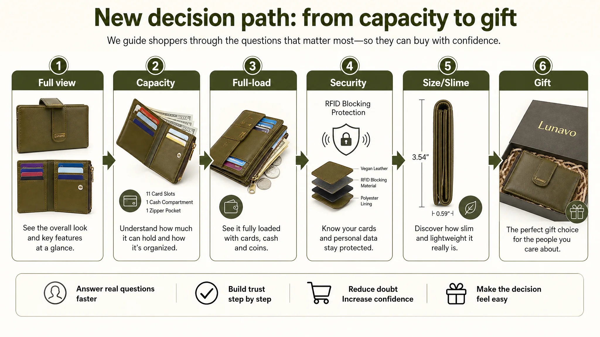
In practical terms:
- Capacity and full‑load usage moved to the center of the image and A+ path, visually showing the wallet stuffed with cards, bills, and coins while still closed relatively flat.
- RFID protection moved earlier in both title and images, from a supporting feature to a core promise.
- Slimness and portability were showcased only after buyers had seen what the wallet can actually hold.
- Gift and color variety were pushed toward the end of the journey, as risk‑removal and personalization, not entry points.
This sequence matches how real Amazon buyers decide in this category:
1. Will it hold everything I need?
2. Will it actually feel slim and easy to carry?
3. Will my cards be safe from skimming?
4. Do I like how it looks, and is it gift‑worthy?
The original Listing answered (2) and (4) early, but left (1) and (3) under‑served. DeepBI reversed that.
The Title: Putting Real Demand Ahead of Style Words
DeepBI recommended re‑architecting the title to:
Women’s Coin Purse Slim RFID Blocking Wallet Small Bifold Credit Card Holder Minimalist Multi Card Case with Zipper Pocket (Army Green)
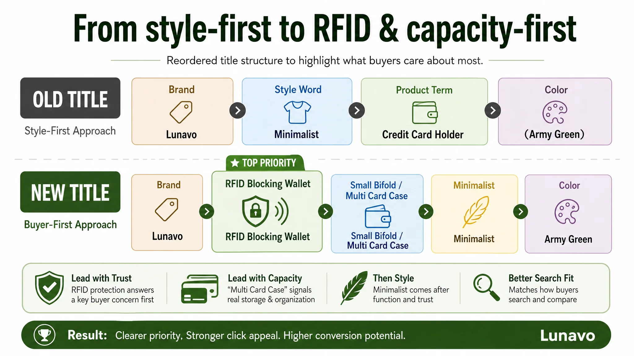
Key shifts in logic:
- Surface the highest‑value keyword cluster early: “women’s coin purse” + “RFID Blocking Wallet” align with actual Amazon search behavior and category expectations.
- Combine form and capacity: “Small bifold” + “multi card case” makes it explicit that this is not just a “card holder” but a compact wallet that can replace a larger one.
- Keep “Minimalist” as a style enhancer, not the main hook. It stays in the title for long‑tail coverage but no longer leads the promise.
- Keep color integrated yet natural: “(Army Green)” remains at the end but benefits from better upstream relevance.
This is not a keyword dump exercise; it is a re-prioritization of what the buyer cares about first.
Main Images: From Static White‑Background to Capacity and Security Proof
DeepBI’s visual diagnosis did not ask for more “beautiful” images; it asked for images that reduce decision friction.
The hero image: show what matters at a glance
The recommended first image:
- Split into two views:
- Left: the wallet closed at a slight angle, clearly showing the Army Green exterior and clasp.
- Right: the wallet fully opened and fully loaded with cards.
- Text overlays highlight:
- “Army Green”
- “Multi‑card mini wallet”
This immediately tells a scrolling buyer:
- What the product looks like.
- That it is a compact but high‑capacity piece.
The supporting sequence: answer doubts in the right order
DeepBI’s proposed adjustments:
1. Move the current “super slim” size comparison image to later in the path (4th or 5th).
- Only after the buyer sees capacity and full‑load behavior does “still slim” become credible and persuasive.
1. Create a clear capacity composition image
- A fully horizontal, open wallet.
- Each card slot numbered (1–11), plus callouts for cash compartment and side zipper pocket.
- Overlay headline like: “Large capacity, well organized”.
1. Replace redundant angles with an RFID concept visual
- A wallet at an angle with contactless payment iconography.
- Layered material illustration (outer leather, RFID blocking layer, inner lining).
- Icon + text such as “RFID blocking protection” to visually confirm the feature.
1. Introduce a “empty vs full” comparison image before the gift box shot
- Top: empty wallet neatly open.
- Bottom: wallet fully loaded with cards, flat cash, and visible coins.
- This is the visual proof that “mini size” and “large capacity” are not conflicting statements.
With these changes, every additional image in the sequence introduces new information or resolves a new doubt, rather than repeating similar angles.
Bullets: From Parameter Listing to “Pain Point → Solution” Mini Stories
The original bullets focused on dimensions, slot counts, and generic durability claims. DeepBI’s guidance was to:
- Maintain factual accuracy (no invented functions).
- Restructure bullets around what the buyer worries about, not what the seller wants to list.
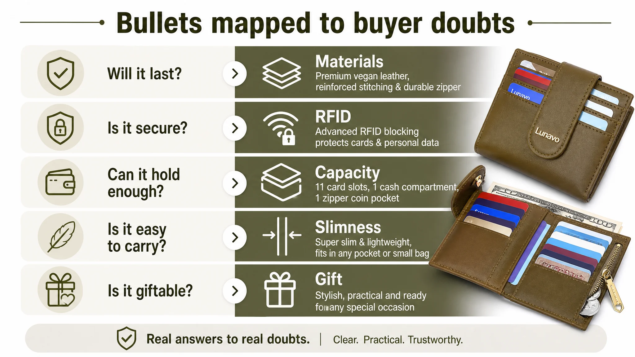
The resulting bullet logic:
1. Premium material + longevity promise
- Not just “PU leather” but “soft vegan leather + reinforced stitching + durable lining”.
- This translates “it won’t fall apart in a year” into a clear expectation.
1. Security & RFID protection
- Explicitly mention RFID blocking and how it protects personal and payment data from unauthorized scanning.
- Tie in the secure zipper pocket for coins and small essentials — so nothing slips out.
1. Capacity in mini size
- Clearly list: 11 card slots, 1 full‑length cash compartment, 1 side zipper coin pocket.
- Emphasize “more storage than most mini purses” to strengthen the comparative angle.
1. Ultra‑slim & pocket‑friendly
- Use concrete size and weight numbers.
- Connect them to practical scenarios: jacket pockets, small handbags, travel.
1. Gift positioning
- Tighten and emotionalize: who it’s for and on what occasions, rather than a long raw list of holidays.
Each bullet now operates as a mini conversion block, not a dry spec line.
A+ Detail Page: Turning a Static Gallery into a Conversion Story
DeepBI restructured the A+ modules around a clear flow:
Module 1: Full‑load scenario at the top
- Replace the brand logo opener with a full‑load, real‑use visual.
- Show the wallet packed with cards and cash, yet still held flat by the external strap.
- Headline direction: “Slim design, surprisingly spacious”.
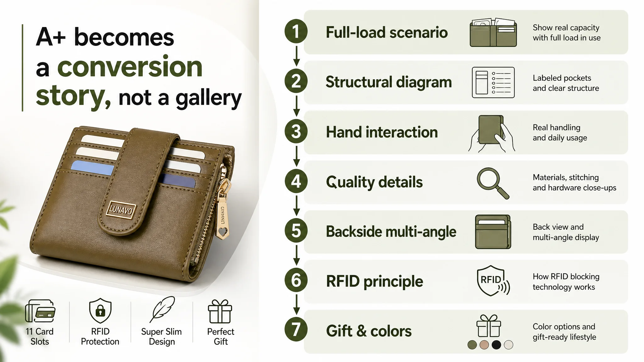
Purpose: immediately address the thin‑wallet skepticism: “If it’s that slim, can it actually hold my stuff?”
Module 2: Structural diagram with quantified regions
- Use an open wallet image.
- Add callouts for:
- 11 card slots
- 1 cash compartment
- 1 side zipper coin pocket
- ID window if present
- Circular zoom‑in on critical areas (zipper pocket, card slots).
Purpose: count it for the buyer; no mental arithmetic required.
Module 3: Hand interaction and size in real life
- Human hands holding the wallet and pulling out a full banknote.
- Show that the zipper opening is wide enough for bills without awkward folding.
- Reinforce compactness vs. hand size.
Purpose: give a concrete sense of scale and practicality, like the competitor does.
Module 4: Consolidated quality details
- Combine button, zipper head, and vegan leather grain into a single “quality details” module.
- Message: premium look and durable build, without over‑occupying multiple blocks.
Purpose: one strong quality statement, not three repetitive hints.
Module 5: Backside and multi‑angle view
- Show the back of the wallet clearly: any slots, clasp, stitching.
- Make sure buyers understand there is no “dead” side or hidden unusable area.
Purpose: remove any ambiguity about what they are buying.
Module 6: RFID blocking principle
- An explanatory graphic for RFID shielding.
- This is not inventing new functionality; it visualizes the function already claimed in title/bullets.
- Show which areas are protected and how, with icons and short text.
Purpose: move beyond “we say it has RFID” to “here is how it protects you”.
Module 7: Multi‑color gift scene at the end
- A top‑down layout of several colors arranged as a gift scene.
- Copy focuses on occasions and recipients.
Purpose: serve as final emotional nudge and personalization confirmation.
With this re‑layout, A+ stops being a fragmented gallery and becomes a coherent argument: this wallet is practical, secure, well‑built, and nice enough to gift.
Before Ads Could Work Again, the Page Had to Convert
Once the Listing’s decision logic was rebuilt — from search results (title, main image) down through bullets and A+ — several things changed in the seller’s operating posture, even before any new hard data:
- Traffic quality started to matter again
With a stronger page, spend on high‑value keywords (like “RFID wallet women”, “multi card case wallet”) could be justified. Each click had a better chance of turning into an order.
- ACOS pressure became diagnosable
If ACOS remained high after Listing optimization, the team could now plausibly question targeting and bid levels, rather than suspecting the page itself.
- Dependence on brute‑force ad spend began to ease
A Listing that tells a sharper story tends to recover organic rankings over time. There is less need to keep “buying back” the same positions.
- The seller’s understanding shifted
Internally, the conversation moved from “our ads are underperforming” to “our Listing was asking buyers to work too hard to say yes.”
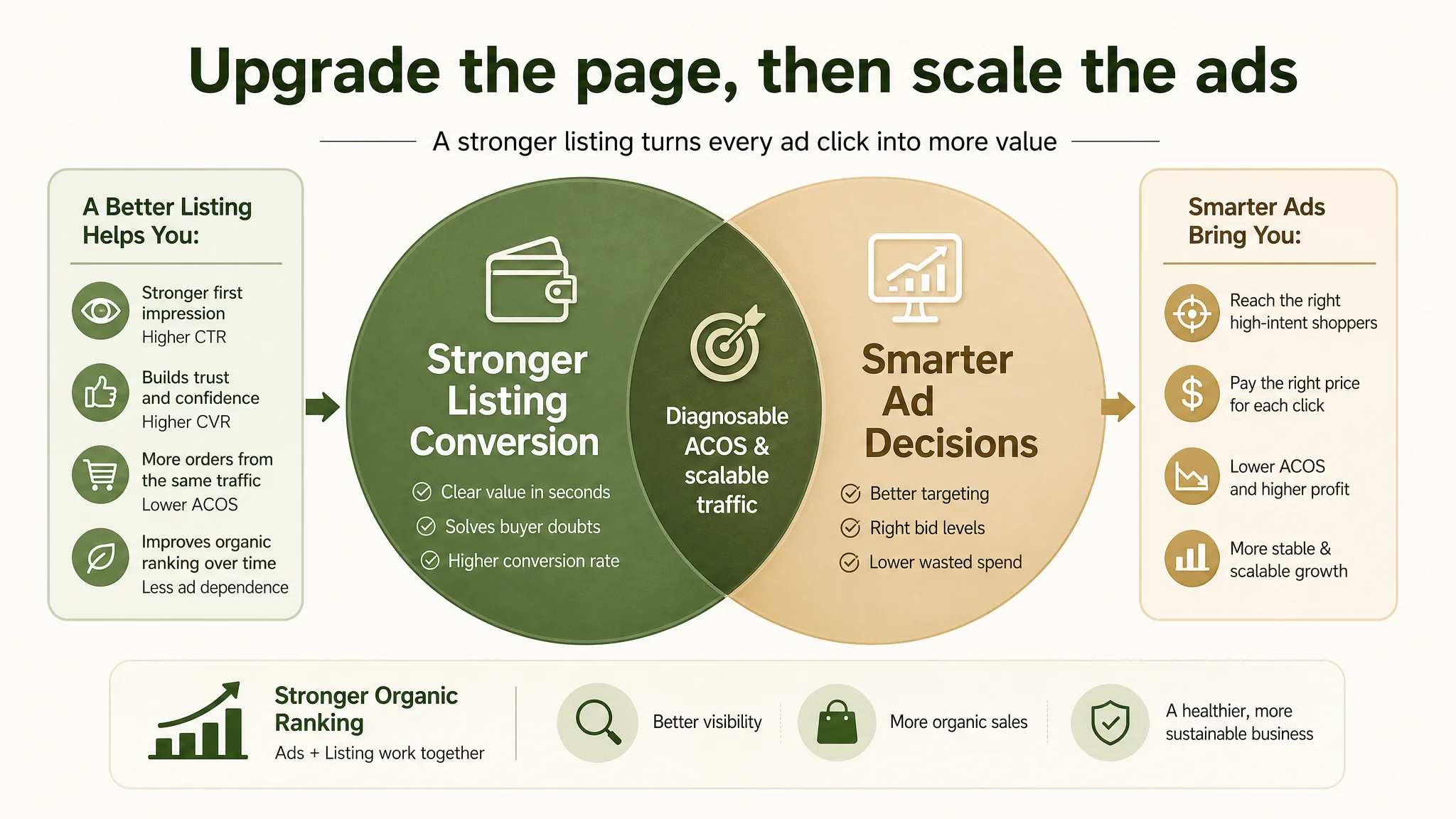
Even without inventing numerical outcomes, the risk profile changed:
- Wasted impressions decreased as more visitors understood, in seconds, what the product actually offers.
- The Listing stopped fighting against the benchmark competitor at every step and started speaking in the same language: capacity, security, practicality, then style.
What Other Amazon Sellers Can Take from This Case
This wallet Listing case is not unique to its category. Similar patterns appear across many Amazon niches:
- Teams assume high ACOS = ad problem.
- They keep changing bids, keywords, and budgets.
- The page itself has never been truly benchmarked against the real category leaders.
Key lessons:
1. Listing conversion is the foundation of ad efficiency.
If your title, main images, bullets, and A+ are not aligned around the buyer’s real doubts, no campaign structure can fully compensate.
1. Small scoring gaps compound into large business gaps.
Being a little weaker than the benchmark on title, a little weaker on images, and a little weaker on A+ adds up to a real conversion penalty — and a harder path to profitable ads.
1. The sequence of information matters as much as the information itself.
In this case, talking about slimness and color before capacity and security was a structural error, not a cosmetic one.
1. Ads should not be scaled until the Listing deserves more traffic.
Use data and structured comparison to ask:
- Does my page resolve the same doubts as the best competitor — as clearly and as fast?
- If I were a cold buyer landing here, would I trust this enough to pay?
DeepBI’s role in this case was not to “polish the visuals”, but to reframe the problem: the Amazon ads were doing what they were supposed to; the Listing was not yet capable of fully capitalizing on that traffic. Once that judgment is clear, the optimization path becomes much simpler — repair the page’s sales logic first, then restart the ad playbook on a more solid foundation.