
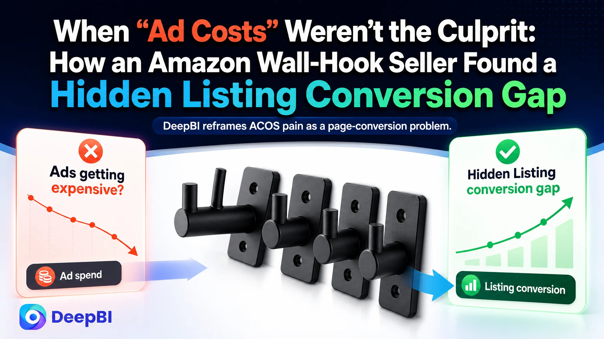
This case comes from an Amazon seller in the home-organization category on the Canadian marketplace, selling black wall-mounted hooks for coats, towels, and everyday items. The team had already been running Amazon ads and believed the main problem was rising advertising costs and unstable ACOS. They repeatedly tweaked bids, keywords, and placements, but orders did not respond as expected. Traffic was there; conversion wasn’t.
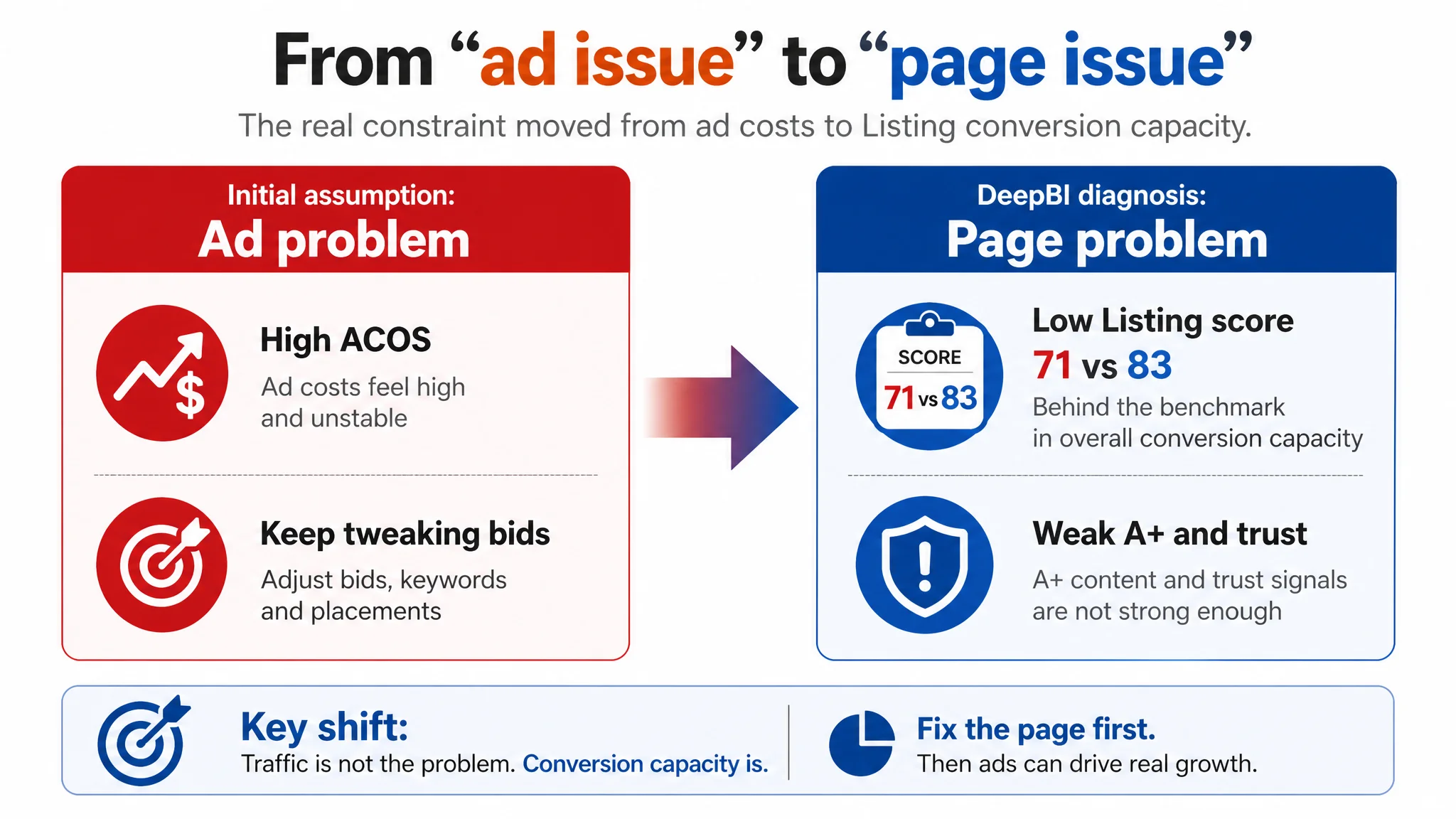
After running the product page through DeepBI, the picture changed. The data showed that, compared with a benchmark wall-hook listing, this Amazon Listing had a weaker overall score (71 vs 83) and a clear deficit in the detail/A+ module and persuasive path. Ads were not failing; the page was consuming traffic. The real issue was that the product page did not build enough trust around its core strengths—heavy-duty capacity, dual-hook advantage, and modern aesthetic—and instead over-invested in technical parameters and surface lists.
The subsequent optimization did not start with “more ads” or “more keywords”. It started by rebuilding how the title, main images, bullet points, and A+ modules work together to answer one simple buyer question: “Will these hooks really hold my stuff securely and look good in my home?” By reordering evidence, clarifying core claims, and visualizing heavy-duty performance, the Listing’s conversion logic began to recover. For other Amazon sellers, this case is a reminder: when ACOS feels uncontrollable, the root cause may be a Listing that doesn’t deserve the traffic it is getting.
The Amazon Seller’s Initial View: “Our Ads Are Getting Expensive”
This seller’s product-page situation looked, on the surface, “good enough”:
- The product: wall-mounted dual hooks in matte black, sold as a 4-pack, targeting bathrooms, kitchens, entryways, and bedrooms.
- The marketplace: Amazon Canada.
- Competition: a strong benchmark listing in the same category, also wall-mounted hooks, positioned around an “entryway and bedroom” coat rack use case.
From the seller’s day-to-day perspective:
- Amazon ads were driving traffic.
- ACOS felt high and unstable.
- The response was typical: adjust bids, refine keyword lists, tweak campaign structures.
The team’s working assumption was straightforward: “If we keep tuning the ads and spend, ACOS will eventually come down.”
What they didn’t see yet was that the Listing itself—title, main images, bullet points, and A+ content—was underperforming against the benchmark, especially in how it turned visits into conviction and then into orders.
“The real problem was not that ads failed to bring traffic. It was that the page could not convert the traffic.”
Where the Misdiagnosis Started: Treating a Conversion Problem as an Ad Problem
From the inside, the seller believed they had already done the basics:
- A full set of main images and lifestyle scenes.
- Bullet points with material, size, installation instructions, and surface compatibility.
- A+ modules covering features like waterproof, anti-rust, and load capacity.
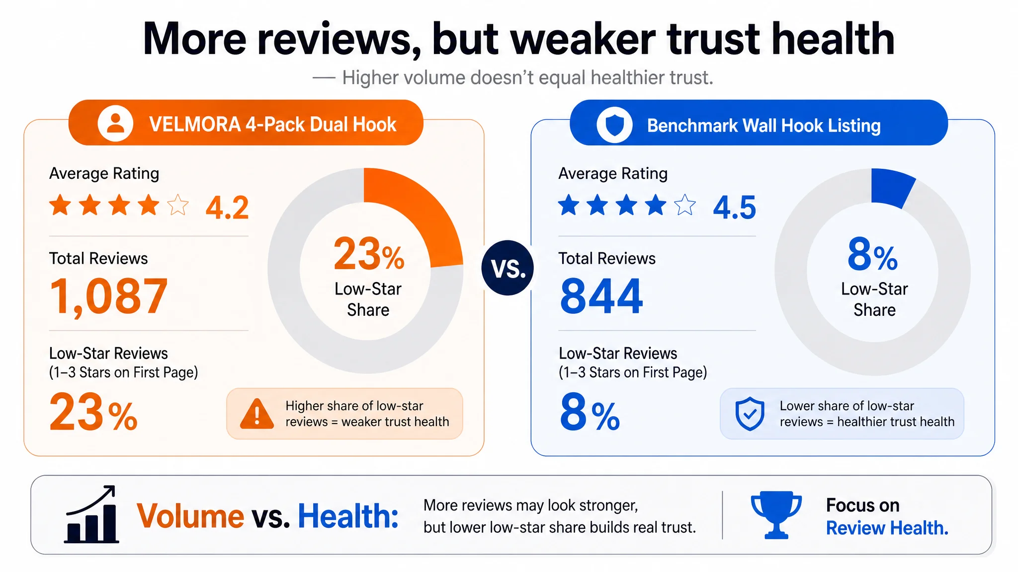
- Over 1,000 reviews with a 4.2-star rating—numerically more reviews than the benchmark.
So when performance wobbled, the operating logic defaulted to:
- “We need better ad structure.”
- “We should adjust bids.”
- “We might need new keywords.”
That is, the problem was framed as an advertising optimization issue, not a product-page conversion issue.
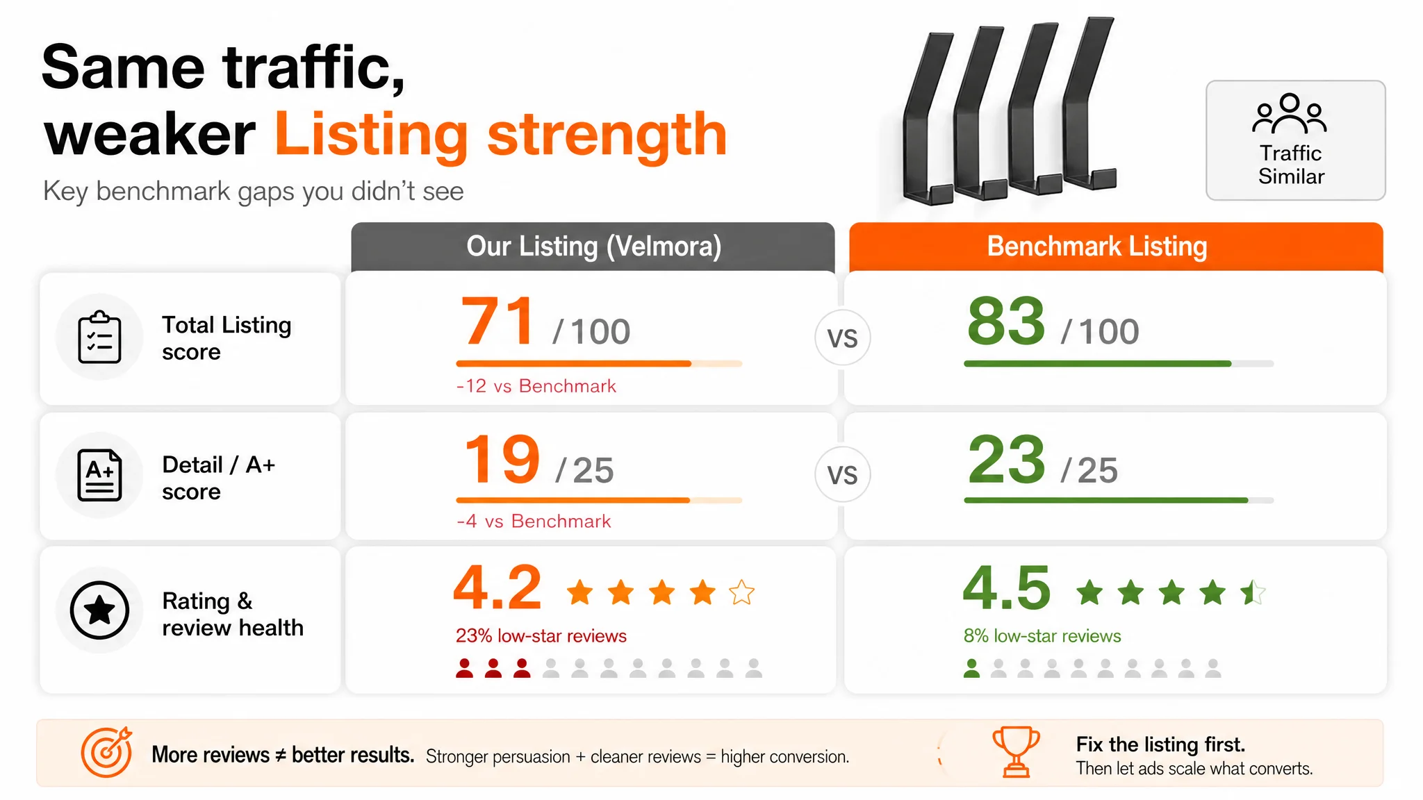
However, key facts were easy to ignore without side-by-side data:
- The benchmark listing had a higher total Listing score (83 vs 71).
- The largest single gap was in the detail/A+ dimension (-4 points).
- The seller’s review count was higher, but rating quality and negative-review ratio were worse (4.2 stars vs 4.5; first-page low-star share 23% vs 8%).
In other words, the Listing’s persuasive power and trust health were both weaker than the competitor’s, even though ad traffic kept flowing.
Listing Data Exposed the Real Constraint: Conversion Capacity, Not Traffic Volume
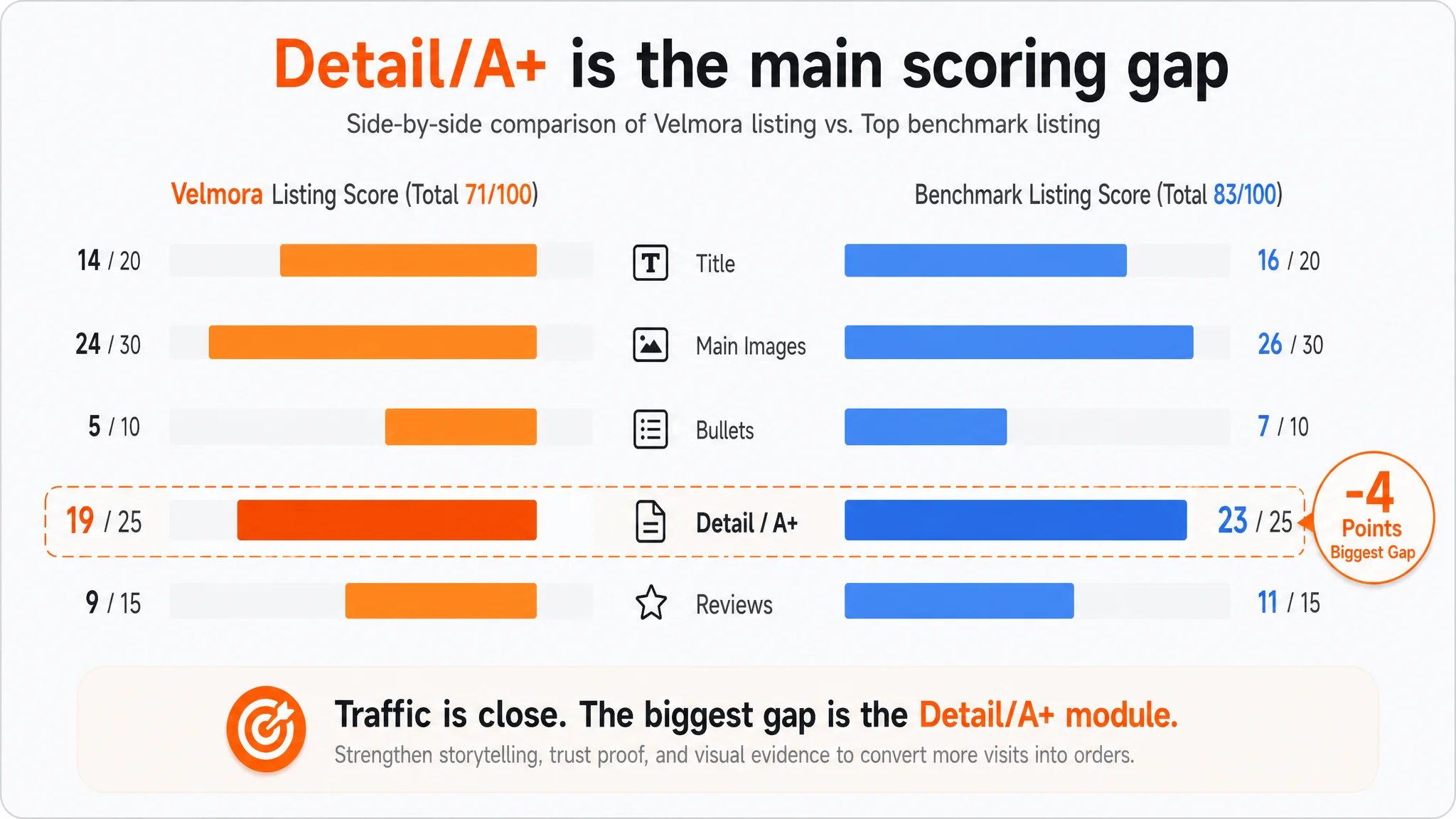
DeepBI’s Listing evaluation broke the page down into title, main image, bullet points, detail page, and review dimensions:
- Total score: 71 vs benchmark’s 83 (−12 gap)
- Title: 14 vs 16
- Main image set: 24 vs 26
- Bullet points: 5 vs 7
- Detail / A+: 19 vs 23 (biggest delta, −4)
- Reviews: 9 vs 11
The pattern mattered more than any single number:
1. The biggest weakness sat in the A+ / detail area.
This is where buyers usually confirm trust for heavy-duty home hardware (load capacity, durability, aesthetic fit, installation clarity).
1. Bullet points scored low.
They were dominated by parameters (dimension, material, installation steps) rather than buyer outcomes or pain-point resolution (no scratches, secure hold, space saving, clean aesthetic).
1. Reviews were mixed in a risky way.
More reviews than the benchmark, but:
- Lower overall rating (4.2 vs 4.5).
- Significantly higher proportion of low-star reviews on the first page (23% vs 8%).
This combination signaled a clear diagnosis:
The Listing did not effectively articulate and prove its key strengths, and existing trust signals were weaker than the benchmark.
In other words, the Listing’s conversion capacity was the bottleneck, not ad delivery.
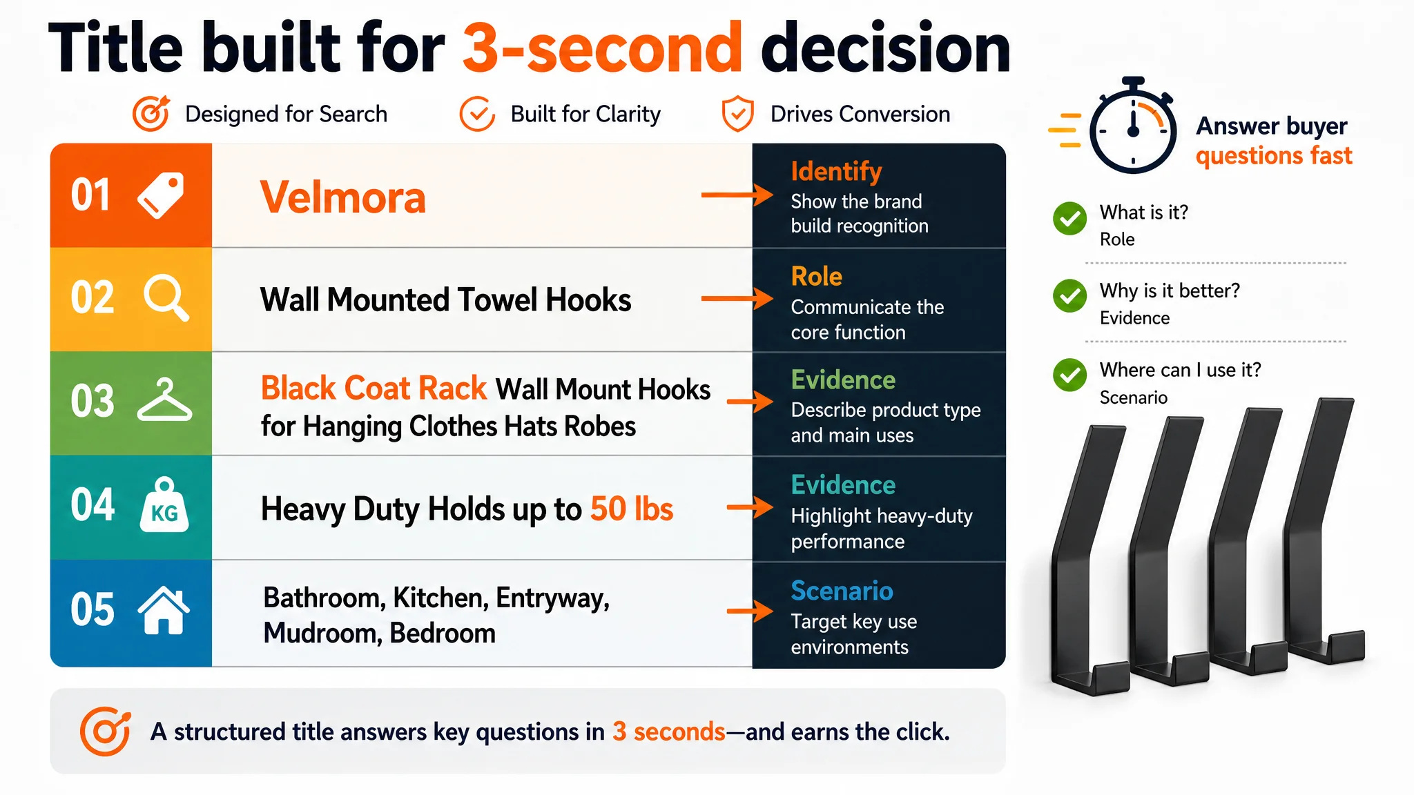
Title: Structured for Coverage, Not for Decision Logic
The title did not clearly frame the outcome
The benchmark’s title followed a tight Amazon pattern:
- Brand front-loaded.
- Clear product type (“Coat Rack Wall Mount”, “Coat Hooks Wall Mount”).
- Numeric value anchor (“with 15 Hooks”).
- Focused primary use cases (“Entryway and Bedroom”).
The target Listing’s original title:
- Put the brand in the middle.
- Led with “4 Packs”, which quantified quantity but not functional advantage.
- Listed many application scenes (Kitchen, Door, Cabinet, etc.), making it long and diluted.
- Offered fewer variants of the core functional keywords (coat rack, coat hooks, hat rack).
DeepBI’s judgment was that this title emphasized coverage instead of decision logic. Buyers scanning search results were not immediately told:
- What core role these hooks play (coat rack, towel hooks, hat rack).
- Why these hooks are different (dual hooks, heavy-duty, 50 lbs capacity).
- Where they should be used first (bathroom, entryway, bedroom).
The recommended title structure shifted the logic to:
Brand + core functional term (“Wall Mounted Towel Hooks”) + product type (“Black Coat Rack Wall Mount Hooks for Hanging Clothes Hats Robes”) + heavy-duty attribute + main scenarios (Bathroom, Kitchen, Entryway, Mudroom, Bedroom).
This wasn’t about squeezing in more keywords; it was about making the Amazon search result snapshot do the first 3 seconds of selling: “These are heavy-duty, matte-black hooks that can serve as both towel hooks and coat racks in key home areas.”
Main Images: Plenty of Pictures, but Weak Trust and Decision Anchors
Both the seller and the benchmark had multiple main images, but their roles in the buyer journey were different.
Image 1: Identification vs. differentiation
- The seller’s first image:
- Clean white background.
- Shows the product and quantity (4 hooks).
- No visual emphasis on dual-hook design or capacity.
- The benchmark’s first image:
- Also white background.
- Immediately communicates quantity and key structure and often hints at functional advantage.
Core issue: The seller’s image identified the product but did not differentiate it. DeepBI’s direction: keep the white background, but visually encode:
- “4-pack” as a clear label.
- “Upgraded dual-hook design” as an immediately visible concept.
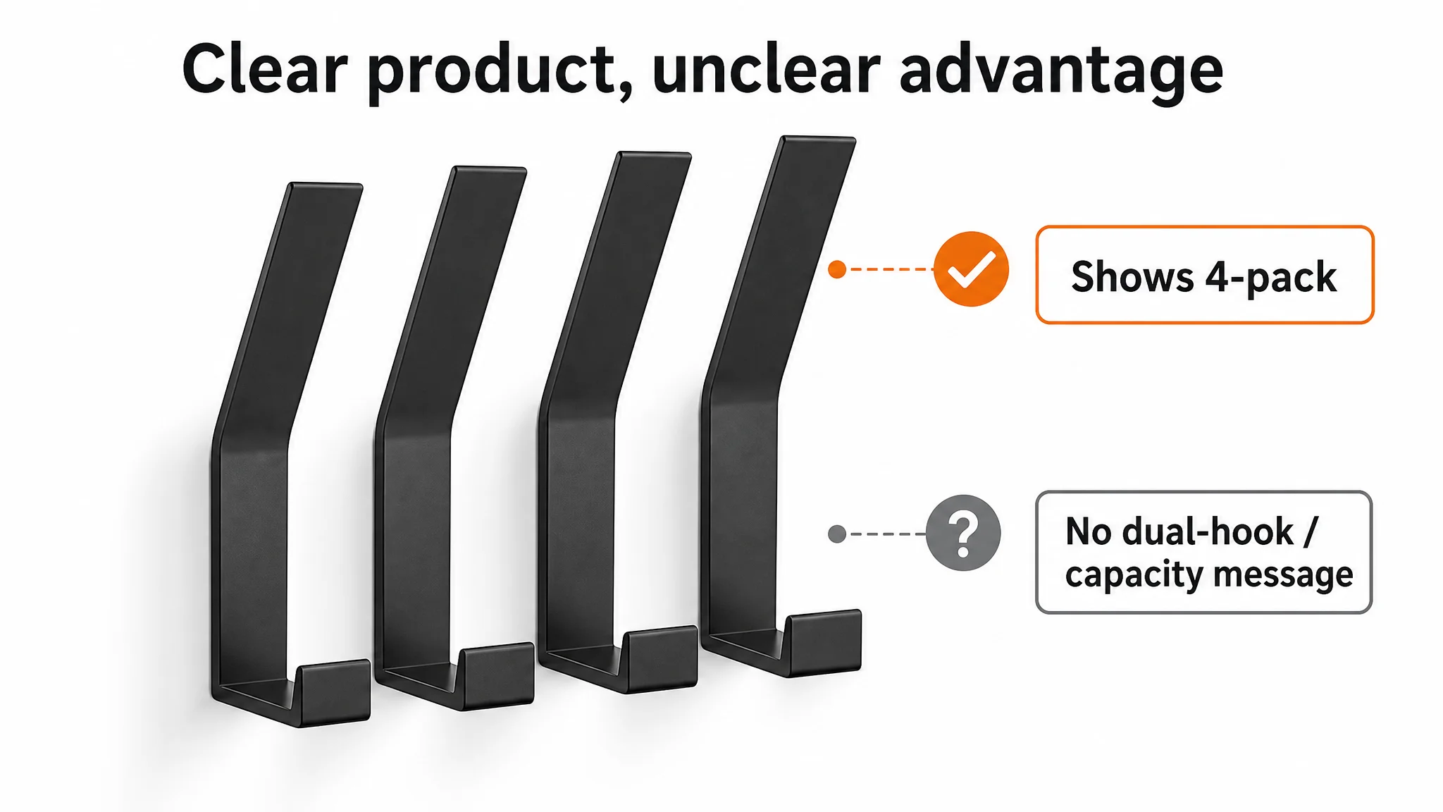
Image 2: Function explanation without emotional or trust hook
- The seller’s second image:
- Shows what the hooks can hold (coats, heavier garments).
- Lacks visual dramatization of why dual hooks are better (e.g., split functions, stability, anti-slip).
- The benchmark:
- Uses zoomed-in views and text overlays to emphasize anti-slip, scratch protection, and user-friendly spacing.
DeepBI’s judgment: This image answered “What can it hold?” but not “Why should I trust it more than standard hooks?” Target direction:
- Highlight “upper hook vs. lower hook” usage.
- Visually imply that dual hooks prevent slip and handle heavier loads more stably.
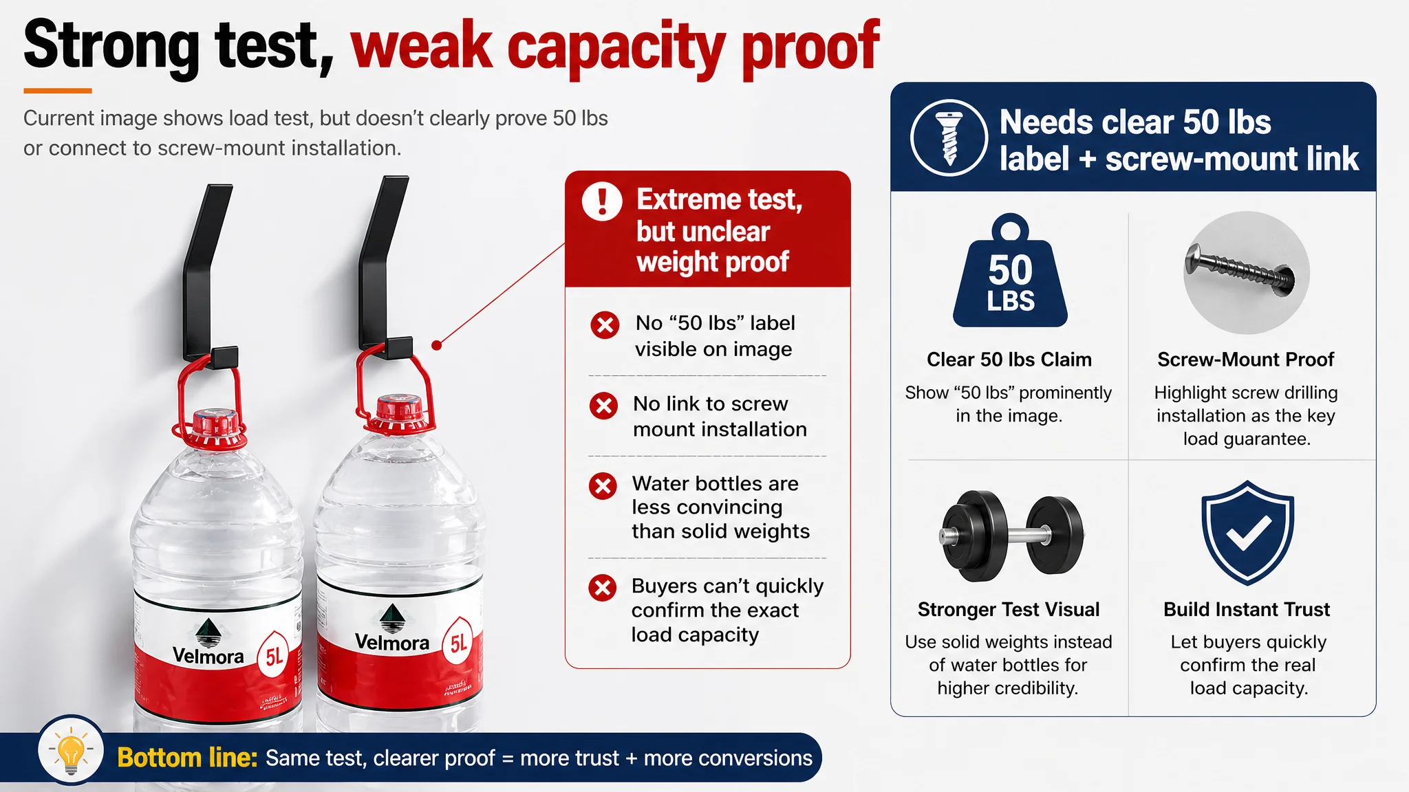
Image 3: Load test without clear logic
- The seller used an image showing hooks holding two water buckets.
- The claim “50 lbs” existed in copy, but:
- The image did not explicitly label “50 lbs”.
- It did not connect the load capacity to the installation method (screw-fixed).
- The benchmark:
- Used specific weight evidence (e.g., dumbbells) and clarified how installation supports that weight.
DeepBI’s recommendation: promote load capacity to a core visual claim:
- Explicitly state “50 lbs” on the image.
- Connect that capacity to “screw-mounted installation” and “space aluminum construction”.
“Advertising does not only amplify advantages. It can also amplify a page’s existing defects.”
Without that clarity, ad traffic was being sent to a page that hinted at strength but never fully proved it.
Images 4–5: Overweighting technical notes early in the path
- The seller brought in:
- A combined dimensions + waterproof/anti-rust image.
- A detailed “suitable wall types” guide relatively early in the image sequence.
- These are valuable—but mainly for cautious buyers nearing final confirmation.
By placing them too early, the Listing:
- Used critical visual real estate for parameters and restrictions instead of trust-building and value framing.
- Delayed a clear, simple installation steps image that could reduce “installation anxiety”.
DeepBI’s reordering logic:
- Early images: role, differentiation, load capacity evidence, aesthetic fit.
- Later images: wall-type compatibility and detailed technical guidance.
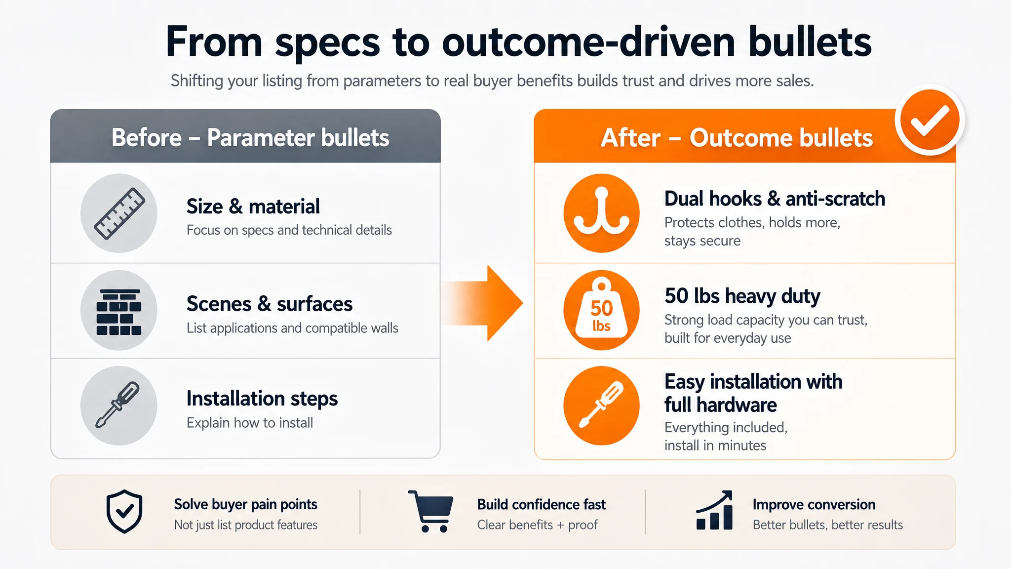
Bullet Points: Data-Rich, But Not Buyer-Outcome-Rich
The seller’s bullet points centered on:
- Sizes and material (space aluminum).
- Applicable scenes and surfaces.
- Installation steps and limitations.
The benchmark’s bullet points centered on:
- User outcomes: no scratches, space-saving, easy to reach items without disturbing others.
- Aesthetic integration: blending with decor, covered screws for a clean look.
DeepBI’s assessment: the seller’s bullets answered “what it is” and “where it fits”, but not “what it does for your daily life.”
The optimization moved each bullet toward a “pain → solution → evidence” structure:
1. Bullet 1: Dual hooks & anti-scratch
- Shift from generic “upgraded hooks” to:
- Dual-prong structure.
- Ability to hold multiple items (heavy coats + backpacks).
- Rounded edges preventing fabric damage.
1. Bullet 2: 50 lbs heavy duty
- Directly contrast standard hooks (around 20 lbs) with this product’s 50 lbs capacity.
- Emphasize waterproof, rust-proof, corrosion-resistant qualities for humid rooms.
1. Bullet 3: Matte black & space saving
- Combine modern aesthetic language (matte black, minimal) with specific dimensions and space-saving use behind doors or on walls.
1. Bullet 4: Multi-purpose & surfaces
- Explicitly map everyday rooms (entryway, bedroom, bathroom, utility room) to supported surfaces (tile, concrete, planks, wallpaper).
- Make limitations clear but secondary.
1. Bullet 5: Easy installation with full hardware
- Highlight “everything included”.
- Break installation into three simple steps, reducing intimidation for less handy buyers.
This restructuring did not invent new attributes; it reordered existing facts so that each bullet resolved a practical concern: capacity, fabric safety, space, compatibility, and ease of setup.
Detail / A+ Content: The Missing Trust Bridge for Heavy-Duty Claims
The biggest numerical gap to the benchmark was in the detail/A+ dimension. DeepBI’s qualitative analysis showed why.
The A+ structure lacked a “problem–solution” storyline
- The seller’s A+:
- Listed features: waterproof, load capacity, multi-scene use, wall compatibility, installation.
- Treated modules as a linear parameter list.
- The benchmark’s A+:
- Started from everyday problems: cluttered entryways, scratching hooks, unstable racks.
- Showed a before/after contrast for space and organization.
- Visualized key features:
- 22 lbs capacity with real weights.
- Anti-slip design.
- 6-hook layout.
- Screw caps for aesthetics and safety.
DeepBI’s judgment: the seller’s page had information, but not a narrative.
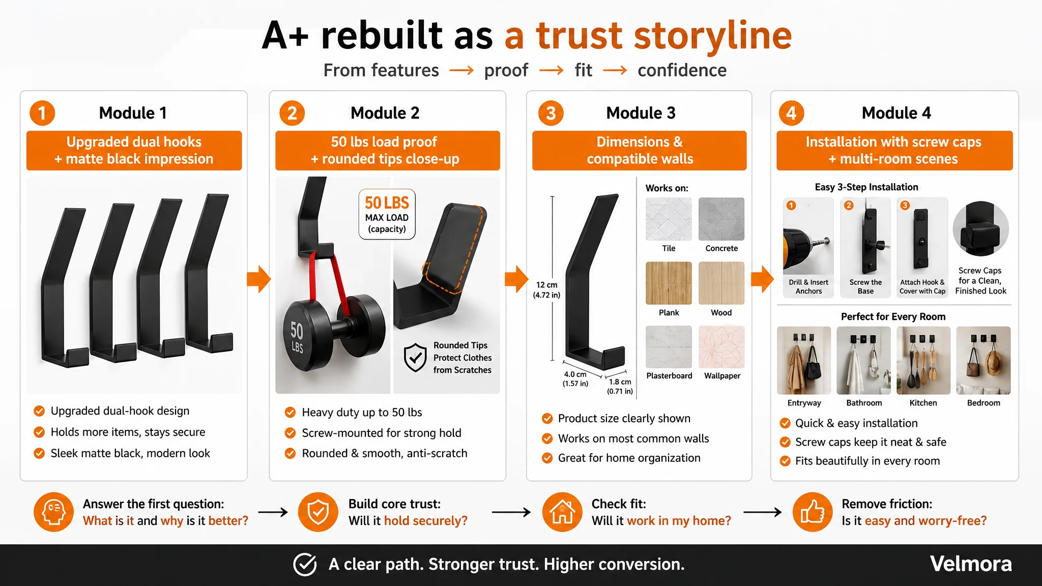
Elevating load capacity and fabric safety to center stage
Given that the product’s real asset is 50 lbs capacity, the A+ had to be rebuilt around that:
- Module 1:
Connect to main images; frame “upgraded dual hooks” and “matte black modern design” as the starting impression.
- Module 2 (core evidence):
- Promote 50 lbs load capacity from text to visual proof.
- Use a clear weight indicator (e.g., a 50 lbs equivalent) instead of two water bottles.
- Zoom on rounded hook tips, directly addressing “snagging clothes” fears.
- Module 3:
Simplify technical parameters and compatibility; merge with the dimension diagram instead of giving them a standalone, disruptive module.
Installation and aesthetic details as a trust layer
- The original installation module showed steps but ignored a hidden buyer concern: visible screws and potential scratching.
- Benchmark-style thinking: show screw caps / decorative covers and emphasize:
- Cleaner look.
- Protection from scratches.
- DeepBI’s direction:
- Keep the 4-step installation flow.
- Amplify the presence and benefit of screw caps within those steps.
Multi-scene validation at the end, not in the middle
The seller’s original A+ structure had scenes and surfaces split across multiple modules, diluting clarity.
The revised logic:
- Combine multi-surface compatibility and multi-room scenarios into a final “one-stop home organization solution” module.
- Use a set of reorganized existing images to show:
- Entryway.
- Bedroom.
- Bathroom.
- Kitchen.
- Back-of-door usage.
This way, buyers finish the A+ journey with a clear answer: “Yes, these hooks will work in my home, in multiple rooms, on my walls, and they’ll look organized and clean.”
Reviews: Volume Without Health Is a Silent Risk
On reviews, the seller had one clear advantage and two hidden weaknesses:
- Advantage:
- Higher total review count (1087 vs 844), suggesting broader sales history.
- Weaknesses:
- Lower average rating (4.2 vs 4.5).
- Much higher proportion of visible low-star reviews on the first review page (23% vs 8%).
DeepBI’s interpretation:
- The review volume signaled that the product had market acceptance.
- The weaker rating and higher low-star visibility indicated:
- Some recurring dissatisfaction signals.
- A trust curve that could easily decline if not addressed.
Because this case focused on immediate Listing optimization, the emphasis was on:
- Reducing friction points (e.g., evidence gaps, unclear installation, aesthetic concerns) that may have contributed to negative experiences.
- Ensuring that any future positive feedback would sit on a stronger, more convincing page.
Over time, as the Listing’s promise and actual use experience align better, the review profile can become more balanced. But the key here was to stop the Listing from undermining its own strengths.
Why DeepBI Did Not Start with Ads: Fix the Page Before Buying More Traffic
From a business perspective, the biggest risk at this stage was continuing to pour ad budget into a page that could not fully convert the traffic it was already getting.
The decision order DeepBI recommended was:
1. Stabilize the Listing’s conversion logic first.
- Clarify core value in the title and main images.
- Prove heavy-duty capacity visually and structurally.
- Convert bullet points from specs lists into pain-point solutions.
- Rebuild the A+ path around trust and daily-life outcomes.
1. Then re-evaluate ads.
- Once the page can credibly support a stronger CVR, ad optimizations (keywords, bids, structure) become productive rather than wasteful.
This sequence reflects a simple operating principle:
**If the page cannot convert, ads will amplify loss. If the page can convert, ads can amplify growth.**
By focusing first on the Listing’s conversion capacity, the seller increased the chance that every future dollar of ad spend would work harder.
How the Page’s Sales Logic Started to Recover
After realigning the Listing around trust and daily use, several structural changes occurred:
- The page started to tell a coherent story:
- Who this product is for (homeowners needing sturdy, modern hooks).
- What problem it solves (mess, lack of hanging space, worries about falling items or fabric damage).
- Why it is credible (50 lbs load evidence, dual hooks, rounded edges, screw caps, compatible walls).
- Visual modules and text no longer competed; they cooperated:
- Main images and A+ modules were tied to the same core claims and evidence.
- Bullet points reinforced the same logic rather than introducing unrelated technical details.
- Technical parameters moved from the front line to a supporting role:
- They still existed for careful buyers.
- But they no longer blocked or diluted the main selling narrative.
While this case does not quote post-optimization ACOS or CVR numbers, the commercial effect is clear:
- The Listing’s ability to convert both ad traffic and organic traffic became more robust.
- The store reduced its risk of overpaying for clicks that the page could not justify.
- Future ad adjustments could be made with more confidence, knowing that the core page was not the weak link.
What This Case Means for Other Amazon Sellers
For other Amazon sellers, especially in functional home categories, this case reflects a common trap:
- Symptom: ACOS feels high; ads look “inefficient”.
- Reflex: Adjust campaigns again—bids, negatives, structures.
- Hidden reality: The Listing is underperforming versus a benchmark in trust-building and conversion logic.
Three practical takeaways:
1. Ads expose, they don’t fix, Listing weaknesses.
If the page does not clearly articulate and prove its main advantages, more traffic just exposes that weakness faster.
1. Listing conversion is a capacity problem, not just a content problem.
It’s not about having more words or more images; it’s about whether title, main images, bullets, and A+ form a coherent decision path that resolves specific buyer doubts.
1. Trust modules must be prioritized, not buried.
For load-bearing products, early, visual, specific proof of performance (like 50 lbs capacity tied to screw installation) is not optional; it is the foundation of every subsequent persuasion step.
In this Amazon wall-hook case, DeepBI’s value was not in listing features, but in reframing the problem:
- Away from “ads are expensive”
- Toward “the Listing is not fully converting the traffic we already pay for”
Once that reframing happened, the path forward became clear: fix the product page first, then let ads carry a stronger, more trustworthy story.