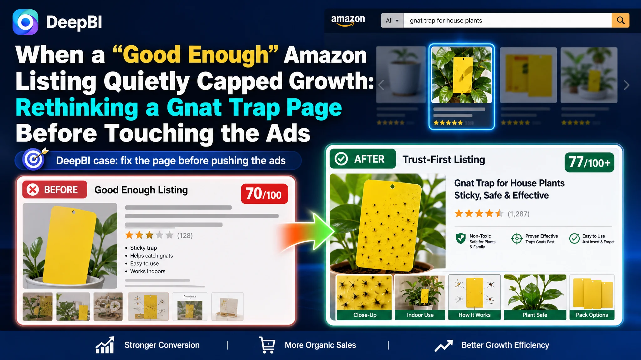
This case comes from an Amazon seller in the US marketplace selling yellow sticky gnat traps for houseplants and home use. On the surface, their Amazon Listing looked solid: complete image set, A+ content, reasonable reviews, and a total Listing score of 70/100 in DeepBI — not a disaster. Yet, even with steady Amazon ad traffic, orders were not growing in line with spend, and ACOS was becoming increasingly hard to control.
The seller’s first reaction was familiar: they believed this was an advertising optimization problem. They suspected keywords and bids needed to be pushed harder, or that they should “buy more traffic” to catch up with a benchmark competitor whose listing looked similar but sold far more. The assumption was that with enough traffic, the page would naturally lift conversions over time.
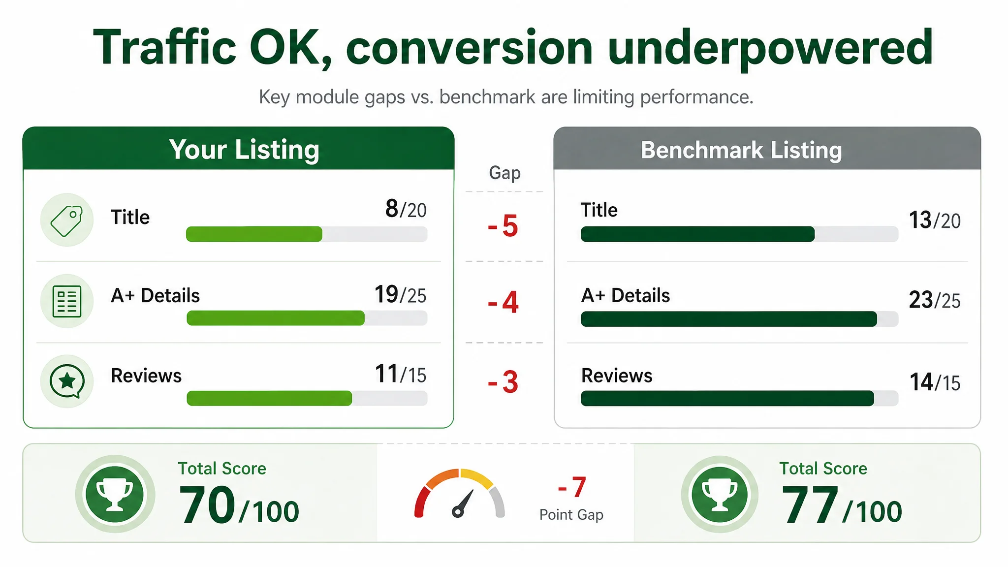
DeepBI’s diagnosis showed a different story. Against a carefully matched benchmark listing in the same gnat-trap subcategory, the core weakness was not in traffic volume, but in Listing conversion capacity — especially title logic, A+ proof, and trust-building visuals. The seller’s page was consuming traffic more than converting it: a 70/100 score versus the competitor’s 77/100, with clear gaps in title (–5 points), details/A+ (–4 points), and reviews (–3 points).
This article walks through how the problem was reframed from “ads not working hard enough” to “the product page can’t fully convert the traffic it already has,” why DeepBI insisted on repairing the Listing before further ad tuning, and what specific title, image, and A+ adjustments rebuilt the sales logic. For other Amazon sellers, the case is a reminder that a Listing can look “fine” and still be the real bottleneck behind rising ACOS and stagnant orders.
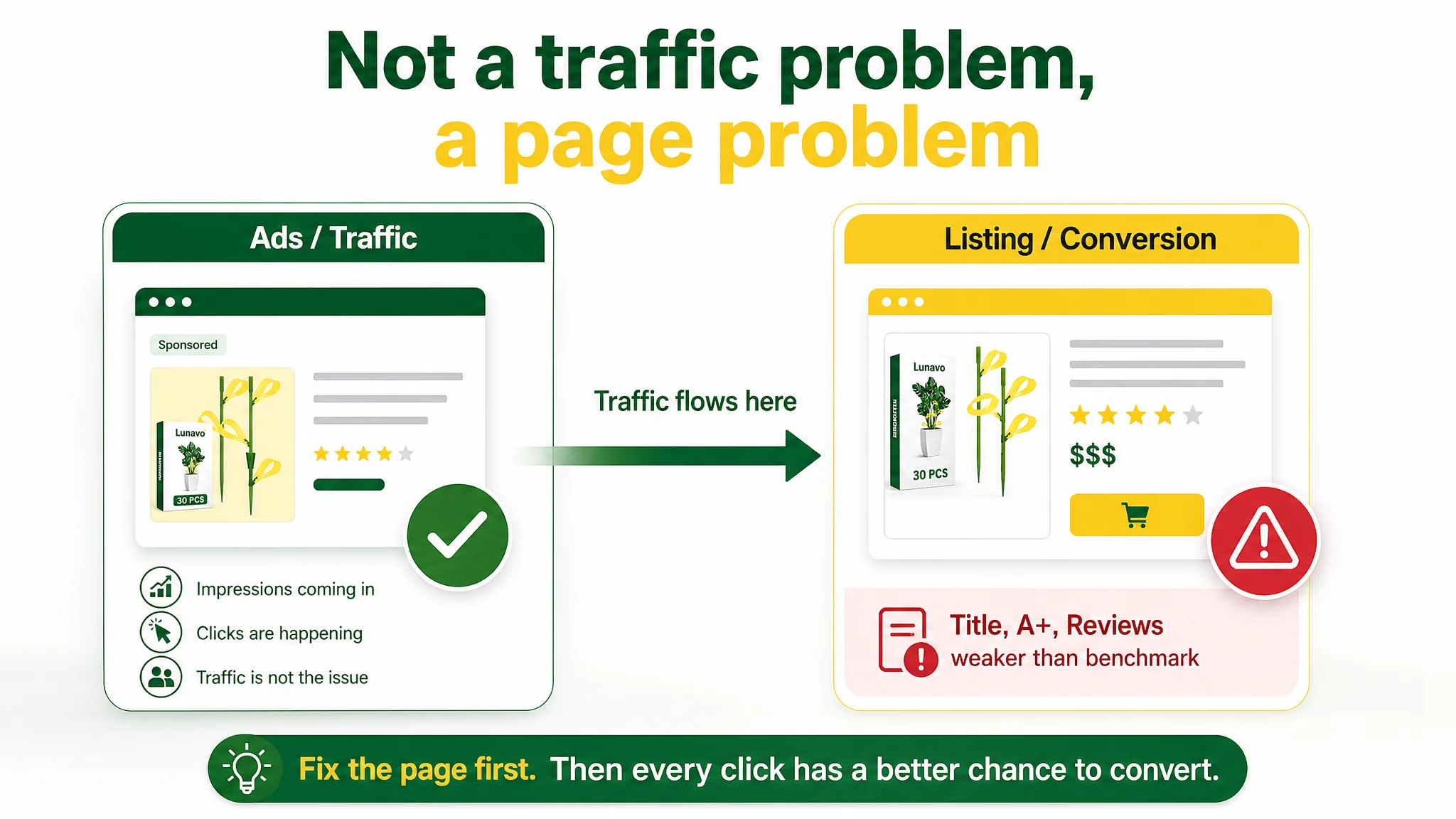
Amazon Ads Were Not Failing. The Page Was Consuming the Traffic.
The seller came to DeepBI with a very concrete pain point: Amazon ads were bringing in impressions and clicks, but orders and CVR were not following at the expected pace. ACOS was stubborn, and attempts to tweak bids and keywords were delivering little relief.
Internally, the team framed the issue as:
- “The ads aren’t optimized enough yet.”
- “We’re probably missing some high-intent keywords.”
- “If we increase budget and refine campaigns, we can catch up to top competitors.”
They were treating traffic acquisition as the main lever, assuming the Listing was already decent and that ad mechanics were the limiting factor.
DeepBI’s first step was to score the Listing and lock in a true benchmark competitor for the same use case: sticky gnat traps for plants, targeting indoor and kitchen environments on Amazon US. The data surfaced a different tension:
“The real problem was not that ads failed to bring traffic. It was that the page could not convert the traffic.”
The benchmark Listing scored 77/100; the customer’s Listing sat at 70/100. That 7-point gap was not randomly distributed. It clustered in exactly the modules that turn visitors into buyers:
- Title: –5 points versus benchmark
- Details/A+: –4 points
- Reviews/VoC: –3 points
Their ads were feeding a page that was structurally weaker at building trust and closing the decision, especially when compared to the category’s “conversion ceiling”.
The Real Constraint Was Listing Conversion Capacity
DeepBI’s scoring showed the Listing was not broken, but underpowered:
- Total score: 70/100 (customer) vs 77/100 (benchmark)
- Reviews: 4.3 stars with ~746 reviews vs 4.6 stars with ~5,460 reviews
- Front-page review mix: similar negative-review ratio, but the competitor had far more visual proof via image reviews
This meant the competitor wasn’t merely benefiting from more traffic; it had built a stronger internal trust engine on the product page.
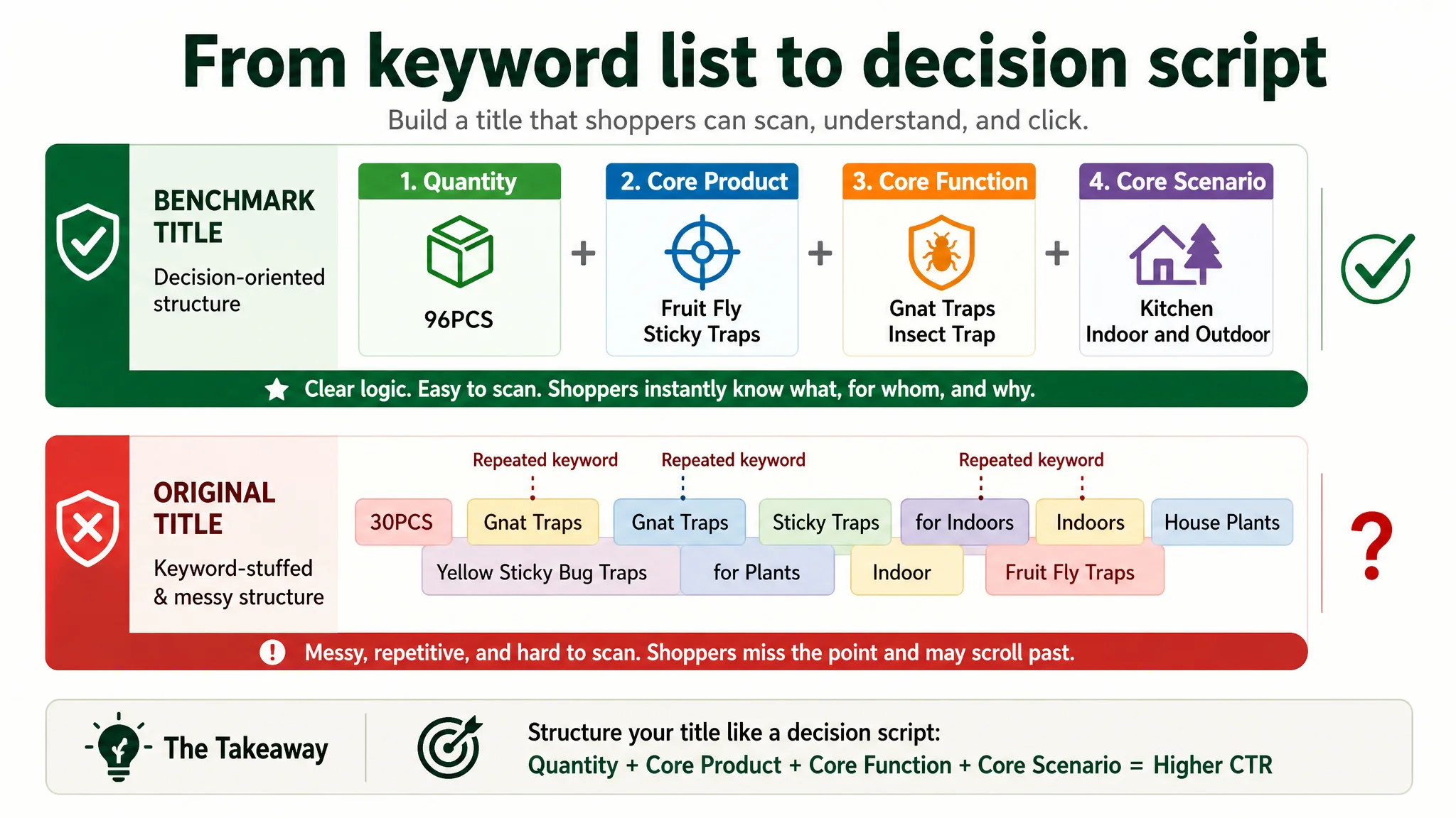
Title: Words That Looked Busy but Did Not Carry the Click
DeepBI’s title analysis highlighted several problems:
- The competitor opened with “96PCS” — a large quantity anchor that instantly signals value.
- The customer opened with “30PCS” and repeated keywords like “Gnat Traps” and “Indoors/Indoor,” padding length without adding value.
- The benchmark sequence was clean and decision-oriented:
Quantity + Core product + Core function + Core scenario
- The customer title’s structure was loose and less scannable, hurting CTR from search results.
- The competitor clearly indicated “Kitchen Indoor and Outdoor”, while the customer emphasized only “Indoors”, narrowing perceived usability and search coverage.
On Amazon, the search-result title is often the first and sometimes the only micro-pitch. Here, the seller had keyword density but lacked clear, tight decision logic.
A+ and Detail Page: Information Without Proof
On the detail page, both listings used multiple modules, but the story depth differed sharply:
- The customer A+ contained:
- Core scene images
- Icon rows for features
- Before/after conceptual illustrations
- Usage steps
- Brand/tagline visuals
- The benchmark A+ contained:
- Product structure and form visuals
- Scene applications in a four-image collage
- A gallery of actual caught insects in a nine-grid layout
- Multi-scenario photos (kitchen, desk, living spaces)
- A safety-focused food-scene image (fruit basket + plants)
The key gap:
- The benchmark built a visual evidence chain: multiple real “full-of-gnats” boards, multi-room usage, and food-adjacent safety imagery.
- The customer relied on illustrative and conceptual graphics, with only symbolic yellow boards, and no heavy visual proof that “this actually catches bugs at scale.”
DeepBI flagged this as a classic trust gap: the product claims were there, but the page lacked proof strong enough to close hesitant buyers.
Reviews: Scale and Visual Persuasion
Rating and volume differences reinforced the same conclusion:
- 4.3 vs 4.6 stars is not catastrophic, but in crowded Amazon categories it matters.
- ~746 reviews vs ~5,460 reviews means:
- The competitor has far stronger social proof.
- Its front page is filled with image-rich, high-credibility reviews.
For a pest-control item, buyers want to see other people’s real results. The competitor’s review layer amplified what its A+ already did: show outcome, not just promise.
Why Traditional Ad Optimization Kept Failing
From the seller’s perspective, the natural reaction to rising ACOS was:
- Add more keywords.
- Fine-tune bids.
- Adjust match types and campaign structure.
- Push budgets to “break through” the plateau.
DeepBI connected these ad efforts to Listing scores and saw a misalignment:
- Ad metrics signaled traffic was not the main problem.
- Listing metrics showed conversion and trust modules lagging the category benchmark.
Each incremental dollar in paid traffic was being poured into a page that didn’t yet deserve more traffic. As long as the Listing stayed at a structural disadvantage, classic ad optimizations could only shift spend distribution, not fundamentally improve the outcome.
“Advertising does not only amplify advantages. It can also amplify a page’s existing defects.”
Running harder on ads would mainly magnify the conversion gap rather than close it.
This Product Page Did Not Lack Traffic. It Lacked Trust.
DeepBI’s diagnosis reframed the problem: Before tuning ads further, the Listing needed to earn the right to receive more traffic.
The core judgment: Fix the conversion engine first, then make ads work harder.
The focus shifted to:
1. Title clarity and decision logic
2. Visual proof of effectiveness and durability
3. Safety and multi-scenario positioning
4. Leveraging the green adjustable stake as a differentiator
The Title Needed to Carry the Outcome, Not Just Keywords
DeepBI proposed a revised title structure:
30PCS Fruit Fly Sticky Traps for Indoors and House Plants, Gnat Traps Catcher for Fungus Gnat, Whiteflies, Mosquitoes, Thrips, Yellow Sticky Bug Traps, Stake Holders Included
Key shifts in logic:
- Front-load the core keyword “Fruit Fly Sticky Traps” for A9 relevance and buyer scanning.
- Remove repetitive mentions of “Gnat” and “Indoor/Indoors” to free character space.
- Integrate “House Plants” and multi-pest coverage (fungus gnat, whiteflies, thrips) to catch long-tail queries.
- Explicitly mention “Stake Holders Included” to highlight a tangible product advantage.
The goal wasn’t more words, but a cleaner decision script at search-result level: what it is, who it’s for, what it handles, and what differentiates it.
Bullet Points Had Information, but Not a Buying Logic
The seller’s original bullets were not weak in content. They emphasized:
- How the traps work
- Safety and eco-friendliness
- Durability and UV resistance
- Design and aesthetics
- Multi-scenario use
But compared to the benchmark, the entry points were less aligned with what buyers decide on first.
DeepBI reorganized bullets to align with a pain-point → solution → proof path, borrowing the benchmark’s strengths while preserving the product’s unique assets.
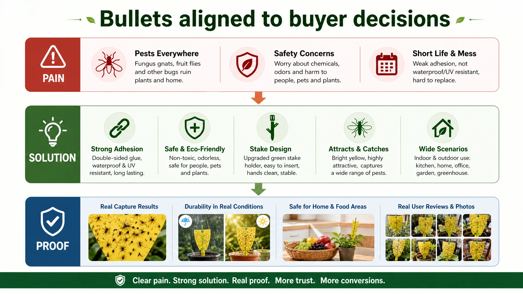
Bullet 1: Durability and Adhesion as the First Promise
New direction:
- Lead with “ULTRA-STRONG ADHESION & LONG LASTING”
- Combine:
- Double-sided ultra-strong adhesive
- UV resistance
- Waterproof properties
- No need to replace until fully covered
This immediately assures buyers: “You won’t be constantly changing these; they stick and keep working.”
Bullet 2: Safety Framed in Buyer Language
The benchmark emphasized “safe and harmless” in simple terms. DeepBI’s copy:
- “100% SAFE & ECO-FRIENDLY”
- Non-toxic, eco-friendly, no chemicals, no odor
- Safe for people and pets
- Will not damage indoor or outdoor plants
The seller’s original text mentioned safety, but with more technical phrasing. The new bullet translated it into buyer language and search phrases widely used on Amazon.
Bullet 3: Design and Ease of Use as Differentiation
The customer product had a clear hardware edge: a green stake holder that helped insertion without getting hands sticky.
DeepBI recast this as:
- “UPGRADED STAKE HOLDER & EASY SETUP”
- Unique green holder, easier insertion
- Hands stay clean
- Stronger support, neater plant appearance vs hanging traps
This turned a structural difference into a visible reason to choose this listing over generic competitors.
Bullet 4: Scientific Visual Attraction Explained Simply
Instead of technical phrases like “pigment information attraction,” DeepBI suggested:
- “HIGHLY EFFECTIVE VISUAL ATTRACTION”
- Bright yellow pigment designed to lure fungus gnats, fruit flies, whiteflies
- Once they land, they are captured instantly
- Helps break the pest life cycle
The shift was from internal logic to clear benefit plus simple mechanism.
Bullet 5: Versatile Scenario Coverage to Widen Use Cases
Finally, DeepBI expanded the application narrative:
- “VERSATILE USE FOR VARIOUS SCARIOS”
- Indoor houseplants, kitchens, greenhouses, backyard gardens
- Suitable for small pots and larger garden areas
- Subtle nudge toward multi-location use (and thus higher unit quantity per buyer)
This bullet connected directly to the multi-scene visuals that would be added in A+.
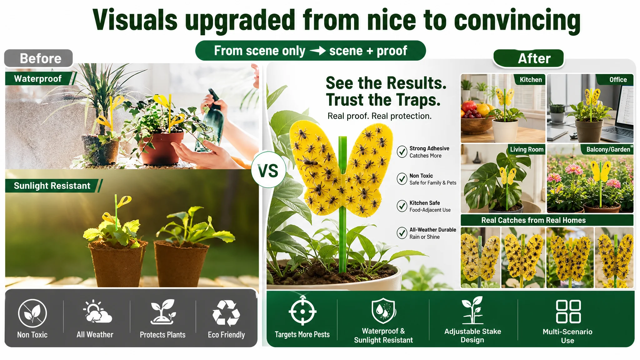
The Main Image Was Not Just a Visual Issue. It Failed to Create a Reason to Click.
On Amazon search results, the main image is the first gate: no click, no conversion.
DeepBI’s comparison of main-image sets revealed:
- The customer’s images were structurally complete: scenes, features, detail shots, human usage.
- The competitor’s main images hit harder on volume, proof, and clarity, even with fewer emotional elements.
DeepBI did not reject the existing structure; instead, it reorganized it into a more conversion-oriented visual system.
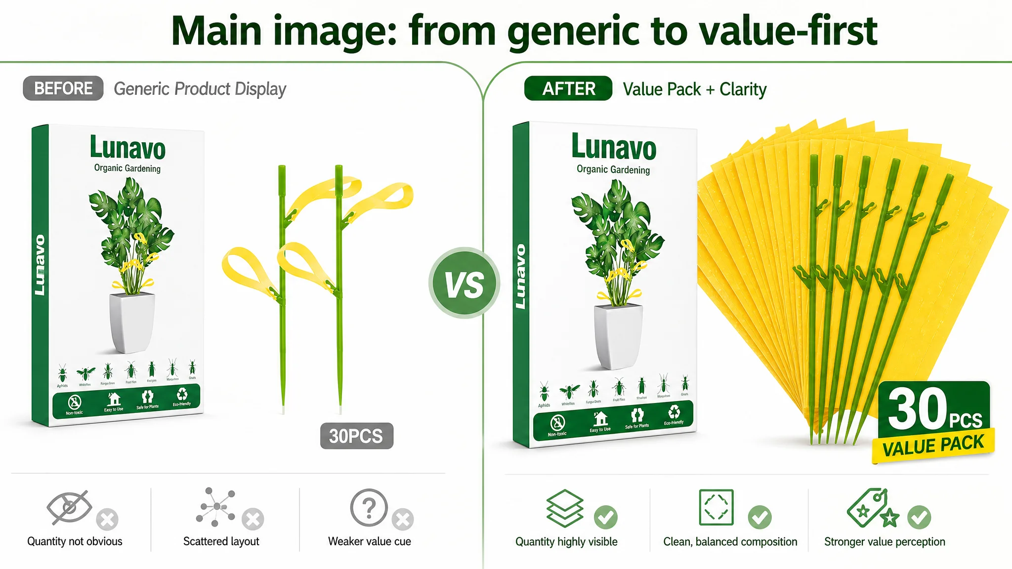
1. Showing “Value Pack” at a Glance
A new primary composition:
- Box on the left (~30% of frame)
- Multiple traps in a fan-like arrangement on the right (~60%)
- Flat, front-facing angle, clean white background
- “30 PCS Value Pack” in deep green text at bottom-right
This directly countered the competitor’s “96PCS” visual shock by making quantity visually obvious even at thumbnail size.
2. Visualizing Target Pests in a Professional Way
Instead of a dense, hard-to-read spectrum chart, DeepBI recommended:
- Central product at 40% scale
- Subtle circular background halo
- Eight real insect images around the ring (gnats, fruit flies, etc.)
- A simplified color spectrum with “600nm Target Wave” highlighted
This kept the product’s “scientific” angle but expressed it in clear, modern visuals.
3. Proving Waterproof and Sun-Resistant in One Shot
Rather than abstract icons, DeepBI proposed:
- Split-screen composition:
- Left: product in a plant under simulated water spray (“100% Waterproof”)
- Right: product in sunlight with a gentle lens flare (“Sunlight Resistant”)
- Both in realistic garden scenes with enhanced color
Three seconds on this image answer a core buyer worry: “Will it stop working if I water my plants or keep them outside?”
4. Presenting Dimensions as Precision, Not Text
A dedicated dimension image:
- Product at right ~50% of frame
- Simple gray gradient background
- Fine measurement lines and clear labels (“3.9 inch”, “1.3 inch”, “5.5 inch”)
This gave the listing a precision and professionalism similar to industrial design imagery, reinforcing trust.
5. Raising Scene Aesthetics to Match Category Level
DeepBI’s guidance:
- Show traps in a woven basket or terracotta pot full of flowers
- Low-angle shot, early-morning backlight
- Soft bokeh of a lush garden background
- Warm yellow vs natural green color contrast
This upgraded the overall mood from functional to aspirational gardening, without sacrificing clarity.
A+ Content: From Conceptual Illustrations to Outcome-Based Proof
The core issue in the A+ was not the number of modules, but the absence of hard evidence that the traps work.
DeepBI’s restructuring centered on six visual logics.
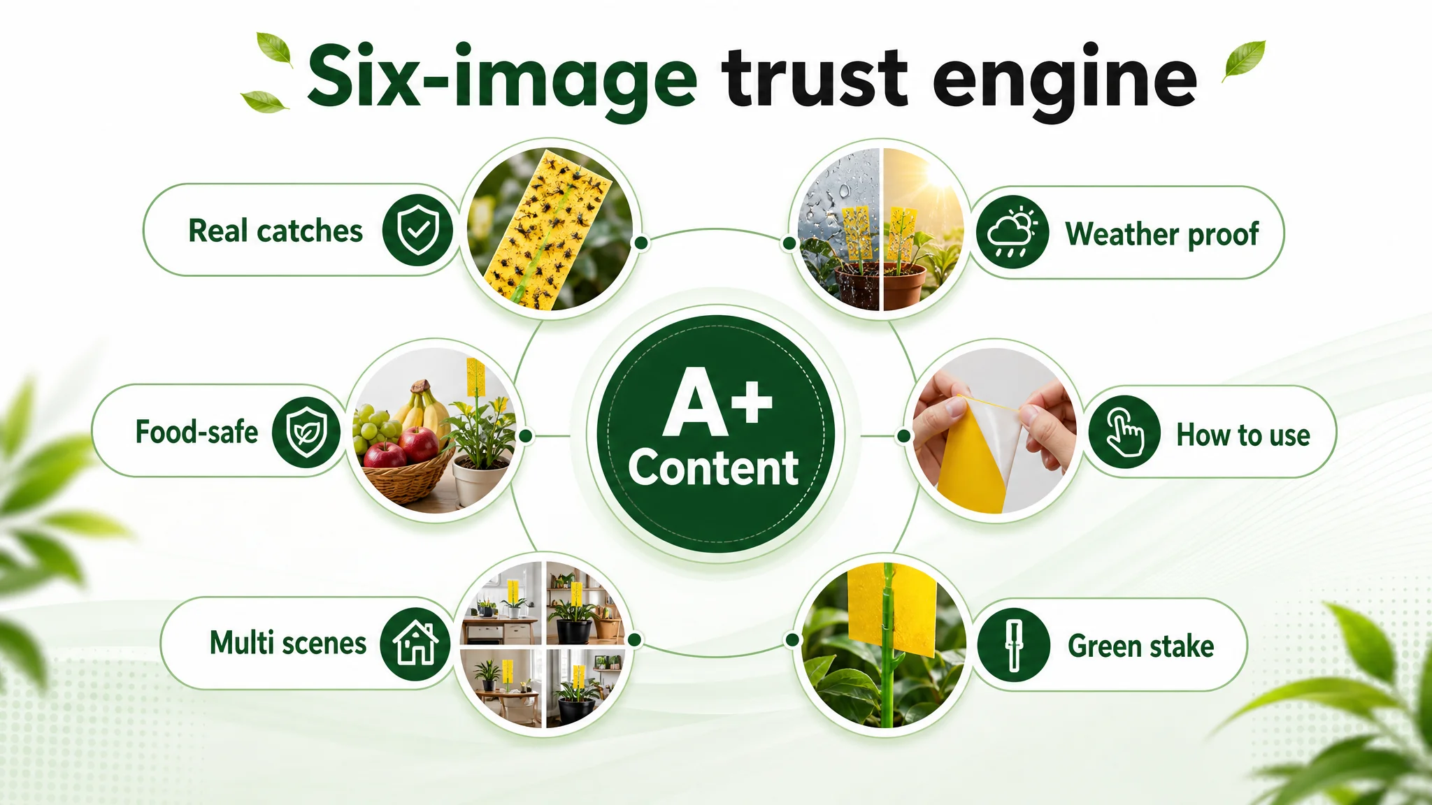
1. Show Real Caught Insects
A high-impact hero image:
- Yellow trap (butterfly shape or similar) visibly covered with gnats and fruit flies
- Occupying ~50% of frame, crisp edges, no stylized filters
- Soft-focus indoor plant background
This answered the top question: “Does it actually catch bugs like in the reviews?”
2. Visualize Weather Resistance with Split Scenes
A weather module:
- Left: sunny conditions, bright 6000K lighting
- Right: rain or mist spraying over the plant
- The trap intact and functional in both
This turned “waterproof” and “UV-resistant” from copy claims into instant visual understanding.
3. Put the Trap Next to Food to Signal Safety
A kitchen safety image:
- Trap in a plant next to a fruit basket (apples, grapes, bananas)
- Clean, modern kitchen countertop
- Neutral, natural light
The benchmark’s fruit-basket image had already proven this logic: it subtly communicates “safe around food” without overexplaining.
4. Show How to Use It in One Close-Up
A micro shot:
- Two hands peeling off the white protective film
- Yellow sticky surface clearly visible
- Neutral gray background
This made “easy to use” tangible, especially for buyers who worry about sticky, messy installation.
5. Cover Multiple Real-Life Scenarios
A four-scene collage:
- Office desk plant
- Kitchen windowsill
- Living-room floor plant
- Balcony flower rack
The traps appear naturally in each setting, with consistent lighting. This supports the bullet about versatility and nudges buyers toward multi-location usage, which increases cart size.
6. Highlight the Green Adjustable Stake as a Real Differentiator
A structural logic image:
- Green support stake and yellow board combination at center, ~60% of frame
- Stake shown mid-adjustment to imply flexibility
- Soft-focus plant background
While the benchmark competitor relied on standard ground-insert traps, this seller’s adjustable green stake is a real product advantage. DeepBI made sure it was visually obvious, not buried in text.
7. Build Social Proof Visually
A nine-image collage mimicking user-generated content:
- Different household scenes
- Each showing traps filled with insects
- Minimal retouching; real-life feel
This acts as a quasi-review layer inside the A+ itself, lowering the mental barrier for buyers who need to see others’ outcomes before committing.
Why DeepBI Did Not Keep Tuning the Ads First
Given the diagnosis, DeepBI’s priority sequence was explicit:
1. Stabilize and strengthen the Listing’s conversion logic:
- Clearer, more competitive title
- Stronger bullet-point hierarchy
- Main images that carry value, proof, and clarity
- A+ visuals that directly address “Does it work?” and “Is it safe here?”
1. Only then revisit ad tuning:
- Once CTR and CVR improve from the page itself, ad decisions (budget, keywords, bids) start compounding instead of leaking.
The biggest risk at that stage was letting ads amplify a sub-optimal page. Without fixing the trust and proof gaps, any incremental ad spend would be largely absorbed by a Listing that could not match the benchmark’s conversion behavior.
How the Page’s Sales Logic Started to Recover
Post-diagnosis, the seller began reworking their Listing around these principles:
- Title cleaned up and refocused on fruit fly traps + house plants + stake holders.
- Bullet points restructured to follow a pain → solution → result pattern.
- Main-image set redesigned to:
- Visualize pack size
- Highlight target pests
- Prove waterproof/sun-resistant features
- Raise aesthetic quality to category level
- A+ rebuilt around:
- Real capture evidence
- Weather durability
- Kitchen-safe positioning
- Micro-usage details
- Multi-scenario coverage
- Stake-design differentiation
- Visual social proof
As these elements rolled out, the Listing moved from “good enough” to credible competitor territory in terms of how it handled each step of the buyer’s decision.
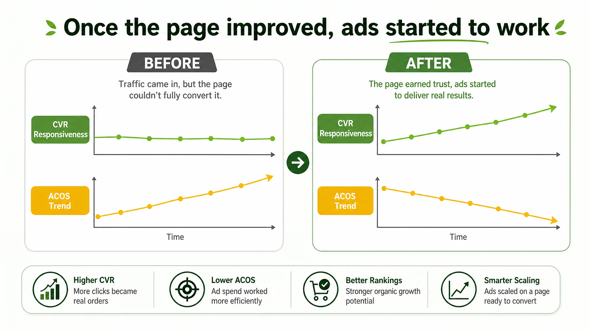
The immediate effects were not framed as miracle jumps, but in how operations felt:
- CVR started to become more responsive to ad changes instead of staying flat.
- ACOS began to show downward movement as more clicks turned into orders.
- The seller saw early signs that organic rankings and orders had a better chance to recover because the page itself now captured value more efficiently.
- Most importantly, ad decisions felt less like guesswork and more like scaling a page that was structurally ready.
What Changed in the Seller’s Understanding
Through this case, the seller’s mental model shifted in several key ways:
- Amazon ads cannot compensate for every weakness in the product page.
- A Listing that scores “okay” can still be the main bottleneck once a category matures.
- Title, main image, bullet points, and A+ are not isolated tasks; they need to form a coherent decision path for the buyer.
- Before scaling spend, the question must be:
“Does this page truly deserve more traffic than it is currently getting?”
- Reviews and A+ visuals are not merely “nice to have.” In categories like pest control, visual proof is a core conversion asset.
For other Amazon sellers, this case is a reminder that rising ACOS and flat orders don’t always mean your ad strategy is failing. Often, the more profitable move is to pause, benchmark your Amazon Listing against the real category ceiling, and ask whether your page is fully capable of converting the traffic you already pay for.
DeepBI’s value in this case was not about adding another feature or dashboard. It was about forcing a sharper question: Is the real problem in the ads, or in the way the product page earns trust and closes the sale?