
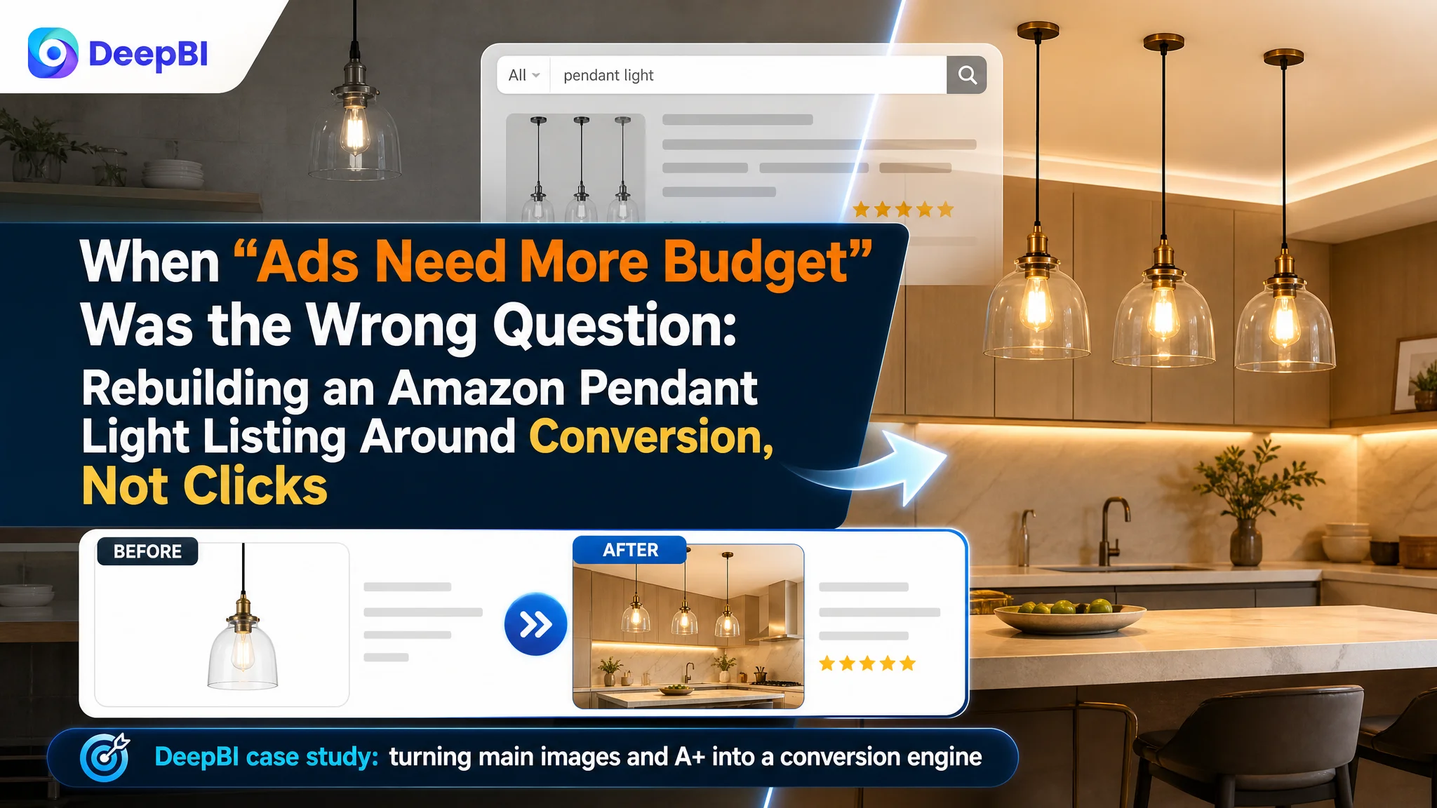
This case comes from a US Amazon seller in modern pendant lights. The team was under pressure from rising Amazon ad costs and assumed their problem was “insufficient traffic” and “not enough budget.” They kept tuning keywords and bids, trying to force more exposure through Amazon ads. Yet, even when traffic came in, the orders did not scale as expected.
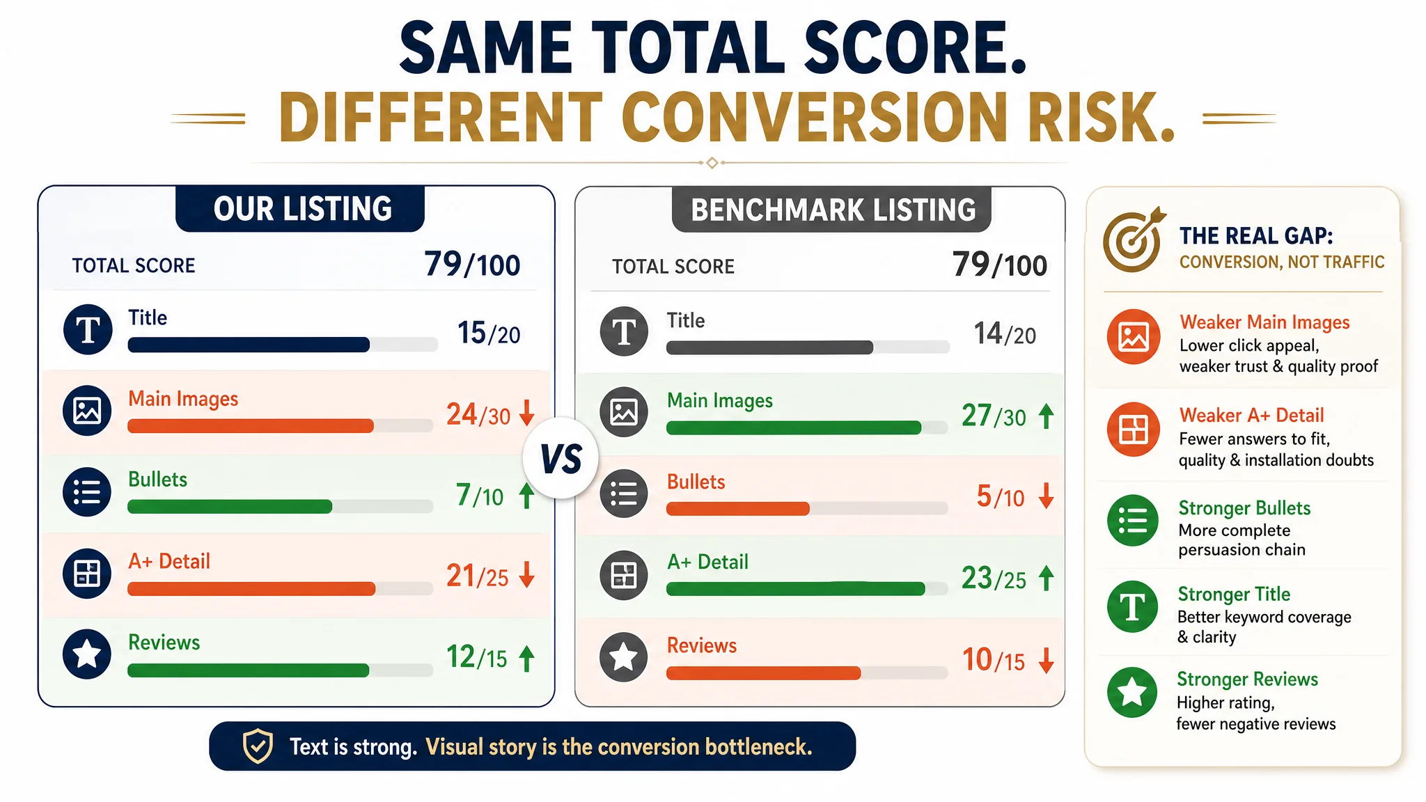
After DeepBI stepped in, the diagnosis moved away from ads and toward the Amazon Listing itself. Against a carefully selected benchmark listing, the product page scored the same total—79/100—but the sub-scores told a different story. Title and bullets were actually stronger than the competitor, and reviews were healthier. The real gap was not “no selling points,” but that the visual story on the main images and A+ did not fully match how buyers make decisions for a $100+ category like lighting.
Once the team accepted that the core bottleneck was Amazon product-page conversion, not ad mechanics, the optimization path changed. Instead of pushing more traffic into the existing page, we restructured the main image sequence, made technical parameters visually clear, and rebuilt A+ modules to reduce “Will this fit my space?” and “Is this material really premium?” risks. Ads then became useful again, because the traffic finally landed on a page that could convert.
For other Amazon sellers, the value of this case is not in pendant lights. It’s in recognizing when a stable overall Listing score hides a critical structural issue: if your title, bullets, and reviews are good, but ad efficiency is still fragile, the missing piece is often how your main image set and A+ translate specs and quality into trust and scenarios. That is exactly where this seller’s Listing was stuck.
The Core Conflict: Conversion Capacity, Not Ad Exposure
On paper, this Listing looked “fine”:
- Overall score: 79/100, identical to the benchmark.
- Title: slightly better than the competitor (15 vs. 14).
- Bullet points: clearly stronger (7 vs. 5).
- A+ detail: only 2 points behind (21 vs. 23).
- Reviews: higher quality, fewer negatives (4.5 stars vs. 4.4, far fewer 1-star reviews).
From a typical Amazon operations perspective, this often leads to one conclusion: “Our page is okay; we just need more traffic and more reviews.” So the seller focused on:
- Increasing Amazon ads budget to gain exposure.
- Tweaking bids and keywords.
- Expecting that more reviews over time would fix the conversion.
But the data pattern DeepBI saw was different: the Listing had enough structural strengths to avoid being a “bad page,” yet it still lagged in visually proving quality, fit, and lifestyle value. In other words:
The real constraint was not that ads were failing to bring traffic. The page itself could not fully convert the traffic it already had.
When ad spend keeps going up but ACOS refuses to stabilize, and total scores look respectable, conversion capacity—not traffic volume—becomes the prime suspect.
Why Traditional Ad Optimization Kept Hitting a Wall
The seller’s logic was common:
- Title already full of keywords: “Brushed Gold,” “3 Pack,” “Dimmable,” “3 Color Temperature,” “Pendant Lights.”
- Bullet points containing “professional,” “energy-saving,” “lifetime warranty.”
- Reviews above 4.5 stars with video UGC.
- Ads showing impressions and clicks, but orders not growing proportionally.
Under that lens, it was easy to think: “If we push more on ads and climb rankings, conversion will improve.” But DeepBI’s comparative diagnosis against the benchmark exposed the underlying problem:
- The benchmark was not winning on text; it was winning on how the page visually carried buyers through the decision process.
- The benchmark’s image stack systematically answered the exact questions a cautious lighting buyer asks before paying:
- “Will this visually upgrade my space?”
- “Is the material solid and premium enough for long-term use?”
- “Will it fit my ceiling height and room size?”
- “Is this worth the price compared to alternatives?”
The seller’s Listing, in contrast, had:
- Stronger parameters and promises in text.
- But weaker visual proof, especially in main images and A+ modules.
- And a scene focus that was too narrow (kitchen-heavy, less lifestyle depth).
As a result, any incremental traffic from Amazon ads was landing on a page that still left critical doubts unresolved. That is why traditional ad optimization—more budget, better keywords—couldn’t fix the underlying problem.
What DeepBI’s Listing Score Actually Revealed
The equal total score (79 vs. 79) was a trap. Without decomposing that score, it was easy for the team to think “We’re on par with the benchmark; just push traffic.” DeepBI’s breakdown showed a very different structure:
- Title (15 vs. 14):
The seller’s title was better optimized for Amazon search:
- Rich long-tail coverage: “3 Pack,” “Brushed Gold,” “Dimmable,” “3 Color Temperature.”
- Clear function: dimming, color temperature switching.
- Reasonable structure: core “Pendant Lights” near the front, good weight on “Brushed Gold.”
- Only minor redundancy toward the end.
- Bullets (7 vs. 5):
The seller’s bullets built a stronger persuasion chain:
- From parameters → performance → usage scenes → after-sales.
- Included strong trust signals: “professional,” “lifetime warranty.”
- More complete than the benchmark’s relatively flat feature listing.
- Reviews (12 vs. 10):
- Higher rating (4.5 vs. 4.4).
- Lower 1-star ratio.
- Video reviews already present.
- Benchmark had more total reviews but concentrated quality complaints.
On these three “text and trust” dimensions, the seller’s Listing was not the weak side.
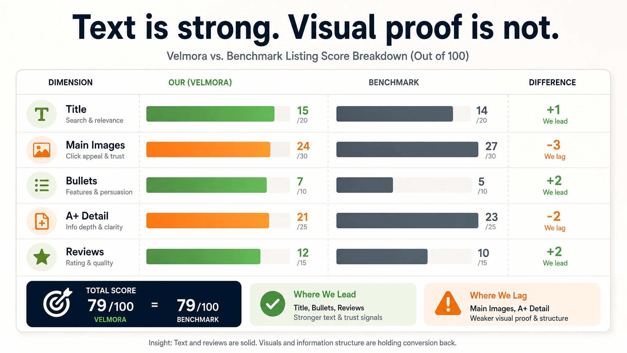
The true gaps appeared where their team originally felt “we’re okay”:
- Main images (24 vs. 27):
Benchmark main images did three things better:
- Click-through appeal: Hybrid composition (product close-up + installed scene) on the first image created instant differentiation on Amazon search results.
- Trust: Multiple scenes plus material breakdown shots (metal base, aluminum, silicone diffuser) made quality feel verifiable.
- Price justification: High-emotion scenes (bedroom, dining room, cozy spaces) positioned the product as a “home aesthetic upgrade,” not just a light source.
- A+ detail (21 vs. 23):
Benchmark leaned into:
- Visual parameter charts (6000K, 24W, 1920lm, adjustable length).
- Clear “does it fit my space?” communication via dimension diagrams.
- Structured material breakdown (round base, aluminum, silicone, LED strip).
- Lifestyle extension across multiple spaces.
The seller had:
- Good scenes and a creative CRI/fruit comparison concept.
- But parameters and structure fit were not visually front-loaded.
- Material close-ups lacked annotation and perceived professionalism.
- Some visuals felt overly “composited,” which weakened trust.
The conclusion was clear:
This Listing did not lack keywords, promises, or good reviews. It lacked a visual and structural path that turned those assets into a confident “Buy” decision.
That is the type of constraint ads cannot fix.
Why DeepBI Refused to “Just Push Ads First”
From a business-risk perspective, continuing to prioritize ads would have created three problems:
1. Amplifying a conversion defect:
Every new dollar in Amazon ads would send more traffic into a page that still left buyers uncertain about fit and quality. That means:
- ACOS volatility.
- Poor CVR masking under “decent” CTR.
- Difficulty scaling spend without performance breaking.
1. Misleading operational learning:
If the seller kept associating “bad results” with “bad campaigns,” they would:
- Keep rebuilding campaigns, structures, and keyword sets.
- Continue overlooking the real issue: how the product is evaluated on-page.
1. Eroding long-term organic health:
Low-conversion paid traffic can drag down the Listing’s relevance, making organic recovery harder. Piling on ads while ignoring conversion quality is essentially training Amazon’s algorithm to distrust the page.
Given these risks, DeepBI prioritized:
- Repairing the Listing’s decision logic first.
- Only then scaling ads into a page that deserves traffic.
Where the Product Page Was Really Leaking Conversion
The main image set: not enough reason to click or trust
The seller’s main images were clear, but not strategically sequenced:
- Image 1 – Plain product shot:
- Confirmed “3-pack spiral brushed gold pendants.”
- But on search results, it looked similar to many other spiral pendants.
- No scene context, no scale reference, no immediate “this will transform my room” signal.
- Image 2 – 3 color temperatures (3000K / 4000K / 5000K):
- Confirmed the feature, but only in isolated product views.
- Did not show how each color temperature changed real room atmosphere.
- Image 3 – Good dining scene + cluttered icons:
- Strong visual potential, but overloaded with mixed icons and text.
- The scene’s emotional power was diluted.
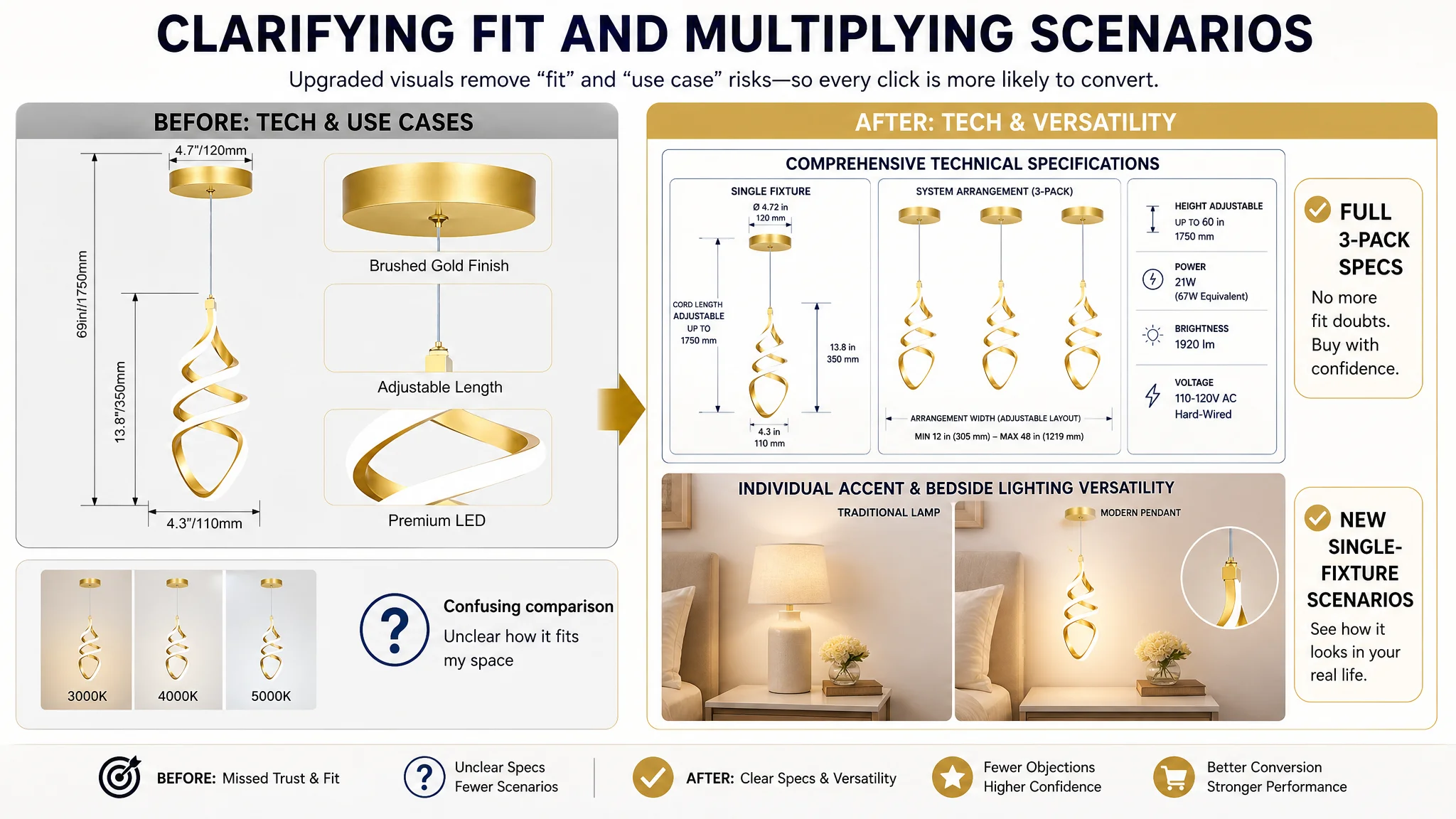
- Image 4 – Specs for a single pendant:
- Useful, but only partially answered space-fit questions and only for one unit, not the 3-pack arrangement.
- Image 5 – Confusing comparison with a single light:
- Unclear decision logic for a product sold as a 3-pack.
- Did not show alternative use cases; felt redundant.
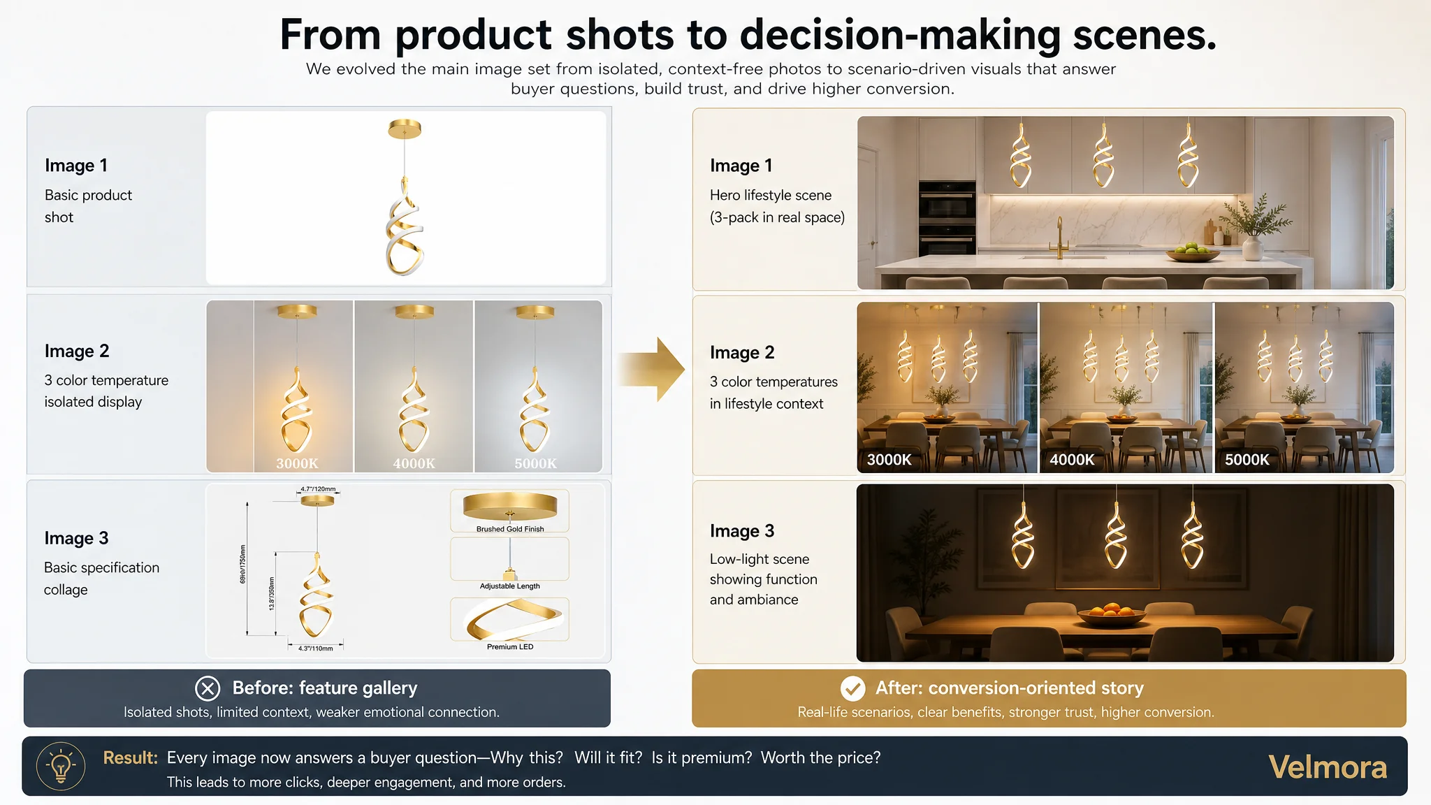
The benchmark used these slots differently:
- Opening with combined product + scene for instant click motivation.
- Early inclusion of multi-room high-emotion scenes.
- Clear technical and dimensional visuals that reduced installation and fit anxiety.
- A material breakdown that visually justified price.
The A+ layout: good content, but mis-ordered and under-leveraged
The seller’s A+ modules included:
- Atmosphere scenes.
- Component close-ups.
- Multi-scene usage.
- Dimming and color temperature explanations.
- CRI charts and comparisons.
Individually, these were good assets. But from a decision-flow perspective:
- Key fit and performance decisions were not addressed early enough:
- Dimensions and adjustable height were not immediately visible after the aesthetic intro.
- Wattage, lumens, and core performance were not visually summarized upfront.
- Material and construction were not clearly used as trust anchors:
- Close-ups existed, but lacked labeled breakdown (“aluminum,” “silicone,” “electroplated finish”) that signals premium build quality.
- Technical credibility was split across too many modules:
- CRI and color accuracy were repeated in separate sections, increasing reading load without strengthening the argument.
- The closing argument stayed technical rather than emotional:
- Beautiful CRI comparisons, but framed mainly as “technical proof,” not as a “vibrant life / premium home feeling” finale.
The result: buyers had to work harder than necessary to connect “looks good” → “fits my space” → “is built well” → “will upgrade my home.” Many simply didn’t complete that journey.
How DeepBI Reframed the Optimization Direction
With the core bottleneck identified as Listing conversion (not ad setup), DeepBI’s judgment was:
- Do not keep stacking ad spend onto a half-optimized page.
- Systematically rebuild the page so each image and module plays a defined decision role.
There were four main shifts.
1. Turn the main image set into a conversion engine, not a feature gallery
The logic sequence moved from “product → feature → scene” to:
1. Visual hook and context (post-optimization Image 1):
- A hybrid shot: close-up of the spiral brushed gold finish plus installed view over a kitchen island.
- Immediate scale, style, and usage confirmation right on search results.
1. Scenario depth, not just variety (Image 2–3):
- Multiple rooms: kitchen island, dining room, bedroom, possibly foyer.
- Each scene showing the product as a “home aesthetic upgrade,” not just illumination hardware.
1. Functional proof in real environments (Image 2–3 refinements):
- Show 3000K / 4000K / 5000K directly on an actual room scene, not isolated product shots.
- Demonstrate how color temperature changes mood, not just numbers.
1. Technical validation with full-system specs (Image 4):
- Clear dimension diagrams for the full 3-pack layout and each individual fixture.
- Adjustable rope length, canopy size, wattage, lumens, and ceiling compatibility (flat/sloped) visualized.
- Answer “Will it fit my ceiling and island?” at a glance.
1. Versatility instead of redundancy (Image 5):
- Replace confusing comparison with scenes of single fixtures used as bedside lamps or accent lights.
- Prove that the product works beyond the kitchen: more use cases, more perceived value.
This shift turned the image row from “confirm what it is” into “show why it is worth choosing and how it fits into my home.”
2. Reorder A+ modules around buyer risk, not internal logic
The A+ restructuring was driven by one question: “At each scroll position, which buying risk should this image reduce?”
- Module 1 – Aesthetic validation & identity, not feature clutter:
- A clean, high-quality hero scene that answers: “Is this brushed gold elegant, or is it tacky?”
- Let visuals land the “modern, refined, spiral design” before text tries to explain.
- Module 2 – Performance and capability front-loaded:
- Icons and visuals to summarize:
- Wattage / equivalent.
- Lumens.
- 3 color temperatures.
- Dimmable capability.
- Immediate reassurance: “This is bright enough, flexible enough, and technically solid.”
- Module 3 – Spatial fit and adjustability as a dedicated module:
- Dimension diagrams with the retractable steel rope highlighted.
- Clear canopy and body sizes.
- Explicit “fits different ceiling heights and layouts” positioning.
- Directly tackles the biggest functional risk: “Will this work in my space?”
- Module 4 – Material transparency and price justification:
- A structured breakdown: base, aluminum body, silicone diffuser, electroplated brushed brass finish.
- Connects “premium materials + process” to “long-term durability and elevated look.”
- Module 5 – Dimming and versatility combined:
- Show different brightness levels in different scenes:
- Softer light in a bedroom.
- Brighter light in a kitchen.
- Link dimming and color-temp flexibility to real-life usage rather than technical charts.
- Module 6 – Streamlined technical proof:
- Merge or reduce redundant CRI technical copy.
- Move key CRI data points into Module 2 or into the comparison module, avoiding repetition.
- Module 7 – Emotional lifestyle close, not just CRI comparison:
- Use the CRI comparison as a foundation, but frame it as:
- “Vibrant food and decor.”
- “Premium home ambiance.”
- “A more vivid everyday life around your kitchen island and dining space.”
- End on a lifestyle promise, not a lab metric.
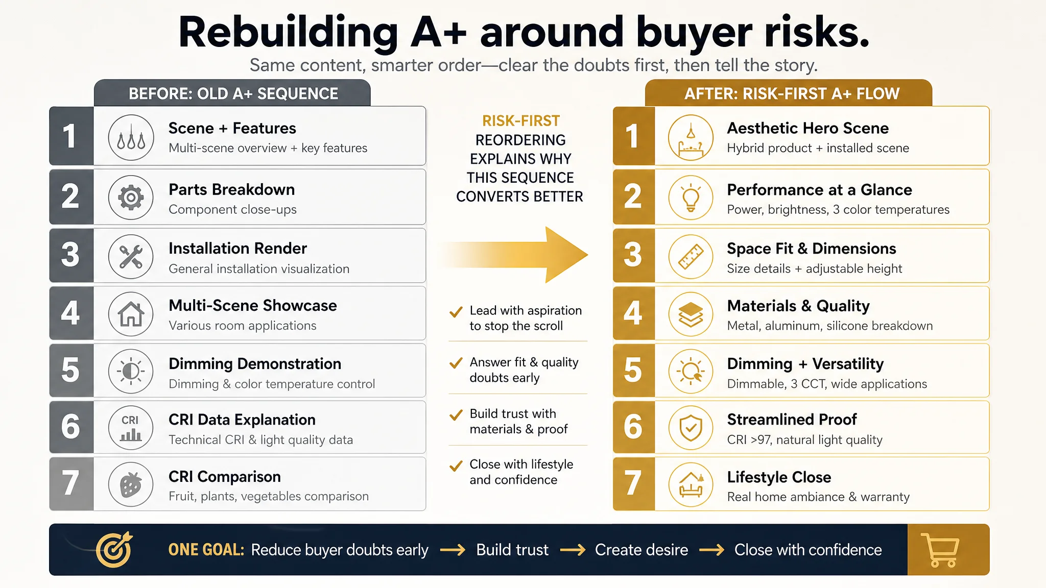
This reordering made the A+ flow feel like a guided decision process rather than a list of unprioritized information.
3. Align bullets with the new visual story
The bullet points were already structurally strong, but they needed to be fully aligned with how the new visuals would sell:
- BP1 – Modern Design & High Efficiency:
- Tie modern brushed brass finish + long lifespan (100,000+ hours) directly to reduced maintenance pain.
- Reinforce that this is a visual upgrade and a practical, energy-efficient choice.
- BP2 – Premium Quality & Superior CRI:
- Emphasize high-quality aluminum + silicone + electroplating.
- CRI > 97 as a professional-grade signal: colors look natural, decor appears true-to-life.
- BP3 – Adjustable Height & Easy Installation:
- Integrate the retractable steel rope with “quick, hard-wired installation.”
- Address the “installation will be a hassle” concern directly.
- BP4 – 3-Color Temperatures & Dimmable:
- Position “customizable lighting” rather than reciting specs.
- Make the wall-switch control and dimmer compatibility sound like everyday convenience, not technical complexity.
- BP5 – Versatile Application & Lifetime Warranty:
- Lock in specific spaces: kitchen island, dining room, bedroom, ceilings.
- Couple that with a lifetime warranty and “contact us anytime” promise as a strong final trust layer.
This ensured that text and images reinforced each other instead of running in parallel tracks.
4. Make reviews and warranty work as force multipliers
The seller’s review profile was healthier than the benchmark:
- Higher average rating.
- Far fewer 1-star complaints.
- Video reviews and detailed positive feedback.
Combined with a clearly communicated lifetime warranty in bullets and A+, this allowed the Listing to:
- Turn “fewer reviews” from a weakness into a “quality over quantity” story.
- Use warranty and high-CRI, premium materials as justification for a higher perceived value.
Once the visual and structural logic were upgraded, this underlying review advantage could finally express itself in conversion.
What Changed After the Page Logic Was Rebuilt
This case does not rely on fabricated numerical outcomes. Instead, the real changes were in the operating state and risk profile of the Listing.
On the Listing itself:
- The Amazon product page began to act like a proper conversion engine:
- Main images created a clear reason to click and explore.
- A+ modules reduced concrete objections in a predictable order.
- Bullets, visuals, and A+ told one coherent story instead of scattered benefits.
- The page’s ability to convert both organic and paid traffic improved:
- The core decision risks—fit, quality, installation complexity, and lifestyle value—were addressed visually and structurally.
- Reviews and warranty could be leveraged more effectively because the page now looked as serious as its promises.
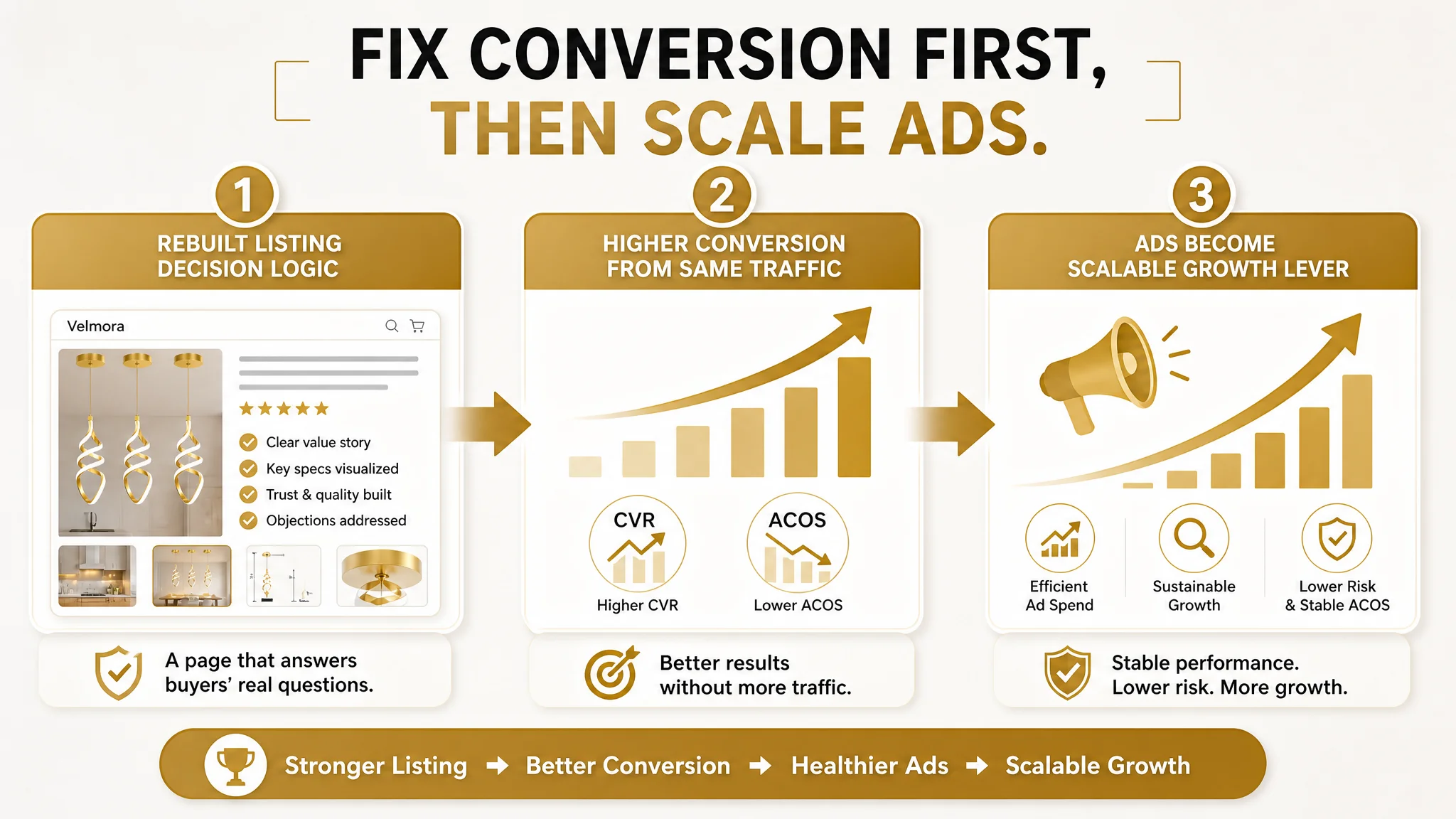
On advertising and traffic:
- Amazon ads stopped “fighting” the Listing:
- Each paid click had a higher chance of turning into an order, stabilizing ACOS.
- Ad traffic stopped amplifying weaknesses and started amplifying strengths.
- The seller’s dependency on brute-force ad scaling decreased:
- With a better converting page, they could sustain more balanced traffic:
- Organic keywords had a healthier chance to stick.
- Ads became a growth lever, not a subsidy for a weak page.
On the team’s understanding:
- They shifted from “we just need more budget and reviews” to:
- “If our Listing cannot visually carry the decision logic, no ad structure will save it.”
- “Title, main image, bullets, and A+ must work together to convert, not separately.”
- “Before scaling Amazon ads, we must ask: Does this page deserve more traffic?”
What Other Amazon Sellers Can Take Away
This pendant light case is a textbook example of a broader Amazon pattern:
- A Listing with good title, bullets, and reviews.
- Ads that bring traffic but deliver fragile efficiency.
- A total Listing score that matches a strong benchmark.
- Yet, performance that feels “harder than it should be.”
In these situations, it is tempting to:
- Push more budget.
- Add more keywords.
- Chase more reviews.
But the real question is often:
“Is my Amazon product page truly handling the decision logic that my ad traffic is paying for?”
For this seller, DeepBI’s value was not in showing them “how to write nicer copy” or “how to design prettier images,” but in:
- Proving, with structured competitor comparison, that their weakness was not in text but in visual trust and scenario logic.
- Reordering and re-framing the Listing so that each element reduced a specific buying risk.
- Insisting on fixing product-page conversion before scaling ads.
If your Amazon ads feel expensive, your campaigns look structurally okay, your reviews are decent, and yet your orders do not keep pace with traffic, this case suggests a different starting point: stop blaming ads; audit whether your Listing actually deserves the traffic you’re buying.