
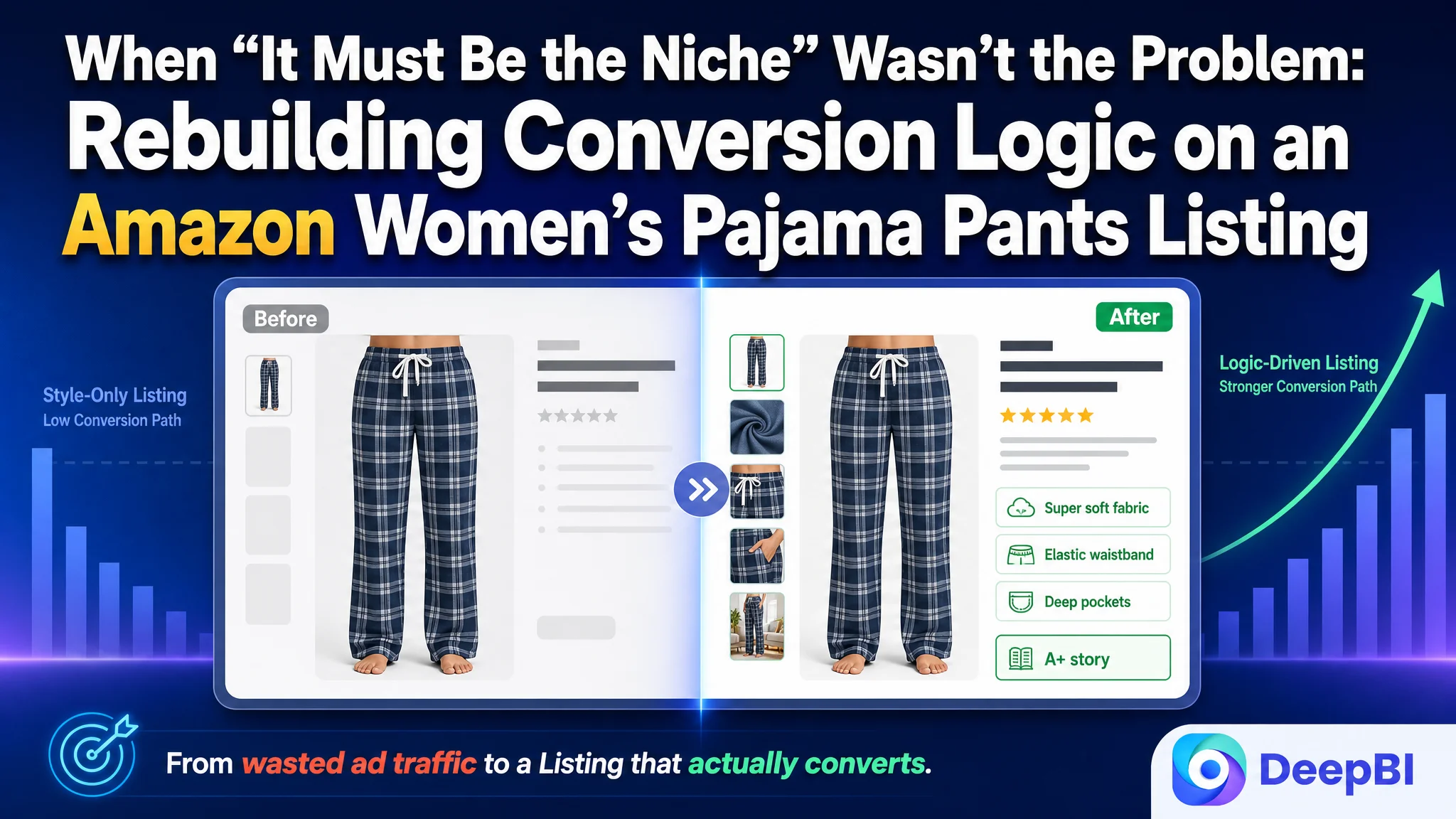
This case comes from an Amazon seller in the women’s pajama pants category on the US marketplace. The brand had a solid product and good reviews, but was under pressure: ad costs were rising, yet orders were not following. The team was convinced the category was just “too competitive” and that they mainly had a traffic and review-scale issue, so most efforts went into Amazon ads and review-building.
When DeepBI benchmarked the Amazon Listing against a category-leading competitor, a different picture appeared. The title and reviews were not the real bottleneck. The critical gap was in the visual and narrative logic of the Amazon product page itself—especially the main image sequence, bullet points, and A+ modules. The page looked “fine” to the team, but it wasn’t answering the buyer’s real questions in the right order.
The optimization that followed did not start with more ad tweaking. It focused on rebuilding the Listing’s decision path: turning the main image set into a structured comfort-and-function proof chain, rewriting bullets around “pain point → solution” logic, and reshaping A+ modules to build brand trust, clarify fabric choices, and reduce purchase risk. Once the page could convert traffic more effectively, advertising spend finally had somewhere to land.
For other Amazon sellers, this case is a reminder: when ACOS feels stubborn and clicks don’t become orders, the problem is often not bid strategy or “bad creatives” alone. If a competitor with worse star rating but stronger Listing logic can outsell you, the real leak is in how your Amazon product page tells the story and handles objections—not in the traffic source.
Amazon Ads Weren’t the Villain. The Listing Was Wasting the Traffic.
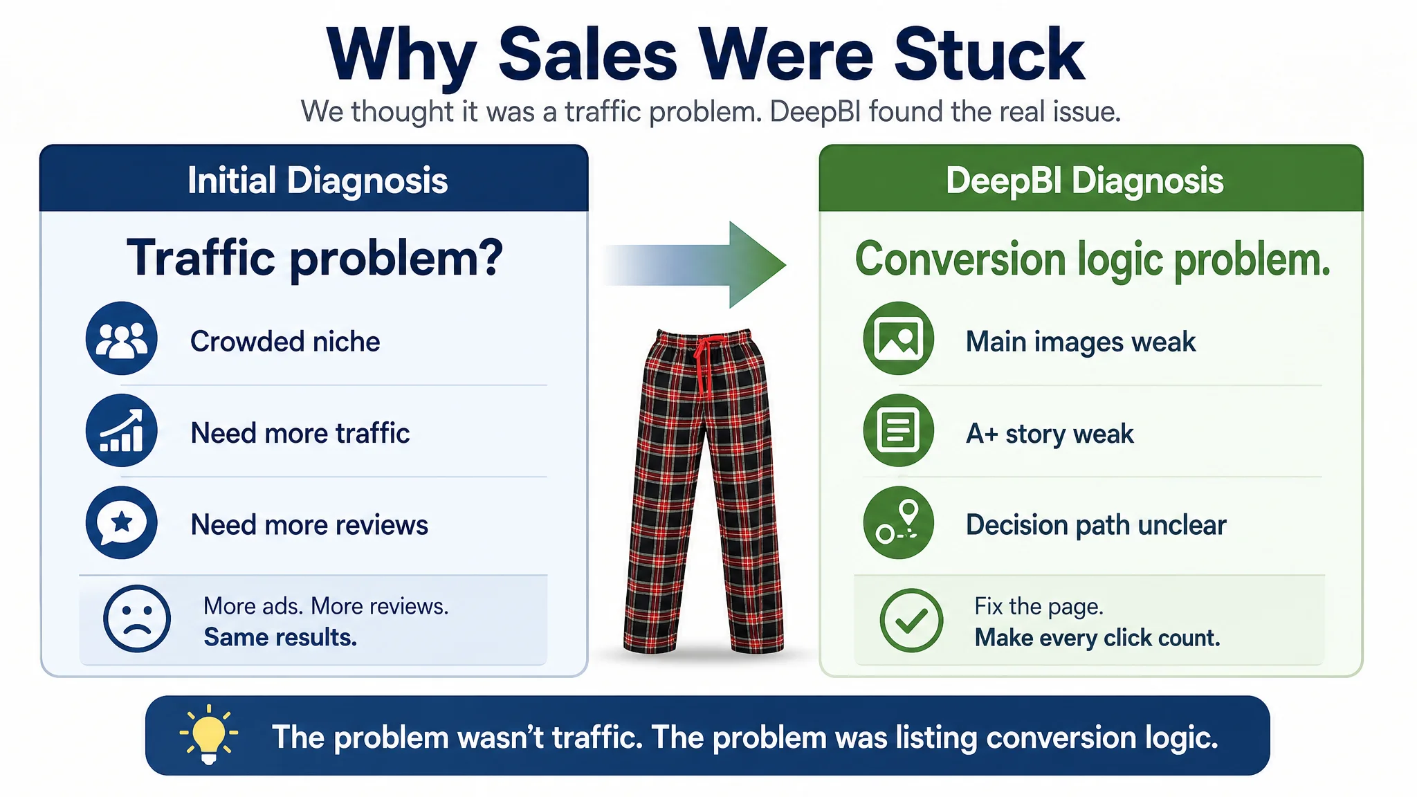
Before working with DeepBI, the seller’s diagnosis looked familiar:
- Category is crowded, CPC is high.
- Competitor has far more reviews.
- Therefore, “our main issue is traffic volume and review count, not the page.”
As a result, the team’s operating rhythm was:
- Keep increasing bids on key pajama-related search terms.
- Run more promotions and coupons to keep the ad side “active.”
- Focus on gathering more reviews to “catch up” with the benchmark.
But the numbers hid an important contradiction:
- The seller’s average rating was 4.5 stars, higher than the competitor’s 4.3.
- Negative review ratio was lower; homepage reviews had no 1-star, while the competitor’s did.
- Yet, the competitor’s Listing clearly converted better and supported a much larger review base.
In other words, product satisfaction and rating weren’t the problem. The issue was that the Amazon Listing itself couldn’t fully convert the traffic it received. Ads were pushing more people onto a page that lacked a clear decision path.
“The real problem was not that ads failed to bring traffic. It was that the page could not convert the traffic.”
DeepBI’s scoring made this structural imbalance very clear:
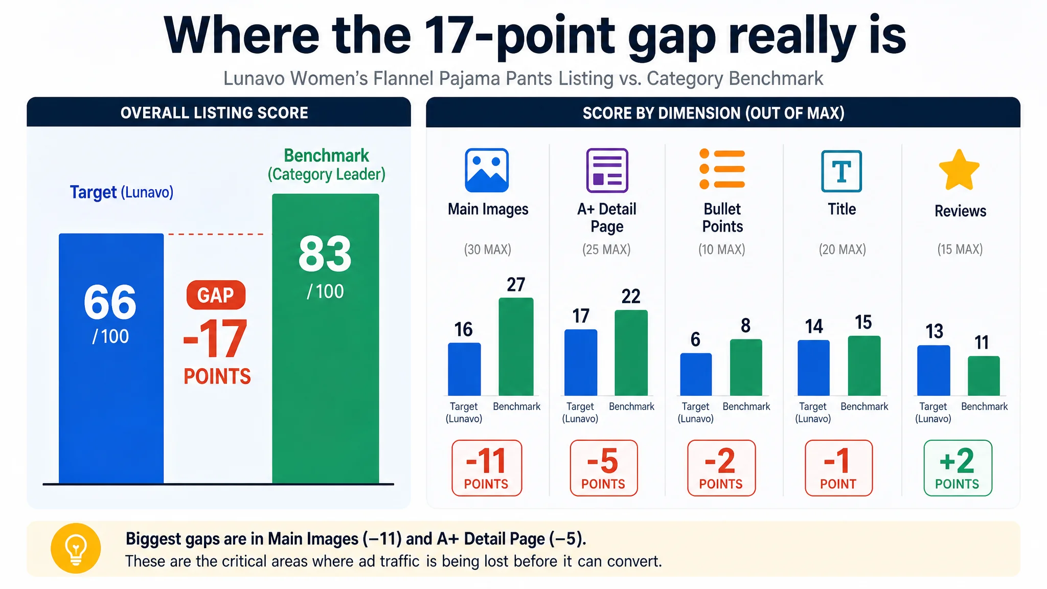
- Overall Listing score:
- Target Listing: 66/100
- Benchmark Listing: 83/100
- Gap: –17 points
- By dimension:
- Title: –1
- Main images: –11
- Bullet points: –2
- A+ detail page: –5
- Reviews: +2 (the only dimension where the target was better)
The highest negative gap was not in keyword or rating, but in main-image conversion capacity. The second major gap was the A+ story. That’s exactly where ad traffic was being consumed without turning into stable orders.
The Real Constraint: Listing Conversion Capacity, Not Product Quality
From a seller’s internal perspective, the Listing “made sense”:
- Title contained all the important keywords.
- Main images showed the front, back, and different colors.
- Bullet points listed materials, pockets, drawstring, style.
- A+ featured fabric and size info.
On paper, nothing looked obviously wrong. That’s why the team kept returning to ads and reviews as the operating levers.
DeepBI’s Listing benchmark reframed the situation:
1. Title
- The target title front-loaded the core keyword “Women’s Pajama Pants” and included “Comfy Lounge Sleep PJ Pants”, fabric, and features like “Drawstring and Pockets”.
- However, it was information-dense and slightly redundant (e.g., “Pajama Pants” + “PJ Pants”), sacrificing readability and professionalism.
- The competitor followed a cleaner formula: brand + emotional promise + core product (“Super Soft Flannel Plaid Pajama Sleep Pants”).
- That made their Amazon search snippet both more compact and emotionally charged.
The title wasn’t disastrously wrong; it was just not pulling its weight in triggering clicks and trust.
1. Main Images (Biggest Gap: –11)
On Amazon, the main image sequence is not just decoration. It’s the first half of the conversion funnel. Here, the target Listing’s logic looked like this:
- Image 1: Front view — confirms style, but doesn’t answer “How soft? What’s the fabric? Where are the pockets?”
- Image 2: Size information — an early image spent almost entirely on sizing, with minimal comfort or lifestyle cues.
- Image 3: Back view — necessary for fit, but low information density vs. what it could carry.
- Image 4: Pocket shot — shows pockets but doesn’t consolidate utility or comfort proof.
- Image 5: Style/color variations — visual repetition, no added decision value.
The competitor’s images, by contrast, used each slot to progressively resolve core doubts:
- What is it made of?
- How does it feel (super soft, warm, cozy)?
- How does it fit on real bodies?
- How easy is it to wash and maintain?
- In which scenes will I actually wear it (home, winter, gift, etc.)?
The core insight: the target Listing had images, but not a persuasive sequence. Buyers had to work too hard to connect fabric, comfort, and daily use.
1. Bullet Points (BP) – Logic vs. Listing
The target bullets were largely functional:
- Fabric and touch description
- Seasonal suitability
- Elastic waist and adaptability
- Pocket function
- Style and multi-scene use
The competitor’s bullets followed a different logic:
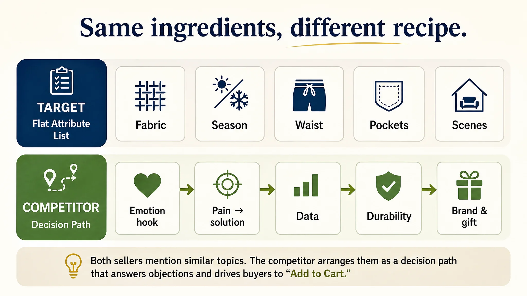
- Emotional hook (“ULTIMATE COZY VIBES”)
- Clear pain point → solution (warmth, shrinkage, lazy-day fit)
- Concrete data (inseam length, blend percentages)
- Durability and low maintenance
- Brand promise and gift-worthiness
So even though both sides “talked about the same things”, one side built a decision path, the other just listed attributes.
1. A+ Detail Page – Story vs. Modules
The target A+ modules did the following:
- Repeated product visuals
- Showed fabric
- Displayed waist details and multiple colors
- Included a size chart and care icons
The competitor’s A+ did something more strategic:
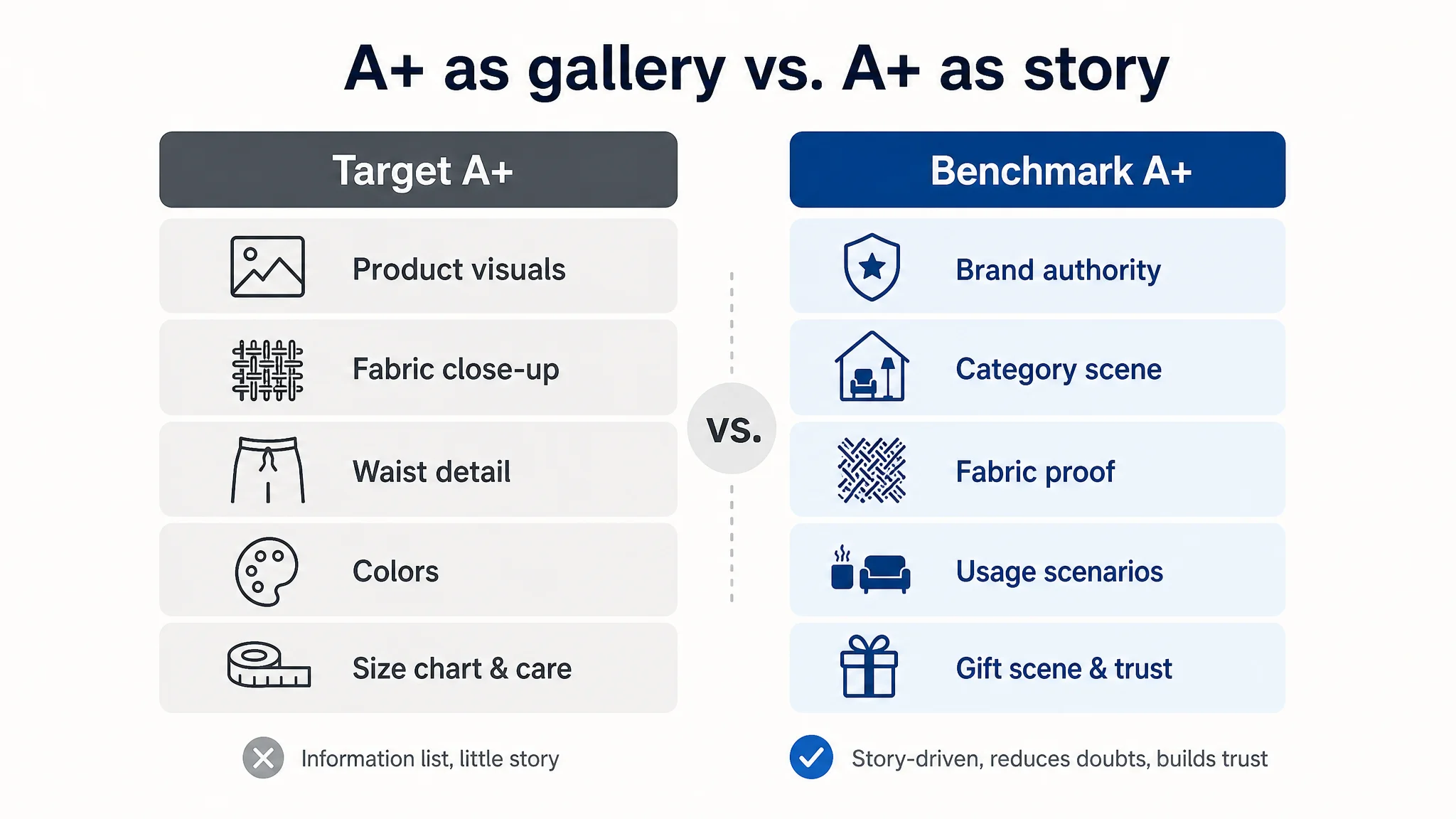
- Led with brand identity and “sleepwear expert” positioning.
- Showed full category scenes and combo sets (e.g., 2-pack) to anchor value.
- Visualized fabric composition and “minimal shrinking” claims.
- Used explicit winter, home, and gifting scenarios.
Again, the issue wasn’t that the target had no A+. It was that the A+ modules did not reduce doubts or build brand-level trust in a structured way.
“Advertising does not only amplify advantages. It can also amplify a page’s existing defects.”
With reviews and rating already strong, DeepBI judged the true bottleneck to be the Listing’s conversion logic—particularly main images and A+—not product strength or ad strategy.
Why DeepBI Did Not Recommend “Keep Tuning Ads First”
When ACOS is painful, the most intuitive move is to:
- Narrow keywords
- Adjust bids
- Restructure campaigns
- Try new creatives
But DeepBI’s diagnosis raised a key business risk:
- Every extra click from Amazon ads was landing on a page that failed to reassure buyers about fabric feel, warmth, durability, and fit in time.
- The competitor, with a lower rating but stronger Listing narrative, could absorb the same category traffic and convert it more efficiently.
- Without fixing the page, any additional ad spend would be compounding inefficiency.
The priority was therefore:
1. Stop letting ads feed a weak conversion funnel.
2. Repair the Listing’s persuasion capacity first.
3. Only then consider scaling or re-optimizing ads based on a more trustworthy page.
From an operational standpoint, that decision order reduced risk:
- Lower probability that incremental ad spend would turn into wasted clicks.
- Higher chance that, once you do pay for traffic, the Listing can recover ACOS and support healthier TACOS (total ad cost of sales).
- Better foundation for organic rankings, since improved CVR feeds Amazon’s relevance signals.
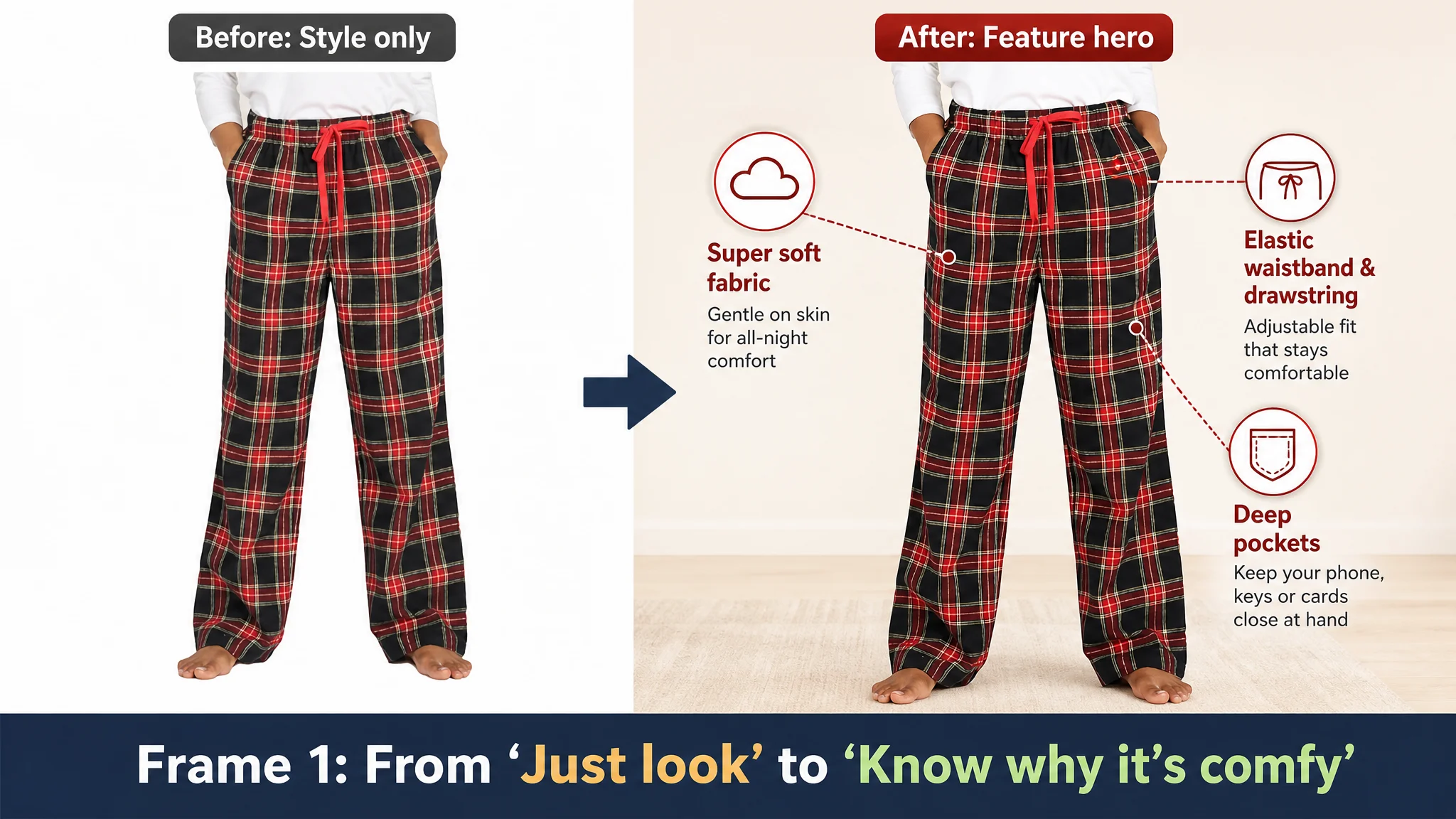
Rebuilding the Main Image Sequence: From “Look at the Style” to “Trust the Comfort”
DeepBI’s key judgment on images was straightforward: this Listing did not lack pictures; it lacked a conversion script.
The reframe was to turn the main image set into a progressive logic:
“Appearance → Fabric & feel → Fit & movement → Utility features → Risk reduction & summary.”
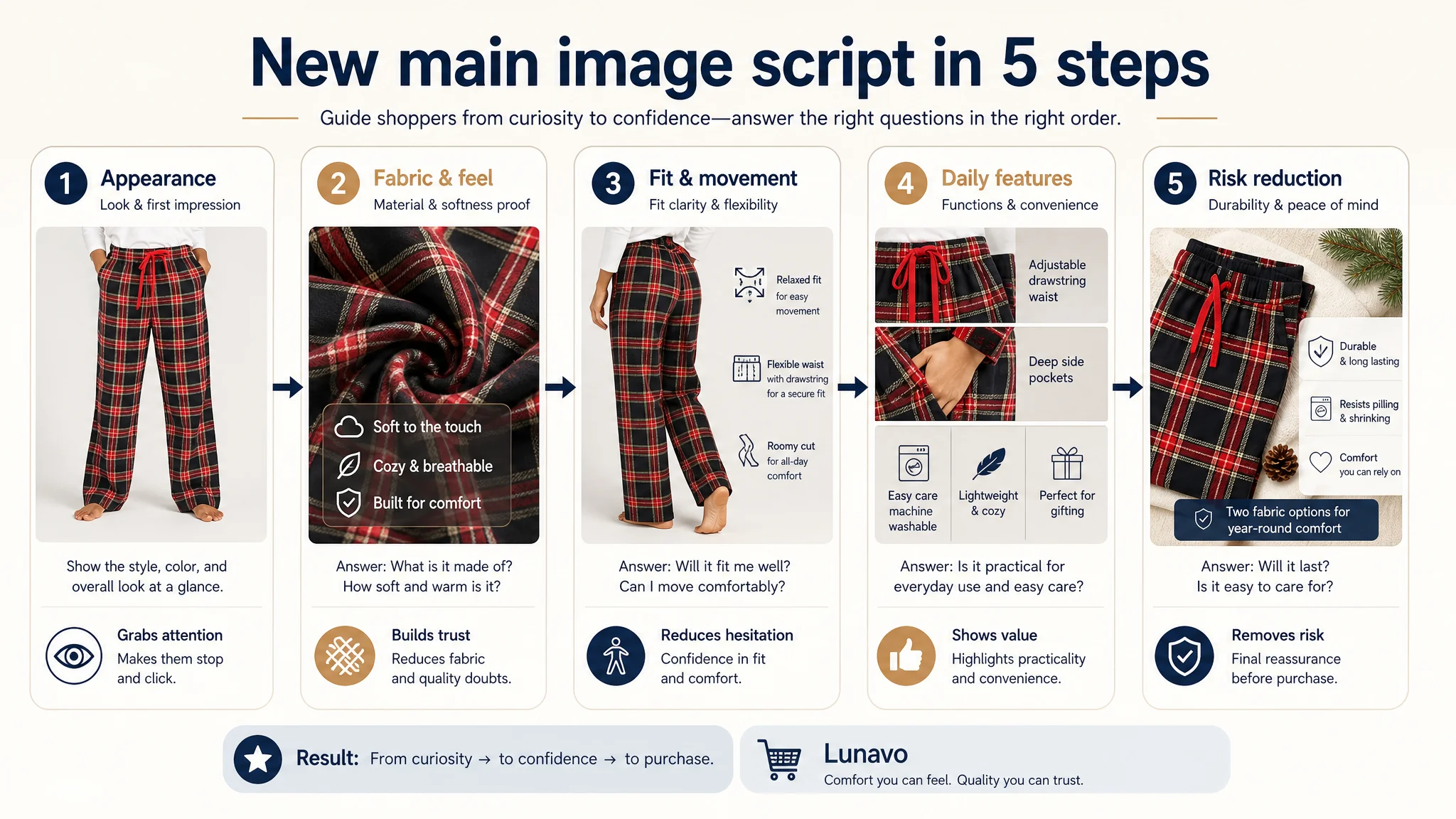
1. Image 1: From Basic Front View to Feature Hero
- Original role: “Initial style and fit confirmation.”
- Problem: Only shows appearance. Comfort and functional features (pockets, waistband) are not clearly visible or highlighted.
- Optimization direction:
- Keep the style presentation but overlay or integrate high-info feature cues:
- Comfy lounge/sleep pants
- Super soft flannel or fleece options
- Elastic waistband & drawstring
- Deep pockets
- Make this image a feature hero that answers “Is this the right type of pajama pant for me?” at a glance.
2. Image 2: Use Early Space to Answer “What Is It Made Of?”
- Original role: “Sizing reference with minimal style validation.”
- Problem: Too narrow. At this early stage, buyers care more about fabric and feel than detail sizing.
- Optimization direction:
- Reposition this image as a fabric and comfort resolver:
- L74: 100% brushed cotton flannel — breathable, soft, good for summer nights / AC rooms.
- L109: Lightweight micro-fleece — cozy, warm, for chilly days in spring/fall/winter.
- Combine close-up texture shots with scene cues (sofa, bed, winter home setting).
This step directly tackles the first psychological barrier: “Will it be soft and appropriate for my climate?”
3. Image 3: Back View With Fit Logic, Not Just a Pose
- Original role: “Back-view fit confirmation.”
- Problem: Necessary angle but low information density; no explicit explanation of fit.
- Optimization direction:
- Keep the back view, but merge it with fit transparency:
- Show movement (walking, stretching).
- Include simple callouts: “Relaxed fit”, “Elastic waistband + adjustable drawstring”, “Comfortable for different body types.”
- Purpose: Let buyers see the range of motion and understand where the waistband sits, reducing sizing anxiety.
4. Image 4: Consolidate All Key Features
- Original role: “Pocket side view.”
- Problem: Repeats a generic style view, only confirming pockets as a visual, not as a utility cluster.
- Optimization direction:
- Turn this into a feature map:
- Elastic waistband
- Adjustable drawstring
- Deep side pockets (fits phone, keys, cards)
- Versatile style for home + quick errands
- One image that visually consolidates daily-use benefits rather than repeating similar angles.
5. Image 5: Risk Reduction & Value Summary
- Original role: “Style variation repetition.”
- Problem: Zero new decision value; doesn’t reduce risk or summarize benefits.
- Optimization direction:
- Use this slot to address maintenance and longevity:
- “Durable & low maintenance”
- “Engineered to minimize shrinkage”
- “Soft texture retained after multiple washes”
- Add a concise benefit summary to nudge action: comfort, versatility, easy care.
By reordering the logic and raising information density in each frame, the main image carousel becomes a click-to-buy bridge, not just a gallery.
Turning Bullet Points From Parameter Lists Into Buying Logic
DeepBI’s recommendation was to align bullets with a “pain point → solution → scenario” rhythm, while also absorbing effective elements from the benchmark.
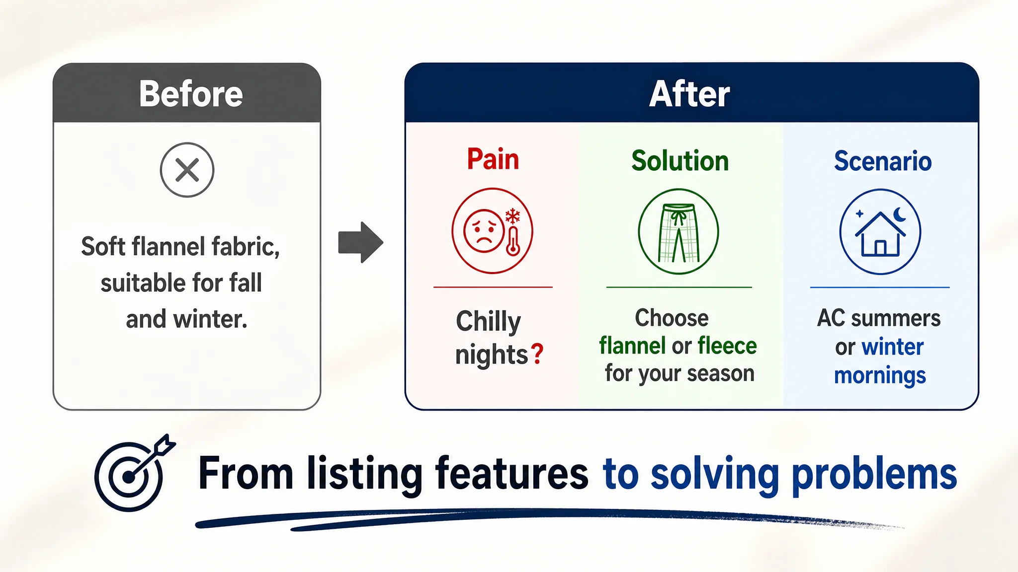
Bullet 1: Lead With Comfort and Choice, Not Just Material
- Benchmark: “ULTIMATE COZY VIBES” with a clear fabric blend and winter-night scenario.
- Optimization idea:
- Emphasize all-season comfort and the two fabric options upfront:
- 100% cotton flannel (breathable, airy comfort).
- Lightweight micro-fleece (cozy warmth).
- Tie to real usage: summer nights, AC rooms, chilly winter days.
This turns “fabric composition” into a clear benefit + scenario instead of a dry spec.
Bullet 2: Fit & Movement as a Core Promise
- Benchmark: “RELAXED FIT FOR LAZY DAYS” with mobility emphasis.
- Optimization idea:
- Clarify:
- Roomy cut → no restriction when sleeping or lounging.
- Flexible elastic waistband → comfortable but secure.
- Outcome: buyers can imagine lying on the couch, walking around the house, or bending without feeling constrained.
Comfort becomes a felt promise, not just an adjective.
Bullet 3: Pockets as Hands-Free Utility, Not Just “Has Pockets”
- Benchmark: “SMART DESIGN WITH POCKETS”.
- Optimization idea:
- Name the benefit: hands-free convenience.
- Detail what fits in the pockets (phone, keys, cards).
- Mention adjustable drawstring for customized fit.
- Connect function with style: classic plaid, lounge aesthetic.
Here, pockets shift from a tick-box feature to a decision driver.
Bullet 4: Durability and Easy Care to Neutralize Shrinkage Fears
- Benchmark: “DURABLE LOW MAINTENANCE FABRIC” with “Say goodbye to excessive shrinkage.”
- Optimization idea:
- Explicitly address:
- Shape and size retention after multiple washes.
- Softness that lasts.
- This reduces the common pajama objection: “Will it shrink or deform?”
Bullet 5: Versatile Lifestyle & Gift Scenario
- Benchmark: “QUALITY YOU CAN COUNT ON” + gift angle.
- Optimization idea:
- Expand “Versatile style” to:
- Home lounging
- Quick errands
- Casual outings
- Add “thoughtful holiday gift” for women who value comfort and quality sleep.
This unlocks additional purchase motivations: gift buying, multi-occasion usage.
A+ Detail Page: From “More Pictures” to a Persuasion Path
The original A+ modules were doing work, but not in the right order or depth. DeepBI’s diagnosis focused on role reassignment:
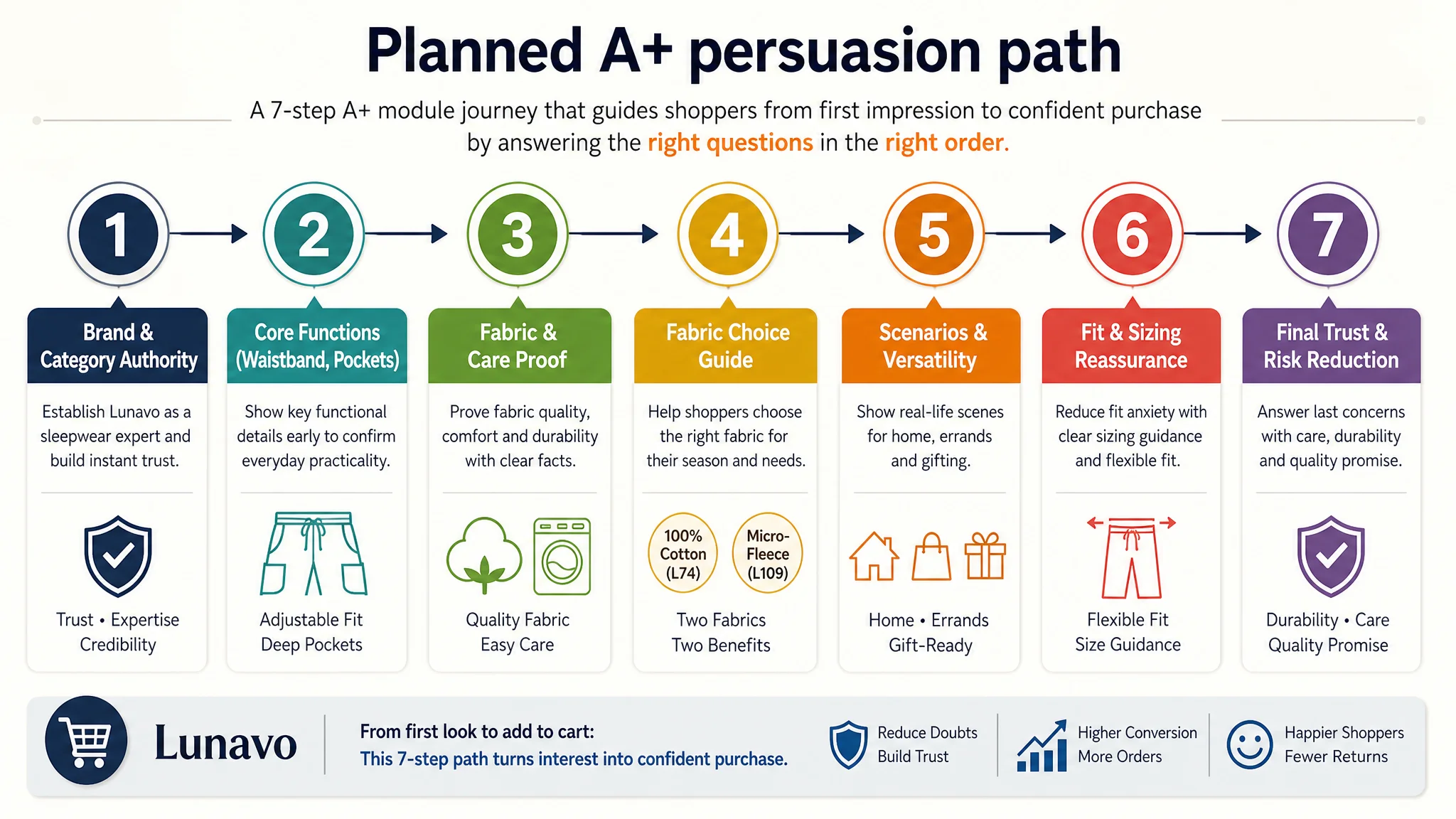
1. Module 1 – Establish Brand & Category Authority
- Current: Basic product identification, close to what images already show.
- Target:
- Show brand mark and position as a dedicated sleepwear/loungewear player.
- Use full-category scene to signal “we specialize, not just dabble.”
1. Module 2 – Early Functional Confirmation
- Current: Generic comfort statement with abstract cotton visuals.
- Target:
- Make elastic waistband + adjustable drawstring + deep pockets explicit here, not buried later.
- This assures buyers early that core functionality is covered.
1. Module 3 – Fabric & Care as Rational Proof, Not Afterthought
- Current: Functional details appear late, with limited depth.
- Target:
- Visualize:
- L74 = 100% cotton flannel (breathable, soft).
- L109 = micro-fleece (warm, lightweight).
- Connect to care instructions (machine wash cold, dry low).
- Turn it into “you won’t have shrinkage surprises if you follow these steps.”
1. Module 4 – Help Buyers Choose the Right Fabric
- Current: Variety showcase with no decision guide.
- Target:
- Map fabric to use case:
- “Choose flannel if… (summer nights, AC rooms).”
- “Choose fleece if… (cold mornings, winter evenings).”
- Reduce choice anxiety, especially for first-time buyers.
1. Module 5 – Scenario & Versatility
- Current: Redundant fabric textures, repeating comfort claims.
- Target:
- Show lounge-at-home, quick errands, casual outings in real contexts.
- Possibly integrate “gift-worthy” visuals (wrapped set, holiday context).
1. Module 6 – Fit Risk Handling
- Current: Another generic comfort/fabric module.
- Target:
- Focus on size & fit reassurance:
- “Flexible & easy fit” with visual demonstration of waist stretch and leg room.
- Simple fit guidance (e.g., “True to size, consider sizing up for extra roomy fit” if that reflects reality).
1. Module 7 – Final Trust & Risk Reduction
- Current: Close-up with limited logical connection to previous content.
- Target:
- Synthesize:
- 100% cotton vs. micro-fleece story.
- Care instructions.
- Quality reassurance.
- This is the final rational checkpoint before clicking “Add to Cart.”
Instead of a long scroll of similar visuals, the A+ becomes a guided persuasion journey.
What Changed: From Wasted Traffic to a Page That Deserves Ads
Because this case focuses on structural diagnosis rather than short-term campaign tests, we won’t invent numbers that weren’t recorded. But we can clearly describe the operating state shift:
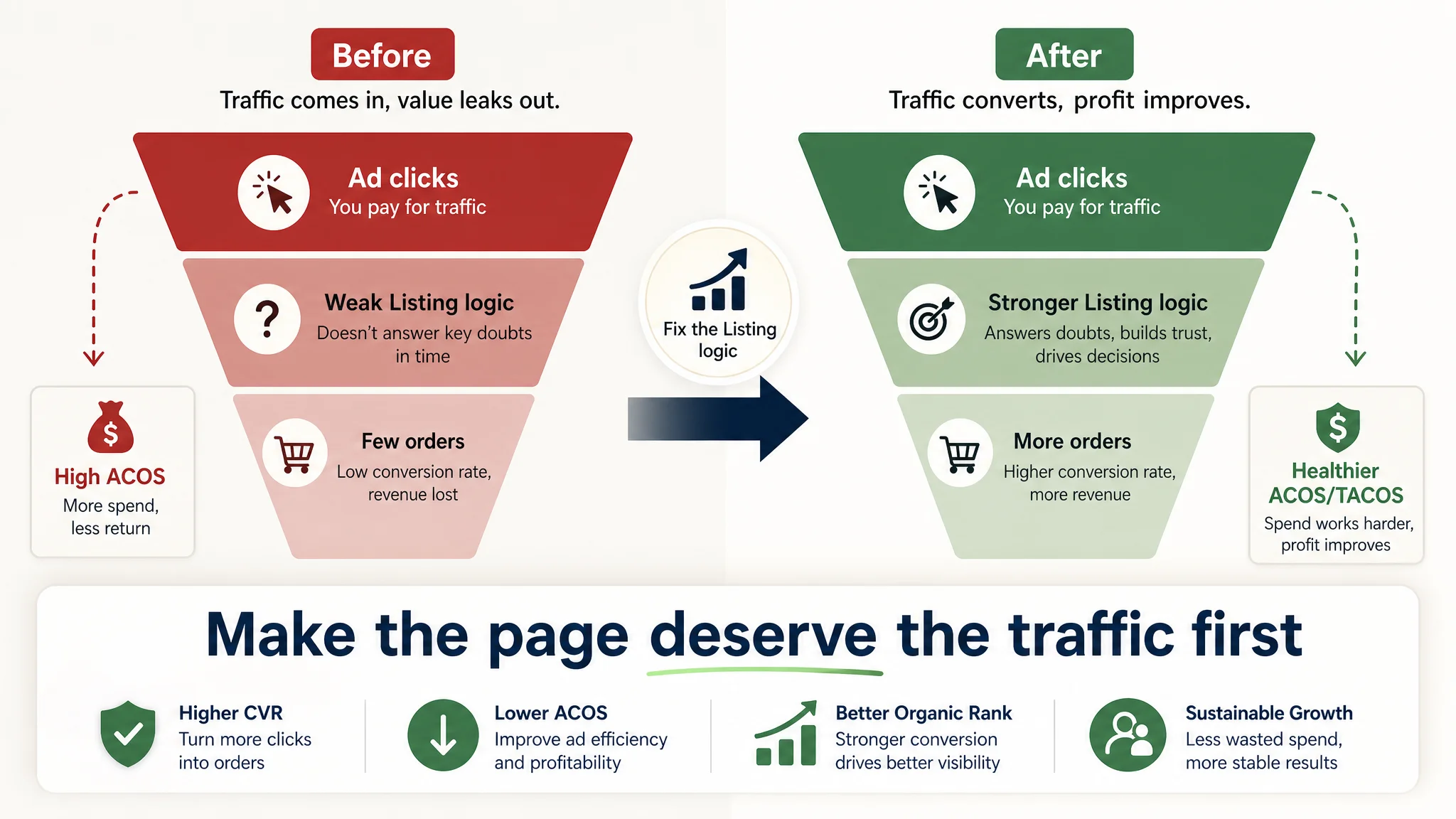
- Listing conversion capacity improved:
- The main images now answer comfort, fabric, and fit doubts in a structured way.
- Bullet points form a logical argument instead of a parameter list.
- A+ modules reduce shrinkage, sizing, and fabric-choice risk.
- Ad traffic became useful again:
- Each additional click from Sponsored Products or Sponsored Brands has a higher likelihood of converting.
- ACOS can begin to move down not because bids are magically smarter, but because the page now does more work per visit.
- Dependence on brute-force advertising decreased:
- With a stronger page, organic rankings have a better chance to stabilize because conversion signals improve.
- The seller no longer has to rely solely on bid hikes and coupons to maintain volume.
- Understanding inside the team shifted:
- They stopped treating Amazon ads as the default answer to every sales issue.
- Listing quality—especially main images and A+—is now recognized as the foundation for advertising efficiency.
- Before scaling spend on any ASIN, the core question became:
“Does this page deserve more traffic yet?”
For Amazon sellers reading this, the takeaway is direct:
If your product is well-rated and reviews are healthy, yet ACOS is stubborn and orders lag behind competitors, the root cause may not be in your campaign console. It may be in how your Amazon Listing stitches together title, main images, bullets, and A+ into a coherent buying logic.
Fix that first. Ads will start working for you again, instead of exposing your conversion leaks faster.