
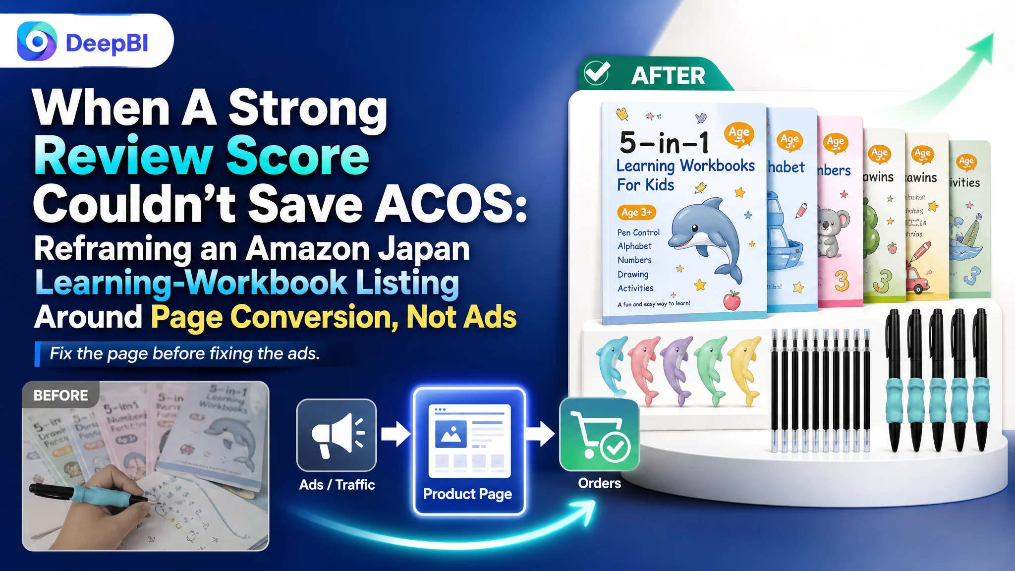
An Amazon seller in Japan came to DeepBI with a familiar pressure: ad costs were climbing, exposure was there, reviews were excellent—yet the product page was not turning traffic into enough orders. This was a children’s handwriting/learning workbook set, and the team’s first instinct was to “fix the ads”: refine keywords, tweak bids, and push harder on Sponsored Products to defend rank.
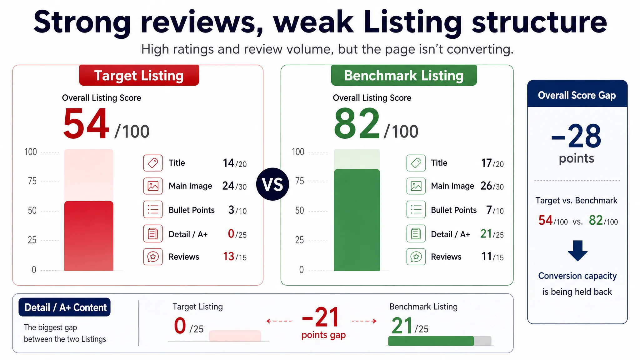
DeepBI’s Listing scoring quickly showed a different story. While the product carried a 4.5-star rating and close to 3,000 reviews—far stronger than a key competitor—the Amazon Listing itself was structurally weak. The benchmark competitor had an 82/100 Listing score; this page sat at 54/100, dragged down by almost non-existent A+ content, scattered bullet points, and a main-image set that made it hard for parents to understand what, exactly, they were buying.
The later optimization therefore did not start with ad controls. It focused on rebuilding the Amazon product page: restructuring the main image to make the full set obvious, rewriting the title and bullets around “repeatable practice” and “grooved templates,” and designing a trust-focused A+ that built confidence without relying on brand history. For other Amazon sellers, this case is a reminder that strong reviews and more traffic cannot compensate for a page that doesn’t clearly show value and ease risk; if the Listing conversion capacity is capped, ads will only amplify the loss.
Amazon Ads Were Not Failing. The Page Was Consuming the Traffic.
From the seller’s perspective, the symptoms all pointed toward advertising:
- Impressions and clicks were coming in.
- Reviews were overwhelmingly positive (4.5 stars, nearly 3,000 reviews).
- A category competitor with fewer reviews seemed to be capturing more share.
The intuitive conclusion: our ads must be underperforming. The team assumed that better keyword refinement, more granular campaigns, or different bid strategies would close the gap.
But when DeepBI ran a full Listing scoring and benchmark comparison, the picture changed:
- Overall Listing score
- Target Listing: 54/100
- Benchmark Listing: 82/100
- Gap: –28 points
- Key dimension gaps
- Title: –3
- Main image: –2
- Bullet points: –4
- Detail/A+ content: –21
- Reviews: +2 (the target Listing actually led here)
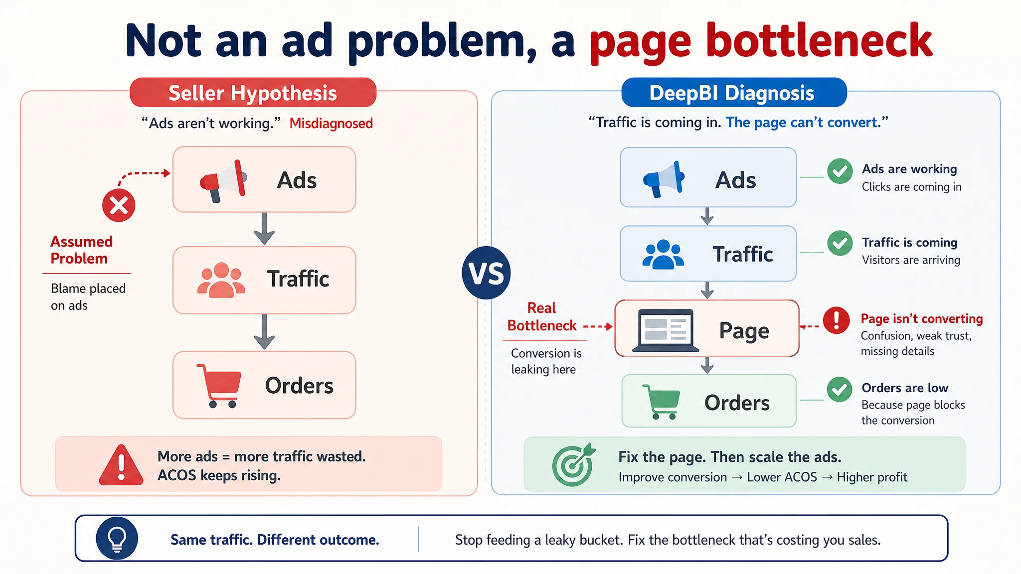
“The real problem was not that ads failed to bring traffic. It was that the page could not convert the traffic.”
In other words, the seller was operating under a misdiagnosis: treating a Listing-conversion problem as if it were an advertising problem. Ads were generating clicks, but the product page could not complete the trust and decision path—especially for cautious parents buying an education-focused product.
The Real Constraint Was Listing Conversion Capacity
DeepBI’s core judgment was simple: for this Amazon Japan ASIN, the primary bottleneck was not traffic volume, but the page’s ability to convert that traffic.
Title: Informative, But Not a Decision Driver
The original title packed in keywords and product details (“reusable,” “groove template design,” etc.), and it front-loaded the core category term “workbook,” which is good for search.
But compared with the benchmark:
- The competitor followed a clear “brand + core function + key benefit + content + age” progression.
- It spoke directly to parents’ mental model with lines like “can be written many times,” and clearly listed learning content: hiragana, katakana, numbers, ABC.
- The competitor title was structured as a decision narrative, not just a spec dump.
The DeepBI assessment: the title was not failing on keywords; it was failing on persuasion logic. It didn’t immediately answer what the child would practice, how often they could reuse it, and why it mattered for early learning.
Main Image: No Clear “What’s in the Box” Moment
From a distance, the main image looked busy rather than strong:
- Too many overlapping elements (grooves, hands, grips, multiple covers) created information overload.
- There was no clean, immediate view of the complete set (five workbooks, pens, refills, grips) in one coherent shot.
- For a parent scrolling search results, it took effort to understand the product configuration.
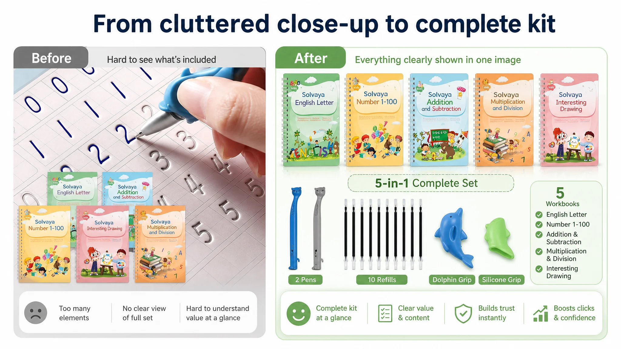
DeepBI’s visual agents have seen this pattern often: overloaded first images can drop click-through rates by 15–20% because shoppers can’t lock onto a clear value in the first three seconds. Here, the main image failed to answer a basic question:
“If I buy this, exactly what am I getting for my child?”
Bullet Points: Features Listed, But No Buying Logic
The original bullet points were technically rich:
- Description of groove design
- Description of reusable ink
- Mentions of grips and materials
But structurally, they were:
- Feature-centered, not child- or parent-centered.
- List-like, with each bullet standing alone rather than forming a persuasion sequence.
- Missing explicit usage outcomes such as “practice again and again without mess” or “helps your child master correct stroke order.”
The competitor, by contrast, was running a “specs → value → scenes → principle → accessories” logic:
1. What’s included.
2. Why it’s beneficial.
3. How it’s used.
4. How it actually works.
5. How accessories support the learning experience.
This difference is critical on Amazon: bullet points must not only inform; they must carry the buyer from interest to confidence.
Detail Page: A+ Was Simply Missing
This was the most damaging gap.
- The target Listing had no A+ content, no visual story, no modular breakdown.
- The benchmark Listing used A+ to:
- Show children using the product in real scenes.
- Present the brand’s sales history and awards.
- Clearly state the core problem (“messy environments, limited practice”) and present this product as the solution.
DeepBI’s scoring reflected this starkly:
- Detail/A+
- Target: 0/25
- Benchmark: 21/25
- Gap: –21 points
With Amazon’s modern product pages, removing A+ is effectively removing the final layer of persuasion. Parents buying a learning tool for a 3-year-old aren’t just buying content; they’re buying trust.
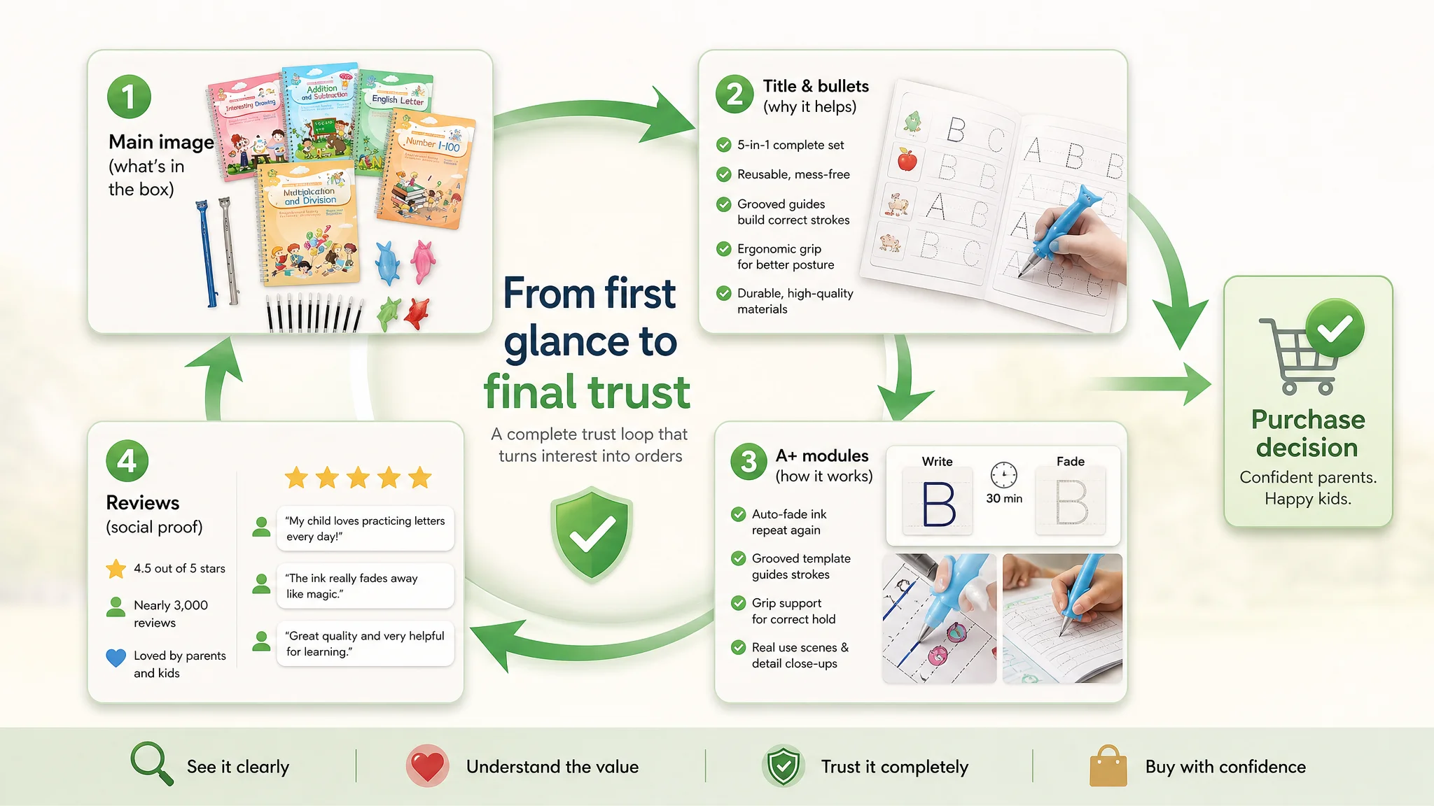
Reviews: A Hidden Strength That Was Not Being Used
Ironically, in the only dimension where the seller clearly led, the page wasn’t capitalizing:
- Star rating: 4.5 vs. competitor’s 4.2
- Review volume: 2,946 vs. ~436
- Home-page reviews: multiple five-star entries, multi-language feedback showing broad adoption.
The Listing had trust credibility in reviews, but the page architecture (no A+, weak bullet logic) meant this trust was not being anchored and extended into a coherent story.
Why DeepBI Did Not Keep Tuning the Ads First
Given this data, continuing to optimize only ads would have been commercially irrational.
From DeepBI’s perspective, the key risks were:
- Ads amplifying a weak page: More traffic to a low-conversion Listing drives ACOS up and reinforces the sense that “ads don’t work,” when the underlying issue is page logic.
- Over-reliance on paid traffic: With conversion under-optimized, organic ranking struggles, forcing continuous ad spend just to maintain visibility.
- Lost advantage: The strong review base (higher rating, far more reviews) was not being translated into visible trust signals on the page.
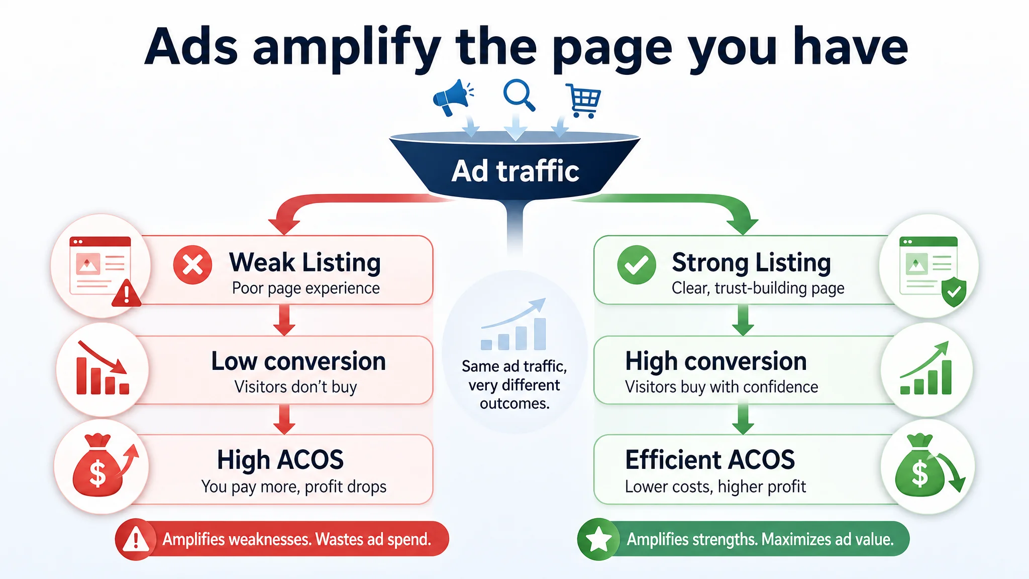
“Advertising does not only amplify advantages. It can also amplify a page’s existing defects.”
DeepBI therefore recommended a clear decision order:
1. Repair Listing conversion capacity first
Especially the main image, bullets, and A+ modules.
1. Then re-evaluate ad performance once the page can actually absorb and monetize traffic.
Only after the product page could stand on its own did it make sense to re-invest meaningfully in ads.
This Product Page Did Not Lack Traffic. It Lacked Trust.
Once the core constraint was identified, DeepBI’s focus shifted from raw traffic to how parents would decide on the page.
Rebuilding the Main Image Around “Complete Set” and Core Mechanism
DeepBI’s scoring highlighted that the benchmark competitor’s first image did three things very clearly:
1. Showed the entire set in an organized layout.
2. Let parents instantly see the range of practice content.
3. Suggested durability and repeat use through visual storytelling.
For this Listing, DeepBI recommended a new main-image logic:
- Primary frame: “complete kit”
- All five workbooks aligned.
- Two pens, matching refills, dolphin grip, silicone grip clearly visible.
- Bold but clean “5-in-1” callout for content categories.
- Remove distracting hand close-ups and overlapping covers from the first image.
- Use subsequent images for scenarios and close-ups, instead of compressing everything into image #1.
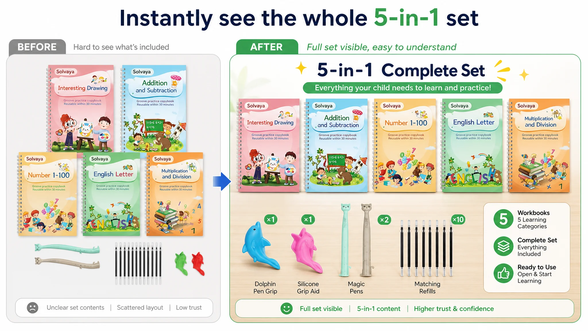
The goal: in search results and on the product page, a parent should understand the kit in one glance.
Clarifying the Title Around “Child Writing Practice + Reusable + Grooved Template”
The new title structure was designed to mirror how parents search and decide on Amazon Japan:
- Leading with “child writing practice notebook” (子供 書き方練習帳) to match search intent.
- Bringing in the “educational / learning” attribute (知育) to anchor the product as an educational tool, not just stationery.
- Explicitly naming the practice scope:
- Hiragana
- Numbers
- ABC
- Calligraphy practice
- Highlighting “reusable” and “groove template design” as core differentiators.
- Mentioning the support pen/grip in the tail as an added benefit, not as the headline.
This was not about stuffing more terms; it was about reordering the information to mirror parents’ evaluation logic: What is this? What does my child practice? Is it reusable? Does it help with correct writing?
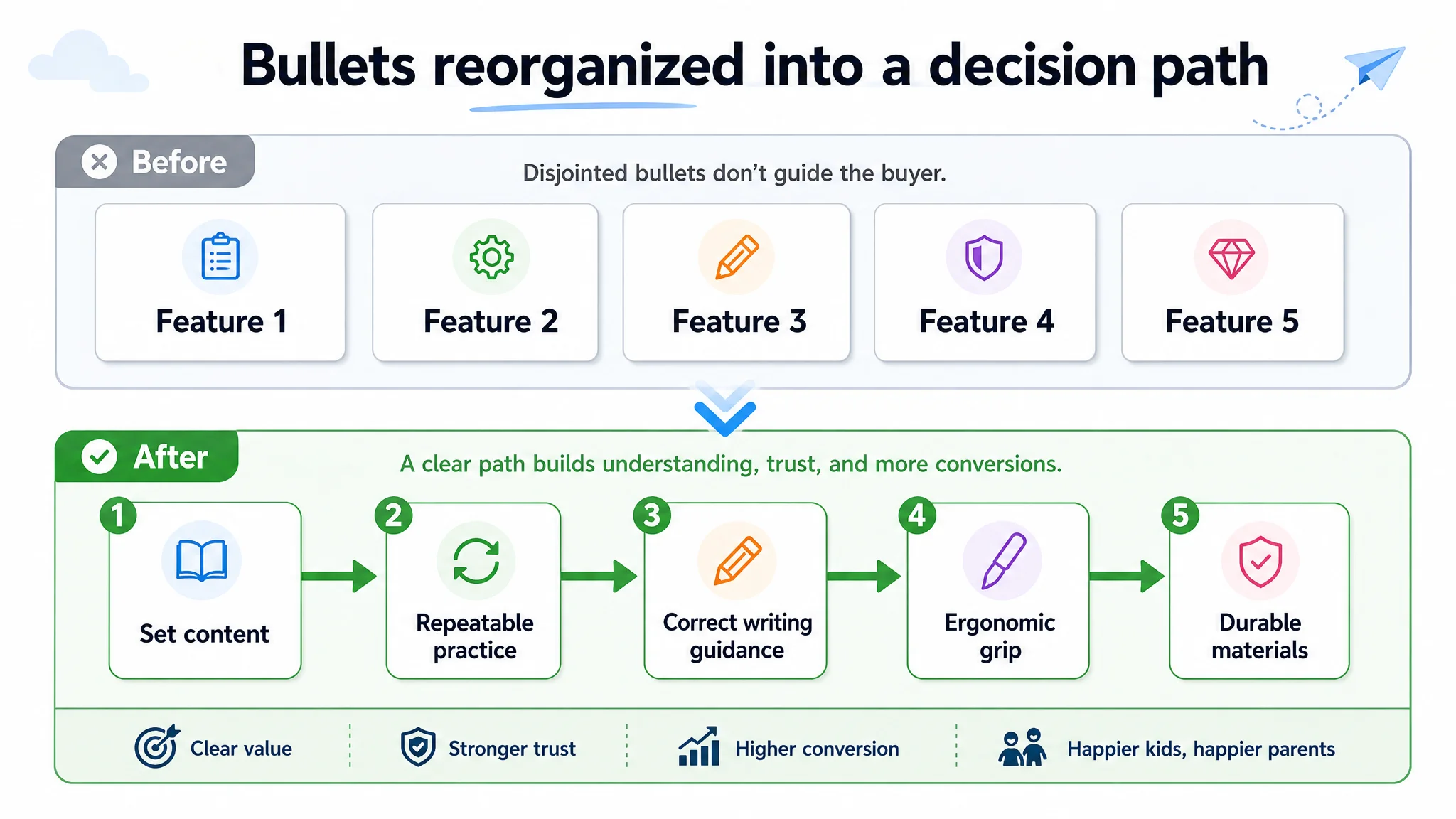
The Bullet Points Had Information, But Not a Buying Logic
To repair the mid-page decision path, DeepBI recommended a complete restructuring of the bullet points. Instead of five independent feature statements, the bullets were rewritten as a progressive persuasion chain.
Bullet 1: “What Exactly Am I Getting?” – The 5-in-1 Set
Objective: remove ambiguity about the scope of content.
- Introduce the set as a “luxury 5-in-1 practice set” covering:
- Alphabet
- Numbers (1–100)
- Arithmetic (addition, subtraction, multiplication, division)
- Drawing
- Clearly name the included accessories:
- Magic pen
- Writing-grip aid
This gives parents immediate clarity that one purchase covers multiple learning areas, reducing the mental friction of wondering if they’ll need additional materials.
Bullet 2: “Can My Child Really Reuse It?” – Magic Ink & Economics
Objective: directly address the reusability and mess concern.
- Explain that the magic ink fades automatically in about 30 minutes, with no erasing required.
- Emphasize:
- No extra wiping effort.
- No dirtying notebooks.
- Economical and environmentally considerate.
This bullet transforms “reusable” from a vague claim into a concrete, time-bound behavior, which is more persuasive and credible to parents.
Bullet 3: “Will My Child Learn Correctly?” – 3D Groove Guidance
Objective: differentiate the physical learning aid.
- Describe the 3D groove design as a “physical template” that guides the pen.
- Link this to:
- Correct stroke order.
- Proper character shapes.
- Muscle memory and confidence.
Here, DeepBI deliberately anchored the value to learning outcomes, not just design flair, positioning the product as more than a flat practice sheet.
Bullet 4: “Is It Ergonomic?” – Grip and Posture Support
Objective: address a common but often unspoken parent concern.
- Introduce the silicone grip as an ergonomic writing aid for small hands.
- Frame it as:
- Reducing finger strain.
- Establishing correct pen holding habits early, in a natural way.
Even though the competitor didn’t emphasize this, DeepBI saw it as a latent category pain point that this product could credibly own.
Bullet 5: “Will It Last?” – Paper Quality & Durability
Objective: reduce risk about material and longevity.
- Highlight thick, high-quality paper that:
- Resists bleed-through.
- Is less prone to staining.
- Withstands frequent reuse.
This bullet ties the product back to its role as a long-term learning tool, not a disposable workbook.
Together, these bullets now form a linear decision narrative:
Content richness → Repeatable practice → Correct learning support → Ergonomic care → Reliable quality
Before Ads Could Work Again, the Page Had to Convert
Beyond the main image and bullets, DeepBI pushed for a complete rethink of the A+ (detail) section, precisely because the brand itself was not yet a household name.
Why A+ Had to Be Built First
The benchmark competitor leaned heavily on:
- Brand history (20+ years of continuous sales).
- Awards and third-party validation.
- Global sales and certification.
This customer did not have the same brand assets. Trying to mirror this approach would have been both unrealistic and ineffective.
Instead, DeepBI argued:
- When you can’t lean on brand, you must lean on product logic.
- The A+ must be anchored in core functions and tangible mechanisms, not brand storytelling.
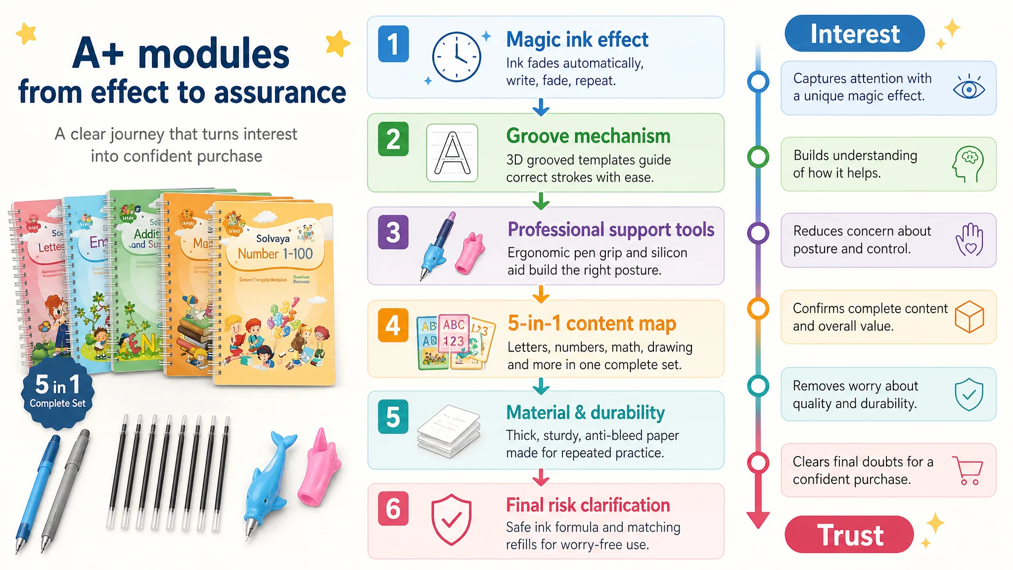
A+ Structure: From “Magic Effect” to Risk Clarification
DeepBI’s proposed A+ architecture:
1. Module 1–2: Magic Effect & Core Mechanism
- Show the “write → wait → fade” cycle with strong visual contrast:
- Left: fresh dark ink.
- Right: 30 minutes later, faded text.
- Clarify that the magic ink is designed for pen use and that the notebook can be reused repeatedly.
- Link this to “no mess, no erasing effort” to align with parent pain points.
1. Module 3: Groove Design & Ease of Learning
- Visualize the groove template guiding the pen along the correct path.
- Explain how this lowers the barrier for children just starting to write.
1. Module 4: Professional Writing Support Tools
- Highlight the grip and guidance content.
- Position them as professional-level assistance for correct posture and pen holding.
1. Module 5: Clear Breakdown of the 4 Books / 5-in-1 Content
- List precisely what each book covers.
- Make it impossible for parents to be confused about the content scope.
1. Module 6: Material & Durability Assurance
- Distill the paper quality and durability message into visuals and concise copy.
- Address concerns about tearing, staining, or fast wear.
1. Module 7: Final Doubt Clearing
- Clarify key properties of the ink and refills—within confirmed, real capabilities.
- Avoid any unverified claims about safety or chemical properties; stay within factual boundaries.
Throughout, DeepBI deliberately avoided inventing features or suggesting unverified claims. The trust it sought to build was rational, product-based trust, not imaginative storytelling.
How the Page’s Sales Logic Started to Recover
Once the Listing’s core structure was refocused around clarity, trust, and learning outcomes, the seller could reasonably expect several changes in operating state—even before new ad experiments:
- Parents browsing the page would:
- Understand the set immediately from the main image.
- See a clear mapping between their child’s needs and the practice content.
- Visualize how repeatable, mess-free practice worked.
- Feel reassured about posture, grip, and material durability.
- The strong review base, previously an underused asset, would now sit behind a coherent page narrative, rather than floating above a thin content block.
With this, ad traffic no longer fell into a “trust vacuum.” The product page finally had the capacity to receive and convert both organic and paid visitors.
How the Seller’s Understanding Changed
This case did not end with a “magic number” claim about ACOS or CVR, because the most important shift was not in the dashboard; it was in the seller’s mental model:
- High star ratings and large review counts do not guarantee strong Listing conversion.
- Amazon ads cannot compensate for a page that:
- Fails to show what’s in the box.
- Does not explain how the product works.
- Does not structure bullets and A+ around a clear decision path.
- Listing quality is the foundation for ad efficiency:
- Main image drives CTR.
- Title and bullets drive initial confidence.
- A+ content and reviews complete the trust loop.
For this Amazon Japan learning workbook, DeepBI’s role was not to “optimize ads” first, but to stop ad spend from continually feeding into a weak page. By identifying the true constraint—Listing conversion capacity—it redirected the seller’s limited attention to where it would structurally matter most.
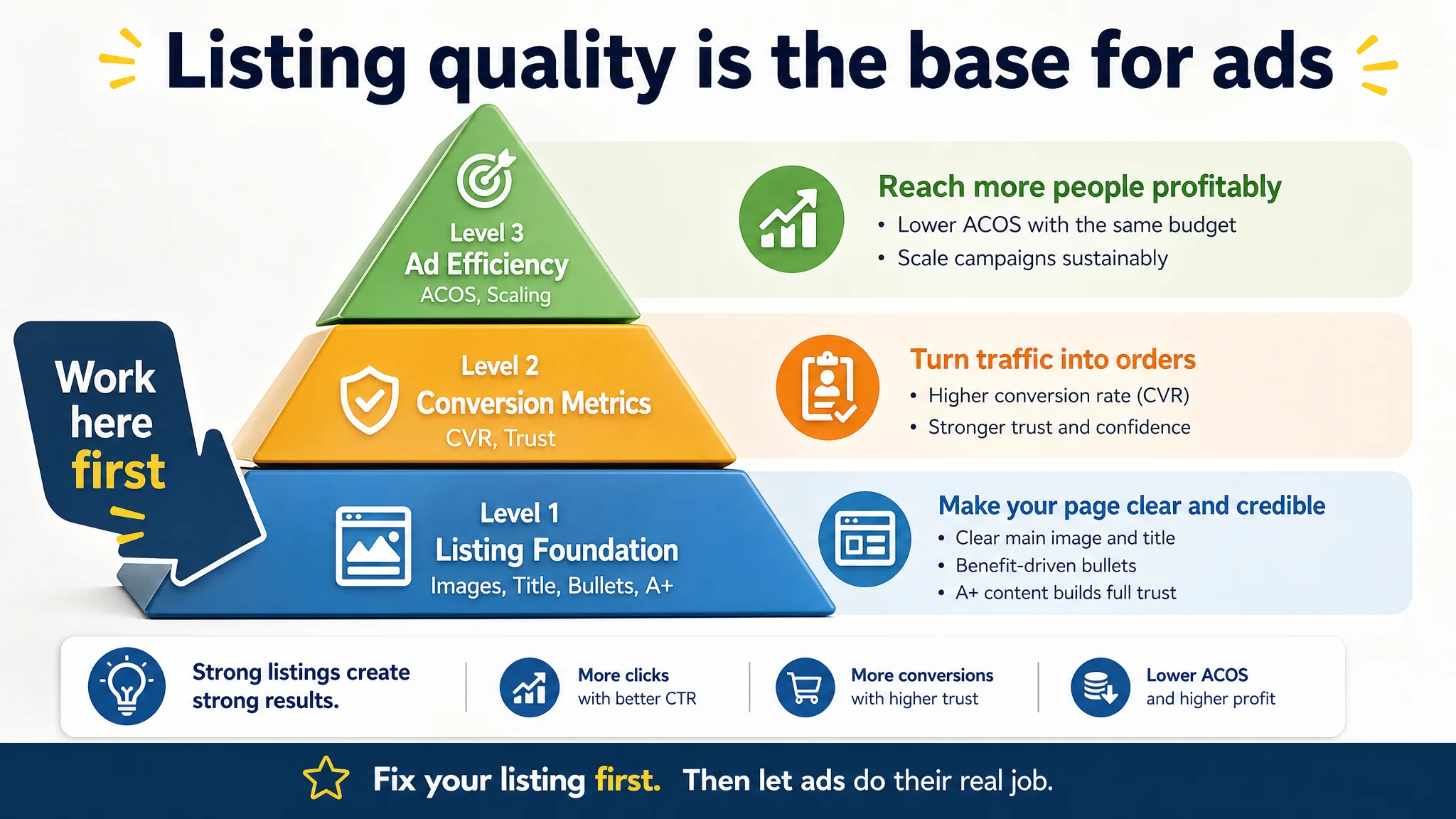
For other Amazon sellers facing rising ad costs and stubborn ACOS, the core takeaway is straightforward:
Before scaling ads, ask whether your Amazon product page genuinely deserves more traffic. If the page cannot convincingly show value, trust, and outcomes, then your biggest problem is not in the campaigns—it is in the Listing itself.