
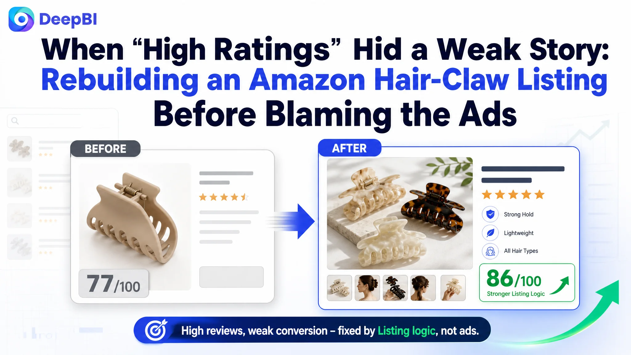
This case comes from an Amazon seller in the US marketplace operating a set of large matte hair claw clips for women. On the surface, the product looked healthy: a 4.7-star rating, over 1,600 reviews, and feedback quality even better than a leading competitor in the same hair-accessory segment. Yet as Amazon ad costs climbed, the team kept feeling that “ads are getting worse” and suspected they were losing in bids and keywords, not on the Amazon Listing itself.
After bringing the Listing into DeepBI, it became clear that this was not primarily an Amazon ads problem. The core constraint was product-page conversion: the title, main-image set, bullet points, and A+ visuals did not build the same trust and buying logic as the benchmark Listing they were competing against. Ads were driving traffic into a page that looked “good enough” at a glance, but structurally underperformed when users actually made a decision.
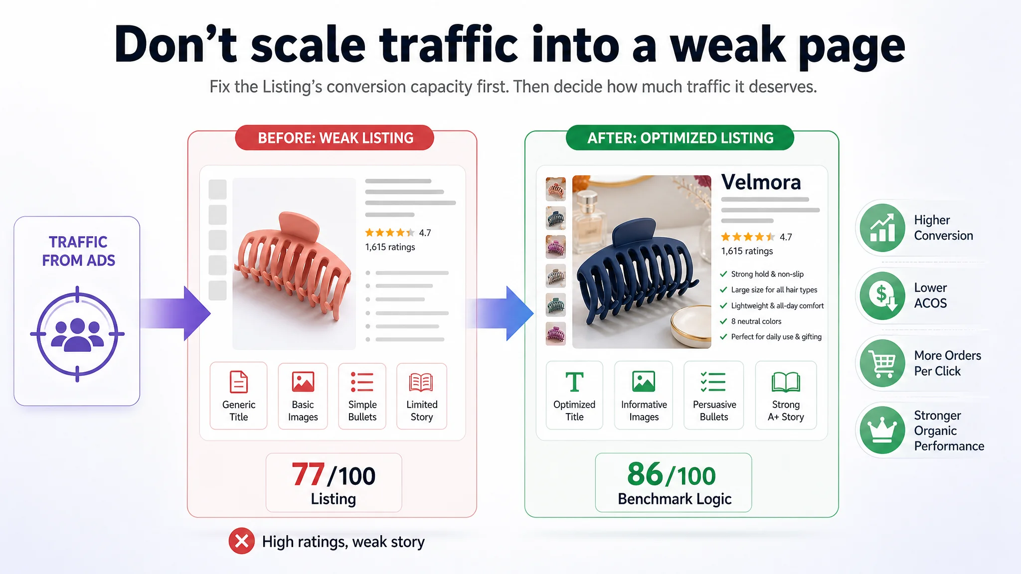
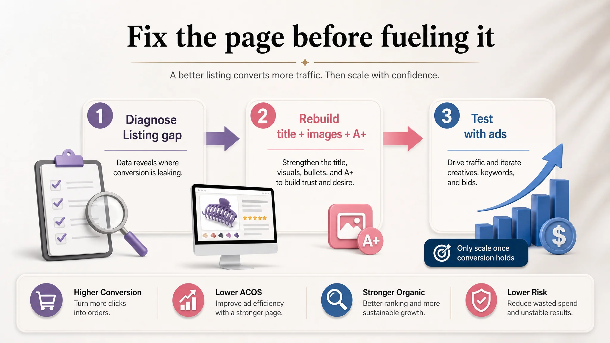
DeepBI reframed the issue: fix the Listing’s conversion capacity first, then decide how much traffic it deserves. The optimization work focused on three levers—title clarity and keyword logic, bullet-point buying paths, and a complete visual narrative from main images through A+ content. For other Amazon sellers, the case is a reminder: a strong star rating and “okay-looking” visuals do not guarantee a competitive Listing. When ACOS is hard to control, the first question should be whether the page can truly convert the traffic you are already paying for.
The Real Problem Was Not Ads. It Was a 77-Point Listing Competing Against an 86-Point Page.
From the seller’s perspective, the product was performing “fine enough”:
- Star rating: 4.7, higher than the competitor’s 4.6
- Review volume: 1,615 vs. competitor’s 2,235 (about 72% of the competitor’s count)
- Home-page negative-review rate (≤3 stars): 12.5%, significantly better than the competitor’s 22.2%
So when advertising performance started to feel unstable, the intuitive diagnosis was:
- “Our reviews are strong; the problem must be in ads.”
- “We might not be bidding aggressively enough or using the right keyword mix.”
- “Maybe our creatives are a bit weak, but the page is basically fine.”
However, DeepBI’s Listing scoring told a different story.
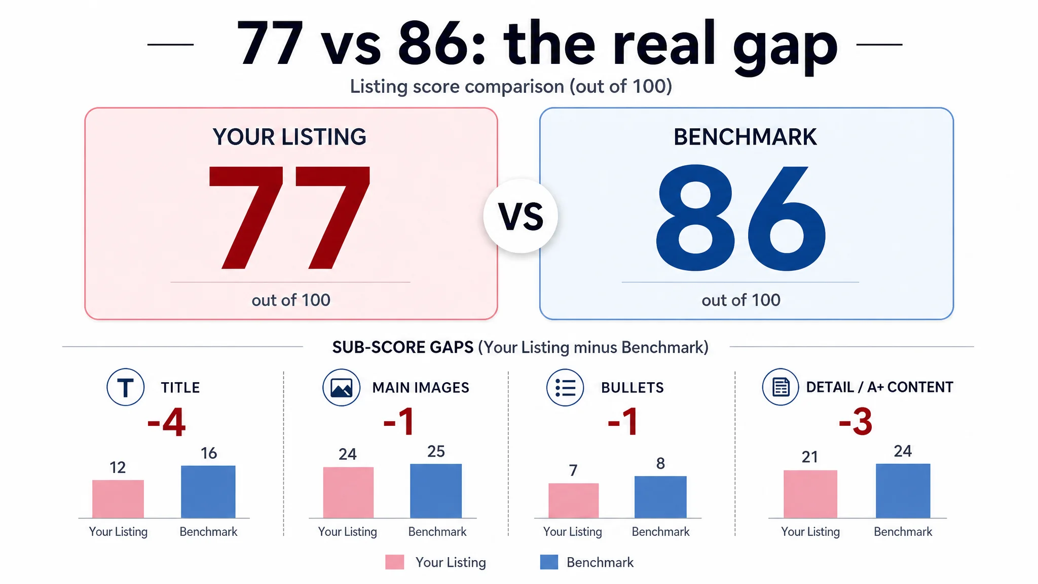
The Listing scored 77/100, while the benchmark competitor sat at 86/100—a 9-point gap. The difference was not in reviews (both scored 13/15). It was in the selling infrastructure of the page:
- Title: 12 vs. 16 (−4)
- Main images: 24 vs. 25 (−1)
- Bullet points: 7 vs. 8 (−1)
- Detail/A+ content: 21 vs. 24 (−3)
“The real issue was not that ads failed to bring traffic. It was that the page could not convert traffic as competitively as the benchmark.”
In a category as crowded as hair claw clips, a 9-point Listing gap is enough to turn rising ad spend into flat or fragile orders.
The Seller’s Misdiagnosis: Ads, Not Listing, Were Blamed
Before the diagnosis, the seller’s internal logic looked roughly like this:
- “CTR feels okay; clicks are coming. If orders aren’t rising as expected, ads must be inefficient.”
- “We already have lifestyle pictures and multiple scenes; the Listing shouldn’t be the problem.”
- “Our rating is higher than the competitor; we are more trustworthy.”
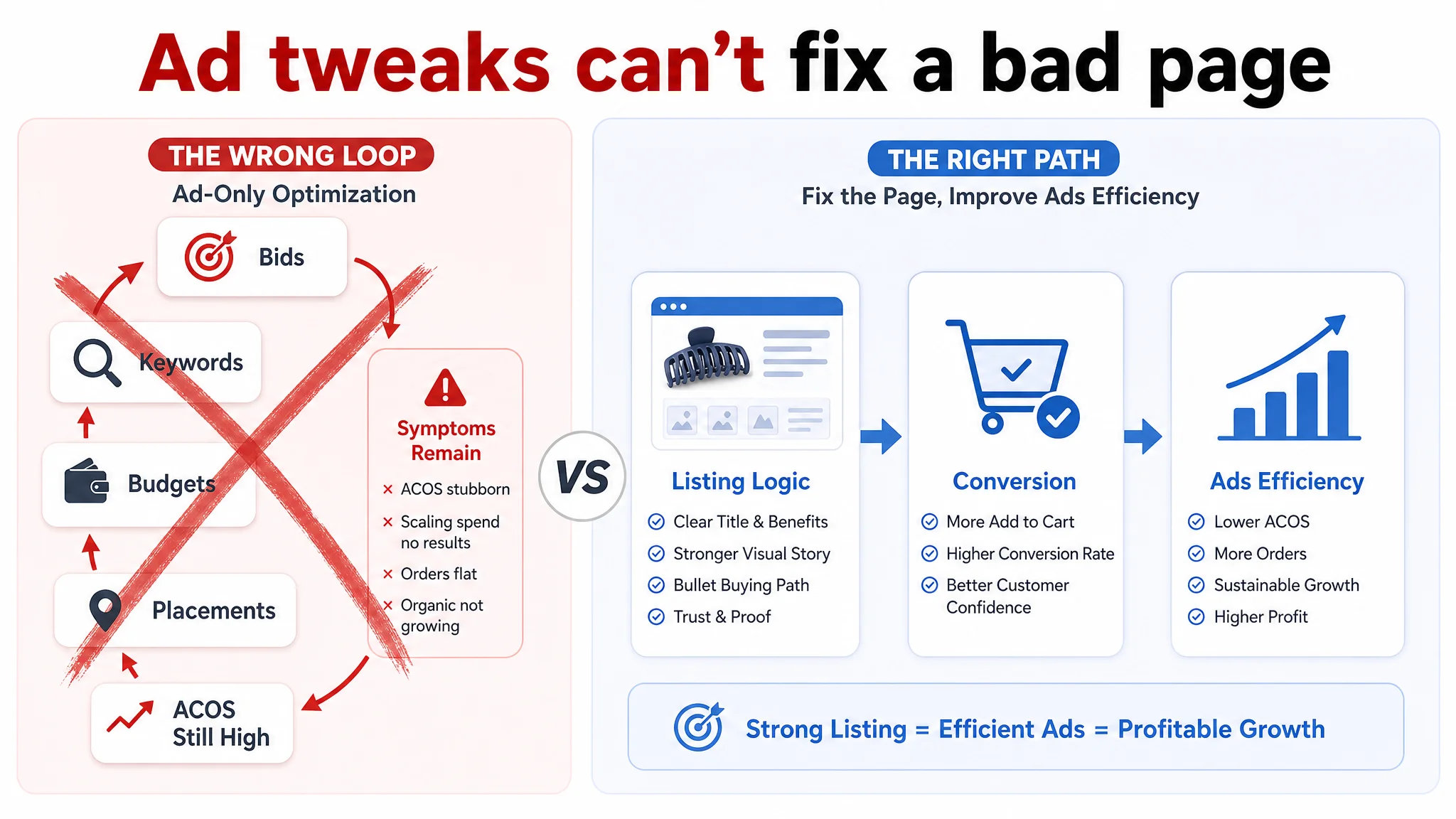
This led to a familiar loop:
- Rebuilding campaigns
- Adjusting bids and negative keywords
- Tweaking budgets and placements
Yet the underlying symptoms persisted:
- ACOS was stubborn
- Scaling spend did not translate into stable order growth
- Organic share did not show a clear upward trend
Traditional ad optimization could not fix what was actually happening: the page was consuming traffic.
Listing Conversion Was the Real Constraint
Title: Information Without a Clear Decision Logic
The benchmark competitor followed a classic Amazon title pattern:
- Brand name at the front (brand + core keyword)
- Clear structure: product + audience + core benefit + attributes
- Specific size notation: “4.33 Inch” instead of a rounded “4.3 Inch”
- “For women” placed directly after the core product term, anchoring audience and intent
The target Listing, by contrast:
- Did not front-load the brand
- Used a less precise size expression
- Pushed “Fashion Hair Accessories for Women and Girls” toward the back
- Kept broad, vague phrases in the title instead of sharply aligned search-intent wording
Result:
- The title carried keywords, but did not prioritize what matters most at the decision moment.
- It felt more generic and less authoritative than the benchmark, despite similar content.
Main Images: Visuals Without a Strong Click Reason
On paper, the Listing had multiple images and lifestyle scenes. But three key weaknesses became visible when compared to the benchmark:
1. Information density and logic
The main image set did not help users quickly answer:
- How many clips are in the set?
- How big are they in real-world terms?
- Can they handle thick or curly hair?
The benchmark used structured layouts, clear matrices, and explicit labels to deliver those answers within seconds.
1. Trust around functionality
The competitor showed:
- Spring coil counts (e.g., “7 coils”) as a visual proof of grip strength
- Internal teeth design clearly, linking it to non-slip performance
The target Listing relied more on generic visual styling and less on functional evidence.
1. Lifestyle positioning
The benchmark turned a “plastic clip” into a lifestyle accessory:
- Vanity-table scenes, professional photography, controlled light and shadows
- A visual mood that says “light luxury hair accessory”, not “cheap plastic tool”
“Advertising does not only amplify advantages. It can also amplify a page’s existing defects.”
When users compared both Listings from the search results, the competitor’s visual story made its higher click share almost inevitable.
Bullet Points: Features Without a Buying Path
The bullet points on the target Listing were not wrong; they were simply mis-ordered and under-leveraged.
Competitor’s bullet structure:
- Starts with giftability and neutral colors (market differentiation)
- Moves into material quality and grip strength (functional assurance)
- Clarifies size and specs (risk control)
- Reinforces daily-use scenarios (frequency and usefulness)
- Closes with an “all-day comfort” promise (deep pain point: no headaches)
Target Listing’s structure:
- Starts with material and anti-slip characteristics
- Talks about design and comfort in a generic way
- Only later mentions broader scenarios and gift attributes
- Does not systemically anchor the product as a style accessory or social gift
Even with solid content, the seller’s bullets read more like a product sheet than a buying script.
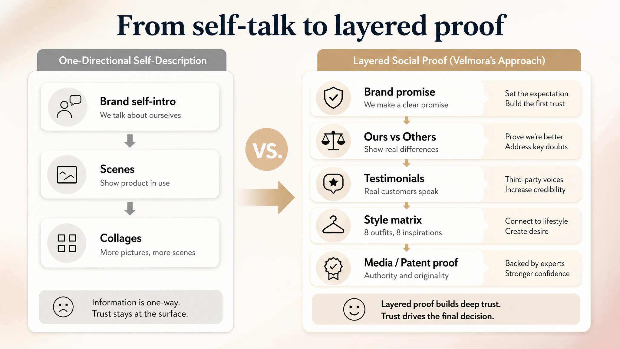
A+ Content: Missing the Final Layer of Persuasion
Both Listings had A+ content, but the roles they played were different.
Competitor’s A+:
- Brand proposition up front
- “Ours vs Others” comparison modules
- Material and craftsmanship comparisons
- Customer testimonials embedded visually
- “Fashion matrix” with 8 complete outfit ideas
- Patent and media mentions (Yahoo, CNN, NYT, etc.) as trust anchors
Target Listing’s A+:
- Main visual
- Core selling-point image
- Structure and size diagram
- Multiple lifestyle use scenes
- Gift/social scenes and daily-use collages
These modules were rich but one-directional: the brand spoke about itself, but did not create:
- A clear competitive contrast
- Third-party validation
- A structured style identity
As a result, the A+ section did not fully unlock the product’s potential to move from “functional clip” to “aspirational accessory”.
Why DeepBI Did Not Start With Ads
Once the Listing scoring and benchmark comparison were clear, DeepBI’s judgment was straightforward:
- The Listing’s conversion foundation lagged the benchmark.
- Reviews and ratings were strong enough; credibility was not the main bottleneck.
- Text and visuals failed to use that credibility to win the decision.
From a business-risk perspective:
- Continuing to scale ads would mainly buy more expensive proof that the page was underperforming.
- Each dollar of ad spend had a lower probability of converting than the competitor’s because the page did not answer the same questions with the same clarity.
Therefore, the decision path was:
1. Do not treat ACOS as an ad-only problem.
A 9-point Listing gap means even perfectly tuned campaigns will bleed efficiency.
1. Repair the Listing’s decision logic first.
Title, main images, bullets, and A+ must be rebuilt to:
- Clarify “what this is and for whom”
- Prove “why this set is stronger, more comfortable, and more stylish”
- Reduce perceived risk around size, grip, durability, and comfort
1. Use ads later to test the rebuilt page.
Once the page can convert, ad adjustments will finally reflect actual demand instead of page weaknesses.
How the Optimization Reframed the Page
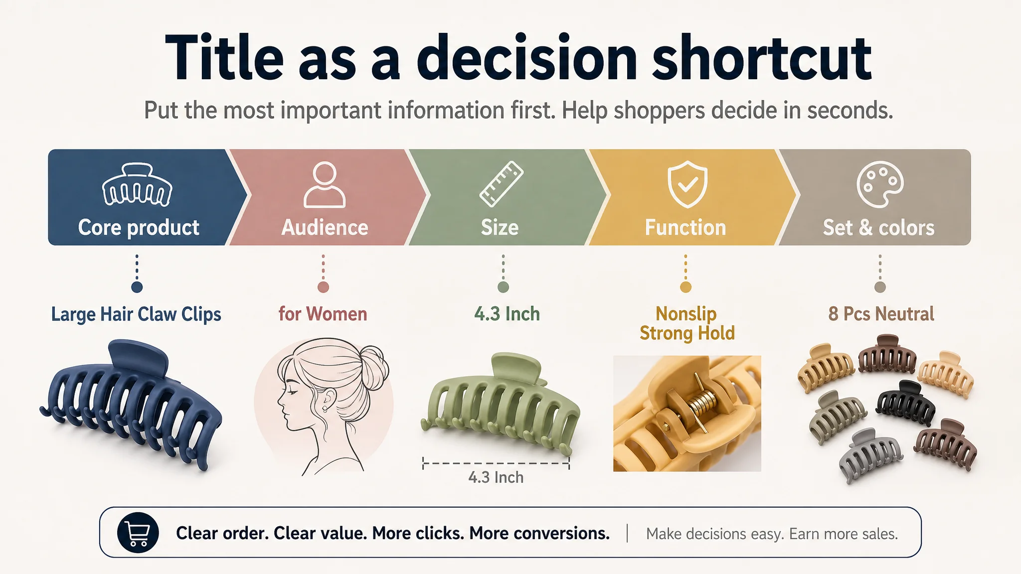
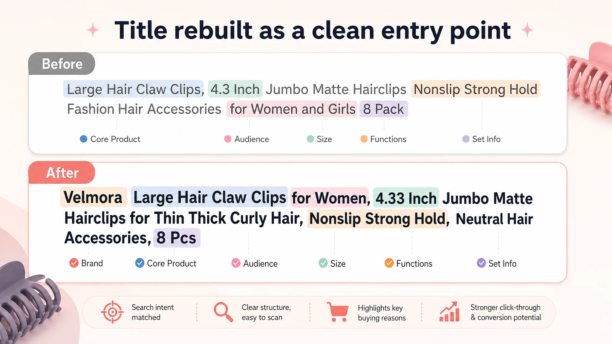
Title: From Generic Label to Focused Entry Point
DeepBI’s recommended title structure:
Large Hair Claw Clips for Women, 4.3 Inch Jumbo Matte Hairclips for Thin Thick Curly Hair, Nonslip Strong Hold Banana Jaw Clips, Neutral Hair Accessories, 8 Pcs
Key changes:
- “Large Hair Claw Clips” moved to the front as the core keyword.
- “4.3 Inch” standardized alongside “Jumbo”, aligning with user expectations and competitor terminology.
- Audience and use (“for Women”, “Thin Thick Curly Hair”) sit close to the product term, aligning search intent.
- Functional attributes (“Nonslip”, “Strong Hold”) are integrated, not buried.
- Set size and color positioning (“Neutral Hair Accessories, 8 Pcs”) are clearly stated.
This does two things simultaneously:
- Strengthens relevance for Amazon’s search logic.
- Gives the buyer, especially on mobile, a clean, scannable reason to click.
Bullet Points: Turning Features into a Conversion Script
Each bullet was rebuilt as a pain point → solution → evidence loop.
1. Material & grip as a trust anchor
- High-quality acrylic with matte finish, non-toxic, shatter-resistant
- Strong metal spring + inner teeth
- Explicit promise: strong yet gentle grip, no snagging or scalp scratching
1. Color and styling logic
- 8 defined, named colors for outfit matching
- Color language framed in terms of “aesthetic and fashionable accessories”
- Clear gift usage: birthdays, Valentine’s, anniversaries
1. Size and compatibility
- Unified size expression (4.3" x 1.85")
- Explicit coverage of thick, thin, curly, fine, and long hair
- Focus on all-day hold without slipping
1. Comfort as a deep pain point
- Lightweight structure
- Emphasis on “no-headache comfort”
- Directly addressing the reason many users abandon larger clips
1. Usage scenarios and gifting
- Concrete daily-use scenes: washing, makeup, cooking, bathing, office
- Exquisite gift box as both shipping protection and perceived value
- Clear after-sales commitment
Instead of a loose list, the bullets became a structured buying argument.
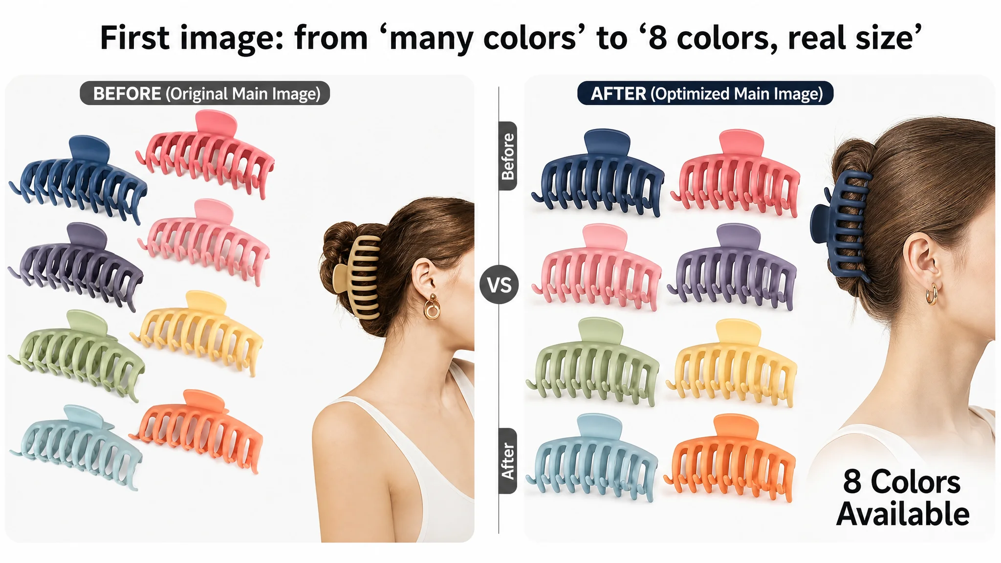
Main Images: From “Many Pictures” to a Conversion-Oriented Set
DeepBI’s optimization did not aim to “beautify” images for its own sake. It aimed to give each image a clear job in the decision path.
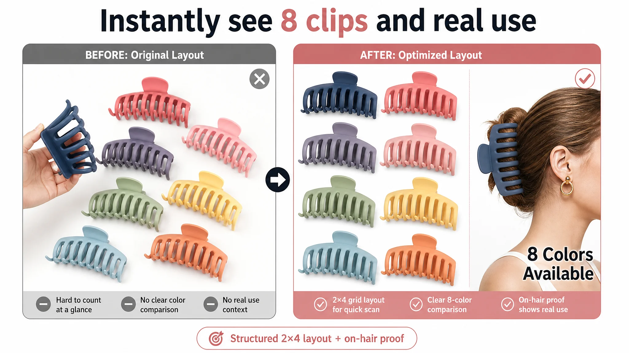
1. First Image: Instant Understanding of Variety and Use
- 8 clips arranged in a 2×4 matrix on the left (~65% of the frame)
- A side profile model wearing a clip on the right (~35%)
- Clean white background, cold-toned lighting to highlight color diversity
- Simple text: “8 Colors Available”
This makes users instantly see:
- How many clips they get
- The real size on hair
- The range of colors in a single glance
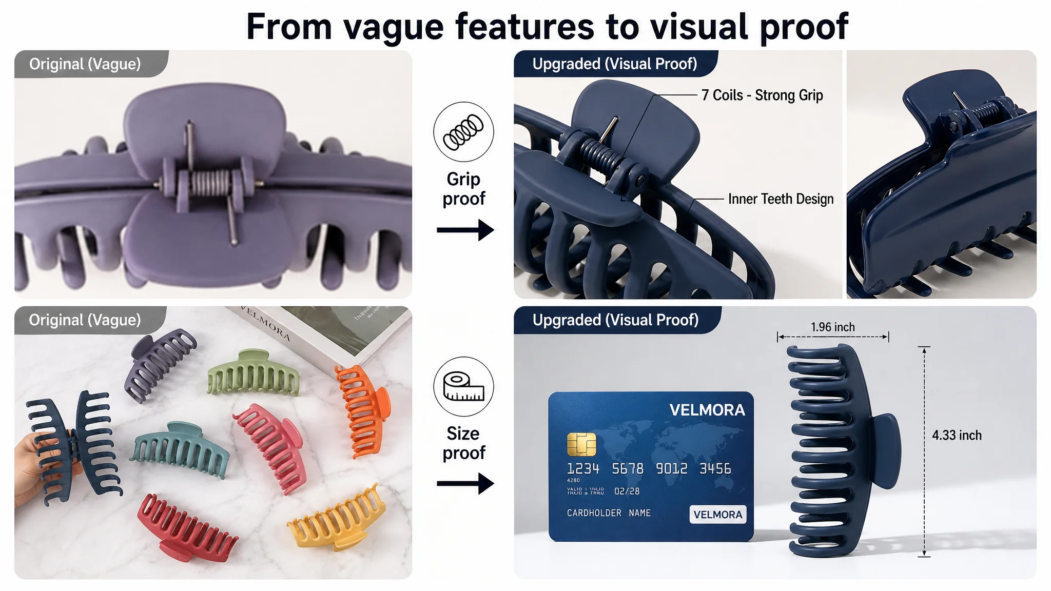
2. Functional Comparison Image
- Left: macro close-up on spring and inner teeth of the product
- Right: competitor-style structure as reference
- Clear tags like “7 Coils – Strong Grip” and “Inner Teeth Design”
Even if the Amazon page cannot explicitly label a competitor, the visual logic communicates:
- “We are structurally robust. You can see why.”
3. Size Proof Image
- Product placed vertically in the center
- A dollar bill or credit card on the side as a familiar reference
- Dashed lines and labeled dimensions (“4.33 inch”, “1.96 inch”)
This reduces:
- Uncertainty about actual size
- Returns caused by mismatch between mental image and reality
4. Lifestyle Upgrade Image
- Clip placed on a bright vanity surface
- Surrounding objects: perfume, brushes, compact powder
- Soft warm light, blurred mirror edge
The goal is to:
- Reposition the clip as part of a light-luxury personal routine, not a cheap tool.
5. Hair-Type Adaptation Image
- Four-grid composition
- Models with very thick, medium, fine, and curly hair
- Clear labels like “For Thick Hair”
This directly addresses:
- The biggest functional fear: “Will it hold my hair type?”
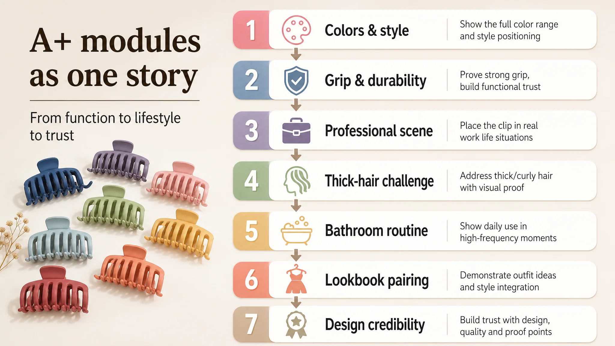
A+ Detail Page: From “Many Scenes” to a Coherent Story
DeepBI’s recommendations reshaped the A+ into a sequence that matches how buyers actually evaluate:
1. Color and style introduction
- All 8 colors in a visually controlled layout around a model
- Neutral, warm background to emphasize the matte Morandi palette
- No filters; real product colors
1. Grip and durability proof
- 180-degree open-angle shots
- Clip biting into thick hair in a clean, studio-like scene
- Clear emphasis on spring and inner teeth without invented parameters
1. Professional daily-use scenario
- Office scene with a model in a suit
- Clear view of clip as part of a formal look
- Reinforcing “it’s safe to use this in serious environments”
1. Thick-hair challenge
- Macro shot of the clip fully gripping a large bundle of hair
- Realistic lighting and natural home background
- Visual proof: no need for exaggerated claims
1. Bathroom & routine scene
- Clip on a marble sink with toothbrush and skincare bottle
- Morning-light feel, clean white and light-blue palette
- Ties the product to real daily rituals
1. Lookbook-style outfit pairing
- Magazine-like layout
- Full-body outfits on one side, product close-up and color label on the other
- Strong visual logic: “this clip completes this look”
1. Design credibility
- Clip overlaid on a design sketch
- Warm, desk-lamp style lighting
- Communicates originality and intent, countering “cheap plastic” perception
Together, these modules move users from:
- “Is this clip big enough and strong enough?”
- To “Is it comfortable and suitable for my daily life?”
- To “Does it fit my style and say something about me?”
What Changed for the Seller
The case does not rely on invented numerical results. Instead, the changes are tangible in how the Listing now behaves as a business asset:
- Listing conversion capacity improved.
The page now communicates clearly:
- What the buyer is getting
- Why it addresses their exact pain points
- How it fits into their lifestyle and identity
- Ad traffic became useful again.
With a stronger page:
- A click from Amazon ads is more likely to become an order
- ACOS has room to move down, because the same traffic produces more revenue
- Ad testing reflects real demand rather than page weaknesses
- Organic potential increased.
Better conversion improves:
- The Listing’s ability to rank and stay ranked
- Dependence on aggressive ads to sustain sales
- The resilience of the product against seasonal and bid fluctuations
- The team’s understanding shifted.
They moved from:
- “We have more stars than the competitor; ads must be the issue”
To:
- “Listing quality is the foundation of ad efficiency.”
- “Title, main images, bullets, and A+ must be aligned before scaling traffic.”
- “Before increasing budget, we must ask: does this page deserve more traffic?”
Takeaways for Other Amazon Sellers
This hair-accessory case is not about one specific product. It’s a pattern many Amazon sellers face:
- Strong reviews, but an under-structured Listing
- Continuous ad tuning with unstable ACOS
- A belief that “ads are the problem” because the page looks fine at a glance
The key lessons:
1. Ads cannot rescue a weak decision logic.
If the page cannot convincingly answer “what, why, for whom, and why now”, ads will mostly amplify waste.
1. Listing scoring is not a vanity metric.
A 77 vs. 86 gap in title, main images, bullets, and A+ is enough to determine who captures the incremental order in a competitive category.
1. Reviews are necessary but not sufficient.
A 4.7-star rating proves product satisfaction, not Listing competitiveness.
1. Visuals must carry business logic, not just aesthetics.
Every image—main or A+—needs a role in the conversion funnel: proof of quantity, proof of size, proof of grip, proof of comfort, proof of style.
DeepBI’s value in this case was not “making nicer pictures” or “rewriting some bullets.” It was correctly judging that the root cause of the seller’s advertising pressure was a Listing that underperformed its benchmark. Once that judgment changed, the optimization path became clear—and the product page started to behave like an asset that actually deserves the traffic it receives.