
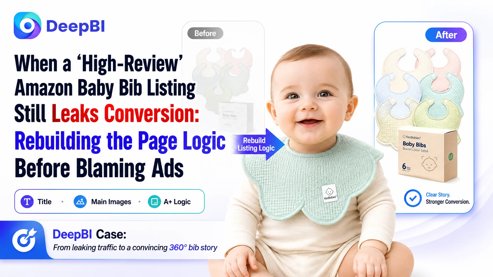
An established Amazon baby-accessories seller in the US marketplace came to DeepBI with a familiar frustration: ad traffic was not the problem. The listing for a muslin baby bib set already had 4.5 stars and over a thousand reviews—far more than a key competitor—yet the page struggled to convert and hold its ground against a newer, leaner competitor listing. The seller’s first instinct was to push harder on Amazon ads and keep tweaking bids and keywords, assuming the issue was traffic volume and keyword coverage.
DeepBI’s analysis told a different story. Using listing scoring and direct benchmark comparison, we found that the real gap was not in advertising operations, but in the Amazon product page itself—especially the title and visual narrative. The page had strong reviews and decent imagery, but the way it framed quantity, material, and functional proof was significantly weaker than the competitor, which was quietly winning clicks and trust with a more focused Amazon Listing structure.
The later optimization therefore did not start with another round of ad fine-tuning. Instead, the priority became: re-architect the title, re-order and reframe the main image set, and rebuild the A+ detail page into a clear, step-by-step persuasion path around “absorbent + waterproof + reversible 360° petal design.” Only after this conversion foundation was repaired would additional ad spend make sense. For other Amazon sellers, this case is a reminder that strong reviews and “OK” visuals do not guarantee conversion—and that ad inefficiency is often a symptom of a Listing that does not fully deserve the traffic it gets.
Amazon Ads Were Not Failing. The Page Was Consuming the Traffic.
From the seller’s perspective, the situation initially looked like a standard advertising problem.
- The baby bib listing already had:
- 4.5 stars
- 1,200+ reviews
- A perceived “trust advantage” over a competitor with only a few dozen reviews
Yet, when they compared sales momentum and ranking, the competitor’s Amazon Listing was overtaking them. The internal narrative quickly formed:
- “Our product is better reviewed; the problem must be ads.”
- “We’re not bidding aggressively enough.”
- “We need broader keyword coverage to keep up.”
So the team kept iterating campaigns—raising bids, expanding keyword sets, and trying different ad group combinations—expecting ACOS to come down once the “right” traffic mix was found.
It didn’t happen.
Clicks came, but orders did not scale at the same pace. ACOS was hard to control, and scaling budgets only amplified volatility. The seller felt they were paying more and more to defend a position they should already be winning on reviews alone.
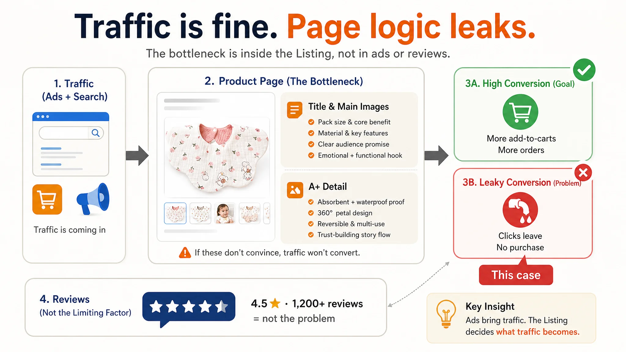
“The real problem was not that ads failed to bring traffic. It was that the page could not convert the traffic.”
This is where DeepBI stepped in—not by touching the campaigns first, but by asking a more fundamental question: Does this Listing actually deserve more traffic than it already gets?
The Real Constraint Was Listing Conversion Capacity
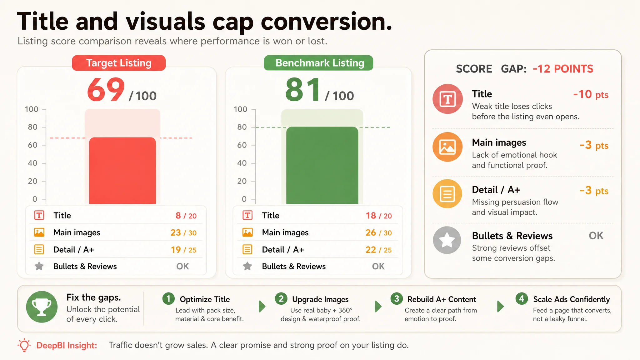
DeepBI’s Listing scoring placed the target product page at 69/100, versus 81/100 for a directly comparable benchmark listing in the same baby-bib segment.
The gap was not general—it was specific:
- Title: 8 vs 18 (out of 20)
- Main image: 23 vs 26 (out of 30)
- Detail/A+ content: 19 vs 22 (out of 25)
- Bullet points: Slight edge over the competitor
- Reviews: Clear advantage in volume and visible quality
In other words, the product had social proof, but the Listing structure could not fully monetize it.
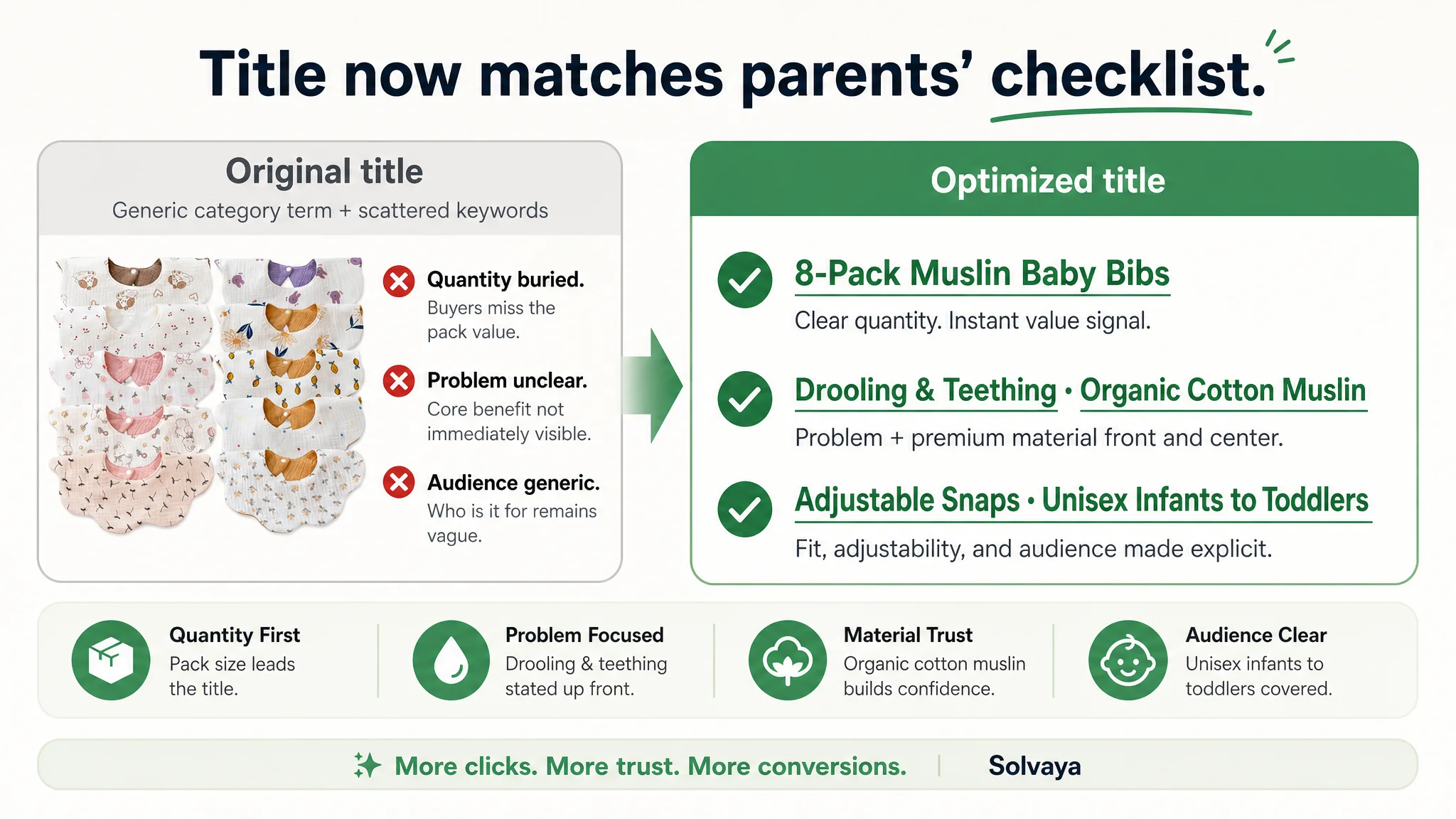
Title: Weak at the Exact Point Where Amazon Weighs Heavily
On Amazon, the title is more than a label—it directly affects both search exposure and first-glance click motivation.
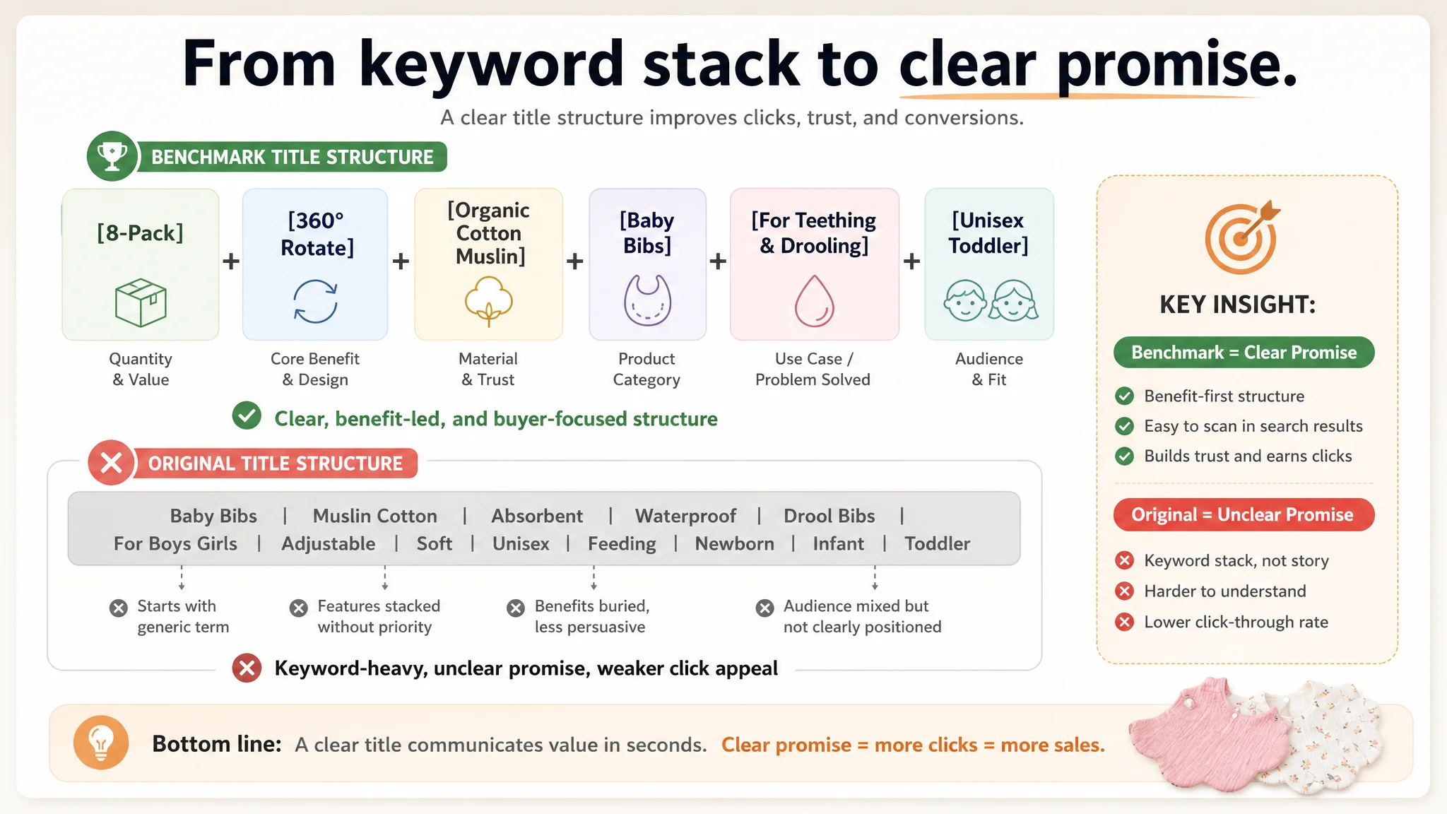
The benchmark title followed a mature Amazon pattern:
- Starts with pack size + core structural benefit (e.g., “8-Pack 360° Rotate”)
- Brings material and use-case (“Organic Cotton”, “Teething and Drooling”) up front
- Clearly signals fit and adjustability (“Adjustable with Snaps”)
- Explicitly covers audience and gender (“Baby Boys and Girls”, “Toddler”, “Unisex”)
The target Listing’s title, in contrast:
- Led with a generic category term, not pack size or a sharp benefit
- Buried or generalized key attributes
- Relied more on keyword stacking than on a clear buying promise
This is critical, because on an Amazon search results page:
- A buyer quickly scans:
- Quantity (Pack value)
- Core function (What problem it solves)
- Material (Trust and comfort)
- Fit / adjustability (Will it actually work for my baby?)
- If those are not explicit in the title, the Listing immediately loses click priority—even if reviews are superior.
The scoring made one thing clear: this Listing was starting at a disadvantage the moment it appeared in search results, before ads even had a chance to “perform”.
This Product Page Did Not Lack Traffic. It Lacked a Clear Promise.
When DeepBI reviewed the visual and A+ structure, the pattern repeated: the page had “enough images,” but the order, emphasis, and emotional logic were misaligned with how parents actually decide.
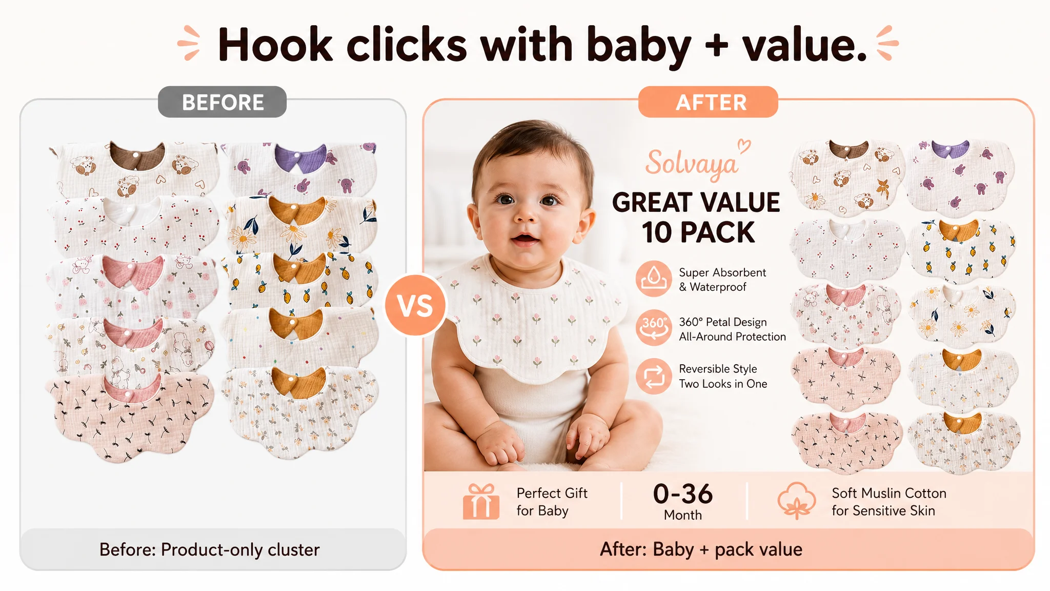
Main Image Set: Information Without a Strong Hook
The main image dimension was not a disaster—but it lagged where it mattered:
- The primary image showed a static product cluster, no baby, no emotional hook.
- The competitor’s first images, by contrast, used:
- A smiling baby wearing the bib
- Clear 360° coverage visuals
- High-emotion, high-trust imagery that parents instinctively respond to
This difference is subtle but brutal in practice:
- At thumbnail scale, a real baby + visible protection acts as a visual shortcut:
- “This is already working for someone like my child.”
- A product-only cluster with no emotion reads as:
- “Yet another bib set; I’ll see if there’s a better one.”
Furthermore:
- The target Listing’s functional proof image (structure layers) appeared too late in the sequence.
- The text inside that image used inconsistent material wording:
- The bullet points spoke of “muslin cotton” and a “TPU inner layer”
- The structure image said “polyester fiber + waterproof membrane”
- That inconsistency injects doubt:
- “Is this really muslin + TPU? What exactly am I getting?”
“Advertising does not only amplify advantages. It can also amplify a page’s existing defects.”
In this case, every extra paid click was sent into a page that:
- Didn’t clearly show why it’s safer or more effective
- Didn’t immediately prove absorbent + waterproof logic
- Didn’t make the reversible, 360° petal design unmistakable
The Detail Page Lacked a Persuasion Path, Not Modules
The A+ content was not empty. The seller had already invested in:
- Material explanations
- Structural diagrams
- Multiple baby-wearing scenes
- A “perfect gift” angle
But the behavioral sequence was incomplete.
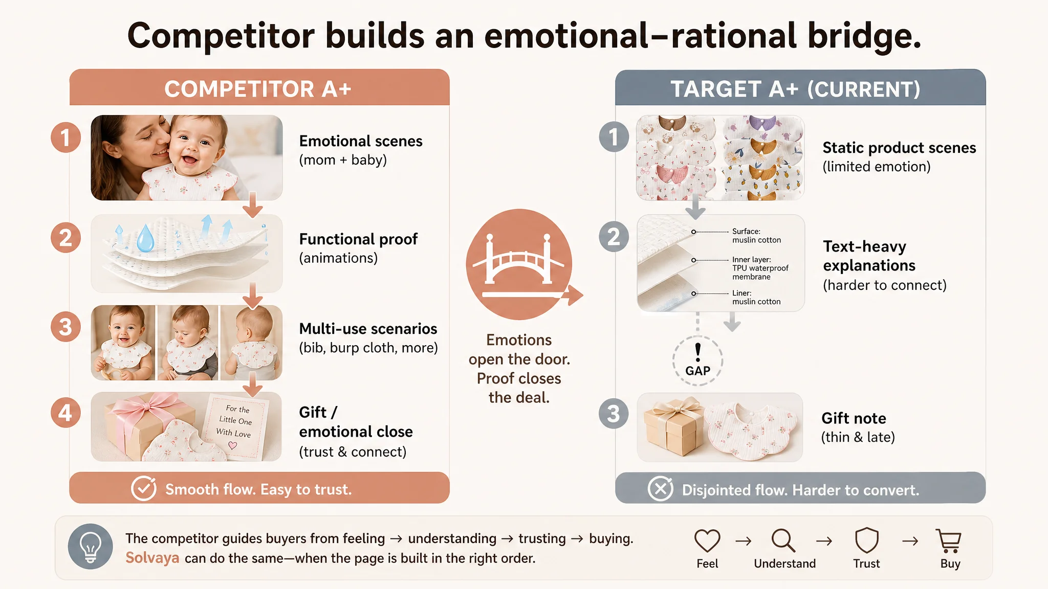
The Competitor Built an Emotional-to-Rational Bridge
The benchmark detail page followed a clear pattern:
1. Warm emotional entry
- Mother kissing the baby
- Parent-child interaction scenes (drawing, playing)
- Immediate emotional trust: “These parents are like me.”
1. Visible functional proof
- Absorption motion graphics
- Breathability arrows
- 360° rotation shown visually, not just stated
1. Multi-use scenarios
- Bib, burp cloth, washcloth—all shown, not just listed
1. Emotional closure
- Poetic parent messages
- Clear gift framing
The target Listing, by comparison:
- Used mostly static, lower-emotion scenes
- Relied more heavily on textual explanations for:
- TPU waterproof layer
- Absorbent exterior
- Comfort and fit
- Underused its unique reversible double-sided design as a visual differentiator
So even with stronger reviews, the page made parents work harder to imagine:
- Will this really keep my baby’s clothes dry?
- Will it feel comfortable enough?
- Does it justify the price vs another bib?
DeepBI’s judgment: the page did not need more text. It needed a better-ordered, more coherent decision path.
Why DeepBI Did Not Keep Tuning the Ads First
At this point, the seller expected ad-level recommendations: new keyword sets, negative keyword tuning, bid strategies, etc.
Instead, DeepBI prioritized the Listing itself.
The reasoning was straightforward:
1. Title and main-image gaps were directly suppressing CTR.
Any ad optimization would be fighting uphill against weaker search-page appeal.
1. Inconsistent material messaging risked trust.
Parents in baby categories are extremely sensitive to:
- Fabric content
- Safety layers
- Comfort claims
If the structure image and bullets don’t align, skepticism rises and CVR drops.
1. The reversible design, a real differentiator, was under-leveraged.
Ads cannot fix a page that hides its own strongest advantage.
1. Review volume was already strong.
The usual “we need more reviews first” excuse did not apply. The constraint was clearly how the page used that trust, not the lack of it.
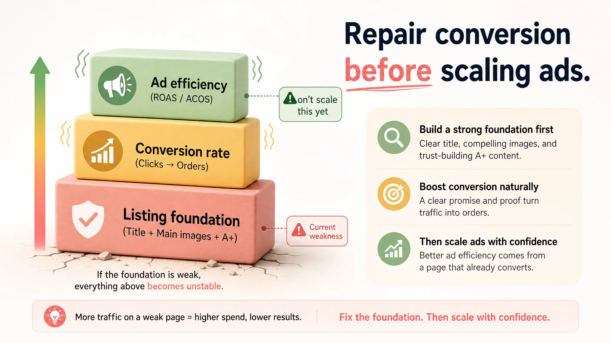
In short:
- Pushing more ad spend into a leaky page would increase ACOS volatility, not solve growth.
- The lowest-risk move was to repair conversion first, then decide how much traffic the page deserved.
How the Optimization Focus Shifted: From Campaign Controls to Page Logic
DeepBI reframed the work in three layers:
1. Title and search-entry promise
2. Main image sequence and visual trust
3. Detail/A+ persuasion path
1. Rebuilding the Title Around Pack Value and Core Outcome
The recommended title structure moved closer to the benchmark logic, while preserving the product’s actual attributes:
8-Pack Muslin Baby Bibs for Drooling and Teething, Organic Cotton Muslin Drool Bibs for Boys Girls, Super Soft & Absorbent Newborn Bibs with Adjustable Snaps, Unisex Bibs for Infants Toddlers
Key shifts:
- Pack size first (“8-Pack”)
Immediate value perception in a category where quantity is a key decision factor.
- Problem and use-case early (“Drooling and Teething”)
Aligns directly with why parents search for bibs in the first place.
- Material and feel (“Organic Cotton Muslin”, “Super Soft & Absorbent”)
Positions the product in the high-trust segment, especially important in baby categories.
- Fit and lifespan (“Adjustable Snaps”, “Infants Toddlers”, “Unisex”)
Signals longer usable life and broader usage, increasing perceived value per pack.
This was not about keyword stuffing; it was about building a search-front promise that matched parents’ mental checklist.
2. Reordering the Main Images to Serve a Clear Narrative
DeepBI did not ask the seller to start from scratch. Instead, it re-ordered and reframed existing assets:
- Image 1: From static cluster to “model + pack”
- Switch from a plain product group to:
- Baby model wearing the bib
- Visible variety of patterns
- Anchor emotional connection and show real fit.
- Image 2: Model + clear functional label
- Keep the model and age range (0–36 months)
- Overlay strong, concise function tags:
- “Absorbent & Waterproof”
- “Locks in drool”
- “360° petal design”
- Put the core promise where the eye goes first.
- Image 3: Structure proof brought forward
- Move the layer-structure image earlier in the sequence.
- Align its wording with bullet points:
- “Muslin cotton exterior”
- “TPU inner layer”
- “Leakproof barrier”
- Turn it into a visual answer to the question:
- “Why does this keep clothes dry?”
- Image 4: Replace low-value size chart with high-usage scene
- Size is rarely the deal-breaker in bibs; it doesn’t deserve an early slot.
- Instead, use a scene:
- Baby playing or eating
- Bib clearly in place
- Soft & safe / machine-washable cues
- Address concerns about restriction, comfort, and maintenance.
- Image 5: Reversible design as a clear, final hook
- Show both sides of the same bib:
- Printed cartoon front
- Complementary solid back
- Call out:
- “Two looks in one”
- “Easy to match daily outfits”
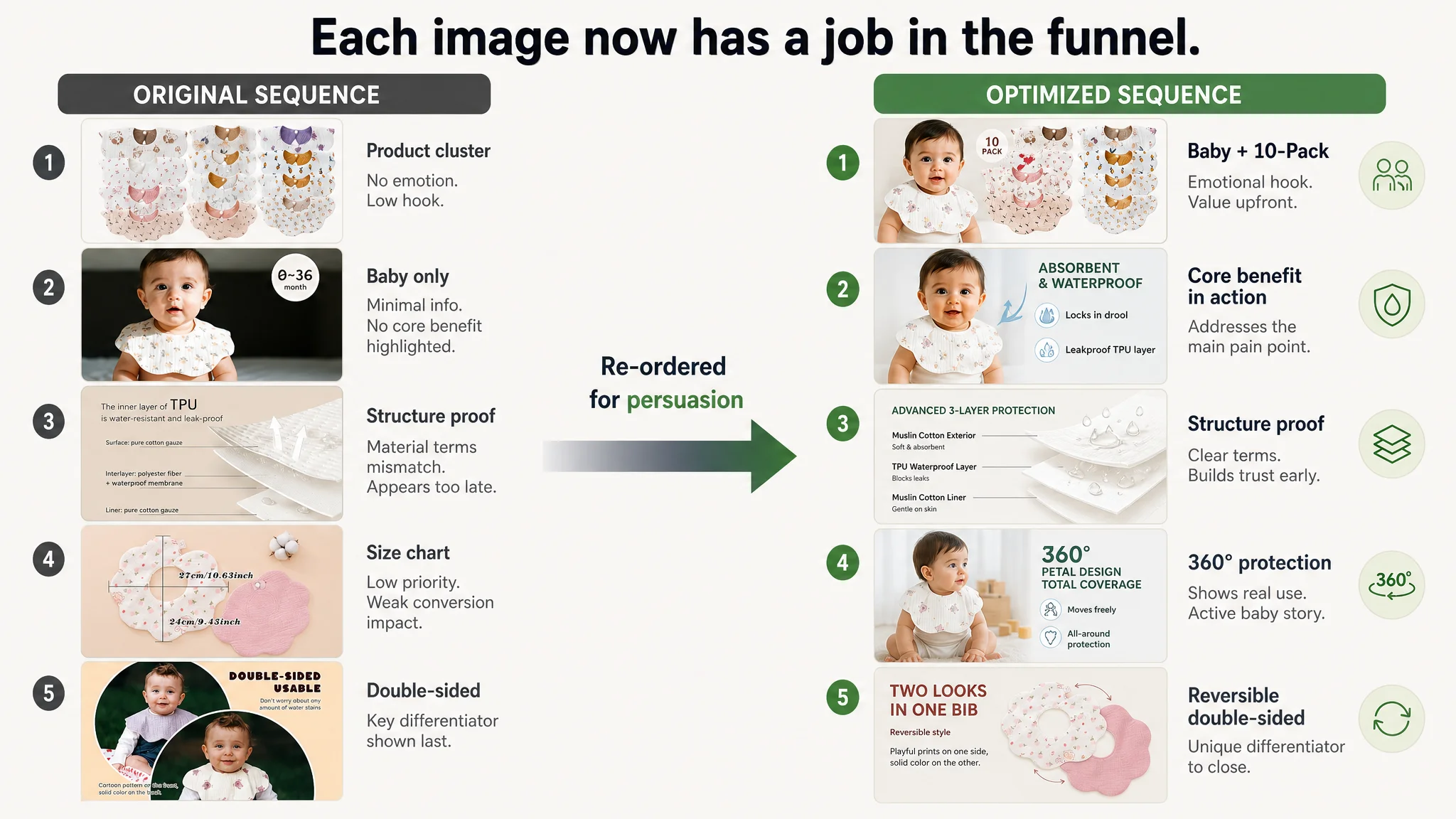
The central shift: every image now had a defined job in the persuasion chain, rather than just “showing more angles”.
The Bullet Points Already Had Logic—They Needed Alignment With Visuals
Unlike many Listings, this one already had relatively strong bullet logic. DeepBI’s role was to sharpen and align them with the new visual story:
1. SUPER ABSORBENT & WATERPROOF PROTECTION
- Emphasizes dual-layer logic: muslin exterior + TPU inner layer
- Positions the bib as different from standard cotton-only bibs.
1. 360° PETAL DESIGN & REVERSIBLE STYLE
- Connects the 360° coverage with the visual petal shape.
- Clarifies the reversible, two-style-in-one benefit.
1. MULTIFUNCTIONAL TEETHING ESSENTIAL
- Expands scenarios: burp cloth, washcloth, wipe cloth.
- Increases perceived value beyond a single function.
1. ADJUSTABLE SNAPS & COMFORTABLE FIT
- Addresses age span (0–36 months).
- Reduces concerns about tightness or irritation.
1. IDEAL 10-PACK GIFT SET WITH SAFETY FIRST
- Highlights pack advantage (10 vs competitor’s 8).
- Retains safety warnings, reinforcing brand responsibility.
The key was not to rewrite everything, but to ensure that the bullets, title, and images all told the same story:
- Same material terms
- Same structure logic
- Same benefit sequence
This eliminated micro-contradictions that quietly erode trust.
Rebuilding the A+ Detail Page as a Step-by-Step Decision Path
DeepBI then recommended a modular A+ rebuild, not by adding more content, but by structuring it around how parents actually read:
Module 1: Warm Mother–Baby Scene
- High-quality image of a parent holding the baby wearing the bib.
- Focus on:
- Soft drape and fit
- Cute pattern visible
- Calm, positive emotion
- Purpose: bridge from product to real life and close the “is this real?” gap.
Module 2: Active Daily-Use Scene
- Baby sitting, playing, or eating while wearing the bib.
- Visual message:
- Full coverage without restricting movement.
- Purpose: address unspoken concerns:
- “Will this get in the way?”
- “Is it too bulky or stiff?”
Module 3: 360° Shape and Sizing Logic
- Left: flat lay showing the 360° petal shape with arrows.
- Right: clear inner/outer diameter measurements.
- Purpose: give a rational anchor:
- “It really does cover all sides.”
- “It will fit my baby’s neck safely.”
Module 4: Structural Proof of Absorbent + Waterproof Logic
- Exploded view showing:
- Muslin cotton outer layers
- TPU waterproof inner layer
- Arrow-based explanation:
- Liquid absorbed by outer layer
- Locked by TPU layer
- Clothes stay dry underneath
- Purpose: translate an abstract claim into visible physics.
Module 5: Reversible Design as Differentiation
- Side-by-side or fold-over display of front vs back.
- Highlight:
- One bib, two styles
- Easy outfit coordination
- Purpose: make the product feel both practical and stylish.
Module 6: Teething-Specific Moment
- Baby with teething toy or during heavy drooling.
- Bib tightly yet comfortably fitting around the neck.
- Purpose: explicitly validate the product in the worst-case scenario:
- “This is built for your teething stage, not just occasional spills.”
Module 7: Gift-Value Closure
- Visual recap of the full 10-pack set.
- Gift context: baby shower, registry, new-parent gift.
- Short, clear benefit summary:
- Soft, practical, stylish
- Easy to pack and travel with
- Purpose: final confirmation that this set is both high-value and safe.
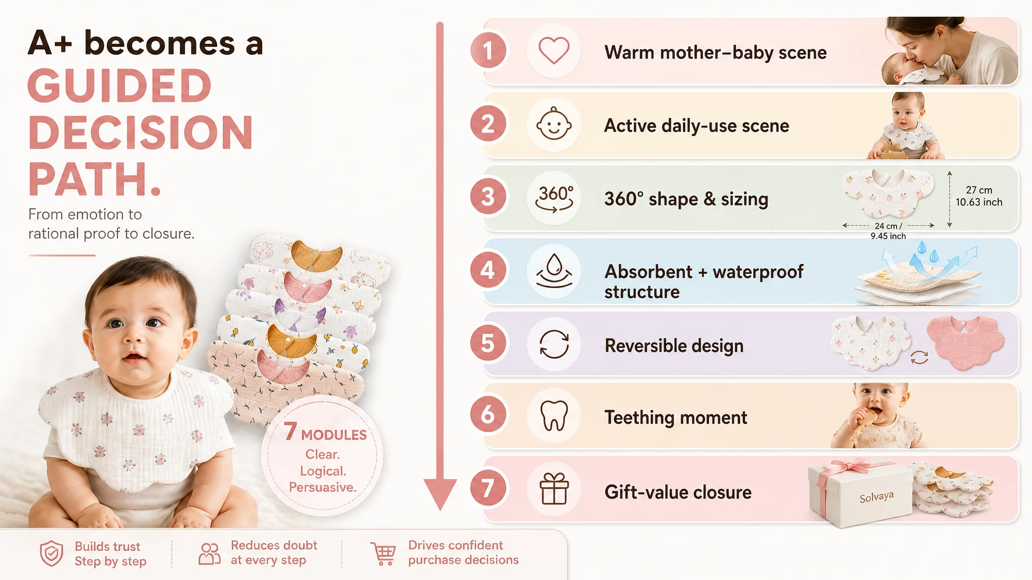
With this structure, any additional ad traffic no longer lands on a generic gallery; it lands on a deliberate decision engine.
How Ad Traffic Became Useful Again
The seller’s most important shift was not just in images or text. It was in understanding what ads can and cannot fix.
After aligning the title, main images, bullets, and A+ content:
- The Listing began to:
- Communicate value earlier (title and main images)
- Build trust more efficiently (consistent material messaging)
- Use its true differentiators (TPU waterproof layer, reversible petal design, 10-pack value) as the center of the story
This changed the operating state:
- CTR had a real chance to recover
The page now competed on visible promises, not just reviews.
- CVR could stabilize
Parents who clicked saw a coherent, trust-building narrative instead of scattered proof.
- Advertising dependence became more rational
The seller could judge:
- “Is this page ready for more traffic?”
- “If we raise bids, will we be feeding a working machine or a leaky funnel?”
Even without inventing hard numbers, the direction of risk changed:
- Ads stopped being a way to compensate for page weaknesses.
- Ads became a way to amplify a Listing that now deserved more exposure.
What Other Amazon Sellers Can Take From This Case
This case is not unique to baby bibs or the US marketplace. The pattern appears across categories:
- A Listing has strong reviews
- A competitor with fewer reviews begins to outpace it
- The team blames
- Ads
- Budget
- Competition intensity
- Meanwhile, the actual bottleneck is:
- Title clarity
- Main-image hook
- A+ trust structure
From DeepBI’s perspective, the key lessons are:
1. Ads cannot fix a misaligned promise.
If your Amazon product page doesn’t articulate quantity, material, core benefit, and audience in the title and main view, you are paying to lose comparisons on the search page.
1. Review strength is not a conversion guarantee.
If a competitor tells a clearer story, buyers will forgive their lower review volume—especially if your page makes them work for understanding.
1. Listing conversion is the foundation of advertising efficiency.
Before scaling campaigns, ask:
- Does my title win the glance?
- Does my main image prove anything beyond existence?
- Does my A+ content reduce doubt or add noise?
1. Consistency matters more than volume.
Every time your bullets, images, and A+ use different language for the same feature, trust erodes. Aligning material and structure language is not “cosmetic”—it is conversion-critical.
DeepBI’s value in this case was not in supplying more features or more content. It was in reframing the problem:
- From “our ads are inefficient”
- To “our Amazon Listing cannot fully convert the traffic we already have”
Only after that judgment changed did the optimization path make commercial sense—and only then did Amazon ads become a true growth lever, rather than an expensive bandage.