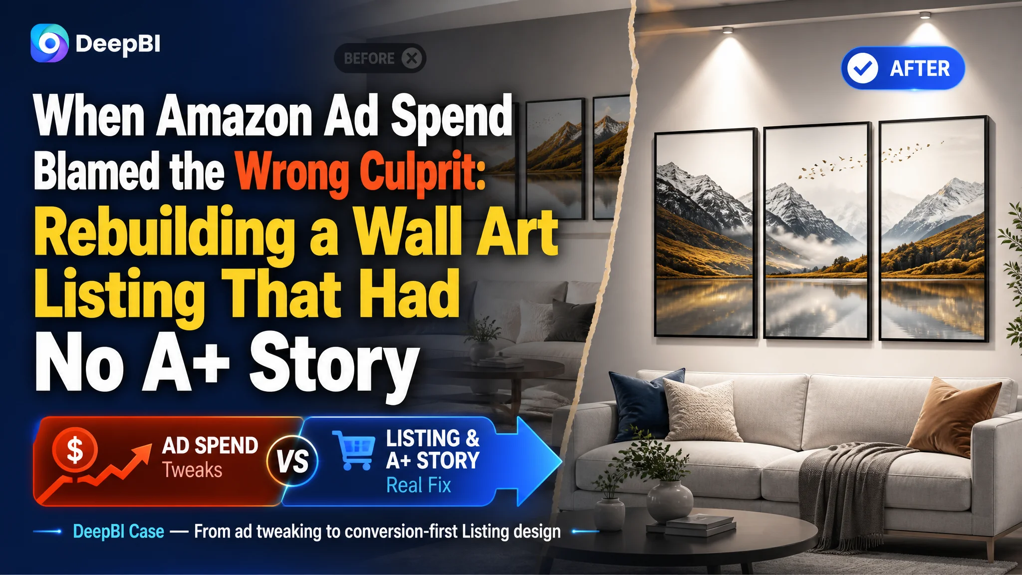
An Amazon wall art seller in the US marketplace came to DeepBI because ads were getting harder to control: spend was rising, but orders were not keeping up. On the surface, this looked like a familiar “ads problem” — maybe bids were too high, keywords not precise enough, or campaigns structured poorly. The team’s instinct was to keep tuning advertising while hoping historical experience would eventually pull ACOS back down.
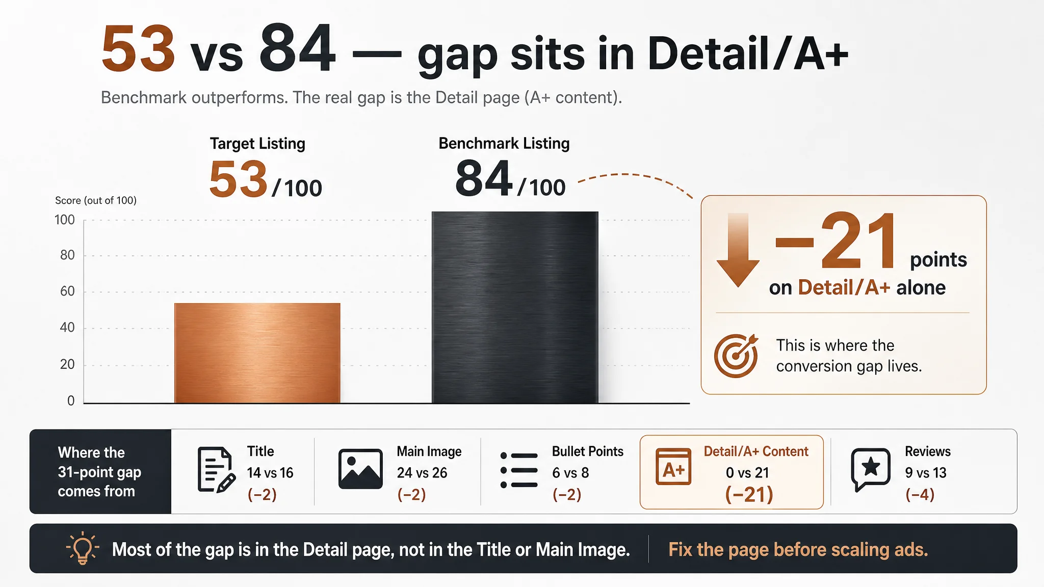
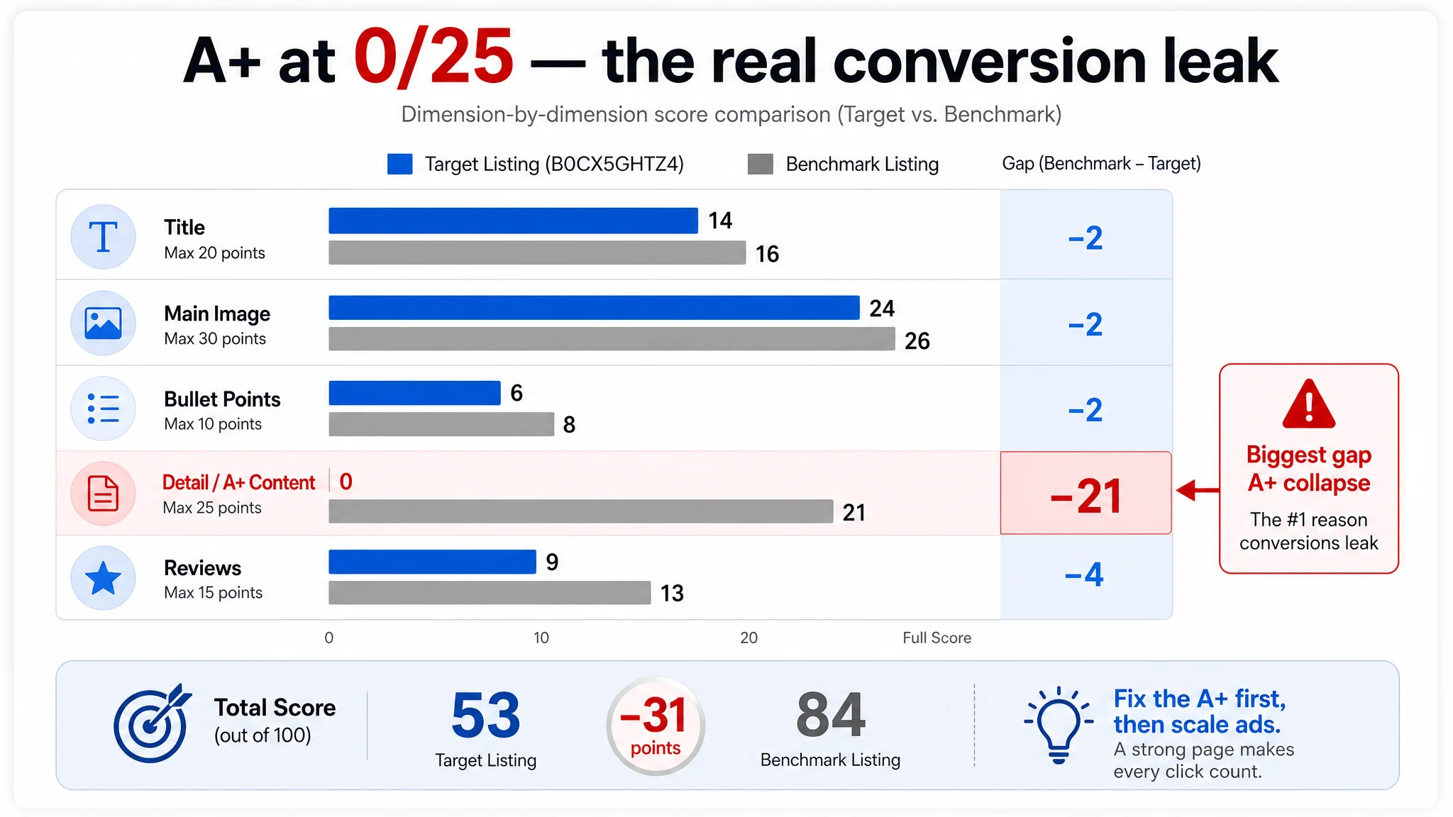
Once DeepBI ran a full Listing diagnosis, a different picture appeared. Against a directly comparable framed wall art benchmark, the target Amazon Listing scored 53/100 versus 84/100 — and almost the entire gap sat in the product page itself. The title and main image were only slightly weaker; the real collapse was a zero score on the detail/A+ dimension, while the benchmark’s A+ content scored 21/25 and carried the conversion load.
The later optimization did not start with ads. It focused on rebuilding Amazon Listing conversion capacity: refocusing the title on real search terms, upgrading main images from “home snapshots” to gallery-level visuals, structuring bullet points around buying logic, and—most critically—building a full A+ story to answer doubts about style fit, materials, durability, and size. For other Amazon sellers, the case is a reminder: when ACOS feels “stuck”, the leak may be inside the product page, not inside the ad account.
The Numbers That Broke the “This Is Just an Ads Issue” Assumption
DeepBI’s Listing scoring put a hard structure around something the seller had only felt vaguely.
- Target Listing overall: 53 / 100
- Benchmark Listing overall: 84 / 100
- Gap: –31 points
By dimension:
- Title: 14 vs 16 (–2)
- Main image set: 24 vs 26 (–2)
- Bullet points: 6 vs 8 (–2)
- Detail/A+ content: 0 vs 21 (–21)
- Reviews: 9 vs 13 (–4)
On paper, this Listing did not lack a title or main image completely; they were just slightly behind. But a zero-score detail page facing a 21-point benchmark meant the product page had almost no mid-to-lower funnel conversion engine.
“The real problem was not that ads failed to bring traffic. It was that the page could not convert the traffic.”
From a business perspective, this changes the question. The seller had been asking, “How do we make these ads cheaper?” The data forced a different one: “Does this Listing deserve the traffic we’re paying for?”
What the Seller Originally Misread
The seller’s initial diagnosis can be summarized in three beliefs:
1. “This is mainly a bidding and keyword problem.”
Rising ACOS was read as a direct sign that ad knobs (bids, negative keywords, match types) needed more micro-tuning.
1. “Our images and copy are ‘good enough’ for now.”
There was no A+ content at all, but the team treated that as a “later upgrade”, not a current bottleneck.
1. “Reviews will carry trust once volume grows.”
With a 4.4-star rating and 28 reviews, they felt they simply needed more review volume; page structure was not seen as the primary trust lever.
The issue: traditional Amazon ad playbooks assume a minimally competent Listing. When the page is missing an entire decision layer (A+), ad optimization inputs a broken funnel and expects it to behave like a working one.
Amazon Ads Were Not Failing. The Page Was Consuming the Traffic.
DeepBI’s diagnosis highlighted one core constraint: Listing conversion capacity.
- Reviews:
- Target: 4.4 stars, 28 reviews, with 25% negative rate on the first page (2 of 8)
- Benchmark: 4.6 stars, 158 reviews, 0% negative on the first page
Reviews were not catastrophic, but they were not strong enough to offset structural weaknesses elsewhere.
The structural gap sat in three places:
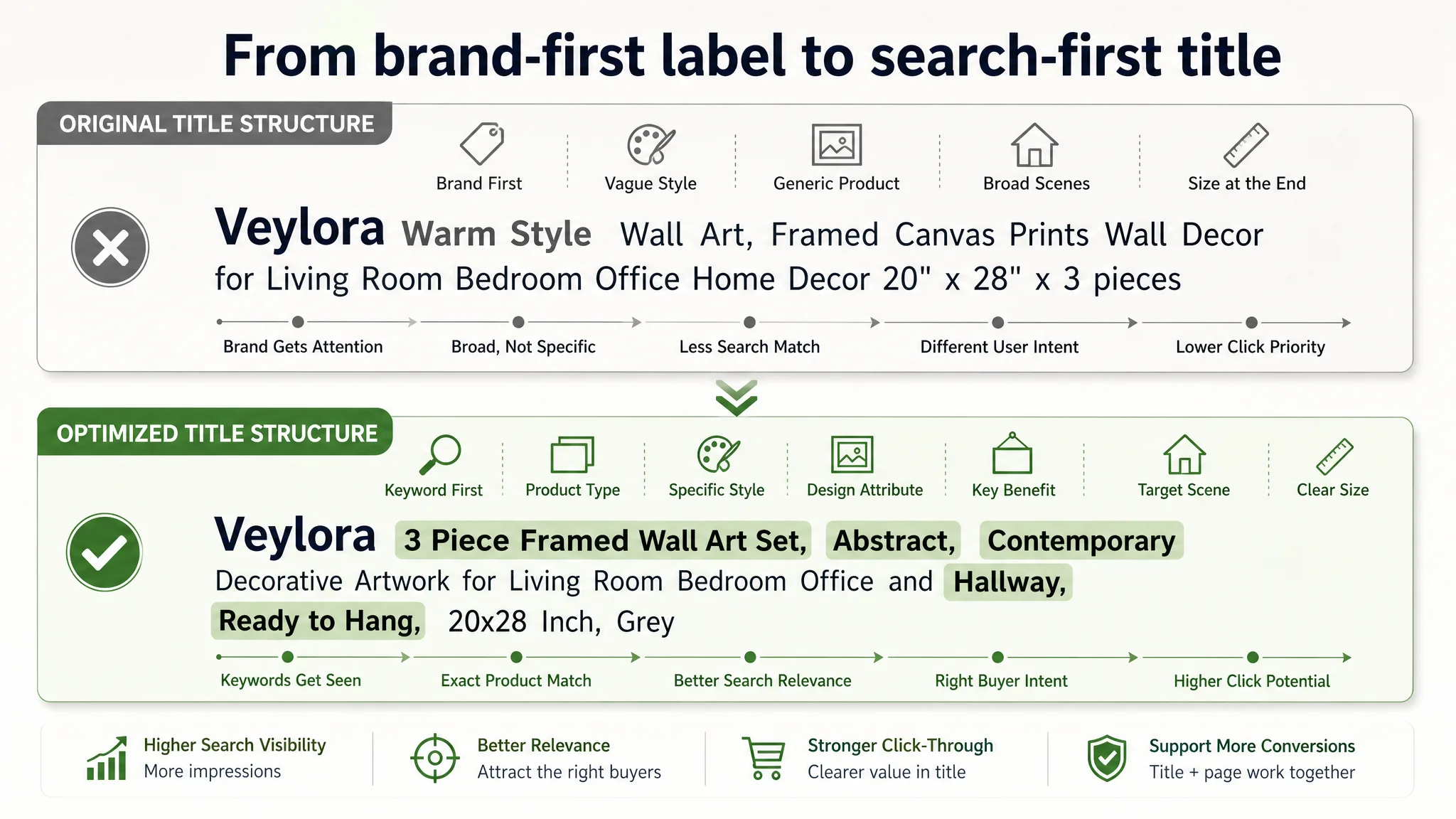
1. Title: Misaligned with How Buyers Search
The benchmark title leads with what Amazon shoppers actually type:
“Large Framed Modern Abstract Wall Art 3 Piece Set, Black and White Decorative Artwork, Minimalist Trendy Line Geometric … 20x30 Inch”
In contrast, the target title leads with the brand and a vague style cue:
- Brand name in front of core keywords
- “Warm Style” as a broad, non-specific descriptor
- Size expressed as 20" x 28" x 3 pieces without highlighting “large” as a visual promise
- Scene keywords broad but unfocused: “Living Room Bedroom Office Home Decor” without sharper niche hooks like “Hallway”
Business impact: In early-stage growth, leading with a lesser-known brand name sacrifices search friendliness. The Listing forces Amazon and buyers to “work” to see that this is “framed wall art”, “abstract”, “large”, “3-piece set”. In a crowded wall art category, that costs impressions and clicks.
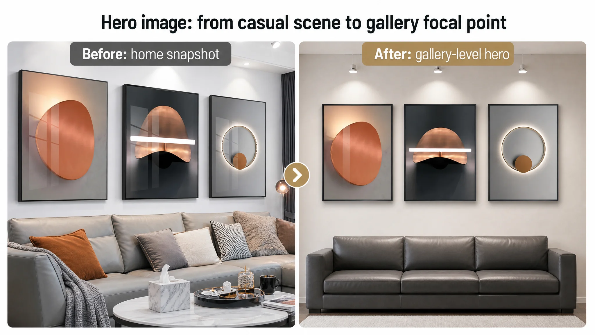
2. Main Image Set: Home Snapshot vs Gallery-Level Decision Aid
The target’s images contained:
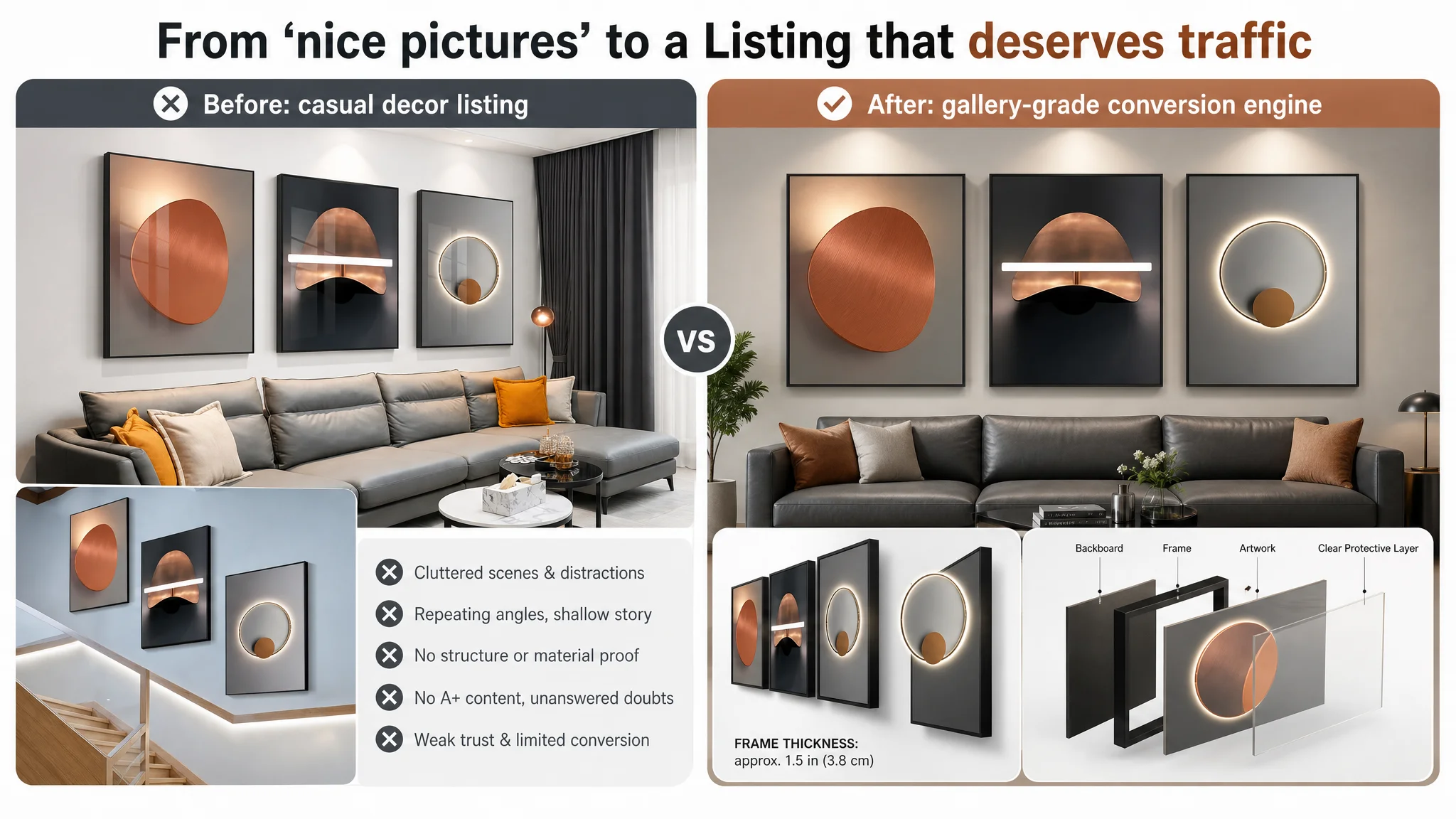
- Cluttered scenes (tissue boxes, random table decor) that diluted perceived premium feel
- Repeated scenes, which reduce depth of browsing and session time
- Weak structural depiction: no high-fidelity framework or layered construction visuals
- Vague technical cues (e.g., “HD Light Mask”) that don’t translate into perceived material value
The benchmark, by contrast, uses:
- Minimalist, high-end room scenes with clean lines and spotlighting
- 45° side-view compositions to show frame depth and industrial design
- Exploded-view diagrams illustrating backboard, frame, artwork, and clear protective layer
- Macro shots of surface finish and water beads to demonstrate durability and “crystal” finish
“Advertising does not only amplify advantages. It can also amplify a page’s existing defects.”
Here, ad spend was amplifying the lack of a visual reason to click and stay. Even buyers who clicked through saw repeated, shallow visuals that never advanced their decision from “this looks nice” to “this is built well, will last, and fits my space.”
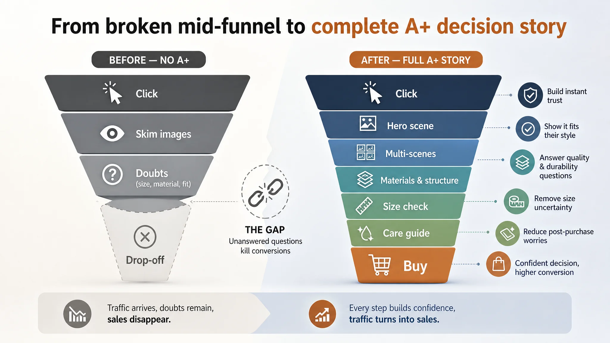
3. Detail/A+ Content: A Complete Black Hole
This was the decisive gap: the target Listing had no A+ content at all.
The benchmark’s A+ strategy:
- Brand-first hero image: “Elevate Your Space With Premium Art” in a high-end living room
- Multi-scene panels: living room, hallway, office—each showing compatibility with different interior styles
- Material and structure focus: crystal porcelain / Plexi glass, water-resistance, layered construction
- Icons for core benefits: waterproof, easy to clean, ready to hang, durable frame
- Size reference with furniture diagrams
- Care guide and usage tips
The target Listing:
- No visual entry point beyond standard images
- No structured journey from style > material > structure > size > maintenance
- No professional visual language (no exploded diagrams, no water-drop macro shots, no frame detail photography)
Result: When ad-driven traffic reached the detail section, the funnel ended. Buyers with reasonable questions—Will this fit above my sofa? How thick is the frame? Is the surface easy to clean? Will it warp?—found nothing. The path from click to confidence was broken.
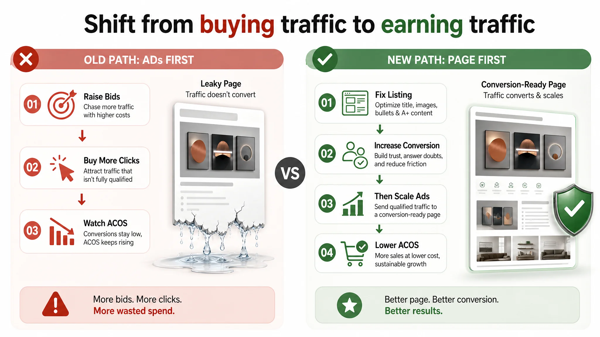
Why DeepBI Refused to “Fix Ads” First
From DeepBI’s perspective, continuing to tune ads first would have created three risks:
1. Wasting paid traffic on an incomplete conversion path
With a 0/25 score on detail/A+ content, every additional click had a high probability of dying from unanswered doubts. Each incremental dollar would produce diminishing returns.
1. Masking the real issue behind noisy ad metrics
Any small improvement from ad tweaks (e.g., slightly better keywords) would blur the perception of the real structural problem: “This Listing cannot fully carry traffic.” The team might misattribute minor ACOS moves to ad craftsmanship rather than page-level changes.
1. Increased dependence on ads for basic visibility
Without a robust product page, organic conversion and ranking power remain weak. Over time, the Listing becomes structurally reliant on paid traffic to maintain baseline sales, making the business fragile to bid inflation.
DeepBI’s judgment: Listing conversion had to be repaired before any new push on ads.
Reframing the Problem: From “More Traffic” to “Deserving Traffic”
The core decision shift was:
- Old framing:
“We need more efficient traffic.”
- New framing:
“We need a page that deserves the traffic we already have.”
That meant:
- Treating A+ absence as a hard constraint, not a cosmetic omission
- Viewing main images as decision tools, not just decoration
- Making the title a search and positioning asset, not just a label
- Using bullet points to build buying logic, not just list features
This Product Page Did Not Lack Traffic. It Lacked Trust.
DeepBI’s Listing analysis made one thing clear: the product page never fully earned trust.
Title: From Brand-Led to Decision-Led
DeepBI recommended a title structure closer to buyer intent:
“3 Piece Framed Wall Art Set, Modern Bright Warm Style Abstract Prints, Contemporary Decorative Artwork for Living Room Bedroom Office and Hallway, Ready to Hang, 20x28 Inch, Grey”
Key changes:
- Core term “Framed Wall Art Set” and “3 Piece” pulled forward
- Specific style words like “Abstract” and “Contemporary” added
- Size summarized cleanly, with “Ready to Hang” as a functional promise
- Target scenes expanded to include “Hallway”, matching benchmark coverage
This does two things:
1. Gives Amazon’s algorithm clearer signals on where to index and show the Listing.
2. Gives buyers faster recognition in search results: they see what it is and why it matters without reading deeply.
Bullet Points: From Feature Lists to Buying Chains
DeepBI’s analysis of bullet structure showed:
- The target focused on:
- Design style explanation
- Printing technology parameters
- Materials and safety
- Scene lists
- Installation ease
- The benchmark focused on:
- Design aesthetics + promised effect (“gallery-like showcase”)
- Craft + durability commitments
- Scene fit + style compatibility
- Emotional and gifting value
- Support / satisfaction promise
The revised bullets restructure the page’s persuasion logic:
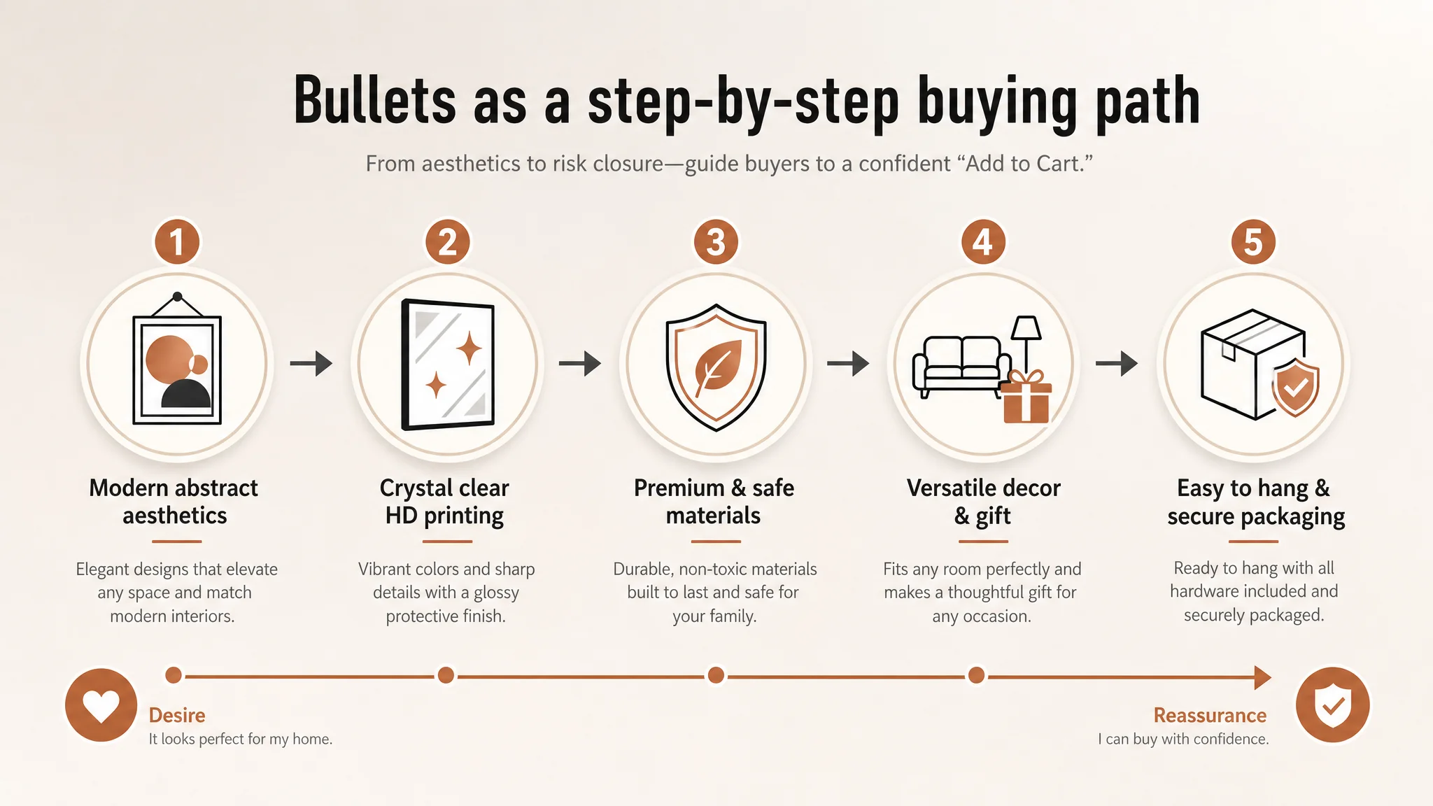
1. MODERN ABSTRACT AESTHETICS
Not just “modern style”, but a clearly described outcome: turning bare walls into a “gallery-like showcase” that fits contemporary and minimalist decor. This links visual style to room upgrade, not just to abstract design language.
1. CRYSTAL CLEAR HD PRINTING
Ties technology (HD printing, glossy protective layer, waterproof, fade-resistant) to long-term appearance—answering durability doubts and justifying price.
1. PREMIUM & SAFE MATERIALS
Leverages PVC frame’s real advantages (lightweight, non-toxic, odorless, child-safe) to reassure family buyers. Safety and easy maintenance are anchored as reasons to pick this Listing over others.
1. VERSATILE DECOR & THOUGHTFUL GIFT
Extends usage from “my wall” to “my friend’s new home,” tapping into gifting scenarios that the original Listing never explicitly targeted.
1. EASY TO HANG & SECURE PACKAGING
Combines installation convenience with packaging security and a soft satisfaction promise. This closes the risk loop: buyers see reduced risk of damaged goods and a smoother unboxing experience.
In short, bullet points stop being a technical spec sheet and become a decision pathway.
Main Images: From “Home Scene” to “Visual Proof of Value”
DeepBI’s main-image recommendations explicitly mirrored what benchmark buyers were responding to.
Elevating the Hero Scene
Instead of a cluttered living room shot, the new hero concept:
- Centers three frames evenly on a minimalist warm-grey wall
- Uses overhead spotlights to create soft halos around the artwork
- Places a long dark-grey leather sofa below, with background slightly blurred
This establishes:
- Clear visual focus on the artwork
- A more “gallery-like”, premium ambiance
- Immediate visual proof that these prints can be the centerpiece of a modern living room
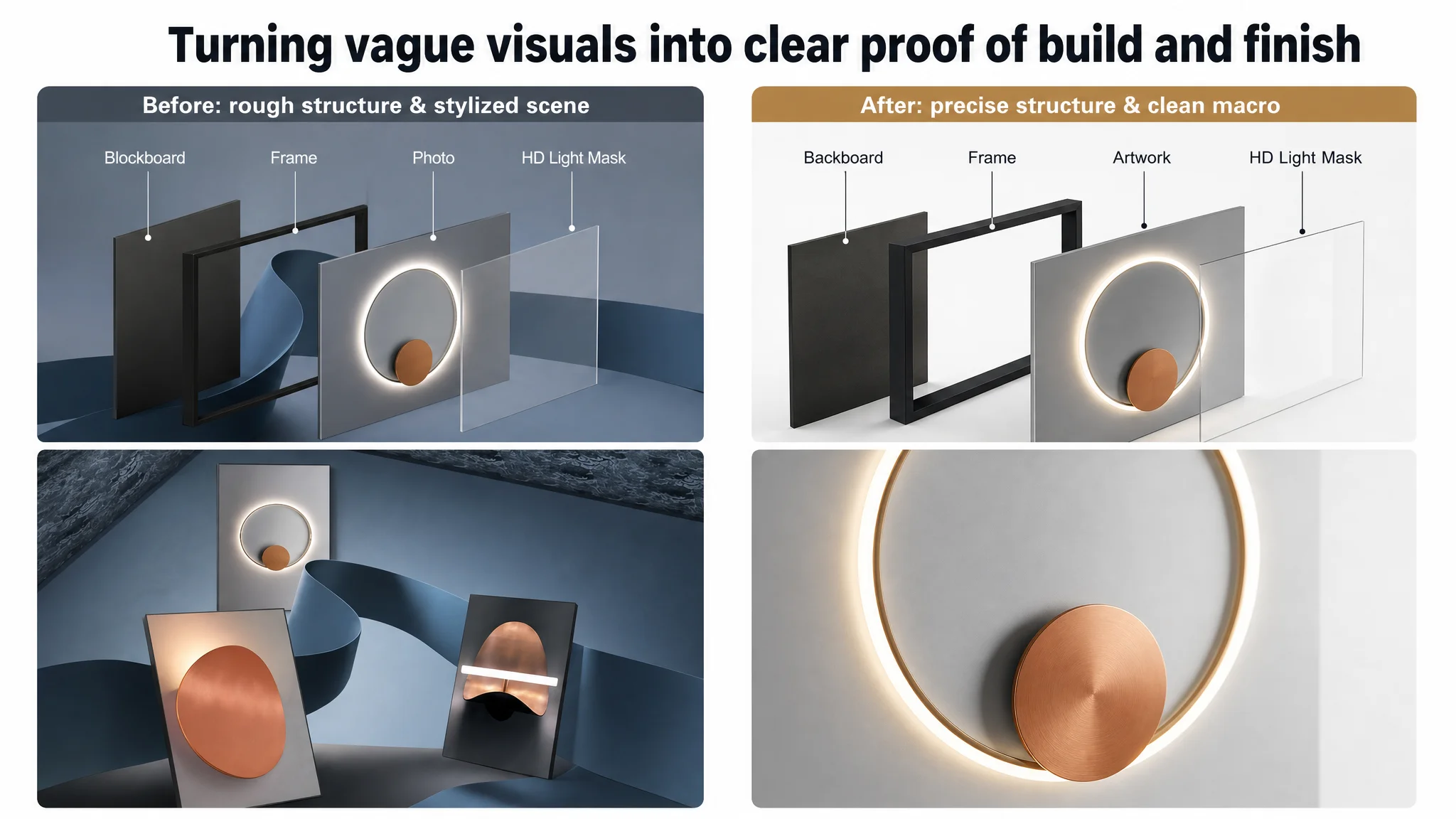
Showing Depth, Structure, and Craft
Additional images are designed to:
- Present frames at 45° angles to reveal depth and frame construction
- Use pure white backgrounds to emphasize geometry and cleanliness
- Include subtle annotations on frame thickness, aligning with buyers’ need for physical understanding without overwhelming them
Macro and Exploded Views
Critical mid-funnel visuals:
- Exploded view showing backboard, frame, print, and protective layer, each labeled
This is not an aesthetic flourish; it is structural reassurance.
- Macro shot of the artwork surface with soft light and smooth geometry
This highlights “crystal-like” clarity and line precision, connecting directly to the “HD printing, glossy protective layer” bullet point.
Together, these images show what words alone cannot: this is a well-built object, not just a poster in a frame.
A+ Content: Turning an Empty Zone into a Complete Decision Story
The largest single gap—0 vs 21 points—was the absence of A+.
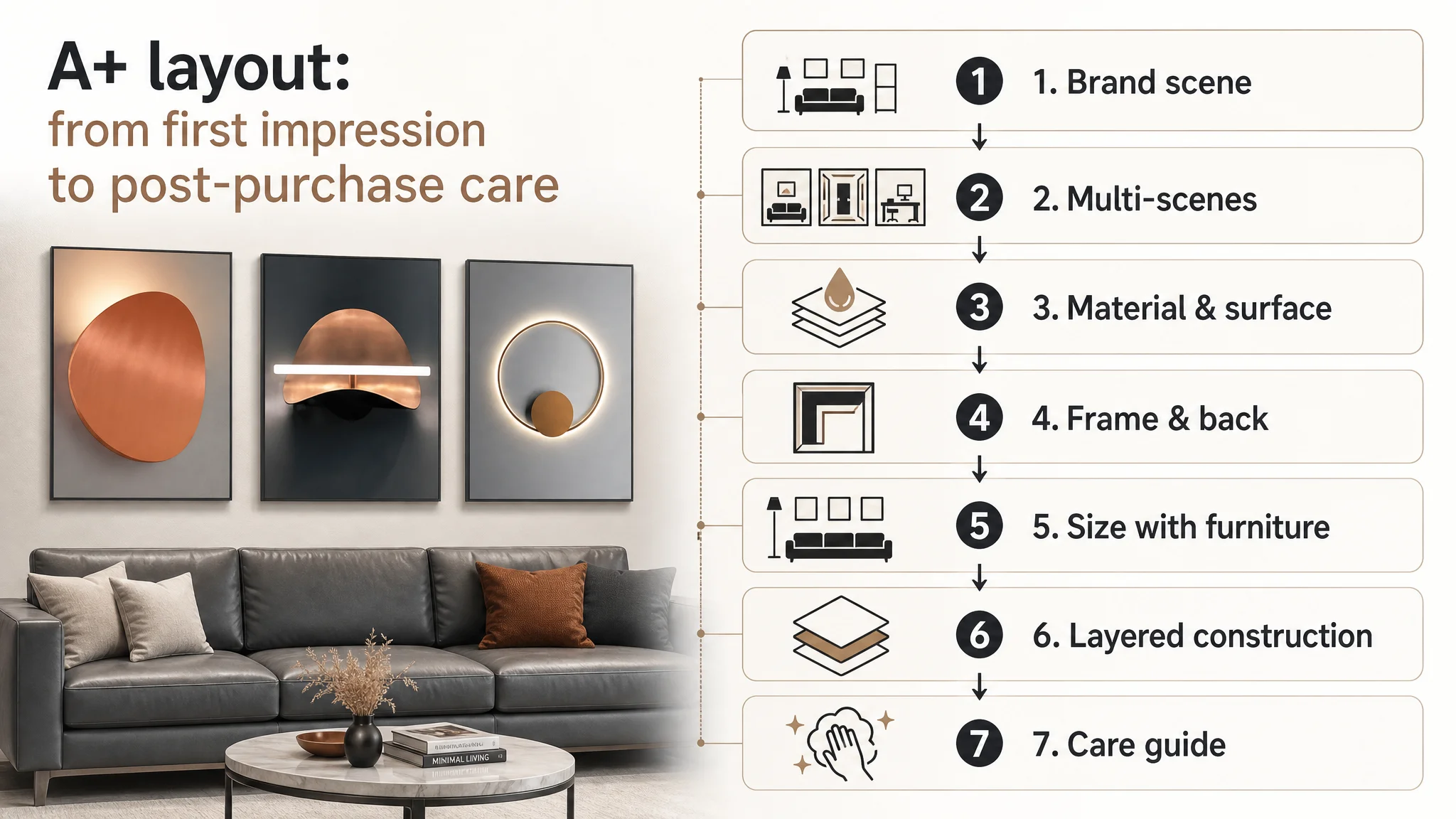
DeepBI’s redesigned A+ storyline follows a deliberate arc:
1. Brand Scene Introduction
Wide hero image: the artwork above a high-end modern sofa, natural side lighting, brand logo placed cleanly. Goal: set a premium and trustworthy first impression in the detail section.
1. Multi-Scene Compatibility
Three adjacent panels showing:
- Living room
- Workspace or studio
- Bedroom
All with consistent lighting and clean walls. Goal: answer the core buyer question: “Will this fit my room?”
1. Material and Surface Detail
Split image:
- Left: 45° side shot showing thickness and reflective halo
- Right: macro view with water droplets on the surface
Goal: visually prove waterproof, easy-clean, and premium finish.
1. Frame and Back Structure
A close-up of reinforced corners and screws on the back. Goal: support promises about durability and reduce fear of warping or weak frames.
1. Size Reference with Furniture
A front-on shot of a standard sofa with the three frames above, plus clear dimension lines (e.g., 20" height, overall width). Goal: reduce size misjudgment, a major driver of returns in wall art.
1. Layered Construction Diagram
Suspended, separated layers showing:
- Protective surface
- Artwork core
- Frame
- Backboard
Each labeled cleanly. Goal: provide a professional-level explanation of craft and justify perceived value.
1. Care and Maintenance Guide
Simple icons (dusting, cleaning solution) with short text. Goal: finish the story by showing long-term ease of ownership, which increases comfort with purchasing.
This sequence rebuilds the funnel from interest to conviction:
- Style fit
- Material credibility
- Structural reliability
- Size clarity
- Long-term maintainability
How Ad Traffic Became Useful Again
While the case material does not quote specific CVR or ACOS numbers, the operating logic changed in three ways:
1. Fewer Dead Clicks
Once the Listing carried a coherent story from title to A+, each click had more reasons to convert. Instead of bouncing at vague visuals or missing information, buyers encountered a guided decision journey.
1. Recovery of Organic Conversion Potential
With a stronger page, organic visitors—from browse, related items, or long-tail search—found enough trust to order without being “carried” by ads. This gradually reduces dependence on paid traffic for baseline sales.
1. More Meaningful Ad Optimization
After Listing repair, ad tuning (bids, keywords, placements) operates on a solid conversion foundation. ACOS moves become better aligned with page quality; scaling spend is less risky because the funnel no longer leaks at the mid-stage.
What Changed in the Seller’s Understanding
For this Amazon wall art seller, the biggest shift was not just visual; it was conceptual.
They moved from:
- Seeing ads as the main lever for fixing performance
to
- Recognizing Listing conversion quality as the precondition for any ad efficiency.
They also internalized that:
- A slightly weaker title and main image can be survivable.
- A zero on A+ / detail content in a visual, style-driven category is not.
And perhaps most importantly:
Before buying more traffic, they now ask: “Does this page fully answer why someone should choose us, and why they can trust us?”
What Other Amazon Sellers Can Take From This
This case is not about wall art only; it is about where you look when ACOS starts to slip.
Key takeaways for Amazon sellers:
- High ACOS is not always an ad problem.
When detail/A+ content is missing or weak, traffic will fail to convert, no matter how carefully you tune bids.
- Listing conversion capacity is measurable.
A 53 vs 84 score, with a –21 gap on detail page content, is not a matter of taste; it is a structural handicap.
- Title, main images, bullet points, and A+ must form one story.
Each module should hand off to the next:
- Title wins search and sets expectations.
- Main images create the click and initial trust.
- Bullets build a logical path of benefits and proof.
- A+ resolves doubts and locks the decision.
- Before scaling ads, judge whether the page deserves more traffic.
If your page lacks A+ in a high-consideration category, that is often the first bottleneck to resolve.
DeepBI’s role in this case was not to “add nicer images” or “rewrite copy” in isolation. It was to locate the real constraint—a page that could not carry the traffic it was buying—and to reorder the seller’s decisions so that Listing conversion, not ad tweaking, became the first step.