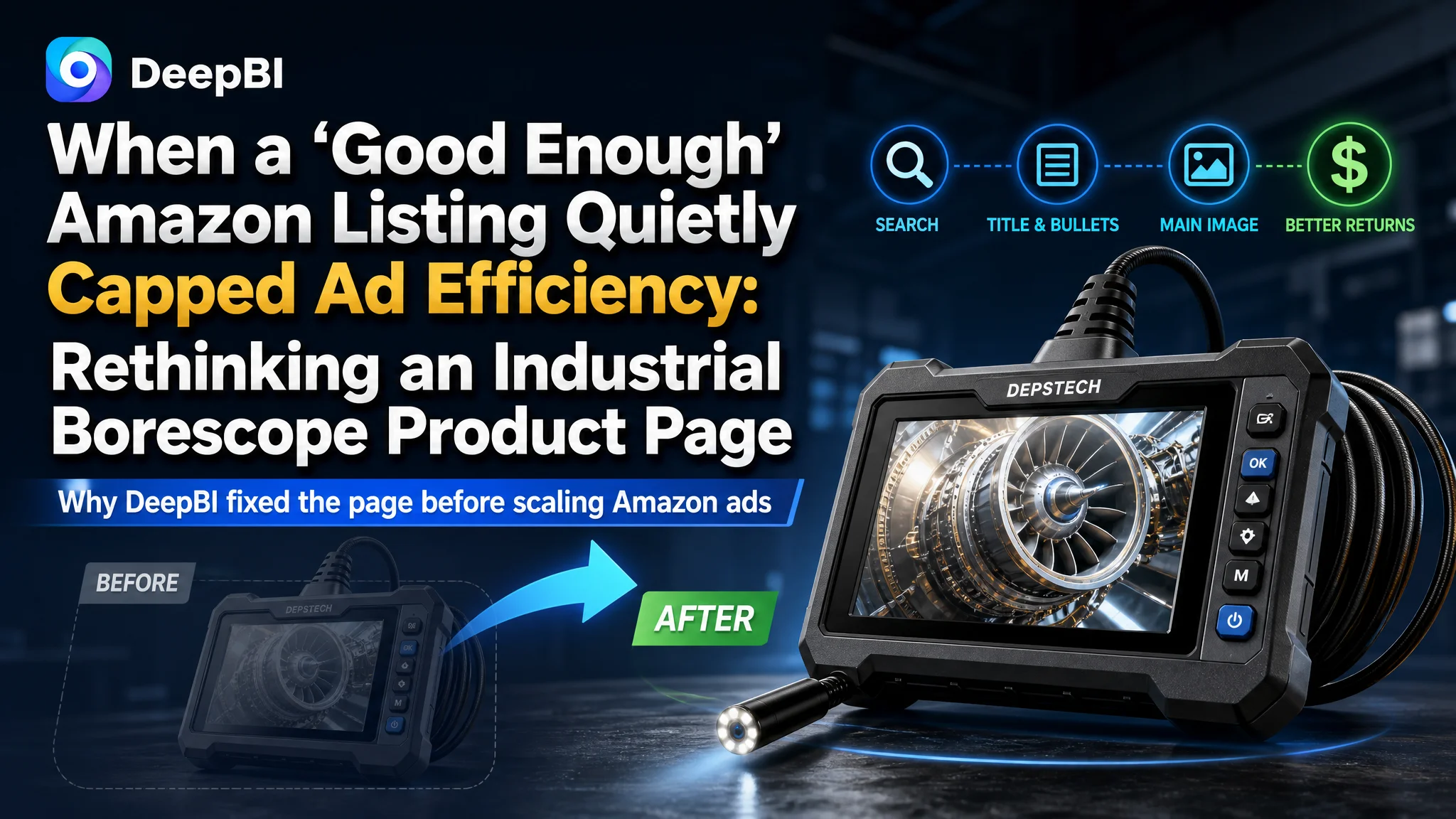
An Amazon seller in the industrial tools category came to DeepBI with a familiar pressure: ad spend was getting harder to control, yet their core borescope Listing already looked “pretty strong” on the surface. Ratings were high, reviews were plentiful, A+ content was well-built, and even DeepBI’s scoring showed only a 2‑point gap against a strong benchmark competitor. The team’s instinct was to keep pushing Amazon ads—more keyword tuning, more bid adjustments—because nothing on the page looked obviously broken.
DeepBI’s diagnosis told a different story. The real constraint was not traffic volume or ad structure, but how the Amazon product page translated that traffic into decisions. The Listing’s title, bullets and main-image logic were subtly misaligned with how industrial and automotive buyers search, scan, and decide. The competitor wasn’t winning by having more features; it was winning by framing those features in a way that reduced decision friction in seconds.
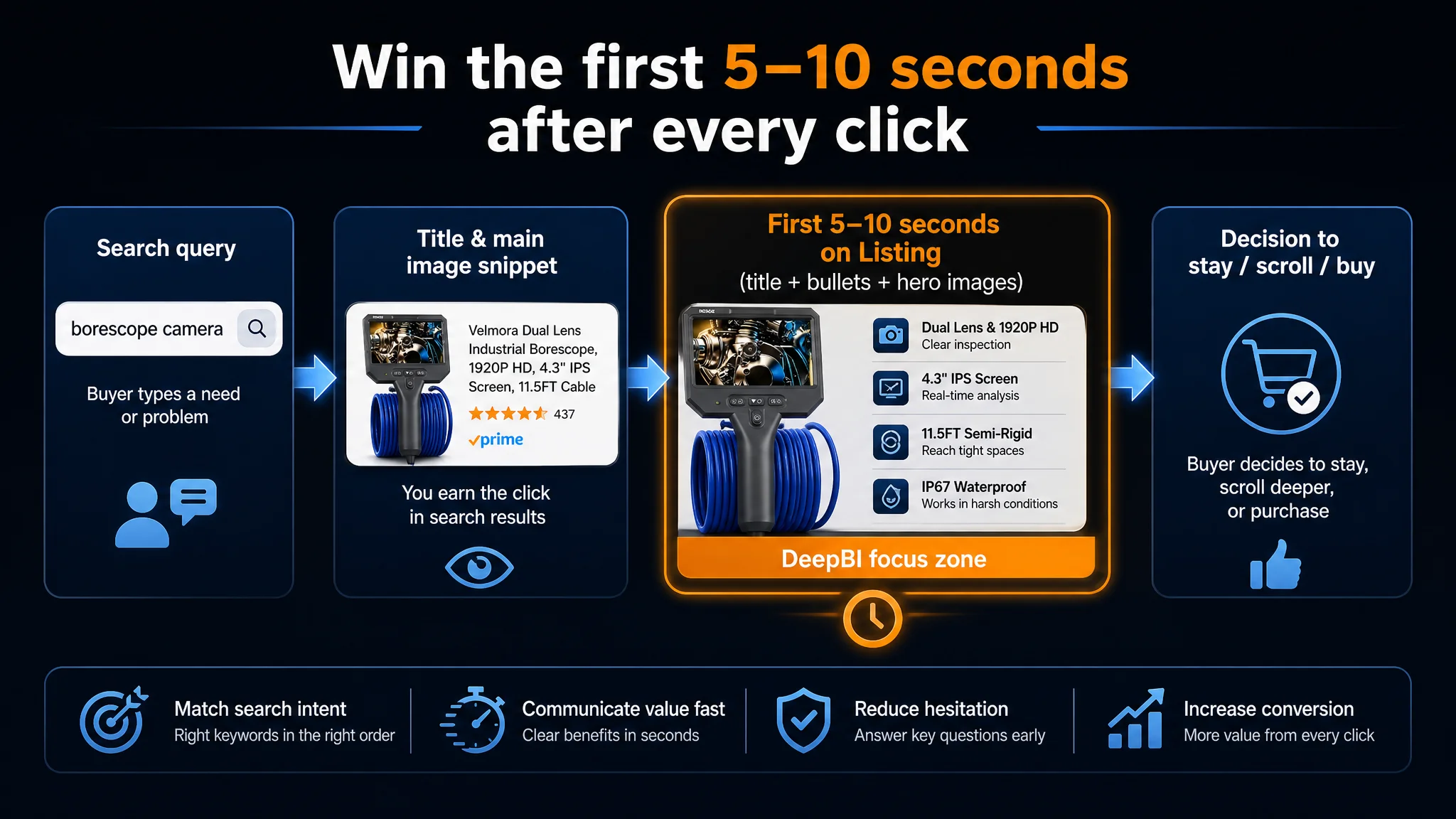
This case walks through how DeepBI reframed the problem from “ad optimization” to “Listing conversion capacity”: why a 79/100 Listing with 4.7 stars was still leaking orders, what specific title and bullet gaps were limiting professional buyers, why the main-image story was not yet acting as a click magnet, and how reordering the optimization sequence—page first, ads second—made ad traffic useful again. For Amazon sellers who believe their pages are already “good enough,” this is a reminder that small misalignments in title, visuals and bullet logic can quietly cap the ceiling of every advertising dollar.
Amazon Ads Were Hitting a Ceiling Because the Page Was Doing the Wrong Job
From a distance, this borescope Listing did not look like a problem child.
- Overall DeepBI Listing score: 79/100, versus the benchmark at 81/100
- Star rating: 4.7 vs competitor’s 4.5
- Review volume: 437, more than triple the benchmark’s 136
On paper, this is the kind of Amazon product page most teams would defend: “Reviews are great, A+ is complete, score gap is only 2 points, let’s just fix the ads.”
That assumption is where the misdiagnosis began.
DeepBI’s multi‑dimension scoring made one thing clear: this Listing did not suffer from a trust problem. It suffered from decision friction in the early seconds of the buyer journey—exactly where ad traffic lands.
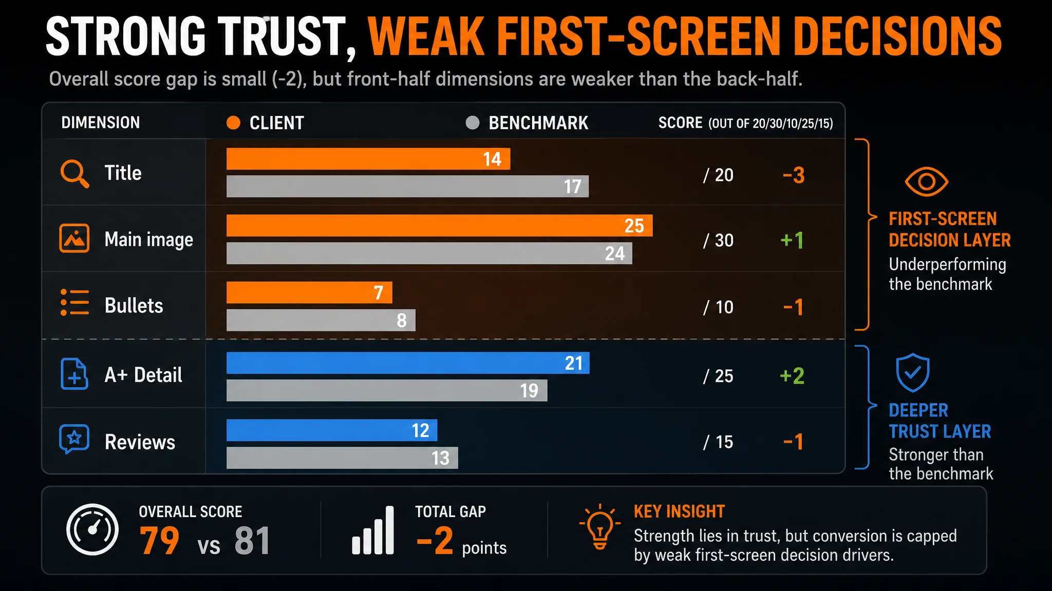
- Title: -3 vs benchmark
- Bullets: -1 vs benchmark
- Main image: slightly higher score, but with a structural issue: weak scenario anchoring
- A+ / detail: +2 vs benchmark
- Reviews: -1 vs benchmark on professional depth of content
In other words, the front half of the page (search result snippet + hero section) was underperforming the benchmark, while the back half (A+ and reviews) was actually stronger.
“The real problem was not that ads failed to bring traffic. It was that the page did not help the right buyers decide fast enough.”
The ads were doing their job. The Listing was not.
The Misdiagnosis: Treating High ACOS as an Advertising Problem
Before working with DeepBI, the seller’s operating logic was straightforward:
- ACOS was stubborn
- Clicks were not converting at the expected rate
- Benchmark competitor appeared in the same search terms
So the team leaned on what had worked in the past:
- More keyword expansion
- More granular campaign structures
- Bid adjustments to chase profitable terms
But their own Amazon product page was already close to the competitor in total score and significantly ahead on social proof. In this context, adding more traffic without correcting the page logic mostly magnified the existing conversion loss.
DeepBI’s radar made that mismatch explicit:
- The benchmark gained its edge in title clarity and bullet-driven decision logic
- The client gained its edge in A+ visual storytelling and review trust
Yet the client’s optimization effort was almost entirely concentrated on traffic acquisition, not front-page decision architecture.
This is the classic trap: treating a conversion bottleneck as a traffic bottleneck because nothing on the page looks obviously broken.
The Real Constraint: Listing Conversion Capacity, Not Features or Reviews
DeepBI’s Listing-score breakdown highlighted one central constraint:
The Listing had enough proof and enough features. What it lacked was a tight, professional decision path from search results to first scroll.
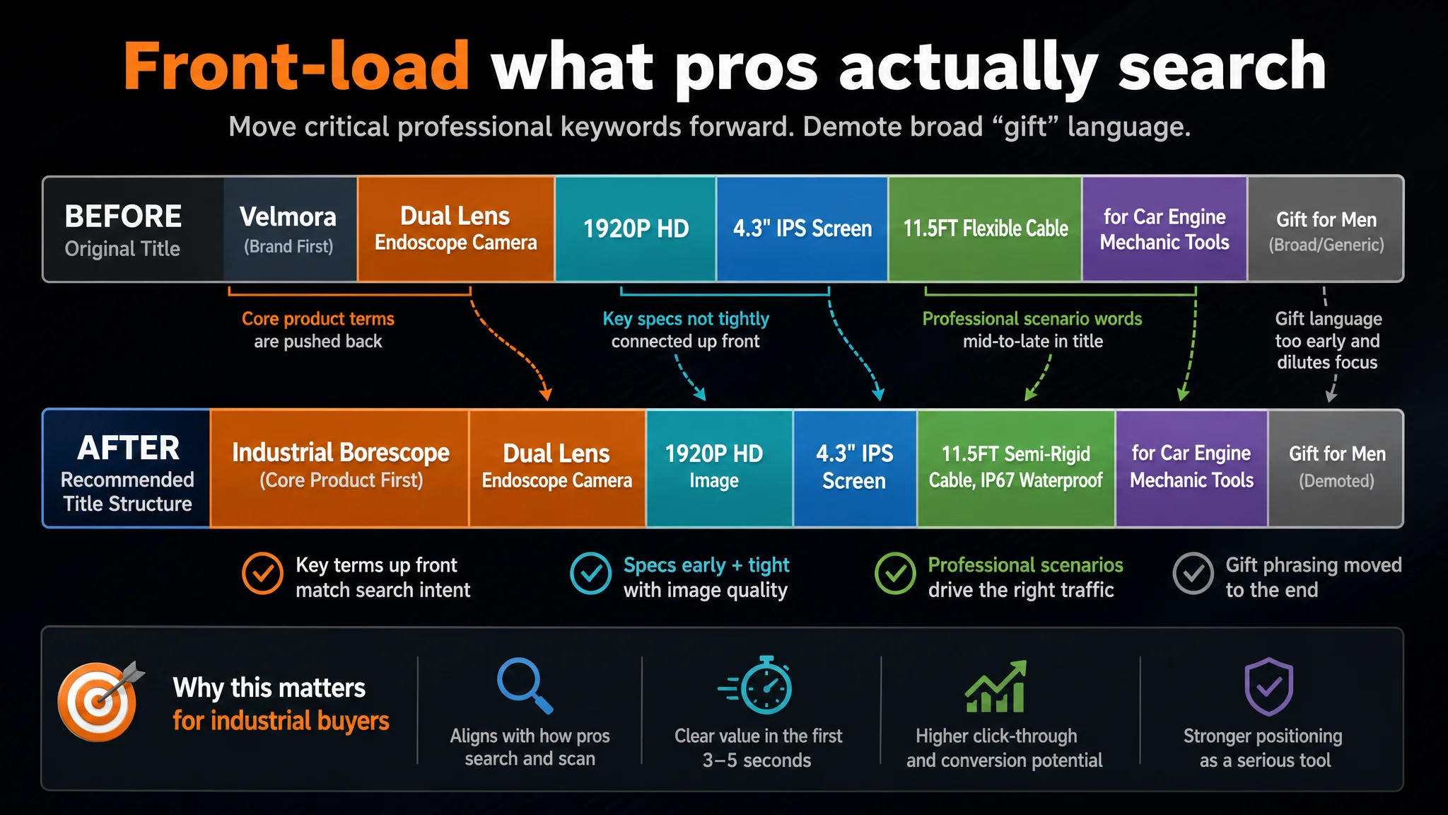
1. The Title Didn’t Lead With How Industrial Buyers Search
The benchmark competitor’s title structure was laser‑aligned with how industrial and automotive buyers type queries:
- Leading with the core product term: “3.9mm Endoscope Camera”
- Immediately tying it to output quality (“1920P HD”) and screen size (“4.3" IPS Screen”)
- Embedding quantified specs (probe diameter “3.9mm”, cable “5FT”)
- Anchoring to professional scenarios: “Car Engine Aircraft Mechanic Tools”
By contrast, the client’s original title choices diluted that precision:
- Brand name in front, pushing the core product term back
- “Dual Lens” emphasized, but without being framed as the primary search keyword
- Screen spec placed mid‑title, not tightly connected to image quality
- Scene words like “Gift for Men” broadened the audience but blurred the professional focus
For Amazon’s search results, this meant:
- Weaker alignment with query intent from mechanics and technicians
- Less immediate clarity for buyers scanning 10–15 titles in a row
- A mixed message: professional borescope or general gift gadget?
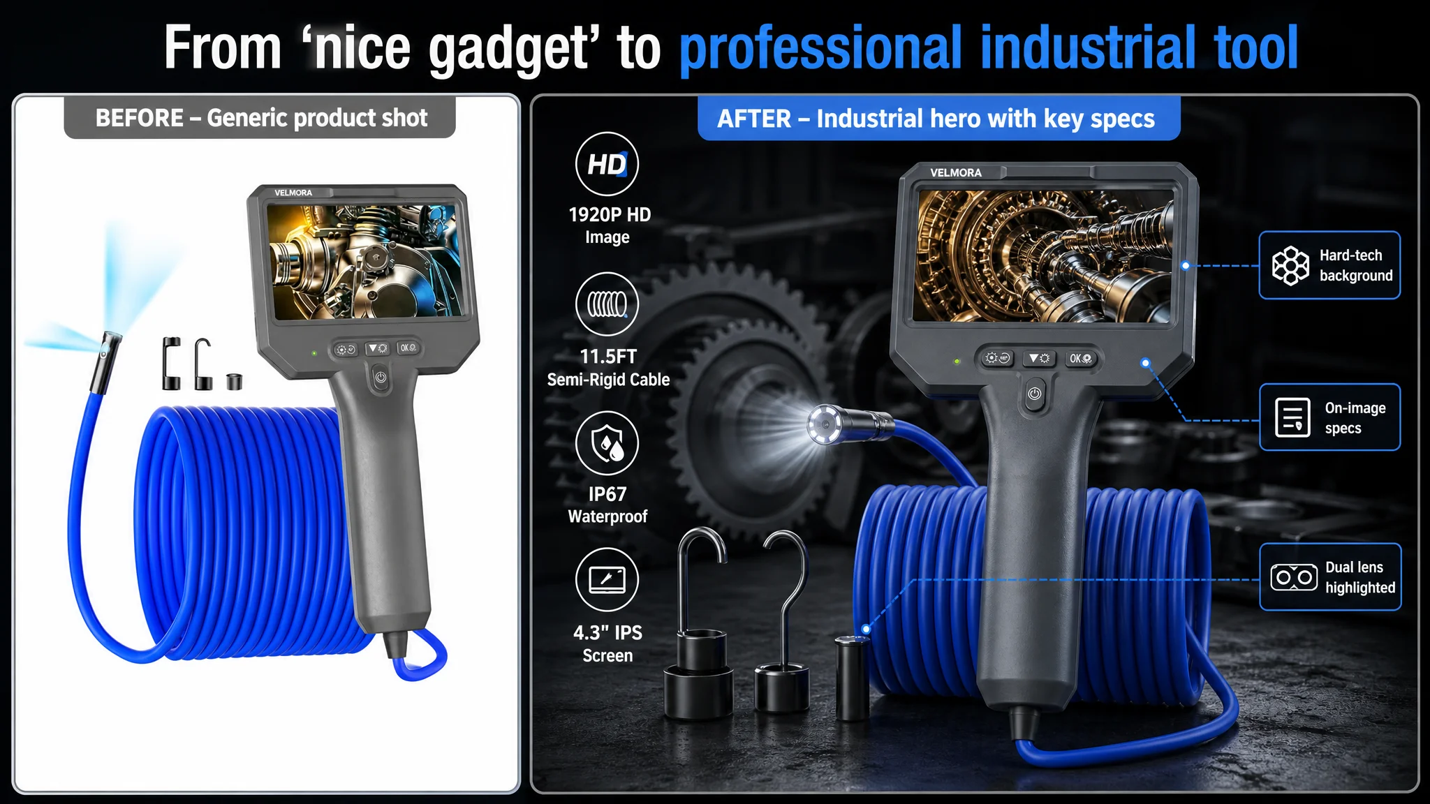
2. Main Images Looked Good, but Didn’t Build an Instant “Use Case”
The main-image set had decent aesthetics and even scored slightly higher than the benchmark on raw quality. The issue was what those pixels were doing for the first click.
- Primary main image: product‑only, with limited context
- Many images relied on multi‑panel compositions and text overlays
- Scenario anchoring (“this is for engines, pipes, HVAC”) was spread across multiple images instead of hammered into the first one
The benchmark took a different approach:
- Deep, dark industrial backgrounds
- Strong contrast and “hard industrial” lighting
- Clear, single-scene visuals showing the probe inside real mechanical gaps
- Icon matrices that let buyers capture key specs in ~3 seconds
For a mobile Amazon shopper, especially a mechanic browsing between jobs, the competitor’s images answered in one glance:
- What is this?
- Where can I use it?
- How thin is the probe really?
- Is this a serious tool or a toy?
The client’s visuals required more swiping and reading, especially to understand probe capability in tight gaps—a core concern in this category.
3. Bullets Talked Features. The Competitor Talked Jobs, Time, and Money.
The bullets were where DeepBI saw the clearest conversion logic gap.
Competitor bullets consistently followed a pain–solution–value arc:
- “Ultra-Slim 3.9mm… 51% smaller than normal 8mm probe… Save your time and money.”
- “No worry about dirtying your expensive phone… on-the-spot analysis… make informed decisions.”
- “Versatile flexible inspection camera… ideal for car repair, machinery, home maintenance…”
- “Powerful snake camera… IP67… adjustable LEDs… perfect gift for DIY and tech-savvy users.”
Each bullet:
- Started from a specific user situation or pain
- Quantified or illustrated the advantage
- Ended on a time / money / peace-of-mind payoff
The client’s bullets, by contrast:
- Heavily listed technical specs and accessories
- Mixed tool attributes with generic scenario labels
- Only partially connected to time, cost, or decision benefits
They were not wrong. They were just function-first, while the competitor was outcome-first.
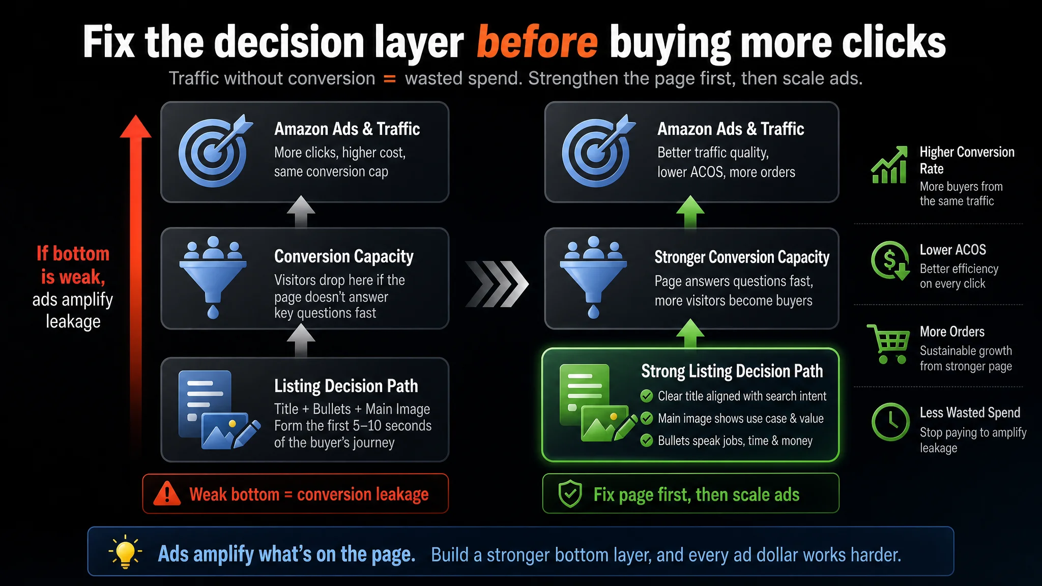
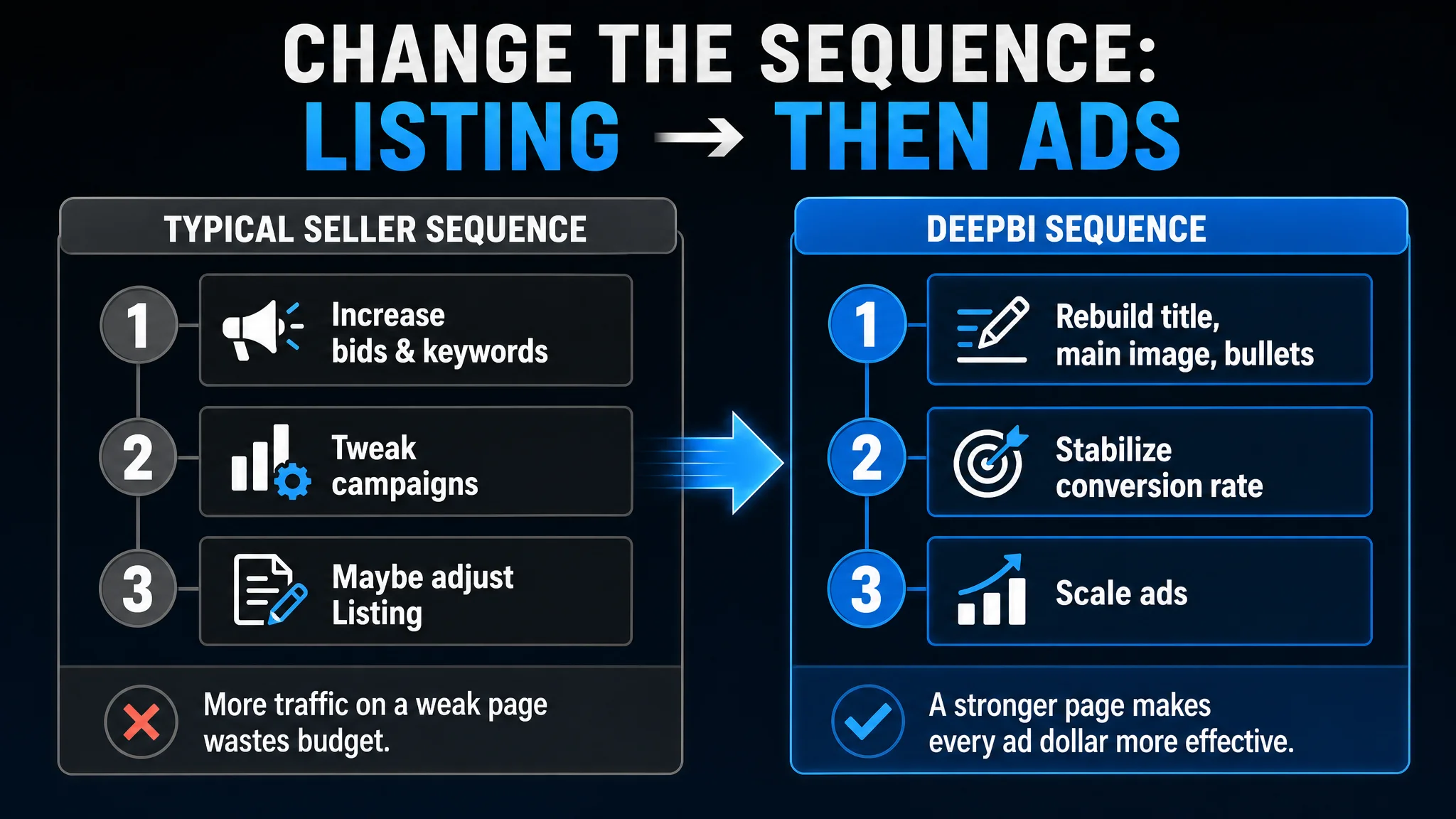
Why DeepBI Refused to Start With Ads: Fix the Page Before Amplifying It
From a business-risk standpoint, DeepBI judged that:
- The Listing had enough social proof and strong A+ content
- The front-page decision logic (title + main image + bullets) was the limiting factor
- Pushing more traffic through an un‑refocused headline and bullet structure would mostly burn ad budget
So DeepBI’s recommendation was explicit:
“Before you invest in acquiring more sessions, make sure the current Listing deserves them.”
This meant in practice:
- Do not prioritize further bid polishing and keyword expansion
- Do re-architect the page’s first-screen narrative so each click has a higher probability of converting
The objective was not to win an aesthetic contest. It was to reduce the time it takes for a professional buyer to decide that this borescope solves their job better and faster.
Rebuilding the Decision Path: From “Dual Lens Gadget” to “Professional Industrial Tool”
DeepBI’s optimization logic reorganized the Listing into a single, coherent story:
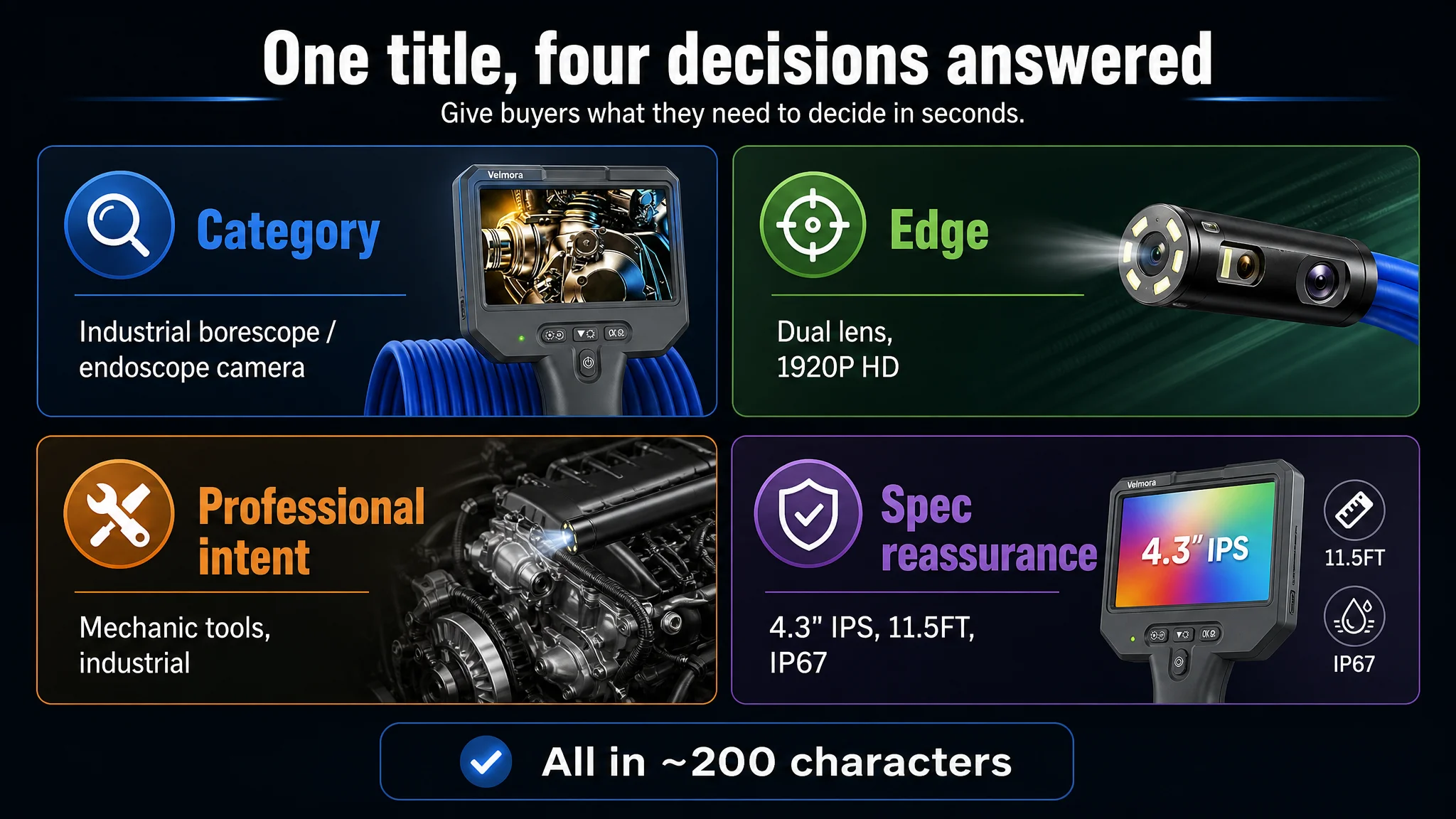
1. Title: Lead With “What This Is” and “Why It’s Different”
Recommended title structure:
Dual Lens Industrial Borescope, 1920P HD Endoscope Camera with Light, 4.3" IPS Screen, 11.5FT Semi-Rigid Cable, IP67 Waterproof Snake Cam for Car Engine Mechanic Tools, Gift for Men
Key shifts:
- Move “Industrial Borescope” and “Endoscope Camera” forward to align with high-intent search phrases
- Surface “Dual Lens” as a primary differentiator, not a buried attribute
- Introduce IP67 Waterproof and Semi-Rigid Cable explicitly, using terminology that industrial buyers expect
- Focus scene words on “Car Engine” and “Mechanic Tools”, with “Gift for Men” as a secondary tag instead of the main positioning
The goal: in 200 characters or less, the Amazon title must communicate:
- Category
- Edge (dual lens, 1920P)
- Professional intent (industrial, mechanics)
- Key spec reassurance (screen, cable, waterproof)
So that the click from a mechanic or technician is earned, not accidental.
2. Bullets: From Spec List to User Job Script
DeepBI’s bullet recommendations rewired each point into a “headline + job + payoff” structure:
Bullet 1: Dual Lens & 1920P HD Clarity
- Not just “dual lens” as a label
- Explicitly states two viewing angles in narrow spaces
- Connects to real jobs: auto diagnostics, industrial machinery, HVAC
- Ends with “save your time and effort during complex inspections”
Effect: dual lens is no longer a generic feature. It becomes a time-saving mechanism for real work.
Bullet 2: 4.3" IPS Screen & Real-time Analysis
- Directly addresses the “dirtying your expensive phone” pain
- Emphasizes independence from a smartphone
- Frames the screen as a decision tool (“on-the-spot analysis”)
- Transparently clarifies that it does not take photos or videos, reducing post-sale frustration
Effect: reduces both purchase hesitation and future negative reviews.
Bullet 3: 11.5FT Semi-Rigid Cable & Versatility
- Turns physical length into a distance advantage vs shorter cables
- Relates that advantage to real environments (pipe drains, wall structures)
- Speaks to both pros and DIYs
Effect: buyers no longer have to infer where 11.5ft matters; it is spelled out.
Bullet 4: IP67 Waterproof & 7 Adjustable LEDs
- Combines environmental resilience (wet/dark areas) with visibility control
- Mentions ergonomic handheld design to address longer usage comfort
Effect: merges trust in durability with trust in usability.
Bullet 5: Complete Tool Kit & Ideal Gift
- Clarifies exactly what’s in the box (hook, magnet, etc.)
- Connects accessories to a job: retrieving lost items
- Frames the product as a practical gift for engineers, mechanics, and tinkerers
Effect: reduces “what am I really getting?” friction and aligns with the gift angle without losing the professional core.
Main Image: From “Nice Product Shot” to “Immediate Use-Case Proof”
DeepBI’s image analysis concluded that the client’s visuals were aesthetic but cognitively expensive.
The new main-image logic focused on:
1. Industrial “Hard Tech” Baseline
- Dark grey to black backgrounds
- Cold blue industrial lighting to highlight contours
- Product centered, occupying around 75% of the frame
- Screen showing a highly detailed mechanical structure (e.g., golden turbine)
Purpose: make it visually obvious that this is a precision industrial instrument, not a casual gadget.
2. Visualizing the Probe’s Core Job: Entering Tiny Spaces
- Probe at the visual center, inserted into narrow gear gaps
- High-contrast lighting from the probe tip
- Clear on-image call-out of probe diameter
Purpose: translate the abstract “small probe” into “I can actually get into these tight clearances” in one glance.
3. Making Technology Tangible, Not Abstract
- Lens and imaging module shown with subtle tech glow, not raw exploded parts
- Simple, controlled composition that suggests advanced imaging without confusing buyers
Purpose: signal “advanced imaging tech” without overwhelming or distracting.
4. Highlighting the Screen as the Second Life of the Product
- Close-up, slightly low-angle shot of the screen
- Deep background blur so the screen content pops
- Clear “4.3 inch” call-out, associated with vivid, sharp visuals
Purpose: remind buyers that the screen quality is their daily experience, not a line in the spec sheet.
5. Anchoring in Real Work Environments
- Hand-held shots in a blurred workshop or factory
- Simple line icons across the top summarizing key functions
- No clutter, no excessive text on the image
Purpose: position the product squarely in professional use, while still welcoming advanced DIY buyers.
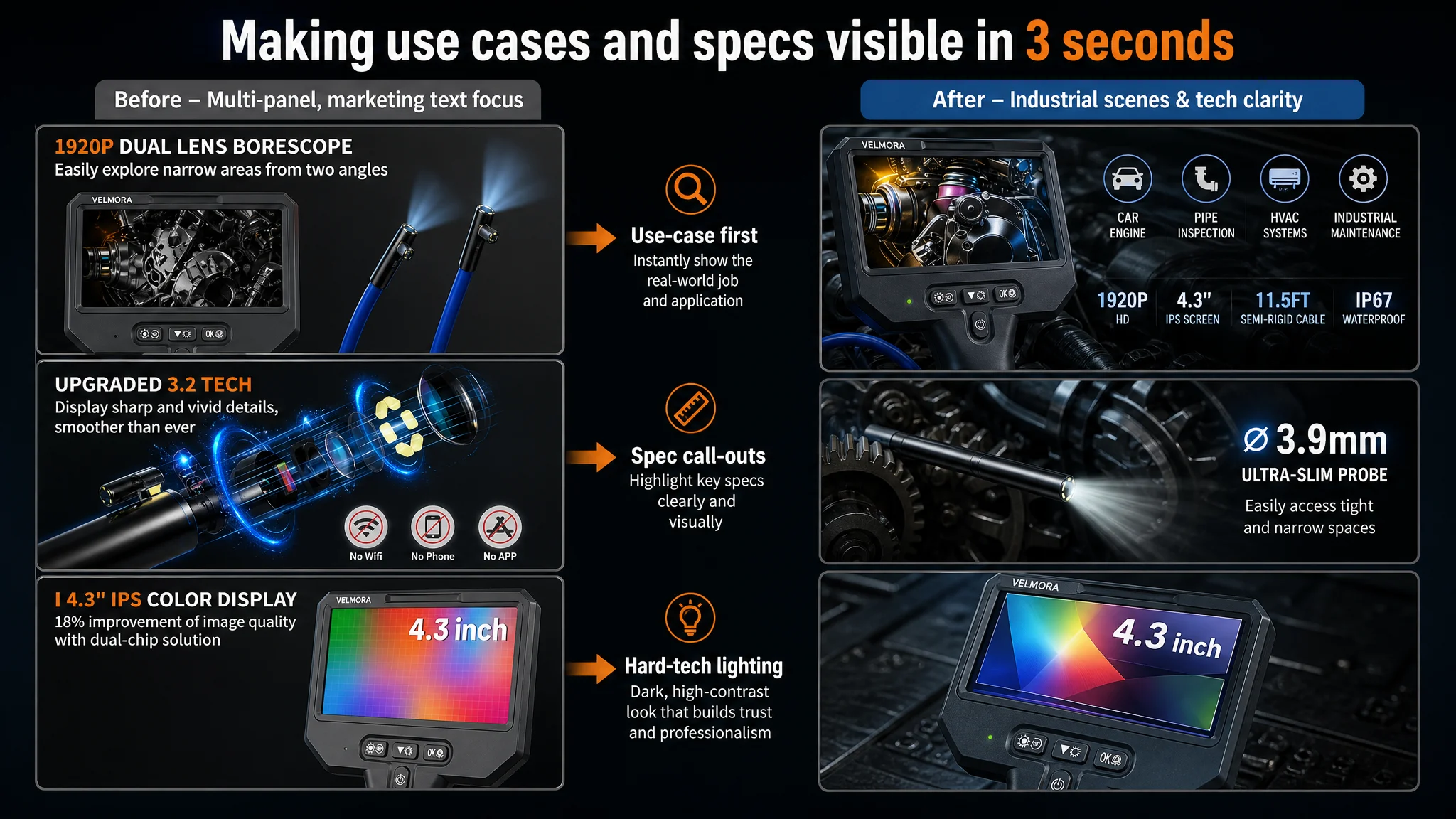
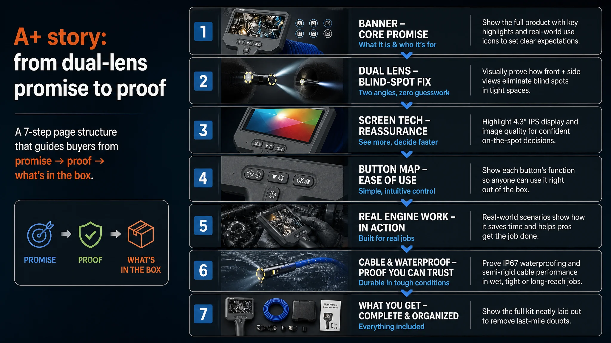
A+ Content: Strong, but Now Re-aligned Around “Dual Lens” and Trust
Unlike many cases, this seller’s A+ modules were already stronger than the benchmark:
- Rich real-world scenes (cars, appliances, air conditioning, pipes)
- Cohesive visual language across feature modules
- A clear professional tone
DeepBI’s recommendations did not seek to “add more.” They refocused what was already there:
1. Banner: Declare the Core Promise in One Visual Sentence
- Product held at a 30-degree angle
- Screen showing piston deposits or similar high-detail engine issue
- Background: blurred auto repair garage
- Bold text: “1920P DUAL LENS”, plus four icons (car, pipe, HVAC, industrial)
Purpose: Let a mechanic understand, in under a second: “High-res dual-lens tool, built for my jobs.”
2. Dual Lens: Show, Don’t Explain
- Probe inside a metal pipe
- Both front and side cameras glowing
- Side-view showing a crack invisible from the front view
- On-image label: “Front & Side View” with arrows indicating angles
Purpose: Turn “dual lens” from a technical term into a visual resolution of blind spots.
3. Screen Tech: Reduce Hidden Doubts
- Layered, exploded view of screen structure (LCD, filters, protection)
- Clean, minimal background
- Enhanced color and contrast on the displayed image
Purpose: address unspoken concerns about fragility, clarity, and color accuracy without adding more words.
4. Buttons: Remove Perceived Complexity
- Front view of device with each button called out by dotted lines and labels
- Soft, even lighting to keep icons legible
Purpose: make the device feel learnable in minutes, so complexity doesn’t block purchase.
5. Real Engine Work: Replace “AI Feel” With Genuine Credibility
- Gloved hand using the borescope in a real engine bay
- Focus on device and probe, with controlled depth of field
- Workshop lighting, metallic blues and greys
Purpose: put the buyer into the scene as the operator.
6. Cable & Waterproof: Prove It Visually
- Semi-rigid cable shaped in an “S” inside a transparent water tank
- Probe lit up underwater, bubbles visible
- Clean, lab-like background
Purpose: visually certify IP67 and cable shaping in one frame, without extra explanation.
7. What You Get: Remove Last-Mile Doubt
- Knolling layout (flat-lay, evenly spaced) of device, cable, case, manual, hook, magnet, etc.
- Dark matte background with soft top lighting
Purpose: convey organization, completeness, and brand discipline—a subtle but powerful trust builder.
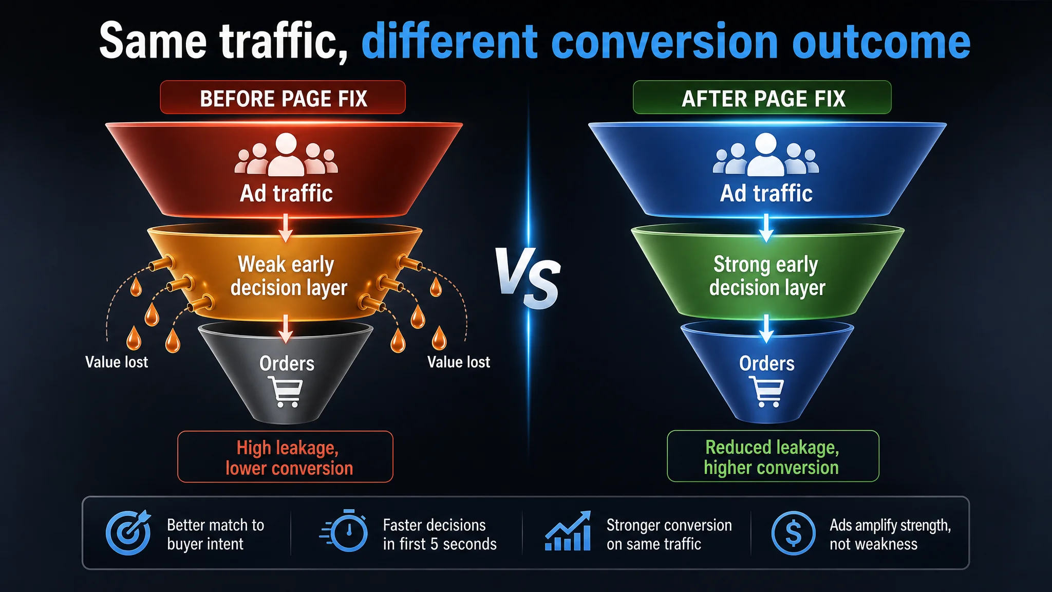
What Changed: From Ads Amplifying Weakness to Ads Amplifying Strength
After realigning the Listing:
- The page’s early decision layers—title, main image, bullets—began to match the strength of its A+ and reviews
- Professional buyers could see their jobs and outcomes in the first few seconds instead of hunting for them
- Dual lens, 11.5ft cable, IP67 waterproofing, and the independent screen shifted from “features on a list” to reasons to pay and reasons to choose this Listing
While the case does not attach specific post-optimization metrics, operationally the shift was clear:
- The Listing’s conversion capacity became more robust
- The dependency on pushing ever more traffic to achieve the same order volume decreased
- Ads stopped acting as a patch for weak messaging and instead became multipliers for a stronger product story
“Advertising does not only amplify advantages. It can also amplify a page’s existing defects.”
By fixing the page first, this seller made sure every future dollar spent on Amazon ads had a better chance to return.
What Other Amazon Sellers Can Take Away
This case is not about a spectacularly broken Listing. It is about a quiet cap on performance in a Listing that already looked “good enough.”
Key lessons for Amazon sellers:
1. High ratings and solid A+ content do not guarantee efficient ad spend.
If title, main image, and bullets don’t mirror how your best buyers search and decide, you will overpay for every order.
1. A 2‑point Listing score gap can hide a much larger decision gap.
When the competitor’s advantage is front-loaded in title and bullets, it will collect clicks and decisions earlier in the funnel.
1. Dual lens, IP ratings, cable specs—these are only powerful when tied to jobs.
Specs that don’t answer “what job does this help me do faster or cheaper?” are just noise.
1. Fix the page before scaling the ads.
Ad optimization is not a substitute for a weak early-page decision path. It only makes the inefficiency more expensive.
DeepBI’s value in this case was not in generating more assets or toggling more campaign switches. It was in forcing a reframing:
- From “How do we drive more traffic?”
- To “What exactly happens in the first 5–10 seconds after each click, and does that justify driving more traffic at all?”
For sellers operating in competitive Amazon categories—especially technical and industrial products—this is the judgment line that separates incremental improvements from a genuine change in how your traffic converts.