
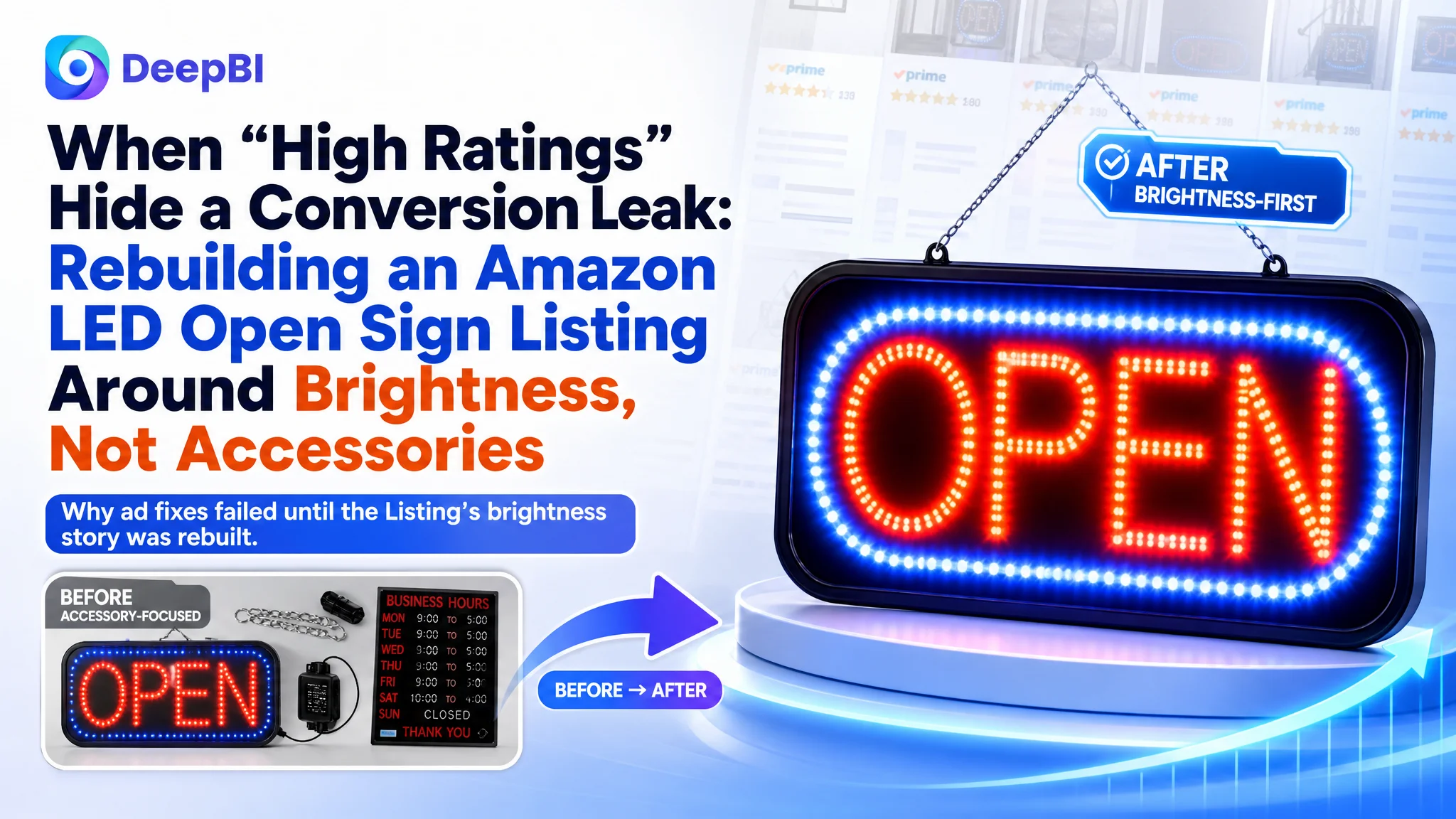
This case comes from an Amazon seller in the US marketplace, operating in the LED “OPEN” sign niche for storefronts. On paper, the product looked safe: 4.7 stars, over 150 reviews, and better review quality than a key competitor. Yet the seller was under pressure—Amazon ads were getting more expensive, and despite steady traffic, the Listing was not converting as expected. The team’s first reaction was to blame advertising and keep tuning bids and keywords.
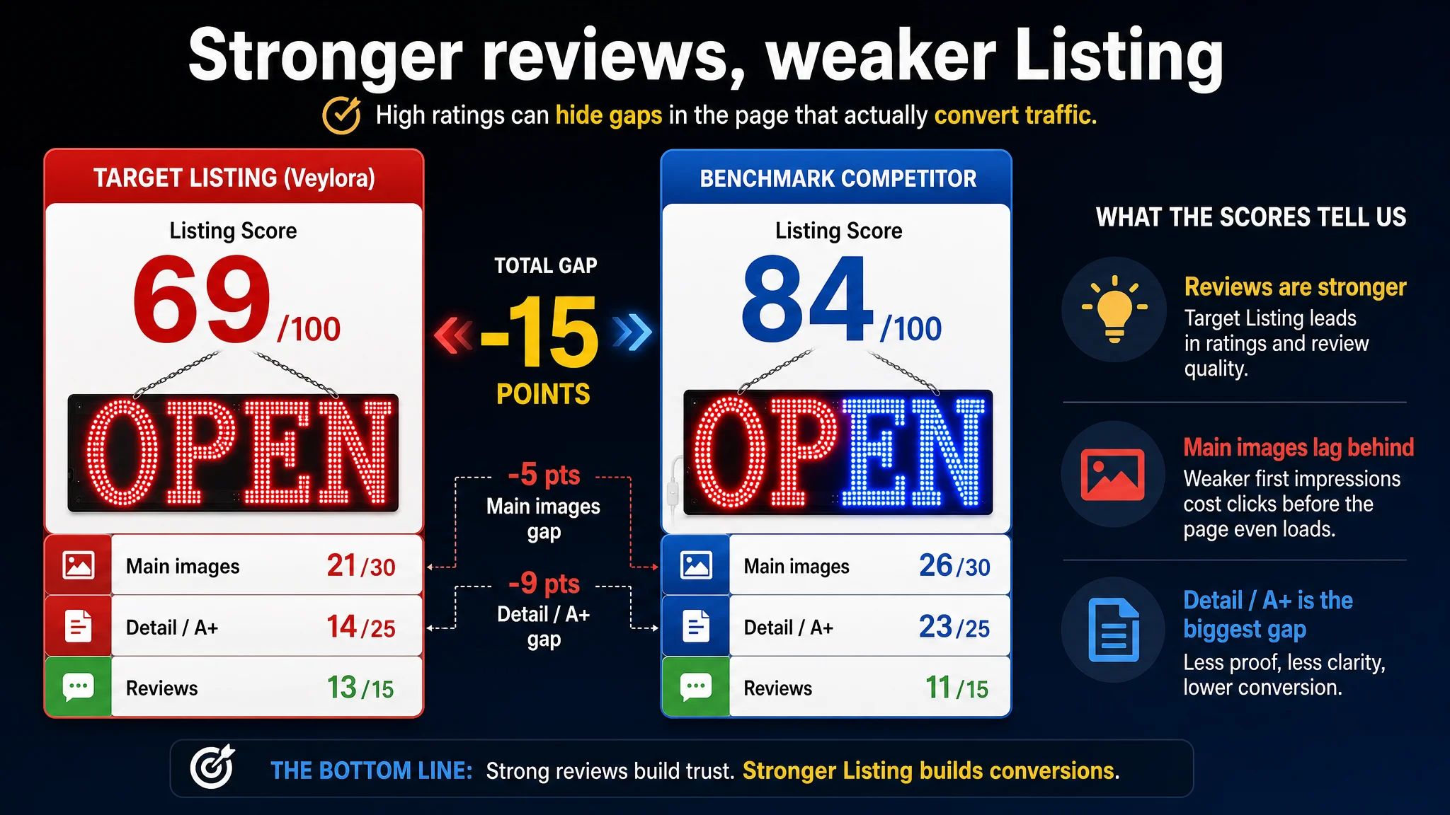
DeepBI’s diagnosis told a different story. Against a benchmark LED open-sign Listing, the customer’s product page scored 69/100 vs. the competitor’s 84/100. The largest gap was not in reviews or price, but in main images and A+ detail content—the very modules that should translate ad clicks into orders. The page did not convincingly answer the most basic buyer question in this category: “Is it bright enough and visible for my business?”
The optimization path therefore changed direction. Instead of continuing to squeeze ACOS through more ad tweaks, the focus shifted to Amazon Listing conversion: rebuilding the main image around “ultra bright” visibility, restructuring the image sequence, and upgrading A+ content to show daytime visibility, night-time impact, and concrete evidence behind the 672 LEDs. Ads later started to work again because they were finally driving to a page that could carry the sales logic.
For other Amazon sellers, the lesson is direct: high ratings and good reviews do not guarantee that your product page is telling the right story. When ad optimization stops working, the real leak may be in how your Listing visually proves its core promise. DeepBI’s value in this case was not a new feature; it was the judgment to stop fixing ads and rebuild the page’s conversion capacity first.
The Problem the Seller Thought They Had
The seller was seeing a familiar pattern on Amazon:
- Traffic was coming in, driven by Amazon ads and organic search.
- Reviews were strong: 4.7 stars, 150+ total reviews, zero low-star reviews on the first page.
- A key competitor in the same LED open sign niche had lower rating (4.4) and more visible negative reviews.
From the seller’s perspective, this looked like an advertising problem:
- “Our product is better reviewed; ads must be inefficient.”
- “If we improve campaign structure, keywords, and bids, ACOS should come down.”
- “Maybe we just need to increase budgets or switch match types.”
They were trapped in a classic misdiagnosis: assuming high ACOS and weak growth meant ads were underperforming, while ignoring whether the Amazon Listing itself was structurally weaker than the competitor’s.
Amazon Ads Were Not Failing. The Page Was Consuming the Traffic.
DeepBI’s Listing scoring made the Amazon context brutally clear:
- Overall Listing score:
- Target Listing: 69/100
- Benchmark competitor: 84/100
- Gap: -15 points
Breaking it down:
- Title: 15 vs. 17 (-2)
- Main images: 21 vs. 26 (-5)
- Bullet points: 6 vs. 7 (-1)
- Detail page / A+: 14 vs. 23 (-9)
- Reviews: 13 vs. 11 (+2, i.e., better than the competitor)
In other words:
The only dimension where the seller clearly beat the competitor was reviews—the part they were not actively fixing. The worst gap was in detail content and main images—the parts their traffic had to pass through to convert.
This is exactly the kind of structural leak Amazon ads cannot fix. Every additional click was being poured into a page that:
- Did not visually prove “super bright, visible in daylight”.
- Overloaded the first image with accessories instead of the glowing sign.
- Underused A+ modules to explain brightness, visibility distance, and remote control usage.
- Repeated similar daytime scenes without building a clear buying logic.
If the core question in this category is “Will this sign stand out from a busy street, even in daylight?”, this Listing was not answering it.
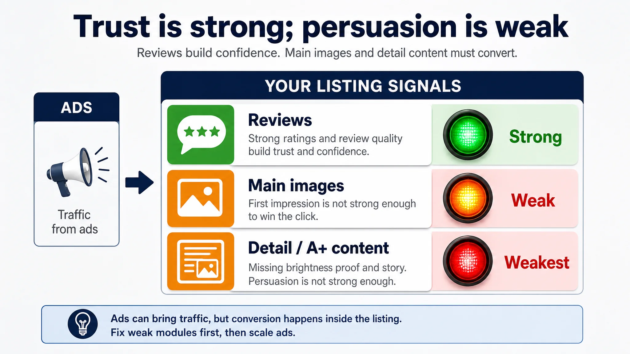
The Real Constraint: Listing Conversion Capacity, Not Review Quality
From a business point of view, the constraint was not trust—it was persuasion.
Reviews were a false sense of security
- 4.7 vs. competitor’s 4.4 stars.
- More total reviews.
- No low-star reviews on the first page.
The seller interpreted this as: “Our product is stronger; we just need more traffic.” DeepBI treated it differently: strong reviews are a conversion support, not a conversion engine. If the main images and A+ fail to communicate the brightness story, reviews cannot compensate for low click-through and low on-page persuasion.
Data pointed to the real bottleneck
The scoring gap made the root cause visible:
- Main image gap (-5 points):
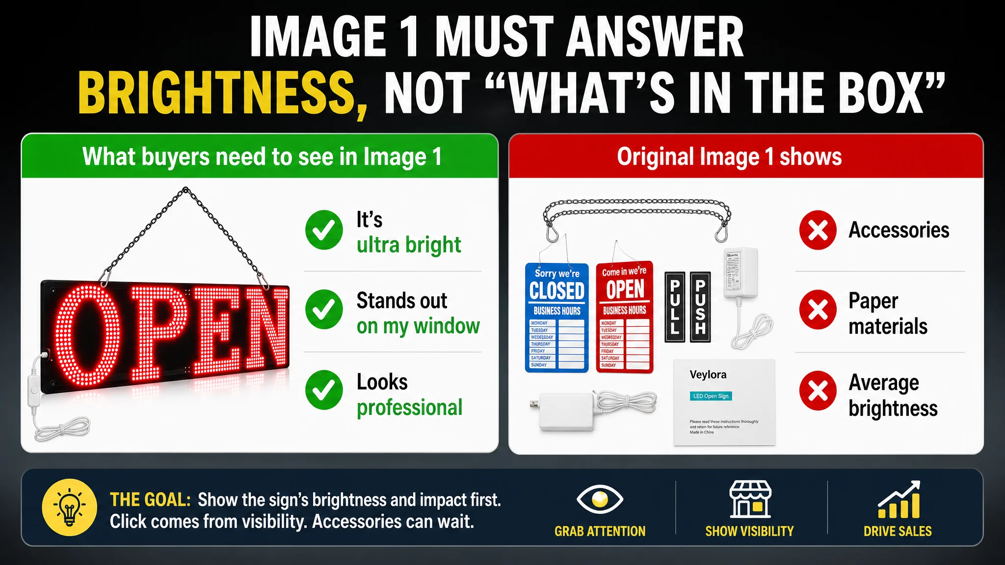
The first image was a “family shot” with sign + business hours card + door stickers + instruction paper. The product—the glowing “OPEN” sign—did not dominate the frame. On Amazon search results, this means:
- Lower visual contrast.
- Weaker “hook” vs. a competitor showing a clean, bright sign.
- Lost clicks before the product page even loads.
- Detail/A+ gap (-9 points):
The competitor used A+ to build a complete decision path:
- Ultra-bright night scenes with high contrast.
- Clear daytime visibility shots.
- Remote control features, modes, and usage explanations.
- “What’s included” and installation visuals.
- Industry-targeted scenes (coffee shop, bar, vape shop, liquor store, holiday windows, etc.).
The target Listing used the detail section for:
- Repeated brand logo and generic storefront visuals.
- Multiple similar daytime street scenes with weak contrast.
- An unlit or weakly lit sign in several images.
- Non-LED hanging signs and unrelated accessories that diluted perceived value.
From DeepBI’s perspective, this Listing was not lacking credibility; it was lacking clarity on what outcome the buyer gets and proof that the sign is truly bright and visible.
Why Traditional Ad Optimization Kept Failing
The seller’s ad decisions were rational—until the environment changed:
- Rising ad costs made every wasted click more painful.
- Competitors upgraded their visuals, not just their bids.
- Amazon shoppers in this category started expecting:
- Strong night-time contrast.
- Clear daytime visibility.
- A visible remote or control logic.
- A clear sense of what comes in the box and how to install it.
Under that new standard, the seller’s optimization cycle looked like this:
1. Increase bids or budgets to maintain visibility.
2. Tweak keyword lists to chase better ACOS.
3. See that conversions remain flat or inconsistent.
4. Assume ads are still the problem.
What was actually happening:
Advertising was doing its job—bringing in relevant traffic—but the page could not convert that traffic at the benchmark’s level.
With a 15-point Listing gap, even well-structured campaigns cannot deliver sustainable ACOS. Every incremental dollar of ad spend was amplifying a page that lacked a visible, coherent brightness story.
This Product Page Did Not Lack Traffic. It Lacked a Brightness Story.
DeepBI’s analysis reframed the core business question:
- Not: “How do we reduce ACOS by tuning bids?”
- But: “Does this page deserve more traffic before we fix how it sells?”
The answer, in this case, was no.
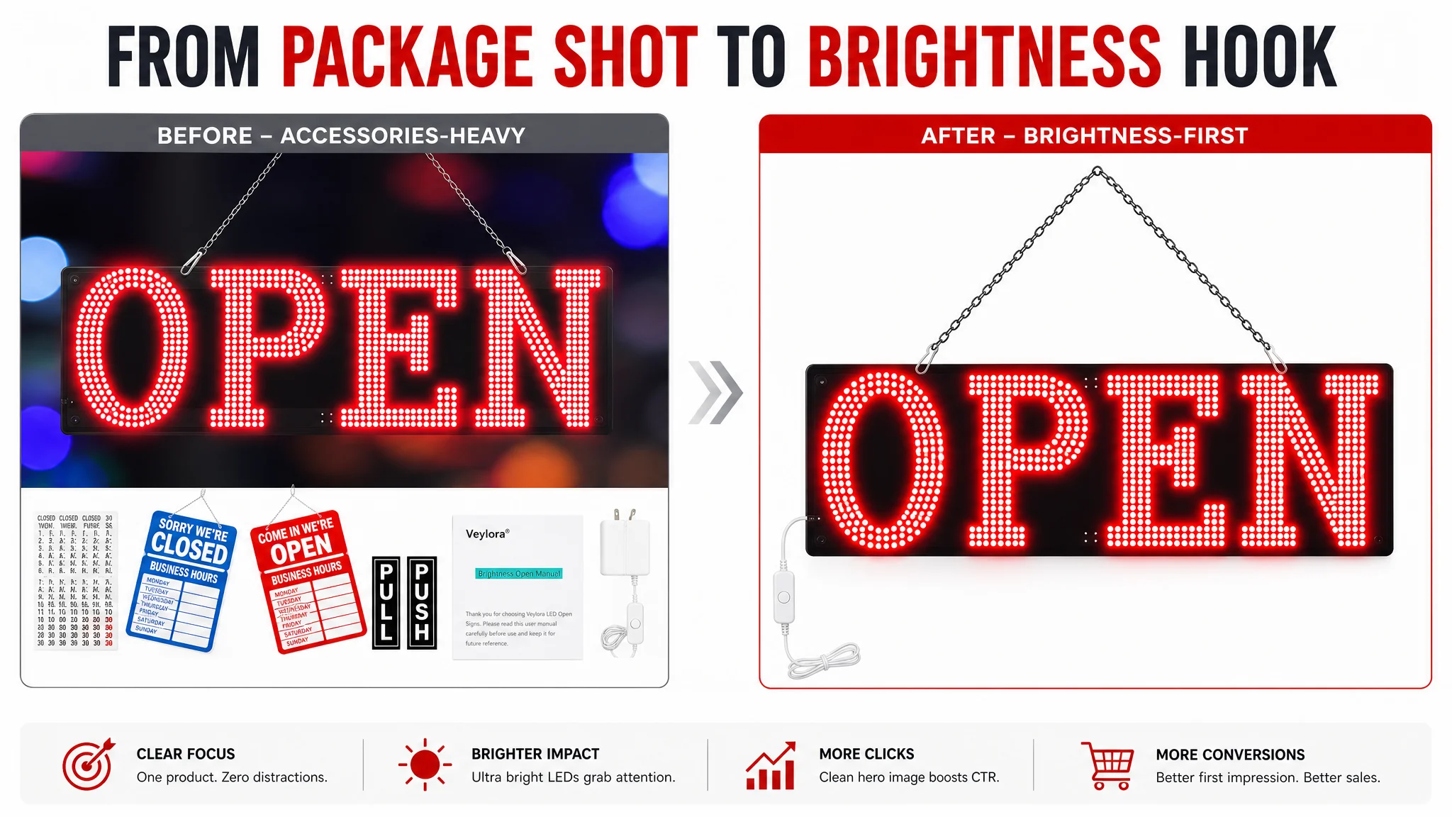
The main image was not just “busy”. It failed at the category’s core promise.
In LED open signs, the first frame must answer:
- “How bright is it?”
- “Will it stand out on my window or door?”
- “Does it look clean and professional?”
The target Listing’s first image:
- Showed the sign, but also:
- Hanging hardware.
- Business hours card.
- Door stickers.
- Instruction paper.
- Reduced the sign’s visual dominance.
- Showed an average brightness level with limited contrast on a white or neutral background.
The competitor’s first image:
- Put the glowing “OPEN” sign front and center.
- Used high contrast and bold red-blue light to jump off the white background.
- Visually shouted “ultra bright” before any text was read.
DeepBI’s judgment: the first image was working as a packaging shot, not as a click driver. In Amazon search, that is a direct hit on CTR and the starting point of weak conversion.
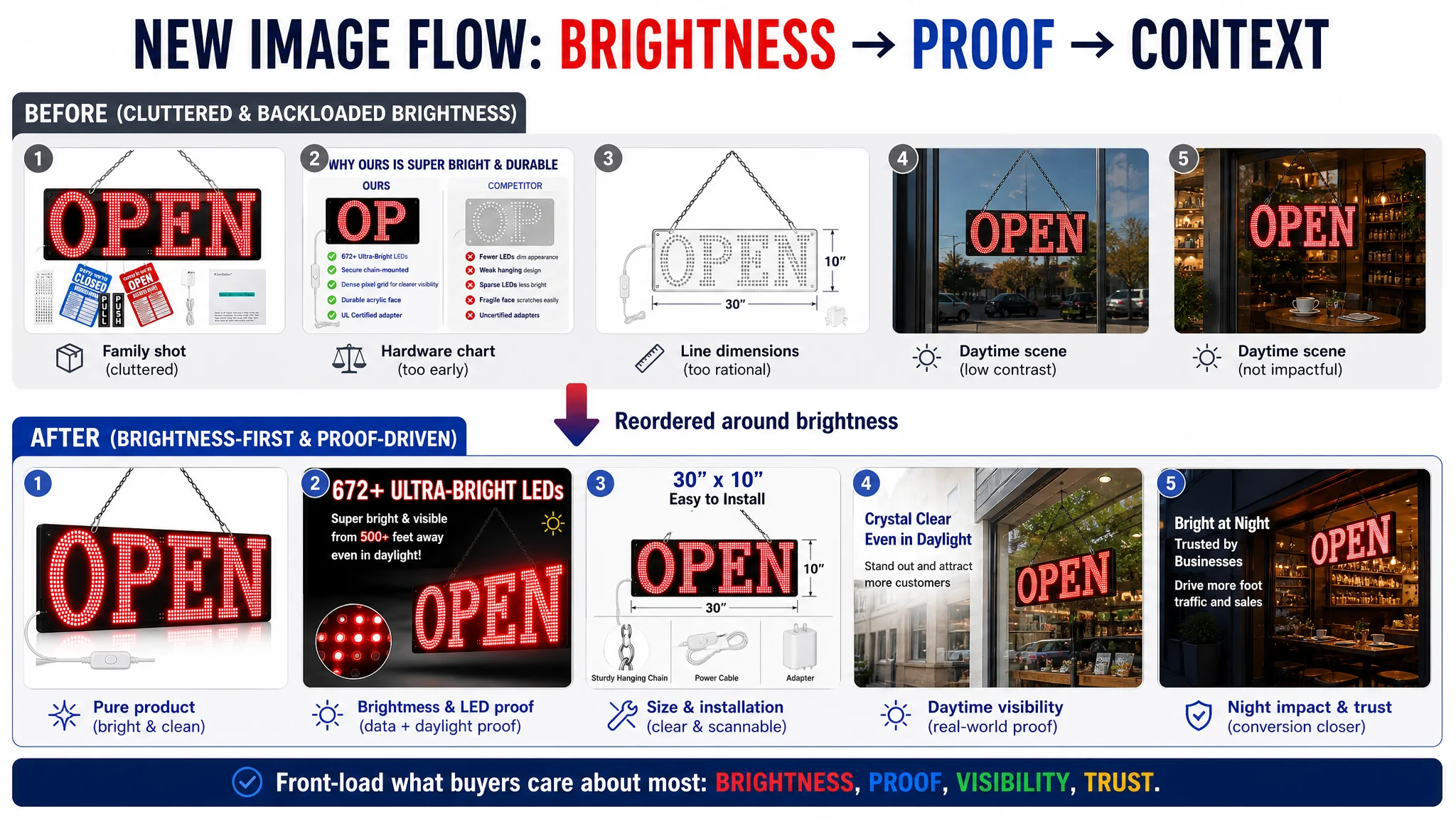
The image stack diluted trust instead of building it
The sequence of images for the target Listing was mis-ordered and mis-focused:
- Image 2: A technical hardware comparison with another sign—too early, too rational, no brightness proof.
- Image 3: A line-drawing dimensions chart—again rational, but not persuasive before desire is created.
- Images 4 and 5: Daytime scenes where the sign blends into the environment and does not look obviously bright.
Meanwhile, the competitor’s sequence:
- Started with brightness: bright sign on white, then high-contrast night scenes.
- Quickly moved to quantitative claims: visible up to XXX feet, remote controls, modes, and brightness levels.
- Then showed “what’s in the box” and installation, reducing friction.
- Finally, expanded into multiple real-business scenes and holiday uses.
In short, the competitor’s images answered:
1. “It’s bright.”
2. “It’s visible from far away.”
3. “It’s easy to install and control.”
4. “It fits my type of business.”
The seller’s images mostly answered:
- “We include some accessories.”
- “Here are dimensions and some generic scenes.”
- “Trust us, it’s bright,” without compelling visual evidence.
Why DeepBI Did Not Keep Tuning Ads First
From a decision logic standpoint, DeepBI prioritized Listing conversion over advertising optimization for three reasons.
1. The largest gap to the benchmark was on-page, not in reviews or price
A 15-point overall Listing gap, with -5 in main image and -9 in detail content, means the current page was not structurally capable of reaching the competitor’s CVR, even if traffic quality improved.
Continuing to tune ads first would:
- Increase spend on a page that cannot “cash out” that traffic.
- Create the illusion that ads are underperforming, while they are actually feeding a weak Listing.
- Delay the moment when the core brightness story is fixed.
2. Advertising was amplifying the wrong outcome
“Advertising does not only amplify advantages. It can also amplify a page’s existing defects.”
If the core message the page delivers is:
- “Standard brightness.”
- “Some accessories.”
- “Generic scenes with low contrast,”
then every extra click amplifies the perception that this sign is not meaningfully brighter than alternatives. That is a dangerous loop in a saturated Amazon category.
3. The business risk of ignoring Listing conversion was rising
In a category where:
- Competitors have already upgraded their visuals.
- Buyers are trained to expect strong brightness proof.
- Reviews alone are not differentiating enough.
The risk is not just short-term ACOS; it is erosion of organic ranking:
- Weak CTR on search results signals to Amazon that the Listing is less relevant.
- Weak CVR reduces the likelihood of sustaining top-of-page positions.
- Over time, the seller must spend more on ads to compensate for declining organic share.
DeepBI’s judgment: fix the Listing’s conversion story first, then decide how much traffic it deserves.
How the Optimization Re-centered the Page on “Extreme Brightness”
DeepBI’s recommendations did not start with “make it prettier”. They started with:
- “Make the core outcome—extreme brightness—visually undeniable.”
- “Rebuild the image and A+ logic around that.”
Reframing the main image: from “package shot” to “brightness engine”
The main image strategy pivoted around three principles:
1. Remove non-core elements
- Business hours card, door stickers, manuals—anything that did not prove brightness—should be removed from the first image.
- The sign and its power source should dominate, with the “OPEN” glow taking as much of the frame as possible.
1. Push brightness to the limit within Amazon rules
- Strengthen the LED glow to appear more vivid and saturated.
- Use a pure white background with high contrast to make the sign pop.
- Ensure the visual reads instantly as “ultra bright LED open sign” at thumbnail size.
1. Move quantitative brightness support earlier in the sequence
- Bring “672+ LEDs” into the second or third image, pairing visual brightness with a tangible number.
- Connect “more LEDs” to “visible even in direct sunlight” as a rationale, not a raw spec.
This changed the first impression from “here’s what you get in the box” to “this sign is obviously brighter than what you’re using now”.
Reordering the image sequence to match buyer logic
DeepBI recommended a new flow:
1. Image 1: Pure product, ultra-bright glow, strong contrast.
2. Image 2: Visual brightness + quantified LED count (672+) + distance visibility claim.
3. Image 3: Real product, with dimensions and hanging chain, showing easy installation and exact size.
4. Image 4: Daytime storefront/window shot, with strong visibility and overlay text like “Clear in direct sunlight” and “Attract customers even during the day”.
5. Image 5: Night-time storefront shot, showing the sign as the visual focus, plus messaging on attracting foot traffic.
6. Optional further images focusing on silent operation, safe voltage, or specific business scenarios.
With this sequence, buyers experience:
- Desire (bright, eye-catching sign).
- Proof (LED count, visibility claims).
- Practicality (size, installation).
- Context (day and night scenes).
- Confidence (noise-free, durable, energy efficient).
Turning A+ from repetition into a structured selling story
The existing A+ modules were heavily weighted toward:
- Repeated daytime scenes.
- Brand logo dominance.
- Mixed, sometimes confusing accessory visuals.
DeepBI shifted them into a six-part narrative:
1. Opening visual
- Replace an oversized logo with a strong hero image: sign glowing in a real shop window.
- Pair copy like “Bright LED Open Sign for Business” + “Unique process makes our open sign much brighter and more eye-catching than regular neon signs.”
1. Technical evidence
- Use close-up or partially disassembled visuals to show dense LED arrays and solid build.
- Reinforce “672+ super bright LEDs”, “low consumption”, “prolonged lifespan”, and “no flicker or noise” as rational support.
1. Daytime visibility
- Use the best daytime image (e.g., flower shop window) to anchor the claim:
“Even during the day, pedestrians can still see it at a glance when they pass your store.”
1. Night-time dominance
- Highlight a night shot where the sign clearly dominates the storefront visual.
- Emphasize all-day/all-night operation, silent running, and eye-catching yet not harsh light.
1. Installation and “what’s included”
- Show the actual box contents: sign, chain, power adapters.
- Reinforce “plug-and-play”, “easy to hang on storefront, glass door, or window”.
1. Multi-scene fit
- Use collage to show florists, retail stores, pubs, hotels, salons, and cafes.
- Use copy that explicitly answers “Will this look right in my shop?” with real-world scenes rather than generic claims.
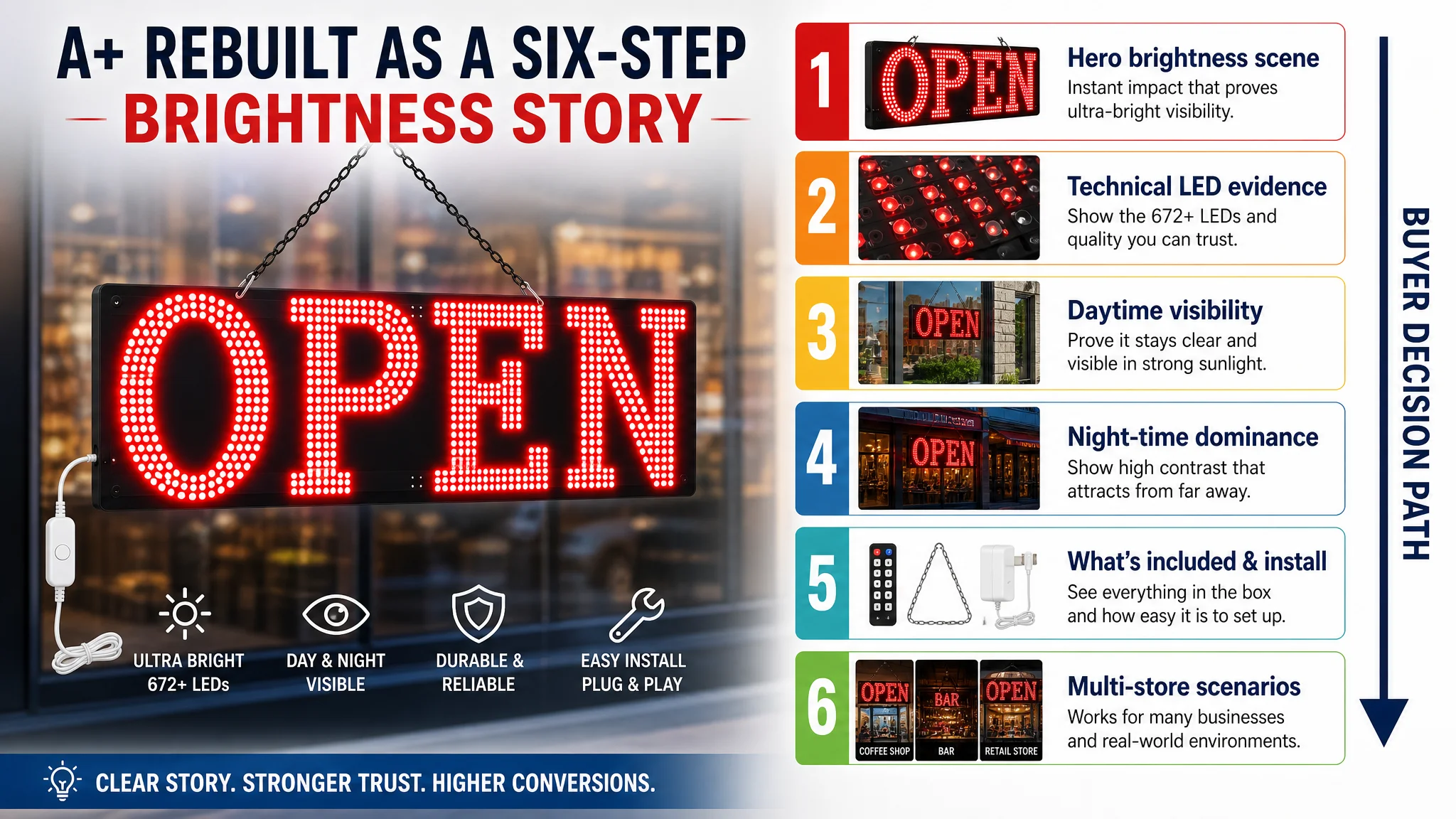
This transformed the detail page from “more of the same” into a structured path that resolves brightness, visibility, installation, and applicability doubts in a deliberate order.
Bullet Points: From Generic Feel-Good to Quantified Benefits
The original bullet points leaned on emotional wording (“feel assured”) and generic advantages (“energy saving”, “long-lasting”), but lacked:
- Quantitative support.
- Clear linkage between specs and business outcomes (more traffic, more revenue).
- Professional tone consistent with a commercial sign.
DeepBI’s recommended structure:
1. Brightness and visibility with numbers
- “672+ LEDs”
- “Visible from up to 500 feet” (if supported by product reality)
- “Remains clear even in direct sunlight”
1. Energy efficiency and professional lifespan
- Compare to traditional glass neon: lower power, no heat, no flicker, silent operation.
- Emphasize suitability for 24/7 business use.
1. Installation and plug-and-play
- Highlight pre-mounted hanging chain.
- Emphasize lightweight yet sturdy design, easy relocation.
1. Versatile business scenarios
- Name specific business types: retail shops, florists, salons, bars, pubs, cafes, restaurants, hotels, boutiques.
- Frame the sign as a “traffic driver”, not just an ornament.
1. Professional quality and support
- Replace emotional language with quality-control language.
- Promise responsive, professional customer support.
1. Pre-purchase notice
- Clarify that this is a professional-grade, bright sign—not a dim home decoration.
- Remind buyers to measure their available space (30" x 10").
- List what’s included to reduce surprises and returns.
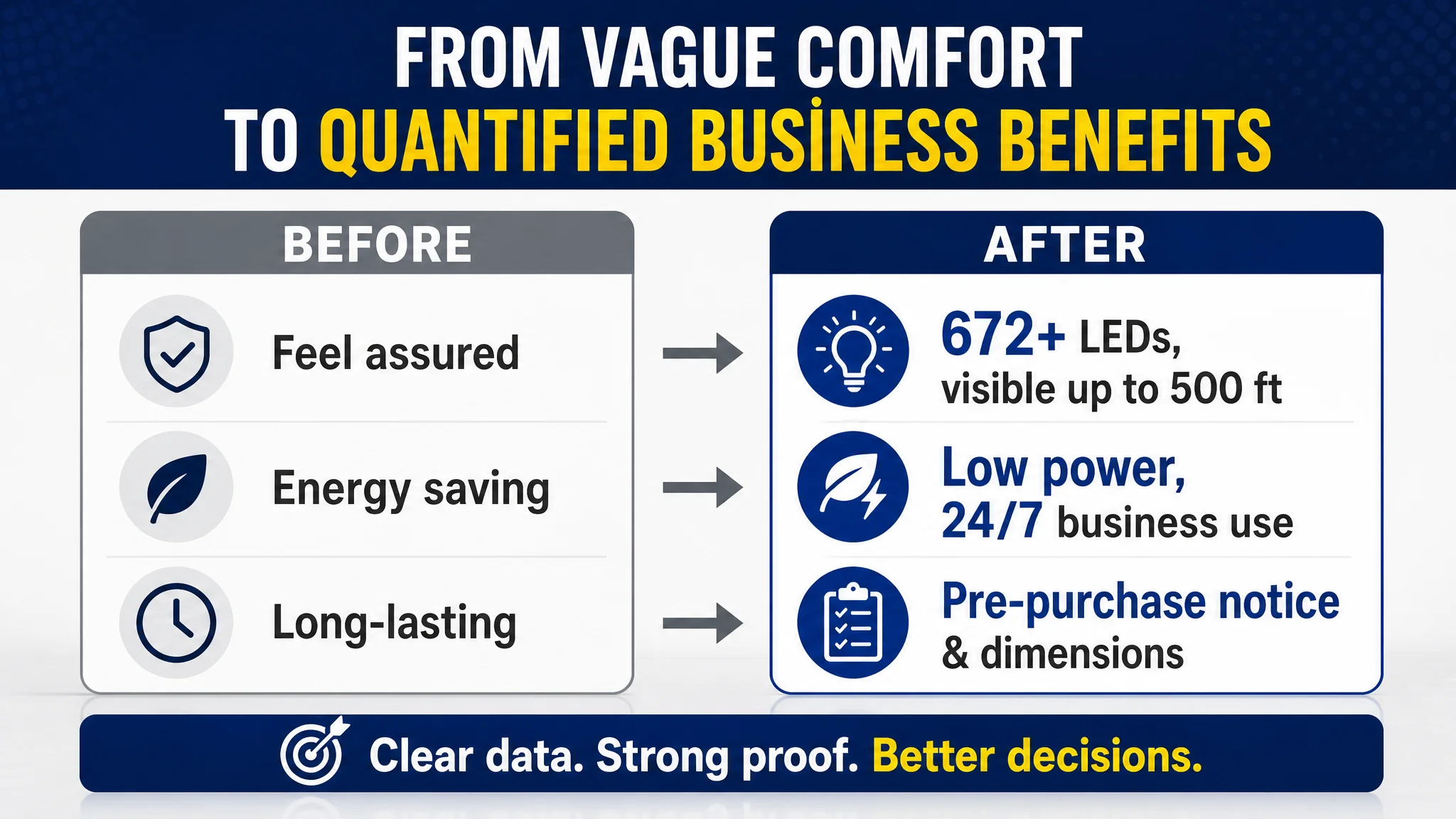
This shift made the bullet section align with the visual story: bright, professional, easy to install, and designed for real businesses.
How Ad Traffic Became Useful Again
The seller’s immediate question was: “If we change all this, will ACOS improve?” DeepBI deliberately avoided inventing numeric promises. Instead, the focus was on how the operating state would change:
- CTR: With a dominant brightness-focused main image and stronger thumbnail contrast, the Listing is more likely to win clicks against similar-priced competitors in search results.
- CVR: With stronger A+ persuasion, the page is better at converting both ad and organic traffic, particularly from buyers shopping for brightness and daytime visibility.
- Organic stability: As the page’s inherent conversion ability improves, Amazon’s ranking algorithm has fewer reasons to demote it, reducing overdependence on ad spend.
- Risk reduction: Ads no longer primarily amplify a weak brightness story; they amplify a coherent, tested sales narrative anchored in visual proof.
Most importantly, the seller’s understanding changed:
- Ads are not a universal fix for conversion problems.
- Listing quality—especially main image and A+ structure—sets the ceiling for how far ad optimization can go.
- Before scaling spend, they now judge whether a page actually deserves more traffic.
What Other Amazon Sellers Can Take Away
This LED open sign case is not about a niche category; it’s about a pattern many Amazon sellers face:
- Strong reviews but unstable or plateaued sales.
- Rising ad costs and stubborn ACOS.
- A reflex to blame campaigns instead of examining the product page.
The central lessons:
1. Do not let good ratings mask a weak listing
A 4.7-star average does not guarantee your title, main image, and A+ are aligned with how buyers in your category decide.
1. Treat Listing conversion as the foundation of ad efficiency
Ads amplify whatever your page already does—good or bad. If your main image lacks a clear reason to click, or your A+ fails to prove the core outcome, better targeting will only partially help.
1. Anchor your page in a single, category-specific promise
For LED open signs, that promise is brightness and visibility. For other categories, it might be comfort, safety, or speed. Everything—images, bullets, A+—should reinforce that one core outcome.
1. Use competitor benchmarks as a ceiling, not inspiration
The seller in this case was not failing randomly; they were failing relative to a clearly better competitor Listing. DeepBI’s role was to quantify that gap and turn it into a specific, ordered change path.
1. Decide the order of optimization deliberately
In this case, fixing ads first would have delayed progress. By prioritizing Listing conversion, the seller created a page that can justify and sustain future ad investment.
For Amazon sellers under pressure from rising ad costs, this case underscores a simple but often overlooked truth: before asking how to buy more traffic, ask whether your Amazon product page is truly ready to convert the traffic you already have.