
This is a case about an Amazon US seller in the wall-art accessories category (canvas floater frames) who was under pressure from rising ad costs but couldn’t see a clear problem on the surface. Reviews were solid, main images looked “good enough”, and ads kept bringing traffic. Yet orders were not growing in line with spend, and the team’s instinct was to blame keyword tuning and bids inside Amazon ads.
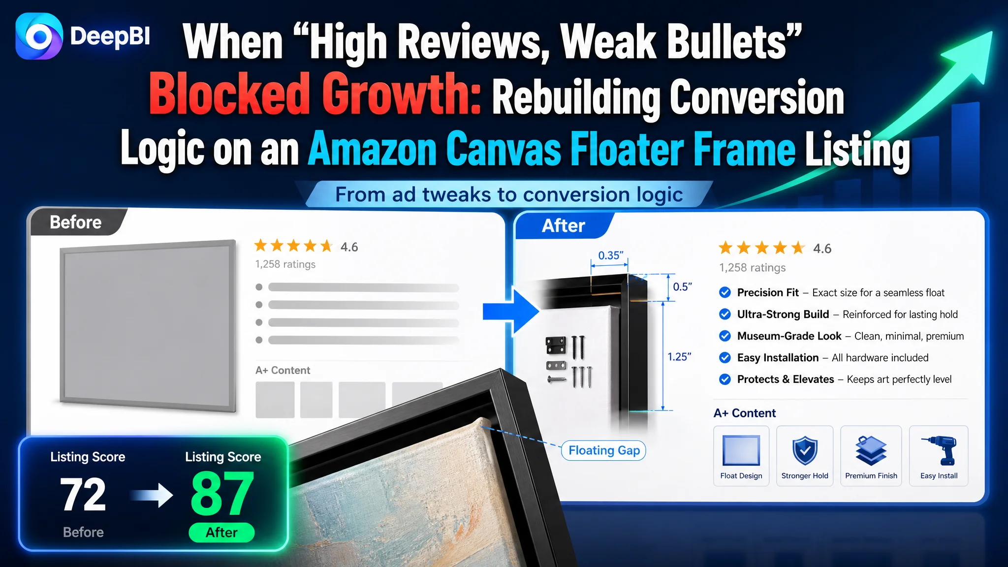
DeepBI’s diagnosis pointed in a very different direction. In a one‑to‑one benchmark against a category‑leading Amazon listing, the customer’s page scored 72/100 vs. the competitor’s 87/100. The gap did not sit in star rating or basic imagery; it sat in how the listing told the product story. Bullet points and A+ content were structurally weak, and the title diluted core category and usage signals. In other words, the Amazon product page was consuming traffic, not converting it.
Once the problem was reframed as “Listing conversion capacity” rather than “ad optimization”, the entire optimization sequence changed. DeepBI focused first on rebuilding title logic, bullet‑point persuasion, and A+ image flow around how buyers actually decide on a canvas floater frame: sizing clarity, floating effect, material trust, and installation ease. Only after the page could credibly convert did ad traffic start to make sense again.
For other Amazon sellers, this case is a reminder: healthy reviews and decent images do not guarantee a healthy listing. When ads become harder to optimize, the root cause may be that your Amazon product page lacks a coherent buying logic. Fixing that first is often the difference between endlessly adjusting bids and actually regaining control over ACOS, CVR, and the balance between paid and organic orders.
What the Seller Saw: Traffic, Spend, but Limited Follow‑Through
The product is a canvas floater frame on Amazon US—targeting home décor buyers who want a “gallery‑style” floating effect for their wall art.
From the seller’s perspective:
- Star rating was acceptable: 4.3 stars with over 1,200 reviews—almost double the benchmark competitor’s review count.
- Main images didn’t look obviously “bad”.
- Ads were running and bringing traffic, but ACOS was stubborn, and scaling spend did not bring proportional order growth.
The intuitive conclusion inside the team:
“Our Amazon ads still aren’t tuned enough. We need better keywords, more precise bids, more campaigns.”
So they kept working the ads while assuming the listing was fundamentally sound.
The Misdiagnosis: Treating an Ad Problem That Wasn’t There
From inside the account, data simply looked like “rising spend, mediocre returns”. That usually gets framed as:
- Wrong keyword selection
- Wrong match types or bids
- Poor campaign structure
Because reviews were strong and there were multiple product images, the listing itself was seen as a secondary issue at most.
This is where many Amazon sellers get trapped:
“Reviews are fine and images exist, so the page should convert—let’s fix ads first.”
But when DeepBI put the listing into a structured benchmark against the best‑performing competitor in the same Amazon subcategory, a different picture emerged.
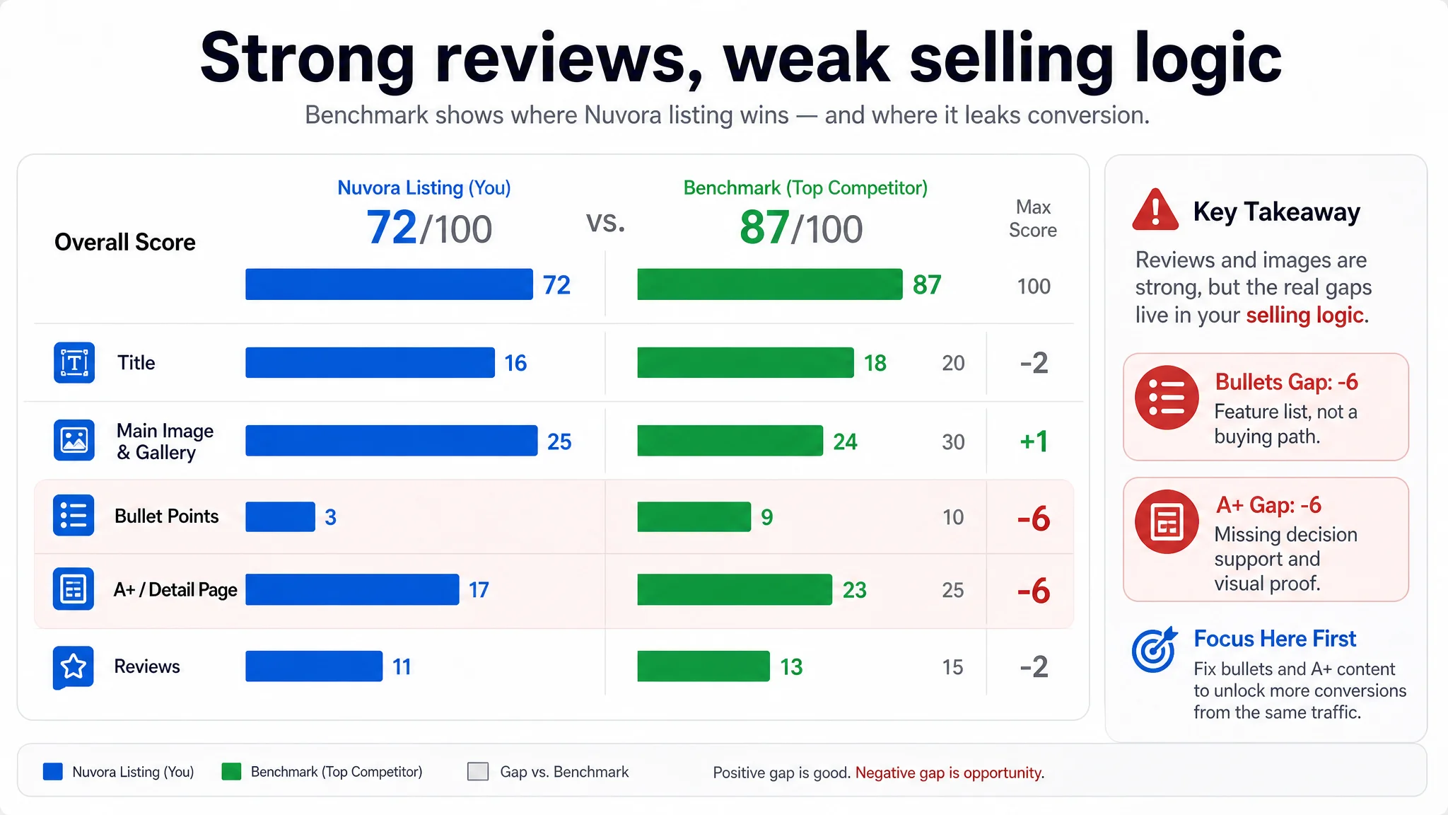
Listing Scores Exposed a Single Core Constraint
DeepBI’s listing scoring compared the customer’s Amazon listing to a proven, high‑performing canvas floater frame listing:
- Overall score:
- Customer listing: 72/100
- Benchmark listing: 87/100
- Gap: ‑15 points
The breakdown made the real bottleneck obvious:
- Title: Customer: 16, Benchmark: 18, Max: 20, Gap: -2
- Main Image & Gallery: Customer: 25, Benchmark: 24, Max: 30, Gap: +1
- Bullet Points: Customer: 3, Benchmark: 9, Max: 10, Gap: -6
- A+ / Detail Page: Customer: 17, Benchmark: 23, Max: 25, Gap: -6
- Reviews: Customer: 11, Benchmark: 13, Max: 15, Gap: -2
The main imagery was not the weakest link—in fact it slightly outscored the competitor on the raw visual dimension.
The real constraint was clear:
The listing’s selling logic—bullets + A+ content—was far weaker than the benchmark, despite similar ratings and plenty of reviews.
In business terms: The Amazon product page did not lack traffic or social proof. It lacked a structured path to purchase.
That became the core conflict of the case.
How the Competitor’s Title Quietly Captured the Right Traffic
The title gap looked small on paper (16 vs. 18/20) but had outsized impact on search relevance and the quality of incoming traffic.
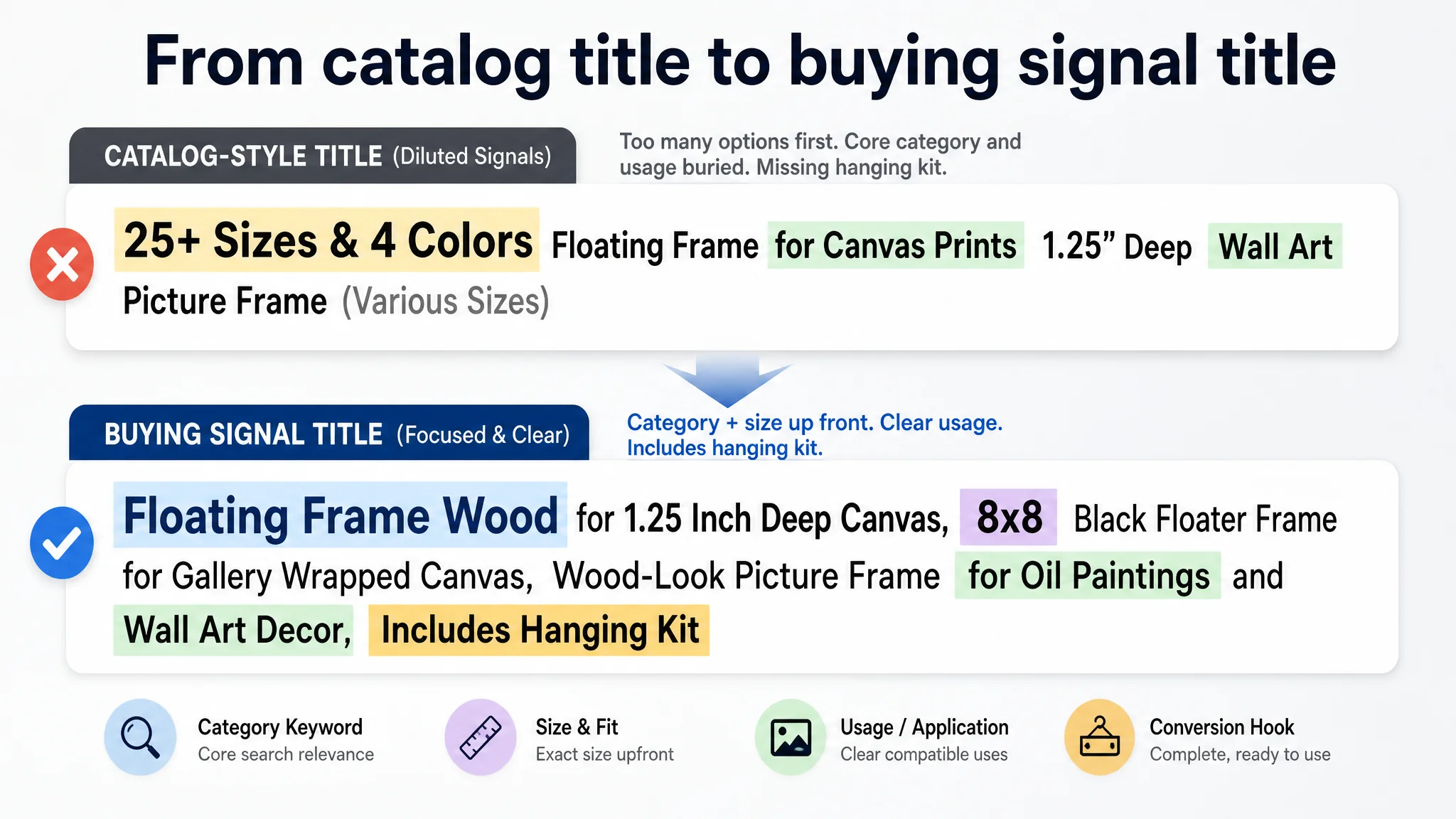
What the benchmark did right
The benchmark title:
- Opened with a strong brand + category combo: “Texas Art Canvas Floater Frame”
This tied a recognizable regional brand identity directly to the core category keyword.
- Used a depth range (“1” to 1.25””) instead of a single number.
This broadened the addressable audience while sounding more professional.
- Listed compatible content types clearly: “Oil Paintings, Prints and Wall Art” as separated, scannable usage cases.
- Ended with a practical conversion hook: “with Hanging Kit”, signaling a complete solution.
What the customer’s title did instead
- Pushed “25+ sizes and 4 colors” to the front, turning the title into a mini catalog.
- Buried the core category term (“floater frame”) and compatible usage inside a more cluttered structure.
- Omitted the clear “hanging kit” promise, even though hardware was included.
Result: the customer was not only attracting slightly less precise search traffic, but also failing to signal “complete, ready‑to‑hang solution” at the title level—an easy win for conversion and for Amazon’s ad relevance.
DeepBI’s proposed title refocused on:
- Leading with “Floating Frame Wood for 1.25 Inch Deep Canvas”
- Explicitly stating the exact size (8x8) of this ASIN instead of “25+ sizes”
- Adding “Includes Hanging Kit” and explicit usage like “Oil Paintings and Wall Art Decor”
This wasn’t cosmetic. It was about tightening keyword relevance and making each ad‑driven impression more likely to match true buying intent.
The Real Leak: Bullet Points Without a Buying Logic
The most severe scoring gap was in bullet points: 3 vs. 9 out of 10.
On Amazon, bullets are not just “extra text”. For many shoppers they are the primary decision tool after the main images. The comparison looked like this:
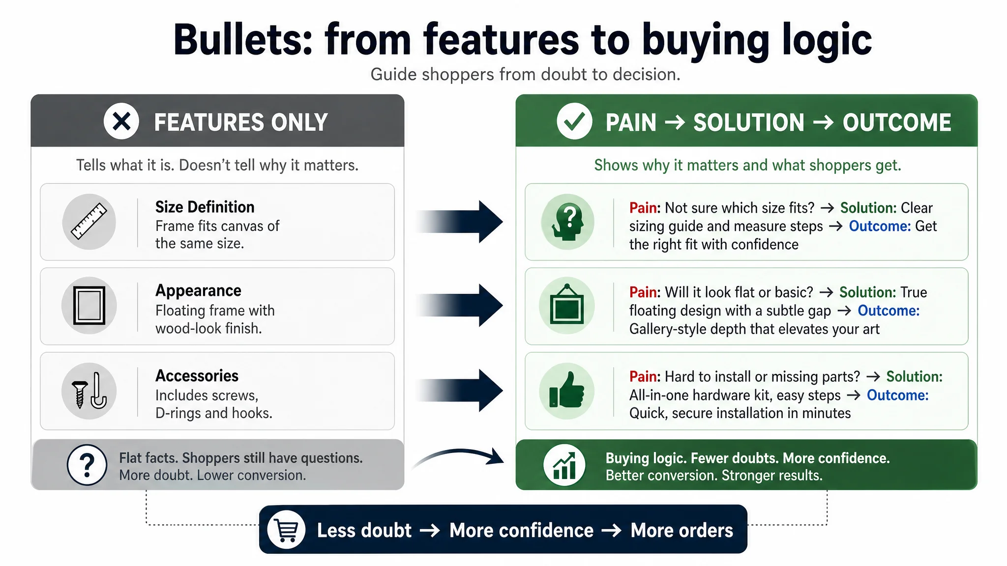
Benchmark bullets
- Organized around user‑perceived value, not internal attributes.
- Each bullet followed a full conversion arc:
Pain / Need → Solution → Outcome / Promise.
- Blended technical clarity with scene and emotion, e.g. “gallery‑style presentation”.
Customer bullets
- Structured as a feature list:
- Size definition
- Appearance description
- Accessories list
- Quality/service notes
- Mostly flat explanations, little emotional or visual language
- No clear narrative of “what this frame does for your art on your wall”.
From DeepBI’s perspective, this explained why ad traffic was stalling out on the page. The buyer had to do all the mental work themselves: “How do I measure? Will this fit? What does ‘floating’ actually look like? How hard is installation? Will this look high‑end in my home?”
The optimized bullets DeepBI proposed were intentionally built around those exact questions:
1. Perfect Fit Sizing – Matches Your Canvas
- Clarifies that the listed size equals the canvas size
- Shows exactly how to measure
- Reduces sizing confusion and returns
1. Modern Floating Design – Horizontal or Vertical Display
- Explains the floating gap in concrete visual terms
- Highlights versatility (vertical or horizontal)
- Upgrades perceived value (“gallery‑style presentation”)
1. Premium Craftsmanship & Quality Control
- Links “made to order” with rigorous inspection
- Converts generic “quality” claims into an assurance path
1. Professional Gallery Look for Wrapped Canvases
- Anchors the design to gallery‑wrapped canvases
- Calls out the gap that creates the floating effect
- Positions the frame as “museum‑like”, not just functional
1. Complete Hardware Kit – Hassle‑Free Installation
- Lists all hardware clearly
- Emphasizes “just a screwdriver” and “ready to hang in minutes”
“The real problem was not that ads failed to bring traffic. It was that the page could not convert the traffic.”
By aligning bullets to how people actually shop a technical but aesthetic product, the listing could finally start to carry its weight in the conversion funnel.
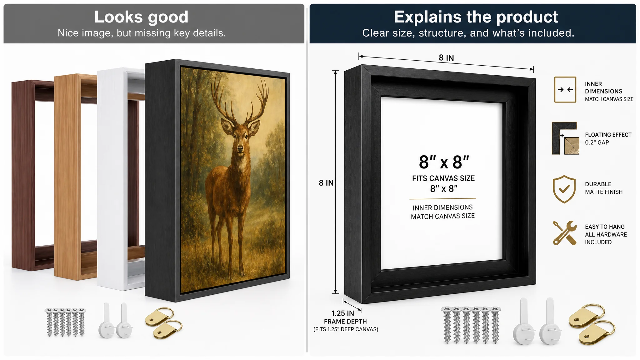
This Page Did Not Lack Images. It Lacked Decision Support.
On the surface, the customer’s A+ / detail area looked busy enough:
- Color variations
- Size explanation
- Scene images
- Installation illustrations
- Structure diagrams
- Accessory images
- Composite visuals
Yet it still scored 17 vs. the competitor’s 23 out of 25.
The difference was not “number of images” but how those images worked together as a decision journey.
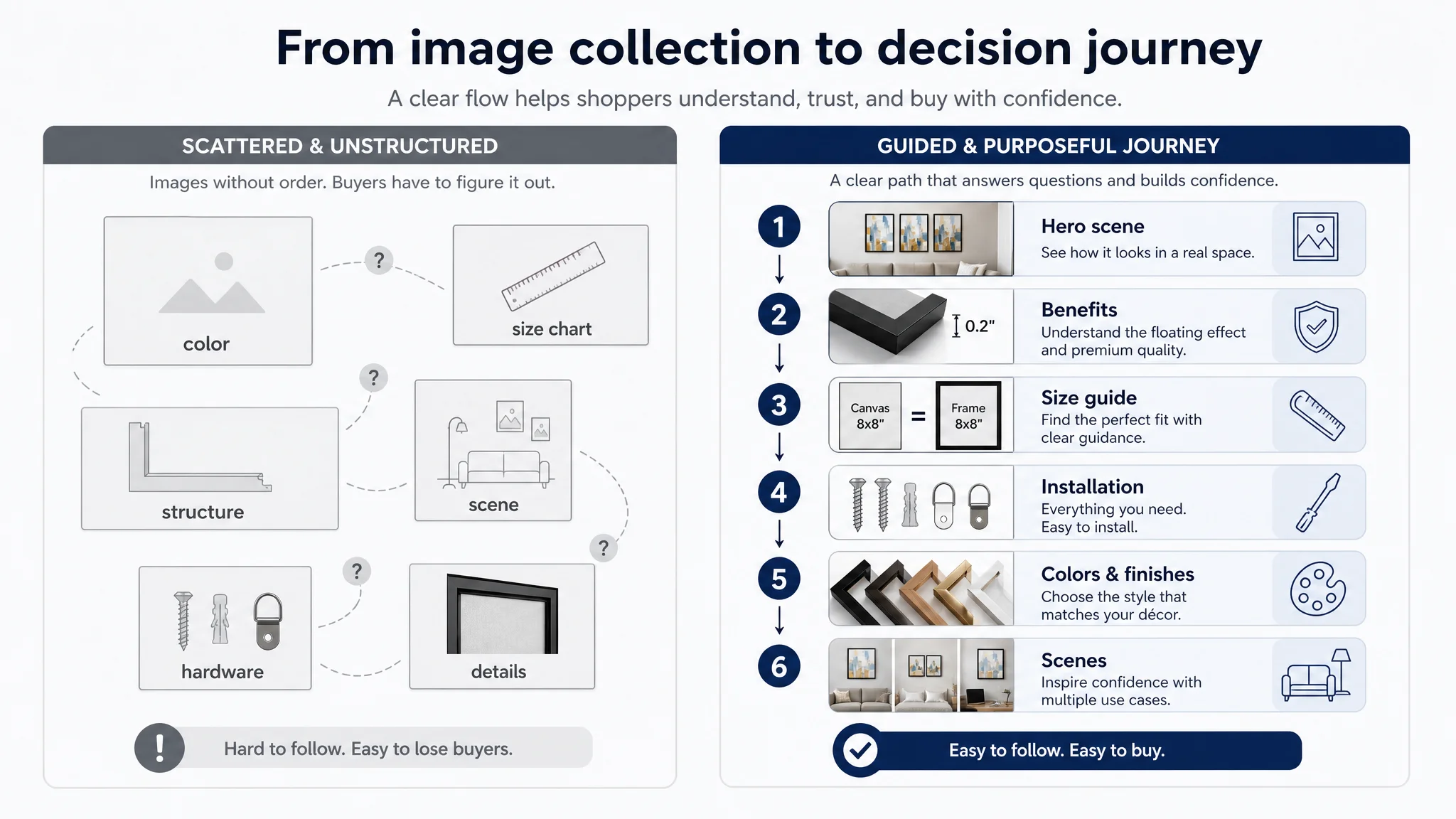
Benchmark structure
The benchmark competitor’s A+ flow felt almost like a guided sales conversation:
1. High‑impact lifestyle hero
- Frames in a cohesive living room setup
- Immediate “this would look good in my home” signal
1. Core benefit callouts
- “5 colors, 48 sizes” expressed visually
- Instant comprehension, no text overload
1. Material and craftsmanship close‑ups
- “Made in Texas, USA”
- Professional cross‑sections and technical callouts turned into perceived value.
1. Size breadth and selection guide
- Thought‑through visual sizing logic
- “Frame size = canvas size” made painfully obvious
1. Installation and hardware clarity
- Hardware, steps, and ease shown visually
1. Multi‑scene usage
- Bedrooms, offices, hallways—showing universality
In contrast, the customer’s A+ had:
- White brick wall backgrounds and weaker aesthetic staging
- Dispersion of key information (size charts and structure separated)
- Vague claims like “Durable Oak” without visual/technical support
- Less explicit linking of technical features (gap, depth) to visible outcomes
The result: shoppers had to assemble the decision logic themselves. That costs trust and time—and it shows up as lower CVR and more wasted ad clicks.
Why DeepBI Refused to “Fix Ads First”
From DeepBI’s perspective, the data was unambiguous:
- Reviews: Healthy and even stronger in volume than the benchmark.
- Main images: Not fundamentally broken; in some sub‑dimensions slightly ahead.
- Bullets + A+: Significantly weaker than the market leader and misaligned with decision logic.
If they had started with Amazon ads optimization—more spend, more keywords, incremental bid work—they would have only amplified a listing that could not properly convert new visitors.
“Advertising does not only amplify advantages. It can also amplify a page’s existing defects.”
The risk at this stage:
- Rising ACOS with no structural CVR improvement
- Increasing dependence on paid traffic to maintain rank
- Erosion of organic ranking because the page underperforms against category standards
DeepBI’s judgment was clear:
Rebuild the listing’s conversion capacity first. Then let ads scale.
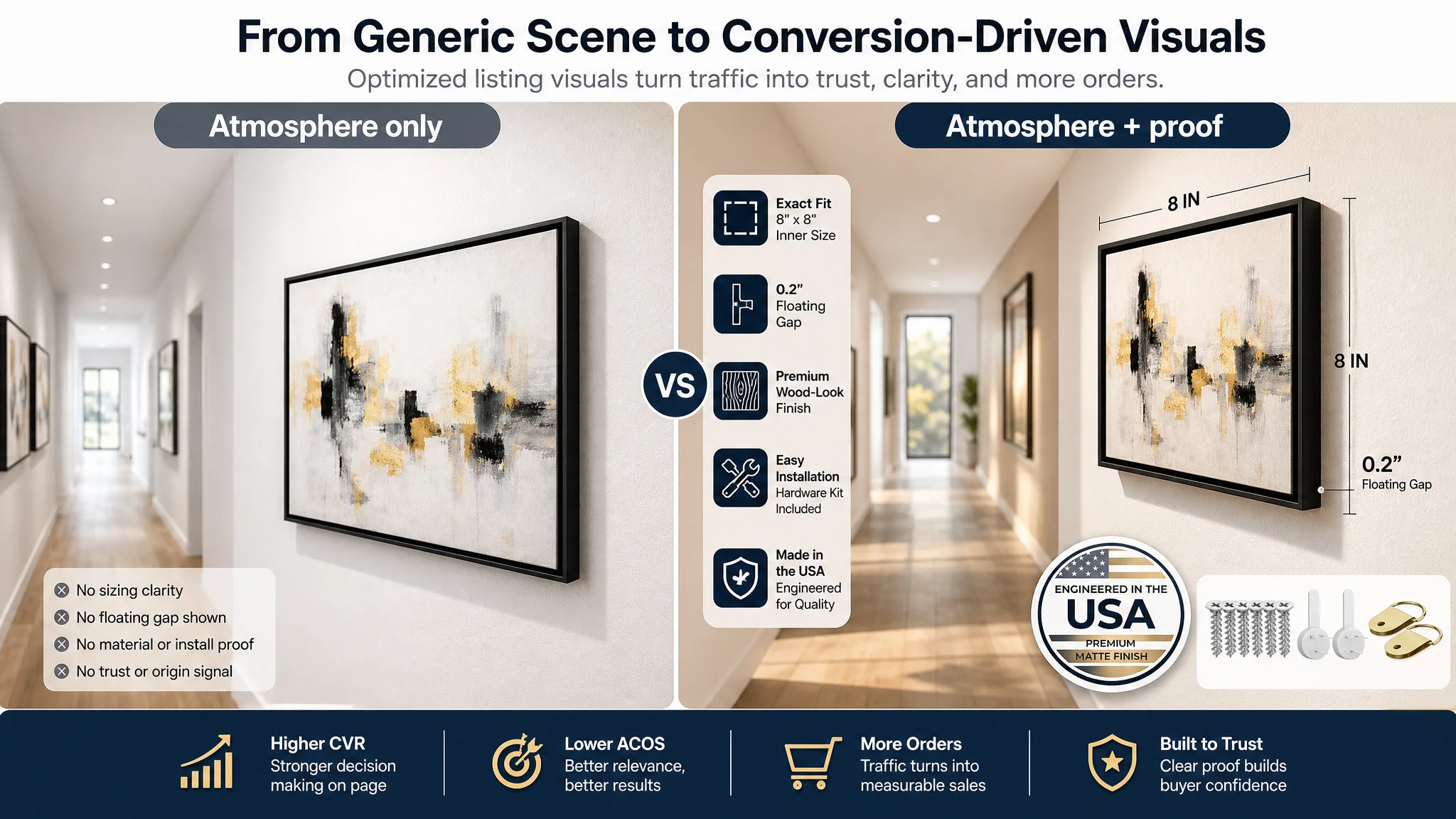
How the Visual Strategy Shifted: From “Product Display” to “Conversion Engine”
DeepBI’s recommendations for imagery followed a simple principle: Every image must either:
- Increase click‑through (CTR) from Amazon search results, or
- Remove a concrete purchase barrier on the detail page.
On the main image / gallery
The new direction was not “prettier visuals”; it was technical clarity + scene aesthetics:
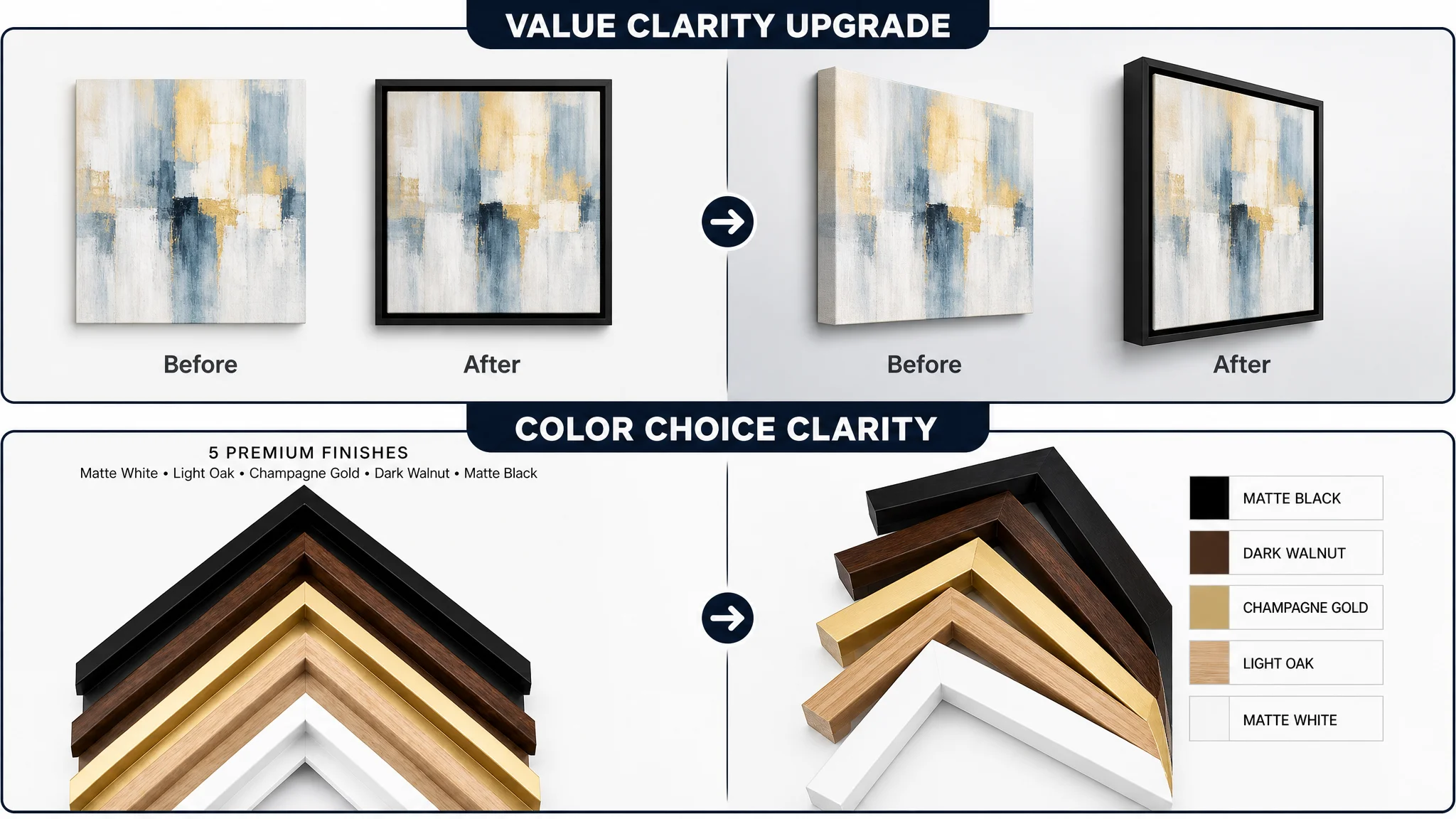
1. Lead image as technical + completeness proof
- Frame centered, ~75% of frame, 45‑degree angle
- Clean white background
- Hardware (screws, D‑rings, hooks) neatly arranged in the corner
- Clear length/width labels on the frame
→ Signals “professional, complete kit” directly from the search results page.
1. Before/after comparison
- Left: unframed canvas
- Right: same canvas in the floater frame
- “Before” / “After” labeled
→ Makes the value of the frame visible in one glance.
1. Color options as a structured choice
- 5 frame corners fanned out with labeled color blocks
→ Simplifies style selection and reduces hesitation.
1. Cross‑section technical visualization
- Corner close‑up + 2D cross‑section with annotated dimensions
→ Explains the floating structure without heavy text.
1. High‑end hallway scene
- Modern, warm, real home environment
→ Triggers “this will upgrade my space” more effectively than a generic brick wall.
On the A+ / detail page
The recommended A+ layout explicitly mirrored the buyer’s mental steps:
1. Banner: “gallery‑level” hero scene
- Three framed artworks in a modern living‑room setting
- Warm, premium light to support higher perceived value
1. Floating gap micro‑close‑up
- Micro shot of the 0.2–0.5 inch gap with strong side lighting
- Visualizes the floating effect and gap depth clearly
1. Size selection logic
- Side‑by‑side image: raw canvas vs. framed canvas
- Simple overlay text: “Frame size = canvas size”
→ Reduces size confusion and expected returns.
1. Color selection module
- Fan of corner samples with real wood‑grain textures
→ Anchors trust in material and color match.
1. Multi‑scene usage module
- Bedroom, office, staircase/entryway
→ Broadens use cases and appeals to multiple buyer segments.
1. Installation steps with real hands
- “Insert canvas → tighten screws → attach hangers → hang on wall”
- Real tools and parts, neutral background
→ Lowers perceived complexity and fears about DIY.
1. Durability and structure
- Exploded view of frame + hardware, side lighting to show thickness
→ Turns “durable material” from a claim into a visual fact.
Each recommended change was directly tied back to a specific friction point seen in the benchmark comparison.
How Ad Traffic Became Valuable Again
Once the listing’s structure and messaging aligned with buyer logic, paid traffic could finally work the way the seller expected:
- Shoppers landing from Amazon ads would:
- Immediately see that the frame matches their canvas depth and size
- Understand how to measure and choose correctly
- Believe the “floating effect” promise because they can literally see the gap
- Trust the material and craftsmanship through magnified, structured images
- Feel that installation is simple and fully supported by hardware
From there, several healthy shifts usually follow—even if exact numbers are not disclosed:
- CVR begins to recover, as the page stops wasting already‑qualified clicks.
- ACOS starts to move down, because each paid click has a higher chance of becoming an order.
- Organic ranking stabilizes or improves, as Amazon’s algorithm sees better conversion signals.
- Reliance on ads decreases, since the listing itself can support more organic traffic effectively.
The important point: these improvements do not come from one more round of bid tweaks. They come from a product page that finally deserves the traffic it receives.
What Changed in the Seller’s Understanding
By the end of the process, the seller’s view of their Amazon business had shifted in several important ways:
- Ads are not the default scapegoat.
High ACOS is often a symptom of a weak listing, not weak campaign management.
- Listing quality is a performance asset, not a cosmetic asset.
Title, main image, bullets, and A+ must form a single conversion system.
- Review strength does not guarantee conversion strength.
You can have more reviews than competitors and still lose the sale if your page doesn’t guide the decision.
- Before scaling spend, the page must pass a conversion audit.
If bullets score 3/10 and A+ 17/25 against the category leader, turning up ad volume will only magnify waste.
For Amazon sellers reading this, the takeaway is practical:
- When ad performance stalls, don’t just open the campaign manager.
Put your listing side by side with the strongest competitor and ask:
- Does my title prioritize the right category signals and usage cases?
- Do my bullets follow a clear pain → solution → outcome logic?
- Does my A+ visually answer sizing, effect, material, and installation questions better than anyone else?
DeepBI’s role in this case was not to “add features” but to force that exact reframe, quantify the listing gap against the Amazon category benchmark, and translate that gap into a precise, commercially grounded optimization path.
Once the seller stopped treating an ad symptom and started treating a listing root cause, the Amazon product page could finally carry its weight—and every paid click began to matter again.