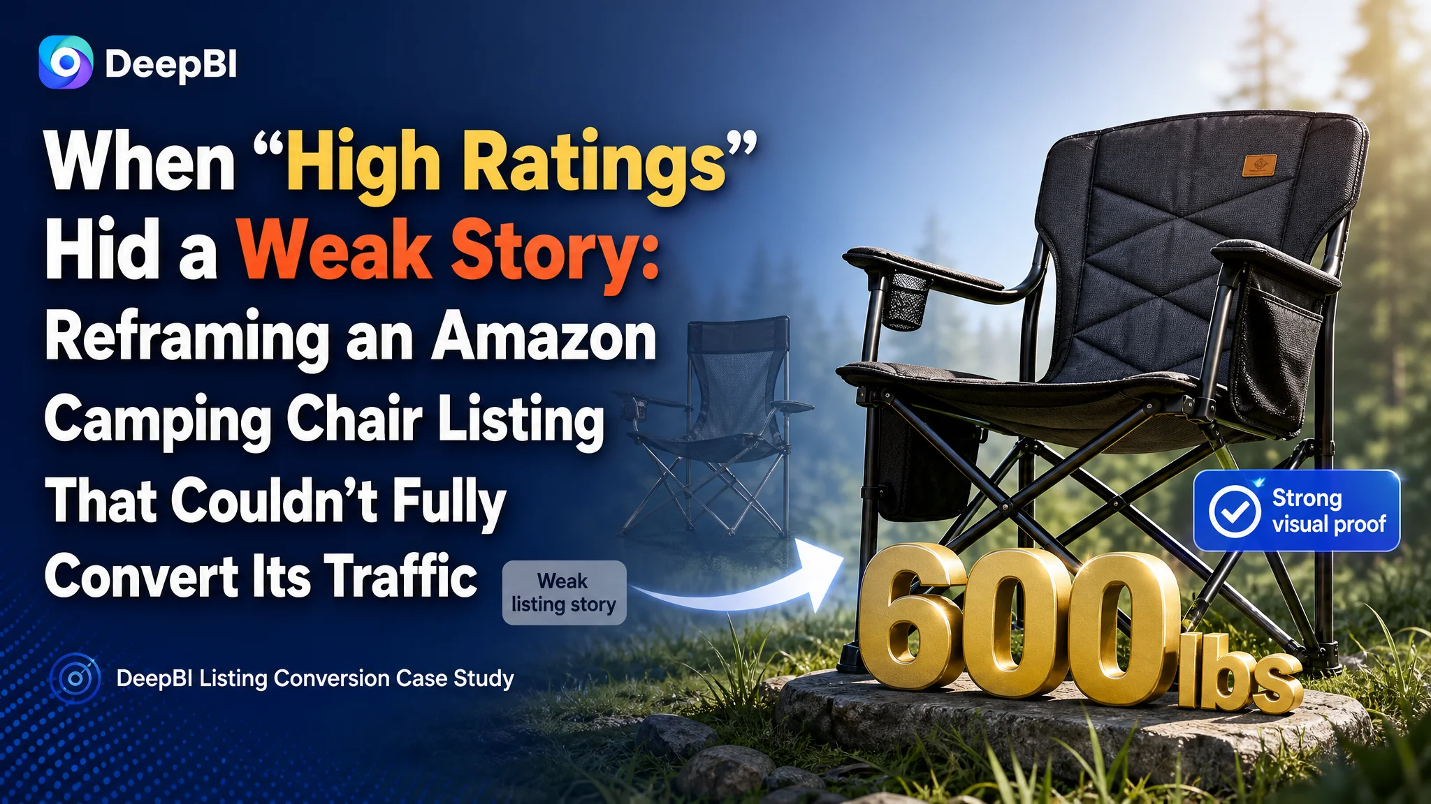
This case comes from an Amazon seller in the US outdoor category, selling an oversized heavy‑duty camping director’s chair. Advertising traffic was not the main problem—ratings were high, reviews were solid, and the chair’s core specs were competitive. Yet, against a leading benchmark listing in the same sub‑niche, the seller’s Amazon Listing consistently under‑performed in click‑through and conversion, forcing them to lean harder on ads to maintain sales.
The customer team originally believed they had an “ad optimization” issue: bids, keywords, and campaign structure. They spent time tuning Sponsored Products and Sponsored Brands, but ACOS pressure remained and the gap with the top competitor did not close. DeepBI’s diagnosis came to a different conclusion: the core leak was not in traffic acquisition but in how the Amazon product page itself converted that traffic—especially through the main image set, bullet points, and A+ storytelling.
Once the Listing was scored and benchmarked, the optimization focus shifted from “buying more traffic” to “making every click worth more.” DeepBI helped the seller rebuild the title’s selling logic, redesign the main image system to visually prove “600 lbs heavy‑duty + extra‑wide comfort,” and re‑architect the A+ content around family‑oriented outdoor scenarios and multi‑scene usage. For other Amazon sellers, this case is a reminder: strong reviews and okay scores do not guarantee that your page is telling the right story. If you only push harder on ads while your Listing quietly loses the comparison battle, your ad spend will keep amplifying the wrong outcome.
The Listing Did Not Look “Bad”—But It Was Quietly Losing the Comparison
On paper, this Amazon camping chair Listing looked healthy:
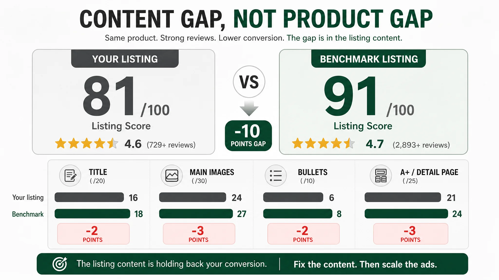
- Overall Listing score: 81/100
- Review rating: 4.6 stars, 729+ reviews with solid, detailed feedback
- Category: oversized heavy‑duty director’s chair with side table and side pocket
- Key spec: 600 lbs weight capacity, wide seat, steel frame
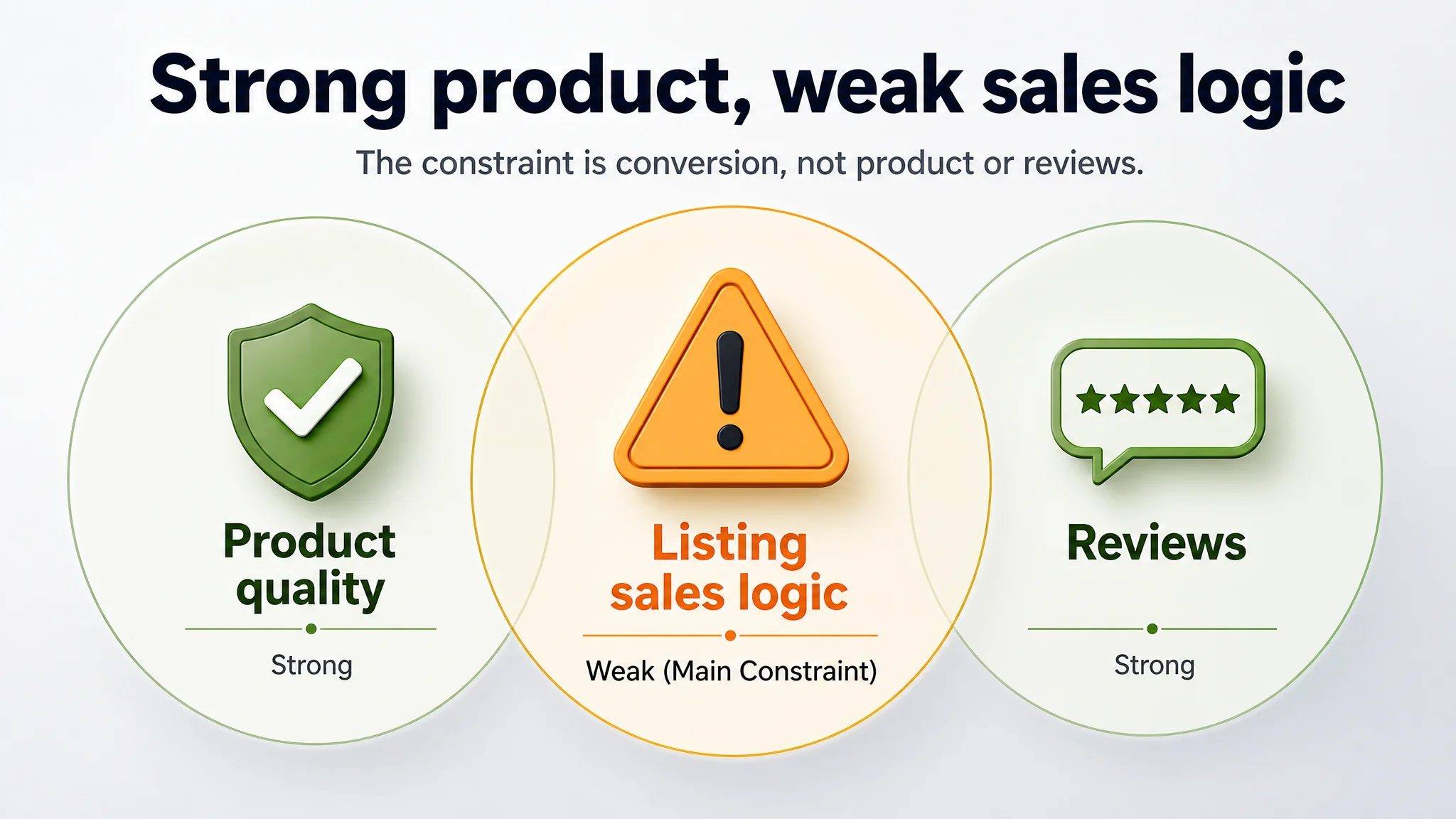
However, the category‑leading benchmark Listing, selling a very similar product, scored 91/100. The 10‑point gap came almost entirely from content and visual expression:
- Title: –2 vs benchmark
- Main images: –3
- Bullet points: –2
- Detail page / A+: –3
- Reviews: essentially equal in quality; benchmark simply had more volume
The seller’s operations team had been focusing on advertising levers because the basics appeared “good enough”: star rating high, returns under control, main features present. In their internal view, if anything needed work, it was ad efficiency.
DeepBI’s scoring and benchmarking told a different story: the ads weren’t the main constraint; Listing conversion capacity was lower than it should be for this level of product and review strength.
“The real problem was not that ads failed to bring traffic. It was that the page could not fully convert the traffic it already had.”
The Original Misdiagnosis: “This Is an Ad Cost Problem”
From the seller’s perspective, the symptoms were familiar:
- To win impressions on high‑value camping keywords, bids kept creeping up
- ACOS was hard to push down without sacrificing visibility
- Organic rank did not improve in line with ad spend
- Competitors with similar products seemed to hold stronger positions
Given these pressures, the intuitive diagnosis was:
- “Our ads need more precise keywords”
- “Our bids are not optimized enough”
- “We should restructure campaigns and split more ad groups”
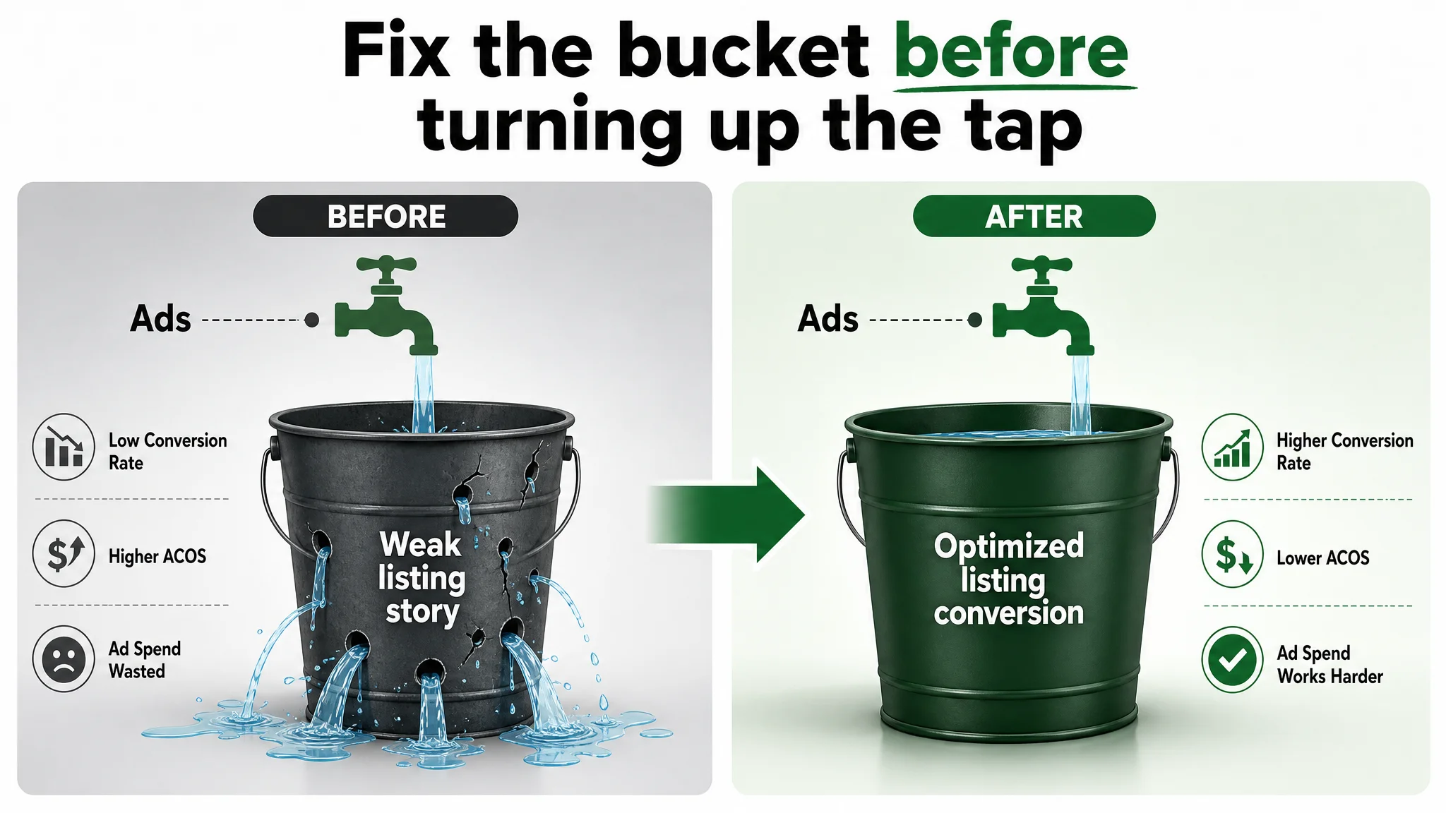
What they did not fully consider: if the Amazon product page underperforms the benchmark in how it tells the story, every additional ad click simply feeds a weaker conversion funnel. In that case, even excellent campaign management cannot change the underlying conversion ceiling.
This is why repeated ad tuning did not solve the problem. The seller was trying to optimize the faucet while ignoring the leak in the bucket.
What the Data Actually Showed: A Conversion Gap, Not a Traffic Gap
DeepBI’s Listing scoring broke the problem down into specific, comparable dimensions versus the benchmark:
- Title (16 vs 18/20) – Core keywords present, but selling logic and emotional hook weaker
- Main images (24 vs 27/30) – Functional, but lacking strong emotional and proof‑driven visuals
- Bullet points (6 vs 8/10) – Information present, but scattered and less persuasive
- Detail/A+ (21 vs 24/25) – Many modules, but narrative fragmented and less targeted to decision makers
- Reviews (14 vs 14/15) – Essentially equal in quality; benchmark had more volume but not better sentiment
Two important conclusions:
1. The product was not the problem. Quality and real‑world satisfaction were strong.
2. The Listing’s “sales logic” was inferior to the benchmark’s across the key conversion modules.
In other words, the seller’s Amazon page did not lack content; it lacked structured persuasion that matched how buyers actually decide in this category.
The Real Constraint: Listing Conversion Capacity, Not Review Quality
DeepBI’s judgment was that the core bottleneck was:
The Amazon Listing could not convert traffic as efficiently as the best benchmark in the same niche.
Not because of bad reviews, not because of missing specs, but because the page:
- Did not fully exploit the chair’s true competitive edges (600 lbs support, lighter weight, extra‑wide seat)
- Did not speak clearly enough to the right buyer persona (often a family decision maker or large‑body user)
- Did not visually prove heavy‑duty stability and comfort the way the benchmark did
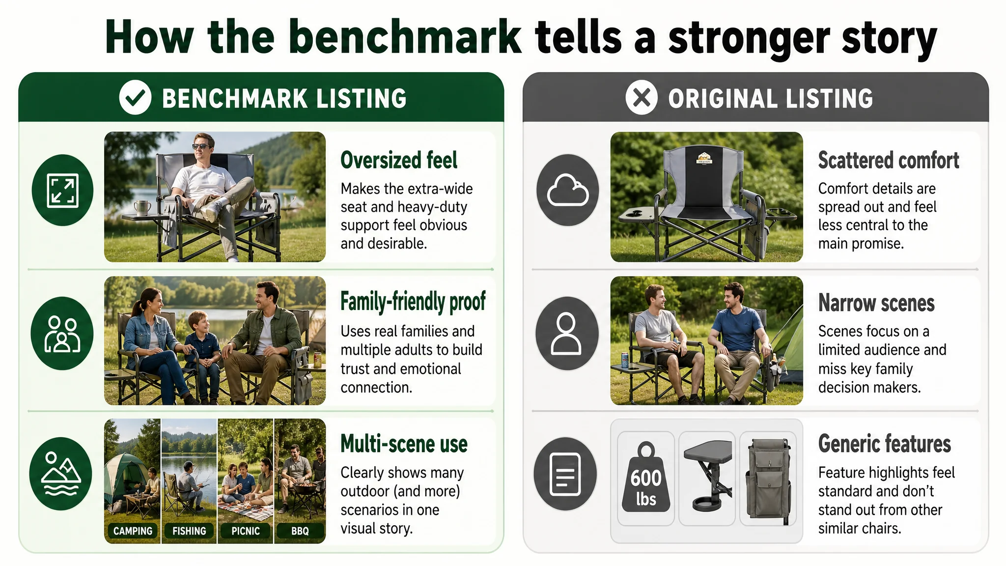
The benchmark Listing used its content to:
- Make the XXL / oversized dimension feel obvious and desirable from title to images
- Visually prove stability and family‑friendliness through scenes with children and multiple adults
- Package comfort as a dedicated, emotionally resonant promise
- Systematically show multi‑scene usage (camping, fishing, picnic, BBQ) in a single visual module
By contrast, the customer’s Listing:
- Spread comfort across several bullet points instead of elevating it as a central promise
- Used mainly young‑friends‑social scenes, narrowing resonance with family decision makers
- Had scene images, but not organized as a clear multi‑scenario map—information felt fragmented
- Showed side pocket and side table, but did not clearly highlight differentiated, high‑value use cases
This was not a “no content” problem; it was a conversion architecture problem.
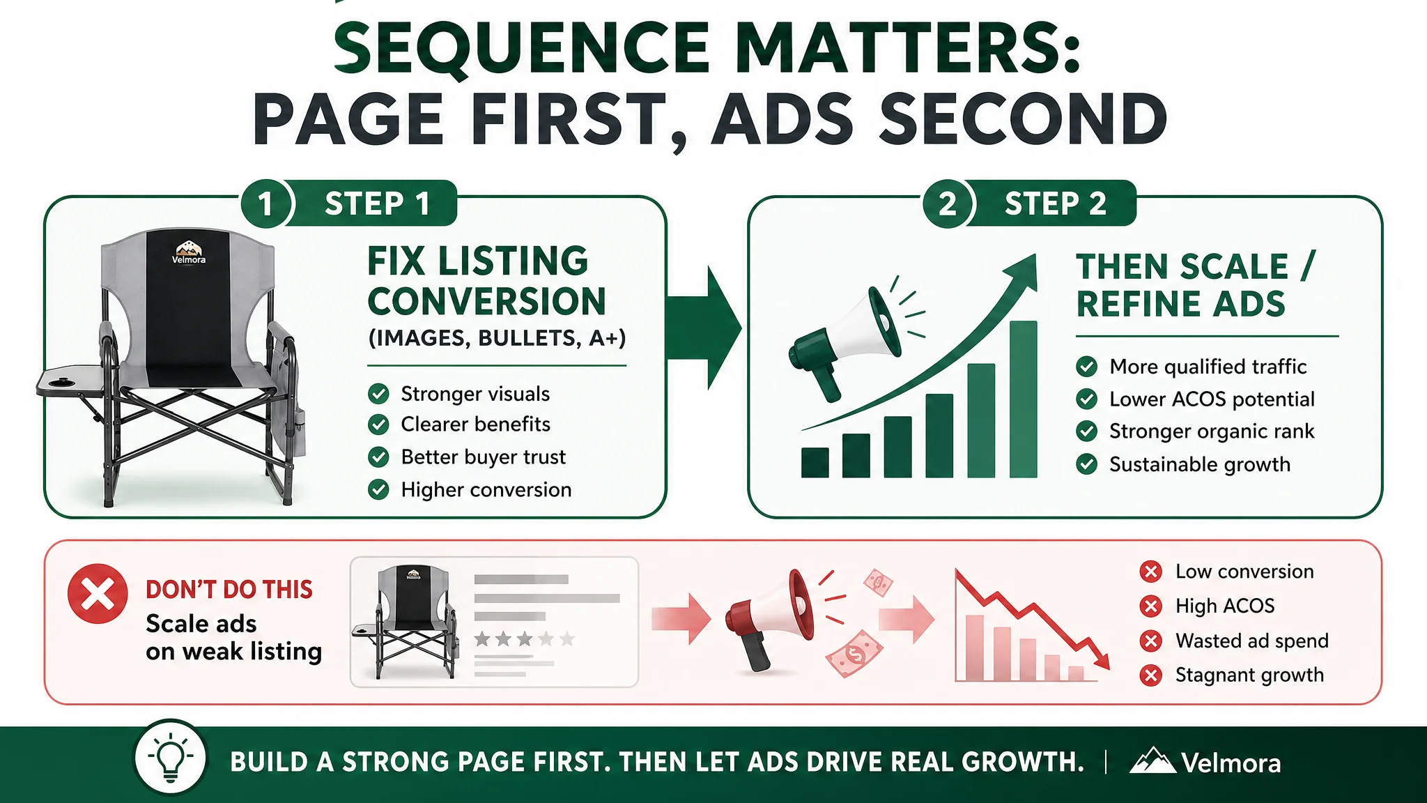
Why DeepBI Did Not Recommend “More Ad Tuning” First
Given this diagnosis, DeepBI’s reasoning was straightforward:
- If the Listing is structurally weaker than the benchmark in how it converts traffic,
- and if ads are already delivering traffic at a reasonable level,
- then pushing more traffic through the same page will not fundamentally improve ACOS or TACOS.
The priority had to be:
1. Repair the Listing’s conversion logic and visual proof, so that each click has a higher chance to convert.
2. Then, scale or refine ads based on a stronger base page, turning ad spend into a genuine growth lever instead of a subsidy for a weaker page.
Continuing to tweak ads without fixing the page would have meant:
- Ad spend continues to rise to maintain sales
- Organic rank remains suppressed relative to potential
- The benchmark keeps compounding its advantage via better conversion and more review volume
“Advertising does not only amplify advantages. It can also amplify a page’s existing defects.”
Where the Listing Was Quietly Losing the Click: Main Image Logic
The main image set lacked a strong reason to click
On the search results page, the benchmark’s main image system did three things better:
1. Emotion and aspiration
- Real family scenarios (parent and child reading, family picnic) created “I want this life” resonance.
- The customer’s images skewed toward generic young‑friends social scenes, missing a key decision‑maker: the family buyer.
1. Proof of heavy‑duty performance
- The benchmark visually demonstrated multiple adults sitting, making “600 lbs support” feel real.
- The customer’s images emphasized parameters and labels more than visceral proof.
1. Differentiation and memory hooks
- The benchmark highlighted unique accessories (detachable shoulder strap, integrated cooler bag) with zoomed‑in, memorable close‑ups.
- The customer’s “side table protector handle,” “widened seat,” etc., felt more standard and less distinctive on the search page.
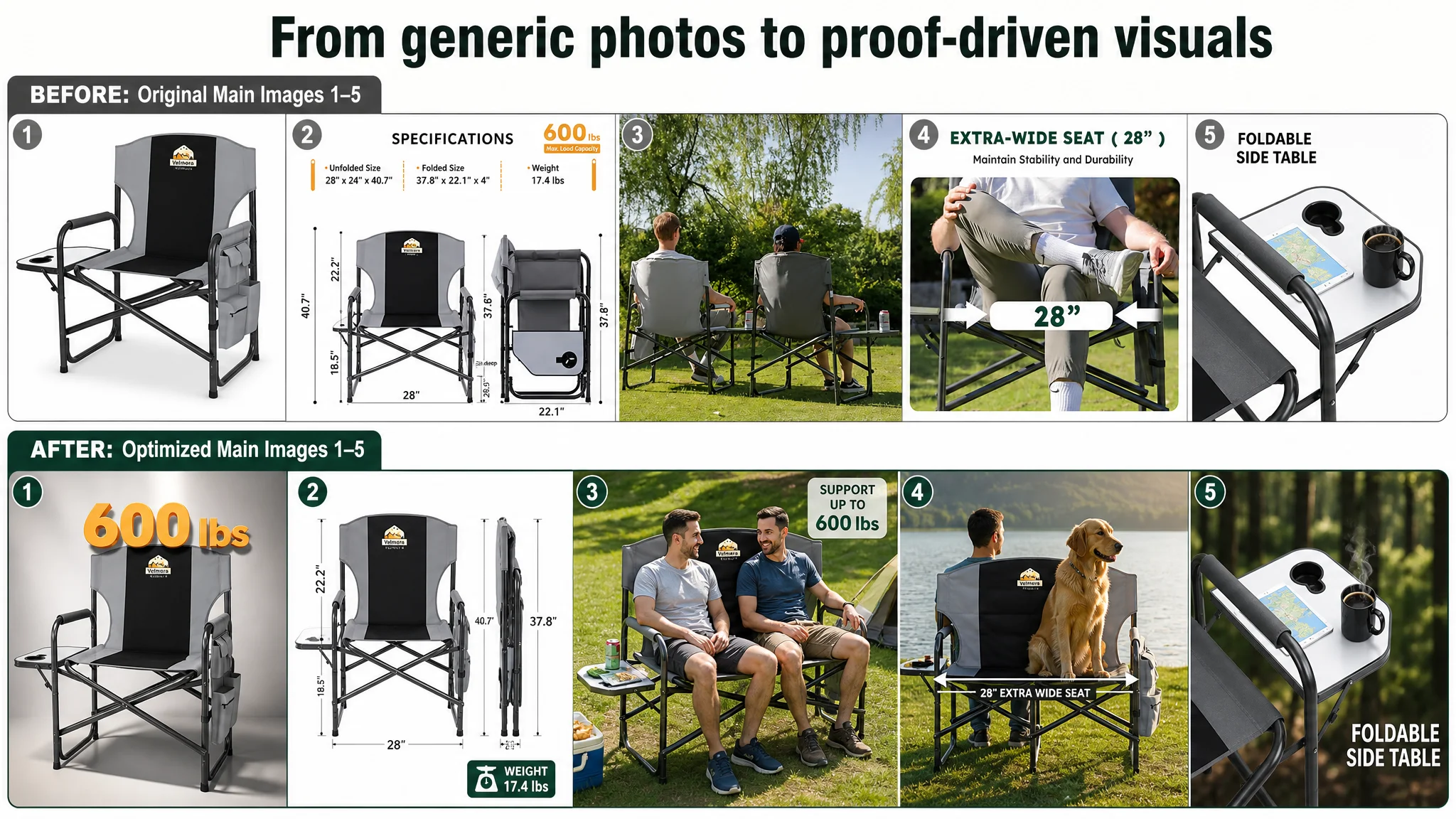
DeepBI’s visual diagnosis translated into specific main‑image directions:
- Image 1 – Heavy‑duty authority:
Centered chair at a 45° angle, occupying ~75% of the frame, with strong, hard light and a subtle shadow. A bold “600 lbs” 3D‑style mark above the seat visually anchors the heavy‑duty promise. This directly addresses the core category anxiety: “Is it really strong enough?”
- Image 2 – Dimensions in one glance:
Side‑by‑side unfolded vs fully folded chair, 1:1 proportion, precise dimension lines and labels. This reduces cognitive load on space and storage decisions.
- Image 3 – Real‑world load proof:
Two adult men sitting on the chair in a real outdoor scene, low‑angle shot, bright natural light, “Support up to 600 lbs” overlay. This converts the spec into visible reality.
- Image 4 – Extra‑wide comfort made obvious:
Person seated with a large dog occupying the remaining space; white arrows and “28'' EXTRA WIDE SEAT” label. The buyer does not have to imagine the width—they see it.
- Image 5 – Side table as lifestyle, not just a feature:
Close‑up of the side table with a tablet and steaming coffee in a forest‑camp setting, labeled “FOLDABLE SIDE TABLE”. The message shifts from “has a table” to “supports your way of using it.”
By doing this, the seller stops relying on text and specs to do the work that images should be doing at the CTR stage.
Bullet Points: From Parameter Listing to Buying Logic
The bullet points also showed a clear pattern: information existed, but the logic did not match the benchmark’s persuasion path.
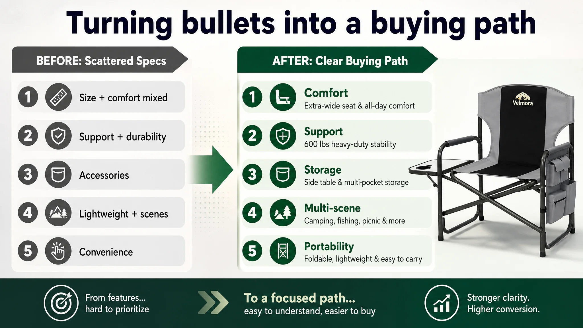
How the benchmark structured its five bullets
- Lead with OVERSIZED DIMENSION – directs attention immediately to XXL sitting space.
- Separate, focused MAXIMUM COMFORT – dedicates a whole bullet to comfort outcome.
- Dedicated bullet for heavy‑duty frame & 600 lbs support – clear promise plus materials.
- Detailed bullet on side table & insulated pocket – concrete use, not just naming parts.
- Final bullet on multi‑scenario use – ties everything together in real use cases.
DeepBI’s re‑architecture of the seller’s bullets
The goal was to turn each bullet into a “pain point → promise → proof” mini‑story:
1. EXTRA‑WIDE SEAT & PREMIUM COMFORT
- Contrast 28" vs typical 21" seats to make comfort advantage tangible.
- Add foam‑padded seat and backrest for ergonomic support, addressing long‑sitting fatigue.
1. HEAVY‑DUTY 600LBS SUPPORT
- Emphasize strengthened steel frame, 50% thicker than typical chairs, and anti‑rust powder coating.
- Reassure buyers who are skeptical that a foldable chair can truly support 600 lbs.
1. CONVENIENT SIDE TABLE & STORAGE
- Frame “hands‑free convenience” with specific objects: phone, drink, tablet, personal items.
- Highlight high‑density 600D Oxford cloth for weather resistance and easy cleaning.
1. LIGHTWEIGHT & MULTI‑SCENARIO USE
- Turn the weight difference into an advantage: 16.3 lbs vs a 22‑lbs competitor.
- Chain the main scenes together: camping, beach, picnic, fishing, backyard, office.
1. PRE‑ASSEMBLED & PORTABLE DESIGN
- Elevate “no assembly required” and built‑in handle as a convenience differentiator.
- Address the hidden fear: “heavy‑duty means heavy and cumbersome” by showing it is easy to carry.
This restructuring does not invent new features; it simply reorders and sharpens the existing ones into a clear decision path.
Detail Page / A+: From Fragmented Modules to a Coherent Outdoor Story
The customer’s detail page was not empty. It actually had many modules:
- Brand scene image
- Core parameters
- Steel frame highlight
- Wide seat close‑up
- Armrest function
- Folding size
- Side table structure
- Side pocket features
- Quick assembly
- Easy folding
- Multi‑person scene
The problem: the modules did not form a coherent narrative. The benchmark’s A+ execution did.
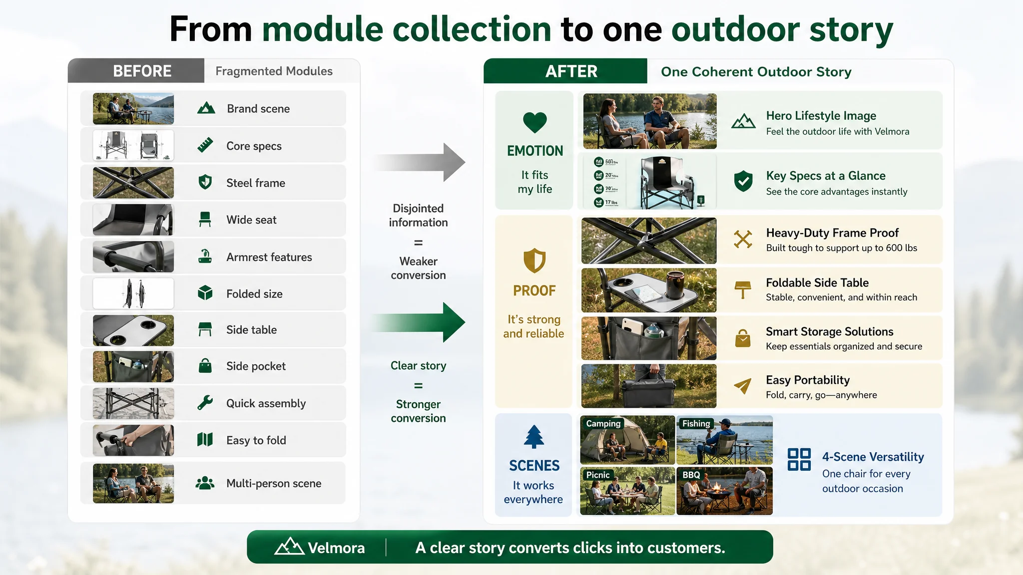
Where the benchmark pulled ahead
- Emotional coverage:
Family + children scenes (mother and child reading, full family picnic) hit the emotional triggers of comfort, safety, and togetherness.
- Scenario breadth:
A “4‑scene application collage” (Camping/Fishing/Picnic/BBQ) made “one chair, many uses” visually obvious.
- Differentiated innovation:
Clear emphasis on unique features like an insulated side pocket, retractable side table, detachable shoulder strap—with close‑ups, icons, and text.
- Visual cohesion:
Unified color palette (natural greens, grays), consistent outdoor background, clean font hierarchy. The page felt like one story, not a collection of slides.
DeepBI’s A+ restructuring direction
Instead of “more images,” the emphasis was on better‑ordered, better‑targeted images:
1. Opening hero: family‑oriented outdoor scene
2. Core‑spec summary panel
3. Heavy‑duty frame proof shot
4. Side table in real use
5. Side pocket capacity
6. Portability demonstration
7. Four‑scene usage collage
The result is a detail page that addresses emotion, logic, and risk in a structured order, making it easier for both organic visitors and ad‑driven traffic to say “yes.”
Why Listing Conversion Had to Be Fixed Before Scaling Ads Again
From a business standpoint, DeepBI’s judgment came down to sequence and risk:
- Risk if they kept optimizing ads first:
- Ad spend continues to rise while conversion stays below benchmark.
- Organic ranking lags, forcing continued high dependence on paid traffic.
- Benchmark continues compounding its advantage through better CVR and faster review accumulation.
- Benefit of fixing the Listing first:
- Every existing click (organic + paid) has a better chance to convert.
- ACOS has room to move down at the same or even lower bid levels.
- Organic share of orders can grow as Amazon’s algorithm sees stronger conversion signals.
- Future ad optimizations operate on a stronger base, making scaling more controllable.
In other words, the Listing is the foundation of ad efficiency. Without a convincing page, no campaign structure can deliver its full potential.
How the Page’s Sales Logic Started to Recover
After the content and visual restructuring, several qualitative shifts occurred in how the Listing behaved in the funnel:
- The main image set began to visually own the heavy‑duty and extra‑wide promises, rather than burying them in text.
- Bullet points stopped being a scattered list of features and became a clear sequence of buying reasons.
- The A+ section shifted from multiple disjointed images to a coherent outdoor lifestyle story, directly aligned with the core buyer’s real scenarios.
- Concerns about stability, comfort, portability, and multi‑scene use were all addressed with specific, believable visuals.
As a result, the page became much better at turning both organic and ad traffic into orders. The Listing started to regain its own sales capability, instead of leaning so heavily on ever‑increasing ad investment.
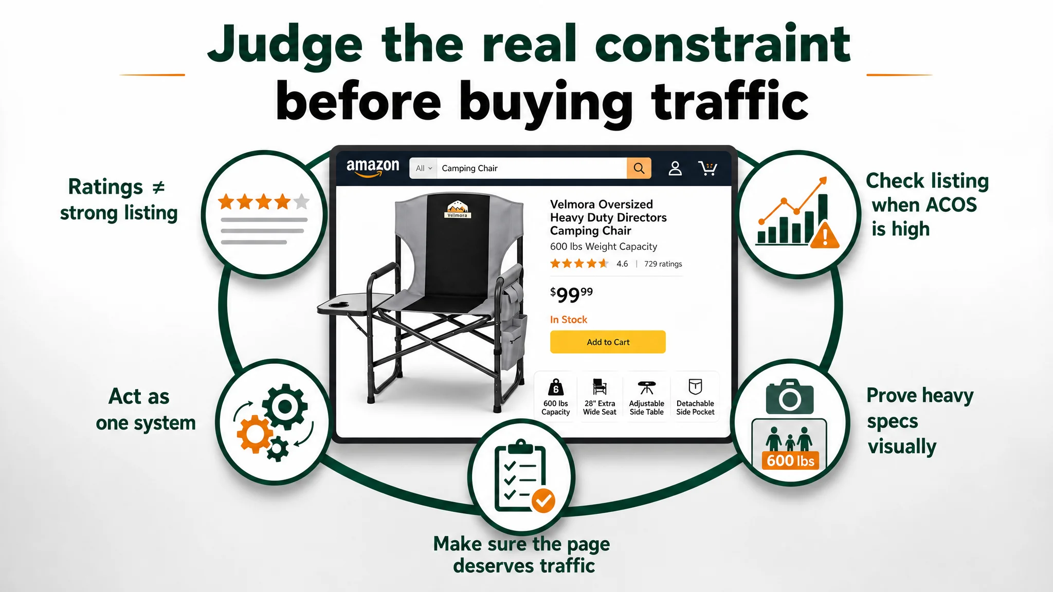
What Other Amazon Sellers Can Take Away
Several lessons from this camping chair case apply broadly across Amazon categories:
1. High ratings do not guarantee a strong Listing.
You can have 4.6–4.7 stars and hundreds of reviews, yet still lose conversion to a competitor whose content tells a sharper, more emotionally resonant story.
1. If ads keep feeling “expensive,” check the Listing first.
When ACOS is stubborn and tweaks to keywords and bids don’t move the needle, there is a serious chance the bottleneck is page‑level conversion—not campaign structure.
1. Titles, main images, bullets, and A+ must work as one system.
In this case, each part on its own was “okay,” but together they did not form a strong decision logic. The benchmark’s advantage came from coherent storytelling, not one magic module.
1. Heavy specs must be made visually believable.
A claim like “600 lbs capacity” or “extra‑wide seat” has to be proven with visuals—people, context, and comparisons—not just numbers.
1. Before buying more traffic, ask whether the page deserves it.
If DeepBI’s scoring shows you are 10 points behind a true benchmark, aggressive ad scaling will likely just amplify that gap. Fix conversion first; then let ads compound your strengths.
This is where DeepBI’s value ultimately lies for Amazon sellers: not in offering another panel of metrics or a list of features, but in judging where the real constraint is—and insisting on fixing the Listing’s conversion logic before pouring more fuel into the traffic engine.