
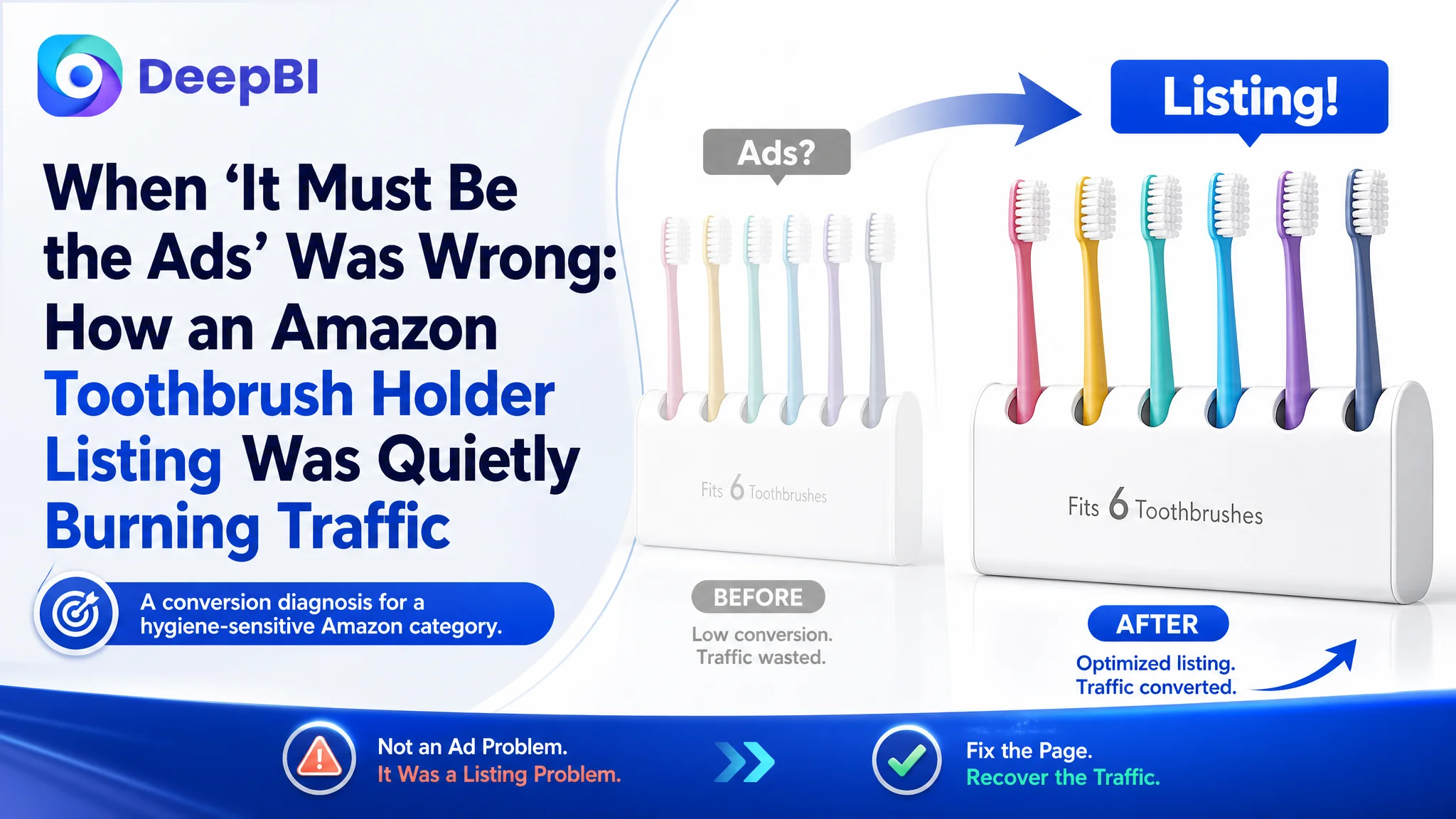
For this Amazon seller in the bathroom accessories category, the pressure looked familiar: ad spend was climbing, click costs were not cheap, and yet orders were not keeping up. The team’s first instinct was to blame Amazon ads—bids, keywords, and campaign structure—and they kept tuning campaigns, hoping ACOS would finally move. But behind those numbers sat a product page that was scoring only 60/100 against an 80/100 benchmark Listing in the same Amazon category.
DeepBI’s diagnosis reframed the situation completely. This was not a traffic or keyword problem; it was a Listing conversion problem. The main image, title, A+ content, and review structure were all weaker than a comparable high-performing Amazon Listing, especially in trust-building areas like compatibility proof, hygiene logic, and social proof. Ads were faithfully delivering traffic into a page that could not fully convert it.
Once the seller accepted that the real constraint was Amazon product-page conversion, the optimization direction changed: instead of endlessly adjusting ads, they rebuilt the Listing around clear decision logic—fixing the title, tightening the visual story of the main images, and restructuring A+ to answer the core “Will this fit my toothbrush and stay hygienic?” questions. As the page’s sales logic started to make sense, ad traffic became useful again.
Other Amazon sellers can recognize themselves in this: when ACOS feels stuck, the temptation is to push harder on ads. This case shows how a mid-performing Listing—especially in a trust-sensitive category—quietly caps your results, and why repairing Listing conversion capacity must often come before the next round of ad optimization.
The Core Conflict: Clicks Were Not the Real Problem
On paper, this toothbrush holder Listing did not look hopeless.
- The product solved a real bathroom problem: dust-proof, wall-mounted toothbrush storage with multiple slots.
- The page had been built seriously: complete bullet points, functional A+ images, and some reviews.
- Star rating was acceptable: 4.3 stars.
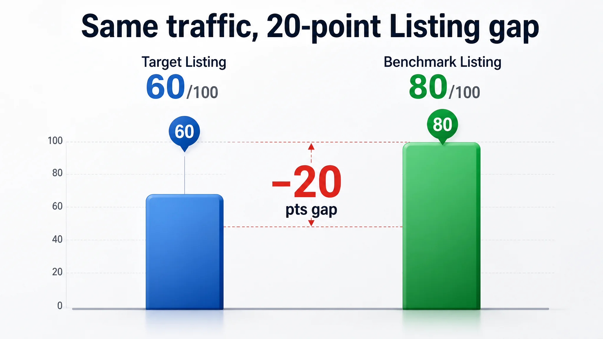
Yet when DeepBI placed this Amazon Listing against a category-leading competitor, the numbers were blunt:
- Overall Listing score:
- Target Listing: 60 / 100
- Benchmark Listing: 80 / 100
- Gap: –20 points
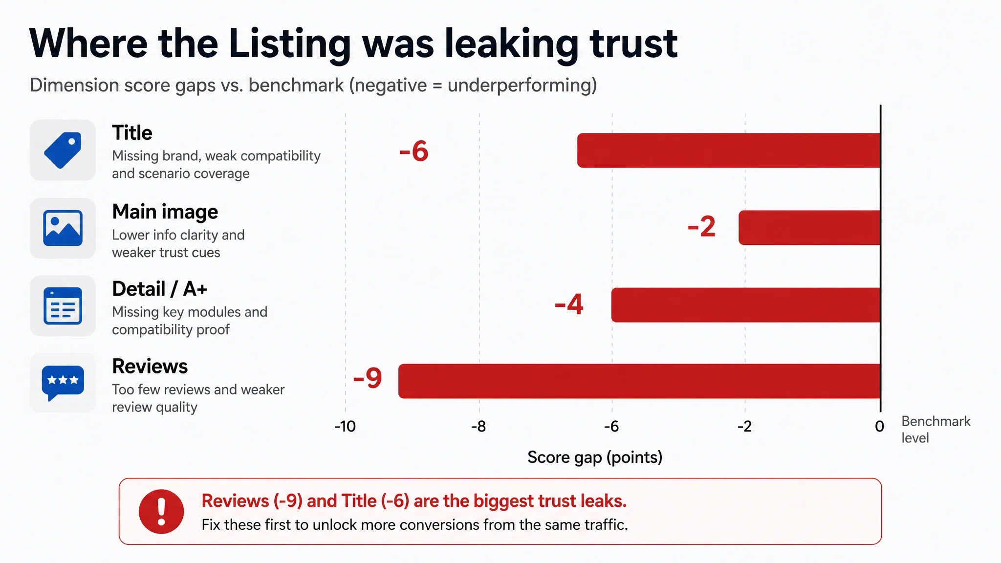
- Dimension scores (Target vs. Benchmark):
- Title: 10 vs. 16 (–6)
- Main image: 24 vs. 26 (–2)
- Bullet points: 5 vs. 4 (+1, but for the wrong reason)
- Detail / A+: 17 vs. 21 (–4)
- Reviews: 4 vs. 13 (–9)
The key: this was not a case of “no effort.” It was a case of misaligned effort. The seller had a relatively complete Listing, especially in text. But the parts that truly decide conversion in this category—visual trust, hygiene logic, compatibility proof, and review depth—were significantly weaker than the benchmark.
“The real problem was not that ads failed to bring traffic. It was that the page could not convert the traffic.”
From DeepBI’s perspective, pouring more budget into ads at this stage would only amplify the Listing’s weaknesses.
The Seller’s Original Misdiagnosis: “We Must Fix Ads, Not the Page”
Before DeepBI’s diagnosis, the seller’s mental model looked like this:
- ACOS was higher than they wanted.
- CPCs felt expensive.
- Impressions were not translating into enough orders.
So the working hypothesis was:
- Ads are the problem.
- We need better keywords, better bid strategy, maybe more negative keywords.
- If we tune ad structure, ACOS will fall.
This is a common trap for Amazon sellers:
1. Ads are visible and controllable every day.
You log in, see the spend and ACOS, and it feels natural to adjust there.
1. Listing conversion is harder to quantify.
Sellers often sense “we could improve the images,” but without a clear benchmark or score, it feels subjective.
1. Historical experience says “tune ads first.”
For many sellers, this worked in the early growth phase. As competition intensified, that playbook started to fail.
In this case, the seller had already:
- Adjusted bids and budgets multiple times.
- Tweaked targets and campaign structures.
- Tried to control ACOS via ad-side levers.
But the underlying conversion capacity of the Amazon product page never improved, so each round of ad tuning delivered little relief.
What DeepBI Saw: A Conversion Bottleneck, Not an Advertising Bottleneck
Listing scoring exposed where the page was leaking
When DeepBI’s Listing scoring compared the target Listing to a true benchmark in the US Amazon marketplace, the pattern was clear: almost every trust and decision-critical dimension underperformed.
- Title: –6 points vs. benchmark
- Main image: –2 points
- Detail / A+: –4 points
- Reviews: –9 points
The single “better” area—bullet points—masked a key issue: the seller had more text and more complete descriptions, but the benchmark had sharper, decision-focused communication.
In other words, the seller wrote a better instruction manual; the benchmark wrote a better sales argument.
The real constraint: Listing conversion capacity
DeepBI’s judgment: at this stage, any attempt to further push ads would suffer from diminishing returns because:
- The page was not building enough trust for a hygiene-sensitive bathroom accessory.
- Key category pain points were not addressed visually in a way that the benchmark Listing already did.
- Reviews were too few to compensate for these structural gaps.
So the core conflict became:
- Seller’s focus: Keep tuning ads to reduce ACOS.
- Real constraint: The Amazon Listing could not fully convert either paid or organic traffic.
Until that constraint changed, ACOS would remain structurally resistant.
Where the Listing Actually Fell Behind
1. The Title: Words Were There, But the Decision Logic Wasn’t
The original Amazon title had typical elements:
- “6 slots”
- “Toothbrush holder”
- “Perfect for dorm bathrooms and shower”
But under competitive pressure, it broke down in several ways:
- No brand anchor.
The benchmark Listing followed the standard “Brand + Product” pattern, reinforcing brand recognition. The target Listing skipped this, losing a small but meaningful trust signal.
- Redundant information, wasted characters.
It repeated the “6 toothbrushes” idea instead of using that space for higher-leverage information.
- Weak compatibility framing.
The benchmark explicitly addressed a core pre-buy fear—“Will this fit my toothbrush?”—by stating compatibility with specific toothbrush types. The target title did not.
- Loose structure.
The benchmark flowed like: “Brand – core function – installation – use scenario – specific selling point.” The target Listing was closer to a list of features without a clear decision sequence.
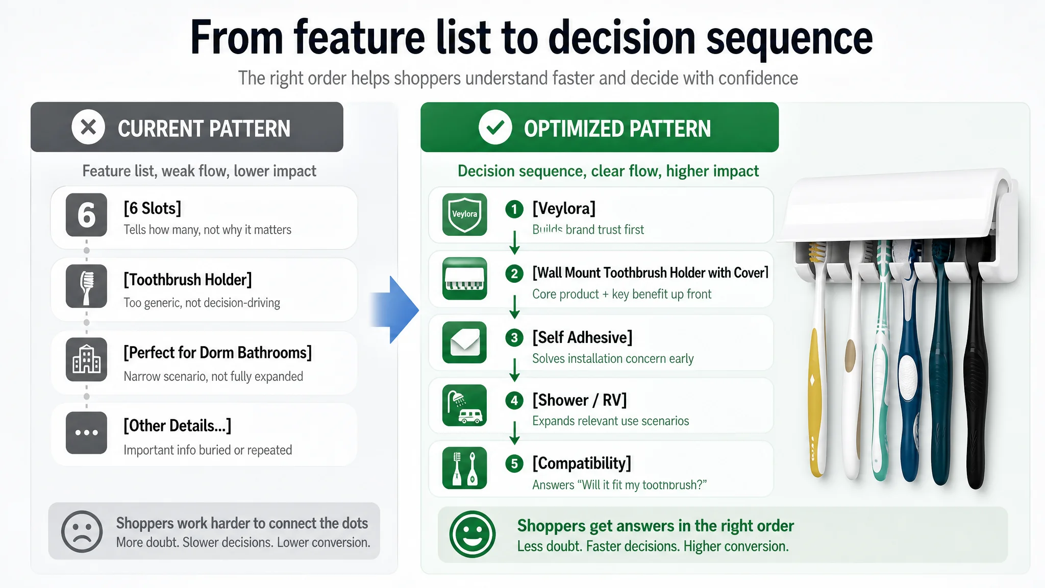
DeepBI’s proposed direction:
- Bring the core keyword “Wall Mount Toothbrush Holder with Cover” forward.
- Use freed-up characters (from removing redundant “Holds 6 Toothbrushes”) to add material and compatibility descriptors.
- Explicitly include RV / shower / dorm use scenarios to expand search coverage.
- Introduce compatibility wording (manual and electric brushes, depending on real product constraints) to close the trust gap.
This was not a matter of stuffing more keywords; it was about aligning the title with how real Amazon shoppers decide: What is it? Will it fit me? Where will I use it?
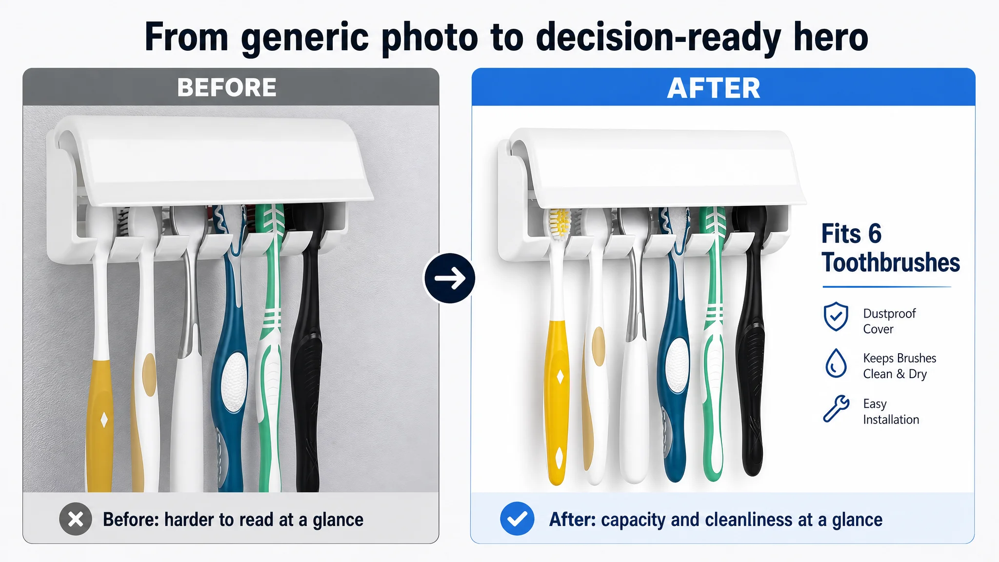
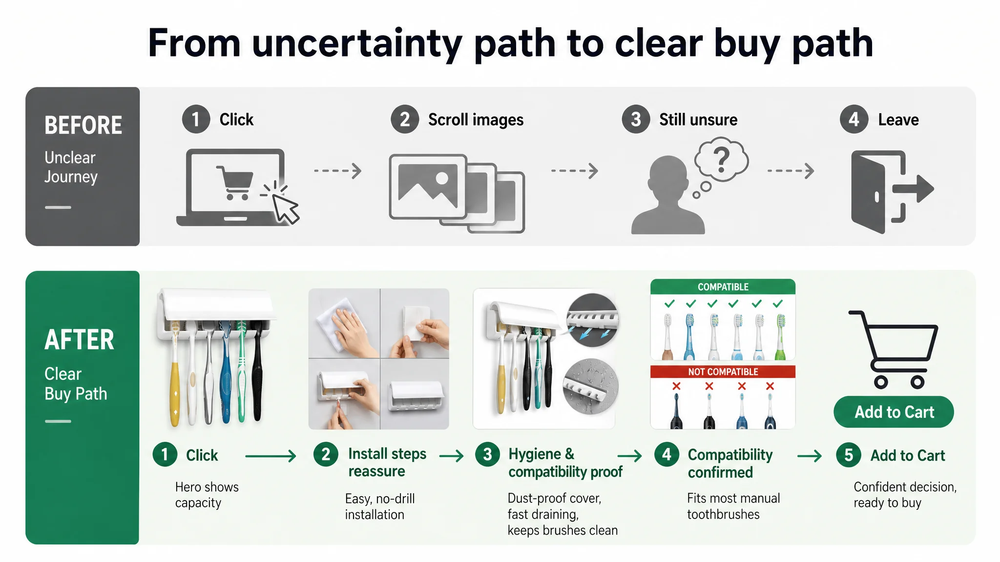
2. The Main Image Set: Information Was There, But It Was Hard Work to Read
The existing image set did show the product, some usage, and installation. But compared with the benchmark, DeepBI saw three critical weaknesses:
1. Information capture speed was low.
In Amazon search results, shoppers make decisions in seconds. The target main image required more cognitive effort to understand:
- Number of slots was not visually dominant.
- Installation seemed fragmented rather than presented as a simple process.
- Key benefits like dust-proof cover and compatibility were not instantly apparent.
1. Scene and aesthetic were not aspirational enough.
For buyers who care about bathroom aesthetics, the benchmark Listing created a more polished, lifestyle-consistent environment. The target Listing leaned toward “ordinary snapshot,” which:
- Reduced perceived value.
- Limited appeal to higher-value segments that care about clean, minimal bathroom design.
1. Compatibility and trust cues were unclear.
The target Listing did not visually answer, “Will this work with my toothbrush type?” The benchmark solved this with explicit visual logic and contrast.
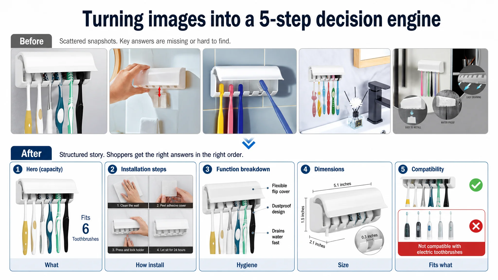
DeepBI’s recommended direction focused on visual decision logic, not just “nicer pictures”:
- A clean, centered hero shot: product occupying ~75% of the frame, 45-degree angle, clear internal view of exactly six toothbrush slots, with overlay text “Fits 6 Toothbrushes.” This increases click-through probability in the search grid.
- A 2x2 installation grid: four clear steps (clean wall, peel adhesive, press, wait), each with real hands and clear text. This turns “Will it be a hassle to install?” into “I can do this in 30 seconds.”
- A three-part functional breakdown image: call-outs for “Flexible flip cover”, “6 Toothbrush slots”, “Dustproof design.” This visually answers hygiene and capacity concerns.
- A dimension image: length, height, depth, and slot width called out with clear lines and values (aligned with the real product specs). This reduces returns and pre-purchase hesitation.
- A compatibility vs non-compatibility image (where accurate): e.g., green checkmarks over multiple manual toothbrush types, red crosses on incompatible electric brushes, with “Compatible / Not Compatible” labels. This mirrors the benchmark’s use of simple, strong compatibility logic.
“Advertising does not only amplify advantages. It can also amplify a page’s existing defects.”
The aim: transform the main image deck from “product snapshots” into a compressed decision engine.
3. Bullet Points: Comprehensive, Yet Not Conversion-Oriented
Interestingly, the target Listing scored slightly higher than the benchmark in the bullet-point dimension—but for reasons that did not help conversions.
The seller’s bullet points:
- Covered design, function, installation, use scenarios, and capacity.
- Explained things like automatic cover mechanics and multi-scene use in detail.
The benchmark’s bullet points:
- Were shorter, more concentrated on keywords.
- Hit core pain points quickly: space saving, easy install, core use.
DeepBI’s reading:
- The seller had written a mini product manual—accurate, detailed, but heavy.
- The benchmark had written sales-focused summaries—punchy and easy to scan.
So the optimization did not mean adding even more text. It meant restructuring what was already there into a more commercially focused logic:
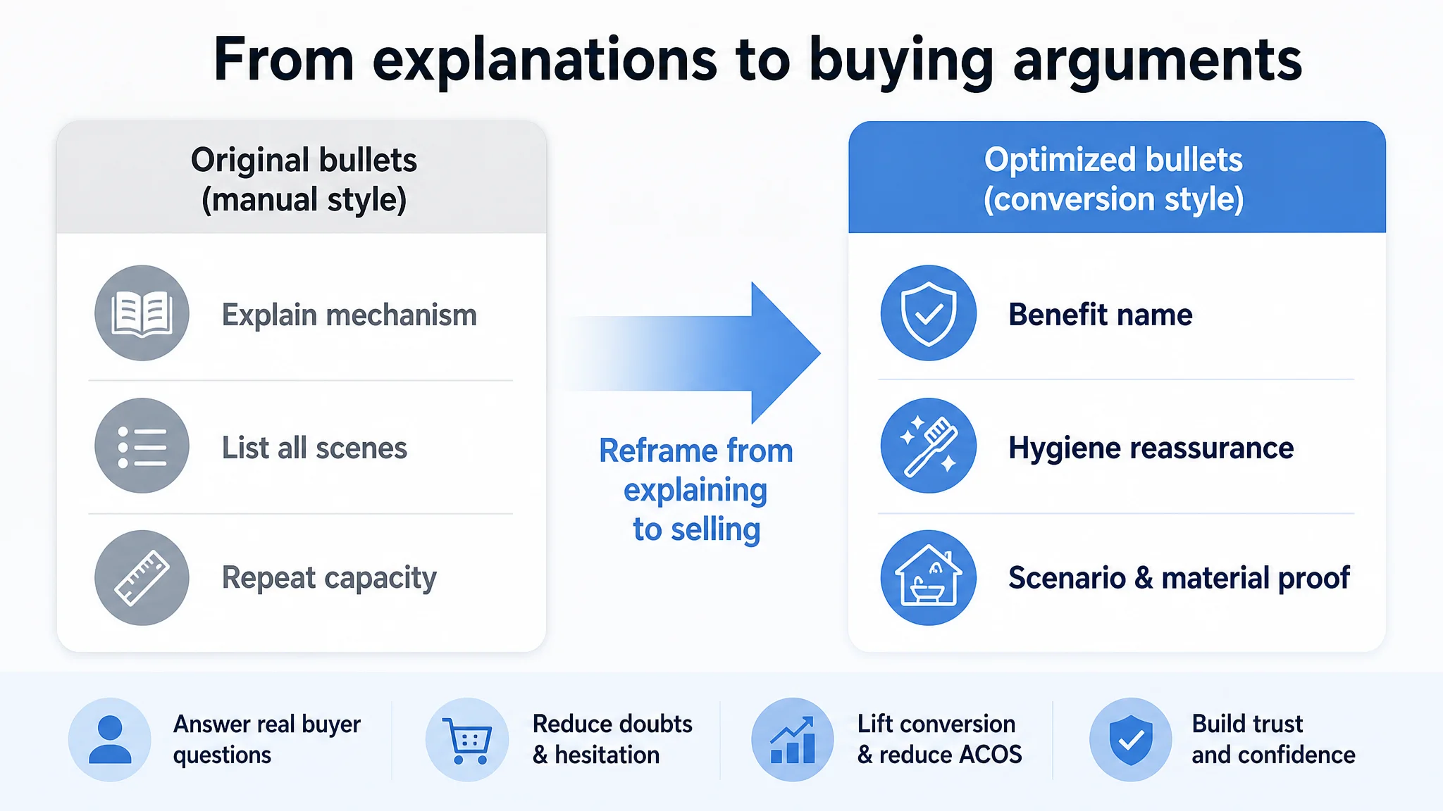
- BP #1 – Space & capacity framed as a named benefit
“Space-Saving 6-Slot Design…” making the primary benefit obvious, not just a neutral description.
- BP #2 – Hygiene and automatic cover as a trust driver
“Hygienic Automatic Cover…” shifting from telling how it works to emphasizing why it matters (clean, dust-free brushes).
- BP #3 – Installation fear removal
“Tool-Free Self-Adhesive Installation…” explicitly calling out “No drilling” and “protects your walls.”
- BP #4 – Scenario expansion
“Versatile for Multiple Scenarios…” tying into RV, camper, trailer use—capturing long-tail searches and specialized needs.
- BP #5 – Material and durability
“Durable & Modern Construction…” leveraging material advantages (e.g., moisture-resistant plastic or aluminum) to justify trust and price.
The bullet points moved from “complete description” to “structured conversion path”: problem → benefit → reassurance.
4. A+ Detail Page: Modules Were Present, But the Story Was Incomplete
The target Listing’s A+ content was not empty. It included:
- Scene image.
- Adhesive installation feature.
- Hygiene protection design.
- Multiple angles and packaging.
But compared with the benchmark’s A+:
- No explicit compatibility chart.
The benchmark’s “compatibility matrix” listed eight major toothbrush models with checkmarks, making the buying decision feel professionally validated. The target Listing simply showed the product, leaving shoppers to guess.
- Weak emotional and lifestyle scenes.
The benchmark used humanized scenarios (e.g., a couple sharing a bathroom) to build emotional resonance. The target Listing leaned on static product shots.
- Linear logic was missing.
The benchmark followed a commercial storyline: Pain point (dust / clutter) → Solution (design) → Trust (compatibility / validation) → Scenes / variations. The target Listing mentioned features but did not guide the reader through a clear journey.
- Spelling and layout issues hurt trust.
Typo errors in words like “Holder” or “Cover / Shower” and cut-off text blocks are subtle but damaging in a hygiene category. They signal carelessness, which conflicts with the promise of cleanliness.
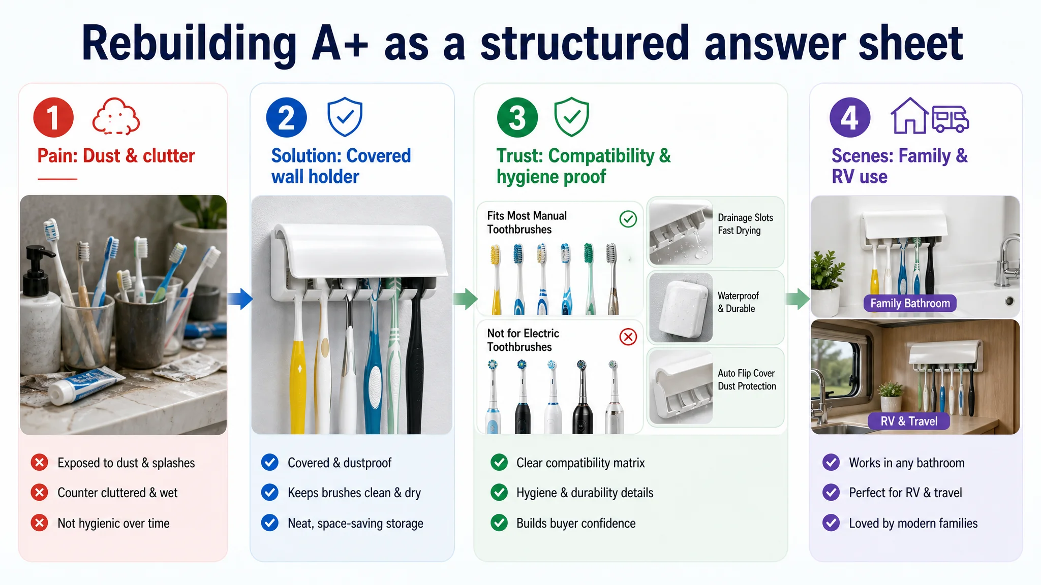
DeepBI’s direction:
- Repair all language issues first.
In a category where cleanliness equals trust, spelling errors and broken words are not cosmetic—they are conversion leaks.
- Rebuild the hero A+ module for clarity and cleanliness.
Bright, minimal bathroom scene, product centered, clear “5-Slot Toothbrush Holder” text (or 6 if correctly specified), with correct spellings.
- Add a dust-proof micro shot.
Close-up of the half-open cover with visible brush heads inside, plus explicit “Hygienic Dust-proof Cover” text and simple dust-blocking icons.
- Clarify “no-drill” installation visually.
Single clear image showing hand applying the product, zoomed-in on adhesive backing, with “Damage-Free Installation” text highly readable.
- Show drainage detail in micro shot.
Close-up of bottom drainage holes with water droplets and “Fast Draining” messaging to tackle long-term hygiene and mildew concerns.
- Create a compatibility grid.
Visual matrix of several toothbrush head types, labelled under “Universal Compatibility,” with the holder clearly shown supporting appropriate types.
- Show real-life space saving.
A bathroom countertop before/after logic, or at least a clean countertop with the holder on the wall and minimal items below, plus “Save 80% Counter Space” message.
- Highlight material advantage.
If the product is aluminum or uses superior material, a micro shot of rounded metal edges, with “Premium Aluminum Material – Rustproof & Durable.” This directly differentiates from plastic competitors.
This reframed the A+ from “image gallery” to a structured answer sheet to every key objection.
5. Reviews: Trust Was Not Just About Star Rating
On rating alone, the two Listings looked similar:
- Target: 4.3 stars, 19 reviews.
- Benchmark: 4.4 stars, 1,177 reviews.
But:
- The benchmark had over 60 times more reviews, including abundant photo/video feedback.
- The target Listing had a higher share of 3-star and below reviews (about 25% vs. 15%), and very little visual evidence to counterbalance them.
To DeepBI, this meant:
- The target Listing was still in the early trust-building phase.
- The page could not rely on social proof to “carry” weak visuals or incomplete compatibility messaging.
- Therefore, the burden of proof shifted even more heavily onto main images and A+ content.
This is why it was critical to fix Listing conversion first: ads could not “push through” a low-trust page that also lacked strong review volume.
Why DeepBI Did Not Recommend “Fix Ads First”
From a pure ad-operations perspective, it would have been easy to propose:
- Rebuilding campaign structures.
- Adjusting match types.
- Segmenting branded vs. generic keywords.
- Layering in more negative keywords.
But DeepBI’s judgment was that:
- The biggest business risk at this stage was not ad structure; it was that every marginal click had low probability of conversion due to Listing gaps.
- Traffic existed, but the Listing consumed it inefficiently. Continuing to push ad optimization first would increase the cost of learning without raising the ceiling.
In practical terms:
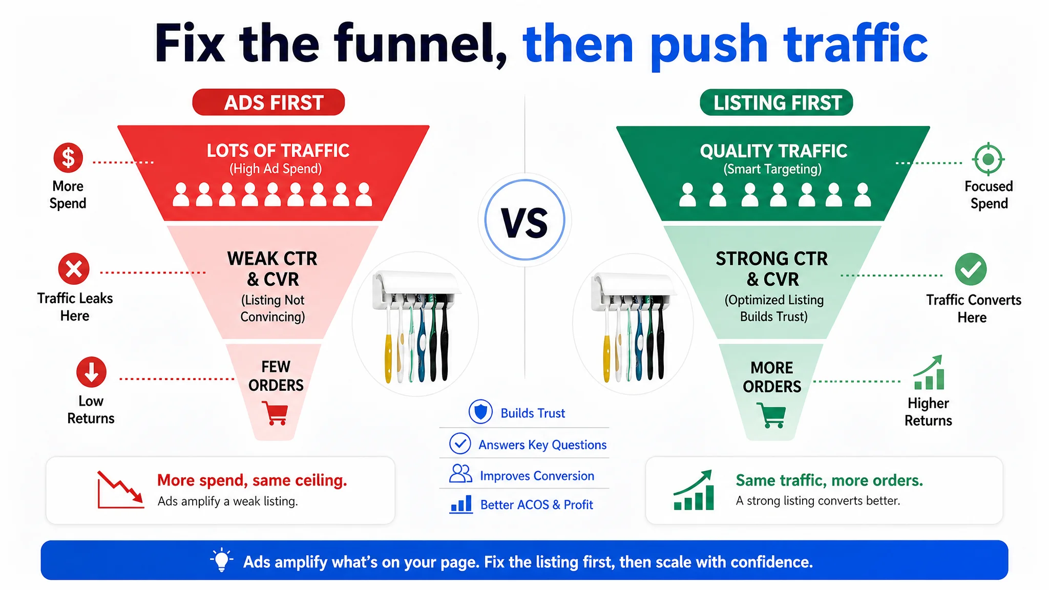
- If CTR is limited by a weak main image, no amount of bid tuning will fundamentally change click volume per impression.
- If CVR is limited by missing trust modules (compatibility, hygiene, installation clarity), pumping more traffic raises spend faster than revenue.
So the priority sequence became:
1. Repair Listing conversion logic
- Make the main image set compelling and information-dense.
- Tighten the title.
- Restructure bullet points into a decision path.
- Rebuild A+ around core category concerns.
- Clean up all language and layout errors.
1. Then, re-evaluate ad performance.
- Once the page can convert more reliably, ad reports start reflecting real potential.
- ACOS and TACOS become more controllable not because “ads improved,” but because the page finally deserves the traffic.
How the Page’s Sales Logic Started to Recover
After refocusing on Listing conversion, the seller’s page behavior began to shift in several ways (even without inventing specific numeric results):
- The page started to answer the right questions in the right order.
Shoppers could see:
- What the product is and how many brushes it holds.
- How it is installed and whether they can handle it.
- Whether it keeps brushes clean and dry.
- Whether their toothbrush type will fit.
- How it will make their bathroom look and feel.
- The visual path reduced friction.
Instead of forcing shoppers to mentally simulate usage, images and A+ content walked them through it. This lowered cognitive effort and supported faster “Add to Cart” decisions.
- Trust no longer depended solely on review volume.
While review growth still mattered, the upgraded visuals and text provided independent signals of professionalism and reliability.
- Ad traffic became valuable instead of wasteful.
With a stronger Listing, existing ads could begin to generate more orders from the same traffic, improving the underlying economics of spend.
From an operational standpoint, this changed the seller’s mindset:
- Ads were no longer seen as a universal fix.
- The team understood that Amazon ads amplify whatever is present on the product page—good or bad.
What Other Amazon Sellers Can Take Away
For Amazon sellers facing rising ACOS and plateauing orders, this case speaks to several critical lessons:
1. High ACOS is often a Listing problem, not an ad problem.
When you see persistent inefficiency, first ask:
- Is my main image competitive in my category’s search grid?
- Does my title communicate compatibility, core function, and scenarios clearly?
- Does my A+ content systematically remove doubts?
1. More text is not the same as better conversion.
A detailed page can still fail if it lacks a clear decision logic and visual proof. Bullet points should be buying arguments, not manuals.
1. In trust-sensitive categories, visuals carry more weight than you think.
Bathroom accessories, personal care, and anything hygiene-related amplify small trust leaks (typos, unclear covers, missing drainage explanations) into real conversion loss.
1. Ads amplify everything. Fix what they are amplifying.
Before scaling spend, ensure your Amazon Listing:
- Makes sense at a glance.
- Answers “Will it fit?” with visual evidence.
- Proves hygiene and durability visually, not just verbally.
- Looks at least as professionally constructed as a benchmark Listing.
1. Listing conversion capacity is the foundation of sustainable ad performance.
Once the product page can convert both paid and organic traffic more efficiently, ACOS becomes a lever, not a crisis.
This toothbrush holder seller did not lack effort; they lacked the right diagnosis. DeepBI’s value was not in “creating nicer images” or “rewriting some copy,” but in reframing the core problem: from a supposed ad issue to a real, measurable Amazon Listing conversion constraint. That reframing is what opened the path to meaningful change.