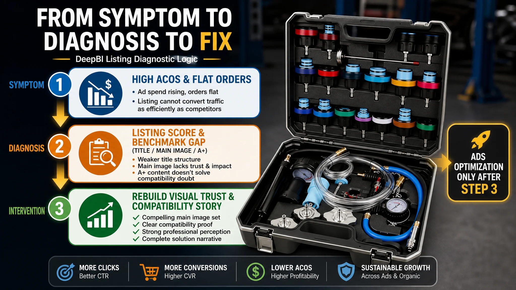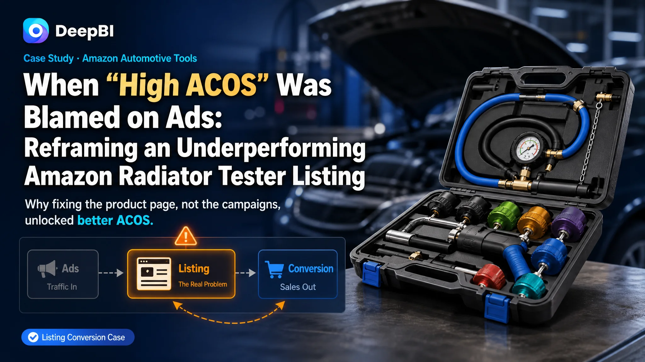
An experienced Amazon seller in the US automotive tools category came to DeepBI with a familiar complaint: Amazon ads for a radiator pressure tester kit were getting more expensive, ACOS was hard to control, and yet orders were not growing in step with traffic. The team’s working assumption was clear—this was an advertising optimization problem. They kept iterating bids, keywords, and campaign structures, but the numbers stubbornly refused to move in the right direction.
Once DeepBI pulled the Listing into its Amazon Listing scoring and benchmark system, a different story emerged. Against a strong category competitor, the customer’s product page scored 69/100 vs. 81/100, with pronounced gaps in the main image, detail/A+ content, and title structure. The ad engine was not the primary bottleneck; the Amazon Listing itself could not fully convert the traffic it was already getting.
The later optimization therefore did not start with another round of bid tuning. It focused on rebuilding the page’s sales logic: clarifying the title, reframing the main image set from “tool catalog” to “professional solution in real use”, and redesigning A+ modules to visibly solve the buyer’s biggest concern—compatibility and professional trust. For other Amazon sellers, this case is a reminder: when ACOS refuses to fall, the real leak may be in Listing conversion, not in campaign settings.
Amazon Ads Were Not Failing. The Page Was Consuming the Traffic.
From the seller’s perspective, the problem looked straightforward:
- Ads were running, impressions were fine.
- Spend was rising faster than sales.
- ACOS stayed higher than they could accept.
The default diagnosis inside the team: “Our advertising isn’t optimized enough.” They cycled through the usual playbook—adjust bids, refine keyword match types, add negatives, test new campaigns. Nothing fundamentally changed.
What DeepBI saw in the data, though, was a different pattern: this product page did not lack traffic. It lacked the ability to convert that traffic as efficiently as the category benchmark.
- Overall Listing score: 69/100 vs. a benchmark competitor at 81/100.
- The biggest gaps were not in reviews (only -1 point) or bullet points (where they actually led by +2), but in:
- Main image & image set: -6 points
- Detail/A+ page: -4 points
- Title: -3 points
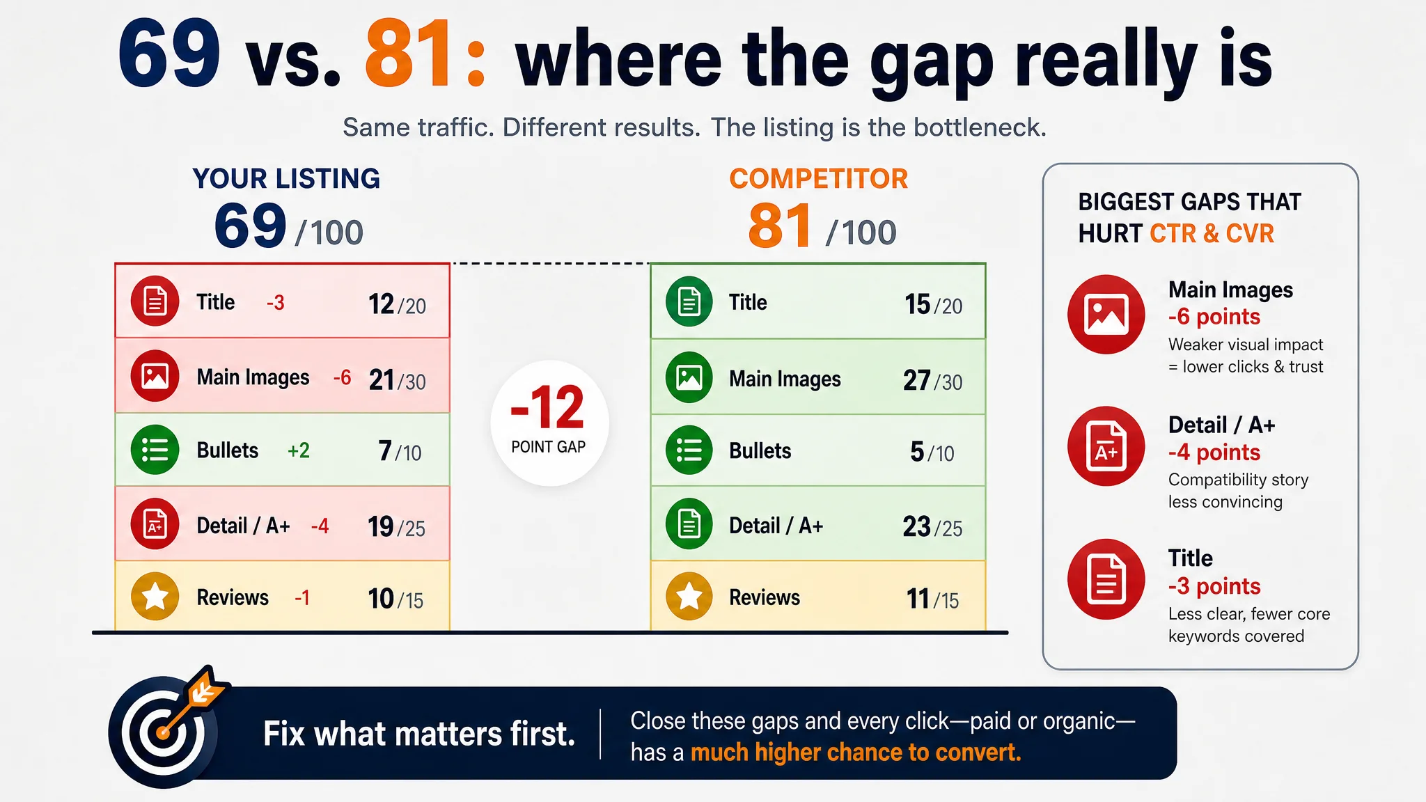
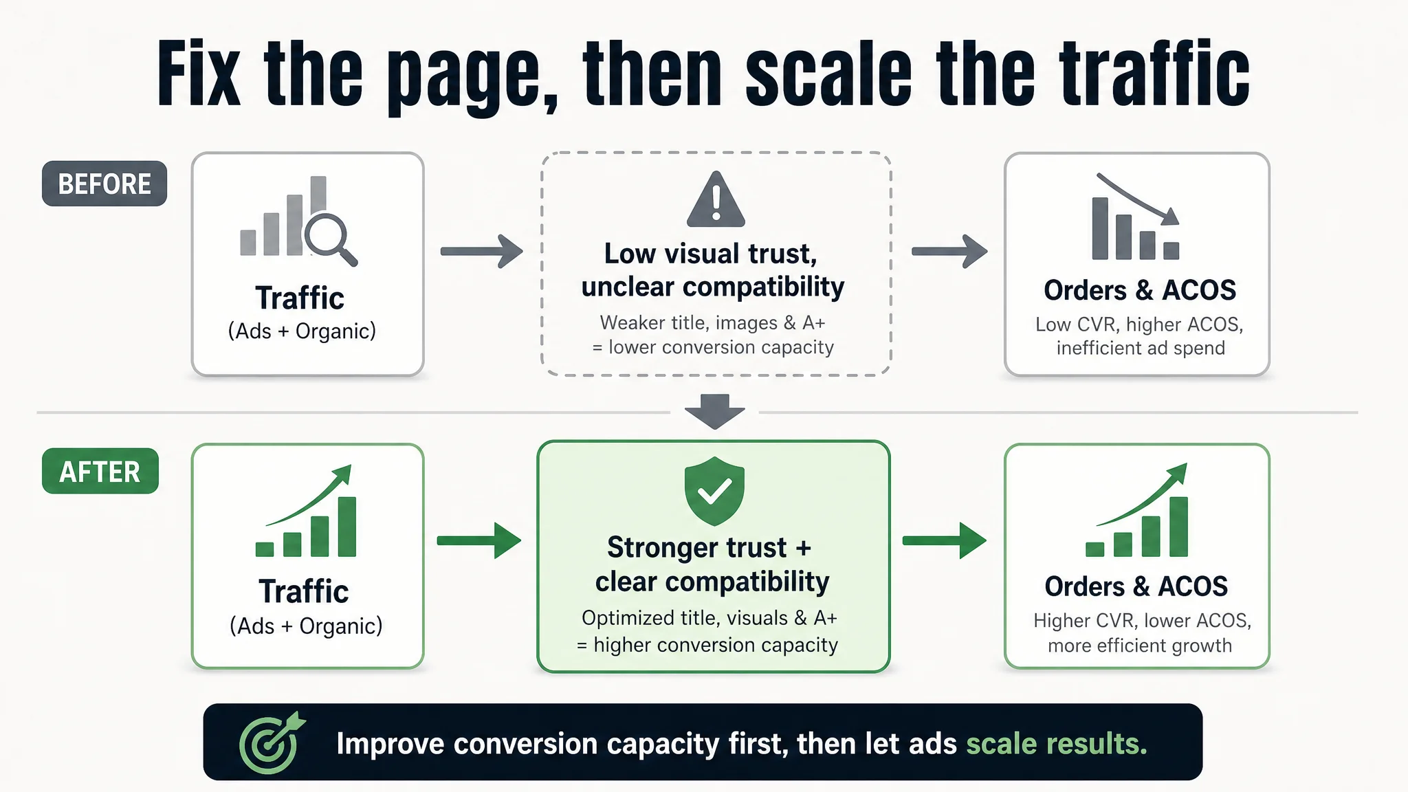
In other words, the areas that most directly drive CTR and CVR were weaker than the competing Listing that the same buyers were also seeing. Ads were pushing traffic into a weaker sales environment.
“The real problem was not that ads failed to bring traffic. It was that the page could not convert the traffic.”
At that point, continuing to fine-tune campaigns would only mean spending more to send buyers into a structurally less persuasive page.
The Real Constraint Was Listing Conversion Capacity
DeepBI’s scoring and benchmark comparison made the core constraint explicit: this Amazon Listing’s conversion capacity was lower than the category ceiling, especially in visual trust and compatibility storytelling.
Let’s break down where the real bottleneck sat.
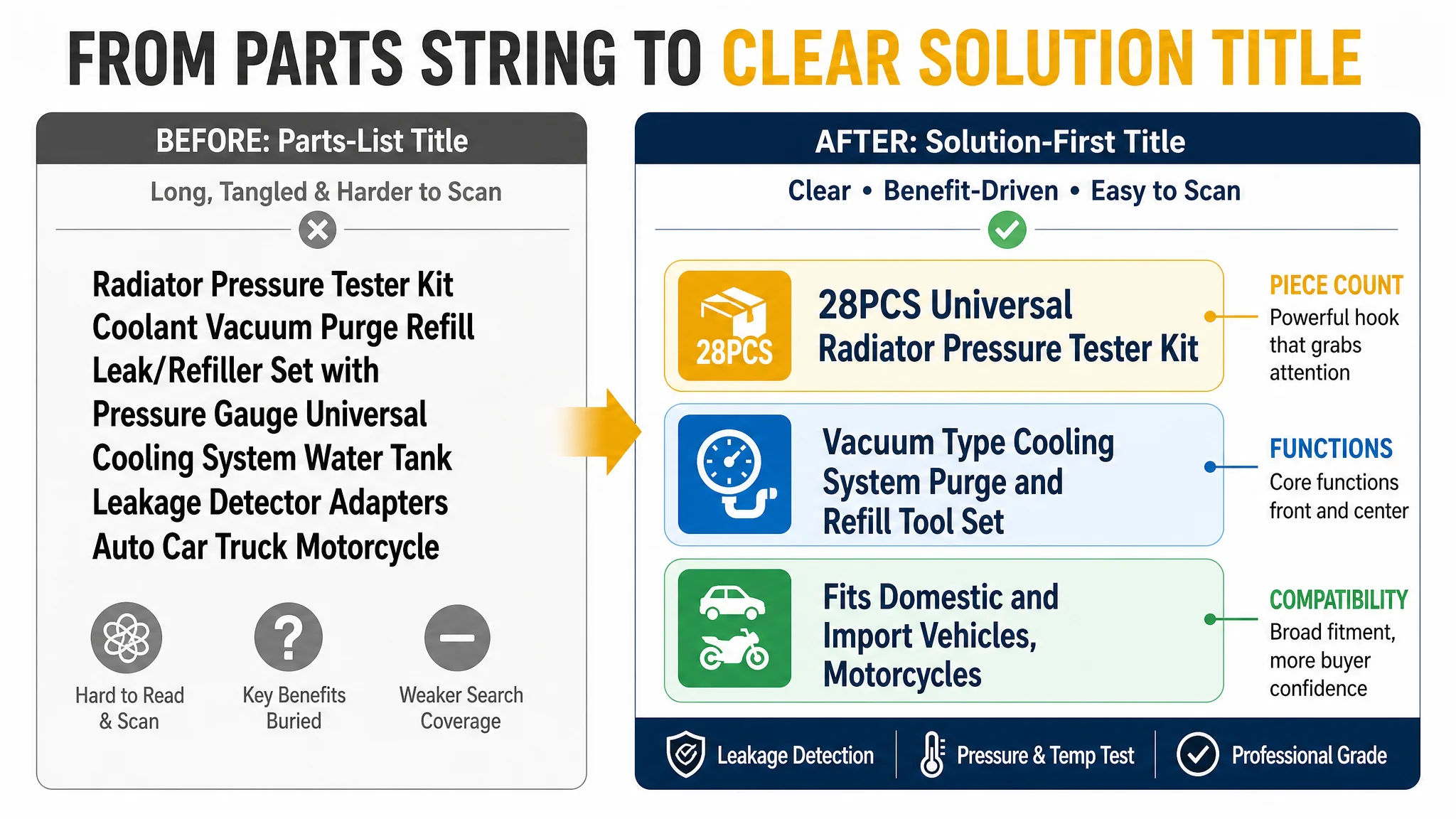
The title was not carrying its full weight
On Amazon, the title does more than satisfy the algorithm; it is often the buyer’s first “spec summary” at thumbnail level. Here:
- The customer did have the core keyword “Radiator Pressure Tester Kit” early in the title.
- But the phrase structure was long, somewhat tangled, and more “parts list” than clear outcome.
- Competing Listing:
- Structured as “core product + core function + application scope”,
- Added “Coolant Pressure Tester” as another strong search term,
- Highlighted “Universal Fit 28PCS” at the end as a crisp value anchor.
The result: the competitor’s title reads faster, covers more relevant search terms, and lands a clear “universal 28-piece solution” message. The customer’s title, by contrast, leaned into technical phrasing like “Purge Refill Leak/Refiller Set”, which is less intuitive for many buyers.
The main image set weakened both CTR and trust
This is where the biggest numerical gap sat, and where the ad inefficiency became structurally inevitable.
- The customer’s main image set followed a “tool manual” style:
- Flat lay, top-down angles
- Heavy technical focus
- Little to no real-life usage context or emotional framing
- The benchmark Listing did the opposite:
- Warm tone scene images with a person using the tool
- Clear brand identity visible in the images
- Modules like “21 vehicle types compatible”, “Professional / High-quality / Easy to use” placed visually as trust badges
DeepBI’s analysis highlighted three consequences:
1. Lower CTR
- Buyers scanning search results see a static tool kit versus a warm scene of a person working on a car.
- The competitor’s thumbnail is a “solution in action”; the customer’s is “equipment in storage”.
- In most categories, the former wins clicks.
1. Weaker professional trust
- The competitor visually signals “professional-grade, widely compatible” through labels and scene context.
- The customer’s visuals feel more like a generic toolbox—no visible proof that it’s designed for a wide range of vehicles.
1. Incomplete conversion story
- Competitor image sequence:
- Unboxing → Function explanation → Compatibility coverage → Emotional close (scene with person & car)
- Customer image sequence:
- Mostly function listings and part diagrams
- No clear “problem → solution → result” narrative.
“Advertising does not only amplify advantages. It can also amplify a page’s existing defects.”
With this visual structure, ads were effectively paying to show buyers a tool that looked less complete, less professional, and less clearly compatible than the alternative in the same search results.
The bullet points were not the problem
Interestingly, the customer’s bullet points were not the weak link. In the scoring, they even outperformed the benchmark (+2 points):
- Opened with cost savings and troubleshooting—directly tied to the buyer’s core pain.
- Covered:
- Color-coded adapters
- Newbie-friendly design
- A detailed compatibility and application guide in the final bullet.
In structure, the customer’s bullet logic was actually stronger than the competitor’s, which started with “easy to store” and ended with generic after-sales service.
This was one reason the seller had trouble believing the Listing was the bottleneck—they could see their text content was solid. The problem is that good bullets cannot fully compensate for a weaker title and a visually underpowered main image set.
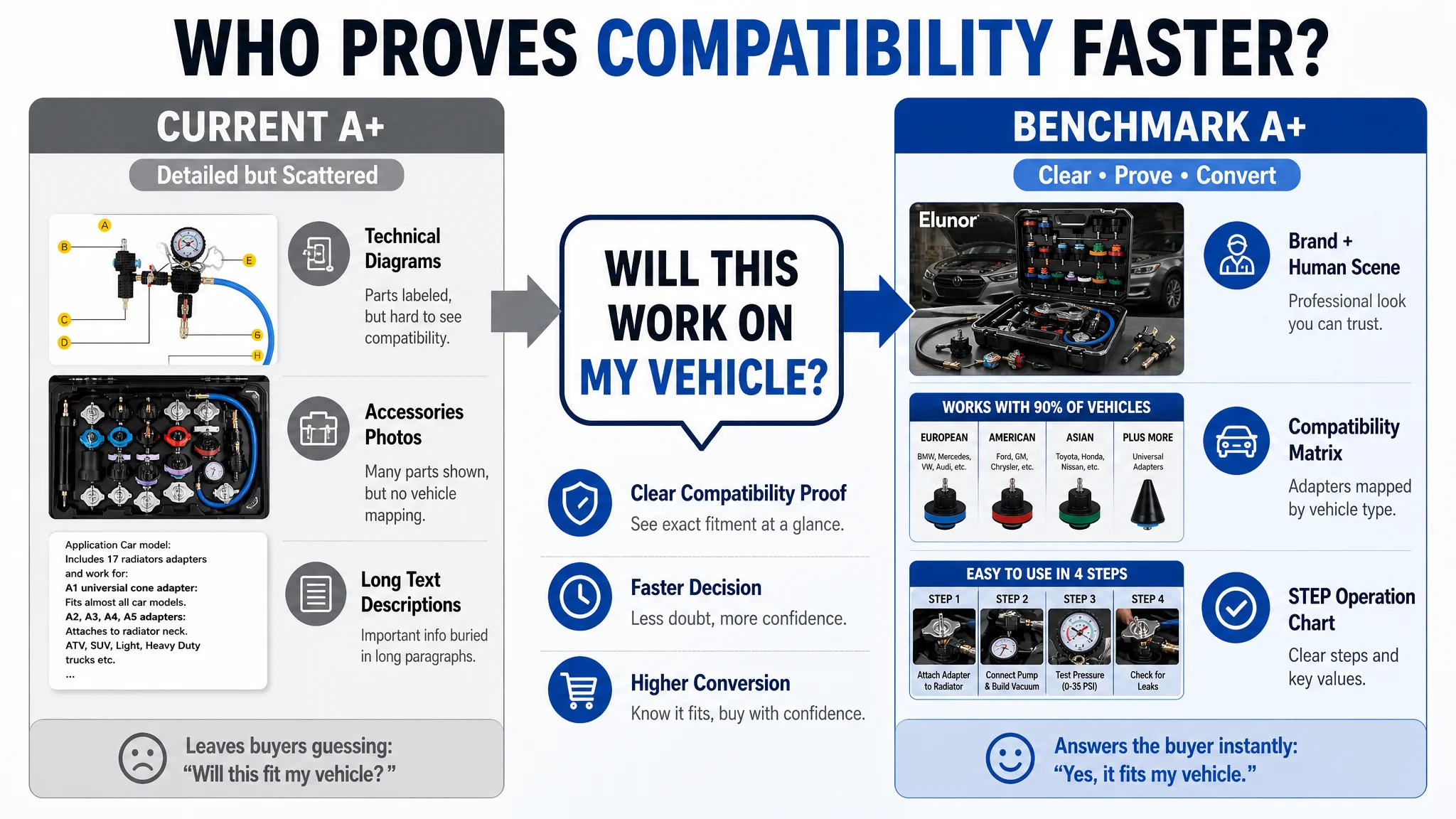
The detail/A+ page left compatibility doubts unsolved
For a technical tool like a radiator pressure tester and vacuum refill kit, compatibility is the biggest purchase barrier. If a buyer is not convinced it fits their vehicle, they won’t risk the purchase.
On this dimension:
- The customer’s A+ content included:
- Product main visual
- Structural diagrams
- Accessories display
- Material details
- Operation guides for vacuum refilling and pressure testing
- But these were mostly technical diagrams and step-by-step instructions with loose layout and few visual anchors.
The benchmark Listing:
- Opened with a strong brand visual plus a human-in-scene shot.
- Broke functions into clear modules (vacuum purge & refill / pressure test & temperature monitoring).
- Devoted multiple A+ panels solely to compatibility, with:
- Adapters grouped visually by vehicle type and year
- A clear “works with 90% of vehicles” style conclusion.
- Used STEP-labeled operation diagrams with highlighted key values (e.g., -20~-25 inHg, 0~35 psi), fitting the reading habits of technicians.
DeepBI’s judgment: the customer’s A+ was technically detailed but did not resolve the buyer’s biggest decision risk—“Will this work on my exact vehicle?”—as clearly as the competitor’s.
Why DeepBI Did Not Keep Tuning the Ads First
With this evidence chain, DeepBI made a clear judgment call:
- The main constraint on profitable growth was not campaign structure or bidding tactics.
- It was the Listing’s ability to convert both paid and organic traffic versus the category benchmark.
Continuing to optimize ads first would have created three business risks:
1. Paying to prove a known weakness
- More traffic into an under-optimized page only reinforces the pattern: higher spend, flat or weak orders, rising ACOS.
1. Eroding confidence in ads themselves
- The seller’s internal narrative would remain “ads don’t work for this product,” when in reality the page was under-leveraging the traffic.
1. Delaying necessary page repairs
- As competitors continue to strengthen their Listings, the gap in CTR/CVR widens, making later recovery more expensive.
Given the data, Listing conversion had to be repaired first, so that each future advertising dollar had a fair chance of returning value.
This Product Page Did Not Lack Traffic. It Lacked Trust.
DeepBI’s optimization focus was deliberately narrow: rebuild trust and decision clarity on the page, rather than rebuild the ad account.
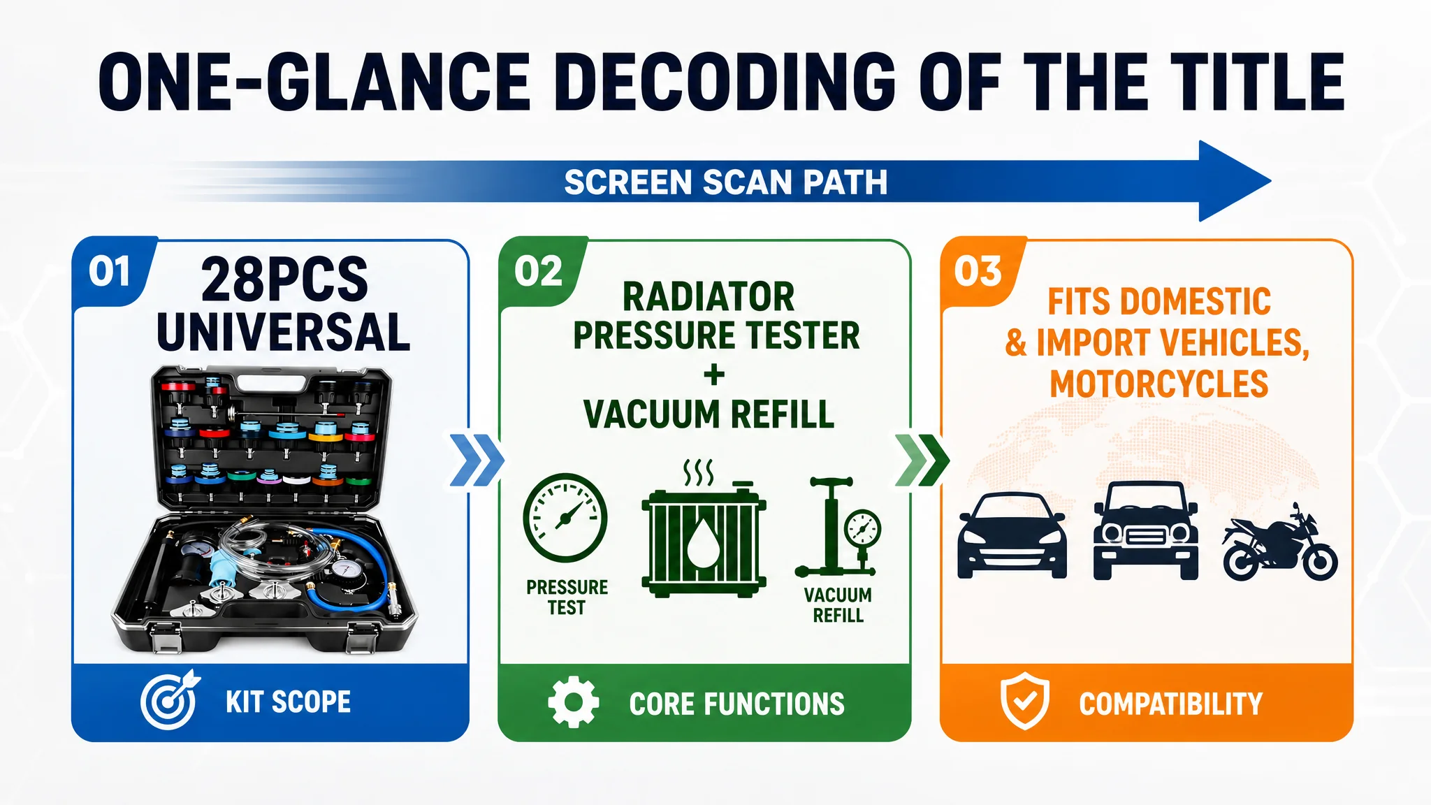
Reframing the title as a clear solution, not a parts string
The recommended title direction:
28PCS Universal Radiator Pressure Tester Kit, Vacuum Type Cooling System Purge and Refill Tool Set for Automotive Water Tank Leakage Detection, Fits Domestic and Import Vehicles, Motorcycles
The logic:
- Bring “28PCS” to the front to create a strong first-glance impact on both mobile and desktop.
- Retain and structure the core function keywords:
- Radiator Pressure Tester Kit
- Vacuum Type Cooling System
- Purge and Refill
- Leakage Detection
- Clearly state compatibility at the end:
- Domestic and import vehicles
- Motorcycles
This structure lets buyers decode the Listing in one scan: “28-piece universal radiator tester + vacuum refill set” that “fits most vehicles.”
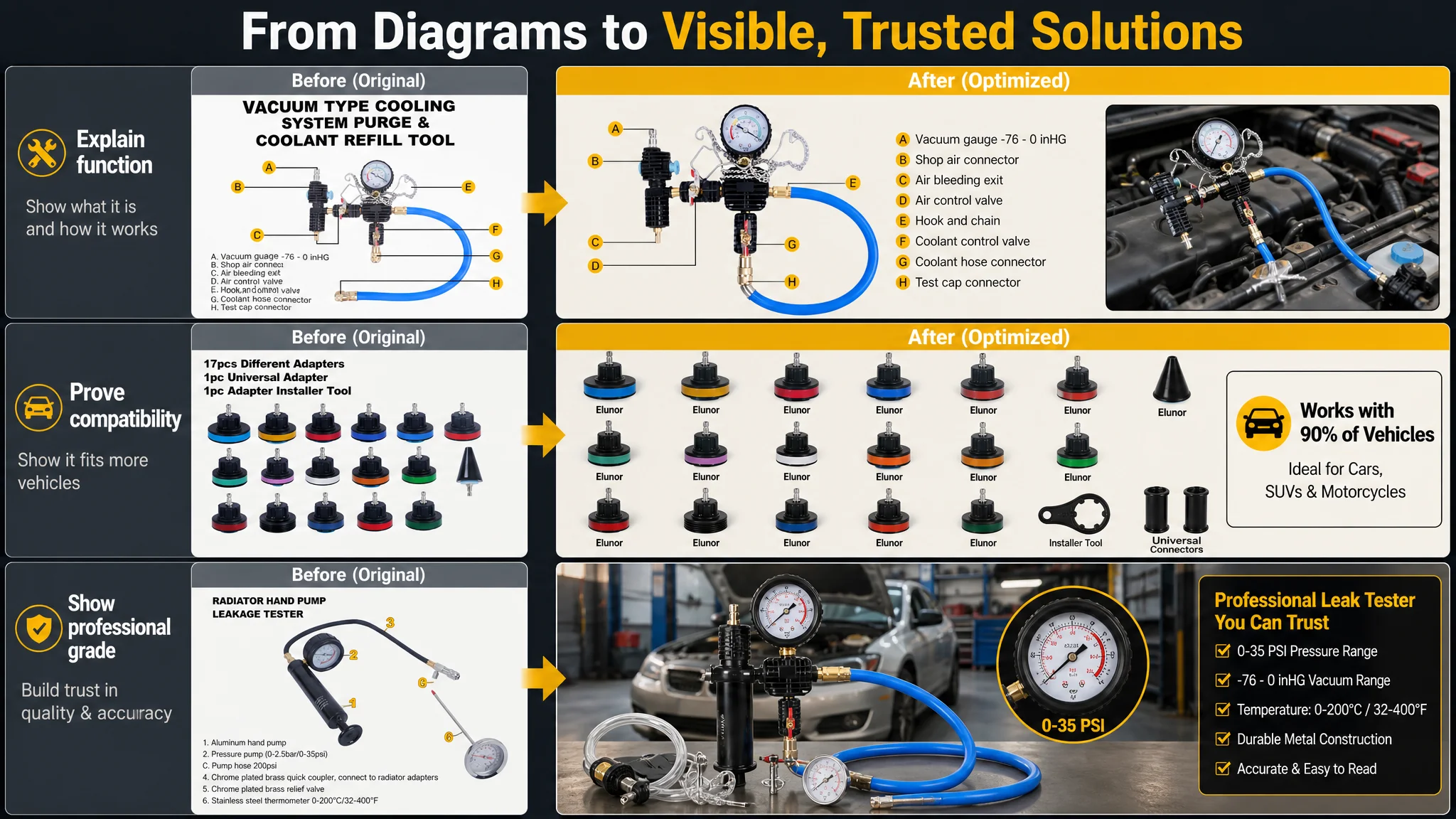
Turning the main image set into a visible solution
DeepBI’s main-image guidance did not aim for generic “prettier visuals”. It specified how each image should change the buyer’s perception and reduce friction:
1. Primary image: from flat lay to “complete solution in context”
- 45° angle view of the open tool case, placed on the right.
- Left side: short textual call-out: “28 PIECE KIT” plus key components list.
- Background: blurred garage with an open hood, subtle natural light.
This shifts the first impression from “a pile of tools” to “a professional kit used where you actually work on cars.”
1. Functional visualization image: “how this vacuum system actually works”
- Left: main vacuum tool with labeled key parts (A–H).
- Right: small in-use photo showing the tool connected to a vehicle radiator.
This answers the “how do I use this?” question visually in one glance.
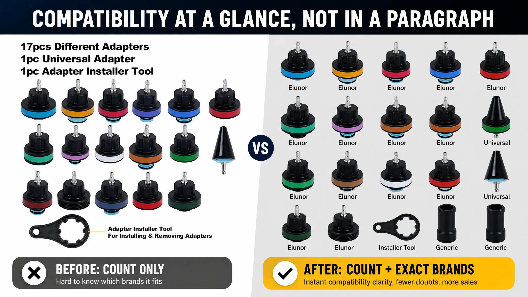
1. Compatibility matrix image: “which brand does each adapter fit?”
- 4×5 grid layout of adapters.
- Each adapter labeled with matching automotive brands (BMW, Ford, Toyota, etc.).
This directly tackles the largest purchase barrier—compatibility—without forcing buyers to hunt through text.
1. Instrument close-up image: “professional-grade readings you can trust”
- Low-angle shot of the main pump and gauge,
- Enlarged gauge circle showing 0–35 psi clearly.
- Background: modern workshop scene.
This connects the tool visually to professional environments and emphasizes precise readings.
1. Refrigerant connector image: “precision components, not generic parts”
- Three core connectors diagonally arranged,
- Dark grey background with subtle texture,
- Clean typography marking compatible models.
The goal: upgrade the perceived grade from generic kit to “precision component set.”
Across the set, the decision logic was consistent: make the page visually prove “professional, compatible, complete”. Without that, no amount of ad traffic would feel safe enough for buyers to convert at scale.
The Bullet Points Needed Reordering, Not Reinvention
Because the bullet point strategy was already relatively strong, DeepBI kept the logic but sharpened the clarity and trust in each line:
1. Complete Cooling System Solution
- Integrates leak detection, temperature measurement, and coolant refill.
- Emphasizes “solve at home, save repair cost.”
1. Premium Quality & Superior Sealing
- Clarifies material quality and vacuum performance, directly addressing durability concerns.
1. Color-Coded for Easy Identification
- Converts a technical feature into a usability benefit: DIY and beginners can operate with less confusion.
1. Universal Compatibility & 17 Adapters
- Consolidates compatibility info and universal tapered adapter story into a single strong bullet.
1. Portable Storage & Professional Support
- Links robust toolbox storage with a clear after-sales commitment to close any lingering risk perception.
These bullets align with the image and A+ changes, forming a consistent “pain → solution → assurance” path rather than a loose list of features.
A+ Content: Making Compatibility and Professionalism Obvious
DeepBI’s A+ recommendations followed a clear six-module logic, each aimed at a specific buyer question.
1. Opening: “one complete toolkit” at a glance
- 45° view of the open 28-piece case in a neat workshop.
- Strong lighting and neutral background to emphasize completeness and order.
Buyer takeaway: “Everything I need comes in this one kit.”
2. Core instrument focus: “this gauge and pump are serious equipment”
- Close-up of the vacuum pump and gauge on a black background,
- High contrast makes the critical scale region (-30 to 0 inHg) extremely readable.
Buyer takeaway: “This isn’t a toy tool; it’s a precise instrument.”
3. Compatibility visualization: “find your brand in one panel”
- Matrix of 17 color-coded adapters with brand labels (VW, BMW, Ford, etc.).
- Clean, no-shadow lighting to avoid visual noise.
Buyer takeaway: “I can quickly see if my vehicle is supported.”
4. Real usage scene: “this really fits and works in a real engine bay”
- Real engine bay scene showing the kit connected and in use.
- Focus on the connection point and gauge.
Buyer takeaway: “This actually fits under the hood; the hoses and connectors look solid.”
5. Durability focus: “aluminum caps built for long-term use”
- Close-up of the aluminum radiator cap testers on a deep blue gradient background.
- Metallic reflections emphasize quality and corrosion resistance.
Buyer takeaway: “This kit is built to last; it’s not made of fragile plastics.”
6. Step-by-step usage guide: “operating this won’t be overwhelming”
- Split layout: left with simplified visual flow, right with numbered steps.
- Manual-like styling reduces perceived complexity.
Buyer takeaway: “I can follow this without being a professional mechanic.”
7. Final action prompt: “28-piece value, clearly visible”
- Top-down shot of the closed case surrounded by all adapters and accessories.
- Clean white background, soft lighting.
Buyer takeaway: “I’m getting a lot of value and coverage for the price.”
All of this converges on one point: remove hesitation at every stage of the decision, so that ad-driven and organic traffic have a much higher chance of turning into orders.
Before Ads Could Work Again, the Page Had to Convert
Once the Listing’s weak points had been systematically addressed—title, main image, and A+ trust structure—the seller was finally in a position where ads could be meaningful again:
- The click stage (thumbnail) gained:
- A more compelling main image
- A clearer, more digestible title
- Stronger “complete kit” and “universal fit” signals
- The conversion stage (product page) gained:
- Clearer compatibility proof
- Stronger professional-grade perception
- Lower perceived operational complexity
- Better alignment between images, bullets, and A+ modules
This did not magically guarantee a specific CVR number or ACOS level, but it changed the operating risk profile:
- Each click had a higher probability of converting.
- Each incremental ad dollar was less likely to be wasted on a page that could not carry its weight.
- The Listing began to regain its ability to support organic rankings without constantly leaning on ad spend.
How the Seller’s Understanding Ultimately Changed
At the start, the customer’s line of thought was:
- “Our ACOS is high. We need better ad optimization.”
- “We’ve already written detailed bullet points; the page is fine.”
After the DeepBI diagnosis and Listing rebuild, their understanding shifted:
- Amazon ads cannot compensate for a structurally weaker Listing.
- Listing conversion is a prerequisite for efficient ads, not a byproduct of them.
- Title, main image, bullets, and A+ have to form a consistent decision path:
- Attract the right click
- Build trust fast
- Eliminate compatibility and usability doubts
- Make the value of the kit obvious
And critically:
“Before adding more traffic, we must first be sure the page deserves more traffic.”
For other Amazon sellers, especially in technical categories like automotive tools, this case is less about radiators and more about logic:
- If ACOS is stuck, check whether you’re actually facing a Listing conversion bottleneck.
- If your ads are sending buyers into a page that looks less compatible, less professional, or less complete than your competitors, the problem isn’t in the campaigns—it’s in the page.
DeepBI’s value in this case was not in “editing a title” or “making nicer pictures”, but in making the correct judgment about where the real constraint was. Once that constraint was addressed, ads stopped being the scapegoat and started becoming useful again.