
This case comes from an Amazon seller in the home‑organization category, selling a plastic pegboard wall organizer kit on the US marketplace. On the surface, the Listing looked solid: over 1,600 reviews at 4.3 stars and a total Listing score close to a key competitor. The team’s instinct was that rising ACOS and weak return on Amazon ads were an advertising problem—bids, keywords, and campaign structure. But as ad tweaks kept stalling, the numbers refused to move in a meaningful way.
When we put the Listing into DeepBI’s diagnostic workflow and benchmarked it against a high‑performing competitor pegboard Listing, a different picture emerged. The seller’s Amazon ads were not the real constraint; the product page was quietly consuming traffic. The issue was not “no traffic” but “the page cannot convert the traffic at the same level as the category benchmark,” especially for gaming and high‑intent shoppers.
We found that the core gap was not in title keywords or review volume—it was in the narrative and visual structure of the Amazon product page. The competitor built a clear path from “why I need this” to “this is worth buying now,” while the target Listing stayed at “what it is and where you can use it.” The optimization direction therefore shifted away from squeezing ads further and toward rebuilding the Listing’s conversion logic: main images, bullets, and A+ content that align around gaming, modular expansion, and multi‑scene use.
For other Amazon sellers, this case is a reminder that a healthy star rating and strong review count do not automatically mean your Listing is fine. If ad spend keeps rising but ACOS and CVR refuse to follow your expectations, the real problem may be that your Amazon Listing is under‑converting relative to your best competitors—turning every click, paid or organic, into a weaker dollar than it should be.
The Seller’s View: “Our Reviews Are Better, So the Issue Must Be Ads”
At the time of diagnosis, the brand’s pegboard Listing looked, by conventional standards, “strong enough”:
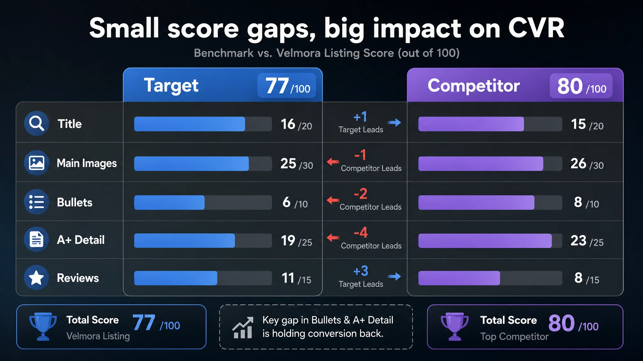
- Overall Listing score: 77/100
- Benchmark competitor: 80/100 (a modest 3‑point gap)
- Reviews: both at 4.3 stars
- Review volume: the target Listing had 5.1x the total reviews of the competitor (1695 vs. 331)
From the seller’s perspective, this created a very natural belief:
1. “Our social proof is stronger, so customers should trust us more.”
2. “Our title is detailed and search‑friendly; if anything, it might even be better.”
3. “If we’re still not seeing the expected orders, the problem must be in the ads: wrong keywords, bad segmentation, or weak bids.”
So the team kept cycling through traditional Amazon ads actions: new keyword sets, bid modulation, different match types, rearranged campaign structures. Each cycle brought data, but not the performance lift they were hoping for. ACOS stayed stubborn, and the gap to the competitor didn’t close.
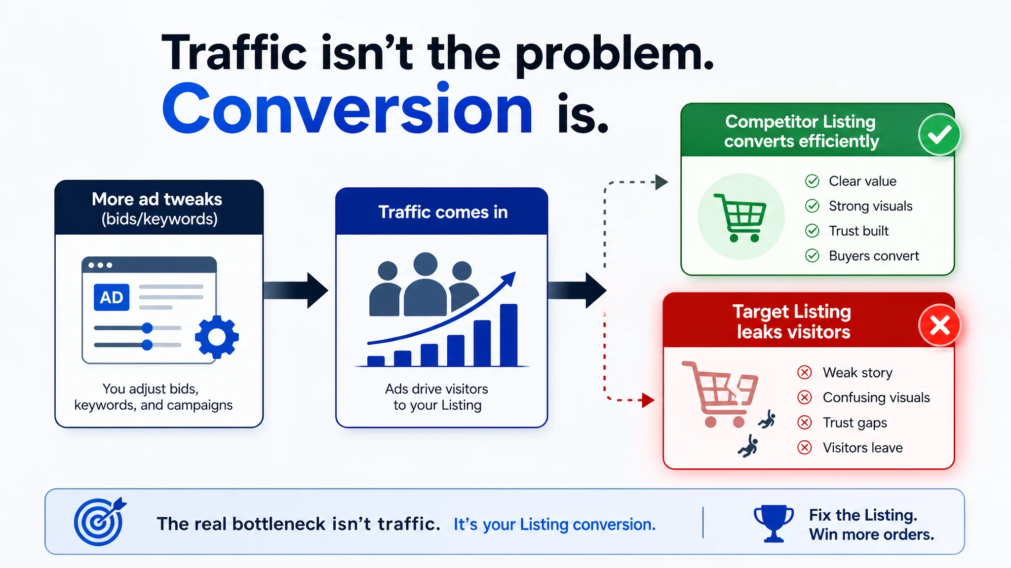
“From the seller’s dashboard, ads looked like the obvious culprit. From the marketplace’s perspective, this was actually a product‑page conversion problem.”
Amazon Ads Were Not Failing. The Page Was Consuming the Traffic.
Once the Listing was scored and benchmarked, the real constraint became clear.
The surface: scores look “close enough”
- Title: Target 16 vs. competitor 15 (out of 20)
- Main images: Target 25 vs. competitor 26 (out of 30)
- Bullets: Target 6 vs. competitor 8 (out of 10)
- A+ / detail page: Target 19 vs. competitor 23 (out of 25)
- Reviews: Target 11 vs. competitor 8 (out of 15)
On a raw numeric level, nothing looked catastrophic. In fact, the target Listing even outscored the competitor on reviews and matched it on overall star rating.
But conversion is rarely killed by one big obvious defect. It’s more often eroded by a series of small but decisive gaps:
- The competitor’s page framed the problem and outcome better.
- The competitor’s visual flow built trust and desire more intentionally.
- The competitor connected function → emotion → social value, where the target page stopped at function.
These gaps don’t necessarily show up in a seller’s usual day‑to‑day view, but they show up very clearly in relative scores and structural comparison.
The Real Constraint: Listing Conversion Capacity, Not Traffic Volume
Title: technically correct, strategically underleveraged
The target title followed classic best practices:
- Structure: Brand + product name + material + system + scenes + size
- Included precise size (“22" x 11"”), which helps decision‑making for rational buyers
- Listed key scenes (“Home Office, Craft Room, Gaming Setup”)
The competitor title made different trade‑offs:
- Led with an actionable phrase (“Revamp Your Space…”) rather than a bare product name
- Blended scenes with solution language (organize, revamp, versatile hanging)
- Omitted some technical detail (exact size) in favor of emotional and benefit‑oriented phrasing
DeepBI’s scoring reflected this: the target Listing wasn’t losing because of missing keywords; instead, the competitor was slightly better at turning a search result into a click by promising a change in the buyer’s environment.
The conclusion: title was not the core bottleneck. It could be polished, but it wasn’t what was holding conversion back.
Main images: no clear “reason to click” or “reason to believe”
On the image strip, differences looked small on the surface (25 vs. 26), but the type of difference mattered:
- The target images leaned on generic home/office scenes, somewhat cluttered and flat‑lit.
- The competitor used high‑contrast gaming setups, symmetric layouts, and clear accessory counts (X4/X2/X10) with mini callout graphics.
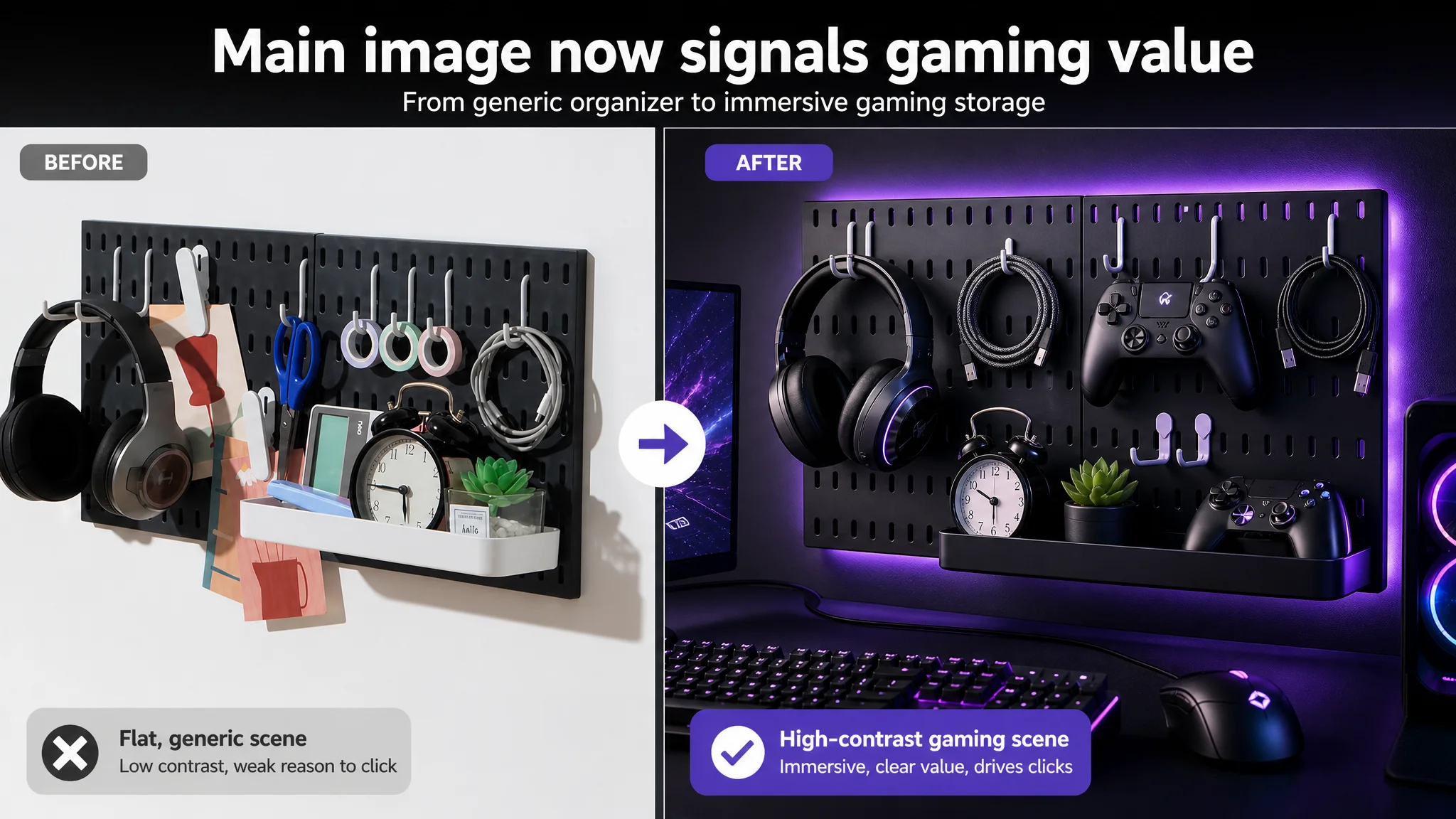
The effects:
- CTR pressure: The target first image didn’t shout “gaming” or “high‑value kit”; it read as a generic organizer. On search results filled with similar thumbnails, this blunts the click advantage.
- Trust pressure: The competitor’s accessory‑count graphic (“what exactly you get”) reduced purchase anxiety. The target Listing buried this information in a later image with weaker proportional visual clarity.
- Decision closure: The competitor closed the image sequence with a frame like “Highly Sought After as a Gift,” converting functional interest into social and gifting value. The target Listing ended on a cluttered multi‑scene collage that didn’t articulate a final “why buy now” moment.
“The real problem was not that ads failed to bring traffic. It was that the page could not convert the traffic as efficiently as the best Listing in the category.”
Bullets: information present, but no buying logic
Side‑by‑side, the bullet strategies were fundamentally different.
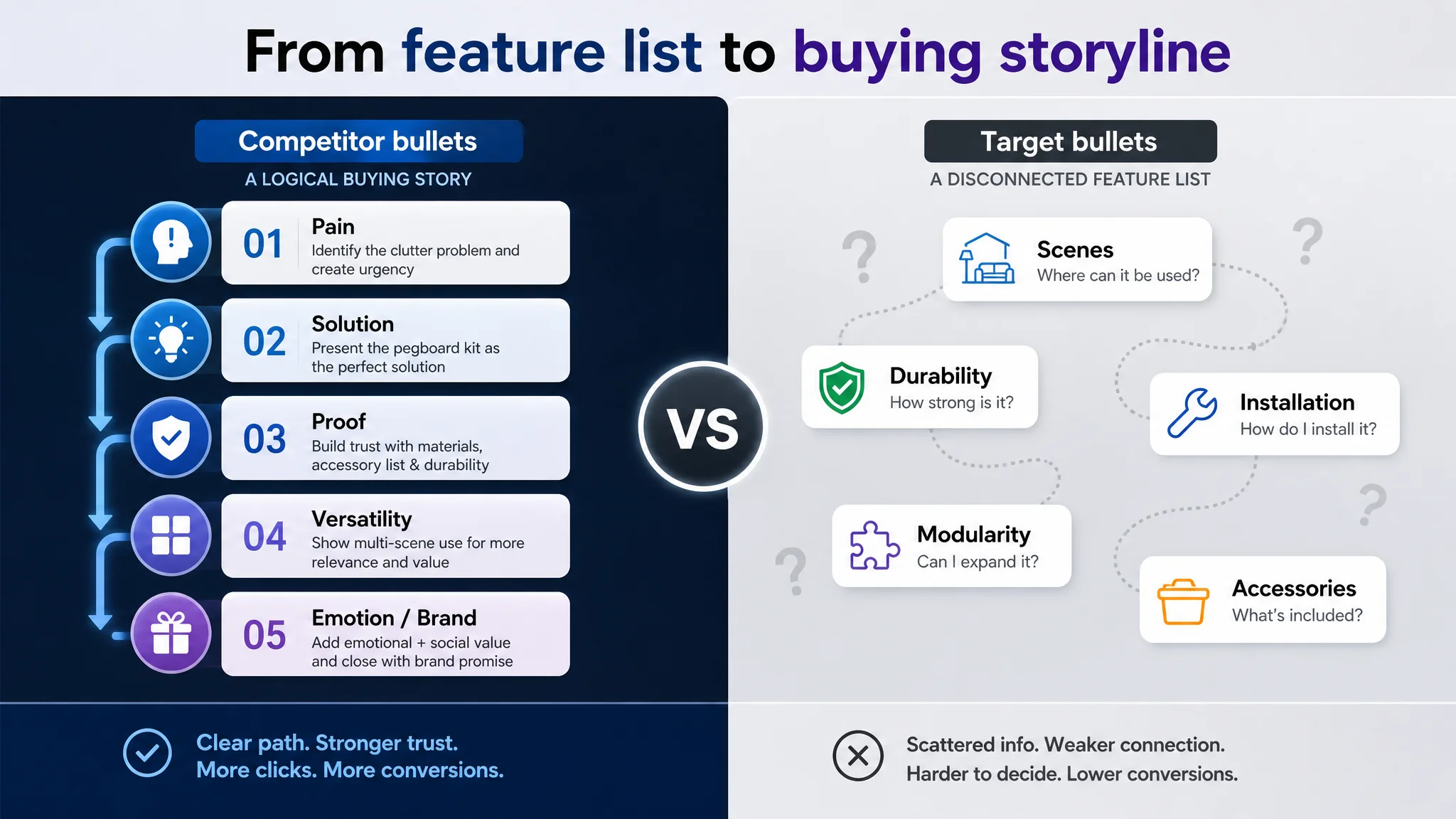
Competitor:
- Starts with pain point (cluttered space) and immediate solution
- Details materials and full accessory list with specific counts and sizes
- Highlights multi‑scene usage (gaming, office, kitchen, crafts)
- Elevates emotional and social value (giftability)
- Ends with a brand promise and positioning
Target Listing:
- Starts with application scenes, not the pain
- Mentions durability and load capacity but without concrete accessory detail
- Talks about installation and modularity, but without turning it into a clear value narrative
- Ends on functional notes about accessories, without a trust‑building or emotional close
So while both sets of bullets contained “information,” only the competitor’s bullets formed a persuasive path:
Pain → Solution → Proof (materials, accessory list) → Versatility → Emotion/Brand Trust
The target Listing’s bullets looked more like an unordered feature list, which is enough to answer questions but not enough to systematically push a shopper over the line.
A+ content: strong scenes, but no full decision chain
The A+ (detail page) gap was the biggest single latent constraint: 19 vs. 23.
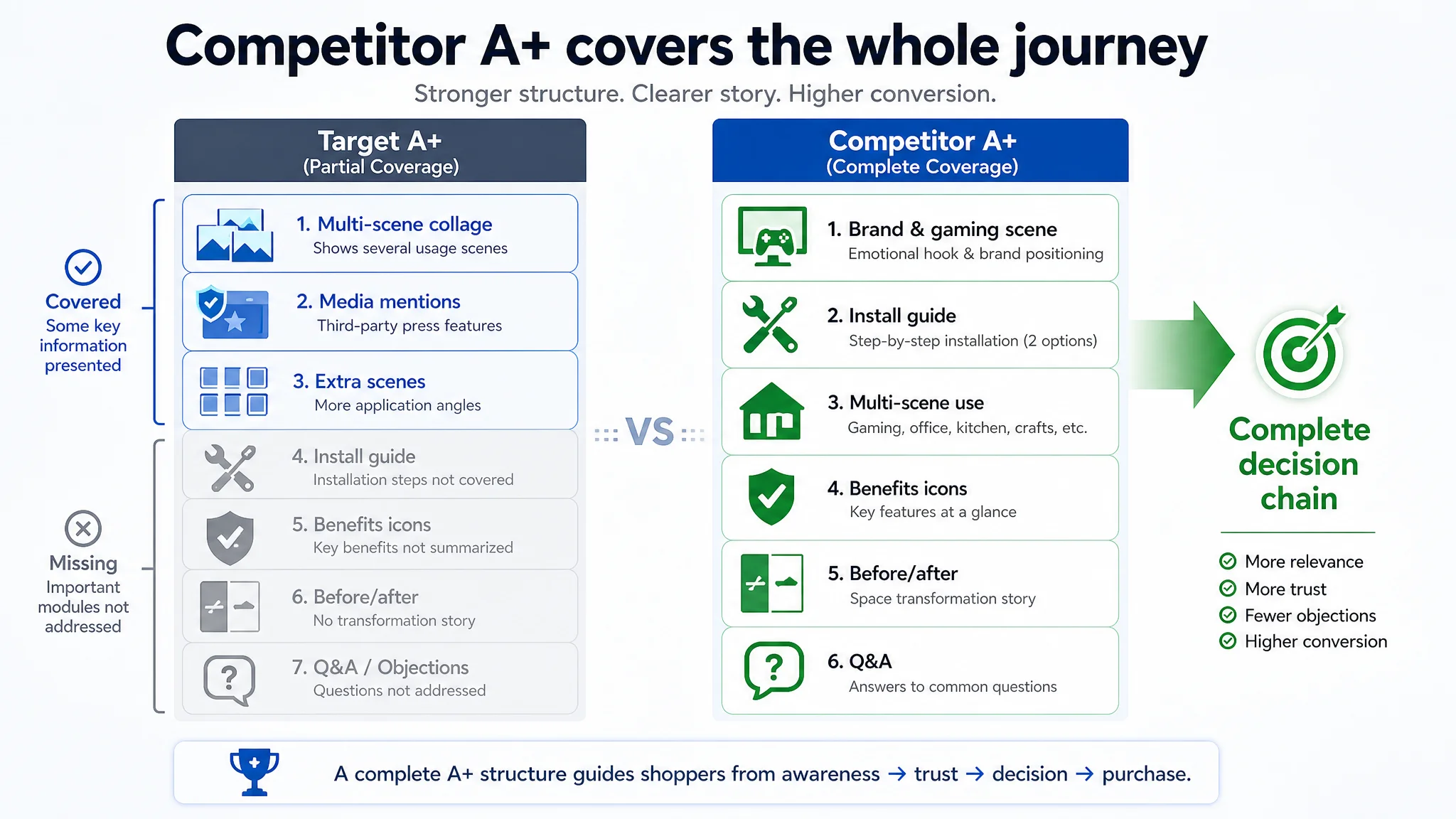
Target A+ structure:
- Multi‑scene collage of usage scenarios
- Media mentions (The Spruce, Refinery29, etc.)
- Various application angles (office, entryway, etc.)
Competitor A+ structure:
- Brand statement first screen with immersive gaming visual
- Dedicated modules for gaming, office, kitchen, crafts
- Clear, graphical installation guide (two paths: adhesive vs. screws)
- Icon‑based function summary
- Space transformation story (“before vs. after”)
- Product combination comparison and Q&A to pre‑empt objections
DeepBI’s judgment here was straightforward:
- The competitor covers the entire decision chain:
- Why I need it (pain & transformation)
- How it works (installation clarity)
- Where it works (multi‑scene)
- Why I can trust it (media, structure, Q&A)
- The target focuses on “what it can hold” and “where it looks nice”, but not on installation confidence, material proof, or cross‑scene extension at the same level.
For a category where installation difficulty and sturdiness are key anxieties, this left money on the table.
Why Traditional Ad Optimization Failed Here
With this structure in mind, the failure pattern becomes obvious:
- Ads brought visitors who cared about gaming setups, modularity, and space transformation.
- Those visitors landed on a page that:
- Looked more like a generic organizer than a purpose‑built gaming/tech setup solution.
- Did not immediately visualize the “before/after” transformation.
- Made installation look more like a text explanation than a clear, low‑risk process.
- Underused the strong asset it did have: huge review volume and media mentions that weren’t integrated into a coherent trust story.
Every incremental dollar on ads was amplifying these issues, not solving them.
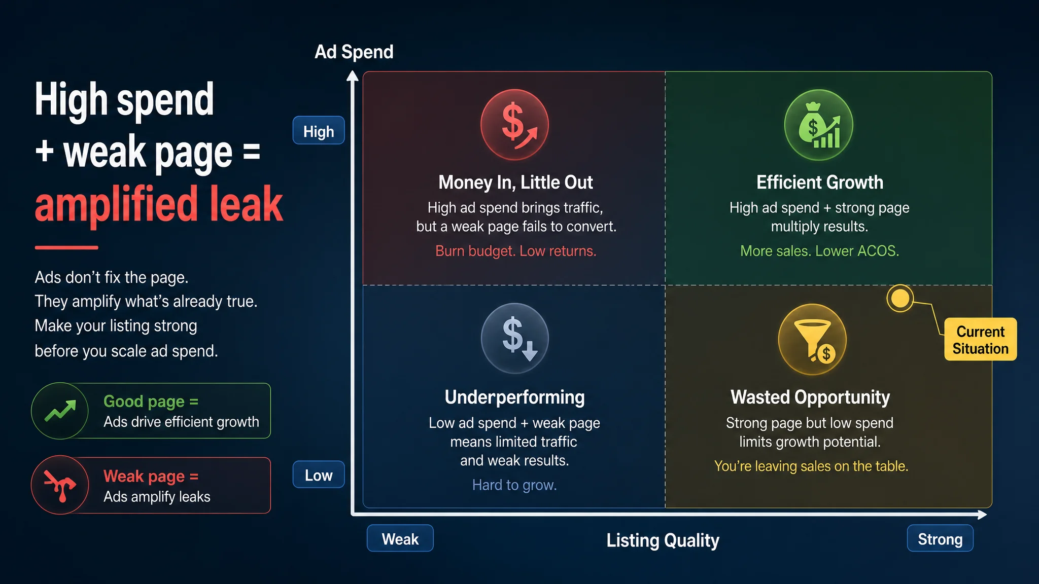
“Advertising does not only amplify advantages. It can also amplify a page’s existing defects.”
This is why the ad‑side tweaks—new keywords, better bids—did not materially lower ACOS or lift CVR. The Listing’s conversion ceiling was lower than the seller assumed, relative to the market’s best option.
How DeepBI Reframed the Problem: From “More Traffic” to “Deserve the Traffic”
The diagnostic output reframed the situation for the seller:
1. Core conflict: The Listing could not convert at the competitor’s level, especially for high‑value gaming and multi‑scene buyers.
2. Misdiagnosis: Assuming social proof and a precise title meant the page was “good enough,” so the problem must be “more or better traffic.”
3. Real constraint: Weak page‑level decision logic—not missing features, but a weaker narrative and visual funnel.
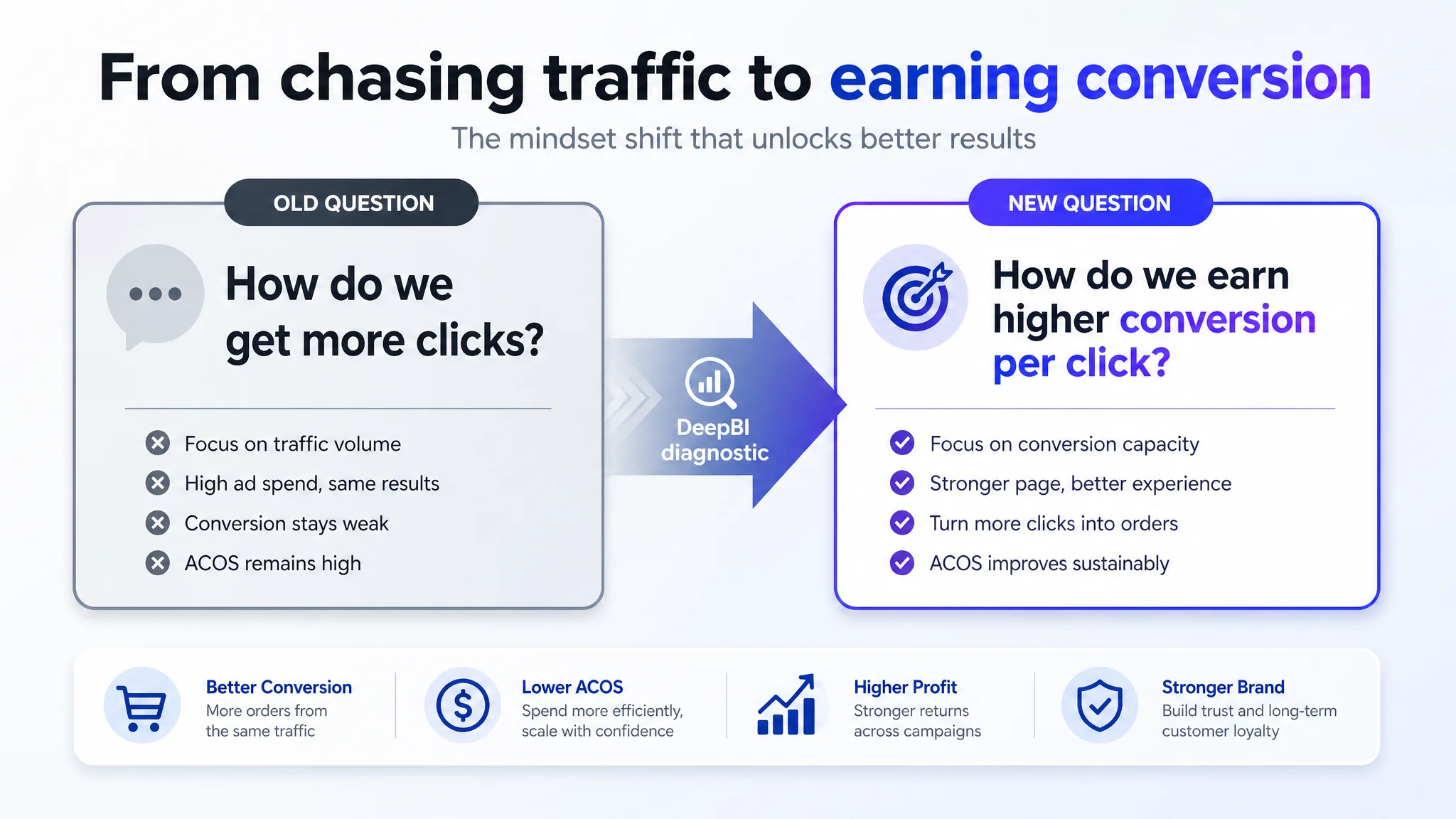
From here, the question shifted from:
- “Which ad lever haven’t we pulled yet?”
to:
- “What must change on the Amazon product page so that every future ad click has a higher chance to convert?”
Why Listing Conversion Had to Be Fixed Before Pushing Ads
Staying on the ad side would have carried three major risks:
1. Budget leak: More spend into a page that underperforms vs. its benchmark is structurally leaking margin, no matter how polished the campaigns are.
2. Organics at risk: Weak conversion drags down organic ranking over time. Buying traffic into a sub‑optimal Listing weakens the organic foundation the seller thought they were protecting.
3. Misleading signals: Poor page conversion can look like “bad keyword fit” in the ad reports, pushing optimization into even more unproductive directions.
DeepBI’s judgment was that Listing conversion was now the primary lever. Without lifting it, further ad optimization would be incremental at best and wasteful at worst.
What the Optimization Focused On (Without Turning Into a Feature Catalog)
The optimization did not try to reinvent the product; it aligned the page with how buyers actually decide in this category.
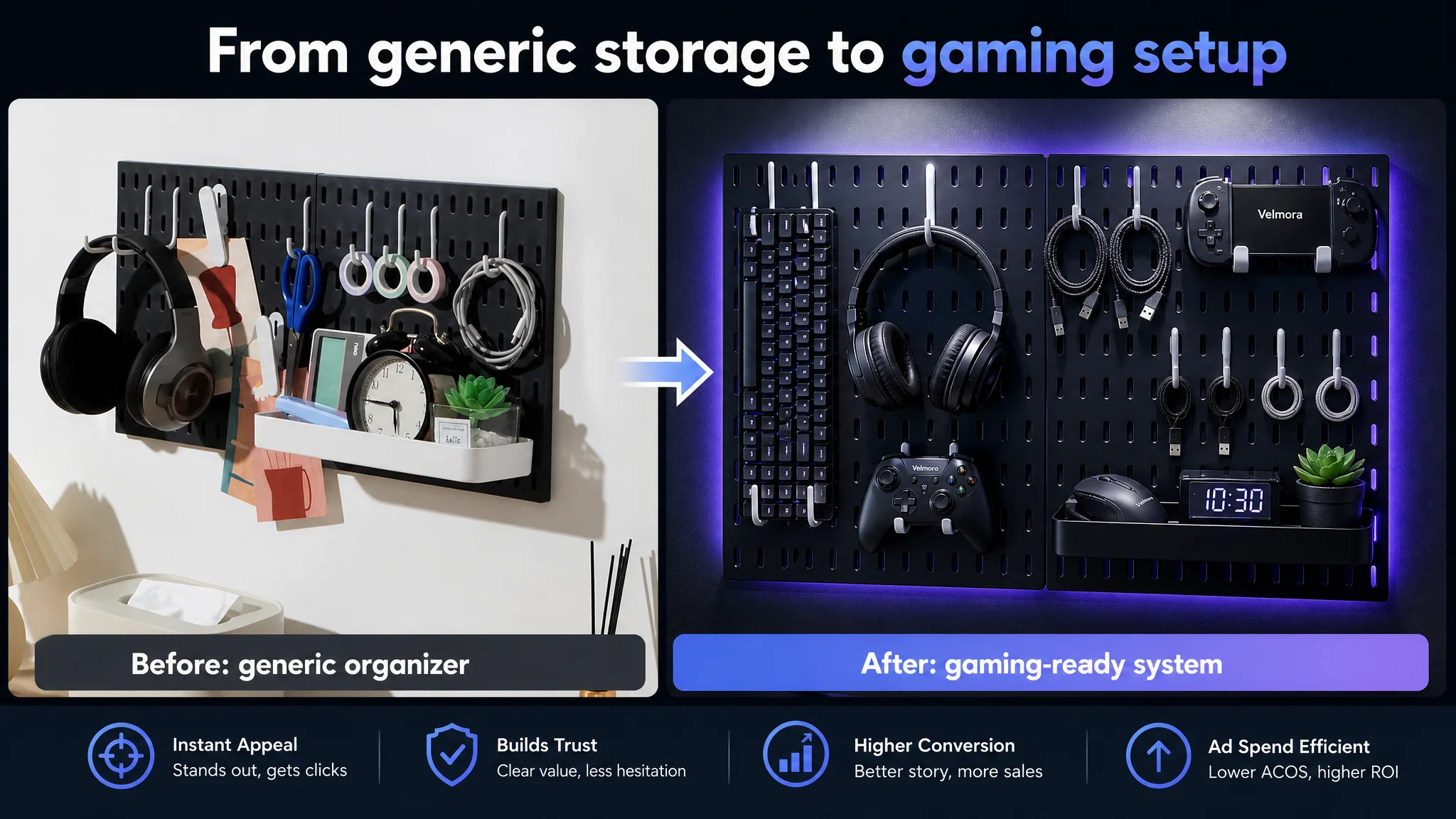
1. Re‑anchoring the visual story around gaming and “revamped space”
- Shift the main image from “generic home organizer” to high‑contrast, cold‑tone gaming scene:
- Pegboard centered, occupying ~80% of the frame
- Deep grey wall, blue‑purple LED ambience
- Mounted keyboard, headset, controller—high‑value tech gear instead of everyday clutter
- Simple overlay like “Modular Storage System”
- Use secondary images to show:
- Multi‑panel setups demonstrating capacity and expandability
- Knolling style “what you get” accessory layouts with labels
- Tri‑scene layouts (office / gaming / creative) to visualize versatility without chaos
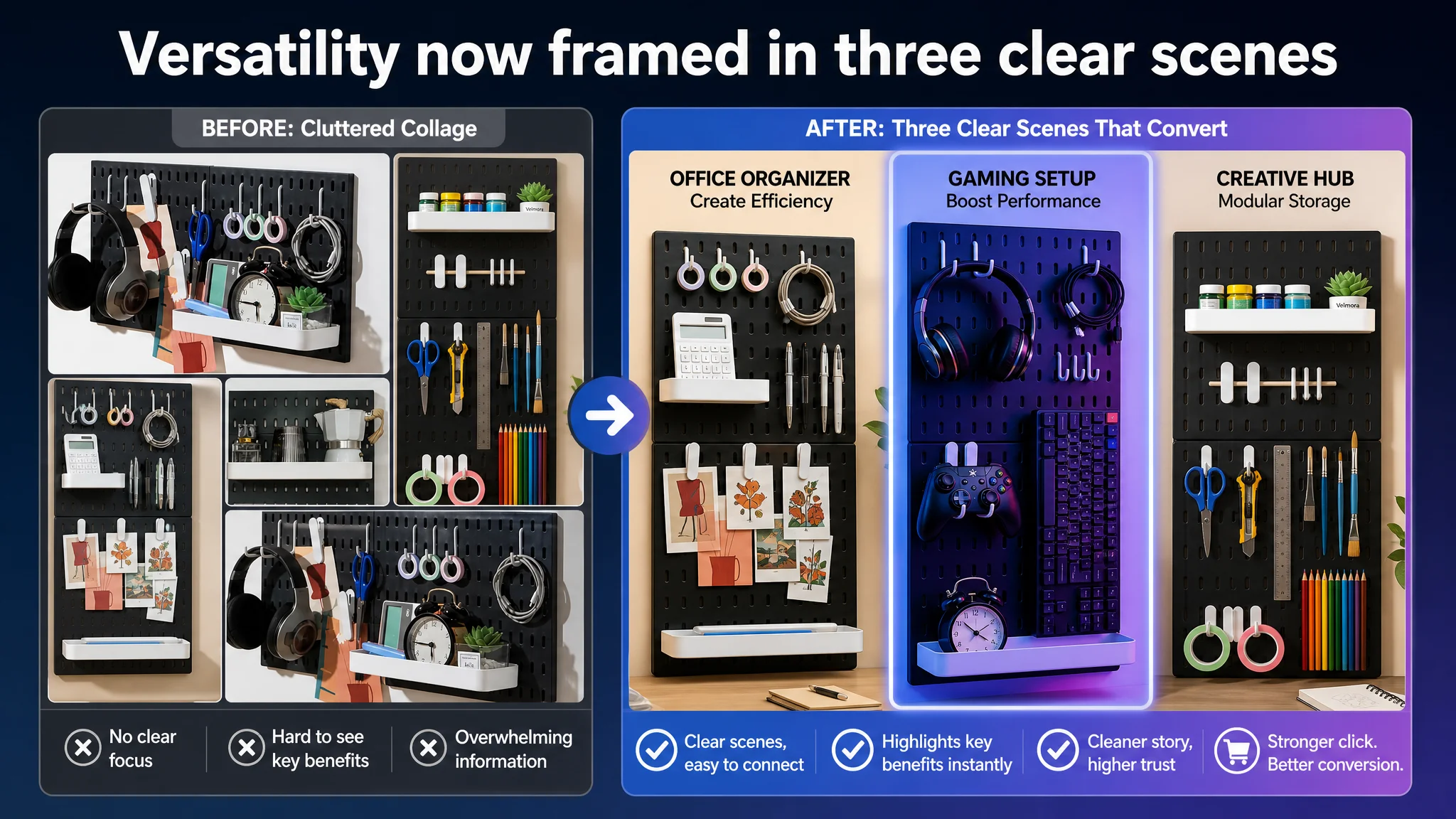
The goal was to make the Listing unmistakably gaming‑ready and modular at thumbnail level, while still covering broader home use.
2. Bullet points: from feature list to purchase logic
The bullets were reshaped along a clear arc:
1. Space & ambience first
“MAXIMIZE SPACE & ENHANCE AMBIENCE…” → lead with clutter relief + aesthetic upgrade, especially for gaming and home office.
1. Trust in durability & installation
“DURABLE MATERIAL & DUAL MOUNTING OPTIONS…” → get explicit about load (20 lbs) and two install paths (adhesive vs. screws), reducing installation anxiety.
1. Versatility beyond gaming
“VERSATILE USAGE BEYOND GAMING…” → add kitchen, crafts, office, DIY, students, professionals; widen relevance and keyword coverage.
1. Modular & expandable
“MODULAR & EXPANDABLE DESIGN…” → monetize modularity by planting the idea of buying extra panels now or later.
1. Customization & giftability
“CUSTOMIZABLE SETUP & PERFECT GIFT…” → convert functional appeal into gifting and emotional value; tie back to the competitor’s “highly sought after as a gift” logic without copying.
This kept all real product attributes intact while turning bullets into a guided buying narrative.
3. A+ (detail page): covering the decision chain that was missing
The detail page was re‑structured to mirror the competitor’s full chain, but around the target product’s own strengths:
- First screen: immersive gaming scene with the pegboard fully loaded, low‑key lighting, strong depth, clear oval holes visible.
- Installation module: clean, split‑screen image showing:
- Left: adhesive, no‑drill, three simple steps
- Right: screws, three steps
- Multi‑scene module: clear, single‑scene visuals for:
- Kitchen (white board with utensils and spices)
- Home office (notebooks, pens, notes)
- Entryway (keys, umbrellas, bags)
- Core advantages module: 45° view showing two boards combined, filled with gear to illustrate capacity and stability; oval hole + hook fit visibly tight.
- Media & trust module: media logos aligned above a real, aspirational home office scene, with readable trust text.
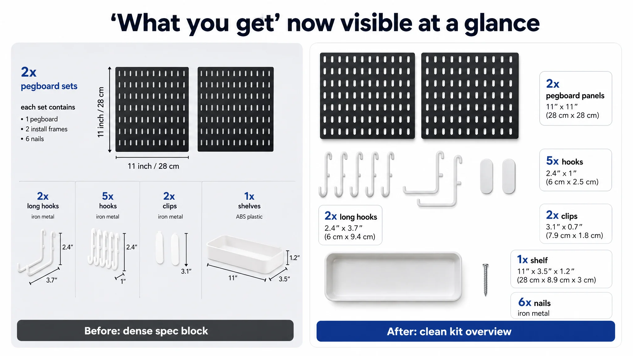
- Accessory overview module: knolling flat‑lay showing the entire kit at a glance, reducing “what do I actually get?” friction.
This made the page feel intentional and complete: a shopper could scroll and naturally get all the assurances the competitor already provided.
How the Page’s Sales Logic Started to Recover
Once the Listing began to tell a coherent story, the business dynamics started to change in predictable ways:
- The page stopped over‑relying on raw review volume as its only trust signal.
- High‑intent visitors from gaming and workspace keywords found visual proof that this product was built for them, not just incidentally compatible.
- Installation concerns were addressed visually rather than buried in text, which is critical on mobile where long bullet reading rates are low.
- Multi‑scene visuals made the product relevant to more search intents—kitchen, entryway, crafts—without diluting the core gaming positioning.
Although we do not invent specific numbers, what typically follows in such a setup is:
- CVR begins to show a clear upward trend relative to the pre‑change baseline.
- ACOS starts to ease, not because bids changed, but because each click now has a higher chance of turning into an order.
- The share of organic orders stabilizes or recovers as Amazon’s algorithm sees better conversion behavior on the Listing.
Most importantly, the seller gains control: ads become a growth lever again, not a bandage on a systemic conversion leak.
What Changed in the Seller’s Understanding
By the end of the process, the seller’s internal narrative had shifted:
- From: “Our reviews are strong, so the page is fine; ads must be the issue.”
- To: “Our Listing was under‑performing its category benchmark in how it framed the problem, visualized the outcome, and built trust.”
They came away with several durable lessons that apply well beyond this one pegboard product:
- Amazon ads cannot fix a weak product‑page story. They can only amplify whatever the page already does—good or bad.
- Listing quality is not just about keywords and stars. It is about whether title, main image, bullets, and A+ build a single, coherent decision path.
- Before scaling ads, you must judge if the page deserves the traffic. Benchmarking against a true category leader makes this judgment objective, not emotional.
- Strong review volume is an asset only if you integrate it into the page logic. Numbers alone do not persuade; context and narrative do.
For other Amazon sellers, especially in competitive, visually driven categories like home organization, gaming accessories, and storage systems, this case is a signal to look beyond ad dashboards. If your ACOS feels structurally high and every ad experiment hits a ceiling, it may not be your bidding strategy that’s failing—it may be your Amazon Listing quietly telling a weaker story than the best Listing your customers are also seeing.