
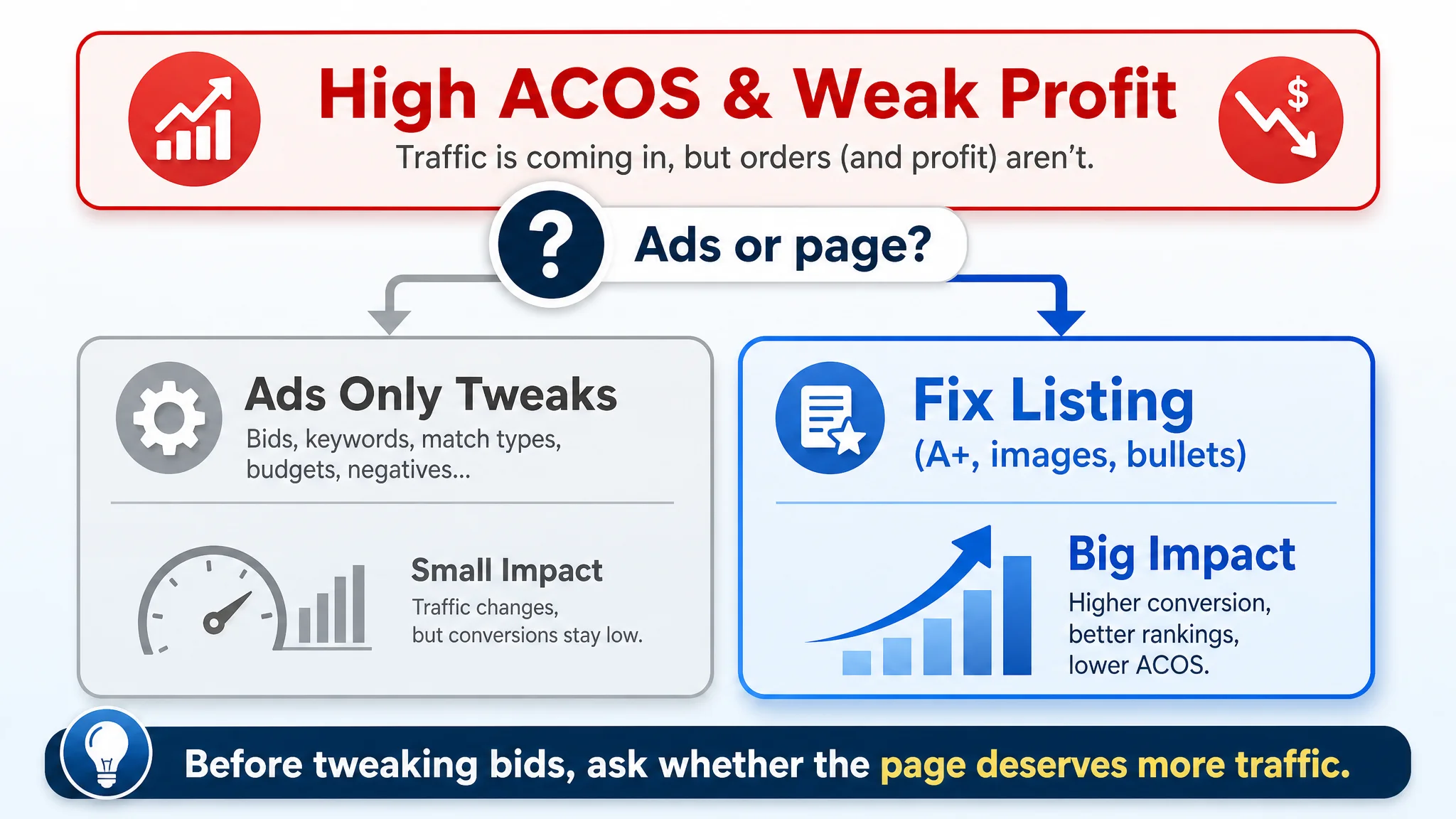
An Amazon seller in the UK lumbar support pillow niche came to us with a familiar pressure: ad spend was getting harder to control, yet orders were not growing in step with traffic. Internally, the team believed they were facing an Amazon ads problem—bids, keywords, and campaign structure must be off—so most of the energy went into tuning Sponsored Products, not the product page.
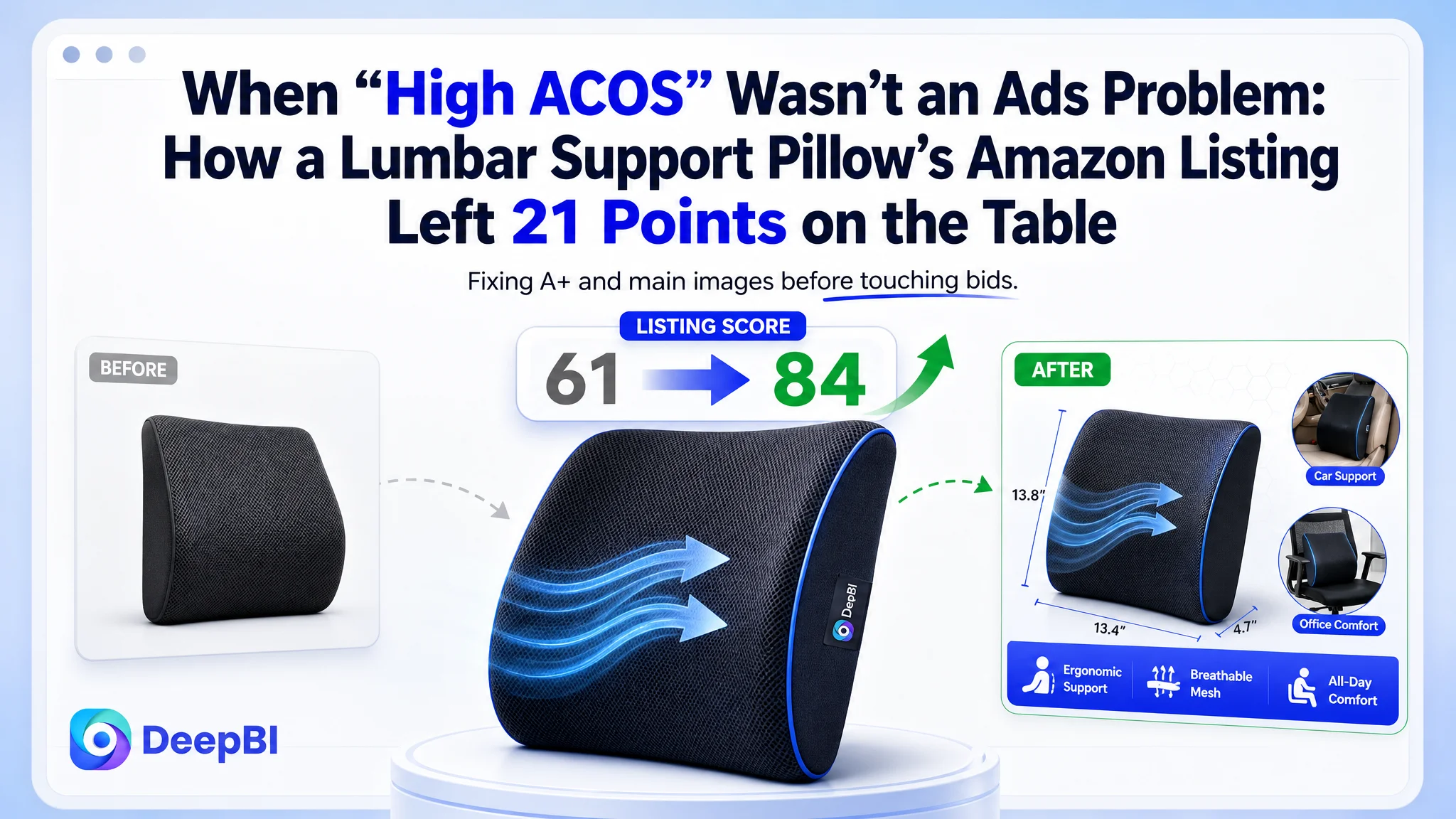
Once DeepBI put their Listing under the same microscope as a top-performing Amazon competitor, a different picture emerged. The title, main image, and bullet points were broadly competitive. The real collapse was on the product page itself: zero A+ content against a competitor with a full, structured visual story. On a 100‑point scale, the Listing scored 61 versus the competitor’s 84; 21 of those missing points were in the detail/A+ dimension alone.
From there, the optimization path flipped. Instead of pushing more traffic into an under-explained page, the focus shifted to rebuilding the Amazon Listing’s visual and narrative structure—especially A+ content and main-image series—around trust, ergonomics, and multi‑scenario use. For Amazon sellers, this case is a reminder that when ACOS feels “stuck,” the real bottleneck may be a Listing that lacks a conversion engine, not an ads dashboard that lacks another tweak.
This Listing Didn’t Lack Traffic. It Lacked a Sales Engine.
From the seller’s perspective, the story started with ads.
They were in a crowded Amazon UK category for lumbar support pillows. The product was differentiated by a breathable “4D Air‑Mesh” design, positioned as a more advanced, ergonomic solution for long sitting. Traffic from Amazon ads was acceptable, and keyword coverage was not obviously weak, but profitability and order growth were under pressure. The instinctive diagnosis: the ads must be inefficient.
So the team cycled through the standard playbook—adjust bids, refine match types, trim poor‑performing keywords, and test budget allocations. Despite this, the sense was that ACOS refused to improve as expected. Ads were bringing people in, but the Listing wasn’t turning enough of those visits into orders.
“The real problem was not that ads failed to bring traffic. It was that the page could not convert the traffic.”
When we ran a full DeepBI Listing diagnostic against a single, tightly matched Amazon benchmark Listing, the core constraint became unmistakable.
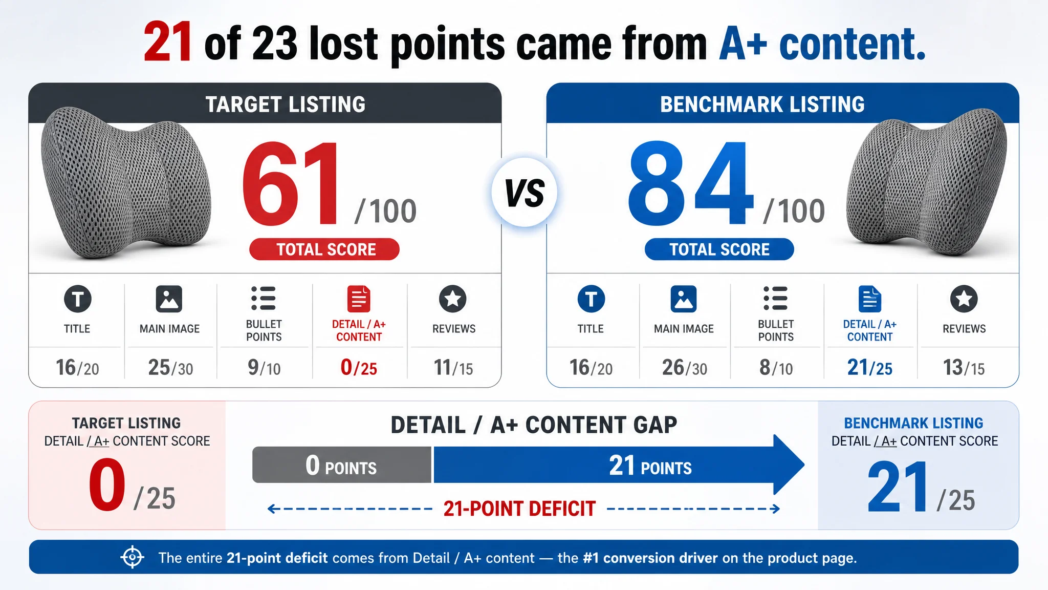
The Numbers Made the Root Cause Hard to Ignore
On a 100‑point competitive score, the target Amazon Listing came in at 61. The benchmark Listing in the same lumbar support sub‑category scored 84. The gap was not spread evenly; it was concentrated in one place:
- Overall score
- Target Listing: 61/100
- Benchmark Listing: 84/100
- Gap: ‑23 points
- By dimension
- Title: 16 vs 16 (out of 20) → no real gap
- Main image set: 25 vs 26 (out of 30) → only ‑1
- Bullet points: 9 vs 8 (out of 10) → slight advantage
- Detail / A+ content: 0 vs 21 (out of 25) → ‑21
- Reviews: 11 vs 13 (out of 15) → ‑2, with fewer total reviews
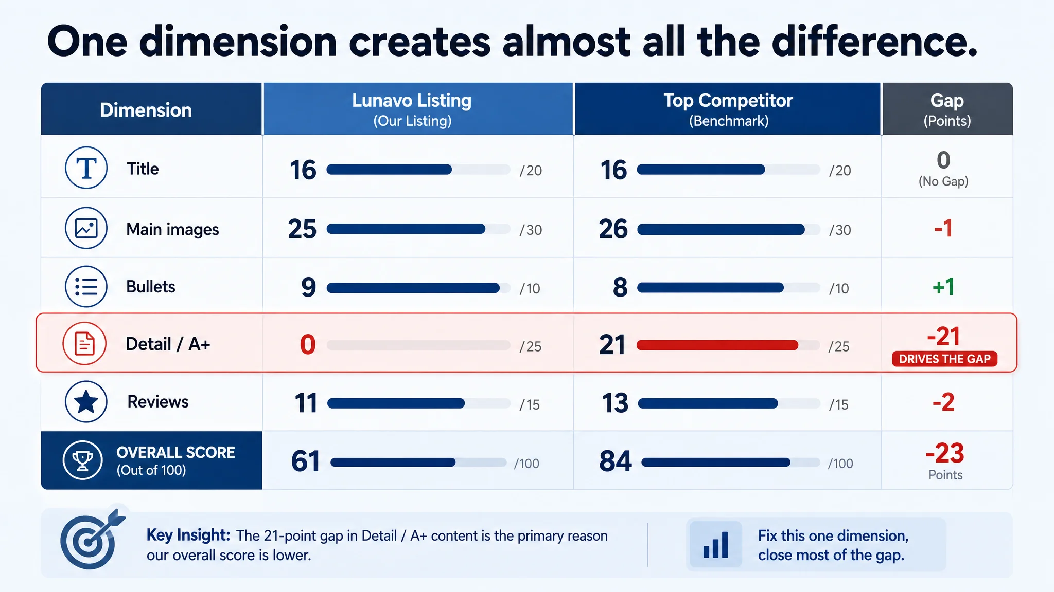
The data said two things clearly:
1. This was not a “headline and bullets” problem.
The title followed Amazon best practices, and the bullets were actually more advanced in pain‑point depth and long‑term health framing than the competitor’s.
1. The Listing had effectively no product‑page story.
A full 21‑point gap came from the detail/A+ section alone. In practical terms, the competitor was running a complete A+ visual funnel; this Listing had none.
If you keep treating this as an ads problem, you are pouring paid clicks into a page that has no structured way to convert skeptical, high‑consideration buyers.
What the Seller Originally Misdiagnosed
The seller’s first instinct was understandable.
- Ads were consuming a growing share of revenue.
- ACOS reductions were slow and fragile.
- Category competition was intensifying.
So the working theory was: “Our ads aren’t optimized enough.” The team expected that further bid tuning, negative keywords, and structural tweaks would restore efficiency.
Why that logic broke down in this case:
- CTR was not the primary disaster zone.
With a main image that was roughly in line with the benchmark and a mature, keyword‑rich title, there was no evidence of a catastrophic click‑through failure relative to the category ceiling.
- The funnel was collapsing after the click.
For a product like a lumbar pillow, which solves a chronic pain issue and can feel “medical,” buyers need more than a single image and some text. They need to see how it works, where it fits, and why it’s safe and professional. The competitor provided that; this Listing did not.
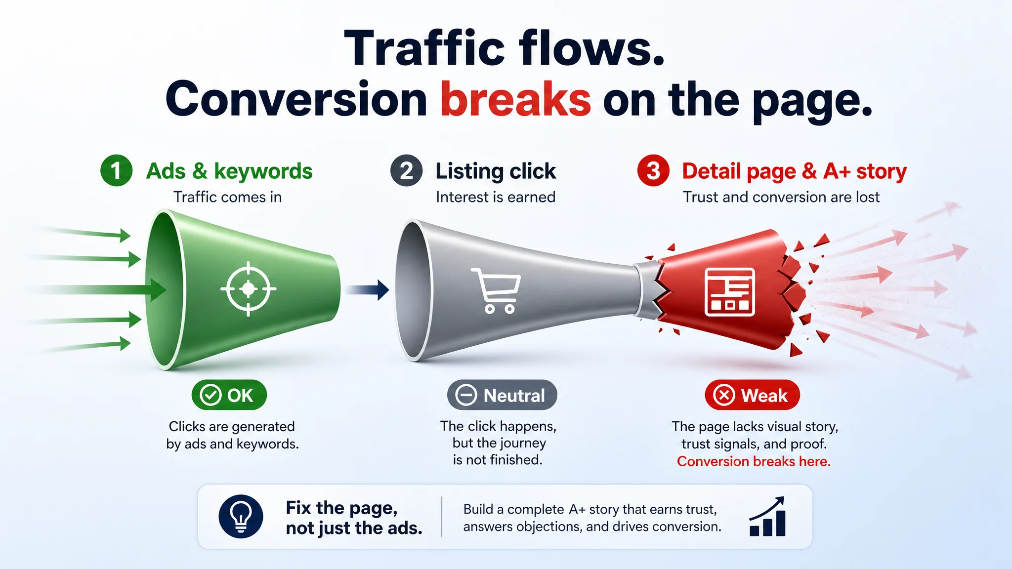
Traditional Amazon ad optimization can improve efficiency when the page has a basic ability to sell. Here, the Listing simply was not giving the traffic enough reasons to commit.
The Real Constraint: Listing Conversion Capacity, Not Keyword Bids
DeepBI’s scoring and visual analysis pointed to one core bottleneck:
The Amazon product page lacked a complete, visual conversion story.
Let’s break down where the Listing stood versus the benchmark.
Title: Competitive, but Not the Problem
Both titles were structurally solid and search‑aware.
- Both led with “Lumbar Support Pillow for Lower Back Pain Relief”–style phrasing, aligning with high‑intent Amazon search behavior.
- The target Listing already used “4D Air‑Mesh”, a specific, technically appealing material cue around breathability.
- The benchmark added color information “(Black)” at the end, which is a small but useful detail for clarity and filtering.
DeepBI’s recommendation here was incremental, not foundational:
- Emphasize “Breathable” up front to fully leverage the 4D Air‑Mesh differentiation.
- Retain the core keyword structure for A9 relevance.
- Keep color at the end to reduce post‑purchase mismatch and returns.
In other words, the title was not where 23 points were leaking.
Main Image Series: Minor Gaps, Not Catastrophic
The primary images were not perfect, but they were not the collapse point.
The benchmark Listing did a slightly better job on:
- Emotional hook and functional hint in the first image.
The competitor’s main image hinted at breathability and multi‑scenario use with visual overlays. The target Listing’s first image felt more neutral and clinical, likely costing an estimated 5–8% relative CTR in crowded search results.
- Clean, data‑driven visualizations.
Where the target Listing used cluttered “doctor plus UI” overlays and low‑credibility visual effects, the benchmark relied on minimalist dimension graphics and structured callouts, which felt more precise and trustworthy.
But these were points of refinement, not the main reason traffic was not turning into orders.
Bullet Points: Stronger Than the Competitor, on Paper
Ironically, the text was ahead of the benchmark in several ways:
- More specific pain description and immediate relief promises.
- Stronger emphasis on long‑term ergonomic health and posture support.
- Professional maintenance guidance (e.g., expansion time, care instructions).
The competitor added a sixth bullet related to brand trust, but overall, this Listing’s bullet structure was logical and compelling:
1. Pain & solution
2. Core technology & comfort
3. Multi‑scenario use
4. Ergonomics & long‑term health
5. Use & maintenance
6. (Planned) quality & durability
So again, not a bullet‑point problem.
Detail / A+ Content: The 21‑Point Black Hole
This is where the Listing simply fell out of the race.
The competitor’s Amazon A+ region deployed a full, conversion‑oriented visual stack:
- A hero image combining product + human + usage scene, immediately anchoring identity and context.
- Problem–solution comparison modules (incorrect vs correct posture), using red “X” and green “✓” logic to make spine health risks visual and urgent.
- Clear function and principle diagrams, including pressure distribution visuals and X‑ray‑style overlays for professional authority.
- Close‑up material shots emphasizing breathability and texture.
- Multi‑scenario tiling (office, car, home, gaming) to broaden relevance.
- Visual proof of memory foam rebound and comfort under pressure.
- Dimension and installation diagrams that remove final “will this fit my chair?” objections.
The target Listing had none of this. No A+, no structured image modules, no visual explanation of ergonomics, no professional proof, no scenario mapping.
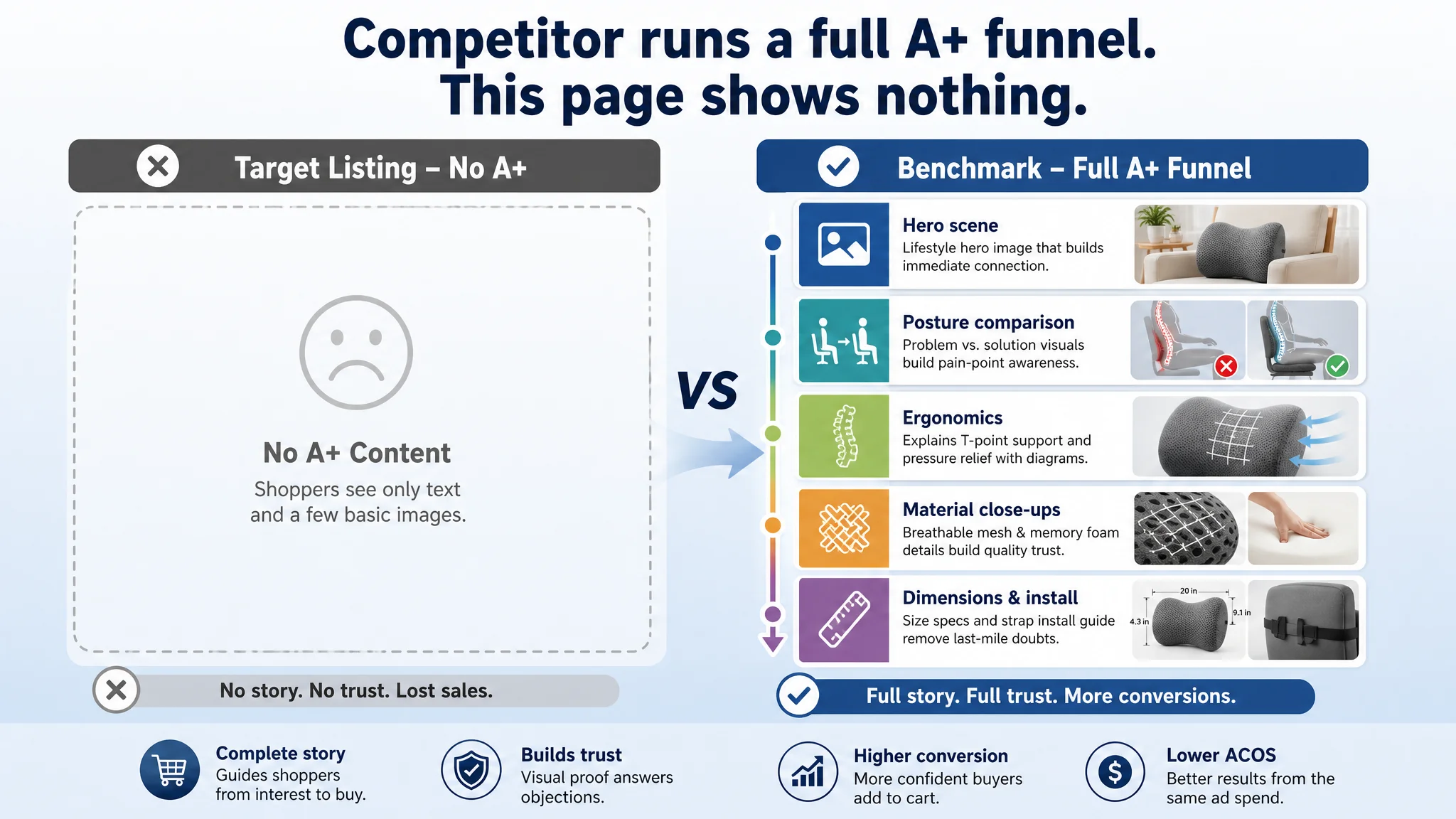
Result: the competitor had a full conversion funnel; this Listing had a cliff.
Why DeepBI Refused to Treat This as an Ads‑First Problem
From a business‑risk perspective, continuing to treat this as an Amazon ads issue would have been dangerous:
- Ads would keep amplifying a weak page, inflating spend without meaningfully improving CVR.
- The lack of visual trust and explanation would cap organic conversion, weakening the Listing’s ability to sustain rank organically.
- Review count and social proof, already thinner than the competitor’s, would be slow to catch up if the page could not convert at similar rates.
With a 21‑point detail/A+ deficit, the priority had to be:
Repair the product page’s sales logic before scaling or further intensifying ads.
That judgment was grounded in three principles:
1. Listing conversion is the base layer of advertising performance.
If the page cannot persuade, additional traffic simply magnifies inefficiency.
1. Detail/A+ content was the largest, most concentrated gap.
Fixing a 21‑point hole yields more leverage than shaving one or two points off main images or title differences.
1. The category is high‑consideration.
For chronic pain and ergonomics, buyers need trust, explanation, and reassurance. Pure text and a few generic images are not enough.
How the New Direction Rebuilt the Page’s Conversion Logic
The optimization path was not about cosmetic “prettier images.” It was about reconstructing how the Amazon product page leads a buyer from interest to conviction.
1. Clarifying the Product’s Position in the Title
DeepBI’s title revision focused on making the product’s differential instantly recognizable in search results:
- “Breathable 4D Air‑Mesh” pulled the unique material advantage forward.
- The core search phrase “Lumbar Support Pillow for Lower Back Pain Relief” stayed at the front for algorithm relevance.
- Color “(Black)” at the end aligned with benchmark practice for clarity and reduced return risk.
This ensured the title participated fully in both search capture and click‑through influence.
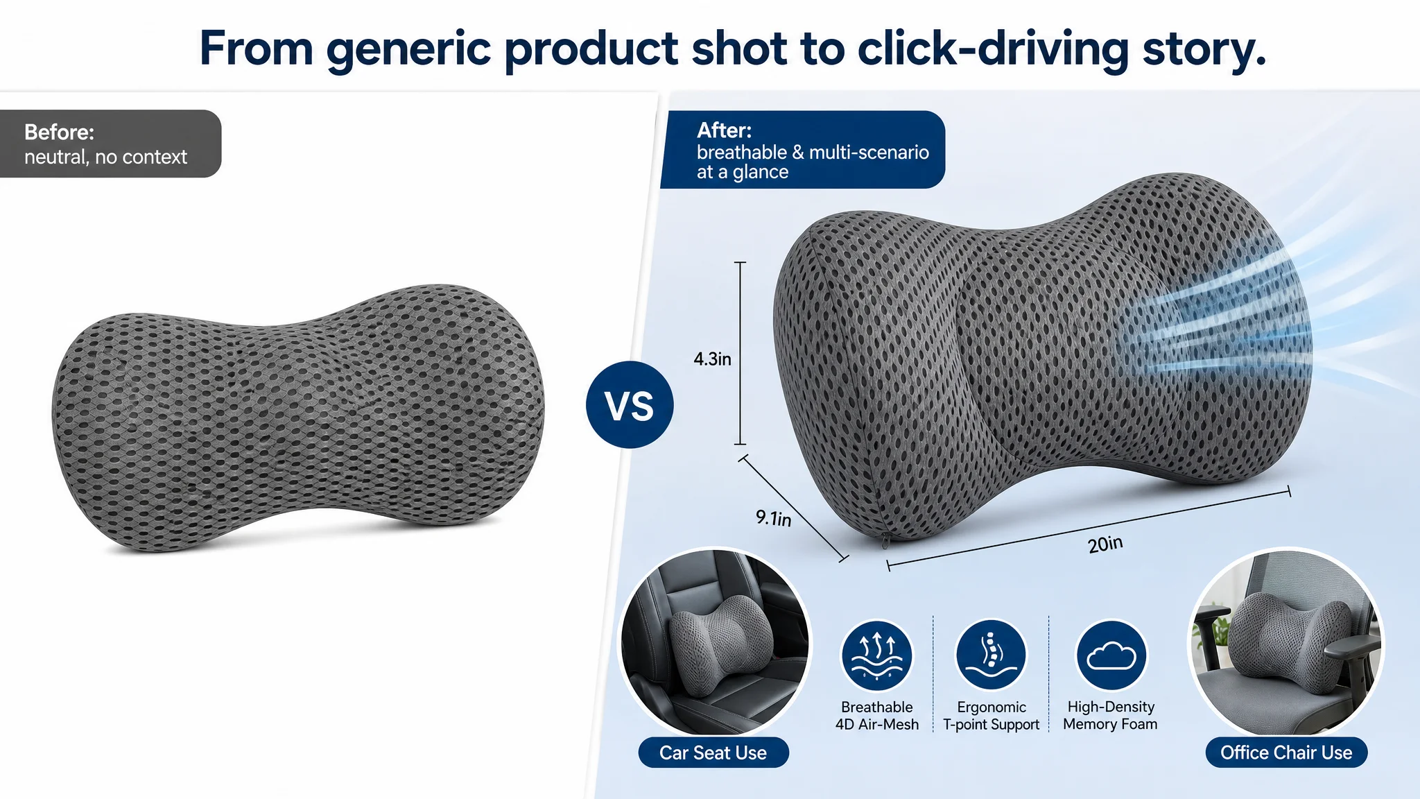
2. Turning Main Images Into a Structured Story, Not Just Pictures
Each main image received a defined role in the decision journey.
Main Image #1: Click Magnet With Function Hints
- Product centered at a 45° angle on a clean gradient background.
- Subtle airflow lines to hint breathability.
- Small circular insets showing use on office and car seats.
Purpose: move from a neutral, clinical shot to a visually inviting, multi‑scenario promise, improving CTR potential.
Main Image #2: From Cluttered “Doctor UI” to Professional Dimensions
- Remove distracting doctor and cheap UI overlays.
- Replace with a clean dimension graphic, product centered, with precise measurements and neutral gradients.
Purpose: signal design precision and fit, not gimmicks, reducing “will it fit?” friction.
Main Image #3: Visualizing Support, Not Just Showing a Pillow
- Product in a modern bedroom scene, with a subtle grid light effect over the lumbar support region labeled “T‑point Support.”
Purpose: make the idea of structured, ergonomic support feel real and tangible without resorting to unrealistic internal cutaways.
Main Image #4: Material and Detail Trust
- Real‑world car seat application on one side.
- Three circular detail close‑ups: zipper, fabric texture, foam rebound.
Purpose: elevate material trust and build confidence in durability and everyday practicality.
Main Image #5: Professional Backing Without Clinical Distance
- Friendly, unmasked doctor image paired with the product.
- Below, three small scenario images: office sitting, driving, pregnancy support.
Purpose: retain professional credibility while increasing warmth and relatability, avoiding the “cold medical device” impression.
“Advertising does not only amplify advantages. It can also amplify a page’s existing defects.”
By redefining each image’s job, the Listing moved from a collection of pictures to a coherent visual argument.
3. Upgrading Bullet Points Into a Convincing, Balanced Narrative
The bullet points were already strong; the work here was refinement and alignment with the visual story.
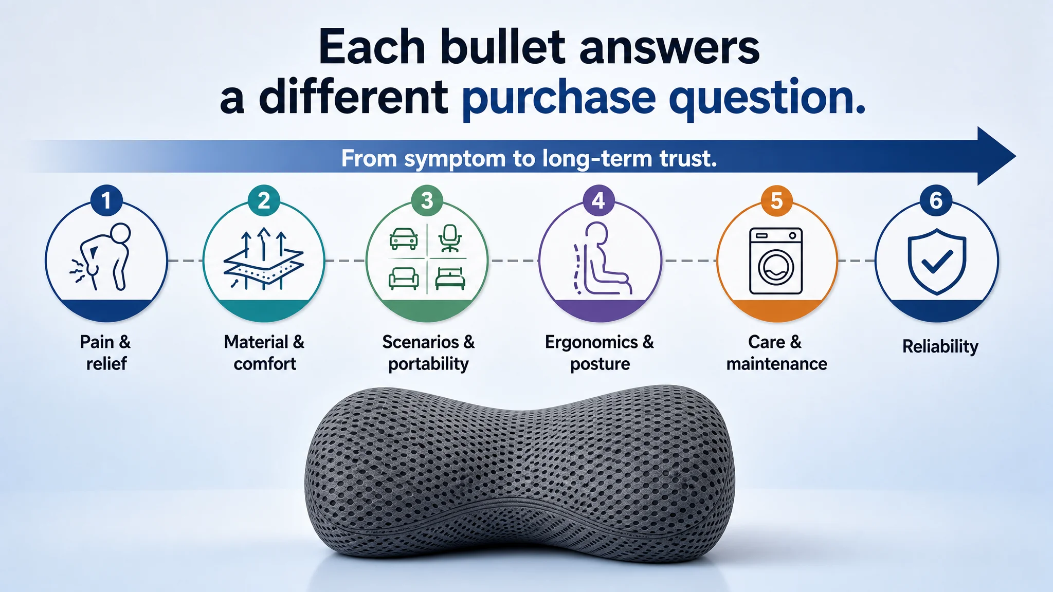
Examples:
- BP #1 – Pain relief across sitting and reclining.
Expanded to cover both seated and lying scenarios, reinforced with “responsive high‑density memory foam” language to match ergonomic visuals.
- BP #2 – Breathability and maintenance.
Explicit “Breathable 4D Mesh” framing, plus hidden zipper and easy machine‑wash cover to match cleaning/maintenance imagery.
- BP #3 – Versatile & portable.
Explicitly tied to office, commuting, gaming, and home relaxation—mirroring the multi‑scenario images.
- BP #4 – Ergonomic posture and pressure relief.
Anchored to posture correction, slouching prevention, and even weight distribution, dovetailing with the posture comparison A+ visuals.
- BP #5 – Maintenance clarity.
Clear separation between washable cover and non‑washable foam core, plus realistic expansion guidance (12+ hours), reducing post‑purchase confusion and potential returns.
- BP #6 – Reliability and long‑term performance.
Added to match the competitor’s brand trust bullet, emphasizing shape retention and foam behavior over time.
This ensured the text and images worked as a single, mutually reinforcing conversion asset.
4. Building an A+ Structure That Mirrors How Buyers Decide
The biggest leap was in the detail/A+ area, where the Listing previously had nothing.
DeepBI’s plan recreated, then upgraded, the benchmark’s conversion logic in seven steps:
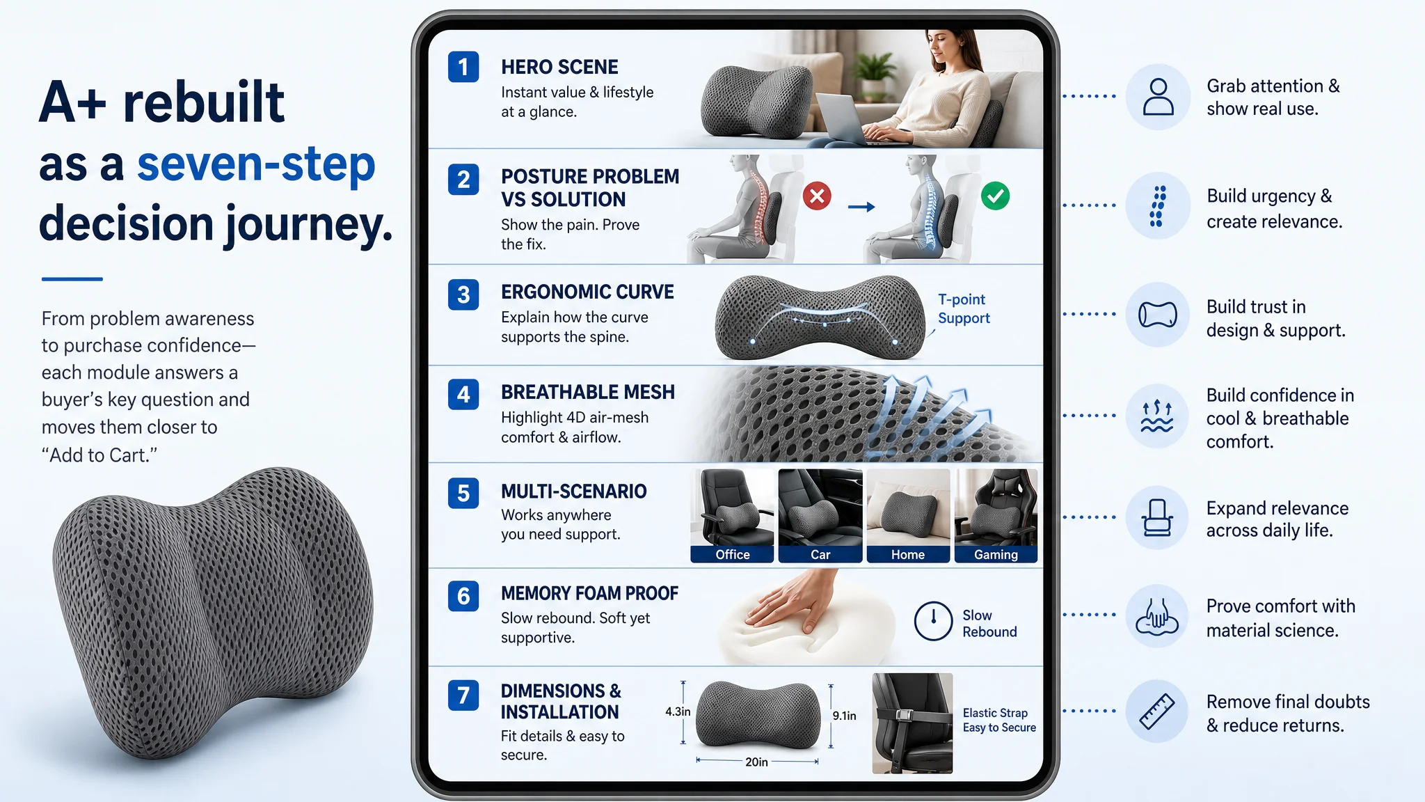
1. Hero identity & context
- Product + person using a laptop on a sofa, cushion at the lower back.
- Clear title overlay: “Memory Foam Lumbar Support Pillow.”
Job: immediate identity, lifestyle relevance, and lowered psychological distance.
1. Posture problem vs solution
- Left: no cushion, curved spine, red X and highlighted pain zones.
- Right: with cushion, healthy S‑curve, green check.
Job: make the pain and risk of inaction visual, not abstract.
1. Ergonomic curve explanation
- Close‑up of the pillow’s curves, with subtle lines pointing to key support areas.
Job: turn “ergonomic” from a buzzword into something visibly engineered.
1. Breathable 4D mesh close‑up
- Macro shot of the mesh, with airflow arrows.
Job: allow buyers to “feel” breathability with their eyes, supporting the “4D Air‑Mesh” title claim.
1. Multi‑scenario montage
- Four circular insets: office chair, car seat, bedroom support, gaming chair.
Job: show that one purchase solves comfort across all daily seats.
1. Memory foam rebound and material proof
- Split image showing full product and exposed foam with hand imprint.
Job: display pressure relief and slow rebound as a tangible, trustworthy property.
1. Dimensions & installation guidance
- Structured diagram with length, width, height, plus strap application on a chair.
Job: remove last‑mile doubts around fit and ease of installation, lowering return risk.
This rebuilt A+ structure directly targeted the 21‑point deficit and re‑engineered the detail page from “text only” to a complete, high‑intent conversion path.
What Changed for the Business — Even Before Exact Numbers
The case material does not include post‑optimization metrics, so we will not invent them. But the operational state changes are clear:
- The Listing regained the ability to explain itself.
Buyers no longer hit a wall of text and a handful of generic images. Instead, they encountered a coherent spine health and comfort story.
- Ad traffic became more “worth sending.”
With a detail page now capable of building trust and handling objections, each paid click had a better chance of converting, creating conditions for ACOS to begin easing rather than constantly fighting an uphill battle.
- Organic conversion capacity strengthened.
A more persuasive product page improves not just paid traffic outcomes but also the ability to hold and grow organic rank, reducing long‑term dependence on ad spend.
- Risk around returns and negative reviews was reduced.
Clear cleaning instructions, expansion guidance, and sizing visuals helped pre‑empt misunderstandings that often lead to returns and low‑star feedback.
Most importantly, the seller’s understanding of the real problem shifted:
- High ACOS was not purely an advertising issue.
- A neglected A+ region was silently capping the Listing’s overall conversion ceiling.
- Title, main image, bullets, and A+ must be judged as a single system, not isolated assets.
What Other Amazon Sellers Can Take From This
Several patterns in this case are widely applicable:
1. If your title and main image are near category best practice, but orders lag traffic, suspect the detail page.
A 0‑score or weak A+ region in a high‑consideration category is almost always a major bottleneck.
1. Ads can’t fix a trust gap.
When the Listing doesn’t visually prove what it promises, no amount of bid optimization will deliver the ACOS stability you expect.
1. Look for concentrated gaps, not small, evenly spread weaknesses.
Here, a single 21‑point deficit in the detail/A+ dimension defined the entire problem. That’s where effort had the highest leverage.
1. Make every image do a job in the funnel.
Click magnet, ergonomic proof, scenario mapping, material trust, dimensional reassurance—random “nice” images are not enough.
For this lumbar support pillow seller, DeepBI’s value was not in listing out “features” of a tool. It was in reframing the core business question: “Do we really have an ads problem, or do we have a Listing that doesn’t deserve more traffic yet?”
Once that judgment changed, the optimization path—and the store’s risk profile—changed with it.