

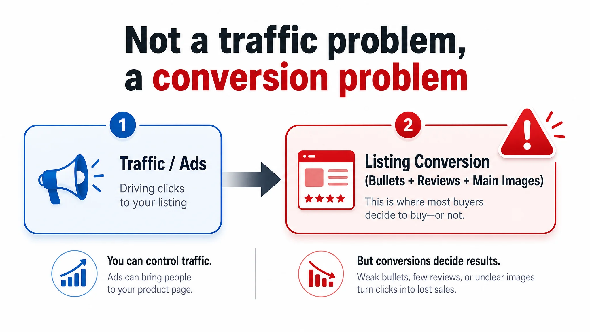
An Amazon seller in the hydration backpack category came to DeepBI with a familiar frustration: ads were running, a carefully written Amazon title and a visually rich A+ page were already in place, but the product page still could not compete with a key benchmark listing. On paper, the Listing looked “better” than the competitor; in reality, orders lagged and ad efficiency felt stuck.
The seller’s team had been tightening keywords, polishing titles, and planning to pour more budget into Amazon ads, convinced the bottleneck was exposure and bids. DeepBI’s diagnosis pointed elsewhere. The data showed that the real weak links were the bullet points and the review layer—exactly where buyers look for proof, reassurance, and buying logic after they land on the page.
Once the problem was reframed from “we need more traffic” to “the Listing is not converting the traffic it already has,” the optimization path changed. Instead of another round of bid tweaks, the focus shifted to: rebuilding bullet points around user pain points, making the main-image set more informational, and strengthening trust cues in the A+ content and review strategy. This case shows how an Amazon seller with a seemingly strong page was still losing to a competitor—and what other sellers can learn about not letting ads amplify a weak product-page story.
The Listing Looked Strong on Paper, but Conversion Was Still Fragile
From a distance, this Amazon hydration pack Listing looked like a success story.
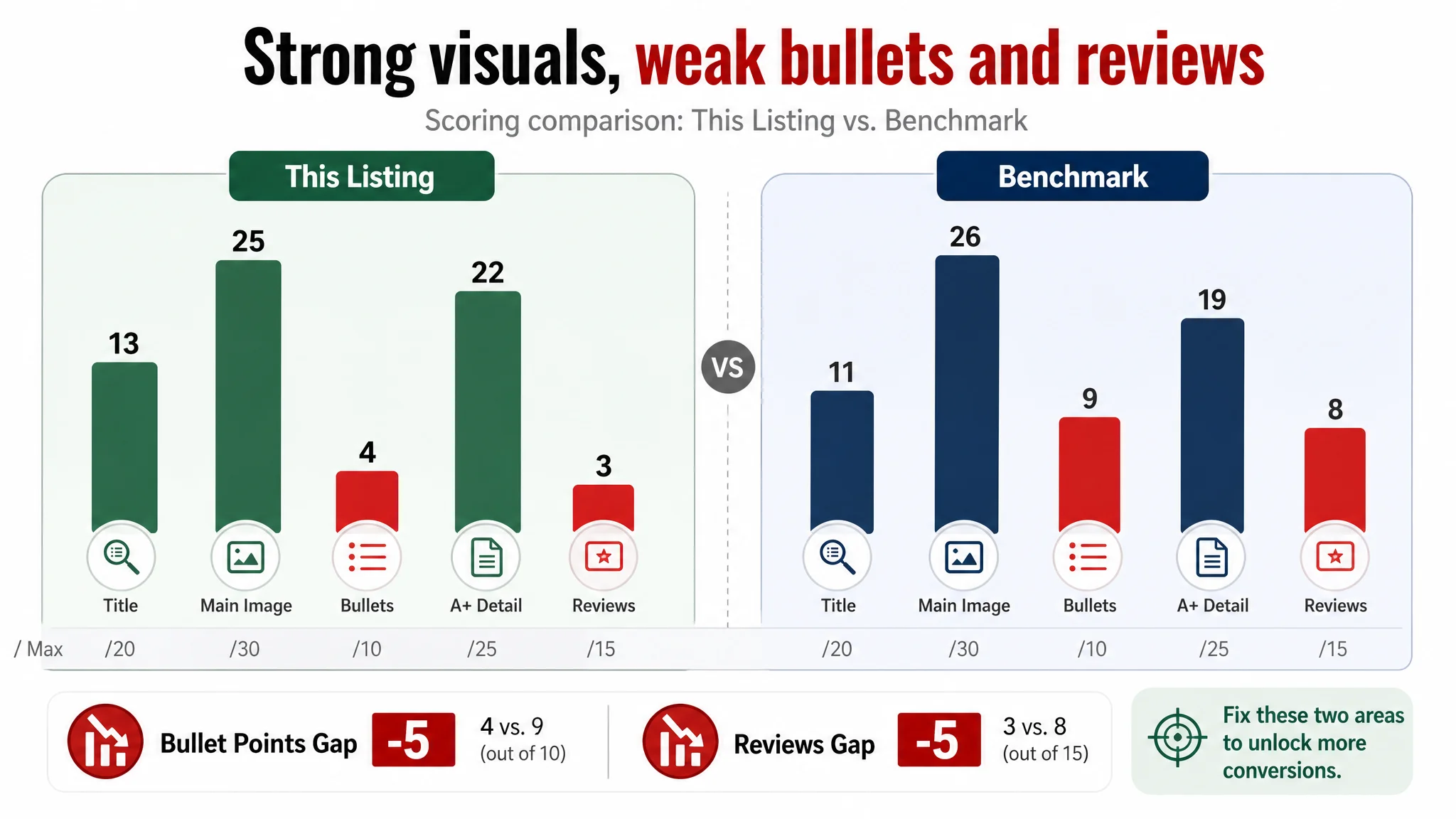
DeepBI’s Listing scoring put the product at 67/100, while the benchmark competitor scored 73/100. This was not a disastrous gap, and in some dimensions the seller was actually ahead:
- Title: 13 vs. 11 (out of 20) – stronger structure and keyword logic
- Main image: 25 vs. 26 (out of 30) – essentially competitive
- A+ / detail content: 22 vs. 19 (out of 25) – richer visual storytelling
The real damage came from two neglected areas:
- Bullet points: 4 vs. 9 (out of 10) – a -5 gap
- Reviews: 3 vs. 8 (out of 15) – another -5 gap
The competitor had 40 reviews at 4.1 stars, with a realistic spread of ratings and rich usage detail. This Listing had a single 5-star review—perfect on the surface, but too thin to be trusted.
On Amazon, that combination is dangerous: a visually impressive page that doesn’t finish the persuasion job in copy, and a review layer that doesn’t yet look “real” to buyers.
“The real problem was not that ads failed to bring traffic. It was that the page could not convert the traffic.”
The Misdiagnosis: “Our Title and A+ Are Fine; Ads Need More Work”
Before working with DeepBI, the seller’s internal logic looked like this:
- The title followed a proven Amazon formula (core product + capacity + key features + scenes + audience).
- The main image set already included lifestyle and detail shots.
- The A+ content was richer and more immersive than most category peers.
- Ads were bringing in impressions, but orders were not scaling as expected.
The team drew what seemed like a reasonable conclusion: if the page content is already strong, then the bottleneck must be:
- Bids that are not aggressive enough
- Campaign structure that needs more segmentation
- Keywords that are missing some search terms
So they were preparing for another round of ad-side optimization, assuming the Listing was basically “done.”
DeepBI’s scoring and benchmark comparison broke that assumption.
Amazon Ads Were Not Failing. The Page Was Consuming the Traffic.
When DeepBI aligned this Listing against a high-performing benchmark in the same Amazon category, a different picture emerged.
Title and A+ Were Not the Problem
On the surface:
- The title was already more mature than the competitor’s:
- Core term “Hydration Pack for Hiking” pushed forward
- Material and scenes clearly laid out (600D PU, cycling, music festivals, rave)
- Unique features like “Removable Tool Pouch” surfaced
- The A+ detail page went beyond static descriptions:
- Real outdoor photography (rain, trails, high-motion usage)
- VS comparison modules showing problems and solutions across hiking, cycling, and security checkpoints
- Clear explanation of fit, safety, and smart usage
If the bottleneck had been title coverage or missing A+ modules, the diagnosis would have been different. Here, those elements were already an asset.
The Conversion Leak Lived in Bullet Points and Reviews
DeepBI’s scoring highlighted two structural weaknesses that the team had underestimated:
1. Bullet points lacked buying logic
The competitor’s bullet points:
- Started from user pain points (e.g., difficulty accessing items mid-run)
- Framed each bullet as problem → solution → outcome/assurance
- Closed the loop with an explicit after-sales promise to reduce perceived risk
This Listing’s bullet points:
- Focused on static attributes (fabric, compartments, straps, safety features)
- Listed functions, but rarely answered “why this matters” in real usage
- Missed a clear, explicit trust or guarantee statement
In Amazon terms: the bullet section was informational, not persuasive. Buyers had to do their own mental work to connect features to benefits.
1. The review layer did not yet look credible
- 1 total review vs. 40 for the benchmark
- 5.0 stars vs. 4.1 stars, but with no variance and minimal detail
- No visible pattern of real-world usage, pros/cons, or photos
For an unfamiliar brand in a functional category (hydration backpack with an integrated bladder), that is a red flag. Even if ads drive clicks, the lack of review depth makes buyers hesitate—especially when a competitor offers dozens of detailed experiences.
In short: the page was not finishing the trust and logic work that the title and A+ had started.
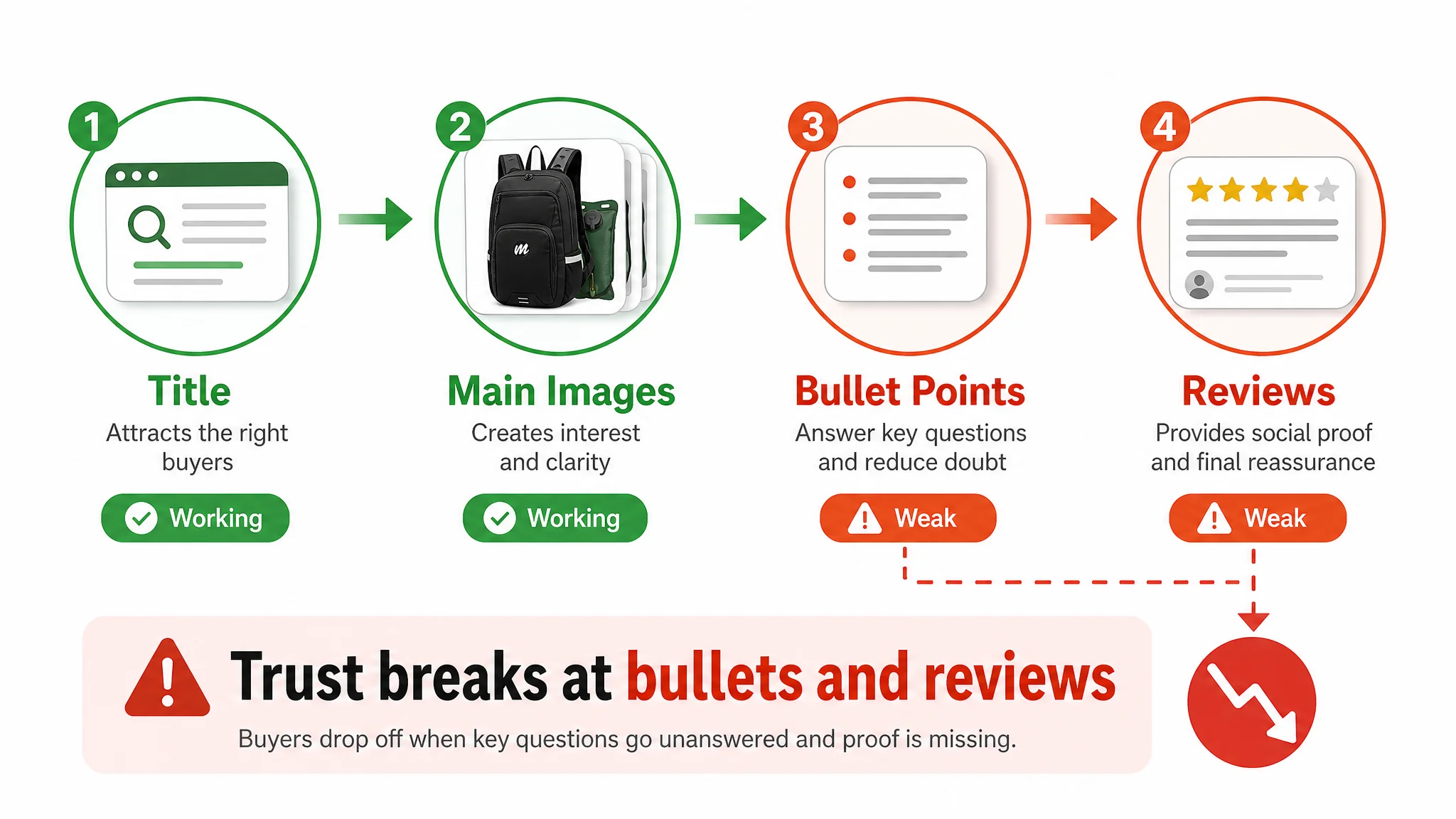
This Product Page Did Not Lack Features. It Lacked a Coherent Buying Story.
To understand why conversion lagged, it helps to look at how each major module behaved in the buyer’s decision path.
The Title Spoke to the Algorithm and the Buyer
DeepBI’s analysis confirmed the title was doing its job:
- Core keyword “Hydration Pack for Hiking” moved toward the front, aligning with Amazon search behavior.
- The title combined:
- Capacity (2L water bladder)
- Material (600D durable PU)
- Key differentiators (Removable Tool Pouch, adjustable straps)
- Multi-scene coverage (hiking, cycling, music festivals, rave events, men/women)
In purely structural terms, the title was not the weak point. It was already balancing A9 logic and human readability.
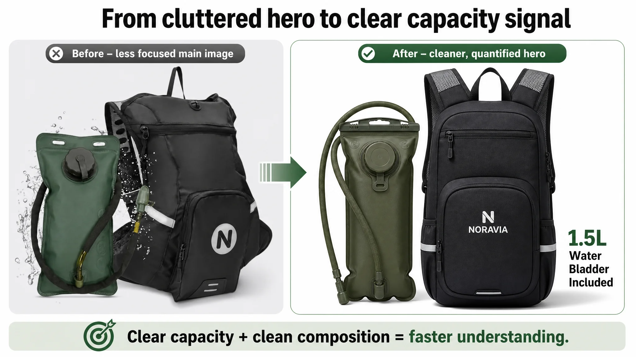
The Main Image Set Had Visual Strength, but Not Enough Immediate Signal
The main-image dimension scored high, but DeepBI still found issues that affected click and scan behavior:
- First main image:
- Composition felt cluttered
- Capacity callout (2L bladder) was not visually quantified in a clear, at-a-glance way
- Missing side-view image:
- No clear sense of thickness, profile, or side hooks
- Limited “one-glance” summary image:
- Functional highlights were scattered across multiple images, forcing more scrolling
- Storage visuals were under-used:
- Internal capacity was shown, but not grounded in familiar items like smartphone, energy bar, keys
- Back ventilation not visualized enough:
- The critical “breathable back system” was present, but not turned into an immediate, visual “airflow” story
The competitor, by contrast, used more standardized, high-information images: clear capacity callouts, structured diagrams, and simple, high-density visual summaries of pockets and comfort.
“Advertising does not only amplify advantages. It can also amplify a page’s existing defects.”
The Bullet Points Had Information, but Not a Buying Logic
DeepBI’s diagnosis of the bullet section is where the core conversion problem crystallized.
How the Competitor Used Bullet Points
The benchmark Listing’s bullet points:
- Started with hydration and comfort outcomes, not just material labels
- Emphasized:
- Staying hydrated over long-distance activities
- Body-hugging design to reduce bounce
- Lightweight and quick-drying fabric
- Unisex fit across multiple sports
- Compact practicality and overall usability
Each bullet felt like a mini story:
- What problem the buyer faces
- How this backpack solves it
- What result or reassurance it delivers
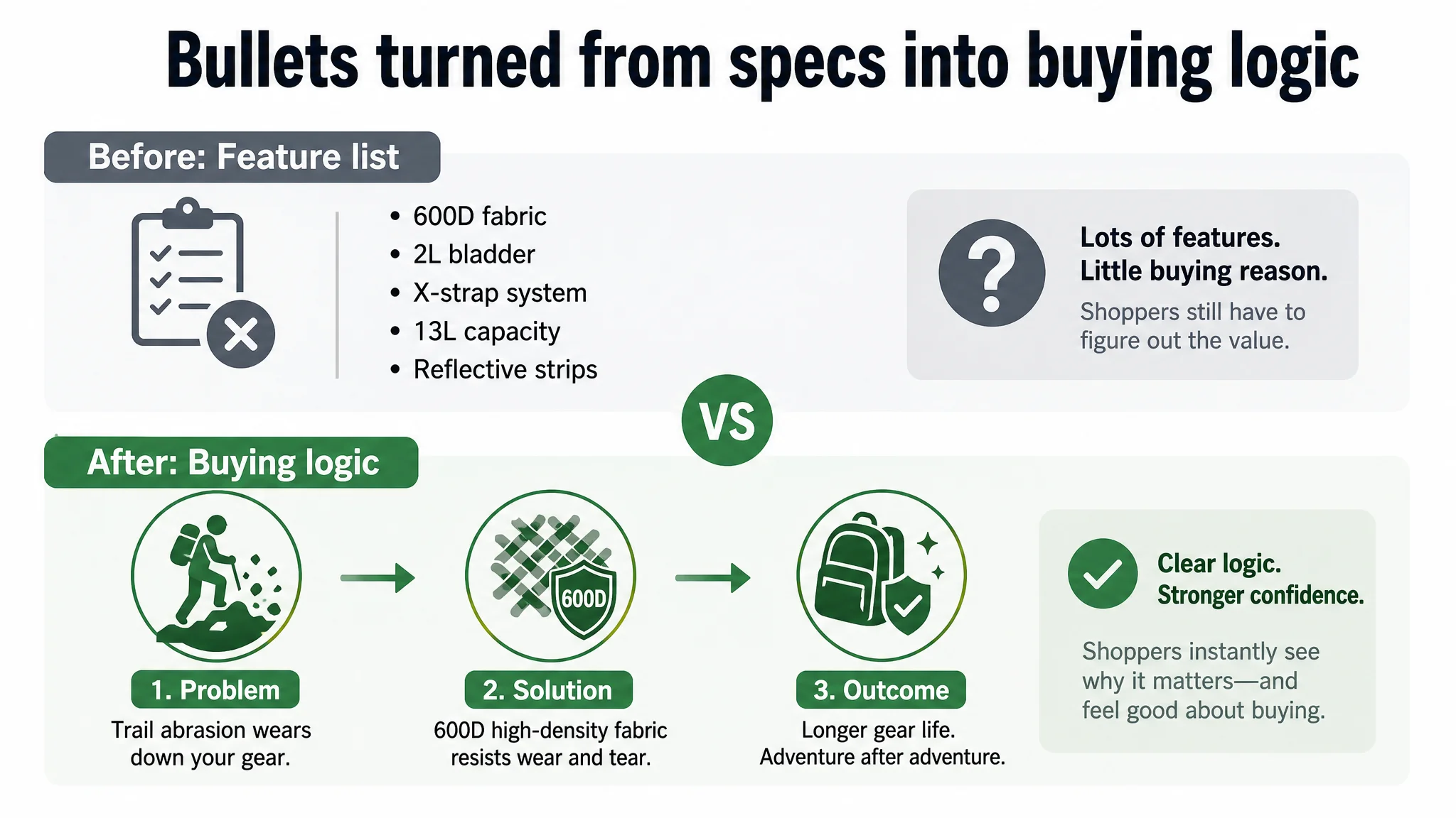
How This Listing Used Bullet Points Before Optimization
Initially, this Listing’s bullets were closer to a spec sheet:
- High-density 600D fabric
- 2L water bladder
- X-shaped strap system
- 13L capacity with internal compartments
- Safety design (reflective strips, etc.)
Each piece was true—but the mental bridge from feature to benefit was weak. The buyer had to infer:
- Why 600D matters beyond durability
- Why 2L vs 1.5L actually changes their experience
- Why the X-strap prevents bounce in real running or cycling
- How 13L can be “high capacity” but still not feel heavy
In other words, the Listing had data, but not a narrative.
DeepBI’s Reframing of the Bullet Section
DeepBI’s optimized bullets aligned closer to the competitor’s persuasion logic while emphasizing this product’s real advantages:
- Bullet 1 – Fabric framed as protection and durability
- Rather than just “600D fabric,” the copy reframed it as:
- Higher abrasion and tear resistance than standard fabrics
- Lightweight and moisture-wicking
- Consistent protection for gear in rough and wet conditions
- Bullet 2 – Hydration framed as longer performance and leak-proof assurance
- Highlighted:
- 2L bladder = ~33% more water than common 1.5L packs
- Leak-proof design (lockable bite valve)
- UV-protected tube sleeve
- Bullet 3 – X-strap as a solution to bounce and discomfort
- Positioned the X-strap as:
- Customizable, body-hugging fit
- Stability during high-intensity activity
- Cooling through breathable mesh and ventilation ports
- Bullet 4 – Capacity framed as “no extra burden” with fast access
- 13L capacity described as:
- High capacity without bulk
- Enhanced organization via detachable tool pouch
- Immediate access to essentials in emergencies or technical tasks
- Bullet 5 – Safety and versatility framed as peace of mind
- Emphasis on:
- Reflective details front and back for low-light safety
- Multi-sport versatility (running, hiking, general outdoor use)
This reframing turned bullet points into decision tools, not just feature lists.
The Detail Page Was Outperforming the Competitor, but the Trust Gap Remained
A paradox in this case: the A+ detail page was already superior to the competitor on several fronts.
A+ Content: Stronger Structure, Richer Visuals
DeepBI’s comparison showed:
- The seller used:
- Main hero scene
- 3 VS modules for problem/solution storytelling
- Structural breakdown and hydration system close-ups
- Rain usage shots, breathable back views, tool pouch demos, and multi-scene collages
- The competitor relied more on:
- Standard scene images
- Basic size labels
- Simple pocket diagrams
- Color variations and generic multi-scene applications
From a content-strategy standpoint:
- This Listing:
- Structured A+ around pain points and solutions
- Used high-resolution real-world shots for credibility
- Covered function, safety, usage education, and emotional resonance
- The competitor:
- Stayed at the level of basic parameters and color choices
- Lacked deeper education, performance proof, or brand/story elements
So why did the competitor still hold the edge in overall scoring?
Because A+ content cannot compensate alone when:
- Bullet points do not lock the purchase decision before the fold
- Trust signals (reviews, guarantees) are weaker
- The main image set doesn’t immediately communicate key reassurance (safety of bladder materials, anti-leak structure, airflow comfort)
DeepBI’s judgment: the seller’s A+ was not the core constraint; the entry-layer trust and logic (bullets + reviews + first images) were.
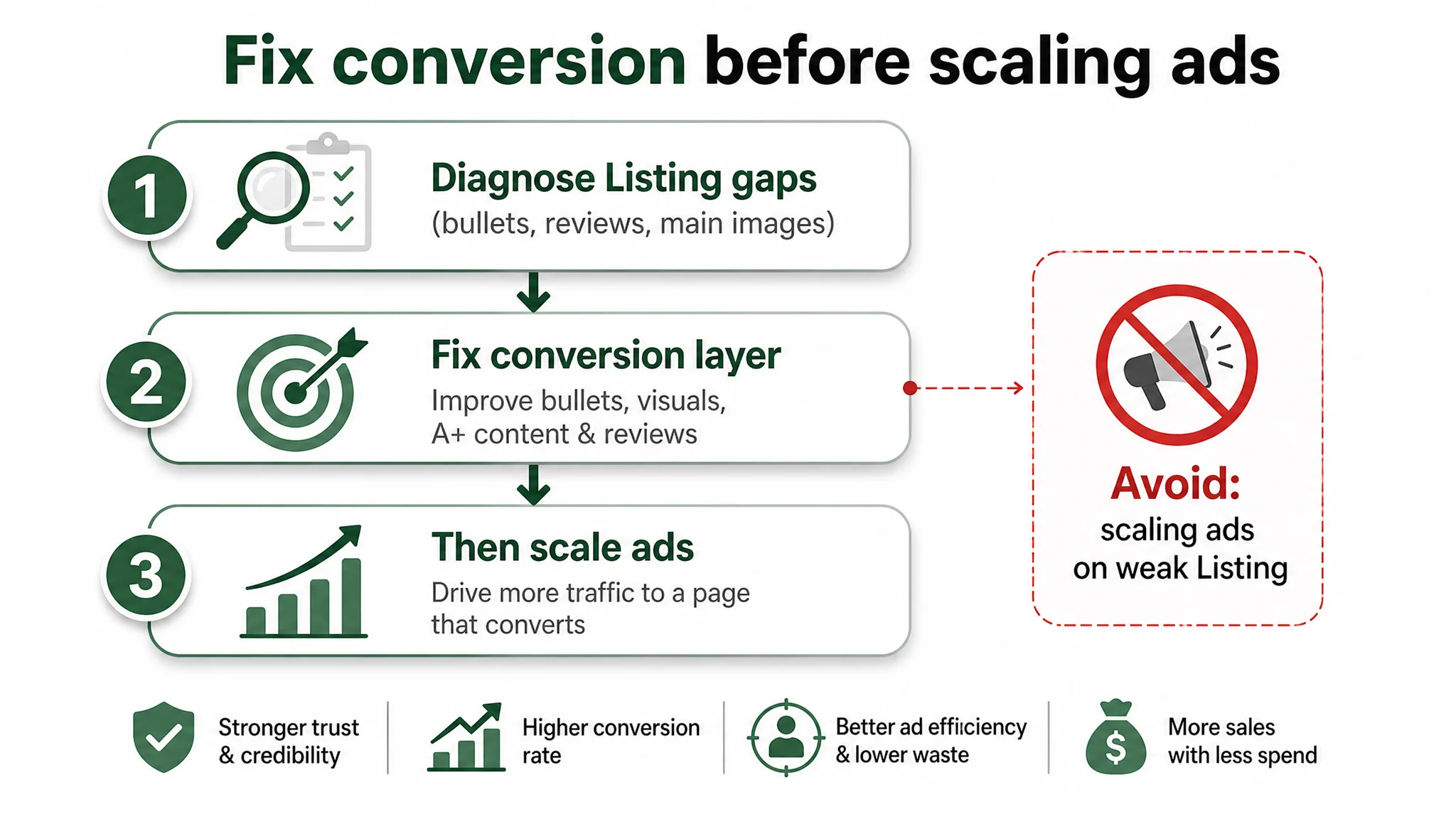
Why DeepBI Did Not Recommend “Fix the Ads First”
At this stage, the seller was under predictable pressure:
- Amazon ad costs felt heavy
- ACOS was hard to bring down
- Traffic existed, but order growth was flat
- The instinct was to push harder on bids and keyword coverage
DeepBI’s diagnosis suggested the opposite order of operations.
The Risk of Letting Ads Amplify a Weak Conversion Layer
If the team had:
- Increased bids
- Expanded keyword sets
- Scaled up campaign budgets
…without first shoring up bullet logic, review credibility, and main-image clarity, they would have:
- Paid more for the same or only marginally better CVR
- Fed more traffic into a page that still left buyers with:
- Questions about durability vs. comfort
- Doubts about hydration safety (no clear BPA/FDA visual markers)
- Weak proof of real-world usage (few reviews)
In other words, ads would amplify the Listing’s weak spots instead of its strengths.
The Priority Call: Fix Page Conversion Capacity Before Scaling Ads
DeepBI’s reasoning:
- The Listing already had solid A+ content and a mature title.
- The biggest measurable gaps vs. benchmark were:
- Bullet points: -5 points
- Reviews: -5 points
- These gaps sit directly between click and purchase in the funnel.
Therefore:
- The first priority was to repair the conversion layer:
- Rebuild bullet points around “pain point → solution → outcome”
- Use visuals and icons to make bladder safety and material trust more immediately legible
- Plan review strategy to build volume and content depth
- Only after that would it make sense to:
- Re-expand ads
- Test new main-image variants for CTR improvement
- Re-balance organic vs. paid traffic structure
This is what changed the trajectory: instead of treating ads as the main lever, DeepBI treated Listing conversion capacity as the foundation of sustainable advertising.
How the Page’s Sales Logic Started to Recover
The optimization path aligned around a simple principle: every major module must reduce buyer doubt, not just add information.
Main Image: From “Just a Product Shot” to “Instant Value Snapshot”
Key adjustments focused on making the main-image set work harder:
- Primary image:
- Centered the pack, clean studio style
- Visually quantified the bladder (clear “2L” capacity callout)
- Highlighted the contrast between black pack and green bladder
- Side-view and back-view images:
- Added a 45° side view to convey thickness and hooks
- Used back view with airflow arrows to show breathable mesh and “AirFlow Back System”
- Functional composite image:
- One high-density visual summarizing:
- Breathable straps
- Reflective strips
- Quick-release buckles
- Adjustable Velcro points
- Storage demonstration:
- Flat-lay shot with the pack open and real items (phone, keys, energy bar, tools)
- Arrows connecting compartments to items to show “modular storage” at a glance
These changes didn’t just make the page prettier—they made the core decision questions visible faster.
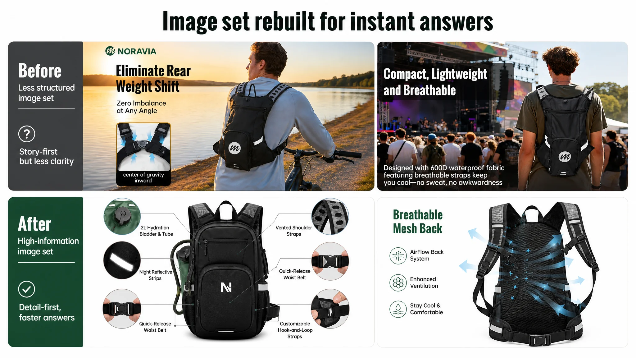
A+ Content: Turning Technical Claims into Visual Proof
DeepBI’s guidance reorganized and sharpened the A+ modules:
- Storage module:
- Showed actual items inside and outside the detachable tool pouch
- Used simple arrows and clean background to clarify how space is structured
- Hydration safety module:
- Centered the 2L bladder with clear, minimal icons:
- “BPA FREE”
- “TPU Material”
- “FDA Grade”
- Night safety module:
- Showed the backpack in a dusk running scenario
- Made reflectors light up as they would under car headlights
- Back ventilation module:
- Large rear view with airflow arrows and clear “AirFlow Back System” label
- Usage-guide module:
- 2x2 grid teaching:
- How to open/close the fill cap
- How to insert bladder
- How to use ON/OFF bite valve
- How to drink correctly
- Water-resistance module:
- Rainy trail scene with water beading off the pack surface
- Visual focus on zippers and seams to support “storm-ready” claims
- Lightweight comparison module:
- Visual metaphor using a scale, linking:
- 2L capacity
- “Ultralight feel” language
Together, these modules made it much harder for buyers to doubt:
- Is this safe to drink from?
- Will it leak?
- Will it stay comfortable in motion?
- Can it handle real weather and terrain?
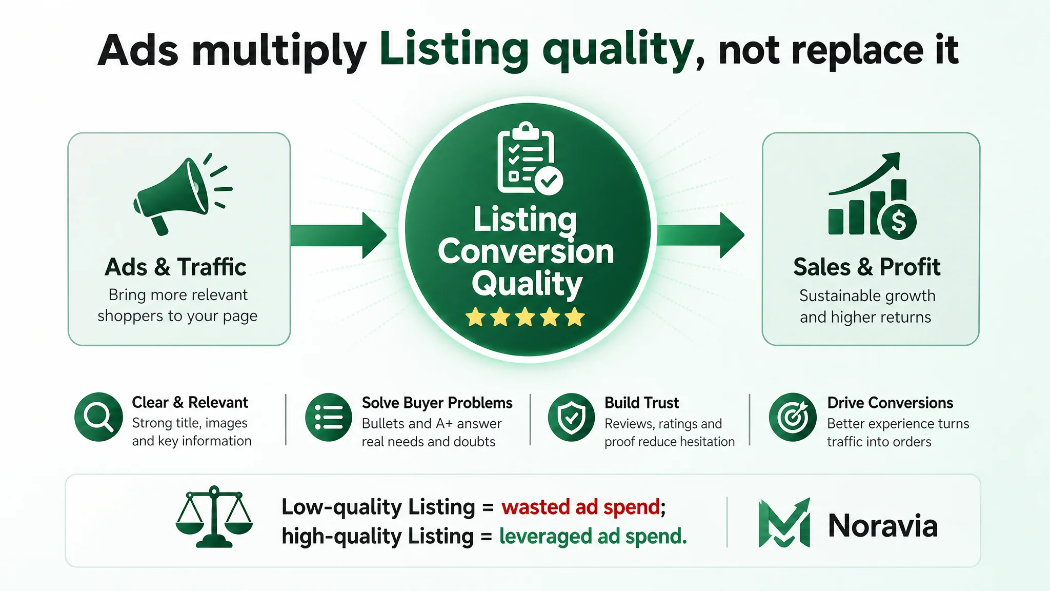
How Ad Traffic Became Useful Again
While this case does not rely on invented post-optimization metrics, the operational state of the Listing changed in a few important ways:
- The page gained clearer conversion logic:
- Title brought relevant traffic
- Main images signaled capacity, safety, and comfort quickly
- Bullets framed features as solutions
- A+ closed remaining doubts with visual proof
- The risk of wasted ad spend decreased:
- Paid clicks now landed on a page that:
- Told a coherent story
- Built trust faster
- Aligned more closely with buyer decision steps
- The traffic structure became more controllable:
- The seller could:
- Resume ad scaling with more confidence
- Monitor CTR and CVR knowing the Listing was no longer the obvious weak point
- Rely less on “just spend more” and more on “spend where the page can actually convert”
Most importantly, the seller’s mental model shifted: Amazon ads were no longer treated as a cure-all, but as a multiplier of Listing conversion quality.
What Other Amazon Sellers Can Take from This Case
This case is not about hydration packs alone. It’s about a pattern:
- A seller invests heavily in title, A+ content, and ads
- The page scores well in many dimensions
- Yet a quieter part of the Listing—bullet points and reviews—still constrains conversion
Key takeaways:
1. High scores in some Listing dimensions can hide fatal weaknesses in others.
Title and A+ can look great, but if bullet points and reviews lag, conversion will still break.
1. Bullet points are not just for features. They are where you encode your buying logic.
Moving from “fabric: 600D” to “why 600D matters in real terrain and weather” changes how buyers feel about the product.
1. A+ content cannot carry the whole conversion burden.
Many buyers never scroll that far. If your bullets and initial images don’t close the decision loop, A+ becomes a safety net, not a core driver.
1. Ads amplify whatever your page already is.
If your Listing cannot convert, ads amplify defects. If your Listing is structurally sound, ads amplify strengths.
1. Listing conversion is not “design work”; it’s business judgment.
DeepBI’s value in this case was not generating prettier images, but identifying that the true constraint was conversion logic and trust, not visibility or keyword coverage.
For Amazon sellers under pressure from rising ad costs, this case is a reminder: before you ask “how do we buy more traffic?”, it’s worth asking “does our Amazon product page deserve more traffic?”