
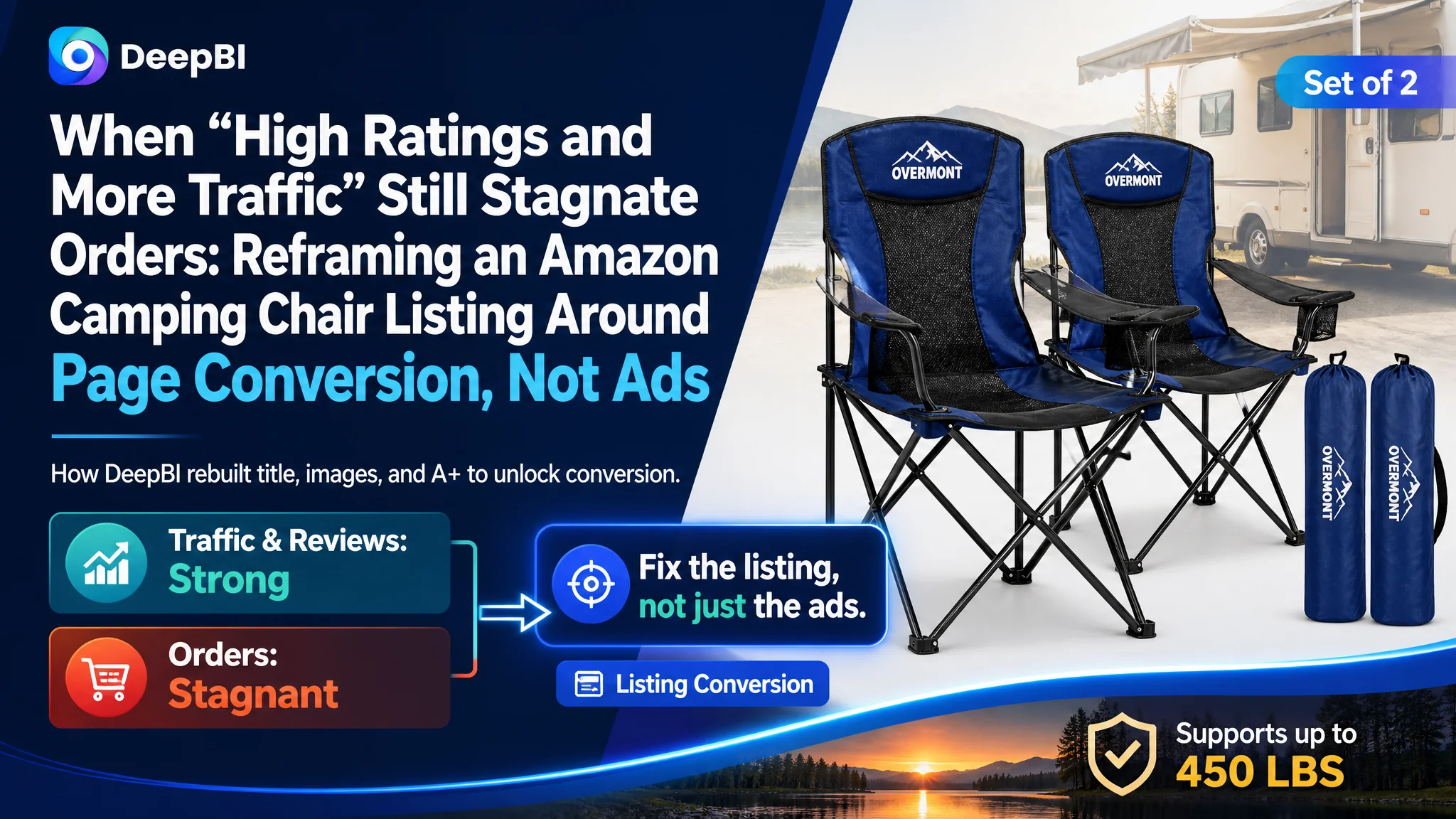
An Amazon seller in the outdoor category came to DeepBI with a familiar frustration: the camping chair set they were promoting on the US marketplace had solid reviews, increasing traffic, and a competitive price, yet orders were not growing in step. The team’s first instinct was to blame Amazon ads—bids, keywords, and campaign structure—and they kept tuning campaigns, hoping ACOS would drop and orders would climb.
DeepBI’s diagnosis pointed in a different direction. By benchmarking the listing against a category-leading camping chair competitor, we found the real constraint was not traffic volume, but the listing’s ability to convert that traffic. The title diluted core value, the main image failed to create a strong “Heavy Duty” impression, and the A+ content lacked a coherent comfort and trust story. Ads were effectively amplifying a page that was not ready to convert.
The subsequent optimization did not start with “better ads.” It started with rebuilding the Amazon Listing’s sales logic: restructuring the title around the heavy-duty, 2-pack value; reframing bullet points from feature lists to outcome-focused benefits; and redesigning main images and A+ modules to visually prove “outdoor sofa-level comfort” and heavy-duty reliability. For other Amazon sellers, this case is a reminder: when ads feel “inefficient,” the first place to audit is not always the campaign console—it is often the product page that is supposed to carry the weight of conversion.
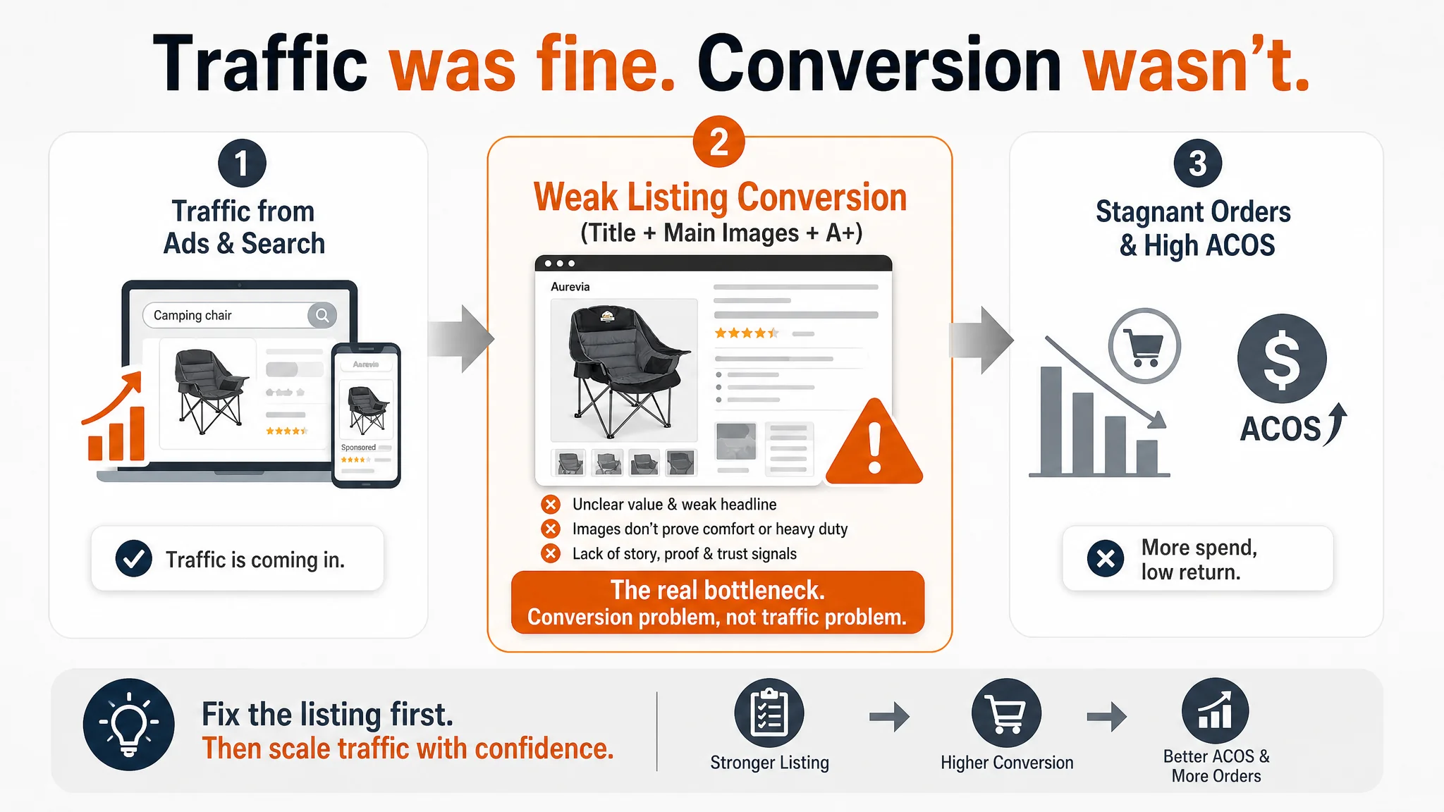
Amazon Ads Were Not Failing. The Page Was Consuming the Traffic.
From the seller’s perspective, the early warning signs came from advertising data.
Traffic was there. The camping chair set was getting exposure through Amazon ads and some organic ranking. Reviews were strong: a 4.7-star rating with over 170 reviews, no visible low-star reviews on the first page, and feedback that reinforced the chair’s comfort and stability.
Yet ACOS was stubborn, and the team felt that every incremental dollar in ads brought less and less return. Their working hypothesis:
- The problem was in Amazon ads.
- Click-through rate (CTR) and conversion rate (CVR) issues could be fixed by pushing more relevant keywords, refining bids, or testing new ad creatives.
- With reviews already strong, the page was considered “good enough” and did not seem like the bottleneck.
They kept iterating in the ad console, but performance did not break through. Ads were blamed; the listing was assumed to be fine.
“The real problem was not that ads failed to bring traffic. It was that the page could not convert the traffic.”
DeepBI’s role was not to tweak campaigns first, but to ask a more fundamental question: Does this listing deserve more traffic right now?
The Real Constraint: Listing Conversion Capacity, Not Review Quality
DeepBI’s Listing scoring framework quantified the listing’s competitiveness against a benchmark camping chair listing in the same category.
- Target Listing total score: 78/100
- Benchmark Listing total score: 86/100
- Gap: -8 points
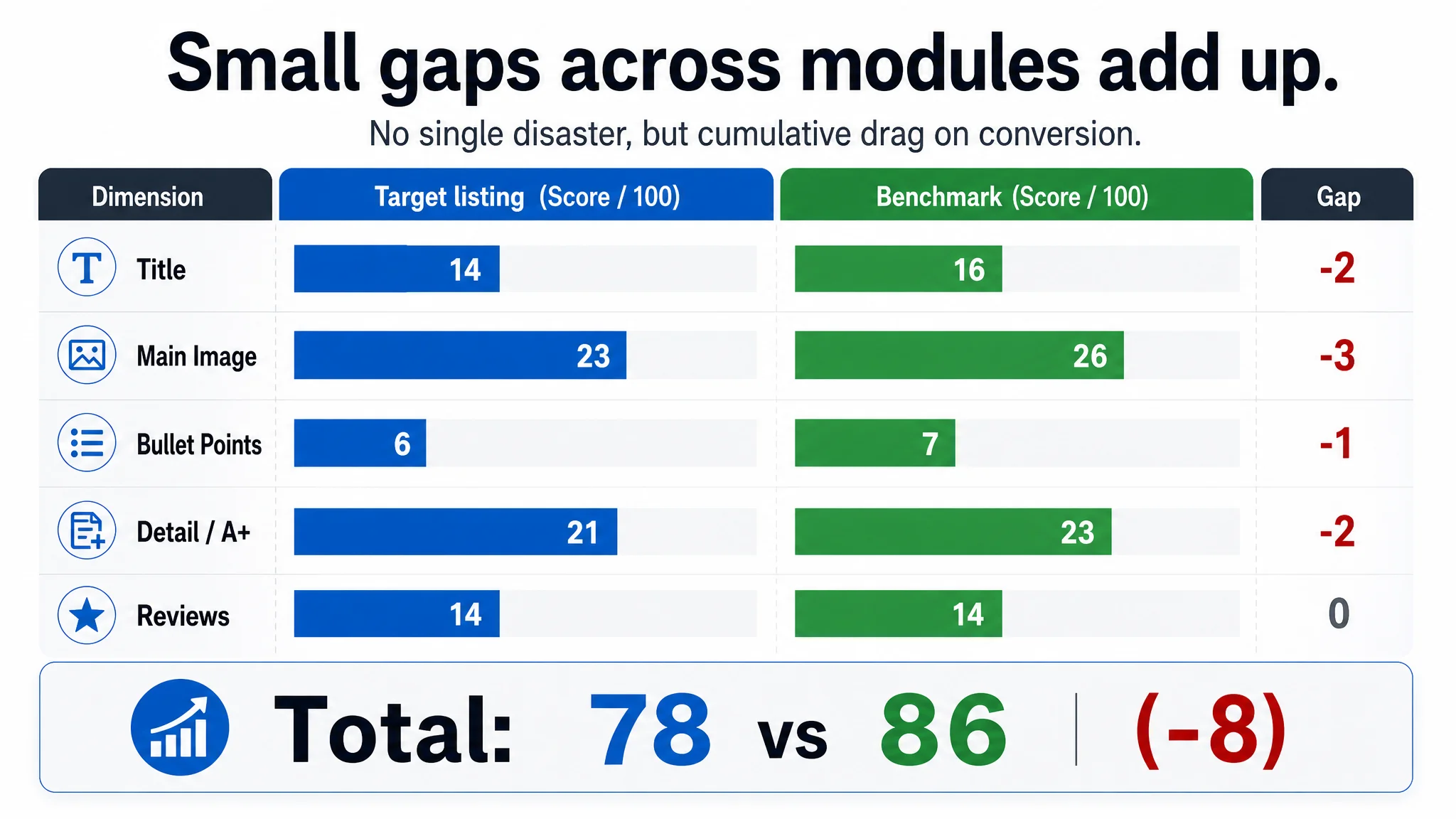
Dimension by dimension:
- Title: 14 vs 16 (gap -2)
- Main Image: 23 vs 26 (gap -3)
- Bullet Points: 6 vs 7 (gap -1)
- Detail / A+: 21 vs 23 (gap -2)
- Reviews: 14 vs 14 (no gap)
Reviews were not the problem. In fact, on paper, the target Listing had a slight edge in review count. What the scoring exposed was something more subtle but more dangerous: every content layer of the page was slightly weaker than the benchmark.
No single module was catastrophic.
But together, these 2–3 point gaps across title, main image, bullets, and A+ created a cumulative drag on conversion:
- Core search terms were not leveraged at the beginning of the title.
- The main image did not visually own the “Heavy Duty 2-pack” story.
- Bullet points listed features without turning them into results and experiences.
- A+ content emphasized structural data more than comfort and decision logic.
In other words, the page was good enough to not obviously fail, but not strong enough to earn a higher CVR—especially when paid traffic costs were rising.
Why Traditional Amazon Ad Optimization Kept Failing
From a classic Amazon operations playbook, the seller’s path made sense:
- Ads feel inefficient → adjust bids, expand or tighten keyword sets.
- Test different match types and campaign structures.
- Maybe refresh some creatives.
But DeepBI’s scoring and benchmark comparison showed that ads were doing their job: they were bringing visitors. The breakdown was between click and purchase.
Three structural problems made ad tuning ineffective:
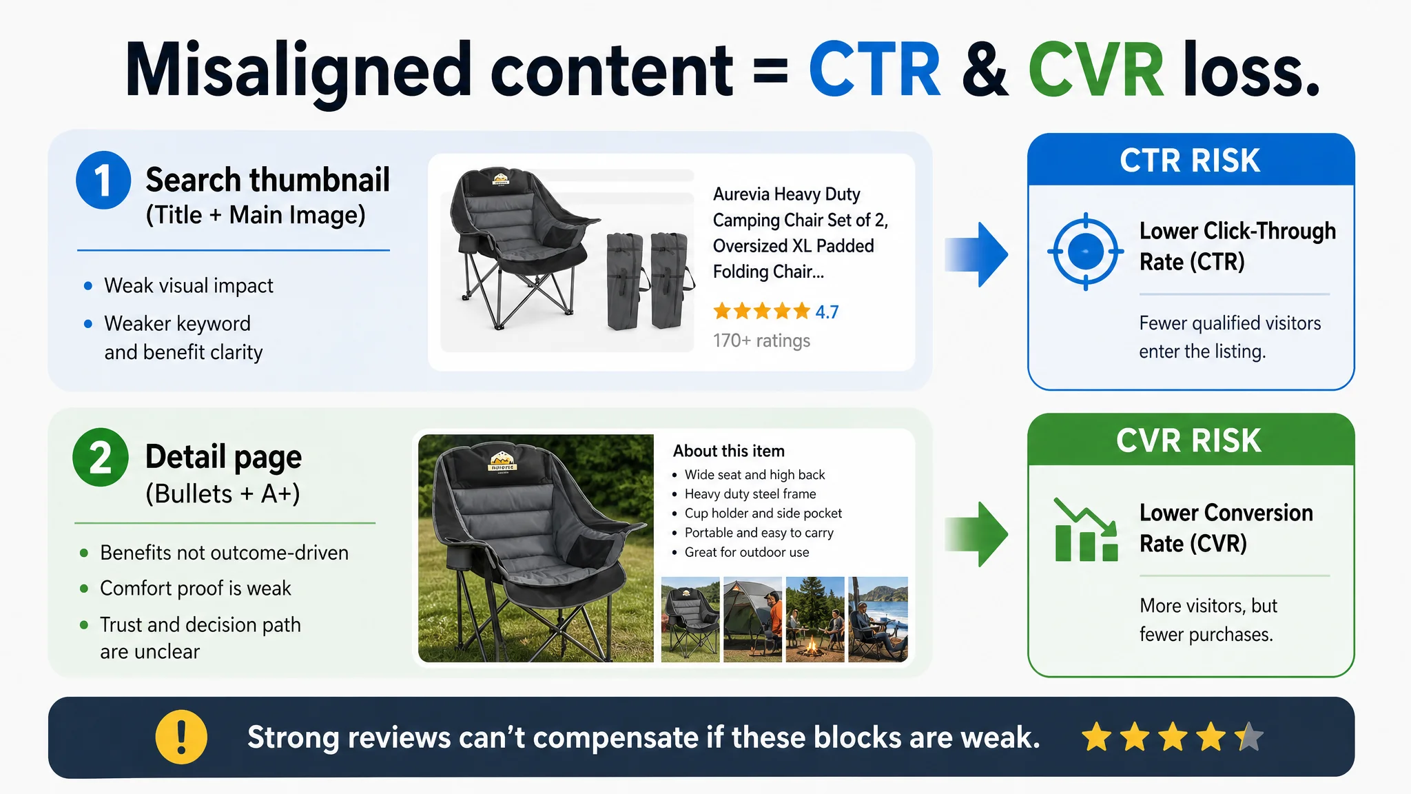
1. The page did not create a clear reason to click.
Main images and title were not fully aligned with the category’s top-performing visual and keyword logic. Even if impressions were secured via ads, CTR was likely capped by weaker thumbnails in the search grid.
1. The page did not build enough trust around “Heavy Duty comfort.”
Competing listings visualized comfort and support with extreme clarity—neck support, back support, padding weight, and “no-pinch” designs. The target Listing leaned heavily on structural stability and dimensions, leaving the most emotionally important promise—comfort—under-visualized.
1. The page lacked a cohesive decision path.
Content existed, but did not form a consistent “problem–solution” storyline. Scenes like snow and balcony use were visually rich but not tightly tethered to a central comfort or heavy-duty narrative.
As long as this conversion structure remained weak, any additional ad spend was mostly paying to expose these weaknesses more often.
This Product Page Did Not Lack Traffic. It Lacked a Clear Value Story.
DeepBI’s analysis made one judgment clear: the listing didn’t have a traffic problem. It had a clarity problem.
The Title: Keywords Present, Logic Diluted
The original title contained all the “right” words:
- “Camping Chair Set of 2”
- “Wide”
- “Heavy Duty”
- “Portable”
- “450 LBS”
- Color information
But structurally, it fell into several traps:
- The core term “Camping Chair Set of 2” appeared too deep in the string (around the 20th character), weakening search-weight emphasis—especially on mobile.
- Secondary descriptors (wide, heavy duty, portable, “Gaint”) competed for attention rather than building a clear hierarchy.
- Redundant wording (“Outdoor, Outside”) created a sense of keyword stuffing rather than professional clarity.
- The 450 LBS capacity, a crucial trust driver, sat mid-title instead of being used as a strong closing argument.
- Color information (“Black and Grey”) was pushed to the very end, making it less aligned with how buyers scan variations.
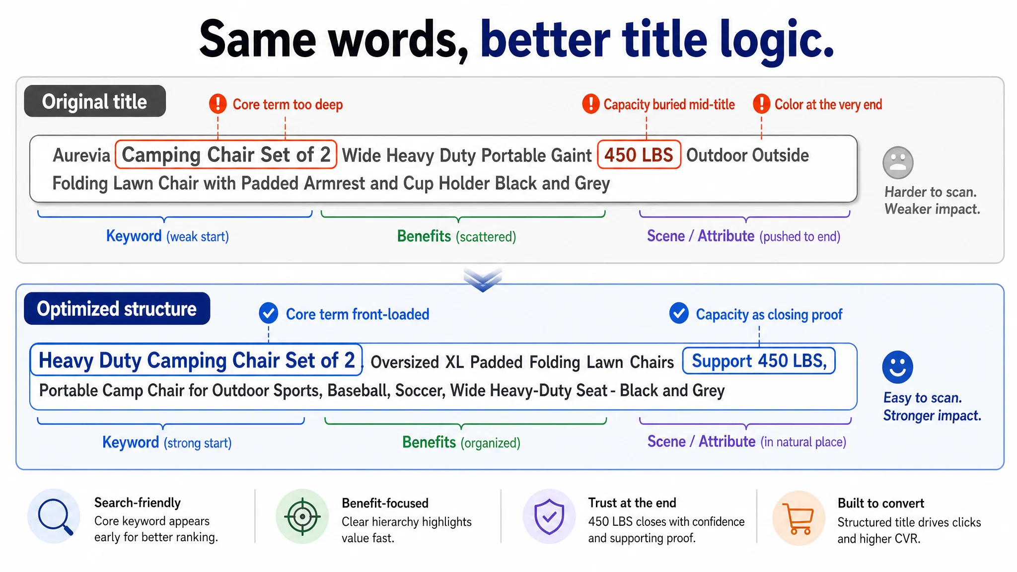
The benchmark competitor did the opposite:
- Led with “2 Pack Camping Chairs” / “Oversized” to establish form factor and bundle value.
- Used a clean “keyword + core benefit + scene” structure.
- Closed with “Support 450LBS, Green,” turning capacity into a persuasive end-note.
Result: In search results, the competitor’s title immediately answered “what it is,” “why it matters,” and “for whom,” while this listing asked users to parse a dense string.
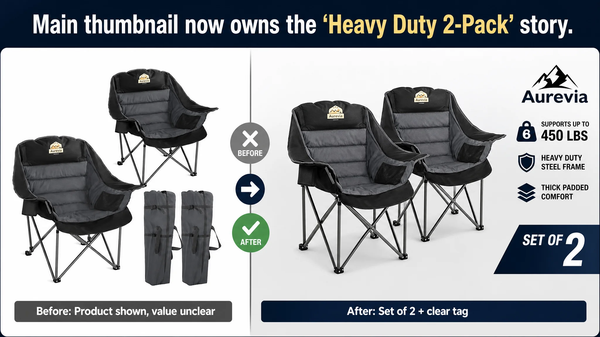
The Main Images: Function Shown, Emotion Missing
On the main image set, DeepBI’s visual benchmark flagged a consistent pattern:
- Primary image: two chairs plus storage bags on a white background. Clean, but static. No human, no action, no environment that signaled “heavy duty” usage.
- Secondary images: indoor scenes (including a Christmas tree), generic backgrounds, and some outdoor use—but with limited emphasis on professional outdoor scenarios.
The benchmark listing:
- Featured consistent, high-contrast compositions.
- Brought in human use, varied demographics, and relational scenes (couples, family, friends).
- Used detailed macro shots to prove comfort claims—e.g., hand pressing into thick padding alongside specific fill-weight text.
DeepBI’s conclusion:
“This product page did not lack images. It lacked a visual reason for the buyer to trust ‘heavy duty comfort’ at a glance.”
The listing was speaking the language of features, while the category’s top performer was speaking the language of experience and proof.
How DeepBI Identified the Real Problem—and Why We Refused to Start with Ads
DeepBI’s scoring logic doesn’t just rate modules in isolation; it maps them directly to CTR and CVR behavior:
- Low main-image scores → CTR risk.
- Low bullet / A+ scores → CVR risk.
- Strong reviews → trust is present, but not fully leveraged.
For this camping chair listing, the pattern was:
- No review gap.
- Moderate deficits in title, main image, bullets, and details.
- A benchmark competitor that structurally outperformed in comfort proof and decision logic.
This led to a simple but crucial judgment:
If we pushed more traffic now, we’d be amplifying a page that does not yet deserve that traffic.
Two risks were immediate:
1. ACOS instability.
With weak conversion, every incremental click was more expensive in terms of cost per order.
1. Organic ranking fragility.
Amazon’s algorithm watches how much of your traffic converts. A low-converting page, even with strong review scores, risks losing organic positions over time when ads keep sending non-converting traffic.
So DeepBI’s recommendation to the seller was explicit:
- Do not prioritize further ad scaling before reinforcing listing conversion capacity.
- Fix the page’s sales logic first, then let ads amplify a stronger, more trustworthy asset.
Rebuilding the Listing: From Fragmented Features to a Coherent Heavy-Duty Comfort Story
The optimization that followed was not a cosmetic refresh. It was a reprioritization of what the listing needed to do first.
1. Title: Heavy Duty 2-Pack, Front and Center
DeepBI’s proposed title structure:
Heavy Duty Camping Chair Set of 2, Oversized XL Padded Folding Lawn Chairs Support 450 LBS, Portable Camp Chair for Outdoor Sports, Baseball, Soccer, Wide Heavy-Duty Seat - Black and Grey
Key shifts:
- Keyword layout optimization. “Heavy Duty Camping Chair” + “Set of 2” moved into the first 50 characters to capture Amazon’s search-weight focus and improve instant recognizability in search results.
- Error correction and cleanup. Misspellings like “Gaint” removed; repetitive descriptors like “Outdoor Outside” pruned.
- Logical grouping. Product form (Oversized XL Padded) separated from core parameter (Support 450 LBS) and usage scenes (Outdoor Sports, Baseball, Soccer), making scanning easier for both buyers and the A9 algorithm.
This did not add new claims; it reorganized existing truths into a more competitive, benchmark-aligned structure.
The Bullet Points Had Information, but Not a Buying Logic
The seller’s original bullet points covered comfort, safety, portability, storage, and scenes. On paper, nothing was “missing.” But DeepBI’s analysis, based on the benchmark, identified a more powerful path:
The competitor emphasized:
- “Heavy-duty” and “oversized” as a first, bold statement.
- Specific comfort technology (“high loft spray-bonded cotton,” “slightly reclined backrest,” “lower-back support”).
- Result-driven phrasing (“keep drinks cool,” “optimize space,” “meet all your comfort and joy needs”).
The seller’s bullets:
- Emphasized generic function lists.
- Spoke more in terms of features than consequences.
DeepBI’s optimization reframed bullets around five conversion-focused roles:
1. Lead with comfort as “outdoor sofa” experience.
• Ultimate Sofa-Like Comfort: Experience unparalleled relaxation with high-density soft cotton padding across the headrest, backrest, and seat. Featuring unique 4mm thick sponge-padded armrests, this chair provides ergonomic support for your head, neck, back, and hips, bringing the luxury of your living room sofa to the great outdoors.
Purpose: Turn the chair from “just a folding chair” into “outdoor sofa-level comfort.” This aligns with how high-priced camping chairs actually justify their premium.
1. Make “Heavy Duty” a quantified promise, not a label.
• Heavy-Duty & 450lbs Capacity: Built for maximum durability, our camping chair features reinforced steel supports that are 50% thicker than standard frames. Combined with high-density, weather-resistant 600D Oxford fabric and strengthened safety bolts, it securely supports up to 450 lbs, ensuring stable and long-lasting performance.
Purpose: Combine frame thickness, fabric quality, and capacity into a single trust chain.
1. Turn portability into a clear differentiation.
• Portable with Backpack-Style Strap: No assembly required—unfold and enjoy in seconds. Weighing 14.2 lbs, this compact chair includes an innovative expandable compression carry bag with backpack-style straps, allowing for hands-free transport to your favorite fishing spot, campsite, or outdoor event.
Purpose: Highlight backpack-style carry and compression bag—advantages the benchmark does not emphasize—creating distinct reasons to choose this listing.
1. Use storage to relieve a real pain point.
• Convenient Multiple Storage Spaces: Keep all your essentials organized and within easy reach. This chair is equipped with integrated cup holders and two large side pockets, perfect for storing beverages, books, mobile phones, and tablets. This thoughtful design ensures a clutter-free experience while you relax.
Purpose: Move from “has pockets” to “solves clutter and keeps essentials close.”
1. Expand scene coverage with a lifestyle angle.
• Versatile for Every Outdoor Occasion: Whether you are hiking, attending an open-air movie night, tailgating, or simply relaxing in your backyard, this stylish chair is the perfect companion. Its robust design and fashionable color options make it an essential gear choice for picnics, beach trips, and all outdoor adventures.
Purpose: Position the chair as a multi-scene lifestyle item, not just a “camping-only” tool.
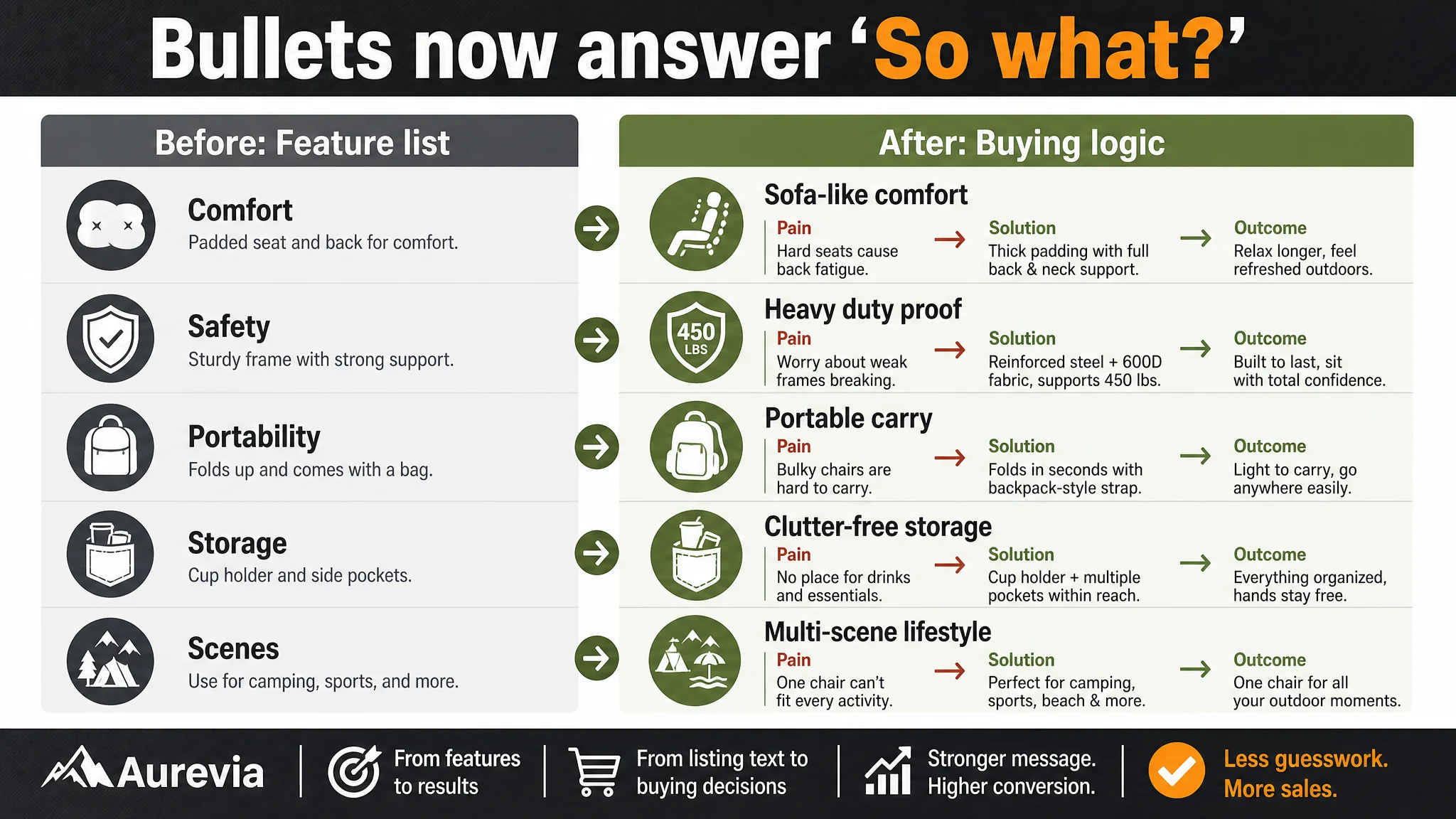
The critical shift: each bullet now closes a “pain → solution → outcome” loop, instead of merely listing attributes.
Main Images: From Static Display to Explicit Heavy-Duty and Ease-of-Use Proof
DeepBI’s guidance reframed the main-image set around three goals:
- Clarify the 2-pack value.
- Visualize “Heavy Duty” and comfort.
- Show ease of use and real-world scenes.
The Primary Image: “Set of 2” as a Visual Hook
Recommendation:
- Two open chairs plus two storage bags, centered, occupying ~80% of the frame.
- 45-degree side angle; clean white background with soft lighting.
- A subtle “Set of 2” tag in the bottom-right corner.
Purpose:
- Make the 2-pack nature obvious at thumbnail size.
- Create a denser, more premium visual mass compared to the previous, looser composition.
Secondary Image: Repositioning from Family Leisure to Professional RV Camping
Original: An indoor Christmas-tree scene, which softened the chair’s “heavy-duty” perception.
New direction:
- Chair placed beside a modern gray RV.
- Natural outdoor light, forest/grass background.
- Caption “Professional RV Camping.”
This moved the product from a casual indoor accessory into the professional outdoor equipment mental category—better aligned with “Heavy Duty” search intent.
Dimensional & Capacity Visualization
Another image was repositioned as a clear dimension and capacity reference:
- Chair at 45 degrees, with a storage bag beside it.
- Clean, soft-lit background.
- Clear labels for width, height, depth in bold, readable font.
Objective: convert numbers into instant, visually digestible reassurance for larger users or those concerned about fit.
Ease of Use: Folding Sequence
To address the “big chair must be difficult to store” concern:
- A three-stage folding sequence: fully folded, half-open, fully open with an adult user.
- Directional arrows at the bottom to guide the eye.
Purpose: show that size and comfort do not come at the cost of usability, especially for those wary of large-format folding chairs.
Heavy Duty Capacity: Environmental Proof
Instead of a generic seaside scene:
- A sunset lakeside setup.
- Low-angle shot with long shadows.
- “Supports up to 450 lbs” highlighted in the corner.
Effect: build a visual association between serious environments and the chair’s load-bearing capability, reinforcing the “heavy duty” promise beyond text.
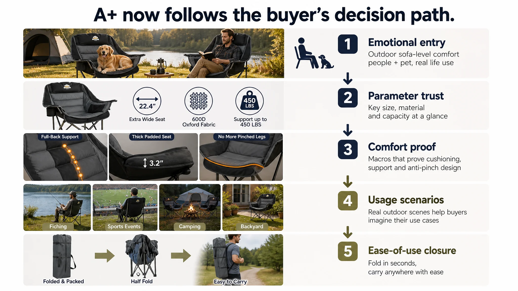
A+ Detail Page: Turning Comfort and Trust into a Visual, Not Just Textual, Story
The A+ section was rich but unfocused. DeepBI’s analysis showed:
- Many scenes (snow, balcony, etc.) that looked attractive but did not reinforce a clear main storyline.
- A focus on structure and size, but limited visualization of comfort and anti-pinch design.
The benchmark competitor, in contrast:
- Led with brand trust and relatable human scenes (people + dog + tent).
- Mapped the decision path: brand trust → core parameters → deep comfort details → multi-scene validation → product overview.
- Used strong, concise taglines and consistent brand color accents.
DeepBI’s recommendations for the A+ content focused on reordering and refocusing the narrative:
Opening Module: Outdoor Sofa-Level Comfort
- Two chairs (in two colors) on an autumn park lawn.
- A man reading, a dog relaxed on the chair.
- Warm light, soft background, chairs commanding ~60% of the frame.
Purpose: anchoring the “outdoor sofa” positioning visually in the first screen, where buyers decide whether to keep scrolling.
Core Parameters: Visual Trust for Width and Capacity
- Minimal white background.
- 45-degree view of the chair with three circular icons:
- “22.44in Extra Wide Seat”
- “600D High Quality Fabric”
- “450lbs Max Capacity”
Objective: turn technical specs into an easy trust map. Buyers don’t need to read paragraphs to know: this is wide, durable, and strong.
Comfort Modules: Neck and Back Support as Physical Evidence
- Macro shot of the top of the backrest, highlighting thick padding.
- Label “Full-Back Comfort Support” with an orange wavy line showing spine support.
Rationale: buyers cannot feel the chair; this visual translates invisible comfort into visible design logic.
Anti-Pinch Edge Detail
- Focus on the front edge of the seat from a 45-degree angle.
- Text “No More Pinched Legs.”
This targeted a category-wide pain point (edge discomfort) and created a competitive differentiation point not fully covered by the benchmark.
Storage and Multi-Scene Usability
- Practical shot showing:
- Cup holder with a stainless steel tumbler.
- Side pocket with a phone and magazine.
This addressed a simple but critical question: “Will my stuff actually fit?”
- A separate scene at a lakeside fishing spot with two chairs facing the water.
- Morning light, calm tone, minimal compositing.
Purpose: link the chair to long-duration use, stability, and rust resistance via a realistic, trust-building scenario.
Portability and Carry
- Split composition:
- Left: three overlapping states of the folding process.
- Right: an adult carrying the black storage bag on a grassy hill.
Outcome: buyers can see the transformation from “large comfortable chair” to “portable, backpackable unit” in one glance, reducing perceived hassle cost.
After Listing Repair: How Ads Became Useful Again
Once the listing’s title, bullet points, main images, and A+ modules were restructured, the business logic changed:
- The page now spoke the same language as the benchmark in terms of comfort, heavy-duty capacity, portability, and multi-scene usage.
- The 2-pack value and “Heavy Duty” promise became immediately evident in search thumbnails.
- Comfort and anti-pinch solutions were visually proven, not just stated.
Even without inventing new functions or inflating claims, the listing’s conversion capacity improved:
- Traffic from ads now landed on a page that better matched search expectations.
- ACOS had a healthier basis to improve because CVR was no longer artificially capped by structural content weaknesses.
- Organic orders had a stronger foundation: Amazon’s ranking logic could now see a more convincing conversion behavior pattern.
We do not fabricate numbers where none were provided, but operationally, three things clearly shifted:
1. The listing regained control over its own destiny.
It no longer relied on reviews alone to carry trust; the page itself started doing the heavy lifting.
1. Advertising dependence became more rational.
Ads were used to amplify a stronger core asset, not to compensate for a weak one.
1. The seller’s judgment matured.
The team began to see that “high ratings + more ads” is not always the answer. The product page’s ability to tell a coherent, proof-backed story is the real leverage point.
What Other Amazon Sellers Can Take Away
This camping chair case is not just about one outdoor product. It illustrates a pattern many Amazon sellers face:
- Ads become harder to “fix,” even with experience.
- Reviews look good, so the listing is assumed safe.
- Yet CVR and ACOS don’t move in the desired direction.
From DeepBI’s perspective, the key lessons are:
- Ads do not only amplify advantages. They also amplify existing page defects.
If the listing cannot clearly answer “what it is,” “why it’s different,” and “why it’s trustworthy,” ad dollars will highlight that gap.
- Listing conversion is a structural capability, not a cosmetic layer.
Title hierarchy, main-image logic, bullet point outcomes, and A+ storytelling need to work as one system.
- Before scaling ads, always ask: “Does this page deserve more traffic?”
If your title, main images, bullet points, and A+ content score consistently below a realistic benchmark—even by “only” a few points—those gaps compound at the CVR level.
In this case, DeepBI’s value was not in listing features, but in helping the seller correct the misdiagnosis: stepping back from campaign tweaks to see that the real bottleneck was the Amazon Listing itself.
For Amazon sellers operating under rising ad costs, that reframing is often the difference between chasing symptoms and actually stabilizing the business.