
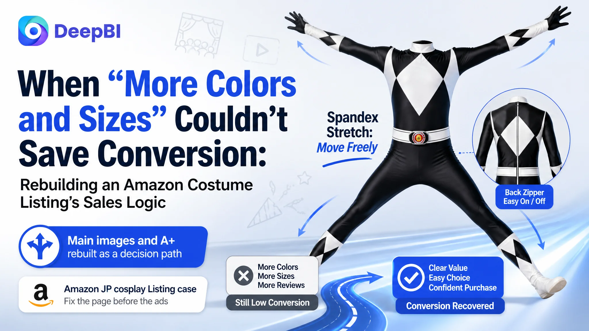
This case comes from an Amazon Japan seller in the cosplay / party-costume category. On the surface, the product had what many sellers work hard to build: more reviews than the main competitor, a higher star rating, multiple colors and sizes, and a complete A+ section. Yet the Listing underperformed. Advertising was getting traffic in, but orders were not following at the expected pace.
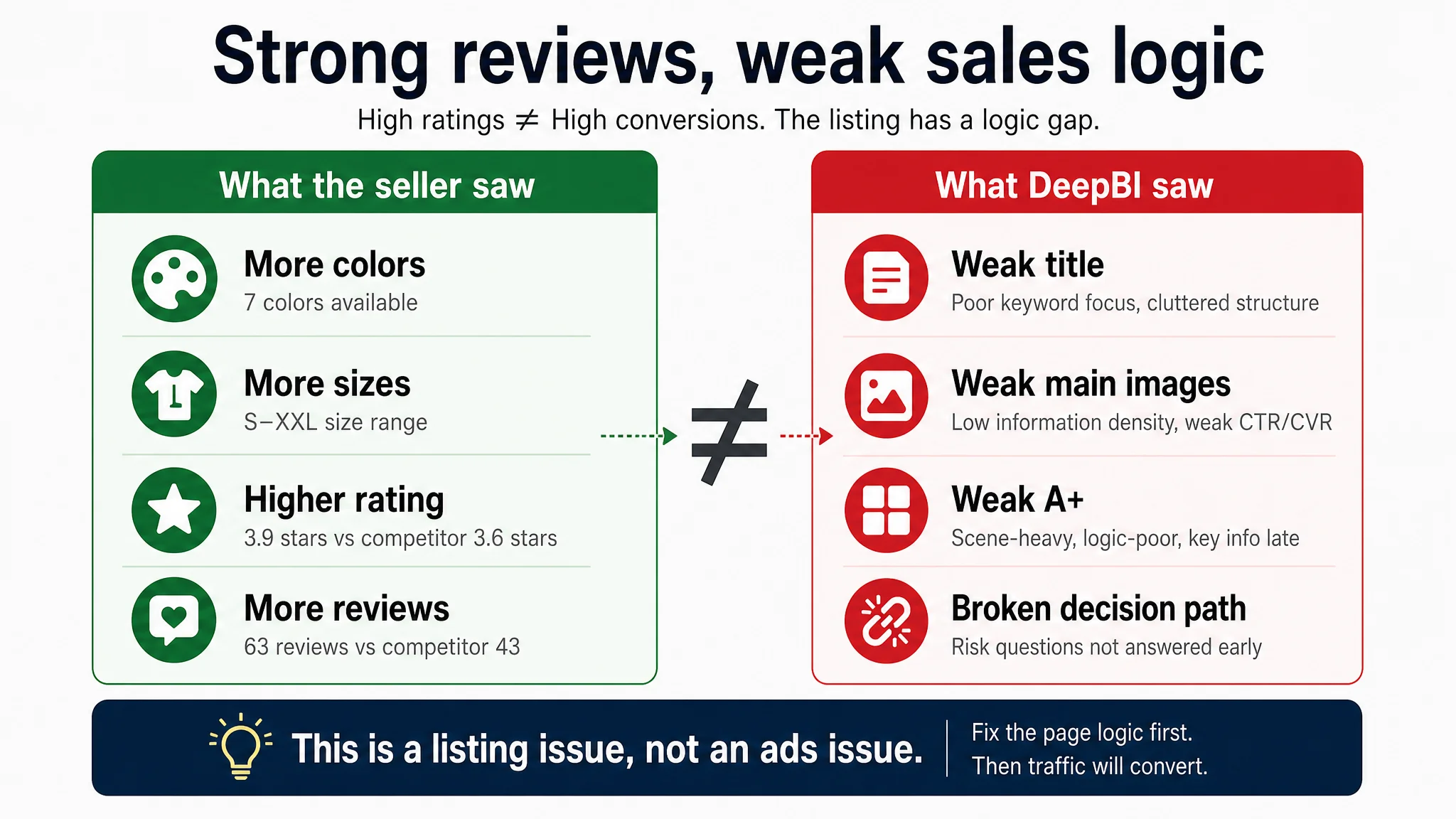
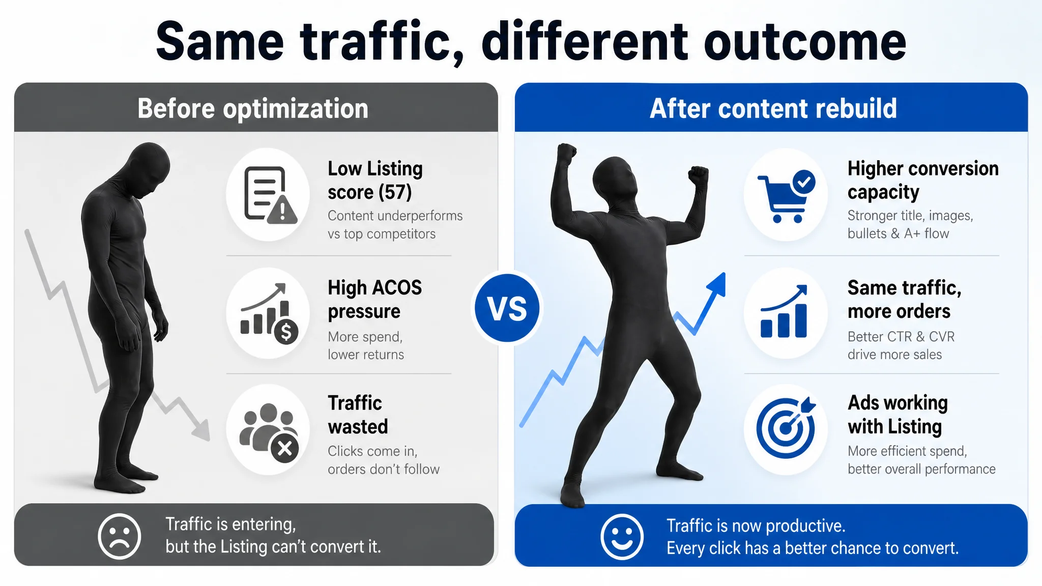
The seller’s first reaction was typical: “We probably need to push more reviews and tweak bids.” They believed the problem sat mainly in Amazon ads and social proof. DeepBI’s diagnosis pointed elsewhere. Against a high-performing benchmark Listing, the target page scored 57/100 versus 78/100, with the biggest gaps not in reviews but in title, main images, bullets, and A+ structure. The page was simply not converting the traffic it already had.
Once the issue was reframed as a Listing-conversion problem rather than an advertising problem, the optimization direction changed completely. Instead of continuing to tune bids and budgets, DeepBI guided the team to rebuild the page’s decision path: from a visual-first, “nice to look at” page to a conversion-driven sequence that tackles “Can I see? Can I move? Will it fit? Is it worth it?” in the right order.
For other Amazon sellers, the lesson is blunt: once a Listing reaches a certain review base, weak performance is rarely “just an ads issue”. If your title structure, main-image set, bullets, and A+ do not answer the real buying questions as cleanly as the top competitor, additional traffic only amplifies the waste. This case shows how to recognize that state—and how to correct it.
1. What the Seller Saw: “Our Reviews Are Better, So Why Aren’t We Winning?”
This Amazon JP seller operates a full-body cosplay suit used for Halloween, parties, and events.
On paper, their trust signals looked strong:
- Star rating: 3.9 vs the main competitor’s 3.6
- Review count: 63 vs competitor’s 43
- First page of reviews: multiple 4–5 star reviews visible, while the competitor’s first page showed none
From the seller’s point of view, this meant:
“Our evaluation profile is already ahead. If we keep testing ad keywords and maybe get a few more reviews, conversion should catch up.”
But DeepBI’s Listing scoring told a different story:
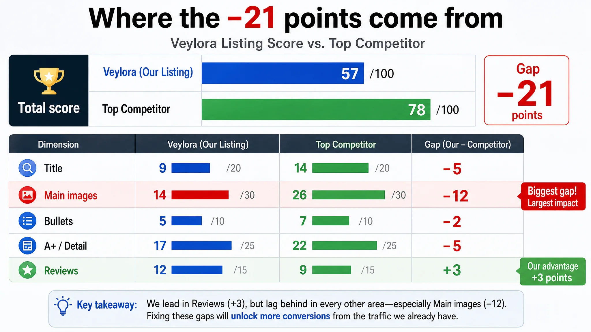
- Overall Listing score: 57/100
- Benchmark competitor score: 78/100
- Gap: –21 points, concentrated in the core content modules
By dimension:
- Title: 9 vs 14 (–5)
- Main images: 14 vs 26 (–12)
- Bullets: 5 vs 7 (–2)
- A+/detail: 17 vs 22 (–5)
- Reviews: 12 vs 9 (+3)
The only dimension where the seller beat the competitor was reviews. Everywhere else, they were behind—and in the single most visible area (main images), the gap was enormous.
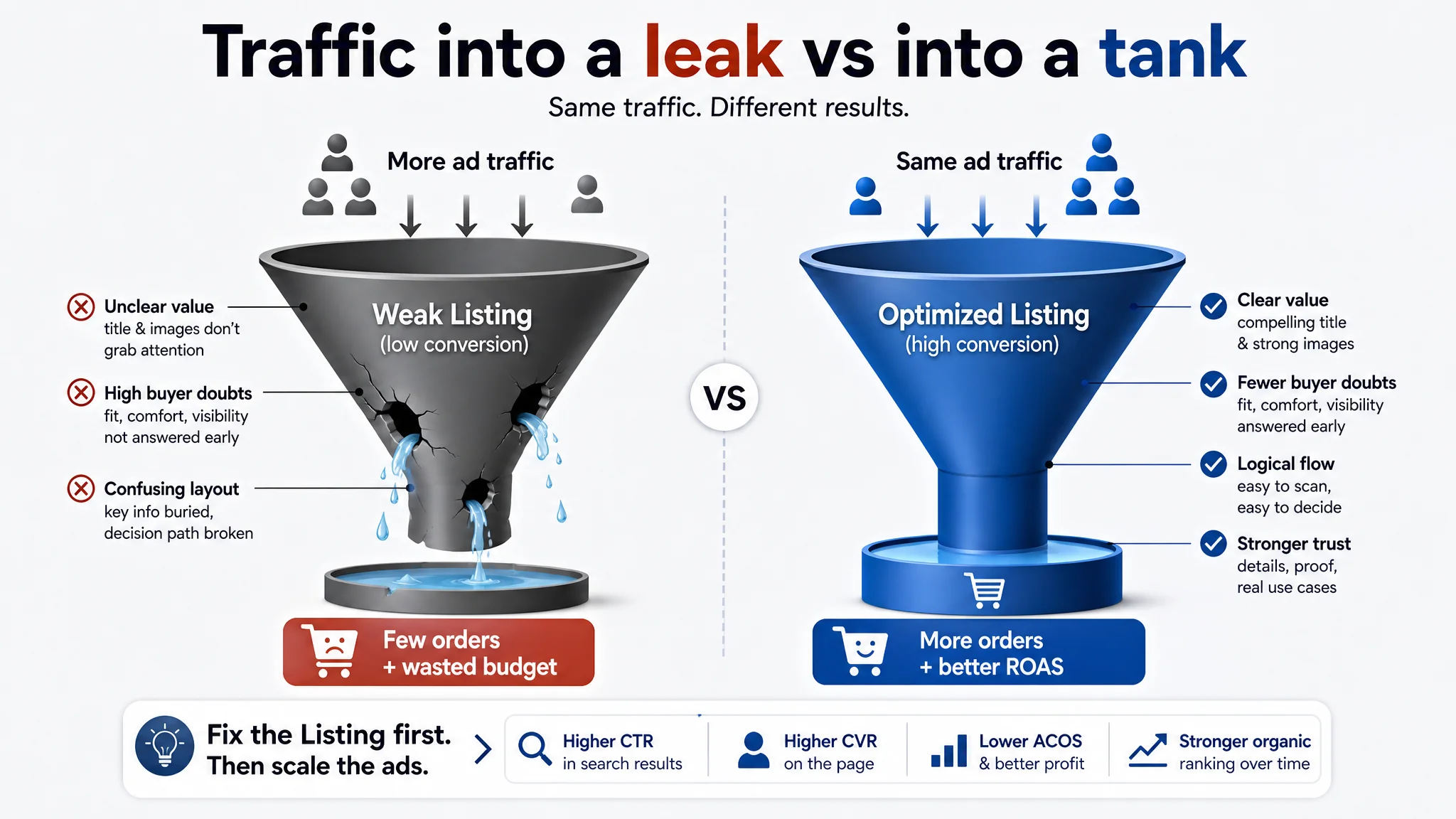
This is the kind of misalignment that ads cannot fix. Ads can increase exposure and clicks, but they cannot rebuild a broken decision path on the product page.
2. The Original Misdiagnosis: Treating a Conversion Problem as an Ads Problem
The seller’s operating logic had been:
- ACOS and TACOS pressure rising
- Traffic coming in, orders not keeping up
- Competitor seems to sell well with fewer reviews
- Therefore: “Our ads structure and review volume must be the main issues.”
Two typical misjudgments followed.
2.1 Overconfidence in Social Proof
Because their star rating and review quantity were higher, the seller assumed:
- Trust level on the page was “good enough”
- Conversion issues must be elsewhere (e.g., ad traffic quality)
In reality, DeepBI’s comparison showed:
Reviews were not the bottleneck. Page content was.
The product had enough social proof to convert—if the page had been designed to carry visitors through a clear decision sequence.
2.2 A “More Features, More Attributes” Mindset
The original title tried to pack in:
- Brand-like string with non-standard characters
- Product type
- “7 colors”
- Size range S–XXL
- Lightweight / fit claims
The seller’s belief: “If we mention all attributes, we’ll capture more searches and look more complete.”
But on Amazon, especially in a crowded category like costumes, this easily turns into noise:
- Core search terms become diluted
- Key selling points are buried
- The title looks less structured and less scannable than the benchmark
The same pattern appeared in images and A+: lots of visual content, but not aligned to how buyers actually decide.
3. DeepBI’s Judgment: The Real Constraint Was Listing Conversion Capacity
DeepBI’s scoring engine and benchmark comparison made one conclusion unavoidable:
This Listing did not lack traffic. It lacked a page that deserved the traffic.
Three specific areas defined the bottleneck.
3.1 Title: Weak Search and Weak First Impression
Issues in the original title:
- Contained non-standard characters that are hard for Amazon search to interpret
- Tried to cover too many attributes (colors, size range) at the expense of core search terms and scenarios
- Lacked a clear, front-loaded combination of:
- Core keyword for the “invisible man” costume concept
- Full-body suit cosplay term
- Structured selling-point bracket
The benchmark, by contrast:
- Front-loaded brand + core product term (“full-body suit”)
- Used [ ] to highlight key attributes (“good visibility, stretch material, 3 sizes”)
- Placed use scenarios (Halloween, party, etc.) clearly in the latter part, capturing high-intent searches
Why this mattered first:
If the title underperforms, ads pay more to bring the same traffic, and organic discoverability lags. Without fixing this, any ad optimization is fighting against both the algorithm and the shopper’s first scan.
3.2 Main Images: A 12-Point Gap Where CTR and CVR Are Decided
Main-image scores were 14 vs 26. That’s not a cosmetic gap; it’s a sales gap.
The seller’s image set:
- Repeated basic silhouettes from slightly different angles
- Had strong atmosphere (party vibe), but low information density
- Delayed or weakened critical decision-driving visuals:
- Back zipper design
- Sizing clarity
- Stretch and movement
- Breathability / comfort cues
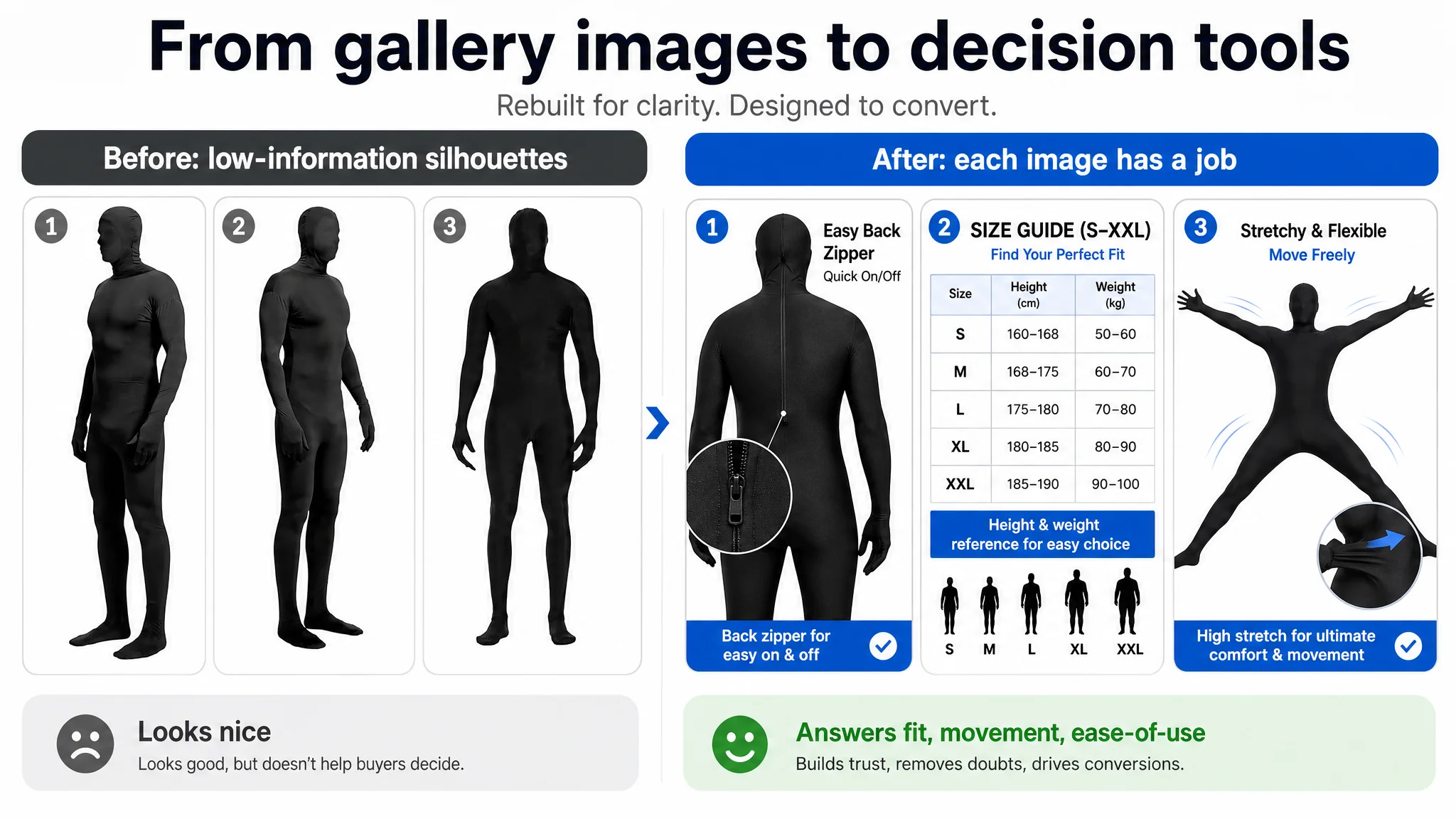
The benchmark image set, on the other hand, used each slot to answer a specific question:
1. Strong poster-like first image with immediate costume context
2. Dedicated size chart graphic
3. Clear visual evidence of comfort and stretch
4. Specific function details (zipper, glove dexterity)
5. Scenario usage and versatility
“The real problem was not that ads failed to bring traffic. It was that the page could not convert the traffic.”
When the most visible asset on the Amazon search results page fails to:
- Create a reason to click
- Quickly reduce “will this fit?” anxiety
- Show “I can move and see safely in this”
then both CTR and CVR suffer, regardless of review count.
3.3 A+ Detail Page: Scene-Rich but Logic-Poor
The seller did have A+ content, but:
- Modules were dominated by multi-color displays and party scenes
- Critical friction points (sizing, comfort, visibility, ease of use) appeared late or only as text
- The size table was buried toward the end
- There was no structured progression from:
1. What this product achieves at your event
2. Can it fit me?
3. Is it comfortable and safe to wear for a long time?
4. Is it easy to put on and actually use?
5. How can I reuse or adapt it?
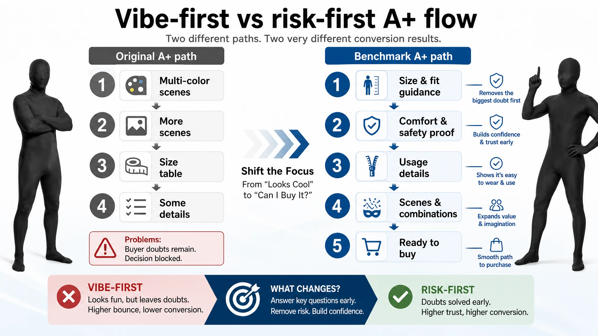
The benchmark’s A+ did exactly this:
- Put detailed sizing early, with height/weight guidance and silhouettes
- Used comparison and before/after visuals to prove comfort and playfulness
- Highlighted practical details (back zipper, five-finger gloves)
- Expanded scenarios and pairing ideas only after removing the main doubts
In DeepBI’s view, this was the core sales-logic leak:
The page sold “vibe” before it solved “risk”.
For costumes, “risk” is simple: Can I see? Can I breathe and move? Will it fit? Will I be embarrassed?
Those questions must be answered early and visually, not buried under color variations.
4. Why DeepBI Did Not Recommend “Fix Ads First”
At this stage, the seller’s instinct was to:
- Keep testing keywords
- Adjust bids and budgets
- Wait for review count to grow further
DeepBI pushed back.
4.1 The Business Risk of Pushing Traffic into a Weak Page
Three immediate risks were identified:
1. Ad spend inefficiency:
Traffic was being driven to a Listing that underperformed against the category benchmark in every content dimension except reviews. Each additional click had a lower probability of converting than it could.
1. Organic ranking stagnation:
Poor conversion, especially versus top competitors, limits the Listing’s ability to gain and hold strong organic positions. Ads were not feeding a healthy flywheel; they were feeding a leak.
1. Misleading operational signals:
Continuing to tune ads without fixing the page would likely reinforce the wrong conclusion: “Ads in this category are just getting too expensive,” instead of, “Our page is not competitive enough yet.”
Given these risks, the priority became:
Repair Listing conversion capacity first. Then let ads exploit that capacity.
4.2 Decision Order: Content Before More Traffic
DeepBI’s recommendation sequence:
1. Title restructuring
- Front-load core “invisible man costume” + full-body suit cosplay keywords
- Add a structured bracket for key attributes: stretch fabric, back zipper, lightweight
- Expand scenario terms (Halloween, party, school festival, performance, photo shoots) in the tail
- Remove distracting non-standard characters that hurt search parsing
1. Main-image set redesign
- Reorder images so that:
- 1st image: back view highlighting the zipper as a prominent practical feature
- 2nd image: clear, well-designed size chart with height/weight guidance
- 3rd image: fully extended pose emphasizing stretch and freedom of movement
- 4th image: close-up of zipper and glove details to show ease of use and dexterity
- 5th image: comfort-focused pose with copy emphasizing lightweight and breathability
1. A+ information flow restructuring
- Move size guidance from the bottom to the top of the A+
- Compress repetitive color/scene content
- Insert modules that visually validate:
- Stretch fabric and ease of posing
- “Good visibility” and event safety (text-based where imagery is limited)
- Back zipper and finger flexibility for smartphone and props
- Only then expand into multi-color combinations and customization ideas
- End with a pure “final confirmation” full-body image and a strong emotional nudge: this is the item that will make your event stand out
Only after this conversion foundation is strengthened does it make sense to:
- Re-accelerate ads
- Test more aggressive keyword coverage
- Grow traffic volume
5. How the Page’s Sales Logic Started to Recover
Once the seller accepted that this was a Listing issue, not an ads issue, the optimization work had a clear direction.
5.1 Title: From Attribute List to Searchable Value Statement
The optimized title structure followed three priorities:
- Search behavior:
Tight placement of “invisible man costume” and full-body suit cosplay terms, near the front, for Amazon JP search patterns.
- Feature framing:
A [ ] block highlighting:
- Stretch fabric
- Back zipper
- Lightweight comfort
This mirrors the benchmark’s use of brackets but focuses on the seller’s own strengths.
- Scenario coverage without dilution:
Halloween, party, event, school festival, performance, and filming—all included, but after the core product and features. This protects keyword relevance while still capturing scenario searches.
Effect in operational terms:
- Search algorithms now see a more coherent title
- Shoppers scanning search results first see “what it is” and “why it’s practical,” not a noisy attribute dump
- Clicks are more likely to come from people who understand the product before landing on the page
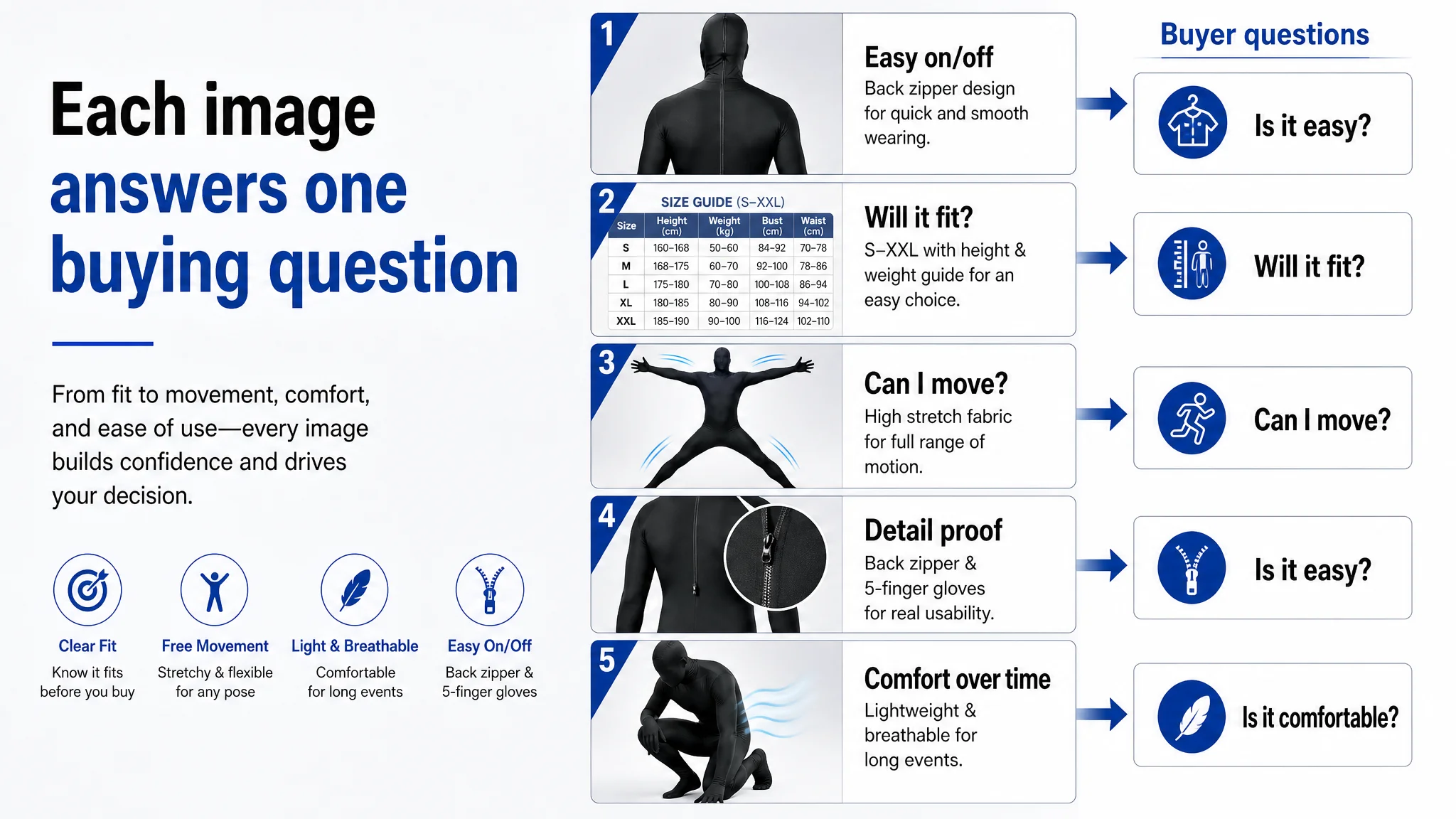
5.2 Main Images: Each Slot Assigned a Job
DeepBI’s analysis reframed each image slot as a business tool, not just a picture.
Image 1 – Back zipper as the hero
- Switch to a clear back view that showcases the zipper
- Copy focuses on “easy to put on and take off, even when changing quickly at events”
Purpose: reduce the “Will I get stuck in this?” fear at first glance.
Image 2 – Sizing clarity
- Replace a redundant side silhouette with a detailed size chart visual
- Include height/weight reference in addition to chest/waist/hip measurements
Purpose: address “Will it fit?” in the second image, instead of burying it deep in A+.
Image 3 – Stretch and movement
- Full-body pose with arms and legs extended
- Visual emphasis on “stretch spandex blend” and “easy to move and pose”
Purpose: counter “Will it be too tight to move?”—a major blocker for event costumes.
Image 4 – Detail and usability
- Close-up of the zipper area with a magnified inset
- Supportive text on easy zip and solo dressing
Purpose: shift the product from “funny costume” to “usable gear” in the buyer’s mind.
Image 5 – Comfort and breathability
- Pose suggesting comfort and flexibility
- Copy stressing “lightweight & less stuffy” for long party or stage use
Purpose: address long-wear comfort, which drives both purchase decision and review quality.
By turning the image strip into a structured series of answers, the Listing starts to behave like a sales conversation, not a gallery.
5.3 A+ Detail Page: From Repetition to a Decision Path
DeepBI reorganized A+ modules around the shopper’s mental steps.
1. Module 1 – Event outcome, not colors
- Lead with “ultimate crowd-pleaser item” positioning
- Show clear Halloween, cosplay, and performance use cases
- Reduce color emphasis at this stage
1. Module 2 – Size, early and visual
- Promote the size table to this position
- Include height/weight guidance, not just measurements
- Clarify that stretch fabric means some flexibility by body type
1. Module 3 – Fabric and comfort validation
- Use running/large movement poses to show stretch
- Text to highlight polyester x spandex blend, easy posing, and low stuffiness
- Mention good visibility to address safety, even if imagery is limited here
1. Module 4 – Usability details
- Visual emphasis on back zipper
- Text clarifying ease of putting on/taking off and finger mobility for props and smartphones
1. Module 5 – Color and customization
- Now show 7-color variation
- Suggest pairing with wigs, masks, sunglasses to unlock multiple costume ideas
1. Module 6 – Emotional push
- Strong copy: “Guaranteed to make your event more exciting”
- Model image focused on energy and crowd response
1. Module 7 – Clean final confirmation
- Simple full-body view with no extra text
- Function: let the buyer quietly confirm “Yes, this is what I want”
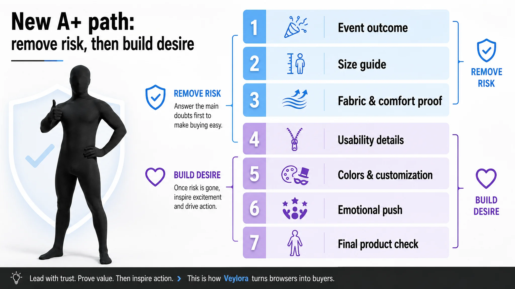
The result is an A+ section where:
- Rational doubts are removed in the first half
- Emotional desire and imagination are built in the second half
- The last module helps the buyer cross the final line to “Add to Cart”
6. What Changed in the Business State
The case material does not include post-optimization KPIs, so we will not fabricate numbers. What did change—and what matters for operators—is the operating state and risk profile of this Listing.
6.1 Conversion Capacity, Not Just Cosmetics
After restructuring:
- The title is better aligned with Amazon JP search behavior
- The main-image set is engineered to increase both CTR (at search-results level) and CVR (once on the page)
- The A+ section supports a coherent decision flow instead of repeating color and scene visuals
Practically, this means:
- Each paid click now lands on a page more capable of converting
- The seller is less dependent on ever-higher bids to sustain sales
- Organic potential is no longer capped by a structurally weak Listing
6.2 Traffic Became Useful Again
With the page repaired:
- Ads no longer amplify the Listing’s weaknesses
- Traffic from both paid and organic sources is more likely to result in orders
- Review advantages (higher rating, larger volume) finally work in tandem with content, instead of compensating for it
In other words, the Listing started to behave like a real asset, not just an endpoint for traffic.
6.3 The Seller’s Understanding Shifted
The most important outcome was cognitive:
- The team stopped treating ACOS and conversion as purely advertising problems
- They recognized that reviews alone cannot offset weak title, images, and A+ logic
- They saw that Listing quality is the foundation of advertising efficiency
“Before scaling ads, we need to ask: does this page deserve more traffic?”
That question is the real value of this case for other Amazon sellers.
7. What Other Amazon Sellers Can Take Away
This costume Listing is just one ASIN in one marketplace, but the pattern is common:
- Reviews look “good enough”
- Ads feel “expensive”
- The instinct is to keep adjusting campaigns and chase more reviews
DeepBI’s diagnosis process in this case highlights three practical checkpoints for any Amazon seller:
1. Compare your Listing, not your feelings, to the benchmark
- Title structure, main images, bullets, and A+ can be scored and compared
- A 20+ point gap vs the category leader is not a cosmetic issue; it is a business constraint
1. Ask whether each image and module has a job
- Does each main image answer a specific buying question?
- Does your A+ follow a decision path, or just show “more of the same”?
1. Fix conversion capacity before you push harder on traffic
- If reviews are already decent, and your content scores lag far behind the benchmark, ads are not the first lever
- Once the page is capable, ad optimization becomes meaningful again
In this case, DeepBI’s value was not in generating more assets. It was in forcing a clearer judgment: traffic was not the bottleneck; the Amazon Listing was. Only after that judgment changed did the business logic—and the page—start to recover.